Embed Size (px)
Citation preview
Colorific
Spiral Saturday
The human eye can see about 2.5 million distinct colors!
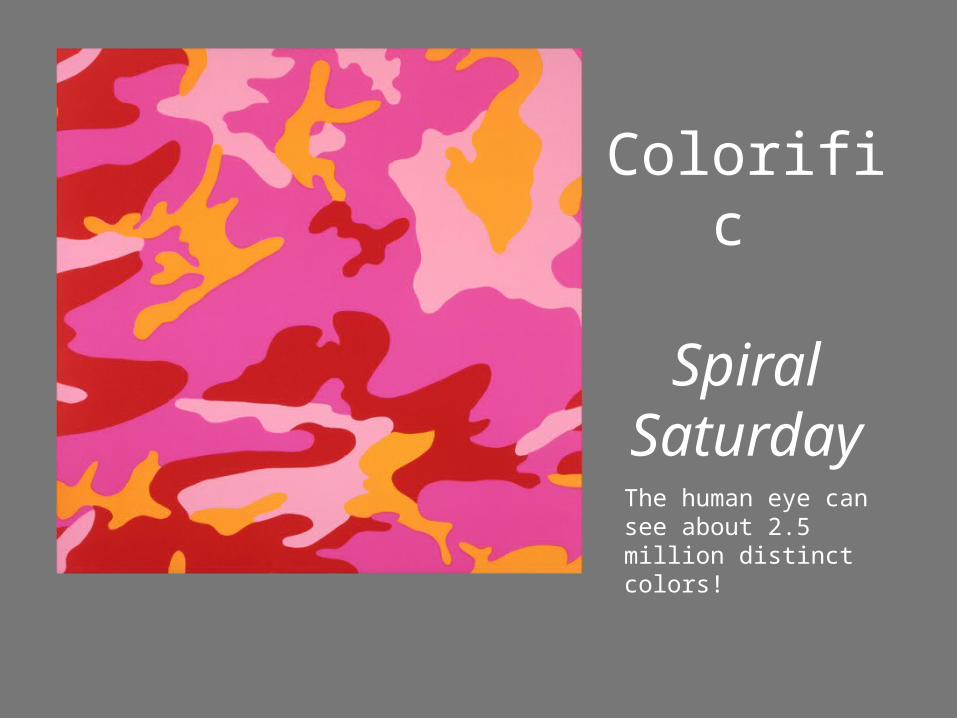
Color theory has given western artists insight into their craft for centuries. During the Renaissance and throughout 17th and 18th century, the fundamentals of color theory helped artists skillfully render the observable world. However, as the era of Modern Art emerged, artists began to use color theory to diverge from reality, mine their emotions and experiment with visual perception.
Why is color theory important?
Traité de la peinture en mignature, 1708, The Hague, reproduced in The Creation of Color in Eighteenth-Century Europe
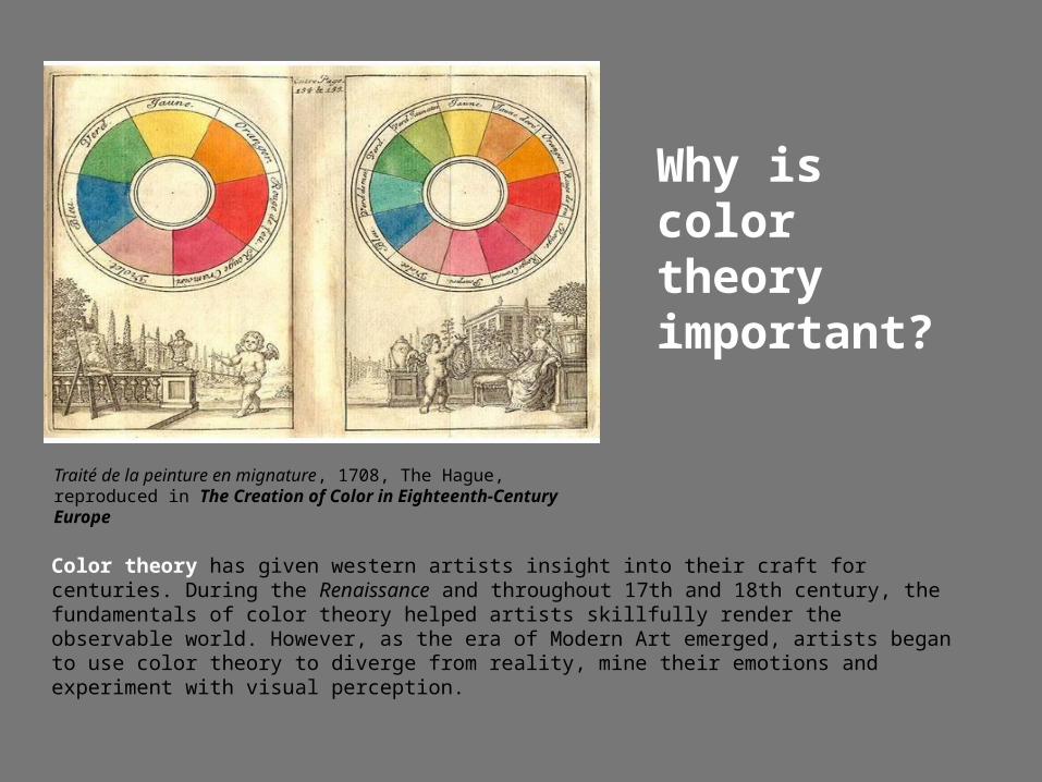
Primary ColorsA primary color is a “root” color that can be mixed with to make secondary and tertiary colors but cannot itself be made by mixing. On the painter’s color wheel they are:
Red Yellow BlueHenri Matisse (French, 1869 -1954) The Dessert Harmony in Red, 1908
Thomas Gainsborough (English, 1727 -1788) Blue Boy, 1770
Vincent van Gogh (Dutch, 1853 -1890) Wheat Field Under Threatening Skies, 1890
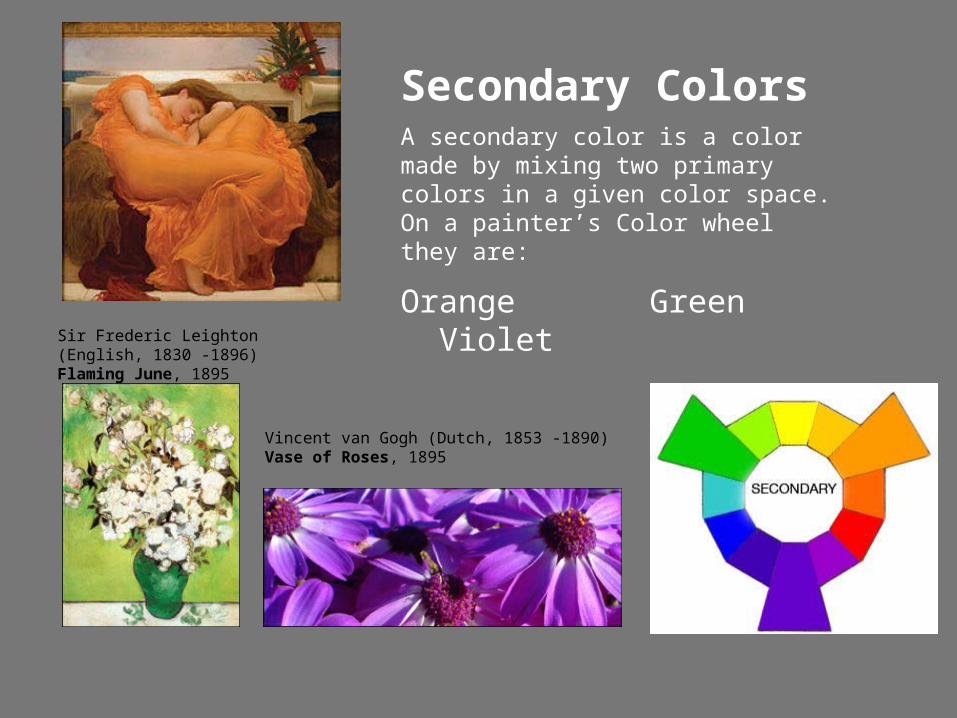
Secondary ColorsA secondary color is a color made by mixing two primary colors in a given color space. On a painter’s Color wheel they are:
Orange Green Violet
Sir Frederic Leighton (English, 1830 -1896) Flaming June, 1895
Vincent van Gogh (Dutch, 1853 -1890) Vase of Roses, 1895
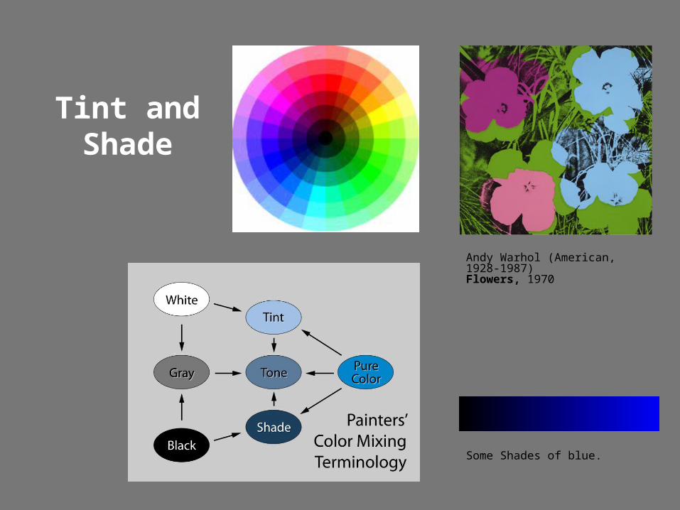
Tint and Shade
Andy Warhol (American, 1928-1987) Flowers, 1970
Some Shades of blue.
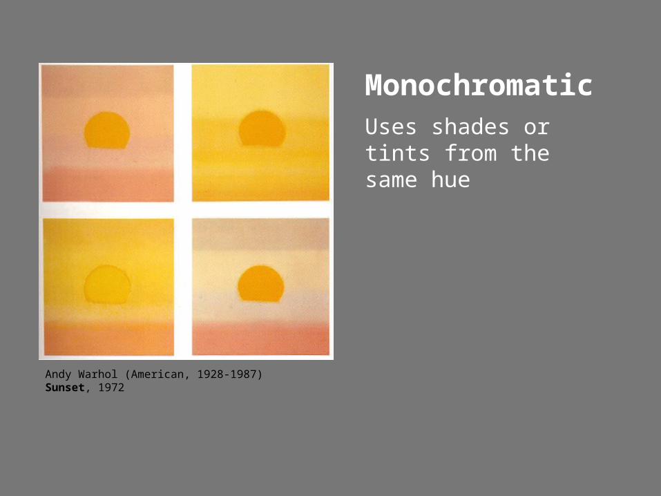
MonochromaticUses shades or tints from the same hue
Andy Warhol (American, 1928-1987) Sunset, 1972
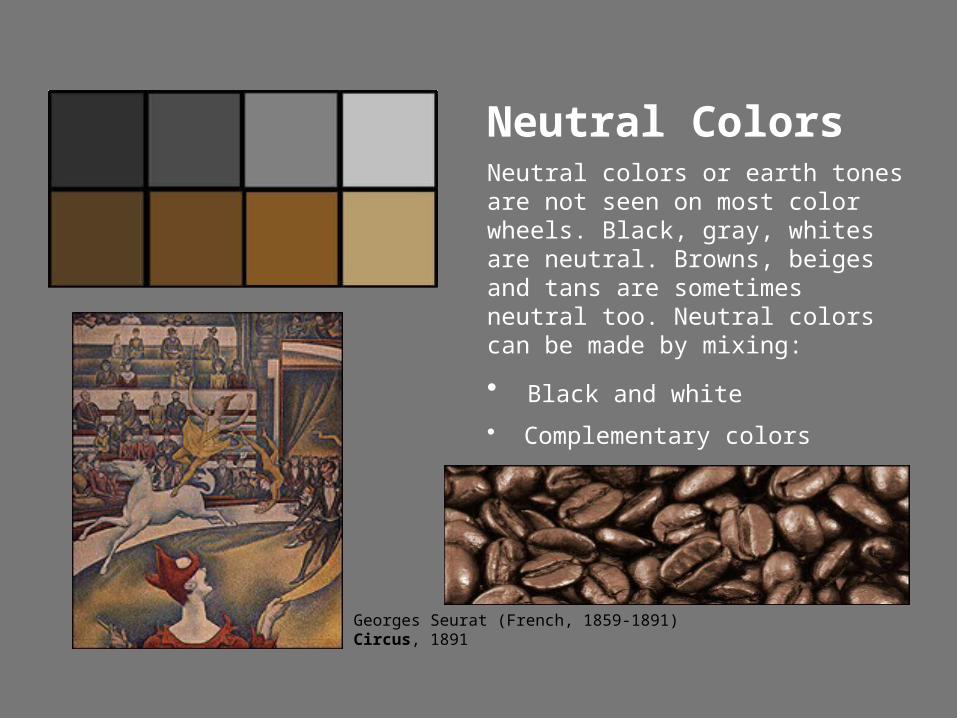
Neutral ColorsNeutral colors or earth tones are not seen on most color wheels. Black, gray, whites are neutral. Browns, beiges and tans are sometimes neutral too. Neutral colors can be made by mixing:
• Black and white
• Complementary colors
• All three primaries together
Georges Seurat (French, 1859-1891) Circus, 1891
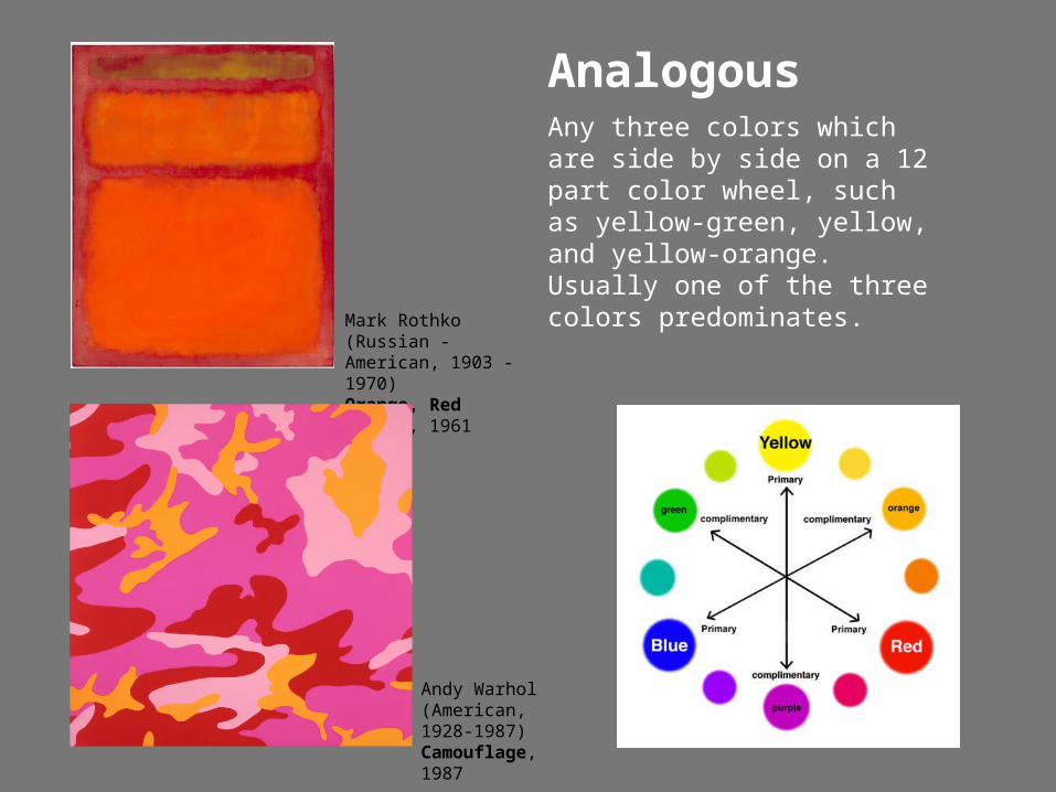
AnalogousAny three colors which are side by side on a 12 part color wheel, such as yellow-green, yellow, and yellow-orange. Usually one of the three colors predominates.
Andy Warhol (American, 1928-1987)Camouflage, 1987
Mark Rothko (Russian -American, 1903 - 1970) Orange, Red Yellow, 1961
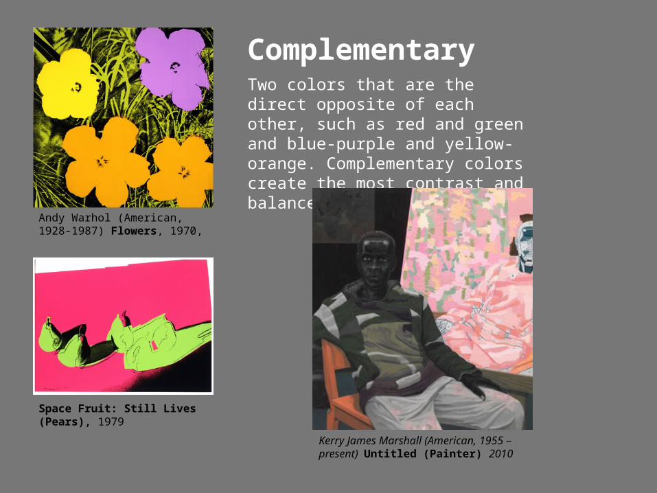
ComplementaryTwo colors that are the direct opposite of each other, such as red and green and blue-purple and yellow-orange. Complementary colors create the most contrast and balance in design.
Space Fruit: Still Lives (Pears), 1979
Kerry James Marshall (American, 1955 – present) Untitled (Painter) 2010
Andy Warhol (American, 1928-1987) Flowers, 1970,
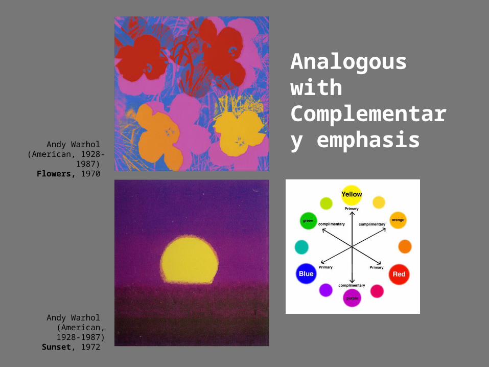
Analogous with Complementary emphasis
Andy Warhol (American, 1928-1987)
Flowers, 1970
Andy Warhol (American, 1928-1987)
Sunset, 1972
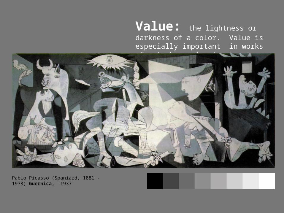
Value: the lightness or darkness of a color. Value is especially important in works of art when color is absent.
Pablo Picasso (Spaniard, 1881 -1973) Guernica, 1937
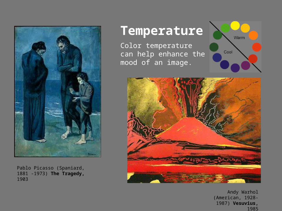
TemperatureColor temperature can help enhance the mood of an image.
Andy Warhol (American, 1928-1987) Vesuvius, 1985
Pablo Picasso (Spaniard, 1881 -1973) The Tragedy, 1903
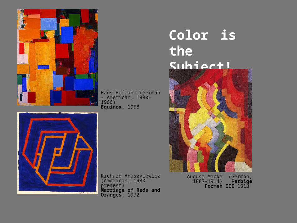
Color is the Subject!
Hans Hofmann (German - American, 1880-1966) Equinox, 1958
August Macke (German, 1887-1914) Farbige Formen III 1913
Richard Anuszkiewicz(American, 1930 - present) Marriage of Reds and Oranges, 1992
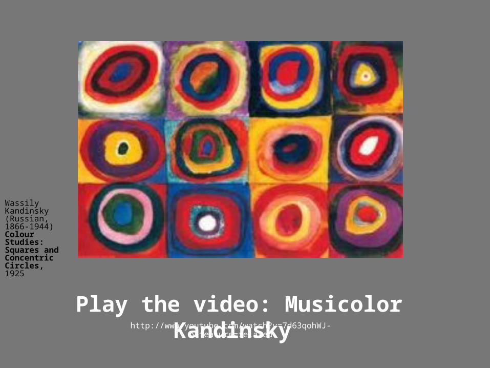
Play the video: Musicolor Kandinsky http://www.youtube.com/watch?v=7d63qohWJ-o&feature=related
Wassily Kandinsky (Russian, 1866-1944) Colour Studies: Squares and Concentric Circles, 1925