Embed Size (px)
Citation preview

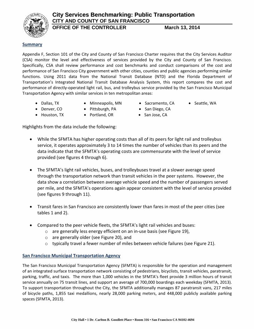
City Services Benchmarking: Public Transportation
City and County of San Francisco Office of the Controller ‐ City Services Auditor
March 13, 2014
CCiittyy SSeerrvviicceess BBeenncchhmmaarrkkiinngg:: PPuubblliicc TTrraannssppoorrttaattiioonn
CITY AND COUNTY OF SAN FRANCISCO OFFICE OF THE CONTROLLER March 13, 2014
City Hall • 1 Dr. Carlton B. Goodlett Place • Room 316 • San Francisco CA 94102-4694
Summary
Appendix F, Section 101 of the City and County of San Francisco Charter requires that the City Services Auditor (CSA) monitor the level and effectiveness of services provided by the City and County of San Francisco. Specifically, CSA shall review performance and cost benchmarks and conduct comparisons of the cost and performance of San Francisco City government with other cities, counties and public agencies performing similar functions. Using 2011 data from the National Transit Database (NTD) and the Florida Department of Transportation’s Integrated National Transit Database Analysis System, this report compares the cost and performance of directly‐operated light rail, bus, and trolleybus service provided by the San Francisco Municipal Transportation Agency with similar services in ten metropolitan areas:
Dallas, TX Minneapolis, MN Sacramento, CA Seattle, WA
Denver, CO Pittsburgh, PA San Diego, CA
Houston, TX Portland, OR San Jose, CA
Highlights from the data include the following:
While the SFMTA has higher operating costs than all of its peers for light rail and trolleybus service, it operates approximately 3 to 14 times the number of vehicles than its peers and the data indicate that the SFMTA’s operating costs are commensurate with the level of service provided (see figures 4 through 6).
The SFMTA’s light rail vehicles, buses, and trolleybuses travel at a slower average speed through the transportation network than transit vehicles in the peer systems. However, the data show a correlation between average vehicle speed and the number of passengers served per mile, and the SFMTA’s operations again appear consistent with the level of service provided (see figures 9 through 11).
Transit fares in San Francisco are consistently lower than fares in most of the peer cities (see tables 1 and 2).
Compared to the peer vehicle fleets, the SFMTA’s light rail vehicles and buses: o are generally less energy efficient on an in‐use basis (see Figure 19), o are generally older (see Figure 20), and o typically travel a fewer number of miles between vehicle failures (see Figure 21).
San Francisco Municipal Transportation Agency
The San Francisco Municipal Transportation Agency (SFMTA) is responsible for the operation and management of an integrated surface transportation network consisting of pedestrians, bicyclists, transit vehicles, paratransit, parking, traffic, and taxis. The more than 1,000 vehicles in the SFMTA’s fleet provide 3 million hours of transit service annually on 75 transit lines, and support an average of 700,000 boardings each weekday (SFMTA, 2013). To support transportation throughout the City, the SFMTA additionally manages 87 paratransit vans, 217 miles of bicycle paths, 1,855 taxi medallions, nearly 28,000 parking meters, and 448,000 publicly available parking spaces (SFMTA, 2013).

City Services Benchmarking: Public Transportation Page 2
City Hall • 1 Dr. Carlton B. Goodlett Place • Room 316 • San Francisco CA 94102-4694
Peer Agencies
Benchmarking is a process in which an organization compares its performance to the performance of other similar agencies, or “peers.” Transit systems across the United States vary considerably based on a variety of factors such as the modes of transit operated, age of the system, state of capital infrastructure, cost of living, labor agreements, and climate; it is important to keep these differences in mind when making comparisons across agencies. This section briefly describes how the SFMTA as a whole compares to the peers selected for this analysis.1 Public transportation systems are made up of one or more modes of transportation. For example, the primary modes operated by the SFMTA are light rail, trolleybus, and bus. Light rail consists of electric‐powered rail cars that operate in mixed traffic and are connected to overhead lines, and trolleybuses are electric‐powered busses connected to overhead wires. Generally speaking, the mix of modes an agency operates influences basic characteristics such as its structure and size, its budget, and numerous aspects of its day‐to‐day management. As a result, agencies that operate similar modes of transit serve as more suitable peers in a benchmarking analysis. Figure 1 below shows how San Francisco compares to its peers in this regard. In particular, the figure displays the percentage of passenger trips served by the various modes of transportation operated by the SFMTA and its peer agencies.2 A “passenger trip” (also referred to in this report as a “boarding”) takes place each time a passenger boards a transit vehicle. Figure 1 shows a clear predominance of bus and light rail service among the transit agencies, consistent with our goal of establishing a group of peers that have similar operating characteristics. Notable differences among the agencies include the large number of trips served by trolleybus in San Francisco and Seattle, and the absence of large‐scale light rail or streetcar service in Seattle.3 Figure 1 – Percentage of Passenger Trips Carried by Mode of Transportation
† Includes commuter bus and bus rapid transit ‡ Includes hybrid rail and inclined plane 1 The procedures used to select peer agencies for this analysis are consistent with the guidelines in Transit Cooperative Research Program (TCRP) Report 141, published in 2010 by the National Academy of Sciences (NAS). For more information about the TCRP methodology and the manner in which it was used in this case, refer to Appendix A of this document and TCRP Report 141. 2 Excludes demand response service. 3 As discussed further in Appendix A, Seattle was selected as a peer for this analysis despite its lack of light rail service since it is one of a few transit agencies in the country that operates trolleybus service and it is otherwise comparable to SFMTA in several other respects.
0% 20% 40% 60% 80% 100%
Seattle
San Jose
San Francisco
San Diego
Sacramento
Portland
Pittsburgh
Minneapolis
Houston
Denver
Dallas Bus
Trolleybus
Other Bus
Light Rail/Street Car
Cable Car
Commuter Rail
Other Rail
Vanpool
†
‡
City Services Benchmarking: Public Transportation Page 3
City Hall • 1 Dr. Carlton B. Goodlett Place • Room 316 • San Francisco CA 94102-4694
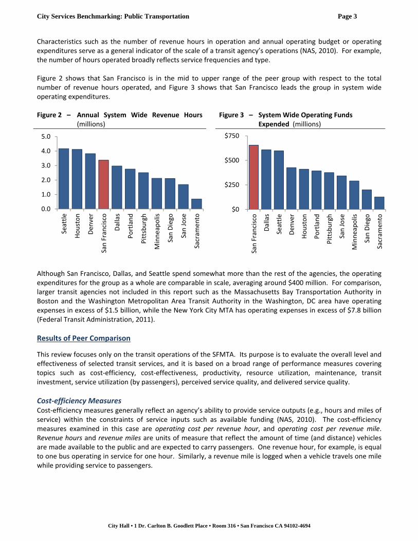
Characteristics such as the number of revenue hours in operation and annual operating budget or operating expenditures serve as a general indicator of the scale of a transit agency’s operations (NAS, 2010). For example, the number of hours operated broadly reflects service frequencies and type. Figure 2 shows that San Francisco is in the mid to upper range of the peer group with respect to the total number of revenue hours operated, and Figure 3 shows that San Francisco leads the group in system wide operating expenditures. Figure 2 – Annual System Wide Revenue Hours
(millions) Figure 3 – System Wide Operating Funds
Expended (millions)
Although San Francisco, Dallas, and Seattle spend somewhat more than the rest of the agencies, the operating expenditures for the group as a whole are comparable in scale, averaging around $400 million. For comparison, larger transit agencies not included in this report such as the Massachusetts Bay Transportation Authority in Boston and the Washington Metropolitan Area Transit Authority in the Washington, DC area have operating expenses in excess of $1.5 billion, while the New York City MTA has operating expenses in excess of $7.8 billion (Federal Transit Administration, 2011).
Results of Peer Comparison
This review focuses only on the transit operations of the SFMTA. Its purpose is to evaluate the overall level and effectiveness of selected transit services, and it is based on a broad range of performance measures covering topics such as cost‐efficiency, cost‐effectiveness, productivity, resource utilization, maintenance, transit investment, service utilization (by passengers), perceived service quality, and delivered service quality.
Cost‐efficiency Measures Cost‐efficiency measures generally reflect an agency’s ability to provide service outputs (e.g., hours and miles of service) within the constraints of service inputs such as available funding (NAS, 2010). The cost‐efficiency measures examined in this case are operating cost per revenue hour, and operating cost per revenue mile. Revenue hours and revenue miles are units of measure that reflect the amount of time (and distance) vehicles are made available to the public and are expected to carry passengers. One revenue hour, for example, is equal to one bus operating in service for one hour. Similarly, a revenue mile is logged when a vehicle travels one mile while providing service to passengers.
0.0
1.0
2.0
3.0
4.0
5.0
Seattle
Houston
Den
ver
San Francisco
Dallas
Portland
Pittsburgh
Minneapolis
San Diego
San Jose
Sacram
ento
$0
$250
$500
$750
San Francisco
Dallas
Seattle
Den
ver
Houston
Portland
Pittsburgh
San Jose
Minneapolis
San Diego
Sacram
ento
City Services Benchmarking: Public Transportation Page 4
City Hall • 1 Dr. Carlton B. Goodlett Place • Room 316 • San Francisco CA 94102-4694
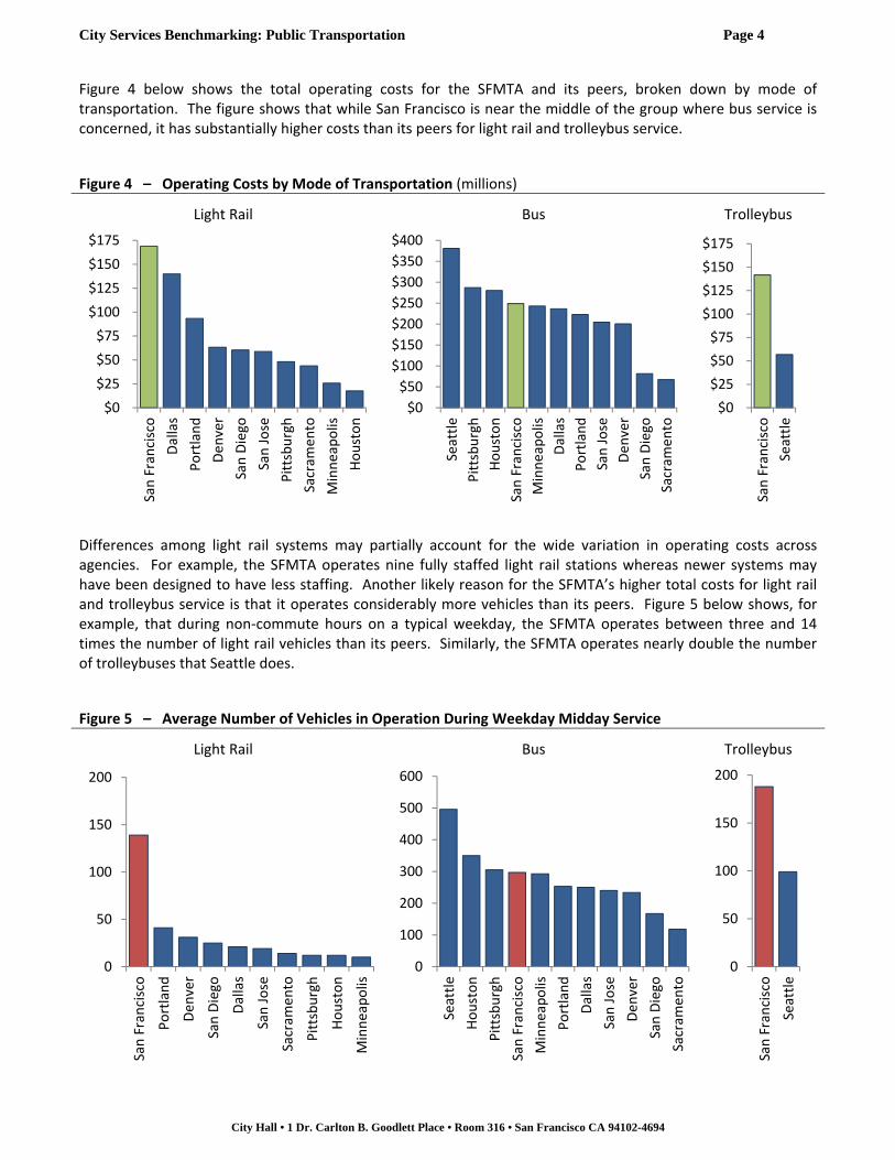
Figure 4 below shows the total operating costs for the SFMTA and its peers, broken down by mode of transportation. The figure shows that while San Francisco is near the middle of the group where bus service is concerned, it has substantially higher costs than its peers for light rail and trolleybus service.
Figure 4 – Operating Costs by Mode of Transportation (millions)
Light Rail Bus Trolleybus
Differences among light rail systems may partially account for the wide variation in operating costs across agencies. For example, the SFMTA operates nine fully staffed light rail stations whereas newer systems may have been designed to have less staffing. Another likely reason for the SFMTA’s higher total costs for light rail and trolleybus service is that it operates considerably more vehicles than its peers. Figure 5 below shows, for example, that during non‐commute hours on a typical weekday, the SFMTA operates between three and 14 times the number of light rail vehicles than its peers. Similarly, the SFMTA operates nearly double the number of trolleybuses that Seattle does.
Figure 5 – Average Number of Vehicles in Operation During Weekday Midday Service
Light Rail Bus Trolleybus
$0
$25
$50
$75
$100
$125
$150
$175
San Francisco
Dallas
Portland
Den
ver
San Diego
San Jose
Pittsburgh
Sacram
ento
Minneapolis
Houston
$0
$50
$100
$150
$200
$250
$300
$350
$400
Seattle
Pittsburgh
Houston
San Francisco
Minneapolis
Dallas
Portland
San Jose
Den
ver
San Diego
Sacram
ento
$0
$25
$50
$75
$100
$125
$150
$175
San Francisco
Seattle
0
50
100
150
200
San Francisco
Portland
Den
ver
San Diego
Dallas
San Jose
Sacram
ento
Pittsburgh
Houston
Minneapolis
0
100
200
300
400
500
600
Seattle
Houston
Pittsburgh
San Francisco
Minneapolis
Portland
Dallas
San Jose
Den
ver
San Diego
Sacram
ento
0
50
100
150
200San Francisco
Seattle

City Services Benchmarking: Public Transportation Page 5
City Hall • 1 Dr. Carlton B. Goodlett Place • Room 316 • San Francisco CA 94102-4694
To illustrate this point further, Figure 6 shows the average number of light rail vehicles in operation during weekday midday service versus the total operating cost of that service. The plot demonstrates a clear trend of increasing costs with an increase in the number of vehicles in operation. Moreover, San Francisco’s costs are generally in line with the trend established by the peer group. Figure 6 – Average Number of Light Rail Vehicles in Operation During Weekday Midday Service vs.
Operating Costs
With a greater number of light rail vehicles and trolleybuses in operation throughout the day, the SFMTA operates for a proportionately greater number of revenue hours. Thus, when the total operating costs are divided by the number of revenue hours for each mode, the SFMTA’s costs are more alike those of its peers for all three modes (Figure 7). Figure 7 – Operating Costs Per Revenue Hour
Light Rail Bus Trolleybus
San Francisco
Portland
Denver
San Diego
Dallas
San Jose
Sacramento
Pittsburgh
HoustonMinneapolis
$0
$50
$100
$150
$200
0 30 60 90 120 150
Operating Costs (m
illions)
Avg. Wkdy Midday No. of Vehicles in Operation
$0
$100
$200
$300
$400
Dallas
Pittsburgh
San Jose
San Francisco
Houston
Sacram
ento
Minneapolis
Portland
San Diego
Den
ver
$0
$100
$200
$300
$400
San Francisco
San Jose
Pittsburgh
Seattle
Den
ver
Portland
Sacram
ento
Minneapolis
Houston
Dallas
San Diego
$0
$100
$200
$300
$400San Francisco
Seattle
City Services Benchmarking: Public Transportation Page 6
City Hall • 1 Dr. Carlton B. Goodlett Place • Room 316 • San Francisco CA 94102-4694
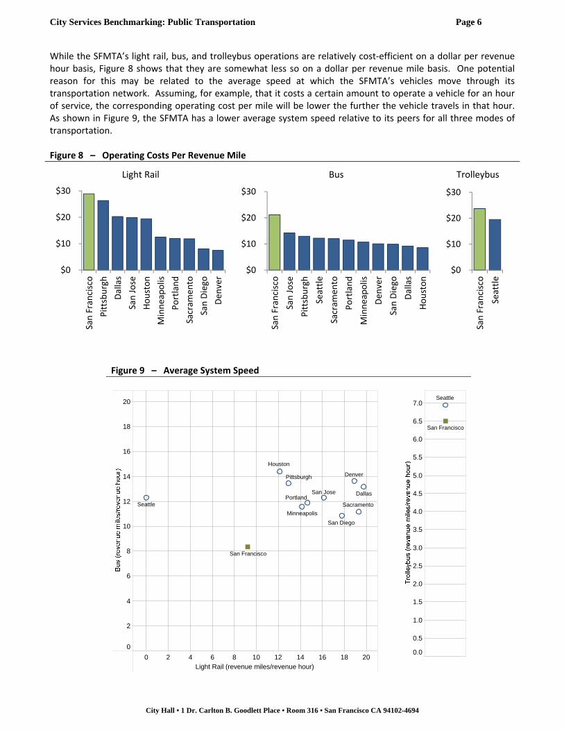
While the SFMTA’s light rail, bus, and trolleybus operations are relatively cost‐efficient on a dollar per revenue hour basis, Figure 8 shows that they are somewhat less so on a dollar per revenue mile basis. One potential reason for this may be related to the average speed at which the SFMTA’s vehicles move through its transportation network. Assuming, for example, that it costs a certain amount to operate a vehicle for an hour of service, the corresponding operating cost per mile will be lower the further the vehicle travels in that hour. As shown in Figure 9, the SFMTA has a lower average system speed relative to its peers for all three modes of transportation. Figure 8 – Operating Costs Per Revenue Mile
Light Rail Bus Trolleybus
Figure 9 – Average System Speed
$0
$10
$20
$30
San Francisco
Pittsburgh
Dallas
San Jose
Houston
Minneapolis
Portland
Sacram
ento
San Diego
Den
ver
$0
$10
$20
$30
San Francisco
San Jose
Pittsburgh
Seattle
Sacram
ento
Portland
Minneapolis
Den
ver
San Diego
Dallas
Houston
$0
$10
$20
$30
San Francisco
Seattle
0 2 4 6 8 10 12 14 16 18 20Light Rail (revenue miles/revenue hour)
0
2
4
6
8
10
12
14
16
18
20
San Jose
San Diego
SacramentoPortland
Pittsburgh
Houston
Denver
Dallas
Minneapolis
Seattle
San Francisco
0.0
0.5
1.0
1.5
2.0
2.5
3.0
3.5
4.0
4.5
5.0
5.5
6.0
6.5
7.0Seattle
San Francisco

City Services Benchmarking: Public Transportation Page 7
City Hall • 1 Dr. Carlton B. Goodlett Place • Room 316 • San Francisco CA 94102-4694
The amount of time a bus takes to traverse its route is influenced by the number of passengers that are served (Bertini & El‐Geneidy, 2004). Each time the bus stops to board or alight passengers, it experiences a delay, which reduces the average speed of the bus. This effect likely contributes to the SFMTA’s lower average speeds. For example, Figure 10 shows that with the exception of Houston’s light rail system, the SFMTA has more boardings per revenue mile than its peers for all three modes of transit. Furthermore, as shown in Figure 11, there is a high correlation between the number of boardings per revenue mile and average bus speed; again, the SFMTA’s performance is consistent with the trend exhibited by the group.4
Figure 10 – Boardings Per Revenue Mile
Figure 11 – Boardings Per Revenue Mile vs. Average System Speed for Bus Service
4 See a similar figure in Appendix B pertaining to light rail service.
Light Rail Bus Trolleybus
0
1
2
3
4
5
6
7
8
9
10
11
12
San Francisco
San Jose
San Diego
Sacramento
Portland
Pittsburgh
Minneapolis
Houston
Denver
Dallas
0
1
2
3
4
5
6
7
8
9
10
11
12
San Francisco
Seattle
San Jose
San Diego
Sacramento
Portland
Pittsburgh
Minneapolis
Houston
Denver
Dallas
0
1
2
3
4
5
6
7
8
9
10
11
12
San Francisco
Seattle
DallasDenver
Houston
Minneapolis
Pittsburgh
Portland
SacramentoSan Diego
San Francisco
San Jose
Seattle
0
5
10
15
0 1 2 3 4 5 6 7 8
Average System Speed
Boardings Per Revenue Mile

City Services Benchmarking: Public Transportation Page 8
City Hall • 1 Dr. Carlton B. Goodlett Place • Room 316 • San Francisco CA 94102-4694
Cost‐effectiveness Measures While the foregoing analysis provides insight into how cost‐efficient the SFMTA is in providing transit service, one limitation of cost‐efficiency measures is that they do not speak to a transit system’s ability to meet the needs of its passengers (NAS, 2010). To that end, the analysis includes a variety of additional performance measures, which look at the cost, quality, and level of service provided. Figure 12 below shows the operating cost per boarding, which represents the cost of serving each person who boards a vehicle. The SFMTA has the lowest costs per boarding for bus and trolleybus service, and is in the middle of the peer group for light rail service. Figure 12 – Operating Costs Per Boarding
Light Rail Bus Trolleybus
The SFMTA’s relatively lower costs overall may be due in part to the fact that it operates in a dense environment and it has a high level of ridership (Figures 13 and 14). This essentially spreads out the operating costs over a large number of riders, resulting in lower costs per boarding. Figure 13 – Boardings (millions)
Light Rail Bus Trolleybus
$0
$2
$4
$6
$8
Pittsburgh
Dallas
San Jose
Sacram
ento
San Francisco
Den
ver
Minneapolis
Portland
San Diego
Houston
$0
$2
$4
$6
$8
San Jose
Dallas
Pittsburgh
Houston
Sacram
ento
Seattle
Den
ver
Portland
Minneapolis
San Diego
San Francisco
$0
$2
$4
$6
$8
Seattle
San Francisco
0
25
50
75
100
San Francisco
Portland
San Diego
Dallas
Den
ver
Sacram
ento
Houston
Minneapolis
San Jose
Pittsburgh
0
25
50
75
100
San Francisco
Seattle
Minneapolis
Portland
Pittsburgh
Houston
Den
ver
Dallas
San Jose
San Diego
Sacram
ento
0
25
50
75
100
San Francisco
Seattle

City Services Benchmarking: Public Transportation Page 9
City Hall • 1 Dr. Carlton B. Goodlett Place • Room 316 • San Francisco CA 94102-4694
Figure 14 – Boardings Per Service Area Capita (boardings/person)
Light Rail Bus Trolleybus
Other cost‐effectiveness measures relate to the share of the operating cost per boarding that is covered by fares (referred to as the farebox recovery ratio), and the corresponding share of the cost per boarding that is subsidized for riders (subsidy per boarding). This information is shown below in Figure 15 as a percentage of the operating cost per boarding. Fares cover 24% of the operating cost per boarding for light rail service in San Francisco, while the remaining 76% is otherwise subsidized. For light rail service, the three agencies with the highest costs (Pittsburgh, Dallas, and San Jose) [see Figure 12] also have the highest levels of subsidies. Of the remaining agencies, the SFMTA subsidizes the greatest percentage of transit costs for riders. With regard to bus service, the SFMTA ranks near the lower end of the peer group but also has the lowest cost per trip (Figure 12). Figure 15 – Farebox Recovery Ratio and Subsidy Per Boarding (%)
Light Rail Bus Trolleybus
% of operating cost subsidized % of operating cost covered by fares
020406080
100120
San Francisco
Portland
San Diego
Sacram
ento
Dallas
Den
ver
Minneapolis
San Jose
Pittsburgh
Houston
020406080
100120
San Francisco
Seattle
Portland
Minneapolis
Pittsburgh
Den
ver
San Jose
Dallas
Sacram
ento
Houston
San Diego
020406080
100120
San Francisco
Seattle
0%
25%
50%
75%
100%
Dallas
San Jose
Pittsburgh
San Francisco
Sacram
ento
Houston
Minneapolis
Den
ver
Portland
San Diego
0%
25%
50%
75%
100%
Dallas
San Jose
Houston
Sacram
ento
Den
ver
Portland
Pittsburgh
Seattle
San Francisco
Minneapolis
San Diego
0%
25%
50%
75%
100%
San Francisco
Seattle

City Services Benchmarking: Public Transportation Page 10
City Hall • 1 Dr. Carlton B. Goodlett Place • Room 316 • San Francisco CA 94102-4694
The farebox recovery ratio and subsidy per boarding are based in large part on an agency’s fare structure. Tables 1 and 2 below, respectively compare the SFMTA’s light rail and bus fares to those of its peers. As both tables show, fares in San Francisco are equal to or lower than fares in virtually all of the peer cities.5
Table 1 – Light Rail Fare Schedules (excluding passes and other discounts)1 Agency
Full Fare
Reduced Fares
Youth2
(Ages) Fare Students2,3 Seniors
(Ages) Fare Persons with Disabilities
Medicare Card Holders2
Pittsburgh4
Peak $3.25 (6‐11) $1.60 – (65+) Free $1.60 –
Off‐peak $2.50 (6‐11) $1.25 – (65+) Free $1.25 –
Dallas $2.50 (5‐14) $1.25 $1.25 (65+) $1.25 $1.25 $1.25
Oregon $2.50 (7‐17) $1.65 $1.65 (65+) $1.00 $1.00 $1.00
Sacramento $2.50 (5‐18) $1.25 – (62+) $1.25 $1.25 $1.25
San Diego $2.50 – – (60+) $1.25 $1.25 $1.25
Denver $2.25 (6‐13) $1.10 $1.10 (65+) $1.10 $1.10 $1.10
Minneapolis
Peak $2.25 (6‐12) $2.25 – (65+) $2.25 $0.75 $2.25
Off‐peak $1.75 (6‐12) $0.75 – (65+) $0.75 $0.75 $0.75
San Francisco $2.00 (5‐17) $0.75 – (65+) $0.75 $0.75 $0.75
San Jose $2.00 (5‐17) $1.75 – (65+) $1.00 $1.00 –
Houston4 $1.25 (w/student ID) $0.60
$0.60 (65‐69) $0.60(70+) Free
$0.60 $0.60
Notes: 1. As published online as of 3/10/14; 2. Dashes indicate that reduced fares are not offered; 3. Student category generally includes GED/high school and above; 4. Fare schedule is distance based – listed fares are representative only
Table 2 – Bus and Trolleybus Fare Schedules (excluding passes and other discounts)1 Agency
Full Fare
Reduced Fares
Youth2
(Ages) Fare Students2,3 Seniors
(Ages) Fare Persons with Disabilities
Medicare Card Holders2
Pittsburgh4
Peak $3.25 (6‐11) $1.60 – (65+) Free $1.25 –
Off‐peak $2.50 (6‐11) $1.25 – (65+) Free $1.25 –
Dallas $2.50 (5‐14) $1.25 $1.25 (65+) $1.25 $1.25 $1.25
Oregon $2.50 (7‐17) $1.65 $1.65 (65+) $1.00 $1.00 $1.00
Sacramento $2.50 (5‐18) $1.25 – (62+) $1.25 $1.25 $1.25
Seattle
Peak $2.50 (6‐18) $1.25 – (65+) $0.75 $0.75 $0.75
Off‐peak $2.25 (6‐18) $1.25 – (65+) $0.75 $0.75 $0.75
Denver $2.25 (6‐13) $1.10 $1.10 (65+) $1.10 $1.10 $1.10
San Diego $2.25 – – (60+) $1.10 $1.10 $1.10
Minneapolis
Peak $2.25 (6‐12) $2.25 – (65+) $2.25 $0.75 $2.25
Off‐peak $1.75 (6‐12) $0.75 – (65+) $0.75 $0.75 $0.75
San Francisco $2.00 (5‐17) $0.75 – (65+) $0.75 $0.75 $0.75
San Jose $2.00 (5‐17) $1.75 – (65+) $1.00 $1.00 –
Houston4 $1.25 (w/student ID) $0.60
$0.60 (65‐69) $0.60(70+) Free
$0.60 $0.60
Notes: 1. As published online as of 3/10/14; 2. Dashes indicate that reduced fares are not offered; 3. Student category generally includes GED/high school and above; 4. Fare schedule is distance based – listed fares are representative only
5 In addition to its regular youth fares, the SFMTA is currently implementing a pilot program to provide low and moderate income students residing in San Francisco free access to Muni.

City Services Benchmarking: Public Transportation Page 11
City Hall • 1 Dr. Carlton B. Goodlett Place • Room 316 • San Francisco CA 94102-4694
Service Quality Measures Performance measures related to the level and quality of service provided include the number of route miles per square mile of service area, which is depicted in Figure 16 below. The number of route miles per square mile of service area reflects the overall availability of transit service. As Figure 16 shows, San Francisco stands far apart from its peers in this regard. The extensive amount of coverage provided by the SFMTA is also evident in the system map in Appendix B. The density of the SFMTA’s network reflects both the high demand associated with operation in a dense community, and the need to serve neighborhoods that would otherwise be inaccessible due to a hilly topography. Notably, 100% of residential areas within the City are within a quarter mile of a bus stop (SFMTA, 2013c). At the same time, however, a high number of route miles per square mile of service area may indicate duplicative routing. In some cases (e.g., express routes), duplicative routing may provide customers with more attractive transit options and increase ridership. In other circumstances, however, duplication may not necessarily improve access to transit and could lead to inefficiencies. Further analysis would be required to determine the extent of duplicative mileage in the transit system and its implications for costs and access to transit.
Figure 16 – Route Miles Per Square Mile of Service Area
Productivity, Resource Utilization, and Transit Investment Measures Transportation systems can also be analyzed by looking at measures that focus on system administration, including measures related to productivity, resource utilization, investment in transit, and maintenance. The first three of these topics are covered in this section, and maintenance is covered in the final section.
Light Rail Bus Trolleybus
0.0
0.2
0.4
0.6
0.8
1.0
1.2
1.4
1.6
1.8
2.0
San Francisco
San Jose
San Diego
Sacramento
Portland
PittsburghMinneapolis
HoustonDenver
Dallas
0
1
2
3
4
5
6
7
8
9
10
11
12
13
14 San Francisco
Seattle
San Jose
San Diego
Sacramento
PortlandPittsburgh
Minneapolis
Houston
Denver
Dallas
0.0
0.2
0.4
0.6
0.8
1.0
1.2
1.4
1.6
1.8
2.0
2.2
2.4
2.6
2.8
3.0
3.2
3.4San Francisco
Seattle
City Services Benchmarking: Public Transportation Page 12
City Hall • 1 Dr. Carlton B. Goodlett Place • Room 316 • San Francisco CA 94102-4694
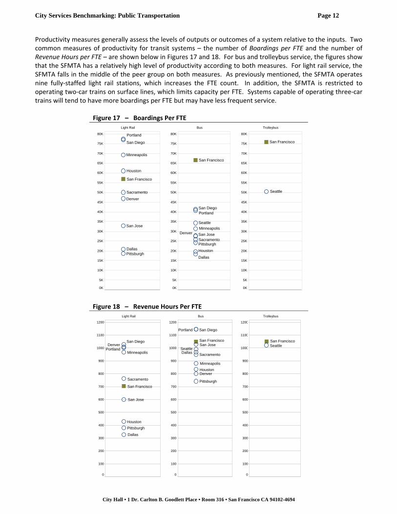
Productivity measures generally assess the levels of outputs or outcomes of a system relative to the inputs. Two common measures of productivity for transit systems – the number of Boardings per FTE and the number of Revenue Hours per FTE – are shown below in Figures 17 and 18. For bus and trolleybus service, the figures show that the SFMTA has a relatively high level of productivity according to both measures. For light rail service, the SFMTA falls in the middle of the peer group on both measures. As previously mentioned, the SFMTA operates nine fully‐staffed light rail stations, which increases the FTE count. In addition, the SFMTA is restricted to operating two‐car trains on surface lines, which limits capacity per FTE. Systems capable of operating three‐car trains will tend to have more boardings per FTE but may have less frequent service.
Figure 17 – Boardings Per FTE
Figure 18 – Revenue Hours Per FTE
0K
5K
10K
15K
20K
25K
30K
35K
40K
45K
50K
55K
60K
65K
70K
75K
80K
San Francisco
San Jose
San Diego
Sacramento
Portland
Pittsburgh
Minneapolis
Houston
Denver
Dallas
0K
5K
10K
15K
20K
25K
30K
35K
40K
45K
50K
55K
60K
65K
70K
75K
80K
San Francisco
Seattle
San Jose
San Diego
Sacramento
Portland
Pittsburgh
Minneapolis
Houston
Denver
Dallas
0K
5K
10K
15K
20K
25K
30K
35K
40K
45K
50K
55K
60K
65K
70K
75K
80K
San Francisco
Seattle
Light Rail Bus Trolleybus
Light Rail Bus Trolleybus
0
100
200
300
400
500
600
700
800
900
1000
1100
1200
San Francisco
San Jose
San Diego
Sacramento
Portland
Pittsburgh
Minneapolis
Houston
Denver
Dallas
0
100
200
300
400
500
600
700
800
900
1000
1100
1200
San Francisco
SeattleSan Jose
San Diego
Sacramento
Portland
Pittsburgh
Minneapolis
HoustonDenver
Dallas
0
100
200
300
400
500
600
700
800
900
1000
1100
1200
San FranciscoSeattle

City Services Benchmarking: Public Transportation Page 13
City Hall • 1 Dr. Carlton B. Goodlett Place • Room 316 • San Francisco CA 94102-4694
Electricity and fuel are significant cost drivers for transit systems, and common performance measures are the number of miles a light rail vehicle or trolleybus gets per kilowatt hour (kWh) of power and the number of miles a bus travels per gallon of fuel consumed.6 Figure 19 below shows that the SFMTA’s trolleybuses tend to get slightly more mileage per kilowatt hour than Seattle’s, but the SFMTA’s light rail fleet is relatively less efficient than most of the peer fleets, and its bus fleet ranks at the bottom of the peer group. In‐use vehicle efficiency depends to a large extent on vehicle operating conditions and characteristics (Center for Transportation Research and Education, Iowa State University, 2012), and may be influenced by factors such as the type of service provided (e.g., local transit vs. intercity commute service), traffic patterns and other driving conditions, and the number of stops a vehicle makes to board and alight passengers. For example, acceleration causes large spikes in energy consumption so a light rail vehicle operating in heavy mixed traffic with multiple starts and stops will tend to use more energy than a vehicle operating at more constant speeds. The in‐use efficiency of the SFMTA’s bus fleet is also affected by its heavy passenger loads (see figures 10, 13, and 14), and operation in a hilly environment.
Figure 19 – Average In‐use Energy Efficiency and Fuel Economy
6 It should be noted that in-use efficiency, or the efficiency realized under actual operating conditions, is substantially different than the rated efficiency of a vehicle, which is based on laboratory test cycles.
Light Rail(vehicle miles/kWh)
Trolleybus(vehicle miles/kWh)
Bus(vehicle miles/gallon)
0.00
0.02
0.04
0.06
0.08
0.10
0.12
0.14
0.16
0.18
0.20
0.22
San Francisco
San Jose
San Diego
Sacramento
Portland
Pittsburgh
Minneapolis
Houston
Denver
Dallas
0.00
0.02
0.04
0.06
0.08
0.10
0.12
0.14
0.16
0.18
0.20
0.22
San Francisco
Seattle
0.0
0.5
1.0
1.5
2.0
2.5
3.0
3.5
4.0
4.5
San Francisco
Seattle
San Jose
San Diego
Sacramento
Portland
Pittsburgh
Minneapolis
Houston
Denver
Dallas

City Services Benchmarking: Public Transportation Page 14
City Hall • 1 Dr. Carlton B. Goodlett Place • Room 316 • San Francisco CA 94102-4694
One additional factor that may contribute to San Francisco’s somewhat lower in‐use vehicle efficiency is the average age of its fleet, particularly where its light rail vehicles are concerned. For example, Figure 20 shows that the average age of the SFMTA’s light rail fleet exceeds the average age of the peer fleets by 7 to 21 years.7 The SFMTA’s bus and trolleybus fleets are closer in age to some of the peer fleets, and San Francisco’s position in this regard is likely to improve as the SFMTA began deploying new buses in June 2013 as part of a five year plan to replace its entire fleet (SFMTA, 2013b). Continued investments in transit infrastructure such as this will further reduce vehicle age and may help to improve in‐use efficiency. One notable development in this area outside of San Francisco is a pilot project initiated in 2013 to install a regenerative energy storage unit on Portland’s TriMet light rail line. The new unit will store energy from braking so that it can be reused to reduce energy consumption or stabilize system voltage during peak periods of operation8 (Siemens Corporation, 2013).
Figure 20 – Average Fleet Age (years)
7 For clarification, note that the SFMTA’s light rail fleet includes a number of historic streetcars dating back to as early as the 1920s. The remainder of the fleet was put in service between 1997 and 2003. 8 As previously mentioned, vehicle acceleration causes fluctuations in system voltage and in extreme cases can lead to service disruptions.
Light Rail Bus Trolleybus
0
2
4
6
8
10
12
14
16
18
20
22
24
26
28
San Francisco
San Jose
San Diego
SacramentoPortland
Pittsburgh
MinneapolisHouston
Denver
Dallas
0
1
2
3
4
5
6
7
8
9
10
11
12
13
San Francisco
SeattleSan Jose
San Diego
Sacramento
Portland
Pittsburgh
Minneapolis
Houston
Denver
Dallas
0
1
2
3
4
5
6
7
8
9
10
11
12
13
San Francisco
Seattle
City Services Benchmarking: Public Transportation Page 15
City Hall • 1 Dr. Carlton B. Goodlett Place • Room 316 • San Francisco CA 94102-4694
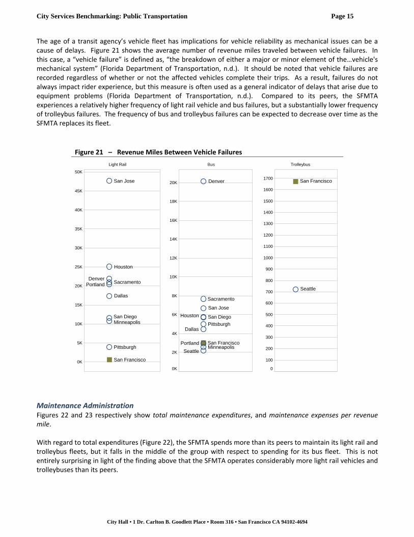
The age of a transit agency’s vehicle fleet has implications for vehicle reliability as mechanical issues can be a cause of delays. Figure 21 shows the average number of revenue miles traveled between vehicle failures. In this case, a “vehicle failure” is defined as, “the breakdown of either a major or minor element of the…vehicle's mechanical system” (Florida Department of Transportation, n.d.). It should be noted that vehicle failures are recorded regardless of whether or not the affected vehicles complete their trips. As a result, failures do not always impact rider experience, but this measure is often used as a general indicator of delays that arise due to equipment problems (Florida Department of Transportation, n.d.). Compared to its peers, the SFMTA experiences a relatively higher frequency of light rail vehicle and bus failures, but a substantially lower frequency of trolleybus failures. The frequency of bus and trolleybus failures can be expected to decrease over time as the SFMTA replaces its fleet.
Figure 21 – Revenue Miles Between Vehicle Failures
Maintenance Administration Figures 22 and 23 respectively show total maintenance expenditures, and maintenance expenses per revenue mile. With regard to total expenditures (Figure 22), the SFMTA spends more than its peers to maintain its light rail and trolleybus fleets, but it falls in the middle of the group with respect to spending for its bus fleet. This is not entirely surprising in light of the finding above that the SFMTA operates considerably more light rail vehicles and trolleybuses than its peers.
Light Rail Bus Trolleybus
0K
5K
10K
15K
20K
25K
30K
35K
40K
45K
50K
San Francisco
San Jose
San Diego
SacramentoPortland
Pittsburgh
Minneapolis
Houston
Denver
Dallas
0K
2K
4K
6K
8K
10K
12K
14K
16K
18K
20K
San Francisco
Seattle
San Jose
San Diego
Sacramento
Portland
Pittsburgh
Minneapolis
Houston
Denver
Dallas
0
100
200
300
400
500
600
700
800
900
1000
1100
1200
1300
1400
1500
1600
1700San Francisco
Seattle

City Services Benchmarking: Public Transportation Page 16
City Hall • 1 Dr. Carlton B. Goodlett Place • Room 316 • San Francisco CA 94102-4694
Figure 22 – Total Maintenance Expenditures (millions)
Light Rail Bus Trolleybus
On a dollar per revenue mile basis (Figure 23) the SFMTA spends more than its peers to maintain its bus fleet. However, the SFMTA’s maintenance spending on its light rail and trolleybus fleets is somewhat more comparable to spending by its peers. Again, as the SFMTA replaces its bus and trolleybus fleets, maintenance costs may decline. Figure 23 – Maintenance Expenses Per Revenue Mile ($/revenue mile)
Light Rail Bus Trolleybus
$0
$20
$40
$60
$80
$100
San Francisco
Dallas
Portland
San Jose
Pittsburgh
San Diego
Den
ver
Sacram
ento
Houston
Minneapolis
$0
$20
$40
$60
$80
$100
Seattle
Pittsburgh
Houston
Den
ver
San Francisco
San Jose
Dallas
Minneapolis
Portland
San Diego
Sacram
ento
$0
$20
$40
$60
$80
$100
San Francisco
Seattle
$0
$4
$8
$12
$16
Pittsburgh
San Francisco
Houston
San Jose
Dallas
Portland
Minneapolis
Sacram
ento
San Diego
Den
ver
$0
$1
$2
$3
$4
$5
$6
San Francisco
Pittsburgh
San Jose
Den
ver
Seattle
Portland
San Diego
Houston
Sacram
ento
Minneapolis
Dallas
$0
$1
$2
$3
$4
$5
$6
Seattle
San Francisco

City Services Benchmarking: Public Transportation Page 17
City Hall • 1 Dr. Carlton B. Goodlett Place • Room 316 • San Francisco CA 94102-4694
Areas for Future Research The measures included in this report provide a broad and high‐level overview of complex transportation systems. Further, this report represents a snapshot in time and it should be regarded only as a starting point for further evaluation. Based on the foregoing analysis, potential opportunities for further research and evaluation may include the following:
Continue to work with the SFMTA to reduce wait times, speed up travel times, improve reliability, and accomplish the other goals of the Transit Effectiveness Project (TEP);
Plan future activities to evaluate the effectiveness of the TEP initiatives;
Evaluate the extent of duplicative routing throughout the MUNI system and consider the implications of such duplication;
Perform staffing or other analyses to consider why the SFMTA ranks somewhat lower among its peers with regard to the number of boardings and revenue hours for light rail service compared to its rankings for bus and trolleybus service on the same measures; and
Characterize the nature of vehicle failures experienced by the SFMTA’s vehicle fleets and the extent to which those failures impact the quality of delivered service.
City Services Benchmarking: Public Transportation Page 18
City Hall • 1 Dr. Carlton B. Goodlett Place • Room 316 • San Francisco CA 94102-4694
Appendix A
Benchmarking Methodology
The TCRP is a cooperative effort among the Federal Transit Administration, National Academies, and the Transit Development Corporation, Inc., a nonprofit educational and research organization. Published in 2010 by the National Academy of Sciences, TCRP Report 141 sets forth a comprehensive methodology for performance measurement and peer comparison of public transportation systems including an approach for selecting peer agencies and considerations for identifying performance measures.
Data Sources Recipients of certain grant funding from the Federal Transit Administration (FTA) are required by statute to submit information to what is known as the National Transit Database (NTD), a database established by Congress to serve as the country’s primary source of information on domestic transit systems; over 660 transportation providers in urbanized areas currently report to the NTD (Federal Transit Administration, 2013). Based on outreach conducted for the development of TCRP Report 141, the Transportation Research Board found the industry consensus to be that the NTD is the best source of US transit data, in part because the data is based on standardized definitions, it is readily available, and the FTA has ongoing efforts to improve its quality (NAS, 2010). We have accordingly relied on NTD data for the development of this report. Rather than compiling the data directly from NTD data files, most of the information used in our analysis was retrieved from the Florida Department of Transportation’s Integrated National Transit Database Analysis System (INTDAS), a freely‐available software tool developed to aid in the retrieval, visualization, and analysis of NTD data. Data from 2011 was used as the basis for this analysis as it was the most recent year of data available from INTDAS at the time the information was gathered.
Peer Agency Selection The TCRP methodology was designed to provide a robust, practical, and transparent process for selecting peer agencies based on uniformly defined and readily available data (NAS, 2010). Prior to publication of the final report, the methodology underwent testing by numerous transit agencies, regional transportation authorities, and state departments of transportation. The resulting procedures utilize three screening factors and up to fourteen peer‐grouping factors to identify agencies that are similar to the target agency: Screening Factors
Rail operator (yes/no) Rail‐operator only (yes/no)
Heavy‐rail operator (yes/no)
Peer‐grouping Factors
Urban area population Population growth rate
Total annual vehicle miles operated Percent low‐income population
Annual operating budget Annual roadway delay per traveler
Population density Freeway lane miles per capita
Service area type Percent service demand‐responsive
State capital (yes/no) Percent service purchased
Percent college students Distance from target agency

City Services Benchmarking: Public Transportation Page 19
City Hall • 1 Dr. Carlton B. Goodlett Place • Room 316 • San Francisco CA 94102-4694
“Likeness scores” are used to determine the degree of similarity between the target agency and potential peers with respect to each of the seventeen factors; in many cases the scores are based on the percentage by which the value for the peer agency differs from that of the target. The individual scores are then aggregated into a total likeness score. Agencies with aggregate scores less than 0.5 are generally considered to be the best matches although agencies with scores of less than 1 may be acceptable peers. Agencies with scores greater than or equal to 1 are generally considered undesirable. One feature of the TCRP methodology is that it allows for substantial differences to exist between the target agency and potential peers in one or more respects. However, in order to end up with a low aggregate likeness score, those differences must be compensated by greater similarity in other respects. Recognizing that transit agencies are unlikely to be alike every respect, the methodology thus attempts to find peers that are “similar enough” to the target agency that performance comparisons may still yield useful insights (NAS, 2010, p. 34). For more information regarding the relevance of the rating factors and calculation of the likeness scores, refer to TCRP Report 141. Recent versions of INTDAS incorporate the TCRP peer selection process, allowing for easy computation of likeness scores for numerous agencies with respect to a given target agency. Out of more than 600 candidate peers, the following agencies had likeness scores of less than 1 with respect to the SFMTA: Agency (NTD ID) City Likeness
Score
San Diego Metropolitan Transit System (9026) San Diego, CA 0.41
Dallas Area Rapid Transit (6056) Dallas, TX 0.62
Santa Clara Valley Transportation Authority (9013) San Jose, CA 0.62
Metro Transit (5027) Minneapolis, MN 0.69
Tri‐County Metropolitan Transportation District of Oregon (0008) Portland, OR 0.80
Sacramento Regional Transit District (9019) Sacramento, CA 0.86
Port Authority of Allegheny County (3022) Pittsburgh, PA 0.88
King County Dept. of Transportation–Metro Transit Division (0001) Seattle, WA 0.94
Metropolitan Transit Authority of Harris County, Texas (6008) Houston, TX 0.97
Denver Regional Transportation District (8006) Denver, CO 0.98
It should be noted that minor adjustments were made to the scoring to account for circumstances unique to this case. In particular, in order to operate its demand response service, the SFMTA contracts with a paratransit broker, which in turn subcontracts with a relatively large pool of vans and taxis. Apparently because of the large number of taxis at its disposal for demand response transportation, the NTD indicates that a large percentage of the SFMTA’s service is purchased rather than directly operated. According to other NTD data, however, the actual number of “passenger trips” taken by taxi is a small fraction of the trips taken by light rail, bus, and trolleybus – modes which are directly operated by the SFMTA. Because this analysis is limited to service that is directly operated, we recalculated the likeness scores after excluding “percent service purchased” as one of the peer grouping factors. In addition, because the King County Metro Transit Division does not operate extensive light rail service, the original likeness calculations from INTDAS were based on an adverse score with respect to the screening factor that accounts for rail service. Because King County Metro Transit is one of the few other agencies in the country that operates trolleybus service, we elected to neglect that factor for that agency only. In an effort to be more inclusive for this initial benchmarking analysis of the SFMTA, we considered all ten of the above agencies as peers. However, as suggested by TCRP Report 141, we have taken care throughout the report to consider differences among the agencies that may be relevant to the performance comparisons.

City Services Benchmarking: Public Transportation Page 20
City Hall • 1 Dr. Carlton B. Goodlett Place • Room 316 • San Francisco CA 94102-4694
Appendix B Figure B‐1 – Boardings Per Revenue Mile vs. Average System Speed for Light Rail Service
Figure B‐2 – SFMTA System Map
0
5
10
15
20
25
0 2 4 6 8 10 12 14
Average System Speed (RM/RH)
Boardings Per Revenue Mile
SF
City Services Benchmarking: Public Transportation Page 21
City Hall • 1 Dr. Carlton B. Goodlett Place • Room 316 • San Francisco CA 94102-4694
References Bertini, R., & El‐Geneidy, A. (2004). Modeling Transit Trip Time Using Archived Bus Dispatch System
Data. Journal of Transportation Engineering, 130(1), pp 56‐67. Center for Transportation Research and Education, Iowa State University. (2012). Evaluation of In‐Use
Fuel Economy and On‐Board Emissions for Hybrid and Regular CyRide Transit Buses. Retrieved from http://www.intrans.iastate.edu/research/documents/research‐reports/hybrid_transit_bus_w_cvr5.pdf.
Federal Transit Administration. (2011). National Transit Database Transit Profiles. Retrieved from
http://www.ntdprogram.gov/ntdprogram/profiles.htm. Federal Transit Administration. (2013). Welcome to the National Transit Database. Retrieved from
http://www.ntdprogram.gov/ntdprogram/ntd.htm. Florida Department of Transportation. (2013). Integrated National Transit Database Analysis System
[Data set; developed for Florida Department of Transportation by Lehman Center for Transportation Research, Florida International University]. Retrieved from http://www.ftis.org/intdas.html.
Florida Department of Transportation. (n.d.). Florida Standard Performance (FSV) Variables. Retrieved
from the INTDAS system at http://www.ftis.org/intdas.html. National Academy of Sciences. (2010). TCRP Report 141: A Methodology for Performance Measurement
and Peer Comparison in the Public Transportation Industry. Retrieved from http://www.trb.org/Publications/PubsTCRPProjectReports.aspx.
SFMTA. (2013). SFMTA 2013 Annual Report. Retrieved from http://www.sfmta.com/annualreport. SFMTA. (2013b). Mayor Lee and SFMTA Unveil New Hybrid Muni Buses to Improve Transit Service
[Press release]. Retrieved from http://www.sfmta.com/news/press‐releases/mayor‐lee‐and‐sfmta‐unveil‐new‐hybrid‐muni‐buses‐improve‐transit‐service.
SFMTA. (2013c). Title VI Service Monitoring Program [presentation]. Retrieved from
http://www.sfmta.com/sites/default/files/agendaitems/11‐5‐13%20Item%2013%20Title%20VI%202013%20Program%20Update%20presentation.pdf.
Siemens Corporation. (2013). Siemens Installing First Regenerative Energy Storage Unit in the U.S. on
New TriMet Light Rail Line [Press Release]. Retrieved from http://news.usa.siemens.biz/press‐release/smart‐grid/siemens‐installing‐first‐regenerative‐energy‐storage‐unit‐us‐new‐trimet‐lig

City Services Benchmarking: Public Transportation Page 22
City Hall • 1 Dr. Carlton B. Goodlett Place • Room 316 • San Francisco CA 94102-4694
CONTROLLER’S OFFICE CITY SERVICES AUDITOR
The City Services Auditor was created within the Controller’s Office through an amendment to the City Charter that was approved by voters in November 2003. Under Appendix F to the City Charter, the City Services Auditor has broad authority for:
Reporting on the level and effectiveness of San Francisco’s public services and benchmarking the city to other public agencies and jurisdictions.
Conducting financial and performance audits of city departments, contractors, and functions to assess efficiency and effectiveness of processes and services.
Operating a whistleblower hotline and website and investigating reports of waste, fraud, and abuse of city resources.
Ensuring the financial integrity and improving the overall performance and efficiency of city government.
Project Team: Peg Stevenson, Director Randle McClure, Project Manager Kyle Burns, Senior Performance Analyst Joe Lapka, Senior Performance Analyst Faran Sikandar, City Hall Fellow For more information, please contact: Joseph Lapka Office of the Controller City and County of San Francisco (415) 554-7528 | [email protected]