Embed Size (px)
Citation preview
Bar GraphsBar Graphs
Powerpoint hosted on www.worldofteaching.comPlease visit for 100’s more free powerpoints

What do you know aboutWhat do you know about
bar graph?bar graph? double bar graph?double bar graph?
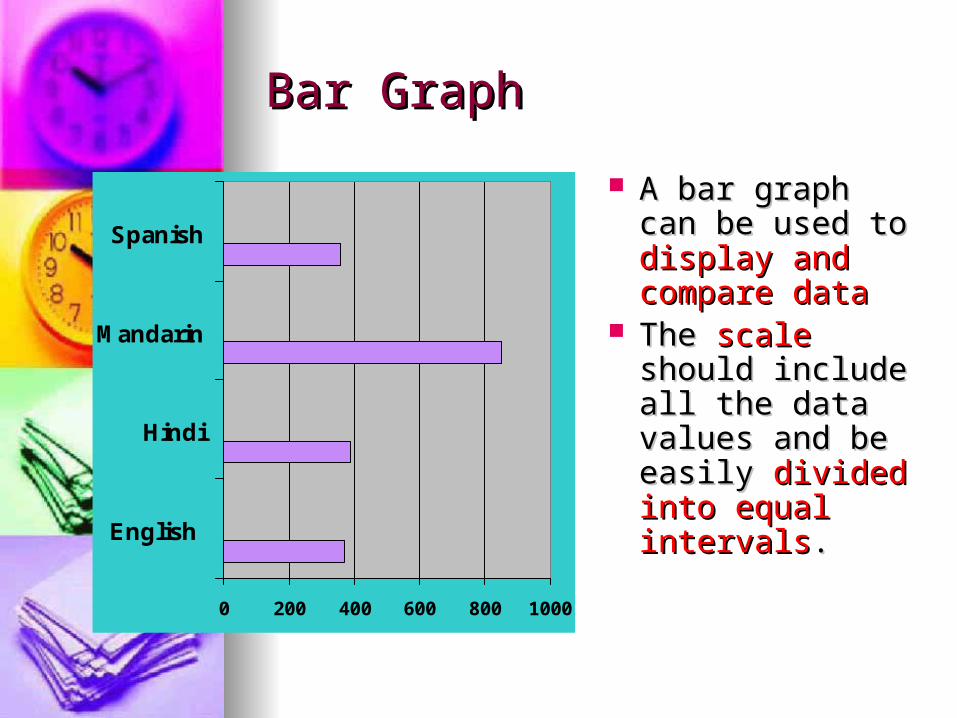
Bar GraphBar Graph
0 200 400 600 800 1000
English
Hindi
Mandarin
Spanish
A bar graph can A bar graph can be used to be used to display and display and compare datacompare data
The The scale scale should include should include all the data all the data values and be values and be easily easily divided divided into equal into equal intervalsintervals..

How to interpret a Bar GraphHow to interpret a Bar Graph??
How many of How many of Mrs. Laing’s Mrs. Laing’s students are students are band members?band members?
How many of How many of Mrs. Laing’s Mrs. Laing’s students are not students are not band members?band members? 0
12
34
56
7
Femaleband
Female notband
Male band Male notband
The bar graph shows Mrs. Laing’s The bar graph shows Mrs. Laing’s students by gender and band students by gender and band
membershipmembership..

Double Bar GraphDouble Bar Graph
0
10
20
30
40
50
60
70
80
90
1stQtr
2ndQtr
3rdQtr
4thQtr
Can be used to Can be used to compare two compare two related sets of related sets of datadata

How to make a Double-Bar How to make a Double-Bar GraphGraph??
Choose a scale and interval Choose a scale and interval for the vertical axis (y axis).for the vertical axis (y axis).
Draw a pair of bars for each Draw a pair of bars for each country’s data. Use different country’s data. Use different colors to show males and colors to show males and females.females.
Label Label both the vertical axis (y both the vertical axis (y axis) and horizontal axis (x axis) and horizontal axis (x axis)axis) and give the graph a and give the graph a titletitle..
Make a key to show what Make a key to show what each bar represents.each bar represents.

The table shows the highway The table shows the highway speed limits on interstate roads speed limits on interstate roads
within three stateswithin three states
StateStateUrbanUrbanRuralRural
FloridaFlorida65mi/h65mi/h70 mi/h70 mi/h
TexasTexas70 mi/h70 mi/h70 mi/h70 mi/h
VermontVermont55mi/h55mi/h65 mi/h65 mi/h

Step 1Step 1
Choose a scale Choose a scale and interval for the and interval for the vertical axis.vertical axis.
0
20
40
60
80
StateStateUrbanUrbanRuralRural
FloridaFlorida65mi/h65mi/h70 mi/h70 mi/h
TexasTexas70 mi/h70 mi/h70 mi/h70 mi/h
VermontVermont55mi/h55mi/h65 mi/h65 mi/h
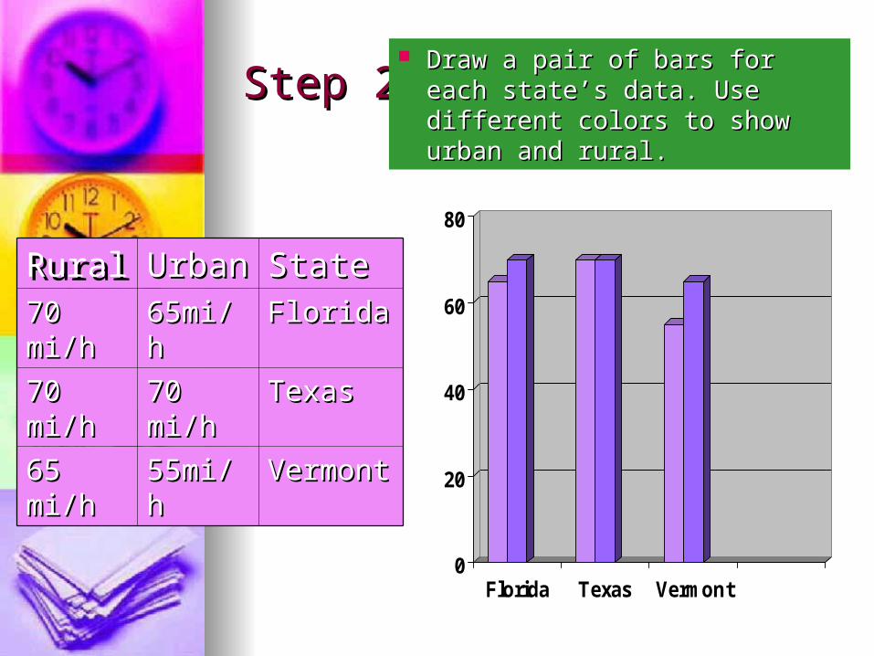
Step 2Step 2 Draw a pair of bars for each Draw a pair of bars for each
state’s data. Use different state’s data. Use different colors to show urban and rural.colors to show urban and rural.
0
20
40
60
80
Florida Texas Vermont
StateStateUrbanUrbanRuralRuralFloridaFlorida65mi/h65mi/h70 mi/h70 mi/h
TexasTexas70 mi/h70 mi/h70 mi/h70 mi/h
VermontVermont55mi/h55mi/h65 mi/h65 mi/h
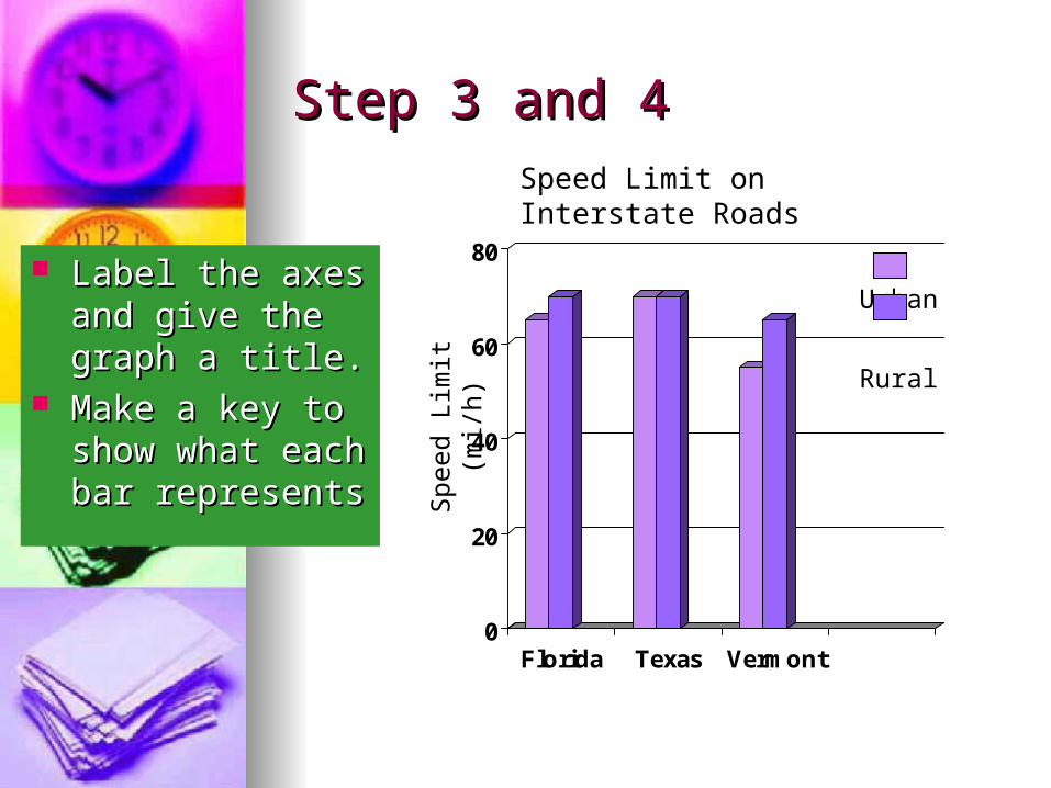
Step 3 and 4Step 3 and 4
Label the axes and Label the axes and give the graph a give the graph a title.title.
Make a key to Make a key to show what each show what each bar representsbar represents
0
20
40
60
80
Florida Texas Vermont
Spe
ed L
imit
(mi/h
)
Urban
Rural
Speed Limit on Interstate Roads

Step 1Step 1 Make a frequency Make a frequency
table of the data. table of the data. Be sure to use Be sure to use equal intervalsequal intervals
Number of hours of TVNumber of hours of TV
11IIII66IIIIII
22IIIIIIII77IIII - IIIIIIII - IIII
33IIII - IIIIIIII - IIII88IIIIII
44 IIII - IIIII - I99IIIIIIII
55 IIII - IIIIIII - III
Number of Number of hours of TVhours of TV
FrequencyFrequency
1-31-31515
4-64-61717
7-97-91616

Step 2Step 2
Number of Number of hours of TVhours of TV
FrequencyFrequency
1-31-31515
4-64-61717
7-97-91616
Choose an appropriate scale and interval for the vertical Choose an appropriate scale and interval for the vertical axis. The greatest value on the scale should be at least as axis. The greatest value on the scale should be at least as great as the greatest frequency.great as the greatest frequency.
0
4
8
12
16
20
1-3 4-6 7-9

Step 3Step 3 Draw a bar for each interval. Draw a bar for each interval.
The height of the bar is the The height of the bar is the frequency for that interval. frequency for that interval.
Label the Label the y y axaxiis and s and the x the x axis. Then axis. Then give the graph titlegive the graph title
Hours of Television Watched
0
4
8
12
16
20
1-3 4-6 7-9Hours
Nu
mb
er
of
stu
de
nts
Number of Number of hours of TVhours of TV
FrequencyFrequency
1-31-31515
4-64-61717
7-97-91616

Hours of Television Watched
0
4
8
12
16
20
1-3 4-6 7-9
Hours
Nu
mb
er
of
stu
de
nts

The endThe end