Embed Size (px)
Citation preview
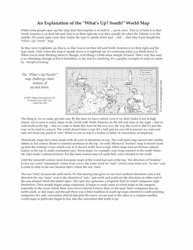
An Explanation of the “What’s Up? South!” World Map
When some people open up this map their first impulse is to hold it ... upside down. That is, to hold it so thatNorth America is on their left and Asia is on their right the way they usually do when the Atlantic is in themiddle. Of course right away they realize the type is upside down and ... duh! ... that they'd just bought the"What’s Up? South!” map.
So they turn it rightside up, that is, so that Asia is on their left and North America is on their right and thetype reads. Only when this map is upside down is it rightside up. It's confusing when you think about it.When you're done thinking about it, though, everything's a little more sharply focused. That's why this mapis so refreshing: though at first it befuddles, in the end it's clarifying. It's a graphic example of what we meanby...thought provoking.
The thing is, we so easily get into ruts. By the time we leave school, even if we don't make it out of highschool, we've seen so many maps of the world with North America on the left and Asia on the right -- that is,with north at the top -- that we come to think this must be the way it is, the way the world is. But it's just theway we're used to seeing it. The world doesn't have a top. It's a ball and we can roll it anyway we want andlook at it from any point of view. What we put on top is a matter of habit, of convention, of emphasis.
Historically maps have been made with all sorts of directions on top. The wall-sized map carved onto marbletablets in 3rd century Rome is oriented southeast to the top. An early Medieval "Isodore" map is bound southup (but the writing's every which way so it doesn't really have a top). Often maps had an obvious natural feature at the top to make orientation easy. Swiss maps, for example, were long oriented to the south wherethe Alps made a natural horizon. For the same reason maps of north Italy were oriented to the north.
Until the sixteenth century most European maps of the world had east at the top, "the direction of Paradise."In fact our word "orientation" comes from oriens, the Latin word for "east". Oriens came from oriri, "to rise," andit came to refer to the east because that's where the sun "rises".
The sun "rises" because the earth turns. It's this turning that gives us our four cardinal directions: east is thedirection the sun "rises," west is the direction it "sets," and north and south are the directions at either end ofthe axis around which the planet spins. This spin also generates a magnetic field in which compasses alignthemselves. Once people began using compasses, it began to make sense to orient maps to the compass, especially in the ocean where there were fewer natural features than on the land. Since compasses line upnorth-south, so did maps; and though there was a brief tradition of south-up maps oriented to south-pointingcompasses (it's only convention afterall that puts the arrow on one end or the other of a compass needle),world maps in particular began to buy into the convention that north is up.
The “What’s Up?South!”map challenges basic
notions of up and down.
© 2001, Maps International, Inc.Available from ODT, Inc.,
1-800-736-1293
© w
ww
.see
ingm
aps.
com
It's not. "Up" is over our heads, and when we mix "up" with "top" and "north" we do ourselves a disservice. We confuse all the other things we associate with "up" and "top" (like "good" and "heaven") with north; and all the things we associate with "down" and "bottom" (like bad and hell) with south. So Australia is "downunder" (under what?) and Antarctica is "the bottom of the world." Antarctica doesn’t even show up on this"What’s Up? South!" map of the world. Some world!
But then ... it's hard to show the whole planet -- which is after all a three-dimensioned sphere -- on a two-dimen-sioned piece of paper. Along with that extra dimension a lot of other things have to go. A map can show one ormore -- but not all -- of the following: directions the way they are on the globe, distances the way they are on theglobe, areas the way they are on the globe, or shapes the way they are on the globe.
When maps show things the way they are on the globe it's common to say they're true, as in; "This map showstrue directions." But the language of "true" and "false," like that of "top" and "bottom," carries so much extra baggage it's not much use. It's more useful to be familiar with many different kinds of maps, each with its own slant. It's like getting to know a poem in a language you don't understand. Each new translation reveals a facet the other translations ignored. The more translations you read, the surer your "triangulation" on the poemyou're trying to get to know. The best way to understand our world is to view it through as many lenses as possible, to see it from as many vantage points as we can.
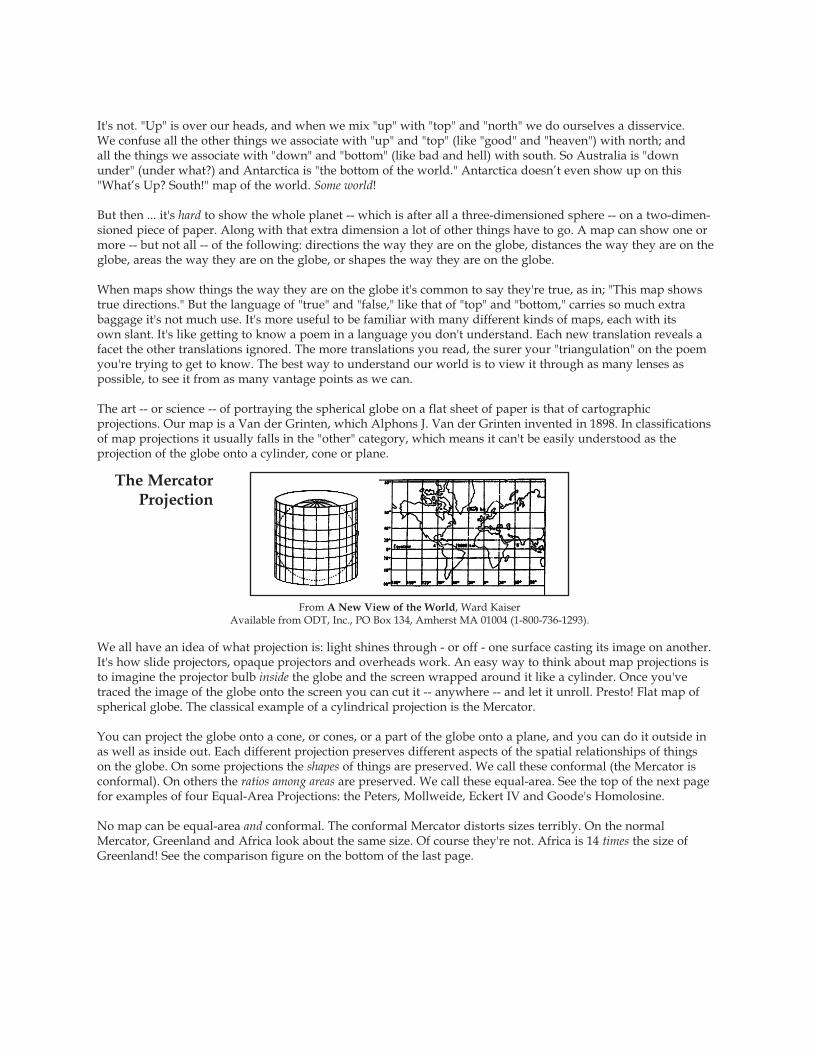
The art -- or science -- of portraying the spherical globe on a flat sheet of paper is that of cartographic projections. Our map is a Van der Grinten, which Alphons J. Van der Grinten invented in 1898. In classificationsof map projections it usually falls in the "other" category, which means it can't be easily understood as the projection of the globe onto a cylinder, cone or plane.
We all have an idea of what projection is: light shines through - or off - one surface casting its image on another.It's how slide projectors, opaque projectors and overheads work. An easy way to think about map projections isto imagine the projector bulb inside the globe and the screen wrapped around it like a cylinder. Once you'vetraced the image of the globe onto the screen you can cut it -- anywhere -- and let it unroll. Presto! Flat map ofspherical globe. The classical example of a cylindrical projection is the Mercator.
You can project the globe onto a cone, or cones, or a part of the globe onto a plane, and you can do it outside inas well as inside out. Each different projection preserves different aspects of the spatial relationships of things on the globe. On some projections the shapes of things are preserved. We call these conformal (the Mercator is conformal). On others the ratios among areas are preserved. We call these equal-area. See the top of the next pagefor examples of four Equal-Area Projections: the Peters, Mollweide, Eckert IV and Goode's Homolosine.
No map can be equal-area and conformal. The conformal Mercator distorts sizes terribly. On the normalMercator, Greenland and Africa look about the same size. Of course they're not. Africa is 14 times the size ofGreenland! See the comparison figure on the bottom of the last page.
The MercatorProjection
From A New View of the World, Ward Kaiser Available from ODT, Inc., PO Box 134, Amherst MA 01004 (1-800-736-1293).
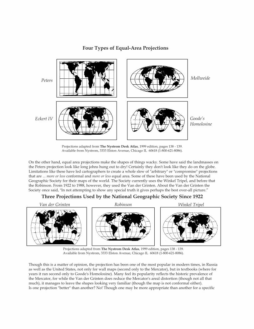
On the other hand, equal area projections make the shapes of things wacky. Some have said the landmasses onthe Peters projection look like long johns hung out to dry! Certainly they don't look like they do on the globe.Limitations like these have led cartographers to create a whole slew of "arbitrary" or "compromise" projectionsthat are ... more or less conformal and more or less equal area. Some of these have been used by the NationalGeographic Society for their maps of the world. The Society currently uses the Winkel Tripel, and before that the Robinson. From 1922 to 1988, however, they used the Van der Grinten. About the Van der Grinten theSociety once said, "In not attempting to show any special truth it gives perhaps the best over-all picture.”
Though this is a matter of opinion, the projection has been one of the most popular in modern times, in Russia as well as the United States, not only for wall maps (second only to the Mercator), but in textbooks (where foryears it ran second only to Goode's Homolosine). Many feel its popularity reflects the historic prevalence ofthe Mercator, for while the Van der Grinten does reduce the Mercator's areal distortion (though not all thatmuch), it manages to leave the shapes looking very familiar (though the map is not conformal either).Is one projection "better" than another? No! Though one may be more appropriate than another for a specific
Peters Mollweide
Goode’sHomolosine
Eckert IV
Four Types of Equal-Area Projections
Projections adapted from The Nystrom Desk Atlas, 1999 edition, pages 138 - 139.Available from Nystrom, 3333 Elston Avenue, Chicago IL 60618 (1-800-621-8086).
Three Projections Used by the National Geographic Society Since 1922
Van der Grinten Robinson Winkel Tripel
Projections adapted from The Nystrom Desk Atlas, 1999 edition, pages 138 - 139.Available from Nystrom, 3333 Elston Avenue, Chicago IL 60618 (1-800-621-8086).

use or purpose. Each projection translates the globe from its own unique perspective . The equal-area Peters isoften contrasted to the constant compass-bearing Mercator because they are so glaringly different. At ODT, Inc.we appreciate this contrast because it shocks viewers into questioning their assumptions about maps in particu-lar and life in general. It helps people to "think outside the box" by exploring how what they see is predicated onwhat they expect to see.
The "What’s Up? South!” map is similarly shocking though in another way. The continents are actually shapedmuch like they are on a Mercator but look unfamiliar because we're not used to orienting our maps to the south.But sometimes all we need to do to solve our problems is turn them upside down.
We hope you'll explore many different points of view. Lots of great free materials are available from the U.S. Geological Survey. They are at 1-888-275-8747 and have a fax-on-demand system at 1-703-648-4999. Check out their web site at www.USGS.gov. The National Geographic Society has materials at www.nationalgeographic.com. Also check out www.terraserver.com and www.NystromNet.com. For questions regarding the “What’s Up? South!” map, please call ODT at 1-800-736-1293.
References:"Rock Your World," Jennifer J. Salopek, Training & Development, March, 1999, pages 54 - 55.A New View of the World, Ward Kaiser, 1993, ODT, Inc., Amherst MA (1-800-736-1293). The Nystrom Desk Atlas, 1999 edition, pages 138 - 139. From Nystrom, Chicago IL (1-800-621-8086).Flattening the Earth: Two Thousand Years of Map Projections, John P. Snyder, 1993, Univ. of Chicago Press,
pages 108 - 109, 156 - 157, and 165 - 166.The Power of Maps, Denis Wood, with John Fels, 1992, The Guilford Press, pages 58-60, 190. "A good map is (easy) to find," Gail R. Chaddock, Christian Science Monitor, November 9, 1999, pages 11, 14 -15.
Map Projections, free poster available from U.S.G.S., order item #96-0200 (flat) or #96-0201 (folded) from 1-888-275-8747, Ext# 3. Comparisons of 18 map projections.
Seeing Through Maps: The Power of Images to Shape Our World View, Ward Kaiser & Denis Wood, 2001, ODT, Inc., Amherst MA, (1-800-736-1293)
ODT, Incorporated PO Box 134, Amherst, MA 01004
( 4 1 3 ) 5 4 9 - 1 2 9 3 1 - 8 0 0 - 7 3 6 - 1 2 9 3 F A X : ( 4 1 3 ) 5 4 9 - 3 5 0 3
www.seeingmaps.comE-mail: [email protected]
© 2001, ODT, Inc. All rights reserved
Mercator's projection isuseful for navigation. It shows shapes as theyappear on a globe, butdistorts relative sizes.
Adapted from A New View of the World, Ward Kaiser Available from ODT, Inc., PO Box 134, Amherst MA 01004 (1-800-736-1293)