Embed Size (px)
Citation preview
A PARALLAX VIEW OF PSYCHO
Parallax is the change visible when an object is seen from two different perspectives.
Slavoj Zizek’s The Parallax View (2006) includes many perspectives on parallax. In it,
Zizek uses parallax as a metaphor for the gap that opens up whenever there co-exist
two irreconcilable points of view. The book is structured around manifestations of
parallax in three main areas: philosophy, science, and politics. In philosophy, parallax is
the ontological difference between subject and object; in science, it is the difference
between the conceptual Real of mathematical formulae and our own experience of
reality; in politics, it encompasses all irreconcilable social antagonisms between
individuals and groups, for example ‘class struggle’ (2006: 11). Though Zizek’s concept
of parallax is clearly defined, his definition is wide, and so the concept is widely
applicable. Accordingly, throughout the book, Zizek layers parallax onto parallax, for
example suggesting that the co-existence of religious belief and doubt is itself caught up
in a parallax, inasmuch as it inspires in the believer both a feeling of anxiety and a
consciousness of the more ‘comical’ elements of religious belief (2006: 387, 105). Each
example of parallax thus implies others, existing within a network of parallax
relationships extendable in multiple directions.
Despite this multiplicity of parallaxes, there is one direction in which Zizek does not
extend his metaphor: that of cinema. The film references in The Parallax View can be
counted on two hands, and most of these take the form of examples used to
demonstrate a point unrelated to cinema. For example, Zizek elaborates his scientific
parallax by referring to the rebels in The Matrix (Andy Wachowski & Larry Wachowski,
1999), who experience the ‘reality’ of walking down a city street when in fact they inhabit
the “desert of the Real”, immobilized on the chairs that connect them to the Matrix (2006:
155).i Of course, as cinema is merely a mode of representation, it is not surprising that it
should play such a marginal role in Zizek’s self-proclaimed magnum opus. At the same
time, given the fact that parallax is an optical phenomenon, and that The Parallax View
takes its title from a film, this exclusion remains slightly surprising.
In this article, I extend Zizek’s metaphor of parallax to cinema by looking at an example
of cinematic parallax that Zizek has himself touched on, albeit without naming it. In Is
There A Proper Way To Remake a Hitchcock Film?, Zizek discusses Gus Van Sant’s
1998 remake of Alfred Hitchcock’s Psycho (1960). For Zizek, Van Sant’s film promises
more than it delivers: it is a ‘failed masterpiece’, neither different enough from
Hitchcock’s to elaborate its themes, nor similar enough to achieve ‘the uncanny effect of
the double’ (2007). Though the remake is no masterpiece, its difference-in-sameness
can still be put to critical work. As Zizek notes, the more similarities there are between
two objects, the more visible the differences become. Van Sant’s film is the closest
commercial cinema has yet come to duplicating an existing film. Narrative, dialogue,
production design, music, mise-en-scène, and editing are all almost the same as in
Hitchcock’s Psycho. The only significant stylistic difference is that Hitchcock’s Psycho is
black-and-white and Van Sant’s is color. Because the two films are otherwise so similar,
they form an ideal basis for an exploration of the cinematographic parallax between
black-and-white and colour.
There is another notable film-related parallax that Zizek engaged with before
‘discovering’ his guiding metaphor.ii It is the parallax between his psychoanalytic
approach to cinema and that of ‘post-theorists’ including David Bordwell. Zizek has
devoted his career to Lacanian theory; Bordwell rejects outright that there can be any
satisfactory ‘Theory of Everything’. By extension, Bordwell’s methodology typically
involves looking in detail at the various formal elements of individual films (for example,
narrative, lighting, editing, design, etc.), and then using inductive reasoning to establish
‘middle-level’ theories about how these elements function across groups of films – for
example, the group of films known as ‘classical Hollywood cinema’ (Bordwelll & Carroll
1996: 3). Though he is devoted to Theory, Zizek’s methodology is far less systematic
than Bordwell’s: Zizek develops his ideas by means of juxtapositions, associations,
inversions, and metamorphoses. A further contradiction exists between Bordwell’s
interest in our cognitive responses to the moving image (what the screen places in our
heads), and Zizek’s interest in cinema as a screen onto which we project our desires.
There are many other contradictions besides.
In short, these two irreconcilable approaches to cinema provide a perfect example of
Zizek’s definition of parallax as the co-existence of two perspectives between which
there is an ‘antinomy which can never be dialectically “mediated/sublated” into a higher
synthesis, since there is no common language, no shared ground’ (Zizek 2006: 5). As
Todd McGowan reminds us in the recent IJZS issue on ‘Zizek and Cinema’, the
antinomy between Zizek and Bordwell is nowhere more acute than in their responses to
each other’s work (2007). In The Fright of Real Tears, Zizek dismisses ‘post-theorists’ by
suggesting they attack ‘a comically simplified caricature of Lacan, Althusser, et al.’
(2001: 4). Bordwell in turn, usually a paragon of academic manners, intensifies the
antinomy by attacking Zizek as ‘an insistent monologist’ (2005). Clearly there is no
chance of future dialectic discourse between Zizek and Bordwell. For a beginning
academic like me, still looking for methodologies to emulate and worthwhile questions to
ask, this antinomy between two of film academia’s guiding lights is frustrating to say the
least.
Is there any way to reconcile the two? I believe there is, and that it involves engaging
with the third constituent of parallax. Zizek’s metaphor of parallax focuses on the
‘parallax gap’ between two irreconcilable perspectives; the ‘object’ of these perspectives
remains implicit. I wish to adapt this view of parallax, and suggest that when Zizekian
and Bordwellian critical perspectives are focused outward on a cinematic ‘object’, we
can gain a better view of it than by looking from one or other perspective alone.
Accordingly, in this essay I explore the cinematic ‘object’ of Psycho from both
perspectives.iii I map the theoretical parallax gap between Zizek and Bordwell onto the
stylistic parallax gap between Hitchcock’s Psycho and Van Sant’s. For reasons that I
hope will become clear, I look at Hitchcock’s Psycho through a Zizekian eye, and Van
Sant’s Psycho through a Bordwellian eye.
Zizek-Eye Psycho
Hitchcock made Psycho at a time when realist film was most often black-and-white, and
black-and-white most often signified realism. Italian Neo-Realism, cinéma vérité,
television news, and the French nouvelle vague were almost exclusively black-and-
white. Furthermore, as the aesthetic norm in Hollywood gradually shifted towards color
in the 1950s, black-and-white became ever more narrowly the preserve of certain types
of filmmaking and certain specific genres. Prominent among these were social realism
and documentary. So, inevitably, black-and-white cinematography and realism became
associatively connected. This association continues, in a weakened form, to the present
day. At the same time, filming in black-and-white necessarily entails a visual
transformation. Images are inscribed onto the film negative minus their hue and
saturation. Regardless of how a black-and-white film is lit, by simple virtue of being
black-and-white it is a partial abstraction of visual reality. It was not only documentaries
and social realism that tended to be black-and-white in the 1950s, but also films noirs
and horror films, films whose mood often depended on heightened visuals. From the
perspective of the 1950s, black-and-white can thus be seen as both realistic and
unrealistic.iv It connotes realism, but it also simplifies and stylizes visual reality.
Hitchcock exploits this connotative flexibility to create in Psycho a film of transitions
between daytime grays and the deep shadows and high contrasts of night, of the horror
genre, and of Norman’s psyche. The film begins with a flat, gray, televisual aesthetic. In
the opening scene, set in a hotel room, Marion Crane (Janet Leigh) is having a
lunchtime encounter with a lover. As James Naremore observes, the Venetian blinds in
the bedroom do not cast expressive noir-ish shadows on the walls (1973: 28). Bright, flat
lighting remains the norm throughout the film’s early Phoenix sequences, providing it
with an initial visual connotation of realism (figs. 1a & 2a).v The grayness of the images
can also be regarded as a visual analogue to what Zizek refers to as the ‘dreary, grey
“leaden time”’ of Marion’s daily routine (1992a: 226). This leaden time manifests itself
most obviously in her regular lunchtime trysts – an attempt to break out of her repetitive
life has become incorporated into it. Clearly, Marion has not reached what Kierkegaard,
via. Zizek, refers to as the ethical stage of repetition, a stage at which ‘the subject has
learned to avoid the twin traps of impatient hope in the New and of nostalgic memory of
the Old’ (1992b: 78). Marion fails to find satisfaction in the return of the Same, and so –
when an envelope of money lands in her hands – she buys a new car and drives off into
the desert.
Not only is black-and-white able to encompass realism and stylization, but it also allows
for seamless transitions between the two. Filming in black-and-white simplifies visual
reality – the complicating variable of color is removed. Changes in lighting from shot to
shot cannot cause jarring color shifts, so one lighting style can give way to another
almost imperceptibly. Psycho includes several transitions between realism and
stylization, the most remarkable of which occurs during Marion’s journey. As day turns to
night on the desert highway outside Phoenix, the cinematography moves from the low-
contrast, flat grays of realism to the deep shadows of the horror genre and the high
contrast black-and-white of expressionism (figs. 6a-10a). Shot by shot, the scene
through the windscreen becomes ever more iconic until all that can be seen is on-
coming headlights and pounding rain, and all that is left in Marion’s reaction shots is a
face floating in darkness (figs. 11a-15a). After a while, even the headlights disappear,
seemingly washed away by the rain, and Marion finds herself on a road to nowhere in a
series of shots that looks forward to the demented opening of David Lynch’s Lost
Highway (1997). At last, out of the blackness, the Bates Motel appears, and Marion’s
world is usurped by the darker world of Norman Bates (Anthony Perkins).
In discussing the move from Psycho’s first phase to its second phase, Zizek uses the
metaphor of a Moebius strip: ‘if we progress far enough on one surface, all of a sudden
we find ourselves on its reverse’ (1992a: 227). Zizek suggests that the movement from
one side of the strip to the other takes place when Marion is murdered; specifically, it
occurs in Hitchcock’s famous close-up shot of Marion’s dead eye (1992a: 228). Even
immediately prior to Marion’s murder, in Zizek’s view, the film could still end
conventionally. To extend his Kierkegaardian idea of repetition: having reached a new
level of maturity as a result of her conversation with Norman and realized that there is no
‘New’ waiting for her out in the desert, she could return to work on Monday morning.
Though Zizek’s metaphor of the Moebius strip is spot on, in my view his choice of the
eye shot as the film’s key moment of transition is slightly off. I suggest instead that it is
in Marion’s journey from day to night that her everyday circuit is twisted. Because the
film’s grays gradually turn to black, the precise point of transition – like the precise point
at which the front of a Moebius strip becomes the back – is impossible to locate. One
thing seems clear to me, however: cinematographically, by the time Marion arrives at the
Bates motel, the film’s transition from realism to horror / expressionism, from Marion’s
neurosis to Norman’s psychosis, has already occurred.
There is nothing especially unrealistic about the Bates Motel – even the main house,
though eerie, is typical late 19th century American Gothic. Over the following ten minutes,
all that takes place is an oblique series of exchanges between an insecure young man
with a demanding parent and a confused young woman carrying a large amount of
money. It is up to the cinematography to signal that Marion has moved to the unlit side of
the Moebius strip. Early signals include large areas of darkness, such as the doorway to
Norman’s parlor, and disconcerting shadows, such as those cast by the stuffed birds
inside the parlor (figs. 5a & 16a). Given the isolated location of the motel and the fact
that it is night, the darkness is visually plausible. However, it is also expressive. The dark
areas on screen suggest places the camera should not go, just as Marion’s conversation
with Norman throws up psychological locations upon which it would be safer not to
impinge. Marion’s entry into Norman’s parlor is a hesitant and abortive entry into his
mind. She leaves prematurely, having seen only this single (not quite innocuous)
antechamber, and so never discovers the truth about him. It remains up to her sister to
complete the architectonic journey into Norman’s psyche. It is only in the film’s climax,
when Lila Crane (Vera Miles) enters the darkest recesses of the cellar that Norman’s
psychosis is revealed.
Another on-screen transition between day and night occurs while Arbogast (Martin
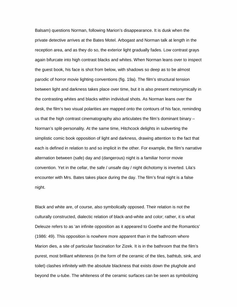
Balsam) questions Norman, following Marion’s disappearance. It is dusk when the
private detective arrives at the Bates Motel. Arbogast and Norman talk at length in the
reception area, and as they do so, the exterior light gradually fades. Low contrast grays
again bifurcate into high contrast blacks and whites. When Norman leans over to inspect
the guest book, his face is shot from below, with shadows so deep as to be almost
parodic of horror movie lighting conventions (fig. 19a). The film’s structural tension
between light and darkness takes place over time, but it is also present metonymically in
the contrasting whites and blacks within individual shots. As Norman leans over the
desk, the film’s two visual polarities are mapped onto the contours of his face, reminding
us that the high contrast cinematography also articulates the film’s dominant binary –
Norman’s split-personality. At the same time, Hitchcock delights in subverting the
simplistic comic book opposition of light and darkness, drawing attention to the fact that
each is defined in relation to and so implicit in the other. For example, the film’s narrative
alternation between (safe) day and (dangerous) night is a familiar horror movie
convention. Yet in the cellar, the safe / unsafe day / night dichotomy is inverted. Lila’s
encounter with Mrs. Bates takes place during the day. The film’s final night is a false
night.
Black and white are, of course, also symbolically opposed. Their relation is not the
culturally constructed, dialectic relation of black-and-white and color; rather, it is what
Deleuze refers to as ‘an infinite opposition as it appeared to Goethe and the Romantics’
(1986: 49). This opposition is nowhere more apparent than in the bathroom where
Marion dies, a site of particular fascination for Zizek. It is in the bathroom that the film’s
purest, most brilliant whiteness (in the form of the ceramic of the tiles, bathtub, sink, and
toilet) clashes infinitely with the absolute blackness that exists down the plughole and
beyond the u-tube. The whiteness of the ceramic surfaces can be seen as symbolizing
cleanliness, purity, civilization. By contrast, in the blackness of the bathroom pipes lurks
what Zizek refers to as a ‘primordial, pre-ontological Chaos’ (2007). The whiteness of
bathroom furniture is an anal retentive whiteness, a repression of the unpalatable fact
that our homes are directly connected to the excremental lake of a sewage farm.
Obscenely mixing with the faecal darkness of the bathroom pipes is the darkness of
Marion’s blood. Freed from the verisimilar mooring of redness, Marion’s black blood
enters the realm of the symbolic. It looks nothing like real blood – it is darker, uglier,
dirtier (fig 18a). Norman’s understandable instinct is to remove this dirt with a bucket and
mop. Yet for all his effort, the tension between blackness and whiteness remains
irreconcilable. Just as the mopping does not make everything normal again, so the
return of the bathroom to its gleaming whiteness is only superficial. Beyond the
whiteness of the bathroom walls it is still night, as manifested by the darkness that
frames the doorway in the wide shots of the bathroom. The bathroom’s fluorescent
whiteness is a false daylight, just as the mopping is a false erasure of the horror that has
spilled onto the bathroom floor. Norman cannot mop himself up.
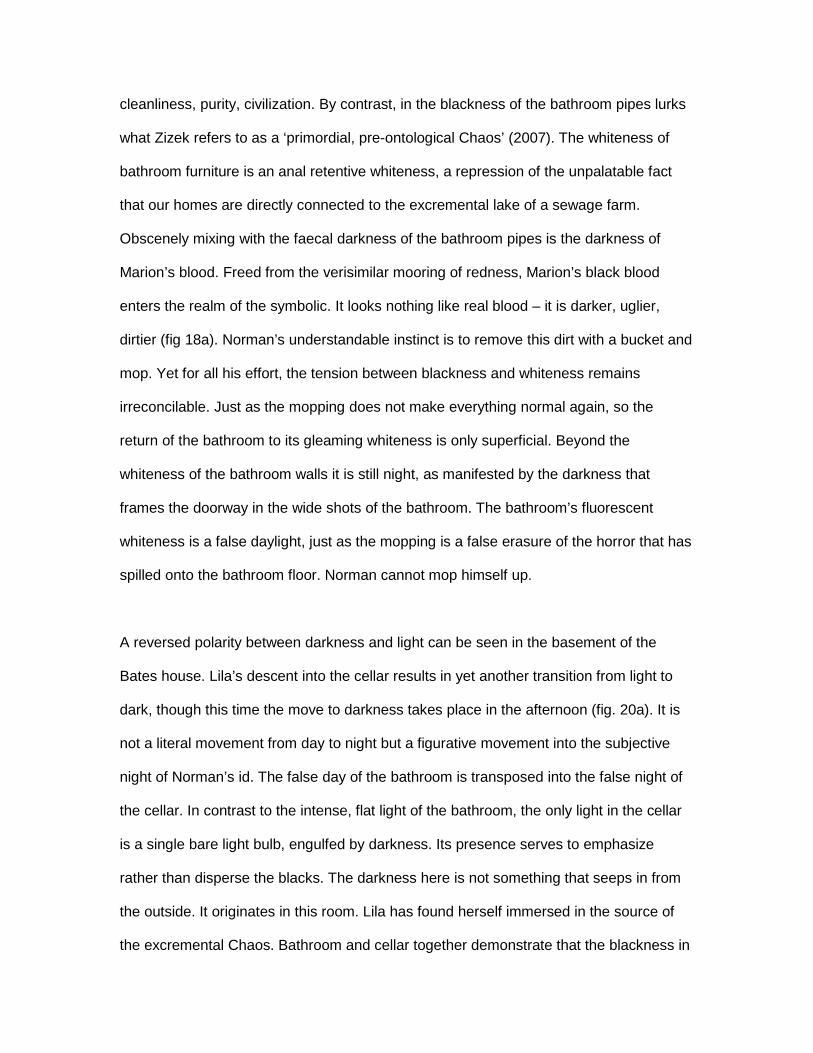
A reversed polarity between darkness and light can be seen in the basement of the
Bates house. Lila’s descent into the cellar results in yet another transition from light to
dark, though this time the move to darkness takes place in the afternoon (fig. 20a). It is
not a literal movement from day to night but a figurative movement into the subjective
night of Norman’s id. The false day of the bathroom is transposed into the false night of
the cellar. In contrast to the intense, flat light of the bathroom, the only light in the cellar
is a single bare light bulb, engulfed by darkness. Its presence serves to emphasize
rather than disperse the blacks. The darkness here is not something that seeps in from
the outside. It originates in this room. Lila has found herself immersed in the source of
the excremental Chaos. Bathroom and cellar together demonstrate that the blackness in
Psycho has multiple sources and multiple meanings. It is an incursion into the normality
of Zizek’ pre-ontological Chaos. It is blood, bile, and excrement mixed together. It is the
darkness leaking out from within us, mixed with the emptiness encroaching from without.
Blackness is all these things at once, and whatever else one’s imagination can transform
it into. Zizek, for example, concludes the first episode of The Pervert’s Guide to Cinema
by extrapolating his comparison of the toilets in Psycho and Francis Ford Coppola’s The
Conversation (1974) to suggest that watching the blackness at the beginning of a film is
like waiting for a toilet to flush. There is no limit to the extent that black can be
interpreted and made to signify.vi
Bordwell-Eye Psycho
If filming Psycho in black-and-white was a visually transformative act, then filming it in
color was also transformative, but in reverse. In Gus Van Sant’s remake, the stylization
achieved by the use of black-and-white is – in a sense – unmade: Van Sant’s film marks
a return for Psycho to its ‘original’ profilmic existence in color. Of course, as Peter
Wollen reminds us, ‘when a color film is seen projected, the color is not in the Bazinian
sense a direct indexical registration of color in the natural world; it is a dye’ (1980: 24).
Nonetheless, ceteris paribus, color film offers a more accurate record of what is present
in front of the lens than does black-and-white. No matter what film stocks, lighting gels
and lens filters have been used during a shoot, or what digital processes will follow,
when a reel of film comes back from the lab, grass is almost always a shade of green
and sky a shade of blue. It is this verisimilitude that caused Van Sant and his
cinematographer Chris Doyle some of their greatest problems.
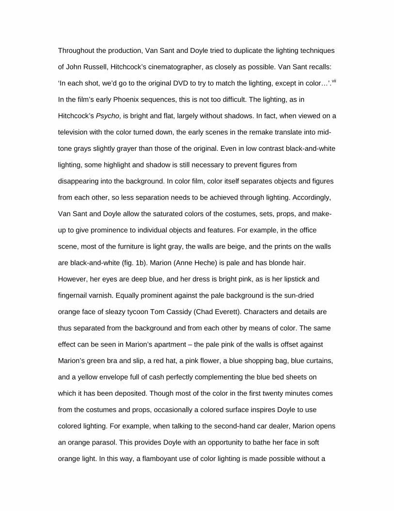
Throughout the production, Van Sant and Doyle tried to duplicate the lighting techniques
of John Russell, Hitchcock’s cinematographer, as closely as possible. Van Sant recalls:
‘In each shot, we’d go to the original DVD to try to match the lighting, except in color…’.vii
In the film’s early Phoenix sequences, this is not too difficult. The lighting, as in
Hitchcock’s Psycho, is bright and flat, largely without shadows. In fact, when viewed on a
television with the color turned down, the early scenes in the remake translate into mid-
tone grays slightly grayer than those of the original. Even in low contrast black-and-white
lighting, some highlight and shadow is still necessary to prevent figures from
disappearing into the background. In color film, color itself separates objects and figures
from each other, so less separation needs to be achieved through lighting. Accordingly,
Van Sant and Doyle allow the saturated colors of the costumes, sets, props, and make-
up to give prominence to individual objects and features. For example, in the office
scene, most of the furniture is light gray, the walls are beige, and the prints on the walls
are black-and-white (fig. 1b). Marion (Anne Heche) is pale and has blonde hair.
However, her eyes are deep blue, and her dress is bright pink, as is her lipstick and
fingernail varnish. Equally prominent against the pale background is the sun-dried
orange face of sleazy tycoon Tom Cassidy (Chad Everett). Characters and details are
thus separated from the background and from each other by means of color. The same
effect can be seen in Marion’s apartment – the pale pink of the walls is offset against
Marion’s green bra and slip, a red hat, a pink flower, a blue shopping bag, blue curtains,
and a yellow envelope full of cash perfectly complementing the blue bed sheets on
which it has been deposited. Though most of the color in the first twenty minutes comes
from the costumes and props, occasionally a colored surface inspires Doyle to use
colored lighting. For example, when talking to the second-hand car dealer, Marion opens
an orange parasol. This provides Doyle with an opportunity to bathe her face in soft
orange light. In this way, a flamboyant use of color lighting is made possible without a
sacrifice in verisimilitude (fig. 2b).
The colors in the Phoenix sequences are an imaginative alternative to the gray mid-
tones of Hitchcock’s film. Van Sant’s pinks and oranges do perhaps diverge a little from
the visual drabness of Hitchcock’s opening, but this in itself is no criticism – bright
costumes often clothe bored, desperate people. Intense color often implies banality.
After dark, however, when the cinematography in Hitchcock’s film diverges from the
visual codes of realism, the cinematography in Van Sant’s faces greater challenges. As
soon as Hitchcock and Russell’s lighting becomes low-key and directional, Van Sant and
Doyle’s strategy of duplicating it in color becomes unfeasible.
A recurrent problem for cinematographers is the question of light sources: how can the
artificial light sources used to illuminate a film be made to appear internal to the film’s
diegesis, so that they do not draw attention to the filmmaking process? Using Bordwell’s
terminology, the question becomes: how can artificial light sources be realistically
motivated? Realistic motivation refers to the mobilisation of elements in a film in order to
increase the film’s plausibility, viz.: ‘In a film set in nineteenth-century London, the sets,
props, costumes, etc. will typically be motivated realistically’ (Bordwell et al. 1985: 19). If
directional light is not to contradict a fictional film’s reality effect, it must appear to
emanate from diegetic sources: sunlight, streetlights, interior lights, and so on. Because
black-and-white is an intrinsically stylized mode of representation, it accommodates
directional lighting more easily than color. In black-and-white, a table lamp can cast a
long shadow on a wall without looking unrealistic, even though we know that table lamps
usually give out soft light. By contrast, because color film does not intrinsically stylize, it
is often more immediately apparent when a light source exceeds its motivation – one
need only think of the countless after dark sequences in bad thrillers that feature bright
orange city streets and bedrooms bathed in electric blue moonlight. The problem of light
sources is especially significant when using directional lighting. In everyday life,
directional light sources are relatively rare – they are generally restricted to desk lamps,
spotlights, torches, headlights, etc. In the absence of the stylizing effect of black-and-
white, the apparatus of high contrast directional lighting becomes difficult to conceal.
Expressionism becomes irreconcilable with the demands of realistic motivation.
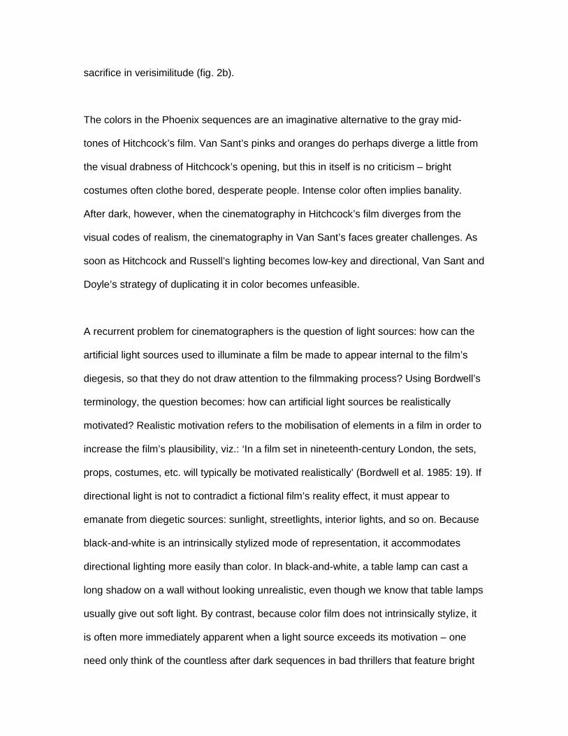
Though the deep shadows cast by the stuffed birds in Norman’s parlor survive into Van
Sant’s film, in color they raise the question of where the light is coming from: it is
certainly not coming from the soft glow of the table lamps that appear to illuminate the
room (figs. 5b & 16b).viii The same problem is apparent in the scene with Arbogast
(William H. Macy), when Norman (Vince Vaughn) leans over the desk to inspect the
motel register (fig. 19b). Why such darkness under Norman’s chin? Unsurprisingly, Van
Sant and Doyle generally do not even attempt to mimic the original film’s high contrast
shots. For example, when Marion is stabbed in the shower, Hitchcock’s first revelatory
shot of Mrs. Bates is so intensely backlit that her figure is transformed into shadow (fig.
17a). Paradoxically, the excessive lighting pointed towards the camera conceals her true
identity. In color, such an extreme technique would again raise the question of where the
light was coming from. So the lighting is flattened and Mrs. Bates’s true identity is
additionally concealed by the running water of the shower and some subtle CGI work
replacing Vince Vaughn’s eyes with those of a female (fig. 17b).
Instead of using directional lighting to create atmosphere, Van Sant and Doyle use
saturated color. On Universal’s Psycho 98 website, Doyle identifies the replacement of
high contrast with saturation as one of his guiding principles.ix Night (and false night)
sequences, which tend towards high contrast in Hitchcock’s film, tend towards intense
saturation in Van Sant’s. Just as the absence of daylight makes possible high contrast
black-and-white, so it makes possible saturated color lighting. At night, all light is
artificial, so colored lighting is more easily justified than it is during the day. In the
absence of the flattening white of daylight, all it takes to realistically motivate a shot
suffused in orange light is an orange lampshade. Time and again, as in the scene with
Marion’s parasol but to a greater extreme, Doyle uses diegetic color to provide realistic
motivation for his intensely colored lighting. For example, the pink and green neon of the
motel sign turns Marion’s first minutes at the Bates Motel into a chromatic
phantasmagoria. As she drives up to the motel, the back window of her car is a cascade
of green, justified by the combination of a green neon vacancy sign and pouring rain.
From the green light of the car, Marion moves past a solid orange door, into the orange
and white interior light of reception (justified by an orange ceiling light and the partially
unshielded white light of two desk lamps), then back out into the pink light of the veranda
(presumably justified by the red neon of the motel sign). When Norman shows Marion
her cabin, his face is lit with a mixture of (wall lamp) orange and (bedside lamp) white.
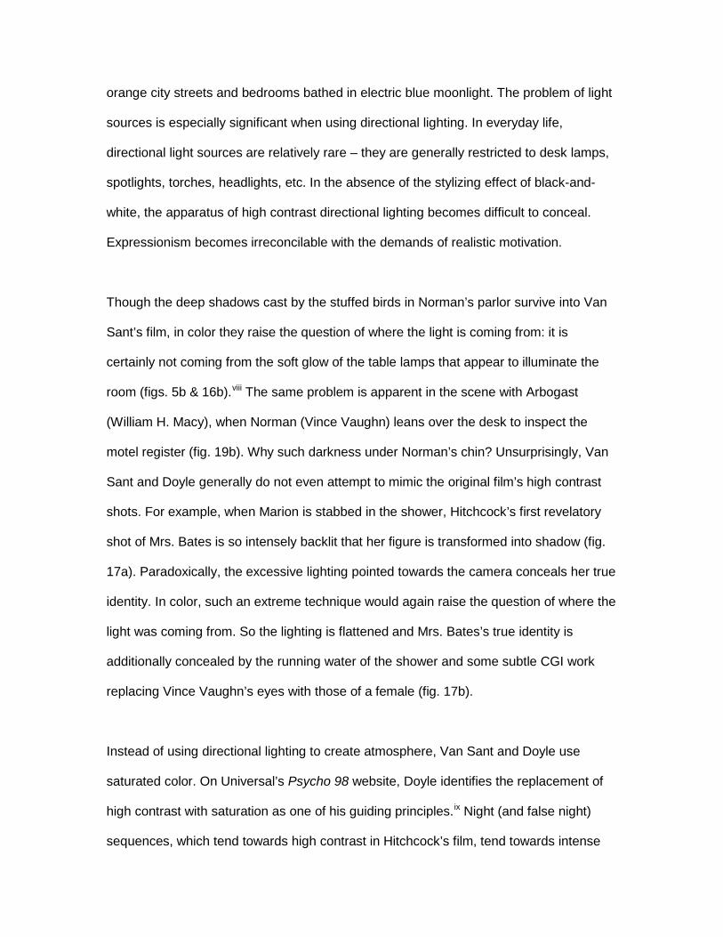
The neon-infused colors of the Bates Motel are breathtaking. Unfortunately, they are
also largely redundant. The heightened atmosphere achieved through the high contrast
blacks and whites of Hitchcock’s film cannot be achieved through saturation. For
example, in Hitchcock’s Psycho, the view from reception into the black space of
Norman’s parlor is profoundly menacing (fig. 3a). In Van Sant’s film, the same space is
affectively neutralized by the surrounding oranges and pinks (fig. 3b). In addition, the
sheer amount of color lighting in Van Sant’s film inevitably makes the ‘night’ scenes
much brighter than in Hitchcock’s. In The Analysis of Film, Raymond Bellour opens his
chapter on Psycho by observing how unnervingly ‘obscure’ the photography is (2000:
238). No such claim could be made for Van Sant’s film. In black-and-white, when
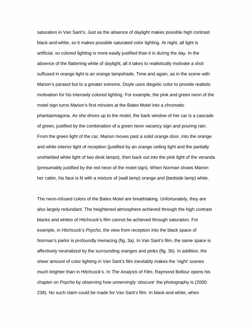
Norman appears on the motel veranda with a tray of sandwiches, he remains a part of
the darkness he has just stepped out of (fig. 4a). In color, the increased amount of fill
light clearly separates him from the black background (fig. 4b). Inside Norman’s parlor,
the mixture of orange and white light is almost cheerful (fig. 5b). An even more extreme
example of surplus light can be seen when Lila Crane (Julianne Moore) approaches Mrs.
Bates in the cellar. The epicenter of the original film’s darkness is transformed into a
brightly lit aviary with a background wash of semi-motivated blue daylight (fig. 20b). In
color, a single light bulb could not have provided enough realistic motivation to light a
whole cellar.
Though it is easy to pin some of the lack of atmosphere in the color Psycho on Chris
Doyle’s decision to use colored lighting, it is rather more difficult to imagine what the
alternatives could have been. Furthermore, there are many occasions when the failure of
Van Sant’s film to duplicate the workings of Hitchcock’s is due not to Doyle’s use of color
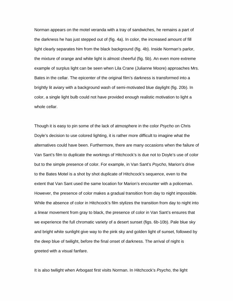
but to the simple presence of color. For example, in Van Sant’s Psycho, Marion’s drive
to the Bates Motel is a shot by shot duplicate of Hitchcock’s sequence, even to the
extent that Van Sant used the same location for Marion’s encounter with a policeman.
However, the presence of color makes a gradual transition from day to night impossible.
While the absence of color in Hitchcock’s film stylizes the transition from day to night into
a linear movement from gray to black, the presence of color in Van Sant’s ensures that
we experience the full chromatic variety of a desert sunset (figs. 6b-10b). Pale blue sky
and bright white sunlight give way to the pink sky and golden light of sunset, followed by
the deep blue of twilight, before the final onset of darkness. The arrival of night is
greeted with a visual fanfare.
It is also twilight when Arbogast first visits Norman. In Hitchcock’s Psycho, the light
slowly fades over the length of their conversation. Russell gradually dims the ‘daylight’
lighting through the windows until all that is left is the hard light of the lamps in reception
– another simple movement from gray to high contrast black-and-white. But, as just
seen, in color the movement from day to night involves a change of hues, so dimming a
set of lights to signify dusk cannot be realistically motivated. Doyle’s solution to this
problem is to make it already dark when Arbogast and Norman start talking. The result
looks fine, but another leakage of night into day has been lost.
Also lost is much of the blackness of Hitchcock’s film, whose monochrome
cinematography transforms a variety of colors into black. By contrast, in Van Sant’s film,
for black to exist on-screen it has to exist in front of the camera. So, for example, the
swamp behind the motel ‘returns’ to its original dark green, and the black blood in the
bathroom becomes red: this time, blood cannot be mimicked by chocolate syrup (fig.
18b).x The verisimilitude of color film closes down meaning, making literal what in the
original was open to symbolic interpretation.
More broadly, the presence of color brings about a disintegration of the visual and
structural oppositions of the original film. The narrative fluctuation between day and night
is no longer paralleled by a cinematographic movement between light and darkness, low
contrast and high contrast, and realism and expressionism. Doyle attempts to
differentiate the Bates Motel from Phoenix through the use of white light shone on
pigmentary color in the former and saturated color lighting in the latter. But in the end,
the locations are both still color. The pastel props and costumes of the Phoenix
sequences survive into the Bates Motel sequences. The lime green sheets of the motel
bed complement Marion’s green bra just as harmoniously as did the pink walls of her
apartment. In a cinematographic sense, Marion has ended in the same place that she
started. The whole extended driving sequence has become superfluous. So, by
extension, the thematic oppositions between normality and abnormality, sanity and
insanity, reality and horror, and subjectivity and objectivity, are weakened. Van Sant’s
film not only unmakes the stylization of Hitchcock’s film, it also unmakes its visual
meanings.
A Binocular View of Psycho
In analyzing the two versions of Psycho, I have looked at the ‘same’ film from two critical
perspectives. I have looked at Hitchcock’s Psycho through a Zizekian eye, and Van
Sant’s Psycho through a Bordwellian eye. By removing profilmic color and creating a
partially abstracted image, the black-and-white cinematography of Hitchcock’s Psycho
encourages an interpretative critical response that looks beyond the specificity of the
image. For example, in The Pervert’s Guide to Cinema (Sophie Fiennes, 2006) Zizek
elaborates a glance by Norman down the u-tube to suggest that watching a black
cinema screen is like waiting for a toilet to flush. Zizek’s conceptual amalgamation of
emptiness, shadow, and shit is contingent on the chromatic abstraction of black-and-
white cinematography. By contrast, Van Sant’s Psycho draws attention to its stylistic
difference-in-sameness, encouraging a Bordwellian response that analyzes the visual
nuances of Van Sant and Doyle’s mimetic techniques. Though my Zizekian eye and my
Bordwellian eye are of course unable to see from the other’s perspective, I hope that the
resulting view of Psycho has provided a kind of binocular vision, through which the
cinematography of Hitchcock’s and Van Sant’s films can be understood in greater depth
than if they were analyzed independently.
It should be noted that Zizek’s and Bordwell’s points of view also interact beyond the
optic chiasm, in the brain. Bordwell perhaps has a point when he calls Zizek an ‘insistent
monologist’: if one were stranded on a desert island with only a book by Zizek for
company, then one might reasonably choose suicide in favor of a lifetime of subjugation
to his insistent academic voice (2005). However, to assume that Zizek does not relate to
other academics just because he does not engage with their work as methodically as
Bordwell is to overlook the fact that most academic debate takes place not on page or
screen but in our heads. Zizek’s ideas stimulate internal dialogue, with others’ ideas and
our own, and also interact with them in unexpected ways. In our heads, all Theory
becomes theory. All ideas mix, and the metaphor of parallax becomes redundant.
Accordingly, I conclude by mixing up Hitchcock’s Psycho with Van Sant’s, and Zizek’s
ideas with Bordwell’s.
Zizek views Van Sant’s film as inhabiting an awkward no man’s land between similarity
and difference. This view can be replicated with reference to its cinematography. Chris
Doyle’s lighting is too close to the original but not close enough: it exists in tension both
with mainstream Hollywood’s visual topoi of realism and with the expressive lighting
style of the original film. Van Sant and Doyle’s experiment compelled them to imitate
Hitchcock and Russell’s lighting. At the same time, they were not free to duplicate it.
Doing so would have resulted in an art film lighting style that drew attention to its artifice
and alienated multiplex audiences. The only way to duplicate the original film’s visual
style without breaking Hollywood’s taboo on realistically unmotivated lighting would have
been to remake it in black-and-white. But, of course, the entire project was economically
premised on the fact that Hitchcock’s film was to become color. It was precisely its color
that allowed Van Sant to get his film financed. The stylistic tensions of Van Sant’s film
are thus a manifestation of the tension between art and commerce. To carry out his
perverse art project, Van Sant required a large budget. Perhaps he believed that he
could reconcile art and economics through color. If so, he was wrong: culturati perceived
the film as an attempt to repackage an ageing product for a teen market, while teens
were baffled by the film’s artfulness. Each group interpreted the film as having been
made for the other: Van Sant’s version attempted to achieve both critical and
commercial success (in a sense, to achieve a parallax between art and commerce) and
as a result achieved neither.
References
Anonymous. “Psycho.” The Hollywood Reporter. 160.34 (1960): 3.
Baker, Peter. “Psycho.” Films and Filming. 6.12 (1960): 21.
Bellour, Raymond. 2000. The Analysis of Film. Bloomington: Indiana University Press.
Bordwell, David. 2005. “Slavoj Zizek: Say Anything.”
http://www.davidbordwell.net/essays/zizek.php.
Bordwell, David & Carroll, Noël (eds.). 1996. Post-theory: reconstructing film studies.
Madison: University of Wisconsin Press.
Bordwell, David, Janet Staiger, & Kristin Thompson. 1985. The Classical Hollywood
Cinema: Film Style & Mode of Production to 1960. New York: Columbia
University Press.
Deleuze, Gilles. 1986. Cinema 1, The Movement-Image. London: The Athlone Press.
Holben, Jay. 2001. “The Root(s) of all Evil.” American Cinematographer 82.10: 48-57.
McGowan, Todd. 2007. “Introduction: Enjoying the Cinema.” International Journal of
Zizek Studies 1.3.
Naremore, James. 1973. Filmguide to Psycho. Bloomington: Indiana University Press.
Truffaut, François. 1986. Hitchcock. London: Paladin Books.
Wollen, Peter. 1980. “Cinema and Technology: A Historical Overview.” In The Cinematic
Apparatus. Stephen Heath and Teresa de Lauretis, eds. London: The Macmillan
Press Ltd. 14-22.
Zizek, Slavoj (ed.). 1992a. Everything You Always Wanted to Know about Lacan (But
Were Afraid to Ask Hitchcock). 1992. London, New York: Verso.
Zizek, Slavoj. 1992b. Enjoy Your Sympton! Jacques Lacan in Hollywood and out. New
York: Routledge.
Zizek, Slavoj. 2001. The Fright of Real Tears: Krzysztof Kieslowski between Theory and
Post Theory. London: BFI.
Zizek, Slavoj. Accessed 15 Sep 2007. “Is There A Proper Way To Remake a Hitchcock
Film?” http://www.lacan.com/hitch.html.
i As is often the case, in The Parallax View, Zizek uses examples from films as if they were ‘real’. Appearance is ‘reality’, and so film examples mix with and become equivalent to examples from history. ii The metaphor of parallax has clearly been latent in Zizek’s thought for a long time. It could perhaps even with hindsight be regarded as the guiding metaphor of his life’s work. iii Clearly, a cinematic ‘object’ is not real in the same way as an object that has shape and mass. Beyond the materiality of the medium itself (a film negative, a videotape, a DVD, etc.), a film is only a representation: it exists as light. Accordingly, the ‘object’ of my imagined parallax between the two films does not exist. The ‘objective’ Psycho that the two films provide different perspectives on comprises the two perspectives themselves. An appropriate optical metaphor for this conceptual Psycho might be that of a mirror that allows one’s left eye and right eye to look directly into each other. iv The fact that black-and-white can be seen as both realistic and unrealistic is not as paradoxical as it may sound. Realism is an exceptionally slippery concept. It has been understood in many different ways at different periods in the history of art, and indeed often during the same period. For the sake of clarity, in this article I used the term ‘realism’ to describe the style of filmmaking that was perceived in the late 1950s as ‘realistic’. Realism is grayness, handheld camera, and location filming. To describe images whose ‘realism’ is restricted to the close reproduction of what is visible in front of the camera, I use the term ‘verisimilar’. v A reviewer in Films and Filming wrote: ‘In his presentation Hitchcock has copied the camera styles of the Continental realists. He has tried to achieve the casual looking-in on reality’ (Baker 1960). A reviewer for the Hollywood Reporter referred to the opening sequence as a ‘torrid love scene typical of the French “new wave” school’ (anonymous 1960). vi White too is symbolically over-determined. For every meaning that has been ascribed to black, the opposite meaning has been ascribed to white. Symbolically, as well as cinematographically, white and black are defined in relation to each other. However, in all but the bathroom sequences of Hitchcock’s Psycho, it is black that is the more prominent of the two. vii Director’s commentary. DVD of Psycho, Universal Studios 2002. Note the oxy-moron of an ‘original DVD’: the ‘original’ the Van Sant copies is itself a copy. viii This problem is also apparent in the color version of The Man Who Wasn’t There (Joel Coen, 2001). When the film came out on DVD, it was released in parts of Asia in color as well as black-and-white. Logistically, releasing a color DVD version was not a problem, as the film had been shot on color negative, anticipating the likelihood of a color DVD release (Holben 2001: 49). However, on an aesthetic level the process was not so straightforward. The color original was shot using hard light sources, in order to look good in black-and-white. Translated into color, the lighting is often intrusive. The more expressive the lighting, the better the film looks in black-and-white, but the worse it looks in color. Presumably because of this, in the color version the higher contrast shots tend to be less saturated than lower contrast shots; the color version fluctuates from strong color to near black-and-white.
ix ‘Hitchcock’s Presence.’ Accessed 23 Aug 2007. http://www.psychomovie.com/production/prodhitchcock.html x The chromatic verisimilitude incidentally makes the sequence much more visceral than in the original. The gruesome smears of red on ceramic white lend credence to Hitchcock’s claim that the bathroom sequence would never have made it past the censors in color (Truffaut 1986: 514).