Embed Size (px)
Citation preview

48
A Business Intelligence Dashboard Design Approach to Improve Data Analytics and Decision Making
Dmytro Orlovskyi, Andrii Kopp
National Technical University “KhPI”, Kyrpychova str. 2, Kharkiv, 61002, Ukraine
Abstract This paper considers a problem of dashboard design in order to improve data analytics and
decision making as business intelligence capabilities. Essentials of data warehouses and data
marts used as data sources for business intelligence activities are briefly outlined, and the star
schema data structure is considered as the most widely used. Data visualization is considered
from the perspective of proper visualization graphs and charts selection. It is extremely vital
for designed dashboards, since inappropriate visuals may mislead users and shift their focus
to wrong things. Bar charts, line charts, and pie charts are considered as the most common
visualization graphs. Proposed approach includes two phases: dataset preparation and dataset
analysis. While dataset preparation is mostly focused on star schema transformation into flat
structures, dataset analysis phase proposes recommendations on which visualizations may be
placed on a designed dashboard. In order to propose such recommendations, threshold values
of dataset sizes are used. A dashboard design process, which is considered as the baseline of
the proposed dashboard design approach, is outlined. Sample dataset in considered, five data
subsets are prepared and recommendations on visualization charts for these datasets, which
may be placed on a dashboard, are proposed. Obtained results are discussed, conclusions are
made, as well as the further research objectives in this field are formulated.
Keywords 1 Data Analytics, Business Intelligence, Data Visualization, Dashboard, Star Schema.
1. Introduction
In today’s competitive market situation, it is extremely important for small business and large
corporations to have permanent access to analytical reports regarding their business activities. Such
access may be granted by modern data analytics and visualization techniques covered in this section.
However, it is a challenging problem to design information technologies (IT) in this field. Thus, the purpose of work is to provide an approach that may help to design IT for data analytics, visualization,
and data-driven decision making. Related problems are outlined in following subsections.
1.1. Data Analytics and Business Intelligence in Decision Making
The subject of data analytics domain is the process that includes data collection, organization, pre-
processing, transformation, modeling, and interpretation. Data analytics activities are usually divided
into [1]:
Descriptive analytics.
Predictive analytics.
These two areas naturally are overlapped and interrelated but still serve for the different purposes. However, the descriptive analytics focuses on data summarization or condensation in order to extract
IT&I-2020 Information Technology and Interactions, December 02–03, 2020, KNU Taras Shevchenko, Kyiv, Ukraine
EMAIL: [email protected] (D. Orlovskyi); [email protected] (A. Kopp)
ORCID: 0000-0002-8261-2988 (D. Orlovskyi); 0000-0002-3189-5623 (A. Kopp)
© 2020 Copyright for this paper by its authors.
Use permitted under Creative Commons License Attribution 4.0 International (CC BY 4.0).
CEUR Workshop Proceedings (CEUR-WS.org)

49
statistics or data patterns, while the predictive analytics is about extraction of models from data in order to be used for future predictions [1].
On practical business issues data analytics is used together with data warehousing to support
decision making using management information systems usually called Business Intelligence (BI)
systems. BI is an umbrella term, which covers reports, scorecards, dashboards, notification alerts, pre-defined user-specified queries, ad hoc queries, multidimensional analyses, statistical analyses,
prediction, and simulation models. All of these are BI capabilities that help business users to make
vital business decisions in order to reduce costs, increase revenues, etc. [2]. Data warehouses are specialized databases used to store records about transactions, products,
customers, performance metrics, financial results, etc. Such business information is collected over
multiple years in order to be used for analytical purposes. Data analytics methods and models use data volumes stored in data warehouses to provide statistical analysis, predictions, and simulation results
to stakeholders (business users that require such data insights) [2].
Core Business Intelligence capabilities are:
Data extraction.
Data storage.
Data visualization.
These capabilities are supported by the respective information technologies:
Extract-Transform-Load (ETL) pipelines.
Data Warehouses (DW) and Data Marts (DM).
Reports and dashboards. ETL technologies are used for data receiving from one or multiple source data stores (Extract
phase), transforming (cleansing, aggregation, summarization, concatenation, etc.) of data (Transform
phase), and storing data in a target source (Load phase). All the required data processing operations are specified in ETL scripts. In Business Intelligence systems production databases usually act as the
source data stores, while DW and DM serve as the target data stores [3].
A general use-case of ETL scripts in a BI data pipeline is demonstrated in Figure 1.
Figure 1: ETL scripts general use-case
DW and DM used as the target data sources are traditionally built using relational or wide-column
(or combined) database management systems. The difference between data warehouses and data
marts is that DM are usually focused on limited domains (i.e. subject areas) but also are having a dimensional data model design, which is also used in DW. Data marts may belong to organizational
departments and are associated only with concrete activities of organizational units (e.g., “Sales”,
“Marketing”, “Procurement”, etc.) [4].
In fact, data marts depend on data warehouses, since in most business information systems DM tend to acquire their information from the general enterprise DW [4]. The (multi-) dimensional data
model design, which is typical for DM and DW, is achieved through the appliance of following data
structures optimized for data warehousing needs:
Star schema.
Snowflake schema.

50
These schemas address needs of very large databases designed for analytical purposes. On practice dimensional modeling includes five steps [5]:
Identify a business process (a sequence of activities that produces data records, e.g. order
placement, sale processing, delivery processing, etc.).
Identify a level of detail.
Identify dimensions.
Identify facts.
Build a schema.
In general a schema is the logical description (some sort of a blueprint) of a database. Database schemas define how data entities are organized (which attributes they contain) and how the relations
among these entities are associated. Dimension tables in data warehouses are collections of reference
information about events, which are known as facts. Fact tables consist of dimension foreign keys
linked to dimension tables and measures, which represent some numeric facts [6]. The star schema is simplest but extensively used nowadays data warehouse schema. According to
the star schema, the fact table is at the center and the dimension tables are nodes of the “star” [6].
Sample star schema DW design is shown in Figure 2.
Figure 2: Sample star schema data warehouse design
Since the star schema data warehouse model is one of the simplest but, on the other hand, is the
most widely used data structure in BI domain, in this paper will be considered exactly this kind of
storages.
Data loaded into DW may be prepared and used for descriptive (statistical) and predictive (model building) analytics. However, nowadays managers and other business users require dashboards that
reflect status of their activities in the form of measures that demonstrate a progress towards pre-
defined goals [7]. Dashboards are used at the top presentation layer of the whole BI architecture [8]. Dashboards allow business users to visualize data by combining a plethora of charts, graphs, and
other data visualization widgets together. Advanced BI tools allow users to visualize results of various
machine learning models (classification, clustering, regression, etc.) in an interactive graphical user-friendly interface. There are BI solutions such as Tableau, QlikView, Microsoft Power BI, and others,
which are extremely efficient in data discovery and visualization. There are also open source data
visualization components D3.js and Kibana, which are extremely popular on market [9].
1.2. Data Visualization and Business Intelligence Dashboards
According to Stephen Few, a leader in the field of data visualization, the following dashboards
design principles are [10]:

51
Used visualization charts should fit the best nature of data included in data sets displayed on a
dashboard.
Used visualization charts should serve their purposes even in case if they are resized in order to be placed into small spaces on a dashboard.
Also, according to [10], dashboard design flaws are related to inappropriate data visualization
charts and graphs chosen to be placed on dashboards.
The most appropriate visualizations, which are highly informative and best suitable for human-eye perceptions, according to Lisa Pappas and Lisa Whitman [11] are bar charts and line charts. On the
other hand, less efficient visuals are dials or speedometers [11]. However, dials are widely used on
dashboards probably because of the dashboard concept is originated from vehicles, such as planes and automobiles.
According to Zach Gemignani et al. [12], visualization charts are building blocks used to construct
dashboards. Choosing wrong visualizations may mislead dashboard audience into focusing on the wrong things. When selecting charts, it is required to understand the purpose of a chart, which is
actually making it easy for users to identify patterns and compare values to each other [12].
Since people judge values accurately on two-dimensional plane, bar charts, line charts, and pie
charts are the best visualizations. The ability to analyze data declines when graphs use other visual features, such as size, color, radial distance, etc. Hence, pie charts are considered as less effective than
bar charts and line charts because of the requirement to compare radial distances and areas [12]. Some
examples of the most efficient visualization charts in different forms (e.g. horizontal and vertical bar charts, pie and donut charts, etc.) are demonstrated in Figure 3 [13].
Figure 3: Some example of the most efficient visualization charts
In [14] it is also mentioned that common graphs and charts are:
Bar charts. Show comparison at different times, locations, and conditions.
Line charts. Display trends over time in amounts, sizes, rates, etc.
Pie charts. Show what parts make up a whole in order to compare relative sizes of these parts.
Dashboard visualizations should be used to display relationships between different numbers
between different numbers within dataset [15]. Hence, visualizations, which are attractive by sight
(e.g. radial bar charts, polar area charts, radial histograms, chord diagrams, three-dimensional graphs, contour plots, heat maps, etc.), may be completely inefficient for data analytics. According to Russell
Carter et al. [15], bar charts efficiently demonstrate differences in quantities between groups, line
charts are great for illustrating change across time, and pie charts show proportions well. Also in [15] is declared that visualization graphs should be as simple and as clear as possible, labels should be
large enough to read, and texts should be kept to minimum. Usage of line, pie, and bar charts is also
mentioned in the Essentials of Business Communication book [16]. It says that visualization should

52
be easy to understand, there should not be unnecessary details or too much text that my overload the audience.
1.3. Problem Statement
The dashboard design problem includes selection of visualizations, such as graphs and charts,
which should be placed in a limited space. If choose inappropriate visualization charts that do not fit nature of data presented in datasets prepared for visualization, developed BI dashboard applications
may mislead business users and shift their focus and attention to unimportant or wrong things. Thus,
dashboard design problem is extremely relevant nowadays when big data volumes processing and
analysis is vital for making business decisions. Since the problem is not trivial and complex enough, it is required to propose a BI dashboard design approach.
2. Methods
Proposed approach is based on the relational algebra methods used to process DM and DW data structures in order to prepare datasets for analysis and suggest appropriate visualizations that should
be placed on dashboards. The dashboard design process, which is underlying for a proposed approach,
includes steps related to dataset preparation and dataset analysis that lead to recommendations on
dashboard visualizations.
2.1. Dataset Preparation
This step is based on the relational algebra methods that operate functional dependencies and other
associated dependencies (partial, transitive, etc.). Therefore, in star schema data warehouses only
dimensions are de-normalized [6] (there might be transitive dependencies presented, when the determinant is not part of the primary key, e.g. in the sample data warehouse model there is the
transitive dependency 𝑆𝑡𝑜𝑟𝑒_𝐼𝑑 → 𝑆𝑡𝑜𝑟𝑒_𝐶𝑖𝑡𝑦 → 𝑆𝑡𝑜𝑟𝑒_𝑅𝑒𝑔𝑖𝑜𝑛), while fact tables are in 3NF.
It means that business measures in the fact relation (table) depend on the primary key attributes (columns) derived from dimension relations (tables) as foreign keys:
{𝐷𝑖𝑃𝐾|𝑖 = 1, 𝑛̅̅ ̅̅̅} → {𝑀𝑗|𝑗 = 1,𝑚̅̅ ̅̅ ̅̅ }, (1)
where 𝐷𝑖𝑃𝐾 is the 𝑖-th primary key attribute of the fact table derived as the foreign key from the 𝑖-th
dimension table, 𝑛 is the number of primary key attributes in the fact table and, at the same time, the
number of dimension tables respectively, 𝑀𝑗 is the 𝑗-th measure of the fact table, and 𝑚 is the number
of measures in the fact table. Then each dimension table may contain possibly de-normalized dependencies described as:
𝐷𝑖𝑃𝐾 → {𝐷𝑖
𝑘|𝑘 = 1, 𝑞𝑖̅̅ ̅̅ ̅}, (2)
where 𝐷𝑖𝑘 is the 𝑘-th attribute of the 𝑖-th dimension table, and 𝑞
𝑖 is the number of attributes in the 𝑖-th
dimension table.
Composition of the associated dimension attributes (2) and measures (1) into the flat structure may
be done using the join operation of the relational algebra, ensuring inclusion into the result set only
those tuples, which primary keys 𝐷𝑖𝑃𝐾, 𝑖 = 1, 𝑛̅̅ ̅̅ are equal:
{𝑀𝑗|𝑗 = 1,𝑚̅̅ ̅̅ ̅̅ } ⋈𝐷𝑖𝑃𝐾,𝑖=1,𝑛̅̅̅̅̅ {𝐷𝑖
𝑘|𝑘 = 1, 𝑞𝑖̅̅ ̅̅ ̅}, (3)
where ⋈ is the notation of join operation. Hence, the result data set may be described with the following superset of attributes, which are
measures and dimension attributes:
{𝑀𝑗|𝑗 = 1,𝑚̅̅ ̅̅ ̅̅ } ∪ ⋃ {𝐷𝑖𝑘|𝑘 = 1, 𝑞𝑖̅̅ ̅̅ ̅}
𝑖=1,𝑛̅̅̅̅̅
. (4)
The example of such flat structure (3, 4), which is based on the demonstrated sample star schema
data warehouse (Figure 2) is shown in Figure 4.

53
Figure 4: Sample flat structure derived from a star schema
In order to prepare the obtained dataset for visualization, selection and projection operations
should be done. In fact, on practice all the data preparations may be done using SQL (Structured
Query Language). SQL can be used for data analysis such as filtering, sorting, and joining. SQL also provides functions (e.g. aggregation functions MIN, MAX, SUM, COUNT, and AVG; pivoting, null
processing, and ranking functions, etc.) to respond complex analysis requests with all elegance and
performance of this language [7].
2.2. Dataset Analysis
Obtained flat data structures are extremely convenient for data selection and projection operations
even though these structures are de-normalized and contain redundant data. As it was mentioned in a
previous subsection, on practice these relational operations are performed using the SQL language and its analytical capabilities. Each of SQL queries forms a subset of the general dataset extracted
from the DM or DW. Subsets returned by SQL queries should be used as datasets for visualization
using charts and graphs on BI dashboards (Figure 5).
Figure 5: Generic data pipeline for the proposed approach

54
As it is shown in Figure 4 above, each dataset obtained as the result of corresponding SQL query should be analyzed in order to define which data visualization graph or chart should be placed on a
dashboard.
First of all, the set of attributes included in the result set of any SQL query may contain of two
subsets of attributes:
𝑋 ⊆ ⋃ {𝐷𝑖𝑘|𝑘 = 1, 𝑞𝑖̅̅ ̅̅ ̅}
𝑖=1,𝑛̅̅̅̅̅
∪ 𝑌 ⊆ {𝑀𝑗|𝑗 = 1,𝑚̅̅ ̅̅ ̅̅ }, (5)
where 𝑋 is the subset of attributes that may be placed on the x-axis, and 𝑌 is the subset of attributes
that may be placed on the y-axis.
Obviously, there may be multiple attributes included in subsets 𝑋 and 𝑌 (5). Most of the modern
BI suites allow data analysts to create charts with primary and secondary y-axes, hierarchical x-axes,
and drill down (navigation to detailed data hierarchy layers in order to discover more granular data) features. For example, let us consider the sample dataset of five attributes related to sales:
Cost of sold products (measure).
Number of sold products (measure).
Year (dimension’s attribute).
Quarter number (dimension’s attribute).
Month number (dimension’s attribute).
Thus, considered attributes could be mapped to the line and column chart. Such data visualization
example was made using Microsoft Power BI is shown in Figure 6.
Figure 6: Example of dataset mapping to the visual chart axes
Selection of proper visualization graphs and charts is the main problem, which must be solved in
the BI dashboards development. In order to analyze datasets (returned by SQL queries) and suggest
visualization, the following function is proposed:
𝑉𝑖𝑠𝑢𝑎𝑙𝑖𝑧𝑎𝑡𝑖𝑜𝑛(𝐷𝑆) = {
|𝐷𝑆| = 1, 𝐶𝑎𝑟𝑑2 ≤ |𝐷𝑆| ≤ 𝑡1, 𝑃𝑖𝑒
𝑡1 + 1 ≤ |𝐷𝑆| ≤ 𝑡2, 𝐵𝑎𝑟|𝐷𝑆| > 𝑡2, 𝐿𝑖𝑛𝑒
, (6)
where 𝐷𝑆 is the analyzed dataset produced by an SQL query and which is required to be placed on a
dashboard using a certain graph or chart, 𝑡1 is the upper threshold of the dataset size |𝐷𝑆| that is
suitable for a pie chart visualization, and 𝑡2 is the upper threshold of the dataset size |𝐷𝑆| that
is suitable for a bar chart visualization. Proposed in (6) bar charts, line charts, and pie charts are considered as the most suitable for data
visualization and human perception, which were already mentioned in subsection 1.2 [11–16]. While
text cards may be used to display single-value measures, such as any generalized measures, ratios, or other possible scalar values.
55
Sample thresholds, which may be used on practice, are demonstrated in Table 1. These thresholds were recommended by different studies in the field of data analytics and visualization [14, 17–21].
Table 1 Dataset size thresholds suitable for different visualizations
Source Pie chart threshold, 𝑡1 Source Bar chart threshold, 𝑡2
[14, p. 107] 6 [19] 10 – 12 [17, p. 68] 4 [20] 12
[18, p. 281] 5 [21] 15
These limitations (Table 1) of pie charts and bar charts are caused by their usage as comparative
tools, while line charts are used to display trends over time. It was hard to find recommendations on thresholds, we have found them mentioned by: Telg and Irani in [14], Evergreen in [17], and Stirrup
et al. in [18] for pie charts; Choudhury in [19], Inforgram team in [20], and Gulbis in [21].
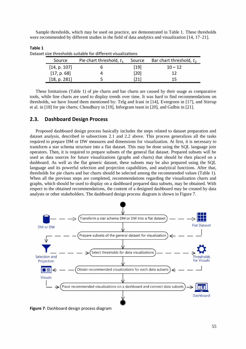
2.3. Dashboard Design Process
Proposed dashboard design process basically includes the steps related to dataset preparation and
dataset analysis, described in subsections 2.1 and 2.2 above. This process generalizes all the tasks
required to prepare DM or DW measures and dimensions for visualization. At first, it is necessary to
transform a star schema structure into a flat dataset. This may be done using the SQL language join operators. Then, it is required to prepare subsets of the general flat dataset. Prepared subsets will be
used as data sources for future visualizations (graphs and charts) that should be then placed on a
dashboard. As well as the flat generic dataset, these subsets may be also prepared using the SQL language and its powerful selection and projection capabilities, and analytical functions. After that,
thresholds for pie charts and bar charts should be selected among the recommended values (Table 1).
When all the previous steps are completed, recommendations regarding the visualization charts and
graphs, which should be used to display on a dashboard prepared data subsets, may be obtained. With respect to the obtained recommendations, the content of a designed dashboard may be created by data
analysts or other stakeholders. The dashboard design process diagram is shown in Figure 7.
Figure 7: Dashboard design process diagram

56
Described dashboard design process allows users to choose appropriate visualization charts and graphs. Example of this process usage is outlined in the next section.
3. Results and Discussion
As the example we have used the test dataset with randomly generated records. This dataset is
supposed to describe sales facts between 2009 and 2020 years. There are two measures:
“Items Sold” (a number of sold product items).
“Items Cost” (revenue of sales).
And also there are four dimension attributes:
“Date”.
“Year”.
“Quarter”.
“Month”.
In order to simplify the demonstrated example and focus only on the recommendations suggestion
for the visualization charts to be used, let us consider already prepared flat dataset of the columns
mentioned above.
Now it is required to prepare subsets of the general dataset using SQL queries. There are five data subsets, which are necessary to be visualized using a dashboard:
Average revenue by quarter (Appendix 1).
Lowest sales and highest sales by month (Appendix 2).
Revenue by date (Appendix 3).
Average revenue per item (Appendix 4).
Average revenue per quarter (Appendix 5).
Datasets returned by these SQL queries (Figure 8–12) are supposed to be visualized using the different graphs and charts on a dashboard. It is required to define thresholds for data visualizations.
In fact, there are 12 possible combinations of 𝑡1 and 𝑡2 thresholds: |{4,5,6}| × |{10,11,12,15}| = 12.
After we have applied the function (6) proposed in subsection 2.2 to each of considered datasets,
by using all the possible pairs of 𝑡1 and 𝑡2 threshold values, we have obtained the following results
outlined in Table 2.
Table 2 Recommended visualizations obtained for each of considered datasets
𝐷𝑆 𝑡1 4 5 6 4 5 6 4 5 6 4 5 6
𝑡2 10 10 10 11 11 11 12 12 12 15 15 15
1 |𝐷𝑆1| = 4 P P P P P P P P P P P P 2 |𝐷𝑆2| = 12 L L L L L L B B B B B B 3 |𝐷𝑆3| = 481 L L L L L L L L L L L L 4 |𝐷𝑆4| = 1 C C C C C C C C C C C C 5 |𝐷𝑆5| = 1 C C C C C C C C C C C C
Here B stands for a bar chart, C stands for a card, L stands for a line chart, and P stands for a pie
chart. Considered datasets (Table 2) are of different sizes, from large enough (|𝐷𝑆3| = 481) to scalar
values (|𝐷𝑆4| = 1 and |𝐷𝑆5| = 1).
Because of various dataset volumes, there were obtained recommendations regarding various
visualizations to be placed on a dashboard. Actually there are only two distinct combinations of the proposed visualizations: PLLCC and PBLCC. The first one includes the following charts:
Average revenue by quarter – a pie chart.

57
Lowest sales and highest sales by month – a line chart.
Revenue by date – a line chart.
Average revenue per item – a card.
Average revenue per quarter – a card.
Sample dashboard design for the first combination of visualizations is shown in Figure 13. The
donut chart is used instead of plain pie chart, since it is more visually attractive.
Figure 8: Sample dashboard design for the first recommended set of visuals (PLLCC)
The second set of recommended charts includes the following visualizations:
Average revenue by quarter – a pie chart.
Lowest sales and highest sales by month – a bar chart.
Revenue by date – a line chart.
Average revenue per item – a card.
Average revenue per quarter – a card.
Sample dashboard design for the first combination of visualizations is shown in Figure 14.
Obtained dashboard design alternatives may be chosen by analysts for further usage or as the
proofs of concepts for demonstration to business users (managers, directors, and other stakeholders) for their further approval. These alternatives could be quantitatively evaluated using visuals ranking
proposed in [22]. Dashboard design variants 𝑉𝑎𝑟1 and 𝑉𝑎𝑟2 could be evaluated as following:
𝑉𝑎𝑟𝑖 =∑(𝑤𝑗
max𝑘=1,𝑣̅̅ ̅̅
𝑤𝑘⋅
𝑑𝑗max𝑘=1,𝑣̅̅ ̅̅
𝑑𝑘⋅ 𝑥𝑗)
𝑣
𝑗=1
, 𝑖 = 1,2̅̅ ̅̅ , (7)
where 𝑥𝑗 is the number of visuals of 𝑗-th graph type placed on the dashboard under evaluation, 𝑤𝑗 is
the prevalence of 𝑗-th graph type [22], 𝑑𝑗 is the degree to which 𝑗-th graph type helps glean insights
and make decisions [22], and 𝑣 is the number of visuals.
According to the evaluation results, second alternative design (𝑉𝑎𝑟2 = 1.94) is more preferable
than the first one (𝑉𝑎𝑟1 = 1.54), since bar charts are better suited for relatively small datasets of 10 –
15 categories (|𝐷𝑆2| = 12) than line charts (see Table 1).
However, this approach should be complemented with the possibility of suggestions elaboration regarding places of visualization charts on a dashboard. In order to propose places of visualizations, it
is required to define relative sizes of each chart, which may be based on corresponding dataset sizes.

58
Figure 9: Sample dashboard design for the second recommended set of visuals (PBLCC)
4. Conclusion
In this study we have discussed the dashboard design problem, which is extremely important in data analytics and decision making areas. In order to prevent misleading of business users, managers,
and remaining stakeholders by inappropriately designed dashboards, which may contain unsuitable
visualization charts and graphs that do not fit to considered datasets, we have proposed the dashboard design approach. This approach is based on data mart or data warehouse transformation from the star
schema, extremely popular and quite simple data structure, into the flat dataset, suitable for selection
and projection operations that should be used to produce data subsets. These data subsets then may be
used as data sources for visualizations on dashboards, which are usually bar charts for comparisons, line charts for trends over time, pie charts for parts of a whole, and cards for scalar values. It is vital to
select appropriate visualization among the considered, which is why we have proposed the function,
which maps data subsets to kinds of visuals and helps to elaborate recommendations for dashboard design. Considered example demonstrates sample dataset, derived subsets of records, and proposed
visual charts for their demonstration on a dashboard. Future research in this field includes software
implementation of the proposed approach, as well as the research of relative sizes and placement of visualization graphs and charts on a dashboard’s space.
5. References
[1] J. Moreira, A. Carvalho, T. Horvath, A General Introduction to Data Analytics, John Wiley &
Sons, 2018. [2] S. Williams, Business Intelligence Strategy and Big Data Analytics: A General Management
Perspective, Morgan Kaufmann, 2016.
[3] R. van der Lans, Data Virtualization for Business Intelligence Systems: Revolutionizing Data
Integration for Data Warehouses, Elsevier, 2012. [4] R. Hughes, Agile Data Warehousing for the Enterprise: A Guide for Solution Architects and
Project Leaders, Newnes, 2015.
[5] A. Nordeen, Learn Data Warehousing in 24 Hours, Guru99, 2020. [6] P. Bhatia, Data Mining and Data Warehousing: Principles and Practical Techniques, Cambridge
University Press, 2019.

59
[7] R. Ghlala, Analytic SQL in SQL Server 2014/2016, John Wiley & Sons, 2019. [8] A. M. Maquera, Business Intelligence – First Steps, 2020. URL: https://medium.com/
@anamumaq/business-intelligence-primeros-pasos-3a17fc0a0c46.
[9] P. Ghavami, Big Data Analytics Methods: Analytics Techniques in Data Mining, Deep Learning
and Natural Language Processing, Walter de Gruyter GmbH & Co KG, 2019. [10] S. Few, Information Dashboard Design: Displaying Data for At-a-glance Monitoring, Analytics
Press, 2013.
[11] L. Pappas and L. Whitman. "Riding the technology wave: Effective dashboard data visualization." Human Interface and the Management of Information, 2011, pp. 249–258. doi:
10.1007/978-3-642-21793-7_29.
[12] Z. Gemignani, C. Gemignani, R. Galentino, P. Schuermann, Data Fluency: Empowering Your Organization with Effective Data Communication, John Wiley & Sons, 2014.
[13] Data Viz Project – Collection of data visualizations to get inspired and finding the right type.
URL: https://datavizproject.com/.
[14] R. Telg, T. A. Irani, Agricultural Communications in Action: A Hands-On Approach, Cengage Learning, 2011.
[15] R. Carter, J. Lubinsky, E. Domholdt, Rehabilitation Research – E-Book: Principles and
Applications, Elsevier Health Sciences, 2013. [16] M. E. Guffey, D. Loewy, Essentials of Business Communication, Cengage Learning, 2012.
[17] S. Evergreen, Effective Data Visualization: The Right Chart for the Right Data, SAGE
Publications, 2019. [18] J. Stirrup, A. Nandeshwar, A. Ohmann, M. Floyd, Tableau: Creating Interactive Data
Visualizations, Packt Publishing Ltd, 2016.
[19] S. Choudhury, Choosing the right chart type: Bar charts vs Column charts, 2013. URL:
https://www.fusioncharts.com/blog/bar-charts-or-column-charts/. [20] Create interactive column charts to educate your audience. URL:
https://infogram.com/create/column-chart.
[21] J. Gulbis, Data Visualization – How to Pick the Right Chart Type?, 2016. URL: https://eazybi.com/blog/data_visualization_and_chart_types.
[22] W. Eckerson, M. Hammond, Visual Reporting and Analysis: Seeing Is Knowing, TDWI, 2011.
6. Appendix
Appendix 1. SQL query for the “Average revenue by quarter” dataset
Appendix 2. : SQL query for the “Lowest sales and highest sales by month” dataset
Appendix 3. SQL query for the “Revenue by date” dataset
Appendix 4. SQL query for the “Average revenue per item” dataset
Appendix 5. SQL query for the “Average revenue per quarter” dataset