Embed Size (px)
Citation preview
103-2018Saggioin volume internazionale
Bollini, L. (2018). Color and accessibility in underground wayfinding and signage design. In V. Mar-chiafava and L. Luzzatto (Eds.) Color and Colorimetry –Multidisciplinary Contribution Vol. XIVb (p. 247-257). Milano: Gruppo del Colore[ISBN: 978-88-99513-09-2]
URL: https://gruppodelcolore.com/wp-content/uploads/2018/10/ColourAndColorimetry_Vol_XIVB_2018.pdf

Colour and Colorimetry Multidisciplinary Contributions
Vol. XIV B
Edited by Veronica Marchiafava and Lia Luzzatto
www.gruppodelcolore.it
Regular Member AIC Association Internationale de la Couleur
Colour and Colorimetry. Multidisciplinary Contributions. Vol. XIV B Edited by Veronica Marchiafava and Lia Luzzatto
Layout by Veronica Marchiafava
ISBN 978-88-99513-09-2
© Copyright 2018 by Gruppo del Colore – Associazione Italiana Colore Piazza C. Caneva, 4 20154 Milano C.F. 97619430156 P.IVA: 09003610962 www.gruppodelcolore.it e-mail: [email protected]
Translation rights, electronic storage, reproduction and total or partial adaptation with any means reserved for all countries.
Printed in the month of October 2018
2

Colour and Colorimetry. Multidisciplinary Contributions Vol. XIVB
Proceedings of the 14th Conferenza del Colore.
Joined meeting with: Associação Portuguesa da Cor Centre Français de la Couleur (CFC-FR) Colour Group Great Britain (CG-GB) Colourspot (Swedish Colour Centre Foundation) Comité del color (Sociedad Española de Óptica) Deutsche Farbwissenschaftliche Gesellschaft Forum Farge Groupe Français de l'Imagerie Numérique Couleur (GFINC)
Area di Ricerca di Firenze del Consiglio Nazionale delle Ricerche Firenze, Italia, September 11th-12th, 2018
Organizing Comittee
Alessandro Farini Elisabetta Baldanzi Lia Luzzatto
Programme Comittee
Raffaella Fontana David Jafrancesco Veronica Marchiafava Marcello Picollo
Organizing Secretariat
Veronica Marchiafava, GdC-Associazione Italiana Colore
3
Scientific Committee – Peer review Fabrizio Apollonio | Università di Bologna, IT Leslie Harrington | HUEgroup, US Elisabetta Baldanzi | INO-CNR, IT John Barbur | City University London, UK Laura Bellia | Università di Napoli Federico II Giordano Beretta | Peaxy Inc., US Berit Bergstrom | NCS Colour AB, SE Giulio Bertagna | B&B Colordesign, IT Janet Best | Colour consultant, UK Marco Bevilacqua | Università di Pisa, IT Fabio Bisegna | Sapienza Università di Roma, IT Valerie Bonnardel | University of Winchester, UK Aldo Bottoli | B&B Colordesign, IT Patrick Callet | École Centrale Paris, FR Jean-Luc Capron | Université Catholique de Louvain, B Cristina Maria Caramelo Gomes | Universidade Lusiada de Lisboa, P Antonella Casoli | Università di Parma, IT Céline Caumon | Université Toulouse2, FR Vien Cheung | University of Leeds, UK Veronica Conte | University of Lisbon, P Osvaldo Da Pos | Università di Padova, IT Arturo Dell'Acqua Bellavitis | Politecnico di Milano, IT Julia De Lancey | Truman State University, Kirsville-Missouri, USA Maria João Durão | University of Lisbon, P Reiner Eschbach | Xerox, USA Maria Linda Falcidieno | Università di Genova, IT Alessandro Farini | INO-CNR, IT Christine Fernandez-Maloigne | University of Poitires, FR Renato Figini | Konica-Minolta, IT Agnes Foiret-Coillet | Université Paris1 Panthéon-Sorbonne, FR Raffaella Fontana | INO-CNR, IT Francesca Fragliasso | Università di Napoli Federico II, IT Davide Gadia | Università di Milano, IT Marco Gaiani | Università di Bologna, IT Margarida Gamito | University of Lisbon, P Anna Gueli | Università di Catania, IT Robert Hirschler | Serviço Nacional de Aprendizagem Industrial, BR Francisco Imai | Canon, US David Jafrancesco | INO-CNR, IT Kay Bea Jones | Knowlton School of Architecture, Ohio State University, US Marta Klanjsek Gunde | National Institute of Chemistry- Ljubljana, SLO Guy Lecerf | Université Toulouse2, FR Massimiliano Lo Turco | Politecnico di Torino Maria Dulce Loução | Universidade Tecnica de Lisboa, P
Lia Luzzatto | Color and colors, IT Veronica Marchiafava | IFAC-CNR, IT Gabriel Marcu | Apple, USA Anna Marotta | Politecnico di Torino IT Berta Martini | Università di Urbino, IT Stefano Mastandrea | Università Roma Tre, IT Louisa C. Matthew | Union College, Schenectady-New York, USA John McCann | McCann Imaging, US Annie Mollard-Desfour | CNRS, FR John Mollon | University of Cambridge, UK Fernando Moreira da Silva | University of Lisbon, P Paulo Noriega | University of Lisbon, P Sonia Ovarlez | FIABILA SA, Maintenon, FR Carinna Parraman | University of the West of England, UK Laurence Pauliac | Historienne de l'Art et de l'Architecture, Paris, FR Giulia Pellegri | Università di Genova, IT Joao Pernao | University of Lisbon, P Luciano Perondi | Isia Urbino, IT Silvia Piardi | Politecnico di Milano, IT Marcello Picollo | IFAC-CNR, IT Angela Piegari | ENEA, IT Cristina Pinheiro | Laureate International University, P Fernanda Prestileo | ICVBC-CNR, IT Boris Pretzel | Victoria & Albert Museum, UK Noël Richard | University of Poitiers, FR Katia Ripamonti | University College London, UK Alessandro Rizzi | Università di Milano, IT Maurizio Rossi | Politecnico di Milano, IT Michela Rossi | Politecnico di Milano, IT Elisabetta Ruggiero | Università di Genova, IT Michele Russo | Sapienza Università di Roma, IT Paolo Salonia | ITABC-CNR, IT Raimondo Schettini | Università di Milano Bicocca, IT Verena M. Schindler | Atelier Cler Études chromatiques, Paris, FR Andrea Siniscalco | Politecnico di Milano, IT Gennaro Spada | Università di Napoli Federico II, IT Roberta Spallone | Politecnico di Torino, IT Christian Stenz | ENSAD, Paris, FR Andrew Stockman | University College London, UK Ferenc Szabó | University of Pannonia, H Delphine Talbot | University of Toulouse 2, FR Raffaella Trocchianesi | Politecnico di Milano, IT Stefano Tubaro | Politecnico di Milano, IT Francesca Valan | Studio Valan, IT Marco Vitali | Politecnico di Torino, IT
4
Organisers:
Endorsement:
5
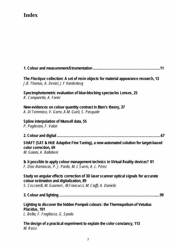
Index
1. Colour and measurement/Strumentation .…..………………………………………….…..11
The Plastique collection: A set of resin objects for material appearance research, 13 J.B. Thomas, A. Deniel, J.Y Harderberg
Spectrophotometric evaluation of blue-blocking spectacles Lenses, 25 R. Comparetto, A. Farini
New evidences on colour quantity contrast in Itten’s theory, 37 A. Di Tommaso, V. Garro, A.M. Gueli, S. Pasquale
Spline interpolation of Munsell data, 55 P. Paglierani, F. Valan
2. Colour and digital ………………………………………………………………………..………67SHAFT (SAT & HUE Adaptive Fine Tuning), a new automated solution for target-based color correction, 69 M. Gaiani, A. Ballabeni
Is it possible to apply colour management technics in Virtual Reality devices? 81 F. Díaz-Barrancas, P. J. Pardo, M. I. Suero, A. L. Pérez
Study on angular effects correction of 3D laser scanner optical signals for accurate colour estimation and digitalization, 89 S. Ceccarelli, M. Guarneri , M.Francucci, M. Ciaffi, A. Danielis
3. Colour and lighting …………………………………………………………………………..…99
Lighting to discover the hidden Pompeii colours: the Thermopolium of Vetutius Placidus, 101 L. Bellia, F. Fragliasso, G. Spada
The design of a practical experiment to explain the color constancy, 113 M. Rossi
7

The 300 years of the second edition of Newton’s Opticks and its news in arts and science, 121 J. A. P. da Silva, M. C. D. Neves
Lighting Design, Well-being and Educational Buildings, 129 D. Casciani, M. Rossi
4. Colour and phisiology ……………………………………………………………...…………139
Comparison of colour perception in control subjects before and after fitting coloured filters, 141 S. Gazzera, A. Bellatorre, M. Greco, S. Maffioletti
5. Colour and restoration……………………………………………………………………..….153
Potentialities of reflectance hyperspectral imaging technique in the field of architecture, 155 C. Cucci, A. Casini, F. Cherubini, M. Poggesi, L. Stefani, M. Picollo
Picasso’s “Science and Charity” and its three oil sketches: a comparison of their hues through their chromatic values, 167 M. Picollo, C. Cucci, L. Stefani, R. Jiménez-Garnica, L. Fuster-López, A. Vila
Painted or not painted? Discovering color traces of ancient stones, 177 S. Bracci, D. Magrini, G. Bartolozzi
6. Colour and built environment ………………………………………………………..………187
Color Allegories: Progressions, Pretensions, and Pride in Art Deco Murals of New York City, 189 J. Schumacher
Toward a Chromatic Hermeneutics. Color Practices in Architectural Reconstructions between Digital and Virtual Heritage, 201 M. Carpiceci, F. Colonnese
What we can learn about improving urban space from colour mapping, 211 C. Carver
7. Colour and design………………………………………………………………………………223
Simulated CMF as a Credible Representation Method for Experimental Design Studies, 225 B. Ulusoy, N. Olguntürk, O. Pedgley
8

Enhancing Co-responsibility for Environmental Protection by Designing Colorful Spaces Inspired by Nature, 233 F. Nouri Kakhki, M. Khalili
Color and accessibility in underground wayfinding and signage design, 247 L. Bollini
8. Colour and culture………………………………………………………………………………259
Affective Reconstructions: Poetics of Light and Colour Design in Contemporary Theatre in Tehran, 261 M. Bolouri
A synesthetic interpretation of space through the colour of music, 273 U. Velo
The harmonies of colours in the underground spaces of the city, 283 L. Noury
Millennial pink: From iPhone to Rihanna. An Analysis of a Color Trend, 293 K. Bideaux
Translating Colours – A Cognitive-Linguistic Research Project on Translating Colour Words and Colour Metaphors into Estonian, 303 M. Uusküla, A. Kalda
9. Colour and education………………………………………………………………………..…309
The meaning of colors in two different child development stages, 311 G. Ortiz Hernández, C. Ortiz Hernández
10. Colour and communication/marketing……………………………………………………321
Technical Development and Emotional Effect on the Color of the Cinematographic Image, 323 M. Khafagy
9
Color and accessibility in underground wayfinding and signage design.
1Letizia Bollini 1Department of Psychology. University of Milano-Bicocca, [email protected]
1. IntroductionColor is one of the most influential assets in the language of visual design. It is often used to emphasize, differentiate or to connotate graphic messages in many different contexts from brand to interface design. Many of our interac-tions with the physical or digital environment surrounding us are mediated by chromatic information. Although color blindness is not explicitly considered a physical impairment, it could be, therefore, a limitation in everyday life. In particular, many of the signage and way-finding system, such as traffic light, street signs, and so on are mainly based on the color codex. Moreover, in undergrounds maps, way-finding scheme, archigraphics, brand, and signage plans and artifacts make broad use of color language. The paper presents and discusses this issues according to the Universal desi-gn/Design 4 all principles from a theoretical and an experimental point of view. Then, research maps and exemplifies some of the most relevant case studies in the history of underground signage design from the London Tube to the Porto project. In the end, the article proposes and debate the best prac-tice and guideline of inclusive color signage design strategies.
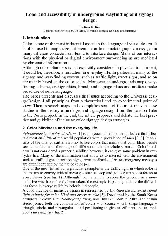
2. Color blindness and the everyday lifeAchromatopsia or color blindness [1] is a physical condition that affects a that affec-ts almost an 8,5% of the world population with a prevalence of men [2, 3]. It con-sists of the total or partial inability to see colors that means that color blind people see not at all or a smaller range of different tints in the whole spectrum. Color blind-ness is not considered a proper disability; however, it can give some problem in eve-ryday life. Many of the information that allow us to interact with the environment such as traffic lights, direction signs, error feedbacks, alert or emergency messages are often identified by the use of color [4]. One of the most trivial but significant examples is the traffic light in which color is the means to convey critical messages such us stop and go to guarantee safeness to every driver (see fig. 1). Although many attempts to solve the problem in a more inclusive way have already been taken, the example is paradigmatic to the difficul-ties faced in everyday life by color blind people. A good practice of inclusive design is represented by Uni-Sign the universal signal light suitable for color blind and everyone else [5]. Developed by the South Korea designers Ji-Youn Kim, Soon-young Yang, and Hwan-Ju Jeon in 2009. The design studio joined both the combination of colors – of course – with shape language – triangle, circle, and rectangular – and positioning to give an efficient and unambi-guous message (see fig. 2).
247
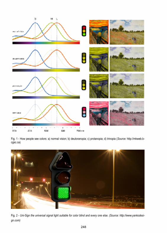
Fig. 1 - How people see colors: a) normal vision; b) deutoranopia; c) protanopia; d) trinopia (Source: http://mkweb.b-cgsc.ca)
Fig. 2 - Uni-Sign the universal signal light suitable for color blind and every one else. (Source: http://www.yankodesi-gn.com) ! 248

3. Design for all: an inclusive and ethical design approachIn the last two decades, a new sensibility has raised among designers about ethical issues and inclusiveness. Given up the industrial idea of standardization that domi-nated Rationalism and the 20th century, the design community is now embracing the concept of diversity, weakness and different abilities. Accessibility, inclusiveness, and enabling are the drivers of a new ethical approach to the main international movements such as Universal Design in the US [6, 7] and the Design for All in Europe [8, 9, 10] started in 1998. A year before, the World Wide Web Consortium had already proposed the WAI (Web Accessibility Initiative) [11] a work in progress activity intended to guarantee the accessibility of the internet to people whit disability [12]. “The power of the Web is in its universality. Access by everyone regardless of disability is an essential aspect” is the declaration given by its inventor Tim Berners Lee, who strongly claim the access to information among the most important human rights [13]. On one hand, this program is deeply connected to a user – or better to say – a hu-man-centered design approach [14]: as stated by IDEO who firstly adopted this de-finition “It’s a process that starts with the people you’re designing for and ends with new solutions that are tailor-made to suit their needs. Human-centered design is all about building a deep empathy with the people you’re designing for; generating tons of ideas; building a bunch of prototypes; sharing what you’ve made with the people you’re designing for, and eventually putting your innovative new solution out in the world.” Putting people first is the mantra to keep in mind the users’ needs and the contexts in which they will use or interact with our projects both physical and digi-tal. On the on the other hand to an ethical point of view on the role and the responsibili-ty of designers [15, 16, 17, 18]. The issues of a design culture more concerned with social and long-lasting values have been expressed already since the late ’50. The rise of consumerism and social inequalities, the works conditions of proletariats un-til the liquid Bauman’s world, the cultural role of advertising are the topics of the First things first manifesto written by Ken Garlan in 1964 [19] and renewed in 2000 [20] and signed by about twenty colleagues. “There are pursuits more worthy of our problem-solving skills. Unprecedented environmental, social and cultural crises de-mand our attention. Many cultural interventions, social marketing campaigns, books, magazines, exhibitions, educational tools, television programs, films, charitable cau-ses and other information design projects urgently require our expertise and help. We propose a reversal of priorities in favor of more useful, lasting and democratic forms of communication – a mind-shift away from product marketing and toward the exploration and production of a new kind of meaning. The scope of debate is shrinking; it must expand. Consumerism is running uncontested; it must be challen-ged by other perspectives expressed, in part, through the visual languages and re-sources of design.” In more recent times, empathy has become one of the more valuable ideas applied to the design approach that tries to be even more involved in the users’ perspective. Understanding of the people you're designing for – not just observation or validation as in the traditional procedures – as a mindset of listening according to Indi Young: “Conventional product development focuses on the solution. Empathy is a mindset that focuses on people, helping you to understand their thinking patterns and per-spectives.” [21].
249

4. Way finding in the undergroundsAs mentioned before, although color blindness is not supposed to be a disability, it can cause difficulties in the everyday interactions, moreover in some specific con-text in which the chromatic language is the communication driver. Way-finding and signage design applied to underground orientation systems is one of these contexts. Frank Pick, executive director of London transport from 1913 to 1938, commissio-ned the signage system of the Tube that leads to the current project. He asked Ed-ward Johnston of the realization of the typeface and a new brand, in 1916, and to Harry Beck the creation of a new map, according to some guidelines [22]. The process that led to the current map was long and implied the application of dif-ferent design styles. The first London's public transport map was developed from the MDR, the Metropolitan District Railways. It was a geographical map, showing the lines of the subway shaped on the physical urban space. This solution which was increasingly blurred, along with the increase of the lines' and stops numbers of stops in the city center. Furthermore, the color was not used initially as a clue to identify better the lines (see fig. 3).
Fig. 3 - The London’s Tube map in 1919. (Source: www.dailymail.co.uk)
In 1931, Harry Beck, an engineer, and a designer tried to solve the problem by ta-king inspiration from the shape of electrical circuits. The new representation strategy was inspired by geometrical and quantitative laws as compressing areas containing fewer stops and dilating the center of the city sol-ved the problem of excessive concentration of stops, decreasing the confusion.
250
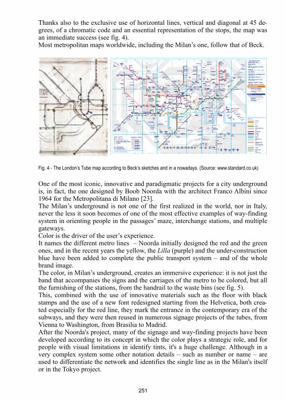
Thanks also to the exclusive use of horizontal lines, vertical and diagonal at 45 de-grees, of a chromatic code and an essential representation of the stops, the map was an immediate success (see fig. 4). Most metropolitan maps worldwide, including the Milan’s one, follow that of Beck.
Fig. 4 - The London’s Tube map according to Beck’s sketches and in a nowadays. (Source: www.standard.co.uk)
One of the most iconic, innovative and paradigmatic projects for a city underground is, in fact, the one designed by Boob Noorda with the architect Franco Albini since 1964 for the Metropolitana di Milano [23]. The Milan’s underground is not one of the first realized in the world, nor in Italy, never the less it soon becomes of one of the most effective examples of way-finding system in orienting people in the passages’ maze, interchange stations, and multiple gateways. Color is the driver of the user’s experience. It names the different metro lines – Noorda initially designed the red and the green ones, and in the recent years the yellow, the Lilla (purple) and the under-construction blue have been added to complete the public transport system – and of the whole brand image. The color, in Milan’s underground, creates an immersive experience: it is not just the band that accompanies the signs and the carriages of the metro to be colored, but all the furnishing of the stations, from the handrail to the waste bins (see fig. 5). This, combined with the use of innovative materials such as the floor with black stamps and the use of a new font redesigned starting from the Helvetica, both crea-ted especially for the red line, they mark the entrance in the contemporary era of the subways, and they were then reused in numerous signage projects of the tubes, from Vienna to Washington, from Brasilia to Madrid. After the Noorda's project, many of the signage and way-finding projects have been developed according to its concept in which the color plays a strategic role, and for people with visual limitations in identify tints, it's a huge challenge. Although in a very complex system some other notation details – such as number or name – are used to differentiate the network and identifies the single line as in the Milan's itself or in the Tokyo project.
251

Fig. 5 - The Milan’s underground map: a) normal vision; b) color blind vision, deuteranopic vision simulation. (Source: https://www.atm.it)
A solid compromise is represented by the Lisbon underground identity redesign. Opened in 1959, Lisbon underground added the second line only in the ‘90s due to the 1998 Expo [24]. Currently, it counts four metropolitan lines, each of which is associated with an evocative name: seagull, sunflower, caravel, east and according
252

to the common practice to indicate the subway lines with the color that identifies them: blue, yellow, green and red (see fig 6).
Fig. 6- The Lisbon’s underground signage system (Source: www.metrolisboa.pt)
253
5. Universal Design: an experimental evaluationIn the light of these considerations, the research presented by the paper has mapped several way-finding solutions among the most known worldwide underground sy-stems, i.e., Tokyo, Paris, Shangai, Berlin, etc.. In a second phase it has classified them, from the less to the more colors dependent and evaluated them – maps and signage plans – according to Universal Design principles, that means: 1. High contrast solutions;2. Color is not used alone;3. Sort and differentiate the elements in a describable way;4. Ensure the visibility of the key elements;5. Prefer monochromatic pallets;6. Provide multimodal choices7. Use patterns and textures;8. Avoid specific color combinations;Looking at the analysis results, we can deduce some recurrent phenomena. The way-finding systems that use color as a secondary suggestion are much more uniform, according to the guidelines, compared to those in which the color covers a central role. The quality of the latter seems to depend on precautions that allow the eventuality color evasion as a semantic clue and by the presence of combinations that can gua-rantee a sufficiently strong contrast between the elements. As regards the signage systems instead of the second type investigated, quality it seems always to be fairly uniform and good, because the color does not create a real obstacle to comprehen-sion and orientation. A phenomenon particularly interesting is the fact that none of the analyzed signal systems seem to use plots and textures in environmental way-finding. Looking at the last column, finally (see fig.7a), we can note how at the level of accessibility for users the city with the worst signage system is color-blind of the subway would seem to be Milan, while they would seem to boast of a position of advantage the metropolitan areas of London and Lisbon. Further more: in figure 7 a) each selected system is evaluated according to a Likert scale from 1 to 5, based on how much it is virtuous (5) or not completely followed (1) the UD guidelines. In figure 7 b) the radar charts show the accessibility level for the color-blind users offered by the subways Finally, color blind subjects have been involved in an experimental activity to direc-tly test the effectiveness and efficacy of the signage solutions adopted in the under-ground visual communication systems. As well as declared both by Nielsen [22] and Krug [23] in their quick & dirty user test task based methods, composed of six subjects (Italian men living in Lombardy region) were involved in the study 21-54 years old, residents. The study purpose is to check which map was the most understandable. The test was divided into three phases. In the first, color-blind users were asked to follow a path on four of the previously selected color maps: Milan, Lisbon, London in color, and the textured London one. The purpose is to verify whether the use of symbols r textures could solve the problems caused by color. In the second they were asked to order all eight maps dealt with in a personal order of legibility and comprehensibility. In the last phase was requested via a short questionnaire with
254
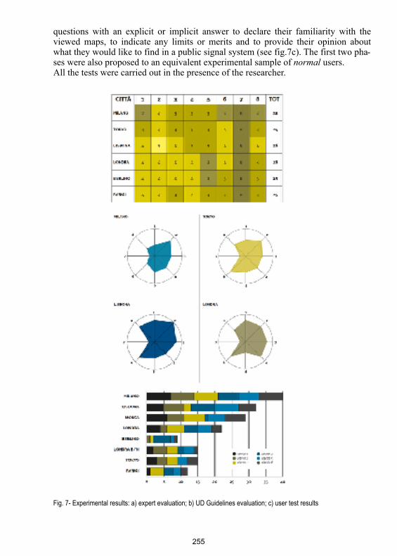
questions with an explicit or implicit answer to declare their familiarity with the viewed maps, to indicate any limits or merits and to provide their opinion about what they would like to find in a public signal system (see fig.7c). The first two pha-ses were also proposed to an equivalent experimental sample of normal users. All the tests were carried out in the presence of the researcher.
Fig. 7- Experimental results: a) expert evaluation; b) UD Guidelines evaluation; c) user test results
255
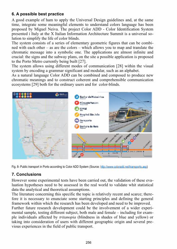
6. A possible best practiceA good example of ham to apply the Universal Design guidelines and, at the same time, integrate some meaningful elements to understand colors language has been proposed by Miguel Neiva. The project Color ADD - Color Identification System presented i Italy at the X Italian Information Architecture Summit is a universal so-lution to simplify the life of color blinds. The system consists of a series of elementary geometric figures that can be combi-ned with each other – as are the colors – which allows you to map and translate the chromatic message into a symbolic one. The applications are almost infinite and crucial: the signs and the subway plans, on the site a possible application is proposed to the Porto Metro currently being built [27]. The system allows using different modes of communication [28] within the visual system by encoding a grammar significant and modular, such as an alphabet. As a natural language Color ADD can be combined and composed to produce new chromatic meanings and to construct coherent and comprehensible communication ecosystems [29] both for the ordinary users and for color-blinds.
Fig. 8- Public transport in Porto according to Color ADD System (Source: http://www.coloradd.net/transports.asp)
7. ConclusionsHowever some experimental tests have been carried out, the validation of these eva-luation hypotheses need to be assessed in the real world to validate whit statistical data the analytical and theoretical assumptions. The literature concerning this specific the topic is relatively recent and scarce; there-fore it is necessary to enunciate some starting principles and defining the general framework within which the research has been developed and need to be improved. Further future research development could be the involvement of a wider experi-mental sample, testing different subject, both male and female – including for exam-ple individuals affected by tritanopia (blindness in shades of blue and yellow) or taking into consideration of users with different geographic origin and several pre-vious experiences in the field of public transport.
256

Nonetheless, the study opens new perspectives on the design activities that in vol public investment and user services
Acknowledges The author would like to thank Chiara Castelli for the iconographic research, the testing activities and mention her final degree dissertation “Daltonismo e accessibili-tà. Orientarsi nelle metropolitane”
Bibliography 1. J. Dalton, “Extraordinary facts relating to the vision of colours”, Cadell and Davins, 1794. http://
lhldigital.lindahall.org/cdm/ref/collection/color/id/55742. http://www.iapb.it/daltonismo3. http://www.colourblindawareness.org/4. L. Bollini, “Somewhere over the rainbow. Color blindness and user interface design: a critical review
in the era of digital ecosystems.”, in F. Valan and V. Marchiafava (Eds.). “Colour and Colorimetry.Multidisciplinary Contributions.” Vol. XIII B (p. 157-168) Gruppo del Colore, 2017
5. http://www.jiyounkim.com/project_html/project_unisignal.html6. R.L. Mace, “Designing for the 21st Century: An International Conference on Universal Design,”
June 19, 1998, Hofstra University, Hempstead, New York. 7. https://www.ncsu.edu/ncsu/design/cud/index.htm8. http://www.designforall.it/9. http://dfaeurope.eu/what-is-dfa/dfa-documents/the-eidd-stockholm-declaration-2004/10. R. Feo, R. Hurtado, Optimastudio, “Diseños para Todos/Designs for All”, Madrid, 2008. 11. https://www.w3.org/WAI/ 12. C. Stephanidis, (Ed.) “User Interfaces for All: Concepts, Methods, and Tools”, Lawrence Erlbaum
Associates, 2001. 13. https://www.w3.org/standards/webdesign/accessibility14. http://www.designkit.org/human-centered-design15. L. Bollini, L. Etica dell’accessibilità e design dell’interazione: Esperienze grafiche di transizione.
Progetto Grafico(8), 172-175, 200616. L. Bollini, “Etica progettata: New media e no profit” in M. Borsotti (Ed.), “Rosso. Fuoco, sangue,
passione.”, CLUP, Milano, 2005 17. L. Bollini and C. Branzaglia,, “No brand more profit, etica e comunicazione”, AIAP Edizioni, Mila-
no, 2003 18. L. Bollini, “I ‘manifesti’ coscienza etica della professione.” in L. Bollini and C. Branzaglia (Eds.),
“No brand more profit” (pp. 52-57), AIAP Edizioni, Milano, 200319. http://www.designishistory.com/1960/first-things-first/20. http://www.manifestoproject.it/adbusters/21. https://rosenfeldmedia.com/books/practical-empathy/22. http://travelsofadam.com/2013/08/london-underground-design/.23. S.C. Castelli, “Noorda, una leggenda metropolitana.” Politecnico di Milano, Milano, 2013 24. http://www.metrolisboa.pt/eng/ 25. J. Nielsen, “Web Usability”, Apogeo, Milano 2001 26. S. Krug, “Don’t make me think”, Tecniche Nuove, Milano, 200427. http://www.coloradd.net/transports.asp28. L. Bollini, “Multimodalità vs. Multimedialità”. Il Verri 16/2001, 144-14829. L. Bollini, “Large, small, medium. Progettare la comunicazione nell’ecosistema digitale”, Maggioli
Editore, 2016
257