Embed Size (px)
DESCRIPTION
flight statistics
Citation preview
BROOKINGS | October 2009 1
M E T R O P O L I TA N I N F R A ST R U C T U R E I N I T I AT I V E S E R I E S
Expect Delays: An Analysis of Air Travel Trends in the United StatesAdie Tomer and Robert Puentes
“ Increasing stress
on our air travel
system will
accompany the
return of eco-
nomic growth,
requiring future
infrastructure
investments to
target both the
large volume of
environmentally
and spatially
inefficient short
haul flights and
the country’s
critical 26 metro-
politan centers
of air traffic.”
Findings
An analysis at the national and metropolitan levels of commercial air travel patterns between
1990 and 2009 reveals that:
■ Air passenger travel in the United States experienced its first annualized drop in September 2008 since the tragedy of September 11, 2001, and the decline has contin-ued through March 2009. Strong economic growth helped American airports increase their
passenger and flight levels by over 60 percent from 1990 to 2008, tripling population growth. However, residents are traveling less since the current economic downturn, producing sustained reductions in passengers and flights since September 2008 and June 2008, respectively.
■ Nearly 99 percent of all U.S. air passengers arrive or depart from one of the 100 largest metropolitan areas, with the vast majority of travel concentrated in 26 metropolitan-wide hubs. Between April 2008 and March 2009, 26 metropolitan areas captured nearly three-quarters of all domestic travelers, while 20 of these metros landed 94 percent of all interna-tional passengers. These extreme shares make these metropolitan hubs the critical links in the nation’s aviation system and reinforce their role as major centers of tourism and commerce.
■ Half of the country’s flights are routes of less than 500 miles, and the busiest corri-dors are between the metropolitan air travel centers. Corridors of no more than 500 miles
constituted half of all flights and carried 30 percent of all passengers in the most recent twelve month period starting April 2008. In fact, the metro Los Angeles-San Francisco corridor, stretching 347 miles, is the second busiest corridor in the country.
■ The 26 metropolitan centers of air travel and other large metropolitan areas host a concentration of national delays—and the situation is worsening over time. The concentra-tion within the 100 largest metropolitan areas was especially troubling with congestion-related delays as well as those lasting over two hours. Within the 26 domestic hubs, six experienced worse-than-average delays for both arrivals and departures: New York, Chicago, Philadelphia, Miami, Atlanta, and San Francisco.
The current economic recession led carriers to reduce flights, which improved on-time perfor-mance. However, the return of economic growth will increase travelers, reduce on-time perfor-mance, and continue the hyper-concentration of U.S. air travel within major metropolitan areas and on short-haul flights. To ensure that the commercial aviation system runs efficiently while simultaneously improving its environmental record, policymakers must focus aviation and other transportation investments on the metropolitan centers and the heavily trafficked short corri-dors, thus strengthening the performance of the our nation’s major economic engines.

METROPOLITAN INFRASTRUCTURE INITIATIVE SERIES2
I. Introduction
Commercial aviation has captured travelers’ imaginations for decades. From the first non air-conditioned flights of the late 1920s to the supersonic speeds of the Concorde, the abil-ity to travel at unheard of speeds across continents and oceans simply made the world a
smaller place. And what initially began as a heavily regulated market with a suspect safety record morphed into a safe, comfortable, and heavily competitive industry.
Now three decades into the domestically deregulated market, travelers became big winners as real ticket prices have fallen dramatically.1 These lower prices opened up new parts of the country and
world to more and more travelers, making income and revenues less of a concern when purchasing tickets. These falling prices were especially helpful to businesses and general economic growth as they effectively shrunk metropolitan distances from one another. It is little wonder that passenger levels nearly tripled over these three decades.2
But all is not well in the sector. The same surging oil prices taxing commuters and truckers are also wreaking havoc on the airline industry as real jet fuel prices increased over 55 percent in three decades.3 The growing air travel industry also led to increased emissions, leaving more pollutants in flight paths and the areas surrounding airports.4 Equally troubling, all those passenger increases intensified congestion and air space pressures, depressing national on-time arrival performance to near-record lows.5
This brief looks beyond these dueling trends and assesses exactly where people are flying and just how often their flights take-off and land on-time.
Fortunately, these patterns and dynamics do not exist in a locational vacuum. Simply put, commer-cial air travel is primarily a metropolitan system based in airports located within metropolitan areas. Therefore, studying national air travel patterns is really another component of studying metropolitan
travel patterns. It also means that maximizing air travel performance is reliant on maximizing metro-politan performance.
First, we assess national travel trends over time, looking at passenger data alongside their flights’ on-time performance. We then disaggregate those national passenger statistics to uncover the specific metropolitan areas where the majority of that travel occurs, both as single entities and the corridors that connect them. The next section analyzes the on-time performance from the nation and its met-ropolitan areas, determining the primary sources of the nation’s delays. Finally, we synthesize these findings into a series of critical implications and implementable recommendations for policymakers.
II. Background: Why Are Air Travel Trends Important?
Almost one decade into the new century, travelers in the United States find themselves confronting difficulties everywhere they turn. Despite recent slowdowns in travel given the economic downturn, our metropolitan roadways are stuffed to the brim with vehicles, many of which are filled with single occupants. Transit systems from the largest to smallest metro-
politan areas are dealing with the dangerous combination of rising demand amid declining operating
budgets. Intermetropolitan passenger rail service faces similar demand increases from a much-her-alded American rail renaissance, but the nonexistent service between most metropolitan areas leaves these demands unfulfilled.
Much like those other travel modes, air travel faces its own batch of problems—and because of these problems U.S. metropolitan areas as a group are faced with substantial long-term challenges to com-petitiveness, sustainability, and inclusiveness.

BROOKINGS | October 2009 3
First, our nation’s airports are experiencing some of the longest arrival and departure delays in that mode’s nearly century-long history. In every year since 2000 at least 15 percent of flights have been delayed at least 15 minutes.6 Combined with many airports’ location on the metropolitan periphery
and the extended security requirements post-9/11, American air travel continues to take longer to get from start to finish.
The business of air travel is also in flux. Since 2000, seven major domestic airlines have either filed for bankruptcy protection or merged with competitors due to financial constraints.7 These finan-cial constraints also reduce the quality of the air travel experience; news stories abound showing increased traveler dissatisfaction with companies squeezing fewer amenities and more seats onto every flight.8 Of course, it’s hard to blame airlines for cutting amenities when the real price of jet fuel tripled from 2000 to 2008.9 Together with the recession’s effects, these factors contributed to 3.7 percent fewer domestic and international air passengers on U.S. airlines in 2008 than 2007.10
This was the first annual decrease since 2002 and is continuing into 2009.
One contributing factor to the delays is the demand for air travel due to limited modal competi-tion. Most areas of the country currently maintain only two modal alternatives for long distance, intermetropolitan area travel: drive or fly. Of course, there is a variable ceiling as to how far most people will drive to reach their destination while others simply do not own an automobile. So unless coach bus service or reliable and timely rail service exists, individuals must fly to reach a destination they’re unable to reach by car.
The federal government is aiming to address this problem through increased investments in inter-metropolitan area rail. While many countries in Europe and Asia built fast, reliable, and modern rail systems, the United States largely ignored this mode outside of the Northeast Corridor and Pacific Coast. The American Recovery and Reinvestment Act (ARRA) reversed that stance by committing $8 billion to high-speed rail investment. This was followed quickly by the president’s FY 2010 Budget, which includes an additional $5 billion request over five years.11 These investments will still take years to go on-line, leaving most travelers with their current alternatives for the foreseeable future.
The nation’s intermetropolitan travel challenges also generate negative consequences with regards
to pollution and inefficient use of infrastructure capacity.
Airplanes produce the most pollution during takeoff, initial ascent, and landing due to engine fuel needs versus cruising speeds.12 Thus, flights traveling shorter distances emit proportionally more pollution than many longer-distance flights. They also carry negative environmental impacts for the areas surrounding the airports, such as noise pollution and runoff concerns, all of which intensify along with airport volumes.13 Just as troubling, air travel is one of the largest per capita polluters per mile, edged out only by solo-driven SUVs and standard automobiles.14 The fact that these emissions
enter the atmosphere and affect the airplane’s entire route only intensifies the problem and makes creating a more environmentally-friendly and sustainable aviation system a true national concern.15
Short-haul flights also make inefficient use of airport and airspace capacity. Because many travelers have no modal alternatives to short intermetropolitan travel, the extra short-haul flights increase the stress on airports’ capacities: from the air traffic control systems, to the runways and terminal slots. Short-haul flights also cause congestion in high-volume airports’ airspace, which then require redesigns to mitigate the congestion. New York, Chicago, and Houston are all currently undertaking costly and lengthy redesigns of their airspaces.16
One investment designed to address airport congestion and weather-related problems is the imple-mentation of the Next Generation Air Transportation System, or NextGen. Beginning with initial work in 2001, NextGen’s main role is to replace the current radar-based air traffic control system with a satellite-based system. The system will also upgrade communications from voice to data and consoli-date weather-related information and assistance.17 However, there have been many hiccups dur-

METROPOLITAN INFRASTRUCTURE INITIATIVE SERIES4
ing the NextGen planning and implementation process and it is not expected to reach even midterm implementation until anywhere from 2012 to 2018.18 And with traffic levels predicted to double or triple by 2025, the clock is ticking to roll out the new system.19
In the meantime, the Federal Aviation Administration (FAA) must rely on its antiquated, radar-based air traffic control system. That system currently experiences more and longer unscheduled outages over time, while additional support systems indicate an increase in frequent system failures.20 These
inefficiencies come with a price tag to fix, too. The FAA projects that $268 million is needed to repair 400 existing terminal facilities.21 Clearly, the country needs investments for both the short- and long-term.
Conversely, air travel does maintain a series of structural advantages over competitive intermetropolitan travel modes. As any air traveler can attest, airplanes’ high speeds make it an attractive choice for traveling long distances. Air travel also has the modal advantage of producing a relatively small physical footprint on the ground. While air travel requires an airport and its associated ground infrastructure, rail and automobile travel require extensive on-the-ground rights-of-way to connect metropolitan areas.
These rapid travel times have also been a principal force in expanding the air travel in-dustry altogether, which spilled-over into the domestic economy, especially with respect to globalization.
Businesses operating in metropolitan areas on opposite coasts or in different countries
altogether now have less logistical difficulties to conduct face-to-face business. Main-taining strong aviation connections enhances interconnectedness and metropolitan ar-eas’ ability to expand their service employment.22 Researchers discovered that “airport
infrastructure expansions to enhance air traffic flows confer travel-time savings and reliability benefits, and thus increased worker productivity and shipping efficiency for manufacturing firms.”23 In another study of the United Kingdom high-tech manufactur-ing and financial services firms were found to rely heavily on air travel to conduct and grow their businesses.24
One of those particular spillover effects is the potential for increased commercial development sur-rounding these transportation hubs. Researchers found that expanded airline network activity in a metropolitan area has a net positive effect on metropolitan employment growth.25 For example, the Dulles Airport Toll Road corridor in metropolitan Washington, DC has grown from farmland with a rural roadway crossing in 1963 to a national commercial center with over 57.7 million square feet of office space in 2007.26 While Northern Virginia business development is not due solely to the opening of the airport, the area’s strategic location is critical for business growth.
In addition, falling ticket prices have improved the equity components of the marketplace. The mar-ket’s heavily competitive structure has led to falling airfares in real terms: the price to fly one mile has dropped from 8.29 cents in 1978 to 4.17 cents in 2008, a nearly 50 percent reduction.27 This increased
affordability means more Americans can utilize air travel, an equitable outcome that leads to improved connectivity for families and businesses alike.
Overall, the air travel industry maintains some clear advantages in comparison to other travel modes, and those advantages bestow incredible opportunities for businesses and pleasure travelers. However, there are also clear inefficiencies within that travel system, inefficiencies which lead to increased pol-lution and misdirected infrastructure investments. Due to this mixed bag, it is imperative that policy-makers have a firm understanding of the specific travel patterns and locational dynamics that aggre-gate to create our national air travel system.
“ Maintaining strong
aviation connections
enhances intercon-
nectedness and met-
ropolitan areas’ ability
to expand their service
employment.”
BROOKINGS | October 2009 5
III. Methodology
Relying on data provided by the United States Department of Transportation’s Bureau of Transportation Statistics (BTS), this report analyzes passenger metropolitan air travel from 1990 to 2009. The analysis requires the use of two distinct commercial aviation databases and a specific geographic methodology.
DatabasesThe first database is the monthly Air Carrier Statistics database for domestic and international carri-ers, known as the T-100 data bank.28 Within the T-100, we utilized two separate datasets to track pas-senger data and flight data: Market and Segment datasets. Depending on the specific analysis, we use both forms in this brief.
The T-100 Market dataset provides passenger data and includes all passenger volumes traveling be-tween two specific airports. The unique element of T-100 Market data is that it counts passengers based on their flight number. For example, consider a fictitious flight from New York to Miami with a stopover in Charlotte that maintains the same flight number for the entire trip. Any traveler deplaning in Char-lotte would be counted as traveling from New York to Charlotte, but any passenger deplaning in Miami would be counted as traveling from New York to Miami directly. This enables our passenger analysis to count every passenger when they exited a flight, creating a more complete picture of where passengers intend to travel but without minimizing the role of hub airports and their network connections.
The other dataset, the T-100 Segment dataset, provides complimentary flight data. T-100 Segment contains all specific flight information by departure and landing airport. So, using the same example as above, that single flight number from New York to Miami would actually be counted as two separate flights due to the stopover in Charlotte. The T-100 Segment database divides flights by departures scheduled and departures performed. The strength of this dataset is we could determine how many flights each airport’s traffic control system managed in a given time period, thereby reflecting the extra demands each airport faced based on the combination of its connecting and final destination passengers.
Both T-100 datasets indicate whether the passenger and flight data was commercial service or not, so we exclude all non-commercial service data from our analysis.
The other primary database is the Airline On-Time Performance database. This domestic-only dataset records the time-related statistics for all domestic operators with at least one percent of the domestic market. While this is a limited profile of flight data versus the two T-100 databases, its flight data still constituted 66.7 percent of the total United States commercial aviation market in 2008. Thus, this ‘sample size’ is representative and sufficiently large enough to consider it a proxy for delay times at national airports and metropolitan areas.29 However, due to incongruous flight data, we only utilize percentages when comparing On-Time data to T-100 data.
Spatial Data and Geographic ScopeThe other critical methodological element is the geographic analysis. Since all but the first finding tracks aviation data by metropolitan area, it required an aggregation of commercial airports up to their metropolitan locations.30 This aggregation lends this analysis a unique perspective on aviation
patterns by true population centers, rather than just the users of distinct airports.
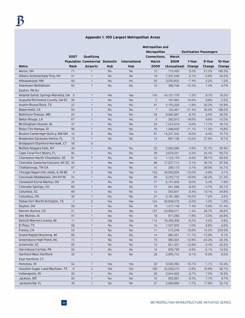
Our analysis uses the country’s 100 largest metropolitan areas as the geographic scope. The 100 larg-est metropolitan areas are defined by the Brookings Metro Program based on updated 2007 Census population estimates. We calculate these 100 metropolitan areas’ air travel by aggregating their air travel statistics from their qualifying airports. We define qualifying commercial service based on three conditions: the airport maintains scheduled intermetropolitan passenger service throughout 2008; the airport is used for regular intermetro passenger service, excluding certain locations such as helipads;
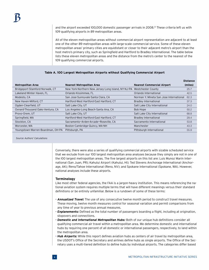
METROPOLITAN INFRASTRUCTURE INITIATIVE SERIES6
and the airport exceeded 100,000 domestic passenger arrivals in 2008.31 These criteria left us with
109 qualifying airports in 89 metropolitan areas.
All of the eleven metropolitan areas without commercial airport representation are adjacent to at least
one of the other 89 metropolitan areas with large-scale commercial service. Some of these eleven metropolitan areas’ primary cities are equidistant or closer to their adjacent metro’s airport than the
host metro’s primary city, such as Springfield and Hartford to Bradley International. The table below lists these eleven metropolitan areas and the distance from the metro’s center to the nearest of the
109 qualifying commercial airports.
Table A. 100 Largest Metropolitan Airports without Qualifying Commercial Airport
Distance
Metropolitan Area Nearest Metropolitan Area Nearest Commercial Airport (miles)
Bridgeport-Stamford-Norwalk, CT New York-Northern New Jersey-Long Island, NY-NJ-PA Westchester County 25.7
Lakeland-Winter Haven, FL Orlando-Kissimmee, FL Orlando International 42.5
Modesto, CA San Jose-Sunnyvale-Santa Clara, CA Norman Y. Mineta San Jose International 62.3
New Haven-Milford, CT Hartford-West Hartford-East Hartford, CT Bradley International 37.3
Ogden-Clearfield, UT Salt Lake City, UT Salt Lake City International 24.0
Oxnard-Thousand Oaks-Ventura, CA Los Angeles-Long Beach-Santa Ana, CA Bob Hope 50.2
Provo-Orem, UT Salt Lake City, UT Salt Lake City International 68.8
Springfield, MA Hartford-West Hartford-East Hartford, CT Bradley International 29.4
Stockton, CA Sacramento—Arden-Arcade—Roseville, CA Sacramento International 53.8
Worcester, MA Boston-Cambridge-Quincy, MA-NH Manchester 43.3
Youngstown-Warren-Boardman, OH-PA Pittsburgh, PA Pittsburgh International 55.9
Source: Authors’ Calculations
Conversely, there were also a series of qualifying commercial airports with sizable scheduled service that we exclude from our 100 largest metropolitan area analyses because they simply are not in one of the l00 largest metropolitan areas. The five largest airports on this list are: Luis Munoz Marin Inter-national (San Juan, PR); Kahului Airport (Kahului, HI); Ted Stevens Anchorage International (Anchor-age, AK); Reno/Tahoe International (Reno, NV); and Spokane International (Spokane, WA). However, national analyses include these airports.
TerminologyLike most other federal agencies, the FAA is a jargon-heavy institution. This means referencing the na-tional aviation system requires multiple terms that will have different meanings versus their standard
definitions or be entirely unfamiliar. Below is a rundown of some of these terms:
• Annualized Travel: The use of any consecutive twelve month period to construct travel measures. These moving, twelve month measures control for seasonal variation and permit comparisons from any time of year to previous annual measures.
• Enplanements: Defined as the total number of passengers boarding a flight, including at origination, stopovers and connections.
• Domestic and International Metropolitan Hubs: Both of our unique hub definitions consider all qualifying commercial air travel within a metropolitan area. We determine domestic and international hubs by requiring one percent of all domestic or international passengers, respectively, to land within the metropolitan area.
• Hub Airports: While this report defines aviation hubs as centers of air travel by metropolitan area, the USDOT’s Office of the Secretary and airlines define hubs as single airports. The Office of the Sec-retary uses a multi-tiered definition to define hubs by individual airports. The categories differ based
BROOKINGS | October 2009 7
80.0%
70.0%
60.0%
50.0%
40.0%
30.0%
20.0%
10.0%
0.0%
-10.0%
1990
1991
1992
1993
1994
1995
1996
1997
1998
199920
00 2001
2002
2003
2004
2005
2006
2007
2008
Passengers
Real GDP
Population
on passenger levels. There is also the concept of airline hub airports, which refer to the locations for centralized operations of specific airline firms. An example is Delta Airlines and Atlanta’s Hartsfield Jackson Airport. We do not use either USDOT’s or airlines’ version of hub airports in this report.
• Corridor: The total travel between any two metropolitan areas. • Regular Service: We define regular service between two metropolitan areas as averaging more than
2 flights per week in each direction of a corridor.• Delayed Arrivals: The FAA considers a flight delayed if the flight either lands fifteen minutes late
at its destination, takes off fifteen late from its origin, is diverted to another arrival airport, or is cancelled altogether.
• On-Time Arrival Rate: The number of non-delayed flights landing divided by the total number of flights.
• Weather-Related Delays: The FAA differentiates between “extreme weather delays” and “national air system (NAS)-related weather delays.” Extreme weather delays are due to extreme or hazardous weather conditions. NAS-related weather delays result from non-extreme weather that impair the National Airspace System but still permit flight. A regional blizzard would qualify as an extreme weather delay while high wind gusts at one airport would be classified as a NAS-related weather delay.
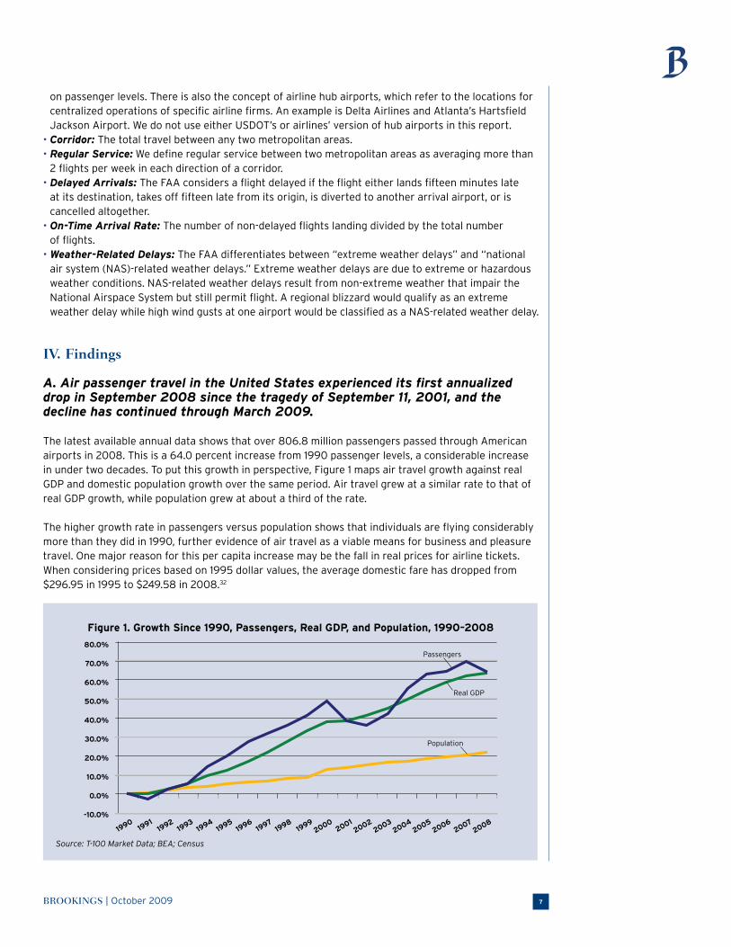
IV. Findings
A. Air passenger travel in the United States experienced its first annualized
drop in September 2008 since the tragedy of September 11, 2001, and the decline has continued through March 2009.
The latest available annual data shows that over 806.8 million passengers passed through American airports in 2008. This is a 64.0 percent increase from 1990 passenger levels, a considerable increase in under two decades. To put this growth in perspective, Figure 1 maps air travel growth against real GDP and domestic population growth over the same period. Air travel grew at a similar rate to that of real GDP growth, while population grew at about a third of the rate.
The higher growth rate in passengers versus population shows that individuals are flying considerably more than they did in 1990, further evidence of air travel as a viable means for business and pleasure travel. One major reason for this per capita increase may be the fall in real prices for airline tickets. When considering prices based on 1995 dollar values, the average domestic fare has dropped from $296.95 in 1995 to $249.58 in 2008.32
Figure 1. Growth Since 1990, Passengers, Real GDP, and Population, 1990–2008
Source: T-100 Market Data; BEA; Census
METROPOLITAN INFRASTRUCTURE INITIATIVE SERIES8
12
10
8
6
4
2
0
1,200
1,000
800
600
400
200
0
19901991
19921993
19941995
19961997
19981999
20002001
20022003
20042005
20062007
2008
Departures
Passengers
Flig
hts
(Mill
ions
)
Pas
seng
ers
(Mill
ions
)
While passenger growth was strong when compared to 1990, the 2008 passenger level was actually a 3.5 percentage decrease from 2007 passenger totals. This was the first annual decrease in passenger totals since the post-September 11, 2001 drop in air travel and only the third annual drop since the early 1990s recession.
Even more troubling is that preliminary 2009 numbers suggest the drop is intensifying. Combined domestic and international numbers are now available through March 2009 and they show a sustained
drop in annualized passenger levels. As it currently stands, March 2009’s annualized passenger levels were down 6.3 percent from the annualized numbers in March 2008. Excluding the declines after 9/11, this is the largest year-over-year drop since 1990.
In addition to the combined domestic and international numbers, domestic figures through June 2009 are also available.33 Extending the analysis by these three additional months reveals an even larger drop. The year-over-year drop from June 2009 annualized numbers compared to June 2008 was 7.9 percent. Again, this was the largest drop since 1990 save for post-9/11.
There is no doubt that the air travel downturn is due in large part to the nation’s larger economic
troubles. Similar decreases occurred in previous recessions, such as the early 1980s, 1990s, and 2000s.34 When economic growth is not strong, households and companies both tend to increase their thriftiness by trimming their budgets and decreasing their consumption. Air travel, like other services, is susceptible to such cuts in personal and business spending.35
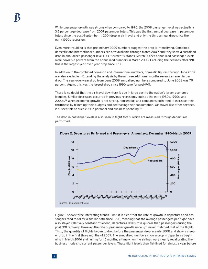
The drop in passenger levels is also seen in flight totals, which are measured through departures performed.
Figure 2. Departures Performed and Passengers, Annualized, December 1990–March 2009
Source: T-100 Segment Data
Figure 2 shows three interesting trends. First, it is clear that the rate of growth in departures and pas-sengers tend to follow a similar path since 1990, meaning that the average passengers per flight have also stayed relatively constant.36 Second, departures levels rose quicker than passengers during the post-9/11 recovery. However, the rate of passenger growth since 9/11 never matched that of the flights. Third, the quantity of flights began to drop before the passenger drop in early 2008 and show a steep-er drop in the first three months of 2009. The annualized numbers show a drop in departures begin-ning in March 2006 and lasting for 15 months, a time when the airlines were clearly recalibrating their business models to current passenger levels. These flight levels then flat-lined for almost a year before

BROOKINGS | October 2009 9
the drop resumed in late 2007 and continued through March 2009. Just like the passenger numbers, the domestic-only numbers through June 2009 display a sustained drop in departures performed.
B. Nearly 99 percent of all U.S. air passengers arrive or depart from one of the 100 largest metropolitan areas, with the vast majority of travel concentrated in 26 metropolitan-wide hubs.
Based on annualized passenger statistics from March 2009, 69.0 percent of all air travelers in the United States traveled exclusively between the 100 largest metropolitan areas. Another 29.9 percent of passengers traveled through one of the 100 largest metropolitan areas at some point in their trip. In sum, 98.8 percent of all passengers in the most recent twelve months passed through at least one of the nation’s 100 largest metropolitan areas. In the U.S., air travel is clearly a large metropolitan phenomenon.
Just as the largest metropolitan areas’ share outperform their per capita share of national economic production, they do the same when it comes to air travel.37 The 100 largest metropolitan areas are
the destinations for 83.9 percent of all air travelers, despite containing 63.6 percent of the national population (Table 1). In fact, every subgrouping of the 100 largest metros displays air travel shares that outpace their population shares. The most extreme of these differences is from the 50 largest metros.
Table 1. Destination Passengers, Annualized, March 2009, and Population, 2008 Estimates
Geography Passengers Share of National Population Share of National
National 786,722,279 100.0% 301,290,332 100.0%
Outside 100 Largest Metros 126,504,504 16.1% 109,522,863 36.4%
100 Largest Metros 660,217,775 83.9% 191,767,469 63.6%
50 Largest Metros 615,364,232 78.2% 164,314,470 54.5%
25 Largest Metros 479,523,532 61.0% 126,208,906 41.9%
10 Largest Metros 306,030,667 38.9% 79,987,895 26.5%
5 Largest Metros 175,783,911 22.3% 53,587,707 17.8%
Source: T-100 Market Data (Passengers) and Census (Population)
Of course, the primary reason for this concentration is the role of metropolitan areas as domestic and international hubs. Research suggests that the country’s commercial aviation system operates within a hub-and-spoke system: higher numbers of smaller capacity flights from smaller airports feed into larger airports that send limited, large volume flights out to other hubs.38 The question is how to as-sess which metropolitan areas are the hubs.
First, we determined that any domestic hub must be the destination of at least one percent of all domestic passengers over the most recent 12-month period.39 We excluded international passengers to isolate the determinations for both domestic and international hubs.
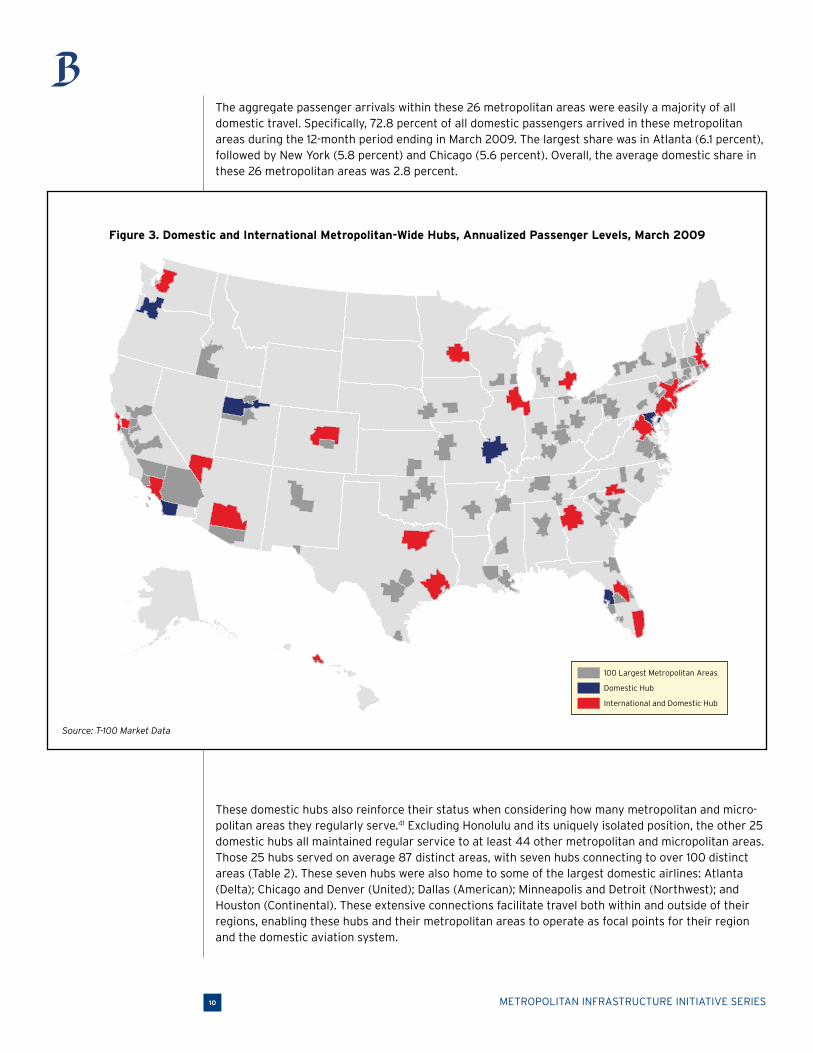
Based on this criterion, 26 metropolitan areas containing 43 commercial airports qualified as domestic hubs in March 2009 (Figure 3). These metropolitan areas cover every corner of the country, from the elder giants of the northeast, to centralized depots in the Midwest, to the Pacific gateways. These 26 metropolitan areas are also leading economic centers: they produce 50.6 percent of America’s GDP and do so with only 40.5 percent of the nation’s population.40 [See Appendix 2 for the full list of the 26 metropolitan centers of air travel.]
METROPOLITAN INFRASTRUCTURE INITIATIVE SERIES10
The aggregate passenger arrivals within these 26 metropolitan areas were easily a majority of all domestic travel. Specifically, 72.8 percent of all domestic passengers arrived in these metropolitan areas during the 12-month period ending in March 2009. The largest share was in Atlanta (6.1 percent), followed by New York (5.8 percent) and Chicago (5.6 percent). Overall, the average domestic share in these 26 metropolitan areas was 2.8 percent.
100 Largest Metropolitan Areas
Domestic Hub
International and Domestic Hub
Figure 3. Domestic and International Metropolitan-Wide Hubs, Annualized Passenger Levels, March 2009
Source: T-100 Market Data
These domestic hubs also reinforce their status when considering how many metropolitan and micro-politan areas they regularly serve.41 Excluding Honolulu and its uniquely isolated position, the other 25 domestic hubs all maintained regular service to at least 44 other metropolitan and micropolitan areas. Those 25 hubs served on average 87 distinct areas, with seven hubs connecting to over 100 distinct areas (Table 2). These seven hubs were also home to some of the largest domestic airlines: Atlanta (Delta); Chicago and Denver (United); Dallas (American); Minneapolis and Detroit (Northwest); and Houston (Continental). These extensive connections facilitate travel both within and outside of their regions, enabling these hubs and their metropolitan areas to operate as focal points for their region and the domestic aviation system.

BROOKINGS | October 2009 11
Table 2. Top 10 Metros by Metropolitan and Micropolitan Area Connections, Annualized, March 2009
Hub Connections
Atlanta-Sandy Springs-Marietta, GA 145
Chicago-Naperville-Joliet, IL-IN-WI 133
Denver-Aurora, CO 127
Dallas-Fort Worth-Arlington, TX 124
Minneapolis-St. Paul-Bloomington, MN-WI 122
Detroit-Warren-Livonia, MI 114
Houston-Sugar Land-Baytown, TX 109
Charlotte-Gastonia-Concord, NC-SC 98
Las Vegas-Paradise, NV 97
New York-Northern New Jersey-Long Island, NY-NJ-PA 96
Source: T-100 Segment Data
Like domestic hubs, international hubs form the backbone of the entire United States air travel net-work, while also serving as global gateways into and out of that network. To assess these hubs, we used a similar criterion as that of the domestic hubs: the metropolitan area must be the destination
for at least one percent of all international passengers over the most recent twelve-month period.
Based on this one-percent rule, 20 metropolitan areas—with 29 of their commercial airports—qualified as international hubs in March 2009.42 All 20 international hubs are also categorized as domestic hubs—cementing these metropolitan areas’ statuses as true aviation gateways both into and within the country.
The 20 international hubs were the destination for 93.6 percent of all international passengers, while the ten largest alone make up 76.2 percent of all international passengers. The largest of these metropolitan shares easily belonged to New York (21.8 percent), followed by Miami (11.9 percent) and Los Angeles (10.0 percent).
C. Half of the country’s flights are routes of less than 500 miles, and the busi-est corridors are between the metropolitan air travel centers.
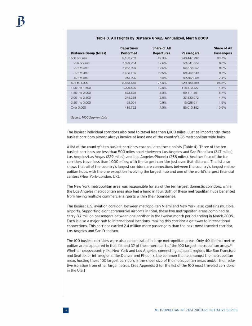
Based on the most recent twelve month period, the most common flights by distance are routes of less than 500 miles. Table 3 shows that, by far, the most popular departures group is flights of 500 miles or less, which make up almost half of all flights. Flights 501 to 1,000 miles long contribute an-other 27.6 percent. Passenger trends also show the dominance of sub-500 mile flights, which carry 30.7 percent of all passengers.
Meanwhile, other than the sub-500 mile group, every other distance category’s share of national passengers exceeds its share of national flights. This demonstrates the hub-and-spoke design to our air travel network—higher numbers of shorter-distance flights carry fewer passengers, which then feed into and support the limited and longer-distance hub connections carrying larger quantities of passengers.
METROPOLITAN INFRASTRUCTURE INITIATIVE SERIES12
Table 3. All Flights by Distance Group, Annualized, March 2009
Departures Share of All Share of All
Distance Group (Miles) Performed Departures Passengers Passengers
500 or Less 5,132,752 49.3% 246,447,292 30.7%
200 or Less 1,829,254 17.6% 53,341,524 6.6%
201 to 300 1,252,009 12.0% 64,574,057 8.0%
301 to 400 1,138,489 10.9% 68,964,643 8.6%
401 to 500 913,000 8.8% 59,567,068 7.4%
501 to 1,000 2,873,645 27.6% 229,780,509 28.6%
1,001 to 1,500 1,099,800 10.6% 118,870,327 14.8%
1,501 to 2,000 523,895 5.0% 69,411,561 8.7%
2,001 to 2,500 274,238 2.6% 37,830,072 4.7%
2,501 to 3,000 98,004 0.9% 15,028,611 1.9%
Over 3,000 415,762 4.0% 85,010,152 10.6%
Source: T-100 Segment Data
The busiest individual corridors also tend to travel less than 1,000 miles. Just as importantly, these busiest corridors almost always involve at least one of the country’s 26 metropolitan-wide hubs.
A list of the country’s ten busiest corridors encapsulates these points (Table 4). Three of the ten busiest corridors are less than 500 miles apart—between Los Angeles and San Francisco (347 miles), Los Angeles-Las Vegas (229 miles), and Los Angeles-Phoenix (358 miles). Another four of the ten corridors travel less than 1,000 miles, with the largest corridor just over that distance. The list also shows that all of the country’s largest corridors are connections between the country’s largest metro-politan hubs, with the one exception involving the largest hub and one of the world’s largest financial centers (New York–London, UK).
The New York metropolitan area was responsible for six of the ten largest domestic corridors, while the Los Angeles metropolitan area also had a hand in four. Both of these metropolitan hubs benefited from having multiple commercial airports within their boundaries.
The busiest U.S. aviation corridor—between metropolitan Miami and New York—also contains multiple airports. Supporting eight commercial airports in total, these two metropolitan areas combined to carry 8.7 million passengers between one another in the twelve-month period ending in March 2009. Each is also a major hub to international locations, making this corridor a gateway to international connections. This corridor carried 2.4 million more passengers than the next most-traveled corridor, Los Angeles and San Francisco.
The 100 busiest corridors were also concentrated in large metropolitan areas. Only 40 distinct metro-politan areas appeared in that list and 32 of those were part of the 100 largest metropolitan areas.43
Whether cross-country like New York and Los Angeles, connecting adjacent regions like San Francisco and Seattle, or intraregional like Denver and Phoenix, the common theme amongst the metropolitan areas hosting these 100 largest corridors is the sheer size of the metropolitan areas and/or their rela-tive isolation from other large metros. [See Appendix 3 for the list of the 100 most traveled corridors in the U.S.]
BROOKINGS | October 2009 13
Table 4. Top 10 Air Corridors, Annualized, March 2009 Change
Metro 1 Metro 2 Distance Passengers 1-Year 5-Year 10-Year
Miami-Fort Lauderdale- New York-Northern New Jersey- 1,067 8,748,534 -6.2% 9.4% 30.5%
Miami Beach, FL Long Island, NY-NJ-PA
Los Angeles-Long Beach-Santa Ana, CA San Francisco-Oakland-Fremont, CA 347 6,306,638 -8.3% 3.0% -17.7%
Atlanta-Sandy Springs-Marietta, GA Miami-Fort Lauderdale-Miami Beach, FL 574 5,045,415 1.7% 1.9% 10.5%
Chicago-Naperville-Joliet, IL-IN-WI New York-Northern New Jersey- 733 4,705,007 -17.1% -5.4% -3.7%
Long Island, NY-NJ-PA
Atlanta-Sandy Springs-Marietta, GA New York-Northern New Jersey- 768 4,544,176 -4.7% 4.6% 14.5%
Long Island, NY-NJ-PA
Los Angeles-Long Beach- New York-Northern New Jersey- 2,458 4,355,755 -0.7% 10.5% 14.0%
Santa Ana, CA Long Island, NY-NJ-PA
New York-Northern New Jersey- Orlando-Kissimmee, FL 955 4,032,427 -8.0% 15.2% 39.0%
Long Island, NY-NJ-PA
New York-Northern New Jersey- London, United Kingdom 3,468 3,881,558 13.1% 2.7% 0.7%
Long Island, NY-NJ-PA
Las Vegas-Paradise, NV Los Angeles-Long Beach-Santa Ana, CA 229 3,733,037 -13.4% -5.4% -16.5%
Los Angeles-Long Beach-Santa Ana, CA Phoenix-Mesa-Scottsdale, AZ 358 3,434,874 -13.0% -9.3% -10.4%
Source: T-100 Segment Data
66%
68%
70%
72%
74%
76%
78%
80%
82%
84%
86%
19901991
19921993
19941995
19961997
19981999
20002001
20022003
20042005
20062007
2008
On
-Tim
e P
erce
nta
ge
300
350
400
450
500
550
600
650
700
750
800
Pas
sen
gers
(M
illio
ns)
Flights On-Time
Domestic Passengers
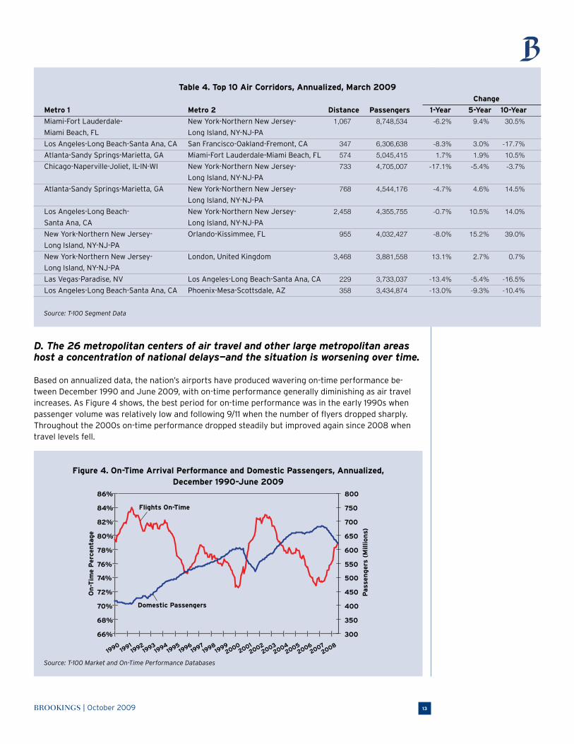
D. The 26 metropolitan centers of air travel and other large metropolitan areas host a concentration of national delays—and the situation is worsening over time.
Based on annualized data, the nation’s airports have produced wavering on-time performance be-tween December 1990 and June 2009, with on-time performance generally diminishing as air travel increases. As Figure 4 shows, the best period for on-time performance was in the early 1990s when passenger volume was relatively low and following 9/11 when the number of flyers dropped sharply. Throughout the 2000s on-time performance dropped steadily but improved again since 2008 when travel levels fell.
Figure 4. On-Time Arrival Performance and Domestic Passengers, Annualized, December 1990–June 2009
Source: T-100 Market and On-Time Performance Databases
METROPOLITAN INFRASTRUCTURE INITIATIVE SERIES14
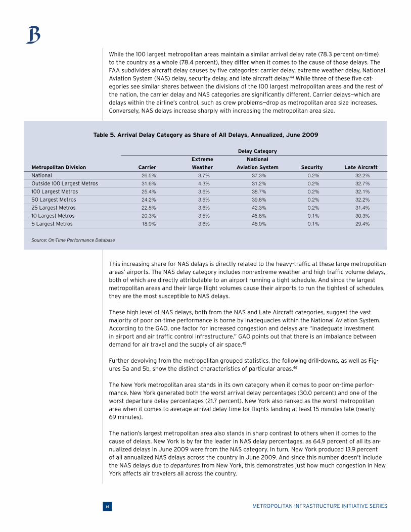
While the 100 largest metropolitan areas maintain a similar arrival delay rate (78.3 percent on-time) to the country as a whole (78.4 percent), they differ when it comes to the cause of those delays. The FAA subdivides aircraft delay causes by five categories: carrier delay, extreme weather delay, National Aviation System (NAS) delay, security delay, and late aircraft delay.44 While three of these five cat-egories see similar shares between the divisions of the 100 largest metropolitan areas and the rest of
the nation, the carrier delay and NAS categories are significantly different. Carrier delays—which are delays within the airline’s control, such as crew problems—drop as metropolitan area size increases. Conversely, NAS delays increase sharply with increasing the metropolitan area size.
Table 5. Arrival Delay Category as Share of All Delays, Annualized, June 2009
Delay Category
Extreme National
Metropolitan Division Carrier Weather Aviation System Security Late Aircraft
National 26.5% 3.7% 37.3% 0.2% 32.2%
Outside 100 Largest Metros 31.6% 4.3% 31.2% 0.2% 32.7%
100 Largest Metros 25.4% 3.6% 38.7% 0.2% 32.1%
50 Largest Metros 24.2% 3.5% 39.8% 0.2% 32.2%
25 Largest Metros 22.5% 3.6% 42.3% 0.2% 31.4%
10 Largest Metros 20.3% 3.5% 45.8% 0.1% 30.3%
5 Largest Metros 18.9% 3.6% 48.0% 0.1% 29.4%
Source: On-Time Performance Database
This increasing share for NAS delays is directly related to the heavy-traffic at these large metropolitan areas’ airports. The NAS delay category includes non-extreme weather and high traffic volume delays, both of which are directly attributable to an airport running a tight schedule. And since the largest metropolitan areas and their large flight volumes cause their airports to run the tightest of schedules, they are the most susceptible to NAS delays.
These high level of NAS delays, both from the NAS and Late Aircraft categories, suggest the vast majority of poor on-time performance is borne by inadequacies within the National Aviation System. According to the GAO, one factor for increased congestion and delays are “inadequate investment in airport and air traffic control infrastructure.” GAO points out that there is an imbalance between demand for air travel and the supply of air space.45
Further devolving from the metropolitan grouped statistics, the following drill-downs, as well as Fig-ures 5a and 5b, show the distinct characteristics of particular areas.46
The New York metropolitan area stands in its own category when it comes to poor on-time perfor-mance. New York generated both the worst arrival delay percentages (30.0 percent) and one of the worst departure delay percentages (21.7 percent). New York also ranked as the worst metropolitan area when it comes to average arrival delay time for flights landing at least 15 minutes late (nearly 69 minutes).
The nation’s largest metropolitan area also stands in sharp contrast to others when it comes to the
cause of delays. New York is by far the leader in NAS delay percentages, as 64.9 percent of all its an-nualized delays in June 2009 were from the NAS category. In turn, New York produced 13.9 percent of all annualized NAS delays across the country in June 2009. And since this number doesn’t include the NAS delays due to departures from New York, this demonstrates just how much congestion in New York affects air travelers all across the country.
BROOKINGS | October 2009 15
Figure 5b. Departure Delay Rankings by Metro, Annualized, June 2009
Source: On-Time Performance Database
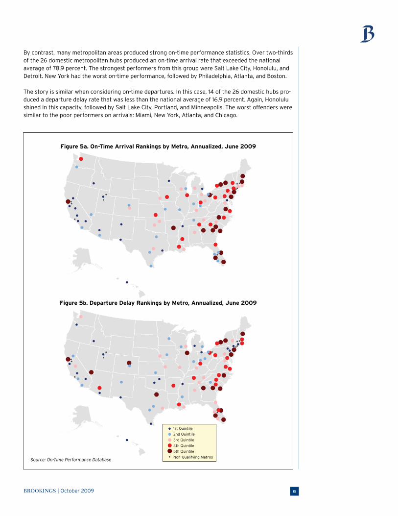
By contrast, many metropolitan areas produced strong on-time performance statistics. Over two-thirds of the 26 domestic metropolitan hubs produced an on-time arrival rate that exceeded the national average of 78.9 percent. The strongest performers from this group were Salt Lake City, Honolulu, and Detroit. New York had the worst on-time performance, followed by Philadelphia, Atlanta, and Boston.
The story is similar when considering on-time departures. In this case, 14 of the 26 domestic hubs pro-duced a departure delay rate that was less than the national average of 16.9 percent. Again, Honolulu shined in this capacity, followed by Salt Lake City, Portland, and Minneapolis. The worst offenders were similar to the poor performers on arrivals: Miami, New York, Atlanta, and Chicago.
1st Quintile
2nd Quintile
3rd Quintile
4th Quintile
5th Quintile
Non-Qualifying Metros
Figure 5a. On-Time Arrival Rankings by Metro, Annualized, June 2009
METROPOLITAN INFRASTRUCTURE INITIATIVE SERIES16
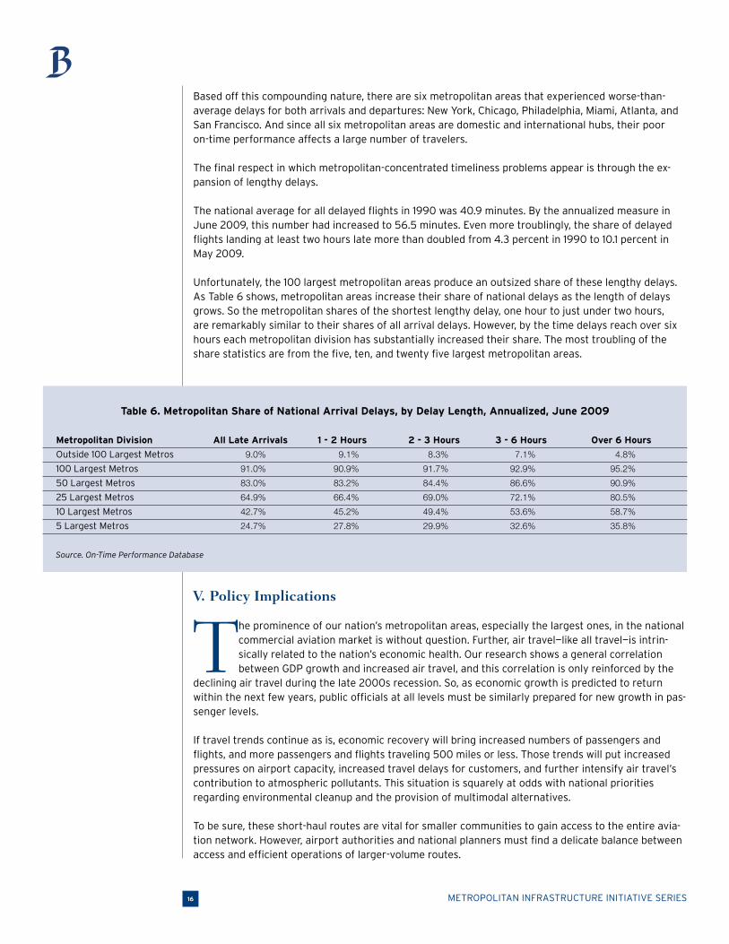
Based off this compounding nature, there are six metropolitan areas that experienced worse-than-average delays for both arrivals and departures: New York, Chicago, Philadelphia, Miami, Atlanta, and San Francisco. And since all six metropolitan areas are domestic and international hubs, their poor on-time performance affects a large number of travelers.
The final respect in which metropolitan-concentrated timeliness problems appear is through the ex-pansion of lengthy delays.
The national average for all delayed flights in 1990 was 40.9 minutes. By the annualized measure in June 2009, this number had increased to 56.5 minutes. Even more troublingly, the share of delayed flights landing at least two hours late more than doubled from 4.3 percent in 1990 to 10.1 percent in May 2009.
Unfortunately, the 100 largest metropolitan areas produce an outsized share of these lengthy delays. As Table 6 shows, metropolitan areas increase their share of national delays as the length of delays grows. So the metropolitan shares of the shortest lengthy delay, one hour to just under two hours, are remarkably similar to their shares of all arrival delays. However, by the time delays reach over six hours each metropolitan division has substantially increased their share. The most troubling of the share statistics are from the five, ten, and twenty five largest metropolitan areas.
Table 6. Metropolitan Share of National Arrival Delays, by Delay Length, Annualized, June 2009
Metropolitan Division All Late Arrivals 1 - 2 Hours 2 - 3 Hours 3 - 6 Hours Over 6 Hours
Outside 100 Largest Metros 9.0% 9.1% 8.3% 7.1% 4.8%
100 Largest Metros 91.0% 90.9% 91.7% 92.9% 95.2%
50 Largest Metros 83.0% 83.2% 84.4% 86.6% 90.9%
25 Largest Metros 64.9% 66.4% 69.0% 72.1% 80.5%
10 Largest Metros 42.7% 45.2% 49.4% 53.6% 58.7%
5 Largest Metros 24.7% 27.8% 29.9% 32.6% 35.8%
Source. On-Time Performance Database
V. Policy Implications
The prominence of our nation’s metropolitan areas, especially the largest ones, in the national commercial aviation market is without question. Further, air travel—like all travel—is intrin-sically related to the nation’s economic health. Our research shows a general correlation between GDP growth and increased air travel, and this correlation is only reinforced by the
declining air travel during the late 2000s recession. So, as economic growth is predicted to return within the next few years, public officials at all levels must be similarly prepared for new growth in pas-senger levels.
If travel trends continue as is, economic recovery will bring increased numbers of passengers and flights, and more passengers and flights traveling 500 miles or less. Those trends will put increased pressures on airport capacity, increased travel delays for customers, and further intensify air travel’s contribution to atmospheric pollutants. This situation is squarely at odds with national priorities regarding environmental cleanup and the provision of multimodal alternatives.
To be sure, these short-haul routes are vital for smaller communities to gain access to the entire avia-tion network. However, airport authorities and national planners must find a delicate balance between access and efficient operations of larger-volume routes.
BROOKINGS | October 2009 17
Recognizing these complexities, it is important to note that these broad-based aviation trends do expose problems with current aviation and transportation policies.
Currently policies are out of sync with the primary sources of our nation’s passengers and delays—the largest metropolitan areas
If the nation’s air travel network is a metropolitan network, then it is these hubs that fuel—and slow—the entire system. But contrary to the metropolitan primacy implicit in these numbers, federal aviation policy does little to recognize these specific metropolitan areas and their airports that are so critical to our national performance.
The most recent federal investment, $1.3 billion in the American Recovery and Reinvestment Act (ARRA), provided only 19.9 percent of total funding to these 26 metropolitan areas and their com-mercial service airports.47 The result: of the $2.6 billion investment through the Airport Improvement Program (AIP) in fiscal year 2009, only 21.8 percent went to these 26 metropolitan areas.48 Even if we
extend these FY 2009 grants to all of the 100 largest metropolitan areas, the total share only increas-es to 37.1 percent. These small shares are dwarfed by the hubs’ share (72.8 percent) and 100 largest metropolitan areas’ share (83.9 percent) of passenger levels.
Equally troubling is that many of the airports awarded funding should not have qualified due to inadequate credentials, specifically poor economic credentials and history of grant management problems.49 Sending a majority of this federal funding to airports that constitute a small minority of all
passenger trips only serves to intensify the congestion-related pressures the country’s aviation system already experiences.50
These ARRA and AIP funds, alongside the annual subsidies from the Essential Air Service (EAS) pro-gram, ensure that more locations are reachable via air travel, irrespective of their local financing and market demand. Moreover, the EAS program’s design of filtering passengers from smaller communities to the country’s largest metropolitan airports ensures these citizens may reach destinations all over the country and world.
However, the EAS program has some faults. The continued urbanization of regions all over the country and competitive pricing due to expanding low-cost carriers have enticed many smaller community residents to simply bypass their airports and drive to regional hubs.51 Similarly, the program’s require-ments for service and aircraft size hinder the carriers’ financial viability.52 This, plus the realities of airline consolidation, led the number of carriers participating in the EAS to decrease from 14 in 1998 to just 10 today.53
Reforming the EAS will require finding the right balance between providing equitable access to smaller and remote towns while enhancing efficiency and performance within large metropolitan areas.
The FAA also permits larger airports to collect their own revenue via the Passenger Facility Charge
(PFC) Program. The program permits airports to levy a maximum charge of $4.50 per arriving passen-ger, which may then be invested back into the airport towards FAA-approved projects.54 This
direct correlation between passenger levels and investment funding is certainly a boon to the nation’s
busier airports, but the charges’ potential impact is limited for two major reasons. First, the charge of $4.50 relative to airport ticket fees is not intended to affect passengers’ mode and travel choices. Second, their collective revenue generation doesn’t do nearly enough to cover both the airport’s oper-ating and long-term investment costs. The most-used passenger airports need to be empowered with the ability to meet their larger-than-average congestion and investment costs without federal imposi-tions or caps.

METROPOLITAN INFRASTRUCTURE INITIATIVE SERIES18
Continued growth in short-haul air travel (500 miles or less) presents logistical, economic, and
environmental challenges
While there are infrastructure problems that need to be addressed when air travel rebounds, such growth would present many benefits. Airline health is likely to improve thru increased revenues, which would help offset surging gas prices. Air travel is also a vital element to connect metropolitan areas all over the country and world, and more passengers will signal that the interconnectedness vital to global economic growth is expanding.
On the flip side, overall passenger growth is sure to indicate growth in the short-haul market—meaning more flights of less than 500 miles will take to the skies.
These sub-500 mile routes are a relative problem for several reasons. First, they place logistical stress-es on our limited airport infrastructure. While traveling between Atlantic and Pacific coasts may only be reasonably done via airplane, this is not the case when traveling over land at distances of 500 miles or less. Unfortunately, the relative lack of investment in alternative modes leaves consumers with mini-mal choices along such corridors. This places stresses on airport infrastructure as they supply capacity and personnel for all flights, irrespective of distance. Thus, we found that the ten metropolitan areas generating the largest shares of flights traveling less than 500 miles were also the source of 42.2 percent of all domestic departure delays.
In addition, the environmental pollutants produced per mile are far greater on short-haul routes versus all others. This causes the average short-haul flight of 250 miles to have an emissions factor of 0.64 pounds per mile per person, while medium flights of 800 miles emit 0.45 pounds per mile per person and long-distance flights of 2500 miles emit 0.39 pounds per mile per person.55
These short-haul flights are, by far, the most common routes within our domestic system. As such, their negative effects are not minor and affect every regional, domestic, and international hub in the country.
The air traffic control system seems ill-equipped to meet the “return to normal” of increased
passenger travel, further delays, and overall weaker on-time performance of the aviation system once the economy rebounds
The linkage between air travel and economic growth is consistent with the principle that transporta-tion is a means to an end. Businesses and individuals need mobility to achieve their economic poten-tial, and this broad reality explains why an upward trend in air travel will continue.
It is this concept of expanded resources that policymakers must be the most concerned with when the economy recovers. While the economic downturn has certainly contributed to the declining passenger and flight levels seen since the beginning of 2008, these downturns do have a silver lining of free-ing up airport capacity and improved on-time arrival rates. But these silver linings will disappear as, according to the FAA’s most recent forecasting report, passenger growth resumes in 2010.56 And, if his-tory is any indication, increased passenger levels at a higher rate than population growth will resume the downward slope in on-time performance.
One reason policymakers can feel confident that such performance will continue to suffer is the reality that the same antiquated air traffic control system will be in place to manage our ever-busier skies. The federal government most recently recognized the inadequacies of its air traffic control system in 2001 and, in response, proposed a major new system known as NextGen. Unfortunately, this sys-tem has been wrought with implementation problems and, according to the most recent estimates, is still at least 3 to 9 years from midterm implementation.57 There is little question that the economic
recovery will arrive before NextGen, meaning the country will continue to rely on its current air traffic control system and any near-term infrastructure upgrades.
BROOKINGS | October 2009 19
VI. Recommendations
T hese trends pose broad policy problems for the country. Policymakers and officials at all levels must contend with installing new capacity based on future demands, making better use of current capacity through enhanced flight distances, and ensuring the entire intermet-ropolitan travel system does not gunk up due to inadequate attention on the major aviation
hubs, all while being prepared for some of the industry’s most unexpected crises.
As often is the case in transportation policy, there is no silver bullet. There are, however, a number of coordinated ideas that can help the country improve its passenger aviation system, both now and in the future. The following three recommendations aim to cut across those three major problems and solve multiple problems at once. Collectively they have the power to positively transform the founda-tion of a highly mobile, interconnected global economy.
1. Empower the most congested metropolitan areas to enact congestion mitigation policies in the present and offer a national capacity plan for the future
The federal government should unleash metropolitan innovation by permitting experimentation with a range of congestion mitigation policies that reflect its spatial realities. There are many alternatives available to policymakers. One potential option is congestion pricing. By enabling airports to levy a variable charge for flights to land, some flights could be shifted to slower periods while maintaining near-peak capacity during busy periods.58 Unfortunately, for a variety of political and equity concerns there has been little implementation of these methods in the U.S.59
Another alternative is complete airport privatization, which empowers private-sector ownership to maximize efficiencies and provide more immediate operational adjustments. Other countries have al-ready implemented such plans, including Australia’s Sydney Airport. However, private ownership would make airport performance more susceptible to market fluctuations and require adequate consumer protections from poorly-constructed agreements.
Due to the complexities of these two policies and many others, the federal government should au-thorize an independent commission to continue the legacy of the FAA’s Future Airport Capacity Task (FACT). FACT’s two national reports in 2003 and 2007 targeted specific locations to install capacity expansions in both the short and long terms.60 The most recent report also provided brief recommen-dations of alternative policies to decrease congestion.
The new commission could update and expand on FACT’s work in a few distinct ways. First, it could broaden the range of stakeholders to include airport and other transportation officials, airline manag-ers, researchers, and consumer groups alongside federal government officials.
Second, the commission could generate an official implementation rubric for congestion mitigation, including the specific criteria used to select particular policies for a metropolitan area. The goal would be to take a national perspective, and help metropolitan areas understand which policies are available to them based on their particular congestion levels and relationship with other metros. At the same time, this rubric would not reduce local authority over airports.
Third, the commission could generate concrete eligibility requirements for federal congestion mitiga-tion assistance. Due to increased congestion in the highest trafficked metropolitan areas, the eligibility requirements could include a hybrid of passenger levels and delay quantities. Moreover, the require-ments should include provisions for reducing or enhancing funding based on performance metrics
over time.
Just as Congress established two national commissions to examine the U.S. road and rail network in 2005, a national aviation commission could target the largest threats to future system operations
METROPOLITAN INFRASTRUCTURE INITIATIVE SERIES20
and outline the optimal policy alternatives to address those threats. Their work would then inform the National Plan of Integrated Airport Systems, which outlines approved projects for the country’s AIP grants over a five year period, to ensure capital investments go to the most needed metropolitan areas.61
Reduced congestion levels since the current recession’s onset leave a window to generate such a plan
and an update to FACT’s 2007 report. And since Congress is currently debating FAA authorization, it’s an optimal time to establish such a commission.
2. Utilize aviation corridor statistics to prioritize specific high-speed rail investments
The burgeoning proposals to construct high-speed rail corridors throughout the country generated considerable attention. The United States’ investment in intermetropolitan rail has been behind for decades, both relative to our own history and our industrialized competitors. This underinvestment left
the country, especially at distances between 200 and 500 miles, with little modal choice and competition.
But constructing high-speed rail corridors is not a simple proposition when considering a country as exceptionally expansive as the United States especially in a severely con-strained fiscal environment. Contrary to many European countries with less land area and a clear metropolitan capital, the United States has multiple metropolitan centers throughout the country and many are over 500 miles from one another. This creates tensions when selecting corridors and developing criteria to prioritize investments.
Fortunately, air travel data provides an excellent tool to prioritize corridor investments. Studying aviation corridors especially helps for two primary requirements of corridor
selection: distance and demand.
Research suggests that successful high-speed rail corridors require competitive travel times versus air travel.62 Rail is fortunate to have certain built-in time advantages due to air travel’s additional time expenditures: decentralized airport location (in most cases), security lines, and early gate arrival requirements. Thus, at distances of less than 400 miles high-speed rail can meet or beat air travel times, while the capability wanes up to and past 500 miles.63 Specifically, research based on European results finds that the optimal distances to transfer market share from air travel to high-speed rail are 200 to 300 miles.64 The effective distances are fluid, though, depending on the rail line’s speed in each corridor.65
Demand is another critical element of any successful transportation investment. Simply put, if you build it you’d like them to come. The detailed statistics for air travel among certain corridors present a detailed picture of the current marketplace for travel between points. Table 7 shows the ten busiest corridors in the country of less than 400 miles. (The table is limited to the 400-mile threshold because research suggests that, under optimal conditions, this is the maximum distance for rail to assume a significant portion of air travel’s market share.)66
“ The full benefits of
high-speed rail invest-
ments will only truly be
realized when they work
in tandem with airports
to offer smooth and
efficient travel on both
modes.”
BROOKINGS | October 2009 21
Table 7. Largest Metropolitan Corridors less than 400 Miles, 100 Largest Metropolitan Corridors Only, Annualized, March 2009
National Rank of
Metro 1 Metro 2 Distance Passengers All Corridors
Los Angeles-Long Beach-Santa Ana, CA San Francisco-Oakland-Fremont, CA 347 6,306,638 2
Las Vegas-Paradise, NV Los Angeles-Long Beach-Santa Ana, CA 229 3,733,037 9
Los Angeles-Long Beach-Santa Ana, CA Phoenix-Mesa-Scottsdale, AZ 358 3,434,874 10
Dallas-Fort Worth-Arlington, TX Houston-Sugar Land-Baytown, TX 232 2,910,797 13
Boston-Cambridge-Quincy, MA-NH New York-Northern New Jersey- 185 2,745,311 16
Long Island, NY-NJ-PA
New York-Northern New Jersey- Washington-Arlington- 222 2,396,311 25
Long Island, NY-NJ-PA Alexandria, DC-VA-MD-WV
Los Angeles-Long Beach-Santa Ana, CA San Jose-Sunnyvale-Santa Clara, CA 318 2,220,207 32
Dallas-Fort Worth-Arlington, TX San Antonio, TX 248 2,116,049 34
Chicago-Naperville-Joliet, IL-IN-WI Minneapolis-St. Paul-Bloomington, MN-WI 342 2,030,439 39
Austin-Round Rock, TX Dallas-Fort Worth-Arlington, TX 190 2,028,399 40
Source: T-100 Market Data
To put these numbers in perspective, the total amount of travelers on Amtrak’ Acela Express and Northeast Regional lines were 11.7 million in fiscal year 2008, and that total corridor services 14 major metropolitan areas.67 Based on these Amtrak statistics, many of these aviation corridors offer an excel-lent customer base to quickly create significant ridership and begin making returns on investment as soon as possible.68
To be sure, not every short distance, high-volume air corridor is a strong candidate for high-speed rail. As such, the United States must utilize the lesson from the recently opened Madrid-Barcelona corri-dor in Spain that an investment can achieve immediately high ridership levels if a large market exists between points.69 It should concentrate a large share of resources in one corridor with broad political
support that also consistently tests as a high-ridership corridor. Representing initial success with a single trunk line will serve as an example to the rest of the country that, when chosen carefully and empirically, high-speed rail can work.
Aviation considerations should be part of our rail investment selection criteria. Regulations should require that locations with congested airports receive certain considerations in the selection process. Similarly, short-haul air travel statistics should be reviewed at regular intervals to ensure potential high-value rail markets are considered for investment. There also should be a formal process for fed-eral railroad and federal aviation leaders to come together in their common goal to provide efficient and equitable intermetropolitan travel.
Many countries and studies have found benefits of rail-service versus aviation over shorter distances: environmentally cleaner, more comfortable, ability to add stops, and typically more centralized loca-tions.70 However, the full benefits of high-speed rail investments will only truly be realized when they work in tandem with airports to offer smooth and efficient travel on both modes. This specifically includes direct modal connectivity and investment selection criteria.
METROPOLITAN INFRASTRUCTURE INITIATIVE SERIES22
3. Accelerate deployment of new technologies and investments to expand operational capacities in the medium term
The 2008 drop in air travel passenger levels and improvement in on-time performance has continued into 2009.71 This helped relieve some of the national aviation system’s congestion-related pressures. However, the situation expected to reverse when the domestic and world economies recover, which will likely lead to more congestion and a continuation of the previous downward trends in on-time performance.
Thus, the federal government must plan ahead and begin to accelerate deployment of new technolo-gies and investments to expand operational capacities. The primary goal of these investments must be explicit: to ease congestion and expand capacity in our nation’s busiest metropolitan areas.
Since midterm implementation of NextGen is years away due to poor organization and questionable structure, the federal government must focus on near-term upgrades to the country’s critical hubs, as recommended by the GAO.72 Based on interviews with
industry stakeholders, GAO recommends that the “FAA shift its focus from planning for NextGen to maximizing what can be done with existing, proven capabilities and existing infrastructure.”73 These upgrades will directly tackle the NAS delays hurting the coun-try’s most vital airports—and are implementable now.74
The FAA recently formed a task force through RTCA, a non-profit organization, to also help identify the technologies available now that can increase capacity in the next few years. They delivered their initial results in September 2009.75 The federal government
should consider these recommendations and we underscore their focus on the key metropolitan areas in the system. This includes not just current bottlenecks, which the task force identified, but also metropolitan areas with looming bottlenecks. The FAA has already reported that even after current planned improvements are made across the
country, some of the nation’s 35 busiest airports will still need new capacity.76
The country can not afford to aim short—and it can not afford to send limited financial resources to under-used airports. Enhanced FAA investments in targeted metropolitan airports have the potential to significantly improve air travel delays.77
“ The federal govern-
ment must plan ahead
and begin to accelerate
deployment of new
technologies and
investments to expand
operational capacities.”
BROOKINGS | October 2009 23
VI. Conclusion
Commercial air travel and its growth since deregulation have benefited customers and met-ropolitan areas alike. Real ticket prices have been cut almost in half since 1978. Aviation ad-vances have served to improve connections among American metropolitan areas and with
other world cities, providing a critical tool in the growth of the country’s high-end service industries. In response, passenger levels have grown in lock-step with national economic growth since 1990. And while passenger levels began dropping in late 2008, they are expected to resume their growth in short order.
But these positive trends belie some of the serious inadequacies within commercial aviation and the
transportation system as a whole. Air travel continues to produce more and more environmental pol-lutants, especially due to the high volume of short-haul flights. On-time performance dropped precipi-tously during the past two decades, particularly due to an air-traffic control system unable to comfort-ably manage growing passenger and flight levels. Finally, federal and state governments primarily limited their non-automobile, intermetropolitan investments to aviation, leaving consumers with little modal choice and a travel system ill-prepared to manage ever-rising gas prices.
These dueling trends have created a set of serious implications for federal policymakers. The intrinsic connection between economic growth and commercial aviation will force infrastructure investments
to match upcoming economic growth. In turn, those investments must target two critical systemic elements: the large volume of environmentally and spatially inefficient flights under 500 miles and the country’s critical 26 metropolitan hubs.
In response, the federal government must address these implications and implement targeted reforms. Metropolitan areas should be empowered to enact congestion-management policies. Air travel statistics must be utilized when selecting high-speed rail investments. And the federal govern-ment simply must accelerate the deployment of available technologies to create more capacity within
the current system.
The country stands at a unique moment. The return of economic expansion will require high-growth industries to be supplied with an educated workforce and goods from around the world. But all of this will not be possible without an efficient and equitable intermetropolitan transportation network.
Targeted transportation investments will have the opportunity to create such a network and unleash that growth. It is critical that the country gets these investments right.
METROPOLITAN INFRASTRUCTURE INITIATIVE SERIES24
Appendix 1. 100 Largest Metropolitan Areas
Metropolitan and
Micropolitan Destination Passengers
2007 Qualifying Connections, March
Population Commercial Domestic International March 2009 1-Year 5-Year 10-Year
Metro Rank Airports Hub Hub 2009 (Annualized) Change Change Change
Akron, OH 71 1 No No 12 715,430 5.2% 21.2% 195.3%
Albany-Schenectady-Troy, NY 57 1 No No 19 1,337,546 -5.1% -5.8% 42.0%
Albuquerque, NM 60 1 No No 35 3,030,652 -7.4% 2.2% 1.2%
Allentown-Bethlehem- 62 1 No No 10 368,706 -12.3% 1.0% 9.7%
Easton, PA-NJ
Atlanta-Sandy Springs-Marietta, GA 9 1 Yes Yes 145 43,107,776 -1.2% 9.7% 18.3%
Augusta-Richmond County, GA-SC 95 1 No No 2 167,954 14.2% 0.8% -2.5%
Austin-Round Rock, TX 37 1 No No 41 4,153,228 -1.8% 30.3% 34.9%
Bakersfield, CA 64 1 No No 7 125,467 -21.4% 40.8% 198.2%
Baltimore-Towson, MD 20 1 Yes No 54 9,885,687 -6.3% 0.0% 39.3%
Baton Rouge, LA 67 1 No No 5 382,613 -16.6% 9.8% -12.0%
Birmingham-Hoover, AL 47 1 No No 23 1,554,619 -6.6% 11.7% 16.1%
Boise City-Nampa, ID 86 1 No No 18 1,498,630 -11.1% 11.4% 19.8%
Boston-Cambridge-Quincy, MA-NH 10 2 Yes Yes 61 14,247,442 -8.3% 8.4% 12.7%
Bradenton-Sarasota-Venice, FL 73 1 No No 12 687,106 -12.2% 27.9% -6.1%
Bridgeport-Stamford-Norwalk, CT 56 0 - - - - - - -
Buffalo-Niagara Falls, NY 46 1 No No 20 2,690,596 0.8% 31.7% 82.9%
Cape Coral-Fort Myers, FL 85 1 No No 28 3,678,241 -5.5% 24.4% 69.7%
Charleston-North Charleston, SC 81 1 No No 12 1,124,170 -4.6% 39.7% 63.5%
Charlotte-Gastonia-Concord, NC-SC 35 1 Yes Yes 98 17,237,712 2.1% 46.7% 67.9%
Chattanooga, TN-GA 97 1 No No 10 289,173 -2.1% 29.9% 55.1%
Chicago-Naperville-Joliet, IL-IN-WI 3 2 Yes Yes 133 40,583,004 -10.0% -3.9% 3.1%
Cincinnati-Middletown, OH-KY-IN 24 1 No No 93 6,223,710 -16.6% -40.2% -21.4%
Cleveland-Elyria-Mentor, OH 25 1 No No 77 5,157,843 -6.0% 3.4% -7.8%
Colorado Springs, CO 83 1 No No 15 941,258 -9.2% -4.7% -25.1%
Columbia, SC 69 1 No No 12 553,631 -8.4% 10.1% 24.6%
Columbus, OH 32 1 No No 27 3,181,383 -16.2% 7.2% 3.5%
Dallas-Fort Worth-Arlington, TX 4 2 Yes Yes 124 30,639,279 -5.0% 7.3% -1.6%
Dayton, OH 59 1 No No 18 1,417,149 1.4% 5.9% 51.4%
Denver-Aurora, CO 21 1 Yes Yes 127 23,959,511 -1.4% 29.7% 39.6%
Des Moines, IA 91 1 No No 18 877,289 -7.8% -3.0% 25.9%
Detroit-Warren-Livonia, MI 11 1 Yes Yes 114 16,458,308 -6.2% 4.2% 9.8%
El Paso, TX 68 1 No No 15 1,537,855 -7.0% 8.8% -3.6%
Fresno, CA 55 1 No No 11 572,249 -10.6% 14.2% 234.0%
Grand Rapids-Wyoming, MI 66 1 No No 14 865,551 -11.1% -13.8% 9.1%
Greensboro-High Point, NC 72 1 No No 15 960,324 -12.6% -24.2% -22.3%
Greenville, SC 82 1 No No 15 651,331 -12.9% -3.4% 25.3%
Harrisburg-Carlisle, PA 94 1 No No 14 608,798 -4.6% -5.1% 14.5%
Hartford-West Hartford- 45 1 No No 28 2,905,742 -9.1% -6.9% 8.5%
East Hartford, CT
Honolulu, HI 54 1 Yes Yes 22 8,505,360 -16.1% -1.1% -15.4%
Houston-Sugar Land-Baytown, TX 6 2 Yes Yes 109 23,556,210 -5.6% 16.9% 26.1%
Indianapolis, IN 33 1 No No 36 3,944,858 -2.7% 7.5% 16.3%
Jackson, MS 93 1 No No 10 653,991 -8.3% 7.7% 9.7%
Jacksonville, FL 40 1 No No 27 2,869,868 -7.7% 17.9% 30.1%

BROOKINGS | October 2009 25
Appendix 1. 100 Largest Metropolitan Areas (continued)
Metropolitan and
Micropolitan Destination Passengers
2007 Qualifying Connections, March
Population Commercial Domestic International March 2009 1-Year 5-Year 10-Year
Metro Rank Airports Hub Hub 2009 (Annualized) Change Change Change
Kansas City, MO-KS 29 1 No No 53 5,125,213 -12.3% 5.9% -2.9%
Knoxville, TN 75 1 No No 17 797,037 -10.1% 16.2% 22.4%
Lakeland-Winter Haven, FL 87 0 - - - - - - -
Las Vegas-Paradise, NV 30 1 Yes Yes 97 20,002,032 -9.9% 17.0% 50.8%
Little Rock-North Little Rock, AR 78 1 No No 18 1,145,056 -6.7% 8.3% -3.2%
Los Angeles-Long Beach- 2 4 Yes Yes 73 35,929,153 -8.8% 4.1% 4.2%
Santa Ana, CA
Louisville, KY-IN 42 1 No No 24 1,756,488 -7.6% 7.8% 0.5%
Madison, WI 89 1 No No 14 711,654 -6.0% -9.9% 18.1%
McAllen-Edinburg-Mission, TX 70 1 No No 3 344,931 -14.4% 26.7% 17.7%
Memphis, TN-MS-AR 41 1 No No 83 5,236,937 -6.2% -1.1% 25.0%
Miami-Fort Lauderdale- 7 3 Yes Yes 62 29,506,881 -4.1% 13.4% 20.4%
Miami Beach, FL
Milwaukee-Waukesha-West Allis, WI 38 1 No No 48 3,663,180 -2.6% 18.6% 47.7%
Minneapolis-St. Paul- 16 1 Yes Yes 122 15,941,220 -6.0% -1.1% 18.9%
Bloomington, MN-WI
Modesto, CA 99 0 - - - - - - -
Nashville-Davidson— 39 1 No No 39 4,485,862 -7.8% 13.1% 18.6%
Murfreesboro, TN
New Haven-Milford, CT 58 0 - - - - - - -
New Orleans-Metairie-Kenner, LA 51 1 No No 31 3,869,126 0.0% -16.3% -12.8%
New York-Northern New Jersey- 1 5 Yes Yes 96 53,266,378 -5.4% 21.7% 24.9%
Long Island, NY-NJ-PA
Ogden-Clearfield, UT 96 0 - - - - - - -
Oklahoma City, OK 44 1 No No 23 1,739,947 -4.8% 11.3% 3.8%
Omaha-Council Bluffs, NE-IA 61 1 No No 22 2,112,194 -2.6% 17.9% 22.9%
Orlando-Kissimmee, FL 27 2 Yes Yes 85 17,414,380 -6.1% 24.4% 36.1%
Oxnard-Thousand Oaks- 63 0 - - - - - - -
Ventura, CA
Palm Bay-Melbourne-Titusville, FL 92 1 No No 1 132,265 -2.8% -33.3% -50.4%
Philadelphia-Camden- 5 1 Yes Yes 80 15,366,097 -3.3% 26.5% 45.1%
Wilmington, PA-NJ-DE-MD
Phoenix-Mesa-Scottsdale, AZ 13 2 Yes Yes 83 19,150,244 -7.7% 4.0% 25.3%
Pittsburgh, PA 22 1 No No 35 4,131,062 -12.8% -40.3% -53.0%
Portland-South Portland- 98 1 No No 12 862,429 3.9% 38.6% 92.1%
Biddeford, ME
Portland-Vancouver- 23 1 Yes No 44 6,818,187 -7.5% 11.8% 7.7%
Beaverton, OR-WA
Poughkeepsie-Newburgh- 77 1 No No 6 300,496 -36.9% 168.7% 31.4%
Middletown, NY
Providence-New Bedford- 36 1 No No 19 2,280,375 -8.0% -10.3% 4.9%
Fall River, RI-MA
Provo-Orem, UT 100 0 - - - - - - -
Raleigh-Cary, NC 49 1 No No 35 4,589,797 -7.6% 16.5% 35.5%
Richmond, VA 43 1 No No 18 1,670,418 -7.0% 39.7% 40.6%

METROPOLITAN INFRASTRUCTURE INITIATIVE SERIES26
Appendix 1. 100 Largest Metropolitan Areas (continued)
Metropolitan and
Micropolitan Destination Passengers
2007 Qualifying Connections, March
Population Commercial Domestic International March 2009 1-Year 5-Year 10-Year
Metro Rank Airports Hub Hub 2009 (Annualized) Change Change Change
Riverside-San Bernardino- 14 2 No No 35 3,466,178 -19.2% -7.2% 1.3%
Ontario, CA
Rochester, NY 50 1 No No 17 1,309,143 -7.8% 4.3% 25.7%
Sacramento—Arden-Arcade— 26 1 No No 32 4,753,794 -11.5% 7.2% 34.7%
Roseville, CA
Salt Lake City, UT 48 1 Yes No 84 9,583,055 -9.4% 8.7% 6.2%
San Antonio, TX 28 1 No No 36 3,931,188 0.2% 24.9% 18.9%
San Diego-Carlsbad- 17 1 Yes No 47 8,699,606 -6.0% 13.5% 21.8%
San Marcos, CA
San Francisco-Oakland- 12 2 Yes Yes 62 23,087,078 -6.5% 10.5% 1.4%
Fremont, CA
San Jose-Sunnyvale- 31 1 No No 23 4,554,136 -13.0% -11.1% -13.1%
Santa Clara, CA
Scranton—Wilkes-Barre, PA 90 1 No No 8 208,969 -1.0% 16.3% 87.3%
Seattle-Tacoma-Bellevue, WA 15 1 Yes Yes 65 15,543,866 -1.2% 16.9% 22.5%
Springfield, MA 74 0 - - - - - - -
St. Louis, MO-IL 18 1 Yes No 59 6,495,139 -6.8% -25.5% -54.1%
Stockton, CA 76 0 - - - - - - -
Syracuse, NY 80 1 No No 14 1,063,826 -8.3% 15.6% 22.4%
Tampa-St. Petersburg- 19 2 Yes No 64 8,879,275 -8.2% 8.7% 29.7%
Clearwater, FL
Toledo, OH 79 1 No No 5 107,368 -30.5% -60.6% -49.0%
Tucson, AZ 52 1 No No 22 1,919,096 -11.5% 13.5% 11.7%
Tulsa, OK 53 1 No No 20 1,537,712 -4.7% 13.6% -5.3%
Virginia Beach-Norfolk- 34 2 No No 22 2,242,717 -5.4% 5.4% 63.6%
Newport News, VA-NC
Washington-Arlington- 8 2 Yes Yes 90 19,828,447 -4.3% 29.5% 47.4%
Alexandria, DC-VA-MD-WV
Wichita, KS 84 1 No No 11 750,893 -4.4% 7.3% 33.2%
Worcester, MA 65 0 - - - - - - -
Youngstown-Warren- 88 0 - - - - - - -
Boardman, OH-PA
Source: Census (Population); T-100 Market Data (Passengers); T-100 Segment Data (Connections)
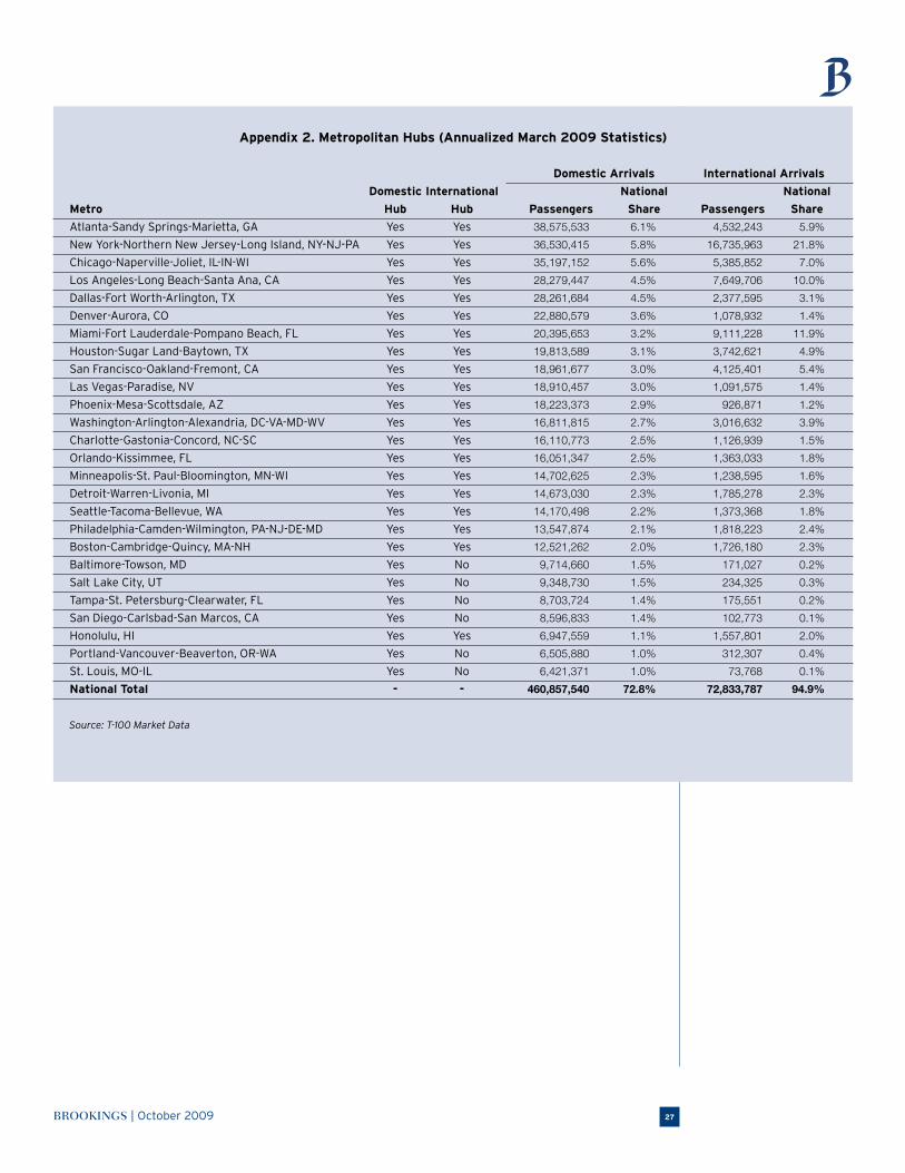
BROOKINGS | October 2009 27
Appendix 2. Metropolitan Hubs (Annualized March 2009 Statistics)
Domestic Arrivals International Arrivals
Domestic International National National
Metro Hub Hub Passengers Share Passengers Share
Atlanta-Sandy Springs-Marietta, GA Yes Yes 38,575,533 6.1% 4,532,243 5.9%
New York-Northern New Jersey-Long Island, NY-NJ-PA Yes Yes 36,530,415 5.8% 16,735,963 21.8%
Chicago-Naperville-Joliet, IL-IN-WI Yes Yes 35,197,152 5.6% 5,385,852 7.0%
Los Angeles-Long Beach-Santa Ana, CA Yes Yes 28,279,447 4.5% 7,649,706 10.0%
Dallas-Fort Worth-Arlington, TX Yes Yes 28,261,684 4.5% 2,377,595 3.1%
Denver-Aurora, CO Yes Yes 22,880,579 3.6% 1,078,932 1.4%
Miami-Fort Lauderdale-Pompano Beach, FL Yes Yes 20,395,653 3.2% 9,111,228 11.9%
Houston-Sugar Land-Baytown, TX Yes Yes 19,813,589 3.1% 3,742,621 4.9%
San Francisco-Oakland-Fremont, CA Yes Yes 18,961,677 3.0% 4,125,401 5.4%
Las Vegas-Paradise, NV Yes Yes 18,910,457 3.0% 1,091,575 1.4%
Phoenix-Mesa-Scottsdale, AZ Yes Yes 18,223,373 2.9% 926,871 1.2%
Washington-Arlington-Alexandria, DC-VA-MD-WV Yes Yes 16,811,815 2.7% 3,016,632 3.9%
Charlotte-Gastonia-Concord, NC-SC Yes Yes 16,110,773 2.5% 1,126,939 1.5%
Orlando-Kissimmee, FL Yes Yes 16,051,347 2.5% 1,363,033 1.8%
Minneapolis-St. Paul-Bloomington, MN-WI Yes Yes 14,702,625 2.3% 1,238,595 1.6%
Detroit-Warren-Livonia, MI Yes Yes 14,673,030 2.3% 1,785,278 2.3%
Seattle-Tacoma-Bellevue, WA Yes Yes 14,170,498 2.2% 1,373,368 1.8%
Philadelphia-Camden-Wilmington, PA-NJ-DE-MD Yes Yes 13,547,874 2.1% 1,818,223 2.4%
Boston-Cambridge-Quincy, MA-NH Yes Yes 12,521,262 2.0% 1,726,180 2.3%
Baltimore-Towson, MD Yes No 9,714,660 1.5% 171,027 0.2%
Salt Lake City, UT Yes No 9,348,730 1.5% 234,325 0.3%
Tampa-St. Petersburg-Clearwater, FL Yes No 8,703,724 1.4% 175,551 0.2%
San Diego-Carlsbad-San Marcos, CA Yes No 8,596,833 1.4% 102,773 0.1%
Honolulu, HI Yes Yes 6,947,559 1.1% 1,557,801 2.0%
Portland-Vancouver-Beaverton, OR-WA Yes No 6,505,880 1.0% 312,307 0.4%
St. Louis, MO-IL Yes No 6,421,371 1.0% 73,768 0.1%
National Total - - 460,857,540 72.8% 72,833,787 94.9%
Source: T-100 Market Data

METROPOLITAN INFRASTRUCTURE INITIATIVE SERIES28
Appendix 3. Top 100 Corridors
Total Passengers
Average March,
Distance 2009 1-Year 5-Year 10-Year
Rank Population Area 1 Population Area 2 (miles) (Annualized) Change Change Change
1 Miami-Fort Lauderdale- New York-Northern New Jersey- 1,067 8,748,534 -6.2% 9.4% 30.5%
Miami Beach, FL Long Island, NY-NJ-PA
2 Los Angeles-Long Beach- San Francisco-Oakland-Fremont, CA 347 6,306,638 -8.3% 3.0% -17.7%
Santa Ana, CA
3 Atlanta-Sandy Springs-Marietta, GA Miami-Fort Lauderdale-Miami Beach, FL 574 5,045,415 1.7% 1.9% 10.5%
4 Chicago-Naperville-Joliet, IL-IN-WI New York-Northern New Jersey- 733 4,705,007 -17.1% -5.4% -3.7%
Long Island, NY-NJ-PA
5 Atlanta-Sandy Springs-Marietta, GA New York-Northern New Jersey- 768 4,544,176 -4.7% 4.6% 14.5%
Long Island, NY-NJ-PA
6 Los Angeles-Long Beach- New York-Northern New Jersey- 2,458 4,355,755 -0.7% 10.5% 14.0%
Santa Ana, CA Long Island, NY-NJ-PA
7 New York-Northern New Jersey- Orlando-Kissimmee, FL 955 4,032,427 -8.0% 15.2% 39.0%
Long Island, NY-NJ-PA
8 New York-Northern New Jersey- London, United Kingdom 3,468 3,881,558 13.1% 2.7% 0.7%
Long Island, NY-NJ-PA
9 Las Vegas-Paradise, NV Los Angeles-Long Beach-Santa Ana, CA 229 3,733,037 -13.4% -5.4% -16.5%
10 Los Angeles-Long Beach- Phoenix-Mesa-Scottsdale, AZ 358 3,434,874 -13.0% -9.3% -10.4%
Santa Ana, CA
11 Chicago-Naperville-Joliet, IL-IN-WI Los Angeles-Long Beach-Santa Ana, CA 1,739 3,322,769 -9.9% -19.4% -4.2%
12 New York-Northern New Jersey- San Francisco-Oakland-Fremont, CA 2,576 2,980,648 2.7% 26.2% 16.7%
Long Island, NY-NJ-PA
13 Dallas-Fort Worth-Arlington, TX Houston-Sugar Land-Baytown, TX 232 2,910,797 -8.9% -6.0% -29.6%
14 Atlanta-Sandy Springs-Marietta, GA Orlando-Kissimmee, FL 403 2,821,071 0.4% 9.4% 9.2%
15 Dallas-Fort Worth-Arlington, TX Los Angeles-Long Beach-Santa Ana, CA 1,224 2,786,650 -5.2% 0.1% -1.6%
16 Boston-Cambridge-Quincy, MA-NH New York-Northern New Jersey- 185 2,745,311 -8.4% 5.7% -22.2%
Long Island, NY-NJ-PA
17 Denver-Aurora, CO Los Angeles-Long Beach-Santa Ana, CA 853 2,723,775 1.6% 23.0% 15.0%
18 Los Angeles-Long Beach- Seattle-Tacoma-Bellevue, WA 959 2,699,063 5.5% 20.7% 28.7%
Santa Ana, CA
19 Atlanta-Sandy Springs-Marietta, GA Washington-Arlington-Alexandria, 540 2,602,487 -1.6% 10.5% 16.7%
DC-VA-MD-WV
20 Las Vegas-Paradise, NV San Francisco-Oakland-Fremont, CA 411 2,553,818 -2.4% 33.5% 48.6%
21 Chicago-Naperville-Joliet, IL-IN-WI Denver-Aurora, CO 892 2,535,863 -2.6% 4.1% -3.8%
22 Hilo, HI Honolulu, HI 190 2,535,758 -22.4% -6.1% -17.9%
23 San Diego-Carlsbad-San Marcos, CA San Francisco-Oakland-Fremont, CA 447 2,415,335 3.3% 43.5% 8.9%
24 Chicago-Naperville-Joliet, IL-IN-WI Washington-Arlington-Alexandria, 593 2,413,979 -12.4% 11.0% 15.3%
DC-VA-MD-WV
25 New York-Northern New Jersey- Washington-Arlington-Alexandria, 222 2,396,311 -6.4% -3.4% -22.5%
Long Island, NY-NJ-PA DC-VA-MD-WV
26 Atlanta-Sandy Springs-Marietta, GA Los Angeles-Long Beach-Santa Ana, CA 1,933 2,333,854 -0.8% 5.9% 73.8%
27 Honolulu, HI Kahului-Wailuku, HI 89 2,306,863 -21.5% -9.2% -34.3%
28 Charlotte-Gastonia-Concord, NC-SC New York-Northern New Jersey- 545 2,297,825 6.2% 105.2% 83.0%
Long Island, NY-NJ-PA
29 San Francisco-Oakland-Fremont, CA Seattle-Tacoma-Bellevue, WA 675 2,287,797 4.4% 8.3% -12.2%
30 Atlanta-Sandy Springs-Marietta, GA Chicago-Naperville-Joliet, IL-IN-WI 598 2,255,127 0.4% -1.4% -15.6%
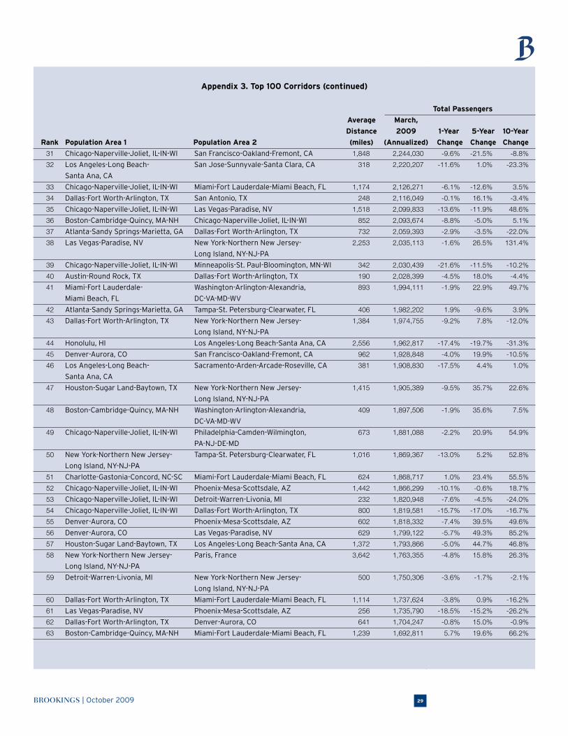
BROOKINGS | October 2009 29
Appendix 3. Top 100 Corridors (continued)
Total Passengers
Average March,
Distance 2009 1-Year 5-Year 10-Year
Rank Population Area 1 Population Area 2 (miles) (Annualized) Change Change Change
31 Chicago-Naperville-Joliet, IL-IN-WI San Francisco-Oakland-Fremont, CA 1,848 2,244,030 -9.6% -21.5% -8.8%
32 Los Angeles-Long Beach- San Jose-Sunnyvale-Santa Clara, CA 318 2,220,207 -11.6% 1.0% -23.3%
Santa Ana, CA
33 Chicago-Naperville-Joliet, IL-IN-WI Miami-Fort Lauderdale-Miami Beach, FL 1,174 2,126,271 -6.1% -12.6% 3.5%
34 Dallas-Fort Worth-Arlington, TX San Antonio, TX 248 2,116,049 -0.1% 16.1% -3.4%
35 Chicago-Naperville-Joliet, IL-IN-WI Las Vegas-Paradise, NV 1,518 2,099,833 -13.6% -11.9% 48.6%
36 Boston-Cambridge-Quincy, MA-NH Chicago-Naperville-Joliet, IL-IN-WI 852 2,093,674 -8.8% -5.0% 5.1%
37 Atlanta-Sandy Springs-Marietta, GA Dallas-Fort Worth-Arlington, TX 732 2,059,393 -2.9% -3.5% -22.0%
38 Las Vegas-Paradise, NV New York-Northern New Jersey- 2,253 2,035,113 -1.6% 26.5% 131.4%
Long Island, NY-NJ-PA
39 Chicago-Naperville-Joliet, IL-IN-WI Minneapolis-St. Paul-Bloomington, MN-WI 342 2,030,439 -21.6% -11.5% -10.2%
40 Austin-Round Rock, TX Dallas-Fort Worth-Arlington, TX 190 2,028,399 -4.5% 18.0% -4.4%
41 Miami-Fort Lauderdale- Washington-Arlington-Alexandria, 893 1,994,111 -1.9% 22.9% 49.7%
Miami Beach, FL DC-VA-MD-WV
42 Atlanta-Sandy Springs-Marietta, GA Tampa-St. Petersburg-Clearwater, FL 406 1,982,202 1.9% -9.6% 3.9%
43 Dallas-Fort Worth-Arlington, TX New York-Northern New Jersey- 1,384 1,974,755 -9.2% 7.8% -12.0%
Long Island, NY-NJ-PA
44 Honolulu, HI Los Angeles-Long Beach-Santa Ana, CA 2,556 1,962,817 -17.4% -19.7% -31.3%
45 Denver-Aurora, CO San Francisco-Oakland-Fremont, CA 962 1,928,848 -4.0% 19.9% -10.5%
46 Los Angeles-Long Beach- Sacramento-Arden-Arcade-Roseville, CA 381 1,908,830 -17.5% 4.4% 1.0%
Santa Ana, CA
47 Houston-Sugar Land-Baytown, TX New York-Northern New Jersey- 1,415 1,905,389 -9.5% 35.7% 22.6%
Long Island, NY-NJ-PA
48 Boston-Cambridge-Quincy, MA-NH Washington-Arlington-Alexandria, 409 1,897,506 -1.9% 35.6% 7.5%
DC-VA-MD-WV
49 Chicago-Naperville-Joliet, IL-IN-WI Philadelphia-Camden-Wilmington, 673 1,881,088 -2.2% 20.9% 54.9%
PA-NJ-DE-MD
50 New York-Northern New Jersey- Tampa-St. Petersburg-Clearwater, FL 1,016 1,869,367 -13.0% 5.2% 52.8%
Long Island, NY-NJ-PA
51 Charlotte-Gastonia-Concord, NC-SC Miami-Fort Lauderdale-Miami Beach, FL 624 1,868,717 1.0% 23.4% 55.5%
52 Chicago-Naperville-Joliet, IL-IN-WI Phoenix-Mesa-Scottsdale, AZ 1,442 1,866,299 -10.1% -0.6% 18.7%
53 Chicago-Naperville-Joliet, IL-IN-WI Detroit-Warren-Livonia, MI 232 1,820,948 -7.6% -4.5% -24.0%
54 Chicago-Naperville-Joliet, IL-IN-WI Dallas-Fort Worth-Arlington, TX 800 1,819,581 -15.7% -17.0% -16.7%
55 Denver-Aurora, CO Phoenix-Mesa-Scottsdale, AZ 602 1,818,332 -7.4% 39.5% 49.6%
56 Denver-Aurora, CO Las Vegas-Paradise, NV 629 1,799,122 -5.7% 49.3% 85.2%
57 Houston-Sugar Land-Baytown, TX Los Angeles-Long Beach-Santa Ana, CA 1,372 1,793,866 -5.0% 44.7% 46.8%
58 New York-Northern New Jersey- Paris, France 3,642 1,763,355 -4.8% 15.8% 26.3%
Long Island, NY-NJ-PA
59 Detroit-Warren-Livonia, MI New York-Northern New Jersey- 500 1,750,306 -3.6% -1.7% -2.1%
Long Island, NY-NJ-PA
60 Dallas-Fort Worth-Arlington, TX Miami-Fort Lauderdale-Miami Beach, FL 1,114 1,737,624 -3.8% 0.9% -16.2%
61 Las Vegas-Paradise, NV Phoenix-Mesa-Scottsdale, AZ 256 1,735,790 -18.5% -15.2% -26.2%
62 Dallas-Fort Worth-Arlington, TX Denver-Aurora, CO 641 1,704,247 -0.8% 15.0% -0.9%
63 Boston-Cambridge-Quincy, MA-NH Miami-Fort Lauderdale-Miami Beach, FL 1,239 1,692,811 5.7% 19.6% 66.2%
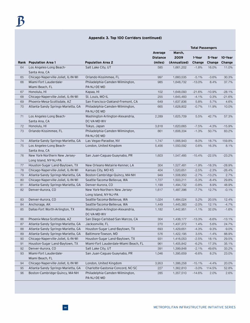
METROPOLITAN INFRASTRUCTURE INITIATIVE SERIES30
Appendix 3. Top 100 Corridors (continued)
Total Passengers
Average March,
Distance 2009 1-Year 5-Year 10-Year
Rank Population Area 1 Population Area 2 (miles) (Annualized) Change Change Change
64 Los Angeles-Long Beach- Salt Lake City, UT 585 1,661,202 -1.8% 16.0% 11.0%
Santa Ana, CA
65 Chicago-Naperville-Joliet, IL-IN-WI Orlando-Kissimmee, FL 997 1,660,535 -5.1% -3.6% 30.3%
66 Miami-Fort Lauderdale- Philadelphia-Camden-Wilmington, 985 1,648,732 -13.0% 8.4% 37.7%
Miami Beach, FL PA-NJ-DE-MD
67 Honolulu, HI Kapaa, HI 102 1,648,093 -21.6% -10.9% -28.1%
68 Chicago-Naperville-Joliet, IL-IN-WI St. Louis, MO-IL 255 1,645,483 -4.1% 0.3% -21.6%
69 Phoenix-Mesa-Scottsdale, AZ San Francisco-Oakland-Fremont, CA 649 1,637,836 5.8% 5.7% 4.6%
70 Atlanta-Sandy Springs-Marietta, GA Philadelphia-Camden-Wilmington, 665 1,628,802 -0.7% 11.9% 10.0%
PA-NJ-DE-MD
71 Los Angeles-Long Beach- Washington-Arlington-Alexandria, 2,289 1,625,709 5.5% 42.7% 57.3%
Santa Ana, CA DC-VA-MD-WV
72 Honolulu, HI Tokyo, Japan 3,818 1,620,665 -7.5% -4.3% -15.9%
73 Orlando-Kissimmee, FL Philadelphia-Camden-Wilmington, 861 1,606,334 -1.3% 50.7% 83.2%
PA-NJ-DE-MD
74 Atlanta-Sandy Springs-Marietta, GA Las Vegas-Paradise, NV 1,747 1,566,943 -8.0% 18.7% 159.8%
75 Los Angeles-Long Beach- London, United Kingdom 5,456 1,550,592 0.6% 16.3% 8.1%
Santa Ana, CA
76 New York-Northern New Jersey- San Juan-Caguas-Guaynabo, PR 1,603 1,547,485 -15.4% -22.5% -23.2%
Long Island, NY-NJ-PA
77 Houston-Sugar Land-Baytown, TX New Orleans-Metairie-Kenner, LA 304 1,527,481 -1.9% -18.3% -28.9%
78 Chicago-Naperville-Joliet, IL-IN-WI Kansas City, MO-KS 404 1,520,651 -2.5% -2.3% -26.4%
79 Atlanta-Sandy Springs-Marietta, GA Boston-Cambridge-Quincy, MA-NH 949 1,508,950 -2.7% -13.2% 2.7%
80 Chicago-Naperville-Joliet, IL-IN-WI Seattle-Tacoma-Bellevue, WA 1,727 1,503,211 -5.3% -8.4% 29.8%
81 Atlanta-Sandy Springs-Marietta, GA Denver-Aurora, CO 1,199 1,494,732 -0.8% 8.9% 48.9%
82 Denver-Aurora, CO New York-Northern New Jersey- 1,617 1,487,396 -7.7% 12.7% -0.1%
Long Island, NY-NJ-PA
83 Denver-Aurora, CO Seattle-Tacoma-Bellevue, WA 1,024 1,484,024 5.2% 20.5% 12.4%
84 Anchorage, AK Seattle-Tacoma-Bellevue, WA 1,449 1,445,383 -2.0% 12.1% -4.7%
85 Dallas-Fort Worth-Arlington, TX Washington-Arlington-Alexandria, 1,182 1,442,951 -1.1% 32.0% -1.6%
DC-VA-MD-WV
86 Phoenix-Mesa-Scottsdale, AZ San Diego-Carlsbad-San Marcos, CA 304 1,438,177 -13.3% -6.6% -13.1%
87 Atlanta-Sandy Springs-Marietta, GA Jacksonville, FL 270 1,437,372 1.4% 5.6% 24.7%
88 Atlanta-Sandy Springs-Marietta, GA Houston-Sugar Land-Baytown, TX 693 1,429,651 -4.3% -9.3% -9.0%
89 Atlanta-Sandy Springs-Marietta, GA Baltimore-Towson, MD 576 1,422,195 3.5% -1.4% 88.9%
90 Chicago-Naperville-Joliet, IL-IN-WI Houston-Sugar Land-Baytown, TX 931 1,416,053 -2.5% 18.1% 29.5%
91 Houston-Sugar Land-Baytown, TX Miami-Fort Lauderdale-Miami Beach, FL 961 1,405,842 -6.2% 17.3% 35.1%
92 Denver-Aurora, CO Salt Lake City, UT 391 1,399,848 -2.1% 49.6% 33.2%
93 Miami-Fort Lauderdale- San Juan-Caguas-Guaynabo, PR 1,046 1,395,659 -6.6% 8.2% 23.0%
Miami Beach, FL
94 Chicago-Naperville-Joliet, IL-IN-WI London, United Kingdom 3,953 1,386,258 -15.1% -4.4% 20.0%
95 Atlanta-Sandy Springs-Marietta, GA Charlotte-Gastonia-Concord, NC-SC 227 1,362,810 -3.0% 114.5% 52.8%
96 Boston-Cambridge-Quincy, MA-NH Philadelphia-Camden-Wilmington, 285 1,357,510 -14.6% 2.0% 2.6%
PA-NJ-DE-MD
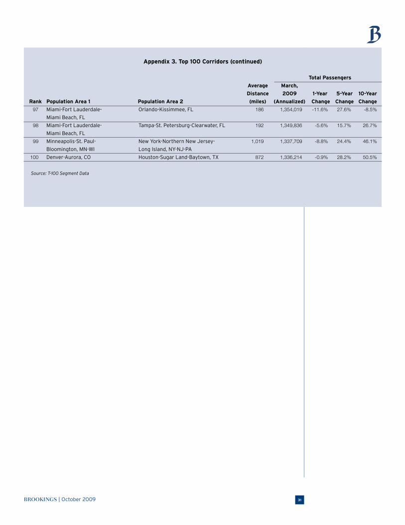
BROOKINGS | October 2009 31
Appendix 3. Top 100 Corridors (continued)
Total Passengers
Average March,
Distance 2009 1-Year 5-Year 10-Year
Rank Population Area 1 Population Area 2 (miles) (Annualized) Change Change Change
97 Miami-Fort Lauderdale- Orlando-Kissimmee, FL 186 1,354,019 -11.6% 27.6% -8.5%
Miami Beach, FL
98 Miami-Fort Lauderdale- Tampa-St. Petersburg-Clearwater, FL 192 1,349,836 -5.6% 15.7% 26.7%
Miami Beach, FL
99 Minneapolis-St. Paul- New York-Northern New Jersey- 1,019 1,337,709 -8.8% 24.4% 46.1%
Bloomington, MN-WI Long Island, NY-NJ-PA
100 Denver-Aurora, CO Houston-Sugar Land-Baytown, TX 872 1,336,214 -0.9% 28.2% 50.5%
Source: T-100 Segment Data
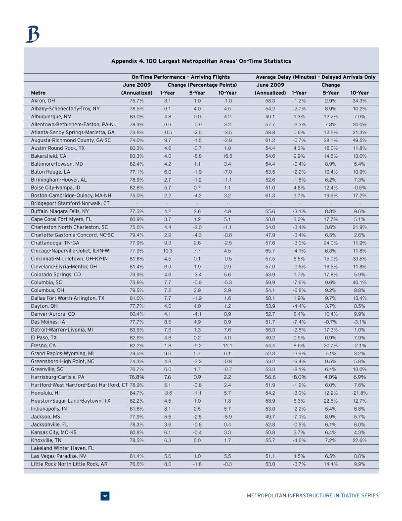
METROPOLITAN INFRASTRUCTURE INITIATIVE SERIES32
Appendix 4. 100 Largest Metropolitan Areas’ On-Time Statistics
On-Time Performance - Arriving Flights Average Delay (Minutes) - Delayed Arrivals Only
June 2009 Change (Percentage Points) June 2009 Change
Metro (Annualized) 1-Year 5-Year 10-Year (Annualized) 1-Year 5-Year 10-Year
Akron, OH 75.7% 3.1 1.0 -1.0 58.3 -1.2% 2.9% 34.3%
Albany-Schenectady-Troy, NY 78.5% 6.1 4.0 4.5 54.2 -2.7% 8.9% 10.2%
Albuquerque, NM 83.0% 4.8 0.0 4.2 49.1 1.3% 12.2% 7.9%
Allentown-Bethlehem-Easton, PA-NJ 78.9% 6.9 -0.9 3.2 57.7 -6.3% 7.3% 20.0%
Atlanta-Sandy Springs-Marietta, GA 73.6% -0.5 -2.5 -3.5 58.8 0.6% 12.6% 21.3%
Augusta-Richmond County, GA-SC 74.0% 9.7 -1.5 -2.8 61.2 -0.7% 28.1% 49.5%
Austin-Round Rock, TX 80.3% 4.6 -0.7 1.0 54.4 4.3% 16.0% 11.8%
Bakersfield, CA 83.3% 4.0 -8.8 16.5 54.6 9.9% 14.8% 13.0%
Baltimore-Towson, MD 82.4% 4.2 1.1 3.4 54.4 -0.4% 8.9% 6.4%
Baton Rouge, LA 77.1% 6.0 -1.9 -7.0 53.5 -2.2% 10.4% 10.9%
Birmingham-Hoover, AL 78.9% 2.7 -1.2 -1.1 52.6 -1.8% 6.2% 7.3%
Boise City-Nampa, ID 82.6% 5.7 0.7 1.1 51.0 4.8% 12.4% -0.5%
Boston-Cambridge-Quincy, MA-NH 75.0% 2.2 -4.2 3.2 61.3 3.7% 19.9% 17.2%
Bridgeport-Stamford-Norwalk, CT - - - - - - - -
Buffalo-Niagara Falls, NY 77.5% 4.2 2.6 4.9 55.6 -3.1% 8.8% 9.6%
Cape Coral-Fort Myers, FL 80.9% 3.7 1.2 5.1 50.8 3.0% 17.7% 5.1%
Charleston-North Charleston, SC 75.6% 4.4 -2.0 -1.1 54.0 -3.4% 3.6% 21.9%
Charlotte-Gastonia-Concord, NC-SC 79.4% 2.9 -4.3 -0.8 47.9 -3.4% 6.5% 2.6%
Chattanooga, TN-GA 77.9% 9.3 2.6 -2.5 57.6 -3.0% 24.0% 11.9%
Chicago-Naperville-Joliet, IL-IN-WI 77.9% 10.3 7.7 4.5 65.7 -4.1% 6.3% 11.8%
Cincinnati-Middletown, OH-KY-IN 81.6% 4.5 0.1 -0.5 57.5 6.5% 15.0% 33.5%
Cleveland-Elyria-Mentor, OH 81.4% 6.9 1.9 2.9 57.0 -0.6% 16.5% 11.8%
Colorado Springs, CO 79.9% 4.6 -3.4 5.6 53.9 1.7% 17.8% 5.9%
Columbia, SC 73.6% 7.7 -0.9 -5.3 59.9 -7.6% 9.6% 40.1%
Columbus, OH 79.5% 7.2 2.9 2.9 54.1 -6.8% 9.2% 8.8%
Dallas-Fort Worth-Arlington, TX 81.0% 7.7 -1.9 1.6 58.1 1.9% 9.7% 13.4%
Dayton, OH 77.7% 4.0 4.0 1.2 53.9 -4.4% 3.7% 8.5%
Denver-Aurora, CO 80.4% 4.1 -4.1 0.9 52.7 2.4% 10.4% 9.9%
Des Moines, IA 77.7% 8.5 4.9 0.9 51.7 -7.4% -0.7% -3.1%
Detroit-Warren-Livonia, MI 83.5% 7.6 1.3 7.6 56.3 -2.8% 17.3% 1.0%
El Paso, TX 82.6% 4.8 0.2 4.0 49.2 0.5% 6.9% 7.9%
Fresno, CA 82.2% 1.8 -5.2 11.1 54.4 8.6% 20.7% -2.1%
Grand Rapids-Wyoming, MI 79.5% 9.6 5.7 6.1 52.3 -3.9% 7.1% 3.2%
Greensboro-High Point, NC 74.3% 4.9 -3.2 -0.8 53.2 -9.4% 9.5% 5.8%
Greenville, SC 76.7% 6.0 1.7 -0.7 53.3 -8.1% 6.4% 13.0%
Harrisburg-Carlisle, PA 76.8% 7.6 0.9 2.2 56.6 -8.0% 4.0% 6.9%
Hartford-West Hartford-East Hartford, CT 78.9% 5.1 -0.8 2.4 51.9 -1.2% 6.0% 7.6%
Honolulu, HI 84.7% -3.6 -1.1 5.7 54.2 -3.0% 12.2% -21.8%
Houston-Sugar Land-Baytown, TX 82.2% 4.5 1.0 1.8 58.9 6.3% 22.6% 12.7%
Indianapolis, IN 81.6% 8.1 2.5 5.7 53.0 -2.2% 5.4% 6.8%
Jackson, MS 77.9% 5.5 -2.5 -5.9 49.7 -7.1% 8.9% 5.7%
Jacksonville, FL 78.3% 3.6 -0.8 0.4 52.8 -0.5% 6.1% 6.0%
Kansas City, MO-KS 80.8% 6.1 -0.4 3.3 50.8 2.7% 6.4% 4.3%
Knoxville, TN 78.5% 6.3 5.0 1.7 55.7 -4.6% 7.2% 22.6%
Lakeland-Winter Haven, FL - - - - - - - -
Las Vegas-Paradise, NV 81.4% 5.6 1.0 5.5 51.1 4.5% 6.5% 8.8%
Little Rock-North Little Rock, AR 76.6% 8.0 -1.8 -0.3 53.0 -3.7% 14.4% 9.9%
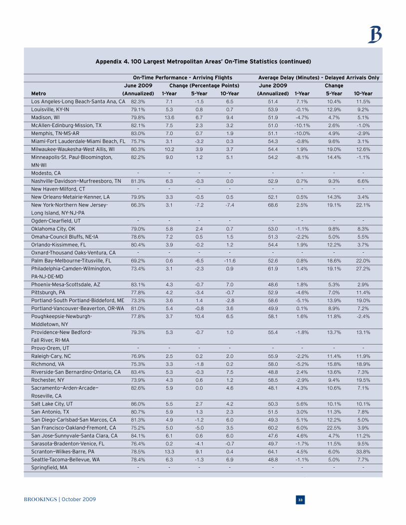
BROOKINGS | October 2009 33
Appendix 4. 100 Largest Metropolitan Areas’ On-Time Statistics (continued)
On-Time Performance - Arriving Flights Average Delay (Minutes) - Delayed Arrivals Only
June 2009 Change (Percentage Points) June 2009 Change
Metro (Annualized) 1-Year 5-Year 10-Year (Annualized) 1-Year 5-Year 10-Year
Los Angeles-Long Beach-Santa Ana, CA 82.3% 7.1 -1.5 6.5 51.4 7.1% 10.4% 11.5%
Louisville, KY-IN 79.1% 5.3 0.8 0.7 53.9 -0.1% 12.9% 9.2%
Madison, WI 79.8% 13.6 6.7 9.4 51.9 -4.7% 4.7% 5.1%
McAllen-Edinburg-Mission, TX 82.1% 7.5 2.3 3.2 51.0 -10.1% 2.6% -1.0%
Memphis, TN-MS-AR 83.0% 7.0 0.7 1.9 51.1 -10.0% 4.9% -2.9%
Miami-Fort Lauderdale-Miami Beach, FL 75.7% 3.1 -3.2 0.3 54.3 -0.8% 9.6% 3.1%
Milwaukee-Waukesha-West Allis, WI 80.3% 10.2 3.9 3.7 54.4 1.9% 19.0% 12.6%
Minneapolis-St. Paul-Bloomington, 82.2% 9.0 1.2 5.1 54.2 -8.1% 14.4% -1.1%
MN-WI
Modesto, CA - - - - - - - -
Nashville-Davidson—Murfreesboro, TN 81.3% 6.3 -0.3 0.0 52.9 0.7% 9.3% 6.6%
New Haven-Milford, CT - - - - - - - -
New Orleans-Metairie-Kenner, LA 79.9% 3.3 -0.5 0.5 52.1 0.5% 14.3% 3.4%
New York-Northern New Jersey- 66.3% 3.1 -7.2 -7.4 68.6 2.5% 19.1% 22.1%
Long Island, NY-NJ-PA
Ogden-Clearfield, UT - - - - - - - -
Oklahoma City, OK 79.0% 5.8 2.4 0.7 53.0 -1.1% 9.8% 8.3%
Omaha-Council Bluffs, NE-IA 78.6% 7.2 0.5 1.5 51.3 -2.2% 5.0% 5.5%
Orlando-Kissimmee, FL 80.4% 3.9 -0.2 1.2 54.4 1.9% 12.2% 3.7%
Oxnard-Thousand Oaks-Ventura, CA - - - - - - - -
Palm Bay-Melbourne-Titusville, FL 69.2% 0.6 -6.5 -11.6 52.6 0.8% 18.6% 22.0%
Philadelphia-Camden-Wilmington, 73.4% 3.1 -2.3 0.9 61.9 1.4% 19.1% 27.2%
PA-NJ-DE-MD
Phoenix-Mesa-Scottsdale, AZ 83.1% 4.3 -0.7 7.0 48.6 1.8% 5.3% 2.9%
Pittsburgh, PA 77.8% 4.2 -3.4 -0.7 52.9 -4.6% 7.0% 11.4%
Portland-South Portland-Biddeford, ME 73.3% 3.6 1.4 -2.8 58.6 -5.1% 13.9% 19.0%
Portland-Vancouver-Beaverton, OR-WA 81.0% 5.4 -0.8 3.6 49.9 0.1% 8.9% 7.2%
Poughkeepsie-Newburgh- 77.8% 3.7 10.4 6.5 58.1 1.6% 11.8% -2.4%
Middletown, NY
Providence-New Bedford- 79.3% 5.3 -0.7 1.0 55.4 -1.8% 13.7% 13.1%
Fall River, RI-MA
Provo-Orem, UT - - - - - - - -
Raleigh-Cary, NC 76.9% 2.5 0.2 2.0 55.9 -2.2% 11.4% 11.9%
Richmond, VA 75.3% 3.3 -1.8 0.2 58.0 -5.2% 15.8% 18.9%
Riverside-San Bernardino-Ontario, CA 83.4% 5.3 -0.3 7.5 48.8 2.4% 13.6% 7.3%
Rochester, NY 73.9% 4.3 0.6 1.2 58.5 -2.9% 9.4% 19.5%
Sacramento—Arden-Arcade— 82.6% 5.9 0.0 4.6 48.1 4.3% 10.6% 7.1%
Roseville, CA
Salt Lake City, UT 86.0% 5.5 2.7 4.2 50.3 5.6% 10.1% 10.1%
San Antonio, TX 80.7% 5.9 1.3 2.3 51.5 3.0% 11.3% 7.8%
San Diego-Carlsbad-San Marcos, CA 81.3% 4.9 -1.2 6.0 49.3 5.1% 12.2% 5.0%
San Francisco-Oakland-Fremont, CA 75.2% 5.0 -5.0 3.5 60.2 6.0% 22.5% 3.9%
San Jose-Sunnyvale-Santa Clara, CA 84.1% 6.1 0.6 6.0 47.6 4.6% 4.7% 11.2%
Sarasota-Bradenton-Venice, FL 76.4% 0.2 -4.1 -0.7 49.7 -1.7% 11.5% 9.5%
Scranton—Wilkes-Barre, PA 78.5% 13.3 9.1 0.4 64.1 4.5% 6.0% 33.8%
Seattle-Tacoma-Bellevue, WA 78.4% 6.3 -1.3 6.9 48.8 -1.1% 5.0% 7.7%
Springfield, MA - - - - - - - -
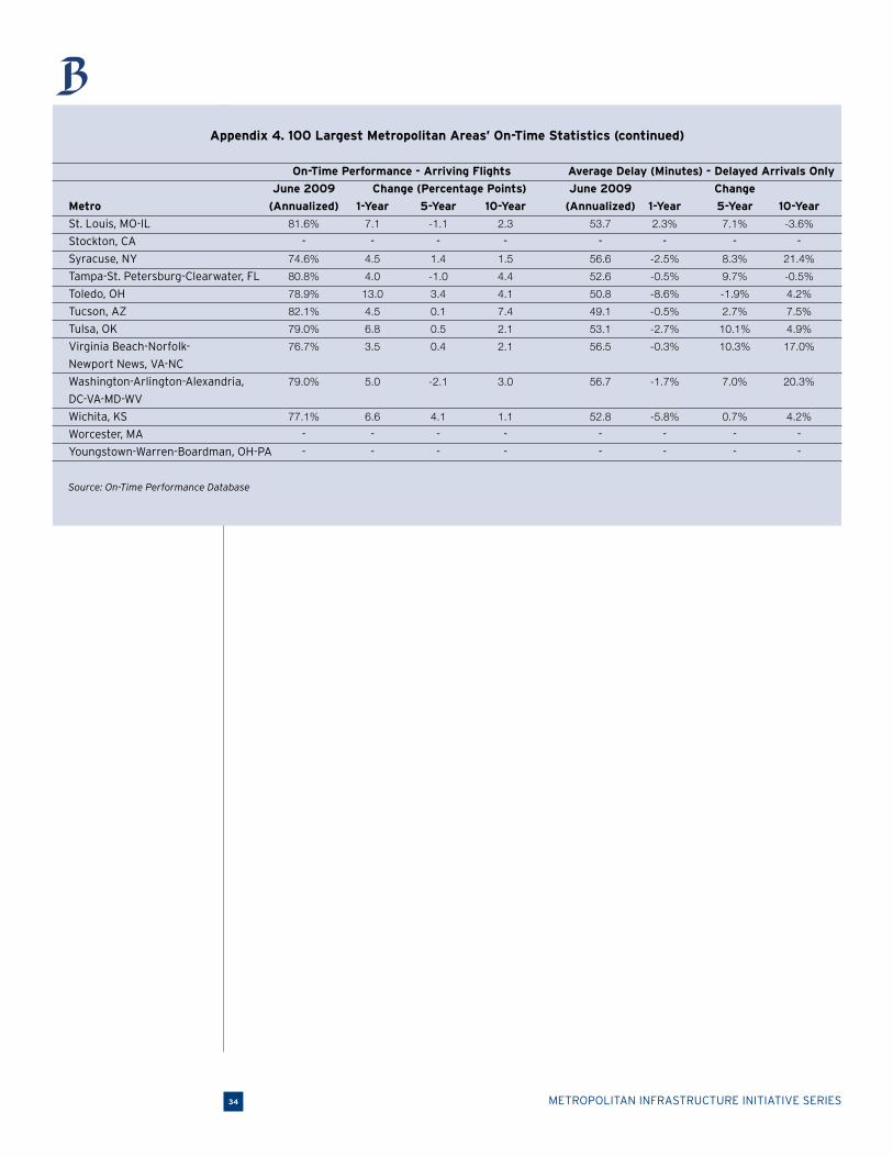
METROPOLITAN INFRASTRUCTURE INITIATIVE SERIES34
Appendix 4. 100 Largest Metropolitan Areas’ On-Time Statistics (continued)
On-Time Performance - Arriving Flights Average Delay (Minutes) - Delayed Arrivals Only
June 2009 Change (Percentage Points) June 2009 Change
Metro (Annualized) 1-Year 5-Year 10-Year (Annualized) 1-Year 5-Year 10-Year
St. Louis, MO-IL 81.6% 7.1 -1.1 2.3 53.7 2.3% 7.1% -3.6%
Stockton, CA - - - - - - - -
Syracuse, NY 74.6% 4.5 1.4 1.5 56.6 -2.5% 8.3% 21.4%
Tampa-St. Petersburg-Clearwater, FL 80.8% 4.0 -1.0 4.4 52.6 -0.5% 9.7% -0.5%
Toledo, OH 78.9% 13.0 3.4 4.1 50.8 -8.6% -1.9% 4.2%
Tucson, AZ 82.1% 4.5 0.1 7.4 49.1 -0.5% 2.7% 7.5%
Tulsa, OK 79.0% 6.8 0.5 2.1 53.1 -2.7% 10.1% 4.9%
Virginia Beach-Norfolk- 76.7% 3.5 0.4 2.1 56.5 -0.3% 10.3% 17.0%
Newport News, VA-NC
Washington-Arlington-Alexandria, 79.0% 5.0 -2.1 3.0 56.7 -1.7% 7.0% 20.3%
DC-VA-MD-WV
Wichita, KS 77.1% 6.6 4.1 1.1 52.8 -5.8% 0.7% 4.2%
Worcester, MA - - - - - - - -
Youngstown-Warren-Boardman, OH-PA - - - - - - - -
Source: On-Time Performance Database
BROOKINGS | October 2009 35
Endnotes
1. Air Transport Association, Annual Passenger Yields: U.S. Airlines (1978 Prices), 1926 – 2008, available at www.airlines.org/
economics/finance/PaPricesYield.htm.
2. Bureau of Transportation Statistics, Air Carrier Traffic Statistics, Historical Air Traffic Data, 1954–2008, available at
www.bts.gov/programs/airline_information/air_carrier_traffic_statistics.
3. Bureau of Transportation Statistics, Airline Data and Statistics, Fuel Cost and Consumption, 1977–2009, available at
www.bts.gov/programs/airline_information/fuel_cost_and_consumption.
4. U.S. Environmental Protection Agency, “Inventory of U.S. Greenhouse Gas Emissions and Sinks: 1990–2007,” Report 430-R-09-
004, 2009.
5. Source: Authors’ analysis of Bureau of Transportation On-Time Performance Database statistics
6. Ibid.
7. Mergers and bankruptcy filings since 2000: TWA and American airlines merged in 2001; US Airways filed for bankruptcy in 2002
and 2004, then merged with America West in 2005; Northwest and Delta both filed for bankruptcy in 2005 and completed their
merger in 2008; ATA filed for its final bankruptcy in 2008.
8. For example, see: Michelle Higgins, “Aboard Planes, Class Conflict,” New York Times, November 25, 2007.
9. BTS, Fuel Cost and Consumption, 1977–2009
10. Bureau of Transportation Statistics, “December 2008 Airline Traffic Data: System Traffic Down 5.7 Percent in December
from 2007 and Down 3.7 Percent in 2008,” March 12, 2009, available at www.bts.gov/press_releases/2009/bts012_09/html/
bts012_09.html.
11. At the time of publication, Congress is wrestling with different levels of funding for high speed rail from the House ($4 billion)
and Senate ($1.2 billion) versions of the FY2010 appropriations bill.
12. Samantha Putt del Pino and Pankaj Bhatia, “Working 9 to 5 on Climate Change: An Office Guide,” World Resources Institute,
2002. See also: Joyce E. Penner and others, Aviation and the Global Atmosphere, United Nations Intergovernmental Panel on
Climate Change, 2001, Section 8.3.2.
13. National Resources Defense Council, “Flying Off Course: Environmental Impacts of America’s Airports,” 1996.
14. Sightline Institute, “How Low-Carbon Can You Go: The Green Travel Ranking,” 2008, available at www.sightline.org/maps/charts/
climate-CO2byMode.
15. It is also an international concern as the Intergovernmental Panel on Climate Change (IPCC) expects an increase in aircraft-
related global emissions by 2050 irrespective of large or small economic growth. The IPCC also expects aviation’s share of
global emissions to rise from 2 to 3 percent. See: U.S. Government Accountability Office, “Aviation and Climate Change: Aircraft
Emissions Expected to Grow, but Technological and Operational Improvements and Government Policies Can Help Control
Emissions,” Report GAO-09-554, 2009.
16. U.S. Government Accountability Office, “National Airspace System: FAA Reauthorization Issues are Critical to System
Transformation and Operations,” Report GAO-09-377T, 2009a.
17. Federal Aviation Administration, “FAA’s NextGen Implementation Plan 2009,” 2009.
18. U.S. Government Accountability Office, “Next Generation Air Transportation System: Issues Associated with Midterm
Implementation of Capabilities and Full System Transformation,” Report GAO-09-481T, 2009b.
19. U.S. Government Accountability Office, “Next Generation Air Transportation System: Status of Key Issues Associated with the
Transition to NextGen,” Report GAO-08-1154T, 2008.
20. GAO, 2009a.
21. GAO, 2009b.
22. Jan Brueckner, “Airline Traffic and Urban Economic Development,” Urban Studies, Vol. 40 (8): 2003, pp. 1455–1469.
23. Jeffrey Cohen and Catherine Morrison Paul, “Airport Infrastructure Spillovers in a Network System,” Journal of Urban
Economics, Vol. 54(3): 2003, pp. 459-473. These results also were reinforced by an econometric analysis by the International
Air Transport Association. See: Mark Smyth and Brian Pearce, Airline Network Benefits: Measuring the Additional Benefits
Generated by Airline Networks for Economic Development, IATA Economics, 2006.
24. Oxford Economic Forecasting, “The Economic Contribution of the Aviation Industry in the UK,” 2006.
25. Michael Irwin and John Kasarda, “Air Passenger Linkages and Employment Growth in U.S. Metropolitan Areas,’ American
Sociological Review, Vol. (56): 1991, pp. 524-537.
26. These statistics include the inventories of Dulles, Reston, Herndon, and Tysons Corner. See: Fairfax County Economic
Development Authority, “Real Estate Report Yearend 2007,” 2008.
27. Air Transport Association, Annual Passenger Yields: U.S. Airlines (1978 Prices), 1926 – 2008, available at www.airlines.org/
economics/finance/PaPricesYield.htm.
METROPOLITAN INFRASTRUCTURE INITIATIVE SERIES36
28. The Air Carrier Statistics database is also available in other combinations limited to domestic carriers and domestic flights.
29. This is exactly what the FAA does when publishing the on-time statistics—uses the sample-size percentages to represent the
entire country’s performance.
30. The one exception to this was the Greenville, SC metropolitan area. Greenville Spartanburg International Airport is a few miles
over the border of the Greenville metropolitan boundary into the Spartanburg metropolitan area, but the airport is actually
closer to the city of Greenville than Spartanburg. Due to these locational dynamics, we associated this airport’s performance
with the Greenville metropolitan area.
31. Based on authors’ calculations of a floor for regular service that exceeded sub-regional service.
32. Bureau of Transportation Statistics, National-Level Average Fare Series, available at www.bts.gov/xml/atpi/src/avgfareseries.xml.
33. These domestic numbers only include flights hosted by domestic carriers.
34. Based on U.S. Air Carriers only, the other years with air travel decreases since 1956 were 1970, 1975, 1980, and 1981.
35. For example, the current recession has produced cuts in international travel according to executives from Boeing and Airbus.
See: Jeremiah Marquez, “Global Air Travel May Not Recover Until 2011,” New York Times, September 9, 2009.
36. The average number of passengers per flight in 1990 was 72.2, while the average in 2008 was 75.8. Source: Authors’ calcula-
tions based on T-100 Segment data.
37. For more information on the metropolitan nature of the U.S. economy, see: Alan Berube, “MetroNation: How U.S. Metropolitan
Areas Fuel Prosperity,” Brookings, 2007.
38. For more hub-and-spoke information, see: Reconnecting America “Missed Connections: Finding Solutions to the Crisis in Air
Travel,” 2002. Two follow-up reports also discuss the hub-and-spoke system.
39. The FAA considers any domestic airport handling 1 percent of all enplanements over one year, domestic or international, to be
a ‘Large Hub.’ See the FAA’s most recent national map from 2007 at www.bts.gov/programs/geographic_information_services/
maps/hub_maps/2007/html/map.html.
40. Berube, 2007. Also, see Appendix B.
41. Regular service is defined as averaging more than 2 flights per week in each direction of a corridor. We also considered each
non-metropolitan commercial service airport the same as a metropolitan area. Hence the use of ‘metropolitan and micropolitan
areas.’
42. Only 29 of these metropolitan areas’ 44 commercial service airports hosted at least 10,000 internationally arriving passengers
in 2008.
43. The nine exceptions included three major international metropolitan areas (London, Paris, and Tokyo), three popular Hawaiian
Island airports (Kona, Lihue, and Maui), metropolitan San Juan (PR), and aviation-reliant Anchorage (AK).
44. For a description of these delay categories, see the Methodology Section. The FAA also provides a comprehensive description
on their web site at www.bts.gov/help/aviation/html/understanding.html.
45. GAO, 2009a.
46. For a complete list of metropolitan on-time performance, see Appendix D.
47. The data is from a project list dated July 1, 2009. At that time, 90.2 percent of the $1.3 billion package has been assigned to
specific airport projects. Source: Authors’ analysis of ARRA reporting data.
48. Source: Authors’ analysis of Federal Aviation Administration’s Airport Improvement Program data.
49. U.S. Department of Transportation, Advisory No. AA-2009-003, 2009, available at www.oig.dot.gov/StreamFile?file=/data/pdf-
docs/Final_ARRA_Advisory_AIP_%283%29.pdf.
50. Thomas Frank, “Feds Keep Little-Used Airports in Business,” USA Today, September 18, 2009.
51. U.S. Government Accountability Office, “National Transportation System: Options and Analytical Tools to Strengthen DOT’s
Approach to Supporting Communities’ Access to the System,” Report GAO-09-753, 2009.
52. ibid
53. GAO, 2009a.
54. At the time of publication, Congress is considering raising the PFC cap to $6 or $7 for certain airports. However, there is dis-
sension as the House’s FAA reauthorization legislation (H.R. 915) includes an increase but the Senate’s current version (S. 1451)
does not. Conference Committee will likely determine the maximum levy.
55. Emissions factors provided by the United Kingdom’s Department for Environment, Food, and Rural Affairs, “Passenger Transport
Emissions Factors,” 2007.
56. Federal Aviation Administration, “Aerospace Forecast, Fiscal Years 2009 – 2025,” 2009.
57. GAO, 2009b.
58. Eric A. J. H. Pels, “The Economics of Airport Congestion Pricing,” Tinbergen Institute Discussion Paper No. 03-083/3.
59. Joshua L. Schank, “Solving Airside Airport Congestion: Why Peak Runway Pricing is Not Working,” Journal of Air Transport
Management, Vol. 11: 2005, pp. 417–425.

BROOKINGS | October 2009 37
60. The MITRE Corporation, “Capacity Needs in the National Airspace System, An Analysis of Airport and Metropolitan Area
Demand and Operational Capacity in the Future, 2007 – 2025 (FACT 2),” Federal Aviation Administration, 2007.
61. Federal Aviation Administration “National Plan of Integrated Airport Systems, Report to Congress, 2009 – 2013,” 2008.
62. Mar González-Savignat, “Competition in Air Transport: The Case of the High Speed Train,” Journal of Transport Economics and
Policy, Vol. 38(1): 2004, pp. 77-108.
63. Ibid. See Also: Nicole Adler, Chris Nash, and Eric Pels, “High Speed Rail and Air Transport Competition,” Tinbergen Institute
Discussion Paper, TI 2008-103/3.
64. M Janic, “High-speed rail and air passenger transport: a comparison of the operational environmental performance,”
Proceedings of the Institution of Mechanical Engineers, Part F: Journal of Rail and Rapid Transit, Vol. 217(4): 2003, pp. 259-269.
65. Since many of the lines currently under consideration would only offer speeds of up to 110 mph, these limitations may signifi-
cantly reduce the competitive distances.
66. For one example, see: Ginés De Rus, “The Economic Effects of High Speed Rail Investment,” Discussion Paper No. 2008-16,
OECD and International Transportation Forum Joint Transport Research Centre, October 2008.
67. Amtrak, Northeast Corridor Trains Report, Fiscal Year 2008, available at www.amtrak.com/pdf/NortheastCorridor.pdf.
68. Among other sources, GAO found that the Japanese experience discovered higher ridership along corridors with multiple large
urban areas. See: U.S. Government Accountability Office, “High Speed Passenger Rail: Future Development Will Depend on
Addressing Financial and Other Challenges and Establishing a Clear Federal Role”, Report GAO-09-317, 2009c.
69. “Ave Madrid,” The Economist, February 5, 2009. See Also: Ginés De Rus, “The Economic Effects of High Speed Rail Investment.”
70. GAO, 2009c.
71. BTS is constantly updating its air travel statistics. See the pages linked from the following URL: www.bts.gov/programs/airline_
information/.
72. GAO,2009b.
73. ibid
74. Specifically, GAO mentions that performance-based navigation and approach capabilities, which are mature and already active
in certain areas, “allow for more efficient arrival and departure procedures, … more routes, and enable the use of runways that
cannot currently be used under certain conditions.” There are also data communication capabilities that upgrade plane-to-con-
trol communications and, in turn, “improve air traffic controller productivity, and enhance efficiency, capacity and safety.” See:
Responses to Questions for the Record: March 18, 2009, Hearing on ATC Modernization: Near-Term Achievable Goals, GAO-09-
718R, 2009e
75. RTCA, “RTCA Task Force 5 NextGen Mid-Term Implementation Task Force Report,” 2009.
76. GAO, 2009b.
77. Steven A. Morrison and Clifford Winston, “The Effect of FAA Expenditures on Air Travel Delays,” Journal of Urban Economics,
Vol. 63: 2008, pp. 669-678.

METROPOLITAN INFRASTRUCTURE INITIATIVE SERIES38
AcknowledgementsFor their substantive and thoughtful comments on earlier drafts and other elements of this
paper, we wish to acknowledge: Scott Bernstein, Thomas Berry, Anthony Downs, Martin Dresner, Jane Garvey, Kara Kockelman, Robert Lang, Joshua Schank, William Swelbar, Stephen Van Beek, and Clifford Winston. We also thank our Metro Program collaborators: Alan Berube, Emilia Istrate, David Jackson, Amy Liu, Mark Muro, Rebecca Romash, and Anne Wingate. Finally, thank you to the officials at the Bureau of Transportation Statistics that reviewed our methodology.
The Metropolitan Policy Program at Brookings thanks the Surdna Foundation and the Rockefeller Foundation for their support of the program’s Metropolitan Infrastructure Initiative and the
John D. and Catherine T. MacArthur Foundation, the George Gund Foundation, the Rockefeller Foundation, and the Heinz Endowments, for their general support of the program.
This work builds on a decade of independent and rigorous research and policy development funded through prior support from the Ford Foundation, the Joyce Foundation, MacArthur Foundation, the McKnight Foundation, Charles Stewart Mott Foundation, the William Penn Foundation, and the Rockefeller Foundation.
We also wish to thank the members of the Metropolitan Leadership Council for their support of the Blueprint Initiative, a multi-year initiative to promote an economic agenda for the nation that builds on the assets and centrality of America’s metropolitan areas. Learn more about the Blueprint at www.blueprintprosperity.org.
For More InformationAdie Tomer
Research Analyst
Metropolitan Policy Program
Brookings [email protected]
Robert Puentes
Senior Fellow and Director, Metropolitan Infrastructure InitiativeMetropolitan Policy Program
Brookings [email protected]
For General InformationMetropolitan Policy Program at Brookings202.797.6139www.brookings.edu/metro
BROOKINGS | October 2009 39
About the Brookings Institution Metropolitan Program at BrookingsCreated in 1996, the Metropolitan Policy Program provides decisionmakers with cutting-edge research and policy ideas for improving the health and prosperity of metropolitan areas including
their component cities, suburbs, and rural areas. To learn more visit www.brookings.edu/metro.
About the Brookings Institution Metropolitan Infrastructure InitiativeLaunched in 2008, the goal of the Metropolitan Infrastructure Initiative is to develop timely, independent analysis, frame key debates, and offer policy recommendations to help leaders in the United States and abroad address key infrastructure challenges with specific emphasis on transportation. The initiative is part of the Metro Program’s flagship research and policy initiative, the Blueprint for American Prosperity. This and other publications, speeches, presenta-tions, and commentary on transportation and infrastructure are available at:http://www.brookings.edu/metro/Infrastructure-Initiative.aspx
In the Series
■ The Road…Less Traveled: An Analysis of Vehicle Miles Traveled Trends in the U.S.
■ Making Transportation Sustainable: Insights from Germany
■ Memo to the President: Invest in Long-Term Prosperity
■ A Bridge to Somewhere: Rethinking American Transportation for the 21st Century
■ An Inherent Bias? Geographic and Racial-Ethnic Patterns of Metropolitan Planning Organization Boards
■ Principles for a U.S. Public Freight Agenda in a Global Economy

1775 Massachusetts Avenue, NW Washington D.C. 20036-2188telephone 202.797.6000fax 202.797.6004web site www.brookings.edu
telephone 202.797.6139 fax 202.797.2965web site www.brookings.edu/metro
BROOKINGS
![2[1]. Selection of Patients for air travel Jun 09 · Selection of Patients for Air travel ... (foreign air space) ... Selection of Patients for air travel Jun 09.ppt Author:](https://img.dokumen.tips/doc/110x75/5b39ee2b7f8b9a5a178ef213/21-selection-of-patients-for-air-travel-jun-09-selection-of-patients-for.jpg)