Embed Size (px)
Citation preview


ii
March 2021

Contents
1 Executive summary 1
2 Introduction 3
3 Data exploration for the Red knot data 5
3.1 Import the data and load the packages . . . . . . . . . . . . . . . . . . . . . 5
3.2 Data preparation . . . . . . . . . . . . . . . . . . . . . . . . . . . . . . . . . 6
3.3 Spatial locations . . . . . . . . . . . . . . . . . . . . . . . . . . . . . . . . . 7
3.4 Spatial-temporal resolution . . . . . . . . . . . . . . . . . . . . . . . . . . . 8
3.5 Red knot numbers versus year . . . . . . . . . . . . . . . . . . . . . . . . . . 13
3.6 Number of zeros . . . . . . . . . . . . . . . . . . . . . . . . . . . . . . . . . 14
3.7 Country effect . . . . . . . . . . . . . . . . . . . . . . . . . . . . . . . . . . . 16
3.8 Conclusions . . . . . . . . . . . . . . . . . . . . . . . . . . . . . . . . . . . . 17
4 Poisson GLMM applied on the Red knot data 19
4.1 Model formulation . . . . . . . . . . . . . . . . . . . . . . . . . . . . . . . . 19
4.2 Applying the Poisson GLMM . . . . . . . . . . . . . . . . . . . . . . . . . . 20
4.3 Overdispersion . . . . . . . . . . . . . . . . . . . . . . . . . . . . . . . . . . 21
4.4 Model validation . . . . . . . . . . . . . . . . . . . . . . . . . . . . . . . . . 21
4.5 Poisson GAMM applied on the Red knot data . . . . . . . . . . . . . . . . . 30
4.6 What is next? . . . . . . . . . . . . . . . . . . . . . . . . . . . . . . . . . . . 32
5 GAMM applied on the UK Red knot data in R-INLA 33
5.1 Model formulation . . . . . . . . . . . . . . . . . . . . . . . . . . . . . . . . 33
5.2 Executing the Poisson GAMM in mgcv . . . . . . . . . . . . . . . . . . . . 34
5.3 Executing the Poisson GAMM in R-INLA . . . . . . . . . . . . . . . . . . . 34
5.4 Plotting the smoother in R-INLA . . . . . . . . . . . . . . . . . . . . . . . . 37
iii
iv CONTENTS
6 Spatial GAM applied on the UK Red knot data 41
6.1 Introduction . . . . . . . . . . . . . . . . . . . . . . . . . . . . . . . . . . . . 41
6.2 Model formulation Poisson GAM with spatial correlation . . . . . . . . . . 41
6.3 Distances between sites . . . . . . . . . . . . . . . . . . . . . . . . . . . . . 42
6.4 Defining the mesh . . . . . . . . . . . . . . . . . . . . . . . . . . . . . . . . 42
6.5 Controlling the spatial dependency term . . . . . . . . . . . . . . . . . . . . 46
6.6 Stack for the GAM with spatial correlation . . . . . . . . . . . . . . . . . . 47
6.7 Defining the formula . . . . . . . . . . . . . . . . . . . . . . . . . . . . . . . 48
6.8 Executing the spatial GAMs in R-INLA . . . . . . . . . . . . . . . . . . . . 48
6.9 Comparing models . . . . . . . . . . . . . . . . . . . . . . . . . . . . . . . . 50
6.10 Results of the ZINB GAM with spatial dependency . . . . . . . . . . . . . . 50
6.11 Two major problems . . . . . . . . . . . . . . . . . . . . . . . . . . . . . . . 52
7 GAM with spatial-temporal replicate correlation 59
7.1 Projector matrix . . . . . . . . . . . . . . . . . . . . . . . . . . . . . . . . . 60
7.2 Defining the stack . . . . . . . . . . . . . . . . . . . . . . . . . . . . . . . . 60
7.3 NB and ZINB GAMs with the replicate correlation . . . . . . . . . . . . . . 61
7.4 Results of the ZINB GAM with replicate correlation . . . . . . . . . . . . . 62
7.5 ZANB GAM with spatial-temporal correlation . . . . . . . . . . . . . . . . 64
8 Oystercatcher data 71
8.1 Data preparation . . . . . . . . . . . . . . . . . . . . . . . . . . . . . . . . . 71
8.2 Data exploration . . . . . . . . . . . . . . . . . . . . . . . . . . . . . . . . . 71
8.3 Poisson GLMM . . . . . . . . . . . . . . . . . . . . . . . . . . . . . . . . . . 75
8.4 GAM with spatial correlation . . . . . . . . . . . . . . . . . . . . . . . . . . 78
9 Comments 83
A Technical information on smoothers 87
A.1 Moving average and LOESS smoothers . . . . . . . . . . . . . . . . . . . . . 87
A.2 Linear spline regression . . . . . . . . . . . . . . . . . . . . . . . . . . . . . 89
A.3 Quadratic and cubic spline regression . . . . . . . . . . . . . . . . . . . . . . 93
Chapter 1
Executive summary
In this report we will analyse Red knot data from the United Kingdom and Oystercatcher data from South Africa and Namibia. Both data sets contain annual counts that are obtained from a large number of sites. The Red knot data were sampled between 1975 and 2018, and the Oystercatcher data are from 1992 to 2018. Some sites were sampled every year and other sites only once. The counts vary between 0 and 120,000. From a statistical point of view, these data are challenging. The main problems that we encountered are spatial dependency, zero inflation, non-linear trends, missing covariates and large variation in the bird counts. Ignoring any of these problems is likely to result in statistical models that provide incorrect ecological conclusions. Adopting the wrong solution for a specific problem will result in poor models and incorrect conclusions as well. As an example, due to the large variation in the data the initial models were highly overdispersed. The dispersion statistic was around 500. Adopting a quasi-Poisson approach is a popular solution for dealing with overdispersion, but with such a large overdispersion one should not do this. Instead, the source of the overdispersion should be found and modelled accordingly (Hilbe, 2014). Strong spatial correlation is present in the Red knot data (not only in the UK data but also in the European data). Ignoring spatial dependency is the worst sin that a statistician (or anyone who is analysing data) can commit, and it results in pseudoreplication. As a result the models will produce measures of uncertainty that are too small. It may also result in parameter estimates that are wrong, and this can lead to incorrect ecological conclusions. We were able to extend the models with spatial and spatial-temporal correlation using a recently developed statistical technique called INLA (Rue et al., 2009; Blangiardo and Cameletti, 2015; Zuur et al., 2017; Zuur and Ieno, 2018). We also dealt with the non-linear temporal patterns using generalised additive models and incorporated statistical distributions especially designed for data with excessive numbers of zeros. The resulting models show trends over time and also indicate which sites are utilised by the birds (where and when). The methods that we applied in this report are highly sophisticated and require a fair amount of knowledge to work with. This report aims to provide a quasi-layperson’s term introduction to Poisson, negative binomial and zero-inflated negative binomial generalised additive models with spatial and spatial-temporal correlation. We assume that the reader is familiar with multiple linear regression, mixed-effects modelling and generalised linear modelling (Zuur et al., 2009).
1

Chapter 2
Introduction
In this report we will analyse Red knot data from the United Kingdom and Oystercatcher data from South Africa and Namibia. The analysis of these data sets requires statistical techniques that can deal with spatial dependency, temporal dependency, zero inflation, large variation and non-linear trends. We will apply generalised additive models with spatial and spatial-temporal correlation using the software R-INLA.
In Chapter 3 we will apply a detailed data exploration on the Red knot data. These are counts, and the first model that we will apply is a generalised linear mixed-effects model (GLMM) with a Poisson distribution in Chapter 4. The model is highly overdispersed, and a detailed model validation indicates that we definitely need to deal with spatial dependency and also with a non-linear year effect and zero-inflation issues. In Chapter 5 we show how to execute a generalised additive model (GAM) in R-INLA, and the model is extended with spatial dependency in Chapter 6. Here is also where the numerical estimation problems start to appear. We noticed that tweaking initial values, priors and configurations of spatial components sometimes resulted in rather different posterior distributions of the parameters. This indicates model instability. The variation in the Red knot data is extremely large; we have sites with 0 counts and sites with 120,000 birds. We suspect that the numerical problems are partly due to this large variation. We also made an attempt to extend the models towards spatial-temporal dependency, but either the Red knots are not temporally correlated or numerical estimation problems prevented the model from finding the right solution. It should also be noted that computing time for these models is in terms of half day on a modern computer. In Chapter 8 we apply the same methodology on the Oystercatcher data, but our impression is that the spatial GAM does not provide an essential improvement compared to an ‘ordinary’ GAMM. This is because the spatial correlation is low for this data set.
In Chapter 9 we discuss the statistical approach that is currently being applied on these data, namely TRIM.
All calculations are carried out in the statistical software package R (R Core Team, 2020). This report was written with the add-on package Bookdown (Xie, 2020), which is an extension of the RMarkdown language. This means that the source files that were used to create this report contain all R code required to reproduce the analyses, and it can also be used to repeat the analysis for future data sets. Readers who are not interested in the R code can ignore the parts of text pertaining to the code. As to the statistical methods, we assume familiarity with multiple linear regression, generalised linear models and generalised additive models.
3


Chapter 3
Data exploration for the Red knot data
A statistical analysis should always start with data exploration. See for example Zuur et al. (2010), who developed an 8-step protocol for this. As part of this protocol we need to look at the presence of outliers, collinearity (i.e. correlation between covariates), the type of relationships that we may expect between covariates and the response variable (e.g. linear versus non-linear), and we also need to visualise spatial and spatial-temporal dependency.
3.1 Import the data and load the packages
Before we start data exploration, we first import the Red knot data with the read.csv function. It is assumed that the first row in the csv file contains the names of the variables (header = TRUE). Missing values should be coded as NA in the data file. The code that we do not show here is setting the working directory with the setwd() function as this is computer specific.
CC <- read.csv(file = "CALCA.csv", header = TRUE, na.strings = "NA", stringsAsFactors = TRUE)
source("HighstatLibV13.R")
The source function sources our support file HighstatLibV13.R, which is available from www.highstat.com. We load a large number of packages.
library(easypackages) #Defines 'libraries' function to load packages. libraries("sp", "rgdal", "raster", "utils", "colorRamps", "rgdal",
"raster", "dismo","rasterVis", "RColorBrewer", "lattice", "gridExtra", "splancs", "lattice", "INLA", "gstat", "ggplot2", "mgcv", "ggmap", "plyr", "rgl", "cowplot", "maps", "maptools",
5
6 CHAPTER 3. DATA EXPLORATION FOR THE RED KNOT DATA
"glmmTMB", "dplyr", "mapdata", "worldHiresMapEnv", "fields", "rgeos", "performance", "gamm4", "inlabru")
3.2 Data preparation
At certain stages of the analyses we need to calculate Euclidean distances between the sampling locations, and we will use UTM coordinates for this. We therefore convert the WGS84 coordinates of the sampling locations into UTM coordinates. We will use the function LongLatToUTM from our support file HighstatLibV13.R. This function requires the longitude and latitude coordinates of each site, and one value for the UTM zone. The study area covers various UTM zones and in such a case it is recommended to use the UTM value of the center of the study area. We will use UTM zone 31 for this.
#' Convert WGS84 to UTM xy <- LongLatToUTM(x = CC$Long,
y = CC$Lat, zone = 31, Hemisphere = "north")
CC$Xkm <- xy[,2] / 1000 CC$Ykm <- xy[,3] / 1000
We have data from 44 years, and during the statistical analysis we will use year as a continuous covariate. At various stages of the data exploration and model validation, it is useful to have year also as a categorical covariate.
CC$fYear <- factor(CC$Year)
The response variable is the number of observed Red knots at a site in a year. In the next chapter we will present the statistical models. In these models we will use the notation RK𝑖𝑠 for the number of observed knots at site 𝑖 in year 𝑠. The data file uses Count for this. To avoid confusion, we will use the same name in the R code. We therefore rename the variable Count to RK.
CC$RK <- CC$Count #CC <- rename(CC, "RK" = "Count")
During the analysis we need a variable that identifies the country. The first two characters of the variable Site identify the country. For example, the first element of Site is DE01756, and this is an observation from Germany (DE refers to ‘Deutschland’). We will create a new variable Country that contains these two characters. We do this with the substr function, but the input of this functions needs to be of the type ‘character’ and not a categorical variable. This explains why we first convert Site into a vector of characters.
7 3.3. SPATIAL LOCATIONS
Site.Char <- as.character(CC$Site) CountryID <- substr(x = Site.Char, start = 1, stop = 2) CC$Country <- factor(CountryID)
At some stage during the data exploration we will visualise the absence and presence of Red knots. For this we need a variable that contains zeros and ones for the absence and presence of Red knots, respectively. We use the ifelse function for this. If RK is larger than 0, then RK01 is 1, and 0 otherwise.
CC$RK01 <- ifelse(CC$RK > 0, 1, 0)
We now have all the required variables for the data exploration and the analysis.
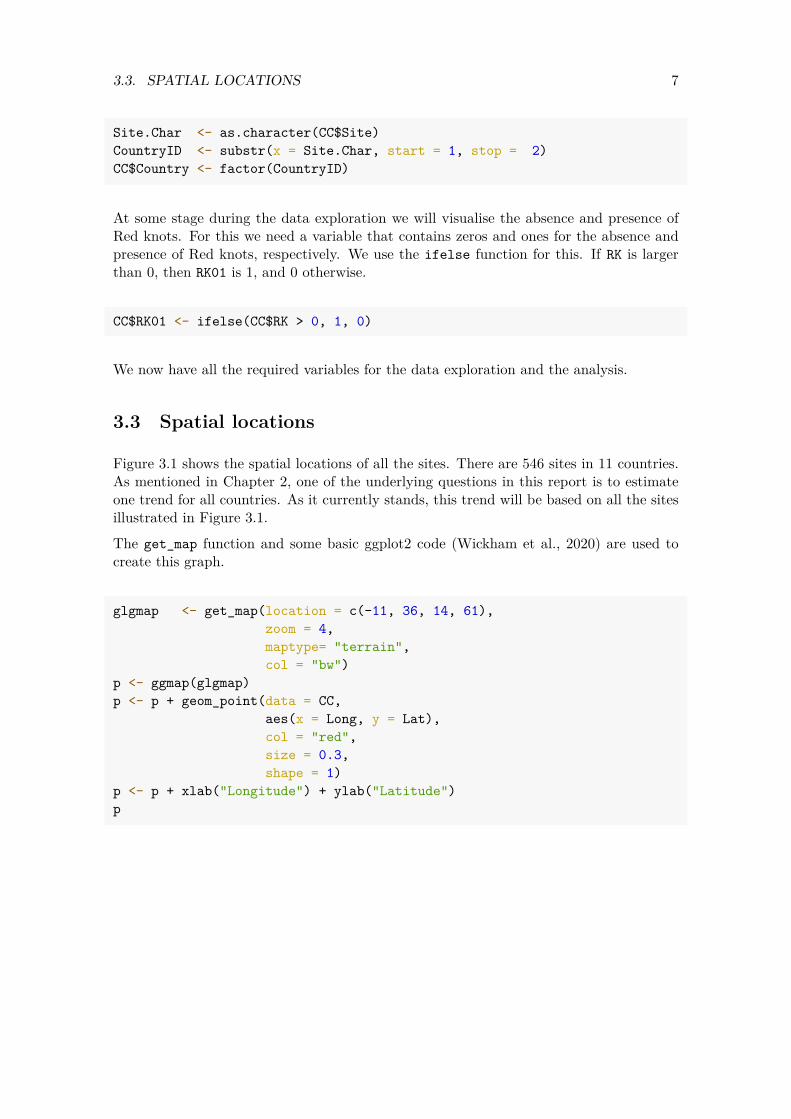
3.3 Spatial locations
Figure 3.1 shows the spatial locations of all the sites. There are 546 sites in 11 countries. As mentioned in Chapter 2, one of the underlying questions in this report is to estimate one trend for all countries. As it currently stands, this trend will be based on all the sites illustrated in Figure 3.1.
The get_map function and some basic ggplot2 code (Wickham et al., 2020) are used to create this graph.
glgmap <- get_map(location = c(-11, 36, 14, 61), zoom = 4, maptype= "terrain", col = "bw")
p <- ggmap(glgmap) p <- p + geom_point(data = CC,
aes(x = Long, y = Lat), col = "red", size = 0.3, shape = 1)
p <- p + xlab("Longitude") + ylab("Latitude") p
8 CHAPTER 3. DATA EXPLORATION FOR THE RED KNOT DATA
40
45
50
55
60
−10 −5 0 5 10Longitude
Latit
ude
Figure 3.1: Sampling locations for all years.
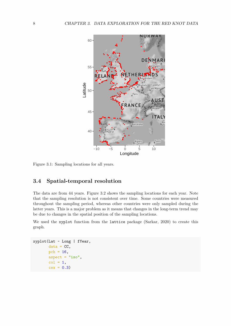
3.4 Spatial-temporal resolution
The data are from 44 years. Figure 3.2 shows the sampling locations for each year. Note that the sampling resolution is not consistent over time. Some countries were measured throughout the sampling period, whereas other countries were only sampled during the latter years. This is a major problem as it means that changes in the long-term trend may be due to changes in the spatial position of the sampling locations.
We used the xyplot function from the lattice package (Sarkar, 2020) to create this graph.
xyplot(Lat ~ Long | fYear, data = CC, pch = 16, aspect = "iso", col = 1, cex = 0.3)
9 3.4. SPATIAL-TEMPORAL RESOLUTION
Long
Lat
354045505560
−10 0 5 10
1975 1976
−10 0 5 10
1977 1978
−10 0 5 10
1979 1980
−10 0 5 10
1981
1982 1983 1984 1985 1986 1987
354045505560
1988354045505560
1989 1990 1991 1992 1993 1994 1995
1996 1997 1998 1999 2000 2001
354045505560
2002354045505560
2003 2004 2005 2006 2007 2008 2009
2010 2011 2012 2013 2014 2015
354045505560
2016354045505560
2017
−10 0 5 10
2018
Figure 3.2: Sampling locations for each year.
We further investigate the unbalanced spatial-temporal resolution of the data as this is a rather important aspect of the data. To see which countries were measured in which years, we create a table of the two variables Country and Year.
10 CHAPTER 3. DATA EXPLORATION FOR THE RED KNOT DATA
Z <- table(CC$Country, CC$Year)
This table has 11 rows (countries) and 44 columns (years), which makes it too large to print. We will visualise the values in this table using the ggplot function. To do this, we need to convert the 11 by 44 matrix Z into a vector of length 484 by 1. We also add the year and site names. We use the as.vector and rep functions to do this. The results are stored in the data frame DataSiteYear2.
DataSiteYear <- data.frame(NumSites = as.vector(Z), Years = rep(colnames(Z), each = nrow(Z)), Countries = rep(rownames(Z), ncol(Z)))
DataSiteYear2 <- subset(DataSiteYear, NumSites > 0) head(DataSiteYear2, 5) #' Show the first 5 rows
## NumSites Years Countries ## 6 119 1975 GB ## 17 115 1976 GB ## 19 1 1976 NL ## 28 114 1977 GB ## 30 16 1977 NL
The data frame MyData2 contains the number of sampled sites per year and country. We have plotted this information in Figure 3.3. A dot means that sampling took place in a specific country and year, whereas if nothing is plotted then no sampling took place for that country and year. The size of the dot is proportional to the number of sampled sites in that year and site. The graph indicates that in various countries, sampling started between 1975 and 1980, but there are also countries where sampling started much later (e.g. Spain, Ireland). Also note that the number of sampling sites differs considerably between the countries. A sensible approach is to use only the data from 1995 onwards.
Basic ggplot2 code is used to create this graph.
DataSiteYear2$MySize <- DataSiteYear2$NumSites / max(DataSiteYear2$NumSites) DataSiteYear2$Years <- as.numeric(DataSiteYear2$Years) p2 <- ggplot(DataSiteYear2,
aes(x = Years, y = Countries, size = NumSites))
p2 <- p2 + geom_point() p2 <- p2 + scale_x_continuous(breaks = seq(from = 1975, to = 2020, by = 10)) p2 <- p2 + labs(x = "Year", y = "Country") p2 <- p2 + theme(text = element_text(size=10)) p2

11 3.4. SPATIAL-TEMPORAL RESOLUTION
DE
DK
ES
FB
FR
GB
IE
NL
NO
PT
WB
1975 1985 1995 2005 2015
Year
Cou
ntry
NumSites
50
100
150
Figure 3.3: Visualisation of the number of sampled sites by country and year. The size of a dot is proportional to the number of sampled sites.
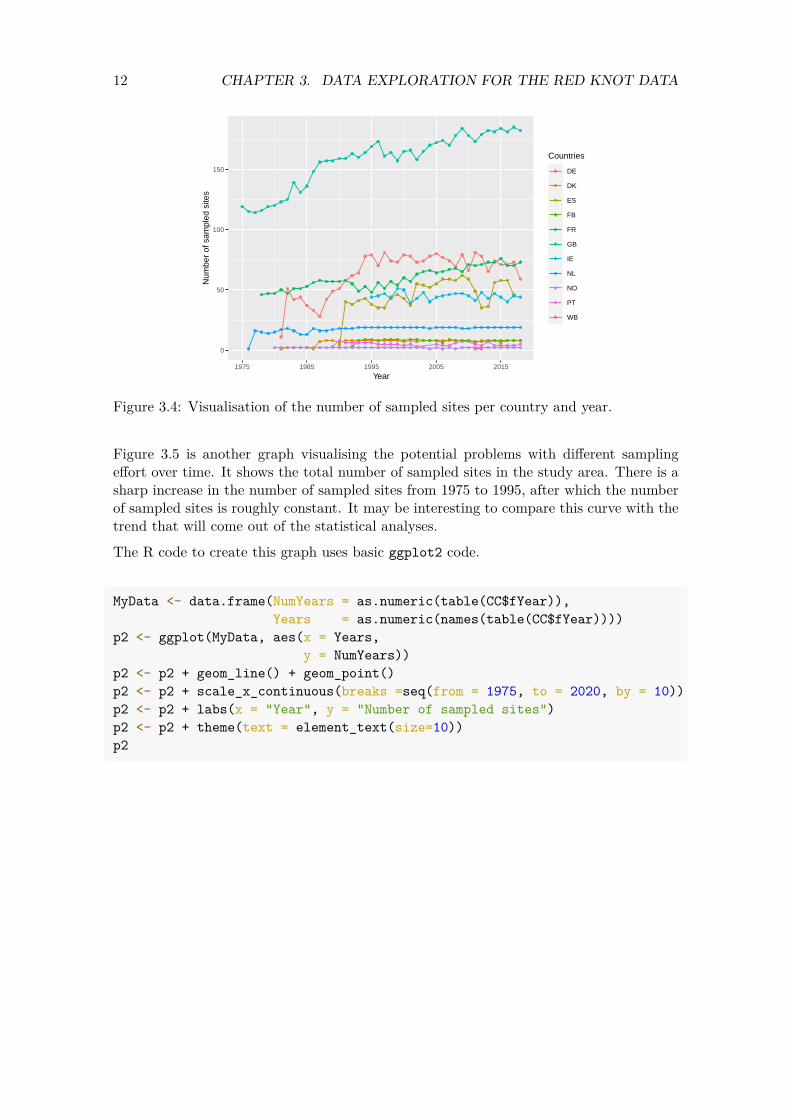
The total number of sampled sites also increase over time within a country; see Figure 3.4. Trends over time in the red Knot abundances per country may be related to the number of sampled sites per country. The overall trend may be influenced by the different starting times of the time series.
p2 <- ggplot(DataSiteYear2, aes(x = Years, y = NumSites, Countries = Countries))
p2 <- p2 + geom_point(aes(col = Countries), size = 1)
p2 <- p2 + geom_line(aes(x = Years, y = NumSites, group = Countries, col = Countries))
p2 <- p2 + scale_x_continuous(breaks = seq(from = 1975, to = 2020, by = 10)) p2 <- p2 + labs(x = "Year", y = "Number of sampled sites") p2 <- p2 + theme(text = element_text(size=10)) p2
12 CHAPTER 3. DATA EXPLORATION FOR THE RED KNOT DATA
0
50
100
150
1975 1985 1995 2005 2015
Year
Num
ber
of s
ampl
ed s
ites
Countries
DE
DK
ES
FB
FR
GB
IE
NL
NO
PT
WB
Figure 3.4: Visualisation of the number of sampled sites per country and year.
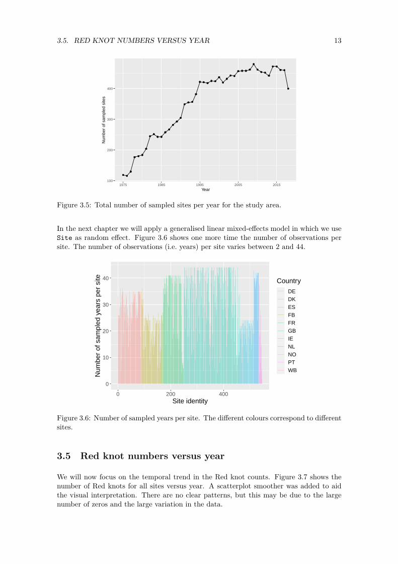
Figure 3.5 is another graph visualising the potential problems with different sampling effort over time. It shows the total number of sampled sites in the study area. There is a sharp increase in the number of sampled sites from 1975 to 1995, after which the number of sampled sites is roughly constant. It may be interesting to compare this curve with the trend that will come out of the statistical analyses.
The R code to create this graph uses basic ggplot2 code.
MyData <- data.frame(NumYears = as.numeric(table(CC$fYear)), Years = as.numeric(names(table(CC$fYear))))
p2 <- ggplot(MyData, aes(x = Years, y = NumYears))
p2 <- p2 + geom_line() + geom_point() p2 <- p2 + scale_x_continuous(breaks =seq(from = 1975, to = 2020, by = 10)) p2 <- p2 + labs(x = "Year", y = "Number of sampled sites") p2 <- p2 + theme(text = element_text(size=10)) p2
13 3.5. RED KNOT NUMBERS VERSUS YEAR
100
200
300
400
1975 1985 1995 2005 2015
Year
Num
ber
of s
ampl
ed s
ites
Figure 3.5: Total number of sampled sites per year for the study area.
In the next chapter we will apply a generalised linear mixed-effects model in which we use Site as random effect. Figure 3.6 shows one more time the number of observations per site. The number of observations (i.e. years) per site varies between 2 and 44.
0
10
20
30
40
0 200 400Site identity
Num
ber
of s
ampl
ed y
ears
per
site Country
DEDKESFBFRGBIENLNOPTWB
Figure 3.6: Number of sampled years per site. The different colours correspond to different sites.
3.5 Red knot numbers versus year
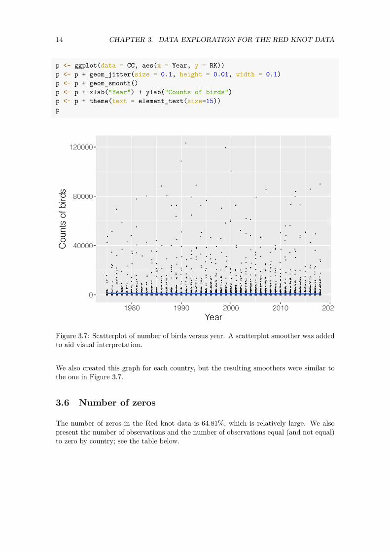
We will now focus on the temporal trend in the Red knot counts. Figure 3.7 shows the number of Red knots for all sites versus year. A scatterplot smoother was added to aid the visual interpretation. There are no clear patterns, but this may be due to the large number of zeros and the large variation in the data.
14 CHAPTER 3. DATA EXPLORATION FOR THE RED KNOT DATA
Cou
nts
of b
irds
p <- ggplot(data = CC, aes(x = Year, y = RK)) p <- p + geom_jitter(size = 0.1, height = 0.01, width = 0.1) p <- p + geom_smooth() p <- p + xlab("Year") + ylab("Counts of birds") p <- p + theme(text = element_text(size=15)) p
120000
80000
40000
0
1980 1990 2000 2010 2020 Year
Figure 3.7: Scatterplot of number of birds versus year. A scatterplot smoother was added to aid visual interpretation.
We also created this graph for each country, but the resulting smoothers were similar to the one in Figure 3.7.
3.6 Number of zeros
The number of zeros in the Red knot data is 64.81%, which is relatively large. We also present the number of observations and the number of observations equal (and not equal) to zero by country; see the table below.

15 3.6. NUMBER OF ZEROS
## Number of observations Number of zeros Number of non-zeros % of zeros ## DE 2426 2008 418 83 ## DK 256 203 53 79 ## ES 1295 1014 281 78 ## FB 215 158 57 73 ## FR 2445 1437 1008 59 ## GB 6931 4194 2737 61 ## IE 1076 424 652 39 ## NL 750 533 217 71 ## NO 75 73 2 97 ## PT 143 74 69 52 ## WB 2 1 1 50
One of the statistical techniques that we will apply in later chapters is a zero-altered negative binomial GLM. In such a model we analyse the absence/presence data, and also the presence-only data. It is important to know the number of non-zeros as this will determine the complexity of the models that can be applied on the non-zero data. The numbers in the table above show that in some countries the number of non-zeros is relatively small, which means that estimating national trends based on only the data from one country may be impractical. Formulated differently, to estimate national trends we recommend using a model that is applied on all the data, and not on the data from only one country.
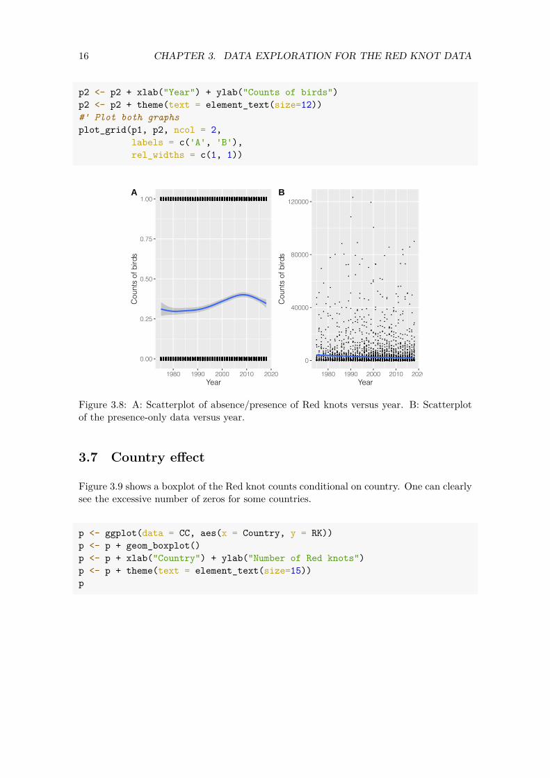
Figure 3.8 shows a scatterplot of the 0-1 data versus year. We also added a scatterplot smoother. The pattern of this smoother is non-linear, which indicates that we may need a smoothing function of year in the model. This guides us towards generalised additive modelling techniques.
Basic ggplot2 coding was used to create this figure.
#' Scatterplot of absence-presence data versus year p1 <- ggplot() p1 <- p1 + geom_jitter(data = CC,
aes(x = Year, y = RK01), size = 0.1, height = 0.01, width = 0.1)
p1 <- p1 + geom_smooth(data = CC, aes(x = Year,
y = RK01)) p1 <- p1 + xlab("Year") + ylab("Counts of birds") p1 <- p1 + theme(text = element_text(size=12)) #' Scatterplot of presence-only data versus year CCPos <- subset(CC, RK > 0) p2 <- ggplot() p2 <- p2 + geom_jitter(data = CCPos,
aes(x = Year, y = RK), size = 0.1, height = 0.1, width = 0.1)
p2 <- p2 + geom_smooth(data = CCPos, aes(x = Year,
y = RK))
16 CHAPTER 3. DATA EXPLORATION FOR THE RED KNOT DATA
p2 <- p2 + xlab("Year") + ylab("Counts of birds") p2 <- p2 + theme(text = element_text(size=12)) #' Plot both graphs plot_grid(p1, p2, ncol = 2,
labels = c('A', 'B'), rel_widths = c(1, 1))
A B 1.00 120000
0.75
Cou
nts
of b
irds
0.50 C
ount
s of
bird
s 80000
40000
0.25
0.00 0
1980 1990 2000 2010 2020 1980 1990 2000 2010 2020 Year Year
Figure 3.8: A: Scatterplot of absence/presence of Red knots versus year. B: Scatterplot of the presence-only data versus year.
3.7 Country effect
Figure 3.9 shows a boxplot of the Red knot counts conditional on country. One can clearly see the excessive number of zeros for some countries.
p <- ggplot(data = CC, aes(x = Country, y = RK)) p <- p + geom_boxplot() p <- p + xlab("Country") + ylab("Number of Red knots") p <- p + theme(text = element_text(size=15)) p

17 3.8. CONCLUSIONS
0
40000
80000
120000
DE DK ES FB FR GB IE NL NO PT WBCountry
Num
ber
of R
ed k
nots
Figure 3.9: Boxplots of the number of Red knots conditional on country.
3.8 Conclusions
Data exploration has indicated that the Red knot counts contain a large number of zero counts. There may be non-linear patterns over time. And most importantly, the spatial resolution has changed over time. With this we mean that not all countries were sampled from start to end. And the number of sampled sites has increase sharply from 1975 to 1995. This means that trends over time may be confounding with the spatial position of the sampling locations.
A large number of imputation methods exist to estimate missing values in time series. However, the number of site-year combinations with no data is 35.01%. This is a rather large percentage of missing values to predict. Furthermore, the majority of these missing values are not ‘missing at random’, but due to sites and countries where sampling starts much later (e.g. around 1995). Hence these are structured missing values. Prediction of such missing values is a much more hazardous exercise than predicting a missing value for a single year in the middle of a time series (a random missing value). An additional argument not to implement imputation methods is that the scatterplot smoothers indicate that any temporal trend is likely to give a poor fit. So, we do not have a good model to predict missing values. Finally, computing time will also be an issue. In later chapters we will execute models with spatial-temporal dependency. With such models we do not have the luxury of rerunning the model multiple times.
In summary, there are no magical tools that can resolve a situation in which 35.01% of the data are missing due to time series starting in different years. The safe option is to truncate the data and analyse the data from 1995 onwards. It should be noted that the techniques that will be applied later are quite capable of predicting missing values, and they even provide measures of uncertainty (e.g. a posterior distribution and 95% credible intervals for each missing value). For missing values at random, we have no qualms about using these. For non-random missing values we caution against using these for imputation purposes.

18 CHAPTER 3. DATA EXPLORATION FOR THE RED KNOT DATA
In the remaining chapters we will run the models on the 1995+ data. These are in the object CC2.
CC2 <- subset(CC, Year >= 1995) CC2 <- droplevels(CC2)
Chapter 4
Poisson GLMM applied on the Red knot data
Our strategy to find the optimal model for the Red knot data is to start simple and slowly build up the complexity of the model. We will first apply a Poisson generalised linear mixed-effects model (GLMM) on the Red knot data. Based on the data exploration results in Chapter 3, we expect that such a model will have problems with zero inflation and spatial dependency. A zero-inflated negative binomial (ZINB) generalised additive model (GAM) with a smoother for year and spatial-temporal dependency may solve some of the problems that we are going to encounter in this chapter. However, it is unwise to start with such a model. The excessive number of zeros in the data may be explained by the temporal trend. If the sites with zeros are next to one another, then the spatial correlation component may model the zeros. If sites have zero observations repeatedly over time, then this is auto-correlation. And if all these things happen, then the different components in the ZINB GAM with spatial-temporal dependency may all fight for the same information, potentially resulting in numerical estimation problems. This explains our motivation to start simple.
4.1 Model formulation
The first model that we will apply is a Poisson GLMM of the form
RK𝑖𝑠 ∼ Poisson (𝜇𝑖𝑠)E [RK𝑖𝑠] = 𝜇𝑖𝑠 (4.1)var [RK𝑖𝑠] = 𝜇𝑖𝑠
log (𝜇𝑖𝑠) = 𝛽1 + 𝛽2 × Year𝑠 + 𝑎𝑖
where RK𝑖𝑠 is the number of counted Red knots at site 𝑖 in year 𝑠. This expression states that the observed number of Red knots at a specific site 𝑖 in year 𝑠 follows a Poisson distribution with parameter 𝜇𝑖𝑠. By definition, the expected value of the number of Red knots at site 𝑖 in year 𝑠 is 𝜇𝑖𝑠 and so is its variance. The mean 𝜇𝑖𝑠 is modelled as an exponential function of the intercept (𝛽1), covariates and the random effects. The selected data set contains measurements from 1995 to 2018, hence the subscript 𝑠 runs from 1 to 24. The total number of sites is 546, and therefore the index 𝑖 runs from 1 to 546. The total sample size is 10673.
19
20 CHAPTER 4. POISSON GLMM APPLIED ON THE RED KNOT DATA
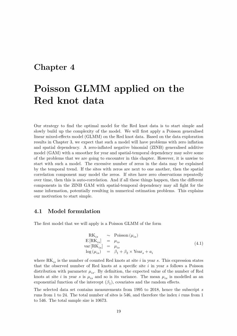
The term 𝑎𝑖 is a random intercept and these 546 random intercepts are assumed to be normal and independently distributed with mean 0 and variance 𝜎2. The random intercepts impose a dependency structure between all Red knots counts from the same site. All observations from different sites are assumed to be independent of one another. We have visualised this dependency structure in Figure 4.1.
Figure 4.1: Dependency structure imposed by a Poisson GLMM using site as random intercept. All observations from the same site are correlated with a value 𝜙. Observations from different sites are assumed to be independent, even if they are close to one another.
At some sites we only have 1 measurement over time, and at other sites we have 24 observations. The dependency structure that is being imposed assumes that the correlation between any two Red knot observations from the same site is the same. Whether the distance in time between these two observations is 1 year or 27 years is not taken into account by this dependency structure.
4.2 Applying the Poisson GLMM
The R code below executes the Poisson GLMM. Due to the logarithmic link function it is crucial to standardise the covariate Year; otherwise we get numerical estimation problems. The function MyStd subtracts the mean and divides by the standard deviation. It is available in our support file HighstLibV13.R. The glmmTMB package (Magnusson et al., 2020) is used to execute the Poisson GLMM.
CC2$Year.c <- MyStd(CC2$Year) M1 <- glmmTMB(RK ~ Year.c + (1| Site),
data = CC2, family = poisson)
21 4.3. OVERDISPERSION
4.3 Overdispersion
The first thing that we should do after executing a Poisson GLM(M) is to check for overdispersion. To do this we obtain the Pearson residuals, square them, add them all up and divide this by the sample size minus the number of parameters. This ratio should be close to 1.
E1 <- resid(M1, type = "pearson") N <- nrow(CC2) Npar <- length(fixef(M1)) + 1 #One sigma Dispersion1 <- sum(E1^2) / (N - Npar) Dispersion1
## [1] 503.2121
In this case, the dispersion parameter is 503.21, which is considerably larger than 1, and indicates serious overdispersion. This means that the confidence intervals for the regression parameters and the long-term trend are too small, and the estimated regression parameters may be biased.
Several factors can cause overdispersion, namely outliers, missing covariates, missing interactions, zero inflation, wrongly modelled covariate effects (e.g. non-linear instead of linear relationships), wrongly modelled dependency, wrong link function or variation that is larger than the Poisson distribution allows for. Each of these causes has its own solution. For example, if zero inflation is the cause of the overdispersion, then a zero-inflated Poisson GLMM needs to be applied. If there are missing interactions, then these should be added to the model. This whole process of fitting, assessing and modifying models does give the analysis a data phishing element, but this is sometimes unavoidable.
If there is overdispersion we need to figure out the cause of the overdispersion and adjust the model accordingly. If we make the wrong choice, then the estimated parameters may be biased.
To determine why we have overdispersion we continue with model validation. Note that if the dispersion statistic had been 1, we would still have to carry out a complete model validation.
4.4 Model validation
4.4.1 Model validation steps for a regression-type model
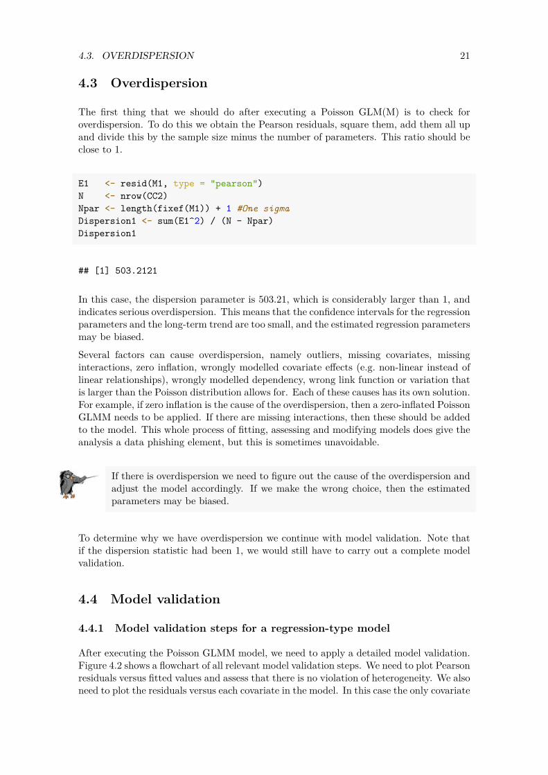
After executing the Poisson GLMM model, we need to apply a detailed model validation. Figure 4.2 shows a flowchart of all relevant model validation steps. We need to plot Pearson residuals versus fitted values and assess that there is no violation of heterogeneity. We also need to plot the residuals versus each covariate in the model. In this case the only covariate
22 CHAPTER 4. POISSON GLMM APPLIED ON THE RED KNOT DATA
is year. If such a graph shows non-linear patterns, then we need to consider allowing for more flexibility by using, for example, a smoother (i.e. allow it to be more non-linear) or allow for interactions. We also need to plot the residuals versus each covariate not in the model. For example, we can plot the residuals versus country identity, or plot residuals versus year for different regions in Europe. If these graphs indicate that there are patterns, then we can conclude that the model with one temporal trend is not good and that model extensions are required. We also need to assess the residuals for temporal dependency and spatial dependency. We must also verify whether the GLMM can cope with the excessive number of zeros. All these steps are part of a systematic approach that should always be followed when working with regression-type models.
Figure 4.2: Model validation steps for a regression-type analysis (including GLMM).
4.4.2 Residuals versus fitted values
We will plot Pearson residuals versus fitted values and Pearson residuals. To do that, we first extract the fitted values (we already have the Pearson residuals). We call these mu1 in the code below. They are an estimate of 𝜇𝑖𝑠 in Equation (4.1).
CC2$mu1 <- fitted(M1) CC2$E1 <- E1
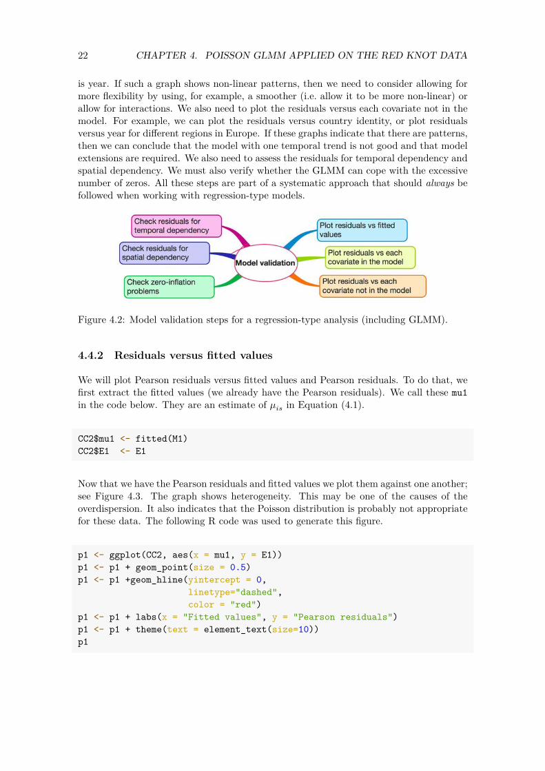
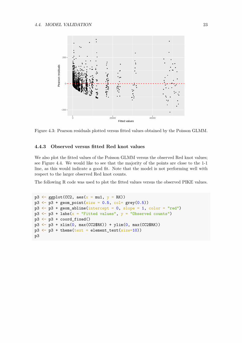
Now that we have the Pearson residuals and fitted values we plot them against one another; see Figure 4.3. The graph shows heterogeneity. This may be one of the causes of the overdispersion. It also indicates that the Poisson distribution is probably not appropriate for these data. The following R code was used to generate this figure.
p1 <- ggplot(CC2, aes(x = mu1, y = E1)) p1 <- p1 + geom_point(size = 0.5) p1 <- p1 +geom_hline(yintercept = 0,
linetype="dashed", color = "red")
p1 <- p1 + labs(x = "Fitted values", y = "Pearson residuals") p1 <- p1 + theme(text = element_text(size=10)) p1
23 4.4. MODEL VALIDATION
−200
0
200
0 20000 40000
Fitted values
Pea
rson
res
idua
ls
Figure 4.3: Pearson residuals plotted versus fitted values obtained by the Poisson GLMM.
4.4.3 Observed versus fitted Red knot values
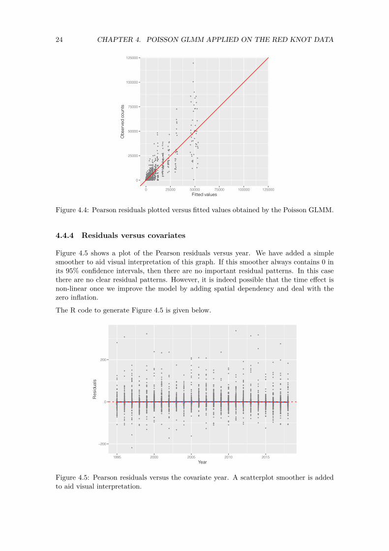
We also plot the fitted values of the Poisson GLMM versus the observed Red knot values; see Figure 4.4. We would like to see that the majority of the points are close to the 1-1 line, as this would indicate a good fit. Note that the model is not performing well with respect to the larger observed Red knot counts.
The following R code was used to plot the fitted values versus the observed PIKE values.
p3 <- ggplot(CC2, aes(x = mu1, y = RK)) p3 <- p3 + geom_point(size = 0.5, col= grey(0.5)) p3 <- p3 + geom_abline(intercept = 0, slope = 1, color = "red") p3 <- p3 + labs(x = "Fitted values", y = "Observed counts") p3 <- p3 + coord_fixed() p3 <- p3 + xlim(0, max(CC2$RK)) + ylim(0, max(CC2$RK)) p3 <- p3 + theme(text = element_text(size=10)) p3
24 CHAPTER 4. POISSON GLMM APPLIED ON THE RED KNOT DATA
125000
100000
Obs
erve
d co
unts
75000
50000
25000
0
0 25000 50000 75000
Fitted values 100000 125000
Figure 4.4: Pearson residuals plotted versus fitted values obtained by the Poisson GLMM.
4.4.4 Residuals versus covariates
Figure 4.5 shows a plot of the Pearson residuals versus year. We have added a simple smoother to aid visual interpretation of this graph. If this smoother always contains 0 in its 95% confidence intervals, then there are no important residual patterns. In this case there are no clear residual patterns. However, it is indeed possible that the time effect is non-linear once we improve the model by adding spatial dependency and deal with the zero inflation.
The R code to generate Figure 4.5 is given below.
200
Res
idua
ls
0
−200
1995 2000 2005 2010 2015
Year
Figure 4.5: Pearson residuals versus the covariate year. A scatterplot smoother is added to aid visual interpretation.

25 4.4. MODEL VALIDATION
p <- ggplot(data = CC2, aes(x = Country, y = E1)) p <- p + geom_boxplot() p <- p + xlab("Country") + ylab("Pearson residuals") p <- p + theme(text = element_text(size=15)) p
4.4.5 Spartial dependency in the random effects
The next model validation step pertains to spatial correlation. We should check the Pearson residuals and the random effects for spatial dependency. Checking for spatial dependency in the random intercepts is often ignored in the literature. The random effects are assumed to be normal and independently distributed. We will investigate whether the random intercepts are indeed spatially independent.
The first thing we do is visualise the values of the random intercepts with respect to the spatial locations of the sites. For this we first need to obtain the spatial locations of the sites. We do this with the tapply function.
MyData <- data.frame(Xkm = tapply(CC2$Xkm, FUN = mean, INDEX = CC2$Site), Ykm = tapply(CC2$Ykm, FUN = mean, INDEX = CC2$Site))
We now have the spatial location of each site in UTM coordinates. We add the random effects to this data frame.
MyData$ai <- ranef(M1)$cond$Site$'(Intercept)'
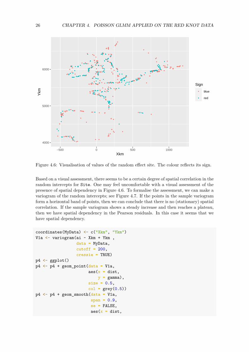
Next we plot the sampling locations. The colour of the points reflects the sign of the random intercepts. If we can see a grouping of dots with the same colour, then this indicates sites close to one another have a similar value for the estimated random effect. And that is a violation of the spatial independence assumption. Figure 4.6 shows that this is indeed the case.
26 CHAPTER 4. POISSON GLMM APPLIED ON THE RED KNOT DATA
4000
5000
6000
−500 0 500 1000
Xkm
Ykm
Sign
blue
red
Figure 4.6: Visualisation of values of the random effect site. The colour reflects its sign.
Based on a visual assessment, there seems to be a certain degree of spatial correlation in the random intercepts for Site. One may feel uncomfortable with a visual assessment of the presence of spatial dependency in Figure 4.6. To formalise the assessment, we can make a variogram of the random intercepts; see Figure 4.7. If the points in the sample variogram form a horizontal band of points, then we can conclude that there is no (stationary) spatial correlation. If the sample variogram shows a steady increase and then reaches a plateau, then we have spatial dependency in the Pearson residuals. In this case it seems that we have spatial dependency.
coordinates(MyData) <- c("Xkm", "Ykm") V1a <- variogram(ai ~ Xkm + Ykm ,
data = MyData, cutoff = 200, cressie = TRUE)
p4 <- ggplot() p4 <- p4 + geom_point(data = V1a,
aes(x = dist, y = gamma),
size = 0.5, col = grey(0.5))
p4 <- p4 + geom_smooth(data = V1a, span = 0.9, se = FALSE, aes(x = dist,

27 4.4. MODEL VALIDATION
y = gamma)) p4 <- p4 + xlab("Distance (km") + ylab("Sample variogram") p4 <- p4 + theme(text = element_text(size=10)) p4
7.5
10.0
12.5
15.0
17.5
0 50 100 150 200
Distance (km
Sam
ple
vario
gram
Figure 4.7: Sample variogram of the random effects.
In summary, the variogram also gives a clear indication of spatial dependency. The ultimate approach to determine whether there is really spatial dependency is to implement a model with spatial (or spatial-temporal) dependency and assess, for example, with the help of an AIC-related tool, whether the model improves.
The same exercise needs to be applied on the Pearson residuals, but because we have multiple Pearson residuals per site, this model validation step is less useful. The Pearson residuals also exhibit spatial dependency, but results are not presented here.
4.4.6 Zero inflation
There is more misery. The data set consists of 10673 observations. We can easily simulate 10673 values for the number of Red knots from the model. In a perfect world, these simulated ‘number of Red knot’ values are comparable to the observed ‘number of Red knots’. If that would be the case then the model performs well. We can define ‘similar’ in many ways. One way is to look for whether the number of zeros in both data sets match. Let us explain this idea with some R code.

28 CHAPTER 4. POISSON GLMM APPLIED ON THE RED KNOT DATA
We first set the random seed so that we get the same results if we run the code again. We obtain the fitted values from the model (where fitted values are defined as intercept + year effect + random effects) and then simulate 10673 from a Poisson distribution using the fitted values from the model M1.
set.seed(1234) N <- nrow(CC2) RK.Simulated <- rpois(n = N, lambda = CC2$mu1)
The RK.Simulated object contains simulated numbers of Red knots from the Poisson GLMM. In the simulated data we have 3641 values equal to 0, whereas we have 6665 for the observed data. It seems that the simulated data (which are truly Poisson) contain a fewer number of zeros. But this is only one set of simulated ‘number of Red knot’ values. We can easily do this 10,000 times, and for each simulated data set we determine the number of zeros. That is what the next block of R code does.
NSim <- 1000 Ysim <- simulate(M1, seed = 12345, nsim = NSim)
The simulate function simulates random effects from a normal distribution with mean 0, and the sigma is taken from the estimated model. Using the estimated regression parameters, it will then calculate the expected values, and the rpois function is used to simulate count data. Note that the simulation process itself can be improved by also simulating the regression parameters.
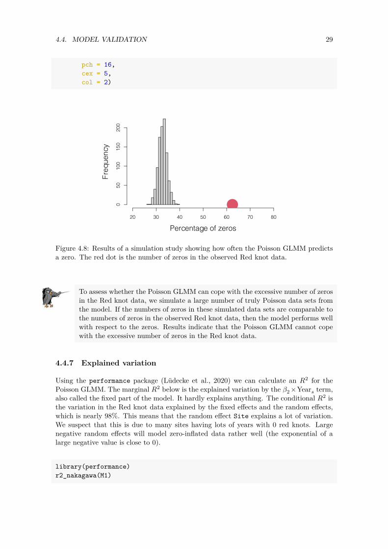
Now that we have 1,000 simulated sets of ‘number of Red knots’ we can calculate the numbers of zeros in each simulated data set and see how often we predict 0 times a zero, 1 times a zero, 2 times a zero, etc. We made a frequency plot of these values; see Figure 4.8. If the model can cope with the excessive number of zeros in the sampled data, then the red dot (representing the number of zeros in the observed Red knot values) would be within the range of the simulated values. That is not the case here, which means that the Poisson GLMM cannot cope with the 62.45% of zeros in the Red knot data. Therefore this model fails the model validation with respect to zero inflation, and it cannot be used for inferences. Further model improvement is required.
zeros <- vector(length = NSim) for(i in 1:NSim){ zeros[i] <- sum(Ysim[,i] == 0)} N <- nrow(CC2) par(mfrow = c(1,1), cex.lab = 1.5, mar = c(5,5,2,2)) hist(100 * zeros / N,
xlab = "Percentage of zeros", ylab = "Frequency", xlim = c(20, 80), main = "")
points(x = 100 * sum(CC2$RK == 0) / N, y = 0,
29 4.4. MODEL VALIDATION
pch = 16, cex = 5, col = 2)
Freq
uenc
y 0
50
100
150
200
20 30 40 50 60 70 80
Percentage of zeros
Figure 4.8: Results of a simulation study showing how often the Poisson GLMM predicts a zero. The red dot is the number of zeros in the observed Red knot data.
To assess whether the Poisson GLMM can cope with the excessive number of zeros in the Red knot data, we simulate a large number of truly Poisson data sets from the model. If the numbers of zeros in these simulated data sets are comparable to the numbers of zeros in the observed Red knot data, then the model performs well with respect to the zeros. Results indicate that the Poisson GLMM cannot cope with the excessive number of zeros in the Red knot data.
4.4.7 Explained variation
Using the performance package (Lüdecke et al., 2020) we can calculate an 𝑅2 for the Poisson GLMM. The marginal 𝑅2 below is the explained variation by the 𝛽2 ×Year𝑠 term, also called the fixed part of the model. It hardly explains anything. The conditional 𝑅2 is the variation in the Red knot data explained by the fixed effects and the random effects, which is nearly 98%. This means that the random effect Site explains a lot of variation. We suspect that this is due to many sites having lots of years with 0 red knots. Large negative random effects will model zero-inflated data rather well (the exponential of a large negative value is close to 0).
library(performance) r2_nakagawa(M1)

30 CHAPTER 4. POISSON GLMM APPLIED ON THE RED KNOT DATA
## # R2 for Mixed Models ## ## Conditional R2: 0.982 ## Marginal R2: 0.000
Note that this does not mean that there is no temporal trend. It only indicates that modelling the trend as 𝛽2 × Year𝑠 is not a good idea.
4.4.8 Summary of the Poisson GLMM
The Poisson GLMM is overdispersed, and the dispersion statistic is too large to ignore. Model validation of the Poission GLMM indicated two main problems: there is spatial correlation in the random effects, and the model cannot cope with the excessive number of Red knot values equal to 0. Model validation did not indicate any major non-linear year effects in the Pearson residuals. We are slightly surprised by this because in our experience trends over time tend to be non-linear for this type of data. To verify whether there really is no non-linear year effect, we will briefly run a generalised additive mixed model in the next section.
4.5 Poisson GAMM applied on the Red knot data
In the previous section we applied a Poisson GLMM, and model validation indicated that there was no non-linear year effect in the Pearson residuals. We are surprised by this, partly because of our experience with this type of data but also because Figure 3.8 did indicate a non-linear year effect for the absence/presence data. To put our minds at ease, we will verify that there really is no non-linear year effect. To do this we apply a Poisson generalised additive mixed-effects model (GAMM) on the Red knot data. Such a model is defined as follows.
RK𝑖𝑠 ∼ Poisson (𝜇𝑖𝑠)E [RK𝑖𝑠] = 𝜇𝑖𝑠 (4.2)var [RK𝑖𝑠] = 𝜇𝑖𝑠
log (𝜇𝑖𝑠) = 𝛽1 + 𝑓(Year𝑠) + 𝑎𝑖
The only difference between Equations (4.1) and (4.2) is the 𝛽2 ×Year𝑠 and 𝑓(Year𝑠). The𝑓(Year𝑠) is a smoother. The aim of the smoothing function of year is to obtain a curve that captures the general pattern of the Red knot counts-year relationship. Smoothers are explained in more detail in Wood (2017), Zuur et al. (2009), Zuur et al. (2015) and Zuur and Ieno (2018). For the moment it suffices to know that the smoother that we will apply in a moment has a mechanism that is called ‘cross validation’. This tool determines the amount of smoothing of a smoother. Formulated differently, cross validation estimates the effective degrees of feeedom (edf). If the edf is 1, then the smoothing function 𝑓(Year𝑠)is a straight line, and we might as well use the Poisson GLMM instead of the Poisson GAMM. The larger the edf, the less smooth is the smoothing function (which represents the year effect). Right now we are only interested in whether a GAMM gives an edf of 1 for the smoother 𝑓(Year𝑠). If it does, then using a GAMM may give better results than a GLMM. We execute the Poisson GAMM with the following code.
31 4.5. POISSON GAMM APPLIED ON THE RED KNOT DATA
G1 <- gamm4(RK ~ s(Year), random =~ (1| Site), data = CC2, family = poisson)
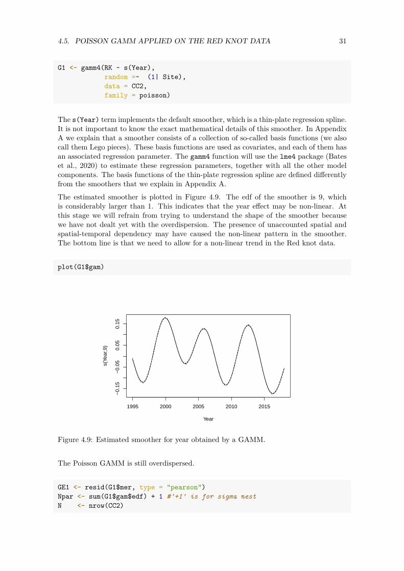
The s(Year) term implements the default smoother, which is a thin-plate regression spline. It is not important to know the exact mathematical details of this smoother. In Appendix A we explain that a smoother consists of a collection of so-called basis functions (we also call them Lego pieces). These basis functions are used as covariates, and each of them has an associated regression parameter. The gamm4 function will use the lme4 package (Bates et al., 2020) to estimate these regression parameters, together with all the other model components. The basis functions of the thin-plate regression spline are defined differently from the smoothers that we explain in Appendix A. The estimated smoother is plotted in Figure 4.9. The edf of the smoother is 9, which is considerably larger than 1. This indicates that the year effect may be non-linear. At this stage we will refrain from trying to understand the shape of the smoother because we have not dealt yet with the overdispersion. The presence of unaccounted spatial and spatial-temporal dependency may have caused the non-linear pattern in the smoother. The bottom line is that we need to allow for a non-linear trend in the Red knot data.
plot(G1$gam)
1995 2000 2005 2010 2015
−0.
15−
0.05
0.05
0.15
Year
s(Ye
ar,9
)
Figure 4.9: Estimated smoother for year obtained by a GAMM.
The Poisson GAMM is still overdispersed.
GE1 <- resid(G1$mer, type = "pearson") Npar <- sum(G1$gam$edf) + 1 #'+1' is for sigma nest N <- nrow(CC2)
32 CHAPTER 4. POISSON GLMM APPLIED ON THE RED KNOT DATA
GE1 <- resid(G1$mer, type = "pearson") OverdispGAMM <- sum(GE1^2) / (N - Npar) OverdispGAMM
## [1] 497.8361
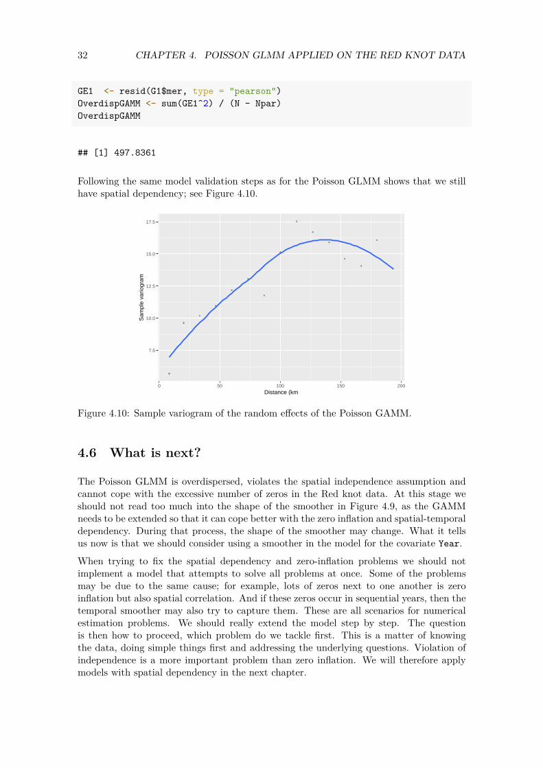
Following the same model validation steps as for the Poisson GLMM shows that we still have spatial dependency; see Figure 4.10.
7.5
10.0
12.5
15.0
17.5
0 50 100 150 200
Distance (km
Sam
ple
vario
gram
Figure 4.10: Sample variogram of the random effects of the Poisson GAMM.
4.6 What is next?
The Poisson GLMM is overdispersed, violates the spatial independence assumption and cannot cope with the excessive number of zeros in the Red knot data. At this stage we should not read too much into the shape of the smoother in Figure 4.9, as the GAMM needs to be extended so that it can cope better with the zero inflation and spatial-temporal dependency. During that process, the shape of the smoother may change. What it tells us now is that we should consider using a smoother in the model for the covariate Year.
When trying to fix the spatial dependency and zero-inflation problems we should not implement a model that attempts to solve all problems at once. Some of the problems may be due to the same cause; for example, lots of zeros next to one another is zero inflation but also spatial correlation. And if these zeros occur in sequential years, then the temporal smoother may also try to capture them. These are all scenarios for numerical estimation problems. We should really extend the model step by step. The question is then how to proceed, which problem do we tackle first. This is a matter of knowing the data, doing simple things first and addressing the underlying questions. Violation of independence is a more important problem than zero inflation. We will therefore apply models with spatial dependency in the next chapter.
Chapter 5
GAMM applied on the UK Red knot data in R-INLA
5.1 Model formulation
In this chapter we will apply a Poisson GAMM on the Red knot data from the UK in R-INLA. The reason for focusing on the UK data is to avoid excessively long computing time at this stage. The UK data were measured from 1975 onwards, and there is no need to remove the pre-1995 data for this country.
CC2 <- subset(CC, Country == "GB") CC2 <- droplevels(CC2)
In Appendix A of this report we explain that a smoother is a collection of abstract mathematical functions. We show that the smoother of the covariate Year can be written as 𝑓(Year) = 𝑋 × 𝛽, where the matrix 𝑋 contains columns with abstract mathematical functions, and the 𝛽s are the corresponding regression parameters. We also show in Appendix A how to execute a GAM as a linear regression model. We used the lm function to do this. The covariates in the lm function were the abstract mathematical functions in the matrix 𝑋. To understand the R code in this chapter, we assume that you are familiar with the code in Appendix A.
The Poisson GAMM that we will apply is defined in (5.1). We will use a smoother for the covariate year. It is the long-term trend present at all sites.
Counts𝑖𝑠 ∼ Poisson (𝜇𝑖𝑠)E [RK𝑖𝑠] = 𝜇𝑖𝑠 (5.1)var [RK𝑖𝑠] = 𝜇𝑖𝑠
log (𝜇𝑖𝑠) = 𝛽1 + 𝑓(Year𝑠) + 𝑢𝑖
Instead of 𝛽×Year𝑠, which was used in the GLMM, the GAMM uses a smoothing function 𝑓(Year𝑠). Just as in the previous chapter, initial analysis showed that the Poisson GAMM is still overdispersed. The same holds for the Poisson models with spatial correlation that will be
33

34 CHAPTER 5. GAMM APPLIED ON THE UK RED KNOT DATA IN R-INLA
applied in the next chapter. We therefore decided to also implement a negative binomial (NB) GAMM; see Equation (5.2).
Counts𝑖𝑠 ∼ NB (𝜇𝑖𝑠, 𝜃) E [RK𝑖𝑠] = 𝜇𝑖𝑠 (5.2)
𝜃𝑖𝑠 var [RK𝑖𝑠] = 𝜇𝑖𝑠 + 𝜇2
log (𝜇𝑖𝑠) = 𝛽1 + 𝑓(Year𝑠) + 𝑢𝑖
Note that this distribution has an extra parameter 𝜃. For small values of 𝜃, the NB distribution allows for a large variation of the counts. In our experience, the NB distribution is capable of dealing rather well with zero-inflated data.
5.2 Executing the Poisson GAMM in mgcv
We only need three lines of R code to execute the Poisson GAMM in the gamm4 package (Wood and Scheipl, 2020) in R.
G1 <- gamm4(RK ~ s(Year), data = CC2, family = "poisson")
Instead of using the output of this model, we will execute the same model in R-INLA. The reason for this is that in R-INLA we can easily add spatial and spatial-temporal correlation. Doing this in the gamm4 or mgcv packages is bound to result in numerical estimation problems. The only problem with executing the Poisson GAMM in R-INLA is that the required code is rather lengthy.
5.3 Executing the Poisson GAMM in R-INLA
In this section we will show how to execute a GAMM in R-INLA. The R code to do this is not well described in the literature, so we will therefore present and explain the code in detail. It is fully explained in Zuur and Ieno (2018).
In Appendix A we explain that a smoothing function of a covariate can be written as𝑋 × 𝛽, and we also show how to obtain the basis functions (i.e. the columns of the 𝑋 matrix). As explained in Appendix A we will keep the smoother relatively simple and use unpenalised cubic regression splines with 7 degrees of freedom.
We will apply a Poisson GAMM in which Year is modelled as a smoother. The native smoothers in R-INLA can be quite unstable, and we will therefore use unpenalised cubic regression splines with 7 degrees of freedom. This will result in a curve that is fairly smooth and will only pick up the main patterns of a covariate effect.
35 5.3. EXECUTING THE POISSON GAMM IN R-INLA
We use the smoothCon function from the mgcv package to obtain the basis functions of a smoother. This is the X matrix for a smoother.
NumKnots <- 8 #df = Number of knots - 1 Lego.Year <- smoothCon(s(Year, bs = "cr", k = NumKnots, fx = TRUE),
data = CC2, absorb.cons = TRUE)[[1]]
The Lego.Year component contains the knot positions and the basis functions, among other information. The 𝑋 matrix is extracted below.
X.Year <- Lego.Year$X #f(Year) = X.Year * beta
The object X.Year contains the 7 abstract mathematical functions that we will use as covariates in the model. This means that in order to estimate the smoother, we need to estimate 8 regression parameters (1 intercept + 7 parameters for the smoother).
The inla function will be used to execute the Poisson GAMM in R-INLA. Just like the lm and glm functions we can use the data= argument to provide the data. However, if there is spatial correlation, then we need to make adjustments in how we pass data to R-INLA. This is done with the so-called stack function.
When we apply models with spatial correlation then we need to use the stack function to combine the response variable, covariates and spatial correlation components. We might as well start using the stack function now as it means that in later chapters we only have to make small changes to the R code.
We don’t have spatial correlation yet, but we might as well use the stack function at this stage of the analysis so that in later chapters we only have to make small modifications to the code. We use the stack function to combine all the data. The code for the stack function is explained in more detail in the next chapter.
N <- nrow(CC2) StackPoissonGAMM <- inla.stack(
tag = "Fit", data = list(RK = CC2$RK), A = list(1, 1, 1), effects = list(
Intercept = rep(1, N), #Intercept X.Year = X.Year, #f(Year) = X.Year * beta Site = CC2$Site)) #random intercept
The last thing that we need to do is to specify a prior for the 𝜎 of the random intercept. As explained in Wang et al. (2018), the default gamma priors for variance parameters in R-INLA do not perform well for GLMMs, and it is recommended to use penalised complexity (PC) priors for such hyperparameters. A PC prior is defined as 𝑃(𝜎 > 𝑈) = 𝛼.

36 CHAPTER 5. GAMM APPLIED ON THE UK RED KNOT DATA IN R-INLA
The task of the user is to select values for 𝑈 and 𝛼, for example 𝑃(𝜎 > 4) = 0.05. This states that the probability that the 𝜎 from the random intercept site is most likely smaller than 4. Such a prior is defined below.
priorpc <- list(prec = list(prior = "pc.prec", param = c(4, 0.05)))
The choice for this prior may appear subjective, but we can easily get some idea of likely values for 𝜎 by applying a model without any covariates and inspecting the estimated 𝜎 for the random intercepts. In such a worst-case scenario, the value of 𝜎 is probably the largest that we may find. Wang et al. (2018) used a 𝜎 that is slightly larger than the 𝜎 obtained by a model without any covariates. One should also keep in mind that a 𝜎 of 4 implies that the majority of the random intercepts are between −1.96 × 4 and 1.96 × 4. And a random intercept of 7 or 8 means that the fitted values are around exp(7) or exp(8), which are rather large values.
For the regression parameters we use diffuse normal priors, and there is no urgent need to adjust these.
When we apply a GLMM or GAMM in R-INLA, an educated guess is required for the likely values of the 𝜎 of the random intercepts 𝑢𝑖, where 𝑢𝑖 ∼ 𝑁(0, 𝜎2). The general recommendation is to use a penalised complexity prior for 𝜎 and specify some sort of upper limit for the likely values of 𝜎 via 𝑃(𝜎 > 𝑈) = 0.05. Based on prior knowledge, initial data analysis and common sense, a sensible value for 𝑈 needs to be selected.
We are now ready to execute the Poisson GAMM in R-INLA; see the code below.
Pois1 <- inla(RK ~ -1 + Intercept + X.Year + f(Site, model = "iid", hyper = priorpc),
data = inla.stack.data(StackPoissonGAMM), control.predictor = list(A = inla.stack.A(StackPoissonGAMM),
link = 1), control.compute = list(dic = TRUE, waic = TRUE), control.inla = list(strategy='gaussian',
int.strategy = 'eb'), family = "poisson")
We also execute the negative binomial GAMM; see the code below. We compared the results with those obtained by the frequentist package glmmTMB. Results were similar.
NB1 <- inla(RK ~ -1 + Intercept + X.Year + f(Site, model = "iid", hyper = priorpc),
data = inla.stack.data(StackPoissonGAMM), control.predictor = list(A = inla.stack.A(StackPoissonGAMM),
37 5.4. PLOTTING THE SMOOTHER IN R-INLA
link = 1), control.compute = list(dic = TRUE, waic = TRUE), control.inla = list(strategy='gaussian',
int.strategy = 'eb'), family = "nbinomial")
HyperMar <- NB1$marginals.hyperpar theta.pd <- HyperMar$`size for the nbinomial observations (1/overdispersion)` theta.pm <- inla.emarginal(function(x) x, theta.pd)
The reason that we execute the negative binomial GLMM is that we would like to use the posterior mean value of the parameter 𝜃 as a starting value for the spatial models that will be applied in later chapters. The NB GAMM produces a posterior mean of 𝜃 = 0.18. Once the model is finished, we have posterior mean values of all the regression parameters. We can also obtain fitted values and Pearson residuals. This allows us to assess the model for overdispersion and apply model validation. We still have spatial correlation in the random effects, and the Poisson GAMM cannot cope with the excessive number of zeros. The only problem that has been solved by the Poisson GAMM is the non-linear covariate effects. We will not show any of these model validation graphs here. Instead, we will show how to plot the smoothers in the next section, before we apply models with spatial correlation.
5.4 Plotting the smoother in R-INLA
When we use the plot function after applying the gamm4 or gam functions in a frequentist analysis, we get a graph of the smoother. There is no plot function that does this for the INLA smoothers. Instead, we have to implement a series of coding steps ourselves before we can visualise the smoothers. In essence, these are the same steps that the plot function does for a gamm4 object. In order to visualise or plot the smoother we need to perform a couple of steps. In short, we need to create a certain number (say 50) of made-up values for the covariate Year, and for these values we calculate the predicted counts. But because this is a smoother, we need to convert these made-up values into basis functions with the same knot locations as the original smoother. These new basis functions are then put into a stack (one stack per smoother) and then combined with the original stack. The code to do this is not presented here, but it is in the RMarkdown document that was used to generate this report. Before we show the smoother, we need to mention one more point. Recall that the Poisson GLMM is of the form
= 𝑒Intercept+𝑓(Year𝑠)+𝑢𝑖 𝜇𝑖𝑠
. Using some high school mathematics, namely 𝑒𝑎+𝑏 = 𝑒𝑎×𝑒𝑏, we can write the link function as
= 𝑒Intercept × 𝑒𝑓(Year𝑠) × 𝑒𝑢𝑖 𝜇𝑖𝑠
2020
38 CHAPTER 5. GAMM APPLIED ON THE UK RED KNOT DATA IN R-INLA
.
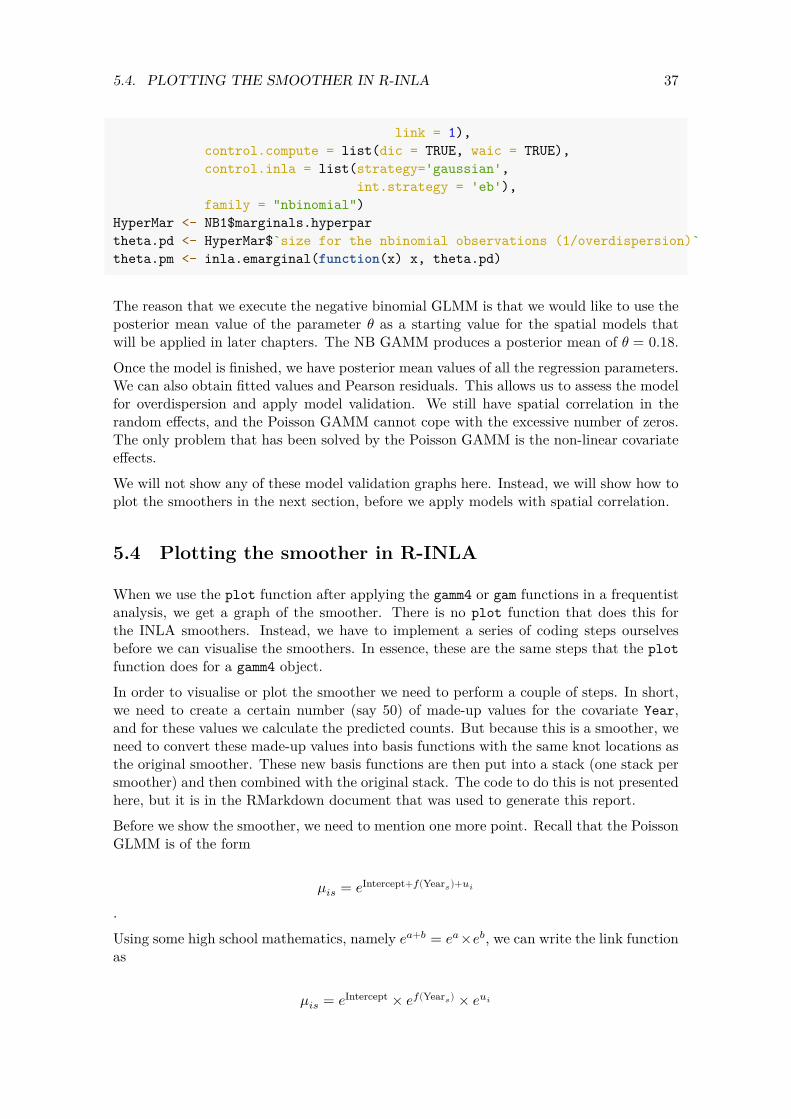
Figure 5.1A shows the 𝑒𝑓(Year𝑖) component obtained by the Poisson GAMM, and panel B shows the component obtained by the negative binomial GAMM. Note that we applied the exponential function. This means that the curve shows the multiplication factor to obtain the expected values of the Red knot counts. Let us focus on the smoother obtained by the negative binomial GAMM in panel B. When year is around 2000 then we need to multiply the rest of the model by approximately 1.35 to obtain the fitted values. When the year values are between 1975 and 1988, we need to multiply the rest of the components by a value close to 0.8 to obtain the expected values.
1.2
1.1 1.5
1.0
1.00.9
0.8
0.5
0.7
Figure 5.1: A: Posterior mean values and 95% credible intervals for the smoother obtained by the Poisson GAMM applied on the Red knot data from the UK. B: Posterior mean values and 95% credible intervals for the smoother obtained by the negative binomial GAMM applied on the Red knot data from the UK. The smoothers are unpenalised cubic regression splines with 7 df.
Finally, we have random effects. We extract them and combine them with the spatial coordinates of the site.
a_i <- NB1$summary.random$Site[,"mean"] MyData.gamm <- data.frame(a_i = a_i,
Xkm = tapply(CC2$Xkm, FUN = mean, INDEX = CC2$Site),
Ykm = tapply(CC2$Ykm,
f(Yea
r)
f(Yea
r)
1980 1990 2000 2010
Year 1980 1990 2000 2010 2020
Year
39 5.4. PLOTTING THE SMOOTHER IN R-INLA
FUN = mean, INDEX =CC2$Site),
Sign = ifelse(a_i > 0, "Positive", "Negative"))
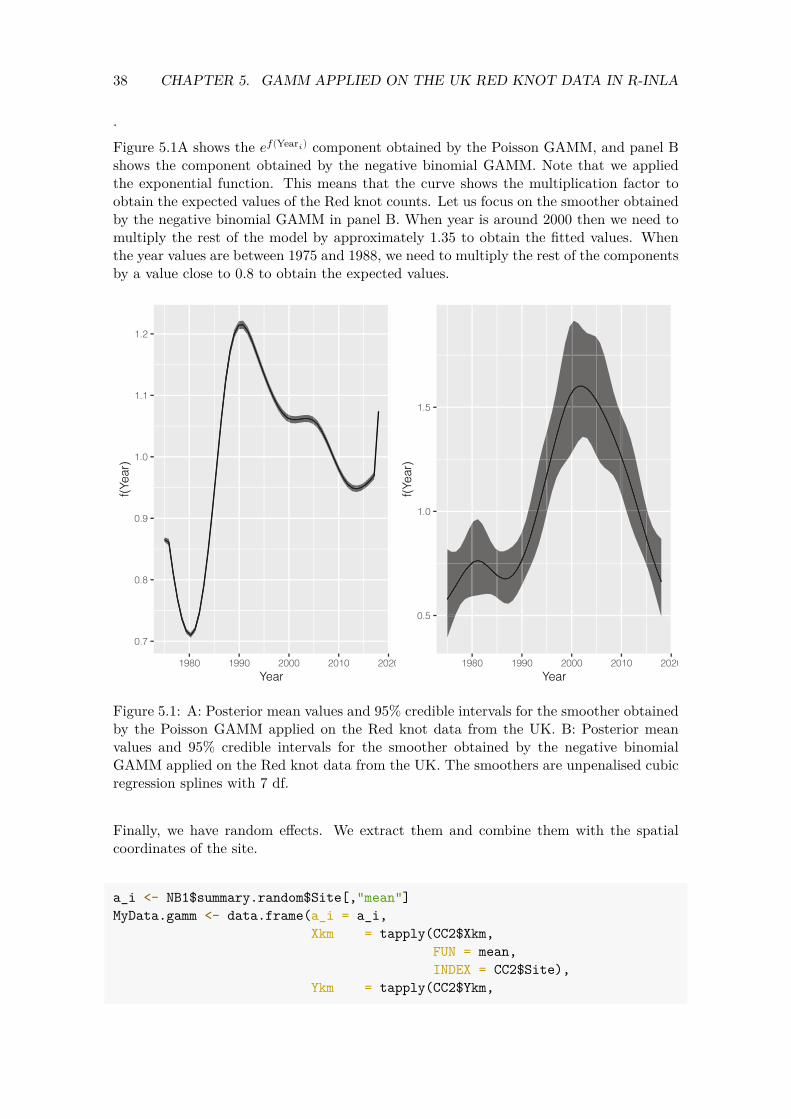
As discussed earlier in this section, we assume that the random intercepts are independently distributed. Figure 5.2 shows that this is not the case. Panel A shows a scatterplot of the spatial coordinates, and we have superimposed the sign of the random intercepts (obtained by the negative binomial GAMM). There is a clear grouping structure indicating spatial dependency in the random effects. Panel B shows a sample variogram of the random intercepts (of the negative binomial GAMM) and also indicates that there is spatial dependency to about 60 km. In summary, there is clear evidence that the random intercepts are spatially correlated. We therefore conclude that the Poisson GAMM and the NB GAMM are not good models, and further model extensions are required.
A B
20
6800
5600
5 0 200 400 Xkm
0 50 100 150 Distance (km)
Figure 5.2: A: Plot of Xkm versus Ykm. Colours of the points are related to the sign of the posterior mean value of the random intercepts obtained by the negative binomial GAMM. B: Sample variogram of the posterior mean values of the random intercepts obtained by the negative binomial GAMM.
6400
Sign
Negative 6000 Positive
Sem
i−va
riogr
am
15
Ykm
10


Chapter 6
Spatial GAM applied on the UK Red knot data
6.1 Introduction
In Chapter 5 we applied generalised additive mixed-effects models and estimated a temporal trend for the UK Red knot data. We used random effects to model dependency between all observations from the same site. We called these the 𝑢𝑖s. We ended up with one 𝑢𝑖 for each site 𝑖. One of the underlying assumptions of the GAMM is that these random intercepts 𝑢𝑖 are independently distributed. However, model validation indicated that there is spatial dependency in these random effects, and that violates the model assumptions. In this chapter we will implement statistical models that allow for spatial dependency between the 𝑢𝑖s. The models are estimated using the INLA method, which is implemented in the R-INLA package (Rue et al., 2020) in R. In this report we avoid discussing technicalities of INLA. Instead, we focus on the conceptual points underlying INLA and show how to run a model with spatial correlation. We will also set the scene for the spatial-temporal GAMs that will be applied in Chapter 7. For a detailed discussion of R-INLA, see Blangiardo and Cameletti (2015), For a non-technical explanation plus a large number of case studies, see Zuur et al. (2017) and Zuur and Ieno (2018).
In this section we will apply Poisson, negative binomial, zero-inflated negative binomial and zero-altered negative binomial GAMs with spatial correlation.
6.2 Model formulation Poisson GAM with spatial correlation
The underlying questions are identical to those in Chapter 5. We will start with the following model.
RK𝑖𝑠 ∼ Poisson (𝜇𝑖𝑠)E [RK𝑖𝑠] = 𝜇𝑖𝑠 (6.1)var [RK𝑖𝑠] = 𝜇𝑖𝑠
log (𝜇𝑖𝑠) = 𝛽1 + 𝑓(Year𝑠) + 𝑢𝑖
41

42 CHAPTER 6. SPATIAL GAM APPLIED ON THE UK RED KNOT DATA
RK𝑖𝑠 is the number of Red knots at site i in year s. A smoother is used to model the effect of year. One may wonder what the difference is between the models in Equation (6.1) and Equation (5.1), which was presented in Section 5.1. The answer lies with the random effects 𝑢𝑖. In Section 5.1 the random intercepts 𝑢𝑖 were independently distributed with mean 0 and variance 𝜎2. Note the word ‘independently’. It implies that two random intercepts 𝑢𝑖 and 𝑢𝑗 are independent of each other, even if the corresponding sites are only 1 kilometer apart. In this section we will relax this assumption and allow the random effects 𝑢𝑖 to be spatially correlated.
It should be noted that the spatially correlated random effects may represent real dependency, but also unmeasured covariate effects. It is not possible to discriminate between them, unless such covariates become available and are included in the model. The role of the spatially correlated random effects is to ensure that no residual spatial patterns are left. It also imposes dependency on the Red knot counts.
The only difference between the statistical models used in this chapter and those used in Chapter 4 is the independence assumption for the random effects. In this chapter we will allow them to be spatially correlated. This may affect the measures of uncertainty around the temporal trend.
6.3 Distances between sites
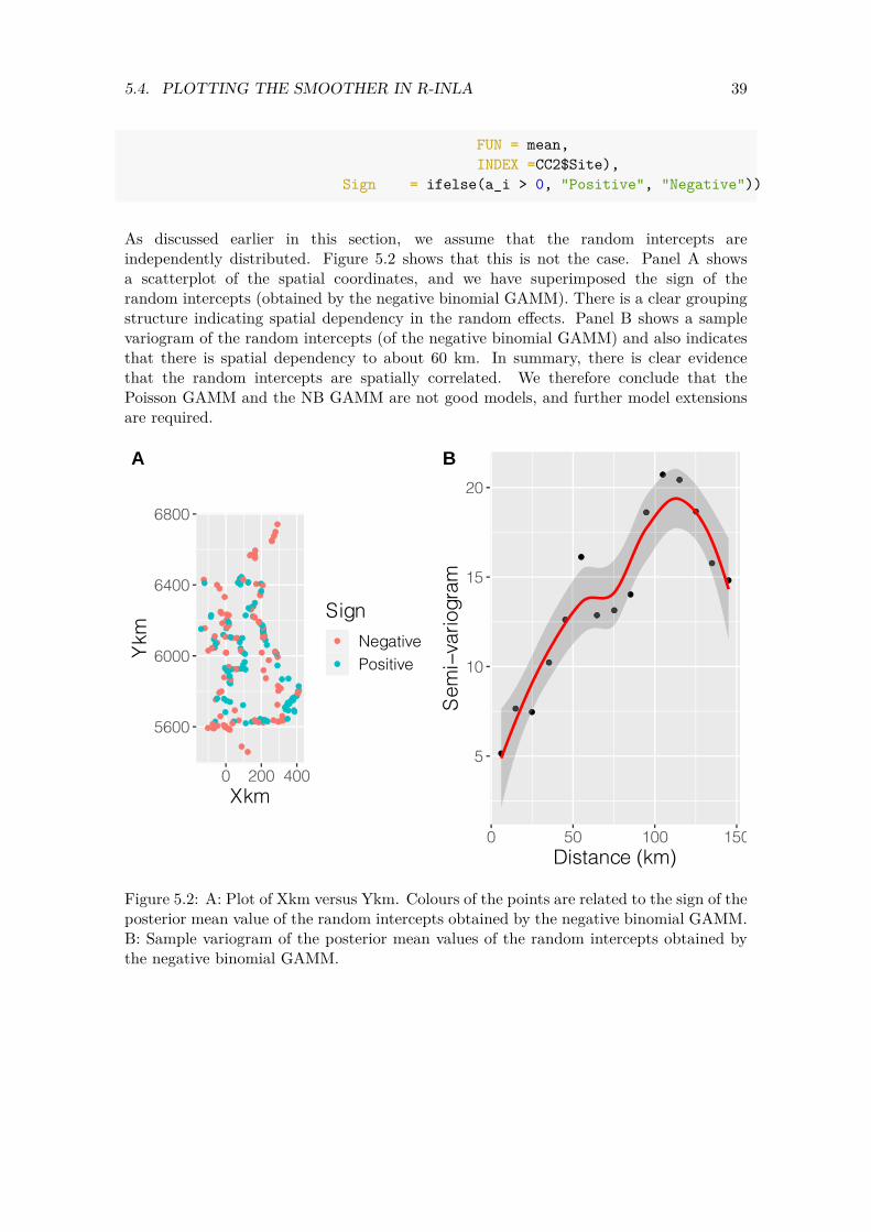
The purpose of the spatial correlation in the model is to capture small-scale dependency, where ‘small’ is relative to the distances between the sites. The first thing that we need to do is to define what is ‘small’ for these data. The left panel in Figure 6.1 shows a histogram of the distances between sites (in km). The right panel shows the cumulative distances. We would like to avoid the situation where the spatial correlation affects too many sites, so we limit it to about 10%-20% of the distance combinations. Spatial patterns on a larger scale may be captured with the covariates ‘Xkm’ and/or ‘Ykm’. Based on Panels A and B in Figure 6.1 we label distances up to about 150 to 200 km as ‘small’.
The spatial correlation is meant to capture only small-scale spatial dependency.
6.4 Defining the mesh
The spatial correlation in the GAM is modelled via the random effects 𝑢𝑖. When we applied the Poisson GAMM in Chapter 5 we assumed that the random effects 𝑢𝑖 were independent and normal distributed, which we wrote as 𝑢𝑖 ∼ 𝑁(0, 𝜎𝑢
2). To allow for spatial dependency, we change the covariance structure and assume that the random intercepts are normal distributed with mean 0 and covariance matrix Ω.
𝑢 ∼ 𝑁(0, Ω)
The off-diagonal elements of Ω allow for correlation between the random effects at different locations. Estimating such a covariance matrix Ω has long been a major problem in
43 6.4. DEFINING THE MESH
Freq
uenc
y
0 50
0000
15
0000
0
Cum
ulat
ive p
ropo
rtion
0.0
0.2
0.4
0.6
0.8
1.0
0 400 800 1200 0 400 800 1200
Distance between sites (km) Distance between sites (km)
Figure 6.1: Left panel: Histogram of distances (km) between sites. Right panel: Cumulative distances between sites (km).
statistics. Rue et al. (2009) provided an efficient computing approach using integrated nested Laplace approximation (INLA), which is implemented in the R-INLA package in R. A brief outline is provided below. A more detailed, and non-technical explanation can be found in Blangiardo et al. (2013), Zuur et al. (2017), Zuur and Ieno (2018) or Wang et al. (2018).
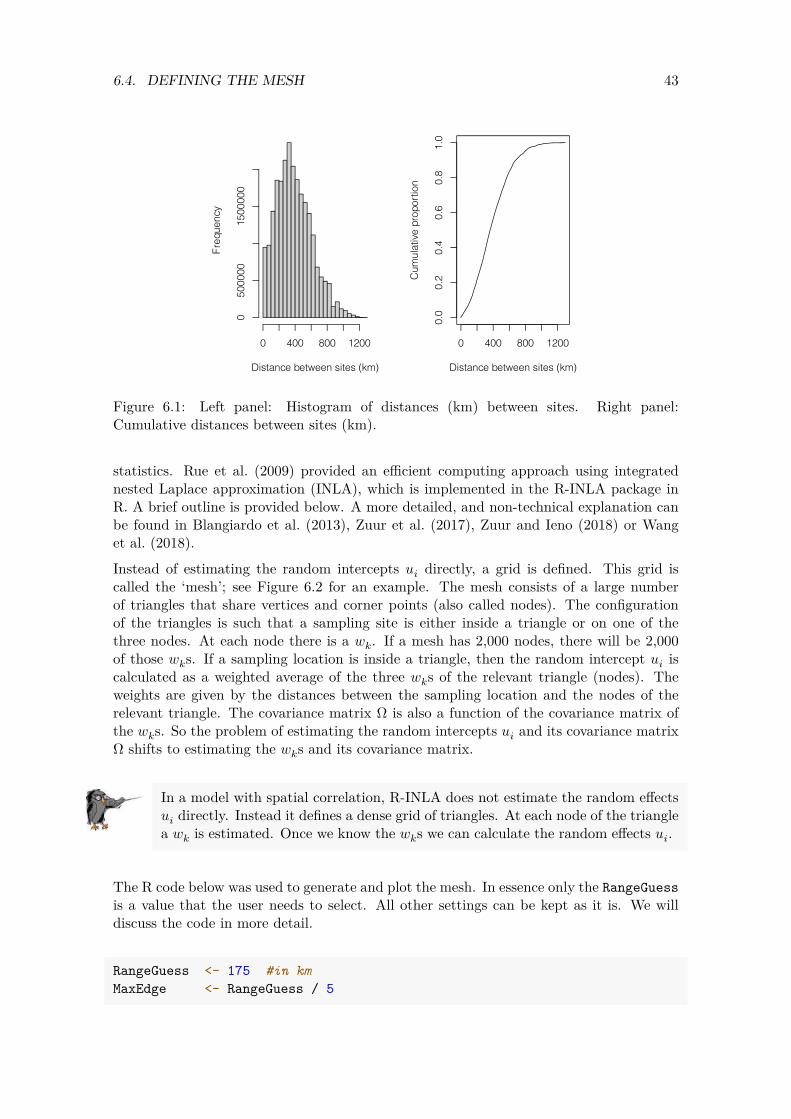
Instead of estimating the random intercepts 𝑢𝑖 directly, a grid is defined. This grid is called the ‘mesh’; see Figure 6.2 for an example. The mesh consists of a large number of triangles that share vertices and corner points (also called nodes). The configuration of the triangles is such that a sampling site is either inside a triangle or on one of the three nodes. At each node there is a 𝑤𝑘. If a mesh has 2,000 nodes, there will be 2,000 of those 𝑤𝑘s. If a sampling location is inside a triangle, then the random intercept 𝑢𝑖 is calculated as a weighted average of the three 𝑤𝑘s of the relevant triangle (nodes). The weights are given by the distances between the sampling location and the nodes of the relevant triangle. The covariance matrix Ω is also a function of the covariance matrix of the 𝑤𝑘s. So the problem of estimating the random intercepts 𝑢𝑖 and its covariance matrix Ω shifts to estimating the 𝑤𝑘s and its covariance matrix.
In a model with spatial correlation, R-INLA does not estimate the random effects 𝑢𝑖 directly. Instead it defines a dense grid of triangles. At each node of the triangle a 𝑤𝑘 is estimated. Once we know the 𝑤𝑘s we can calculate the random effects 𝑢𝑖.
The R code below was used to generate and plot the mesh. In essence only the RangeGuess is a value that the user needs to select. All other settings can be kept as it is. We will discuss the code in more detail.
RangeGuess <- 175 #in km MaxEdge <- RangeGuess / 5

44 CHAPTER 6. SPATIAL GAM APPLIED ON THE UK RED KNOT DATA
Loc <- cbind(CC2$Xkm, CC2$Ykm) NonConvHull <- inla.nonconvex.hull(Loc, convex = -0.06) mesh <- inla.mesh.2d(boundary = NonConvHull,
loc = Loc, max.edge = c(1,5) * MaxEdge, cutoff = MaxEdge / 5)
par(mfrow = c(1,1), mar = c(0, 0, 0, 0)) plot(mesh, asp=1, main = "") points(Loc, col = 2, pch = 1, cex = 0.5)
Figure 6.2: Mesh for the UK Red knot data.
We need not only the 𝑤𝑘 but also its covariance matrix. Instead of trying to estimate the covariance matrix of the 𝑤𝑘s directly, a mathematical function is used to define the value of the correlation. This is done with the so-called Matérn correlation function. This function depends on the distance between sites. It has two parameters: a 𝜎𝑢 and a parameter 𝜅 (pronounced kappa). The parameter 𝜅 is linked to the range, which represents the distance at which spatial dependency diminishes. So in principle we can forget about the 𝜅 and only think about the range. If the range is large, then the spatial correlation covers large
45 6.4. DEFINING THE MESH
areas; if the range is small, then it only affects sites close to one another. Hence, if R-INLA gives a very small range we might as well apply a model without spatial correlation.
For a given mesh, R-INLA will estimate the 𝑤𝑘 values and its covariance matrix. Once we have these, we can calculate the 𝑢𝑖s if we wish. The finer the mesh, the more accurate the solution but at a cost of more intensive computing. Behind the magical curtain of integrals and derivatives, R-INLA uses a complex mathematical function to define covariance between the 𝑤𝑘s as a function of distance between sites and two unknown parameters (the range and 𝜎𝑢).
Let us return to the mesh in Figure 6.2 and the R code that we used to generate the mesh. There is an inner area and an outer area, separated by a blue line. It is recommended to use an outer area to avoid numerical estimation problems due to so-called boundary problems. This is a purely technical requirement. Because every extra node means we have to estimate an extra 𝑤𝑘 value, it is preferable to use a less dense resolution in the outer area. The max.edge = c(1, 5) * MaxEdge causes a ratio of 1 to 5 between the resolutions in the inner and outer parts. This is a recommended ratio. The blue line that divides the inner and outer areas is obtained by putting a non-convex hull around the sampling location. There are different ways to control the density of the triangles, for example, with the maximum edge length of the triangles. When selecting the maximum edge value we should keep in mind the anticipated value of the range. Based on our desire to let the correlation affect sites that are separated by up to about 150-ish km, we selected a range of 175 km (this is RangeGuess). During initial analysis we also tried values of 125, 150 and 200 km. It is recommended to define the maximum edge length as a fifth of this value. The cutoff argument ensures that sampling locations that are within a distance that is smaller than the cut-off value are replaced by a single vertex. This is useful if there are sampling locations with the same spatial locations or if some are very close to one another. It avoids a mesh with lots of very small triangles in certain areas.
Before continuing we show the number of nodes.
mesh$n
## [1] 1589
Our mesh has 1589 observations. As we mentioned earlier, the more nodes we have, the more 𝑤𝑘s we use, and the more accurate the INLA approximation, but the longer the computing time. In general, a mesh with 1000 nodes (i.e. 𝑤𝑘 values) takes only a few minutes on a fast computer. We can easily cope with meshes of higher density, although ultimately the choice of the mesh size depends on available computing power. In practice we choose the value of RangeGuess as large as computing time allows. Having said that, there will be a point at which increasing the value of RangeGuess no longer has any benefit. It is recommended to run the models with different mesh configurations and investigate whether there are any differences in the outcome.
46 CHAPTER 6. SPATIAL GAM APPLIED ON THE UK RED KNOT DATA
From a practical point of view, we only need to choose the value of RangeGuess to generate a mesh. We defined it as 100 km.
6.5 Controlling the spatial dependency term
Next, we execute three commands. The first and third commands should be executed without making changes for different models and mesh configurations. They require no explanation at this stage. The second command does require some explanation.
A <- inla.spde.make.A(mesh, loc = Loc) spde <- inla.spde2.pcmatern(mesh,
prior.range = c(100, 0.05), prior.sigma = c(5, 0.05))
w.index <- inla.spde.make.index('w', n.spde = spde$n.spde)
In Appendix A we explain smoothers. At this point in the reading of this report you may want to glance at that appendix. We start with the moving average and LOESS smoothers. We explain that the wiggliness of these smoothers is controlled by the size of the window that selects local points. Use a large window and the smoother is a straight line; use a small window and the smoother goes from point to point. We then introduce linear spline regression, quadratic spline regression and cubic spline regression models. The wiggliness of such smoothers can be controlled (partly) by the number of knots. The spatial correlation term in the GAM is essentially a two-dimensional smoother of spatial coordinates. Again, there is a mechanism to control the wiggliness of such a smoother. We will discuss this mechanism now. The spatial correlation can be envisioned as a collection of mountains. If the value of the range is large, then there is only one, or perhaps a few, gently sloping mountains. If the range is small, then we may end up with lots of small-radius mountains. In addition to the width of a mountain there is also the height of a mountain. We can control this with the 𝜎𝑢 parameter. If 𝜎𝑢 is small, then the mountains are not very high, whereas a large 𝜎𝑢 will result in high mountains. So a large range and a large 𝜎𝑢 imply that we have a few, but high and wide, mountains. A small range with a large 𝜎𝑢 means lots of high mountains with a small diameter. As we have already mentioned, one can also view the ‘spatial dependency’ term as a two-dimensional smoother of the spatial coordinates. If such a model is fitted with the mgcv package in R, then we use the notation s(Xkm,Ykm), and we can control the shape of such a smoother with a term called the effective degrees of freedom (edf). A high value for edf means that we have a smoother that is rather non-smooth, whereas a smoother with a low edf results in a rather smooth two-dimensional shape.
The spatial correlation in the GAM is essentially a two-dimensional smoother of the spatial coordinates. We can control the amount of smoothing via the range and the 𝜎𝑢. A large range and a small 𝜎𝑢 means that we have a rather smooth pattern, whereas a small range and a large 𝜎𝑢 means that we have a two-dimensional smoother that shows lots of small and high values, and may even result in a perfect fit.

47 6.6. STACK FOR THE GAM WITH SPATIAL CORRELATION
When estimating the smoother in a GAM using the mgcv or gamm4 packages in R, certain tools exist to estimate the optimal value for the amount of smoothing (i.e. the edf). This process is called cross-validation. But such a process is not available when determining the amount of smoothing that the ‘spatial dependency’ term is allowed to do. Instead we can specify likely values for the range and 𝜎𝑢. Or formulated better, we specify non-likely values via so-called penalised complexity priors. This means that, a priori, we need to specify the values 𝑟𝑎𝑛𝑔𝑒0 and 𝑠𝑖𝑔𝑚𝑎0 (and also 𝛼1 and 𝛼2) in the following two expressions.
𝑃(range < 𝑟𝑎𝑛𝑔𝑒0) = 𝛼1𝑃 (𝜎𝑢 > 𝜎0) = 𝛼2
In the R code above we use
𝑃(range < 100 km) = 0.05𝑃 (𝜎𝑢 > 5) = 0.05
What we are saying here is that the probability that the range is smaller than 100 km is rather small, and the probability that 𝜎𝑢 is larger than 5 is also rather small. By increasing range0 and decreasing sigma0 we can force the spatial correlation to be smoother. Choosing these values is a matter of trial and error, prior knowledge and visual observation that the resulting smoother does not overfit the data. This sounds subjective, but in practice it is not too difficult to choose these values.
When we apply a spatial GLM or GAM in R-INLA, an educated guess is required for the likely values of the range (distance at which the spatial dependency diminishes) and the variation of the spatial random field (𝜎𝑢). This is done with penalised complexity priors. Using common sense, biological knowledge, results from initial analysis, expertise and some educated guess work, we need to specify values for range0 in 𝑃(range < range0) > 0.05 and 𝜎0 in 𝑃 (𝜎𝑢 > 𝜎0) = 0.05.
6.6 Stack for the GAM with spatial correlation
When using functions like lm, glm, gam, glmer or glmmTMB in R, the data can be specified with the data = ... argument. R-INLA uses the function inla to execute the models, but it has no data = ... argument, at least not when models with spatial correlation are executed. Instead we combine the response variable, covariates and the information about the 𝑤𝑘s in a so-called stack.
The stack is defined with the inla.stack function; see the R code below. In the data argument of this function we specify the counts of Red knots. In the effects part we define covariates.
The A = list(1,1,...,A) is perhaps the most confusing part of the stack. It requires modifications if covariates are added or removed. The problem is that the response variable and the covariates are measured at the sites, whereas the spatial dependency, defined on the nodes of the triangles, has a much higher resolution. In order to match the sampling locations with the nodes of the mesh we use the 1 as a sort of identify matrix and the
48 CHAPTER 6. SPATIAL GAM APPLIED ON THE UK RED KNOT DATA
second A to map the w_ks to the response and covariates. Note that this stack is nearly the same as we used for the Poisson GAMM.
N <- nrow(CC2) StackGAMSpatial <- inla.stack(
tag = "Fit", data = list(RK = CC2$RK), A = list(1, 1, 1, A), effects = list(
Intercept = rep(1, N), #Intercept X.Year = X.Year, #f(Year) = X.Year * beta fsite = CC2$Site, #Random intercept w = w.index)) #Spatial random field
The stack is a tool to combine data that is defined on different spatial scales (i.e. response and covariates at the sites and the 𝑤𝑘s at the nodes of the mesh).
6.7 Defining the formula
Now that we have done the hard work we are nearly ready to execute the GAM with spatial correlation in R-INLA. We only have to define the model formula.
Form1 <- RK ~ -1 + Intercept + X.Year + f(w, model = spde)
This formula states that the counts of the Red knots are modelled as a function of an intercept, a year effect and the spatial dependency. Note that the ‘−1’ removes the standard intercept, and we use the newly defined Intercept from the stack. The reason for this odd way of coding an intercept is numerical stability of the software.
6.8 Executing the spatial GAMs in R-INLA
We are now ready to execute the spatial Poisson GAM.
Spat.Pois <- inla(Form1, data = inla.stack.data(Stack50GAMSpatial), control.predictor = list(A = inla.stack.A(Stack50GAMSpatial),
link = 1), control.compute = list(dic = TRUE, waic = TRUE), #Faster calculation: control.inla = list(strategy='gaussian',
int.strategy = 'eb'), family = "poisson")
49 6.8. EXECUTING THE SPATIAL GAMS IN R-INLA
The only piece of code that we did not show is adding the stacks that contain the 50 covariate values for the two smoothers so that we can plot them. This explains why we use Stack50GAMSpatial and not StackGAMSpatial.
Just as for the Poisson GLMM and Poisson GAMM, we need to extract the fitted values and calculate the Pearson residuals. We need to plot residuals versus fitted values, and versus all available covariates. The random effects are now allowed to be spatially correlated, so we do not need to check them for spatial dependency. We also need to simulate 1000 data sets from the model and see whether the model can cope with the excessive number of zeros. The Poisson GAM with spatial correlation was still overdispersed, which explains why we also execute the negative binomial GAM with spatial correlation.
Hyper.NB <- list(size = list(initial = theta.pm, fixed = TRUE)) Spat.NB <- inla(Form1,
family = "nbinomial", data = inla.stack.data(Stack50GAMSpatial), control.predictor = list(A = inla.stack.A(Stack50GAMSpatial),
link = 1), control.family = list(hyper = Hyper.NB), control.inla = list(strategy='gaussian',
int.strategy = 'eb'), control.compute = list(dic = TRUE, waic = TRUE))
As an alternative to the negative binomial distribution, we can use the zero-inflated Poisson (ZIP) or the zero-inflated negative binomial (ZINB) distributions. The ZIP and ZINB distributions are explained in Zuur et al. (2012). These are just modifications of the Poisson and negative binomial distributions in the sense that they allow for an excessive number of zeros (zeros that cannot be explained with the covariates). We will apply ZIP and ZINB GAMs with spatial dependency. The same covariates are used.
We execute the ZIP and ZINB models as follows.
Spat.ZIP <- inla(Form1, data = inla.stack.data(Stack50GAMSpatial), control.predictor = list(A = inla.stack.A(Stack50GAMSpatial),
link = 1), control.compute = list(dic = TRUE, waic = TRUE), #Faster calculation: control.inla = list(strategy='gaussian',
int.strategy = 'eb'), family = "zeroinflatedpoisson1",)
Spat.ZINB <- inla(RK ~ -1 + Intercept + X.Year + f(w, model = spde), data = inla.stack.data(Stack50GAMSpatial), control.predictor = list(A = inla.stack.A(Stack50GAMSpatial),
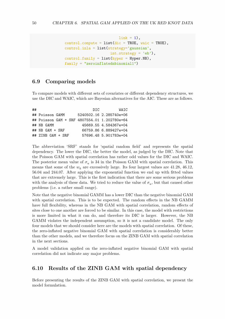
50 CHAPTER 6. SPATIAL GAM APPLIED ON THE UK RED KNOT DATA
link = 1), control.compute = list(dic = TRUE, waic = TRUE), control.inla = list(strategy='gaussian',
int.strategy = 'eb'), control.family = list(hyper = Hyper.NB), family = "zeroinflatednbinomial1")
6.9 Comparing models
To compare models with different sets of covariates or different dependency structures, we use the DIC and WAIC, which are Bayesian alternatives for the AIC. These are as follows.
## DIC WAIC ## Poisson GAMM 5240502.16 2.285740e+06 ## Poisson GAM + SRF 4807554.01 1.202780e+64 ## NB GAMM 45669.55 4.584367e+04 ## NB GAM + SRF 66759.86 6.889427e+04 ## ZINB GAM + SRF 57696.48 5.901783e+04
The abbreviation ‘SRF’ stands for ‘spatial random field’ and represents the spatial dependency. The lower the DIC, the better the model, as judged by the DIC. Note that the Poisson GAM with spatial correlation has rather odd values for the DIC and WAIC. The posterior mean value of 𝜎𝑢 is 34 in the Poisson GAM with spatial correlation. This means that some of the 𝑤𝑘 are excessively large. Its four largest values are 41.28, 46.12, 56.04 and 244.07. After applying the exponential function we end up with fitted values that are extremely large. This is the first indication that there are some serious problems with the analysis of these data. We tried to reduce the value of 𝜎𝑢, but that caused other problems (i.e. a rather small range). Note that the negative binomial GAMM has a lower DIC than the negative binomial GAM with spatial correlation. This is to be expected. The random effects in the NB GAMM have full flexibility, whereas in the NB GAM with spatial correlation, random effects of sites close to one another are forced to be similar. In this case, the model with restrictions is more limited in what it can do, and therefore its DIC is larger. However, the NB GAMM violates the independent assumption, so it is not a candidate model. The only four models that we should consider here are the models with spatial correlation. Of these, the zero-inflated negative binomial GAM with spatial correlation is considerably better than the other models, and we therefore focus on the ZINB GAM with spatial correlation in the next sections. A model validation applied on the zero-inflated negative binomial GAM with spatial correlation did not indicate any major problems.
6.10 Results of the ZINB GAM with spatial dependency
Before presenting the results of the ZINB GAM with spatial correlation, we present the model formulation.

51 6.10. RESULTS OF THE ZINB GAM WITH SPATIAL DEPENDENCY
RK𝑖𝑠 ∼ ZINB (𝜇𝑖𝑠, 𝜃, 𝜋) E [RK𝑖𝑠] = (1 − 𝜋) × 𝜇𝑖𝑠 (6.2)var [RK𝑖𝑠] = (1 − 𝜋) × 𝜇𝑖𝑠 × (1 + 𝜋 × 𝜇𝑖𝑠 + 𝜇
𝜃𝑖𝑠 )
log (𝜇𝑖𝑠) = 𝛽1 + 𝑓(Year𝑠) + 𝑢𝑖
The term 𝜋 is used to model the excessive number of zeros that cannot be modelled with the covariates in the count part of the model. When 𝜋 = 0 we obtain the negative binomial distribution. In R-INLA, 𝜋 cannot be modeled as a function of covariates. Instead, it is constant. The posterior mean value of 𝜋 is 0.52.
The count part of the ZINB GAM with spatial correlation contains an intercept, the smoother for year and spatial correlation. The smoother is plotted in Figure 6.3. Just as before we have applied the exponential function, so along the 𝑦-axis we are visualising the multiplication factors to get the expected counts for Red knots.
0.8
0.9
1.0
1.1
1.2
1980 1990 2000 2010 2020
f(Yea
r)
Year
Figure 6.3: Posterior mean values and 95% credible intervals for the year smoother obtained by the ZINB GAM with spatial correlation applied on the UK Red knot data. The smoother is an unpenalised cubic regression spline with 7 df.
In Equation (6.2) we explained that the expected values of the ZINB GAM are given by
(1 − 𝜋) × 𝑒Intercept × 𝑒𝑓(Year𝑠) × 𝑒𝑢𝑖
and we plotted the effects of year in Figure 6.3. When we plotted the smoother, we applied the exponential function. The ZINB GAM with spatial correlation has correlated random effects 𝑢𝑖. We explained that we estimate 𝑤𝑘 values on a fine mesh. We can extract these 𝑤𝑘s and plot them; see Figure 6.4. Just as in Section 5.4 we can choose whether we want to plot the 𝑤𝑘s or 𝑒𝑤𝑘 . We decided to plot the 𝑤𝑘s.
The interpretation of the spatial random field in Figure 6.4 is as follows. In those areas where we have dark red colours, the 𝑤𝑘s and therefore the 𝑢𝑖s, are around 9. This means that the multiplication factor (to get the expected RK) due to the spatial correlation is

52 CHAPTER 6. SPATIAL GAM APPLIED ON THE UK RED KNOT DATA
around exp(9) ≈ 8100. That is considerably more than the effect of the trend! In the dark purple areas, the 𝑤𝑘 are around −5. This means that the multiplication factor to get the fitted values is around exp(−5) ≈ 0. In simple terms this means that we either have missing covariates or real spatial dependency that is causing higher expected values in the red areas and lower expected values in the purple areas. In the dark red areas the multiplication factor is more than 8000, and in the dark purple areas we probably have plenty of zero Red knots.
−10
−5
0
5
Figure 6.4: Spatial random field obtained by the ZINB GAM with spatial correlation. Yellow dots represent the sampling locations.
The underlying mathematical model for the spatial correlation in the GAM is the Matérn correlation function. The parameters of this correlation function are estimated by R-INLA, and its shape is presented in Figure 6.5.
The posterior mean value of the range is 30.15 km. If we quantify ‘highly correlation’ as correlation values between 0.8 and 1, then the Matérn correlation function in Figure 6.5 indicates that sites separated by up to around 50 km are highly correlated. And if we deem correlation between 0.5 and 0.8 and ‘moderately correlated’, then all sites that are separated by 50 to 100 km are deemed moderately correlated. Any sites separated by more than 30.15 km (which is the value of the range) have a very low correlation. The value of the range indicates that about 2% of the site combinations are affected by the spatial correlation.
6.11 Two major problems

53 6.11. TWO MAJOR PROBLEMS
0 50 100 150 200 250 300
0.0
0.2
0.4
0.6
0.8
1.0
Distance (km)
Cor
rela
tion
Figure 6.5: Matérn correlation function obtained by the ZINB GAM with spatial correlation applied on the UK Red knot data.
6.11.1 Correlation changing over time
There are two major problems with the spatial ZINB GAM (and all other spatial models that we have executed thus far), that may potentially limit its use. The Matérn correlation function allows that random effects of neighboring sites are correlated. But it does not allow for any temporal changes in the correlation. Formulated differently, the model assumes that two observations separated by (for example) 10 km are highly correlated, even if one observation was made in 1995 and the other in 2018. From a biological point of view it is unlikely that there is correlation between these two observations. The solution to this problem is to allow the spatial correlation to change over time. For this we need a GAM with spatial-temporal dependency. We will do this in the next chapter.
6.11.2 Small fitted values
The second problem becomes appearent when we plot the fitted values versus the observed data. The fitted values of the ZINB GAM with spatial correlation are obtained as follows.
N <- nrow(CC2) mu <- Spat.ZINB$summary.fitted.values[1:N, "mean"] Pi <- Spat.ZINB$summary.hyperpar[
"zero-probability parameter for zero-inflated nbinomial_1", "mean"]
ExpCounts <- (1 - Pi) * mu
Once we have the fitted values ExpCounts of the ZINB GAM with spatial correlation, we plot them against the observed number of Red knots; see Figure 6.6. Note that the model is not able to fit the larger fitted values. The largest fitted value of the ZINB GAM with
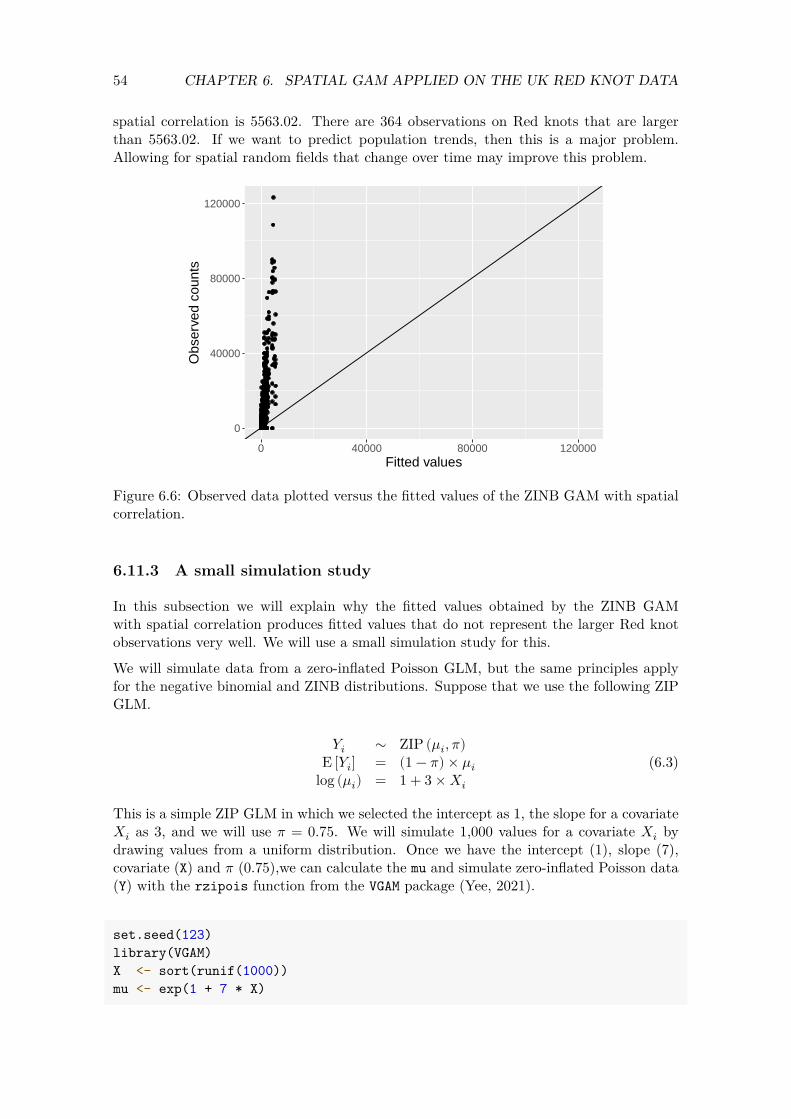
54 CHAPTER 6. SPATIAL GAM APPLIED ON THE UK RED KNOT DATA
spatial correlation is 5563.02. There are 364 observations on Red knots that are larger than 5563.02. If we want to predict population trends, then this is a major problem. Allowing for spatial random fields that change over time may improve this problem.
0
40000
80000
120000
0 40000 80000 120000Fitted values
Obs
erve
d co
unts
Figure 6.6: Observed data plotted versus the fitted values of the ZINB GAM with spatial correlation.
6.11.3 A small simulation study
In this subsection we will explain why the fitted values obtained by the ZINB GAM with spatial correlation produces fitted values that do not represent the larger Red knot observations very well. We will use a small simulation study for this.
We will simulate data from a zero-inflated Poisson GLM, but the same principles apply for the negative binomial and ZINB distributions. Suppose that we use the following ZIP GLM.
𝑌𝑖 ∼ ZIP (𝜇𝑖, 𝜋) E [𝑌𝑖] = (1 − 𝜋) × 𝜇𝑖 (6.3)
log (𝜇𝑖) = 1 + 3 × 𝑋𝑖
This is a simple ZIP GLM in which we selected the intercept as 1, the slope for a covariate𝑋𝑖 as 3, and we will use 𝜋 = 0.75. We will simulate 1,000 values for a covariate 𝑋𝑖 by drawing values from a uniform distribution. Once we have the intercept (1), slope (7), covariate (X) and 𝜋 (0.75),we can calculate the mu and simulate zero-inflated Poisson data (Y) with the rzipois function from the VGAM package (Yee, 2021).
set.seed(123) library(VGAM)
<- sort(runif(1000)) mu <- exp(1 + 7 * X) X

55 6.11. TWO MAJOR PROBLEMS
Pi <- 0.75 Y <- rzipois(1000, lambda = mu, pstr0 = 0.75) ZipData <- data.frame(X = X,
Y = Y)
The data frame ZipData contains the data that we would normally sample in the field. Figure 6.7 shows a frequency plot of the Y data and also a scatterplot of Y versus X. The percentage of observations in Y equal to 0 is 75.6%.
020
040
060
0
Observed values Y
Fre
quen
cies
0 555 1371 2373 0.0 0.4 0.8
050
010
0020
00
Covariate X
Res
pons
e va
riabl
e Y
Figure 6.7: Left: Frequency plot of the simulated Y variable showing an excessive number of zeros. Right: Scatterplot of Y versus X. The horizontal line at 0 is in fact a series of observations that are all equal to 0.
When we apply a ZIP GLM on these data we obtain estimated values close to the original ones, as can be seen from the code below.
library(pscl) M2 <- zeroinfl(Y ~ X | 1,
data = ZipData) summary(M2)
## ## Call: ## zeroinfl(formula = Y ~ X | 1, data = ZipData) ## ## Pearson residuals: ## Min 1Q Median 3Q Max ## -0.5689 -0.5677 -0.5559 -0.4726 3.6030 ## ## Count model coefficients (poisson with log link):
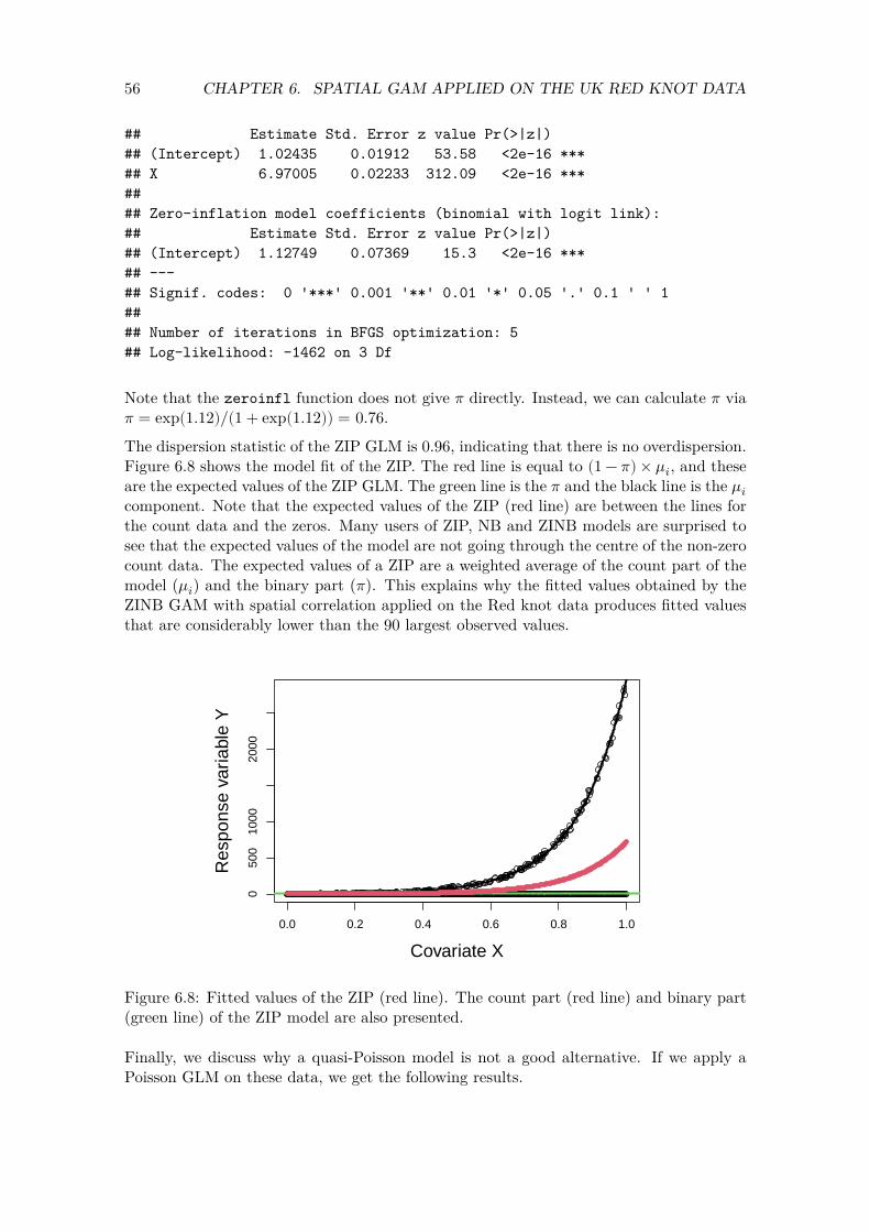
56 CHAPTER 6. SPATIAL GAM APPLIED ON THE UK RED KNOT DATA
## Estimate Std. Error z value Pr(>|z|) ## (Intercept) 1.02435 0.01912 53.58 <2e-16 *** ## X 6.97005 0.02233 312.09 <2e-16 *** ## ## Zero-inflation model coefficients (binomial with logit link): ## Estimate Std. Error z value Pr(>|z|) ## (Intercept) 1.12749 0.07369 15.3 <2e-16 *** ## ---## Signif. codes: 0 '***' 0.001 '**' 0.01 '*' 0.05 '.' 0.1 ' ' 1 ## ## Number of iterations in BFGS optimization: 5 ## Log-likelihood: -1462 on 3 Df
Note that the zeroinfl function does not give 𝜋 directly. Instead, we can calculate 𝜋 via𝜋 = exp(1.12)/(1 + exp(1.12)) = 0.76.
The dispersion statistic of the ZIP GLM is 0.96, indicating that there is no overdispersion. Figure 6.8 shows the model fit of the ZIP. The red line is equal to (1 − 𝜋) × 𝜇𝑖, and these are the expected values of the ZIP GLM. The green line is the 𝜋 and the black line is the 𝜇𝑖
component. Note that the expected values of the ZIP (red line) are between the lines for the count data and the zeros. Many users of ZIP, NB and ZINB models are surprised to see that the expected values of the model are not going through the centre of the non-zero count data. The expected values of a ZIP are a weighted average of the count part of the model (𝜇𝑖) and the binary part (𝜋). This explains why the fitted values obtained by the ZINB GAM with spatial correlation applied on the Red knot data produces fitted values that are considerably lower than the 90 largest observed values.
0.0 0.2 0.4 0.6 0.8 1.0
050
010
0020
00
Covariate X
Res
pons
e va
riabl
e Y
Figure 6.8: Fitted values of the ZIP (red line). The count part (red line) and binary part (green line) of the ZIP model are also presented.
Finally, we discuss why a quasi-Poisson model is not a good alternative. If we apply a Poisson GLM on these data, we get the following results.
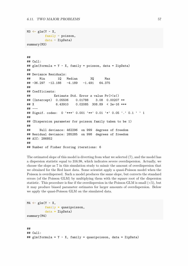
57 6.11. TWO MAJOR PROBLEMS
M3 <- glm(Y ~ X, family = poisson, data = ZipData)
summary(M3)
## ## Call: ## glm(formula = Y ~ X, family = poisson, data = ZipData) ## ## Deviance Residuals: ## Min 1Q Median 3Q Max ## -36.297 -12.188 -4.189 -1.491 64.375 ## ## Coefficients: ## Estimate Std. Error z value Pr(>|z|) ## (Intercept) 0.05506 0.01788 3.08 0.00207 ** ## X 6.43910 0.02085 308.89 < 2e-16 *** ## ---## Signif. codes: 0 '***' 0.001 '**' 0.01 '*' 0.05 '.' 0.1 ' ' 1 ## ## (Dispersion parameter for poisson family taken to be 1) ## ## Null deviance: 462296 on 999 degrees of freedom ## Residual deviance: 285285 on 998 degrees of freedom ## AIC: 286852 ## ## Number of Fisher Scoring iterations: 6
The estimated slope of this model is diverting from what we selected (7), and the model has a dispersion statistic equal to 316.98, which indicates severe overdispersion. Actually, we choose the slope as 7 in this simulation study to mimic the amount of overdispersion that we obtained for the Red knot data. Some scientist apply a quasi-Poisson model when the Poisson is overdispersed. Such a model produces the same slope, but corrects the standard errors (of the Poisson GLM) by multiplying them with the square root of the dispersion statistic. This procedure is fine if the overdispersion in the Poisson GLM is small (<5), but it may produce biased parameter estimates for larger amounts of overdispersion. Below we apply the quasi-Poisson GLM on the simulated data.
M4 <- glm(Y ~ X, family = quasipoisson, data = ZipData)
summary(M4)
## ## Call: ## glm(formula = Y ~ X, family = quasipoisson, data = ZipData)

58 CHAPTER 6. SPATIAL GAM APPLIED ON THE UK RED KNOT DATA
## ## Deviance Residuals: ## Min 1Q Median 3Q Max ## -36.297 -12.188 -4.189 -1.491 64.375 ## ## Coefficients: ## Estimate Std. Error t value Pr(>|t|) ## (Intercept) 0.05506 0.31833 0.173 0.863 ## X 6.43910 0.37117 17.348 <2e-16 *** ## ---## Signif. codes: 0 '***' 0.001 '**' 0.01 '*' 0.05 '.' 0.1 ' ' 1 ## ## (Dispersion parameter for quasipoisson family taken to be 317.0195) ## ## Null deviance: 462296 on 999 degrees of freedom ## Residual deviance: 285285 on 998 degrees of freedom ## AIC: NA ## ## Number of Fisher Scoring iterations: 6
The standard error of the slope has now been corrected, but the 95% confidence interval just contains only the original value. We could have simulated data in which the quasi-Poisson produces biased parameter estimates. Hilbe (2014) argues that if there is overdispersion, then the cause of the problem has to be found, and this needs to be modelled accordingly. In other words, if there is severe overdispersion in a Poisson GLM or GAM, then quasi-Poisson should not be applied.

Chapter 7
GAM with spatial-temporal replicate correlation
In the previous chapter we applied negative binomial and zero-inflated negative binomial GAMs with spatial correlation. The spatial correlation was assumed to be constant over time. In this chapter we will apply the same two GAMs, except that we now allow the spatial correlation to change over time. The link function for both models is defined as follows.
log(𝜇𝑖𝑠) = 𝛽1 + 𝑓(Year𝑖𝑠) + 𝑣𝑖𝑠
Note that we now use the notation 𝑣𝑖𝑠 for the random intercepts. We discuss two options to model the spatial temporal random effects 𝑣𝑖𝑠. Both options will produce a set of 𝑤𝑘s for each year. This means that we will end up with 44 spatial random fields for the UK Red knots data, and we can plot these in 44 colour images. These spatial random fields may represent missing covariates, missing interactions or real dependency. The fundamental question is now how these spatial random fields change from year to year. Option 1 is to use an auto-regressive correlation of order 1 (AR1). This means that we use
𝑣𝑖,𝑠 = 𝜌 × 𝑣𝑖,𝑠−1 + 𝑢𝑖,𝑠
We used a comma between the two subscripts to clearify the notation. The AR1 correlation states that the random effects in year 𝑠 are a function of the random effects in year 𝑠 − 1. The random effects 𝑢𝑖𝑠 are only spatially correlated and are modelled by the Matérn correlation function. The parameter 𝜌 is unknown and needs to be estimated. If 𝜌 is close to 1, then the spatial correlation in year 𝑠 is similar to that of year 𝑠 − 1. Hence, we will end up with 44 colour images that change rather slowly over time. Option 2 is the so-called replicate correlation. We get this if we force 𝜌 to be 0. It means that in each year there is spatial correlation, as determined by the random effects 𝑢𝑖𝑠, but from year to year the location of the spatial correlation is allowed to change randomly. It means that in year 𝑠 − 1 we may have high values for the spatial random field in one part of the study area and in year 𝑠 we can have high values in another part part. The strength of the spatial correlation, as quantified via the parameters for the Matérn correlation function, is assumed to be the same in all years.
59

60 CHAPTER 7. GAM WITH SPATIAL-TEMPORAL REPLICATE CORRELATION
The replicate correlation may be required for species that are dynamic in their spatial positions over time (e.g. birds), whereas the AR1 correlation may be more useful for species that are relatively stationary over time with respect to their spatial positions. In this report we will use the replicate correlation, for the simple reason that computing time is considerably shorter than for the AR1 model.
7.1 Projector matrix
We will use the same mesh as in Chapter 6. To implement a model in which the spatial correlation changes randomly from year to year, we need to inform R-INLA which observations belong to the same year. This needs to be coded via a vector with the values 1 1 1 2 2 2, etc. This is the variable Repl in the code below. It has the value 1 for all observations from 1975, 2 for all observations from 1976, etc.
Repl <- CC2$Year - min(CC2$Year) + 1 NRepl <- length(unique(Repl))
The number of years is NRepl = 44. The number of observations per year varies between 114 and 185. The model will estimate a spatial random field for each year. The minimum number of sites per year that is required for this technique is about 50.
We need to define a projector matrix that contains 44 blocks of weighting factors. The argument repl = Repl in the inla.spde.make.A function below does that.
Arepl <- inla.spde.make.A(mesh = mesh, loc = Loc, repl = Repl)
We also need to inform INLA that the spatial random field consists of 44 blocks.
wrepl.index <- inla.spde.make.index( name = 'w', n.spde = spde$n.spde, n.repl = NRepl)
7.2 Defining the stack
The stack for the models with the replicate correlation is similar to that of the spatial models. We only changed is the projector matrix (Arepl), the name of the spatial random field (wrepl.index) and the name of the stack.
61 7.3. NB AND ZINB GAMS WITH THE REPLICATE CORRELATION
N <- nrow(CC2) StackRepl <- inla.stack(
tag = "Fit", data = list(RK = CC2$RK), A = list(1, 1, Arepl), effects = list(
Intercept = rep(1, N), # Intercept X.Year = X.Year, # f(Year) w = wrepl.index)) # Spatial-temporal correlation
All.StackRepl <- inla.stack(StackRepl, #Observed data. StackPr.Year) #f(Year) for 50 values.
7.3 NB and ZINB GAMs with the replicate correlation
We execute the NB and ZINB GAMs with the replicate correlation with the following code.
Repl.NB <- inla(RK ~ -1 + Intercept + X.Year + f(w, model = spde, replicate = w.repl),
family = "nbinomial", #control.family = list(hyper = Hyper.NB), control.inla = list(strategy='gaussian',
int.strategy = 'eb'), data = inla.stack.data(All.StackRepl), control.predictor = list( A = inla.stack.A(All.StackRepl),
link = 1), control.compute = list(dic = TRUE, waic = TRUE))
Repl.ZINB <- inla(RK ~ -1 + Intercept + X.Year + f(w, model = spde, replicate = w.repl),
family = "zeroinflatednbinomial1", #control.family = list(hyper = Hyper.NB), control.inla = list(strategy='gaussian',
int.strategy = 'eb'), data = inla.stack.data(All.StackRepl), control.predictor = list( A = inla.stack.A(All.StackRepl),
link = 1), control.compute = list(dic = TRUE, waic = TRUE))
We compare both models with their DIC and WAIC values.
## DIC WAIC ## NB GAM + replicate SRF 51120.37 51157.96 ## ZINB GAM + replicate SRF 50802.27 51975.50
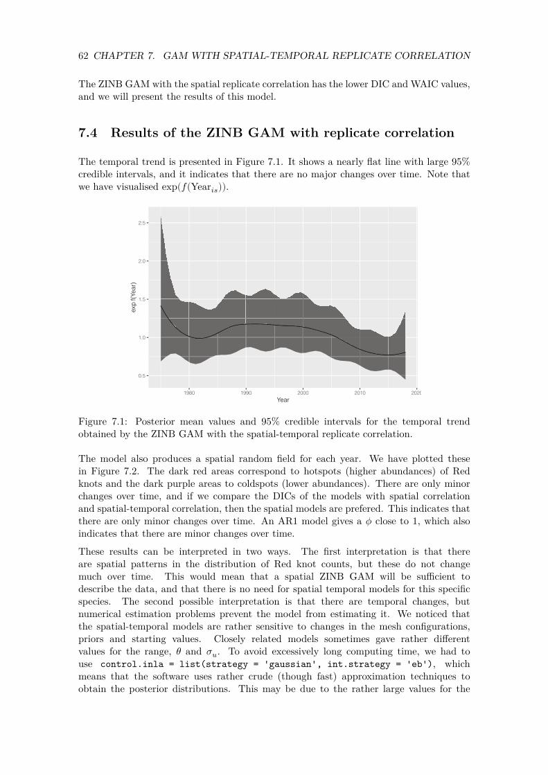
62 CHAPTER 7. GAM WITH SPATIAL-TEMPORAL REPLICATE CORRELATION
The ZINB GAM with the spatial replicate correlation has the lower DIC and WAIC values, and we will present the results of this model.
7.4 Results of the ZINB GAM with replicate correlation
The temporal trend is presented in Figure 7.1. It shows a nearly flat line with large 95% credible intervals, and it indicates that there are no major changes over time. Note that we have visualised exp(𝑓(Year𝑖𝑠)).
0.5
1.0
1.5
2.0
2.5
exp
f(Yea
r)
1980 1990 2000 2010 2020
Year
Figure 7.1: Posterior mean values and 95% credible intervals for the temporal trend obtained by the ZINB GAM with the spatial-temporal replicate correlation.
The model also produces a spatial random field for each year. We have plotted these in Figure 7.2. The dark red areas correspond to hotspots (higher abundances) of Red knots and the dark purple areas to coldspots (lower abundances). There are only minor changes over time, and if we compare the DICs of the models with spatial correlation and spatial-temporal correlation, then the spatial models are prefered. This indicates that there are only minor changes over time. An AR1 model gives a 𝜙 close to 1, which also indicates that there are minor changes over time.
These results can be interpreted in two ways. The first interpretation is that there are spatial patterns in the distribution of Red knot counts, but these do not change much over time. This would mean that a spatial ZINB GAM will be sufficient to describe the data, and that there is no need for spatial temporal models for this specific species. The second possible interpretation is that there are temporal changes, but numerical estimation problems prevent the model from estimating it. We noticed that the spatial-temporal models are rather sensitive to changes in the mesh configurations, priors and starting values. Closely related models sometimes gave rather different values for the range, 𝜃 and 𝜎𝑢. To avoid excessively long computing time, we had to use control.inla = list(strategy = 'gaussian', int.strategy = 'eb'), which means that the software uses rather crude (though fast) approximation techniques to obtain the posterior distributions. This may be due to the rather large values for the

63 7.4. RESULTS OF THE ZINB GAM WITH REPLICATE CORRELATION
1975
1985
1995
2005
2015
1976
1986
1996
2006
2016
1977
1987
1997
2007
2017
1978
1988
1998
2008
2018
1979
1989
1999
2009
1980
1990
2000
2010
1981
1991
2001
2011
1982
1992
2002
2012
1983
1993
2003
2013
1984
1994
2004
2014
0.0
0.4
0.8
Figure 7.2: Posterior mean values of the spatial random field for each year by the ZINB GAM with the spatial-temporal replicate correlation.
64 CHAPTER 7. GAM WITH SPATIAL-TEMPORAL REPLICATE CORRELATION
counts, or high count values that are not spatially correlated. To further investigate which of these two is a plausible explanation, we will implement one more type of model, namely a hurdle model.
7.5 ZANB GAM with spatial-temporal correlation
7.5.1 Outline of ZANB analyses
As a final analysis of the UK Red knot data, we will apply a GAM with a zero-altered negative binomial (ZANB) distribution. This is also called a hurdle model. In a ZANB model we apply two separate analysis. We first apply a Bernoulli model on the absence/presence data, and then we apply a truncated negative binomial model on the presence-only data. Once we have applied these two models, we can combine the two components and calculate the expected values. These are then used to predict Red knots counts. We summarise the workflow below.
1. Apply Bernoulli GAM with spatial correlation on the absence/presence data of Red knots.
2. Apply a Bernoulli GAM with the spatial-temporal replicate correlation on the absence/presence data of Red knots. Compare the DIC and WAIC of both Bernoulli models.
3. Apply a zero-truncated negative binomial GAM with spatial correlation on the presence-only Red knot data. This is data in which the zeros are removed.
4. Apply a zero-truncated negative binomial GAM with spatial-temporal replicate correlation on the presence-only Red knot data. Compare the DIC and WAIC of both zero-truncated models.
5. Combine the relevant components of the Bernoulli and zero-truncated models to calculate expected values of the ZANB model.
We will provide the statistical formulation of the ZANB model towards the end of this section.
7.5.2 Bernoulli models
As explained above, a Bernoulli GAM with spatial correlation, and also with spatial temporal correlation, will be applied on the absence/presence data. The first thing that we need to do is to define a variable RK01, which represents absence (0) and presence (1) of Red knots.
CC2$RK01 <- ifelse(CC2$RK > 1, 1, 0)
The RK01 variable will be the new response variable. From here onwards the R code and statistical analyses are nearly identical to that of the Poisson and negative binomial GAMs. All that we need to do is to change family = "poisson" to family = "binomial". The R code is not presented here, but it is available in the RMarkdown file.
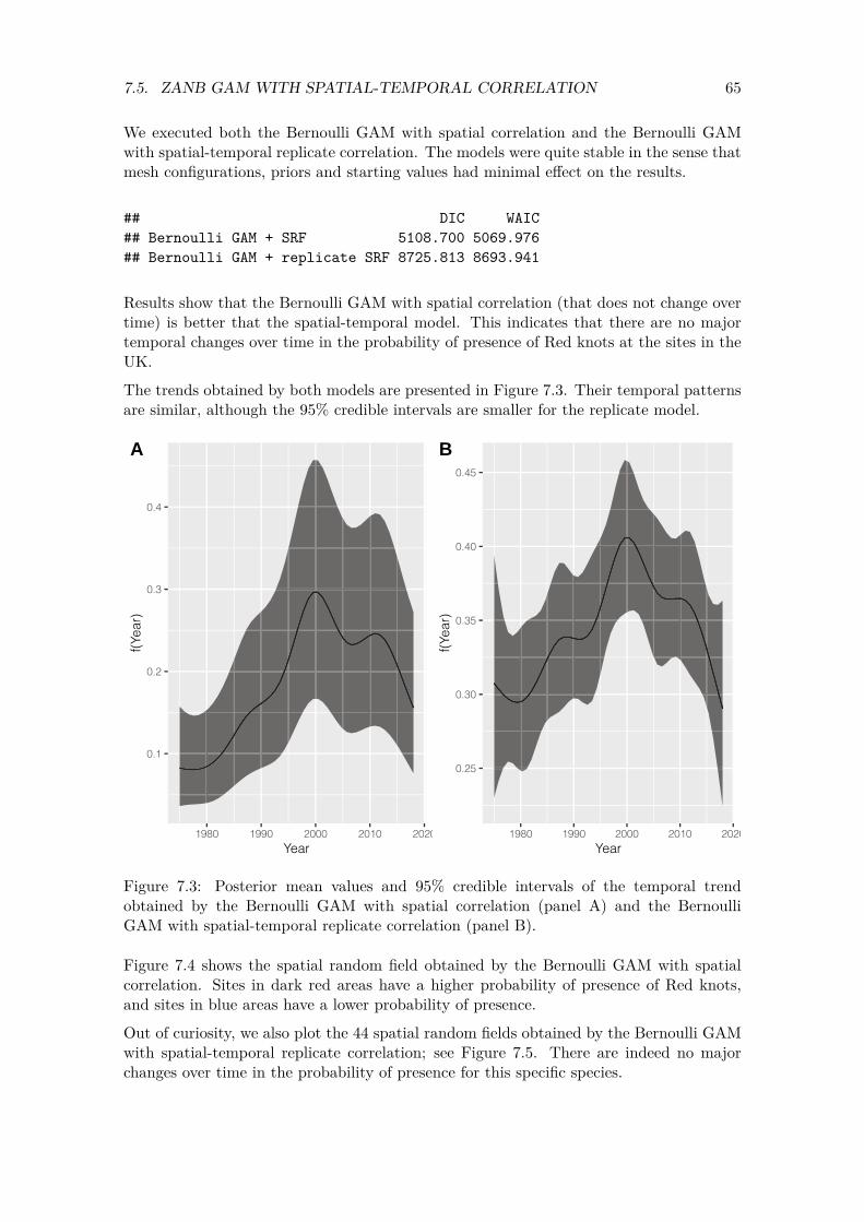
2020
65 7.5. ZANB GAM WITH SPATIAL-TEMPORAL CORRELATION
We executed both the Bernoulli GAM with spatial correlation and the Bernoulli GAM with spatial-temporal replicate correlation. The models were quite stable in the sense that mesh configurations, priors and starting values had minimal effect on the results.
## DIC WAIC ## Bernoulli GAM + SRF 5108.700 5069.976 ## Bernoulli GAM + replicate SRF 8725.813 8693.941
Results show that the Bernoulli GAM with spatial correlation (that does not change over time) is better that the spatial-temporal model. This indicates that there are no major temporal changes over time in the probability of presence of Red knots at the sites in the UK.
The trends obtained by both models are presented in Figure 7.3. Their temporal patterns are similar, although the 95% credible intervals are smaller for the replicate model.
A
0.4
B 0.45
0.40
0.3
0.35
0.2
0.30
0.1 0.25
f(Yea
r)
f(Yea
r)
1980 1990 2000 2010
Year 1980 1990 2000 2010 2020
Year
Figure 7.3: Posterior mean values and 95% credible intervals of the temporal trend obtained by the Bernoulli GAM with spatial correlation (panel A) and the Bernoulli GAM with spatial-temporal replicate correlation (panel B).
Figure 7.4 shows the spatial random field obtained by the Bernoulli GAM with spatial correlation. Sites in dark red areas have a higher probability of presence of Red knots, and sites in blue areas have a lower probability of presence.
Out of curiosity, we also plot the 44 spatial random fields obtained by the Bernoulli GAM with spatial-temporal replicate correlation; see Figure 7.5. There are indeed no major changes over time in the probability of presence for this specific species.
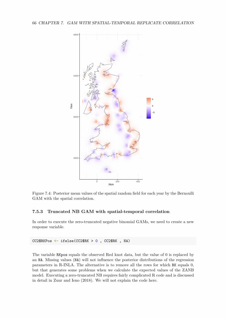
66 CHAPTER 7. GAM WITH SPATIAL-TEMPORAL REPLICATE CORRELATION
5600
6000
6400
6800
0 200 400Xkm
Ykm
−5
0
5
Figure 7.4: Posterior mean values of the spatial random field for each year by the Bernoulli GAM with the spatial correlation.
7.5.3 Truncated NB GAM with spatial-temporal correlation
In order to execute the zero-truncated negative binomial GAMs, we need to create a new response variable.
CC2$RKPos <- ifelse(CC2$RK > 0 , CC2$RK , NA)
The variable RKpos equals the observed Red knot data, but the value of 0 is replaced by an NA. Missing values (NA) will not influence the posterior distributions of the regression parameters in R-INLA. The alternative is to remove all the rows for which RK equals 0, but that generates some problems when we calculate the expected values of the ZANB model. Executing a zero-truncated NB requires fairly complicated R code and is discussed in detail in Zuur and Ieno (2018). We will not explain the code here.
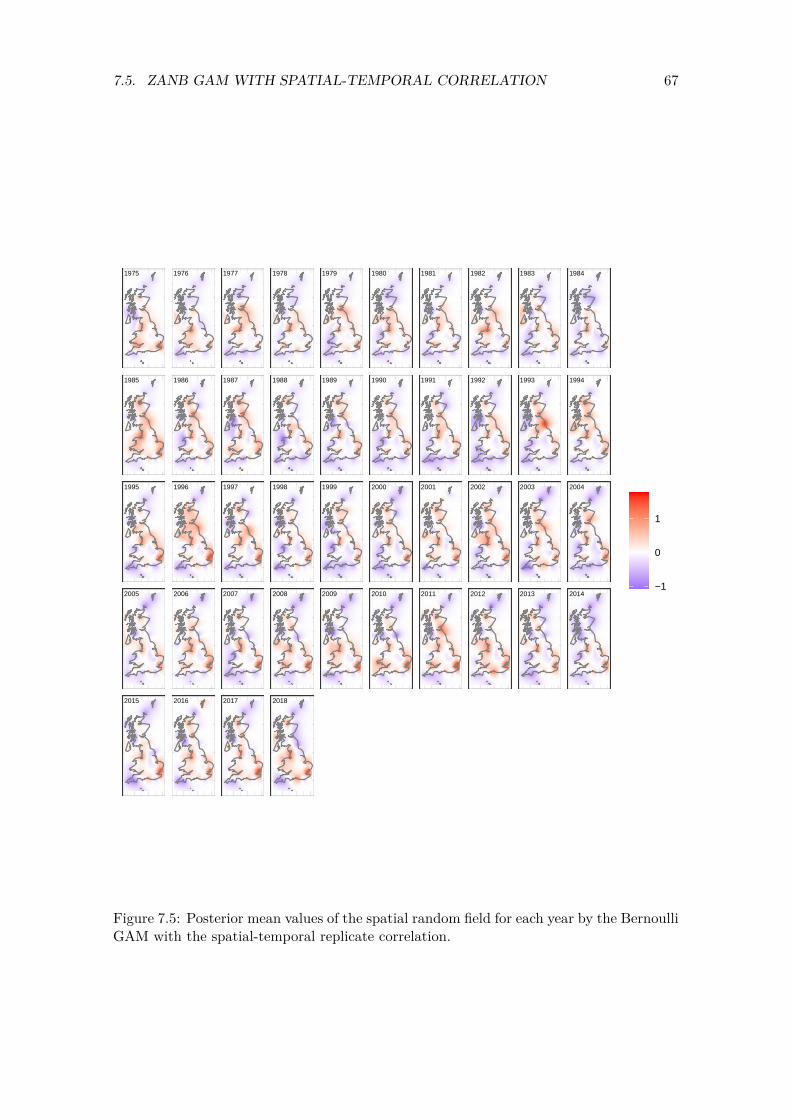
67 7.5. ZANB GAM WITH SPATIAL-TEMPORAL CORRELATION
1975
1985
1995
2005
2015
1976
1986
1996
2006
2016
1977
1987
1997
2007
2017
1978
1988
1998
2008
2018
1979
1989
1999
2009
1980
1990
2000
2010
1981
1991
2001
2011
1982
1992
2002
2012
1983
1993
2003
2013
1984
1994
2004
2014−1
0
1
Figure 7.5: Posterior mean values of the spatial random field for each year by the Bernoulli GAM with the spatial-temporal replicate correlation.
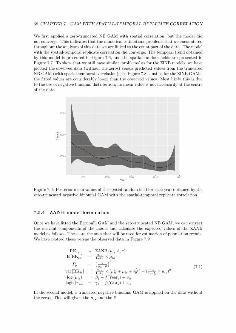
68 CHAPTER 7. GAM WITH SPATIAL-TEMPORAL REPLICATE CORRELATION
We first applied a zero-truncated NB GAM with spatial correlation, but the model did not converge. This indicates that the numerical estimations problems that we encountered throughout the analyses of this data set are linked to the count part of the data. The model with the spatial-temporal replicate correlation did converge. The temporal trend obtained by this model is presented in Figure 7.6, and the spatial random fields are presented in Figure 7.7. To show that we still have similar ‘problems’ as for the ZINB models, we have plotted the observed data (without the zeros) versus predicted values from the truncated NB GAM (with spatial-temporal correlation); see Figure 7.8. Just as for the ZINB GAMs, the fitted values are considerably lower than the observed values. Most likely this is due to the use of negative binomial distribution; its mean value is not necessarily at the centre of the data.
1000
2000
3000
1980 1990 2000 2010 2020
f(Yea
r)
Year
Figure 7.6: Posterior mean values of the spatial random field for each year obtained by the zero-truncated negative binomial GAM with the spatial-temporal replicate correlation.
7.5.4 ZANB model formulation
Once we have fitted the Bernoulli GAM and the zero-truncated NB GAM, we can extract the relevant components of the model and calculate the expected values of the ZANB model as follows. These are the ones that will be used for estimation of population trends. We have plotted these versus the observed data in Figure 7.9.
RK𝑖𝑠 ∼ ZANB (𝜇𝑖𝑠, 𝜃, 𝜋) E [ ] = 𝜋𝑖𝑠 RK𝑖𝑠 1−𝑃0
× 𝜇𝑖𝑠
𝑃0 = (𝜇𝑖𝑠𝜃+𝜃)𝜃
(7.1)𝜋𝑖𝑠 𝜃𝑖𝑠 ) − ( 𝜋𝑖𝑠 var [RK𝑖𝑠] = 1−𝑃0
× (𝜇2𝑖𝑠 + 𝜇𝑖𝑠 + 𝜇2
1−𝑃0 × 𝜇𝑖𝑠)2
log (𝜇𝑖𝑠) = 𝛽1 + 𝑓(Year𝑠) + 𝑣𝑖𝑠
logit (𝜋𝑖𝑠) = 𝛾1 + 𝑓(Year𝑠) + 𝑧𝑖𝑠
In the second model, a truncated negative binomial GAM is applied on the data without the zeros. This will given the 𝜇𝑖𝑠 and the 𝜃.
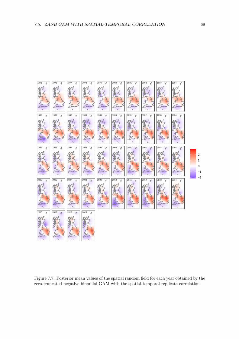
69 7.5. ZANB GAM WITH SPATIAL-TEMPORAL CORRELATION
1975
1985
1995
2005
2015
1976
1986
1996
2006
2016
1977
1987
1997
2007
2017
1978
1988
1998
2008
2018
1979
1989
1999
2009
1980
1990
2000
2010
1981
1991
2001
2011
1982
1992
2002
2012
1983
1993
2003
2013
1984
1994
2004
2014−2
−1
0
1
2
Figure 7.7: Posterior mean values of the spatial random field for each year obtained by the zero-truncated negative binomial GAM with the spatial-temporal replicate correlation.

70 CHAPTER 7. GAM WITH SPATIAL-TEMPORAL REPLICATE CORRELATION
0
40000
80000
120000
0 40000 80000 120000
Fitted values of the zero−truncated GAM
Obs
erve
d da
ta w
ithou
t zer
os
Figure 7.8: Observed number of Red knots (without zeros) and the fitted values of the zero-truncated NB GAM with spatial-temporal replicate correlation.
0
40000
80000
120000
0 40000 80000 120000
Fitted values of the ZANB GAM
Obs
erve
d da
ta w
ith z
eros
Figure 7.9: Observed number of Red knots and the fitted values of the ZANB GAM with spatial-temporal replicate correlation.

Chapter 8
Oystercatcher data
In this chapter we will apply the same methodology on the Oystercatcher data from South Africa.
8.1 Data preparation
In this section we will apply the same data preparation steps as in Section 3.1. We first import the data from the HAEMOV2.csv file, convert longitude and latitude into Xkm and Ykm, convert year into a categorical covariate and redefine Count as OC. Not all R code is presented here, but it is available in the RMarkdown file.
OC <- read.csv(file = "HAEMOV2.csv", header = TRUE, na.strings = "NA", stringsAsFactors = TRUE)
source("HighstatLibV13.R")
8.2 Data exploration
8.2.1 Spatial locations
We first visualise the spatial locations on the sites; see Figure 8.1.
71
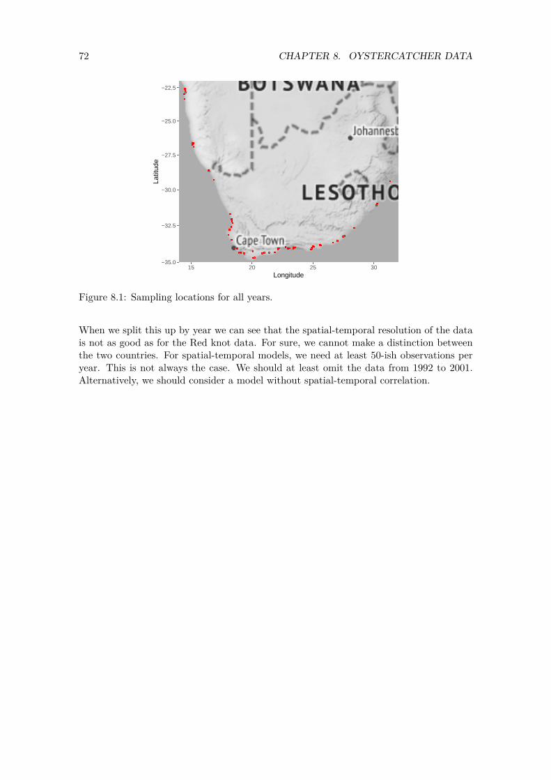
72 CHAPTER 8. OYSTERCATCHER DATA
−35.0
−32.5
−30.0
−27.5
−25.0
−22.5
15 20 25 30Longitude
Latit
ude
Figure 8.1: Sampling locations for all years.
When we split this up by year we can see that the spatial-temporal resolution of the data is not as good as for the Red knot data. For sure, we cannot make a distinction between the two countries. For spatial-temporal models, we need at least 50-ish observations per year. This is not always the case. We should at least omit the data from 1992 to 2001. Alternatively, we should consider a model without spatial-temporal correlation.
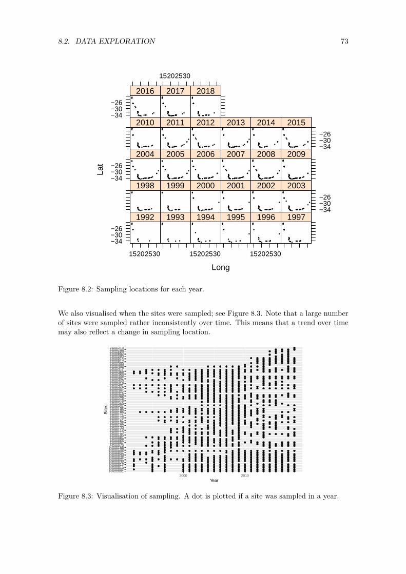
73 8.2. DATA EXPLORATION
Long
Lat
−34−30−26
15202530
1992 1993
15202530
1994 1995
15202530
1996 1997
1998 1999 2000 2001 2002
−34−30−26
2003−34−30−26
2004 2005 2006 2007 2008 2009
2010 2011 2012 2013 2014
−34−30−26
2015−34−30−26
2016
15202530
2017 2018
Figure 8.2: Sampling locations for each year.
We also visualised when the sites were sampled; see Figure 8.3. Note that a large number of sites were sampled rather inconsistently over time. This means that a trend over time may also reflect a change in sampling location.
NA00001NA00002NA00010NA00011NA00013NA00026NA00030NA00031NA00035NA00039NA00040NA00041NA00046NA00108NA00165ZA00019ZA00034ZA00057ZA00065ZA00069ZA00081ZA00100ZA00107ZA00113ZA00114ZA00128ZA00130ZA00132ZA00146ZA00158ZA00161ZA00172ZA00173ZA00175ZA00177ZA00185ZA00186ZA00195ZA00244ZA00247ZA00260ZA00272ZA00275ZA00278ZA00286ZA00309ZA00315ZA00342ZA00347ZA00357ZA00376ZA00401ZA00419ZA00423ZA00426ZA00441ZA00448ZA00453ZA00468ZA00469ZA00471ZA00479ZA00493ZA00499ZA00505ZA00512ZA00513ZA00514ZA00580ZA00594ZA00653ZA00689ZA00703ZA00710
2000 2010
Year
Site
s
Figure 8.3: Visualisation of sampling. A dot is plotted if a site was sampled in a year.
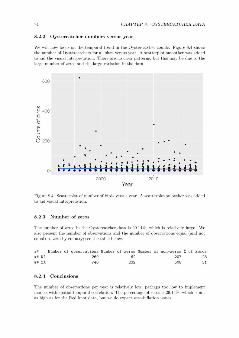
74
600
CHAPTER 8. OYSTERCATCHER DATA
8.2.2 Oystercatcher numbers versus year
We will now focus on the temporal trend in the Oystercatcher counts. Figure 8.4 shows the number of Oystercatchers for all sites versus year. A scatterplot smoother was added to aid the visual interpretation. There are no clear patterns, but this may be due to the large number of zeros and the large variation in the data.
Cou
nts
of b
irds
400
200
0
2000 2010 Year
Figure 8.4: Scatterplot of number of birds versus year. A scatterplot smoother was added to aid visual interpretation.
8.2.3 Number of zeros
The number of zeros in the Oystercatcher data is 29.14%, which is relatively large. We also present the number of observations and the number of observations equal (and not equal) to zero by country; see the table below.
## Number of observations Number of zeros Number of non-zeros % of zeros ## NA 269 62 207 23 ## ZA 740 232 508 31
8.2.4 Conclusions
The number of observations per year is relatively low, perhaps too low to implement models with spatial-temporal correlation. The percentage of zeros is 29.14%, which is not as high as for the Red knot data, but we do expect zero-inflation issues.

75 8.3. POISSON GLMM
8.3 Poisson GLMM
Our starting point is the same Poisson GLMM as in Equation (4.1).
#Without the outlier: OC$Year.c <- MyStd(OC$Year) M1 <- glmmTMB(Count ~ Year.c + (1| Site),
data = OC, family = poisson)
We first check the model for overdispersion, which is indeed present.
E1 <- resid(M1, type = "pearson") N <- nrow(OC) Npar <- length(fixef(M1)) + 1 #One sigma Dispersion1 <- sum(E1^2) / (N - Npar) Dispersion1
## [1] 16.49304
The amount of overdispersion is relatively large, and a detailed model validation was applied; see Figure 8.5. There is one observation that has a large Pearson residual.
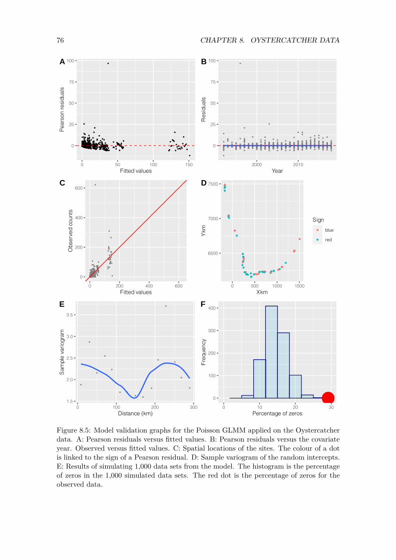
50
C
3.5
76 CHAPTER 8. OYSTERCATCHER DATA
100A 100B
75 75
Pear
son
resi
dual
s
Res
idua
ls
50
25 25
0 0
0 50 100 150 2000 2010
Fitted values Year
D 7500 600
Obs
erve
d co
unts
400 7000 Sign
Ykm
blue
red
200 6500
0
0 200 400 600 0 500 1000 1500
Fitted values Xkm
E F 400
Sam
ple
vario
gram
300 3.0
2.5
Freq
uenc
y
200
2.0 100
1.5 0 100 200
Distance (km) 300
0
0 10 20
Percentage of zeros 30
Figure 8.5: Model validation graphs for the Poisson GLMM applied on the Oystercatcher data. A: Pearson residuals versus fitted values. B: Pearson residuals versus the covariate year. Observed versus fitted values. C: Spatial locations of the sites. The colour of a dot is linked to the sign of a Pearson residual. D: Sample variogram of the random intercepts. E: Results of simulating 1,000 data sets from the model. The histogram is the percentage of zeros in the 1,000 simulated data sets. The red dot is the percentage of zeros for the observed data.
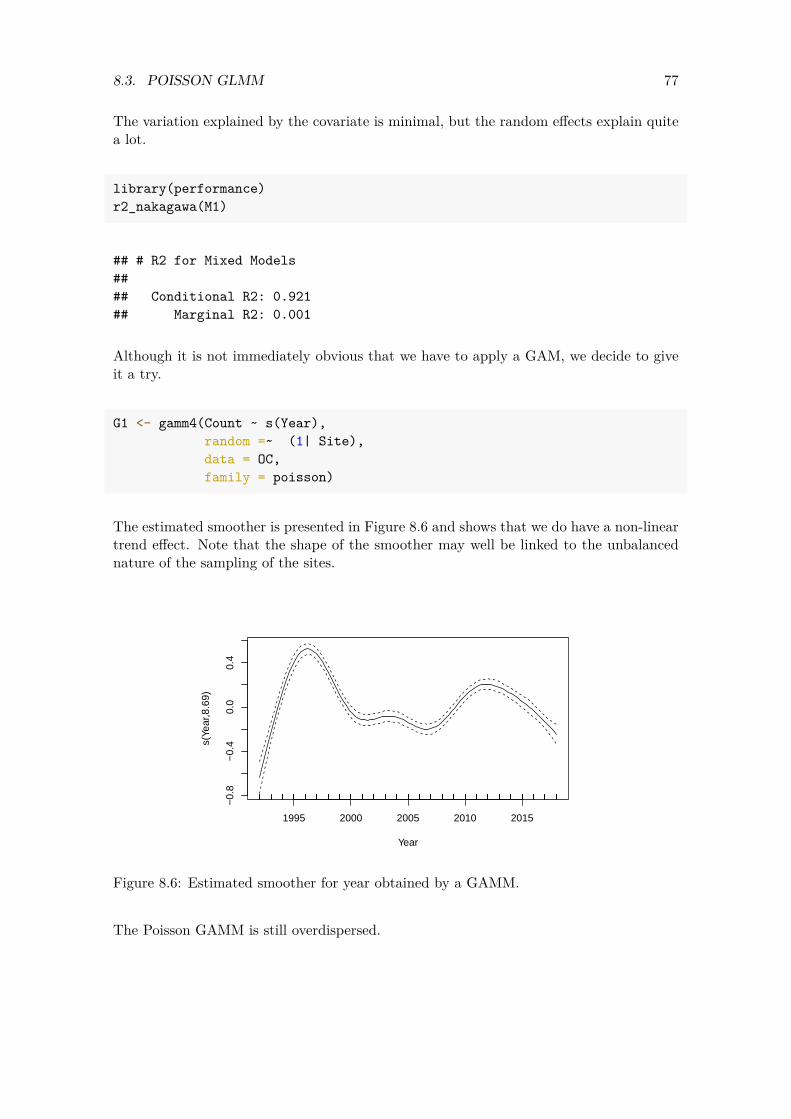
77 8.3. POISSON GLMM
The variation explained by the covariate is minimal, but the random effects explain quite a lot.
library(performance) r2_nakagawa(M1)
## # R2 for Mixed Models ## ## Conditional R2: 0.921 ## Marginal R2: 0.001
Although it is not immediately obvious that we have to apply a GAM, we decide to give it a try.
G1 <- gamm4(Count ~ s(Year), random =~ (1| Site), data = OC, family = poisson)
The estimated smoother is presented in Figure 8.6 and shows that we do have a non-linear trend effect. Note that the shape of the smoother may well be linked to the unbalanced nature of the sampling of the sites.
1995 2000 2005 2010 2015
−0.
8−
0.4
0.0
0.4
Year
s(Ye
ar,8
.69)
Figure 8.6: Estimated smoother for year obtained by a GAMM.
The Poisson GAMM is still overdispersed.
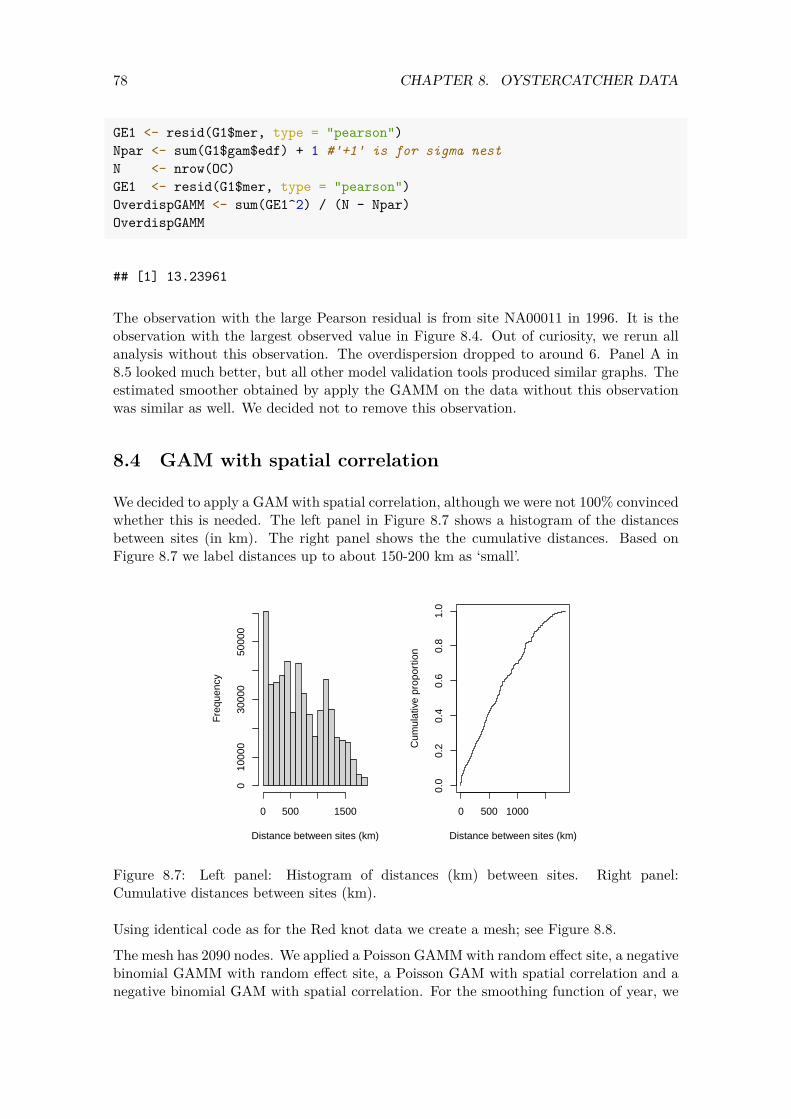
78 CHAPTER 8. OYSTERCATCHER DATA
GE1 <- resid(G1$mer, type = "pearson") Npar <- sum(G1$gam$edf) + 1 #'+1' is for sigma nest N <- nrow(OC) GE1 <- resid(G1$mer, type = "pearson") OverdispGAMM <- sum(GE1^2) / (N - Npar) OverdispGAMM
## [1] 13.23961
The observation with the large Pearson residual is from site NA00011 in 1996. It is the observation with the largest observed value in Figure 8.4. Out of curiosity, we rerun all analysis without this observation. The overdispersion dropped to around 6. Panel A in 8.5 looked much better, but all other model validation tools produced similar graphs. The estimated smoother obtained by apply the GAMM on the data without this observation was similar as well. We decided not to remove this observation.
8.4 GAM with spatial correlation
We decided to apply a GAM with spatial correlation, although we were not 100% convinced whether this is needed. The left panel in Figure 8.7 shows a histogram of the distances between sites (in km). The right panel shows the the cumulative distances. Based on Figure 8.7 we label distances up to about 150-200 km as ‘small’.
Distance between sites (km)
Fre
quen
cy
0 500 1500
010
000
3000
050
000
0 500 1000
0.0
0.2
0.4
0.6
0.8
1.0
Distance between sites (km)
Cum
ulat
ive
prop
ortio
n
Figure 8.7: Left panel: Histogram of distances (km) between sites. Right panel: Cumulative distances between sites (km).
Using identical code as for the Red knot data we create a mesh; see Figure 8.8.
The mesh has 2090 nodes. We applied a Poisson GAMM with random effect site, a negative binomial GAMM with random effect site, a Poisson GAM with spatial correlation and a negative binomial GAM with spatial correlation. For the smoothing function of year, we
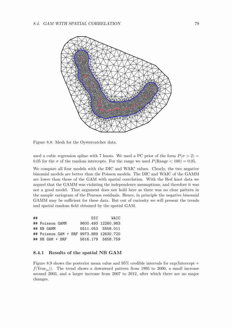
79 8.4. GAM WITH SPATIAL CORRELATION
Figure 8.8: Mesh for the Oystercatcher data.
used a cubic regression spline with 7 knots. We used a PC prior of the form 𝑃(𝜎 > 2) = 0.05 for the 𝜎 of the random intercepts. For the range we used 𝑃 (Range < 100) = 0.05.
We compare all four models with the DIC and WAIC values. Clearly, the two negative binomial models are better than the Poisson models. The DIC and WAIC of the GAMM are lower than those of the GAM with spatial correlation. With the Red knot data we argued that the GAMM was violating the independence assumptions, and therefore it was not a good model. That argument does not hold here as there was no clear pattern in the sample variogram of the Pearson residuals. Hence, in principle the negative binomial GAMM may be sufficient for these data. But out of curiosity we will present the trends and spatial random field obtained by the spatial GAM.
## DIC WAIC ## Poisson GAMM 9600.493 12260.983 ## NB GAMM 5511.053 5558.011 ## Poisson GAM + SRF 9973.889 12630.720 ## NB GAM + SRF 5616.179 5658.759
8.4.1 Results of the spatial NB GAM
Figure 8.9 shows the posterior mean value and 95% credible intervals for exp(Intercept +𝑓(Year𝑖𝑠)). The trend shows a downward pattern from 1995 to 2000, a small increase around 2003, and a larger increase from 2007 to 2012, after which there are no major changes.

80 CHAPTER 8. OYSTERCATCHER DATA
0.5
1.0
1.5
2.0
2.5
3.0 f(Y
ear)
2000 2010
Year
Figure 8.9: Posterior mean values and 95% credible intervals for the year effect obtained by the NB GAM with spatial correlation applied on the Oystercatcher data. The smoother is an unpenalised cubic regression spline with 7 df. We visualised exp(f(Year)).
The spatial random field is presented in Figure 8.10. Note that we have some rather large negative values of the spatial random field. These are probably sites with zero counts.
The fitted values of the NB GAM with spatial correlation are plotted versus the observed counts in Figure 8.11. Although the fit looks reasonably good, we have the impression that we are overfitting the data.
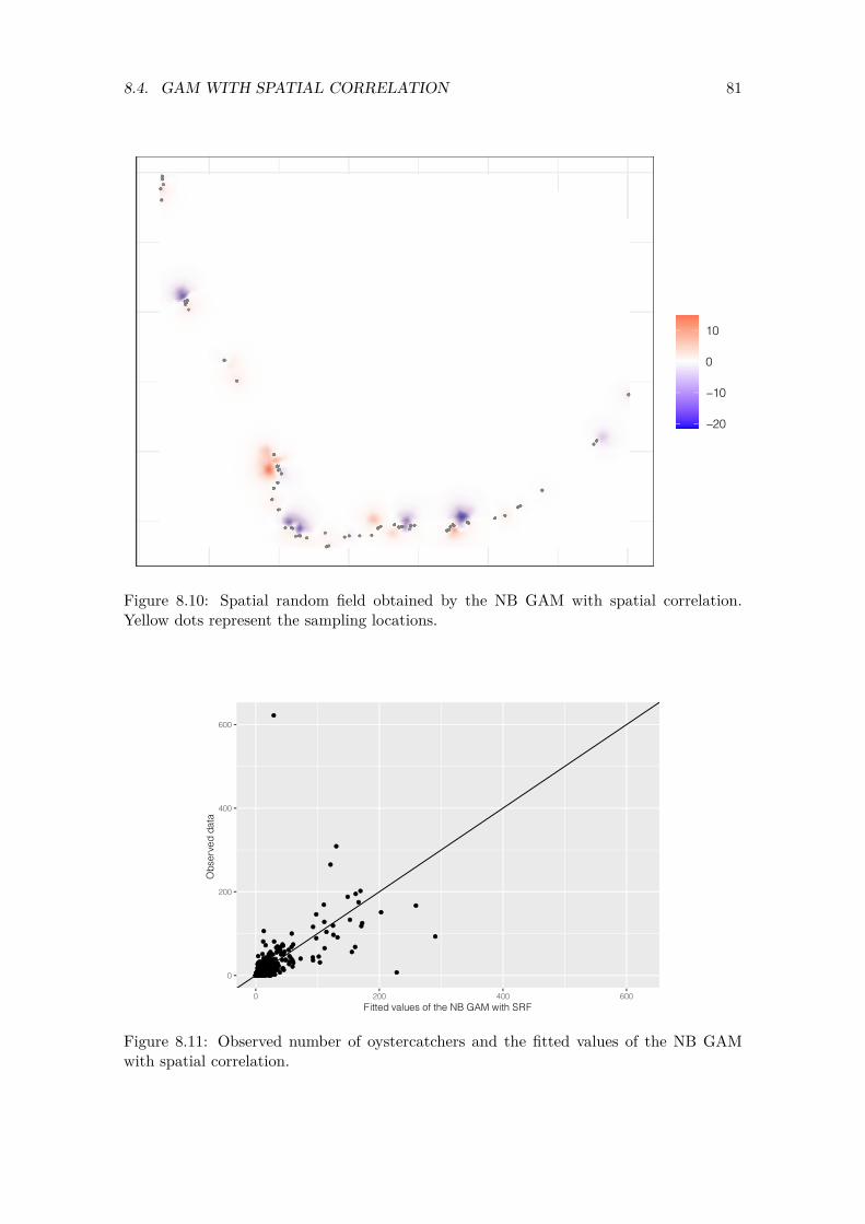
81 8.4. GAM WITH SPATIAL CORRELATION
10
0
−10
−20
Figure 8.10: Spatial random field obtained by the NB GAM with spatial correlation. Yellow dots represent the sampling locations.
600
400
Obs
erve
d da
ta
200
0
0 200 400 600
Fitted values of the NB GAM with SRF
Figure 8.11: Observed number of oystercatchers and the fitted values of the NB GAM with spatial correlation.
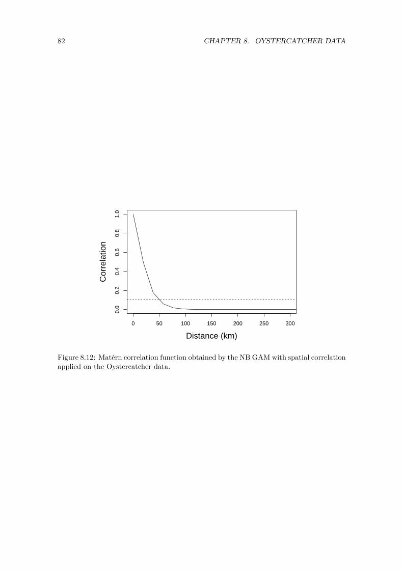
82 CHAPTER 8. OYSTERCATCHER DATA
0 50 100 150 200 250 300
0.0
0.2
0.4
0.6
0.8
1.0
Distance (km)
Cor
rela
tion
Figure 8.12: Matérn correlation function obtained by the NB GAM with spatial correlation applied on the Oystercatcher data.

Chapter 9
Comments
In this report we analysed count data from Red knots in the UK and Oystercatchers from South Africa. The aim was to provide a better approach than what is currently being used for these data, namely via TRIM. The TRIM approach predicts missing values, adds up the counts from all sites and then analyses the univariate time series using a quasi-Poisson GLM or GAM.
One of our criticism against this approach is that adding up data from all sites ignores any spatial dependency issues. The analysis presented in this report shows that there is strong spatial correlation. Aggregating spatially correlated data results in information loss and obscures important processes in the ecological system under study. Clark and Avery (1976) already warned against aggregation and explained concepts as aggregation bias of regression parameters. Furthermore, aggregation of Red knot counts for 500-ish sites means that the few rather abundant sites dominate the signal. One might as well only use the data from only those few sites.
Another criticism of the TRIM approach is that it used a quasi-Poisson approach if there is overdispersion. Such an approach should only be used if the overdispersion is up to about 5, not if the overdispersion is in the range of 500. Hilbe (2014) and Zuur et al. (2014), among many other publications, argue that overdispersion has a variety of causes.
1. Outliers in the response variable. 2. Missing covariates. 3. Missing interactions. 4. Covariate effects that are modelled as linear, whereas their effects are in fact
non-linear. 5. Temporal and spatial dependency that are not taken into account. 6. Repeated measurements that are not taken into account. 7. Use of the wrong link function. 8. Zero inflation that is not taken into account by the model.
It is the task of the scientist to determine what is driving the overdispersion, and to extend the model in such a way that the source of the problem is modelled. Selecting the wrong approach may result in biased parameter estimates and the wrong ecological conclusions.
In this report we made an attempt to analyse the data using R-INLA. We only partly succeeded with this. The fact that the trends obtained by R-INLA do not look like the
83
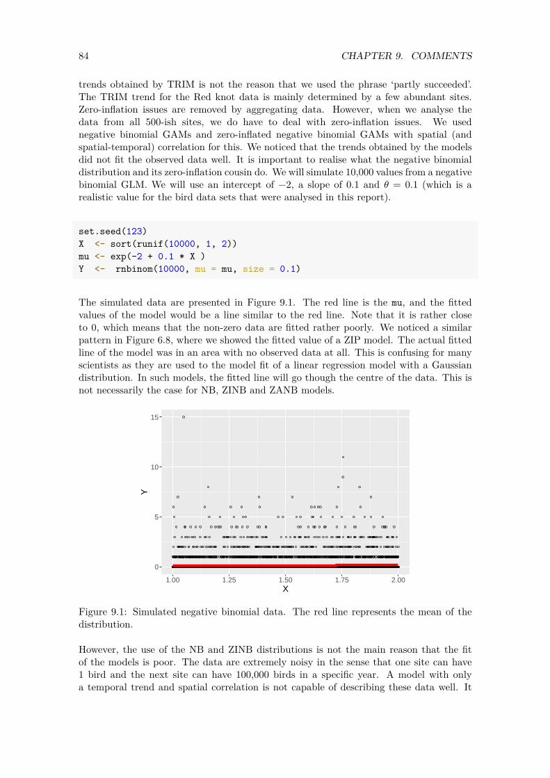
84 CHAPTER 9. COMMENTS
trends obtained by TRIM is not the reason that we used the phrase ‘partly succeeded’. The TRIM trend for the Red knot data is mainly determined by a few abundant sites. Zero-inflation issues are removed by aggregating data. However, when we analyse the data from all 500-ish sites, we do have to deal with zero-inflation issues. We used negative binomial GAMs and zero-inflated negative binomial GAMs with spatial (and spatial-temporal) correlation for this. We noticed that the trends obtained by the models did not fit the observed data well. It is important to realise what the negative binomial distribution and its zero-inflation cousin do. We will simulate 10,000 values from a negative binomial GLM. We will use an intercept of −2, a slope of 0.1 and 𝜃 = 0.1 (which is a realistic value for the bird data sets that were analysed in this report).
set.seed(123) X <- sort(runif(10000, 1, 2)) mu <- exp(-2 + 0.1 * X ) Y <- rnbinom(10000, mu = mu, size = 0.1)
The simulated data are presented in Figure 9.1. The red line is the mu, and the fitted values of the model would be a line similar to the red line. Note that it is rather close to 0, which means that the non-zero data are fitted rather poorly. We noticed a similar pattern in Figure 6.8, where we showed the fitted value of a ZIP model. The actual fitted line of the model was in an area with no observed data at all. This is confusing for many scientists as they are used to the model fit of a linear regression model with a Gaussian distribution. In such models, the fitted line will go though the centre of the data. This is not necessarily the case for NB, ZINB and ZANB models.
0
5
10
15
1.00 1.25 1.50 1.75 2.00X
Y
Figure 9.1: Simulated negative binomial data. The red line represents the mean of the distribution.
However, the use of the NB and ZINB distributions is not the main reason that the fit of the models is poor. The data are extremely noisy in the sense that one site can have 1 bird and the next site can have 100,000 birds in a specific year. A model with only a temporal trend and spatial correlation is not capable of describing these data well. It

85
would be better to add covariates to the model that are able to describe the patterns in the data.

Appendix A
Technical information on smoothers
Readers who are not interested in the technical background of basic smoothers may skip this appendix or just read the summary statements. The text below is partly based on Chapter 20 in Zuur and Ieno (2018).
Smoothing techniques constitute a scientific field in itself, and a large number of books and papers are available that discuss it in various degrees of complexity; see for example Hastie and Tibshirani (1990), Ruppert et al. (2003), Keele (2008), Yee (2015), Zuur et al. (2015), Wood (2017) and Zuur and Ieno (2018), to name just a few. The smoothers that will be used in later chapters are relatively complex. They are fully discussed in Zuur and Ieno (2018). In this appendix we discuss five basic smoothers. The reason for doing this is that by the time we reach the maths of the fifth smoother, you will understand the general principle of smoothers, and that is all that is needed for this report. The more advanced smoothers are all based on similar principles. Throughout this appendix we will ignore the fact that we have pseudo-replication. We also use the normal distribution for RK. This is just a didactic choice as it simplifies the explanation of smoothers.
A.1 Moving average and LOESS smoothers
Figure A.1A shows a scatterplot of RK versus year for the Red knot data. We would like to add a line that captures the main patterns in this scatterplot. One option is to connect sequential points in time, but such a graph is not very informative in this case. Another option is to add a straight line, but then we may be missing important patterns in the data.
87
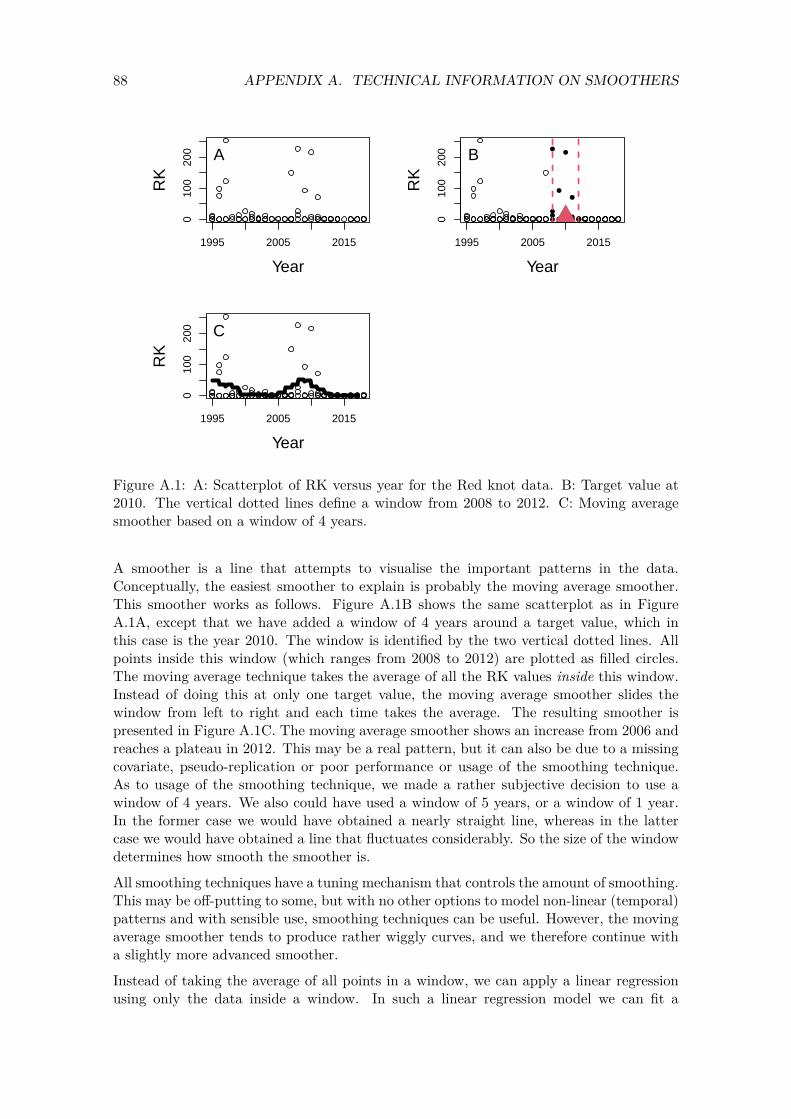
88 APPENDIX A. TECHNICAL INFORMATION ON SMOOTHERS
1995 2005 2015
010
020
0
Year
RK
A
1995 2005 2015
010
020
0
Year
RK
B
1995 2005 2015
010
020
0
Year
RK
C
Figure A.1: A: Scatterplot of RK versus year for the Red knot data. B: Target value at 2010. The vertical dotted lines define a window from 2008 to 2012. C: Moving average smoother based on a window of 4 years.
A smoother is a line that attempts to visualise the important patterns in the data. Conceptually, the easiest smoother to explain is probably the moving average smoother. This smoother works as follows. Figure A.1B shows the same scatterplot as in Figure A.1A, except that we have added a window of 4 years around a target value, which in this case is the year 2010. The window is identified by the two vertical dotted lines. All points inside this window (which ranges from 2008 to 2012) are plotted as filled circles. The moving average technique takes the average of all the RK values inside this window. Instead of doing this at only one target value, the moving average smoother slides the window from left to right and each time takes the average. The resulting smoother is presented in Figure A.1C. The moving average smoother shows an increase from 2006 and reaches a plateau in 2012. This may be a real pattern, but it can also be due to a missing covariate, pseudo-replication or poor performance or usage of the smoothing technique. As to usage of the smoothing technique, we made a rather subjective decision to use a window of 4 years. We also could have used a window of 5 years, or a window of 1 year. In the former case we would have obtained a nearly straight line, whereas in the latter case we would have obtained a line that fluctuates considerably. So the size of the window determines how smooth the smoother is.
All smoothing techniques have a tuning mechanism that controls the amount of smoothing. This may be off-putting to some, but with no other options to model non-linear (temporal) patterns and with sensible use, smoothing techniques can be useful. However, the moving average smoother tends to produce rather wiggly curves, and we therefore continue with a slightly more advanced smoother.
Instead of taking the average of all points in a window, we can apply a linear regression using only the data inside a window. In such a linear regression model we can fit a
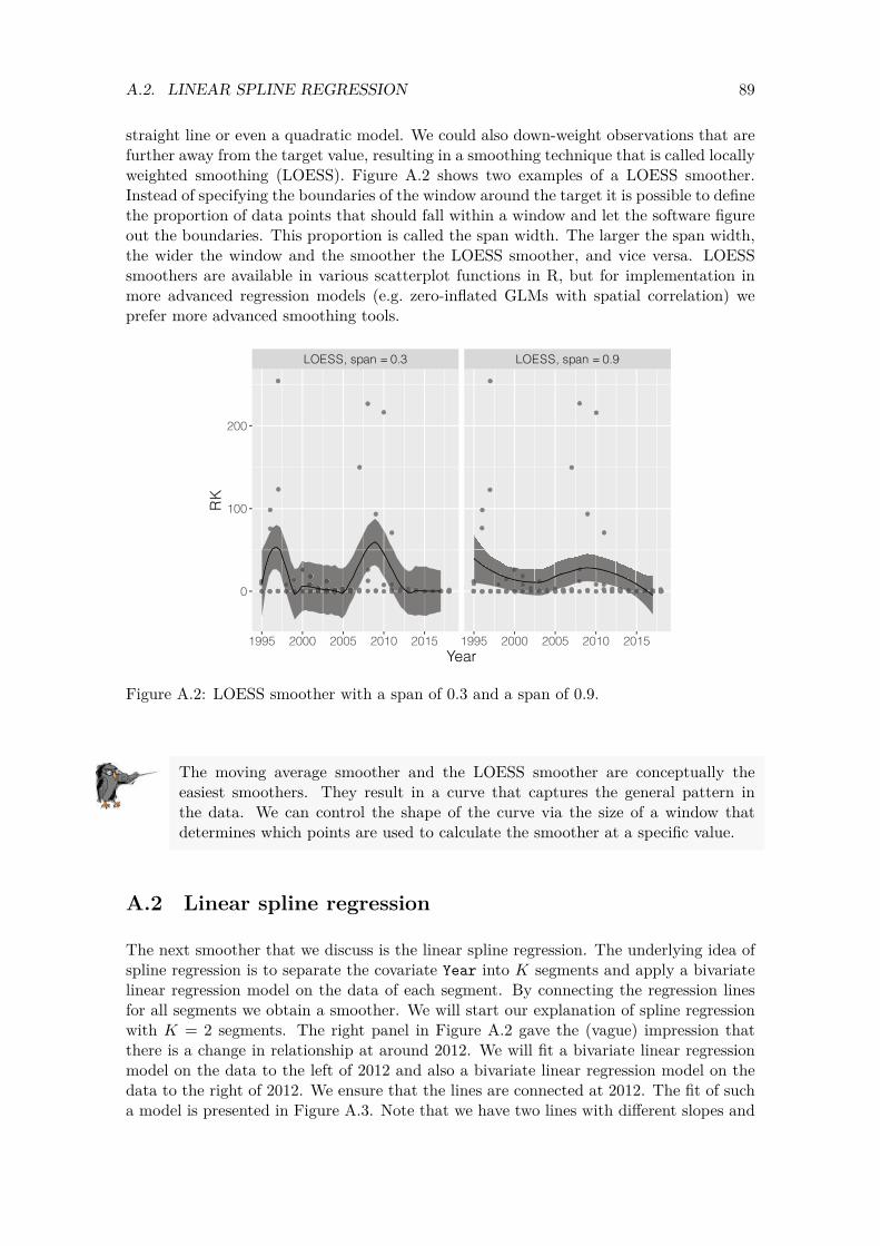
89 A.2. LINEAR SPLINE REGRESSION
straight line or even a quadratic model. We could also down-weight observations that are further away from the target value, resulting in a smoothing technique that is called locally weighted smoothing (LOESS). Figure A.2 shows two examples of a LOESS smoother. Instead of specifying the boundaries of the window around the target it is possible to define the proportion of data points that should fall within a window and let the software figure out the boundaries. This proportion is called the span width. The larger the span width, the wider the window and the smoother the LOESS smoother, and vice versa. LOESS smoothers are available in various scatterplot functions in R, but for implementation in more advanced regression models (e.g. zero-inflated GLMs with spatial correlation) we prefer more advanced smoothing tools.
LOESS, span = 0.3 LOESS, span = 0.9
1995 2000 2005 2010 2015 1995 2000 2005 2010 2015
0
100
200
Year
RK
Figure A.2: LOESS smoother with a span of 0.3 and a span of 0.9.
The moving average smoother and the LOESS smoother are conceptually the easiest smoothers. They result in a curve that captures the general pattern in the data. We can control the shape of the curve via the size of a window that determines which points are used to calculate the smoother at a specific value.
A.2 Linear spline regression
The next smoother that we discuss is the linear spline regression. The underlying idea of spline regression is to separate the covariate Year into 𝐾 segments and apply a bivariate linear regression model on the data of each segment. By connecting the regression lines for all segments we obtain a smoother. We will start our explanation of spline regression with 𝐾 = 2 segments. The right panel in Figure A.2 gave the (vague) impression that there is a change in relationship at around 2012. We will fit a bivariate linear regression model on the data to the left of 2012 and also a bivariate linear regression model on the data to the right of 2012. We ensure that the lines are connected at 2012. The fit of such a model is presented in Figure A.3. Note that we have two lines with different slopes and
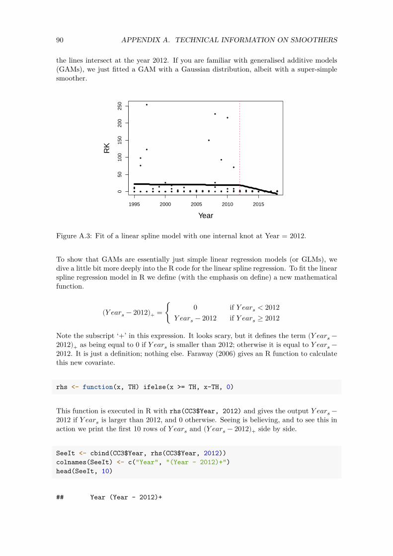
90 APPENDIX A. TECHNICAL INFORMATION ON SMOOTHERS
the lines intersect at the year 2012. If you are familiar with generalised additive models (GAMs), we just fitted a GAM with a Gaussian distribution, albeit with a super-simple smoother.
1995 2000 2005 2010 2015
050
100
150
200
250
Year
RK
Figure A.3: Fit of a linear spline model with one internal knot at Year = 2012.
To show that GAMs are essentially just simple linear regression models (or GLMs), we dive a little bit more deeply into the R code for the linear spline regression. To fit the linear spline regression model in R we define (with the emphasis on define) a new mathematical function.
0 if 𝑌 𝑒𝑎𝑟𝑠 < 2012 (𝑌 𝑒𝑎𝑟𝑠 − 2012)+ = { 𝑌 𝑒𝑎𝑟𝑠 − 2012 if 𝑌 𝑒𝑎𝑟𝑠 ≥ 2012
Note the subscript ‘+’ in this expression. It looks scary, but it defines the term (𝑌 𝑒𝑎𝑟𝑠 −2012)+ as being equal to 0 if 𝑌 𝑒𝑎𝑟𝑠 is smaller than 2012; otherwise it is equal to 𝑌 𝑒𝑎𝑟𝑠 −2012. It is just a definition; nothing else. Faraway (2006) gives an R function to calculate this new covariate.
rhs <- function(x, TH) ifelse(x >= TH, x-TH, 0)
This function is executed in R with rhs(CC3$Year, 2012) and gives the output 𝑌 𝑒𝑎𝑟𝑠 −2012 if 𝑌 𝑒𝑎𝑟𝑠 is larger than 2012, and 0 otherwise. Seeing is believing, and to see this in action we print the first 10 rows of 𝑌 𝑒𝑎𝑟𝑠 and (𝑌 𝑒𝑎𝑟𝑠 − 2012)+ side by side.
SeeIt <- cbind(CC3$Year, rhs(CC3$Year, 2012)) colnames(SeeIt) <- c("Year", "(Year - 2012)+") head(SeeIt, 10)
## Year (Year - 2012)+
91 A.2. LINEAR SPLINE REGRESSION
## [1,] 1999 0 ## [2,] 2015 3 ## [3,] 2010 0 ## [4,] 1998 0 ## [5,] 2016 4 ## [6,] 2017 5 ## [7,] 2003 0 ## [8,] 2007 0 ## [9,] 2005 0 ## [10,] 2009 0
The left column is Year and the right column is either equal to 0 (if the year is smaller than 2012) or Year - 2012 if Year is larger than or equal to 2012. In the first 10 rows we have 9 values smaller than 2012, hence the zeros on the right. There is one row where year equals 2013. The newly defined variable is 1 (= 2013 – 2012). We can now formulate the linear spline regression model with one knot at 2012 as follows.
𝑅𝐾𝑖𝑠 = 𝛽1 + 𝛽2 × 𝑌 𝑒𝑎𝑟𝑠 + 𝛽3 × (𝑌 𝑒𝑎𝑟𝑠 − 2012)+ + 𝜖𝑖𝑠
The 𝜖𝑖𝑠 is the usual residual term in a linear regression model; it is assumed to be normal distributed with mean 0 and (unknown) variance 𝜎2. The fancy expression above is shorthand notation for writing
= { 𝛽1 + 𝛽2 × 𝑌 𝑒𝑎𝑟𝑠 + 𝜖𝑖𝑠 if 𝑌 𝑒𝑎𝑟𝑠 < 2012 𝑅𝐾𝑖𝑠 𝛽1 + 𝛽2 × 𝑌 𝑒𝑎𝑟𝑠 + 𝛽3 × (𝑌 𝑒𝑎𝑟𝑠 − 2012) + 𝜖𝑖𝑠 if 𝑌 𝑒𝑎𝑟𝑠 ≥ 2012
At 𝑌 𝑒𝑎𝑟𝑠 = 2012, both expressions are the same, ensuring that the two lines touch each other at this year. The unknown regression parameters are 𝛽1, 𝛽2 and 𝛽3 and the variance of the residuals. The R code to fit the model is as follows.
Mcsr <- lm(RK ~ Year + rhs(Year, 2012), data = CC3)
Note that this is a linear regression model with two covariates. The function rhs creates the new covariate, and we end up with three estimated regression parameters. Once we have fitted the model it is quite easy to create Figure A.3. We can predict RK values for year values on a regular grid, say 100 values from 2002 to 2017. These values correspond to the smallest and largest year values, and the value of 100 is chosen arbitrarily.
ND <- data.frame(Year = seq(min(CC3$Year), max(CC3$Year), length = 100))
Pcsr <- predict(Mcsr, newdata = ND) par(mfrow = c(1, 1), mar = c(5,5,2,2), cex.lab = 1.5) plot(x = CC3$Year, y = CC3$RK,
xlab = "Year", ylab = "RK", cex = 0.7, pch = 16, col = grey(0.1))

92 APPENDIX A. TECHNICAL INFORMATION ON SMOOTHERS
lines(x = ND$Year, y = Pcsr, lwd = 5) abline(v = 2012, lty = 2)
The point where we separated the year gradient is called a knot. In Figure A.3 we use 1 internal knot and we also count the outer edges as knots; hence we used 3 knots in the model. The choice of Year = 2012 for the internal knot is rather subjective. It is more objective to use the quantiles of year for the knot positions. Another problem is how many knots we should use. Suppose we use 7 knots (i.e. 2 outer knots and 5 internal knots) and quantiles to choose the knot positions. In that case the values of these knots are as follows.
Knots <- quantile(CC3$Year, probs = seq(0, 1, length = 7)) Knots
## 0% 16.66667% 33.33333% 50% 66.66667% 83.33333% 100% ## 1995.0 1998.5 2002.0 2006.0 2011.0 2014.5 2018.0
The internal knots are at the 16.66%, 33.33%, 50%, 66.66% and 83.33% quantiles. These are the years 2005, 2008, 2010, 2013 and 2015. We fit a regression model with knots at these values.
Mcsr <- lm(RK ~ Year + rhs(Year, Knots[2]) + rhs(Year, Knots[3]) + rhs(Year, Knots[4]) + rhs(Year, Knots[5]) + rhs(Year, Knots[6]), data = CC3)
Figure A.4 shows the model fit.
1995 2000 2005 2010 2015
050
100
150
200
250
Year
RK
Figure A.4: Fit of the linear spline model with 5 internal knots.
93 A.3. QUADRATIC AND CUBIC SPLINE REGRESSION
The solid line in Figure A.4 is the smoother 𝑓(𝑌 𝑒𝑎𝑟). Its mathematical formulation is given below. We changed the regression parameters of the second part of the smoother from betas to 𝑏s for notational convenience.
𝑓(𝑌 𝑒𝑎𝑟𝑠) = 𝛽2 × 𝑌 𝑒𝑎𝑟𝑠
𝑏1 × (𝑌 𝑒𝑎𝑟𝑠 − 2005)++𝑏2 × (𝑌 𝑒𝑎𝑟𝑠 − 2008)++𝑏3 × (𝑌 𝑒𝑎𝑟𝑠 − 2010)++𝑏4 × (𝑌 𝑒𝑎𝑟𝑠 − 2013)++𝑏5 × (𝑌 𝑒𝑎𝑟𝑠 − 2015)+
The problem with this notation is that when we use more knots, the equation gets rather lengthy. We can write the expression more compactly as follows.
𝐾
𝑓(𝑌 𝑒𝑎𝑟𝑠) = 𝛽2 × 𝑌 𝑒𝑎𝑟𝑠 + ∑ 𝑏𝑗 × (𝑌 𝑒𝑎𝑟𝑠 − 𝑘𝑗)+𝑗=1
where 𝐾 = 5 internal knots and the 𝑘𝑗 are the knot positions. The parameters 𝛽2, 𝑏1, 𝑏2, …, 𝑏5 are unknown regression parameters that need to be estimated using linear regression, and 𝑌 𝑒𝑎𝑟𝑠 and the (𝑌 𝑒𝑎𝑟𝑠 − 𝑘𝑗)+
terms are known covariates.
A smoother is nothing more than a collection of Lego pieces (i.e. abstract covariates defined at knots), and the corresponding regression parameters can be estimated with linear regression, GLM or GLMM procedures.
A.3 Quadratic and cubic spline regression
The smoother in Figure A.4 is not visually appealing due to the ‘peaky’ connection at the internal knots. To solve this problem we can increase the number of knots, but a linear spline regression tends to stay peaky, even for larger numbers of knots. The only solution to avoid peaky connections is to improve the smoother itself. The quadratic spline regression is defined by
𝐾
𝑓(𝑌 𝑒𝑎𝑟𝑠) = 𝛽2 × 𝑌 𝑒𝑎𝑟𝑠 + 𝛽3 × 𝑌 𝑒𝑎𝑟𝑠2 + ∑ 𝑏𝑗 × (𝑌 𝑒𝑎𝑟𝑠 − 𝑘𝑗)
2
+𝑗=1
This function produces a smoother that is less wiggly than the linear spline regression. We can even go one step further and define the cubic spline regression; such a smoother is less wiggly than the quadratic spline regression. The cubic spline regression is defined below.
𝐾
𝑓(𝑌 𝑒𝑎𝑟𝑠) = 𝛽2 × 𝑌 𝑒𝑎𝑟𝑠 + 𝛽3 × 𝑌 𝑒𝑎𝑟𝑠2 + 𝛽3 × 𝑌 𝑒𝑎𝑟𝑠
3 + ∑ 𝑏𝑗 × (𝑌 𝑒𝑎𝑟𝑠 − 𝑘𝑗)3
+𝑗=1
The fit of the cubic spline regression is presented in Figure A.5.
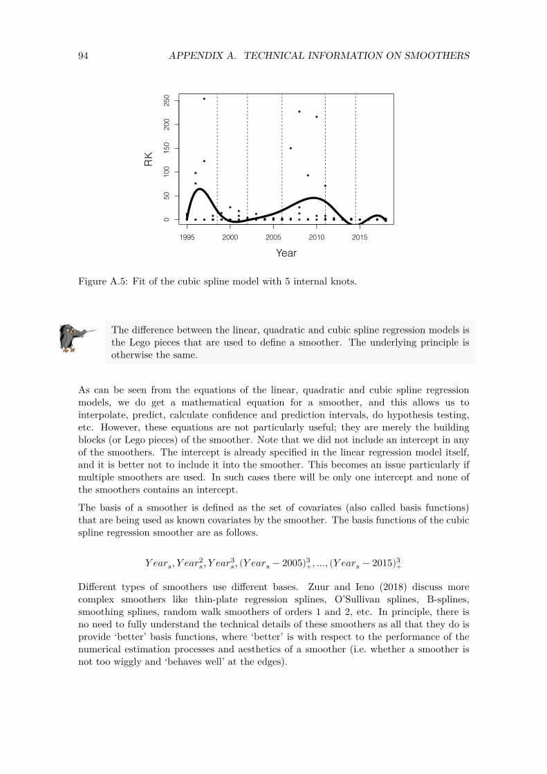
94 APPENDIX A. TECHNICAL INFORMATION ON SMOOTHERS
0 50
10
0 15
0 20
0 25
0
RK
1995 2000 2005 2010 2015
Year
Figure A.5: Fit of the cubic spline model with 5 internal knots.
The difference between the linear, quadratic and cubic spline regression models is the Lego pieces that are used to define a smoother. The underlying principle is otherwise the same.
As can be seen from the equations of the linear, quadratic and cubic spline regression models, we do get a mathematical equation for a smoother, and this allows us to interpolate, predict, calculate confidence and prediction intervals, do hypothesis testing, etc. However, these equations are not particularly useful; they are merely the building blocks (or Lego pieces) of the smoother. Note that we did not include an intercept in any of the smoothers. The intercept is already specified in the linear regression model itself, and it is better not to include it into the smoother. This becomes an issue particularly if multiple smoothers are used. In such cases there will be only one intercept and none of the smoothers contains an intercept.
The basis of a smoother is defined as the set of covariates (also called basis functions) that are being used as known covariates by the smoother. The basis functions of the cubic spline regression smoother are as follows.
𝑌 𝑒𝑎𝑟𝑠, 𝑌 𝑒𝑎𝑟𝑠2, 𝑌 𝑒𝑎𝑟𝑠
3, (𝑌 𝑒𝑎𝑟𝑠 − 2005)3+, ..., (𝑌 𝑒𝑎𝑟𝑠 − 2015)3
+
Different types of smoothers use different bases. Zuur and Ieno (2018) discuss more complex smoothers like thin-plate regression splines, O’Sullivan splines, B-splines, smoothing splines, random walk smoothers of orders 1 and 2, etc. In principle, there is no need to fully understand the technical details of these smoothers as all that they do is provide ‘better’ basis functions, where ‘better’ is with respect to the performance of the numerical estimation processes and aesthetics of a smoother (i.e. whether a smoother is not too wiggly and ‘behaves well’ at the edges).

95 A.3. QUADRATIC AND CUBIC SPLINE REGRESSION
The cubic spline regression contains small mathematical building blocks, which enable us to build up a smoother. The basis of a smoother is the set of basis functions (i.e. building blocks) that are used as covariates for the smoother.
Another point that we need to discuss is how to control the amount of smoothing. Specialised packages like mgcv (Wood, 2017) have tools that determine the optimal amount of smoothing (i.e. the optimal size of the window or the optimal span width). However, the underlying maths is rather complex. With multiple smoothers R-INLA is not very good at determining the optimal amount of smoothing (it sometimes results in a smoother that is too wiggly or at the other extreme, a flat horizontal line). In such cases it is better to control the amount of smoothing manually. Technically, we can use unpenalised cubic regression splines. These are explained in detail in Wood (2017) and used in combination with R-INLA in Zuur and Ieno (2018) In short, the data analyst specifies the amount of smoothing a priori and uses the smooth.construct function from the mgcv package (Wood, 2020) to obtain the basis functions (i.e. the Lego pieces). We suggest only allowing for a small amount of smoothing (in technical jargon this mean that we use smoothers with only three or four degrees of freedom). We will explain this in more detail when we do the analysis in R-INLA.


Bibliography
Bates, D., Maechler, M., Bolker, B., and Walker, S. (2020). lme4: Linear Mixed-Effects Models using Eigen and S4. R package version 1.1-26.
Blangiardo, M. and Cameletti, M. (2015). Spatial and Spatio-Temporal Bayesian Models with R - INLA. Chichester, UK: John Wiley & Sons.
Blangiardo, M., Cameletti, M., Baio, G., and Rue, H. (2013). Spatial and Spatio-Temporal Models with R-INLA. Spatial and Spatio-Temporal Epidemiology, 4:33–49.
Clark, W. a. V. and Avery, K. L. (1976). The Effects of Data Aggregation in Statistical Analysis. Geographical Analysis, 8(4):428–438. _eprint: https://onlinelibrary.wiley.com/doi/pdf/10.1111/j.1538-4632.1976.tb00549.x.
Hastie, T. J. and Tibshirani, R. J. (1990). Generalized Additive Models. Boca Raton, FL: CRC Press.
Hilbe, J. M. (2014). Modeling Count Data. Cambridge, UK: Cambridge University Press.
Keele, L. J. (2008). Semiparametric Regression for the Social Sciences. Chichester, UK: John Wiley & Sons.
Lüdecke, D., Makowski, D., Waggoner, P., Patil, I., and Ben-Shachar, M. S. (2020). performance: Assessment of Regression Models Performance. R package version 0.6.1.
Magnusson, A., Skaug, H., Nielsen, A., Berg, C., Kristensen, K., Maechler, M., van Bentham, K., Bolker, B., and Brooks, M. (2020). glmmTMB: Generalized Linear Mixed Models using Template Model Builder. R package version 1.0.2.1.
R Core Team (2020). R: A Language and Environment for Statistical Computing. R Foundation for Statistical Computing, Vienna, Austria.
Rue, H., Lindgren, F., Simpson, D., Martino, S., Teixeira Krainski, E., Bakka, H., Riebler, A., and Fuglstad, G.-A. (2020). INLA: Full Bayesian Analysis of Latent Gaussian Models using Integrated Nested Laplace Approximations. R package version 20.03.17.
Rue, H., Martino, S., and Chopin, N. (2009). Approximate Bayesian Inference for Latent Gaussian Models by Using Integrated Nested Laplace Approximations. Journal of the Royal Statistical Society: Series B (Statistical Methodology), 71(2):319–392.
Ruppert, D., Wand, M. P., and Carroll, R. J. (2003). Semiparametric Regression. Cambridge, UK: Cambridge University Press.
Sarkar, D. (2020). lattice: Trellis Graphics for R. R package version 0.20-41.
97
98 BIBLIOGRAPHY
Wang, X., Ryan, Y. Y., and Faraway, J. J. (2018). Bayesian Regression Modeling with INLA. Boca Raton, FL: Chapman & Hall.
Wickham, H., Chang, W., Henry, L., Pedersen, T. L., Takahashi, K., Wilke, C., Woo, K., Yutani, H., and Dunnington, D. (2020). ggplot2: Create Elegant Data Visualisations Using the Grammar of Graphics. R package version 3.3.3.
Wood, S. (2020). mgcv: Mixed GAM Computation Vehicle with Automatic Smoothness Estimation. R package version 1.8-33.
Wood, S. and Scheipl, F. (2020). gamm4: Generalized Additive Mixed Models using mgcv and lme4. R package version 0.2-6.
Wood, S. N. (2017). Generalized Additive Models: An Introduction with R, Second Edition. Boca Raton, FL: CRC Press.
Xie, Y. (2020). bookdown: Authoring Books and Technical Documents with R Markdown. R package version 0.21.
Yee, T. (2021). VGAM: Vector Generalized Linear and Additive Models. R package version 1.1-5.
Yee, T. W. (2015). Vector Generalized Linear and Additive Models: With an Implementation in R. New York: Springer-Verlag.
Zuur, A. F., Hilbe, J. M., and Ieno, E. N. (2014). A Beginner’s Guide to GLM and GLMM with R: A Frequentist and Bayesian Perspective for Ecologists. Newburgh, UK: Highland Statistics.
Zuur, A. F. and Ieno, E. N. (2018). Beginner’s Guide to Spatial, Temporal and Spatial-Temporal Ecological Data Analysis with R-INLA, Volume 2: GAM and Zero-Inflated Models. Newburgh, UK: Highland Statistics.
Zuur, A. F., Ieno, E. N., and Elphick, C. S. (2010). A Protocol for Data Exploration to Avoid Common Statistical Problems. Methods in Ecology and Evolution, pages (1):3–14.
Zuur, A. F., Ieno, E. N., and Saveliev, A. A. (2017). Beginner’s Guide to Spatial, Temporal and Spatial-Temporal Ecological Data Analysis with R-INLA: Using GLM and GLMM Volume I. Newburgh, UK: Highland Statistics.
Zuur, A. F., Ieno, E. N., Walker, N., Saveliev, A. A., and Smith, G. M. (2009). Mixed Effects Models and Extensions in Ecology with R. Statistics for Biology and Health. New York: Springer-Verlag.
Zuur, A. F., Saveliev, A. A., and Ieno, E. N. (2012). Zero Inflated Models and Generalized Linear Mixed Models with R. Newburgh, UK: Highland Statistics.
Zuur, A. F., Saveliev, A. A., and Ieno, E. N. (2015). A Beginner’s Guide to Generalised Additive Mixed Models with R. Newburgh, UK: Highland Statistics.


![E-learning 2.0 jako nowy trend edukacji [E-learing 2.0. A New Trend in Education]](https://img.dokumen.tips/doc/110x75/635ed5ac095e4caf220667a1/e-learning-20-jako-nowy-trend-edukacji-e-learing-20-a-new-trend-in-education.jpg)


