Embed Size (px)
Citation preview
Visual Literacy Training: Changing How Journalism Students Reason About Layout
Kevtn G. Bamhurst ll Charles Whitney
JoURNALISM EDUCATION HAS historically slighted or ignored visual literacy. Instead, students have been taught to make visual decisions by following the industry- its traditions, techniques, and tastes. This study hypothesized that by expanding their visual vocabulary, their observational skills, and their knowledge of the cultural context of journalistic images, visual literacy training would shift the students' reasoning about layout, by broadening the variety of reasons they could articulate, by adding expressive and analytic strategies to their established patterns, and by increasing the variety of solutions they reached. The results from an experimental study showed that although they gave about the same number of reasons for an equally varied number oflayout solutions, their reasoning shifted dramatically. On the post-test, the great majority of students appealed less to technique, .tradition, and taste; instead, theyexplained how their layouts expressed the mood and meaning of the stories and art content. In the broadest interpretation, visual literacy training can be seen as empowering. Instead of viewing themselves as cogs in the machine of the media industry, the students can envision their work as an expression of their own ethical judgments and cultural values.
25
Previous Approaches to Layout Training
In the major textbooks, journalism students have been taught three approaches to layout. They were encouraged to ask what other newspaperS did, what made things fit into the page, and what looked good or "pleasing." These strategies represent three strains of thoughtthe traditional, the techn-ical, and the ae8-thetic.
The most important of these three strategies was following the example of existing newspapers. In the absence of a vocabulary and analytical framework for visual thinking, these texts relied on reproductions of newspaper pages considered admirable (see Allen, 1947, for example). The vocabulary used to describe these illustrations amounted to little more than pointing and grunting approvingly. The student learned by inference that the most important reasoning about a layout was trad·itional-doingwhat was already being done in the industry at leading newspapers.
The descriptions of the layouts that illustrated these textbooks generally took a technical tack, identifying the typefaces and sizes, referring to the mechanical specifications and measure-ments of columns.
.: =l''~ ·: -.. . . · ... . :: • -~=::·:·····~·:·'·
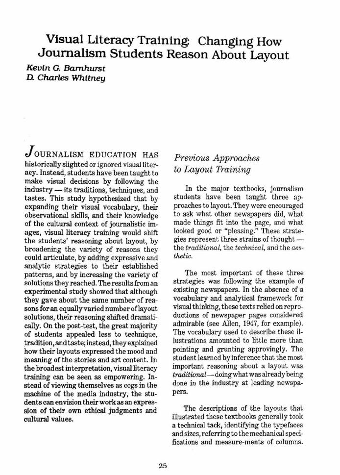
During a session for the visual literacy course, iournalism student Jeff Ost:rowski works in the Typography Laboratory at the University of Illinois College of Communications.
Arnold added to the technical vocabulary by recording the names used in the newspaper back shop for specific headline configurations, but the focus was usually on the page as a whole (Arnold, 1969, p. 106). Thus he made the traditional reasoning articulate by referring to technique.
Justifications for the technical or functional strategy used the analogy of the puzzle, suggesting how the pieces could be shaped to fit together. The resulting patterns- such as the C-, U-, and L-shaped designs listed by Garcia-were then named and identified as structural solutions to the practical problem oflayout (Garcia, 1981, p. 35).
The aesthetic strategy was justified by the shop window analogy. The newspaper front page, like a store window, showed off the wares of the business and tempted the consumer to enter and purchase.· The
26
headline typo-graphy was compared to clothing on display, meant to appeal to the reader (Allen, 1947, p. 50). In the first several revisions of the standard editing textbook, Gilmore, like Garcia, Arnold, and the other writers of design and layout texts, repeatedly justified layouts by citing their ''pleasing'' quality (see Gilmore, 1976, Chapter 5 Makeup). Other textbooks have added to this gloss a more abstract and aesthetic justification. They provided a vague but impressive list of principles of design, including such classical concepts as balance and contrast (compare Baird and Turnbull, 1964; Nelson, 1972; and Conover, 1985).
·or course, the analogy is flawed because store windows invite the consumer to enter and make choices, whereas the newspaper must be purchased before being "entered. n
The newspaper became a commodity with restricted access.
Tradition, technique, and taste-these three threads bound together the logic of layout. Editors supposedly chose between competing traditions, and, within each tradition, they chose among several technical solutions. The textbook writers described these choices as taste options, almost invariably labeled as either oldfashioned or modern. The newer style was signaled approvingly as more "attractive" and was invariably introduced with a buzzword.t
From these texts journalism students learned to work in the following fashion: Considering the page as the frame, they figured out which stories and pictures needed to fit. Using established and traditional patterns of layout, they arranged and sized the text and pictures, finally writing and configuring headlines before sending their plan, in the form of a coded "dummy'' sheet, to the back shop for composition and printing. Their reasoning was essentially practical and traditional, but when asked to justify their work, they could provide an explanation based on pleasing the reader (taste) or appealing to abstract standards of unity, contrast, rhythm, balance, or the like (aesthetics).
Visual Education
What is clearly absent from the procedure is visual literacy - an analytical and conceptual approach that takes into account the expressive, symbolic, and ideological nature of visual images and of visual arrangements of text and image. This lack is the driving force behind some of the general textbooks in visual communications (Berger, 1989, and Morgan and Welton, 1986), but such an approach is not central to training students who specialize in journalism. Rather than incorporating visual literacy, the newest journalism textbooks emphasize current newspaper techniques (such as charts and color, not strictly
27
new, but newly introduced to newspapers by USA Today) along with changing styles (Finberg and Itule, 1990). The new crop of professional textbooks once again stumps for the new ''in" look and against the older style that is now "out."
The most common application of visual literacy to mass communications has been to train viewers, first of film, and more recently of television. But newspapers are also visual forms -
Even print itself is coming to be regarded as a visual medium. Layout, design and typography are widely understood to be a significant part of the total communication process, whilst even the term 'print-media' is frequently a misnomer, since in most texts print is rarely unaccompanied by visual images (Masterman, 1985, p. 13).
The trend in media education has been to inoculate viewers, placing them in opposition to the media by exposing its moral inferiority, its manipulative power, its class and economic advocacy, its mystique in the individual consciousness, and its institutional structure (Bennett, 1976, and Halloran and Jones, 1988). These approaches have explanatory power, but their oppositional nature makes them more appropriate for dissuading students from a career in journalism.
To survive in a professional school of journalism, visual literacy must at least begin within the liberal values of the profession, such as accuracy and objectivity. An appropriate approach in this context would begin with fundamental skills- the
tAJlen (1947) used "streamlined," Arnold (1969) called his "functional," and Garcfa (1981) coined "structural" and used the initials CVI, for "Center of Visual Impact." The most recent example is Ames (1989), who uses TPC, ''Total Page Concept."
ability to observe with care and talk about images with the relatively neutral vocabulary of fonns -before introducing critical concepts. (This "applied arts'' approachis described in Barnhurst, 1987a.)
The Case at Illirwis
In 1986 the course in graphic arts for journalists at the University of Illinois was being revised using visual literacy as a framework. In outline, the course would begin by teaching students how to draw, how to appreciate art in museums, and how to analyze the abstract and expressive forms of visual images from art. After covering these fundamental skills of observation and analysis, the course would provide practical exposure to the sorts of visual tasks found on the job-selecting type, ~reating logos, taking pictures, and designmg charts. The assembling of these images into layouts could then be taught as an expressive and analytical process of visual communication. Later, in the discussion of their practical experiences in the course, students would begin to understand the institutional, social, and political constraints on the visual work of journalists, as well as theories of its manipulative and mythic powers.
By expression, we do not refer to the specific movements in art history usually grouped under the rubric expressionism, but to the broader notion springing from those movements, especially from the abstract schools of expressionism, that arrangements of visual elements evoke moods and recall cultural symbols. Applied to the communication arts, this notion translates roughly that the arrangement of items on the page expresses what matters (cultural values and ethical judgments) about the words and pictures. That is, by doing a layout, an editor expresses something significant about the story.
In the early stages of developing the curriculum in the journalism department at Illinois, we wanted to test the visual literacy training being provided to answer several questions. Were students -ad~ vanced undergraduates with course work in reporting and more or less experience with student newspapers - relying on technical, traditional, and aesthetic reasoning when doing a layout? What kinds of layouts were they doing? Would visual literacy training change those layouts? And would it increase their reliance on expressive modes of reasoning? To find the an~ swers, an experimental study was devised, similar to performance testing described in job training literature (See Gardner, 1981, for example).
Thirty-one undergraduates and graduate students in journalism were given one of two stories selected from the front page of a Midwestern daily they were unlikely to have seen (See Fig. 1). Half received the text type for a uhard," or news, story - the top story on the page- about a murder trial. The other h.alf received the text type for a "soft," or feature, story - from the bottom of the front page - about wann weather. They were also given the words (but not the typography) for the headline. Each story included a visual image, a mug shot of the man on trial with the murder story, and an infonnational chart with the weather story.
After the students created a layout from these elements, they were asked to write down their reasons for laying out the story as they did. 'They also filled out a form with their background and experience.
The post-test was conducted fifteen weeks later, at th.e end of their semester of visual literacy training. The procedure was identical, except that no demographic data was collected and students laid out the alternate story. Those who did the murder
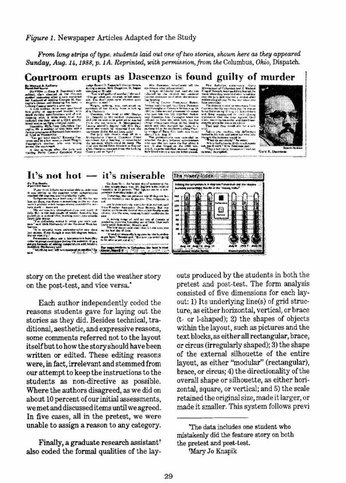
Figure 1. Newspaper Articles Adapted for the Study
From long stripa of type. students laid out one of two stories, shown here a.9 they appeared Sunday, Aug. 14, 1988, p. 1A. Reprinted, with permission, from the Columbus, Ohio, Dispatch .
.lt'>s not hot - it's n1iserahle
story on the pretest did the weather story on the post-test, and vice versa:
Each author independently coded the reasons students gave for laying out the stories as they did. Besides technical, traditional, aesthetic, and expressive reasons, some comments referred not to the layout itselfbut to how the story should have been written or edited. These editing reasons were, in fact, irrelevant and stemmed from our attempt to keep the instructions to the students as non-directive as possible. Where the authors disagreed, as we did on about 10 percent of our initial assessments, wemetand discussed items until we agreed. In five cases, all in the pretest, we were unable to assign a reason to any category.
Finally, a graduate research assistantt also coded the formal qualities of the lay-
29
outs produced by the students in both the pretest and post-t est . The form analysis consisted of five dimensions for each layout: 1) Its underlying line(s) of grid structure, as either horizontal, vertical, or brace (t- or 1-shaped); 2) the shapes of objects within the layout, such as pictures and the text blocks, as either all rectangular, brace, or circus (irregularly shaped); 3) the shape of the external silhouette of the entire layout, as either '1nodular" (rectangular), brace, or circus; 4) the directionality of the overall shape or silhouette, as either horizontal, square, or vertical; and 5) the scale retained the original size, made it larger, or made it smaller. This system follows previ
The data includes one student who mistakenly did the feature story on both the pretest and post-test.
tMary Jo Knapik
ousworkbyBarnhurst(1987bandc),adapting the terminology of professional newspaper makeup to formal coneepts from the applied arts.
Although this was largely an explora~ tory study, we did begin with three hypotheses:
Hypothesis 1: After a semester's instruction in visual literacy, students would give more reasons for why they did a layout in a particular way.
Our reasoning here was that instruction in the vocabulary offonn, the relationship of form to content, and the expressive potential of layout, should broaden or ex~ pand the number of rationales the students gave for their work.
Hypothesis 2: After a semester's instruction in visual literacy, students would be more likely to cite expressive reasons for their layouts, and proportionately less likely to cite traditional, technical, and aesthetic ones.
This was in fact our "acid test" for the instruction. The course was designed to exp.ose students to the possibility of seeing the1r work as a fonn of expression, rather than merely as an exercise in technique that followed personal tastes or industry traditions. If they learned that an editor inevitably expresses values, says something, with layout, then they would be more aware of what they themselves express with their own layouts, and they would explain those reasons.
Hypothesis 9: After a semester's instruction in visual literacy, students would produce more-varied layouts.
With this hypothesis, we proposed that the post~test layouts would have greater variation than the pretest layouts, based on t~e five form-analysis variables. If layout 1s a mode of expres-sion, the course
30
taught, then there is no single right way to lay out a particular story. Instead, the layout would vary with the editor's goals and values. We expected the students' layouts to likewise vary with their reasoning about goals and values.
Results
Table 1 shows the reasons students gave for doing the sorts oflayouts they did. The data show that technical, editing, and traditional rationales predominate in the pretest, before visual literacy training, and especially that virtually no expressive reasons are given for the layouts. In the post-test, however, three-quarters of all reasons are expressive ones, with other categories vanishing into relative insignificance.
Table 1. Reasons Given for the Layouts
The mea:ns and standard deviations on the pretest and post-test f or rationales students used to explain their layouts.
Pretest Post-t&t Mean Std. Mean Std.
Dev. Dev.
Technical 1.52 1.288 .32 .475 Tmditional .74 .631 .065 .359 Aesthetic .29 .693 .065 .250 Expressive .13 .341 2.45 .888 Editing .87 1.48 .32 .475
Total ~.47' 1.90 3.23 .990
'Total e~ludin,g uncodable rellpon.ses i3 3.25.
As Table 1 notes, the mean number of reasons given in the pretest exceeds the number in the post-test, and, if uncodable prete:'t reasons are excluded, the means are VIrtually identical. Thus Hypothesis 1
is not supported. Our post lwc explanation for the failure to support our first hypothesis is an experimental artifact: There appears to be a threshold demand effect, whereby students gave the number of responses they intmtively considered necessary to satisfy the experimenters.
Table 1 appears to confirm our second hypothesis, that students in the post-test are signfficantlymore likely to cite expressive reasons, and significantly less likely to cite other reasons for doing the sorts of layouts they did (Chi-square = 101.3, 1 d.f., p=.0001). A few of the expressive reasons they cited are shown in Table 2.
Table 2. Samples of Expressive Reasons
The lxuic reason I laid them out the way I did was it's a hot topic and to make it a little more cool I decided to lay it out Jurri.zonrolty.
Left the chart fairly large because I think it ts more interesting than the story.
I wanted to leave the layout as vertical as possible because of the energy in the stmy, due to high temps. But the chart on the side makes it wider and not as extreme.
The line created by the direction in which the subject is looking leads the reader to the beginning of the story. -
This is a very emotional, attention-getting story. ThereffYT'e a vertical layout was appropriate.
The story was not hard news or even very interesting. TherejfYT'e, I wanted to u se the layout to liven up the news.
Other analyses not shown on the table also indicated no confound was introduced by tlie counterbalanced design; that is, the feature story generated no more, and no fewer, reasons overall, or of any specific type, than did the news story. Moreover, neither the students' training in other journalism or art and design courses nor their
31
practical experience in school or other publications, had any relation to the number or kinds of reasons they gave on either the pretest or post-test.
Table 3. Fonn Analysis of the Layouts
The number of students employing specific attributes of form in pretest and post-test lay-outs.
Structure Horizontal Vertical Brace Pretest 20 1 10 Post-test 4 7 20
Shapes Rectangular Brace Circus Pretest 10 13 8 Post-test 25 5 1
Silhouette Modular Brace Circus Pretest 21 5 5 Post-test 8 13 10
Direction Horizontal Square Vertical Pretest 12 8 11 Post-test 7 6 18
Art scaling Srrw,ller Original Larger Pretest 2 20 9 Post-test 11 19 1
The third hypothesis was that, in the fonnal analysis, post-test layouts should feature greater variety among students than pretest layouts on the five features coded. Those results, presented in Table 3, show that only for external shape or silhouette of the layout is the hypothesis supported. In the pretest, two-thirds of the students employed a modular layout, but in the post-test fewer than half employed any one style. There were, however, notable shifts on several other formal characteristics. Overall lines of structure, for example, moved from roughly two-thirds horizontal (and one-third brace) in the pretest to roughly two-thirds brace in the post-test. Internal shapes, roughly balanced among categories in the pretest, moved dispro-
portionately to rectangular in the posttest. Finally, on both tests, two-thirds retained the original sizing of the art. Those who did change it moved in different directions, from larger in the pretest to smaller in the post-test.
Our post hoc evaluation of the third hypothesis would be that the hypothesis itself is too crude and insensitive a measure. To some degree, these results may reflect the students' shift away from traditional reasoning (See Fig. 2). In the ''modular" style widely used in the industry, the typical story has text in irregular internal shapes and art sized large, all of which fits into a horizontal rectangle. That was the pattern followed by many students in the pretest. But in the post-test they moved in unpredictable directions, all of them different from the traditional style. The hypothesis predicting greater variety was inadequate to reflect the complexity of their responses. We need to think further about the impact of visual literacy training on layout in this context.
Overall, then, the findings present a mixed picture. Our first hypothesis, that visual literacy training would allow students to produce a more detailed rationale for their designs, was not supported, for reasons we think are artifactual. Our second, and key, hypothesis, that visual literacy training would simultaneously stimulate expressive reasoning and suppress traditional and technical reasoning, was strongly supported. Our third hypothesis, that visual literacy training would stimulate, in the aggregate, more varied designs, received little and mixed support.
Discussion
Given the milieu of journalism, the students' strong response to visual literacy training is encouraging. The obstacles to visual literacy for student journalists are
32
formidable in the existing social context. In the common sense of the term literacy, visual skill has not been considered essential in society for functional literacy or proficiency, which includes reading, writing, speaking, and listening, but not watching or viewing or seeing critically or intelligently: Society has generally defined journalists as not just functionally literate but proficient. Notwithstanding the fact that their work takes visual form, journalists have not needed to be visually literate, at least not historically.
Journalists could justify their news judgments by articulate standards accepted by the industry (for example, explaining that the highest value story goes at the top of the page), and they could enumerate the constraints imposed by their publisher on typography and layout (top story goes on the left, for example, with a headline of a given size). Adler's description of the process at the New York Times twenty years ago described their traditional and technical reasoning (Adler, 1971, pp. 148-151). Usually these patterns were justified as reader preferences. Readers were said, despite the inherent paradox, t o be most interested in, say, war news, and to always look at the top, right (or1 at some newspapers, left) corner for the big story. Institutional constraints were occasionally acknowledged, but not the expressive, symbolic, or ideological aspects of visual communication.
Non-professional media education, on the other hand, has attempted to train readers, not journalists. Young people in the schools have been taught - often in programs designed or sponsored by the newspapers themselves- to use and appreciate the newspaper (and other media)
"See, for example, the Adult Performance Level study funded by the U.S. Office of Education and subsequent Hams survey verification reported by Delker (1984, p. 32).
and admire reporters and editors; or, sometimes at the same time, they are trained to make moral judgments about news stories and to rank newspapers and media forms aecording to standards such as accuracy and neutrality. In this moralistic literacy training, the media are viewed as forms lower than, say, books and opera. In its more sophisticated incarnation, non-professional media education focused attention on analysis and criticism by teaching students to decode the structure of messages and symbols in the newspaper. Mas· terman and others analyzed the patterns of industrial organization, the political context, and the underlying social values that found expression in media fonns such as the newspaper (Masterman, 1985).
Professional practitioners have been generally hostile to this critical approach because they themselves are characterized as cogs in a machine dominated by industry, politics, and culture. They resist the media education approaches because they are just doing a job, not consciously expressing an ideology. When visual literacy concepts have entered newspapers at all, it has been through the hiring of visual artists, who perform the layout tasks formerly assigned to editors. For example, Jane Harrigan's recent description of a day in the life of the Boston Globe describes how designers work and think.
Baker is resigned to the fate of his efforts. j'l'm not creating art,'' he says. "I'm working with stories to· convey them visually."
The designers read all the stories that will go on the page and experiment endlessly . .. in an effort to convey just the right mood (Harrigan, 1987, pp. 119-120).
The graphic designers generally work isolated from the newsroom. They must necessarily follow some traditional and taste patterns of journalism, but their
33
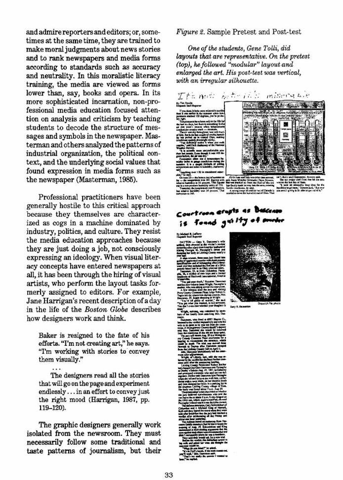
Figure 2. Sample Pretest and Post-test
One of the students, Gene Tolli, did layouts tkat are representative. On the pretest (top), he followed "modular" layout and enlarged the art. HiE post-test was vertical, with an irregutar silhouette.
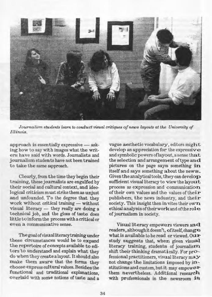
Journalism stu.dents learn to conduct visual critiques of news layouts at the University of Illinois.
approach is essentially expressive- asking how to say with images what the writers have said with words. Journalists and journalism students have not been trained to take the same approach.
Clearly, from the time they begin their training, t h ese journalists are engulfed by their s ocial and cultural context, and ideological criticism must strike them as unjust and unfounded. To the degree that they w ork without critical training - without visual literacy - they really are doing a technical job, and the gloss of taste does lit tle t o inform the process with a critical or e ven a communicative sense.
The goal ofvisualliteracytraiping under t hese circumstances would be to expand the repertoire of concepts available to editors 'to understand and explain what they do when they create a layout. It should also make them aware that the forms they choose express cultural values. Besides the functional and traditional explanations, overlaid with some notions of taste and a
34
vague aesthetic vocabulary, editors might develop an appreciation for the expressive and symbolic powers oflayout , a sense that the selection and arrangement of type and pictures on the page says something in. itself and says something about the news_ Given the analytical tools, they can develop sufficient visual literacy to view the layout process as expression and communication of their own values and the values of their publishers, the news industry, and their society. This insight then invites their own ethical analysis of their work and of the role of journalism in society.
Visual literacy empowers viewers and readers, although it doesn't, of itself, change what is available to be read or viewed. Ou:t' study suggests that, when given visual literacy training, students of journalism shift their thinking dramatically. For professional practitioners, visual literacy maY not change the limitations imposed by institutions and custom, but it may empowe:t' them nevertheless. Additional research with professionals in the newsroom i~
needed to explore this possibility. Instead of simply viewing their layouts as technical solutions or traditional patterns, free from values and ethics, visually literate journalists may connect a newly acquired knowledge of visual expression to the other li~erate proficiencies, judgment, and ethical concerns. Visual literacy may pennit professional practitioners to modulate their presentation of news according to these concerns, rather than simply following the dictates of technical patterns or traditional habits. And, in the end, visual literacy might
35
allow journalists to alter what we read and view in the media.
KEvlN G. BARNHURST is assistant professor of graphic arts, Departm.ent of Journalism, and D. CHARLES WHITNEY is associate professor ofjourrw,liBm aoo research associate professor, Institute of Communications Research, University of Illinois, Urbana.
References Adler, Ruth, C 1971). A Day in the Life of
The New York 'Times. NewYork:J. B. Lippincott.
Allen, John E., (194 7). Newspaper Designin{!. New York: Harper.
Ames, Steven E., (1989). Elements of NewspapeT Design. New York: Praeger.
Arnold, Edmund C., (1969). Modern NewspapeT Design. New York, Harper & Row.
Baird, Russell N ., and Turnbull, Arthur T., (1964). Tke Graphics of Communication. New York: Holt, Rinehart, and Winston.
Bam.hurst, Kevin G., (1987a). The Knowing Eye. Urbana, Illinois: ERIC Document Service, No. ED 284 254.
-- (1987b). News as Art: Point and · Line. Desi{}n: Journal oftM Society of Newspaper Design 25:32-33.
-- (1987c). Expressing Tone. Design: Journal oftke Socwty of Newspaper Design 26:52-53.
Bennett, Susan, ( 1976). Mass Media Education: Defining the Subject. Screen Ed'Ucation, Spring, 15-21.
Berger, Arthur Asa, (1989). Seeing Is Believing: An Imrod'UCtion to Visual Communicatil>n. Mountain View, Calif.: Mayfield.
Conover, Theodore E ., (1985). Graphic Communicatil>ns Today. St. Paul, Minn.: West.
Delker, Paul, (1984). Def":ming Adult Functional Literacy. In Functional Literacy a,nd, the Workplace (pp.
31-34), proceedings of the National Invitational Conference of Education Services. Washington, D.C.: American Council of Life Insurance.
Evans, Harold, (1973). Newspaper Design. London: Heinemann.
Finberg, Howard I., and Itule, Bruce D., (1990). Vuual Editing. Belmont, Calif.: Wadswor th.
Garcia, Mario R., (1981). Contemporary ... Newspaper Design: A Structural Approach. Englewood Cliffs, N.J.: Prentice-Hall.
Gardner, James E., (1981). Training Interventiom in Job-Skill Develapment. Reading, Mass.: Addison-Wesley.
Gilmore, Gene, and Root, Robert, (1976). Modern Newspaper Edit·ing, 2d. ed. San Francisco: Boyd and Fraser.
Halloran, James D., and J ones, Marsha, (1988). Mass Media Education. Paris: UNESCO.
Harrigan, Jane, (1987). Read All About It! Chester, Conn.: Globe/Pequot.
Mastennan, Len, (1985). Teaching the Media. London: Comedia.
Morgan, John, and Welton, Peter, (1986). See What I Mean: An Introduction to Vuual Communication. London: Edward Arnold.
Moen, Daryl R., (1989). Newspaper Lay(JUt and Design. Ames: Iowa State Universit y Press.
Nelson, Roy Paul, (1972). Publication Design. Dubuque, Iowa: Wm. C. Brown.


