Embed Size (px)
Citation preview

NEWSLETTER #75 - February 2019
The closest many modellers get to a date is with one of Excel’s three DATE functions – we cover them all this month.
In this newsletter, we also look at one of Excel’s lesser-used features, Data Tables, to show you how to use them and note the traps to avoid. We also cover off the January updates this month (of which there were quite a few) for various variants of Power BI.
With our regular series on Power Pivot, Power Query, Power BI Updates, VBA, Keyboard Shortcuts and the ever-accumulating A to Z of Excel Functions, it’s another edition where you get your money’s worth (yes, I know this is free!).
Until next month.
This month, we though we’d take a look at “what if?” analysis and a feature that a surprising number of users do not appear to know. This may help with sensitivity analysis, by which we mean the flexing of one or at most two variables to see how these changes in input affect key outputs. This may be performed using Excel’s built-in Data Tables.
Data Tables are ideal for executive summaries where you wish to show how changes in a particular input affect a key output. However, you should use them sparingly. If you can achieve the same functionality without using Data Tables, then you should do that:
Data Tables
[email protected] | www.sumproduct.com | +61 3 9020 2071
www.sumproduct.com | www.sumproduct.com/thought
Liam Bastick, Managing Director, SumProduct
[email protected] | www.sumproduct.com | +61 3 9020 2071
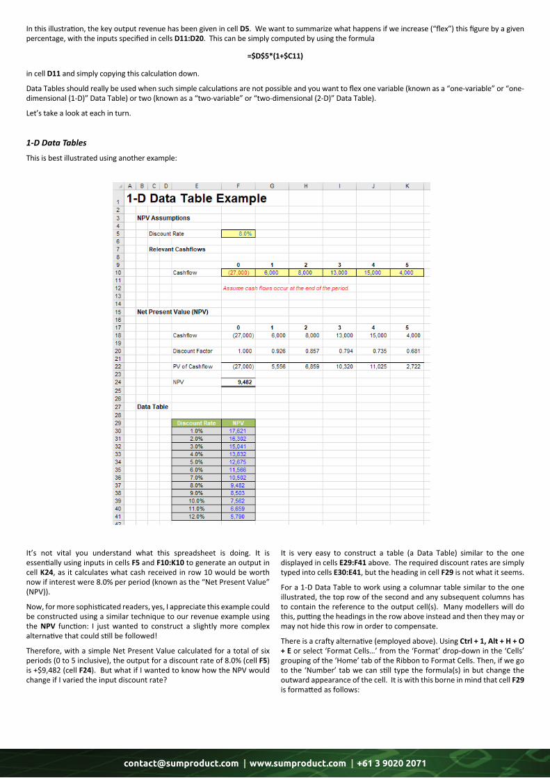
It’s not vital you understand what this spreadsheet is doing. It is essentially using inputs in cells F5 and F10:K10 to generate an output in cell K24, as it calculates what cash received in row 10 would be worth now if interest were 8.0% per period (known as the “Net Present Value” (NPV)).
Now, for more sophisticated readers, yes, I appreciate this example could be constructed using a similar technique to our revenue example using the NPV function: I just wanted to construct a slightly more complex alternative that could still be followed!
Therefore, with a simple Net Present Value calculated for a total of six periods (0 to 5 inclusive), the output for a discount rate of 8.0% (cell F5) is +$9,482 (cell F24). But what if I wanted to know how the NPV would change if I varied the input discount rate?
It is very easy to construct a table (a Data Table) similar to the one displayed in cells E29:F41 above. The required discount rates are simply typed into cells E30:E41, but the heading in cell F29 is not what it seems.
For a 1-D Data Table to work using a columnar table similar to the one illustrated, the top row of the second and any subsequent columns has to contain the reference to the output cell(s). Many modellers will do this, putting the headings in the row above instead and then they may or may not hide this row in order to compensate.
There is a crafty alternative (employed above). Using Ctrl + 1, Alt + H + O + E or select ‘Format Cells…’ from the ‘Format’ drop-down in the ‘Cells’ grouping of the ‘Home’ tab of the Ribbon to Format Cells. Then, if we go to the ‘Number’ tab we can still type the formula(s) in but change the outward appearance of the cell. It is with this borne in mind that cell F29 is formatted as follows:
In this illustration, the key output revenue has been given in cell D5. We want to summarize what happens if we increase (“flex”) this figure by a given percentage, with the inputs specified in cells D11:D20. This can be simply computed by using the formula
=$D$5*(1+$C11)
in cell D11 and simply copying this calculation down.
Data Tables should really be used when such simple calculations are not possible and you want to flex one variable (known as a “one-variable” or “one-dimensional (1-D)” Data Table) or two (known as a “two-variable” or “two-dimensional (2-D)” Data Table).
Let’s take a look at each in turn.
1-D Data Tables
This is best illustrated using another example:
[email protected] | www.sumproduct.com | +61 3 9020 2071
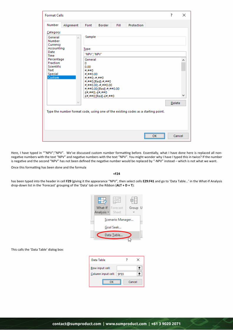
Here, I have typed in “”NPV”;”NPV”. We’ve discussed custom number formatting before. Essentially, what I have done here is replaced all non-negative numbers with the text “NPV” and negative numbers with the text “NPV”. You might wonder why I have I typed this in twice? If the number is negative and the second “NPV” has not been defined the negative number would be replaced by “-NPV” instead – which is not what we want.
Once this formatting has been done and the formula
=F24
has been typed into the header in cell F29 (giving it the appearance “NPV”, then select cells E29:F41 and go to ‘Data Table…’ in the What-If Analysis drop-down list in the ‘Forecast’ grouping of the ‘Data’ tab on the Ribbon (ALT + D + T):
This calls the ‘Data Table’ dialog box:

[email protected] | www.sumproduct.com | +61 3 9020 2071
At this point, confusion often sets in as users are often unsure whether they should be entering details in the ‘Row input cell:’ and/or ‘Column input cell:’ input boxes. The rules are very simple:
• Referenced directly, the inputs and outputs must be on the same sheet as the Data Table (although there are ways and means around this) • Use only one input box if you want to flex one input; use both if you wish to flex two • If inputs are in a column in the Data Table, use the ‘Column input cell:’ input box • If inputs are in a row in the Data Table, use the ‘Row input cell:’ input box.
Here, my inputs are in a column and I want to use them to substitute for the value in cell F5 so I select cell F5 for the ‘Column input cell:’ input box. Clicking ‘OK’ results in the following summary:
That’s it – you have your “What-if?” analysis. It should be noted that at this point you may not enter any rows or columns into the Data Table (or delete any either). This is because the formula
{=TABLE(,F5)}
has been entered into cells F30:F41. The braces (‘{‘ and ‘}’) may not be typed in. These are special characters created by Excel when you type the formula
=TABLE(,F5)
and press CTRL + SHIFT + ENTER rather than ENTER. This is known as an array formula and these cannot be edited, merely deleted in their entirety.
If the table had been across a row instead, ensure that the input values are in the top row, and that the ‘headings’ are in the first column (that is, transpose the example table, above). Then, you would populate the ‘Row input cell:’ box instead.
1-D Data Tables do not need to be simply two columns or two rows. It is entirely possible to display the effects on more than one output at the same time provided you wish to use the same inputs throughout the sensitivity analysis as follows:
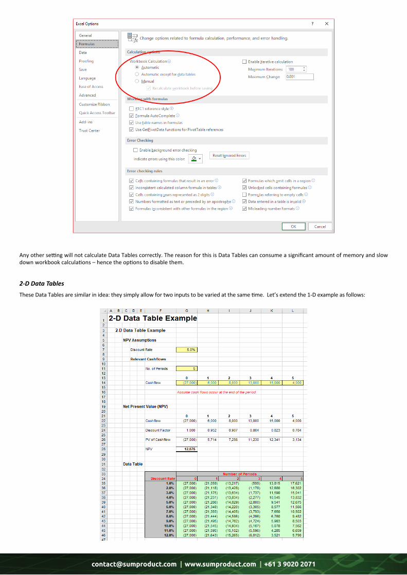
Sometimes, you may find all of the numbers in your Data Table are identical. If this happens, you need to check your calculation settings. To do this, go to Excel Options (File -> Options or Alt + T + O) and then select ‘Formulas’. In the ‘Calculation options’ section, please ensure the ‘Workbook Calculation’ is set to ‘Automatic’:
[email protected] | www.sumproduct.com | +61 3 9020 2071
Any other setting will not calculate Data Tables correctly. The reason for this is Data Tables can consume a significant amount of memory and slow down workbook calculations – hence the options to disable them.
2-D Data Tables
These Data Tables are similar in idea: they simply allow for two inputs to be varied at the same time. Let’s extend the 1-D example as follows:
[email protected] | www.sumproduct.com | +61 3 9020 2071
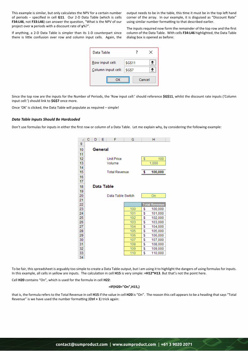
This example is similar, but only calculates the NPV for a certain number of periods – specified in cell G11. Our 2-D Data Table (which is cells F34:L46, not F33:L46) can answer the question, “What is the NPV of our project over x periods with a discount rate of y%?”.
If anything, a 2-D Data Table is simpler than its 1-D counterpart since there is little confusion over row and column input cells. Again, the
output needs to be in the table, this time it must be in the top left hand corner of the array. In our example, it is disguised as “Discount Rate” using similar number formatting to that described earlier.
The inputs required now form the remainder of the top row and the first column of the Data Table. With cells F34:L46 highlighted, the Data Table dialog box is opened as before:
Since the top row are the inputs for the Number of Periods, the ‘Row input cell:’ should reference $G$11, whilst the discount rate inputs (‘Column input cell:’) should link to $G$7 once more.
Once ‘OK’ is clicked, the Data Table will populate as required – simple!
To be fair, this spreadsheet is arguably too simple to create a Data Table output, but I am using it to highlight the dangers of using formulas for inputs. In this example, all cells in yellow are inputs. The calculation in cell H15 is very simple: =H12*H13. But that’s not the point here.
Cell H20 contains “On”, which is used for the formula in cell H22:
=IF(H20="On",H15,)
that is, the formula refers to the Total Revenue in cell H15 if the value in cell H20 is “On”. The reason this cell appears to be a heading that says “Total Revenue” is we have used the number formatting (Ctrl + 1) trick again:
Don’t use formulas for inputs in either the first row or column of a Data Table. Let me explain why, by considering the following example:
Data Table Inputs Should Be Hardcoded
[email protected] | www.sumproduct.com | +61 3 9020 2071
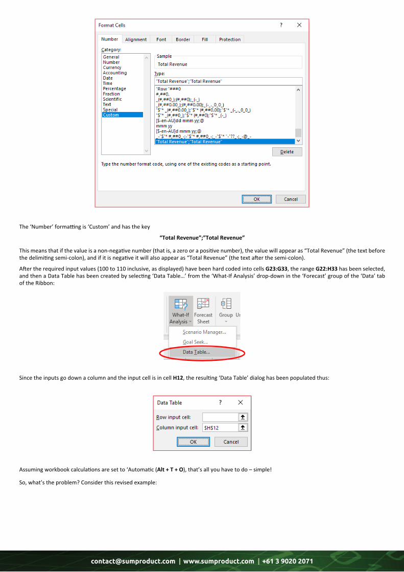
The ‘Number’ formatting is ‘Custom’ and has the key
“Total Revenue”;”Total Revenue”
This means that if the value is a non-negative number (that is, a zero or a positive number), the value will appear as “Total Revenue” (the text before the delimiting semi-colon), and if it is negative it will also appear as “Total Revenue” (the text after the semi-colon).
After the required input values (100 to 110 inclusive, as displayed) have been hard coded into cells G23:G33, the range G22:H33 has been selected, and then a Data Table has been created by selecting ‘Data Table…’ from the ‘What-If Analysis’ drop-down in the ‘Forecast’ group of the ‘Data’ tab of the Ribbon:
Since the inputs go down a column and the input cell is in cell H12, the resulting ‘Data Table’ dialog has been populated thus:
Assuming workbook calculations are set to ‘Automatic (Alt + T + O), that’s all you have to do – simple!
So, what’s the problem? Consider this revised example:

[email protected] | www.sumproduct.com | +61 3 9020 2071
Here, the columnar inputs (cells G53:G63) have been replaced by a formula:
=IF(G52="",$H$42,G52+1)
This seems to be fairly innocuous and theoretically, should make the worksheet more efficient as inputs do not need to be typed in twice. However, look closer. The values in cells H55:H63 are wrong. This is a common trap. It’s dangerous using formulaic inputs in a Data Table.
So what went wrong?
A 1-dimensional columnar Data Table works procedurally as follows:
1. Take the first input and put it in the input cell (so here, the value in cell G53 – 100 presently – would be copied as a value into cell H42) 2. This would cause the values in the formulaic inputs to update (so cells G53:G63 would be updated to [still] display 100, 101, …, 109, 110) 3. The result (cell H45, $100,000) would be recorded in the first row of outputs (cell H53) 4. The second input – currently 101 (cell G54) – would then be pasted as a value into the input cell (cell H42) 5. This would cause the values in the formulaic inputs to update (so cells G53:G63 would be updated to now display 101, 102, …, 110, 111 – these values have changed) 6. The result (cell H45, $101,000) would be recorded in the second row of outputs (cell H54) (this is why this output remains correct) 7. The third input – now revised to 103, not 102 (cell G55) – would then be pasted as a value into the input cell (cell H42) 8. This would cause the values in the formulaic inputs to update (so cells G53:G63 would be updated to now display 103, 104, …, 112, 113 – these values have changed) 9. The result (cell H45, $103,000, being $103 multiplied by 1,000) would be recorded in the third row of outputs (cell H55) (this is why this output is incorrect) 10. The fourth input – now revised to 106, not 103 (cell G56) – would then be pasted as a value into the input cell (cell H42) 11. This would cause the values in the formulaic inputs to update (so cells G53:G63 would be updated to now display 106, 107, …, 115, 116 – these values have changed) 12. The result (cell H45, $106,000, being $106 multiplied by 1,000) would be recorded in the fourth row of outputs (cell H56) (this is why this output is also incorrect) 13. And so on…
14. When all outputs have been determined, the Data Table input values (cells G53:G63) are then reset to the original values (100 to 110 inclusive).
Explained like this, it’s easy to see the problem. If cell G53 had been left as a hard-coded value, or linked to an independent cell elsewhere, this would not have happened. However, people don’t get this, and the internet is littered with end users moaning that their Data Tables are wrong and Excel makes errors. It doesn’t; people do. Be careful; use inputs!
[email protected] | www.sumproduct.com | +61 3 9020 2071
We thought we’d run an elementary series going through the rudiments of Visual Basic for Applications (VBA) as a springboard for newer users. This month, we look at running a macro.
If you have written a macro, chances are you’ll want to run it. They don’t end to win awards for artistic beauty or impact on world peace. There are a few ways to run a macro:
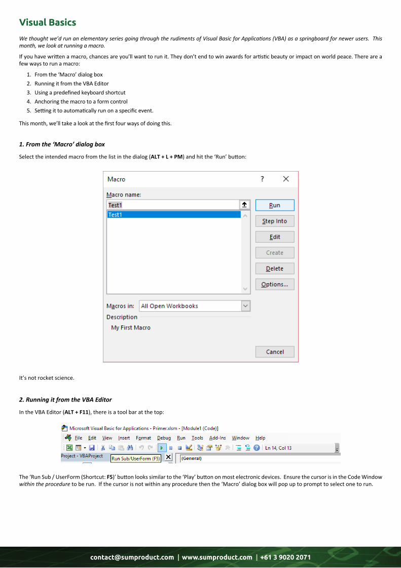
1. From the ‘Macro’ dialog box 2. Running it from the VBA Editor 3. Using a predefined keyboard shortcut 4. Anchoring the macro to a form control 5. Setting it to automatically run on a specific event.
This month, we’ll take a look at the first four ways of doing this.
Visual Basics
Select the intended macro from the list in the dialog (ALT + L + PM) and hit the ‘Run’ button:
In the VBA Editor (ALT + F11), there is a tool bar at the top:
It’s not rocket science.
The ‘Run Sub / UserForm (Shortcut: F5)’ button looks similar to the ‘Play’ button on most electronic devices. Ensure the cursor is in the Code Window within the procedure to be run. If the cursor is not within any procedure then the ‘Macro’ dialog box will pop up to prompt to select one to run.
1. From the ‘Macro’ dialog box
2. Running it from the VBA Editor
[email protected] | www.sumproduct.com | +61 3 9020 2071
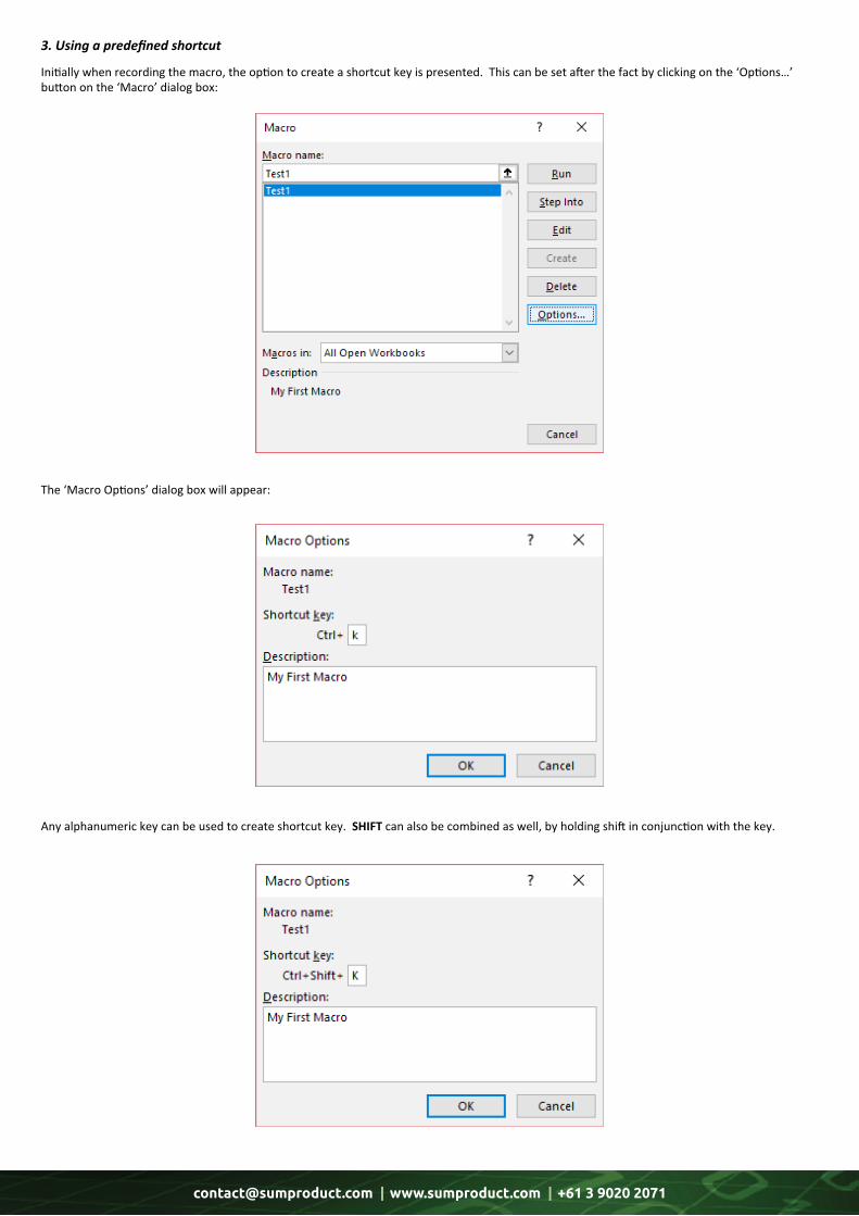
Initially when recording the macro, the option to create a shortcut key is presented. This can be set after the fact by clicking on the ‘Options…’ button on the ‘Macro’ dialog box:
The ‘Macro Options’ dialog box will appear:
Any alphanumeric key can be used to create shortcut key. SHIFT can also be combined as well, by holding shift in conjunction with the key.
3. Using a predefined shortcut
[email protected] | www.sumproduct.com | +61 3 9020 2071
However, macro shortcut keys take precedence over Excel. This means that if an action is assigned to a keyboard shortcut that is already assigned to Excel, this keyboard shortcut replaces the Access key assignment. For example, CTRL + C is the keyboard shortcut for the ‘Copy’ command; if we assign this keyboard shortcut to a macro, Excel will run the macro instead of the ‘Copy’ command.
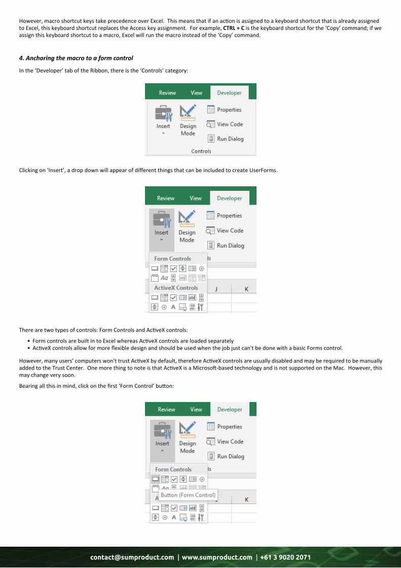
In the ‘Developer’ tab of the Ribbon, there is the ‘Controls’ category:
Clicking on ‘Insert’, a drop down will appear of different things that can be included to create UserForms.
There are two types of controls: Form Controls and ActiveX controls:
• Form controls are built in to Excel whereas ActiveX controls are loaded separately • ActiveX controls allow for more flexible design and should be used when the job just can't be done with a basic Forms control.
However, many users’ computers won't trust ActiveX by default, therefore ActiveX controls are usually disabled and may be required to be manually added to the Trust Center. One more thing to note is that ActiveX is a Microsoft-based technology and is not supported on the Mac. However, this may change very soon.
Bearing all this in mind, click on the first ‘Form Control’ button:
4. Anchoring the macro to a form control
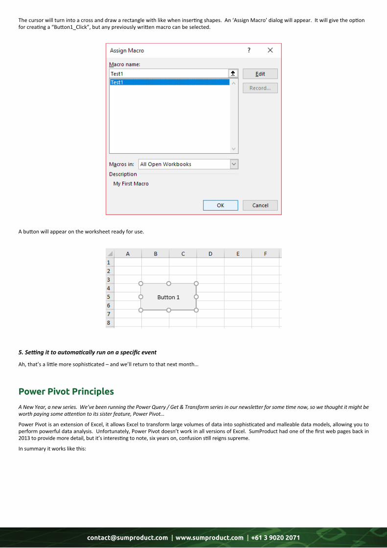
[email protected] | www.sumproduct.com | +61 3 9020 2071
The cursor will turn into a cross and draw a rectangle with like when inserting shapes. An ‘Assign Macro’ dialog will appear. It will give the option for creating a “Button1_Click”, but any previously written macro can be selected.
A button will appear on the worksheet ready for use.
Ah, that’s a little more sophisticated – and we’ll return to that next month…
5. Setting it to automatically run on a specific event
A New Year, a new series. We’ve been running the Power Query / Get & Transform series in our newsletter for some time now, so we thought it might be worth paying some attention to its sister feature, Power Pivot…
Power Pivot is an extension of Excel, it allows Excel to transform large volumes of data into sophisticated and malleable data models, allowing you to perform powerful data analysis. Unfortunately, Power Pivot doesn’t work in all versions of Excel. SumProduct had one of the first web pages back in 2013 to provide more detail, but it’s interesting to note, six years on, confusion still reigns supreme.
In summary it works like this:
Power Pivot Principles
[email protected] | www.sumproduct.com | +61 3 9020 2071
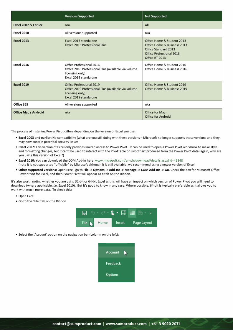
Versions Supported Not Supported
Excel 2007 & Earlier n/a All
Excel 2010 All versions supported n/a
Excel 2013 Excel 2013 standaloneOffice 2013 Professional Plus
Office Home & Student 2013Office Home & Business 2013Office Standard 2013Office Professional 2013Office RT 2013
Excel 2016 Office Professional 2016Office 2016 Professional Plus (available via volume licensing only)Excel 2016 standalone
Office Home & Student 2016Office Home & Business 2016
Excel 2019 Office Professional 2019Office 2019 Professional Plus (available via volume licensing only)Excel 2019 standalone
Office Home & Student 2019Office Home & Business 2019
Office 365 All versions supported n/a
Office Mac / Android n/a Office for MacOffice for Android
The process of installing Power Pivot differs depending on the version of Excel you use:
• Excel 2003 and earlier: No compatibility (what are you still doing with these versions – Microsoft no longer supports these versions and they may now contain potential security issues) • Excel 2007: This version of Excel only provides limited access to Power Pivot. It can be used to open a Power Pivot workbook to make style and formatting changes, but it can’t be used to interact with the PivotTable or PivotChart produced from the Power Pivot data (again, why are you using this version of Excel?) • Excel 2010: You can download the COM Add-In here: www.microsoft.com/en-ph/download/details.aspx?id=43348 (note it is not supported “officially” by Microsoft although it is still available; we recommend using a newer version of Excel) • Other supported versions: Open Excel, go to File -> Options -> Add-Ins -> Manage -> COM Add-Ins -> Go. Check the box for Microsoft Office PowerPivot for Excel, and then Power Pivot will appear as a tab on the Ribbon.
It’s also worth noting whether you are using 32-bit or 64-bit Excel as this will have an impact on which version of Power Pivot you will need to download (where applicable, i.e. Excel 2010). But it’s good to know in any case. Where possible, 64-bit is typically preferable as it allows you to work with much more data. To check this:
• Open Excel • Go to the ‘File’ tab on the Ribbon
• Select the ‘Account’ option on the navigation bar (column on the left):
[email protected] | www.sumproduct.com | +61 3 9020 2071
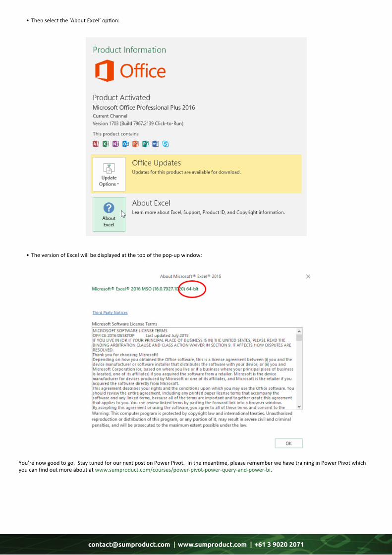
• Thenselectthe‘AboutExcel’option:
• TheversionofExcelwillbedisplayedatthetopofthepop-upwindow:
You’re now good to go. Stay tuned for our next post on Power Pivot. In the meantime, please remember we have training in Power Pivot which you can find out more about at www.sumproduct.com/courses/power-pivot-power-query-and-power-bi.
[email protected] | www.sumproduct.com | +61 3 9020 2071
Each month we’ll reproduce one of our articles on Power Query (Excel 2010 and 2013) / Get & Transform (Excel 2016) from www.sumproduct.com/blog. If you wish to read more in the meantime, simply check out our Blog section each Wednesday. This month, we look at the Power Query Dependencies Viewer.
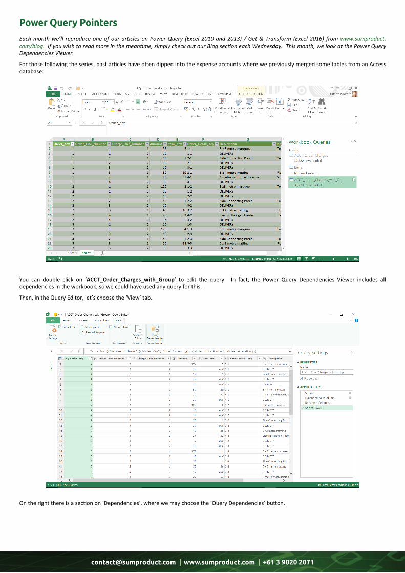
For those following the series, past articles have often dipped into the expense accounts where we previously merged some tables from an Access database:
You can double click on ‘ACCT_Order_Charges_with_Group’ to edit the query. In fact, the Power Query Dependencies Viewer includes all dependencies in the workbook, so we could have used any query for this.
Then, in the Query Editor, let’s choose the ‘View’ tab.
On the right there is a section on ‘Dependencies’, where we may choose the ‘Query Dependencies’ button.
Power Query Pointers
[email protected] | www.sumproduct.com | +61 3 9020 2071
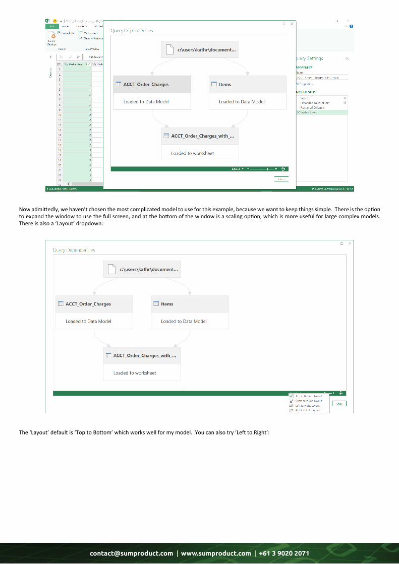
Now admittedly, we haven’t chosen the most complicated model to use for this example, because we want to keep things simple. There is the option to expand the window to use the full screen, and at the bottom of the window is a scaling option, which is more useful for large complex models. There is also a ‘Layout’ dropdown:
The ‘Layout’ default is ‘Top to Bottom’ which works well for my model. You can also try ‘Left to Right’:
[email protected] | www.sumproduct.com | +61 3 9020 2071
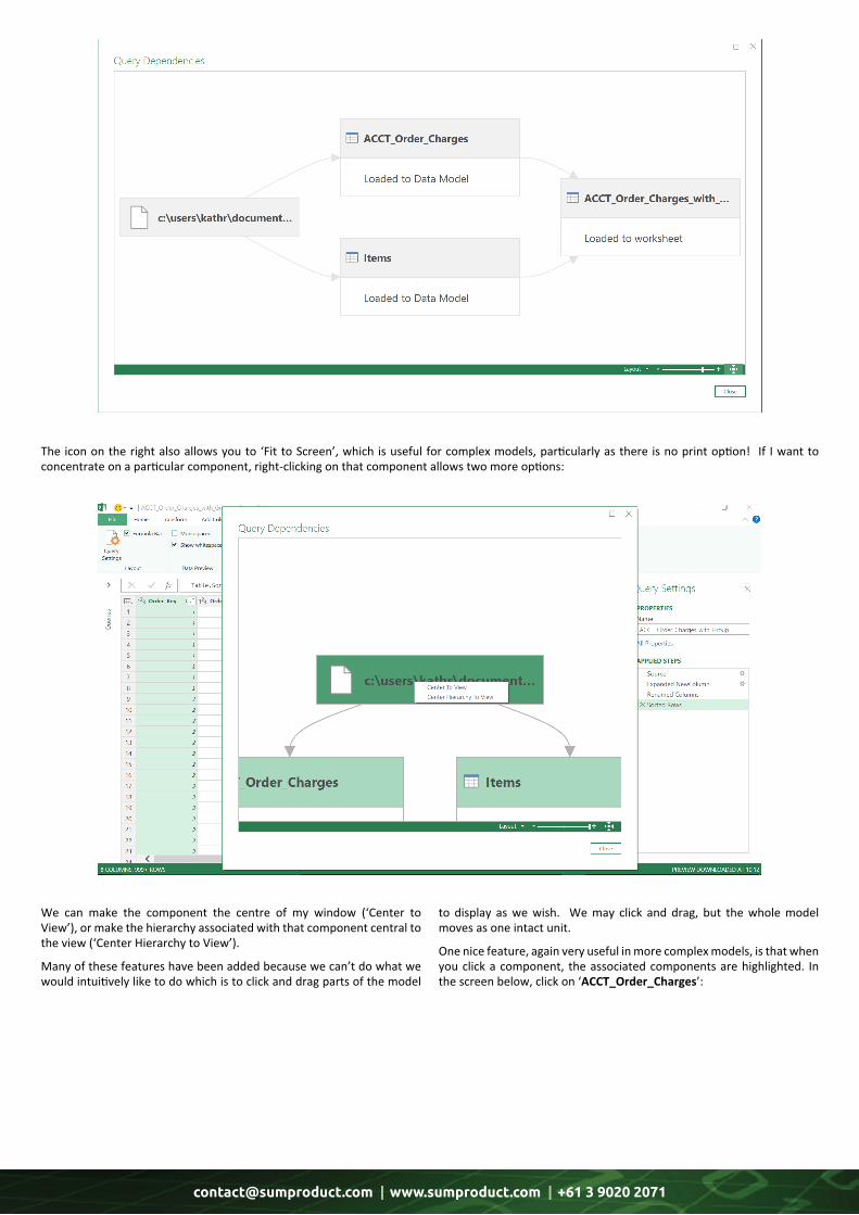
The icon on the right also allows you to ‘Fit to Screen’, which is useful for complex models, particularly as there is no print option! If I want to concentrate on a particular component, right-clicking on that component allows two more options:
We can make the component the centre of my window (‘Center to View’), or make the hierarchy associated with that component central to the view (‘Center Hierarchy to View’).
Many of these features have been added because we can’t do what we would intuitively like to do which is to click and drag parts of the model
to display as we wish. We may click and drag, but the whole model moves as one intact unit.
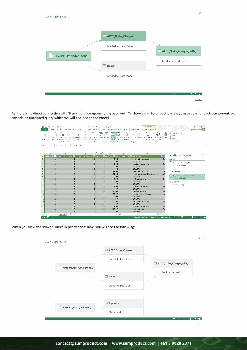
One nice feature, again very useful in more complex models, is that when you click a component, the associated components are highlighted. In the screen below, click on ‘ACCT_Order_Charges’:
[email protected] | www.sumproduct.com | +61 3 9020 2071
As there is no direct connection with ‘Items’, that component is greyed out. To show the different options that can appear for each component, we can add an unrelated query which we will not load to the model.
When you view the ‘Power Query Dependencies’ now, you will see the following:

[email protected] | www.sumproduct.com | +61 3 9020 2071
So, the components are either ‘Loaded to Data Model’, ‘Loaded to worksheet’ or ‘Not loaded’. ‘Not Loaded’ means that when you created the query, you opted to make it ‘connection only’ and not load it into the data model. Note that since we have extracted the queries from different sources, the source paths are shown distinctly on the diagram.
However, ‘Not Loaded’ can be confusing. Consider the diagram below:
Here, we have gone back to the query pane in the Excel worksheet and set the query ‘Items’ not to be loaded to the data model. It is still part of the ‘ACCT_Order_Charges_with_Groups’ query, so it is part of the data loaded to the worksheet.
In summary, the Power Query Dependencies Viewer is useful to get an overview of what is going on in a workbook that uses queries, but we recommend saving before removing any queries that may appear to be ‘redundant’!
More next month!
Latest Updates for Power BI Service and Mobile
It’s been a while – but they’re back! There are some new Previews, rolled out new features, and improved existing functionality across service and mobile:
• Power BI data prep with dataflows (Preview) • Paginated reports in Power BI Premium (Preview) • Updates to the Premium Capacity Metrics app • Recommended apps on Power BI Home • On-premises data gateway updates • Shared credentials, in-app URLs, and more on Mobile • Release notes updates • Personal bookmarks.
Let’s go through each new feature in turn.
Back in November, Microsoft introduced a public Preview of Power BI dataflows to help organisations unify data from disparate sources and prepare it for modelling. They have taken it a step further: analysts can now create dataflows using familiar self-service tools. Dataflows are used to ingest, transform, integrate, and enrich big data by defining data source connections, Extract Transform and Load (ETL) logic, refresh schedules, and more.
In addition, there’s a new model-driven calculation engine that is part of dataflows, which makes the process of data preparation more manageable, deterministic and less cumbersome for data analysts and report creators alike. Dataflows are created and managed in app workspaces by using the Power BI service.
Power BI data prep with dataflows (Preview)
[email protected] | www.sumproduct.com | +61 3 9020 2071
There’s also a Preview of paginated reports in Power BI Premium. Now, users may view and interact with pixel-perfect paginated reports alongside the existing Power BI interactive reports in the Service and
Mobile. You can publish and share paginated reports in your ‘My Workspace’ or in app workspaces, as long as the workspace is in a Power BI Premium capacity.
Microsoft has continued to enhance the Power BI Premium Capacity Metrics app to include new metrics for dataset size and count of datasets in memory. At the same time, they have improved the navigation to make it easier for administrators to view these metrics at a workspace
level. The latest version (1.10) of the app provides a comprehensive view of workload operations such as dataset and dataflow refreshes, dataset evictions, dataset queries, paginated report data retrieval / execution, and system metrics in the capacity for the past seven days.
Paginated reports in Power BI Premium (Preview)
Updates to the Premium Capacity Metrics app
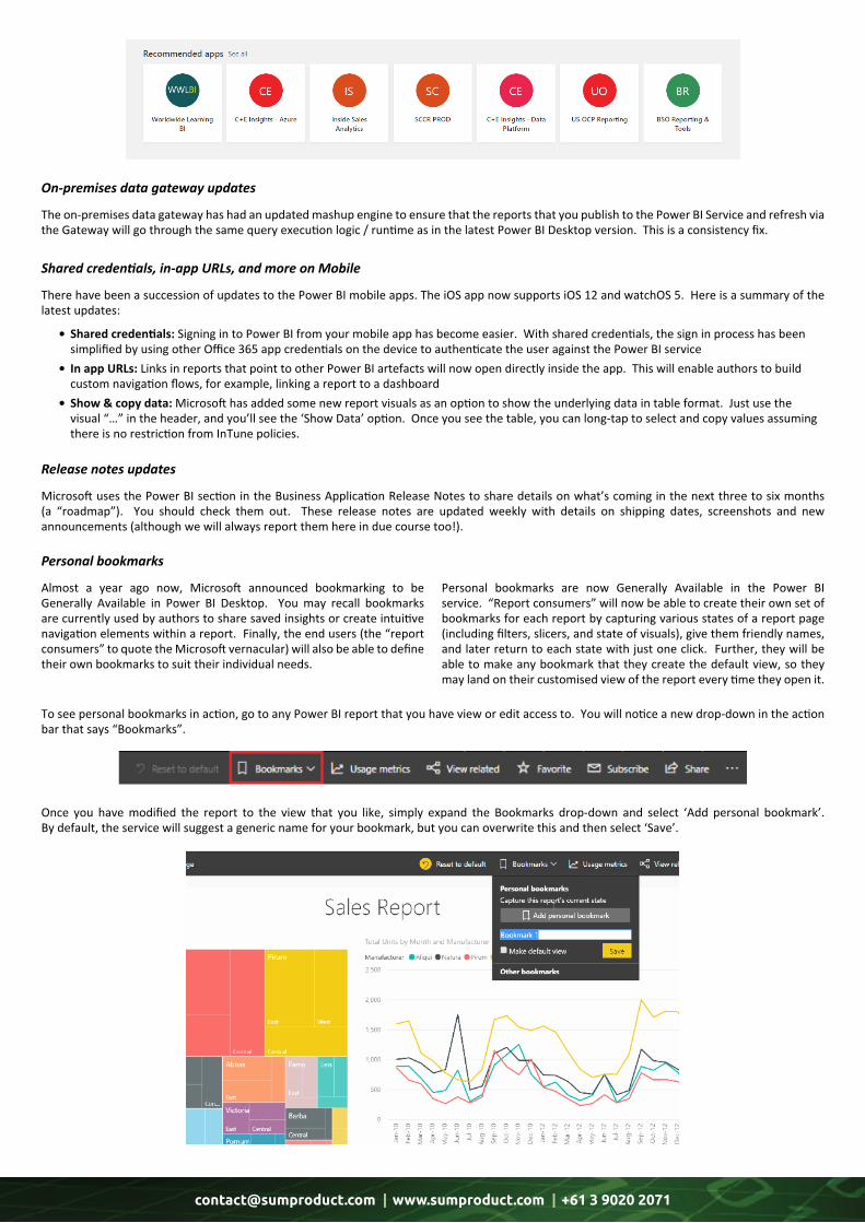
Back in 2017, Microsoft released AI-powered app recommendations in AppSource to suggest relevant content to end users. Now, this comes to Power BI Home with a new Recommended apps section that surfaces the top apps that might of interest (anyone hear sales plug?).
Recommended apps on Power BI Home
[email protected] | www.sumproduct.com | +61 3 9020 2071
There have been a succession of updates to the Power BI mobile apps. The iOS app now supports iOS 12 and watchOS 5. Here is a summary of the latest updates:
• Sharedcredentials: Signing in to Power BI from your mobile app has become easier. With shared credentials, the sign in process has been simplified by using other Office 365 app credentials on the device to authenticate the user against the Power BI service • InappURLs: Links in reports that point to other Power BI artefacts will now open directly inside the app. This will enable authors to build custom navigation flows, for example, linking a report to a dashboard • Show©data: Microsoft has added some new report visuals as an option to show the underlying data in table format. Just use the visual “…” in the header, and you’ll see the ‘Show Data’ option. Once you see the table, you can long-tap to select and copy values assuming there is no restriction from InTune policies.
Microsoft uses the Power BI section in the Business Application Release Notes to share details on what’s coming in the next three to six months (a “roadmap”). You should check them out. These release notes are updated weekly with details on shipping dates, screenshots and new announcements (although we will always report them here in due course too!).
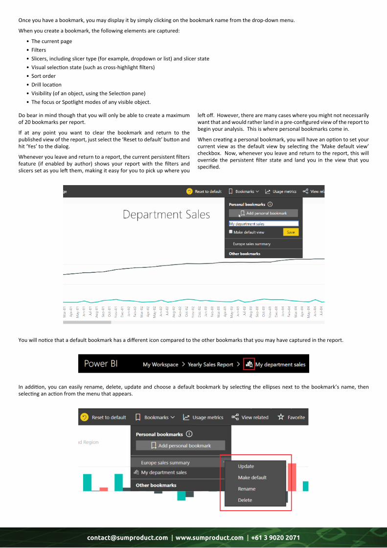
To see personal bookmarks in action, go to any Power BI report that you have view or edit access to. You will notice a new drop-down in the action bar that says “Bookmarks”.
Once you have modified the report to the view that you like, simply expand the Bookmarks drop-down and select ‘Add personal bookmark’. By default, the service will suggest a generic name for your bookmark, but you can overwrite this and then select ‘Save’.
Almost a year ago now, Microsoft announced bookmarking to be Generally Available in Power BI Desktop. You may recall bookmarks are currently used by authors to share saved insights or create intuitive navigation elements within a report. Finally, the end users (the “report consumers” to quote the Microsoft vernacular) will also be able to define their own bookmarks to suit their individual needs.
Personal bookmarks are now Generally Available in the Power BI service. “Report consumers” will now be able to create their own set of bookmarks for each report by capturing various states of a report page (including filters, slicers, and state of visuals), give them friendly names, and later return to each state with just one click. Further, they will be able to make any bookmark that they create the default view, so they may land on their customised view of the report every time they open it.
Shared credentials, in-app URLs, and more on Mobile
Release notes updates
Personal bookmarks
The on-premises data gateway has had an updated mashup engine to ensure that the reports that you publish to the Power BI Service and refresh via the Gateway will go through the same query execution logic / runtime as in the latest Power BI Desktop version. This is a consistency fix.
On-premises data gateway updates
[email protected] | www.sumproduct.com | +61 3 9020 2071
Once you have a bookmark, you may display it by simply clicking on the bookmark name from the drop-down menu.
When you create a bookmark, the following elements are captured:
• The current page • Filters • Slicers, including slicer type (for example, dropdown or list) and slicer state • Visual selection state (such as cross-highlight filters) • Sort order • Drill location • Visibility (of an object, using the Selection pane) • The focus or Spotlight modes of any visible object.
Do bear in mind though that you will only be able to create a maximum of 20 bookmarks per report.
If at any point you want to clear the bookmark and return to the published view of the report, just select the ‘Reset to default’ button and hit ‘Yes’ to the dialog.
Whenever you leave and return to a report, the current persistent filters feature (if enabled by author) shows your report with the filters and slicers set as you left them, making it easy for you to pick up where you
left off. However, there are many cases where you might not necessarily want that and would rather land in a pre-configured view of the report to begin your analysis. This is where personal bookmarks come in.
When creating a personal bookmark, you will have an option to set your current view as the default view by selecting the ‘Make default view’ checkbox. Now, whenever you leave and return to the report, this will override the persistent filter state and land you in the view that you specified.
You will notice that a default bookmark has a different icon compared to the other bookmarks that you may have captured in the report.
In addition, you can easily rename, delete, update and choose a default bookmark by selecting the ellipses next to the bookmark’s name, then selecting an action from the menu that appears.

[email protected] | www.sumproduct.com | +61 3 9020 2071
If you want to access additional bookmarks that may have been published by the author of the report, simply select ‘Other bookmarks’ in the ‘Bookmarks’ drop-down menu to launch the ‘Bookmarks’ pane. All the bookmarks created by the author will be nested under the ‘Report bookmarks’ heading:
If you have a collection of bookmarks that you access frequently and want to avoid clicking on the drop-down each time, use the ‘Bookmarks’ pane to access your bookmarks with one click or just save the URL to your browser bookmark. You can also use the ‘View’ button in the ‘Bookmarks’ pane to begin a slide show.
More next month no doubt.
Power BI Report Server Latest Updates
We just managed to sneak this into this month’s newsletter. Hot off the press, Microsoft announced in late January its next update of Power BI Report Server. This release features copy and pasting between .pbix files, expand / collapse on matrix row headers, and row-level security support. The full list is as follows:
Report Server • Row-level security
Reporting • Dot plot layout support in scatter charts • Copy value and selection from table and matrix • Built-in report theme options • Search in filter cards • Expand and collapse matrix row headers • Copy and paste between desktop files • Smart guides for aligning objects on a page • Set tab order for objects on a page • Tooltips for button visuals • Report accessibility improvements
Modelling • DAX Editor improvements • Modelling accessibility improvements • New DAX functions: o Optional DrilldownFilter argument for the RollupAddIsSubtotal function o NonVisual function o IsInScope function
Analytics • Colour saturation on visuals upgraded to use conditional formatting
[email protected] | www.sumproduct.com | +61 3 9020 2071
Other •UpdatedPowerBIDesktopforReportServericon • Transportlayersecuritysettings •Highcontrastsupportforallpanesandreportfooter • Improvedkeyboardshortcutsdialog.
Let’stakealookateachinturn.
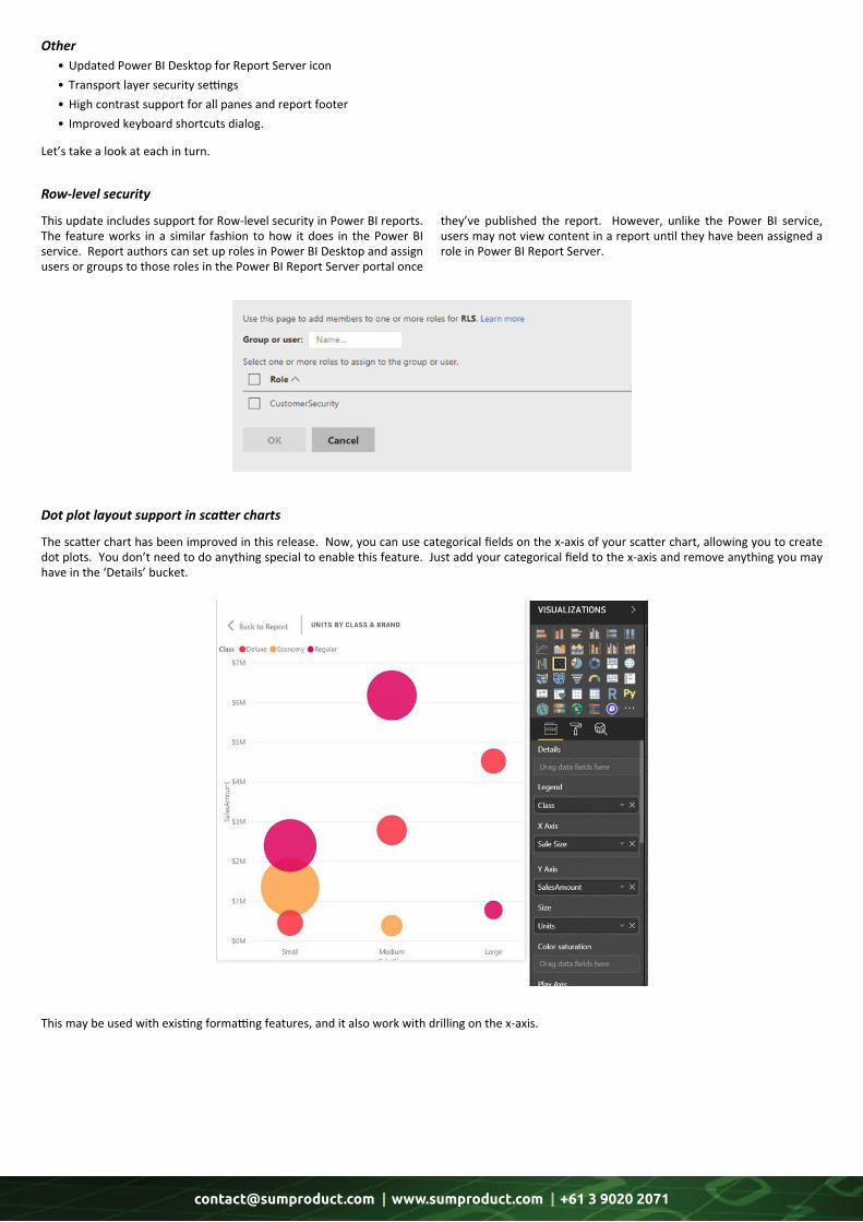
This update includes support for Row-level security in Power BI reports. The feature works in a similar fashion to how it does in the Power BI service. Report authors can set up roles in Power BI Desktop and assign users or groups to those roles in the Power BI Report Server portal once
they’ve published the report. However, unlike the Power BI service, users may not view content in a report until they have been assigned a role in Power BI Report Server.
The scatter chart has been improved in this release. Now, you can use categorical fields on the x-axis of your scatter chart, allowing you to create dot plots. You don’t need to do anything special to enable this feature. Just add your categorical field to the x-axis and remove anything you may have in the ‘Details’ bucket.
This may be used with existing formatting features, and it also work with drilling on the x-axis.
Row-level security
Dot plot layout support in scatter charts
[email protected] | www.sumproduct.com | +61 3 9020 2071
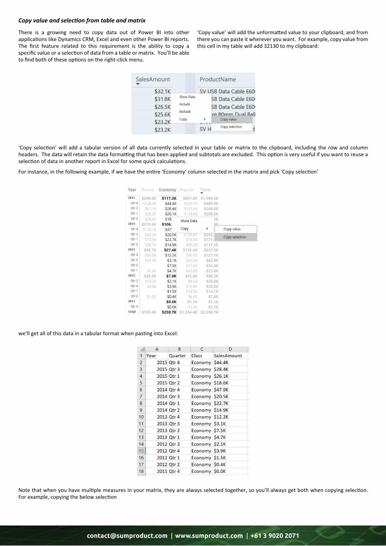
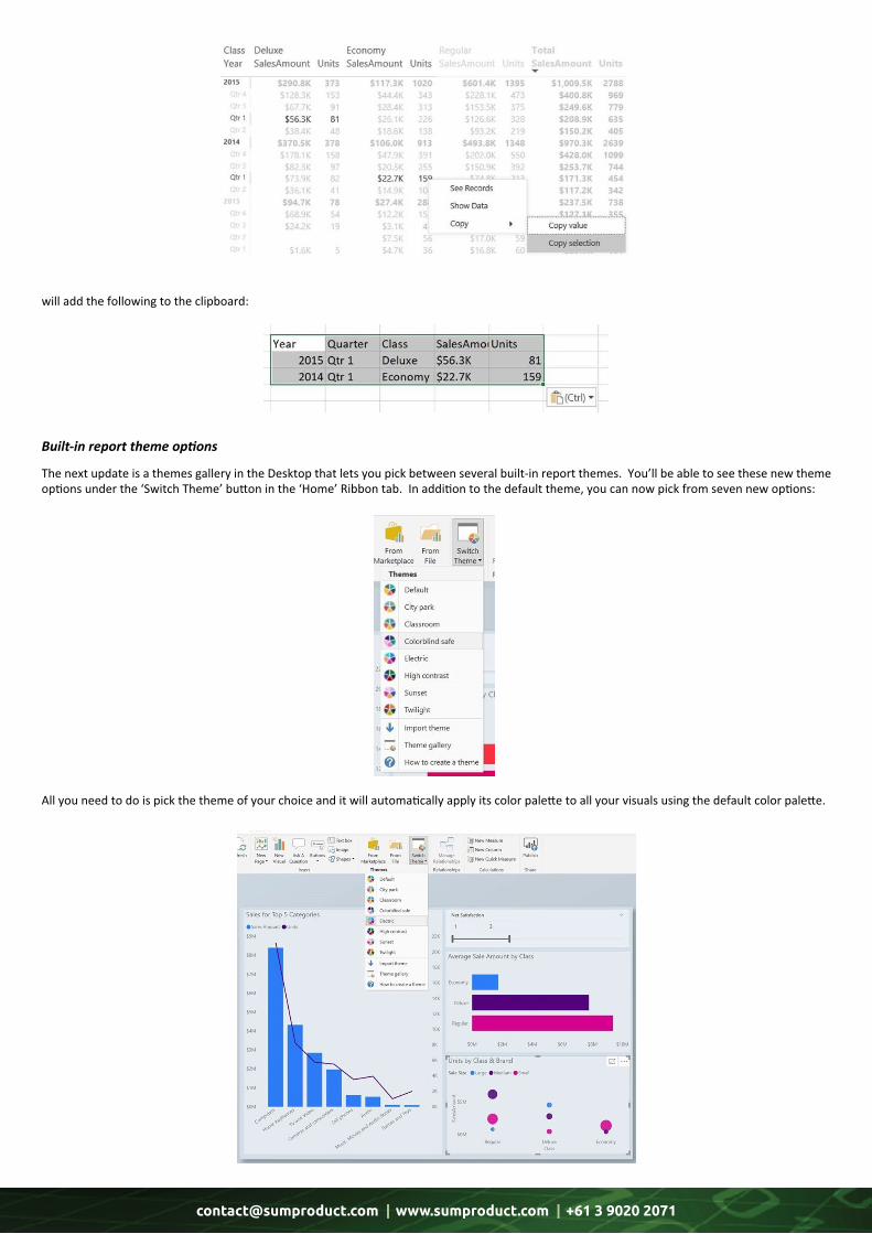
There is a growing need to copy data out of Power BI into other applications like Dynamics CRM, Excel and even other Power BI reports. The first feature related to this requirement is the ability to copy a specific value or a selection of data from a table or matrix. You’ll be able to find both of these options on the right-click menu.
‘Copy value’ will add the unformatted value to your clipboard, and from there you can paste it wherever you want. For example, copy value from this cell in my table will add 32130 to my clipboard:
‘Copy selection’ will add a tabular version of all data currently selected in your table or matrix to the clipboard, including the row and column headers. The data will retain the data formatting that has been applied and subtotals are excluded. This option is very useful if you want to reuse a selection of data in another report in Excel for some quick calculations.
For instance, in the following example, if we have the entire ‘Economy’ column selected in the matrix and pick ‘Copy selection’
we’ll get all of this data in a tabular format when pasting into Excel:
Note that when you have multiple measures in your matrix, they are always selected together, so you’ll always get both when copying selection. For example, copying the below selection
Copy value and selection from table and matrix
[email protected] | www.sumproduct.com | +61 3 9020 2071
will add the following to the clipboard:
The next update is a themes gallery in the Desktop that lets you pick between several built-in report themes. You’ll be able to see these new theme options under the ‘Switch Theme’ button in the ‘Home’ Ribbon tab. In addition to the default theme, you can now pick from seven new options:
All you need to do is pick the theme of your choice and it will automatically apply its color palette to all your visuals using the default color palette.
Built-in report theme options
[email protected] | www.sumproduct.com | +61 3 9020 2071
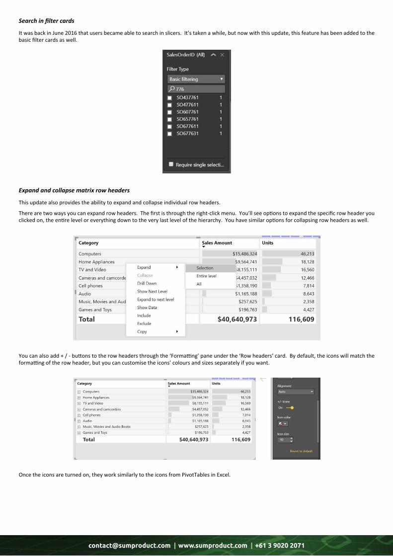
It was back in June 2016 that users became able to search in slicers. It’s taken a while, but now with this update, this feature has been added to the basic filter cards as well.
This update also provides the ability to expand and collapse individual row headers.
There are two ways you can expand row headers. The first is through the right-click menu. You’ll see options to expand the specific row header you clicked on, the entire level or everything down to the very last level of the hierarchy. You have similar options for collapsing row headers as well.
You can also add + / - buttons to the row headers through the ‘Formatting’ pane under the ‘Row headers’ card. By default, the icons will match the formatting of the row header, but you can customise the icons’ colours and sizes separately if you want.
Once the icons are turned on, they work similarly to the icons from PivotTables in Excel.
Search in filter cards
Expand and collapse matrix row headers
[email protected] | www.sumproduct.com | +61 3 9020 2071
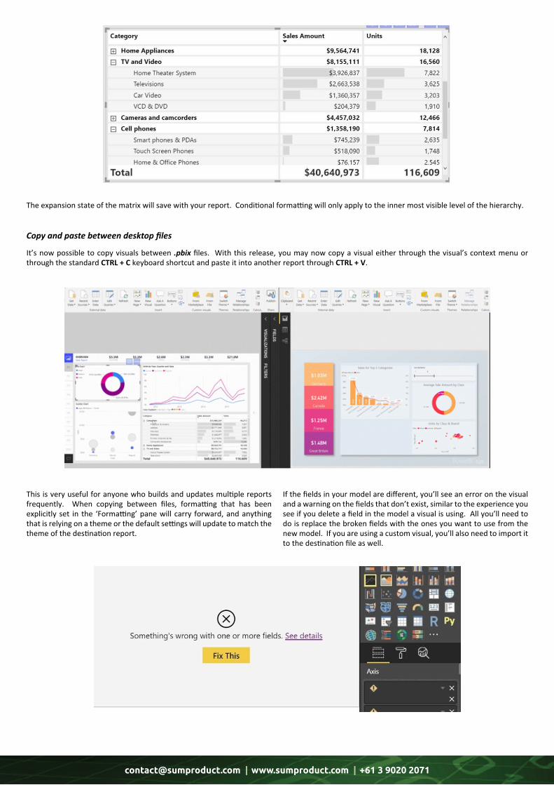
The expansion state of the matrix will save with your report. Conditional formatting will only apply to the inner most visible level of the hierarchy.
It’s now possible to copy visuals between .pbix files. With this release, you may now copy a visual either through the visual’s context menu or through the standard CTRL + C keyboard shortcut and paste it into another report through CTRL + V.
This is very useful for anyone who builds and updates multiple reports frequently. When copying between files, formatting that has been explicitly set in the ‘Formatting’ pane will carry forward, and anything that is relying on a theme or the default settings will update to match the theme of the destination report.
If the fields in your model are different, you’ll see an error on the visual and a warning on the fields that don’t exist, similar to the experience you see if you delete a field in the model a visual is using. All you’ll need to do is replace the broken fields with the ones you want to use from the new model. If you are using a custom visual, you’ll also need to import it to the destination file as well.
Copy and paste between desktop files
[email protected] | www.sumproduct.com | +61 3 9020 2071
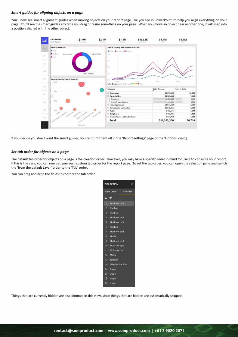
You’ll now see smart alignment guides when moving objects on your report page, like you see in PowerPoint, to help you align everything on your page. You’ll see the smart guides any time you drag or resize something on your page. When you move an object near another one, it will snap into a position aligned with the other object.
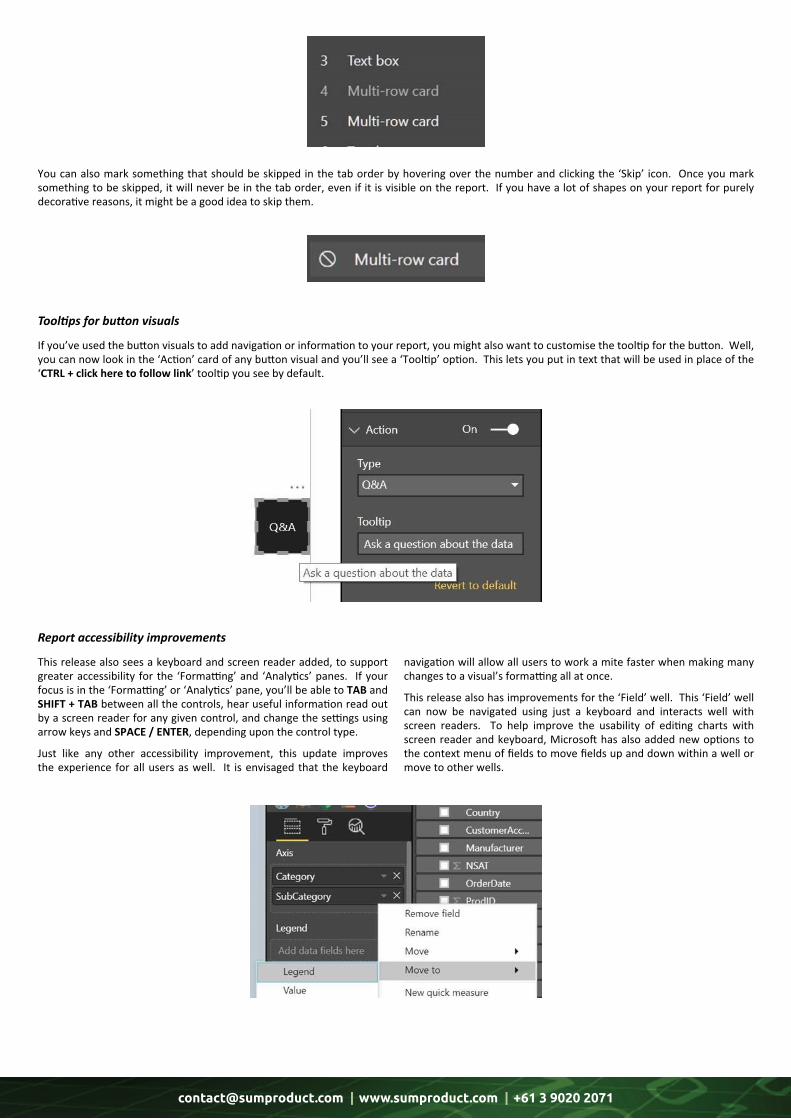
The default tab order for objects on a page is the creation order. However, you may have a specific order in mind for users to consume your report. If this is the case, you can now set your own custom tab order for the report page. To set the tab order, you can open the selection pane and switch the ‘from the default Layer’ order to the ‘Tab’ order.
You can drag and drop the fields to reorder the tab order.
Things that are currently hidden are also dimmed in this view, since things that are hidden are automatically skipped.
If you decide you don’t want the smart guides, you can turn them off in the ‘Report settings’ page of the ‘Options’ dialog.
Smart guides for aligning objects on a page
Set tab order for objects on a page
[email protected] | www.sumproduct.com | +61 3 9020 2071
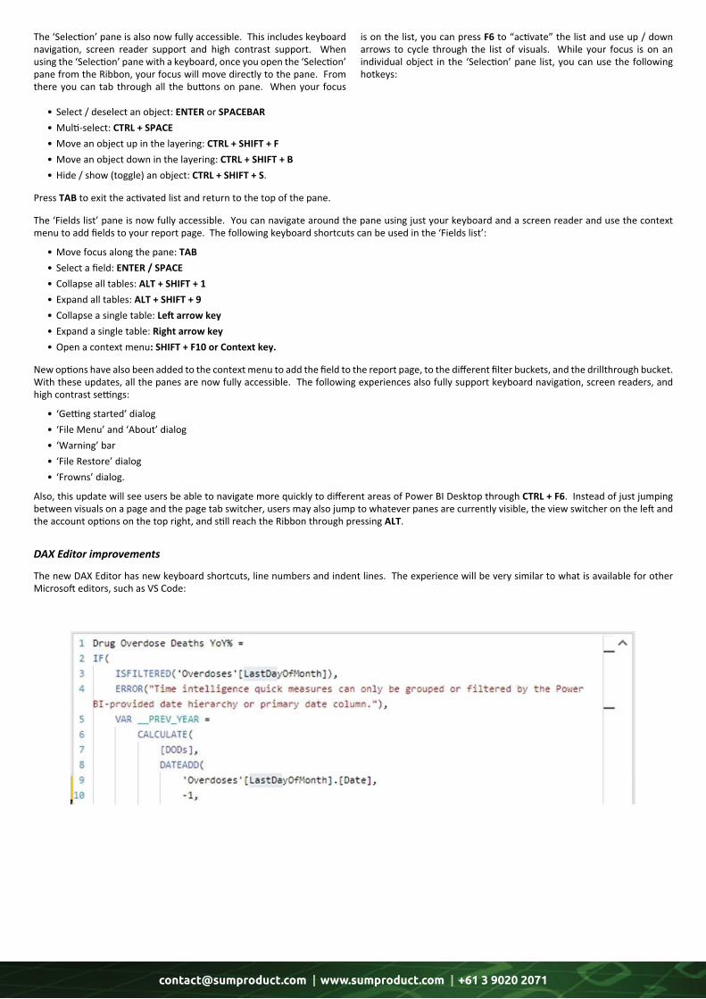
You can also mark something that should be skipped in the tab order by hovering over the number and clicking the ‘Skip’ icon. Once you mark something to be skipped, it will never be in the tab order, even if it is visible on the report. If you have a lot of shapes on your report for purely decorative reasons, it might be a good idea to skip them.
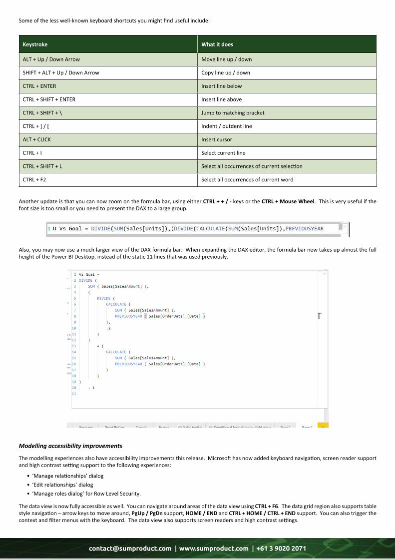
If you’ve used the button visuals to add navigation or information to your report, you might also want to customise the tooltip for the button. Well, you can now look in the ‘Action’ card of any button visual and you’ll see a ‘Tooltip’ option. This lets you put in text that will be used in place of the ‘CTRL + click here to follow link’ tooltip you see by default.
This release also sees a keyboard and screen reader added, to support greater accessibility for the ‘Formatting’ and ‘Analytics’ panes. If your focus is in the ‘Formatting’ or ‘Analytics’ pane, you’ll be able to TAB and SHIFT + TAB between all the controls, hear useful information read out by a screen reader for any given control, and change the settings using arrow keys and SPACE / ENTER, depending upon the control type.
Just like any other accessibility improvement, this update improves the experience for all users as well. It is envisaged that the keyboard
navigation will allow all users to work a mite faster when making many changes to a visual’s formatting all at once.
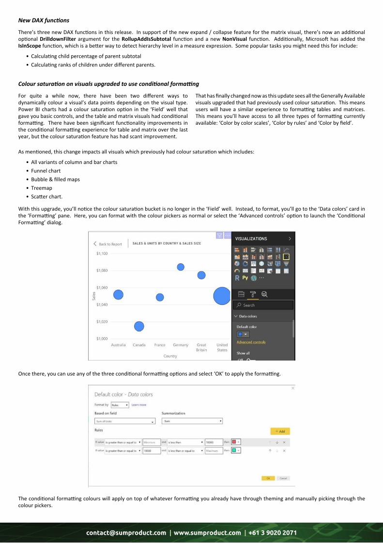
This release also has improvements for the ‘Field’ well. This ‘Field’ well can now be navigated using just a keyboard and interacts well with screen readers. To help improve the usability of editing charts with screen reader and keyboard, Microsoft has also added new options to the context menu of fields to move fields up and down within a well or move to other wells.
Tooltips for button visuals
Report accessibility improvements
[email protected] | www.sumproduct.com | +61 3 9020 2071
The ‘Selection’ pane is also now fully accessible. This includes keyboard navigation, screen reader support and high contrast support. When using the ‘Selection’ pane with a keyboard, once you open the ‘Selection’ pane from the Ribbon, your focus will move directly to the pane. From there you can tab through all the buttons on pane. When your focus
is on the list, you can press F6 to “activate” the list and use up / down arrows to cycle through the list of visuals. While your focus is on an individual object in the ‘Selection’ pane list, you can use the following hotkeys:
• Select/deselectanobject:ENTERorSPACEBAR •Multi-select:CTRL + SPACE •Moveanobjectupinthelayering:CTRL + SHIFT + F •Moveanobjectdowninthelayering:CTRL + SHIFT + B •Hide/show(toggle)anobject:CTRL + SHIFT + S.
PressTABtoexittheactivatedlistandreturntothetopofthepane.
The‘Fieldslist’paneisnowfullyaccessible.Youcannavigatearoundthepaneusingjustyourkeyboardandascreenreaderandusethecontextmenutoaddfieldstoyourreportpage.Thefollowingkeyboardshortcutscanbeusedinthe‘Fieldslist’:
•Movefocusalongthepane: TAB • Selectafield:ENTER / SPACE • Collapsealltables: ALT + SHIFT + 1 • Expandalltables:ALT + SHIFT + 9 • Collapseasingletable:Left arrow key • Expandasingletable: Right arrow key •Openacontextmenu: SHIFT + F10 or Context key.
Newoptionshavealsobeenaddedtothecontextmenutoaddthefieldtothereportpage,tothedifferentfilterbuckets,andthedrillthroughbucket.Withtheseupdates,allthepanesarenowfullyaccessible.Thefollowingexperiencesalsofullysupportkeyboardnavigation,screenreaders,andhighcontrastsettings:
• ‘Gettingstarted’dialog • ‘FileMenu’and‘About’dialog • ‘Warning’bar • ‘FileRestore’dialog • ‘Frowns’dialog.
Also,thisupdatewillseeusersbeabletonavigatemorequicklytodifferentareasofPowerBIDesktopthroughCTRL + F6.Insteadofjustjumpingbetweenvisualsonapageandthepagetabswitcher,usersmayalsojumptowhateverpanesarecurrentlyvisible,theviewswitcherontheleftandtheaccountoptionsonthetopright,andstillreachtheRibbonthroughpressingALT.
The new DAX Editor has new keyboard shortcuts, line numbers and indent lines. The experience will be very similar to what is available for other Microsoft editors, such as VS Code:
DAX Editor improvements
[email protected] | www.sumproduct.com | +61 3 9020 2071
Keystroke What it does
ALT + Up / Down Arrow Move line up / down
SHIFT + ALT + Up / Down Arrow Copy line up / down
CTRL + ENTER Insert line below
CTRL + SHIFT + ENTER Insert line above
CTRL + SHIFT + \ Jump to matching bracket
CTRL + ] / [ Indent / outdent line
ALT + CLICK Insert cursor
CTRL + I Select current line
CTRL + SHIFT + L Select all occurrences of current selection
CTRL + F2 Select all occurrences of current word
Some of the less well-known keyboard shortcuts you might find useful include:
Another update is that you can now zoom on the formula bar, using either CTRL + + / - keys or the CTRL + Mouse Wheel. This is very useful if the font size is too small or you need to present the DAX to a large group.
Also, you may now use a much larger view of the DAX formula bar. When expanding the DAX editor, the formula bar new takes up almost the full height of the Power BI Desktop, instead of the static 11 lines that was used previously.
The modelling experiences also have accessibility improvements this release. Microsoft has now added keyboard navigation, screen reader support and high contrast setting support to the following experiences:
• ‘Manage relationships’ dialog • ‘Edit relationships’ dialog • ‘Manage roles dialog’ for Row Level Security.
The data view is now fully accessible as well. You can navigate around areas of the data view using CTRL + F6. The data grid region also supports table style navigation – arrow keys to move around, PgUp / PgDn support, HOME / END and CTRL + HOME / CTRL + END support. You can also trigger the context and filter menus with the keyboard. The data view also supports screen readers and high contrast settings.
Modelling accessibility improvements
[email protected] | www.sumproduct.com | +61 3 9020 2071
There’s three new DAX functions in this release. In support of the new expand / collapse feature for the matrix visual, there’s now an additional optional DrilldownFilter argument for the RollupAddIsSubtotal function and a new NonVisual function. Additionally, Microsoft has added the IsInScope function, which is a better way to detect hierarchy level in a measure expression. Some popular tasks you might need this for include:
• Calculating child percentage of parent subtotal • Calculating ranks of children under different parents.
As mentioned, this change impacts all visuals which previously had colour saturation which includes:
• All variants of column and bar charts • Funnel chart • Bubble & filled maps • Treemap • Scatter chart.
With this upgrade, you’ll notice the colour saturation bucket is no longer in the ‘Field’ well. Instead, to format, you’ll go to the ‘Data colors’ card in the ‘Formatting’ pane. Here, you can format with the colour pickers as normal or select the ‘Advanced controls’ option to launch the ‘Conditional Formatting’ dialog.
Once there, you can use any of the three conditional formatting options and select ‘OK’ to apply the formatting.
The conditional formatting colours will apply on top of whatever formatting you already have through theming and manually picking through the colour pickers.
For quite a while now, there have been two different ways to dynamically colour a visual’s data points depending on the visual type. Power BI charts had a colour saturation option in the ‘Field’ well that gave you basic controls, and the table and matrix visuals had conditional formatting. There have been significant functionality improvements in the conditional formatting experience for table and matrix over the last year, but the colour saturation feature has had scant improvement.
That has finally changed now as this update sees all the Generally Available visuals upgraded that had previously used colour saturation. This means users will have a similar experience to formatting tables and matrices. This means you’ll have access to all three types of formatting currently available: ‘Color by color scales’, ‘Color by rules’ and ‘Color by field’.
New DAX functions
Colour saturation on visuals upgraded to use conditional formatting
[email protected] | www.sumproduct.com | +61 3 9020 2071
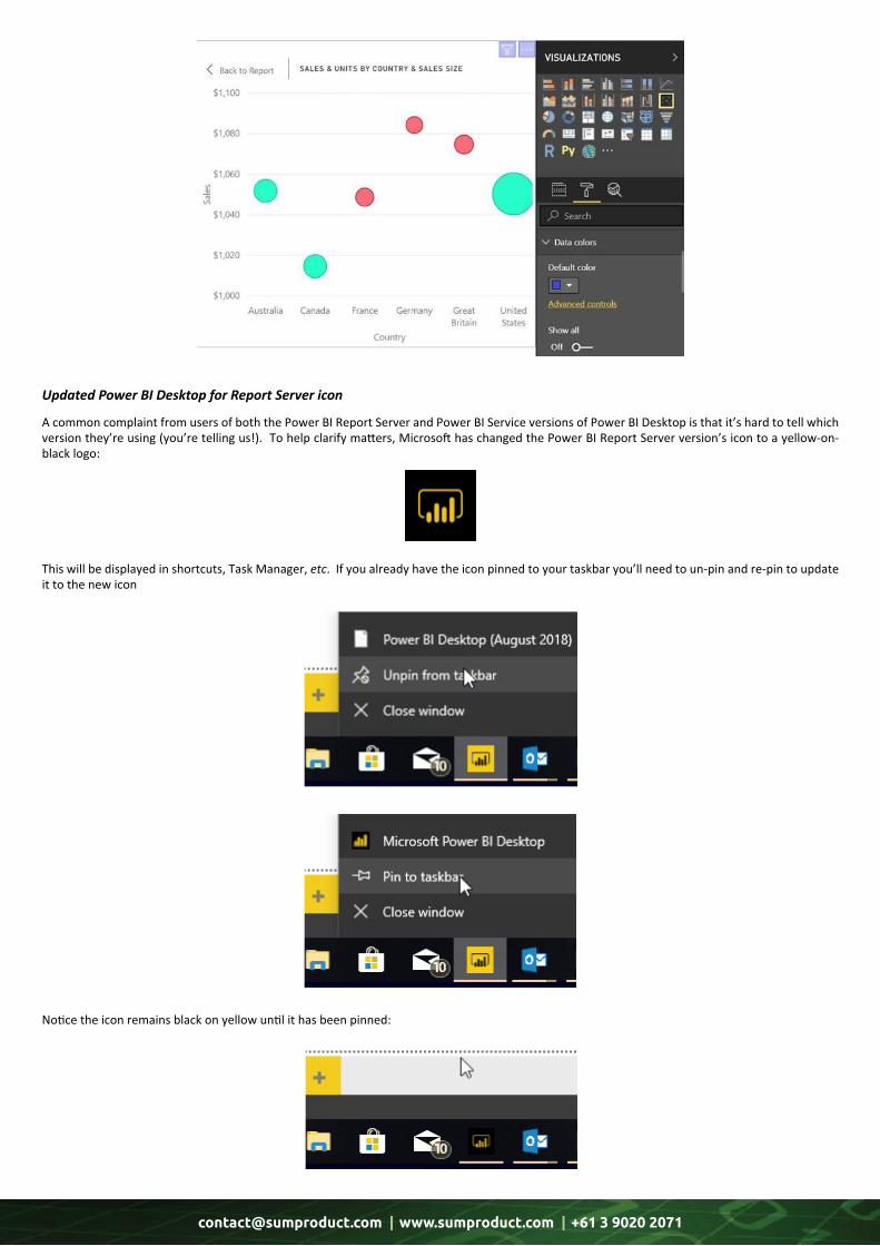
A common complaint from users of both the Power BI Report Server and Power BI Service versions of Power BI Desktop is that it’s hard to tell which version they’re using (you’re telling us!). To help clarify matters, Microsoft has changed the Power BI Report Server version’s icon to a yellow-on-black logo:
This will be displayed in shortcuts, Task Manager, etc. If you already have the icon pinned to your taskbar you’ll need to un-pin and re-pin to update it to the new icon
Notice the icon remains black on yellow until it has been pinned:
Updated Power BI Desktop for Report Server icon
[email protected] | www.sumproduct.com | +61 3 9020 2071
Security is a priority for report preparers, end users and Microsoft alike. The software giant has company-wide programs in place to ensure customers have control over the security of communications with Microsoft services. IT and network security administrators may wish to
force usage of more recent versions of TLS (Transport Layer Security) for any secured communication on their network, and Power BI Desktop now respects the Windows registry keys you use to manage this.
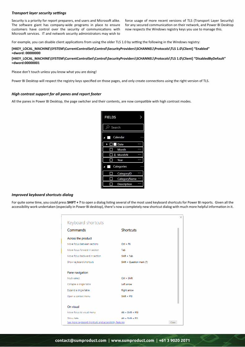
All the panes in Power BI Desktop, the page switcher and their contents, are now compatible with high contrast modes.
For quite some time, you could press SHIFT + ? to open a dialog listing several of the most used keyboard shortcuts for Power BI reports. Given all the accessibility work undertaken (especially in Power BI desktop), there’s now a completely new shortcut dialog with much more helpful information in it.
For example, you can disable client applications from using the older TLS 1.0 by setting the following in the Windows registry:
[HKEY_LOCAL_MACHINE\SYSTEM\CurrentControlSet\Control\SecurityProviders\SCHANNEL\Protocols\TLS 1.0\Client] “Enabled” =dword: 00000000[HKEY_LOCAL_MACHINE\SYSTEM\CurrentControlSet\Control\SecurityProviders\SCHANNEL\Protocols\TLS 1.0\Client] “DisabledByDefault” =dword:00000001
Please don’t touch unless you know what you are doing!
Power BI Desktop will respect the registry keys specified on those pages, and only create connections using the right version of TLS.
Transport layer security settings
High contrast support for all panes and report footer
Improved keyboard shortcuts dialog

[email protected] | www.sumproduct.com | +61 3 9020 2071
Shortcut Action
ALT + Click Insert cursor in DAX Editor
ALT + Down Arrow key Move line down in DAX Editor
ALT + ENTER New line starting from first of line in DAX Editor (no indent)
ALT + I Restart intellisense
ALT + SHIFT + A To comment / uncomment (toggle) a portion of code
ALT + SHIFT + Down Arrow key Copy line down in DAX Editor
ALT + SHIFT + F10 Move focus to ‘Visual’ menu
ALT + SHIFT + F11 Show data
ALT + SHIFT + Right Arrow key Select nearest word and expand selection in DAX Editor
ALT + SHIFT + Up Arrow key Copy line up in DAX Editor
ALT + Up Arrow key Move line up in DAX Editor
CTRL + ALT + Down Arrow key Enter multiple lines of code at once in DAX Editor
CTRL + ALT + Up Arrow key Enter multiple lines of code at once in DAX Editor
CTRL + C Copy
CTRL + D Highlight the current word, CTRL + D again to find / highlight the same next word. Continue pressing CTRL + D to find / highlight all same words, then start typing to replace all words at once
CTRL + DELETE Delete a word in the DAX Editor
CTRL + ENTER Insert line below in DAX Editor
CTRL + F2 Select all occurrences of current word in DAX Editor
CTRL + F6 Move focus between sections
CTRL + G Go to line number in DAX Editor
CTRL + I Select current line in DAX Editor
CTRL + K + C Comment multiple lines in DAX Editor
CTRL + K + U Uncomment multiple lines in DAX Editor
CTRL + Right Arrow key Interact with a Slicer
CTRL + SHIFT Multi-select
CTRL + SHIFT + B Move an object down in the layering (‘Selection’ pane)
CTRL + SHIFT + ENTER Insert line above in DAX Editor
CTRL + SHIFT + F Move an object up in the layering (‘Selection’ pane)
CTRL + SHIFT + K Delete multiple lines in DAX Editor
CTRL + SHIFT + L Select all occurrences of current selection in DAX Editor
CTRL + SHIFT + S Hide / show (toggle) an object (‘Selection’ pane)
CTRL + SHIFT + \ Jump to matching bracket in DAX Editor
CTRL + SPACE Multi-select objects
CTRL + V Paste
CTRL + ‘+’ Comment / uncomment all lines including a desired word
CTRL + [ Outdent line in DAX Editor
Yes, we know we reported on this last month for Power BI Desktop, but hey, you can never get enough of a good thing. Therefore, with no apology forthcoming, here again is the current list of keyboard shortcuts as cited by Microsoft in various locations.
[email protected] | www.sumproduct.com | +61 3 9020 2071
Shortcut Action
CTRL + ] Indent line in DAX Editor
CTRL + / Comment multiple lines in DAX Editor
CTRL + \ Uncomment multiple lines in DAX Editor
ENTER Select or de-select an object
F6 Activate ‘Selection’ pane
Left Arrow key Collapse a single table
Right Arrow key Expand a single table
SHIFT + ENTER Creates line break with auto-indent
SHIFT + F10 Open a context menu
SHIFT + TAB Move focus backward in section or decrease indent (context specific)
SHIFT + ? Show keyboard shortcuts
SPACE Select or de-select an object
TAB Move focus forward in section
Windows Context Key + F10 Open a context menu
That’s it until the March newsletter.
The A to Z of Excel Functions: DATE
We have finally made the ‘D’s!!
This function returns the sequential serial number that represents a particular date. Essentially, this was one method of avoiding the “dreaded Year 2000 bug” which concerned potential division by zero errors.
The DATE function employs the following syntax to operate:
DATE(year,month,day)
The DATE function has the following arguments: • year: this is required. The value of the year argument can include one to four digits. Excel interprets the year argument according to the date system your computer is using. By default, Microsoft Excel for Windows uses the 1900 date system, which means the first date is January 1, 1900. It’s best to use four digits for the year argument to prevent unwanted results. For example, "18" could mean "1918" or "2018" – four- digit years prevent such confusion o if year is between 0 (zero) and 1899 (inclusive), Excel adds that value to 1900 to calculate the year. For example, DATE(108,1,2) returns January 2, 2008 (1900+108) o if year is between 1900 and 9999 (inclusive), Excel uses that value as the year. For example, DATE(2008,1,2) returns January 2, 2008 o if year is less than 0 or is 10000 or greater, Excel returns the #NUM! error value
[email protected] | www.sumproduct.com | +61 3 9020 2071
•month: thisisalsorequiredandshouldbeapositiveornegativeintegerrepresentingthemonthoftheyearfrom1to12(Januaryto December) o ifmonthisgreaterthan12,monthaddsthatnumberofmonthstothefirstmonthintheyearspecified.Forexample,DATE(2018,14,2) returnstheserialnumberrepresentingFebruary2,2019 o ifmonthislessthan1,monthsubtractsthemagnitudeofthatnumberofmonths,plus1,fromthefirstmonthintheyearspecified. Forexample,DATE(2018,-3,2)returnstheserialnumberrepresentingSeptember2,2017 •day:again,thisisrequired.Thisisapositiveornegativeintegerrepresentingthedayofthemonthfrom1to31 o ifdayisgreaterthanthenumberofdaysinthemonthspecified,dayaddsthatnumberofdaystothefirstdayinthemonth.For example,DATE(2018,1,35)returnstheserialnumberrepresentingFebruary4,2018 o ifdayislessthan1,daysubtractsthemagnitudethatnumberofdays,plusone,fromthefirstdayofthemonthspecified.Forexample, DATE(2018,1,-15) returnstheserialnumberrepresentingDecember16,2017.
Itshouldbefurthernotedthat:
• Excelstoresdatesassequentialserialnumberssothattheycanbeusedincalculations.January1,1900isserialnumber1,andJuly6,2009is serialnumber40000becauseitis39,999daysafterJanuary1,1900 • youwillneedtochangethenumberformat(CTRL + 1,‘FormatCells’)inordertodisplayaproperdate • February29,1900isrecognisedasday60onthe1900datesystem.Thisdatedoesnotexist(yearsendingin“00”mustbedivisibleby400to bealeapyear),butthiserrorhasbeenperpetuatedtobeconsistent/compatiblewithLotus1-2-3.
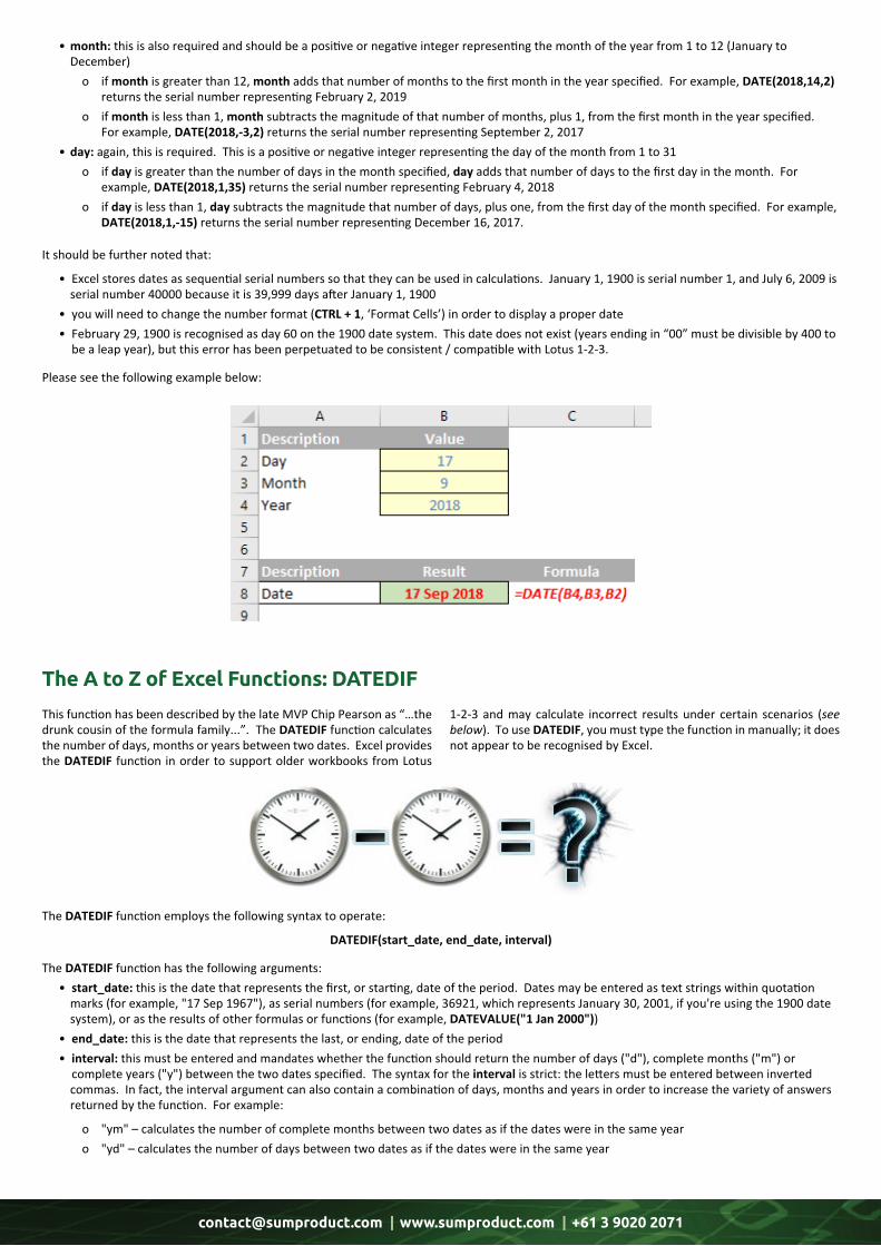
Pleaseseethefollowingexamplebelow:
The DATEDIF function employs the following syntax to operate:
DATEDIF(start_date, end_date, interval)
The DATEDIF function has the following arguments: • start_date: this is the date that represents the first, or starting, date of the period. Dates may be entered as text strings within quotation marks (for example, "17 Sep 1967"), as serial numbers (for example, 36921, which represents January 30, 2001, if you're using the 1900 date system), or as the results of other formulas or functions (for example, DATEVALUE("1 Jan 2000")) • end_date: this is the date that represents the last, or ending, date of the period • interval: this must be entered and mandates whether the function should return the number of days ("d"), complete months ("m") or complete years ("y") between the two dates specified. The syntax for the interval is strict: the letters must be entered between inverted commas. In fact, the interval argument can also contain a combination of days, months and years in order to increase the variety of answers returned by the function. For example:
o "ym" – calculates the number of complete months between two dates as if the dates were in the same year o "yd" – calculates the number of days between two dates as if the dates were in the same year
The A to Z of Excel Functions: DATEDIF
This function has been described by the late MVP Chip Pearson as “…the drunk cousin of the formula family...”. The DATEDIF function calculates the number of days, months or years between two dates. Excel provides the DATEDIF function in order to support older workbooks from Lotus
1-2-3 and may calculate incorrect results under certain scenarios (see below). To use DATEDIF, you must type the function in manually; it does not appear to be recognised by Excel.
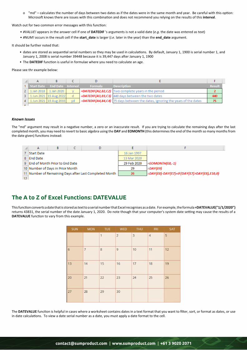
[email protected] | www.sumproduct.com | +61 3 9020 2071
o "md"–calculatesthenumberofdaysbetweentwodatesasifthedateswereinthesamemonthandyear.Becarefulwiththisoption: Microsoftknowsthereareissueswiththiscombinationanddoesnotrecommendyourelyingontheresultsofthisinterval.
Watchoutfortwocommonerrormessageswiththisfunction:
•#VALUE!appearsintheanswercellIfoneofDATEDIF'sargumentsisnotavaliddate(e.g.thedatewasenteredastext) •#NUM!occursintheresultcellifthestart_dateislarger(i.e.laterintheyear)thantheend_dateargument.
Itshouldbefurthernotedthat:
• datesarestoredassequentialserialnumberssotheymaybeusedincalculations.Bydefault,January1,1900isserialnumber1,and January1,2008isserialnumber39448becauseitis39,447daysafterJanuary1,1900 • TheDATEDIFfunctionisusefulinformulaewhereyouneedtocalculateanage.
Pleaseseethrexamplebelow:
The "md" argument may result in a negative number, a zero or an inaccurate result. If you are trying to calculate the remaining days after the last completed month, you may need to revert to basic algebra using the DAY and EOMONTH (this determines the end of the month so many months from the date given) functions instead:
Known Issues
The A to Z of Excel Functions: DATEVALUE
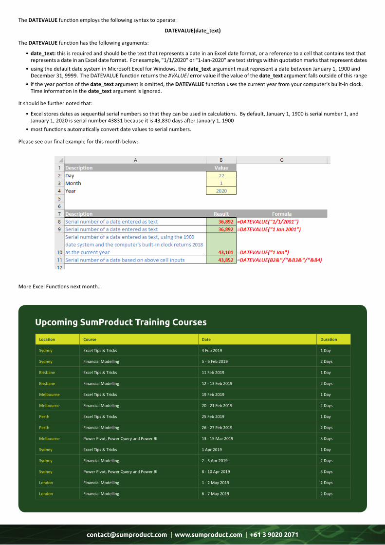
This function converts a date that is stored as text to a serial number that Excel recognises as a date. For example, the formula =DATEVALUE("1/1/2020") returns 43831, the serial number of the date January 1, 2020. Do note though that your computer's system date setting may cause the results of a DATEVALUE function to vary from this example.
The DATEVALUE function is helpful in cases where a worksheet contains dates in a text format that you want to filter, sort, or format as dates, or use in date calculations. To view a date serial number as a date, you must apply a date format to the cell.
[email protected] | www.sumproduct.com | +61 3 9020 2071
The DATEVALUE function employs the following syntax to operate:
DATEVALUE(date_text)
The DATEVALUE function has the following arguments:
• date_text: this is required and should be the text that represents a date in an Excel date format, or a reference to a cell that contains text that represents a date in an Excel date format. For example, "1/1/2020" or "1-Jan-2020" are text strings within quotation marks that represent dates • using the default date system in Microsoft Excel for Windows, the date_text argument must represent a date between January 1, 1900 and December 31, 9999. The DATEVALUE function returns the #VALUE! error value if the value of the date_text argument falls outside of this range • if the year portion of the date_text argument is omitted, the DATEVALUE function uses the current year from your computer's built-in clock. Time information in the date_text argument is ignored.
It should be further noted that:
• Excel stores dates as sequential serial numbers so that they can be used in calculations. By default, January 1, 1900 is serial number 1, and January 1, 2020 is serial number 43831 because it is 43,830 days after January 1, 1900 • most functions automatically convert date values to serial numbers.
Please see our final example for this month below:
More Excel Functions next month…
Upcoming SumProduct Training Courses
Location Course Date Duration
Sydney Excel Tips & Tricks 4 Feb 2019 1 Day
Sydney Financial Modelling 5 - 6 Feb 2019 2 Days
Brisbane Excel Tips & Tricks 11 Feb 2019 1 Day
Brisbane Financial Modelling 12 - 13 Feb 2019 2 Days
Melbourne Excel Tips & Tricks 19 Feb 2019 1 Day
Melbourne Financial Modelling 20 - 21 Feb 2019 2 Days
Perth Excel Tips & Tricks 25 Feb 2019 1 Day
Perth Financial Modelling 26 - 27 Feb 2019 2 Days
Melbourne Power Pivot, Power Query and Power BI 13 - 15 Mar 2019 3 Days
Sydney Excel Tips & Tricks 1 Apr 2019 1 Day
Sydney Financial Modelling 2 - 3 Apr 2019 2 Days
Sydney Power Pivot, Power Query and Power BI 8 - 10 Apr 2019 3 Days
London Financial Modelling 1 - 2 May 2019 2 Days
London Financial Modelling 6 - 7 May 2019 2 Days

[email protected] | www.sumproduct.com | +61 3 9020 2071 [email protected] | www.sumproduct.com | +61 3 9020 2071
[email protected]+61 3 9020 2071
Sydney Address: SumProduct Pty Ltd, Suite 52, Level 10, 88 Pitt Street, Sydney, NSW 2000New York Address: SumProduct Pty Ltd, 48 Wall Street, New York, NY, USA 10005London Address: SumProduct Pty Ltd, Office 7, 3537 Ludgate Hill, London, EC4M 7JN, UKMelbourne Address: SumProduct Pty Ltd, Level 9, 440 Collins Street, Melbourne, VIC 3000Registered Address: SumProduct Pty Ltd, Level 6, 468 St Kilda Road, Melbourne, VIC 3004
Link to OthersThese newsletters are not intended to be closely guarded secrets. Please feel free to forward this newsletter to anyone you think might be interested in converting to
“the SumProduct way”.
If you have received a forwarded newsletter and would like to receive future editions automatically, please
subscribe by completing our newsletter registration process found at the foot of any www.sumproduct.com web page.
Any Questions?If you have any tips, comments or queries for future newsletters, we’d be delighted to hear from you. Please drop us a line at
Our ServicesWe have undertaken a vast array of assignments over the years, including:· Business planning· Building three-way integrated financial statement projections· Independent expert reviews· Key driver analysis· Model reviews / audits for internal and external purposes· M&A work· Model scoping· Power BI, Power Query & Power Pivot· Project finance· Real options analysis· Refinancing / restructuring· Strategic modelling· Valuations· Working capital managementIf you require modelling assistance of any kind, please do not hesitate to contact us at [email protected].
TrainingSumProduct offers a wide range of training courses, aimed at finance professionals and budding Excel experts. Courses include Excel Tricks & Tips, Financial Modelling 101, Introduction to Forecasting and M&A Modelling.
Drop us a line at [email protected] for a copy of the brochure or download it directly fromhttp://www.sumproduct.com/training.
Check out our more popular courses in our training brochure:
There are over 540 keyboard shortcuts in Excel. For a comprehensive list, please download our Excel file awww.sumproduct.com/thought/keyboard-shortcuts. Also, check out our new daily Excel Tip of the Day feature on the www.sumproduct.com homepage.
Key StrokesEach newsletter, we’d like to introduce you to useful keystrokes you may or may not be aware of. This month, we thought we ought to get a SHIFT on and continue with our function key theme…
Keystroke What it does
SHIFT + F1 What is… (Help)
SHIFT + F2 Insert / Edit Comment
SHIFT + F3 Function Wizard
SHIFT + F4 Find Next (from most recent search)
SHIFT + F5 Find dialog
SHIFT + F6 Previous Pan
SHIFT + F8 Add to Selection Mode
SHIFT + F9 Calculate Sheet
SHIFT + F10 Activate Context Menus (right-click equivalent)
SHIFT + F11 Insert New Worksheet
SHIFT + F12 Save
Auckland Financial Modelling 6 - 7 May 2019 2 Days
Wellington Financial Modelling 9 - 10 May 2019 2 Days
Melbourne Excel Tips & Tricks 21 May 2019 1 Day
Melbourne Financial Modelling 22 - 23 May 2019 2 Days
Melbourne Power Pivot, Power Query and Power BI 28 - 30 May 2019 3 Days
Sydney Excel Tips & Tricks 3 Jun 2019 1 Day
Sydney Financial Modelling 4 - 5 Jun 2019 2 Days
Sydney Power Pivot, Power Query and Power BI 10 - 12 Jun 2019 3 Days


