Embed Size (px)
Citation preview
Looking at Shirley, the Ultimate Norm:Colour Balance, Image Technologies,
and Cognitive Equity
Lorna RothConcordia University
Abstract: Until recently, due to a light-skin bias embedded in colour film stockemulsions and digital camera design, the rendering of non-Caucasian skin toneswas highly deficient and required the development of compensatory practicesand technology improvements to redress its shortcomings. Using the emblem-atic “Shirley” norm reference card as a central metaphor reflecting the changingstate of race relations/aesthetics, this essay analytically traces the colour adjust-ment processes in the industries of visual representation and identifies some pro-totypical changes in the field. The author contextualizes the history of thesechanges using three theoretical categories: the ‘technological unconscious’(Vaccari, 1981), ‘dysconsciousness’ (King, 2001), and an original concept of‘cognitive equity,’ which is proposed as an intelligent strategy for creating andpromoting equity by inscribing a wider dynamic range of skin tones into imagetechnologies, products, and emergent practices in the visual industries.
Keywords: Colour balance; Norm reference cards; Dynamic range; Technologicalunconscious; Dysconsciousness; Cognitive equity; Cultural studies
Résumé : Jusqu’à récemment, en raison d’un préjugé favorisant la peau claire dansles films couleurs et dans la conception des caméras numériques, la reproductiondes couleurs de peaux non-caucasiennes a été très déficiente, exigeant ledéveloppement de diverses techniques de compensation et d’amélioration. Utilisantla carte de référence normative « Shirley » comme métaphore pour refléterl'évolution des rapports entre les races et leurs pratiques esthétiques, cet essaianalyse les processus d’ajustement de la couleur dans les industries de lareprésentation visuelle et identifie certains prototypes de changements dans ledomaine. L’auteur situe ces changements historiquement en se rapportant à troisconcepts théoriques : « l’inconscient technologique » (Vaccari, 1981), la« dysconscience » (« dysconsciousness » – King, 2001), et un concept original,« l’équité cognitive », proposé comme stratégie intelligente pour créer et
Lorna Roth teaches and publishes on matters related to minorities, race, media, and cross-culturalcommunications. She is an Associate Professor in the Department of Communication Studies atConcordia University, 7141 Sherbrooke St. West, CJ 4.325, Montréal, QC H4B 1R6. Email:[email protected].
Canadian Journal of Communication, Vol 34 (2009) 111-136©2009 Canadian Journal of Communication Corporation
promouvoir l'équité en inscrivant un plus grand éventail de couleurs de peau dansles technologies et produits de l'image et dans les pratiques émergeantes desindustries visuelles.
Mots clés : Balance de couleur; Cartes de référence normatives; Gammedynamique; Inconscient technologique; Dysconscience; Équité cognitive; Étudesculturelles
In a conversation with NHK (Japanese national broadcasting service)video engineer Toru Hasegawa in New York City, his first words to mewere, “American television is discriminatory because it is biased againstJapanese skin tones.” He further informed me that this is kept quite quietbecause the Japanese do not want North Americans working in televisionproduction in Japan to feel uncomfortable.
(Toru [Tom] Hasegawa, Video Engineer, NHK [Japan Broadcasting Corporation],
New York, NY, personal communication, May 27, 1996)There are several stages to colour balancing a television camera. First,two bar-line cards—one in black and white showing the greyscale, theother in colour—are placed in turn before the cameras to measure theaccuracy and saturation of the luminance and colour portrayal. Theirresulting video signals are viewed and adjusted on a waveform monitorand vectorscope to eliminate any distortion. Next, studio cameras arematched for evenness of colour representation. Technicians then turn tothe human eye for a subjective colour test, rationalized on the basis thatthe human eye perceives colour differently from the way it appears on avectorscope. According to Jan Kasoff, an NBC colour-television camera-man on the program Saturday Night Live, it is at this point that “a goodVCR person will have a colour girl stand in front of the cameras and staythere while the technicians focus on her flesh tones to do their fineadjustments to balance the cameras. This colour girl is always white.”
(Jan Kasoff, former Cameraman, NBC, New York, NY,personal communication, November 20, 1994)
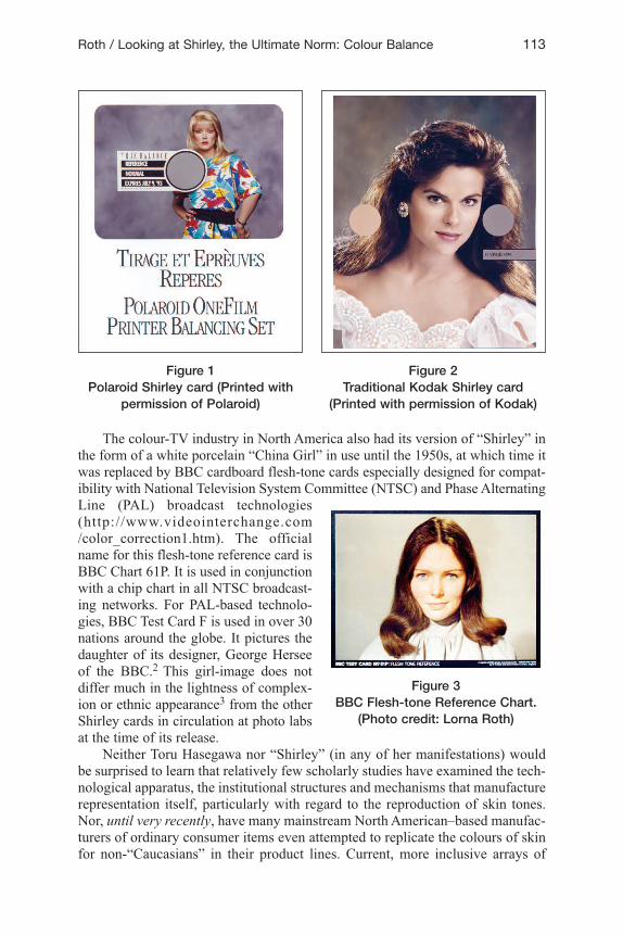
“Skin-colour balance” in still photography printing refers historically to a processin which a norm reference card showing a “Caucasian”1 woman wearing acolourful, high-contrast dress is used as a basis for measuring and calibrating theskin tones on the photograph being printed. The light skin tones of thesewomen—named “Shirley” by male industry users after the name of the firstcolour test-strip-card model—have been the recognized skin ideal standard formost North American analogue photo labs since the early part of the twentiethcentury and they continue to function as the dominant norm. Figures 1 and 2 aretypical of widely-circulated Shirley cards used in most North American analoguephoto labs until very recently.
112 Canadian Journal of Communication, Vol 34 (1)
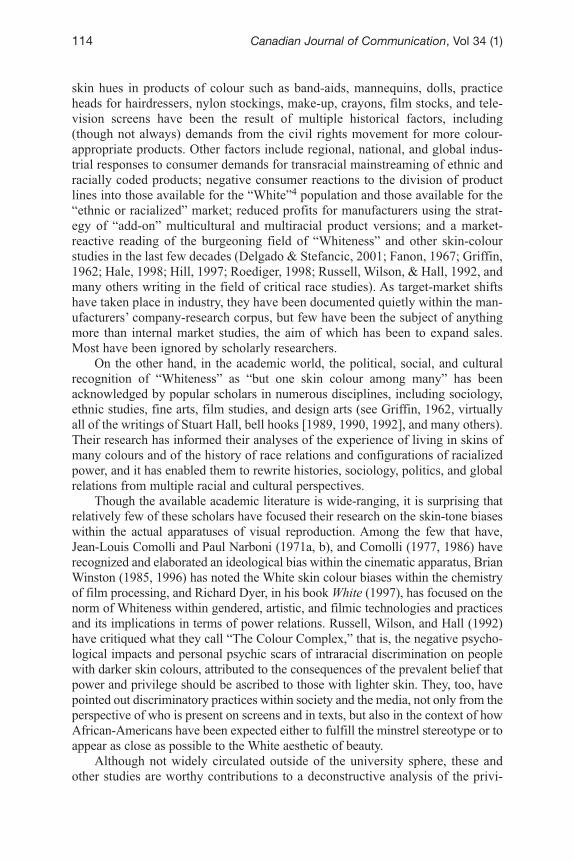
The colour-TV industry in North America also had its version of “Shirley” inthe form of a white porcelain “China Girl” in use until the 1950s, at which time itwas replaced by BBC cardboard flesh-tone cards especially designed for compat-ibility with National Television System Committee (NTSC) and Phase AlternatingLine (PAL) broadcast technologies(http://www.videointerchange.com/color_correction1.htm). The officialname for this flesh-tone reference card isBBC Chart 61P. It is used in conjunctionwith a chip chart in all NTSC broadcast-ing networks. For PAL-based technolo-gies, BBC Test Card F is used in over 30nations around the globe. It pictures thedaughter of its designer, George Herseeof the BBC.2 This girl-image does notdiffer much in the lightness of complex-ion or ethnic appearance3 from the otherShirley cards in circulation at photo labsat the time of its release.
Neither Toru Hasegawa nor “Shirley” (in any of her manifestations) wouldbe surprised to learn that relatively few scholarly studies have examined the tech-nological apparatus, the institutional structures and mechanisms that manufacturerepresentation itself, particularly with regard to the reproduction of skin tones.Nor, until very recently, have many mainstream North American–based manufac-turers of ordinary consumer items even attempted to replicate the colours of skinfor non-“Caucasians” in their product lines. Current, more inclusive arrays of
Roth / Looking at Shirley, the Ultimate Norm: Colour Balance 113
Figure 1Polaroid Shirley card (Printed with
permission of Polaroid)
Figure 2Traditional Kodak Shirley card
(Printed with permission of Kodak)
Figure 3BBC Flesh-tone Reference Chart.
(Photo credit: Lorna Roth)
skin hues in products of colour such as band-aids, mannequins, dolls, practiceheads for hairdressers, nylon stockings, make-up, crayons, film stocks, and tele-vision screens have been the result of multiple historical factors, including(though not always) demands from the civil rights movement for more colour-appropriate products. Other factors include regional, national, and global indus-trial responses to consumer demands for transracial mainstreaming of ethnic andracially coded products; negative consumer reactions to the division of productlines into those available for the “White”4 population and those available for the“ethnic or racialized” market; reduced profits for manufacturers using the strat-egy of “add-on” multicultural and multiracial product versions; and a market-reactive reading of the burgeoning field of “Whiteness” and other skin-colourstudies in the last few decades (Delgado & Stefancic, 2001; Fanon, 1967; Griffin,1962; Hale, 1998; Hill, 1997; Roediger, 1998; Russell, Wilson, & Hall, 1992, andmany others writing in the field of critical race studies). As target-market shiftshave taken place in industry, they have been documented quietly within the man-ufacturers’ company-research corpus, but few have been the subject of anythingmore than internal market studies, the aim of which has been to expand sales.Most have been ignored by scholarly researchers.
On the other hand, in the academic world, the political, social, and culturalrecognition of “Whiteness” as “but one skin colour among many” has beenacknowledged by popular scholars in numerous disciplines, including sociology,ethnic studies, fine arts, film studies, and design arts (see Griffin, 1962, virtuallyall of the writings of Stuart Hall, bell hooks [1989, 1990, 1992], and many others).Their research has informed their analyses of the experience of living in skins ofmany colours and of the history of race relations and configurations of racializedpower, and it has enabled them to rewrite histories, sociology, politics, and globalrelations from multiple racial and cultural perspectives.
Though the available academic literature is wide-ranging, it is surprising thatrelatively few of these scholars have focused their research on the skin-tone biaseswithin the actual apparatuses of visual reproduction. Among the few that have,Jean-Louis Comolli and Paul Narboni (1971a, b), and Comolli (1977, 1986) haverecognized and elaborated an ideological bias within the cinematic apparatus, BrianWinston (1985, 1996) has noted the White skin colour biases within the chemistryof film processing, and Richard Dyer, in his book White (1997), has focused on thenorm of Whiteness within gendered, artistic, and filmic technologies and practicesand its implications in terms of power relations. Russell, Wilson, and Hall (1992)have critiqued what they call “The Colour Complex,” that is, the negative psycho-logical impacts and personal psychic scars of intraracial discrimination on peoplewith darker skin colours, attributed to the consequences of the prevalent belief thatpower and privilege should be ascribed to those with lighter skin. They, too, havepointed out discriminatory practices within society and the media, not only from theperspective of who is present on screens and in texts, but also in the context of howAfrican-Americans have been expected either to fulfill the minstrel stereotype or toappear as close as possible to the White aesthetic of beauty.
Although not widely circulated outside of the university sphere, these andother studies are worthy contributions to a deconstructive analysis of the privi-
114 Canadian Journal of Communication, Vol 34 (1)
leged role that “Whiteness” has played in history, social and power relations,knowledge production/dissemination, and some aesthetic practices. However,none of the aforementioned scholars have extended their critique of privilege toexamine the degree to which industries of visual representation, including alter-native media (TV, video, film, photography), are responding to or ignoring pub-lic and economic pressures to colour-modify their technologies. Their theoreticalfocus tends to remain on representational codes constructed with(in) existingtechnologies.
Although I have researched multiple adjustments to flesh-tone-based colourproducts and technologies in the last decade, the core of my argument for thisarticle stems from the experience of chemical- and digital-based photographersand their subjects’ critiques. Central to this article is a series of Shirley imagesthat can be seen as emblematic of the state of race-relations/aesthetics in theindustries of visual representation and the gradual shifts in technology targeted atimproving the sensitivity of film emulsions and dynamic ranges (the differencebetween the lightest and the darkest of colours) in the digital media sphere. I aminterested in two levels of historical analysis in the domain of colour balancingimagery. The first is that of the technical challenges presented by the limitationswithin imaging technologies and the ways in which an ensemble of practicesemerged to address these deficiencies with reference to human skin tone repro-duction quality. These deficiencies include the difficulty of imaging high con-trasts in skin tones within the same screen shot—for example, a verydark-skinned person sitting next to a very pale-skinned person—and the lack ofestablishment and design of appropriate lighting and make-up for peoples ofdarker skin colours.
The lighting and make-up challenges have been tackled with a series ofcompensatory practices, which have addressed the issues with some level of suc-cess. The difficulty of colour balancing two extremely different skin tones in thesame screen or on paper has been less successful. As you shall see from thematerial I have gathered for this article, the process of recognizing this challengein 1959 and of informing a major film producer, Kodak, of the difficulty ofachieving high-quality photo prints with multiracial content precipitated alengthy socio-technical journey, which is not yet complete. In the digital cameraenvironment, Philips (now Thomson Multimedia Broadcast Solutions) in Breda,the Netherlands, took up this challenge in the 1990s with its television studiocameras and has probably made the most progress to date on extending thedynamic range of its cameras. Philips’ contribution to the solution of the contrastproblem will be elaborated upon in the latter half of this article.5
The second level of analysis is cultural and racial in origin. Between 1959and the present, there have been innumerable versions of Shirley as she hascrossed the decades, continents, and skin colour lines. In this article, images ofNorth American and Japanese Shirleys are seen as transforming to reflect the pre-vailing norms of skin colour beauty in the period in which the labs were usingthem. I shall argue here that the anthropological and sociological content of theseimages has always been emblematic of the period in which they were circulating.They reflect and reveal an order of domination and have had a social and psycho-
Roth / Looking at Shirley, the Ultimate Norm: Colour Balance 115
logical impact (Thierry Le Brun, Independent Cinematographer and Sociologist,Montreal, personal communication, January 7, 2009).
The relationship between the social and the technical in this story—how eachrandomly drove the other to redefine its object of interest—has been serendipi-tous. Although as a scholar, I would have preferred to have seen a patterned,ongoing attempt to improve skin rendition technologies by the various researchlabs, what history reveals instead is a random and messy search, based on ad hocfeedback from surprising publics. Peoples of colour, whose embodied imagerywould have benefited from a more sensitive chemical emulsion in the case of stillphotography and a more dynamic range in the case of digital technology, were notthe constituency group leading the visual engineers and scientists to furtherexplore the dynamic range of their company’s film products. In the second partof this article, the randomness of this effort will be revealed.
On a broader level, my reflections respond to the following key questions:What kinds of knowledge about human skin colour in the form of racializedimagery are manufacturers constructing and defending through the marketing oftheir “presumed innocent” products? What is the corporate stake in investing inor changing a colour aesthetic of Whiteness? What have been the precipitatingfactors that inspired companies to make recent skin colour modifications? Whereare skin colour adjustments in chemical and digital photography taking place?How have colour balance procedures evolved since the 1970s in the techniquesand social practices of photo cultures in North America and Japan? What are thelarger socio-political and economic implications of colour balancing products andprocedures?
About ShirleyShirley’s skin became an industry standard in North American photo labs thatwere dominated by male employees in the 1940s and 1950s. It is no surprise thenthat the person who was imaged on a Shirley card would have had a look and askin colour to conform to a popular masculinist notion of beauty, likely definedfrom a Western/European perspective. Alone or in groups, men wearing colouredshirts with similar skin-tone ranges and hair colours to those of female Shirleyscould have worked as effectively as a reference standard—especially if they hadhad beards or moustaches. These actually might have provided technicians withthe practice to deal more effectively with the contrast issue. Yet I have discoveredfew adult male reference images in my search through labs in the U.S., Canada,Britain, and Japan. The most gender-inclusive images I have found are those ofeither kids or brides and grooms used by Kodak in Japan and numerous compa-nies in North America.6 Consequently, at the very same time that technical andaesthetic decisions were being made by photo labs with regard to what consti-tuted a “beautiful” skin colour norm, there emerged a masculinist collection ofsexy female imagery to tinker with, pin up on lab walls, and use in the colour bal-ancing process. This gendered bias is likely to continue until male visual design-ers begin to unstick themselves from the very powerful patterns of social relationsinto which they have been conditioned or until more women enter the labs andtake on positions of power.
116 Canadian Journal of Communication, Vol 34 (1)
The disappearance of the “technological unconscious” (Vaccari, 1981)In the early histories of photo and television technologies, it was possible to con-sider their design and the ensemble of production techniques and methods sur-rounding them as ideologically neutral. Until about the mid-1960s, it was probablyassumed by most users that visual media were designed to “naturally” reproduceall skin tones equally well. As experience with the use of these photo technologiesexpanded to international markets, non-“Caucasian” communities identified short-comings and became more critical and questioning of their visual quality.Problems for the African-American community, for example, have included repro-duction of facial images without details, lighting challenges, and ashen-lookingfacial skin colours contrasted strikingly with the whites of eyes and teeth.
From a more technical perspective, evidence has been accumulating that thereason for these deficiencies is that film chemistry, photo lab procedures, videoscreen colour balancing practices, and digital cameras in general were originallydeveloped with a global assumption of “Whiteness” embedded within their archi-tectures and expected ensemble of practices. What had become a “White”-biasedinternational standard for the ideal flesh tone had been used as a barometer againstwhich the flesh tones of Blacks, Asians, First Peoples, and other “peoples ofcolour” had been read negatively as an aggravation—a deviation from this invisi-ble norm. This, along with cross-cultural skin-colour-preference tests conductedby film manufacturers such as Kodak and Fuji, had confirmed an internationalpreference for light complexions within the global consumer photo markets. Thevirtual public silence in Kodak’s and Fuji’s institutional discourses and profes-sional literature on alternatives to traditional ways of colour balancing analogueprints is the most concrete evidence we have of this institutional oversight andresistance to change.7
It was from within the broader social context of professional visual technol-ogy users that new practices emerged. These included special lighting methodsfor Black skin, as well as trial-and-error colour balance techniques to compensatefor the challenges of shooting and printing contrasting skin colours from withinthe same screen frame. Photographers of African-American and Asian subjects,who had developed methods for dealing with these “problems” independently,began to share their knowledge with each other and with the public some timearound the late 1950s, at around the same time Kodak was experiencing somecriticism of its photo emulsions regarding this very issue.
In what follows, I shall focus on the (inter)national driving forces that pro-voked Kodak, in particular, to rethink and redesign the range of its chemical rep-resentation of brown tones and to later multiracialize its Shirley card as a gestureof inclusiveness to its broadening consumer photo markets.
The colour adjustment process
The case of still photographyColour photography is not bound to be “faithful” to the natural world.Choices are made in the development and production of photographicmaterials. (Winston, 1996)
Roth / Looking at Shirley, the Ultimate Norm: Colour Balance 117
In the last decade, it has become clear to those who seek out this information thatthe chemistry for stock colour film for still cameras was designed originally witha positive bias toward “Caucasian” skin tones because of its high level of reflec-tivity (Personal interviews with multiple chemists and film designers at Kodak,Rochester, NY, 1995; Winston, 1985, 1996). This is not surprising, given that thedominant market in the early days of photography was perceived to be that of“Caucasians” by Kodak, the main film manufacturer in North America. This didnot have to be the case. Had NASA, the U.S. intelligence service, or meteorolog-ical scientists already completed their research on photography of low-light areasat the time of the popular development of still photography, the evolution of filmchemistry might have unfolded quite differently, as Brian Harris, lighting techni-cian at the Black Entertainment Television (BET) network, pointed out to me(Brian Harris, Lighting Engineer, Black Entertainment Television, Washington,DC, personal communication, July 3, 1997).
Film emulsions could have been designed initially with more sensitivity tothe continuum of yellow, brown, and reddishskin tones, but the design process would havehad to be motivated by a recognition of theneed for an extended dynamic range. At thetime film emulsions were developing, the tar-get consumer market would have been“Caucasians” in a segregated political scene;their skin tones would have been less likely tobe the basis for thinking about dynamicrange, because most subjects in a photographwould either have been all light-skinned or alldarker-skinned. Thus, this was not an elementof social consideration for film chemists. Itwas also believed at the time that physics wasphysics, chemistry was chemistry, and sci-ence was based on reasoned decisions with-out consideration of cultural or racialsubtleties. It is now becoming acknowledgedmore widely within the industry that refine-ments to the chemistry of film emulsionshave never been issues of physics or chem-istry exclusively, but have been the result ofcultural choices as well.
Five key issues were responsible for rais-ing the level of awareness of Kodak researchscientists and image technology developerswith regard to skin colour reproduction inNorth America and elsewhere. The first hadto do with the identification of problems inthe 50s, when their film was being used forschool graduation and class photos.
118 Canadian Journal of Communication, Vol 34 (1)
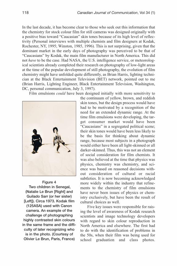
Figure 4Two children in Senegal,
(Natalie Le Brun [Right] andGuilado Sarr (or her sister)
[Left]). Circa 1973. Kodak film(125ASA) used with Canoncamera. An example of thechallenge of photographing
highly contrasted skin coloursin the same frame and the diffi-culty of later recognizing whois in the photo. (Courtesy of
Olivier Le Brun, Paris, France)
According to Jim Rice, the challenge became apparent only when students withcontrasting skin colours were to be photographed in the same image frame (JimRice, former Technical Sales Representative and Marketing Manager, Kodak, andcurrent McGee Endowed Professor, Rochester Institute of Technology,Rochester, NY, personal communication, August 18, 1995). When each studentwas photographed alone, differences in skin tones were easily accommodatedthrough compensatory lighting and a range of technical adjustments learnedthrough experience, but when a group portrait was set up and children of all racesand ethnicities were photographed together, these techniques could not resolvethe problem of the film bias in favour of “Caucasian” skin. Consequently, the pic-ture results showed details on the White children’s faces, but erased the contoursand particularities of the faces of children with darker skin, except for the whitesof their eyes and teeth. Parents complained about this situation and demanded awider continuum of darker skin tones.
Figure 4 is another example of this phenomenon. This photo of two childrenin Senegal in the early seventies demonstrates that even years after complaints ofuneven qualities apparent in images of dark and light skins, the issue remaineduncorrected.
Kodak’s drive to increase the dynamic range of its film products was moti-vated by two other (seemingly irrelevant) issues. These had to do with the pho-tography of brown objects. Here is Kathy Connor’s description of the experienceof Earl Kage, former head of the Color Photo Studio at Kodak Park in the 60s and70s, and former Manager of Kodak Research studios:
Well, he said that it was interesting, that in the mid-sixties and seventiesthere was a coincidental problem that the company was facing. Two oftheir biggest professional accounts were, he didn’t name the company,but somebody said that they made chocolate candies. . . . Apparently, inreproducing chocolate candies, Kodak was receiving complaints thatthey weren’t getting the right brown tones on the chocolates. Also, fur-niture manufacturers were complaining that stains and wood grains intheir advertisement photos were not true to life, and that they weren’tappropriate, so the chemists did some work on that. Earl also said to acertain extent, that research to improve those professional markets andaddressing their questions helped them to do a little bit better with eth-nic skin colours. I was amazed. (Kathy Connor, Executive, Kodak,Rochester, NY, personal communication, August 16, 1995)In his own words, Earl Kage remarked to me:In the 4 x 5, 5 x 7, or even 8 x 10 colour transparency area that manufac-turers of furniture were using to display their wares and to advertise theirfurniture for catalogues, they were having a good deal of difficulty indemonstrating the subtle differences of certain woods. Now, whether itwas maple vs. oak vs. a couple of dark woods, this couldn’t be distin-guished in the photographs. This was also about the same time that wegot some interesting observations from chocolate manufacturers who, indisplaying Whitman’s chocolate or whatever the names were in any case,the subtle variations between the dark and bittersweet and milk choco-
Roth / Looking at Shirley, the Ultimate Norm: Colour Balance 119
lates weren’t as discernible and so some modifications were tried andconsequently my little department became quite fat with chocolate,because what was in the front of the camera was consumed at the end ofthe shoot. (Earl Kage, former Manager, Kodak Research Studios,Rochester, NY, personal communication, August 21, 1995)It is indeed interesting that the improvement of dark skin colour reproduction
came about quite incidentally in this context, and Kage later admitted his ownsurprise at this submerged historical point. “Yes,” he noted, “it is fascinating thatthis has never been said before, because it was never Black flesh that wasaddressed as a serious problem that I knew of at the time” (Earl Kage, formerManager, Kodak Research Studios, Rochester, NY, personal communication,August 21, 1995). Other than parents complaining about graduation photos, Kagedid not recall pressures from the Black community to improve the image qualityof Kodak’s product. This is surprising in many ways. One would have thoughtthat during the height of the civil rights movement in the 1960s and 70s, attentionmight have been turned to Kodak to demand better recognition of the communi-ties’ skin specificities. There were some economic conflicts between Kodak andits labourers in the 60s, many of whom were African-Americans, but the qualityof the photo product was not contested in an organized manner by the Black com-munities, as far as I could discover. It is more likely that at the time, it wasassumed by the public that such things were based on science and could not bechanged, and so battles were fought on issues of economics, poverty, and othercivil rights matters that were of higher priority to the African-American andAfrican-Canadian communities.
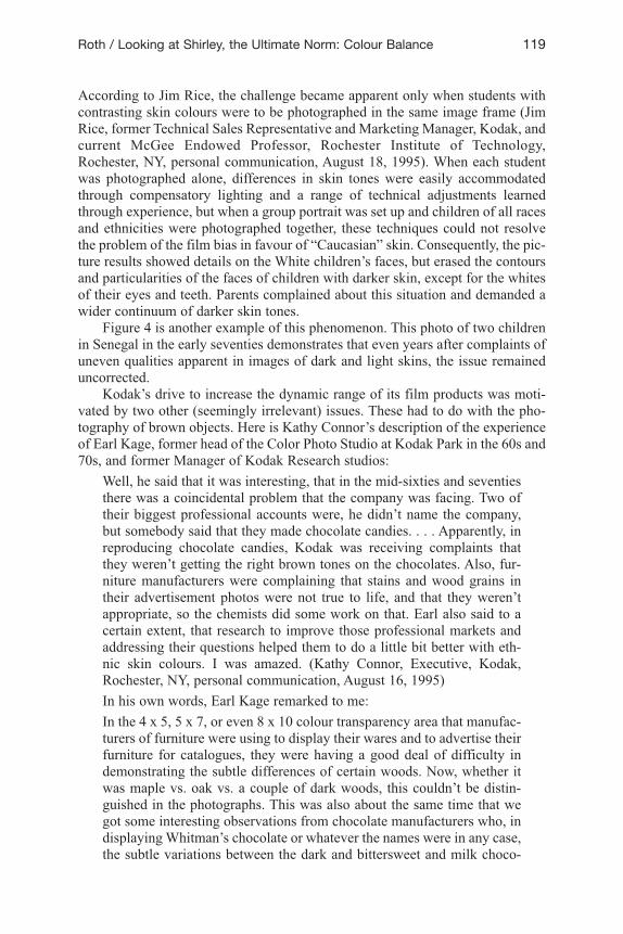
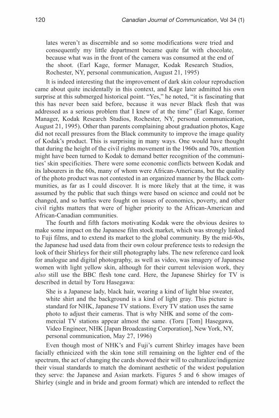
The fourth and fifth factors motivating Kodak were the obvious desires tomake some impact on the Japanese film stock market, which was strongly linkedto Fuji films, and to extend its market to the global community. By the mid-90s,the Japanese had used data from their own colour preference tests to redesign thelook of their Shirleys for their still photography labs. The new reference card lookfor analogue and digital photography, as well as video, was imagery of Japanesewomen with light yellow skin, although for their current television work, theyalso still use the BBC flesh tone card. Here, the Japanese Shirley for TV isdescribed in detail by Toru Hasegawa:
She is a Japanese lady, black hair, wearing a kind of light blue sweater,white shirt and the background is a kind of light gray. This picture isstandard for NHK, Japanese TV stations. Every TV station uses the samephoto to adjust their cameras. That is why NHK and some of the com-mercial TV stations appear almost the same. (Toru [Tom] Hasegawa,Video Engineer, NHK [Japan Broadcasting Corporation], New York, NY,personal communication, May 27, 1996)Even though most of NHK’s and Fuji’s current Shirley images have been
facially ethnicized with the skin tone still remaining on the lighter end of thespectrum, the act of changing the cards showed their will to culturalize/indigenizetheir visual standards to match the dominant aesthetic of the widest populationthey serve: the Japanese and Asian markets. Figures 5 and 6 show images ofShirley (single and in bride and groom format) which are intended to reflect the
120 Canadian Journal of Communication, Vol 34 (1)
ethnic majority and the preferred skin tones in two of the dominant Japaneseindustries of visual representation, that of Fuji Film and Kodak, Japan. Thesehave been widely circulating since the mid-nineties in Japan.
Ongoing international skin colour preference tests conducted by Kodak havealso generated much data useful in informing Kodak film chemists and “design-ers” of the skin colour biases preferred in different parts of the world. This infor-mation has shaped Kodak’s geography of emulsions, which conform to thesepreferences, rather than to considerations of exact reproduction. The industryterm used for this business choice is “optimum reproduction” (Winston, 1996).For this accommodation, film inventory is batched by region and distributed inaccordance with these researched preferences. Although there are no explicitsigns on Kodak’s film boxes of where each target market is located geographi-cally, the film is coded numerically to indicate countries or regions. So, for exam-ple, in 1996, several Kodak sources indicated the regional codes to be as follows:#1–U.S. & Canada; #2–Latin America, Central America, South America, andMexico; #3–Asia Pacific, China, and Japan (often treated as a separate entity);#4–Europe, Middle East, Africa, India.
Ongoing developmentsSkin-tone rendition was further clarified with Kodak’s VeriColor portrait filmseries, which has continued to expand its range of brown-ness and Black tones.VeriColor III, a professional portrait film developed in the early 80s by RichardWien and his team at Kodak Park, was particularly notable for its flexible accom-modation of a range of skin colours. Gold Max, a very popular consumer film,was also a leap forward in this regard from most previous films on the market: itwas referred to at Kodak initially as being able “to photograph the details of a
Roth / Looking at Shirley, the Ultimate Norm: Colour Balance 121
Figure 5Fuji’s mannequin Shirley
(Photo credit: Lorna Roth)
Figure 6Kodak Japan’s bride and groom card
(Photo credit: Lorna Roth)
dark horse in low light” (Richard Wien, Executive, Kodak, Rochester, NY, per-sonal communication, August 18, 1995). With my interest in the filming tech-niques applicable to darker skins, I take this to be a coded message, informing thepublic that this is “the right film for photographing ‘peoples of colour.’”
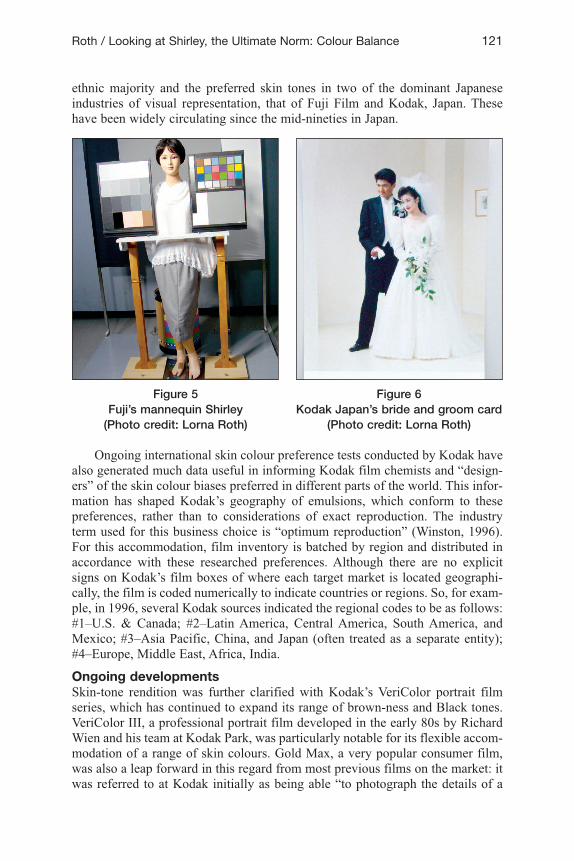
Finally, there have been some cultural changes over time to the Shirley normreference cards to make them more inclusive. From the single “Caucasian”woman surrounded by the necessary colour balancing information codes,Kodak’s Shirley has evolved into an image of three women with different skincolours, dressed fashionably in brightly contrasted clothing.
As seen in Figure 7, the women arevisibly of “Caucasian,” Asian, and Africandescent, though each of them has a fairlylight complexion. That being said, the useof this multiracial norm reference card bysome of the major photo-chemical labs isconcrete recognition that they are investedfinancially and intellectually in addressinga multiracial clientele and are no longerwilling to use trial-and-error techniques ona case-by-case basis to find the appropriatecolour balancing methods for processingimages of non-“Caucasians.” Some resist-ance to changing over to the multiracialreference is evident in the fact thatalthough it was designed in 1995, it stillsells at a rather high premium, and it took afew years to become available throughmajor photo lab suppliers. Consequently,many laboratories have still not switchedcards, and it has not yet penetrated the
global market. Ironically, at about the same time as the multinational film stockcompanies began to recognize the diversity of skin tones within their Shirleyimagery, it became a lot easier to design one’s own norm reference images digi-tally, so it is no longer as invaluable a product as it once was.
Whether the decision to stick with the traditional image in North Americananalogue photo labs is based on financial or sociocultural considerations wouldrequire more corporate lab research and analysis. This might be important socio-cultural research, as it would provide us with a concrete barometer reading as tohow racially marked issues are being treated in the current daily practices ofNorth American photo laboratories.
How does Shirley fare in the digital media sphere?In the digital media sphere of the Internet, there are many Shirley cards circulat-ing. One such digital card, which reinforces the common, almost universal pref-erence for light skin as an international photo standard, is DuPont’s DigitalWaterProof image of a Black female with a very light complexion who parallelsthe existing “Caucasian” Shirley prototypes. She is seen beside narrow stripes
122 Canadian Journal of Communication, Vol 34 (1)
Figure 7 Kodak’s multiracial Shirley card –
North America (Printed with permission of Kodak)
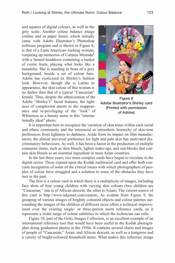
and squares of digital colours, as well as thegrey scale. Another colour balance image(online and in paper form), which initiallycame with Adobe Illustrator’s Photoshopsoftware program and is shown in Figure 8,is that of a Latin American–looking woman,conjuring up memories of Carmen Miranda8
with a fanned headdress containing a basketof exotic fruits, playing what looks like amandolin. She is standing in front of a greybackground, beside a set of colour bars.Adobe has exoticized its Shirley’s fashionlook. However, though she is Latino inappearance, the skin colour of this woman isno darker than that of a typical “Caucasian”female. Thus, despite the ethnicization of theAdobe “Shirley’s” facial features, the light-ness of complexion attests to the reappear-ance and re-privileging of the “look” ofWhiteness as a beauty norm in this “interna-tionally ideal” photo.
It is important here to recognize the variation of skin tones within each racialand ethnic community and the intraracial or intraethnic hierarchy of skin-tonepreferences from lightness to darkness. Aside from its impact on film manufac-turers, the almost universal preference for light and pale skin has motivated dis-criminatory behaviours. As well, it has been a factor in the production of multipleconsumer items, such as skin bleach, lighter make-ups, and sun-blocks that con-tain skin bleach as an essential ingredient in most Asian countries.
In the last three years, two more complex cards have begun to circulate in thedigital sector. These expand upon the Kodak multiracial card and offer both con-crete recognition of some of the critical issues with which photographers of peo-ples of colour have struggled and a solution to some of the obstacles they havemet in the past.
The first is a colour card in which there is a multiplicity of images, includingface shots of four young children with varying skin colours (two children are“Caucasian,” one is of African descent, the other is Asian). The current source ofthis card is http://www.inkjetart.com/custom. As evident from Figure 9, thegrouping of various images of brightly coloured objects and colour palettes sur-rounding the images of the children of different races offers a technical improve-ment over the existing single- or three-person norm reference cards, as itrepresents a wider range of colour subtleties to which the technician can refer.
Figure 10, part of the Getty Images Collection, is an excellent example of aninternational reference tool that would have been useful to the Kodak photogra-pher doing graduation photos in the 1950s. It contains several charts and imagesof people of “Caucasian,” Asian, and African descent, as well as a kangaroo anda variety of bright-coloured household items. What makes this reference image
Roth / Looking at Shirley, the Ultimate Norm: Colour Balance 123
Figure 8Adobe Illustrator’s Shirley card
(Printed with permission of Adobe)
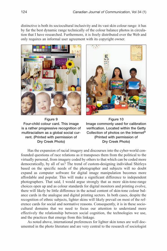
distinctive is both its sociocultural inclusivity and its vast skin colour range: it hasby far the best dynamic range technically of the colour balance photos in circula-tion that I have researched. Furthermore, it is freely distributed over the Web andonly requires an informal user agreement with its copyright owner.
Has the expansion of racial imagery and discourses into the cyber-world con-founded questions of race relations as it transposes them from the political to thevirtually personal, from imagery coded by others to that which can be coded moredemocratically, by all of us? The trend of custom-designing individual Shirleysbased on the specific needs of the photographer and subjects will no doubtexpand as computer software for digital image manipulation becomes moreaffordable and popular. This will make a significant difference to independentphotographers. That said, I would argue strongly that as more skin-tone-rangechoices open up and as colour standards for digital monitors and printing evolve,there will likely be little difference in the actual content of skin-tone colour bal-ance cards in the analogue and digital printing sectors. In both cases, despite therecognition of ethnic subjects, lighter skins will likely prevail on most of the ref-erence cards for social and normative reasons. Consequently, it is in these socio-cultural domains that we need to focus our attention to understand moreeffectively the relationship between social cognition, the technologies we use,and the practices that emerge from this linkage.
As noted above, international preferences for lighter skin tones are well doc-umented in the photo literature and are very central to the research of sociologist
124 Canadian Journal of Communication, Vol 34 (1)
Figure 9Four-child colour card. This image
is a rather progressive recognition ofmultiracialism as a global social cur-
rent. (Printed with permission of Dry Creek Photo)
Figure 10 Image commonly used for calibrationverification. Located within the GettyCollection of photos on the Internet9
(Printed with permission of Dry Creek Photo)
Ron Hall (1994), who is responsible for inventing the term “the bleaching syn-drome.” As he used it originally, this referred to the internalizing of light skin asa dominant cultural criterion of beauty and “as the ideal point of reference for fullassimilation into American society” (Hall, 1995, p. 172). Since his early casestudies in 1994, Hall has replicated his research around the world and has con-cluded that the attraction to lighter skins is almost universal in scope. His researchresults concur with that done by film manufacturers, to which I have alreadyalluded, as well as with the famous doll study by Kenneth Clark (1955) that wasundertaken in the 1940s to assess the psychological effects of segregation onBlack children. In Clark’s study, Black children were asked to identify the pre-ferred skin colour of their favourite dolls and almost all chose the lighter-skinnedones, stating that they were prettier and better, while the Black-skinned dolls wereconsidered bad and ugly.
Cultural reasons for this attitude differ. They include socialization into thenorm of “lightness as beautiful” through literature, the media, and the dominantdiscourses of Western art and aesthetics; associative links among power, prestige,and light skin; historical intraracial discrimination between African-Americanslaves who worked indoors and those who worked the fields and were exposed tothe sun, with the former having more prestige; beauty products targeted to lighterskins, marketed in countries with large populations of Blacks; Asian women’sdislike of the sun, motivated by a desire to retain fair and pinkish skin; the cap-ture of a particular cosmetic market based on the strong desire of women tochange their skin’s look and their willingness to pay the material, physical, andpsychological costs for investing in a new and lighter embodied aesthetic; andconsumer acquiescence to marketing techniques of multinational producers of“skin lightening” products. Whatever the rationale, the sales profits made for skinbleach creams in Africa, Asia, and North and South America attest consistently tothis dominant aesthetic, despite “Black is beautiful” campaigns that appear to besuperficially successful.10
Neither Clark’s nor Hall’s work specifically addresses issues of photo tech-nologies in relation to light skins. It was never their consideration, but in takinga distant look at the social field and period (from the mid–twentieth century intothe twenty-first) in which they were conducting their research, I find that there isa strong correlation between the attitudinal spirit of the times and its intimate con-nection with the development of film emulsions that favoured White skins, light-skinned Shirley card content, and race relations/aesthetics as embedded withinthe images of these anonymous working women.
Whiteness challengedAs is apparent from these examples, my empirical case study research confirmsstrongly that in photographic industries of visual representation, a White, gen-dered reference point has been central to the thinking and decision-making aboutfilm design and practice. The evidence I have accumulated indicates that how oureveryday technologies and products function, and what they favour and ignore,has been coloured by the reference points, assumptions, and invisible norms ofthe cultural intermediaries involved in their design and marketing, most of whomhave been “Caucasian” men. This “flesh tone imperialism” (Thierry Le Brun,
Roth / Looking at Shirley, the Ultimate Norm: Colour Balance 125
Independent Cinematographer and Sociologist, Montreal, November 27, 2006)typifies an aspect of the technological unconscious—an apparent lack of aware-ness of the dominance of Whiteness in the cognitive patterns of those key peopleframing the tools of visual reproduction by decision and design. It informs us sig-nificantly of the need to recognize how deeply embedded in our cognitiveprocesses the naturalization of Whiteness and sexism remains.
If resistance to this bias is to be mobilized, and I want to argue that it can be,it follows that technologies, products of colour, and designers involved in theircreation can no longer be configured naively as neutral or innocent. On the otherhand, I do not want to take a conspiratorial perspective by arguing that designersset out deliberately to privilege Whiteness within their image technologies andensemble of photo practices. I prefer to take a more nuanced position by suggest-ing that technologists involved in the creation of a range of popular media andproducts have likely acquiesced to what Joyce E. King has called “dysconsciousracism” (King, 2001). This kind of racism “tacitly accepts dominant white normsand privileges. Dysconscious racism is not the absence of consciousness (that is,not unconsciousness) but an impaired consciousness or distorted way of thinkingabout race as compared to, for example, critical consciousness” (King, 2001,p. 295). It is much like an occasional, but passing, consciousness of the subtleracial implications embedded in practices, objects, institutions, and policies, andit represents “an uncritical habit of mind (including perceptions, attitudes,assumptions, and beliefs) that justifies inequity and exploitation by accepting theexisting order of things as given” (p. 296).
Dysconsciousness, in relation to race issues, is a semi-consciousness of boththe overt (open, explicit) and inferential (latent) aspects of racism, although ittends to operate more frequently in the context of the latter. By this, I mean thatit is linked to
those apparently naturalized representations of events and situationsrelating to race, whether “factual” or “fictional,” which have racist prem-ises and propositions inscribed in them as a set of unquestioned assump-tions. These enable racist statements to be formulated without everbringing into awareness the racist predicates on which the statements aregrounded. (Hall, 1990, p. 13)Seen in the context of Hall’s broader notion of ideology, dysconsciousness can
best be understood “in terms of structures, practices, and discourses and not as sim-ply something which emanates from certain individual human beings” (Hall, 1990,p. 7). In other words, it is symbolic of a set of complex, often contradictory, socialrelations and is best not considered as the personal inclinations of an individual,though that is where we most often see and hear its manifestation (Hall, 1990).
The invisibility and the silences about race and racisms in society becomemost apparent when a contrasting presence comes into our consciousness. It isthen that we realize our blind spots. Hall notes the difficulty of developing a the-ory and methodology that would teach us to attend not to what people say aboutrace, but rather to what we do not say about it (Hall, 1992). I would extend thisto attend to what is not visibly specified about race, such as the assumption of theWhiteness norm and the small shifts being undertaken quietly by corporations to
126 Canadian Journal of Communication, Vol 34 (1)
accommodate pressures to become more inclusive in their production processesand marketing practices. Although they appear to be insignificant initially, thesesilences and absences inform and frame our knowledge of race relations at thisstage of history. If a society is driven by representation, as Comolli suggests—that is, if the social machine manufactures representations—it also manufacturesitself from representations, the latter operative at once as means, matter, and con-dition of sociality (Comolli, 1977, 1986; Comolli & Narboni, 1971a, 1971b). We,as subjects, are formed through specific cultural and racial modes of visuality.
Pieterse (1992) argues that “the single most important feature of representa-tions of otherness is the role they play in establishing and maintaining socialinequality” (p. 234). If the histories of a variety of skin-tone technologies and prod-ucts make Pieterse’s point apparent, I believe that this state of affairs is attributablelargely to the absence of a technical foundation enabling the public developmentand dissemination of multicultural and multiracial images, representations, andproducts. My goal in this paper and in my current book project, Colour Balance:Race, Technologies, and “Intelligent Design,” is precisely this: to explore the his-tory and current possibilities for the foundations of a collective, anti-racist commonsense to guide the (re)design of our technologies and products of colour. In itself,this is not enough to provoke deep cognitive change, but as a complement to anti-racist institutional and legislative measures in democratic societies, it may stimu-late a revision of our existing technological infrastructure and practices. Studyingand challenging the back-room decision-making processes of technical enterprisesthat establish parity-impeding cultural norms may begin to address some of theissues that I am raising here (Fraser, 2000). Further, it may help to “de-institution-alize patterns of cultural value that impede parity of participation and to replacethem with patterns that foster it” (Fraser, 2000, p. 5).
Like Fraser, my work “focuses attention on the social arrangements wherethe barriers to participation are located, rather than restricting attention exclu-sively to the domain of cultural representation” (Fraser, 2000, p. 7).
Toward a theory of cognitive equityIt is clear that skin colour continues to matter universally. It matters in identityformation; it matters in politics; it matters in the everyday negotiations of institu-tional and social life. It is my contention that simply acknowledging racialminorities through multicultural legislation, policies, and practices is not enoughto instigate shifts in the sociocultural perceptions of the majority of people. WhatI am talking about here is a way of beginning to undo the psychological damageof exclusion (Fanon, 1967) at a very fundamental level and constructing a new oralternative set of body skin colour norms to represent images of success, belong-ing, and inclusivity.
Conceptually, I would like to introduce the notion of “cognitive equity”—that is, a new way of understanding racial equity issues that does not only revolvearound statistics, legislation, or access to institutions, but rather inscribes directlya vision of multicultural and multiracial equity into technologies, products, andemergent practices in their usage. This is a concept in progress, which I amexploring more deeply by examining the decision discourses around organiza-tional skin colour adjustments, industry policies, and racial minority–initiated
Roth / Looking at Shirley, the Ultimate Norm: Colour Balance 127

visual decolonization processes. Is there some sense of a drive toward cognitiveequity that is behind the colour adjustment process, or are corporations engagingin the exercise for the sake of appearing to be “politically correct,” as so much ofthe media coverage on these issues tends to focus on? For example, Binney &Smith kept sample videos of the media coverage when they launched their PeoplePack/Multination and Multicultural crayon and marker collections in the early1990s. Without exception, every media channel raised the notion and framed thestory as one of political correctness (Eric Zebley, Public Relations Co-ordinator,Binney & Smith, Easton, PA, personal communication, June 10, 1996).
The target of cognitive equity goes beyond political correctness and therepair mode of design, which encompasses “fitting or camoflaging” minoritiesinto already existing values of Whiteness, such as painting “Caucasion-featuredmannequins Black or Yellow to symbolically appear “ethnic.” However, unlikeaffirmative action and legislative tools, cognitive equity cannot be measured andcircumscribed in social science or statistical terms, because it cannot yet makecomparable claims for social justice.
Rather, I am conceiving of it as an enabling socialization process that firstaims to open up narrow and distorted cognitive associations around skin colourto close scrutiny. Second, the cognitive equity strategy would broaden and pub-licly recognize the range and subtleties of all skin colours by normalizing themwithin the context of an anti-racist commonsense knowledge framework reflectedwithin technlogies, ordinary products, education curriculum, and the media. Iwould suggest that this important cognitive shift has the potential to establishfacilitative conditions for the development of a more democratically and chro-matically pluralistic society.
I believe that the potential building blocks of cognitive equity will be locatedin small and subtle changes in our taken-for-granted perceptions and behaviours,resulting from an active demand for a wider range of socially imagined possibil-ities for inclusiveness. In the still photography case study presented here, visuallydistinguishing male and female models with a range of skin tones as a revisedinternational norm in the colour balance process might provoke a new way oflooking at and appreciating the beauty of flesh tone variations. In other words, Iam arguing that the range of skin tones should become the new internationalnorm. At a deeper cognitive level, this change would encourage the ideologicalrepositioning of the beauty, power, and privilege linkage that is biased towardWhiteness and “Caucasian-ness” to occupy only one space within the continuumof many skin colour and ethnocultural norms. The goal of cognitive equity mightalso stimulate our thinking about the (re)design process for technologies andproducts of colour. It could support the creation of an infinite array of visual pos-sibilities for the purposes of identification, self-representation, and participationin the production of a “colour balanced” world in which all skin colours couldmatter in more just and equitable terms.
It is at this foundational, conceptual level that I am focusing my thinking,because I believe it is here that we can begin to challenge the vestiges of our neo-colonial approach to visual representation and chip away at the remaining resist-ances to normative, institutional, and economic changes in the social and political
128 Canadian Journal of Communication, Vol 34 (1)
apparatus. Legislated principles of equality rights, complemented by cognitiveequity–based visual tools and products, could act as intelligent, but subtle, inter-ventions in the sociocultural, educational, and economic spheres. Not only couldcognitive equity–based visual tools support new conditions of possibility, guid-ing the (re)construction of a more equitable, colour balanced society, but theycould also claim the defining feature of “quality” as equal to diversity and adapt-ability. It seems to me that in our current sociocultural and political environment,in which diversity discourses are so predominant and in which flexibility ofthinking is so necessary, the production and marketing of visual tools that couldprovide us with a continuum of norms, and which in themselves promote an equi-table vision of racial and ethnic relations, would be a smart strategy of socialintervention that we cannot afford to bypass at this time.
Who has taken up (or will take up) this technical and cognitive design chal-lenge in the industries of visual representation?
The colour adjustment process
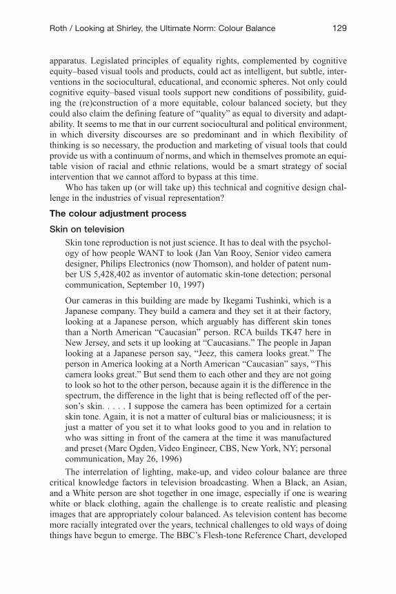
Skin on televisionSkin tone reproduction is not just science. It has to deal with the psychol-ogy of how people WANT to look (Jan Van Rooy, Senior video cameradesigner, Philips Electronics (now Thomson), and holder of patent num-ber US 5,428,402 as inventor of automatic skin-tone detection; personalcommunication, September 10, 1997)
Our cameras in this building are made by Ikegami Tushinki, which is aJapanese company. They build a camera and they set it at their factory,looking at a Japanese person, which arguably has different skin tonesthan a North American “Caucasian” person. RCA builds TK47 here inNew Jersey, and sets it up looking at “Caucasians.” The people in Japanlooking at a Japanese person say, “Jeez, this camera looks great.” Theperson in America looking at a North American “Caucasian” says, “Thiscamera looks great.” But send them to each other and they are not goingto look so hot to the other person, because again it is the difference in thespectrum, the difference in the light that is being reflected off of the per-son’s skin. . . . . I suppose the camera has been optimized for a certainskin tone. Again, it is not a matter of cultural bias or maliciousness; it isjust a matter of you set it to what looks good to you and in relation towho was sitting in front of the camera at the time it was manufacturedand preset (Marc Ogden, Video Engineer, CBS, New York, NY; personalcommunication, May 26, 1996)The interrelation of lighting, make-up, and video colour balance are three
critical knowledge factors in television broadcasting. When a Black, an Asian,and a White person are shot together in one image, especially if one is wearingwhite or black clothing, again the challenge is to create realistic and pleasingimages that are appropriately colour balanced. As television content has becomemore racially integrated over the years, technical challenges to old ways of doingthings have begun to emerge. The BBC’s Flesh-tone Reference Chart, developed
Roth / Looking at Shirley, the Ultimate Norm: Colour Balance 129
in England as a way of representing good light reflectance for “Caucasian” skin,is no longer acceptable as the only tool for colour balancing at networks such asBlack Entertainment Television or Univision (Hispanic television network in theU.S.) when it comes to calibration measurements for African-Americans,Hispanics, Asians, indigenous peoples, and those with darker skin colours. It con-tinues to be utilized in North America and Europe, however, because it is consid-ered a technical baseline marker for reflective skin tones and has somecomparative pertinence to other coloured skins due to the black hair of thewoman being in extreme contrast to her white skin.
When I spoke with video engineers at CBS and NBC in New York, I was toldthat the issues around colour balance are purely technical, based on physics, andinvolve the exact colour matching of reflective skins among several studio cam-eras. My questions about the international standard reference for colour balancebeing a “Caucasian” woman were taken seriously, but responded to with concernthat I might be leading them to the delicate territory of political correctness,where they did not want to go. To them, “physics is physics,” and they havelearned to manoeuvre the supplementary tools of colour balancing to meet theirneeds. If a Black person’s skin details do not show adequately, special make-upor lighting techniques are used to highlight their faces until their images are tech-nically pleasing to the eye. This is not always an easy task.
What follows is a short anecdote relayed to me by one of Philips’/Thomson’stop camera designers, illustrating that reliance on these auxiliary methods ofcolour balancing is not always the best route:
Without telling stories out of school, I know that when Whoopi Goldberghad her talk show, they had Sony BVP-90s and the camera that was onher was completely differently adjusted from the camera that was for theguest. Because of her skin darkness, it was very difficult for the camerato see her correctly, and they had to do all kinds of things to tweak itaround to make her image look right, but when they put that camera onthe other person, it looked horrible. I think she is almost at the extremelevel of darkness of black people. (Greg Pine, Camera Designer andCompany Philosopher, Philips Electronics, Breda, the Netherlands; per-sonal communication, September 10, 1997)Perhaps because they were situated at the margins of North American inter-
ests or due to their smaller institutional investment in traditional ways of doingthings, designers at Philips/Thomson headquartered in Breda, the Netherlands,could more easily respond to the evident challenges that the range of skin toneswas raising for American television practitioners. Here, cutting-edge video elec-tronics specialists were being given the financial and technical resources withwhich to create technologies that would solve problems related to transracial mar-keting. Greg Pine and Jan Van Rooy had been very conscious of skin colour overthe years. They are two video camera designers who began working at PhilipsElectronics in the late 80s and were important pioneers in thinking about andresponding to the challenging issues about which I am writing through theredesign of a set of studio cameras (the LDK series) that enabled more sensitiveconsideration of skin colour variations.
130 Canadian Journal of Communication, Vol 34 (1)
After becoming familiar with the Clark (1955) research on African-Americangirls’ preferences for dolls with lighter skin-tones, they began to recognize theinherent bias in the tools that they were using to represent flesh colours on tele-vision. Pine suggested that it might be interesting to develop two skin tone con-tour controls on a single camera, in respect of the fact that on many news shows,there are two anchors with different racial backgrounds. He and Van Rooy set outto consider conceptually and practically how they could address these challenges.Van Rooy, Senior Video Designer at the time, came up with a prototype camerain the early 90s, in which there were two separate memory settings and storageareas for skin-tones.
Without going into the technical specifications of the LDK studio cameraseries, which can be seen on the Web (Thomson Multimedia Broadcast Solutions,n.d.), suffice it to say that international minority communities expressed greatinterest in Philips’ cameras and have been using them whenever it is financiallypossible. In particular, Black Entertainment Television and other networks aroundthe world where producers and audiences are of mixed races appreciate the advan-tages this innovative camera with dual contours offers. Not only does the cameraallow the user to do two colour balance processes within the same frame, it alsohas electronic make-up tools for the two skin tones. Like current versions ofPhotoshop, the LDK series of cameras can erase age lines, wrinkles, and blemishesfrom a variety of skin-tones and is able to provide those being imaged with morepleasing and aesthetic views of themselves. Van Rooy holds the patent on the inte-gration of automatic skin-tone-detection technology and won an Emmy for it,along with Ikegami, which shared some of its development process in the earlynineties.11 He looks forward to therefinement and expansion of these twoseparate memory settings in the future.
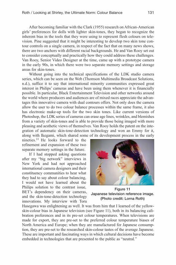
If I had stopped asking questionsafter my “big network” interviews inNew York and had not approachedinternational camera designers and theirconstituency communities to hear whatthey had to say about colour balancing,I would not have learned about thePhilips solution to the contrast issue,BET’s dependency on their cameras,and the skin-tone-detection technologyinnovations. My interview with ToruHasegawa was enlightening as well. It was from him that I learned of the yellow-skin-colour bias in Japanese television (see Figure 11), both in its balancing cali-bration preferences and in its pre-set colour temperatures. When televisions aremade for export, they are pre-set to the preferred colour temperature biases ofNorth America and Europe; when they are manufactured for Japanese consump-tion, they are pre-set to the researched skin-colour tastes of the average Japanese.These are important and fascinating ways in which cultural decisions have becomeembedded in technologies that are presented to the public as “neutral.”
Roth / Looking at Shirley, the Ultimate Norm: Colour Balance 131
Figure 11Japanese television reference image.
(Photo credit: Lorna Roth)
What my findings led me to was the deepening of the most important ques-tion driving my research about image technology design: is physics just physics,after all? And when will the mediation of cultural choices in the process of designbecome more explicitly acceptable on an international scale? Why do we con-tinue to mystify the conception and design of technologies and their ensemble ofcultural and racial practices around skin colour and the calibration process?
Concluding reflections: Beyond ShirleyWithin the digital marketplace, Philips/Thomson and Ikegami were the first in theindustry to risk large sums of investment capital in the recognition of a futuremultiracial market that will very likely expand over time as industrial globaliza-tion captures and maintains the norm in business practices. Other camera andphoto companies have followed suit and are now far more conscious of the needfor dynamic range in their cameras. The proliferation of multiracial Shirley cardsby Fuji, Kodak, and other suppliers of photographic apparatus parallel this recog-nition in their industries’ social field. The dual-skin-contour camera feature,which can colour balance two skin tones within the same image, comes closer toa technology that would enable cognitive equity than any other that I have seento date. This is more than an incremental step in opening up representational prac-tices to a form of inclusiveness that is designed into the technology itself; it is aleap forward, initiated quietly from outside of the mainstream geographies of thevisual industries. Typically, innovation has come from the margins.
Beyond the image industries, the multiracialization of other flesh toneobjects, such as the Crayola crayons’ multicultural collection, the ethnicizationof the common store mannequin and children’s dolls, the skin colour rangesnow available in hearing aids and other prosthetics, and the darkening of tonalranges available in the make-up industries, each contribute in their own smallway to the social and cultural possibilities of achieving cognitive equity some-time in the future. In addition to diversity studies and anti-racist education, pub-lic institutional changes based on equality rights legislation, cultural and racialinclusiveness within the industries of visual representation and journalism, aswell as the very recent (2008) sea change in American presidential politics, willthese technical shifts encourage the development of an unspoken but embeddedanti-racist common sense and consciousness? There are no guarantees.However, in contemplating the words of anthropologist Margaret Visser, “Theextent to which we take everyday objects for granted is the precise extent towhich they govern and inform our lives” (Visser, 1986), I would like to suggestthat the more open we become to new possibilities for racial inclusiveness incommonplace objects and technologies, the closer we will likely get to build-ing a next generation whose social and cultural cognitive processes will be mul-tiracial in scope and practice. Acknowledgment and explicit discussion aboutthe ethnocultural and racial choices we embed within our technologies, prod-ucts, and practices will, I hope, serve the purpose of raising our consciousnessabout how important it is to transform the way we think about, engage with, andact upon the “historical fixtures of our existence” (Walter Benjamin, as cited inKearney, 1994, p. 153).
132 Canadian Journal of Communication, Vol 34 (1)
AcknowledgmentsI would like to thank the following people for their invaluable support for thisproject: Thierry Le Brun for hours of stimulating discussion and feedback; DidierGiovannangeli for his critical eye and thoughtfulness in the feedback and editingprocess; Michael Lithgow for his persistence in getting permissions for publica-tion of the photos for this article; and all of the research assistants whose thor-ough and exploratory research made this work a much richer experience than itwould have been without them. In particular, these are Carole Leah Dawe,Christiana Abraham, Naomi Angel, Ricardo Andres Wicker, and Eloisa Aquino.To Richard Wien, Howard Kay, Alex Hoffard, Grant Bailey, and Jaleen Grove, Iam grateful for your contribution of colour cards to my search for the ultimatenorm. I would also like to note the valuable and thoughtful feedback I receivedfrom the anonymous readers to whom this paper was sent for peer review. Finally,I would like to acknowledge both Concordia University and SSHRC for theirgenerous support of the Colour Balance Project over the years.
Notes1. The term “Caucasian,” referring to the “White race” and coined in 1795 by Johann Friedrich
Blumenbach (1752–1840), an influential German scholar at the time, is a contested, troubling,and obsolete term of racial classification that is no longer recognized as having scientific validity(Painter, 2003). However, in the industries of visual representation, “White” people continue tobe called “Caucasian.” I apologize in advance to those who might be offended by the name, butI am using it to be consistent with the terminology still in active use in the industry. As anacknowledgment of the problematic aspect of this word, it (as well as the term non-“Caucasian”)is used within quotation marks throughout this paper.
2. For further information and to view several images of BBC calibration cards, see the followingURL: http://www.videointerchange.com/color_correction1.htm.
3. There is neither scholarly nor colloquial consensus on the popular meaning of terms like “ethnic,”“multicultural,” and “multiracial.” I use them in the following manner: Ethnicity is a category thatdescribes people: (a) who share a unique culture and who have undergone a common culturalsocialization in that mother culture; and (b) who identify with an ancestral group that has shareda distinct culture, but who have themselves often been brought up in or moved to another culture(Isajiw, 1979). When I refer to multicultural constituency groups, I am pointing to communitieswhose origins are from a broad range of countries, not the one in which they are dwelling cur-rently. They are often considered outsiders or “others” and fall under the rubric of national mul-ticultural policies and legislation targeting integration and inclusiveness within a culture that isnew to them. Multiracialism is similar to multiculturalism and refers to the factor that communitymembers’ skin colours are as diverse as their countries of origin. Multiculturalism policies cantherefore refer to an ethnically diverse society in which all members have similar skin colours,i.e., they appear to pass within the range of “Caucasian” skin tones. Multiracialism policies takediverse skin tones into account and make skin tone an apparent category of difference, as in theCanadian Broadcasting Act (Canada, 1991), for example.
4. Please note the complexity of the term “White” when referring to skin colour: it is a social con-struct. It often denotes a skin colour that can be a darker brown than a light Black skin tone; thus,it is important to recognize the breadth of its variation within ethnically and territorially definedgroups. (Here, I would like to thank one of the peer reviewers for emphasizing this point.)
5. At the time that these innovations and interviews took place, Thomson Multimedia BroadcastSolutions headquartered in Breda, the Netherlands, was called Philips. To be respectful of andconsistent with the historical period in which the design adjustments took place, I am choosing torefer to the company by its original name/Thomson, as in Philips/Thomson.
6. In the latter series of photo cards, the age-old contrast issue is yet again duplicated with the blacktuxedo against a white shirt and the white wedding gown against a contrasting background.
7. Kodak and Fuji are being used here as examples. I do not wish to imply that alternative film emul-sion companies, such as Ilford and Agfa, among others, did anything differently in this regard.
Roth / Looking at Shirley, the Ultimate Norm: Colour Balance 133
8. Carmen Miranda (1909–1955) was a Portuguese-born Brazilian singer who became famous forperforming while wearing a tropical fruit–laden hat. Her iconic image became associated with theUnited Fruit Company and the “Good Neighbor” policy of the U.S. in the 1930s. Images ofCarmen Miranda can be found on Google Images. http://images.google.ca/images?gbv=2&hl=en&q=carmen+miranda&btnG=Search+Images (Viewed on February 27, 2009).
9. The Getty test image is found on the Web under “printer test images” on the following page:http://www.drycreekphoto.com/tools/index.html. You will find it in the JPEG format (3 MB) twothirds of the way down the page after you click Color Management Tools and Utilities.
10. The exception to Hall’s findings is in the attraction of some “Caucasians” to the tanning processin all of its manifestations, from sun-bathing (despite knowledge of its correlation to skin cancer)to the popularity of tanning salons and sprays. There is an abundance of information about thisphenomenon on the Web.
11. van Rooy (2004) has stated: “Just for the record: The Emmy for skin tone contours was sharedbetween Philips and Ikegami. I am the inventor of automatic skin tone detection (pat nr US5,428,402) that was the basis of our Emmy. But the original inventor of skin contours wasMr. Hunt of RCA, I think in 1984 (US 4,506,293). Actually he deserves the Emmy for the origi-nal idea. We, Ikegami and Philips, got it for the implementation.”
Personal InterviewsConnor, Kathy. (1995, August 16). Executive. Kodak. Rochester, NY. Harris, Brian. (1997, July 3). Lighting engineer for Black Entertainment Television.
Washington, D.C.Hasegawa, Toru (Tom). (1996, May 27. Video engineer from NHK, National Broadcasting
System, Japan. New York City, NY.Kage, Earl. (1995, August 21). Former Manager of Kodak Research Studios. Rochester,
NY.Kassoff, Jan (1994, November 20). NBC Cameraman. New York, NY.Le Brun, Thierry. (2006, November 27; 2009 January 7). Independent cinematographer
and sociologist. Montreal, QC.Ogden, Marc. (1996, May 26). CBS video engineer. Rochester, NY. Pine, Greg. (1997, September 10). Camera designer and company philosopher. Philips
Electronics (now Thomson). Breda, the Netherlands.Rice, Jim. (1995, August 18). Former Technical Sales Representative and Marketing
Manager of Kodak, and McGee Endowed Professor at Rochester Institute ofTechnology. Rochester, NY.
Wien, Richard. (1995, August 18). Executive, Kodak. Rochester, NY. van Rooy, Jan. (1997, September 10). Senior video camera designer, Philips Electronics
(now Thomson). Breda, the Netherlands. Zebley, Eric. (1996, June 10). Public Relations Co-ordinator at Binney & Smith (makers
of Crayola products). Easton, PA.
Telephone InterviewHoffard, Alex. (2006, April 7). Independent Photographer. Hong Kong.
Test-Card ImagesBBC test card samples for video color correction. URL: http://www.videointerchange.com
/color_correction1.htm [January 15, 2009].Four-child colour card. URL: http://www.inkjetart.com/custom [January 15, 2009].
134 Canadian Journal of Communication, Vol 34 (1)
Dry Creek Getty test image. URL: http://www.drycreekphoto.com/tools/index.html[January 15, 2009]. [Getty Images: http://legacycreative.gettyimages.com/en-us/marketing/services/Getty_Images_Test_Image.jpg].
References Canada. (1991, June 4). Broadcasting Act, 1991, c. 11, B-9.01.Clark, Kenneth. (1955). Prejudice and your child. Boston, MA: Beacon Press.Comolli, Jean-Louis. (1977). Technique and ideology: Camera, perspective, depth of field.
In P. Erens & B. Horrigan (Eds.), Film reader 2 (pp. 128-140). Evanston, IL:Northwestern University.
Comolli, Jean-Louis. (1986). Technique and ideology: Camera, perspective, depth of field(Parts 3 & 4). In P. Rosen (Ed.), Narrative, apparatus, ideology: A film theoryreader (Diana Matias, Trans.), (pp. 421-443). New York, NY: ColumbiaUniversity Press. (Revisions in translation by Marcia Butzel & Philip Rosen)
Comolli, Jean-Louis, & Narboni, Jean. (1971a). Cinema/ideology/criticism (SusanBennett, Trans.). Screen, 12(1), 27-36.
Comolli, Jean-Louis, & Narboni, Jean. (1971b). Cinema/ideology/criticism (2) (SusanBennett, Trans.). Screen, 12, 145-155.
Delgado, Richard, & Stefancic, Jean. (2001). Critical race theory: An introduction. NewYork, NY: New York University Press.
Dyer, Richard. (1997). White. London: Routledge Press. Fanon, Frantz. (1967). Black skin, white masks. New York, NY: Grove Press.Fraser, Nancy. (2000, May-June). Rethinking recognition. New Left Review, 3. URL:
http://www.newleftreview.org/?view=2248 [January 15, 2009].Griffin, John Howard. (1962). Black Like Me. New York: A Signet BookHale, Grace Elizabeth. (1998). Making Whiteness: The Culture of Segregation in the
South, 1890 – 1940. New York: Vintage Books.Hall, Ron E. (1994). The bleaching syndrome: Implications of light skin for Hispanic
American assimilation. Hispanic Journal of Behavioral Sciences, 16(3), 405-418.Hall, Ron E. (1995). The bleaching syndrome: African Americans’ response to cultural
domination vis-à-vis skin color. Journal of Black Studies, 26(2), 172-184.Hall, Stuart. (1990). The whites of their eyes: Racist ideologies and the media. In M.
Alvarado & J. O. Thompson (Eds.), The media reader, (pp. 7 – 23. London, UK:British Film Institute.
Hall, Stuart. (1992). Race, culture, and communications: Looking backward and forwardat cultural studies. Rethinking MARXISM, 5(1), 10-18.
Hill, Mike. (Ed.). 1997. Whiteness – A Critical Reader. New York: New York UniversityPress.
hooks, bell. 1989. Talking Back: Thinking Feminist, Thinking Black. 1st ed. Toronto:Between the Lines.
hooks, bell. 1990. Yearning: Race, Class and Cultural Politics. 1st ed. Toronto: Between-the-Lines.
hooks, bell. 1992. Black Looks: Race and Representation. Boston: South End Press.hooks, bell. 1996. Reel to Real: Race, Sex, and Class at the Movies. New York: Routledge.Isajiw, Wsevolod W. (1979). Definitions of ethnicity. Toronto, ON: The Multicultural
History Society of Ontario.
Roth / Looking at Shirley, the Ultimate Norm: Colour Balance 135
Kearney, Richard. (1994). Walter Benjamin. In Modern movements in European philoso-phy: Phenomenology, critical theory, structuralism (pp. 151-168). Manchester,UK: Manchester University Press,.
King, Joyce E. (2001). Dysconscious racism: Ideology, identity, and the miseducation ofteachers. In E. Cashmore & J. Jennings (Eds.), Racism: Essential readings(pp. 295-303). London, UK: Sage Publications.
Painter, Nell Irvin. (November 7-8, 2003). Why White people are called “Caucasian?”Subsection of collective degradation: Slavery and the construction of race. InProceedings of the fifth annual Gilder Lehrman Center international conference atYale University (pp. 1-37). New Haven, CT. URL: http://www.yale.edu/glc/events/race/Painter.pdf.
Pieterse, Jan Nederveen. (1992). White on black: Images of Africa and Blacks in westernpopular culture. New Haven, CT: Yale University Press.
Roediger, David R. (Ed.). 1998. Black on white: Black writers on what it means to bewhite. New York: Schocken Books.
Russell, Kathy, Midge Wilson and Ronald Hall. 1992. The colour complex: The politics ofskin colour among African Americans. New York: Doubleday.
Thomson Multimedia Broadcast Solutions. (n.d.). LDK 20 television camera series speci-fications. URL: http://www.thomsongrassvalley.com/docs/Brochures/cameras/ldk20/3122-787-33900.pdf [January 15, 2009].
Vaccari, Franco. (1981). La photographie et l’inconscient technologique. Paris, France:Créatis.
van Rooy, Jan. (2004, May 14). F-900 skin detail adjustment advice [Discussion boardstatement]. URL: http://www.cinematography.net/edited-pages/%5Bcml-hdtv%5D%20F-900%20skin%20detail%20adjustment%20advice.htm [January 15,2009].
Visser, Margaret. (1986). Much depends on dinner. Toronto, ON: McClelland & Stewart.Winston, Brian. (1985). A whole technology of dyeing: A note on ideology and the appa-
ratus of the chromatic moving image. Daedalus, 114(4), 105-123.Winston, Brian. (1996). Technologies of seeing: Photography, cinematography and televi-
sion. London, UK: British Film Institute (BFI Publishing).
136 Canadian Journal of Communication, Vol 34 (1)