Embed Size (px)
Citation preview


Lean Six Sigma Using SigmaXL
and Minitab

ABOUT THE AUTHORS
ISSA BASS is a Master Black Belt and senior consultant with Manor House and Associates. He is the founding editor of SixSigmaFirst.com. Bass has extensive experience in qual-ity and operations management, and is the author of SixSigma Statistics with Minitab and Excel.
BARBARA LAWTON, Ph.D., is a Six Sigma Black Belt and has been improving manufacturing processes using Lean tech-niques and Six Sigma for more than 15 years, in various industries on three continents. Dr. Lawton specializes in data analysis, and is a keen experimentalist and problem solver, using a wide range of statistical tools. She currently works for one of the world’s leading aerospace organizations in the UK.
Lean Six SigmaUsing SigmaXL
and Minitab
Issa Bass
Barbara Lawton, Ph.D.
New York Chicago San Francisco Lisbon London Madrid Mexico City Milan New Delhi San Juan Seoul
Singapore Sydney Toronto

Copyright © 2009 by The McGraw-Hill Companies, Inc. All rights reserved. Except as permitted under the United States CopyrightAct of 1976, no part of this publication may be reproduced or distributed in any form or by any means, or stored in a database orretrieval system, without the prior written permission of the publisher.
ISBN: 978-0-07-162621-7
MHID: 0-07-162621-2
The material in this eBook also appears in the print version of this title: ISBN: 978-0-07-162130-4, MHID: 0-07-162130-X.
All trademarks are trademarks of their respective owners. Rather than put a trademark symbol after every occurrence of a trademarked name, we use names in an editorial fashion only, and to the benefit of the trademark owner, with no intention of infringement of the trademark. Where such designations appear in this book, they have been printed with initial caps.
McGraw-Hill eBooks are available at special quantity discounts to use as premiums and sales promotions, or for use in corporatetraining programs. To contact a representative please visit the Contact Us page at www.mhprofessional.com.
Information contained in this work has been obtained by The McGraw-Hill Companies, Inc.(“McGraw-Hill”) from sources believedto be reliable. However, neither McGraw-Hill nor its authors guarantee the accuracy or completeness of any information publishedherein, and neither McGraw-Hill nor its authors shall be responsible for any errors, omissions, or damages arising out of use of thisinformation. This work is published with the understanding that McGraw-Hill and its authors are supplying information but are notattempting to render engineering or other professional services. If such services are required, the assistance of an appropriate professional should be sought.
TERMS OF USE
This is a copyrighted work and The McGraw-Hill Companies, Inc. (“McGraw-Hill”) and its licensors reserve all rights in and to thework. Use of this work is subject to these terms. Except as permitted under the Copyright Act of 1976 and the right to store andretrieve one copy of the work, you may not decompile, disassemble, reverse engineer, reproduce, modify, create derivative worksbased upon, transmit, distribute, disseminate, sell, publish or sublicense the work or any part of it without McGraw-Hill’s prior con-sent. You may use the work for your own noncommercial and personal use; any other use of the work is strictly prohibited. Your rightto use the work may be terminated if you fail to comply with these terms.
THE WORK IS PROVIDED “AS IS.” McGRAW-HILL AND ITS LICENSORS MAKE NO GUARANTEES OR WARRANTIESAS TO THE ACCURACY, ADEQUACY OR COMPLETENESS OF OR RESULTS TO BE OBTAINED FROM USING THEWORK, INCLUDING ANY INFORMATION THAT CAN BE ACCESSED THROUGH THE WORK VIA HYPERLINK OR OTH-ERWISE, AND EXPRESSLY DISCLAIM ANY WARRANTY, EXPRESS OR IMPLIED, INCLUDING BUT NOT LIMITED TOIMPLIED WARRANTIES OF MERCHANTABILITY OR FITNESS FOR A PARTICULAR PURPOSE. McGraw-Hill and itslicensors do not warrant or guarantee that the functions contained in the work will meet your requirements or that its operation willbe uninterrupted or error free. Neither McGraw-Hill nor its licensors shall be liable to you or anyone else for any inaccuracy, erroror omission, regardless of cause, in the work or for any damages resulting therefrom. McGraw-Hill has no responsibility for the con-tent of any information accessed through the work. Under no circumstances shall McGraw-Hill and/or its licensors be liable for anyindirect, incidental, special, punitive, consequential or similar damages that result from the use of or inability to use the work, evenif any of them has been advised of the possibility of such damages. This limitation of liability shall apply to any claim or cause whatsoever whether such claim or cause arises in contract, tort or otherwise.

To my mother Dema Diallo and my pretty niece Sira Basse
—Issa Bass
To my brother Peter and my late parents, Barbara and Derek. To Professor Ron Pethig, Russel Johnson and Dr. Harry Watts for support and driving me toward a successful career. To Issa Bass who has sent me on a new journey. Finally, to Derek Richards, who taught me the mathematical foundation that has led to a successful engineering career. Thank you.
—Dr. Barbara Lawton

This page intentionally left blank
vii
Contents
Preface xiiiAcknowledgments xv
Introduction 1
An Overview of SigmaXL 3
SigmaXL menu bar 3SigmaXL templates 5Solution 6
Chapter 1. Defi ne 9
Project Planning 9The Gantt chart 10Program evaluation and review technique (PERT) 13
Project Charter 15Project number 16Project champion 16Project defi nition 16Project description 17Value statement 17Stakeholders 17Project monitoring 17Scheduling 17Alternative plans 17Risk analysis 17
Capturing the Voice of the Customer 17Capturing the voice of the external customer 19Capturing the voice of the internal customer 21Capturing the voice of the customers of a project 21Capturing the voice of the next step in the process 21
Critical-to-Quality Tree 22Kano analysis 24
Suppliers-Input-Process-Output-Customers (SIPOC) 26
Cost of Quality 29Assessing the cost of quality 29Cost of conformance 30Preventive cost 30Appraisal cost 31Cost of nonconformance 31Internal failure 31External failure 31
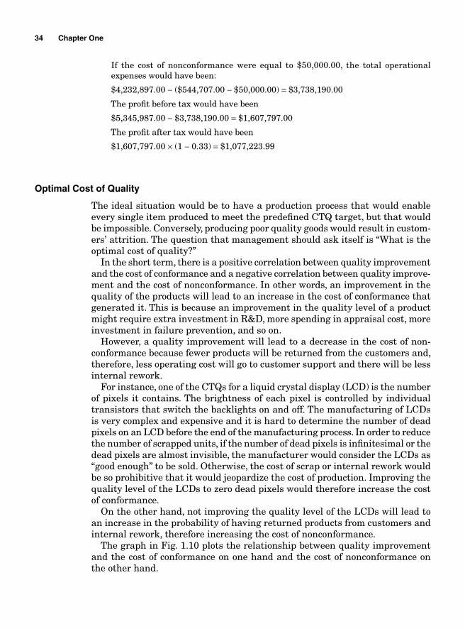
Optimal Cost of Quality 34Cost of Quality According to Taguchi 36Stakeholder Analysis 38
Force fi eld analysis (FFA) 39
Chapter 2. Measure 43
Data Gathering 43Data Types 43
Attribute data 44Variable data 44Locational data 44
Basic Probability 44So what is probability? 44Discrete versus continuous distributions 44Expected value, variance, and standard deviation of discrete distribution 45Discrete probability distributions 47Approximating binomial problems by Poisson distribution 56Continuous distribution 56Z transformation 58
Planning for Sampling 66Random Sampling versus Nonrandom Sampling 67
Random sampling 67Nonrandom sampling 68Nonsampling errors 68Sampling error 68
Central Limit Theorem 69
Sampling distribution of the mean X 70Estimating the population mean with large sample sizes 71Estimating the population mean with small sample sizes and r unknown t-distribution 74b 2 Distribution 77Estimating sample sizes 80Sample size when estimating the mean 81
Measurement Systems Analysis 82Precision and Accuracy 86
Measurement errors due to precision 86Variations due to accuracy 93Gauge bias 94Gauge linearity 96
viii Contents
Contents ix
Attribute Gauge Study 100Assessing a Processes Ability to Meet Customers’ Expectations—Process Capability Analysis 103Process Capabilities with Normal Data 106Estimating Sigma 106
Short-term sigma 106Long-term sigma 107
Potential Capabilities 107Short-term potential capabilities, Cp and Cr 107Long-term potential performance 109Actual capabilities 109Capability indices and parts per million 111Process capability and Z transformation 111Minitab output 115Taguchi’s capability indices CPM and PPM 116
Process Capability Analysis with Nonnormal Data 121Normality Assumption and Box-Cox Transformation 122Process Capability Using Box-Cox Transformation 123Process Capability Using Nonnormal Distribution 128Lean Six Sigma Metrics 130
Six Sigma metrics 131First time yield (FTY) 133Lean metrics 134
Work in Progress (WIP) 141
Chapter 3. Analyze 143
Brainstorming 143Nominal Group Process 143Affi nity Diagram 144Cause-and-Effect Analysis 146Pareto Analysis 149
Using Minitab 152Fault Tree Analysis 152Seven Types of Waste 154
Overproduction 156Wait 157Unnecessary inventory 158Motion 158Unnecessary transportation 158Inappropriate processing 159Product defects 159
Lean Approach to Waste Reduction 159Cycle Time Reduction 161
Takt time 162Batch versus one-piece fl ow 164
Data Gathering and Process Improvement 165Value stream mapping 166How to map your value stream 167
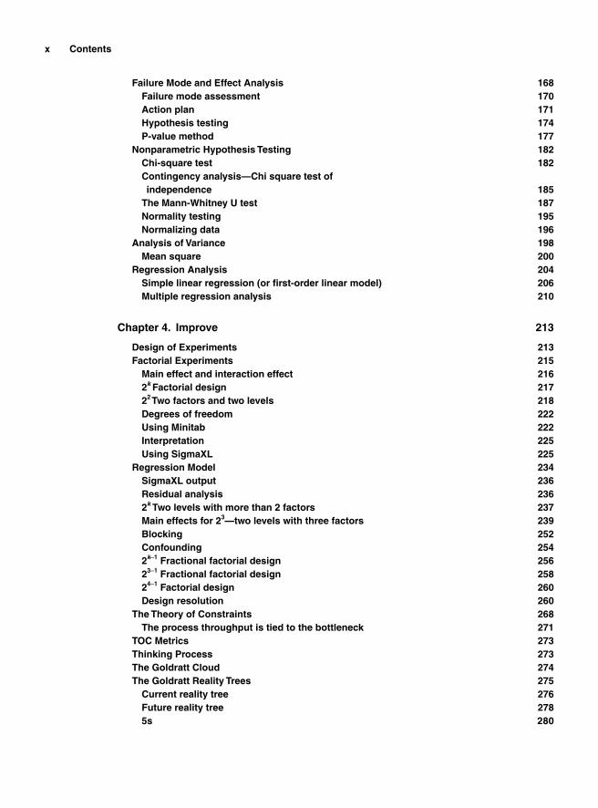
x Contents
Failure Mode and Effect Analysis 168Failure mode assessment 170Action plan 171Hypothesis testing 174P-value method 177
Nonparametric Hypothesis Testing 182Chi-square test 182Contingency analysis—Chi square test of independence 185The Mann-Whitney U test 187Normality testing 195Normalizing data 196
Analysis of Variance 198Mean square 200
Regression Analysis 204Simple linear regression (or fi rst-order linear model) 206Multiple regression analysis 210
Chapter 4. Improve 213
Design of Experiments 213Factorial Experiments 215
Main effect and interaction effect 2162k Factorial design 21722 Two factors and two levels 218Degrees of freedom 222Using Minitab 222Interpretation 225Using SigmaXL 225
Regression Model 234SigmaXL output 236Residual analysis 2362k Two levels with more than 2 factors 237Main effects for 23—two levels with three factors 239Blocking 252Confounding 2542k-1 Fractional factorial design 25623-1 Fractional factorial design 25824-1 Factorial design 260Design resolution 260
The Theory of Constraints 268The process throughput is tied to the bottleneck 271
TOC Metrics 273Thinking Process 273The Goldratt Cloud 274The Goldratt Reality Trees 275
Current reality tree 276Future reality tree 2785s 280
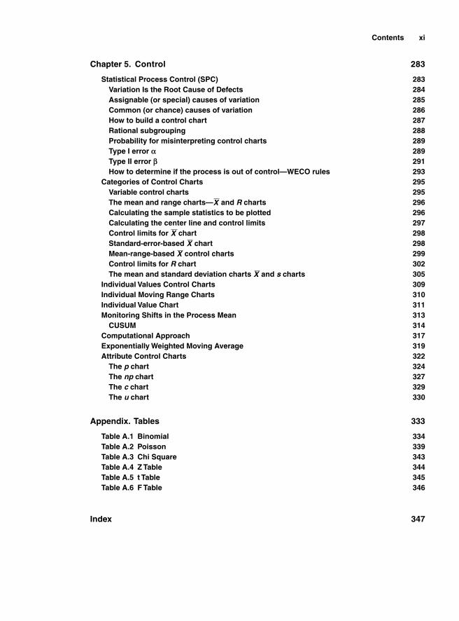
Contents xi
Chapter 5. Control 283
Statistical Process Control (SPC) 283Variation Is the Root Cause of Defects 284Assignable (or special) causes of variation 285Common (or chance) causes of variation 286How to build a control chart 287Rational subgrouping 288Probability for misinterpreting control charts 289Type I error ` 289Type II error a 291How to determine if the process is out of control—WECO rules 293
Categories of Control Charts 295Variable control charts 295The mean and range charts—X and R charts 296Calculating the sample statistics to be plotted 296Calculating the center line and control limits 297Control limits for X chart 298Standard-error-based X chart 298Mean-range-based X control charts 299Control limits for R chart 302The mean and standard deviation charts X and s charts 305
Individual Values Control Charts 309Individual Moving Range Charts 310Individual Value Chart 311Monitoring Shifts in the Process Mean 313
CUSUM 314Computational Approach 317Exponentially Weighted Moving Average 319Attribute Control Charts 322
The p chart 324The np chart 327The c chart 329The u chart 330
Appendix. Tables 333
Table A.1 Binomial 334Table A.2 Poisson 339Table A.3 Chi Square 343Table A.4 Z Table 344Table A.5 t Table 345Table A.6 F Table 346
Index 347

This page intentionally left blank
xiii
Preface
Business production methodologies have never stopped improving since Frederick W. Taylor, the inventor of scientifi c management, devised techniques for factory management and time and motion studies. Eli Whitney created the methods for interchangeable parts and Henry Ford developed the modern assembly lines used in mass production today. These inventions were the pre-cursors of the modern day quality and productivity improvement methodologies. Over the past three decades, many managerial methodologies aimed at improv-ing production processes have been introduced to businesses throughout the world. Some have resisted skepticism and have prevailed and are still being used, while others, such as the total quality management (TQM) or company wide quality control (CWQC), have been deemed to be nothing but fads and have disappeared almost immediately after they appeared. In fact, all the process improvement strategies (Six Sigma, TQM, CWQC, Lean, TOC, etc.) have the same underlying philosophy; they are all geared toward customer satisfaction and insist on the necessity for all sections of a company to cooperate in order to improve all aspects of its operations. They all insist on producing high-quality products at the lowest possible cost through a reduction of waste and continuous improvement.
Some companies have deployed TQM and failed because the deployment was conducted badly, their employees were poorly trained, or the areas they insisted on improving were areas that did not require improvement because their improvement would not have had a positive impact on the overall perfor-mance of the business. This costs money and does not generate any signifi cant return on investment.
In most cases, TQM did not fail because it was in itself a bad methodology or that its application was conducive to poor performance and failure. In fact, the name of the methodology that a company uses to improve its processes should not be the most germane aspect of its management strategy. Currently, the most widespread methodologies used in management are Six Sigma and Lean, also known as the Toyota Production System (TPS).
Indeed, most of the tools that were used by TQM have been refi ned and are still being used in Six Sigma. Six Sigma and Lean have withstood skepticism largely because of the success some major corporations have seen as a direct
result of their application. A careful observation of those corporations would reveal that Six Sigma and Lean are not partially used and, in most cases, they have become a culture, a way of managing for those companies instead of aux-iliary instruments temporarily used to solve a circumstantial problem.
Six Sigma is a data-driven business strategy that seeks to streamline pro-duction processes to constantly generate quasi-perfect products and services in order to achieve breakthrough return on investment. One of the pillars of Six Sigma is the pursuit of the reduction of production process variation to an infi nitesimal level.
Lean manufacturing or TPS is a management methodology originated in Japan and more often associated with Toyota Motor Company; it was introduced to the American public by James Womack and Daniel T. Jones in the 1990s. It is about doing things right the fi rst time and every time at a steady pace. It is also about reducing cycle time and inventory by eliminating waste. The underlying foundation of Lean manufacturing is the organizational strategy that constantly seeks a continuous improvement through the identifi cation of the non-value-added activities (Muda) and their elimination along with the reduction of the time it takes to perform the value-added tasks.
Most companies use these two methodologies simultaneously for process improvement because, taken in isolation, each of these methodologies can yield good results. However, when they are combined, the probability for success is even greater.
This book is written as a practical introduction to Lean Six Sigma project execu-tion and follows the DMAIC (defi ne, measure, analyze, improve, and control) roadmap. It is written in such a way that it can be used as a training text for beginners and a reference for seasoned practitioners. Six Sigma is, by defi nition, analytical and profoundly rooted in statistical analysis. Therefore, ample sta-tistical theory and development are provided to support the analyses. Both a theoretical analysis and the two most widely used statistical software suites, SigmaXL and Minitab, are used throughout the examples to help the reader better understand how to execute a Lean Six Sigma project.
The book is based on years of teaching the Lean and Six Sigma methodolo-gies to a wide variety of audiences from different industries. We hope that the content of the book will be helpful in furthering the understanding of Lean Six Sigma project execution.
xiv Preface

xvxv
Acknowledgments
We would like to thank all the people who have been so helpful in this endeavor. We would like to thank Randle Hooks, the PFS-Web, Memphis, TN Distribution Center’s general manager; John Bradley from Bank of America; Bill Anderson from HP; Harun Sanjay from FedEx; and Tom McGregor from Wal-Mart for their support and advice.
To the Manor House and Associates team and all our trainees, thank you for making us better.
Special thanks are also addressed to Aissata Basse, Fatoumata Basse, and our good friend Vera Kea from the Kenco group.

This page intentionally left blank

Lean Six Sigma Using SigmaXL
and Minitab

This page intentionally left blank
Introduction
The use of Lean Six Sigma has proved to be a powerful and effective way for providing sustained positive operational results in organizations worldwide. Lean Six Sigma is in fact a hybrid philosophy for continuously improving orga-nizations. Lean aims at eliminating waste by creating a culture of improve-ment where people learn powerful tools for solving problems and continuous improvement based on visual management and standardization that sustains enhancement. On the other hand, Six Sigma is a methodology that aims at reducing variations in production processes in order to improve quality and meet customers’ expectations.
Lean, also known as the Toyota Production System, has enabled many organi-zations to reach unparalleled levels of excellence. According to Fortune Magazine, Toyota made 50% more cars in 2005 than it did in 2001. It earned $11.4 billion more than all the major manufacturers combined and out of the 10 highest quality rated cars that run in America, 7 were made by Toyota at a time when GM was deemed close to declaring bankruptcy and Ford was mired in fi nancial problems and had to lay off 30,000 employees. These kinds of successful results have made Toyota Motor Company the most benchmarked organization in the world.
The primary premise for Lean is the focus on the creation of value for the cus-tomers. The value creation that enhances the organization’s overall productivity is done by eliminating non-value added activities using specifi c sets of tools that optimize the utilization of the people and the processes. According to Jeffrey Liker, the leading Toyota Production System’s expert in America, “Toyota Production System is a total system of people, processes, and tools that evolve and grow stron-ger over decades. It is not a toolkit or program that you can ‘implement’ as you would a computer system. To really get anywhere close to the level of excellence of Toyota, senior leaders have to understand that Lean is a way of thinking.”
The Lean thinking process focuses on satisfying customers while improv-ing productivity, reducing lead time, reducing manufacturing and product cost, increasing inventory fl oor space, reducing new product time to market, and improving the cost of quality. This is done by implementing a strategy that constantly seeks a continuous improvement through the identifi cation of the non-value-added activities (Muda) and their elimination along with the reduc-tion of the time it takes to perform the value added tasks.
Defects within a production process are considered to be the results of devia-tions from the predefi ned targets. Six Sigma is a methodology that uses statistical
1
and nonstatistical tools to defi ne the optimal quality target and the tolerance around the target for a production process. It also seeks to identify and remove the causes of defects and errors in production processes by reducing variations around the target and containing them within the tolerance.
The Six Sigma approach to process improvements is project-driven; in other words, areas that show opportunities for improvements are identifi ed and proj-ects are selected to proceed with the necessary improvements.
The integration of Lean with Six Sigma came to be known as Lean Six Sigma. Lean is used to reduce waste but it does not monitor production processes to determine if they are in control. It does not use statistical tools to measure the pro-cesses’ capabilities, i.e., their ability to generate reproducible products or services that meet or exceed customers’ expectations. Because Six Sigma is project-driven, it is less fl exible when it comes to addressing practical issues that occur daily and would not require even small projects to fi x. Issues such as total preventive management (TPM), changeover time, labor and equipment effi ciency, inventory reduction, and overproduction are better addressed using Lean techniques.
An integration of Lean and Six Sigma offers the possibility for reducing defects through a control of process variations and a reduction of waste using Lean techniques.
Lean Six Sigma process improvements are conducted through projects or Kaizen events. The project executions follow a rigorous pattern called the DMAIC (Defi ne, Measure, Analyze, Improve, and Control). At every step in the DMAIC roadmap, specifi c tools are used to measure, analyze data, fi nd root causes of problems, and determine the best options for their resolution.
Since Lean Six Sigma is data-driven, any project conducted using this methodol-ogy will require the use of some software. We elected to use SigmaXL and Minitab.
Most organizations use Microsoft Excel to organize and analyze their data. Excel is equipped with a substantial amount of tools for descriptive statistics and prob-ability calculations but it still lacks capabilities for more complex data analyses. SigmaXL is a powerful statistics software suite that adds those capabilities to Microsoft Excel. It is very reliable and easy to use and because it is embedded in Excel spreadsheets, it makes data readily available for manipulation easy to access and analyze. Besides helping evaluate data through statistical analysis, SigmaXL also makes it easy to perform faster routine data organization and manipulation with Excel. Columns and rows are better manipulated and pivot tables are created much faster. Beyond statistical analysis, SigmaXL also contains a great deal of tools that help analyze quality, Lean, and Six Sigma related issues much faster through its many templates. SigmaXL is becoming a popular tool for Six Sigma Green Belts, Black Belts, quality and business professionals, engineers, and managers around the world.
Minitab software suit is widely used in many corporations and universities. This book contains many examples and exercises to enable the reader to prac-
tice. The fi les required to complete the examples can be downloaded from www.mhprofressional.com/bass/. Minitab and SigmaXL will be needed in some cases to use those exercises. Trial versions of both SigmaXL and Minitab can be down-loaded from their respective websites: www.sigmaXL.com and www.minitab.com.
2 Introduction
An Overview of SigmaXL
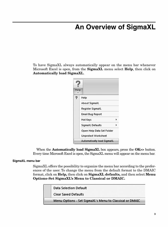
To have SigmaXL always automatically appear on the menu bar whenever Microsoft Excel is open, from the SigmaXL menu select Help, then click on Automatically load SigmaXL.
When the Automatically load SigmaXL box appears, press the OK>> button. Every time Microsoft Excel is open, the SigmaXL menu will appear on the menu bar.
SigmaXL menu bar
SigmaXL offers the possibility to organize the menu bar according to the prefer-ences of the user. To change the menu from the default format to the DMAIC format, click on Help, then click on SigmaXL defaults, and then select MenuOptions–Set SigmaXL’s Menu to Classical or DMAIC.
3
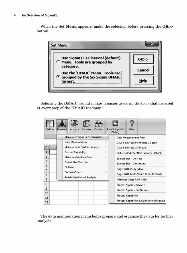
When the Set Menu appears, make the selection before pressing the OK>>button.
Selecting the DMAIC format makes it easier to see all the tools that are used at every step of the DMAIC roadmap.
The data manipulation menu helps prepare and organize the data for further analysis.
4 An Overview of SigmaXL
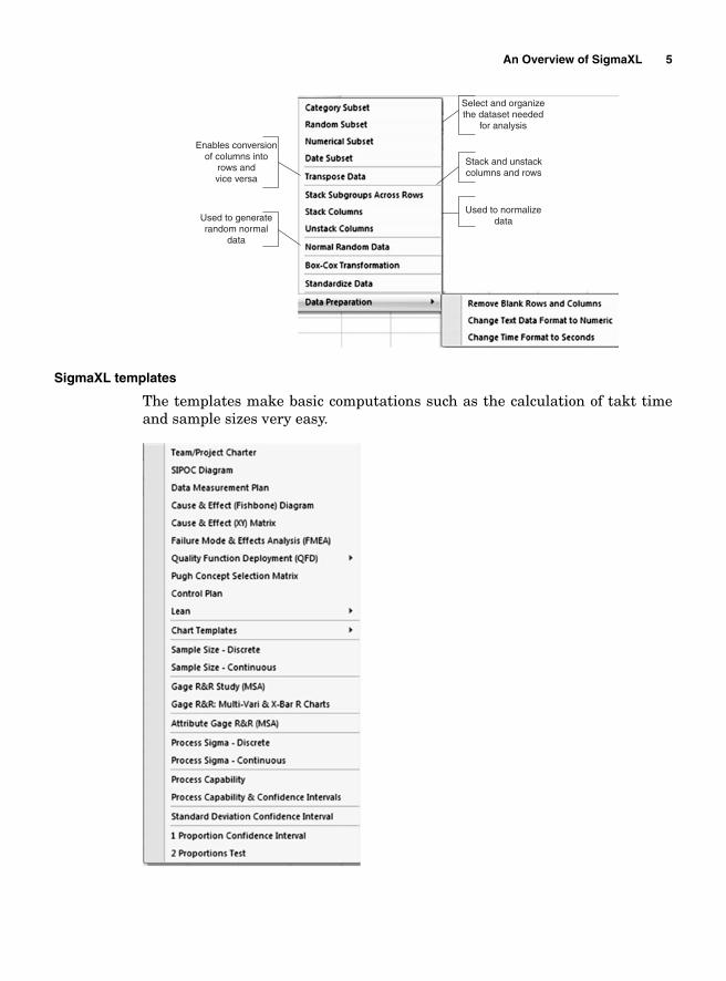
Enables conversionof columns into
rows andvice versa
Used to generaterandom normal
data
Used to normalizedata
Stack and unstackcolumns and rows
Select and organizethe dataset needed
for analysis
SigmaXL templates
The templates make basic computations such as the calculation of takt time and sample sizes very easy.
An Overview of SigmaXL 5
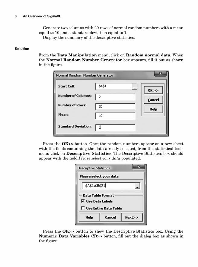
Generate two columns with 20 rows of normal random numbers with a mean equal to 10 and a standard deviation equal to 1.
Display the summary of the descriptive statistics.
Solution
From the Data Manipulation menu, click on Random normal data. Whenthe Normal Random Number Generator box appears, fi ll it out as shown in the fi gure.
Press the OK>> button. Once the random numbers appear on a new sheet with the fi elds containing the data already selected, from the statistical tools menu click on Descriptive Statistics. The Descriptive Statistics box should appear with the fi eld Please select your data populated.
Press the OK>> button to show the Descriptive Statistics box. Using the Numeric Data Variables (Y)>> button, fi ll out the dialog box as shown in the fi gure.
6 An Overview of SigmaXL
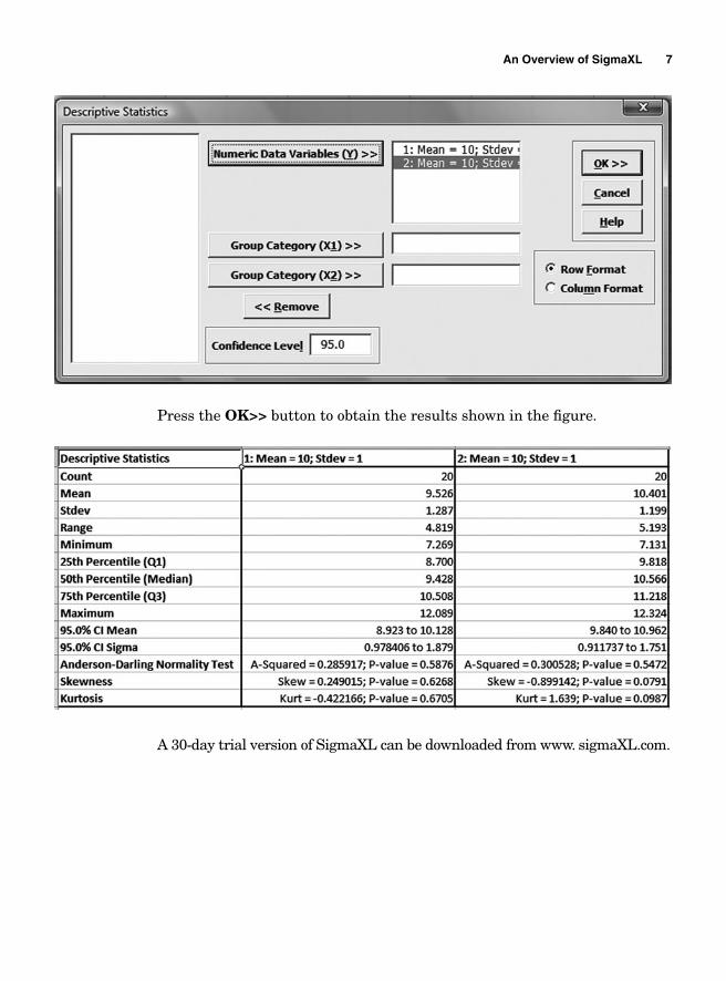
Press the OK>> button to obtain the results shown in the fi gure.
A 30-day trial version of SigmaXL can be downloaded from www. sigmaXL.com.
An Overview of SigmaXL 7

This page intentionally left blank
Chapter
1Defi ne
Project Planning
A problem is defi ned as a contradiction, a gap between a concrete reality that is being faced and a desired situation. The fi rst step in resolving a problem is to clearly understand and articulate both the current reality and the desired situation. A clear defi nition of a problem is the fi rst step of a Lean Six Sigma problem solving roadmap. Lean Six Sigma problem resolutions are performed through projects.
The objective of a project is either to solve an existing problem or to start a new venture. In either case, a carefully planned and organized strategy is needed to accomplish the specifi ed objectives. The strategy includes developing a plan that will defi ne the goals, explicitly setting the tasks to be accomplished, determining how they will be accomplished, and estimating the time and the resources (both human and material) needed for their completion.
The way projects are planned and managed will seriously affect the profi tabil-ity of the ventures for which they are intended and the quality of the products or services that they generate. The strategy used to plan the resources needed for the changes is called project management. It includes the specifi cation of the tasks to be accomplished, how the objectives are to be achieved, the planning of the resources to be allocated, and the budgeting and timing as well as the implementation of the project and the controls involved.
Since not all the tasks can be executed at the same time because of their inter-dependence, a methodic scheduling is necessary for a timely and cost-effective outcome.
The human resources remain the most important aspect of any endeavor; therefore, a clear identifi cation of the people who have a stake in the project as well as those who might resist changes is vital to its success.
However, before a project even starts, there are some prerequisites that must be fulfi lled to ensure its success. These are listed as follows:
9
■ The fi rst step in a project management is its specifi cation, the defi nition of its goals and objectives. A lucid defi nition of a project provides a solid basis for its prompt completion.
■ The management must be committed to the changes envisaged. ■ The overall strategy must be defi ned and be in agreement with the company’s
business vision.■ The project manager must be selected. ■ The key participants to the projects must be identifi ed, their skills and abili-
ties assessed, and their roles defi ned and well understood. ■ The risk involved in the changes to be implemented must be evaluated and
managed.
Most project management plans are subdivided into four major phases: (1) the feasibility study, (2) the project planning, (3) the project implementation, and (4) the verifi cation or evaluation. Each of these phases requires strategic planning.
The three major tools that are used for the purpose of planning and scheduling the different tasks in project management are the Gantt chart, the Critical Path Analysis (or Method), and the Program Evaluation and Review Technique.
However, before any scheduling starts, it is essential to estimate accurately the time that each task might require. A good scheduling must take into account the possible unexpected events and the complexity involved in the tasks them-selves. This requires a thorough understanding of every aspect of the task before developing a list.
One way of creating a list of tasks is a process known as the Work BreakdownStructure (WBS). It consists of creating a tree of activities that take into account their lengths and contingence. The WBS starts with the project to be achieved and goes down to the different steps necessary for its completion. As the tree starts to grow, the list of the tasks grows. Once the list of all the tasks involved is known, based on experience or good wit, an estimation of the time required can be made and milestones determined. Milestones are the critical steps in a project that are used to help measure progress. Knowing the milestones of a project with certainty is extremely important because they can affect the timeli-ness of the project completion as a whole. Delays in project completions can have serious fi nancial consequences and can cost companies market shares.
In global competitive markets, innovation is the driving force that keeps busi-nesses alive, and this is more obvious in high-tech industries. Most companies have several lines of products and each one of them is required to put out a new product every year or every 6 months. If, for instance, Dell’s Inspiron or Latitude fails to put out new products on time, it is likely to lose profi t from the forgone sales (the loss is proportional to the products’ time-to-live) and market shares to its competitors.
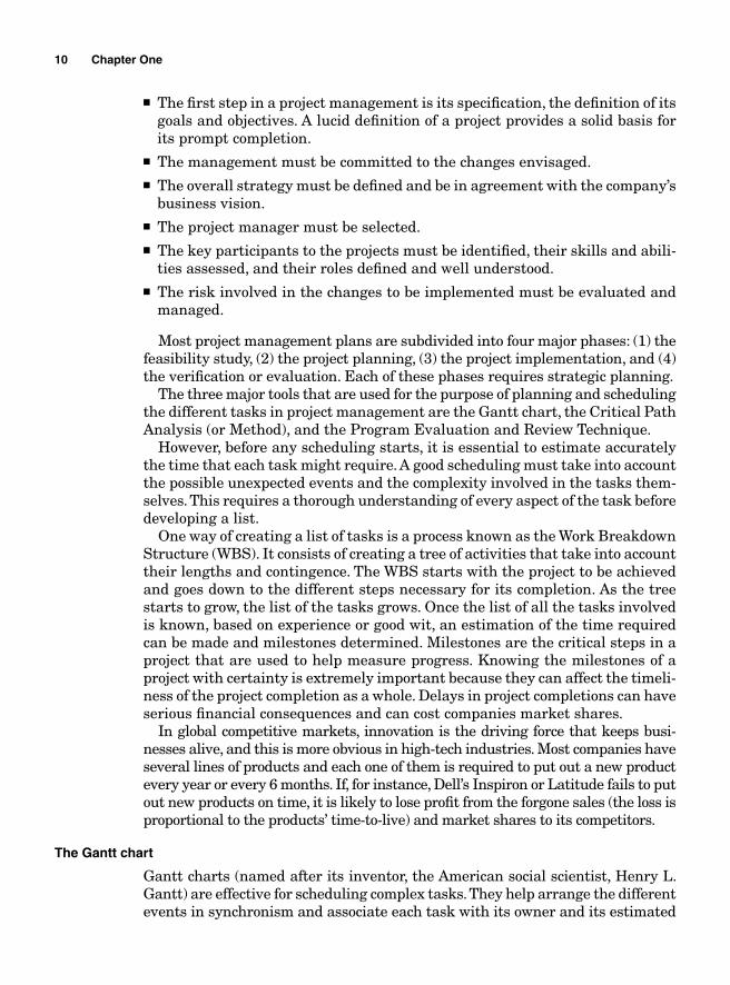
The Gantt chart
Gantt charts (named after its inventor, the American social scientist, Henry L. Gantt) are effective for scheduling complex tasks. They help arrange the different events in synchronism and associate each task with its owner and its estimated
10 Chapter One
beginning and ending time. The charts also allow the project’s team to visualize the resources needed to complete the project and the timing for each task. It therefore shows where the task owners must be at any given time in the execu-tion of the projects. The team working on the project should know whether it is on schedule just by looking at the chart.
The chart itself is divided in two parts. The fi rst part shows the different tasks, the tasks owners, the timing, and the resources needed for their comple-tion; the second part graphically visualizes the sequence of the events.
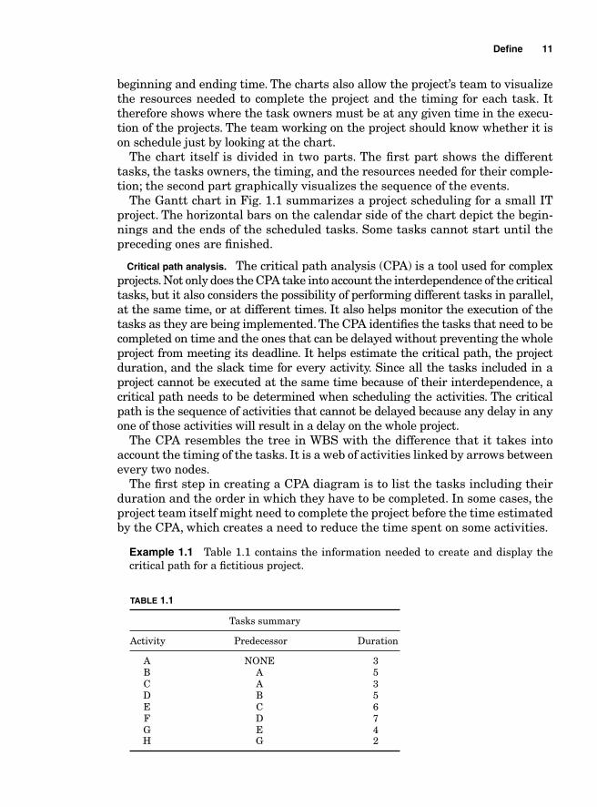
The Gantt chart in Fig. 1.1 summarizes a project scheduling for a small IT project. The horizontal bars on the calendar side of the chart depict the begin-nings and the ends of the scheduled tasks. Some tasks cannot start until the preceding ones are fi nished.
Critical path analysis. The critical path analysis (CPA) is a tool used for complex projects. Not only does the CPA take into account the interdependence of the critical tasks, but it also considers the possibility of performing different tasks in parallel, at the same time, or at different times. It also helps monitor the execution of the tasks as they are being implemented. The CPA identifi es the tasks that need to be completed on time and the ones that can be delayed without preventing the whole project from meeting its deadline. It helps estimate the critical path, the project duration, and the slack time for every activity. Since all the tasks included in a project cannot be executed at the same time because of their interdependence, a critical path needs to be determined when scheduling the activities. The critical path is the sequence of activities that cannot be delayed because any delay in any one of those activities will result in a delay on the whole project.
The CPA resembles the tree in WBS with the difference that it takes into account the timing of the tasks. It is a web of activities linked by arrows between every two nodes.
The fi rst step in creating a CPA diagram is to list the tasks including their duration and the order in which they have to be completed. In some cases, the project team itself might need to complete the project before the time estimated by the CPA, which creates a need to reduce the time spent on some activities.
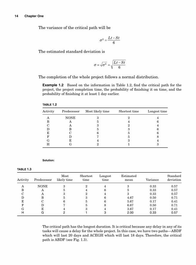
Example 1.1 Table 1.1 contains the information needed to create and display the critical path for a fi ctitious project.
Defi ne 11
TABLE 1.1
Tasks summary
Activity Predecessor Duration
A NONE 3 B A 5 C A 3 D B 5 E C 6 F D 7 G E 4 H G 2
Figure 1.1
12
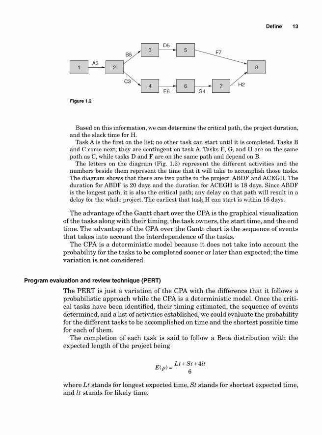
Based on this information, we can determine the critical path, the project duration, and the slack time for H. Task A is the fi rst on the list; no other task can start until it is completed. Tasks B and C come next; they are contingent on task A. Tasks E, G, and H are on the same path as C, while tasks D and F are on the same path and depend on B. The letters on the diagram (Fig. 1.2) represent the different activities and the numbers beside them represent the time that it will take to accomplish those tasks. The diagram shows that there are two paths to the project: ABDF and ACEGH. The duration for ABDF is 20 days and the duration for ACEGH is 18 days. Since ABDF is the longest path, it is also the critical path; any delay on that path will result in a delay for the whole project. The earliest that task H can start is within 16 days.
The advantage of the Gantt chart over the CPA is the graphical visualization of the tasks along with their timing, the task owners, the start time, and the end time. The advantage of the CPA over the Gantt chart is the sequence of events that takes into account the interdependence of the tasks.
The CPA is a deterministic model because it does not take into account the probability for the tasks to be completed sooner or later than expected; the time variation is not considered.
Program evaluation and review technique (PERT)
The PERT is just a variation of the CPA with the difference that it follows a probabilistic approach while the CPA is a deterministic model. Once the criti-cal tasks have been identifi ed, their timing estimated, the sequence of events determined, and a list of activities established, we could evaluate the probability for the different tasks to be accomplished on time and the shortest possible time for each of them.
The completion of each task is said to follow a Beta distribution with the expected length of the project being
E p
Lt St lt( ) = + + 4
6
where Lt stands for longest expected time, St stands for shortest expected time, and lt stands for likely time.
Defi ne 13
1 2
3 5
8
4 6 7
A3
B5
D5F7
G4E6
C3H2
Figure 1.2
The variance of the critical path will be
σ 2
6= −Lt St
The estimated standard deviation is
σ σ= = −2
6Lt St
The completion of the whole project follows a normal distribution.
Example 1.2 Based on the information in Table 1.2, fi nd the critical path for the project, the project completion time, the probability of fi nishing it on time, and the probability of fi nishing it at least 1 day earlier.
14 Chapter One
TABLE 1.2
Activity Predecessor Most likely time Shortest time Longest time
A NONE 3 2 4 B A 5 4 6 C A 3 2 4 D B 5 3 6 E C 6 5 6 F D 7 5 8 G E 4 3 4 H G 2 1 3
Solution:
TABLE 1.3
Most Shortest Longest Estimated StandardActivity Predecessor likely time time time mean Variance deviation
A NONE 3 2 4 3 0.33 0.57 B A 5 4 6 5 0.33 0.57 C A 3 2 4 3 0.33 0.57 D B 5 3 6 4.67 0.50 0.71 E C 6 5 6 5.67 0.17 0.41 F D 7 5 8 6.67 0.50 0.71 G E 4 3 4 3.67 0.17 0.41 H G 2 1 3 2.00 0.33 0.57
The critical path has the longest duration. It is critical because any delay in any of its tasks will cause a delay for the whole project. In this case, we have two paths—ABDF which will last 20 days and ACEGH which will last 18 days. Therefore, the critical path is ABDF (see Fig. 1.3).
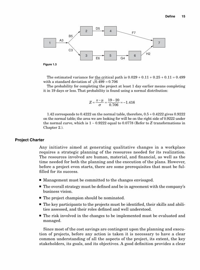
The estimated variance for the critical path is 0.029 + 0.11 + 0.25 + 0.11 = 0.499 with a standard deviation of 0 499 0 706. .= The probability for completing the project at least 1 day earlier means completing it in 19 days or less. That probability is found using a normal distribution:
Z
x= − = − = −μσ
19 200 706
1 416.
.
1.42 corresponds to 0.4222 on the normal table, therefore, 0.5 + 0.4222 gives 0.9222 on the normal table; the area we are looking for will be on the right side of 0.9222 under the normal curve, which is 1 − 0.9222 equal to 0.0778 (Refer to Z transformations in Chapter 2.).
Project Charter
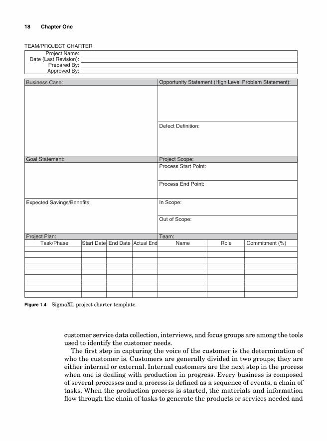
Any initiative aimed at generating qualitative changes in a workplace requires a strategic planning of the resources needed for its realization. The resources involved are human, material, and fi nancial, as well as the time needed for both the planning and the execution of the plans. However, before a project even starts, there are some prerequisites that must be ful-fi lled for its success.
■ Management must be committed to the changes envisaged. ■ The overall strategy must be defi ned and be in agreement with the company’s
business vision.■ The project champion should be nominated. ■ The key participants to the projects must be identifi ed, their skills and abili-
ties assessed, and their roles defi ned and well understood. ■ The risk involved in the changes to be implemented must be evaluated and
managed.
Since most of the cost savings are contingent upon the planning and execu-tion of projects, before any action is taken it is necessary to have a clear common understanding of all the aspects of the project, its extent, the key stakeholders, its goals, and its objectives. A good defi nition provides a clear
Defi ne 15
1
2 4
7
3 5 6
A3B5
D5F7
G4E6
C3H2
Figure 1.3
appreciation of every stakeholder’s role and what is expected of him or her. It also provides a tacit agreement between the parties. The defi nition of the project is displayed on a document called the project charter. The project charter is a written document that embodies the understanding between the different parties involved in the project; it specifi es the overall mission, goals, and objectives of the project and the roles and responsibilities of each participant.
The project charter is written either by the project sponsor or by the proj-ect champion with the approval of the sponsor. Upper management issues the project charter to make the project offi cial. The project charter gives the project champion and his or her team the power to use the organization’s resources for its purpose (see Fig. 1.4). The charter is then made public and distributed to all the stakeholders. Among others, advantages for a charter are as follows:
■ Provides a clear understanding among all the parties involved about the expectations.
■ Defi nes the participant’s role and responsibility.■ Clearly defi nes the scope of the project and the exclusions.■ Defi nes the deliverables and their timelines.■ Enables the team to have access to data that it may not have been able to
access.■ Defi nes and provides the resources needed for a prompt competition.■ Releases the team members from their regular responsibilities.
Each organization has a standardized way to present its project charters but some elements are found on all project charters.
Project number
The project number depends on the organization’s standards and structures. It is just a document reference.
Project champion
The project champion or sponsor ensures that the resources are available and that the project is executed in a timely and cost-effective manner.
Project defi nition
The fi rst step in a project management is the specifi cation of the mission of the team, the defi nition of its goals and objectives. A lucid defi nition of a project provides a solid basis for its prompt completion. The project defi nition generally starts with a background statement. The background statement explains the reason for the project and the context that lead to its need.
16 Chapter One
Project description
This defi nes the project, gives a clear reason for its purpose, and provides the expected measurable results. It sometimes includes the project background and relates it to our present conditions. It makes clear the expectations from every stakeholder. It also defi nes the success of the project and addresses the consequences of a failure. The project description defi nes the constraints and the factors that can affect the project.
Value statement
The value statement clearly sets out the positive impact of the project on the rest of the organization.
Stakeholders
The stakeholders start with the project sponsor, the team working on the project, the internal customers (who can be the project sponsor), and the external cus-tomers. This identifi es the key people involved in the project and their roles.
Project monitoring
This entails how and when to conduct meetings, who participates, and for what purpose, as well as how the progress of the different aspects of the project are measured.
Scheduling
This includes important events and dates that affect the project, as well as dif-ferent deadlines for subparts of the project.
Alternative plans
This includes what to do if things do not go according to plans.
Risk analysis
What risks are involved in the project for the rest of the organization?
Capturing the Voice of the Customer
Since all production processes aim at satisfying some customers (whether they are internal or external), their needs (explicit as well as implicit) need to be deter-mined and integrated in the design of the production processes. Any new product development or product or process improvement should start with capturing the voice of the customer; in other words, what the customers expect to fi nd in the product needs to be precisely assessed and integrated in the design of the prod-ucts. Several techniques are used to capture the voice of the customer. Surveys,
Defi ne 17
customer service data collection, interviews, and focus groups are among the tools used to identify the customer needs.
The fi rst step in capturing the voice of the customer is the determination of who the customer is. Customers are generally divided in two groups; they are either internal or external. Internal customers are the next step in the process when one is dealing with production in progress. Every business is composed of several processes and a process is defi ned as a sequence of events, a chain of tasks. When the production process is started, the materials and information fl ow through the chain of tasks to generate the products or services needed and
18 Chapter One
TEAM/PROJECT CHARTERProject Name:
Date (Last Revision):Prepared By:Approved By:
Business Case:
Goal Statement:
Expected Savings/Benefits:
Project Plan:
Process Start Point:
Process End Point:
In Scope:
Out of Scope:
Opportunity Statement (High Level Problem Statement):
Defect Definition:
Project Scope:
Team:Commitment (%)Task/Phase Start Date End Date Actual End Name Role
Figure 1.4 SigmaXL project charter template.
every task becomes a supplier to the tasks downstream and a customer to the tasks upstream.
Other types of internal customers are the process owners and the stakeholders.
External customers are the users of the fi nal product or service.The importance of the customers remains the same under all circumstances,
whether the customers are internal or external, because every customer can make or break a company. Yet the methods used to capture their needs are different.
Capturing the voice of the external customer
Defi ning the external customer is not always easy. If a company sells a product to retailers, both the end users and the retailers are customers, but who should be considered the primary customer? Is it the end user or the retail store? The way these two groups of customers are treated is not the same because their needs are different. It is important to determine who should be considered the primary customer because their expectations should affect the production processes the most.
To better defi ne the customers, it is good to divide them into actual and potential. Potential customers are those who are not currently buying the com-pany’s products but could possibly do so if changes are made in the company’s operations. Most companies only sell a small proportion of products to the cus-tomers of the market that they serve. Potential customers are competitors’ customers, lost customers, and prospective customers.
Since all external customers, be they primary or not, potential or actual, impact the process, their voices need to be captured and their expectations understood and integrated in the design of the products. The customers’ expec-tations about a product are not necessarily homogeneous but it is always possible to segment the needs and fi nd underlying common trends among the segments and manage the quintessential needs in ways that are conducive to the production of goods or services that meet their expectations at a reason-able cost for the producer. Customers’ expectations can be collected in several ways, such as through surveys, market research, customer service records, focus groups, and interviews.
Survey. A survey is a gathering of opinion about a product or service through a sample of randomly selected customers. It is generally based on a questionnaire with the idea of generating a well-constructed customer perception of the quality of products or services and identifying their weaknesses and their strengths. The pertinence of the survey is contingent upon how its statistical analysis was conducted, mainly on the sample size, the margin of error, and the confi dence level. Surveys can be conducted in several ways. One way of conducting a survey is asking customers to rate some of the critical characteristics of a product in order to generate actionable data that can be geared toward improvement. These steps should be followed:
Defi ne 19
1. Clearly specify the goal of the survey, i.e., what is it that you want to learn about the product?
2. Determine the population to be addressed.
3. Determine your sample size. The determination of sample size follows some statistics rules.
4. Choose survey methodology. How will the customers be contacted?
5. Create the questionnaire. What questions will be asked?
6. Conduct interviews and gather data.
7. Analyze the data gathered and produce the report.
The Likert scale is a good example of how survey data can be organized and analyzed to generate objective results.
Likert scale. A Likert scale is a metric used to measure customers’ attitude or preferences about a product or service. A question related to an aspect of a product is asked but the responses to the question are not open and they are restricted. The responses are ordinal in the sense that they can be ranked from lowest to highest in value.
An example of a Likert scale ranking would be: “Not Relevant at all (0),” “Somewhat Relevant (1),” “Relevant (2),” “Very Relevant (3),” “Extremely Relevant (4).” The numbers in parenthesis are not additive; they are just codes that are not always necessary.
After the survey is completed, the responses to each question are summed up (how many “Very Relevant” did we have for question 1…?); and this is used to generate scores for every question.
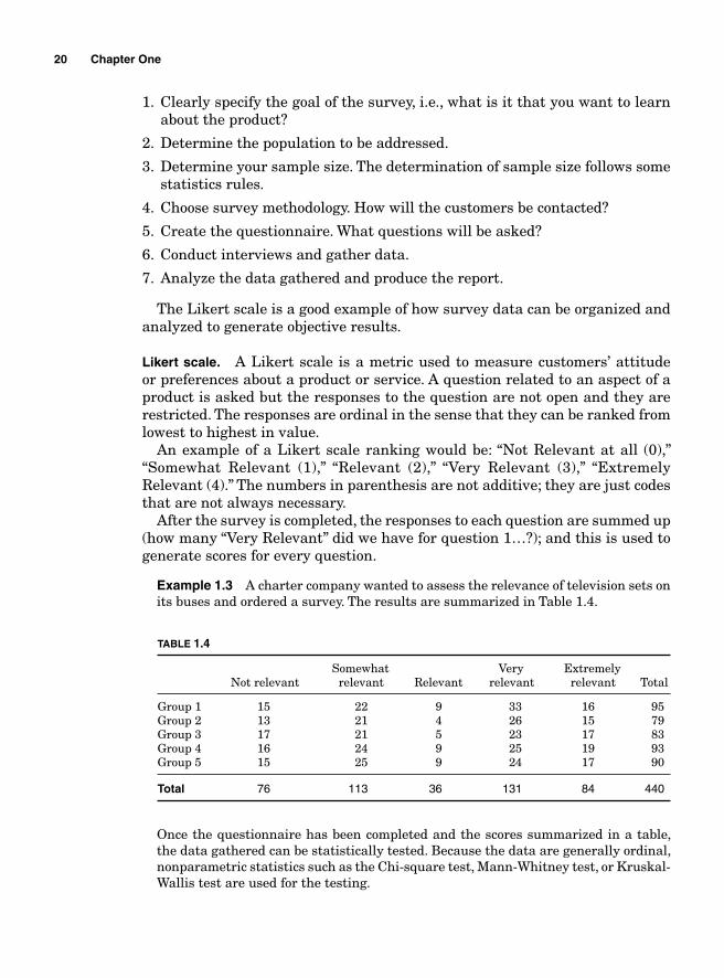
Example 1.3 A charter company wanted to assess the relevance of television sets on its buses and ordered a survey. The results are summarized in Table 1.4.
20 Chapter One
TABLE 1.4
Somewhat Very Extremely Not relevant relevant Relevant relevant relevant Total
Group 1 15 22 9 33 16 95Group 2 13 21 4 26 15 79Group 3 17 21 5 23 17 83Group 4 16 24 9 25 19 93Group 5 15 25 9 24 17 90
Total 76 113 36 131 84 440
Once the questionnaire has been completed and the scores summarized in a table, the data gathered can be statistically tested. Because the data are generally ordinal, nonparametric statistics such as the Chi-square test, Mann-Whitney test, or Kruskal-Wallis test are used for the testing.
Customer service data collection. Customer services (CSR) are, in general, the main point of contact between the customers and the business when poor quality products are sold. The CSR department becomes an invaluable resource for quality assessment because when customer complaints are recorded, the fi les obtained include the nature of the problems that the customers are encountering and in some cases what caused the problems. However, because customers very seldom call to complement businesses when they are satisfi ed with the products they buy, the data generated at CSR need to be viewed with caution.
Focus groups. A focus group is a discussion group composed of a few chosen people (approximately fi ve to nine) to talk about a selected subject. When used for marketing purposes or product development, the intention is generally to assess the customers’ expectations about the product. It is particularly appropriate for obtaining numerous perspectives about the same matter.
Capturing the voice of the internal customer
Failure to clearly and precisely understand the needs of the internal custom-ers and translate them into critical-to-quality characteristics of the products or services can seriously increase the cost of production through project overruns, product or service redesign or internal rework, product returns, and customer services expenses.
Capturing the voice of the customers of a project
A project is, in general, the work of a cross-functional team. Yet the members of the team that work on the design, development, or implementation of a project are seldom its customers. For instance, when a project for a new Warehouse Management System (WMS) is initiated, the people who will be managing the project implementation are hardly ever the ones who will actually be using the system in their daily activities. A group of project managers is gathered to set up the system and once it is ready, the operations department of the business is more likely to use it. Therefore, in this particular case, the primary customer for the project is operations.
One of the critical elements of a project is its clear defi nition. Since the main canon of communication between the steering committee (which oversees the project development and implementation) and the project team is the project charter, capturing the voice of the customer for a project becomes easier because it is clearly spelled out in a signed document, which should state the roles and responsibilities of each participant.
Capturing the voice of the next step in the process
As mentioned earlier, in the chain of events that constitutes a business process, the next step in the process is the customer of the current step when the production is
Defi ne 21
in progress. To reduce the probability for internal rework and improve the quality level, effi ciency, and productivity, the employee at the current step is expected to deliver a defect-free product to the next step. For that to happen, the employees will need to clearly understand what every step of the process expects from the previous ones. Several tools are used for that purpose.
Work instructions. Work instructions or standard operating procedures (SOP) are offi cial documents that contain instructions on how an employee should perform his or her tasks.
As is process mapping. Process mapping is a graphical representation of a process fl ow. It is an effective tool to visualize a process in a very simple way. Flow charts are generally used to describe how material and information fl ow from step to step throughout the process. When unambiguous comments are added to every control of the fl ow chart, the chart becomes a good tool for understanding the requirements at every level of the process and for pinpointing potential sources of nonconformance.
Employee feedback. Employees who are working “hands on” on the products or transferring information are an invaluable sources for understanding the materials on which they work and the conditions in which they move from task to task.
Quality assurance feedback. In an enterprise that values organizational excellence, the role of the quality assurance (QA) department cannot be circumscribed to auditing products to prevent defective parts from reaching customers or monitoring process performance through control charts. The QA department should be associated with every step of the process, from concept design to development and implementation. Once production is in progress, QA is supposed to be the most knowledgeable entity about the quality of the products and the potential sources of their shortcomings. QA employees should be the resource that provides the feedback about where improvement efforts should concentrate within the chain of tasks.
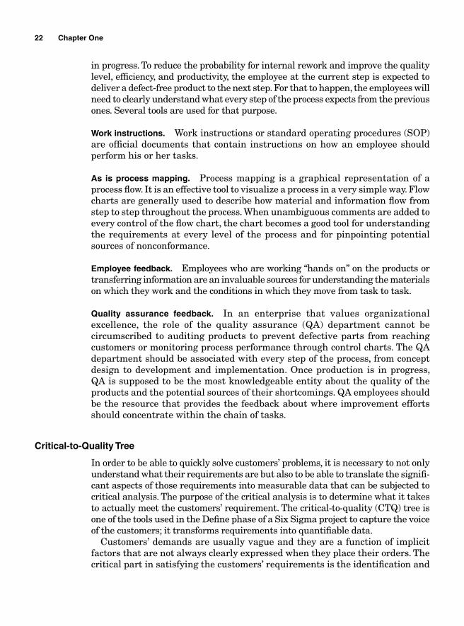
Critical-to-Quality Tree
In order to be able to quickly solve customers’ problems, it is necessary to not only understand what their requirements are but also to be able to translate the signifi -cant aspects of those requirements into measurable data that can be subjected to critical analysis. The purpose of the critical analysis is to determine what it takes to actually meet the customers’ requirement. The critical-to-quality (CTQ) tree is one of the tools used in the Defi ne phase of a Six Sigma project to capture the voice of the customers; it transforms requirements into quantifi able data.
Customers’ demands are usually vague and they are a function of implicit factors that are not always clearly expressed when they place their orders. The critical part in satisfying the customers’ requirements is the identifi cation and
22 Chapter One
the analysis of those implicit factors; therefore, a strategic approach needs to be adopted to build the CTQ tree (see Fig. 1.5).
Building the CTQ tree can help to
■ Identify implicit and vague customer needs and convert them into specifi c requirements.
■ Make sure that all the critical requirements are inventoried. ■ Speed up the understanding of those requirements by the project team while
narrowing the scope to the critical few.
The following steps are used to create a CTQ tree:
1. Identify the product or service that is being analyzed.
2. Identify the key components of the product or service. These are the features that defi ne the product. Without their presence, the product would not be what it is supposed to be.
3. Identify the critical customers’ requirements for the products or services. The team identifi es the basic requirements (quality, price, and delivery) that the customers expect from the products.
Defi ne 23
Computernotebook
Price/Delivery
Upgradability
Quality
Delivery
Price
Warranty time
Dependability
Softwarecompatibility
Hardwarespace and
speed
Figure 1.5
4. Identify the customers’ fi rst level of requirements. In this step, the team identifi es critical requirements that satisfy the key customer need identifi ed in the previous step.
5. Identify the customers’ second level of requirements. In this step, the team identifi es critical requirements that satisfy the key customer need identifi ed in the previous step.
This step has to be repeated until quantifi able requirements are obtained. The data gathering to determine the critical aspects of the products can be
done through surveys, interviews, brainstorming session, or obtained from Customer Services data.
Once the data has been gathered and the tree built, the next step should consist of analyzing the tree to determine the aspects of the critical require-ments that need improvements. The analysis is done in the Analyze phase of the project using the seven quality management tools or statistical analysis.
Kano analysis
Since the quality of a product or service is measured in terms of the satisfaction that the customer derives from using it, understanding the customers’ needs and being able to quantify them becomes paramount. Customers’ “needs” and “wants” are two distinct things, and the ways in which they react when their needs or wants are satisfi ed are not the same. The needs themselves are not appreciated at the same level; some needs are critical in a product, some are necessary but not as critical, and some are neither necessary nor critical but they do make customers feel delighted.
When a company chooses how to produce and sell its products, it needs to be able to measure what features of the product result in satisfying the expressed and implicit needs of the customers. Adding a multitude of features to a product or a service does not necessarily increase its appeal. Being able to know with accuracy what critical few features are demanded and how the customers react to their presence or nonpresence can help improve quality at a lower cost.
The Kano analysis (named after the inventor, Dr. Noriaki Kano) is a tool that helps determine what characteristics a producer might want to include in the product or service to increase customer satisfaction. The Kano model breaks down a product’s features according to how they can meet customers’ expecta-tions, some of which are explicit and some latent.
Kano divides the products’ features in three:
“The threshold (basic) features,” which defi ne the product, without them, the product is useless. These features are fundamental to the product. When you receive a call on your cellular phone, you expect to hear the person on the other end of the line and you expect that person to hear you. If you cannot fi nd
24 Chapter One
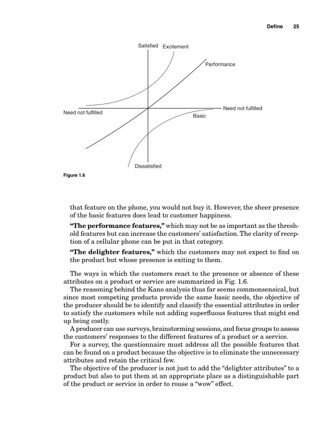
that feature on the phone, you would not buy it. However, the sheer presence of the basic features does lead to customer happiness.
“The performance features,” which may not be as important as the thresh-old features but can increase the customers’ satisfaction. The clarity of recep-tion of a cellular phone can be put in that category.
“The delighter features,” which the customers may not expect to fi nd on the product but whose presence is exiting to them.
The ways in which the customers react to the presence or absence of these attributes on a product or service are summarized in Fig. 1.6.
The reasoning behind the Kano analysis thus far seems commonsensical, but since most competing products provide the same basic needs, the objective of the producer should be to identify and classify the essential attributes in order to satisfy the customers while not adding superfl uous features that might end up being costly.
A producer can use surveys, brainstorming sessions, and focus groups to assess the customers’ responses to the different features of a product or a service.
For a survey, the questionnaire must address all the possible features that can be found on a product because the objective is to eliminate the unnecessary attributes and retain the critical few.
The objective of the producer is not just to add the “delighter attributes” to a product but also to put them at an appropriate place as a distinguishable part of the product or service in order to rouse a “wow” effect.
Defi ne 25
Satisfied
Dissatisfied
Excitement
Performance
BasicNeed not fulfilled
Need not fulfilled
Figure 1.6
Suppliers-Input-Process-Output-Customers (SIPOC)
In order to identify the voice of the customer in the Defi ne phase of a Six Sigma improvement project, it is recommended to map the “as-is” processes through which information and products fl ow from suppliers to customers and identify the differ-ent components of the processes and how they contribute to bringing the products to the customers. Suppliers-Input-Process-Output-Customers (SIPOC) is a high-level diagram of the fi ve key components of the process that contribute to creating and delivering the value demanded by the customers. It shows what those components are and how each one of them participates in the process. Having a visual map of the process handy makes it easier to link the different signifi cant components of the process together, narrow the scope of the project with fewer resources.
The fi ve key components of a SIPOC diagram are:
1. Suppliers. The providers of raw materials, services, and information used in the process to generate the value sold to customers.
2. Inputs. The actual services, raw materials, and information used to create the value sold to customers.
3. Process. The sequence of events used within the organization to transform the raw materials and serviced into value.
4. Outputs. The value created by the organization to satisfy customers’ demands.
5. Customers. The users of the value created by the organization.
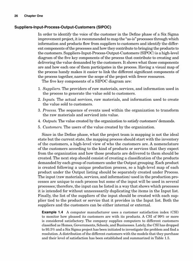
Since in the Defi ne phase, what the project team is mapping is not the ideal state but the current state, the mapping process should start with the inventory of the customers, a high-level view of who the customers are. A nomenclature of the customers according to the kind of products or services that they expect from the organization and how those products are delivered to them should be created. The next step should consist of creating a classifi cation of the products demanded by each group of customers under the Output grouping. Each product is created following a unique production process, so a high-level map of each product under the Output listing should be separately created under Process. The input (raw materials, services, and information) used in the production pro-cesses are unique to each process but some of the input will be used in several processes; therefore, the input can be listed in a way that shows which processes it is intended for without unnecessarily duplicating the items in the Input list. Finally, the list of the suppliers of the input should be created with each sup-plier tied to the product or service that it provides in the Input list. Both the suppliers and the customers can be either internal or external.
Example 1.4 A computer manufacturer uses a customer satisfaction index (CSI) to monitor how pleased its customers are with its products. A CSI of 99% or more is considered satisfactory. The company supplies computers to different customers classifi ed as Homes, Governments, Schools, and Businesses. Lately, the CSI has dropped to 93.5% and a Six Sigma project has been initiated to investigate the problem and fi nd a resolution. A distribution of the different customers with the models that they purchase and their level of satisfaction has been established and summarized in Table 1.5.
26 Chapter One
Defi ne 27
Yan Chuen Plastics
EasternTime Tech
System board
TaiwanFu Da
Network card
HLC MetalParts
Hard drive
BCM
Memory
Intel
Keyboard
Weenkin
Bluetooth
CPU
LCD
Prepare baseplastic
Install XYZ or WYZsystem board
Install networkcard
Install hard drive
Snap in memorycard
Put cover onkeyboard
Install Bluetooth ifneeded
Install CPU
Install LCD
Package units
Model XYZ withBluetooth
Model XYZwithout Bluetooth
Model WYZ withBluetooth
Model WYZwithout Bluetooth
Model WYZ withLinux
Home
Government
Schools
Business
SUPPLIERS INPUT PROCESS OUTPUT CUSTOMERS
S
I
P
O
C
Figure 1.7
TABLE 1.5
Customers Models Satisfaction index (%) Reason for dissatisfaction
Home XYZ without Bluetooth 92 Product overheating WYZ with Linux Government XYZ with Bluetooth 99 Drops connectionsSchools AYZ without Bluetooth 90 Plastic breaks easily, overheatsBusiness WYZ with Bluetooth 93 Fan not turning, locks up too often
Table 1.5 alone does not provide enough actionable data. It provides a glimpse of the extent of the problem but does not afford an understanding of the events that lead to the dissatisfaction. Therefore, in the Defi ne phase of the project, the team decided to create a SIPOC diagram of the organization in order to isolate and organize the different models that might be causing the customers’ dissatisfaction so that the scope of the project can be narrowed to only those models. Narrowing the project to only those models is expected to help reduce the resources needed for the project execution. Figure 1.7 shows the SIPOC created by the project team. Figure 1.7 is not a granular level map of the process; it is a high-level map that shows interactions between the different components at the highest level. Process mappings that are more detailed should be carried out in the Measure phase of the project.
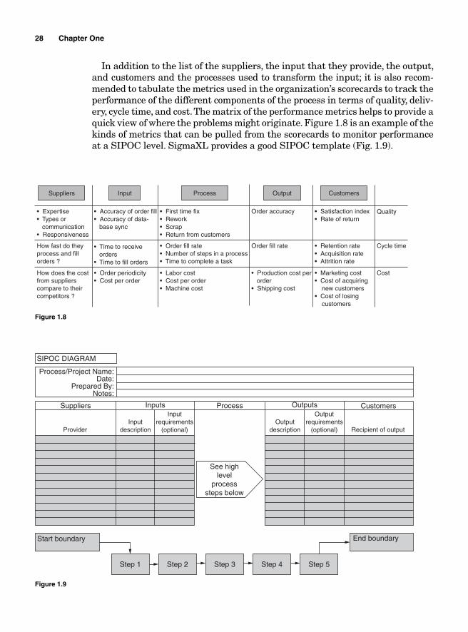
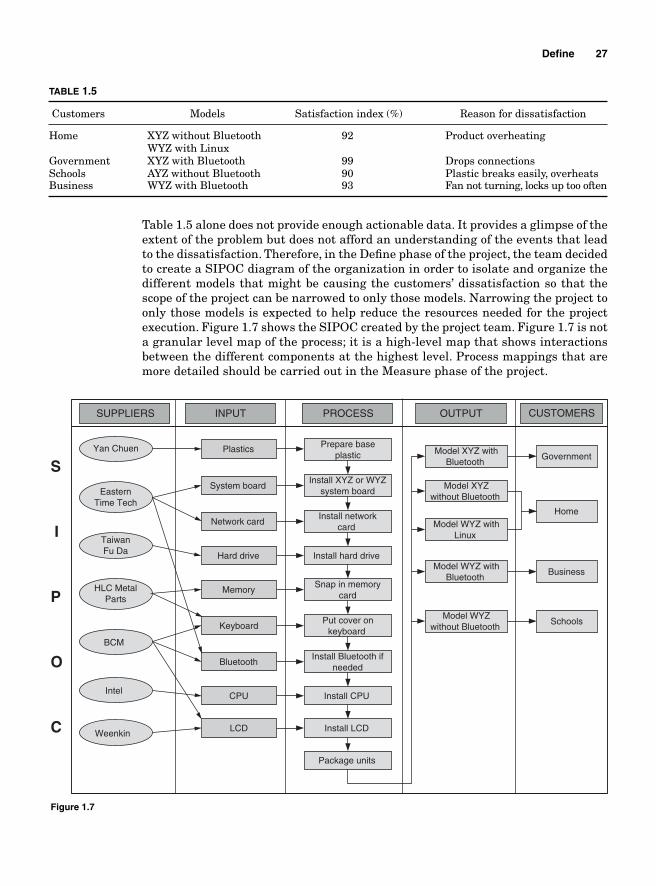
In addition to the list of the suppliers, the input that they provide, the output, and customers and the processes used to transform the input; it is also recom-mended to tabulate the metrics used in the organization’s scorecards to track the performance of the different components of the process in terms of quality, deliv-ery, cycle time, and cost. The matrix of the performance metrics helps to provide a quick view of where the problems might originate. Figure 1.8 is an example of the kinds of metrics that can be pulled from the scorecards to monitor performance at a SIPOC level. SigmaXL provides a good SIPOC template (Fig. 1.9).
28 Chapter One
Figure 1.8
• Expertise• Types or communication• Responsiveness
Suppliers
• Accuracy of order fill• Accuracy of data- base sync
• First time fix• Rework• Scrap• Return from customers
Order accuracy Quality• Satisfaction index• Rate of return
How fast do theyprocess and fillorders ?
• Time to receive orders• Time to fill orders
• Order fill rate• Number of steps in a process• Time to complete a task
Order fill rate • Retention rate• Acquisition rate• Attrition rate
Cycle time
How does the costfrom supplierscompare to theircompetitors ?
• Order periodicity• Cost per order
• Labor cost• Cost per order• Machine cost
• Production cost per order• Shipping cost
• Marketing cost• Cost of acquiring new customers• Cost of losing customers
Cost
Input Process Output Customers
Figure 1.9
Inputrequirements
(optional)
See highlevel
processsteps below
Start boundary End boundary
Step 1 Step 2 Step 3 Step 4 Step 5
Outputrequirements
(optional)
SIPOC DIAGRAM
Process/Project Name:Date:
Prepared By:Notes:
Provider
Suppliers Inputs Process Outputs Customers
Inputdescription
Outputdescription Recipient of output
Cost of Quality
Assessing the cost of quality
The quality of a product is one of the most important factors that determine a company’s sales and profi t. In order to improve on sales, an organization needs to develop a strategic approach that relies on a standardized process to assess the impact of the cost of quality on profi ts and losses. Since in most organiza-tions quality management is a silo separate from operations, the ability to quantify fi nancially the impact of quality improvement can help motivate upper management to take action and help improve on production processes.
The defi nition of quality itself is not uniform. Dr. Joseph Juran defi nes quality in terms of its “fi tness for use,” while Philip Crosby defi nes it in terms of its confor-mance to requirements. Taguchi defi nes quality in terms of a degree of deviation from its predetermined target; the greater the deviation, the lower the quality, while Edward Deming approaches quality from a variability standpoint.
Nevertheless, one thing all quality practitioners agree on is that quality is measured in relation to the characteristics that customers expect to fi nd in the product; therefore, the customers ultimately determine the quality level of the products. The customers’ expectations about a product’s performance, reliability, and attributes are translated into CTQ characteristics and integrated in the products’ design by the design engineers. The CTQs that are expected by the customers become the standards, the reference by which the company goes to produce its products and services. A product is said to be of a poor quality every time it deviates from the predetermined CTQ target.
While designing the products, the engineers must also take into account the capabilities of the resources (machines, people, materials, etc.), that is, their ability to produce products that meet the customers’ expectations. The produc-tion processes that use those resources to produce high-quality products and services come with a cost. When an enterprise measures the cost of quality, it considers the cost involved throughout the production process from when orders are received from customers to how orders are placed to suppliers and all the steps involved in meeting customers’ demands. The cost of quality should be measured in terms of the overall productivity of the resources and the processes used to bring the products to the customers. If quality is assessed not only in terms of how many defects are produced or sold to customers but in terms of the capabilities of the production processes as well (in other words, in terms of the processes’ abilities to meet or exceed customers’ expectations), then poor quality would occur not only when poor quality goods are produced, but also whenever more resources than necessary are used to produce the (good) prod-ucts. Situations that can cause a process to use more resources than necessary occur when a process does not perform at an optimal level and involves waste in the forms of rework, excessive testing, scrap, equipment rebuilding, etc.
Productivity measures the effi ciency of the production processes. It deter-mines how much input has been used for every unit of output. There is a positive correlation between quality and productivity. An improvement in the quality level of production processes will result in an improvement in the productivity of an
Defi ne 29
enterprise. The relationship between productivity and quality can be expressed through the following equation:
P
RTC
=
where P = productivity R = revenue derived from the sales of the products TC = total cost of production
A bad production process will increase waste in the form of rework and scrap, which will result in an increase in the costs of production. An increase in the costs of production will result in the decrease in the productivity of the resources used in the process.
The defi nition of the cost of quality is not unanimously accepted by all quality practitioners. Some practitioners consider the cost of quality as being the cost incurred for not doing things right, while others include the investment spent on getting the processes to produce good quality products and services.
The cost of quality can be assessed in different ways. It can be estimated by assess-ing the cost of meeting standards; in other words, the level of investment needed to improve the production processes to meet customers’ expectations. That cost is called the cost of conformance. In the short run, a quality improvement might require an increase in the cost of conformance but in the end, the investments incurred to improve quality will be offset by the profi ts derived from an increase in sales.
The cost of quality can also be estimated in terms of the profi t loss that occurs when nothing is done to improve on quality. Forrest Breyfogle calls that cost “the cost of doing nothing” (implementing Six Sigma). Some authors call that cost the cost of nonconformance. For instance, if the market standard for the lon-gevity for car tires is 2 years and a tire manufacturer produces tires that last only 18 months, the cost of doing nothing would be measured in terms of the loss incurred when customers buy from the competitors because the company failed to meet market standards.
The cost of conformance includes the appraisal and preventive costs, while the cost of nonconformance includes the costs of internal and external defects.
Cost of conformance
The cost of conformance measures the investments incurred to produce goods and services that meet customers’ expectations. It includes the preventive cost and the appraisal cost.
Preventive cost
The preventive cost is the cost incurred by the company to prevent noncon-formance. That cost is incurred prior to the product being manufactured. It includes the costs of
30 Chapter One
■ New process review■ Quality improvement meetings■ New quality improvement projects■ Process capability assessment and improvement■ The planning of new quality initiatives (process changes, quality improvement
projects, etc.) ■ Employee training
Appraisal cost
This is the cost incurred while assessing, auditing, and inspecting products and procedures to ensure that they conform to specifi cations. It is intended to detect quality related failures before the products are sent to customers. It includes
■ Cost of process audits■ Inspection of products received from suppliers■ Process audit■ Testing on processing equipments■ Final inspection audit■ Design review■ Prerelease testing
Cost of nonconformance
The cost of nonconformance is the cost of having to rework products, process customers’ complaints, and the loss of customers that results from selling poor quality products.
Internal failure
The cost of internal failure is incurred prior to the products being delivered to customers. It includes
■ Cost of reworking products that failed audit■ Cost of bad marketing■ Scrap■ Non-value-adding activities
External failure
The cost of external failure is incurred after the products have been sent to the customers. It includes
Defi ne 31
■ Cost of customer support■ Shipping cost of returned products ■ Cost of reworking products returned from customers■ Cost of refunds■ Warranty claims■ Loss of customer goodwill■ Cost of discounts to recapture customers
Example 1.5 Haere-Lao Technologies manufactures computers sold directly to end-user customers. The cost of quality incurred during its fi rst quarter is summarized in Table 1.6. The total revenue from sales for that quarter was $5,345,987.00 with a total operational expense of $4,232,897.00.
32 Chapter One
TABLE 1.6
Absolute value Relative value (%)
Cost of conformance Preventive costQuality control labor cost $95,678.00 12.07Quality improvement special projects $17,543.00 2.21Training $32,099.00 4.05Total $145,320.00 18.34
Appraisal costIncoming product audit $12,909.00 1.63Process audit labor cost $73,987.00 9.34Down time due to equipment testing $9,823.00 1.24Product prerelease testing $5,692.00 0.72Total $102,411.00 12.92Total cost of conformance $247,731.00 31.26
Cost of nonconformance Internal failureScrap $42,561.00 5.37Rework $135,671.00 17.12Scrap collection $12,908.00 1.63Non-value-adding activities $42,352.00 5.34Total $233,492.00 29.47
External failureShipping cost from customers $31,891.00 4.02Scrap $132,431.00 16.71Customer services $91,324.00 11.52Rework $23,132.00 2.92Warranty claims $11,092.00 1.40Refunds $21,345.00 2.69Total $311,215.00 39.27
Total cost of nonconformance $544,707.00 68.74
Grand total $792,438.00 100.00
1. What is the return on investment (ROI)?
2. What would the ROI have been if the total cost of quality were equal to $100,000.00?
3. If the tax rate were 33% of the gross profi t, how much would have been spent on quality for each dollar made in profi t after tax?
4. How much profi t would have been made after tax if the cost of nonconformance were equal to $50,000.00?
Solution:
1. The Return on Investment (ROI)
Total revenue from sales for that quarter = $5,345,987.00
Total operational expense = $4,232,897.00
ROItotal revenue from sales total operatio= − nnal expenses
total operational expense
$5= ,,345,987.00 $4,232,897.00$4,232,897.00
− = $ .0 2263
In other words, for every dollar invested, the company has made $0.263.
2. What would the ROI have been if the total cost of quality were equal to $100,000.00?
If the total cost of quality were $100,000.00, then the total expenses would have been:
$4,232,897.00 – ($792,438.00 – $100,000.00) = $3,540,459.00
Therefore, the ROI would have been:
ROI
$5,345,987.00 $3,540,459.00$3,540,459.0
= −00
= $ .0 510
For every dollar invested, the company would have made $0.510.
3. If the tax rate were 33% of the gross profi t, how much would have been spent on quality for each dollar made in profi t after tax?
Profi t before tax = $5,345,987.00 – $4,232,897.00 = $1,113,090.00
The profi t after tax = $1,113,090.00 × (1 – 0.33) = $745,770.30
$745,770.30$792,438.00
0.941= $
Therefore, for each dollar invested in quality, only $0.941 was made in after tax profi t.
4. How much profi t after tax would have been made if the cost of nonconformance were equal to $50,000.00?
Defi ne 33
34 Chapter One
If the cost of nonconformance were equal to $50,000.00, the total operational expenses would have been:
$4,232,897.00 − ($544,707.00 − $50,000.00) = $3,738,190.00
The profi t before tax would have been
$5,345,987.00 − $3,738,190.00 = $1,607,797.00
The profi t after tax would have been
$1,607,797.00 × (1 − 0.33) = $1,077,223.99
Optimal Cost of Quality
The ideal situation would be to have a production process that would enable every single item produced to meet the predefi ned CTQ target, but that would be impossible. Conversely, producing poor quality goods would result in custom-ers’ attrition. The question that management should ask itself is “What is the optimal cost of quality?”
In the short term, there is a positive correlation between quality improvement and the cost of conformance and a negative correlation between quality improve-ment and the cost of nonconformance. In other words, an improvement in the quality of the products will lead to an increase in the cost of conformance that generated it. This is because an improvement in the quality level of a product might require extra investment in R&D, more spending in appraisal cost, more investment in failure prevention, and so on.
However, a quality improvement will lead to a decrease in the cost of non-conformance because fewer products will be returned from the customers and, therefore, less operating cost will go to customer support and there will be less internal rework.
For instance, one of the CTQs for a liquid crystal display (LCD) is the number of pixels it contains. The brightness of each pixel is controlled by individual transistors that switch the backlights on and off. The manufacturing of LCDs is very complex and expensive and it is hard to determine the number of dead pixels on an LCD before the end of the manufacturing process. In order to reduce the number of scrapped units, if the number of dead pixels is infi nitesimal or the dead pixels are almost invisible, the manufacturer would consider the LCDs as “good enough” to be sold. Otherwise, the cost of scrap or internal rework would be so prohibitive that it would jeopardize the cost of production. Improving the quality level of the LCDs to zero dead pixels would therefore increase the cost of conformance.
On the other hand, not improving the quality level of the LCDs will lead to an increase in the probability of having returned products from customers and internal rework, therefore increasing the cost of nonconformance.
The graph in Fig. 1.10 plots the relationship between quality improvement and the cost of conformance on one hand and the cost of nonconformance on the other hand.
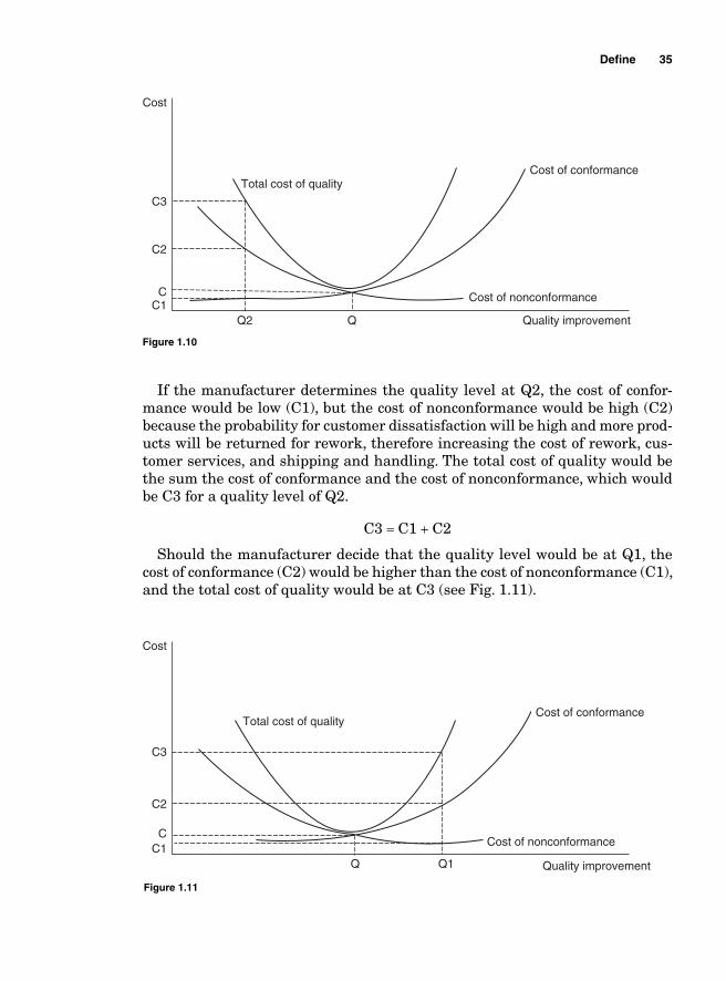
If the manufacturer determines the quality level at Q2, the cost of confor-mance would be low (C1), but the cost of nonconformance would be high (C2) because the probability for customer dissatisfaction will be high and more prod-ucts will be returned for rework, therefore increasing the cost of rework, cus-tomer services, and shipping and handling. The total cost of quality would be the sum the cost of conformance and the cost of nonconformance, which would be C3 for a quality level of Q2.
C3 = C1 + C2
Should the manufacturer decide that the quality level would be at Q1, the cost of conformance (C2) would be higher than the cost of nonconformance (C1), and the total cost of quality would be at C3 (see Fig. 1.11).
Defi ne 35
Cost
Total cost of qualityCost of conformance
Cost of nonconformance
Quality improvement
C3
C2
CC1
Q2 Q
Figure 1.10
Cost
Total cost of qualityCost of conformance
Cost of nonconformance
Quality improvement
C3
C2
CC1
Q1Q
Figure 1.11
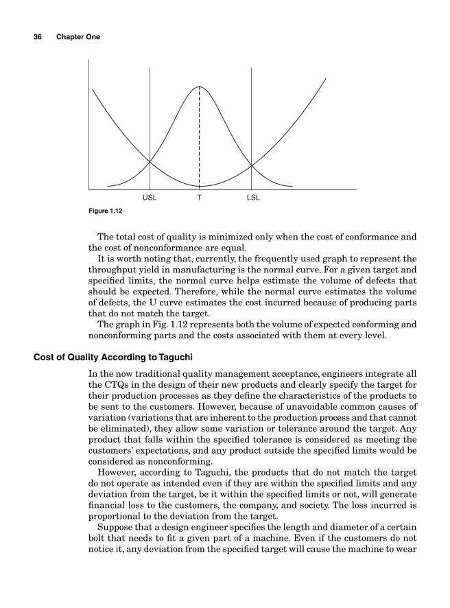
36 Chapter One
The total cost of quality is minimized only when the cost of conformance and the cost of nonconformance are equal.
It is worth noting that, currently, the frequently used graph to represent the throughput yield in manufacturing is the normal curve. For a given target and specifi ed limits, the normal curve helps estimate the volume of defects that should be expected. Therefore, while the normal curve estimates the volume of defects, the U curve estimates the cost incurred because of producing parts that do not match the target.
The graph in Fig. 1.12 represents both the volume of expected conforming and nonconforming parts and the costs associated with them at every level.
Cost of Quality According to Taguchi
In the now traditional quality management acceptance, engineers integrate all the CTQs in the design of their new products and clearly specify the target for their production processes as they defi ne the characteristics of the products to be sent to the customers. However, because of unavoidable common causes of variation (variations that are inherent to the production process and that cannot be eliminated), they allow some variation or tolerance around the target. Any product that falls within the specifi ed tolerance is considered as meeting the customers’ expectations, and any product outside the specifi ed limits would be considered as nonconforming.
However, according to Taguchi, the products that do not match the target do not operate as intended even if they are within the specifi ed limits and any deviation from the target, be it within the specifi ed limits or not, will generate fi nancial loss to the customers, the company, and society. The loss incurred is proportional to the deviation from the target.
Suppose that a design engineer specifi es the length and diameter of a certain bolt that needs to fi t a given part of a machine. Even if the customers do not notice it, any deviation from the specifi ed target will cause the machine to wear
USL LSLT
Figure 1.12
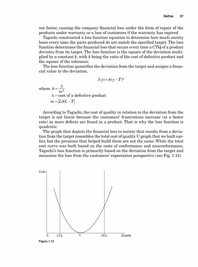
out faster, causing the company fi nancial loss under the form of repair of the products under warranty or a loss of customers if the warranty has expired.
Taguchi constructed a loss function equation to determine how much society loses every time the parts produced do not match the specifi ed target. The loss function determines the fi nancial loss that occurs every time a CTQ of a product deviates from its target. The loss function is the square of the deviation multi-plied by a constant k, with k being the ratio of the cost of defective product and the square of the tolerance.
The loss function quantifi es the deviation from the target and assigns a fi nan-cial value to the deviation.
l y k y T( ) ( )= − 2
where km
= Δ2
Δ = cost of a defective product
m LSL T= −
According to Taguchi, the cost of quality in relation to the deviation from the target is not linear because the customers’ frustrations increase (at a faster rate) as more defects are found in a product. That is why the loss function is quadratic.
The graph that depicts the fi nancial loss to society that results from a devia-tion from the target resembles the total cost of quality U graph that we built ear-lier, but the premises that helped build them are not the same. While the total cost curve was built based on the costs of conformance and nonconformance, Taguchi’s loss function is primarily based on the deviation from the target and measures the loss from the customers’ expectation perspective (see Fig. 1.13).
Defi ne 37
Cost
0 LCL UCL QualityT
Figure 1.13
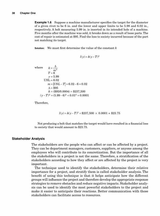
38 Chapter One
Example 1.6 Suppose a machine manufacturer specifi es the target for the diameter of a given rivet to be 6 in. and the lower and upper limits to be 5.98 and 6.02 in., respectively. A bolt measuring 5.99 in. is inserted in its intended hole of a machine. Five months after the machine was sold, it breaks down as a result of loose parts. The cost of repair is estimated at $95. Find the loss to society incurred because of the part not matching its target.
Solution: We must fi rst determine the value of the constant k
l y k y T( ) ( )= − 2
where km
= Δ2
T = 6 y = 5.99 USL = 6.02
m USL T= − = − =6 02 6 0 02. .
Δ = $95 k = ($95/0.0004) = $237,500
( ) ( . ) . .y T− = − = =2 2 25 99 6 0 01 0 0001
Therefore,
l y k y T( ) ( ) $ ,= − = ×2 237 500 0.0001 = $23.75
Not producing a bolt that matches the target would have resulted in a fi nancial loss to society that would amount to $23.75.
Stakeholder Analysis
The stakeholders are the people who can affect or can be affected by a project. They can be department managers, customers, suppliers, or anyone among the employees who will contribute to its concretization. But the importance of all the stakeholders in a project is not the same. Therefore, a stratifi cation of the stakeholders according to how they affect or are affected by the project is very important.
The technique used to identify the stakeholders, determine their relative importance for a project, and stratify them is called stakeholder analysis. The benefi t of using this technique is that it helps anticipate how the different groups will infl uence the project and therefore develop the appropriate response strategies to remove obstacles and reduce negative impacts. Stakeholder analy-sis can be used to identify the most powerful stakeholders to the project and make it easier to anticipate their reactions. Better communication with those stakeholders can facilitate access to resources.
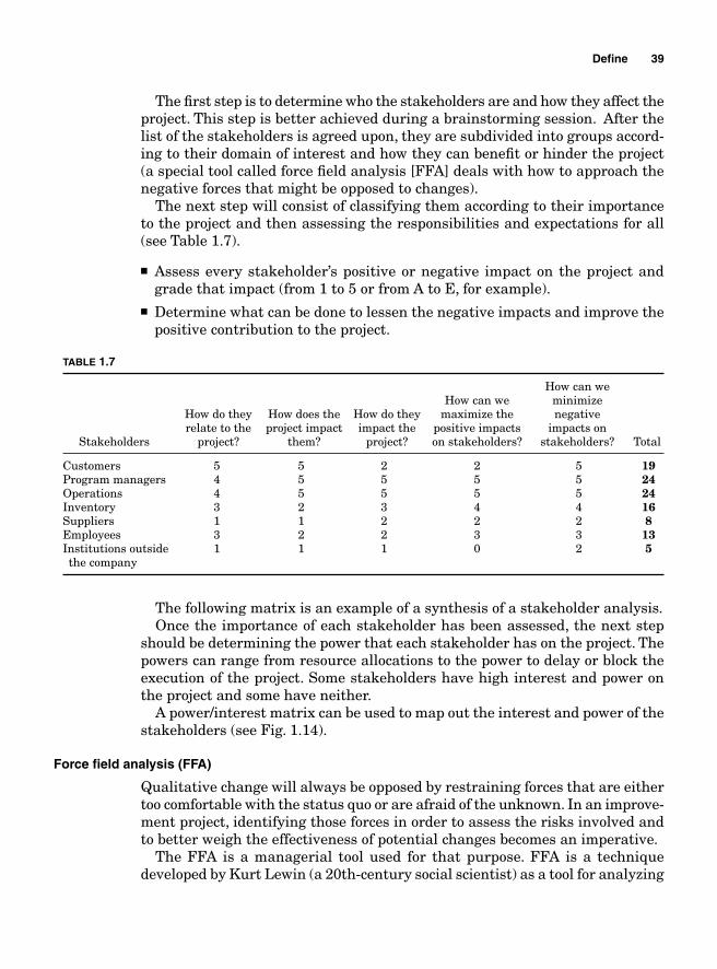
The fi rst step is to determine who the stakeholders are and how they affect the project. This step is better achieved during a brainstorming session. After the list of the stakeholders is agreed upon, they are subdivided into groups accord-ing to their domain of interest and how they can benefi t or hinder the project (a special tool called force fi eld analysis [FFA] deals with how to approach the negative forces that might be opposed to changes).
The next step will consist of classifying them according to their importance to the project and then assessing the responsibilities and expectations for all (see Table 1.7).
■ Assess every stakeholder’s positive or negative impact on the project and grade that impact (from 1 to 5 or from A to E, for example).
■ Determine what can be done to lessen the negative impacts and improve the positive contribution to the project.
TABLE 1.7
How can we How can we minimize How do they How does the How do they maximize the negative relate to the project impact impact the positive impacts impacts on Stakeholders project? them? project? on stakeholders? stakeholders? Total
Customers 5 5 2 2 5 19Program managers 4 5 5 5 5 24Operations 4 5 5 5 5 24Inventory 3 2 3 4 4 16Suppliers 1 1 2 2 2 8Employees 3 2 2 3 3 13Institutions outside 1 1 1 0 2 5the company
The following matrix is an example of a synthesis of a stakeholder analysis.Once the importance of each stakeholder has been assessed, the next step
should be determining the power that each stakeholder has on the project. The powers can range from resource allocations to the power to delay or block the execution of the project. Some stakeholders have high interest and power on the project and some have neither.
A power/interest matrix can be used to map out the interest and power of the stakeholders (see Fig. 1.14).
Force fi eld analysis (FFA)
Qualitative change will always be opposed by restraining forces that are either too comfortable with the status quo or are afraid of the unknown. In an improve-ment project, identifying those forces in order to assess the risks involved and to better weigh the effectiveness of potential changes becomes an imperative.
The FFA is a managerial tool used for that purpose. FFA is a technique developed by Kurt Lewin (a 20th-century social scientist) as a tool for analyzing
Defi ne 39
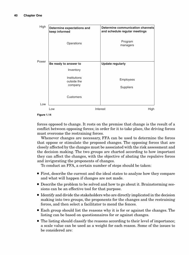
40 Chapter One
forces opposed to change. It rests on the premise that change is the result of a confl ict between opposing forces; in order for it to take place, the driving forces must overcome the restraining forces.
Whenever changes are necessary, FFA can be used to determine the forces that oppose or stimulate the proposed changes. The opposing forces that are closely affected by the changes must be associated with the risk assessment and the decision making. The two groups are charted according to how important they can affect the changes, with the objective of abating the repulsive forces and invigorating the proponents of changes.
To conduct an FFA, a certain number of steps should be taken:
■ First, describe the current and the ideal states to analyze how they compare and what will happen if changes are not made.
■ Describe the problem to be solved and how to go about it. Brainstorming ses-sions can be an effective tool for that purpose.
■ Identify and divide the stakeholders who are directly implicated in the decision making into two groups, the proponents for the changes and the restraining forces, and then select a facilitator to mend the fences.
■ Each group should list the reasons why it is for or against the changes. The listing can be based on questionnaires for or against changes.
■ The listing should classify the reasons according to their level of importance; a scale value can be used as a weight for each reason. Some of the issues to be considered are:
Operations
Determine expectations andkeep informed
Determine communication channelsand schedule regular meetings
Programmanagers
Be ready to answer to Update regularly
Suppliers
EmployeesInstitutionsoutside thecompany
Inventory
Customers
High
High
Power
Low
Low Interest
Figure 1.14
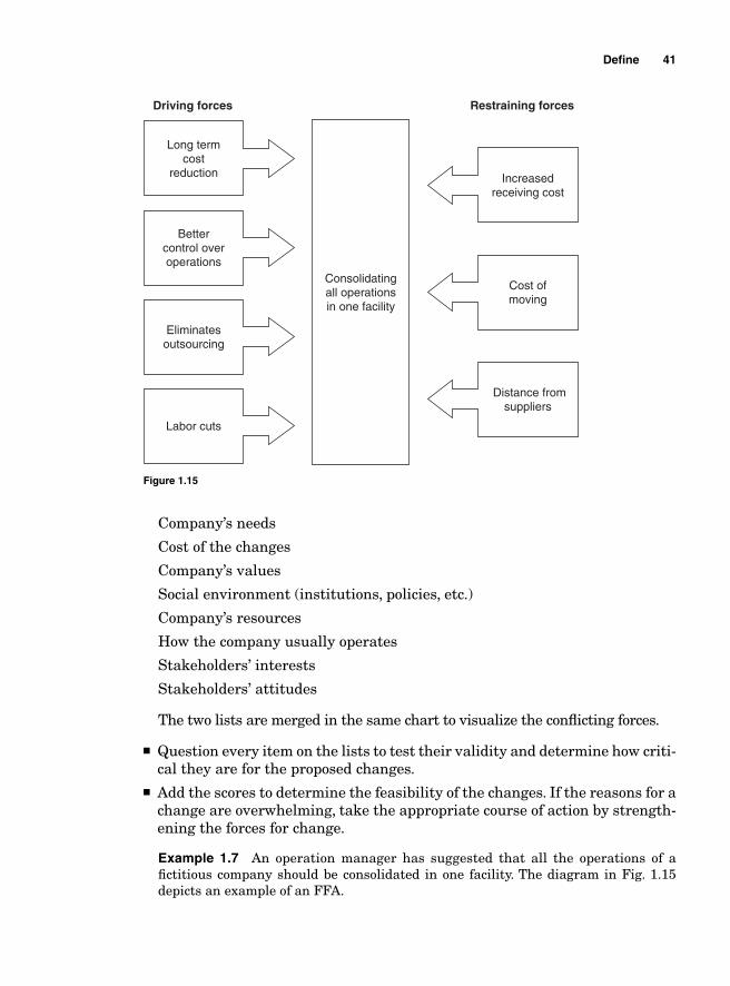
Defi ne 41
Company’s needs
Cost of the changes
Company’s values
Social environment (institutions, policies, etc.)
Company’s resources
How the company usually operates
Stakeholders’ interests
Stakeholders’ attitudes
The two lists are merged in the same chart to visualize the confl icting forces.
■ Question every item on the lists to test their validity and determine how criti-cal they are for the proposed changes.
■ Add the scores to determine the feasibility of the changes. If the reasons for a change are overwhelming, take the appropriate course of action by strength-ening the forces for change.
Example 1.7 An operation manager has suggested that all the operations of a fi ctitious company should be consolidated in one facility. The diagram in Fig. 1.15 depicts an example of an FFA.
Driving forces
Long termcost
reduction
Bettercontrol overoperations
Eliminatesoutsourcing
Labor cuts
Consolidatingall operationsin one facility
Restraining forces
Increasedreceiving cost
Cost ofmoving
Distance fromsuppliers
Figure 1.15

This page intentionally left blank
Chapter
2Measure
Data Gathering
One of the fi rst steps in assessing current process performance is data gather-ing. The process used to collect the data is very important because it ultimately determines their relevance. If wrong data are collected or if the correct data are collected in a wrong way, the results of their analysis would be misleading and would distort the decision-making process. Therefore, a consistent approach must be followed to ensure the reliability of the data. Several important steps need to be followed to guarantee that the collected data accurately refl ect the process performance:
1. Clearly defi ne the purpose for the data collection.
2. Decide on the critical to qualities (CTQs) to be considered.
3. Make sure that the measurement process for data collection is accurate and precise.
4. The appraisers must have a common understanding of the operational defi nitions for the collection process.
5. Decide on the appropriate sampling technique.
Once the data collection has been completed, a data analysis based on the data type is conducted.
Data Types
The more generally used data types are the attribute and the variable data, even though locational data are also used when analyzing data that describe particular positions.
43
Attribute data
Attribute data are discrete, countable, and can only take fi nite values. They are categorical data that cannot be broken into fractions. An example of attribute data is the number of defects at the end of a processing line—we cannot have 10.5 defective parts; we either have 10 or 11 defective parts.
Variable data
Variable data are measurable data on a continuum. They can assume any nega-tive or positive value. Variable data measure length, time, distance, etc.
Locational data
Locational data indicate the position of a CTQ of interest. Locational data would, for instance, indicate what area in a manufacturing plant is the source of 95% of the defects.
Basic Probability
Uncertainty is an inherent part of business operations. No matter how well structured an organization is, no matter how good its processes are, it is impos-sible to predict with absolute certitude the outcome of every decision that is made within it. When an entrepreneur decides to invest in the acquisition of a new business, he does so based on the assumption of the likelihood that the venture would be profi table. Business decision makings are based on the prob-ability of positive outcomes.
So what is probability?
Probability is the chance or the likelihood that something will happen. In statistics, the words chance and likelihood are seldom used to describe the possibilities for an event to take place; instead, the word probability is used along with some other basic concepts the meaning of which is inferred from our everyday use. Probability is the measure of the possibility for an event to take place. It is a number between 0 and 1. If there is a 100% chance that the event will take place, the probability will be 1 and if it is impossible for it to happen, the probability will be 0.
An event is the outcome of an experiment. Determining the number of defects out of a sample of 100 is an experiment and there are many possible events, the possible outcomes can be anywhere between 0 and 100.
An experiment is the study of the process by which an event occurs. An example of an experiment would be the sorting of defective parts from a production line.
Discrete versus continuous distributions
Suppose that an experiment is being conducted to determine the number of items that fail an audit during one shift. The number of outcome can be 0, 1, 2… n items; it ranges from 0 to the number of items produced during that shift.
44 Chapter Two
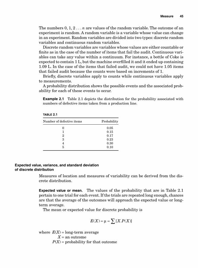
Measure 45
The numbers 0, 1, 2 . . . n are values of the random variable. The outcome of an experiment is random. A random variable is a variable whose value can change in an experiment. Random variables are divided into two types: discrete random variables and continuous random variables.
Discrete random variables are variables whose values are either countable or fi nite as in the case of the number of items that fail the audit. Continuous vari-ables can take any value within a continuum. For instance, a bottle of Coke is expected to contain 1 L, but the machine overfi lled it and it ended up containing 1.09 L. In the case of the items that failed audit, we could not have 1.05 items that failed audit because the counts were based on increments of 1.
Briefl y, discrete variables apply to counts while continuous variables apply to measurements.
A probability distribution shows the possible events and the associated prob-ability for each of these events to occur.
Example 2.1 Table 2.1 depicts the distribution for the probability associated with numbers of defective items taken from a production line.
TABLE 2.1
Number of defective items Probability
0 0.05 1 0.15 2 0.17 3 0.23 4 0.30 5 0.10
Expected value, variance, and standard deviationof discrete distribution
Measures of location and measures of variability can be derived from the dis-crete distribution.
Expected value or mean. The values of the probability that are in Table 2.1 pertain to one trial for each event. If the trials are repeated long enough, chances are that the average of the outcomes will approach the expected value or long-term average.
The mean or expected value for discrete probability is
E X X P X( ) [ . ( )]= = ∑μ
where E(X) = long-term average X = an outcome P(X) = probability for that outcome
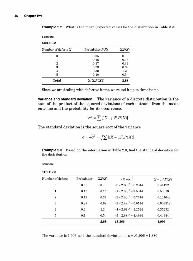
46 Chapter Two
Example 2.2 What is the mean (expected value) for the distribution in Table 2.2?
Solution:
TABLE 2.2
Number of defects X Probability P(X) X.P(X)
0 0.05 0 1 0.15 0.15 2 0.17 0.34 3 0.23 0.69 4 0.30 1.2 5 0.10 0.5
Total
∑∑[ ( )]X.P X
2.88
Since we are dealing with defective items, we round it up to three items.
Variance and standard deviation. The variance of a discrete distribution is the sum of the product of the squared deviations of each outcome from the mean outcome and the probability for its occurrence.
σ μ2 2= −∑ [( ) . ( )]X P X
The standard deviation is the square root of the variance
σ σ μ= = −∑2 2[( ) . ( )]X P X
Example 2.3 Based on the information in Table 2.3, fi nd the standard deviation for the distribution.
Solution:
TABLE 2.3
Number of defects Probability X.P(X) ( )X − μ 2
( ) ( )X P X− μ 2
0 0.05 0 (0 2.88)2− = 8.2944 0.41472
1 0.15 0.15 (1 2.88)2− = 3.5344 0.53016
2 0.17 0.34 (2 2.88)2− = 0.7744 0.131648
3 0.23 0.69 (3 2.88)2− = 0.0144 0.003312
4 0.3 1.2 (4 2.88)2− = 1.2544 0.37632
5 0.1 0.5 (5 2.88)2− = 4.4944 0.44944
2.88 18.366 1.906
The variance is 1.906, and the standard deviation is σ = =1 906 1 380. . .
Measure 47
Discrete probability distributions
A distribution is said to be discrete if it is built on discrete random variables. The four most used discrete probability distributions in business operations are the binomial, the Poisson, the geometric, and the hyper-geometric distributions.
Binomial distribution. The binomial distribution is one of the simplest probability distributions. It assumes an experiment with n identical trials, with each trial having only two possible outcomes considered as success or failure. Each trial is independent of the previous ones. The independence of the trials means that the outcome for each trial is the same as the rest of the trials.
For the remainder of this section, p will be considered as the probability for a success and q as the probability for a failure.
q p= −( )1
The formula for a binomial distribution is as follows:
P x C p qxn x n x( ) = −
where P(x) is the probability for the event x to happen. x may take any value from 0 to n and
Cn
x n xxn =
−!
!( )!
The mean, variance, and standard deviation for a binomial distribution are
μ
σ
σ σ
= =
=
= =
E x np
npq
npq
( )
2
2
Example 2.4 The probability that a container is shipped to customers half-empty is 0.057. Twenty containers have been shipped this morning. What is the probability that fi ve of them are half-empty?
Solution:
n
x
p
q
=
=
=
= − =
20
5
0 057
1 0 057 0 943
.
. .
P x C p q Cxn x n x( ) ( . ) ( . )= = =−5 0 057 0 9435
20 5 15
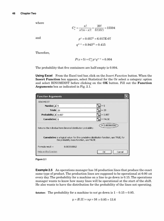
48 Chapter Two
where
Cn
x n xxn =
−= =!
!( )!!
!( !)20
5 1515504
and p
q
x
n x
= =
= =−
0 057
0 943 0 415
5
15
.
. .
6.017E-07
Therefore,
P x C p qxn x n x( ) .= = =−5 0 004
The probability that fi ve containers are half-empty is 0.004.
Using Excel From the Excel tool bar, click on the Insert Function button. When the Insert Function box appears, select Statistical for the Or select a category: option and select BINOMDIST before clicking on the OK button. Fill out the Function Arguments box as indicated in Fig. 2.1.
Figure 2.1
Example 2.5 An operations manager has 16 production lines that produce the exact same type of product. The production lines are supposed to be operational at 6:00 AM every day. The probability for a machine on a line to go down is 0.15. The operations manager wants to know how many lines will be operational at the start of the shift. He also wants to have the distribution for the probability of the lines not operating.
Solution: The probability for a machine to not go down is 1 − 0.15 = 0.85.
μ = = =E X np( ) 16 × 0.85 = 13.6
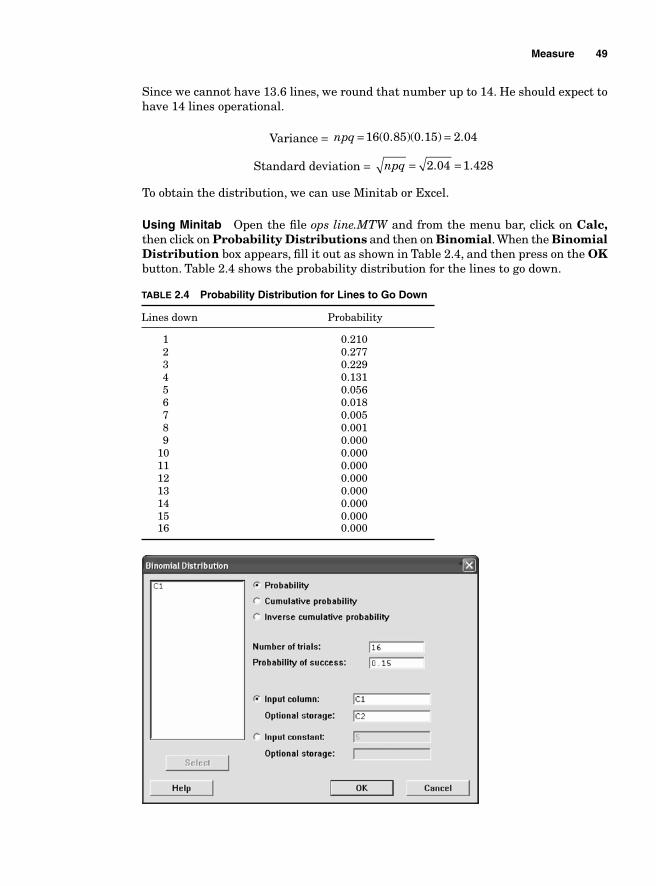
Measure 49
Since we cannot have 13.6 lines, we round that number up to 14. He should expect to have 14 lines operational.
Variance = npq = =16 0 85 0 15 2 04( . )( . ) .
Standard deviation = npq = =2 04 1 428. .
To obtain the distribution, we can use Minitab or Excel.
Using Minitab Open the fi le ops line.MTW and from the menu bar, click on Calc, then click on Probability Distributions and then on Binomial. When the Binomial Distribution box appears, fi ll it out as shown in Table 2.4, and then press on the OK button. Table 2.4 shows the probability distribution for the lines to go down.
TABLE 2.4 Probability Distribution for Lines to Go Down
Lines down Probability
1 0.210 2 0.277 3 0.229 4 0.131 5 0.056 6 0.018 7 0.005 8 0.001 9 0.000 10 0.000 11 0.000 12 0.000 13 0.000 14 0.000 15 0.000 16 0.000
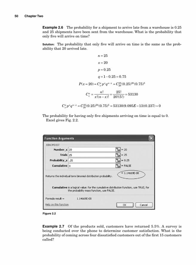
50 Chapter Two
Example 2.6 The probability for a shipment to arrive late from a warehouse is 0.25 and 25 shipments have been sent from the warehouse. What is the probability that only fi ve will arrive on time?
Solution: The probability that only fi ve will arrive on time is the same as the prob-ability that 20 arrived late.
n
x
p
q
=
=
=
= − =
25
20
0 25
1 0 25 0 75
.
. .
P x C p q Cxn x n x( ) ( . ) ( . )= = =−20 0 25 0 7520
25 20 5
Cn
x n xxn =
−= =!
!( )!!
!( !)25
20 553130
C p q C Exn x n x− = =20
25 20 50 25 0 75 53130 9 095( . ) ( . ) ( . −− ≈13 0 237 0)( . )
The probability for having only fi ve shipments arriving on time is equal to 0.Excel gives Fig. 2.2.
Figure 2.2
Example 2.7 Of the products sold, customers have returned 5.5%. A survey is being conducted over the phone to determine customer satisfaction. What is the probability of coming across four dissatisfi ed customers out of the fi rst 15 customers called?
Measure 51
Solution: n
x
p
q
=
=
=
= − =
15
4
0 055
1 0 055 0 945
.
. .
P x C( ) ( . ) ( . )= =4 0 055 0 945415 4 11
Cn
x n xxn =
−= =!
!( )!!
!( !)15
4 111365
P x C p q Cxn x n x( ) ( . ) ( . )= = = =−4 0 055 0 945 13654
15 4 11 (( . )( . ) .0 000009151 0 537 0 007=
Minitab output
Binomial with n = 15 and p = 0.055
x P(X = x)
4 0.0067040
Hyper-geometric distribution. The hyper-geometric distribution is very close to the binomial distribution. One of the conditions of a binomial distribution is the independence of the trials, which made the probability of a success to be the same for every trial. If successive trials are done without replacement and the sample size or population is small, the probability for each observation will vary. If a sample has 10 stones, the probability for taking a particular stone out of the 10 will be 1/10. If that stone is not replaced into the sample, the probability of taking another one will be 1/9. However, if the stones are replaced each time, the probability of taking a particular stone will remain the same, 1/10.
When the sampling is fi nite (relatively small and known) and the outcome changes from trial to trial, the hyper-geometric distribution is used instead of the binomial distribution.
The hyper-geometric distribution assumes
■ A fi nite population of N ■ Two outcomes described as success and failure with k successes in the
population ■ Samples of n items are taken without replacement
The probability distribution depends therefore on k, n, x, and N. The formula for the hyper-geometric distribution is as follows:
P x
C CC
xk
n xN k
nN
( ) = −−
52 Chapter Two
where x is an integer whose value is between 0 and n.
x k
nkN
nkN
kN
N nN
≤
=⎛⎝⎜
⎞⎠⎟
=⎛⎝⎜
⎞⎠⎟
−⎛⎝⎜
⎞⎠⎟
−−
μ
σ2 111
⎛⎝⎜
⎞⎠⎟
Example 2.8 Of the 20 employees at HR, fi ve are men. If three HR employees are randomly selected for a survey, what is the probability that two or more will be men?
Solution:
N
n
k
x
=
=
=
≥
20
3
5
2
We have to fi nd the probability for two selected employees to be men and the probability for three to be men.
Probability for selecting two men
P xC C
CC CC
( )( )= = = =−
−
210 1511
25
3 220 5
320
25
115
320 440
0 132= .
Minitab output
Probability Density Function
Hypergeometric with N = 20, M = 3, and n = 5
x P( X = x )
2 0.131579
The probability for selecting two men is 0.132.
Probability for selecting three men
P xC C
CC CC
( )( )= = = =−
−
310 1114
35
3 320 5
320
35
015
320 00
0 009= .
Minitab output
Probability Density Function
Hypergeometric with N = 20, M = 3, and n = 5
x P( X = x )
3 0.0087719
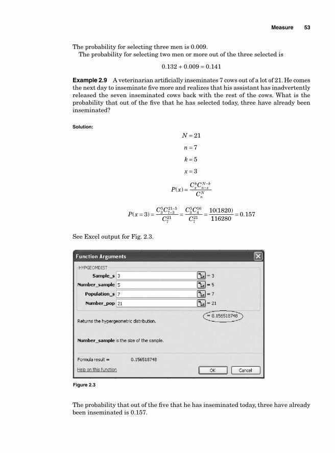
Measure 53
The probability for selecting three men is 0.009.The probability for selecting two men or more out of the three selected is
0.132 + 0.009 = 0.141
Example 2.9 A veterinarian artifi cially inseminates 7 cows out of a lot of 21. He comes the next day to inseminate fi ve more and realizes that his assistant has inadvertently released the seven inseminated cows back with the rest of the cows. What is the probability that out of the fi ve that he has selected today, three have already been inseminated?
Solution:
N
n
k
x
=
=
=
=
21
7
5
3
P xC C
Cxk
n xN k
nN
( ) = −−
P xC C
CC C
C( )
( )= = = =−−
310 18203
57 321 5
721
35
416
721 1116280
0 157= .
See Excel output for Fig. 2.3.
Figure 2.3
The probability that out of the fi ve that he has inseminated today, three have already been inseminated is 0.157.
54 Chapter Two
Poisson distribution. The binomial and the hyper-geometric distributions are used to calculate the probability for one outcome out of two to occur. Not all situations exhibit only two alternatives. For instance, an engineer might want to know the number of defects on a machine; a doctor might be interested in the amount of sugar in the blood of a patient with diabetes, while a quality engineer may be interested in the number of calls received at a call center within a certain time frame. These examples do not state a number of trials nor do they state the number of alternative outcomes. They only describe the occurrence of an event within a time frame, a distance, an area, or a volume. These types of cases call for a Poisson distribution. The Poisson distribution applies to a situation that can be described by a discrete random variable that takes on integers (whole numbers like 1, 2, 3, etc.) with the events occurring at a known average rate.
The density function of the Poisson distribution is
P xex
x
( )!
=−μ μ
where P(x) is the probability for the event x to happen μ is the arithmetic mean for the number of occurrences in a particular
interval e is the constant 2.718282
The mean and the variance of the Poisson distribution are the same and the standard deviation is the square root of the variance.
μ σ
σ μ σ
=
= =
2
2
Example 2.10 Employees come to pick up orders at an inventory location at an average rate of fi ve every 15 min. What is the probability of having seven employees come within a 15-min interval?
Solution:
Pe
( )!
( . ).7
57
78125 0 0075040
0 1047 5
= = =−
See Excel output for Fig. 2.4.The probability for having seven employees come within a 15-min interval is
0.104.
Example 2.11 The employee attrition rate at a company follows a Poisson distribution with a mean of four a month; the HR director wants to know the probability that between fi ve and seven employees would leave the company next month.
Solution: The probability that between fi ve and seven employees would leave the com-pany next month will be the sum of the probabilities for having fi ve, six, and seven employees leave.
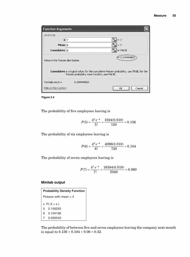
Measure 55
The probability of fi ve employees leaving is
Pe
( )!
( . ).5
45
1024 0 018120
0 1565 4
= = =−
The probability of six employees leaving is
Pe
( )!
( . ).6
46
4096 0 018720
0 1046 4
= = =−
The probability of seven employees leaving is
Pe
( )!
( . ).7
47
16384 0 0185040
0 0607 4
= = =−
Minitab output
Probability Density Function
Poisson with mean = 4
x P( X = x )
5 0.156293
6 0.104196
7 0.059540
The probability of between fi ve and seven employees leaving the company next month is equal to 0.156 + 0.104 + 0.06 = 0.32.
Figure 2.4
56 Chapter Two
Approximating binomial problems by Poisson distribution
Binomial problems can be approximated by the Poisson distribution when the sample sizes are large (n > 20) and p is small (np ≤ 7). In that case, μ = np.
Example 2.12 The probability of receiving material from suppliers late is 0.05. Thirty-fi ve shipments have been sent from the warehouse. What is the probability that only fi ve will arrive late?
μ = = =
= =−
np
Pe
35 0 05 1 75
51 75
516 4135 1 75
( . ) .
( ).
!.. (( . )
.0 174
1200 024=
Minitab output
Probability Density Function
Poisson with mean = 1.75
x P( X = x )
5 0.0237681
The probability that only fi ve will arrive late is 0.024.
Continuous distribution
A continuous random variable is a variable whose set of possible values is a whole interval of numbers and those values are generated from measure-ments as opposed to counts. The most widely used continuous distribution is the normal distribution.
Normal distribution. The normal distribution is certainly the most important probability distribution because it is the most extensively used as the basis for inferential statistics.
Most of nature and human characteristics are normally distributed, and so are most production outputs. For instance, the height of adult male human beings is said to be normally distributed because the average adult male is about 5 ft and 9 in. tall and a signifi cant percentage of adult males are close to that height. The characteristics of a production output of a manufacturing process are also generally normally distributed. Not all the items that come off a production process may be identical, but a high percentage of them are expected to be very close to the mean in order to have a stable and predictable process. When a population is normally distributed, most of the components of that population are very closely clustered around the mean. A characteristic of a population is said to be normally distributed if 68.27% of the population are within one standard deviation away from the mean, 95.47% are within two standard deviations away from the mean, and 99.73% are within three standard deviations away from the population mean.
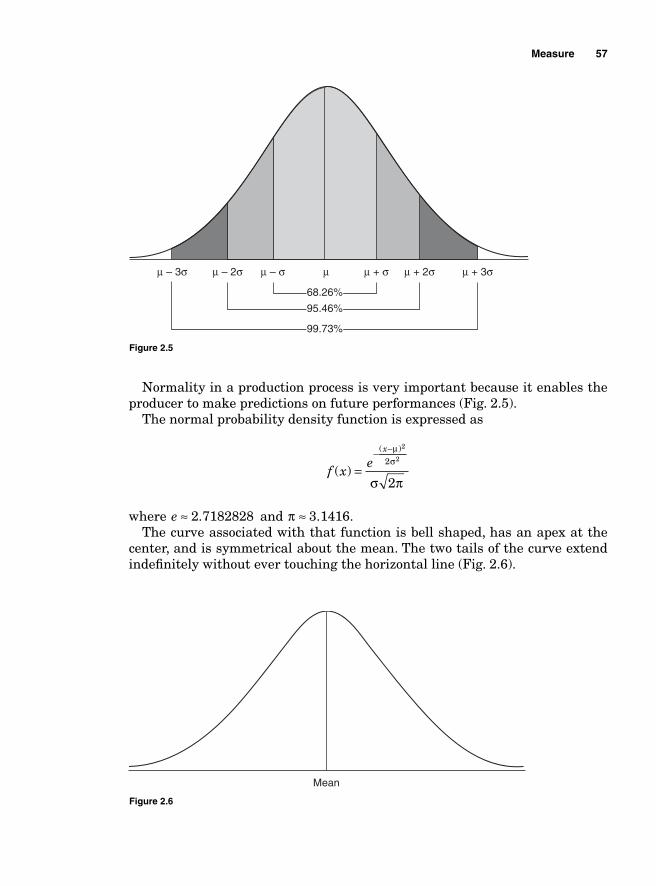
Measure 57
Normality in a production process is very important because it enables the producer to make predictions on future performances (Fig. 2.5).
The normal probability density function is expressed as
f x
ex
( )
( )
=− −μ
σ
σ π
2
22
2
where e ≈ 2 7182828. and π ≈ 3 1416. .The curve associated with that function is bell shaped, has an apex at the
center, and is symmetrical about the mean. The two tails of the curve extend indefi nitely without ever touching the horizontal line (Fig. 2.6).
μ – 3σ μ – 2σ μ – σ μ + σ μ + 2σ μ + 3σμ
68.26%
95.46%
99.73%
Figure 2.5
Mean
Figure 2.6
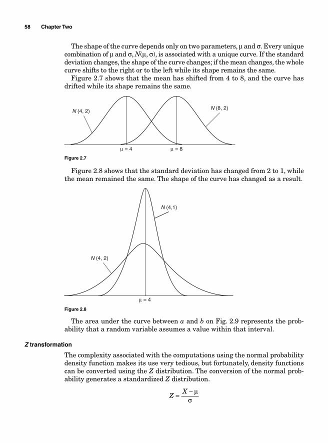
58 Chapter Two
The shape of the curve depends only on two parameters, μ and σ. Every unique combination of μ and σ, N(μ, σ), is associated with a unique curve. If the standard deviation changes, the shape of the curve changes; if the mean changes, the whole curve shifts to the right or to the left while its shape remains the same.
Figure 2.7 shows that the mean has shifted from 4 to 8, and the curve has drifted while its shape remains the same.
N (8, 2)
μ = 4 μ = 8
N (4, 2)
Figure 2.7
N (4,1)
N (4, 2)
μ = 4
Figure 2.8
Figure 2.8 shows that the standard deviation has changed from 2 to 1, while the mean remained the same. The shape of the curve has changed as a result.
The area under the curve between a and b on Fig. 2.9 represents the prob-ability that a random variable assumes a value within that interval.
Z transformation
The complexity associated with the computations using the normal probability density function makes its use very tedious, but fortunately, density functions can be converted using the Z distribution. The conversion of the normal prob-ability generates a standardized Z distribution.
ZX= − μ
σ
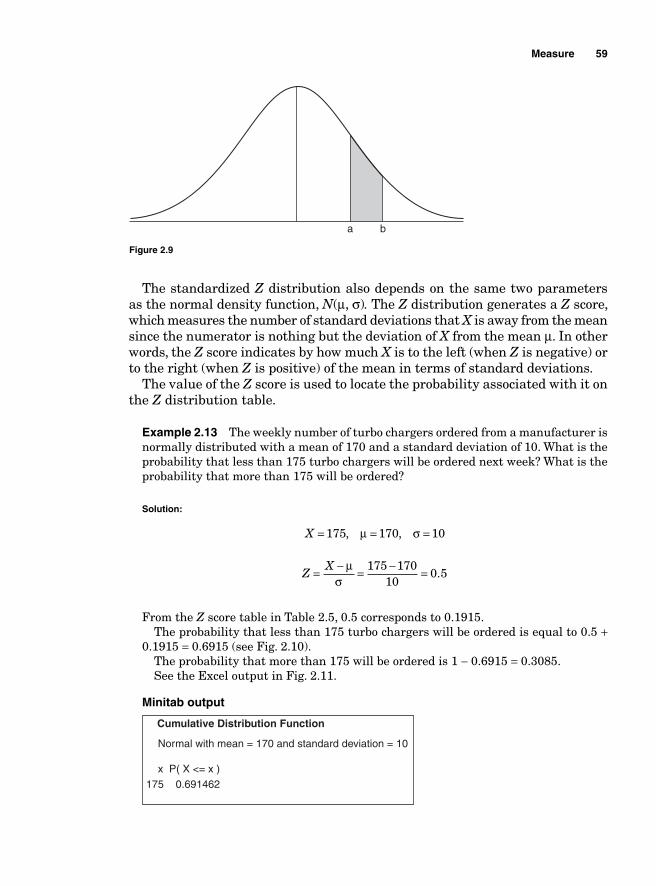
Measure 59
The standardized Z distribution also depends on the same two parameters as the normal density function, N(μ, σ). The Z distribution generates a Z score, which measures the number of standard deviations that X is away from the mean since the numerator is nothing but the deviation of X from the mean μ. In other words, the Z score indicates by how much X is to the left (when Z is negative) or to the right (when Z is positive) of the mean in terms of standard deviations.
The value of the Z score is used to locate the probability associated with it on the Z distribution table.
Example 2.13 The weekly number of turbo chargers ordered from a manufacturer is normally distributed with a mean of 170 and a standard deviation of 10. What is the probability that less than 175 turbo chargers will be ordered next week? What is the probability that more than 175 will be ordered?
Solution:
X = = =175 170 10, ,μ σ
ZX= − = − =μ
σ175 170
100 5.
From the Z score table in Table 2.5, 0.5 corresponds to 0.1915. The probability that less than 175 turbo chargers will be ordered is equal to 0.5 +
0.1915 = 0.6915 (see Fig. 2.10).The probability that more than 175 will be ordered is 1 − 0.6915 = 0.3085.See the Excel output in Fig. 2.11.
Minitab output
Cumulative Distribution Function
Normal with mean = 170 and standard deviation = 10
x P( X <= x )
175 0.691462
a b
Figure 2.9
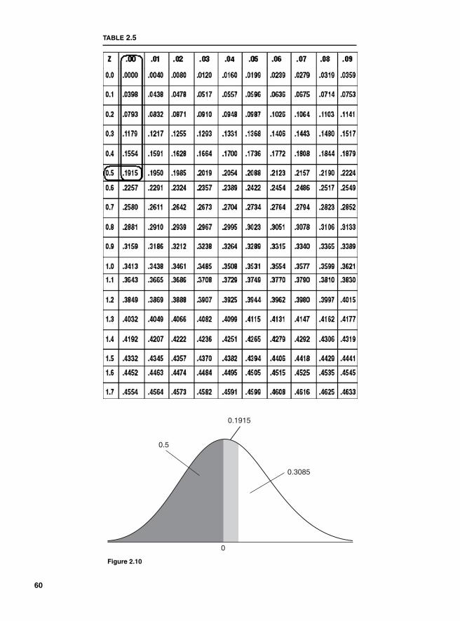
TABLE 2.5
0.1915
0
0.5
0.3085
Figure 2.10
60
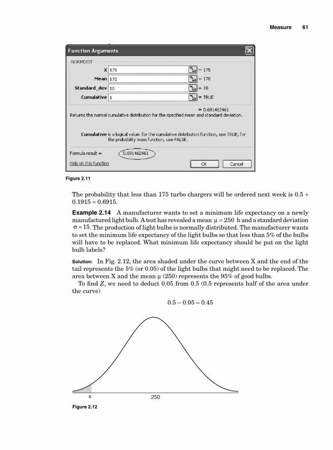
Measure 61
The probability that less than 175 turbo chargers will be ordered next week is 0.5 + 0.1915 = 0.6915.
Example 2.14 A manufacturer wants to set a minimum life expectancy on a newly manufactured light bulb. A test has revealed a mean μ = 250 h and a standard deviation σ = 15. The production of light bulbs is normally distributed. The manufacturer wants to set the minimum life expectancy of the light bulbs so that less than 5% of the bulbs will have to be replaced. What minimum life expectancy should be put on the light bulb labels?
Solution: In Fig. 2.12, the area shaded under the curve between X and the end of the tail represents the 5% (or 0.05) of the light bulbs that might need to be replaced. The area between X and the mean μ (250) represents the 95% of good bulbs.
To fi nd Z, we need to deduct 0.05 from 0.5 (0.5 represents half of the area under the curve)
0.5 − 0.05 = 0.45
Figure 2.11
x 250
Figure 2.12
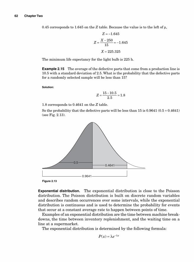
62 Chapter Two
0.45 corresponds to 1.645 on the Z table. Because the value is to the left of μ,
Z = −1.645
ZX= − = −250
151 645.
X = 225.325
The minimum life expectancy for the light bulb is 225 h.
Example 2.15 The average of the defective parts that come from a production line is 10.5 with a standard deviation of 2.5. What is the probability that the defective parts for a randomly selected sample will be less than 15?
Solution:
Z = − =15 10 52 5
1 8.
..
1.8 corresponds to 0.4641 on the Z table.
So the probability that the defective parts will be less than 15 is 0.9641 (0.5 + 0.4641) (see Fig. 2.13).
0.50.4641
0.9641
Figure 2.13
Exponential distribution. The exponential distribution is close to the Poisson distribution. The Poisson distribution is built on discrete random variables and describes random occurrences over some intervals, while the exponential distribution is continuous and is used to determine the probability for events that occur at a constant average rate to happen between points of time.
Examples of an exponential distribution are the time between machine break-downs, the time between inventory replenishment, and the waiting time on a line at a supermarket.
The exponential distribution is determined by the following formula:
P x e x( ) = −λ λ
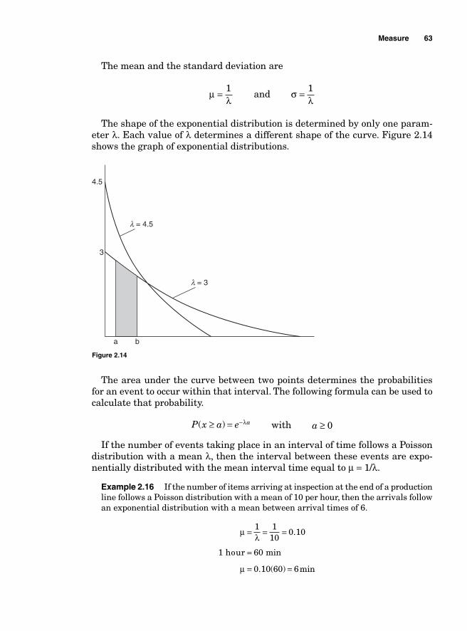
Measure 63
The mean and the standard deviation are
μλ
= 1 and σ
λ= 1
The shape of the exponential distribution is determined by only one param-eter λ. Each value of λ determines a different shape of the curve. Figure 2.14 shows the graph of exponential distributions.
l = 4.5
4.5
3
a b
l = 3
Figure 2.14
The area under the curve between two points determines the probabilities for an event to occur within that interval. The following formula can be used to calculate that probability.
P x a e a( )≥ = −λ with a ≥ 0
If the number of events taking place in an interval of time follows a Poisson distribution with a mean λ, then the interval between these events are expo-nentially distributed with the mean interval time equal to μ = 1/λ.
Example 2.16 If the number of items arriving at inspection at the end of a production line follows a Poisson distribution with a mean of 10 per hour, then the arrivals follow an exponential distribution with a mean between arrival times of 6.
μλ
μ
= = =
=
= =
1 110
0 10
0 10 60 6
.
. ( ) min
1 hour 60 min
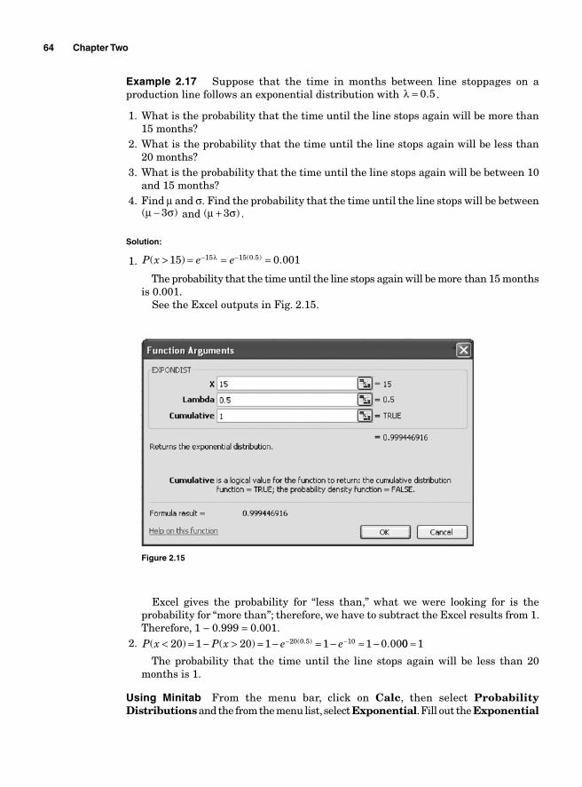
64 Chapter Two
Example 2.17 Suppose that the time in months between line stoppages on a production line follows an exponential distribution with λ = 0 5. .
1. What is the probability that the time until the line stops again will be more than 15 months?
2. What is the probability that the time until the line stops again will be less than20 months?
3. What is the probability that the time until the line stops again will be between 10 and 15 months?
4. Find μ and σ. Find the probability that the time until the line stops will be between ( )μ σ− 3 and ( )μ σ+ 3 .
Solution:
1. P x e e( ) .( . )> = = =− −15 0 00115 15 0 5λ
The probability that the time until the line stops again will be more than 15 months is 0.001.
See the Excel outputs in Fig. 2.15.
Figure 2.15
Excel gives the probability for “less than,” what we were looking for is the probability for “more than”; therefore, we have to subtract the Excel results from 1. Therefore, 1 − 0.999 = 0.001.
2. P x P x e e( ) ( ) .( . )< = − > = − = − ≈ −− −20 1 20 1 1 1 0 0020 0 5 10 00 1≈
The probability that the time until the line stops again will be less than 20 months is 1.
Using Minitab From the menu bar, click on Calc, then select Probability Distributions and the from the menu list, select Exponential. Fill out the Exponential
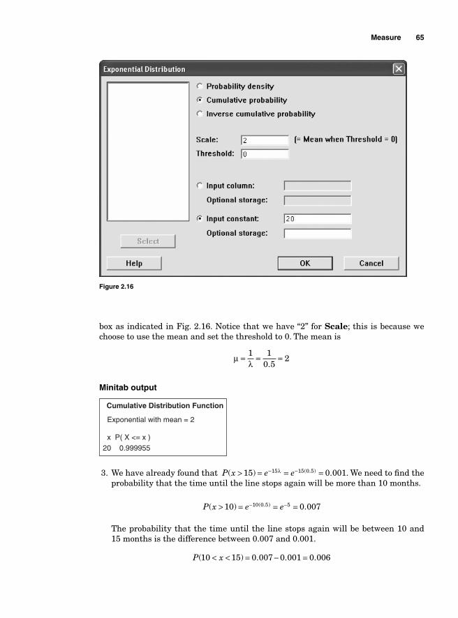
Measure 65
Figure 2.16
box as indicated in Fig. 2.16. Notice that we have “2” for Scale; this is because we choose to use the mean and set the threshold to 0. The mean is
μλ
= = =1 10 5
2.
Minitab output
Cumulative Distribution Function
Exponential with mean = 2
x P( X <= x )
20 0.999955
3. We have already found that P x e e( ) .( . )> = = =− −15 0 00115 15 0 5λ . We need to fi nd the probability that the time until the line stops again will be more than 10 months.
P x e e( ) .( . )> = = =− −10 0 00710 0 5 5
The probability that the time until the line stops again will be between 10 and15 months is the difference between 0.007 and 0.001.
P x( ) . . .10 15 0 007 0 001 0 006< < = − =
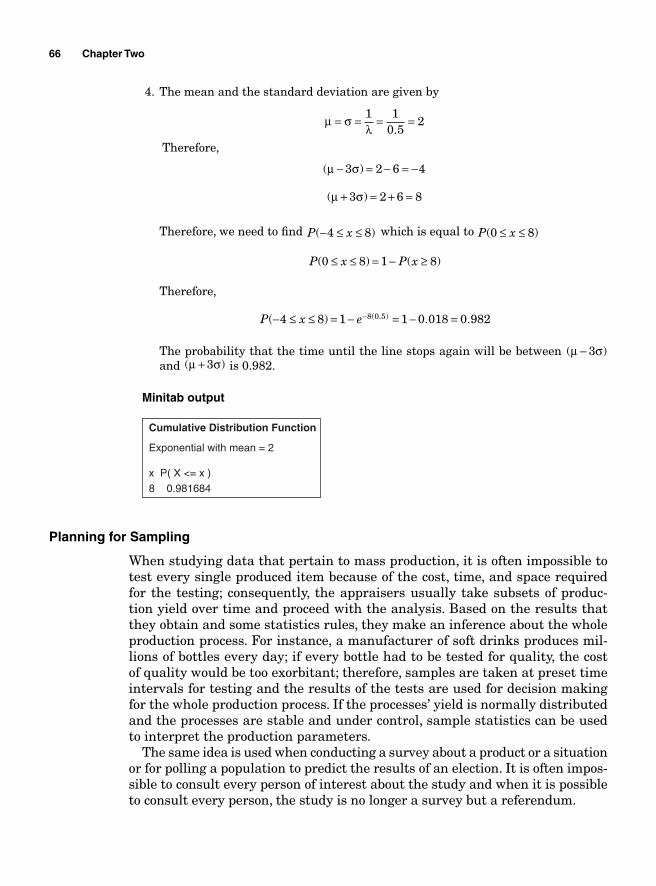
66 Chapter Two
4. The mean and the standard deviation are given by
μ σλ
= = = =1 10 5
2.
Therefore,
( )μ σ− = − = −3 2 6 4
( )μ σ+ = + =3 2 6 8
Therefore, we need to fi nd P x( )− ≤ ≤4 8 which is equal to P x( )0 8≤ ≤
P x P x( ) ( )0 8 1 8≤ ≤ = − ≥
Therefore,
P x e( ) . .( . )− ≤ ≤ = − = − =−4 8 1 1 0 018 0 9828 0 5
The probability that the time until the line stops again will be between ( )μ σ− 3 and ( )μ σ+ 3 is 0.982.
Minitab output
Cumulative Distribution Function
Exponential with mean = 2
x P( X <= x )
8 0.981684
Planning for Sampling
When studying data that pertain to mass production, it is often impossible to test every single produced item because of the cost, time, and space required for the testing; consequently, the appraisers usually take subsets of produc-tion yield over time and proceed with the analysis. Based on the results that they obtain and some statistics rules, they make an inference about the whole production process. For instance, a manufacturer of soft drinks produces mil-lions of bottles every day; if every bottle had to be tested for quality, the cost of quality would be too exorbitant; therefore, samples are taken at preset time intervals for testing and the results of the tests are used for decision making for the whole production process. If the processes’ yield is normally distributed and the processes are stable and under control, sample statistics can be used to interpret the production parameters.
The same idea is used when conducting a survey about a product or a situation or for polling a population to predict the results of an election. It is often impos-sible to consult every person of interest about the study and when it is possible to consult every person, the study is no longer a survey but a referendum.
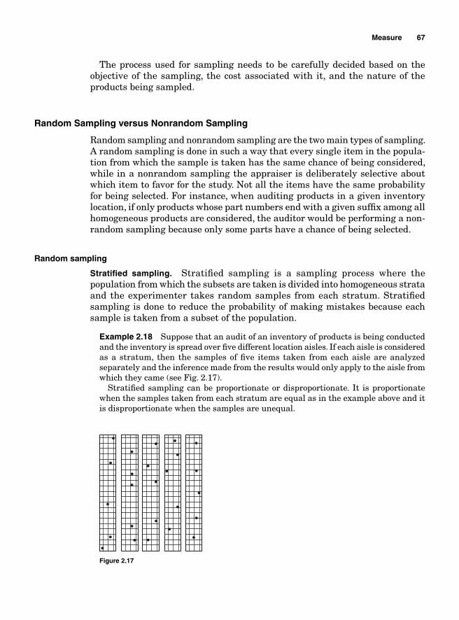
Measure 67
The process used for sampling needs to be carefully decided based on the objective of the sampling, the cost associated with it, and the nature of the products being sampled.
Random Sampling versus Nonrandom Sampling
Random sampling and nonrandom sampling are the two main types of sampling. A random sampling is done in such a way that every single item in the popula-tion from which the sample is taken has the same chance of being considered, while in a nonrandom sampling the appraiser is deliberately selective about which item to favor for the study. Not all the items have the same probability for being selected. For instance, when auditing products in a given inventory location, if only products whose part numbers end with a given suffi x among all homogeneous products are considered, the auditor would be performing a non-random sampling because only some parts have a chance of being selected.
Random sampling
Stratifi ed sampling. Stratifi ed sampling is a sampling process where the population from which the subsets are taken is divided into homogeneous strata and the experimenter takes random samples from each stratum. Stratifi ed sampling is done to reduce the probability of making mistakes because each sample is taken from a subset of the population.
Example 2.18 Suppose that an audit of an inventory of products is being conducted and the inventory is spread over fi ve different location aisles. If each aisle is considered as a stratum, then the samples of fi ve items taken from each aisle are analyzed separately and the inference made from the results would only apply to the aisle from which they came (see Fig. 2.17).
Stratifi ed sampling can be proportionate or disproportionate. It is proportionate when the samples taken from each stratum are equal as in the example above and it is disproportionate when the samples are unequal.
Figure 2.17
68 Chapter Two
Systematic sampling. In systematic sampling, the sample size n is predefi ned and every kth item is selected for sampling with k being predefi ned as well. The objective of systematic sampling is not to reduce the opportunities for error but to simplify the sampling process. For a population N with sample size n,
kNn
=
Example 2.19 A quality assessor wants to build control charts to monitor the quality of circuit board. He decides to select two boards every 20 min for inspection.
Cluster sampling. In stratifi ed sampling, the strata are homogeneous, i.e., the items within each block are identical. In cluster sampling, the appraiser divides the population being studied into strata as in the case of the stratifi ed sampling, but in this case, the blocks called “clusters” are not homogeneous. The items within the clusters are not all identical. If the population being studied is made up of a wide variety of items, each cluster should be built in such a way that it mirrors the diversity of the population. After the clusters have been built, the appraiser randomly makes selections from each cluster to build his samples.
Nonrandom sampling
Nonrandom sampling is a technique of sampling that does not ensure that all the items in the population being sampled have the same probability of being selected. Convenient sampling and judgment sampling are examples of non-random sampling
Convenience sampling. In convenience sampling, the appraiser selects the items based on their handiness or their willingness to participate in the study. If a researcher wants to test some items and only a few are available, he can choose to do so with those that are accessible.
Judgment sampling. Based on experience, a researcher can know exactly what items in a population can make his experiment easy and select only those items.
Nonsampling errors
Nonsampling errors are errors that are not because the samples are not rep-resentative of the population. Nonsampling errors can be calculation errors or data collection errors.
Sampling error
The purpose of sampling is to study a subset of a population and use the results of the study to make an inference about the population. A sampling error happens
Measure 69
when the subsets taken for the study are not representative of the entire popula-tion. For instance, suppose a population of 15 gaskets has thickness measures of 5.00, 5.11, 5.12, 5.12, 5.14, 5.10, 5.09, 5.08, 5.07, 5.90, 5.00, 5.10, 5.00, 5.12, and 6.00. The mean μ for that population would be 5.197. If a sample of the following three measures, 5.11, 5.12, and 5.10, is taken from the population, the mean of the sample would be
X = + + =5 11 5 12 5 10
35 11
. . ..
and the sampling error would be
E X= − = − = −μ 5 11 5 197 0 087. . .
Let us take another sample of three measures: 6.00, 5.10, and 5.11. This time the sample mean will be 5.403 and the sampling error will be E X= − = − =μ 5 403 5 197 0 206. . . .
If another sample is taken and estimated, its sampling error might be differ-ent. These differences are said to be due to chance.
Therefore, if it is possible to make mistakes while estimating the population’s parameters from a sample statistic, how can we be sure that sampling can help us obtain a good estimate? Why use sampling as a mean of estimating the population parameters?
The central limit theorem can help us answer these questions.
Central Limit Theorem
The central limit theorem states that for suffi ciently large sample sizes ( )n ≥ 30 , regardless of the type of the distribution of the population, if samples of size n are randomly drawn from a population that has a mean μ and a standard deviation σ, the samples’ means X are approximately normally distributed. If the population is normally distributed, the samples’ means are normally distributed regardless of the sample sizes.
μ μ
σ σ
x
xn
=
=
where μ x is the mean of the samples’ mean and σ x is the standard deviation of the samples’ means.
The implication of this theorem is that for suffi ciently large populations, the normal distribution can be used to analyze samples drawn from populations that are not normally distributed or whose shapes are unknown.
70 Chapter Two
When means are used as estimators to make inferences about a population’s parameters, and ( )n ≥ 30 , then the estimator will be approximately normally distributed in repeated sampling.
Sampling distribution of the mean X
We have seen in the example of the gasket thickness that the mean of the fi rst sample was 5.11; the mean of the second was 5.403. If the means of all possible samples are obtained and organized, we could derive the sampling distribution of the means.
In that example we had 15 gaskets. If all possible samples of three were to be computed, there would be 455 samples and means.
C
Nn N nn
N =−
=−
=!!( )!
!!( )!
153 15 3
455
The mean and standard deviation of that sampling distribution are given as
μ μ
σ σ
x
x n
=
=
Example 2.20 Gajaga Electronics is a company that manufactures circuit boards. The average imperfection on a board is μ = 5 with a standard deviation of σ = 2 34. when the production process is under control.
A random sample of n = 36 circuit boards has been taken for inspection and a mean of x = 6 defects per board was found. What is the probability of getting a value of x ≤ 6 if the process is under control?
Solution: Since the sample size is greater than 30, the central limit theorem can be used in this case even though the number of defects per board follows a Poisson dis-tribution. Therefore, the distribution of the sample mean x is approximately normal with the standard deviation
σ σx
n= = 2 34
360 39
..
Therefore,
z x
n
= − = − = =μσ
6 50 39
10 39
2 56. .
.
z = 2 56. corresponds to 0.4948 on the Z score table. The probability of getting a value of x ≤ 6 is 0.5 + 0.4948 = 0.9948 (see Fig. 2.18).
P x( ) .≤ =6 0 9948
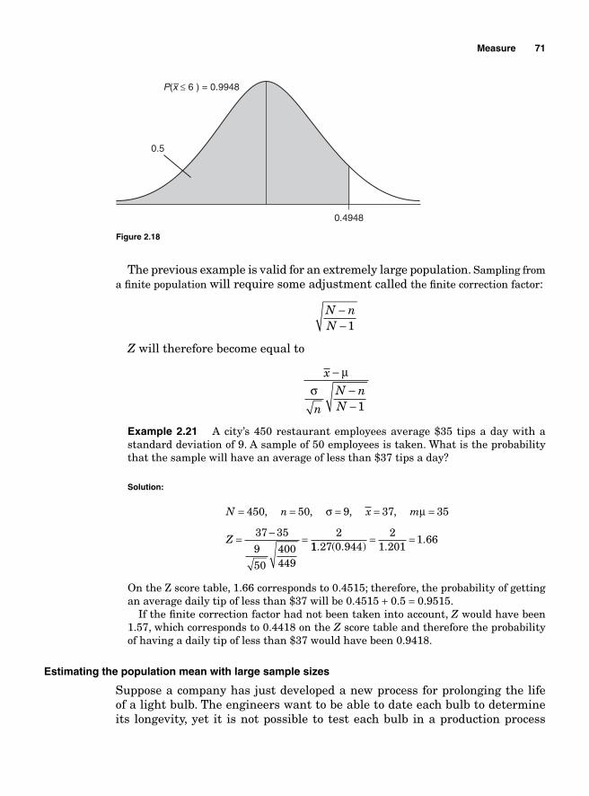
Measure 71
The previous example is valid for an extremely large population. Sampling from a fi nite population will require some adjustment called the fi nite correction factor:
N nN
−− 1
Z will therefore become equal to
x
n
N nN
−−−
μσ
1
Example 2.21 A city’s 450 restaurant employees average $35 tips a day with a standard deviation of 9. A sample of 50 employees is taken. What is the probability that the sample will have an average of less than $37 tips a day?
Solution:
N n x m
Z
= = = = =
= − =
450 50 9 37 35
37 35
9
50
400449
2
, , , ,σ μ
11 27 0 9442
1 2011 66
. ( . ) ..= =
On the Z score table, 1.66 corresponds to 0.4515; therefore, the probability of getting an average daily tip of less than $37 will be 0.4515 + 0.5 = 0.9515.
If the fi nite correction factor had not been taken into account, Z would have been 1.57, which corresponds to 0.4418 on the Z score table and therefore the probability of having a daily tip of less than $37 would have been 0.9418.
Estimating the population mean with large sample sizes
Suppose a company has just developed a new process for prolonging the life of a light bulb. The engineers want to be able to date each bulb to determine its longevity, yet it is not possible to test each bulb in a production process
0.5
P(x ≤ 6 ) = 0.9948
0.4948
–
Figure 2.18
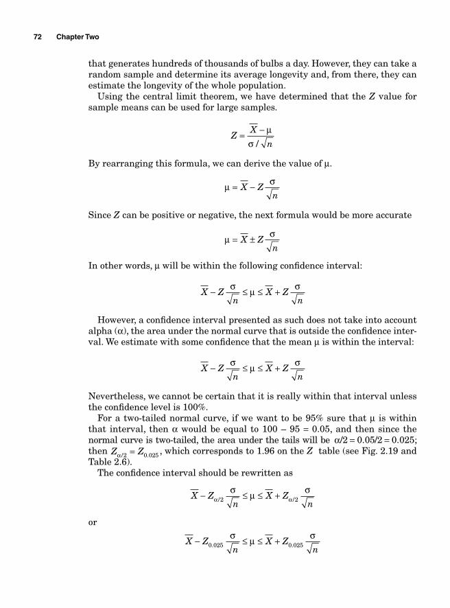
72 Chapter Two
that generates hundreds of thousands of bulbs a day. However, they can take a random sample and determine its average longevity and, from there, they can estimate the longevity of the whole population.
Using the central limit theorem, we have determined that the Z value for sample means can be used for large samples.
Z
X
n= − μ
σ /
By rearranging this formula, we can derive the value of μ.
μ σ= −X Z
n
Since Z can be positive or negative, the next formula would be more accurate
μ σ= ±X Zn
In other words, μ will be within the following confi dence interval:
X Z
nX Z
n− ≤ ≤ +σ μ σ
However, a confi dence interval presented as such does not take into account alpha (α), the area under the normal curve that is outside the confi dence inter-val. We estimate with some confi dence that the mean μ is within the interval:
X Z
nX Z
n− ≤ ≤ +σ μ σ
Nevertheless, we cannot be certain that it is really within that interval unless the confi dence level is 100%.
For a two-tailed normal curve, if we want to be 95% sure that μ is within that interval, then α would be equal to 100 – 95 = 0.05, and then since the normal curve is two-tailed, the area under the tails will be α/ . / .2 0 05 2 0 025= = ; then Z Zα / .2 0 025= , which corresponds to 1.96 on the Z table (see Fig. 2.19 and Table 2.6).
The confi dence interval should be rewritten as
X Z
nX Z
n− ≤ ≤ +α α
σ μ σ/ /2 2
or
X Z
nX Z
n− ≤ ≤ +0 025 0 025. .
σ μ σ
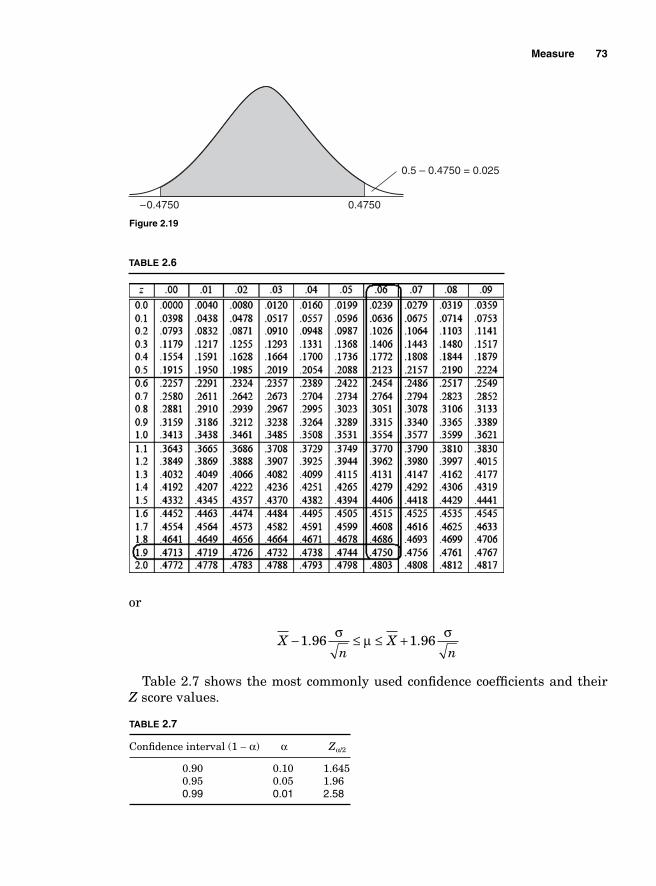
Measure 73
or
X
nX
n− ≤ ≤ +1 96 1 96. .
σ μ σ
Table 2.7 shows the most commonly used confi dence coeffi cients and their Z score values.
0.5 – 0.4750 = 0.025
0.4750–0.4750
Figure 2.19
TABLE 2.6
TABLE 2.7
Confi dence interval (1 − α) α Zα/2
0.90 0.10 1.645 0.95 0.05 1.96
0.99 0.01 2.58
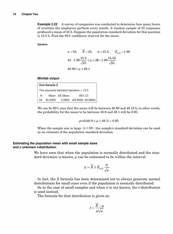
74 Chapter Two
Example 2.22 A survey of companies was conducted to determine how many hours of overtime the employees perform every month. A random sample of 55 responses produced a mean of 45 h. Suppose the population standard deviation for this question is 15.5 h. Find the 95% confi dence interval for the mean.
Solution:
n X Z= = = =
− ≤ ≤
55 45 15 5 1 96
45 1 9615 5
554
2, , . , .
..
/σ
μ
α
55 1 9615 55
55
40 90 49 1
+
≤ ≤
..
. .μ
Minitab output
One-Sample Z
The assumed standard deviation = 15.5
N Mean SE Mean 95% CI
55 45.0000 2.0900 (40.9036, 49.0964)
We can be 95% sure that the mean will be between 40.90 and 49.10 h; in other words, the probability for the mean to be between 40.9 and 49.1 will be 0.95.
prob[40.9 ≤ μ ≤ 49.1] = 0.95
When the sample size is large ( )n ≥ 30 , the sample’s standard deviation can be used as an estimate of the population standard deviation.
Estimating the population mean with small sample sizesand r unknown t-distribution
We have seen that when the population is normally distributed and the stan-dard deviation is known, μ can be estimated to be within the interval
μ σ
α= ±X Zn/2
In fact, the Z formula has been determined not to always generate normal distributions for small sizes even if the population is normally distributed.
So in the case of small samples and when σ is not known, the t-distribution is used instead.
The formula for that distribution is given as:
t
X
s n= − μ
/
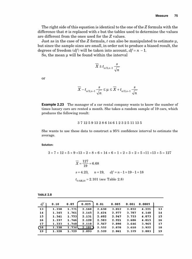
Measure 75
The right side of this equation is identical to the one of the Z formula with the difference that σ is replaced with s but the tables used to determine the values are different from the ones used for the Z values.
Just as in the case of the Z formula, t can also be manipulated to estimate μ, but since the sample sizes are small, in order not to produce a biased result, the degrees of freedom (df ) will be taken into account, df = n - 1.
So, the mean μ will be found within the interval
X t
s
nn± −α / ,2 1
or
X t
s
nX t
s
nn n− ≤ ≤ +− −α αμ/ , / ,2 1 2 1
Example 2.23 The manager of a car rental company wants to know the number of times luxury cars are rented a month. She takes a random sample of 19 cars, which produces the following result:
3 7 12 5 9 13 2 8 6 14 6 1 2 3 2 5 11 13 5
She wants to use these data to construct a 95% confi dence interval to estimate the average.
Solution:
3 + 7 + 12 + 5 + 9 +13 + 2 + 8 + 6 + 14 + 6 + 1 + 2 + 3 + 2 + 5 +11 +13 + 5 = 127
X
s n df n
t
= =
= = = − = − =
12719
6 68
4 23 19 1 19 1 18
0 02
.
. , ,
. 55 18 2 101, . ( )= see Table 2.8
TABLE 2.8
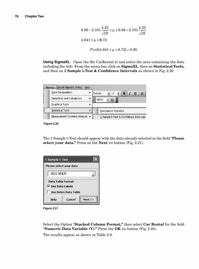
76 Chapter Two
6 68 2 1014 23
196 68 2 101
4 23
19
4 641
. ..
. ..
.
− ≤ ≤ +
≤ ≤
μ
μ 88 72.
Prob[ . . ] .4 641 8 72 0 95≤ ≤ =μ
Using SigmaXL Open the fi le CarRental.xl and select the area containing the data including the title. From the menu bar, click on SigmaXL, then on Statistical Tools, and then on 1 Sample t-Test & Confi dence Intervals as shown in Fig. 2.20
Figure 2.20
Figure 2.21
The 1 Sample t-Test should appear with the data already selected in the fi eld “Pleaseselect your data.” Press on the Next >> button (Fig. 2.21).
Select the Option “Stacked Column Format,” then select Car Rental for the fi eld “Numeric Data Variable (Y).” Press the OK >> button (Fig. 2.22).
The results appear as shown in Table 2.9.
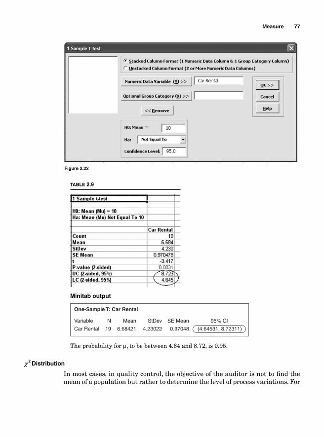
Measure 77
Minitab output
One-Sample T: Car Rental
N Mean SE Mean 95% CI
19
Variable
Car Rental 6.68421
StDev
4.23022 0.97048 (4.64531, 8.72311)
The probability for μ, to be between 4.64 and 8.72, is 0.95.
b 2 Distribution
In most cases, in quality control, the objective of the auditor is not to fi nd the mean of a population but rather to determine the level of process variations. For
Figure 2.22
TABLE 2.9
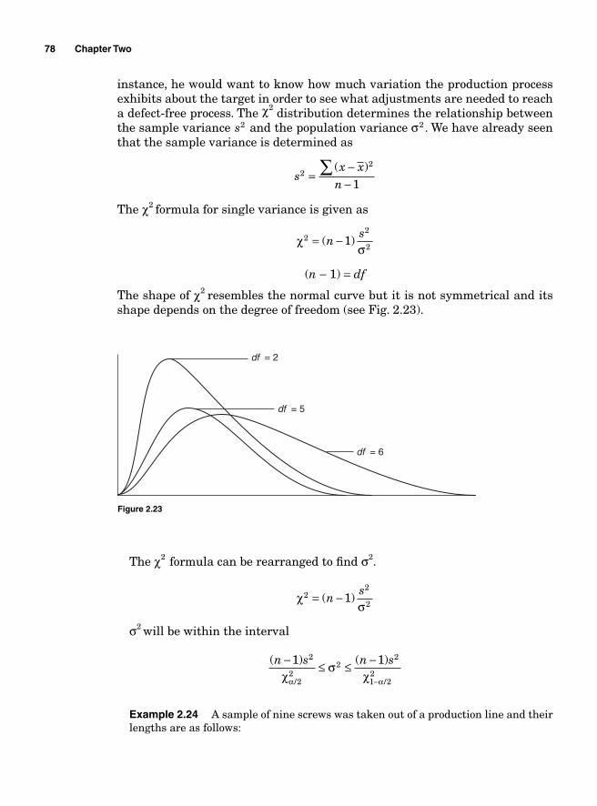
78 Chapter Two
instance, he would want to know how much variation the production process exhibits about the target in order to see what adjustments are needed to reach a defect-free process. The χ2 distribution determines the relationship between the sample variance s2 and the population variance σ2 . We have already seen that the sample variance is determined as
s
x xn
22
1=
−−
∑ ( )
The χ2 formula for single variance is given as
χ
σ2
2
21= −( )ns
(n − 1) = df
The shape of χ2 resembles the normal curve but it is not symmetrical and its shape depends on the degree of freedom (see Fig. 2.23).
df = 6
df = 5
df = 2
Figure 2.23
The χ2 formula can be rearranged to fi nd σ2.
χ
σ2
2
21= −( )ns
σ2 will be within the interval
( ) ( )
/ /
n s n s− ≤ ≤ −
−
1 12
22
22
1 22χ
σχα α
Example 2.24 A sample of nine screws was taken out of a production line and their lengths are as follows:
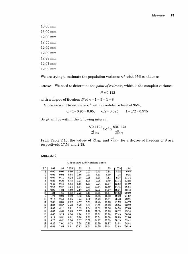
Measure 79
13.00 mm
13.00 mm
12.00 mm
12.55 mm
12.99 mm
12.89 mm
12.88 mm
12.97 mm
12.99 mm
We are trying to estimate the population variance σ2 with 95% confi dence.
Solution: We need to determine the point of estimate, which is the sample’s variance.
s2 0 112= .
with a degree of freedom df of n – 1 = 9 – 1 = 8.
Since we want to estimate σ2 with a confi dence level of 95%,
α α α= − = = − =1 0 95 0 05 2 0 025 1 2 0 975. . , / . , / .
So σ2 will be within the following interval:
8 0 112 8 0 112
0 0252
2
0 9752
( . ) ( . )
. .χσ
χ≤ ≤
From Table 2.10, the values of χ0 0252. and χ0 975
2. for a degree of freedom of 8 are,
respectively, 17.53 and 2.18.
TABLE 2.10
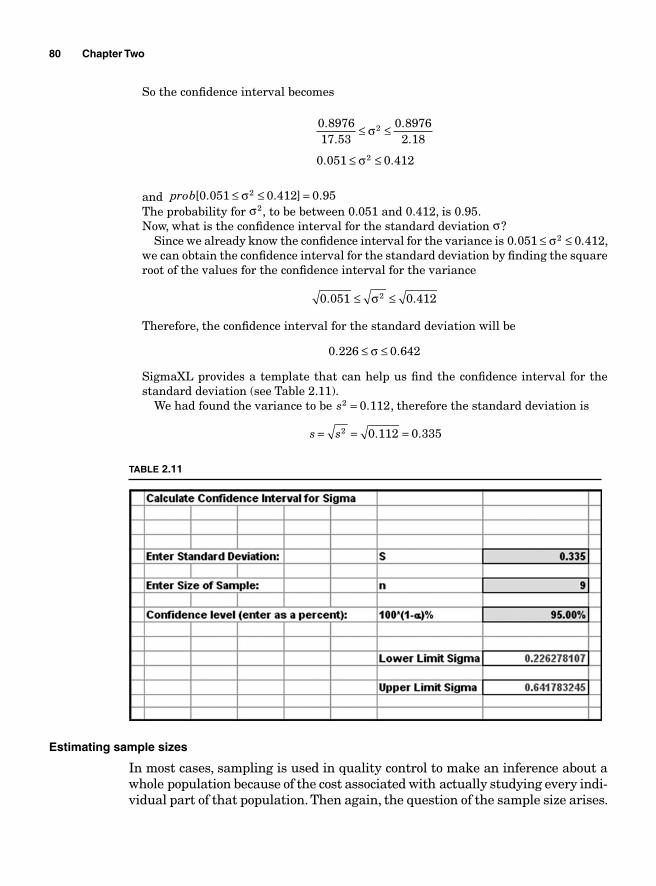
80 Chapter Two
So the confi dence interval becomes
0 897617 53
0 89762 18
0 051 0 412
2
2
..
..
. .
≤ ≤
≤ ≤
σ
σ
and prob[ . . ] .0 051 0 412 0 952≤ ≤ =σThe probability for σ2, to be between 0.051 and 0.412, is 0.95.Now, what is the confi dence interval for the standard deviation σ?
Since we already know the confi dence interval for the variance is 0 051 0 4122. .≤ ≤σ , we can obtain the confi dence interval for the standard deviation by fi nding the square root of the values for the confi dence interval for the variance
0 051 0 4122. .≤ ≤σ
Therefore, the confi dence interval for the standard deviation will be
0 226 0 642. .≤ ≤σ
SigmaXL provides a template that can help us fi nd the confi dence interval for the standard deviation (see Table 2.11).
We had found the variance to be s2 0 112= . , therefore the standard deviation is
s s= = =2 0 112 0 335. .
TABLE 2.11
Estimating sample sizes
In most cases, sampling is used in quality control to make an inference about a whole population because of the cost associated with actually studying every indi-vidual part of that population. Then again, the question of the sample size arises.
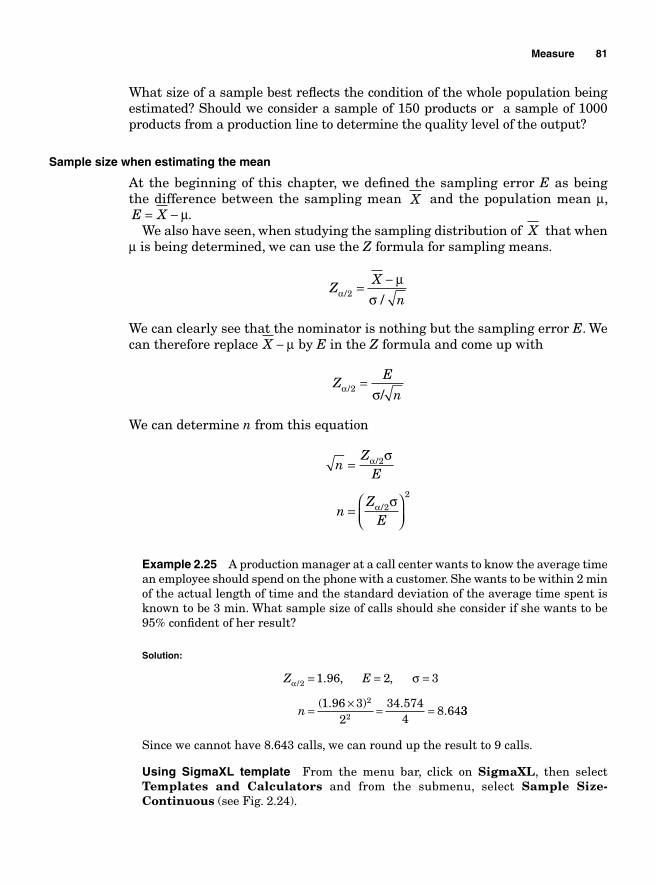
Measure 81
What size of a sample best refl ects the condition of the whole population being estimated? Should we consider a sample of 150 products or a sample of 1000 products from a production line to determine the quality level of the output?
Sample size when estimating the mean
At the beginning of this chapter, we defi ned the sampling error E as being the difference between the sampling mean X and the population mean μ, E X= − μ.
We also have seen, when studying the sampling distribution of X that when μ is being determined, we can use the Z formula for sampling means.
Z
X
nαμ
σ/ /2 = −
We can clearly see that the nominator is nothing but the sampling error E. We can therefore replace X − μ by E in the Z formula and come up with
Z
E
nα σ/ /2 =
We can determine n from this equation
nZ
E
nZ
E
=
=⎛⎝⎜
⎞⎠⎟
α
α
σ
σ
/
/
2
22
Example 2.25 A production manager at a call center wants to know the average time an employee should spend on the phone with a customer. She wants to be within 2 min of the actual length of time and the standard deviation of the average time spent is known to be 3 min. What sample size of calls should she consider if she wants to be 95% confi dent of her result?
Solution:
Z E
n
α σ/ . , ,
( . ) ..
2
2
2
1 96 2 3
1 96 32
34 5744
8 64
= = =
= × = = 33
Since we cannot have 8.643 calls, we can round up the result to 9 calls.
Using SigmaXL template From the menu bar, click on SigmaXL, then select Templates and Calculators and from the submenu, select Sample Size- Continuous (see Fig. 2.24).
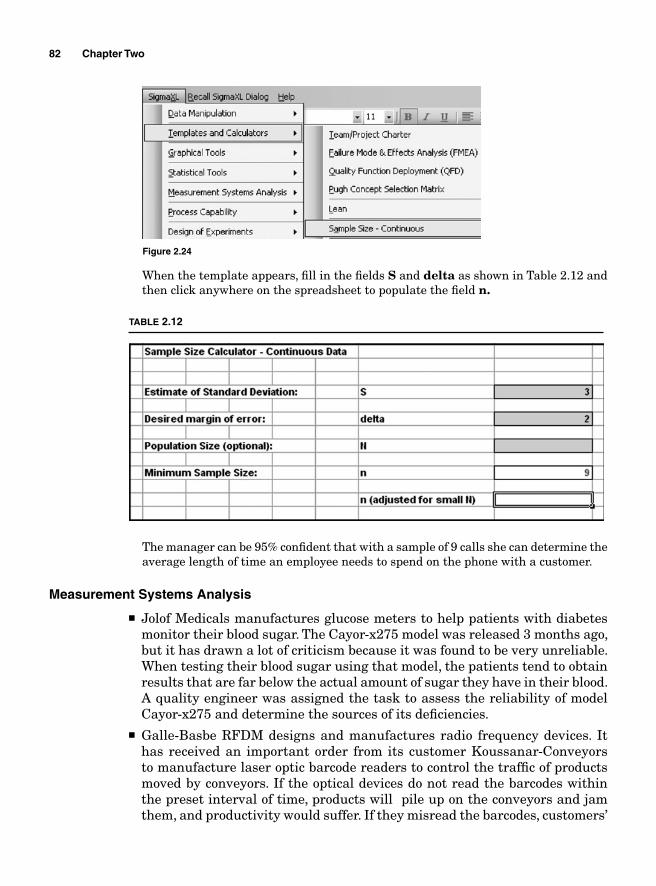
82 Chapter Two
When the template appears, fi ll in the fi elds S and delta as shown in Table 2.12 and then click anywhere on the spreadsheet to populate the fi eld n.
Figure 2.24
TABLE 2.12
The manager can be 95% confi dent that with a sample of 9 calls she can determine the average length of time an employee needs to spend on the phone with a customer.
Measurement Systems Analysis
■ Jolof Medicals manufactures glucose meters to help patients with diabetes monitor their blood sugar. The Cayor-x275 model was released 3 months ago, but it has drawn a lot of criticism because it was found to be very unreliable. When testing their blood sugar using that model, the patients tend to obtain results that are far below the actual amount of sugar they have in their blood. A quality engineer was assigned the task to assess the reliability of model Cayor-x275 and determine the sources of its defi ciencies.
■ Galle-Basbe RFDM designs and manufactures radio frequency devices. It has received an important order from its customer Koussanar-Conveyors to manufacture laser optic barcode readers to control the traffi c of products moved by conveyors. If the optical devices do not read the barcodes within the preset interval of time, products will pile up on the conveyors and jam them, and productivity would suffer. If they misread the barcodes, customers’
Measure 83
shipments would end up being sent to wrong destinations. It is therefore extremely important for the devices to be precise and accurate so they can be used in distribution and manufacturing plants. After the design has been completed, a reliability engineer is charged with testing the devices for fi t-ness for use.
■ Reynolds manufactures and sells diesel engines and the replacement parts for the engines. The distribution center located in Memphis, Tennessee has been having problems with inventory accuracy for the parts that weigh less than 1 oz. The warehouse is always either overstocking those parts or back ordering them because it ran out of stock. The inventory manager believes that this is because when more than 50 pieces of those parts are ordered, the employees do not have to count them, they can just put them on scales to measure their weight and determine the quantities. The quality engineer has been assigned with the task of ensuring that the measurement process is reliable and that it is not causing the uncontrolled variability in the inventory.
Before creating control charts and analyzing a process’ capabilities, it is nec-essary to ensure that the methods and tools used to inspect, test, measure, analyze, or audit the process or the products generated by that process provide accurate, precise, and reliable information. If a faulty gauge is used to measure the conformance of a CTQ to its preset standards, the results obtained can only be fl awed. The performance of the gauges used to test and generate measure-ments on a process yield is a quintessential component of process engineering. The determination of the tools and methods used to assess the quality of the data generated through a measurement system should be the fi rst consideration when appraising the performance of a production process.
The data generated by a measurement process always exhibits some vari-ability and the variations in measurements can only come from two sources: variations due to actual differences between the measured parts and variations due to the measurement process (how the parts were measured). The variance is used to measure those variations.
Suppose that a quality controller wants to determine the sources of variations between motor mounts. The variations can come from either the actual differ-ences between the parts themselves, the measurement process, or the interaction between the parts and the measurement process.
σ σ σTotal Motor Mount2
Measurement Process22 = + ++ ( * )σ σMotor Mount
2Measurement Process2
σTotal2 measures the total variations.
σMotor Mount2 measures the variations due to the actual differences between
the motor mounts.
σMeasurement Process2 measures the variations due to how the measurements were
taken. σ σMotor Mount
2Measurement Process2* measures the interaction between the parts
and the measurement process.
84 Chapter Two
The variations due to the measurement process σMeasurement Process2 can be
subdivided further between the variations due the operator (how he took the measurements) and the variations due to the gauge (the instrument used to collect the measurements).
σ σ σMeasurent Process Operator
2Gauge22 = +
Therefore, when assessing the sources of variations, three components and their interactions are considered: part-to-part variations, variations due to the operators, and variations due to the gauge and the interactions motor mount/operator, operator/gauge, motor mount/gauge, and motor mount/gauge/operator:
σ σ σ σ σTotal Motor Mount2
Operator2
Gauge22 = + + + ( MMotor Mount
2Operator2
Operator2
Gaug
* )
( *
σ
σ σ+ ee2
Motor Mount2
Gauge2
Motor Mount2) ( * ) (+ +σ σ σ ** * )σ σOperator
2Gauge2
If signifi cant variations are present in a production process, measurement systems analysis (MSA) can be used to determine their sources.
The control charts and the analysis of variance (ANOVA) are among the tools used by MSA to pinpoint the sources of variations. The control charts visualize the patterns of the measurements while the ANOVA determines the signifi cance of the factors contributing to the variations.
Example 2.26 A car manufacturer wants to reduce the noise generated by one of its models and has determined that most of the rattling noise is coming from the loose connection between the motor mount (a motor mount is a device that connects different pieces of a car engine to their framework) and the chassis. The thickness of the motor mount is deemed critical to quality. The quality engineer assigned to the task uses an electronic caliper to assess the conformity of a random sample of 20 motor mounts. He measures each of the 20 motor mounts three times and tabulates the results as shown in Table 2.13.
TABLE 2.13
Motor mount M1 M2 M3 Motor mount M1 M2 M3
1 10.0264 10.0391 10.0348 11 11.8616 11.8781 11.8212 2 10.9938 10.98276 10.9325 12 10.0264 10.0391 10.0348 3 10.0332 10.0299 10.0354 13 10.0016 10.0446 10.0036 4 10.0008 9.9523 9.9589 14 10.9879 10.9569 10.9655 5 10.0032 10.0035 10.0094 15 10.0032 10.0035 10.0094 6 11.0204 10.9823 10.9956 16 10.0008 9.9523 9.9589 7 10.0032 10.0035 10.0094 17 10.0264 10.0391 10.0348 8 10.0032 10.0035 10.0094 18 10.9938 10.98276 10.9325 9 10.9938 10.98276 10.9325 19 10.9938 10.98276 10.9325 10 10.0264 10.0391 10.0348 20 10.0032 10.0035 10.0094
Measure 85
The differences across columns M1, M2, and M3 for each line show variation in measurements for the same part while the differences within each column show the variations between parts.
Figure 2.25 shows SigmaXL generated X – R control charts. The interpretation that is made for these control charts will be different from the one created when monitoring a production process with statistical process control. Since each motor mount is a sample and the measurements M1, M2, M3 are the pieces of the sample, each dot on the charts represents a mean measurement for one motor mount. The X chart shows thesignifi cance of the part-to-part variations, while the R chart shows how consistentthe measurement process has been. If the gauge used to measure the parts is good and the same operator measured every part in a consistent manner, the R chart is expected to be in control and stable; otherwise, it will show out of control patterns.
The X chart in Fig. 2.25 shows just about every dot is out of control. These extreme disparities between the parts indicate that the part-to-part variations are very signifi cant. The R chart is stable and in control. This means that the operator did not
11.80
Motor Mount Experiment
Motor Mount Experiment
11.30
10.80
10.30
9.80
0.0800
0.0700
0.0600
0.0500
0.0400
0.0300
0.0200
0.0100
0.0000
R: M
1 –
M3
X-B
ar: M
1 –
M3
–0.0100
–0.0200
1 2 3 4 5 6 7 8 9 10 11 12 13 14 15 16 17 18 19 20
1 2 3 4 5 6 7 8 9 10 11 12 13 14 15 16 17 18 19 20
0.0770
10.4210.39
10.36
0.0299
0.0000
Figure 2.25
86 Chapter Two
have any problem taking measurements, there is consistency in the way he measured the motor mounts, and both the gauge and the operator performed well. Consequently, the sources of the variations in the measurements are traceable to the differences in size between the pieces tested.
SigmaXL output for motor mount experiment (obtained from Motor mount.xls) is shown in Fig. 2.25.
While the control charts visualize the sources of variations, ANOVA quantifi es the signifi cance level of the sources of variation. When using the ANOVA single factor completely randomized experiment, each part is considered as a treatment factor. Since 20 pieces of motor mounts were used, the degree of freedom for the factors would be 19 and since each test was replicated three times, we ended up with 60 measurements. Therefore, a degree of freedom for the total was 59 and 40 degrees of freedom would be left for the error term.
The null hypothesis for the ANOVA experiment suggests that there is no difference between the motor mounts and the alternate hypothesis suggests that at least one motor mount is different.
The Minitab output in Table 2.14 shows that the p-value for the factors is equal to 0.000, which means that the null hypothesis should be rejected and the conclusion is that there are signifi cant differences between the motor mounts.
S = 0.01996 R–Sq = 99.91% R–Sq(adj) = 99.87%
DF194059
SS18.183310.01593
18.19924
F2402.77
P0.000
SourceFactorErrorTotal
MS0.957020.00040
TABLE 2.14 Minitab Output
Precision and Accuracy
Two kinds of errors can result from using a measurement process: accuracy and precision. Accuracy refers to how close the measurements taken refl ect the actual true value of the CTQ being measured and precision refers to how consistent the gauge is at getting the same results every time it measured the same object. It is therefore possible to be precise and not be accurate and vice versa.
Suppose that a sample of 100 brake pads that are known to weigh 1.5 lb each are tested using an electronic scale and the scale shows that each pad weighs 1.45 lb. The scale would not be considered accurate because it fails to give the exact true measurement of 1.5 lb, but it should be considered precise because it obtains the same results at every test.
Measurement errors due to precision
Precision refers to the consistency of the measurements obtained from repeated tests. The two important aspects of precision that are considered are repeatability and reproducibility. Repeatability addresses the variations obtained when a
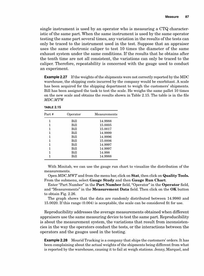
Measure 87
single instrument is used by an operator who is measuring a CTQ character-istic of the same part. When the same instrument is used by the same operator testing the same part several times, any variation in the results of the tests can only be traced to the instrument used in the test. Suppose that an appraiser uses the same electronic caliper to test 10 times the diameter of the same exhaust system under the same conditions. If the results that he obtains after the tenth time are not all consistent, the variations can only be traced to the caliper. Therefore, repeatability is concerned with the gauge used to conduct an experiment.
Example 2.27 If the weights of the shipments were not correctly reported by the MDC warehouse, the shipping costs incurred by the company would be exorbitant. A scale has been acquired for the shipping department to weigh the customers’ shipments. Bill has been assigned the task to test the scale. He weighs the same pallet 10 times on the new scale and obtains the results shown in Table 2.15. The table is in the fi le MDC.MTW
TABLE 2.15
Part # Operator Measurements
1 Bill 14.9988 1 Bill 15.0005 1 Bill 15.0017 1 Bill 14.9999 1 Bill 14.9996 1 Bill 15.0006 1 Bill 14.9997 1 Bill 14.9997 1 Bill 14.998 1 Bill 14.9988
With Minitab, we can use the gauge run chart to visualize the distribution of the measurements.
Open MDC.MWT and from the menu bar, click on Stat, then click on Quality Tools. From the submenu, select Gauge Study and then Gauge Run Chart.
Enter “Part Number” in the Part Number fi eld, “Operator” in the Operator fi eld, and “Measurements” in the Measurement Data fi eld. Then click on the OK button to obtain Fig. 2.26.
The graph shows that the data are randomly distributed between 14.9980 and 15.0020. If this range (0.004) is acceptable, the scale can be considered fi t for use.
Reproducibility addresses the average measurements obtained when different appraisers use the same measuring device to test the same part. Reproducibility is about the measurement system, the variations that result from inconsisten-cies in the way the operators conduct the tests, or the interactions between the operators and the gauges used in the testing.
Example 2.28 Mourid Trucking is a company that ships the customers’ orders. It has been complaining about the actual weights of the shipments being different from what is reported by the warehouse, causing it to fail at weigh stations. Jenny, Marquel, and
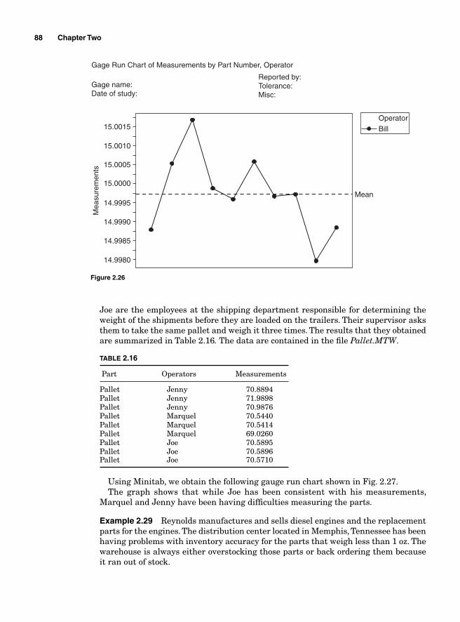
88 Chapter Two
Joe are the employees at the shipping department responsible for determining the weight of the shipments before they are loaded on the trailers. Their supervisor asks them to take the same pallet and weigh it three times. The results that they obtained are summarized in Table 2.16. The data are contained in the fi le Pallet.MTW.
TABLE 2.16
Part Operators Measurements
Pallet Jenny 70.8894Pallet Jenny 71.9898Pallet Jenny 70.9876Pallet Marquel 70.5440Pallet Marquel 70.5414Pallet Marquel 69.0260Pallet Joe 70.5895Pallet Joe 70.5896Pallet Joe 70.5710
Using Minitab, we obtain the following gauge run chart shown in Fig. 2.27.The graph shows that while Joe has been consistent with his measurements,
Marquel and Jenny have been having diffi culties measuring the parts.
Example 2.29 Reynolds manufactures and sells diesel engines and the replacement parts for the engines. The distribution center located in Memphis, Tennessee has been having problems with inventory accuracy for the parts that weigh less than 1 oz. The warehouse is always either overstocking those parts or back ordering them because it ran out of stock.
15.0015
15.0010
15.0005
15.0000
14.9995Mean
OperatorBill
Mea
sure
men
ts
14.9990
14.9985
14.9980
Gage Run Chart of Measurements by Part Number, Operator
Gage name:Date of study:
Reported by:Tolerance:Misc:
Figure 2.26
Measure 89
Mean
Mea
sure
men
t
72.0
71.5
71.0
70.5
70.0
69.5
69.0
Gage Run Chart of Measurement by Part, Operator
Gage name:Date of study:
Reported by:Tolerance:Misc:
OperatorJennyJoeMarquel
Figure 2.27
The inventory manager believes that this is because when more than 50 pieces of those parts are ordered, the employees do not have to count them. For the sake of saving time, they can just put them on a scale to measure their weight and determine the quantities.
The quality engineer has been assigned with the task of ensuring that the measurement process is reliable and that it is not causing the uncontrolled variability in the inventory.
He selects three employees and has them each measure 15 parts using the scale. The measurements obtained are summarized in Table 2.17.
Using SigmaXL SigmaXL offer a very easy and practical way to prepare and organize data for MSA. Open SigmaXL and then open the fi le Inventory Accuracy.xls. From the menu bar, click on SigmaXL and then click on Measurement Systems Analysis on the menu list. Then select Create Gage R&R (Crossed) Work Sheet as shown in Fig. 2.28.
The Create Gage R&R (Crossed) Work Sheet dialog box appears. Fill it out as shown in Fig. 2.29.
Press the OK>> button.When the Create Gage R&R (Crossed) Worksheet appears, enter the
measurements in the Measurement column as shown in Table 2.18.Click on SigmaXL on the menu bar and then click on Measurement Systems
Analysis on the menu list and then on Analyze Gage R&R Crossed. The area should be selected when the Analyze Gage R&R Crossed box appears. Press the Next>> button. Enter Part, Operator, and Measurement in their respective fi elds and the press OK>> to get the results in Table 2.19.
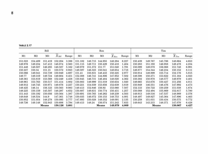
90
TABLE 2.17
Bill Ron Tim
M1 M2 M3 X Bill Range M1 M2 M3 X Ron Range M1 M2 M3 X Tim Range
151.023 154.409 151.419 152.284 3.386 151.182 148.715 144.955 148.284 6.227 150.439 149.767 145.786 148.664 4.653149.976 149.234 147.413 148.874 2.563 151.115 149.711 150.429 150.418 1.404 150.283 151.192 146.958 149.478 4.234151.448 148.027 146.285 148.587 5.162 149.979 151.372 151.77 151.040 1.791 150.099 149.078 156.068 151.748 6.991150.227 150.34 151.15 150.572 0.923 149.597 146.323 150.041 148.654 3.718 149.877 154.344 146.234 150.152 8.111150.066 149.041 153.739 150.949 4.697 151.41 150.831 148.433 150.225 2.977 150.914 149.899 155.714 152.176 5.815149.77 149.319 149.724 149.604 0.451 152.308 146.741 144.806 147.952 7.502 149.598 150.271 153.622 151.164 4.023149.361 153.819 153.568 152.249 4.458 150.845 146.731 146.484 148.020 4.362 150.382 150.978 148.577 149.979 2.401149.961 153.763 150.517 151.414 3.802 150.883 149.999 151.019 150.634 1.020 149.665 153.676 150.427 151.256 4.011149.912 148.745 150.971 149.876 2.227 150.221 154.039 153.656 152.639 3.819 150.949 146.551 146.476 147.992 4.473149.425 146.14 156.123 150.563 9.983 149.413 152.846 156.92 153.060 7.507 152.133 150.722 150.259 151.038 1.874149.225 150.159 145.507 148.297 4.652 150.887 149.631 150.774 150.431 1.257 150.089 152.494 155.869 152.817 5.780151.443 150.192 150.056 150.564 1.387 150.691 150.765 146.262 149.239 4.503 149.913 149.516 147.537 148.989 2.376148.648 148.534 144.9 147.361 3.748 150.035 146.072 150.153 148.753 4.081 148.497 149.827 145.364 147.896 4.463150.952 151.054 148.278 150.095 2.777 147.893 150.028 149.352 149.091 2.135 150.259 151.031 150.434 150.575 0.772149.726 149.148 152.943 150.606 3.794 149.413 148.24 156.074 151.242 7.833 149.643 143.215 148.371 147.076 6.428 Means 150.126 3.601 Means 149.979 4.009 Means 150.067 4.427
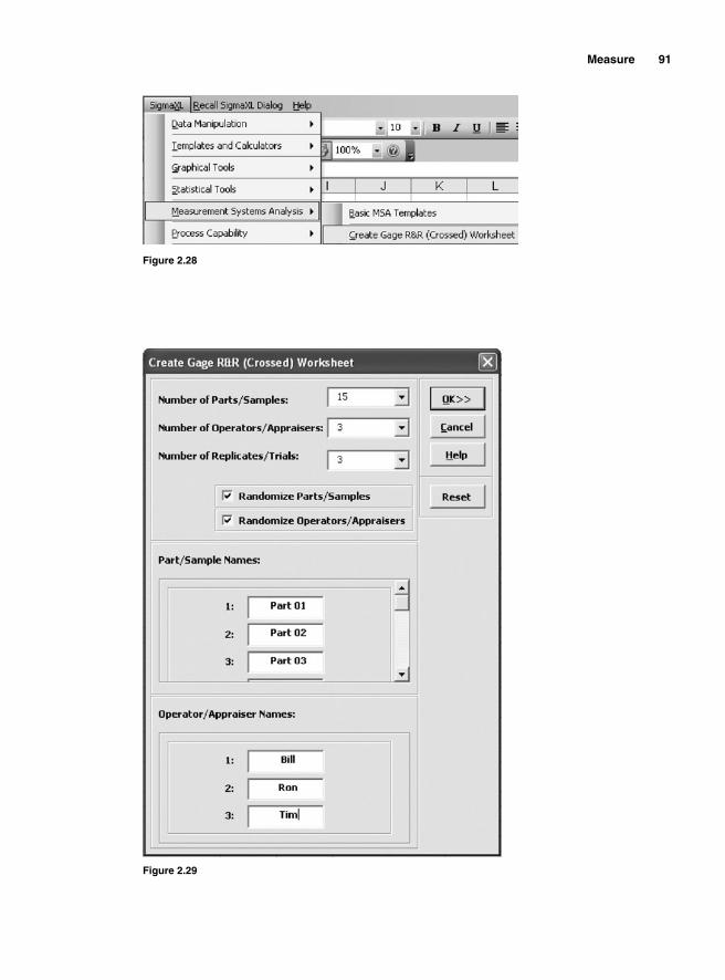
Measure 91
Figure 2.29
Figure 2.28
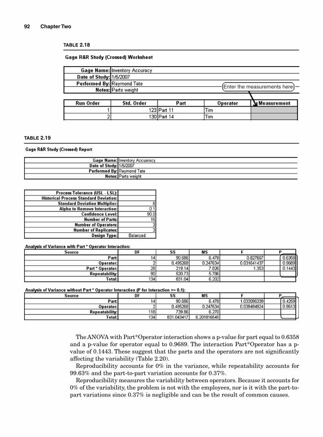
92 Chapter Two
The ANOVA with Part*Operator interaction shows a p-value for part equal to 0.6358 and a p-value for operator equal to 0.9689. The interaction Part*Operator has a p-value of 0.1443. These suggest that the parts and the operators are not signifi cantly affecting the variability (Table 2.20).
Reproducibility accounts for 0% in the variance, while repeatability accounts for 99.63% and the part-to-part variation accounts for 0.37%.
Reproducibility measures the variability between operators. Because it accounts for 0% of the variability, the problem is not with the employees, nor is it with the part-to-part variations since 0.37% is negligible and can be the result of common causes.
Enter the measurements here
TABLE 2.18
TABLE 2.19
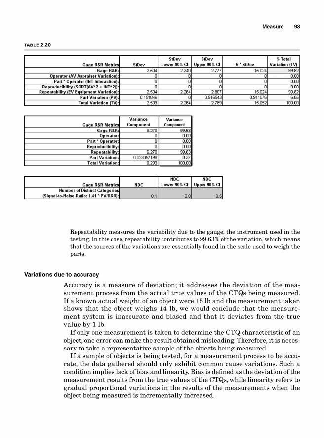
Measure 93
Repeatability measures the variability due to the gauge, the instrument used in the testing. In this case, repeatability contributes to 99.63% of the variation, which means that the sources of the variations are essentially found in the scale used to weigh the parts.
Variations due to accuracy
Accuracy is a measure of deviation; it addresses the deviation of the mea-surement process from the actual true values of the CTQs being measured. If a known actual weight of an object were 15 lb and the measurement taken shows that the object weighs 14 lb, we would conclude that the measure-ment system is inaccurate and biased and that it deviates from the true value by 1 lb.
If only one measurement is taken to determine the CTQ characteristic of an object, one error can make the result obtained misleading. Therefore, it is neces-sary to take a representative sample of the objects being measured.
If a sample of objects is being tested, for a measurement process to be accu-rate, the data gathered should only exhibit common cause variations. Such a condition implies lack of bias and linearity. Bias is defi ned as the deviation of the measurement results from the true values of the CTQs, while linearity refers to gradual proportional variations in the results of the measurements when the object being measured is incrementally increased.
TABLE 2.20
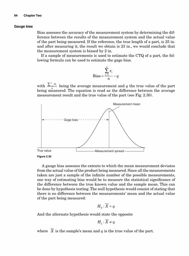
94 Chapter Two
Gauge bias
Bias assesses the accuracy of the measurement system by determining the dif-ference between the results of the measurement system and the actual value of the part being measured. If the reference, the true length of a part, is 25 in. and after measuring it, the result we obtain is 23 in., we would conclude that the measurement system is biased by 2 in.
If a sample of measurements is used to estimate the CTQ of a part, the fol-lowing formula can be used to estimate the gage bias.
Bias = −−
∑ x
nq
ii
n
1
with X
nii
n−∑ 1 being the average measurement and q the true value of the part
being measured. The equation is read as the difference between the average measurement result and the true value of the part (see Fig. 2.30).
Gage bias
True value
Measurement mean
Measurement spread
Figure 2.30
A gauge bias assesses the extents to which the mean measurement deviates from the actual value of the product being measured. Since all the measurements taken are just a sample of the infi nite number of the possible measurements, one way of estimating bias would be to measure the statistical signifi cance of the difference between the true known value and the sample mean. This can be done by hypothesis testing. The null hypothesis would consist of stating that there is no difference between the measurements’ mean and the actual value of the part being measured:
H X q0 : = And the alternate hypothesis would state the opposite
H X q1 : ≠
where X is the sample’s mean and q is the true value of the part.
Measure 95
If the number of measurements taken is relatively small, we can use the t-test to test the hypothesis. In that case,
tX q
s nnα / , /2 1− = −
df n= − 1
Example 2.30 The measurement process for weight of raw materials received at a depot is being audited. A bag of fertilizer known to weigh 10 lb is being tested. The bag was weighed 20 times and the measurements obtained are summarized in Table 2.21.
TABLE 2.21
10.0526 9.9599 9.9156 9.9356 9.9842 10.0279 9.9707 9.9848 9.9151 10.0282 9.9898 10.0169 9.9983 10.1008 10.0365 9.99710.0245 9.9977 10.1136 10.0793
Determine if the measurement process is accurate for an alpha level of 0.05.
Solution: The sample mean is equal to 10.00645; therefore,
Gauge bias = − =10 00645 10 0 00645. .
To determine if the process is biased or not, we can run a hypothesis testing.The null hypothesis for the t-test would be
H X0 10: =
96 Chapter Two
Table 2.21 is the SigmaXL output using 1 Sample t-Test for Raw material.xls.The p-value is equal to 0.6034; therefore, we fail to reject the null hypothesis and
have to conclude that there is not a statistical signifi cant difference between the true value and the measurements’ mean.
Gauge linearity
In Example 2.30, the measurements taken to assess the accuracy of the process were from only one part. For a measurement system to be accurate not only should it be unbiased when measuring one object, but it should be consistent when the dimensions of the object vary. Since the scale used in Example 2.30 is very much likely to be used to weigh loads that are more or less than 10 lb, we expect it to be unbiased for loads of all sizes. If the loads that are being weighed are incrementally increased, the scale should display measurements that are proportional to the incremental changes for the process to be deemed accurate.
Even if the gauge is biased, if it exhibits linearity, we should expect the same proportional variations. Suppose that we are using a voltmeter to measure the voltage of the current that fl ows through an electrical line. If the actual voltage applied is 120 V and that voltage is doubled and then tripled, we should expect it to read 120 V, then 240 V, and fi nally 360 V if the voltmeter is accurate.
If the fi rst reading of the voltmeter was not exact and was off by 5 V, we should expect the readings to be 125 V for the fi rst reading, 250 V for the second reading, and 375 V for the third reading. If these results are obtained, we can conclude that the gauge exhibits linearity.
To run a gauge linearity test, we can use a regression analysis to determine the regression line and observe the spread of the data plots of the gauge mea-surements about the line.
The regression analysis would be a simple linear one with the independent variables being the known actual values and the dependent variables being the gauge bias.
The equation of the regression line is under the form of
Y aX b= +
If a scatter plot with a regression line is used to visualize the relationship between the known actual CTQ values and the gauge is accurate and precise, all the measurements obtained should be on the regression line, and the equa-tion for the regression line would be
Y X=
in other words, if in the equation Y aX b= + , a = 1 and b = 0, we would conclude that the gauge is a perfect instrument to measure the parts because every gauge measurement would be equal to the true value of the part being measured and therefore the bias would be equal to 0 and the regression plot would look like Fig. 2.31.
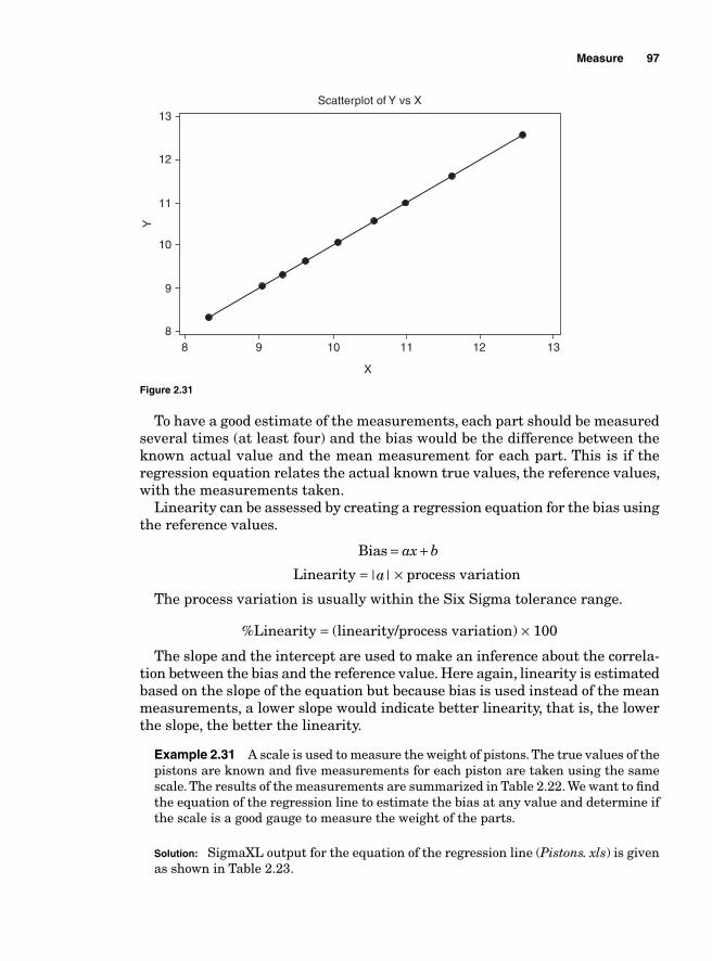
Measure 97
To have a good estimate of the measurements, each part should be measured several times (at least four) and the bias would be the difference between the known actual value and the mean measurement for each part. This is if the regression equation relates the actual known true values, the reference values, with the measurements taken.
Linearity can be assessed by creating a regression equation for the bias using the reference values.
Bias = +ax b
Linearity = | |a × process variation
The process variation is usually within the Six Sigma tolerance range.
%Linearity = (linearity/process variation) × 100
The slope and the intercept are used to make an inference about the correla-tion between the bias and the reference value. Here again, linearity is estimated based on the slope of the equation but because bias is used instead of the mean measurements, a lower slope would indicate better linearity, that is, the lower the slope, the better the linearity.
Example 2.31 A scale is used to measure the weight of pistons. The true values of the pistons are known and fi ve measurements for each piston are taken using the same scale. The results of the measurements are summarized in Table 2.22. We want to fi nd the equation of the regression line to estimate the bias at any value and determine if the scale is a good gauge to measure the weight of the parts.
Solution: SigmaXL output for the equation of the regression line (Pistons. xls) is given as shown in Table 2.23.
13Scatterplot of Y vs X
12
11
10
9
88 9 10 11 12
X
Y
13
Figure 2.31
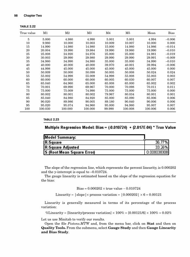
98 Chapter Two
The slope of the regression line, which represents the percent linearity, is 0.000202 and the y-intercept is equal to –0.010724.
The gauge linearity is estimated based on the slope of the regression equation for the bias:
Bias = 0.000202 × true value − 0.010724
Linearity = |slope|× process variation = |0.000202| × 6 = 0.00121
Linearity is generally measured in terms of its percentage of the process variation:
%Linearity = [linearity/process variation] × 100% = [0.00121/6] × 100% = 0.02%
Let us use Minitab to verify our results.Open the fi le Pistons.MTW and, from the menu bar, click on Stat and then on
Quality Tools. From the submenu, select Gauge Study and then Gauge Linearity and Bias Study.
TABLE 2.22
True value M1 M2 M3 M4 M5 Mean Bias
5 5.000 4.980 4.990 5.001 5.001 4.994 −0.006 10 9.980 10.000 10.003 10.009 10.007 10.000 0.000 15 14.990 14.980 14.980 15.000 14.980 14.986 −0.014 20 20.004 19.990 19.984 19.990 19.980 19.990 −0.010 25 25.008 24.920 24.976 25.000 25.000 24.981 −0.019 30 30.003 29.990 29.980 29.990 29.990 29.991 −0.009 35 34.980 34.990 34.980 35.000 35.000 34.990 −0.010 40 40.000 40.000 40.000 39.970 40.001 39.994 −0.006 45 44.998 45.000 45.000 45.000 45.000 45.000 0.000 50 50.009 50.000 50.098 50.005 50.008 50.024 0.024 55 55.002 54.998 55.009 54.998 55.008 55.003 0.003 60 60.000 60.000 60.000 60.005 60.030 60.007 0.007 65 65.040 64.960 65.000 65.008 65.000 65.002 0.002 70 70.001 69.990 69.967 70.000 70.098 70.011 0.011 75 75.000 75.009 74.990 75.000 75.000 75.000 0.000 80 80.002 80.001 80.002 79.967 80.034 80.001 0.001 85 85.040 84.980 84.920 85.000 85.090 85.006 0.006 90 90.020 89.986 90.005 89.180 90.840 90.006 0.006 95 95.020 95.074 94.960 95.000 94.980 95.007 0.007 100 100.030 100.000 100.000 99.990 100.008 100.006 0.006
TABLE 2.23
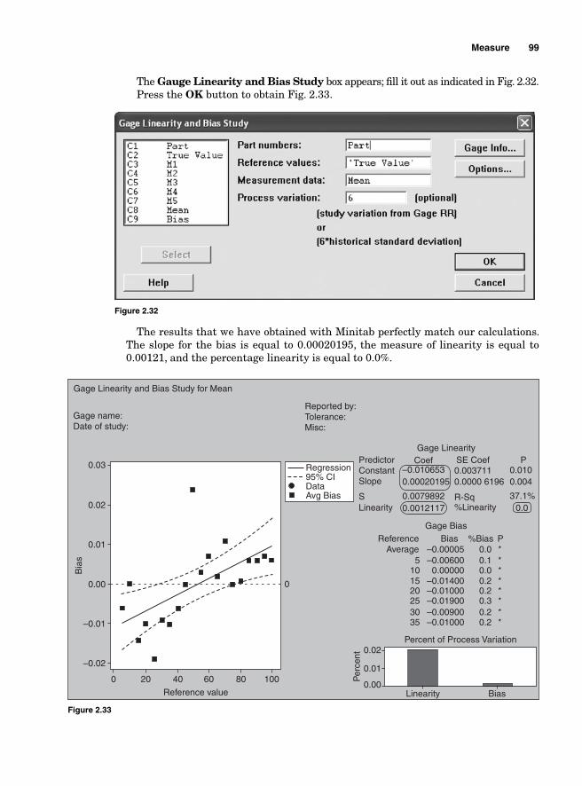
Measure 99
Figure 2.32
Percent of Process Variation0.02
0.01
Per
cent
0.00Linearity Bias
Bia
s
0 20 40
Reference value
60 80 100
0
0.03
0.02
0.01
0.00
–0.01
–0.02
Gage Linearity and Bias Study for Mean
Gage name:Date of study:
Reported by:Tolerance:Misc:
PredictorConstantSlope
SLinearity %Linearity
Gage Linearity
Gage BiasBias %Bias P
5–0.00005 0.0 *
*******
0.10.00.20.20.30.20.2
–0.00600
–0.01400–0.01000–0.01900–0.00900–0.01000
0.00000101520253035
ReferenceAverage
Coef–0.010653 0.003711 0.010
0.004
37.1%
0.0000 61960.00020195
0.00798920.0012117
R-Sq
SE Coef P
0.0Avg BiasData95% CIRegression
Figure 2.33
The Gauge Linearity and Bias Study box appears; fi ll it out as indicated in Fig. 2.32. Press the OK button to obtain Fig. 2.33.
The results that we have obtained with Minitab perfectly match our calculations. The slope for the bias is equal to 0.00020195, the measure of linearity is equal to 0.00121, and the percentage linearity is equal to 0.0%.
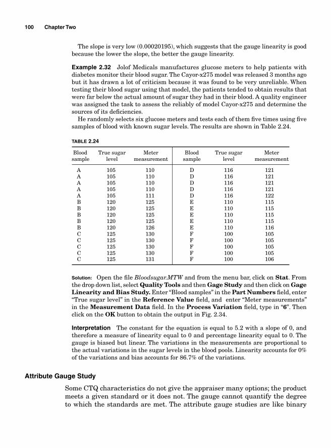
100 Chapter Two
The slope is very low (0.00020195), which suggests that the gauge linearity is good because the lower the slope, the better the gauge linearity.
Example 2.32 Jolof Medicals manufactures glucose meters to help patients with diabetes monitor their blood sugar. The Cayor-x275 model was released 3 months ago but it has drawn a lot of criticism because it was found to be very unreliable. When testing their blood sugar using that model, the patients tended to obtain results that were far below the actual amount of sugar they had in their blood. A quality engineer was assigned the task to assess the reliably of model Cayor-x275 and determine the sources of its defi ciencies.
He randomly selects six glucose meters and tests each of them fi ve times using fi ve samples of blood with known sugar levels. The results are shown in Table 2.24.
TABLE 2.24
Blood True sugar Meter Blood True sugar Meter sample level measurement sample level measurement
A 105 110 D 116 121 A 105 110 D 116 121 A 105 110 D 116 121 A 105 110 D 116 121 A 105 111 D 116 122 B 120 125 E 110 115 B 120 125 E 110 115 B 120 125 E 110 115 B 120 125 E 110 115 B 120 126 E 110 116 C 125 130 F 100 105 C 125 130 F 100 105 C 125 130 F 100 105 C 125 130 F 100 105 C 125 131 F 100 106
Solution: Open the fi le Bloodsugar.MTW and from the menu bar, click on Stat. From the drop down list, select Quality Tools and then Gage Study and then click on Gage Linearity and Bias Study. Enter “Blood samples” in the Part Numbers fi eld, enter “True sugar level” in the Reference Value fi eld, and enter “Meter measurements” in the Measurement Data fi eld. In the Process Variation fi eld, type in “6”. Then click on the OK button to obtain the output in Fig. 2.34.
Interpretation The constant for the equation is equal to 5.2 with a slope of 0, and therefore a measure of linearity equal to 0 and percentage linearity equal to 0. The gauge is biased but linear. The variations in the measurements are proportional to the actual variations in the sugar levels in the blood pools. Linearity accounts for 0% of the variations and bias accounts for 86.7% of the variations.
Attribute Gauge Study
Some CTQ characteristics do not give the appraiser many options; the product meets a given standard or it does not. The gauge cannot quantify the degree to which the standards are met. The attribute gauge studies are like binary
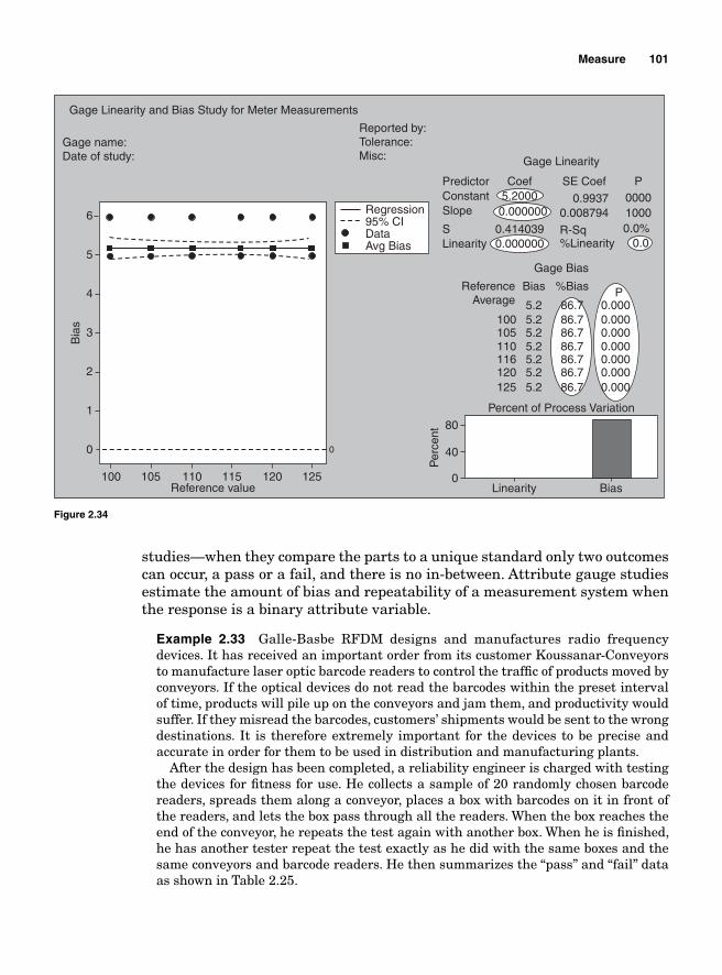
Measure 101
studies—when they compare the parts to a unique standard only two outcomes can occur, a pass or a fail, and there is no in-between. Attribute gauge studies estimate the amount of bias and repeatability of a measurement system when the response is a binary attribute variable.
Example 2.33 Galle-Basbe RFDM designs and manufactures radio frequency devices. It has received an important order from its customer Koussanar-Conveyors to manufacture laser optic barcode readers to control the traffi c of products moved by conveyors. If the optical devices do not read the barcodes within the preset interval of time, products will pile up on the conveyors and jam them, and productivity would suffer. If they misread the barcodes, customers’ shipments would be sent to the wrong destinations. It is therefore extremely important for the devices to be precise and accurate in order for them to be used in distribution and manufacturing plants.
After the design has been completed, a reliability engineer is charged with testing the devices for fi tness for use. He collects a sample of 20 randomly chosen barcode readers, spreads them along a conveyor, places a box with barcodes on it in front of the readers, and lets the box pass through all the readers. When the box reaches the end of the conveyor, he repeats the test again with another box. When he is fi nished, he has another tester repeat the test exactly as he did with the same boxes and the same conveyors and barcode readers. He then summarizes the “pass” and “fail” data as shown in Table 2.25.
Percent of Process Variation
Per
cent
Linearity0
40
80
Bias
Bia
s
Reference value
0
1
100 105 110 115 120 125
0
2
3
4
5
6
Gage Linearity and Bias Study for Meter Measurements
Gage name:Date of study:
Reported by:Tolerance:Misc:
PredictorConstantSlope
SLinearity %Linearity
Gage Linearity
Gage Bias
Bias %Bias P
1005.25.2
5.25.25.25.2
5.2
86.786.7
86.786.786.786.7
86.7
0.0000.000
0.0000.0000.0000.000
0.000105110116120125
ReferenceAverage
Coef
0.99375.20000.000000
0.0000000.414039
000010000.0%
0.0
0.008794
R-Sq
SE Coef P
Avg BiasData95% CIRegression
Figure 2.34
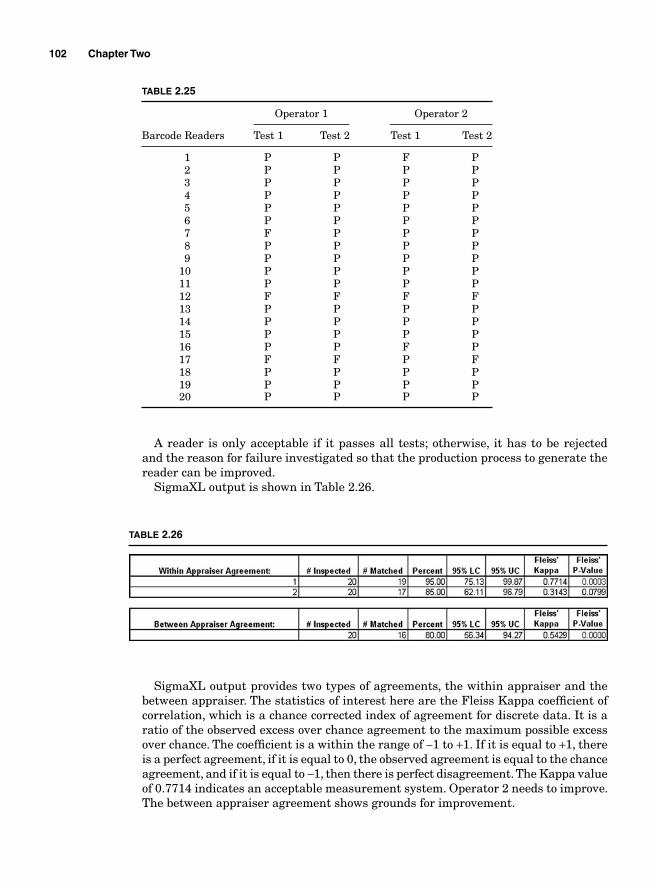
102 Chapter Two
A reader is only acceptable if it passes all tests; otherwise, it has to be rejected and the reason for failure investigated so that the production process to generate the reader can be improved.
SigmaXL output is shown in Table 2.26.
TABLE 2.25
Operator 1 Operator 2
Barcode Readers Test 1 Test 2 Test 1 Test 2
1 P P F P 2 P P P P 3 P P P P 4 P P P P 5 P P P P 6 P P P P 7 F P P P 8 P P P P 9 P P P P 10 P P P P 11 P P P P 12 F F F F 13 P P P P 14 P P P P 15 P P P P 16 P P F P 17 F F P F 18 P P P P 19 P P P P 20 P P P P
TABLE 2.26
SigmaXL output provides two types of agreements, the within appraiser and the between appraiser. The statistics of interest here are the Fleiss Kappa coeffi cient of correlation, which is a chance corrected index of agreement for discrete data. It is a ratio of the observed excess over chance agreement to the maximum possible excess over chance. The coeffi cient is a within the range of −1 to +1. If it is equal to +1, there is a perfect agreement, if it is equal to 0, the observed agreement is equal to the chance agreement, and if it is equal to −1, then there is perfect disagreement. The Kappa value of 0.7714 indicates an acceptable measurement system. Operator 2 needs to improve. The between appraiser agreement shows grounds for improvement.
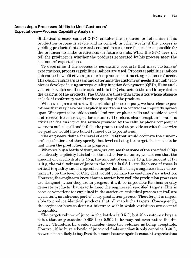
Measure 103
Assessing a Processes Ability to Meet Customers’ Expectations—Process Capability Analysis
Statistical process control (SPC) enables the producer to determine if his production process is stable and in control; in other words, if the process is yielding products that are consistent and in a manner that makes it possible for the producer to make predictions on future trends. What the SPC does not tell the producer is whether the products generated by his process meet the customers’ expectations.
To determine if the process is generating products that meet customers’ expectations, process capabilities indices are used. Process capabilities indices determine how effective a production process is at meeting customers’ needs. The design engineers assess and determine the customers’ needs (through tech-niques developed using surveys, quality function deployment (QFD), Kano anal-ysis, etc.), which are then translated into CTQ characteristics and integrated in the designs of the products. The CTQs are those characteristics whose absence or lack of conformity would reduce quality of the products.
When we sign a contract with a cellular phone company, we have clear expec-tations that may have been explicitly written in the contract or implicitly agreed upon. We expect to be able to make and receive phone calls and be able to send and receive text messages, for instance. Therefore, clear reception of calls is critical to the quality of the service provided by the cellular phone company. If we try to make a call and it fails, the process used to provide us with the service we paid for would have failed to meet our expectations.
The engineers defi ne the level of each CTQ that would optimize the custom-ers’ satisfaction and they specify that level as being the target that needs to be met when the production is in progress.
When we buy a bottle of fruit juice, we can see that some of the specifi ed CTQs are already explicitly labeled on the bottle. For instance, we can see that the amount of carbohydrate is 45 g, the amount of sugar is 43 g, the amount of fat is 0 g, the total volume of juice in the bottle is 0.5 L, etc. Each one of these is critical to quality and is a specifi ed target that the design engineers have deter-mined to be the level of CTQ that would optimize the customers’ satisfaction. However, the engineers know that no matter how well the production processes are designed, when they are in progress it will be impossible for them to only generate products that exactly meet the engineered specifi ed targets. This is because variations (as explained in the section on statistical process control) are a constant, an inherent part of every production process. Therefore, it is impos-sible to produce identical products that all match the targets. Consequently, the engineers have to defi ne a tolerance within which variations are deemed acceptable.
The target volume of juice in the bottles is 0.5 L, but if a customer buys a bottle that only contains 0.498 L or 0.502 L, he may not even notice the dif-ference. Therefore, he would consider these two volumes as being acceptable. However, if he buys a bottle of juice and fi nds out that it only contains 0.40 L, he would be unlikely to buy from that manufacturer again because his expectations
104 Chapter Two
would not have been met. If the bottles happen to contain more than 0.60 L of juice, this would end up being prejudicial to the manufacturer because he would have been selling more for less but if the content in the bottles is 0.502 L, the manufacturer could consider it as acceptable.
So when determining the tolerance around the target, the design engineers need to consider both the customers’ expectations and the cost of production. Based on customers’ expectations and production cost, the engineers can deter-mine that any bottle that contains between 0.498 and 0.502 L is good enough to be sold. In that case, the target for the volume of juice would be 0.5, and 0.498 and 0.502 would be called the upper specifi ed limit (USL) and lower specifi ed limit (LSL), respectively.
If the production process is set in such a way that every bottle that comes from the production lines contains a volume of juice that is within the specifi ed interval, then the production process is said to be capable. If it generates bottles that are outside that interval, the process is then said to be incapable.
The specifi cation of the target for the CTQ and the tolerance around the target is determined prior to starting the production process. Once production is in progress, the producer uses control charts to determine if the process is stable and in control using the control limits as indicators of control and stability. If the variations are contained within the control chart in a random manner, the process is deemed stable and in control. However, a stable and in control process does not necessarily mean that the entire production yield is within the engineered specifi ed limits and therefore meets customers’ expecta-tions. This is because the specifi ed limits and the control limits are two distinct and unrelated indicators. The design engineers determine the specifi ed limits prior to the beginning of the production process, while the production process in progress generates the control limits. There is no statistical relationship between the two.
Example 2.34 In the case of the fruit juice producer, let us suppose that the target volume is still 0.5 L and that the engineered specifi ed limits are USL = 0.502 and LSL = 0.498. The sample means in Table 2.27 are plotted on a control chart. We want to determine if the process has been generating only good quality products.
TABLE 2.27
Volume 0.5 0.509 0.506 0.505 0.503 0.506 0.493 0.507 0.502 0.5 0.499 0.508 0.5Volume 0.5 0.509 0.5 0.492 0.504 0.497 0.496 0.504 0.5 0.5 0.498 0.504
Using SigmaXL, we obtain the control chart in Fig. 2.35. Figure 2.35 shows that the process is stable and in control with UCL = 0.51816, CL = 0.50, and LCL = 0.48448.
Figure 2.36 shows a probability plot that suggests normality; the samples are normally distributed within the control limits.
But Fig. 2.37 shows that even though the process is in control and stable, the spread of the data as shown by the histogram extends far outside the specifi ed limits which are USL = 0.502 and LSL = 0.498. The part of the histogram on the left of the LSL and on the right of the USL represents the products that are of poor quality. So even though the process is stable and in control, it is still generating poor quality products.
Mean CL: 0.50
0.48448
0.51816
0.480000
0.485000
0.490000
0.495000
0.500000
0.505000
0.510000
0.515000
0.520000
1 2 3 4 5 6 7 8 9 10 11 12 13 14 15 16 17 18 19 20 21 22 23 24 25
Indi
vidu
als:
Vol
ume
Figure 2.35
–2.50
–2.00
–1.50
–1.00
–0.50
0.00
0.50
1.00
1.50
2.00
2.50
0.48
0.49
0.49
0.50
0.50
0.51
0.51
0.52
0.52
Volume
NS
CO
RE
Figure 2.36
LSL 0.498 USL 0.502Target 0.5
0
1
2
3
4
5
6
7
8
Volume
Figure 2.37
105
106 Chapter Two
To determine if the production process is yielding good quality products, it is necessary to combine the product specifi cations with the control charts to generate capability indices used to assess precisely how capable the processes are. Several indices are used to measure process capabilities.
Process Capabilities with Normal Data
Process capability indices can be divided into two groups: the indices that mea-sure the processes potential capabilities and the ones that measure their actual capabilities. The potential capability indices determine how capable a process would be if certain conditions were met, essentially if the mean of the processes’ natural variability were centered to the target of the engineered specifi cations. The actual capability indices determine how the process is actually doing. The process capability indices are unitless; they are not expressed in terms of a predetermined unit of measurement. The characterization of the process capa-bilities should take into account the production process variations that occur while it is in progress. Those variations are measured in terms of how the process shifts from its original position due to a combination of common causes of variations and adjustments made to correct special causes. The processes’ shifts have an impact on the spreads of the control charts and consequently the processes’ ability to meet customers’ expectations in the long run. When a process’ ability to meet customers’ expectations is assessed in the short term, process capability indices such as C C
p pk, , and Cr are used and when the long-
term performance is assessed, process performance indices such as ,P Pp pk, , and
Pr are used. The formulae used to compute the capability and the performance indices look very much alike with the exception that the main variable in the formulae that remains the value of sigma is different based on whether what is being addressed is the long-term or short-term variations.
Estimating Sigma
Since the process spread is always equal to six sigma for Shewhart control charts, the variable that explains the range between the upper control limit (UCL) and the lower control limit (LCL) is sigma, the standard deviation. The value of sigma depends on the short-term and the long-term variations. The short-term sigma accounts only for the natural variability of the process, while the long-term sigma takes into account the process shifts due to a combination of variations due to both common and assignable causes.
Short-term sigma
Short-term sigma as seen in Chap. 5 can be calculated in several ways.
■ Standard deviation estimated based on R
σsr
ST
Rd
=2
Measure 107
■ Standard deviation estimated based on samples
σsr
ST
sc
=4
■ Standard deviation estimated for moving range
σsr
ST
MRd
MR= =2 1 128.
Long-term sigma
Long-term sigma is used to calculate the measure of the expected process perfor-mance over a period of time for the process to generate the conforming 99.73% of its output.
σsr
LT
x xknc
i
kn
=
−−
∑ ( )2
4
1
where the numerator is the standard deviation based on all the k samples of n measurements in the control charts. The c4 term is used as a bias factor.
Potential Capabilities
The potential capability indices indicate how capable the process would be at meeting customers’ expectations if certain conditions were met. The potential indices that are more frequently used are Cp and Cr. The output for most pro-duction processes is normally distributed. For a sigma scaled normal graph, 99.73% of the observations would be concentrated between ±3σ from the mean, within a 6σ range.
Short-term potential capabilities, Cp and Cr
Process capabilities are generated by comparing the spread of the control charts to the one of the product specifi cation. A process is said to be potentially capable if the spread of the natural variations is smaller than the spread of the specifi ed limits. This is so when the ratio of the specifi ed range to the one of the control limits is greater than 1. In other words, the following ratio should be greater than 1.
C
USL LSLUCL LCLp = −
−
108 Chapter Two
The range of the control charts is obtained by subtracting the LCL from the UCL and since UCL ST= +μ σ3 and LCL ST= −μ σ3 ,
Range = UCL LCL ST ST ST ST S− = + − − = + − + =( ) ( )μ σ μ σ μ σ μ σ σ3 3 3 3 6 TT
Therefore, the range of the control chart is always equal to 6σST .Therefore,
C
USL LSLUCL LCL
USL LSLp
ST
= −−
= −6σ
Cp = 1 if the specifi ed range equals the range of the natural variations of the process, in which case the process is said to be barely capable. It has the poten-tial to produce only nondefective products if the process mean is centered to the specifi ed target. Approximately 0.27% or 2700 parts per million are defective.
Cp > 1 if the specifi ed range is greater than the range of the control limits. The process is potentially capable if the process mean is centered to the engineered specifi ed target and is (probably) producing products that meet or exceed the customers’ requirements.
Cp < 1 if the specifi ed range is smaller than the range of the control limits and the process is said to be incapable; in other words, the company is producing junk.
Another way of expressing the short-term potential capability would be through the use of the capability ratio, Cr. It indicates the proportion or per-centage of the specifi ed spread that is needed to contain the process range for the production process to be capable. Let us note that it is not the proportion that is necessarily actually occupied.
C
CUCL LCLUSL LSL USL LSLr
p
ST= = −−
=−
1 6σ
Example 2.35 The specifi ed limits for the diameter of car tires are 15.6 for the upper limit and 15 for the lower limit with a process mean of 15.3 and a standard deviation of 0.09. Find Cp and Cr. What can we say about the process’ capabilities?
Solution:
CUSL LSL
C
p
p
= − = − = =6
15 6 156 0 09
0 60 54
1 111σ
.( . )
..
.
==
= =
1 111
11 111
0 9
.
..Cr
Since Cp is greater than 1 and therefore Cr is less than 1, we can conclude that the process is potentially capable if the process mean is centered to the specifi ed target.
SigmaXL template gives the output shown in Table 2.28.
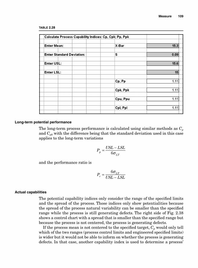
Measure 109
Long-term potential performance
The long-term process performance is calculated using similar methods as Cp and Cpk with the difference being that the standard deviation used in this case applies to the long-term variations
P
USL LSLp
LT
= −6σ
and the performance ratio is
P
USL LSLr
LT=−
6σ
Actual capabilities
The potential capability indices only consider the range of the specifi ed limits and the spread of the process. Those indices only show potentialities because the spread of the process natural variability can be smaller than the specifi ed range while the process is still generating defects. The right side of Fig. 2.38 shows a control chart with a spread that is smaller than the specifi ed range but because the process is not centered, the process is generating defects.
If the process mean is not centered to the specifi ed target, Cp would only tell which of the two ranges (process control limits and engineered specifi ed limits) is wider but it would not be able to inform on whether the process is generating defects. In that case, another capability index is used to determine a process’
TABLE 2.28
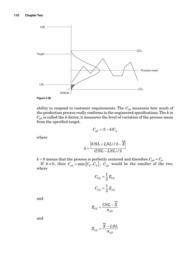
110 Chapter Two
ability to respond to customer requirements. The Cpk measures how much of the production process really conforms to the engineered specifi cations. The k in Cpk is called the k-factor; it measures the level of variation of the process mean from the specifi ed target.
C k Cpk p= −( )1
where
k
USL LSL X
USL LSL=
+ −
−
( ) /
( ) /
2
2
k = 0 means that the process is perfectly centered and therefore Cpk = Cp.If k ≠ 0, then C C Cpk U L= { }min , , Cpk
would be the smaller of the two. where
C Z
C Z
UL UL
LL LL
=
=
13
13
and
and
ZUSL X
ZX LSL
ULST
LLST
= −
= −
σ
σ
Target
LSL
DefectsLCL
Process mean
UCL
USL
Figure 2.38
Measure 111
The long-term process capability indices are obtained similarly
P Z Zpk UL LLLT LT
= ⎧⎨⎩
⎫⎬⎭
min ,13
13
where
and
ZUSL X
ZX LSL
ULLT
LLLT
LT
LT
= −
= −
σ
σ
Capability indices and parts per million
The process capability indices are unitless; in other words, they are not expressed in terms of meters, pounds, or grams. For that reason, it is not always easy to explain their meaning to a person who is not statistics savvy.
For instance, if at the measure phase of a Six Sigma project, the Cpk is found to be 0.78 and at the end of the project, after improvement, it becomes 1.26, all that can be said is that there has been improvement in the production process. However, based only on these two numbers, one cannot easily explain to a person who is not statistics savvy the amount of reduction of defects from the process. The quantifi cation of the parts per million (PPM) that fall outside the specifi ed limits can help alleviate that shortcoming. PPM measures how many parts out of every million produced are defective. Estimating the number of defective parts out of every million produced makes it easier for anyone to visualize and understand the quality level of a production process.
Process capability and Z transformation
For normally distributed data, it is easy to show the relationship between Cpk and the Z distribution and, from the Z transformation, the number of defective PPM can be estimated.
Remember the Z formula from the normal distribution
Z
X= − μσ
If
and
C ZUSL X
C ZX LSL
UL ULST
LL LLST
= = −
= = −
13 3
13 3
σ
σ
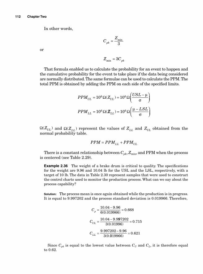
112 Chapter Two
In other words,
or
CZ
Z C
pk
pk
=
=
min
min
3
3
That formula enabled us to calculate the probability for an event to happen and the cumulative probability for the event to take place if the data being considered are normally distributed. The same formulae can be used to calculate the PPM. The total PPM is obtained by adding the PPM on each side of the specifi ed limits.
PPM ZUSL
PPM
UL UL
LL
= = −⎛⎝⎜
⎞⎠⎟
=
10 10
10
6 6
6
Ω Ω
Ω
( )
(
μσ
ZZLSL
LL ) = −⎛⎝⎜
⎞⎠⎟
106 Ω μσ
Ω( )ZUL and Ω( )ZLL represent the values of ZLL and ZUL obtained from the normal probability table.
PPM PPM PPMLL UL= +
There is a constant relationship between Cpk, Zmin, and PPM when the process is centered (see Table 2.29).
Example 2.36 The weight of a brake drum is critical to quality. The specifi cations for the weight are 9.96 and 10.04 lb for the USL and the LSL, respectively, with a target of 10 lb. The data in Table 2.30 represent samples that were used to construct the control charts used to monitor the production process. What can we say about the process capability?
Solution: The process mean is once again obtained while the production is in progress. It is equal to 9.997202 and the process standard deviation is 0.019966. Therefore,
C
C
p
UL
= − =
= −
10 04 9 966 0 019966
0 668
10 04 9 9
. .( . )
.
. . 9972023 0 01996
0 715
9 997202 9 963 0
( . ).
. .( .
=
= −CLL 0019966
0 621)
.=
Since Cpk is equal to the lowest value between CU and CL, it is therefore equal to 0.62.
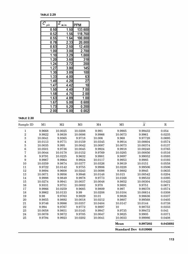
TABLE 2.29
TABLE 2.30
Sample ID M1 M2 M3 M4 M5 X R
1 9.9668 10.0025 10.0208 9.991 9.9905 9.99432 0.054 2 9.9922 9.9838 10.0006 9.9966 10.0073 9.9961 0.0235 3 10.0041 9.9365 9.9718 10.006 9.968 9.97728 0.0695 4 10.0113 9.9771 10.0159 10.0345 9.9914 10.00604 0.0574 5 10.0035 9.995 10.0042 10.0087 10.0073 10.00374 0.0137 6 10.0501 9.9736 10.0045 9.9924 9.9918 10.00248 0.0765 7 10.0044 10.0178 10.0152 9.9769 10.0285 10.00856 0.0516 8 9.9791 10.0225 9.9632 9.9981 9.9897 9.99052 0.0593 9 9.9967 9.9964 9.9924 10.0117 9.9953 9.9985 0.0193 10 10.0359 9.9874 10.0377 10.0326 9.9819 10.0151 0.0558 11 9.9722 10.0142 9.9755 9.9906 10.0228 9.99506 0.0506 12 9.9894 9.9608 10.0243 10.0098 9.9882 9.9945 0.0635 13 10.0071 9.9956 9.9946 10.0148 10.015 10.00542 0.0204 14 9.9998 9.9849 9.9978 9.9773 10.0168 9.99532 0.0395 15 10.0274 9.9941 10.0037 10.0048 9.9852 10.00304 0.0422 16 9.9331 9.9751 10.0002 9.978 9.9891 9.9751 0.0671 17 9.9966 10.0259 9.9685 9.9809 9.997 9.99378 0.0574 18 9.9962 10.0133 9.99 10.0208 10.0104 10.00614 0.0308 19 9.98 9.9763 9.9829 10.01 9.9826 9.98636 0.0337 20 9.9855 9.9892 10.0018 10.0212 9.9807 9.99568 0.0405 21 9.9746 9.9986 10.0357 10.0484 10.0147 10.0144 0.0738 22 9.994 9.9767 9.9772 9.9897 10 9.98752 0.0233 23 10.0058 9.9851 10.0145 9.9947 9.9735 9.99472 0.041 24 10.0076 9.9872 9.9705 10.0047 9.9825 9.9905 0.0371 25 9.9794 9.9923 10.0202 10.0041 10.0033 9.99986 0.0408
Mean 9.997202 0.045692
Standard Dev 0.019966
113
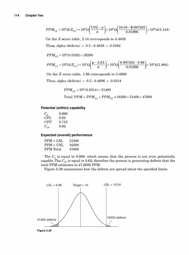
114 Chapter Two
PPM ZUSL
UL UL= = −⎛⎝⎜
⎞⎠⎟
= −10 10 10
10 046 6 6Ω Ω Ω( ).μ
σ99 997202
0 0199610 2 1446.
.( . )
⎛⎝⎜
⎞⎠⎟
= Ω
On the Z sscore table, 2.14 corresponds to 0.4838
Thuss, alpha (defects) 0.5 0.4838 0.0162= − =
PPM
PPM Z
UL
LL LL
= =
= =
10 0 0162 16200
10 10
6
6 6
( . )
( )Ω Ω μμσ
−⎛⎝⎜
⎞⎠⎟
= −⎛⎝⎜
⎞⎠
LSL10
9 997202 9 960 01996
6 Ω . .. ⎟⎟ = 10 1 8646 Ω( . )
On the score table, 1.86 coZ rrresponds to 0.4686
Thus, alpha (defects) = 0.5 0.4686 0.0314− =
PPM
PPM PPM PPM
LL
LL UL
= =
= +
10 0 0314 314006 ( . )
Total == + =16200 31400 47600
Potential (within) capability
Cp 0.668CPL 0.62CPU 0.715Cpk 0.62
Expected (overall) performance
PPM < LSL 31400PPM > USL 16200PPM Total 47600
The Cp is equal to 0.668, which means that the process is not even potentially capable. The Cpk is equal to 0.62; therefore the process is generating defects that the total PPM estimates to 47,6000 PPM.
Figure 2.39 summarizes how the defects are spread about the specifi ed limits.
LSL = 9.96
31400 defects16200 defects
Target = 10 USL = 10.04
Figure 2.39
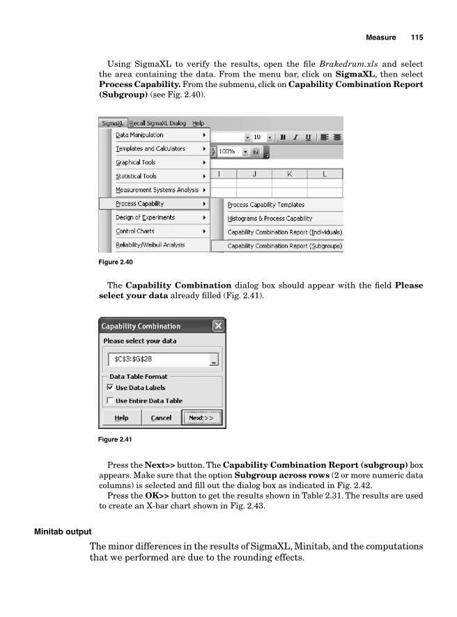
Measure 115
Using SigmaXL to verify the results, open the fi le Brakedrum.xls and select the area containing the data. From the menu bar, click on SigmaXL, then select Process Capability. From the submenu, click on Capability Combination Report (Subgroup) (see Fig. 2.40).
Figure 2.40
The Capability Combination dialog box should appear with the fi eld Please select your data already fi lled (Fig. 2.41).
Figure 2.41
Press the Next>> button. The Capability Combination Report (subgroup) box appears. Make sure that the option Subgroup across rows (2 or more numeric data columns) is selected and fi ll out the dialog box as indicated in Fig. 2.42.
Press the OK>> button to get the results shown in Table 2.31. The results are used to create an X-bar chart shown in Fig. 2.43.
Minitab output
The minor differences in the results of SigmaXL, Minitab, and the computations that we performed are due to the rounding effects.
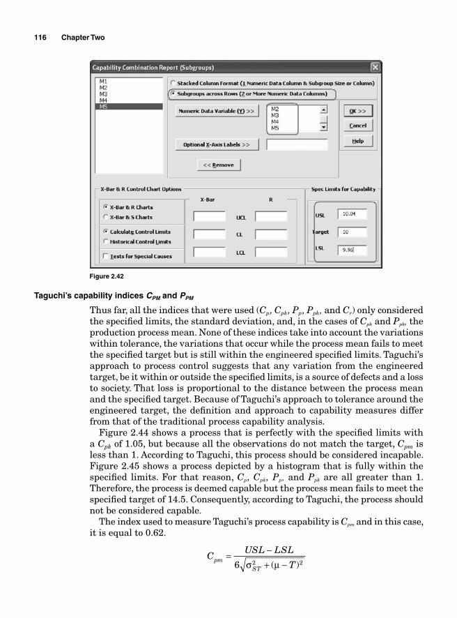
116 Chapter Two
Taguchi’s capability indices CPM and PPM
Thus far, all the indices that were used (Cp, Cpk, Pp, Ppk, and Cr) only considered the specifi ed limits, the standard deviation, and, in the cases of Cpk and Ppk, the production process mean. None of these indices take into account the variations within tolerance, the variations that occur while the process mean fails to meet the specifi ed target but is still within the engineered specifi ed limits. Taguchi’s approach to process control suggests that any variation from the engineered target, be it within or outside the specifi ed limits, is a source of defects and a loss to society. That loss is proportional to the distance between the process mean and the specifi ed target. Because of Taguchi’s approach to tolerance around the engineered target, the defi nition and approach to capability measures differ from that of the traditional process capability analysis.
Figure 2.44 shows a process that is perfectly with the specifi ed limits with a Cpk of 1.05, but because all the observations do not match the target, Cpm is less than 1. According to Taguchi, this process should be considered incapable. Figure 2.45 shows a process depicted by a histogram that is fully within the specifi ed limits. For that reason, Cp, Cpk, Pp, and Ppk are all greater than 1. Therefore, the process is deemed capable but the process mean fails to meet the specifi ed target of 14.5. Consequently, according to Taguchi, the process should not be considered capable.
The index used to measure Taguchi’s process capability is Cpm and in this case, it is equal to 0.62.
CUSL LSL
Tpm
ST
= −+ −6 2 2σ μ( )
Figure 2.42
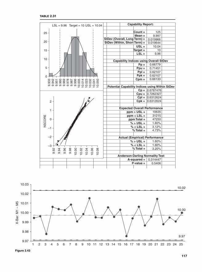
0
9.93
39.
942
9.95
19.
960
9.96
99.
978
9.98
79.
996
10.0
0510
.014
10.0
2310
.032
10.0
4110
.050
5
10
15
20
25
LSL = 9.96 Target = 10 USL = 10.04
–3
9.92
9.94
9.96
9.98
10.0
0
10.0
2
10.0
4
10.0
6
10.0
8
–2
–1NS
CO
RE
0
1
2
Capability Report:
Capability Indices using Overall StDev
Potential Capability Indices using Within StDev
Expected Overall Performance
Actual (Empirical) Performance
Anderson-Darling Normality Test
Count = 1259.997
0.0199660.019644
10.0410
9.96
Mean =StDev (Overall, Long Term) =StDev (Within, Short Term) =
USL =
0.66779
0.67874760.7262327
0.714510.621070.621070.66133
Pp =
Cp =
ppm > USL =
Cpu =0.6312624Cpl =0.6312624
10635ppm < LSL = 31215ppm Total = 47250
% > USL = 1.60%% < LSL = 3.12%% Total =
% > USL = 1.60%1.60%3.20%
0.3144470.5406
% < LSL =% Total =
A-squared =P-value =
4.73%
Cpk =
Ppu =Ppl =
Ppk =Cpm =
Target =LSL =
TABLE 2.31
10.00
9.97
10.02
9.97
9.98
9.99
10.00
10.01
10.02
10.03
1 2 3 4 5 6 7 8 9 10 11 12 13 14 15 16 17 18 19 20 21 22 23 24 25
X-B
ar: M
1 –
M5
Figure 2.43
117
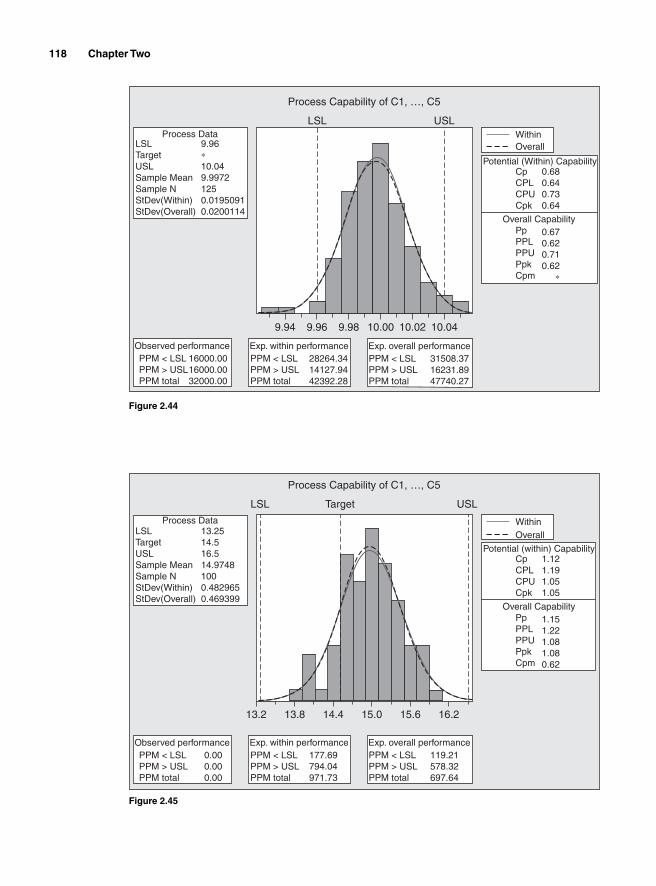
118 Chapter Two
9.94
LSL
Process Capability of C1, …, C5
Process Data
Observed performancePPM < LSL PPM > USL PPM total
16000.0016000.0032000.00
LSLTargetUSLSample Mean Sample N StDev(Within) StDev(Overall)
9.96∗10.049.99721250.01950910.0200114
USLWithinOverall
Potential (Within) Capability
Overall Capability
CpCPLCPUCpk
0.680.640.730.64
PpPPLPPUPpkCpm
0.670.620.710.62
∗
9.96 9.98 10.00 10.02 10.04
Exp. within performancePPM < LSL PPM > USL PPM total
28264.3414127.9442392.28
Exp. overall performancePPM < LSL PPM > USL PPM total
31508.3716231.8947740.27
Figure 2.44
13.2
LSL Target
Process Capability of C1, …, C5
Process Data
Observed performancePPM < LSL PPM > USL PPM total
0.000.000.00
LSLTargetUSLSample Mean Sample N StDev(Within) StDev(Overall)
13.2514.516.514.97481000.4829650.469399
USL
WithinOverall
Potential (within) Capability
Overall Capability
CpCPLCPUCpk
1.121.191.051.05
PpPPLPPUPpkCpm
1.151.221.081.080.62
13.8 14.4 15.0 15.6 16.2
Exp. within performancePPM < LSL PPM > USL PPM total
177.69794.04971.73
Exp. overall performancePPM < LSL PPM > USL PPM total
119.21578.32697.64
Figure 2.45
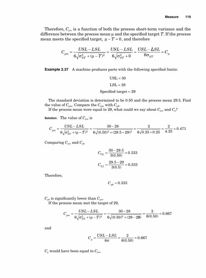
Measure 119
Therefore, Cpm is a function of both the process short-term variance and the difference between the process mean μ and the specifi ed target T. If the process mean meets the specifi ed target, μ − =T 0, and therefore
CUSL LSL
T
USL LSL USLpm
ST ST
= −+ −
= −+
= −6 6 02 2 2σ μ σ( )
LLSLC
STp6σ
=
Example 2.37 A machine produces parts with the following specifi ed limits:
USL = 30
LSL = 28
Specifi ed target = 29
The standard deviation is determined to be 0.50 and the process mean 29.5. Find the value of Cpm. Compare the Cpm with Cpk.
If the process mean were equal to 29, what could we say about Cpm and Cp?
Solution: The value of Cpm is
CUSL LSL
Tpm
ST
= −+ −
= −+6
30 28
6 0 50 29 52 2 2σ μ( ) ( . ) ( . −−=
+= =
29
2
6 0 25 0 25
24 25
0 4712) . . .
.
Comparing Cpm and Cpk
C
C
UL
LL
= − =
= − =
30 29 53 0 50
0 333
29 5 293 0 5
0
.( . )
.
.( . )
..333
Therefore,
Cpk = 0 333.
Cpk is signifi cantly lower than Cpm.If the process mean met the target of 29,
CUSL LSL
Tpm
ST
= −+ −
= −+ −6
30 28
6 0 50 29 22 2 2σ μ( ) ( . ) ( 99
26 0 50
0 667) ( . )
.= =
and
CUSL LSL
p = − = =6
26 0 50
0 667σ ( . )
.
Cp would have been equal to Cpm.
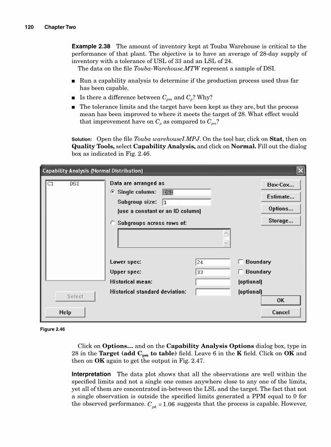
120 Chapter Two
Example 2.38 The amount of inventory kept at Touba Warehouse is critical to the performance of that plant. The objective is to have an average of 28-day supply of inventory with a tolerance of USL of 33 and an LSL of 24.
The data on the fi le Touba-Warehouse.MTW represent a sample of DSI.
■ Run a capability analysis to determine if the production process used thus far has been capable.
■ Is there a difference between Cpm and Cp? Why?
■ The tolerance limits and the target have been kept as they are, but the process mean has been improved to where it meets the target of 28. What effect would that improvement have on Cp as compared to Cpm?
Solution: Open the fi le Touba warehouseI.MPJ. On the tool bar, click on Stat, then on Quality Tools, select Capability Analysis, and click on Normal. Fill out the dialog box as indicated in Fig. 2.46.
Figure 2.46
Click on Options… and on the Capability Analysis Options dialog box, type in 28 in the Target (add Cpm to table) fi eld. Leave 6 in the K fi eld. Click on OK and then on OK again to get the output in Fig. 2.47.
Interpretation The data plot shows that all the observations are well within the specifi ed limits and not a single one comes anywhere close to any one of the limits, yet all of them are concentrated in-between the LSL and the target. The fact that not a single observation is outside the specifi ed limits generated a PPM equal to 0 for the observed performance. Cpk = 1 06. suggests that the process is capable. However,
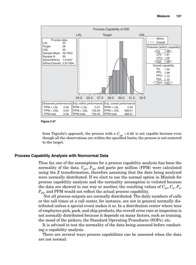
Measure 121
from Taguchi’s approach, the process with a Cpm = 0 65. is not capable because even though all the observations are within the specifi ed limits, the process is not centered to the target.
Process Capability Analysis with Nonnormal Data
Thus far, one of the assumptions for a process capability analysis has been the normality of the data. Cpk, Ppk, and parts per million (PPM) were calculated using the Z transformation, therefore assuming that the data being analyzed were normally distributed. If we elect to use the normal option in Minitab for process capability analysis and the normality assumption is violated because the data are skewed in one way or another, the resulting values of Cpk, Cp, Pp, Ppk, and PPM would not refl ect the actual process capability.
Not all process outputs are normally distributed. The daily numbers of calls or the call times at a call center, for instance, are not in general normally dis-tributed unless a special event makes it so. In a distribution center where tens of employees pick, pack, and ship products, the overall error rate at inspection is not normally distributed because it depends on many factors, such as training, the mood of the pickers, the Standard Operating Procedures (SOPs), etc.
It is advised to test the normality of the data being assessed before conduct-ing a capability analysis.
There are several ways process capabilities can be assessed when the data are not normal:
24.0
LSL Target
Process Capability of DSI
Process data
Observed performancePPM < LSL PPM > USL PPM total
0.000.000.00
LSLTargetUSLSample Mean Sample N StDev(Within) StDev(Overall)
24283329.7843301.010470.971894
USLWithinOverall
Potential (within) capability
Overall capability
CpCPLCPUCpk
1.481.911.061.06
PpPPLPPUPpkCpm
1.541.981.101.100.65
25.5 27.0 28.5 30.0 31.5 33.0
Exp. within performancePPM < LSL PPM > USL PPM total
0.01730.29730.30
Exp. overall performancePPM < LSL PPM > USL PPM total
0.00468.61468.61
Figure 2.47
122 Chapter Two
■ If the subsets that compose the data are normal, the capabilities of the subsets can be assessed and their PPMs aggregated.
■ If the subsets are not normal and the data can be transformed using the Box-Cox or natural log for parametric data or Logit transformation for binary data, transform the data before conducting the analysis.
■ Use other distributions to calculate the PPM.
Normality Assumption and Box-Cox Transformation
One way to overcome the nonnormality of the data is to use the Box-Cox transformation. The Box-Cox transformation converts the observations into an approximately normal set of data. The formula for the transformation is given as
y
x= −λ
λ1
where y is the response factor and λ is the transformation parameter. If λ = 0, the denominator would equal 0. To avoid that hurdle, the natural log
would be used instead.
y x= ln
Example 2.39 The data in the fi le Normality.xls is known to follow Poisson distribution. Using the Box-Cox transformation in SigmaXL, normalize the data.
Solution: Open SigmaXL, then open the fi le Normality.xls. Select the area that con-tains the data before clicking on the SigmaXL from the menu bar. Click on DataManipulation on the menu and from the submenu, select Box-Cox transformation. When the Box-Cox transformation dialog box appears, press the Next>> button, then click on Numerical Data Variable (Y)>>, and then click on the OK>> button to get the normalized data (Table 2.32).
SigmaXL displays the initial data and the normalized data along with the p-value for the Anderson-Darling test.
Example 2.40 Open the fi le boxcoxtrans.MPJ and transform the data.
Solution: Open the fi le boxcoxtrans.MPJ. Click on Stat, select Control Charts, and then click on Box-Cox transformation. In the Box-Cox transformation dialog box, leave “All observations for the chart are in one column” in the fi rst fi eld. Select C1 for the second textbox. Type 1 in subgroup size fi eld. Click on the Options button and type C2 in “store transformed data in:” Click OK twice.
The system should generate a second column that contains the data yielded by the transformation process. The normality of the data in column C2 can be tested using the probability plot. The graph in Fig. 2.48 plots the data before and after transformation.
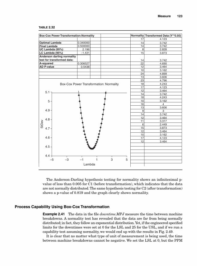
Measure 123
The Anderson-Darling hypothesis testing for normality shows an infi nitesimal p-value of less than 0.005 for C1 (before transformation), which indicates that the data are not normally distributed. The same hypothesis testing for C2 (after transformation) shows a p-value of 0.819 and the graph clearly shows normality.
Process Capability Using Box-Cox Transformation
Example 2.41 The data in the fi le downtime.MPJ measure the time between machine breakdowns. A normality test has revealed that the data are far from being normally distributed; in fact, they follow an exponential distribution. Yet, if the engineered specifi ed limits for the downtimes were set at 0 for the LSL and 25 for the USL, and if we run a capability test assuming normality, we would end up with the results in Fig. 2.49.
It is clear that no matter what type of unit of measurement is being used, the time between machine breakdowns cannot be negative. We set the LSL at 0, but the PPM
–54.4
4.5
4.6
4.7
4.8
4.9
5
5.1
Box-Cox Power Transformation: Normality
–3 –1
Lambda
StD
ev
1 3 5
Box-Cox Power Transformation:Normality Normality Transformed Data (Y**0.50)
Optimal LambdaFinal LambdaUC Lambda (95%)LC Lambda (95%)
A-squaredAD P-value
Anderson darling normalitytest for transformed data:
0.3400001714148
15
1422121024132318171214181016139
1412116
1512101712
4.1233.7423.7422.8283.873
3.7424.6903.4643.1624.8993.6064.7964.2434.1233.4643.7424.2433.162
43.606
33.7423.4643.3172.4493.8733.4643.1624.1233.464
0.5000002.196
–1.431
0.3065270.5438
TABLE 2.32
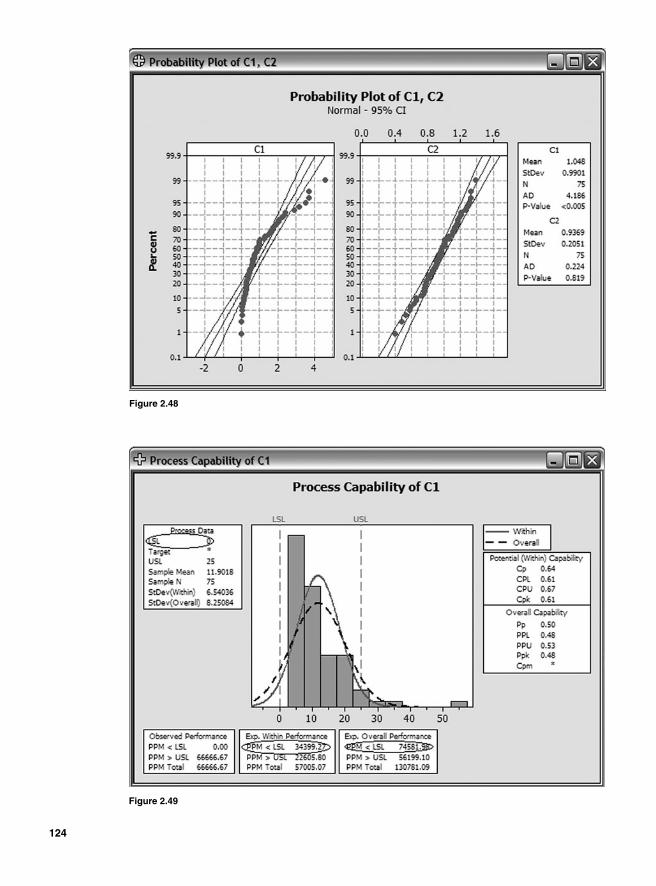
Figure 2.48
Figure 2.49
124
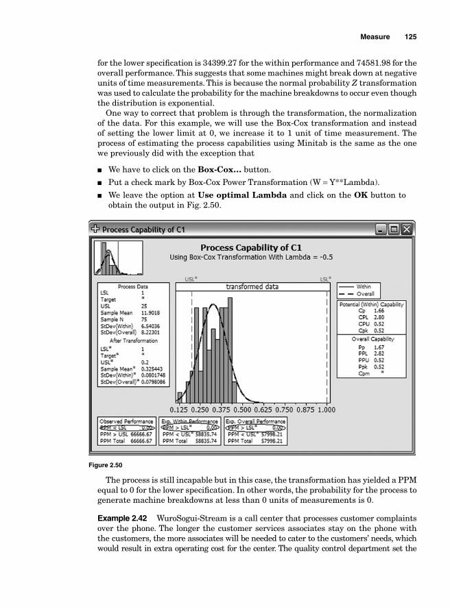
Measure 125
for the lower specifi cation is 34399.27 for the within performance and 74581.98 for the overall performance. This suggests that some machines might break down at negative units of time measurements. This is because the normal probability Z transformation was used to calculate the probability for the machine breakdowns to occur even though the distribution is exponential.
One way to correct that problem is through the transformation, the normalization of the data. For this example, we will use the Box-Cox transformation and instead of setting the lower limit at 0, we increase it to 1 unit of time measurement. The process of estimating the process capabilities using Minitab is the same as the one we previously did with the exception that
■ We have to click on the Box-Cox… button.
■ Put a check mark by Box-Cox Power Transformation (W = Y**Lambda).
■ We leave the option at Use optimal Lambda and click on the OK button to obtain the output in Fig. 2.50.
Figure 2.50
The process is still incapable but in this case, the transformation has yielded a PPM equal to 0 for the lower specifi cation. In other words, the probability for the process to generate machine breakdowns at less than 0 units of measurements is 0.
Example 2.42 WuroSogui-Stream is a call center that processes customer complaints over the phone. The longer the customer services associates stay on the phone with the customers, the more associates will be needed to cater to the customers’ needs, which would result in extra operating cost for the center. The quality control department set the
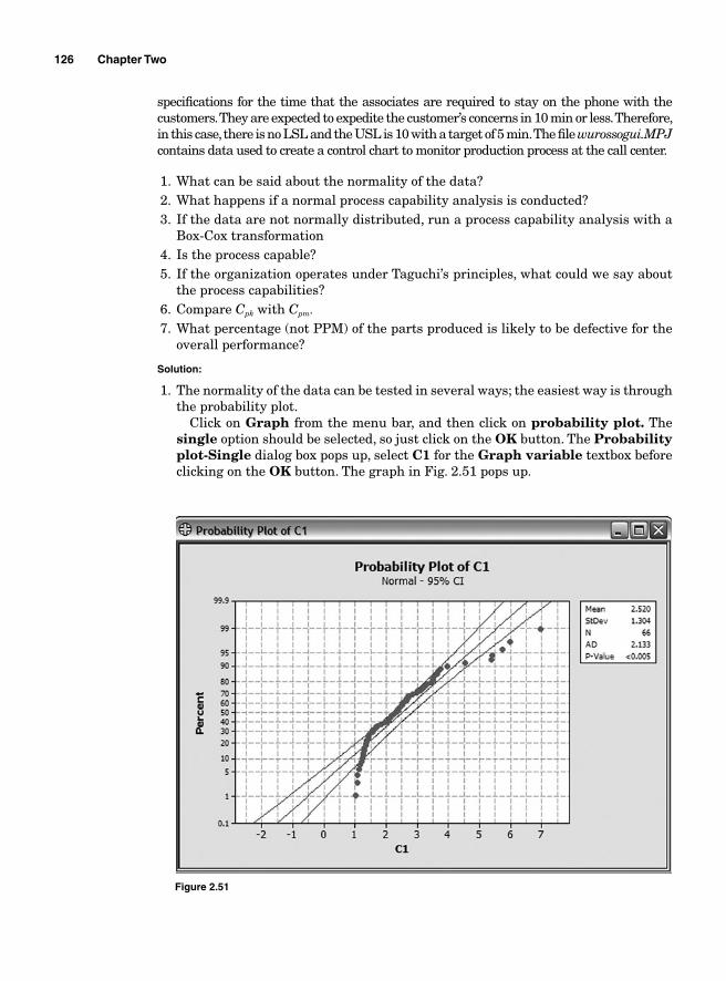
126 Chapter Two
specifi cations for the time that the associates are required to stay on the phone with the customers. They are expected to expedite the customer’s concerns in 10 min or less. Therefore, in this case, there is no LSL and the USL is 10 with a target of 5 min. The fi le wurossogui.MPJ contains data used to create a control chart to monitor production process at the call center.
1. What can be said about the normality of the data? 2. What happens if a normal process capability analysis is conducted? 3. If the data are not normally distributed, run a process capability analysis with a
Box-Cox transformation4. Is the process capable? 5. If the organization operates under Taguchi’s principles, what could we say about
the process capabilities?6. Compare Cpk with Cpm.
7. What percentage (not PPM) of the parts produced is likely to be defective for the overall performance?
Solution:
1. The normality of the data can be tested in several ways; the easiest way is through the probability plot.
Click on Graph from the menu bar, and then click on probability plot. Thesingle option should be selected, so just click on the OK button. The Probabilityplot-Single dialog box pops up, select C1 for the Graph variable textbox before clicking on the OK button. The graph in Fig. 2.51 pops up.
Figure 2.51
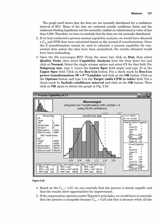
Measure 127
The graph itself shows that the data are not normally distributed for a confi dence interval of 95%. Many of the dots are scattered outside confi dence limits and the Anderson-Darling hypothesis test for normality yielded an infi nitesimal p-value of less than 0.005. Therefore, we have to conclude that the data are not normally distributed.
2. If we had conducted a process normal capability analysis, we would have obtained a Cpk and PPM that were calculated based on the normal Z transformation. Since the Z transformation cannot be used to calculate a process capability for non-normal data unless the data have been normalized, the results obtained would have been misleading.
3. Open the fi le wurossogui.MPJ. From the menu bar, click on Stat, then select Quality Tools, then select Capability Analysis from the drop down list and click on Normal. Select the single column option and select C1 for that fi eld. For Subgroup size, type 1. Leave the Lower Spec fi eld empty and type 10 in the Upper Spec fi eld. Click on the Box-Cox button. Put a check mark by Box-Coxpower transformation (W = Y**Lambda) and click on the OK button. Click on the Options button and type 5 in the Target (adds CPM to table) fi eld. Put a check mark by Include confi dence interval and click on the OK button. Then click on OK again to obtain the graph in Fig. 2.52.
Figure 2.52
4. Based on the Cpk = 1.07, we can conclude that the process is barely capable and that the results show opportunities for improvement.
5. If the organization operates under Taguchi’s principles, we would have to conclude that the process is incapable because Cpm = 0.25 and this is because while all the
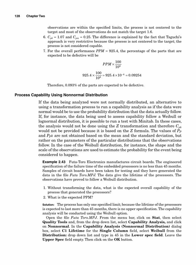
128 Chapter Two
observations are within the specifi ed limits, the process is not centered to the target and most of the observations do not match the target 1.6.
6. Cpk = 1.07 and Cpm = 0.25. The difference is explained by the fact that Taguchi’s approach is very restrictive because the process is not centered to the target; the process is not considered capable.
7. For the overall performance PPM = 925.4, the percentage of the parts that are expected to be defective will be
PPM × 100106
925 410010
925 4 10 0 092546
4. . .× = × =−
Therefore, 0.093% of the parts are expected to be defective.
Process Capability Using Nonnormal Distribution
If the data being analyzed were not normally distributed, an alternative to using a transformation process to run a capability analysis as if the data were normal would be to use the probability distribution that the data actually follow. If, for instance, the data being used to assess capability follow a Weibull or lognormal distribution, it is possible to run a test with Minitab. In these cases, the analysis would not be done using the Z transformation and therefore Cpk would not be provided because it is based on the Z formula. The values of Pp and Ppk are not obtained based on the mean and the standard deviation, but rather on the parameters of the particular distributions that the observations follow. In the case of the Weibull distribution, for instance, the shape and the scale of the observations are used to estimate the probability for the event being considered to happen.
Example 2.43 Futa-Toro Electronics manufactures circuit boards. The engineered specifi cation of the failure time of the embedded processors is no less than 45 months. Samples of circuit boards have been taken for testing and they have generated the data in the fi le Futa Toro.MPJ. The data give the lifetime of the processors. The observations have proved to follow a Weibull distribution.
1. Without transforming the data, what is the expected overall capability of the process that generated the processors?
2. What is the expected PPM?
Solution: The process has only one specifi ed limit; because the lifetime of the processors is expected to last more than 45 months, there is no upper specifi cation. The capability analysis will be conducted using the Weibull option.
Open the fi le Futa Toro.MPJ. From the menu bar, click on Stat, then select Quality Tools and, from the drop down list, select Capability Analysis, and click on Nonnormal. In the Capability Analysis (Nonnormal Distribution) dialog box, select C1 Lifetime for the Single Column fi eld, select Weibull from the Distribution: drop down list and type in 45 in the Lower spec fi eld. Leave the Upper Spec fi eld empty. Then click on the OK button.
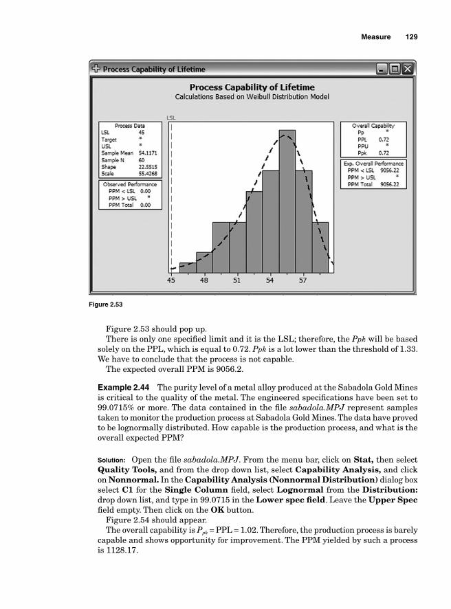
Measure 129
Figure 2.53 should pop up. There is only one specifi ed limit and it is the LSL; therefore, the Ppk will be based
solely on the PPL, which is equal to 0.72. Ppk is a lot lower than the threshold of 1.33. We have to conclude that the process is not capable.
The expected overall PPM is 9056.2.
Example 2.44 The purity level of a metal alloy produced at the Sabadola Gold Mines is critical to the quality of the metal. The engineered specifi cations have been set to 99.0715% or more. The data contained in the fi le sabadola.MPJ represent samples taken to monitor the production process at Sabadola Gold Mines. The data have proved to be lognormally distributed. How capable is the production process, and what is the overall expected PPM?
Solution: Open the fi le sabadola.MPJ. From the menu bar, click on Stat, then select Quality Tools, and from the drop down list, select Capability Analysis, and click on Nonnormal. In the Capability Analysis (Nonnormal Distribution) dialog box select C1 for the Single Column fi eld, select Lognormal from the Distribution: drop down list, and type in 99.0715 in the Lower spec fi eld. Leave the Upper Spec fi eld empty. Then click on the OK button.
Figure 2.54 should appear.The overall capability is Ppk = PPL = 1.02. Therefore, the production process is barely
capable and shows opportunity for improvement. The PPM yielded by such a process is 1128.17.
Figure 2.53
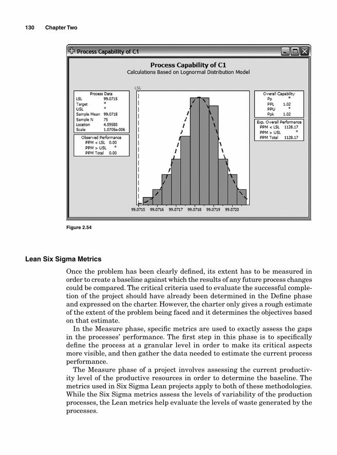
130 Chapter Two
Lean Six Sigma Metrics
Once the problem has been clearly defi ned, its extent has to be measured in order to create a baseline against which the results of any future process changes could be compared. The critical criteria used to evaluate the successful comple-tion of the project should have already been determined in the Defi ne phase and expressed on the charter. However, the charter only gives a rough estimate of the extent of the problem being faced and it determines the objectives based on that estimate.
In the Measure phase, specifi c metrics are used to exactly assess the gaps in the processes’ performance. The fi rst step in this phase is to specifi cally defi ne the process at a granular level in order to make its critical aspects more visible, and then gather the data needed to estimate the current process performance.
The Measure phase of a project involves assessing the current productiv-ity level of the productive resources in order to determine the baseline. The metrics used in Six Sigma Lean projects apply to both of these methodologies. While the Six Sigma metrics assess the levels of variability of the production processes, the Lean metrics help evaluate the levels of waste generated by the processes.
Figure 2.54
Measure 131
Six Sigma metrics
A production process is, by defi nition, a chain of tasks, a sequence of events through which products are transformed from raw material to fi nal goods. The tasks operate as customers and suppliers, with each task being a customer to the task upstream and a supplier to the task downstream. The quality of the product or service generated by each task depends on the variability at the cur-rent task and the combined variability of all the tasks upstream. Consequently, the quality of the fi nal product depends on the combined variability that is exhibited by every step in the production process. To better control the quality level of the process yield and reduce operational expenses, it is necessary to control the potential errors at each step of the process and the overall variability of the process itself.
Quality targets are set for each step in a process and metrics are used to assess the performance of the steps and estimate the probability for a unit of product to go through every step free from defects. The metrics that are generally used in Six Sigma to assess quality are the total containment effectiveness (TCE), fi rst time yield (FTY), the defect per unit (DPU), the PPM, the defect per million opportunities (DPMO), and the rolled through-put yield (RTY). These metrics are calculated to determine the probability for a defect to occur at a given step of a production process. The Poisson and normal distributions are primarily used to determine the probability for defects to occur.
Total containment effectiveness (TCE). Since the objective of process improvement is to eliminate defects all across the production systems, the effectiveness of the defects tracking method should reveal the number of defects found at every step and the defects found after the fi nal products have been released. The metric used to measure the effectiveness of the defects tracking method is the TCE. It compares the number of defects and errors prior to the product release to the total number of defects and errors after release.
The difference between errors and defects is that errors are found before the product leaves the processing step where they occurred, while defects are errors caught after the product leaves the step where they occurred.
TCE
prerelease defects errorsprerele
= +aase defects release defects errors
100%+ +
×
The objective is to minimize the number of defects across the production system but in terms of a defects tracking process, the aim should be to have a high TCE because it would be a sign that more defects and errors are caught before the products are released.
Example 2.45 Table 2.33 contains the errors and a defect found on a product before and after the product was released. Find the TCE.
132 Chapter Two
TABLE 2.33
Processing steps Defects Errors
1 2 0 2 3 1 3 7 5 4 3 6 5 2 1
Total 17 13
Post release 6 0
Solution:
TCEprerelease defects errors
prerele= +
aase defects release defects errors100%
17
+ +×
= +++ +
× =1317 6 13
100% 83 33. %
Therefore, 83.33% of the total defects and errors were found before the product was released.
Defect per unit (DPU). A defect is defi ned as a CTQ that does not meet the specifi ed standard. If the measurement of an object is critical to quality and the specifi cation for the CTQ is that it must fall within the interval [2, 4], any measurement that falls outside that interval will be considered a defect. Most manufactured products have multiple CTQs; therefore, a defective product can have multiple defects.
The DPU is the most basic defects metric. It is the ratio of the number of defects found to the total units of products sent to customers:
DPU
total defectstotal unit
= = DU
Defects per opportunity (DPO). Every product or service exhibits multiple CTQs and has to be free of defects for those products and services to meet customers’ expectations. An opportunity is defi ned as any part of a product or a service where a defect can be found; in other words, opportunities are those CTQs that the customers expect to receive without any defects.
Total opportunities is the total number of opportunities (O) that are found on a set of units (U):
Total opportunities = O × U
DPO will be equal to the ratio of the defects found on all the units to the total number of opportunities:
DPO
defectsO U
DPUO
=×
=
Measure 133
Defects per million opportunities (DPMO). The DPMO measures the number of defects that the process generates for every million opportunities:
DPMO DPO 106= ×
Example 2.46 A manufacturing plant has fi ve processing lines. Table 2.34 shows the DPMO for each line.
TABLE 2.34
Processing lines Units Defects Opportunities DPU Total opportunities DPO DPMO
Line 1 125 123 242 0.984 30250 0.004066 4066 Line 2 145 2 442 0.01379 64090 0.000031 31 Line 3 96 132 427 1.375 40992 0.003220 3220 Line 4 142 113 124 0.79577 17608 0.006418 6418 Line 5 93 6 142 0.06452 13206 0.000454 454
First time yield (FTY)
The probability for fi nding defects on a processing line generally follows a Poisson distribution.
P x
ex
x
( )!
=−μ μ
If the historic average DPU is known, the density function could be converted into
P x
DPU ex
x DPU
( )!
=−
Example 2.47 What is the probability that a product will contain three defects if the historic DPU is 0.9? What is the probability that the process would be free from defects?
Solution:
Pe
( ).
!. ( . )
..
30 9
30 729 0 407
60 049
3 0 9
= = =−
The probability that a product will go through a process defect free is called FTY and is obtained using the following formula derived from the Poisson density function.
Y FTY e DPU= = −
The probability for a product to go through the process defect free is
Pe
e( ).
!.
.
00 9
00 407
0 0 99= = =
−−
134 Chapter Two
Based on that formula, the DPU can be estimated if the FTY is known:
Y FTY e
Y e
DPU Y
DPU
DPU
= =
=
= −
−
−ln( ) ln
ln( )
Rolled throughput yield (RTY). While yield measures the probability for a product to go through a step defect free, the RTY measures the probability for the product to go through several steps defect free.
RTY Y Y Y Yi
i
n
n= ==
∏1
1 2( )( ).....( )
Suppose that a process has fi ve steps and the yield at each step is given in Table 2.35. Calculate the RTY.
TABLE 2.35
Process steps 1 2 3 4 5
Step yield 0.98 0.95 0.89 0.99 0.91
RTY Yi
i
n
= = ==
∏1
0 98 0 95 0 89 0 99 0 91( . )( . )( . )( . )( . ) 00 746.
The probability for a unit of product to go through the fi ve steps defect free is 0.746 and the probability for fi nding a defect on the product is 1 – 0.746 = 0.254.
The use of RTY requires investigating the defect rate at every step of the process. Therefore, it enables the producer to determine where the opportunities for improvement are and take action before the products reach the fi nal stages in the process.
The total defect per unit (TDPU) can be estimated from the RTY:
TDPU RTY= − ln( )
For the previous example, the TDPU would be
TDPU RTY= − = − =ln( ) ln( . ) .0 746 0 293
Lean metrics
The primary purpose of implementing Lean is to identify and eliminate waste from a workplace. The elimination of waste is done through the identifi cation of the activities that do not add value to the customer because the non-value-adding
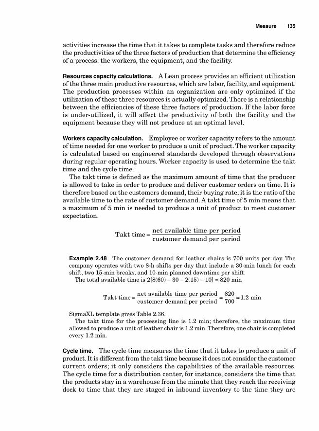
Measure 135
activities increase the time that it takes to complete tasks and therefore reduce the productivities of the three factors of production that determine the effi ciency of a process: the workers, the equipment, and the facility.
Resources capacity calculations. A Lean process provides an effi cient utilization of the three main productive resources, which are labor, facility, and equipment. The production processes within an organization are only optimized if the utilization of these three resources is actually optimized. There is a relationship between the effi ciencies of these three factors of production. If the labor force is under-utilized, it will affect the productivity of both the facility and the equipment because they will not produce at an optimal level.
Workers capacity calculation. Employee or worker capacity refers to the amount of time needed for one worker to produce a unit of product. The worker capacity is calculated based on engineered standards developed through observations during regular operating hours. Worker capacity is used to determine the takt time and the cycle time.
The takt time is defi ned as the maximum amount of time that the producer is allowed to take in order to produce and deliver customer orders on time. It is therefore based on the customers demand, their buying rate; it is the ratio of the available time to the rate of customer demand. A takt time of 5 min means that a maximum of 5 min is needed to produce a unit of product to meet customer expectation.
Takt time
net available time per periodcust
=oomer demand per period
Example 2.48 The customer demand for leather chairs is 700 units per day. The company operates with two 8-h shifts per day that include a 30-min lunch for each shift, two 15-min breaks, and 10-min planned downtime per shift.
The total available time is 2[8(60) − 30 − 2(15) − 10] = 820 min
Takt timenet available time per periodcust
=oomer demand per period
= =820700
1 2. min
SigmaXL template gives Table 2.36.The takt time for the processing line is 1.2 min; therefore, the maximum time
allowed to produce a unit of leather chair is 1.2 min. Therefore, one chair is completed every 1.2 min.
Cycle time. The cycle time measures the time that it takes to produce a unit of product. It is different from the takt time because it does not consider the customer current orders; it only considers the capabilities of the available resources. The cycle time for a distribution center, for instance, considers the time that the products stay in a warehouse from the minute that they reach the receiving dock to time that they are staged in inbound inventory to the time they are
136 Chapter Two
TABLE 2.36
transformed and shipped out. The less waste present in a production process in the form of rework, excess inspection, excess inventory, and excess motion, the shorter the cycle time.
A shorter cycle time reduces the time needed to complete orders and enables a more effi cient utilization of the productive resources. Even though cycle time is not measured in terms of the resources’ ability to meet current customer orders, a short cycle time has a positive effect on time-to-deliver and therefore enables the organization to operate with more fl exibility.
Cycle time
available time to process orders=nnumber of units required
In order to consistently meet customers’ expectations, the production processes must be designed in such a way that the cycle times never exceed the takt times.
The workers’ daily capacity. The production process that most effectively enables the optimization of the utilization of productive resources involves what is called in Japanese “Shojinka,” which translates in English to fl exible work force. Shojinka starts with assigning one person-day to each employee. One person-day
Measure 137
is based on engineered standards that determine the exact amount of work that each employee should perform in a given day of regular operating hours. The engineered standards and the one person-day are used to calculate the takt time, the cycle time, and the process effi ciency.
The workers’ daily capacity is based on the cycle time and is calculated using the following formula:
Load time for workers = cycle time × customer orders
If the cycle time is 1.2 min and the customer orders are 3000 units, the load time of workers will be 3000 × 1.2 = 3600 min or 60 h.
The amount of workers’ time needed to complete the orders will be 60 h.The rational quota per worker will be
Rational quota per workercycle time cust= × oomer orders
available operating hours
Facility capacity calculation. While the employee capacity refers to the amount of work that the workers are able to process based on the cycle time and the customer orders, facility capacity refers to the volume of products that a facility can process during regular operating hours.
Facility capacity
regular operating hoursco
=mmpletion time per unit at the bottleneck
If the completion per unit is 0.005 min and the facility operates 16 regular operating hours every day, then
Facility capacity
16 600.005
= × = =9600 005
192.
0000
The facility can process 192,000 units per day. Let us note that the completion per unit is the time required to complete the
processing of one unit of product and that it depends on the processing capa-bilities of the current bottleneck. The bottleneck is the step in the production process that requires the most time to complete a unit of product.
Equipment utilization. In addition to determining the labor and facility capabilities, a Lean Six Sigma project may also have to assess the equipment utilization effi ciency. The effi ciency and profi tability of the equipment depend on their effective utilization, which is contingent upon their availability. Therefore, all the metrics used to assess the equipment utilization will depend on the extent of their availability. The availability of productive equipment depends on such factors as machine failure, defects due to machine poor performance, loss and waste of products due to machine performance, preventive maintenance that requires production stoppage, and the setup time, that is, the time needed to prepare the equipment for production.
138 Chapter Two
Equipment unavailability can cause an excess of labor and facility capacities, that result in those factors being totally or partially idle because of a lack of equipment. Therefore totally eliminating the factors that impede the equipment availability can help optimize the equipment utilization and boost the facility and labor productivities.
Equipment availability. The availability of the equipment is measured in terms of the time that the equipment can be utilized during working hours. It is therefore the ratio of the actual operation time to the loading time. The operating time is the loading time during a shift minus unscheduled downtime.
Planned downtime includes shift breaks, planned shift meetings, planned maintenance, and any planned exception time that is scheduled for a shift.
Equipment availability
operating timeload
=iing time
loading time downtimeloading time
= −
Example 2.49 A shift is scheduled for 8 h with two 15-min breaks, one 15-min meeting, and 5 min for planned housekeeping. The machines went down during the shift for 45 min. What is the equipment availability?
Loading time = (8 × 60) – ((2 × 15) + 15 + 5) = 480 – 50 = 430 min
Equipment availabilityloading time downtim= − ee
loading time= − = =430 45
4300 895 89 5. . %
The equipment was available 89.5% during the shift.
Equipment performance effi ciency. Each type of equipment is expected to perform at a certain level during operating hours. The speed at which the equipment operates determines not only the equipment’s productivity level but also the operator’s and the facility’s because slow performing machines will lead to a reduction in the productivity of both the workers who use them and the facility in which they operate. Equipment performance effi ciency depends on its operating speed rate and the net operating rate.
Equipment performance effi ciency = net operating rate × operating speed rate
The operating speed rate. The operating speed rate measures how fast the machine actually operates, its actual cycle time compared to its specifi ed speed or ideal cycle time. The net operating rate measures the stability of the equipment; it measures the time that the equipment is being used at a constant speed during a specifi ed period of time.
Operating speed rate = specified cycle timeactual cycle time
Measure 139
Example 2.50 The operating manual of a machine specifi es that it should produce fi ve units per minute and its actual cycle time is 0.35 min. What is the machine’s operating speed?
Solution: The cycle time is the time that it takes to produce one unit of a product. If the specifi ed production per minute is fi ve units, the specifi ed cycle time would be 1/5 = 0.2 min. It should take the machine 0.2 min to produce one unit.
Operating speed rate = specified cycle timeactual cycle time
= 0...
. . %2
0 350 571 57 1= =
Net operating rate. Net operating rate is the ratio that measures the stability of the equipment. The stability of the equipment can be affected by adjustments made by operators and unexpected stoppages.
It is the ratio of actual processing time to the operating time.
Net operating rate = actual processing time
operating time
Example 2.51 The actual cycle time for a machine is 1.07 min per unit and the machine processed 387 units during 450 min of operating time. What is the net operating rate?
Solution: The actual processing time is the actual cycle time × processed units = 1.07 × 387 = 414.09 min.
Net operating rate = actual processing timeoperating time
= 414 0. 99450
0 92 92= =. %
Equipment performance effi ciency = net operating rate × operating speed rate
Equipment performance effi ciency = 0.92 × 57.1 = 52.53
Quality rate of products. The quality rate can be estimated in terms of the defect rate. It is the ratio of the defects found out of every unit of product processed.
If 855 units are processed and 59 defects are found, the defect rate would be 59/855 = 0.069 or, in terms of percentage, 6.9%.
The quality rate would be 100% − 6.9% = 93.1%.In other words, the quality rate would be 93.1%.
Overall equipment effi ciency. The overall equipment effi ciency (OEE) is the metric that enables us to determine how effi ciently the equipment is used. It takes into account the availability of the equipment, its performance effi ciency, and the quality rate of the products that it generates.
OEE = availability × performance effi ciency × quality rate
140 Chapter Two
Based on the level of the OEE, the company can determine its overall level of performance, identify bottlenecks, and eliminate waste and reduce operational expenses.
Example 2.52 Based on the information summarized in Table 2.37, fi nd the OEE.
TABLE 2.37
Work hours 8Breaks 30 minMeeting 15 minUnexpected downtime 35 minMachine’s manual spec 1 unit per minuteActual machine performance 1.05 min per unitNumber of units processed 405Quality rate 0.97
Solution: Since
OEE = availability × performance effi ciency × quality rate
we need to calculate the availability fi rst.
Availability
Equipment availability =
operating time downtimeoperating time
8 6− = ×( 008 60
) ( )( ) ( )
.− + −
× − += =30 15 35
30 15400435
0 92
Equipment performance effi ciency Equipment performance effi ciency has two components:
Equipment performance effi ciency = net operating rate × operating speed rate
Net operating rate = actual processing timeoperating time
1.05= × 4405435
= =425 25435
0 978.
.
Operating speed rate = specified cycle time
actual cycle time= 1
11 050 952
..=
Equipment performance effi ciency = 0.978 × 0.952 = 0.931
OEE = availability × performance effi ciency × quality rate
OEE = 0.92 × 0.931 × 0.97 = 0.831
Throughput rate—average completion rate The throughput rate or fl ow rate measures the rate at which a process generates products. It is the inverse of the process cycle time.
Throughput rate = 1cycle time
Measure 141
Since the cycle time is the time necessary for a process to generate one unit of product, throughput rate can be defi ned as the number of units generated during one unit of time measurement. A unit of time measurement can be hours, minutes, or seconds depending on how the company measures its per-formance.
Work in Progress (WIP)
Work in progress or WIP can be defi ned in different ways; it can be defi ned in terms of time or in terms of inventory.
If a machine produces at a rate of 150 units per hour and it has 1500 units to produce, we say that the machine has 10 h of WIP or we can say that we have 1500 units of WIP inventory.
WIP inventory = throughput rate × fl ow time
1500 = 150 × 10
Flow time = inventory/throughput
10 = 1500/150
The relationship between WIP, throughput, and fl ow time (or total lead time) is known as Little’s law. That principle can be developed further to apply to cycle time because there is a constant relationship between cycle time and throughput.
Flow time = inventory × cycle time
If the machine produces at a rate of 150 units per hour, then we can say that the cycle time (the time that it takes to complete one unit of product) is 1/150 = 0.007 h. If we have 1500 units to process, then
Flow time = inventory × cycle time = 1500 × 0.007 = 10 h.
Process cycle effi ciency. The effi ciency of a process measures the proportion of work that adds value to the operations. The metric used to determine the process effi ciency is the process cycle effi ciency (PCE):
PCE
value-added timeflow time
=

This page intentionally left blank
Chapter
3Analyze
Brainstorming
Most project executions require a cross-functional team effort because different creative ideas at different levels of management are needed in the defi nition and the shaping of a project. These ideas are better generated through brain-storming sessions. Brainstorming is a tool used at the initial steps or during the Analyze phase of a project. It is a group discussion session that consists of encouraging a voluntary generation of a large volume of creative, new, and not necessarily traditional ideas by all the participants. It is very benefi cial because it helps prevent narrowing the scope of the issue being addressed to the limited vision of a small dominant group of managers. Since the participants come from different disciplines, the ideas that they bring forth are very unlikely to be uniform in structure. They can be organized for the purpose of fi nding root causes of a problem and suggest palliatives. If the brainstorming session is unstructured, the participants can give any idea that comes to their minds, but this might lead the session to stray from its objectives.
A structured brainstorming session provides rules that make the collection of ideas better organized. A form of brainstorming called nominal group process (or nominal group technique) is an effective way of gathering and organizing ideas. At the end of the brainstorming session, a matrix called an affi nity dia-gram helps to arrange and make sense of the many ideas and suggestions that were generated.
Nominal Group Process
Nominal group process (or technique) is a method that provides a refl ection group with a framework for a nonthreatening and constraint-free face-to-face discussion where the participants aim at reaching an agreement on a given topic. The objective is to make it easy for every participant to freely express his or her opinion, make suggestions without any pressure, and at the same time
143
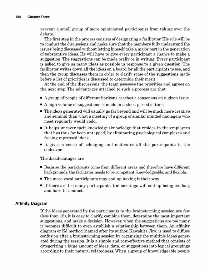
prevent a small group of more opinionated participants from taking over the debate.
The fi rst step in the process consists of designating a facilitator. His role will be to conduct the discussions and make sure that the members fully understand the issues being discussed without letting himself take a major part in the generation of substantive ideas. He will have to give every participant a chance to make a suggestion. The suggestions can be made orally or in writing. Every participant is asked to give as many ideas as possible in response to a given question. The facilitator writes down all the ideas on a board for all the participants to see, and then the group discusses them in order to clarify some of the suggestions made before a list of priorities is discussed to determine their merit.
At the end of the discussions, the team assesses the priorities and agrees on the next step. The advantages attached to such a process are that
■ A group of people of different horizons reaches a consensus on a given issue.■ A high volume of suggestions is made in a short period of time.■ The ideas generated will usually go far beyond and will be much more creative
and seminal than what a meeting of a group of similar minded managers who meet regularly would yield.
■ It helps uncover tacit knowledge (knowledge that resides in the employees that has thus far been untapped) by eliminating psychological complexes and freeing repressed ideas.
■ It gives a sense of belonging and motivates all the participants to the endeavor.
The disadvantages are
■ Because the participants come from different areas and therefore have different backgrounds, the facilitator needs to be competent, knowledgeable, and fl exible.
■ The more vocal participants may end up having it their way.■ If there are too many participants, the meetings will end up being too long
and hard to conduct.
Affi nity Diagram
If the ideas generated by the participants to the brainstorming session are few (less than 15), it is easy to clarify, combine them, determine the most important suggestions, and make a decision. However, when the suggestions are too many it becomes diffi cult to even establish a relationship between them. An affi nity diagram or KJ method (named after its author, Kawakita Jiro) is used to diffuse confusion after a brainstorming session by organizing the multiple ideas gener-ated during the session. It is a simple and cost-effective method that consists of categorizing a large amount of ideas, data, or suggestions into logical groupings according to their natural relatedness. When a group of knowledgeable people
144 Chapter Three
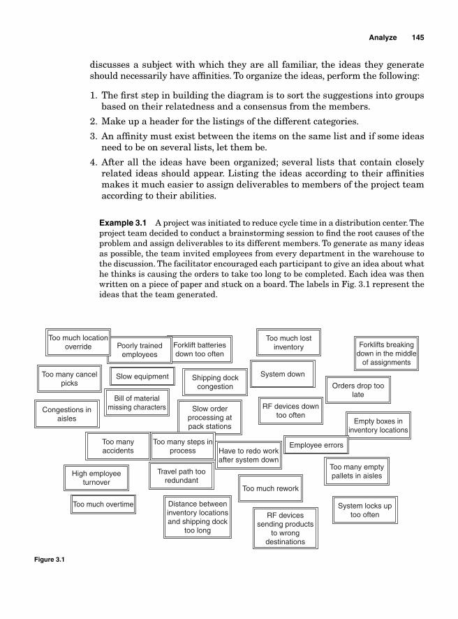
discusses a subject with which they are all familiar, the ideas they generate should necessarily have affi nities. To organize the ideas, perform the following:
1. The fi rst step in building the diagram is to sort the suggestions into groups based on their relatedness and a consensus from the members.
2. Make up a header for the listings of the different categories.
3. An affi nity must exist between the items on the same list and if some ideas need to be on several lists, let them be.
4. After all the ideas have been organized; several lists that contain closely related ideas should appear. Listing the ideas according to their affi nities makes it much easier to assign deliverables to members of the project team according to their abilities.
Example 3.1 A project was initiated to reduce cycle time in a distribution center. The project team decided to conduct a brainstorming session to fi nd the root causes of the problem and assign deliverables to its different members. To generate as many ideas as possible, the team invited employees from every department in the warehouse to the discussion. The facilitator encouraged each participant to give an idea about what he thinks is causing the orders to take too long to be completed. Each idea was then written on a piece of paper and stuck on a board. The labels in Fig. 3.1 represent the ideas that the team generated.
Analyze 145
Too much locationoverride
Too many cancelpicks
Slow equipment
Bill of materialmissing charactersCongestions in
aisles
Poorly trainedemployees
Forklift batteriesdown too often
Shipping dockcongestion
System down
Orders drop toolate
RF devices downtoo often
Slow orderprocessing atpack stations
Too manyaccidents
Too many steps inprocess
Travel path tooredundant
Distance betweeninventory locationsand shipping dock
too long
Too much rework
Have to redo workafter system down
RF devicessending products
to wrongdestinations
System locks uptoo often
Too many emptypallets in aislesHigh employee
turnover
Too much overtime
Employee errors
Empty boxes ininventory locations
Too much lostinventory Forklifts breaking
down in the middle of assignments
Figure 3.1
146 Chapter Three
After having analyzed all the ideas, the team agreed to organize them according to their affi nities in several lists with a heading assigned to each list as shown in Fig. 3.2. According to the listings, the team can easily assign tasks to the different departments that are responsible for their respective problems.
Cause-and-Effect Analysis
The cause-and-effect (C&E) diagram—also known as a fi shbone (because of its shape) or Ishikawa diagram (named after Kaoru Ishikawa, its creator)—is used
Congestions in aisles
Distance between Inventory locationsand shipping dock
too long
Forklift batteriesdown too often
Orders drop too late
Too many empty pallets in aisles
System down
RF devices down too often
Have to redo work after system down
System locks up too often
Slow order processing at pack
stations
Have to usemanual palletjacks when
batteries are down
Travel path too redundant
Empty boxes in inventory locations
Slow equipment
Forklifts breakingdown in the middle
of assignments
Too many steps in process
Bill of materialmissing characters
RF devicessending products
to wrong destinations
Poorly trainedemployees
Shipping dock congestion
Employee errors
High employee turnover
Too much rework
Too much overtime
Too many accidents
Too much locationoverride
Too many cancelpicks
Too much lostinventory
Equipment ProcessHR andtraining IT
Inventory management
Figure 3.2
Analyze 147
to visualize the relationship between an outcome and its different causes. There is very often more than one cause to an effect in business; the C&E diagram is an analytical tool that provides a visual and systematic way of linking different causes (input) to an effect (output). It shows the relationship between an effect and its fi rst-, second-, and third-order causes.
It can be used in the “Design” phase of a production process as well as in an attempt to identify the root causes of a problem. The building of the diagram is based on the sequence of events. “Sub-causes” are classifi ed according to how they generate “sub-effects,” and those “sub-effects” become the causes of the outcome being addressed.
The fi rst step in constructing a fi shbone diagram is to defi ne clearly the effect being analyzed. The second step consists of gathering all the data about the keyprocess input variables (KPIV), the potential causes (in the case of a problem), or requirements (in the case of the design of a production process) that can affect the outcome.
The third step consists of categorizing the causes or requirements according to their level of importance or areas of pertinence. The most frequently used categories are
■ Manpower, machine, method, measurement, mother nature, and materials for manufacturing
■ Equipment, policy, procedure, plant, and people for services
Subcategories are also classifi ed accordingly; for instance, different types of machines and computers can be classifi ed as subcategories of equipment. The last step is the actual drawing of the diagram.
Example 3.2 The average time that it takes Memphis Warehouse to complete a customer order is considered too high and a quality control manager is working to fi nd the root causes for the high cycle time. He collected enough information during a brainstorming session and tabulated the information on a Minitab worksheet found in the fi le cycletime.MTW.
Open the fi le cycletime.MTW and from the menu bar, click on Stat, then on QualityTools, and then on Cause-and-effect. When the Cause-and-effect Diagram box opens up, fi ll it out as shown in Fig. 3.3 before clicking on the OK button.
The diagram in Fig. 3.4 appears.
The fi shbone diagram does help visually identify the root causes of an out-come, but it does not quantify the level of correlation between the different causes and the outcome. Further statistical analysis is needed to determine which factors contribute the most to creating the effect. Pareto analysis is a good tool for that purpose but it still requires data gathering. Regression analysis allows the quantifi cation and the determination of the level of association and signifi cance between causes and effects. A combination of Pareto and regression analysis can help not only determine the level of correlation but also stratify the root causes. The causes are stratifi ed hierarchically according to their level of importance and their areas of occurrence.
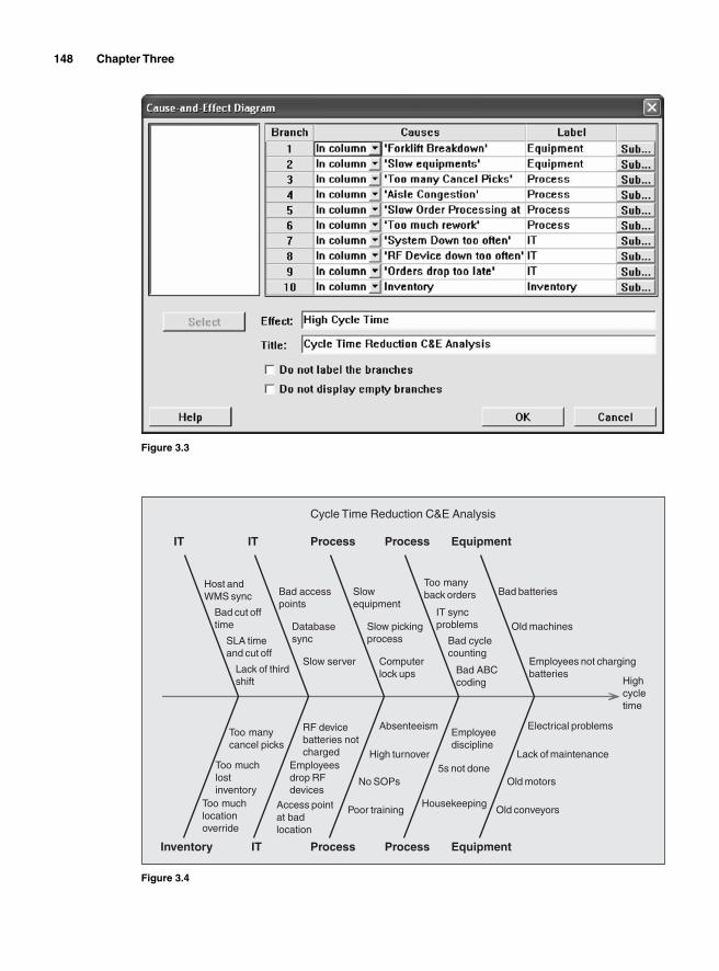
148 Chapter Three
Figure 3.3
Highcycletime
Inventory
IT
IT
IT
Process
Process
Process
Process
Equipment
Equipment
Employees not chargingbatteries
Old machines
Bad batteries
Too many cancel picks
Too much lostinventory
Too much locationoverride
Electrical problems
Lack of maintenance
Old motors
Old conveyors
Bad ABC coding
Bad cycle counting
IT syncproblems
Too many back orders
Employee discipline
5s not done
Housekeeping
Computerlock ups
Slow picking process
Slow equipment
Absenteeism
High turnover
No SOPs
Poor training
Slow server
Databasesync
Bad accesspoints
RF device batteries not charged
Employeesdrop RF devices
Access point at badlocation
Lack of third shift
SLA time and cut off
Bad cut off time
Host andWMS sync
Cycle Time Reduction C&E Analysis
Figure 3.4
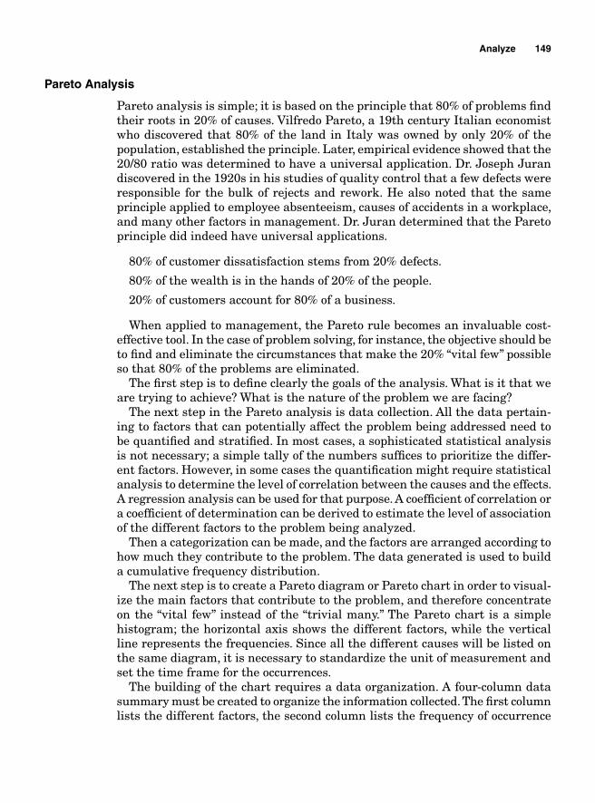
Analyze 149
Pareto Analysis
Pareto analysis is simple; it is based on the principle that 80% of problems fi nd their roots in 20% of causes. Vilfredo Pareto, a 19th century Italian economist who discovered that 80% of the land in Italy was owned by only 20% of the population, established the principle. Later, empirical evidence showed that the 20/80 ratio was determined to have a universal application. Dr. Joseph Juran discovered in the 1920s in his studies of quality control that a few defects were responsible for the bulk of rejects and rework. He also noted that the same principle applied to employee absenteeism, causes of accidents in a workplace, and many other factors in management. Dr. Juran determined that the Pareto principle did indeed have universal applications.
80% of customer dissatisfaction stems from 20% defects.
80% of the wealth is in the hands of 20% of the people.
20% of customers account for 80% of a business.
When applied to management, the Pareto rule becomes an invaluable cost-effective tool. In the case of problem solving, for instance, the objective should be to fi nd and eliminate the circumstances that make the 20% “vital few” possible so that 80% of the problems are eliminated.
The fi rst step is to defi ne clearly the goals of the analysis. What is it that we are trying to achieve? What is the nature of the problem we are facing?
The next step in the Pareto analysis is data collection. All the data pertain-ing to factors that can potentially affect the problem being addressed need to be quantifi ed and stratifi ed. In most cases, a sophisticated statistical analysis is not necessary; a simple tally of the numbers suffi ces to prioritize the differ-ent factors. However, in some cases the quantifi cation might require statistical analysis to determine the level of correlation between the causes and the effects. A regression analysis can be used for that purpose. A coeffi cient of correlation or a coeffi cient of determination can be derived to estimate the level of association of the different factors to the problem being analyzed.
Then a categorization can be made, and the factors are arranged according to how much they contribute to the problem. The data generated is used to build a cumulative frequency distribution.
The next step is to create a Pareto diagram or Pareto chart in order to visual-ize the main factors that contribute to the problem, and therefore concentrate on the “vital few” instead of the “trivial many.” The Pareto chart is a simple histogram; the horizontal axis shows the different factors, while the vertical line represents the frequencies. Since all the different causes will be listed on the same diagram, it is necessary to standardize the unit of measurement and set the time frame for the occurrences.
The building of the chart requires a data organization. A four-column data summary must be created to organize the information collected. The fi rst column lists the different factors, the second column lists the frequency of occurrence
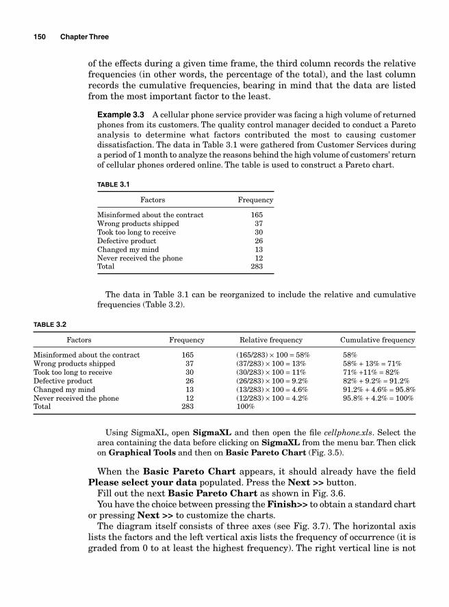
150 Chapter Three
of the effects during a given time frame, the third column records the relative frequencies (in other words, the percentage of the total), and the last column records the cumulative frequencies, bearing in mind that the data are listed from the most important factor to the least.
Example 3.3 A cellular phone service provider was facing a high volume of returned phones from its customers. The quality control manager decided to conduct a Pareto analysis to determine what factors contributed the most to causing customer dissatisfaction. The data in Table 3.1 were gathered from Customer Services during a period of 1 month to analyze the reasons behind the high volume of customers’ return of cellular phones ordered online. The table is used to construct a Pareto chart.
TABLE 3.1
Factors Frequency
Misinformed about the contract 165Wrong products shipped 37Took too long to receive 30Defective product 26Changed my mind 13Never received the phone 12Total 283
The data in Table 3.1 can be reorganized to include the relative and cumulative frequencies (Table 3.2).
TABLE 3.2
Factors Frequency Relative frequency Cumulative frequency
Misinformed about the contract 165 (165/283) × 100 = 58% 58%Wrong products shipped 37 (37/283) × 100 = 13% 58% + 13% = 71%Took too long to receive 30 (30/283) × 100 = 11% 71% +11% = 82%Defective product 26 (26/283) × 100 = 9.2% 82% + 9.2% = 91.2%Changed my mind 13 (13/283) × 100 = 4.6% 91.2% + 4.6% = 95.8%Never received the phone 12 (12/283) × 100 = 4.2% 95.8% + 4.2% = 100%Total 283 100%
Using SigmaXL, open SigmaXL and then open the fi le cellphone.xls. Select the area containing the data before clicking on SigmaXL from the menu bar. Then click on Graphical Tools and then on Basic Pareto Chart (Fig. 3.5).
When the Basic Pareto Chart appears, it should already have the fi eld Please select your data populated. Press the Next >> button.
Fill out the next Basic Pareto Chart as shown in Fig. 3.6.You have the choice between pressing the Finish>> to obtain a standard chart
or pressing Next >> to customize the charts. The diagram itself consists of three axes (see Fig. 3.7). The horizontal axis
lists the factors and the left vertical axis lists the frequency of occurrence (it is graded from 0 to at least the highest frequency). The right vertical line is not
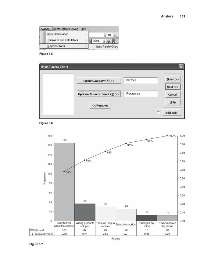
Analyze 151
Figure 3.5
Figure 3.6
165
3730
26
13 12
58%
71%
82%
91%
96%
100%
0
20
40
60
80
100
120
140
160
180
Factors
Freq
uenc
y
0.00
0.10
0.20
0.30
0.40
0.50
0.60
0.70
0.80
0.90
1.00
Series1
CumulativeSum 0.58 0.71
37
0.82
30
0.91
26
0.9613
1.00
12
Misinformed about the contract
Wrong productsshipped
Took too long to receive
Defective product Changed my mind
Never received the phone
165
Figure 3.7
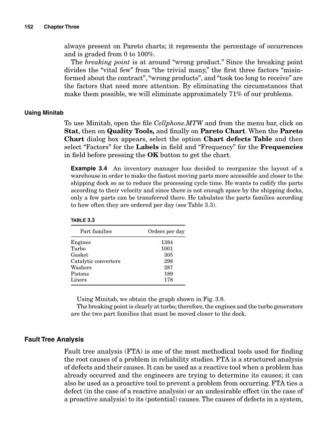
152 Chapter Three
always present on Pareto charts; it represents the percentage of occurrences and is graded from 0 to 100%.
The breaking point is at around “wrong product.” Since the breaking point divides the “vital few” from “the trivial many,” the fi rst three factors “misin-formed about the contract”, “wrong products”, and “took too long to receive” are the factors that need more attention. By eliminating the circumstances that make them possible, we will eliminate approximately 71% of our problems.
Using Minitab
To use Minitab, open the fi le Cellphone.MTW and from the menu bar, click on Stat, then on Quality Tools, and fi nally on Pareto Chart. When the Pareto Chart dialog box appears, select the option Chart defects Table and then select “Factors” for the Labels in fi eld and “Frequency” for the Frequencies in fi eld before pressing the OK button to get the chart.
Example 3.4 An inventory manager has decided to reorganize the layout of a warehouse in order to make the fastest moving parts more accessible and closer to the shipping dock so as to reduce the processing cycle time. He wants to codify the parts according to their velocity and since there is not enough space by the shipping docks, only a few parts can be transferred there. He tabulates the parts families according to how often they are ordered per day (see Table 3.3).
TABLE 3.3
Part families Orders per day
Engines 1384Turbo 1001Gasket 305Catalytic converters 298Washers 287Pistons 189Liners 178
Using Minitab, we obtain the graph shown in Fig. 3.8.The breaking point is clearly at turbo; therefore, the engines and the turbo generators
are the two part families that must be moved closer to the dock.
Fault Tree Analysis
Fault tree analysis (FTA) is one of the most methodical tools used for fi nding the root causes of a problem in reliability studies. FTA is a structured analysis of defects and their causes. It can be used as a reactive tool when a problem has already occurred and the engineers are trying to determine its causes; it can also be used as a proactive tool to prevent a problem from occurring. FTA ties a defect (in the case of a reactive analysis) or an undesirable effect (in the case of a proactive analysis) to its (potential) causes. The causes of defects in a system,
Analyze 153
Count 1384 1001 305 298 287 189 178Percent 38.0 27.5 8.4 8.2 7.9 5.2 4.9Cum % 38.0 65.5 73.9 82.0 89.9 95.1 100.0
Cou
nt
Per
cent
Part families
Other
Piston
s
Was
hers
Cataly
tic co
nver
ters
Gaske
t
Turb
o
Engine
s
4000
3000
2000
1000
0
100
80
60
40
20
0
Pareto Chart of Part Families
Figure 3.8
process, product, or service have their own causes, which also have causes. Not only does FTA inventory the different causes but it also organizes them accord-ing to the factors they affect. Because it does not only consider the fi rst-order causes, but considers all the different factors that could possible cause a defect, FTA is considered as one of the most rigorous and effective tools for root cause analysis. The following steps are used when conduction an FTA.
1. Gather the team conducting the FTA. Just as in the case of a Failure Mode and Effect Analysis (FMEA), an FTA is conducted through a brainstorming session. A group of people knowledgeable about the problem being faced is gathered to determine the several orders of causes of the problem.
2. Specify the main problem or the undesirable effect being analyzed. Be as precise and specifi c as possible when defi ning the problem. An example of a specifi c problem would be “Oil leak draining the sink within an hour of operations” or “RF devices lock up every time an employee scans part number 213242.”
3. To make the relationship between defects and their causes visible, draw a relational diagram.
4. Determine the faults that could lead to the main problem. For the examples above, the causes of the problems may be, respectively, “a crack at the bottom of the oil sink” and “Part number 213242 not listed in the database.”
154 Chapter Three
5. For each fault, list all the possible causes in a fi eld by the related fault. The possible causes for the previous defects could be “there is a crack at the bottom of the sink because the thickness of the material used to make the sink is too small” and “Part number 213242 is not listed in the database because it is two digits short.”
6. Repeat the process until the root of the problem is found.
7. Find a resolution to the problem once the root cause is determined.
Example 3.5 An engineering team is analyzing the root causes of problems found on a newly released notebook model. The stated problems are “The LCD turns blurry and the computer makes a squeaking noise before locking up and shuts off after about 5 min of use.” At the end of a brainstorming session, the diagram in Fig. 3.9 is drawn.
The diagram uncovers several existing problems that potentially affect the functionality of the notebook.
■ Excess solder on system board by the CPU heat sensors■ Bad base plastic design■ Aluminum metal used as keyboard base is too thin■ Not enough holes on keyboard base■ The cards were mislabeled
The next step for the team should be to fi gure out how to solve each of these issues.
Seven Types of Waste
Productivity improvement is one of the most signifi cant fundamentals of any endeavor to better business operations and one of the most effective ways to improve productivity is to increase throughput while reducing or main-taining operational resources. Productivity can be defi ned as the number of items produced for every unit of resources used to produce them; in other words, productivity measures the effi ciency of the effort spent on producing the output.
P
number of items producedtotal cost of p
=rroduction
Productivity is reduced every time the cost incurred to produce one extra unit is increased. Suppose that the total number of items produced by a process is 2500 and the total cost of production is $1000. Then the process’ productivity is
P
number of items producedtotal cost of pro
=dduction
= =25001000
2 5.
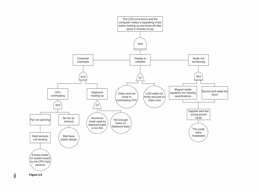
The LCD turns blurry and thecomputer makes a squeaking noisebefore locking up and shuts off after
about 5 minutes of use
And
Display isunstable
Computeroverheats
Audio notfunctioning
And
Magnet insidespeakers not meeting
specifications
Sound card cable tooshort
Supplier sent thewrong sound
cards
LCD cable notfirmly secured on
video card
Video card tooclose to
overheating CPU
Not enough holes on
keyboard base
Aluminum metal used askeyboard base
is too thin
Keyboardheating up
CPUoverheating
No hot airexhaust
Fan not spinning
Heat sensorsnot working
Excess solderon system boardby the CPU heat
sensors
Bad baseplastic design
And
And
Or
Or
The cardswere
mislabeled
Figure 3.9
155
156 Chapter Three
For every dollar invested, 2.5 items were produced. If the cost of production is increased by $500 and the output level remains the same, then
P
number of items producedtotal cost of p
=rroduction
=+
= =25001000 500
25001500
1 667.
In other words, for every dollar invested, the process only yields 1.667 units. Because of an increase in the cost of production, productivity has gone down by 2.5 – 1.667 = 0.833 points.
Several factors can contribute to an increase in the cost of production of products or services and a reduction of productivity. Some of those factors add value to the output while others do not. Among the non-value-adding factors, some are necessary to the production processes while others are not. Spending resources to increase the size of a company’s parking lot may not directly add value to the products or services that the company produces, but it may be necessary for its operations. Working overtime to increase the volume of inven-tory of products that are not ready to be shipped to customers would increase operational expenses without adding any value to the products.
Waste in a production process is defi ned as a factor in the process that unnec-essarily increases operational expenses while it does not add value to the prod-ucts. Identifying the sources of waste and eliminating them is one of the most effective ways of increasing resources’ effi ciencies and processes’ productivity. Despite the signifi cant operational differences within and between industries, Tahiichi Ohno, one of the Toyota Motor Company’s quality gurus, has deter-mined the main sources of waste to be similar across industries. He identifi ed and classifi ed the sources of waste in seven categories.
Overproduction
Overproduction is defi ned as the production of an item that is not ready to be sold to customers (if it is a fi nal product) or to be further processed by the next step in the process (if it is in a transformation process). It can be the result of products being made too early or products being made in excess of the required amount. The cost of overproduction is always prohibitive whether it occurs within a production in progress or under the form of fi nal goods.
When overproduction occurs within a production in progress, it creates clut-ter and prevents a seamless fl ow of materials, which lowers productivity. It is generally the result of batch production, ineffi cient scheduling, and bad coordi-nation. Batch production systems require completed units of products to be held at a step in the process until a predetermined lot is fi nished before it is moved to the next step. Since a perfectly even and balanced fl ow of material across a production process seldom occurs because different steps in a process usually require different amounts of resources and time to process the same volume of products, using a batch-and-queue system can reinforce bottlenecks and cause more overproduction between process steps.
Analyze 157
Example 3.6 A processing line is made up of fi ve steps and the time that it takes each step to complete its task is given in Table 3.4.
TABLE 3.4
Processing steps Processing time (min)
1 2 2 2 3 3 4 1 5 2
If a batch-and-queue system is used and steps 1 and 2 continuously process material, inventory will very quickly accumulate at step 3; steps 4 and 5 will remain idle most of the time.
There is a positive correlation between productivity and throughput. An increase in productivity leads to an increase in throughput. Since throughput measures the rate at which a process yields products or services, it depends on the bottleneck, i.e., the step in the process that takes more effort to complete a task. Subsequently, the productivity of a process will be tied to the rate at which the bottleneck executes tasks.
Overproduction of outbound inventory can be the result of a desire to respond quickly to customers’ demands. An enterprise produces in excess of customers’ current demands and stores the products as outbound inventory waiting for a demand. If the product is highly demanded, the high velocity of the inventory would make the negative impact of high volume of held outbound inventory less visible, but a sudden drop in demand would result in heavy fi nancial losses. The cost attached to overproduction includes
■ An increase in unnecessary inventory■ An increase in operational expenses for handling the inventory■ An increase in the defect rate
Overproduction will generally require prohibitive extra fl oor and labor capacities.
Wait
Waste in the form of wait occurs when productive resources are kept idle while they are waiting for material to process. Waste happens because employees are being paid and resources consumed when they are not producing. Waste in the form of wait also occurs more often because of a lack of coordination and poor scheduling in an unbalanced production process.
In the example in Table 3.4, if a batch-and-queue system is used, the down-stream steps from step 3 would be idle most of the time because they processes the same amount of material much faster than step 3; therefore, they would have
158 Chapter Three
to wait for more work every time they complete a task. Step 3 would be the bottle-neck because it requires more time to process the same volume of material.
Wait increases work in progress (WIP) and cycle time and reduces productivity.
Unnecessary inventory
Inventory can be defi ned as money invested in the acquisition of products intended for transformation or sales. Not only is it money not readily available for spending and does not generate any interest but it is money that requires extra operational expenses for its maintenance. A volume of inventory will require proportional extra expenses in the form of labor, insurance, and fl oor capacity. Even though from an accounting perspective inventory is considered an asset, technically, it is a liability.
Unnecessary inventory is generally the result of overproduction. In most organi-zations, the consequences of unnecessary inventory are not accurately quantifi ed and its impact is seldom made visible. However, unnecessary inventory is largely the root of excessive operational expenses because it is generally responsible for most of the hidden problems that inhibit a seamless fl ow of material and a clutter-free workplace. It requires more resources for its maintenance in the form of extra labor, extra equipment, more interest, and more insurance.
The way Dell used to manage inventory in the 1980s is a good example of how overproduction can negatively affect a business. By the end of the 1980s, Dell was growing at an unprecedented rate and in order to fulfi ll quickly ever-growing customers’ orders, Dell accumulated a high volume of memory chips among the many computer parts that were bought to meet unanticipated demand. Technology in computer industries evolves very fast and the capacity for memory chips went from 256 KB to 1 MB in a short period, leaving Dell with an outstanding volume of obsolete parts that had to be sold at a fraction of their cost. This resulted in great fi nancial losses for Dell.
Motion
A production process should be designed in such a way that a minimum effort is required from operators to generate a maximum result. Such a design would reduce unnecessary physical movements that would strain resources without adding any value to the product or service. Motion refers to the movements of equipment and labor that do not add any value. If workers have to move around constantly to fi nd the tools that they need to perform their work, this would reduce the time that they spent actually performing work and increase their cycle time. Unnecessary motion increases WIP and deteriorates quality.
Unnecessary transportation
Transportation consists of moving a product from one place to another without altering is composition. Typically, transportation does not add any value to the product but it can be a necessary part of the process because, by defi ni-tion, material is expected to fl ow within a transformation process. Unnecessary
Analyze 159
transportation occurs when production cells are too far apart from one another due to a poorly designed process layout. Excessive transportation unnecessarily increases WIP and cycle time and adds more opportunities for errors. The cost of unnecessary transportation is hard to evaluate accurately because it is not always easy to determine what part of transportation within a process does not add any value. If the non-value-adding part of transportation is determined, the precise and accurate quantifi cation of its implications should go beyond the labor cost associated with moving material from one place to another because unnecessary transportation increases cycle time and defects.
Inappropriate processing
By defi nition, processing is the activity that every organization performs to generate products and services. However, there are multiple ways to process material to generate the same type of product. Out of a multitude of ways of processing, one must be more effi cient in terms of resources consumption. Inappropriate processing is a way of processing that is less than optimal; gener-ally, bad plant layout, poor process design, and poorly maintained equipment generate defects. Inappropriate processing will result in rework, overproduction, unnecessary handling, and defects.
Product defects
A defect is a fl aw on a critical to quality (CTQ) of a product that makes it unfi t for sale to customers. Among the seven types of waste, the impact of defects on the bottom line is one of the easiest to quantify because the immediate result of defects is either rework or scrap and both of these come with a quantifi able cost. Product defects increase the cost of nonconformance and drastically reduce productivity. There is a correlation between the production of defects and some of the other six types of waste.
■ The production of defects increases the wait time for the tasks downstream because the defective products cannot be further processed before the defects are corrected. Further inspection may also be needed to ensure the confor-mance of the products.
■ The defective products may have to be reworked in order to correct the prob-lem. This would not only slow the process but also add to labor costs.
■ The rework of the defective products may require additional parts.■ If the defects cannot be corrected, the products are scrapped and both the
material and the labor used to produce and scrap them are wasted.
Lean Approach to Waste Reduction
The underlying foundation of Lean manufacturing is the organizational strategy that constantly seeks a continuous improvement through the identifi cation of the non-value-adding activities (known in Japanese as Muda) and their elimination
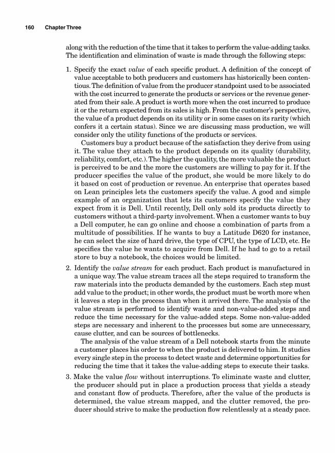
160 Chapter Three
along with the reduction of the time that it takes to perform the value-adding tasks. The identifi cation and elimination of waste is made through the following steps:
1. Specify the exact value of each specifi c product. A defi nition of the concept of value acceptable to both producers and customers has historically been conten-tious. The defi nition of value from the producer standpoint used to be associated with the cost incurred to generate the products or services or the revenue gener-ated from their sale. A product is worth more when the cost incurred to produce it or the return expected from its sales is high. From the customer’s perspective, the value of a product depends on its utility or in some cases on its rarity (which confers it a certain status). Since we are discussing mass production, we will consider only the utility functions of the products or services.
Customers buy a product because of the satisfaction they derive from using it. The value they attach to the product depends on its quality (durability, reliability, comfort, etc.). The higher the quality, the more valuable the product is perceived to be and the more the customers are willing to pay for it. If the producer specifi es the value of the product, she would be more likely to do it based on cost of production or revenue. An enterprise that operates based on Lean principles lets the customers specify the value. A good and simple example of an organization that lets its customers specify the value they expect from it is Dell. Until recently, Dell only sold its products directly to customers without a third-party involvement. When a customer wants to buy a Dell computer, he can go online and choose a combination of parts from a multitude of possibilities. If he wants to buy a Latitude D620 for instance, he can select the size of hard drive, the type of CPU, the type of LCD, etc. He specifi es the value he wants to acquire from Dell. If he had to go to a retail store to buy a notebook, the choices would be limited.
2. Identify the value stream for each product. Each product is manufactured in a unique way. The value stream traces all the steps required to transform the raw materials into the products demanded by the customers. Each step must add value to the product; in other words, the product must be worth more when it leaves a step in the process than when it arrived there. The analysis of the value stream is performed to identify waste and non-value-added steps and reduce the time necessary for the value-added steps. Some non-value-added steps are necessary and inherent to the processes but some are unnecessary, cause clutter, and can be sources of bottlenecks.
The analysis of the value stream of a Dell notebook starts from the minute a customer places his order to when the product is delivered to him. It studies every single step in the process to detect waste and determine opportunities for reducing the time that it takes the value-adding steps to execute their tasks.
3. Make the value fl ow without interruptions. To eliminate waste and clutter, the producer should put in place a production process that yields a steady and constant fl ow of products. Therefore, after the value of the products is determined, the value stream mapped, and the clutter removed, the pro-ducer should strive to make the production fl ow relentlessly at a steady pace.
Analyze 161
Applying the one-piece-fl ow principle is one way of doing this and it will eventually lead to the just-in-time (JIT) method: getting the right part, in the right quantity, at the right time, at every step of the process. A one-piece-fl ow process is only possible if all the steps take the same amount of time to process the materials before they send them to the next step.
4. Let the customer pull value from the producer. When the material fl ows on a steady and constant pace and the just-in-time principles are applied and are working, it becomes easier to predict and plan the work load executions and the deliveries because the time required for the completion of each task is known in advance. Inventory, cycle time, WIP, and complex scheduling are reduced, making it possible to let the customer pull the orders instead of building an excessive outbound stock of products waiting for a potential customer. An excessive stock of product in itself constitutes waste because one cannot know with certitude how long it will stay unsold, and more money will be spent on its maintenance under the form of labor, warranty, and the cost of the space it occupies. Letting the customer pull the products means only producing the products that are ordered by the customers. Let them determine what, when, and in what quantity to produce.
Toyota Motor Company and Dell have excelled because of letting the cus-tomers pull value from them. Until recently, Dell never produced a note-book that had not already been ordered by a customer. This, combined with the fact that the company only orders supplies for products that have already been ordered, keeps its inventory turnover and WIP insignifi cant compared to the rest of the industry; its working capital (cash + accounts receivable + inventory – accounts payable) is negative. A negative working capital means that Dell generates sales without any investment in working capital; it receives revenue from its customers before it pays its suppliers.
5. Pursue perfection. Opportunities for improvements will always be there; there-fore, continuous improvement does not end. Once the process fl ow has started, the company should keep seeking to uncover best practices. There are always possibilities to improve on existing processes by continuously setting higher targets. This in itself will prevent the company from falling back on old ways. A process improvement is made through Kaizen events with the involvement of all concerned employees. A Kaizen event is a small project that targets an area in operations for improvement. It usually lasts less than a month and uses the competencies of all the people who are directly involved in the area.
Cycle Time Reduction
The main purpose of Lean is to improve productivity through an elimination of waste. A production process is a sequence of events, a chain of tasks with each link, each step being considered as a customer to the previous task and a supplier to the next. The products being transformed from raw materials to fi nished goods fl ow through the process and are gradually transformed at each step. Since the
162 Chapter Three
different steps perform different tasks that require different amounts of resources and time to complete, the cycle time at each step is likely to be different from step to step in the process.
Cycle time is defi ned as the time that it takes to complete a given task in a production process. Within a process, there are generally cycle time variations between the different steps. One way to improve on the overall productivity of a process is to reduce overall process cycle time by fi rst reducing the varia-tions within the process. Balancing the cycle times across a process will lead to an uninterrupted continuous fl ow of material, which will eventually lead to a reduction in waste.
To improve upon cycle time, Kaizen events are generally organized. When the cycle time variations between the steps within a process are signifi cant, waste will occur in the form of wait and overproduction. Leveling the production process and reducing the cycle time will help reduce waste, improve on delivery time, and increase fl oor and labor capacities and better capacity planning.
Example 3.7 Suppose that a process is made up of four steps—Receiving, Transfer from Receiving, Packaging and Stocking (Fig. 3.10).
Receiving Transfer from Receiving Packaging Stocking
Figure 3.10
If Receiving takes 10 min to process a unit of material and Transfer from Receiving processes the same unit in 14 min, then an excess of inventory would pile up in front of Transfer from Receiving waiting to be processed. If at the same time Packaging and Stocking process the material faster than Transfer from Receiving, then those steps in the process would end up with idle resources every time they fi nish processing a piece of material.
The cycle time reduction should take into account the customer demand for delivery time. The time to deliver addresses the takt time. The defi nition of takt time is close to cycle time but it is different. It is defi ned as the time needed to meet customer requirements. It is the ratio of the net operating time to the customer requirement.
Takt time
Takt time is the time that it takes to complete customer orders and meet deadlines. When there are cycle time variations within a process, the time to deliver would depend on the step that takes more time to process a piece of material, so that step would be the constraint that would need to be worked
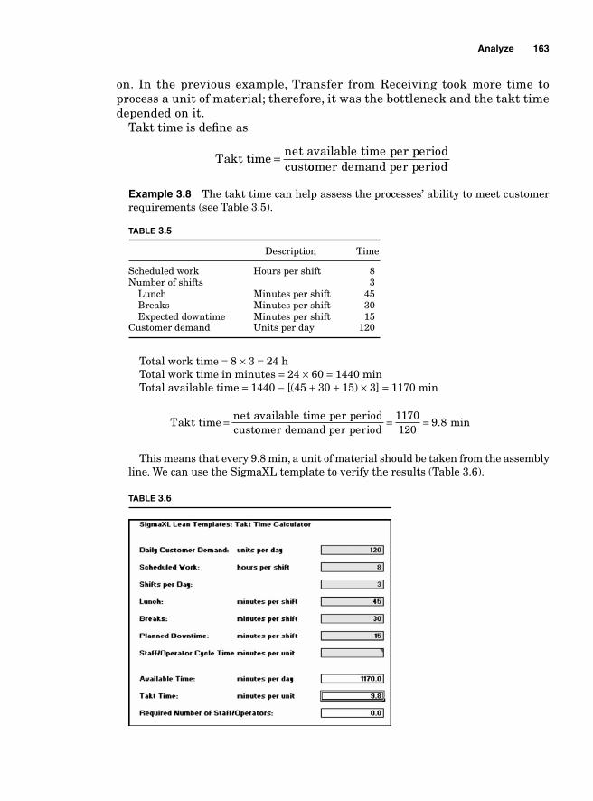
Analyze 163
on. In the previous example, Transfer from Receiving took more time to process a unit of material; therefore, it was the bottleneck and the takt time depended on it.
Takt time is defi ne as
Takt time
net available time per periodcust
=oomer demand per period
Example 3.8 The takt time can help assess the processes’ ability to meet customer requirements (see Table 3.5).
TABLE 3.5
Description Time
Scheduled work Hours per shift 8Number of shifts 3 Lunch Minutes per shift 45 Breaks Minutes per shift 30 Expected downtime Minutes per shift 15Customer demand Units per day 120
Total work time = 8 × 3 = 24 hTotal work time in minutes = 24 × 60 = 1440 minTotal available time = 1440 – [(45 + 30 + 15) × 3] = 1170 min
Takt time
net available time per periodcust
=oomer demand per period
= =1170120
9 8. min
This means that every 9.8 min, a unit of material should be taken from the assembly line. We can use the SigmaXL template to verify the results (Table 3.6).
TABLE 3.6
164 Chapter Three
If the process line is made up of several steps and operates with one-piece fl ow, the ideal solution would be to have each step take 9.8 min to process each piece.
Example 3.9 A processing line uses a one-piece fl ow and has six steps. The time that it takes each step to complete a task is shown in Table 3.7.
TABLE 3.7
Processing steps Processing time (min)
1 10 2 13 3 9 4 10 5 12 6 11
The processing time for each piece depends on step 2 because it is the constraint since it takes more time to complete a task than the rest of the steps. This will result in excess (labor, machine, and/or fl oor) capacities. Step 1 will complete excess pieces and have materials piled up in front of step 2, and since step 3 and the rest of the downstream steps take much less time to process the material, they will end up being idle every time they run out of work. Therefore, the non-value-added elements on this line come under the form of excess inventory and wait.
If the time that it takes to complete one piece and meet the customers’ requirement is 11 min, step 2 will prevent the line from meeting the deadline. Only step 6 really performs to meet the customers’ requirements. Therefore, in order to make improvement to the processing line, the improvement team should determine if there are opportunities for improvement within step 2. If there is no way that step 2 can be made to process the material faster, the team can concentrate on fi nding out how to reallocate resources from steps 1, 3, 4, and 5 to step 2, which may require the redesign of the whole line. Any improvement will depend on how fl exible it is for the process to shift resources from one step to another.
Once the takt time has been calculated, the next step is to create a balanced fl ow of material. Better capacity planning is made by making adjustments on machines, labor, setup time, and fl oor utilization to balance the workload. If batches are being used, it is better to change the process to a one-piece fl ow.
Batch versus one-piece fl ow
In a batch-and-queue process, pieces of material are consolidated in lots after having been processed before being moved to the next steps in the production line, while with one-piece fl ow every time a piece has been completed it is moved to the next step. The advantage of a one-piece fl ow over the batch-and-queue process is explained better through an example.
Example 3.10 Suppose in Example 3.9 that batches of 10 pieces have to be completed before being moved to the next step. How much time will it take to complete the fi rst batch of 10 pieces using the batch-and-queue process? How much time will it take to complete 10 pieces using the one-piece fl ow?
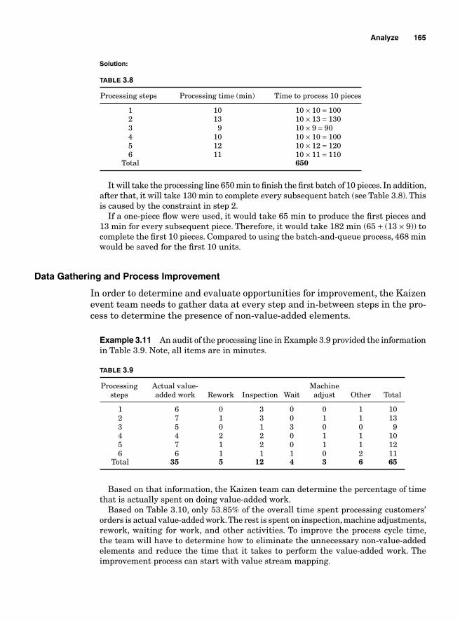
Analyze 165
Solution:
TABLE 3.8
Processing steps Processing time (min) Time to process 10 pieces
1 10 10 × 10 = 100 2 13 10 × 13 = 130 3 9 10 × 9 = 90 4 10 10 × 10 = 100 5 12 10 × 12 = 120 6 11 10 × 11 = 110 Total 650
It will take the processing line 650 min to fi nish the fi rst batch of 10 pieces. In addition, after that, it will take 130 min to complete every subsequent batch (see Table 3.8). This is caused by the constraint in step 2.
If a one-piece fl ow were used, it would take 65 min to produce the fi rst pieces and 13 min for every subsequent piece. Therefore, it would take 182 min (65 + (13 × 9)) to complete the fi rst 10 pieces. Compared to using the batch-and-queue process, 468 min would be saved for the fi rst 10 units.
Data Gathering and Process Improvement
In order to determine and evaluate opportunities for improvement, the Kaizen event team needs to gather data at every step and in-between steps in the pro-cess to determine the presence of non-value-added elements.
Example 3.11 An audit of the processing line in Example 3.9 provided the information in Table 3.9. Note, all items are in minutes.
TABLE 3.9
Processing Actual value- Machine steps added work Rework Inspection Wait adjust Other Total
1 6 0 3 0 0 1 10 2 7 1 3 0 1 1 13 3 5 0 1 3 0 0 9 4 4 2 2 0 1 1 10 5 7 1 2 0 1 1 12 6 6 1 1 1 0 2 11 Total 35 5 12 4 3 6 65
Based on that information, the Kaizen team can determine the percentage of time that is actually spent on doing value-added work.
Based on Table 3.10, only 53.85% of the overall time spent processing customers’ orders is actual value-added work. The rest is spent on inspection, machine adjustments, rework, waiting for work, and other activities. To improve the process cycle time, the team will have to determine how to eliminate the unnecessary non-value-added elements and reduce the time that it takes to perform the value-added work. The improvement process can start with value stream mapping.
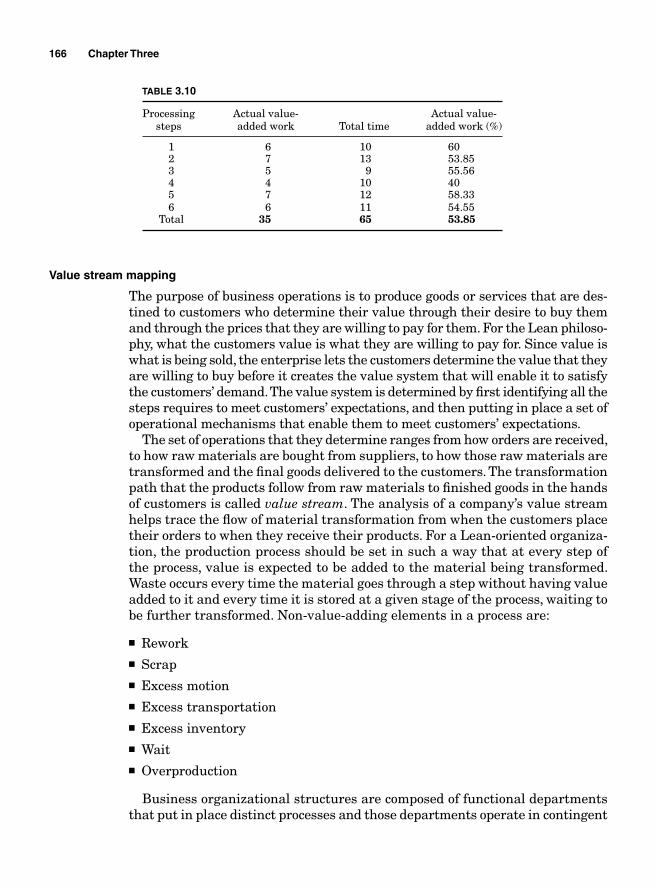
166 Chapter Three
TABLE 3.10
Processing Actual value- Actual value- steps added work Total time added work (%)
1 6 10 60 2 7 13 53.85 3 5 9 55.56 4 4 10 40 5 7 12 58.33 6 6 11 54.55 Total 35 65 53.85
Value stream mapping
The purpose of business operations is to produce goods or services that are des-tined to customers who determine their value through their desire to buy them and through the prices that they are willing to pay for them. For the Lean philoso-phy, what the customers value is what they are willing to pay for. Since value is what is being sold, the enterprise lets the customers determine the value that they are willing to buy before it creates the value system that will enable it to satisfy the customers’ demand. The value system is determined by fi rst identifying all the steps requires to meet customers’ expectations, and then putting in place a set of operational mechanisms that enable them to meet customers’ expectations.
The set of operations that they determine ranges from how orders are received, to how raw materials are bought from suppliers, to how those raw materials are transformed and the fi nal goods delivered to the customers. The transformation path that the products follow from raw materials to fi nished goods in the hands of customers is called value stream. The analysis of a company’s value stream helps trace the fl ow of material transformation from when the customers place their orders to when they receive their products. For a Lean-oriented organiza-tion, the production process should be set in such a way that at every step of the process, value is expected to be added to the material being transformed. Waste occurs every time the material goes through a step without having value added to it and every time it is stored at a given stage of the process, waiting to be further transformed. Non-value-adding elements in a process are:
■ Rework■ Scrap■ Excess motion■ Excess transportation■ Excess inventory■ Wait■ Overproduction
Business organizational structures are composed of functional departments that put in place distinct processes and those departments operate in contingent
Analyze 167
sequences with different operations at different stages and areas of the orga-nization being dependent on each other. Because of this interdependence of the different operations, every time a process at a given department fails to operate to its full potential or take more time to process orders than the other depart-ments, it becomes a constraint, a bottleneck for the entire processing line.
How to map your value stream
Just as in the case of process mapping, the purpose of value stream mapping is to visualize the chain of events that leads to the generation of a throughput in order to determine where the non-value-adding activities are and pinpoint a bottleneck, clutter, or opportunities for improvement. Yet it is necessary to dis-tinguish value stream mapping from process mapping because a value stream map does not only include steps in a process but also includes the fl ow of detailed and descriptive information that pertain to every step of the process.
Mapping the value stream does not only help visualize the sequence of opera-tions but it also makes it easy to assess the process capabilities and performance with regard to takt time. A company has as many value streams as it has prod-ucts, so the fi rst step in value stream mapping is separating the products before examining the chain of processes that lead to their production.
A Lean-oriented organization usually uses pull techniques, which consist of subordinating production to the customers’ actual orders instead of a forecast-driven production process that consists of building a high volume of outbound inventory that will wait for potential customers. Therefore, the value stream mapping of the current state for a Lean-driven process should start with the customers’ demands. The three main players in the production of the demanded products are the customer, the organization’s internal operations, and the sup-pliers of the raw materials and services.
The fi rst step therefore is the assessment of a periodic (weekly, monthly, etc.) volume of orders from the customers that will later be subdivided to determine the daily production requirement. The next step is evaluating the demand for raw materials and services that will be required to satisfy the customers’ demands and then determining the company’s ability to meet demands along with its productivity, performance, and takt time. How long does it take every operation to process a given number of orders based on the available resources?
The current state of value stream mapping is not intended to describe the ideal state of the company but to visualize what is currently happening. Based on the current map, opportunities for improvement can be determined and actions taken.
The list of the data that need to be collected to give a complete picture of the current situation should include the following:
■ Number of operators■ Actual working time (minus breaks and exception time) ■ Cycle time—how long it takes each step in the process to complete its
tasks
168 Chapter Three
■ Set up time—the time it takes to change from producing one type of product to another
■ Available time—the time during which the people and the machines can actu-ally perform value adding work
■ Production per shift■ How many different types of products can be produced at a given station?■ Scrap rate■ Rate of rework
Example 3.12 Figure 3.11 is a simplifi ed map of the value stream of a soap manufacturer.
Failure Mode and Effect Analysis
When a project team is engaged in a new product or process development or a new system implementation, no matter how well thought out and well con-ducted the initiative is uncertainty will always be present and it will always involve potential for failure. Being able to foresee the potential impediments to the initiative is a fi rst step toward reducing the probability for their occur-rence and the cost attached to future repairs. The techniques commonly used in design reliability analyses are the Ishikawa diagram, the fault tree analysis, and the failure mode and effect analysis (FMEA) or failure mode effects and criticality analysis (FMECA). While a fault tree analysis is an investigative tool that goes from the effects of a failure of a product or process to its root causes and the Ishikawa diagram is a relational diagram that traces effects to their causes, an FMEA is a design reliability analysis technique, a preemptive form of brainstorming that generally follows a process mapping for a product or process design and is usually followed by a Pareto analysis. It is a granular analysis of a process, system, or product design for identifying potential defi ciencies. A cross-functional group generally conducts it with all the participants having a stake in or knowledge about the process, system, or product being assessed. While a fault tree analysis is generally conducted to investigate a failure that has already occurred, an FMEA is done prior to a product or process release; it is a preemptive technique. Although the methodology for conducting an FMEA is in general the same, there are minor differences of approach used to carry it out. The differences reside in the collection of the items to be evaluated for potential shortcomings. The collection depends on whether the analysis is done for a product or a process.
An FMEA starts with the gathering of a team of knowledgeable stakeholders who are involved in the design, development, deployment, or marketing of the products or process to be evaluated. The next step is getting all the information pertaining to the subject including diagrams, drawings, and maps that list all the steps (or features) of the process (or product) to be implemented.
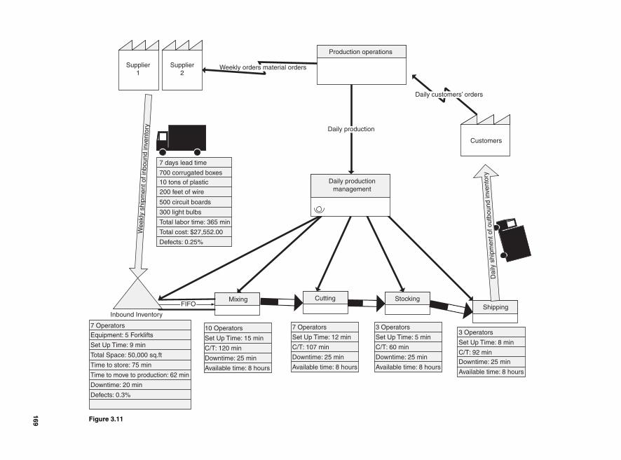
Supplier1
Production operations
Supplier2
7 Operators
Equipment: 5 Forklifts
Set Up Time: 9 min
Total Space: 50,000 sq.ft
Time to store: 75 min
Time to move to production: 62 min
Downtime: 20 min
Defects: 0.3%
Inbound Inventory
Mixing StockingCuttingShipping
10 Operators
Set Up Time: 15 min
C/T: 120 min
Downtime: 25 min
Available time: 8 hours
Daily production
Customers
Dai
lysh
ipm
ent o
f out
boun
d in
vent
ory
Daily customers’ orders
Weekly orders material orders
Wee
kly
ship
men
t of i
nbou
nd in
vent
ory
7 days lead time
700 corrugated boxes
10 tons of plastic
500 circuit boards
300 light bulbs
Total labor time: 365 min
Total cost: $27,552.00
Defects: 0.25%
FIFO
7 Operators
Set Up Time: 12 min
C/T: 107 min
Downtime: 25 min
Available time: 8 hours
3 Operators
Set Up Time: 5 min
C/T: 60 min
Downtime: 25 min
Available time: 8 hours
3 Operators
Set Up Time: 8 min
C/T: 92 min
Downtime: 25 min
Available time: 8 hours
200 feet of wire
Daily production management
Figure 3.11
169
170 Chapter Three
When the FMEA is done in relation with a new product development, the list-ing of the items to be assessed will include all the critical parts of the product and their interactions. The next step is determining the extent of the FMEA. What process, system, or product is being studied, what are the critical compo-nents in that product or process, and how do they interact?
A graphical presentation of an FMEA is generally a representation of two combined matrices: on one side is the failure mode and effect part, which con-sists of developing a list of all the causes of the potential failures and their effects on the overall process or product, and on the other side is the action plan, which determines what needs to be done to prevent the failures from materializing.
Failure mode assessment
The fi rst step is to brainstorm and list the critical parts or phases of the pro-cess or product at hand. Flow charts and CAD drawings are generally used to map processes and interactions between different components of a product. Every element of the fl ow chart should be listed on the FMEA matrix for appraisal.
The next step is listing all of the potential failures that might occur to each part or phase. The probable causes of those failures are then listed and their impact established.
A critical aspect of this methodology is the determination of the severity (or criticality) of the failure, how often it is likely to happen, and how easy it is to detect. In general, the levels of severity, occurrence, and detection of each item in the FMEA are ranked from 1 to 10.
Process step or product function. The process step or product function indicates the item being analyzed. If the FMEA were based on a fl ow chart, it would be a component in the chart. The fl ow chart should be divided in such a way that only one stage is analyzed at a time.
Potential failure mode. The potential failure mode describes the way in which the corresponding item listed in the process step or product function could possibly fail to satisfy its intended purpose. There can be more than one potential failure for a function component. The potential failures may only occur under certain unique circumstance and each one should be listed separately.
Potential effect of the failure. The potential effect of the failure describes the impact of the failure on the functionality of the product or process. It describes what the customer or process owner will actually notice because of the component’s failure. The effect must be a very clear and explicit description of the impact of the noncompliance.
Potential causes of the failure. This describes the fl aws of the design that may lead to a potential failure. Every conceivable ground for failure should be listed
Analyze 171
in a thoroughly descriptive manner so that the corrective actions can be more promptly and cost effectively taken.
Severity. The severity measures how critical or serious a potential failure can be on the product or process. If the failure is so serious that it can stop production, it is graded 10 and if it is very easy to correct, it is graded 1.
Detection. How easy is the failure to detect? Detection is a measure of the ability to detect preemptively the failures. If the potential failure is easy to detect, the grade should be low (1 for very easy to detect and 10 for very hard).
Occurrence. The occurrence measures how often the failure is likely to happen. Here again, the likelihood of an occurrence is expressed in ranking from 1 to 10 (1 for rare and 10 for often).
Current control. Current controls are known preventive controls that are currently being used in similar processes or products.
Risk priority number. The risk priority number (RPN) helps to rank the failures and establish their precedence for problem resolution considerations. It measures the process or product design risk. The RPN is the product of the severity, detection, and occurrence levels. For a failure with a severity of 6, a detection of 3, and an occurrence of 6, the RPN will be 108 (6 × 3 × 6 = 108). The higher the RPN, the more attention that particular step of the process or that characteristic of the product should get.
The templates used for FMEAs are not always the same, but the items above (severity, detection, occurrence, RPN) should always be present because they are the basis for corrective actions. SigmaXL provides a practical template for conducting an FMEA. We will use it in our example.
Action plan
Since the purpose of an FMEA is to forestall failures, after determining the list of potential failures and their RPNs, the next step is the planning of the actions to take to avert their occurrence. The planned actions to be taken are above all based on the nature of the failures but their presence is contingent upon the RPNs. After fi nishing the fi rst phase of the FMEA, preventive tasks are assigned to stakeholders according to their aptitude, but the priority of execution should be subjected to the RPN ranking.
Not all FMEAs follow the same pattern of action plan but the following steps are usually considered.
■ Recommended actions. The recommended preventive actions are generally suggested by the FMEA team during a brainstorming session. It consists of all the suggested proceedings that need to be followed to prevent failures.
172 Chapter Three
The reasons for failures are multifaceted. Every failure can have several causes; that is why recommended preventive actions are better generated by a cross-functional team.
■ Task owner and projected completion date. The task owner is the person who has been assigned the task of mending the aspects of the product, process, or design that is subject to failure. Even though the suggested preventive actions are the result of a brainstorming session, the task of executing the actions is performed at an individual or departmental level. A person or a group of people are selected and assigned the task of averting failures. The projected completion date should also be determined to avoid procrastination and enforce accountability.
■ Severity. If the actions are taken and conducted according to the suggestions made by the team, by how much are they expected to reduce the potential failure? How would they affect the criticality of the failure? Here again the effects of the actions are ranked from 1 to 10.
■ Occurrence. How often will the failures happen if the recommended actions are taken?
■ Detection. Detection refers to the ability to identify failures. After improve-ment, potential failures should be easier to detect than they were before the recommended actions were taken.
■ RPN. Here again, the RPN will be the product of the detection, occurrence, and severity. After the improvements have been made, the RPN is expected to be signifi cantly lower than it was before.
Example of an FMEA
The fl ow chart in Fig. 3.12 represents the future state process map for a new WMS implementation. The map depicts a cross-functional process that involves two interfaced systems’ software and a physical process.
The fi rst system software, Compass, is the host; it stores the customer databases, transportation matrices, orders nomenclatures, and warehouse inventory. The WMS is used to manage the daily transactions in the warehouse. The two systems are interfaced in such a way that the host processes the customer orders fi rst before being dropped to the WMS. Once the orders are dropped, picking labels are printed and the warehouse employees are assigned the tasks to physically pick, pack, and ship the products.
After having mapped the future state of the process, an FMEA is conducted to preempt potential failures. The SigmaXL FMEA template summarizes the results of the brainstorming session.
After having evaluated the potential failures, every item on the list becomes a task and each task is assigned to a project team member. The priority for the task completions depends on the RPN numbers. It is clear that “Are SKUs available” has the highest RPN (60); therefore, it must receive special attention.
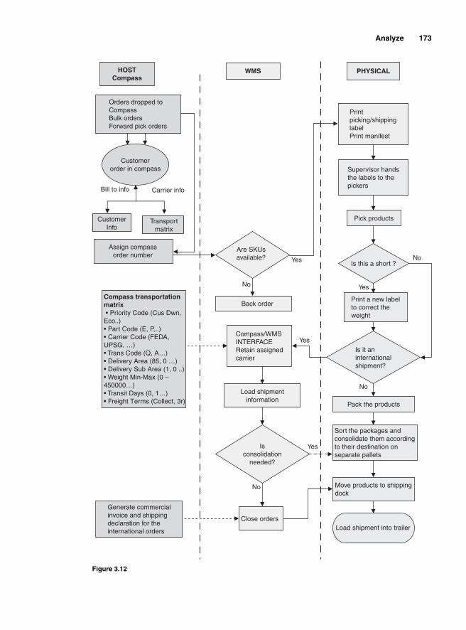
Analyze 173
HOSTCompass
PHYSICALWMS
Orders dropped to CompassBulk ordersForward pick orders
Customerorder in compass
CustomerInfo
Transport matrix
Bill to info Carrier info
Are SKUsavailable?
Assign compassorder number
No
Back order
Pick products
Compass transportation matrix • Priority Code (Cus Dwn, Eco..) • Part Code (E, P,..) • Carrier Code (FEDA, UPSG, …) • Trans Code (Q, A…) • Delivery Area (85, 0 …) • Delivery Sub Area (1, 0 ..) • Weight Min-Max (0 – 450000…)• Transit Days (0, 1…) • Freight Terms (Collect, 3r)
Load shipmentinformation
Compass/WMSINTERFACE Retain assignedcarrier
Isconsolidation
needed?
Sort the packages andconsolidate them accordingto their destination on separate pallets
Generate commercialinvoice and shippingdeclaration for the international orders
Close ordersLoad shipment into trailer
Print picking/shippinglabelPrint manifest
Supervisor handsthe labels to the pickers
Is this a short ?
Is it aninternationalshipment?
Print a new labelto correct the weight
Yes
Yes
Move products to shippingdock
Pack the products
No
No
Yes
Yes
No
Figure 3.12
174 Chapter Three
Hypothesis testing
A hypothesis is a value judgment made about a circumstance, a statement made about a population. Based on experience, an engineer can, for instance, assume that the amount of carbon monoxide emitted by a certain engine is twice the maximum allowed legally. However, his assertions can only be ascertained by conducting a test to compare the carbon monoxide generated by the engine with the legal requirements.
If the data used to make the comparison are parametric data, that is, data that can be used to derive a mean and a standard deviation, the populations from which the data are taken are normally distributed and they have equal variances. A standard error-based hypothesis testing using the t-test can be used to test the validity of the hypothesis made about the population. There are at least five steps to follow when conducting a hypothesis testing
1. Null hypothesis. The fi rst step consists of stating the null hypothesis, which is the hypothesis being tested. In the case of the engineer making a state-ment about the level of carbon monoxide generated by the engine, the null hypothesis is:
H0: The level of carbon monoxide generated by the engine is twice as great as the legally required amount.
The null hypothesis is denoted by H0.
2. Alternate hypothesis. The alternate (or alternative) hypothesis is the oppo-site of the null hypothesis. It is assumed valid when the null hypothesis is rejected after testing. In the case of the engineer testing the carbon monoxide, the alternate hypothesis would be
H1: The level of carbon monoxide generated by the engine is not twice as great as the legally required amount.
The alternate hypothesis is noted H1 or in some cases Ha.
3. Testing the hypothesis. The objective of the test is to generate a sample test statistic that can be used to reject or fail to reject the null hypothesis. The test statistic is derived from the Z formula if the samples are greater than 30.
Z
X
n= − μ
σ /
If the samples are less than 30, the t-test is used.
t
X
s n= − μ
/
4. Level of risk. The level of risk addresses the kinds of errors that can be made while making an inference based on the test statistics obtained from
Analyze 175
the testing. Two types of errors can be made. The experimenter can falsely reject a hypothesis that is true. In that case, we say that he made a Type I error or α error. If he fails to reject a hypothesis that is actually false, he makes a Type II or β error. In the case of the engineer testing the level of the carbon monoxide generated by the engine, if the actual level of carbon monoxide is in fact twice as great as the prescribed level and he rejected the null hypothesis, he would have made a Type I error. If the carbon monox-ide generated by the engine is less than the legally prescribed level and the experimenter fails to reject the null hypothesis, he would have made a Type II error, he would have failed to reject a null hypothesis that happened to be false.
5. Decision rule. Only two decisions are considered: rejecting the hypothesis or failing to reject it. The decision rule determines the conditions under which the null hypothesis is rejected or failed to be rejected. The decision to reject the null hypothesis is based on the alpha (α) level. Before conducting the test, the experimenter must set the confi dence level for the test. He can, for instance, decide to test his hypothesis with a 95% confi dence level. That means he would be 95% sure that the decision to reject or fail to reject the null hypothesis is correct. However, 95% confi dence level also means that there is a 5% chance that an error will be made.
Example 3.13 A machine used to average a production rate of 245 units per hour before it went for repair. After it came back from repair, over a period of 25 h, it produced an average of 249 units with a standard deviation of 8. Determine if there is a statistically signifi cant difference between the machine’s productivity before and after repair at a confi dence level of 95%.
Solution: Since the sample is smaller than 30, we will use the t-test
The null hypothesis is the following:
H0: The productivity before repair = the productivity after repair
The alternate hypothesis should state the opposite:
H1: The productivity before repair ≠ the productivity after repair
n s X= = = =25 8 249 245, , , ,μ
We can determine the interval within which we should expect the calculated t to fall in for the null hypothesis not to be rejected. We will determine the critical t-statistic values based on the degree of freedom and the signifi cance level. Since the confi dence level is set at 95%, α = − =1 0 95 0 05. . . Since the null hypothesis is stated as equality, we will have a two-tailed curve with each tail covering one-half of α. We would need to fi nd α / /2 0 05 2 0 025= =. . .
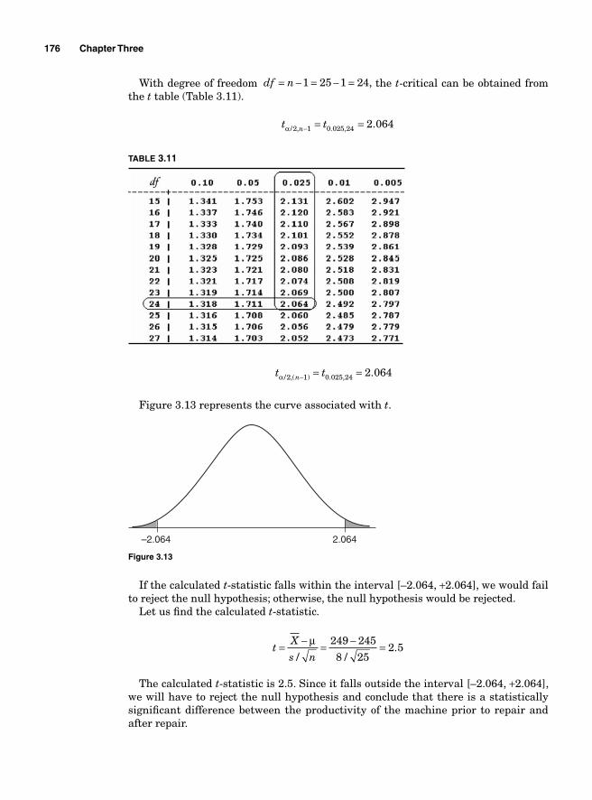
176 Chapter Three
With degree of freedom df n= − = − =1 25 1 24, the t-critical can be obtained from the t table (Table 3.11).
t tnα / , . , .2 1 0 025 24 2 064− = =
TABLE 3.11
t tnα / ,( ) . , .2 1 0 025 24 2 064− = =
Figure 3.13 represents the curve associated with t.
–2.064 2.064
Figure 3.13
If the calculated t-statistic falls within the interval [–2.064, +2.064], we would fail to reject the null hypothesis; otherwise, the null hypothesis would be rejected.
Let us fi nd the calculated t-statistic.
tX
s n= − = − =μ
/ /.
249 245
8 252 5
The calculated t-statistic is 2.5. Since it falls outside the interval [–2.064, +2.064], we will have to reject the null hypothesis and conclude that there is a statistically signifi cant difference between the productivity of the machine prior to repair and after repair.
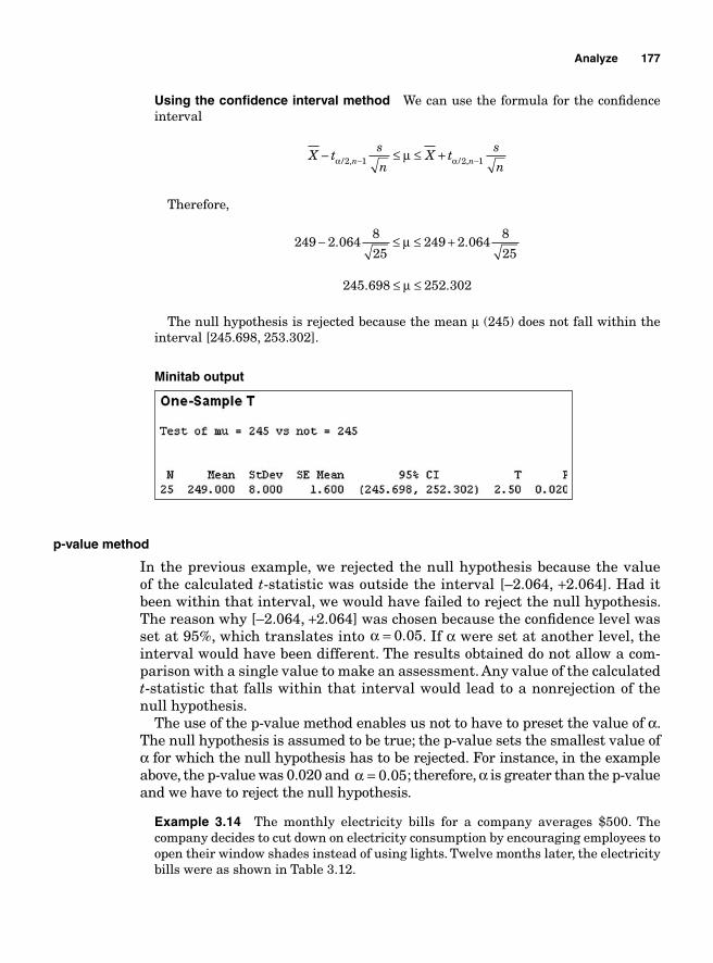
Analyze 177
Using the confi dence interval method We can use the formula for the confi dence interval
X ts
nX t
s
nn n− ≤ ≤ +− −α αμ/ , / ,2 1 2 1
Therefore,
249 2 0648
25249 2 064
8
25− ≤ ≤ +. .μ
245 698 252 302. .≤ ≤μ
The null hypothesis is rejected because the mean μ (245) does not fall within the interval [245.698, 253.302].
Minitab output
p-value method
In the previous example, we rejected the null hypothesis because the value of the calculated t-statistic was outside the interval [–2.064, +2.064]. Had it been within that interval, we would have failed to reject the null hypothesis. The reason why [–2.064, +2.064] was chosen because the confi dence level was set at 95%, which translates into α = 0 05. . If α were set at another level, the interval would have been different. The results obtained do not allow a com-parison with a single value to make an assessment. Any value of the calculated t-statistic that falls within that interval would lead to a nonrejection of the null hypothesis.
The use of the p-value method enables us not to have to preset the value of α. The null hypothesis is assumed to be true; the p-value sets the smallest value of α for which the null hypothesis has to be rejected. For instance, in the example above, the p-value was 0.020 and α = 0 05. ; therefore, α is greater than the p-value and we have to reject the null hypothesis.
Example 3.14 The monthly electricity bills for a company averages $500. The company decides to cut down on electricity consumption by encouraging employees to open their window shades instead of using lights. Twelve months later, the electricity bills were as shown in Table 3.12.
178 Chapter Three
TABLE 3.12
Jan Feb Mar Apr May Jun Jul Aug Sep Oct Nov Dec
479 509 501 470 489 494 445 502 467 489 508 500
Can we say that there has been an improvement in the electricity consumption with a confi dence level of 99%?
Solution: The null hypothesis is
H0: The average electricity bill before changes = the average bill after changes
And the alternate hypothesis is
H1: The average electricity bill before changes ≠ the average bill after changes
where s = 19.264
X = 487 75. n = 12
Because the confi dence level is 99%, α = − =1 0 99 0 01. . .The degree of freedom is 11 and because α = 0 01. , α /2 0 005= . ; therefore, from the
t-table, the critical t-statistic will be t0 005 11 3 106. , . .=We can determine the confi dence interval using the formula
X ts
nX t
s
nn n− ≤ ≤ +− −α αμ/ , / ,2 1 2 1
487 75 3 10619 264
12487 75 3 106
19 264
12. .
.. .
.− ≤ ≤ +μ
470 477 505 023. .≤ ≤μ
The mean $500 falls well within the confi dence interval; therefore, we cannot reject the null hypothesis and have to conclude that there has not been a statistically signifi cant change in the level of electricity consumption because of the employees opening their window shades instead of using their lights.
Using SigmaXL Open SigmaXL and then open the fi le Electricitybill.xls. Select the area containing the data. From the menu bar, click on SigmaXL before clicking on Statistical Tools and then select 1 Sample t-Test & Confi dence Intervals as indicated in Fig. 3.14.
The 1 Sample t-Test should appear with the fi eld Please select your data already fi lled out. Press the Next >> button. When the dialog box appears (see Fig. 3.15), select the Unstacked Column Format (2 or More Data Columns) option, type in “500”
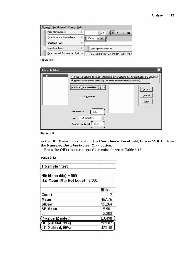
Analyze 179
in the H0: Mean = fi eld and for the Confi dence Level fi eld, type in 99.0. Click on the Numeric Data Variables (Y)>> button.
Press the OK>> button to get the results shown in Table 3.13.
TABLE 3.13
Figure 3.14
Figure 3.15
180 Chapter Three
The p-value is equal to 0.0498, which is greater than α = 0 01. ; therefore, we fail to reject the null hypothesis and have to conclude that there has not been any difference after the changes were implemented.
Example 3.15 A food producer claims that the amount of carbohydrate contained in its bread is 247 g of carb per loaf. A consumer group decides to test that claim. It takes a sample of 20 pieces of bread and runs a test. The observations are summarized in Table 3.14. Determine if the amount of carbohydrate is really 247 g of carb at a confi dence level of 95%.
TABLE 3.14
283.009 263.273 219.832 236.298248.934 264.623 275.402 260.859283.038 235.411 267.245 259.513272.48 244.518 248.304 277.077255.197 255.79 250.85 247.606
Solution: The null hypothesis should state that
H0 247: μ = g
and the alternate hypothesis
H1 247: μ ≠ g
Based on the sample, n = 20, s = 16.636, x = 257 463.
df = 20 – 1 = 19, α/2 = 0.05/2 = 0.025.
From the t-table shown in Table 3.15, we determine that t tdfα / , . , . .2 0 025 19 2 093= =
TABLE 3.15
For the null hypothesis not to be rejected, the calculated t-statistic will have to fall within the interval [–2.093, +2.093] (see Fig. 3.16).
Let us fi nd the calculated t-statistic.
tX
s n= − = − = =μ
/
257 463 24716 636
20
10 4633 72
2 8.
...
. 113
The calculated t-statistic is equal to 2.813, which falls outside the interval [–2.093, +2.093]; therefore, we have to reject the null hypothesis and conclude that the amount of carbohydrate is not equal to 247 g of carb.
Analyze 181
Using the confi dence interval method
257 463 2 09316 636
20257 463 2 093
16 636. .
.. .
.− ≤ ≤ +μ220
249 677 265 249. .≤ ≤μ
Here again, the mean (i.e. 247 g of carbs) falls outside the confi dence interval and we therefore have to reject the null hypothesis.
Using SigmaXL, we obtain Table 3.16.
TABLE 3.16
The p-value is equal to 0.011, which is much smaller than 0.05; therefore, the null hypothesis has to be rejected.
–2.093 2.093
Figure 3.16
182 Chapter Three
Nonparametric Hypothesis Testing
In the previous examples, we used means and standard deviations to determine if there were statistically signifi cant differences between samples. What hap-pens if the data cannot yield arithmetic means and standard deviations? What happens if the data are nominal or ordinal?
When we deal with categorical, nominal, or ordinal data, nonparametric sta-tistics are used to conduct a hypothesis testing. A nonparametric test is a test that analyzes data that cannot be converted into parameters such as means and standard deviations. The Chi-square test and the Mann-Whitney U test are examples of nonparametric tests.
Chi-square test
Chi-square goodness-of-fi t test. Fouta Electronics and Touba Inc. are computer manufacturers that use the same third-party call center to handle their customer services. Touba Inc. conducted a survey to evaluate how satisfi ed its customers were with the services that they receive from the call center. The results of the survey are summarized in Table 3.17.
TABLE 3.17
Categories Rating (%)
Excellent 10Very good 45Good 15Fair 5Poor 10Very poor 15
After having seen the results of the survey, Fouta Electronics decided to fi nd out whether they apply to its customers, so it interviewed 80 randomly selected customers and obtained the results shown in Table 3.18.
TABLE 3.18
Categories Rating (absolute value)
Excellent 8Very good 37Good 11Fair 7Poor 9Very poor 8
To analyze the results, the quality engineer at Fouta Electronics conducts a hypothesis testing. However, in this case, because he is faced with categorical data, he cannot use a t-test since a t-test relies on the standard deviation and the mean, which we cannot obtain from either table. We cannot deduct a mean satisfaction or a standard deviation satisfaction. Therefore, another type of test
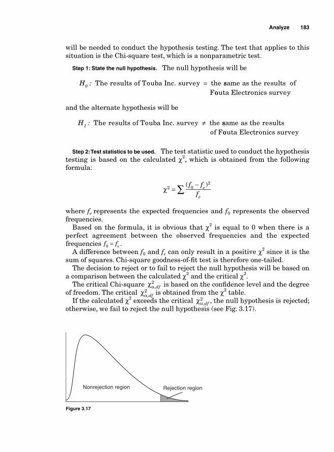
Analyze 183
will be needed to conduct the hypothesis testing. The test that applies to this situation is the Chi-square test, which is a nonparametric test.
Step 1: State the null hypothesis. The null hypothesis will be
H :0 The results of Touba Inc. survey the= ssame as the results ofFoouta Electronics survey
and the alternate hypothesis will be
H :1 The results of Touba Inc. survey the≠ ssame as the resultsof Foouta Electronics survey
Step 2: Test statistics to be used. The test statistic used to conduct the hypothesis testing is based on the calculated χ2, which is obtained from the following formula:
χ2 0
2
=−∑ ( )f ff
e
e
where fe represents the expected frequencies and f0 represents the observed frequencies.
Based on the formula, it is obvious that χ2
is equal to 0 when there is a perfect agreement between the observed frequencies and the expected frequencies f fe0 = .
A difference between f0 and fe can only result in a positive χ2 since it is the sum of squares. Chi-square goodness-of-fi t test is therefore one-tailed.
The decision to reject or to fail to reject the null hypothesis will be based on a comparison between the calculated χ2 and the critical χ2.
The critical Chi-square χα,df2 is based on the confi dence level and the degree
of freedom. The critical χα,df2 is obtained from the χ2 table.
If the calculated χ2 exceeds the critical χα,df2 , the null hypothesis is rejected;
otherwise, we fail to reject the null hypothesis (see Fig. 3.17).
Nonrejection region Rejection region
Figure 3.17
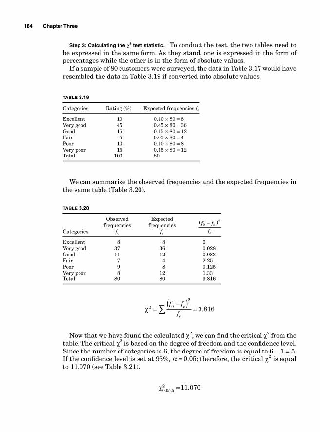
184 Chapter Three
Step 3: Calculating the χ2 test statistic. To conduct the test, the two tables need to be expressed in the same form. As they stand, one is expressed in the form of percentages while the other is in the form of absolute values.
If a sample of 80 customers were surveyed, the data in Table 3.17 would have resembled the data in Table 3.19 if converted into absolute values.
TABLE 3.19
Categories Rating (%) Expected frequencies fe
Excellent 10 0.10 × 80 = 8Very good 45 0.45 × 80 = 36Good 15 0.15 × 80 = 12Fair 5 0.05 × 80 = 4Poor 10 0.10 × 80 = 8Very poor 15 0.15 × 80 = 12Total 100 80
We can summarize the observed frequencies and the expected frequencies in the same table (Table 3.20).
TABLE 3.20
Observed Expected frequencies frequenciesCategories f0 fe
( )f f
fe
e
02−
Excellent 8 8 0Very good 37 36 0.028Good 11 12 0.083Fair 7 4 2.25Poor 9 8 0.125Very poor 8 12 1.33Total 80 80 3.816
χ2 0
2
3 816=−( )
=∑f f
fe
e
.
Now that we have found the calculated χ2, we can fi nd the critical χ2 from the table. The critical χ2 is based on the degree of freedom and the confi dence level. Since the number of categories is 6, the degree of freedom is equal to 6 – 1 = 5. If the confi dence level is set at 95%, α = 0 05. ; therefore, the critical χ2 is equal to 11.070 (see Table 3.21).
χ0 05 5
2 11 070. , .=
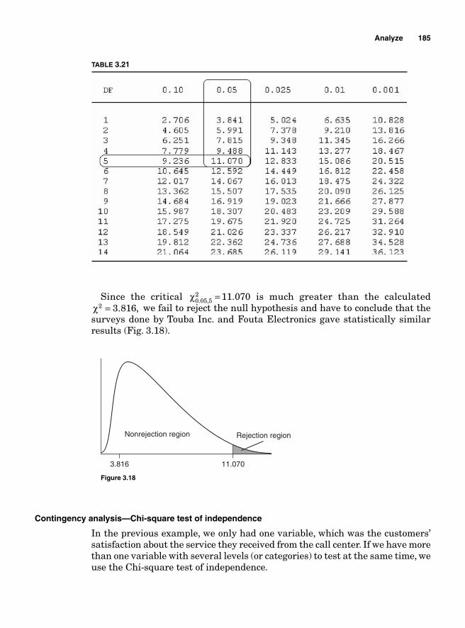
Analyze 185
Since the critical χ0 05 52 11 070. , .= is much greater than the calculated
χ2 3 816= . , we fail to reject the null hypothesis and have to conclude that the surveys done by Touba Inc. and Fouta Electronics gave statistically similar results (Fig. 3.18).
Nonrejection region Rejection region
3.816 11.070
Figure 3.18
Contingency analysis—Chi-square test of independence
In the previous example, we only had one variable, which was the customers’ satisfaction about the service they received from the call center. If we have more than one variable with several levels (or categories) to test at the same time, we use the Chi-square test of independence.
TABLE 3.21
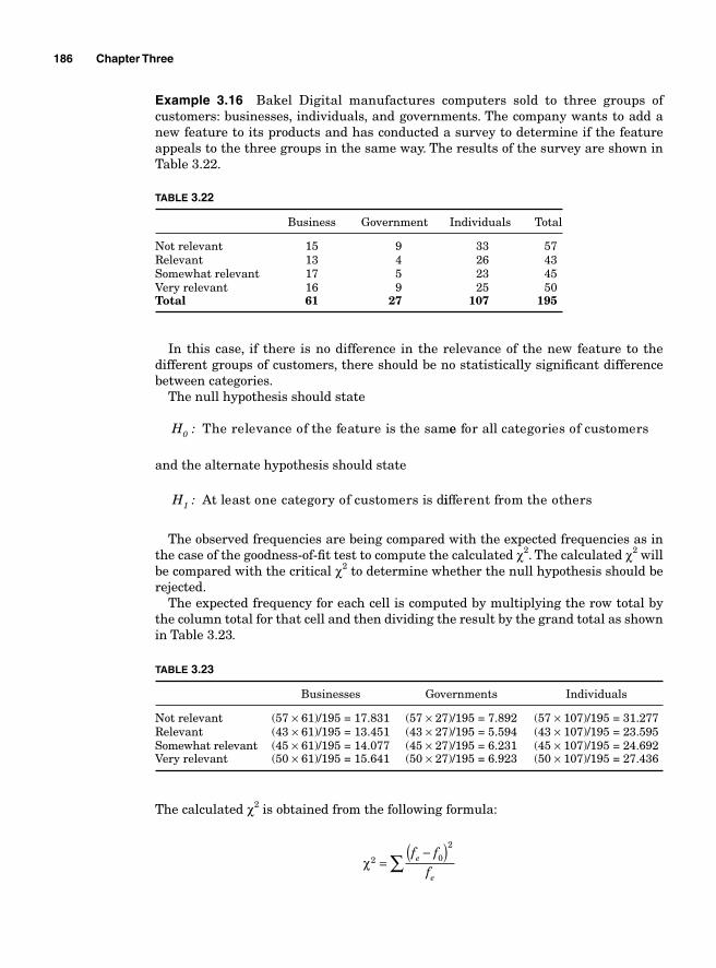
186 Chapter Three
Example 3.16 Bakel Digital manufactures computers sold to three groups of customers: businesses, individuals, and governments. The company wants to add a new feature to its products and has conducted a survey to determine if the feature appeals to the three groups in the same way. The results of the survey are shown in Table 3.22.
TABLE 3.22
Business Government Individuals Total
Not relevant 15 9 33 57Relevant 13 4 26 43Somewhat relevant 17 5 23 45Very relevant 16 9 25 50Total 61 27 107 195
In this case, if there is no difference in the relevance of the new feature to the different groups of customers, there should be no statistically signifi cant difference between categories.
The null hypothesis should state
H :0 The relevance of the feature is the samee for all categories of customers
and the alternate hypothesis should state
H :1 At least one category of customers is diifferent from the others
The observed frequencies are being compared with the expected frequencies as in the case of the goodness-of-fi t test to compute the calculated χ2. The calculated χ2 will be compared with the critical χ2 to determine whether the null hypothesis should be rejected.
The expected frequency for each cell is computed by multiplying the row total by the column total for that cell and then dividing the result by the grand total as shown in Table 3.23.
TABLE 3.23
Businesses Governments Individuals
Not relevant (57 × 61)/195 = 17.831 (57 × 27)/195 = 7.892 (57 × 107)/195 = 31.277Relevant (43 × 61)/195 = 13.451 (43 × 27)/195 = 5.594 (43 × 107)/195 = 23.595Somewhat relevant (45 × 61)/195 = 14.077 (45 × 27)/195 = 6.231 (45 × 107)/195 = 24.692Very relevant (50 × 61)/195 = 15.641 (50 × 27)/195 = 6.923 (50 × 107)/195 = 27.436
The calculated χ2 is obtained from the following formula:
χ2 0
2
=−( )∑
f ff
e
e
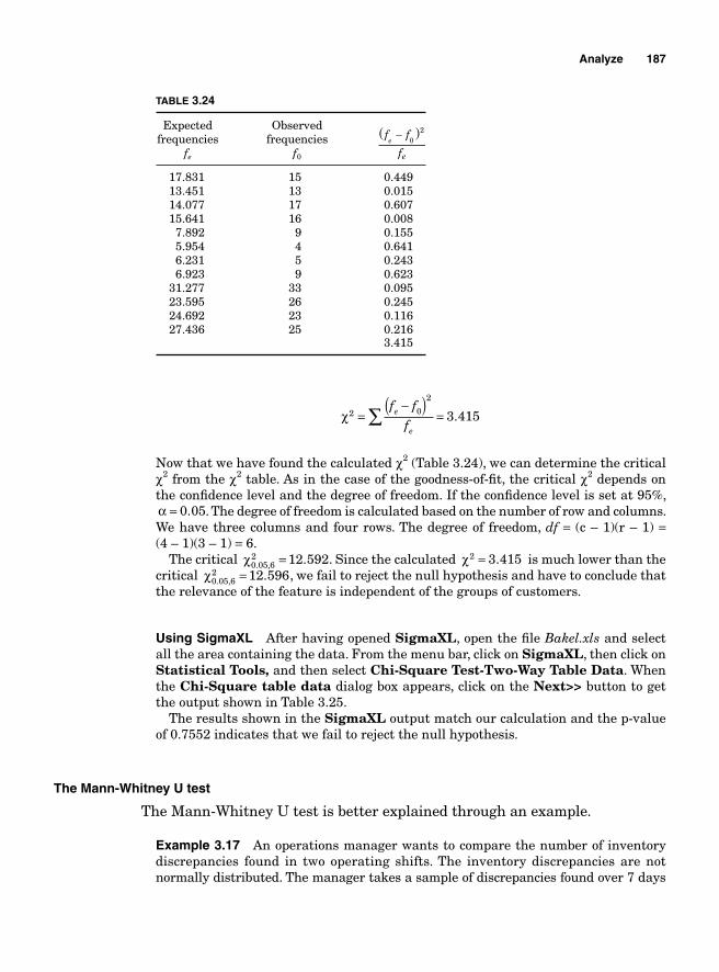
Analyze 187
TABLE 3.24
Expected Observed frequencies frequencies fe
f0
( )f f
fe
e
−0
2
17.831 15 0.449 13.451 13 0.015 14.077 17 0.607 15.641 16 0.008 7.892 9 0.155 5.954 4 0.641 6.231 5 0.243 6.923 9 0.623 31.277 33 0.095 23.595 26 0.245 24.692 23 0.116 27.436 25 0.216 3.415
χ2 0
2
3 415=−( )
=∑f f
fe
e
.
Now that we have found the calculated χ2 (Table 3.24), we can determine the critical χ2 from the χ2 table. As in the case of the goodness-of-fi t, the critical χ2 depends on the confi dence level and the degree of freedom. If the confi dence level is set at 95%, α = 0 05. . The degree of freedom is calculated based on the number of row and columns. We have three columns and four rows. The degree of freedom, df = (c – 1)(r – 1) = (4 – 1)(3 – 1) = 6.
The critical χ0 05 62 12 592. , .= . Since the calculated χ2 3 415= . is much lower than the
critical χ0 05 62 12 596. , .= , we fail to reject the null hypothesis and have to conclude that
the relevance of the feature is independent of the groups of customers.
Using SigmaXL After having opened SigmaXL, open the fi le Bakel.xls and select all the area containing the data. From the menu bar, click on SigmaXL, then click on Statistical Tools, and then select Chi-Square Test-Two-Way Table Data. When the Chi-Square table data dialog box appears, click on the Next>> button to get the output shown in Table 3.25.
The results shown in the SigmaXL output match our calculation and the p-value of 0.7552 indicates that we fail to reject the null hypothesis.
The Mann-Whitney U test
The Mann-Whitney U test is better explained through an example.
Example 3.17 An operations manager wants to compare the number of inventory discrepancies found in two operating shifts. The inventory discrepancies are not normally distributed. The manager takes a sample of discrepancies found over 7 days
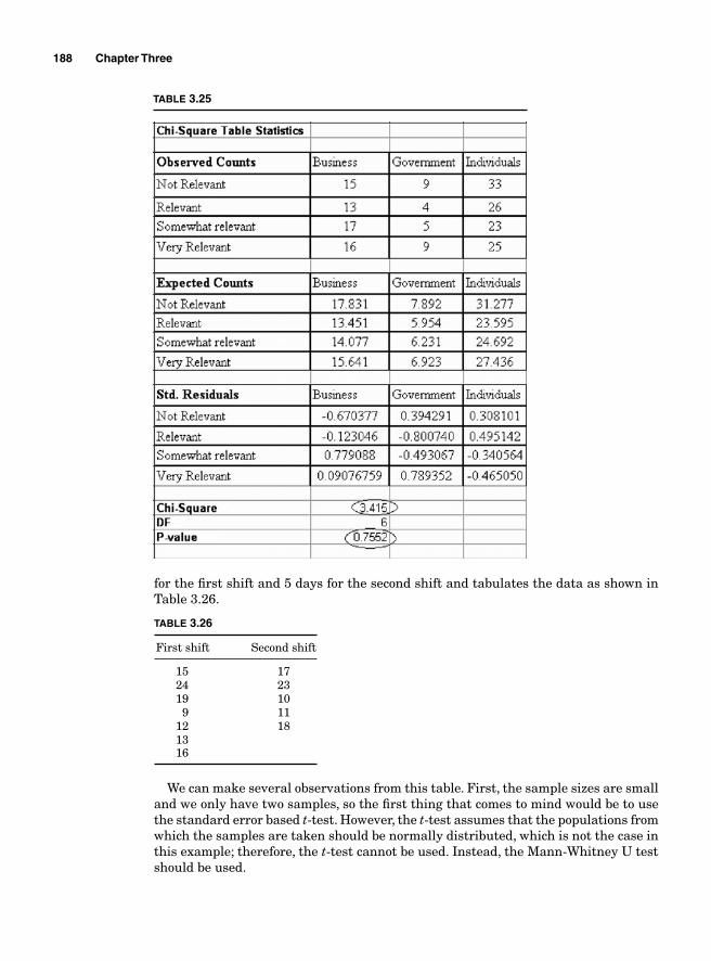
188 Chapter Three
for the fi rst shift and 5 days for the second shift and tabulates the data as shown in Table 3.26.
TABLE 3.26
First shift Second shift
15 17 24 23 19 10 9 11 12 18 13 16
We can make several observations from this table. First, the sample sizes are small and we only have two samples, so the fi rst thing that comes to mind would be to use the standard error based t-test. However, the t-test assumes that the populations from which the samples are taken should be normally distributed, which is not the case in this example; therefore, the t-test cannot be used. Instead, the Mann-Whitney U test should be used.
TABLE 3.25
Analyze 189
The Mann-Whitney U test assumes that the samples are independent and from dissimilar populations.
Step 1: Defi ne the null hypothesis. Just as in the case of the t-test, the Mann-Whitney U test is a hypothesis test. The null and alternate hypotheses are
H0: The number of discrepancies in the fi rst shift is the same as the one in the second shiftH1: The number of discrepancies in the fi rst shift is different from the ones in the second shift
The result of the test will lead to the rejection of the null hypothesis or a failure to reject the null hypothesis.
Step 2: Analyze the data. The fi rst step in the analysis of the data consists of naming the groups. In our case, they are already named First Shift and Second Shift. The next step consists of grouping the two columns in one and sorting the observations in ascending order raked from 1 to n. Each observation is paired with the name of the original group to which it belonged.
We obtain Table 3.27.
TABLE 3.27
Observations Group Ranks
9 First shift 1 10 Second shift 2 11 Second shift 3 12 First shift 4 13 First shift 5 15 First shift 6 16 First shift 7 17 Second shift 8 18 Second shift 9 19 First shift 10 23 Second shift 11 24 First shift 12
We will call ϖ1 the sum of the ranks of the observations for group First Shift and ϖ2 the sum of the ranks of the observations for group Second Shift.
ϖ
ϖ
1
2
1 4 5 6 7 10 12 45
2 3 8 9 11 33
= + + + + + + =
= + + + + =
Step 3: Determining the values of the U statistic. The computation of the U statistics will depend on the samples’ sizes.
The samples are small when n1 and n2 are both smaller than 10. In that case,
U n nn n
v1 1 21 1
1
12
= ++( )
−
U n nn n
v2 1 22 2
2
12
= ++( )
−
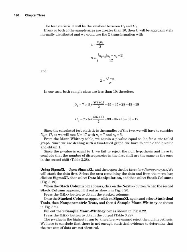
190 Chapter Three
The test statistic U will be the smallest between U1 and U2. If any or both of the sample sizes are greater than 10, then U will be approximately
normally distributed and we could use the Z transformation with
μ =
n n1 2
2
σ =
+ +n n n n1 2 1 2 112
( )
and
Z
U= − μσ
In our case, both sample sizes are less than 10; therefore,
U1 7 57 7 1
245 35 28 45 18= × + + − = + − =( )
U2 7 55 5 1
233 35 15 33 17= × + + − = + − =( )
Since the calculated test statistic is the smallest of the two, we will have to consider U2 = 17, so we will use U = 17 with n2 = 7 and n1 = 5.
From the Mann-Whitney table, we obtain a p-value equal to 0.5 for a one-tailed graph. Since we are dealing with a two-tailed graph, we have to double the p-value and obtain 1.
Since the p-value is equal to 1, we fail to reject the null hypothesis and have to conclude that the number of discrepancies in the fi rst shift are the same as the ones in the second shift (Table 3.28).
Using SigmaXL Open SigmaXL, and then open the fi le Inventorydiscrepancy.xls. We will stack the data fi rst. Select the area containing the data and from the menu bar, click on SigmaXL, then select Data Manipulation, and then select Stack Columns (Fig. 3.19).
When the Stack Column box appears, click on the Next>> button. When the second Stack Column appears, fi ll it out as shown in Fig. 3.20.
Press the OK>> button to obtain the stacked columns. Once the Stacked Columns appear, click on SigmaXL again and select Statistical
Tools, then Nonparametric Tests, and then 2 Sample Mann-Whitney as shown in Fig. 3.21.
Fill out the 2 Sample Mann-Whitney box as shown in Fig. 3.22.Press the OK>> button to obtain the output (Table 3.29).The p-value is the highest it can be; therefore, we cannot reject the null hypothesis.
We have to conclude that there is not enough statistical evidence to determine that the two sets of data are not identical.
Analyze 191
0123456789
101112131415161718192021222324
.1250
.2500
.3750
.5000
.0278
.0556
.1111
.1667
.2500
.3333
.4444
.5556
.0083
.0167
.0333
.0583
.0917
.1333
.1917
.2583
.3333
.4167
.5000
.0030
.0061
.0121
.0212
.0364
.0545
.0818
.1152
.1576
.2061
.2636
.3242
.3939
.4636
.5364
.0013
.0025
.0051
.0088
.0152
.0240
.0366
.0530
.0745
.1010
.1338
.1717
.2159
.2652
.3194
.3775
.4381
.5000
.0006
.0012
.0023
.0041
.0070
.0111
.0175
.0256
.0367
.0507
.0688
.0903
.1171
.1474
.1830
.2226
.2669
.3141
.3654
.4178
.4726
.5274
.0003
.0006
.0012
.0020
.0035
.0055
.0087
.0131
.0189
.0265
.0364
.0487
.0641
.0825
.1043
.1297
.1588
.1914
.2279
.2675
.3100
.3552
.4024
.4508
.5000
P-Values for Mann-Whitney U Statisticn1
n2 = 7 Uo 1 2 3 4 5 6 7
TABLE 3.28
Figure 3.19
Figure 3.20
192 Chapter Three
Example 3.18 In the previous example, we used small samples; in this one, we will use large samples. Tambacounda-Savon is a soap manufacturing company. It operates two shifts. The quality manager wants to compare the quality level of the output of the two shifts. He takes a sample at 12 days from the fi rst shift and another sample at 11 days from the second shift and obtains the following errors per 10,000. The data are summarized in Table 3.30. At a confi dence level of 95%, can we say that the two shifts produce the same quality level of output?
Figure 3.21
Figure 3.22
TABLE 3.29
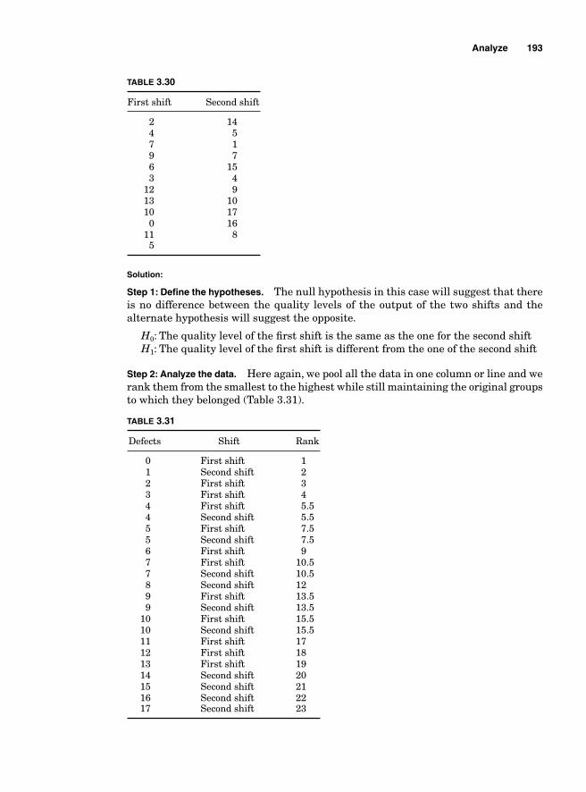
Analyze 193
TABLE 3.30
First shift Second shift
2 14 4 5 7 1 9 7 6 15 3 4 12 9 13 10 10 17 0 16 11 8 5
Solution:
Step 1: Defi ne the hypotheses. The null hypothesis in this case will suggest that there is no difference between the quality levels of the output of the two shifts and the alternate hypothesis will suggest the opposite.
H0: The quality level of the fi rst shift is the same as the one for the second shiftH1: The quality level of the fi rst shift is different from the one of the second shift
Step 2: Analyze the data. Here again, we pool all the data in one column or line and we rank them from the smallest to the highest while still maintaining the original groups to which they belonged (Table 3.31).
TABLE 3.31
Defects Shift Rank
0 First shift 1 1 Second shift 2 2 First shift 3 3 First shift 4 4 First shift 5.5 4 Second shift 5.5 5 First shift 7.5 5 Second shift 7.5 6 First shift 9 7 First shift 10.5 7 Second shift 10.5 8 Second shift 12 9 First shift 13.5 9 Second shift 13.5 10 First shift 15.5 10 Second shift 15.5 11 First shift 17 12 First shift 18 13 First shift 19 14 Second shift 20 15 Second shift 21 16 Second shift 22 17 Second shift 23
194 Chapter Three
vFirst = + + + + + + + + + +1 3 4 5 5 7 5 9 10 5 13 5 15 5 17 18. . . . . ++ =19 123 5.
vSecond = + + + + + + + + =2 5 5 7 5 13 5 15 5 20 21 22 23 152. . . . ..5
We can now fi nd the value of U
UFirst = × + + − =12 1112 12 1
2123 5 86 5
( ). .
USecond = × + + − =12 1111 11 1
2152 5 45 5
( ). .
The following steps consist of fi nding the mean and standard deviation.
μ = = × =n n1 2
212
6611
2
σ =+ +
= + + = =n n n n1 2 1 2 1
12132 12 11 1
12264 16 25
( ) ( ).
Since the USecond is the smallest of the two, it will be used to fi nd the value of Z.
ZU
=−
= − = −Second μσ
45 5 6616 25
1 262.
..
What would have happened if we had used UFirst instead of USecond?
ZU
=−
= − =First μσ
86 5 6616 25
1 262.
..
We would have obtained the same result with the opposite sign. At a confi dence level of 95%, we would reject the null hypothesis if the value of Z is
outside the interval [–1.96, +1.96]. In this case, Z = –1.262 is well within that interval; therefore, we should not reject the null hypothesis (Fig. 3.23).
0–1.96 1.96
1.262
Figure 3.23
Analyze 195
Minitab output
The p-value of 0.2178 is greater than 0.05, which suggests that for an alpha level of 0.05, we cannot reject the null hypothesis.
Normality testing
Before conducting a data analysis using the normal distribution, it is essential to make sure that the characteristic being studied is in fact normally distributed. If nonnormal data are analyzed as if they were normal, the interpretations of the results would be misleading.
Both SigmaXL and Minitab offer options to test the normality of data. Minitab uses three main options for normality testing: the Anderson-Darling test, the Ryan-Joyner test, and the Kolmogorov-Smirnov test. All these tests yield the same results and they are all based on a hypothesis testing with the null hypothesis stating that the data are normal and the alternate hypothesis stating that the data are not normal. If the alpha level is set at 0.05, the null hypothesis is rejected if the p-value is less than 0.05. When conducting a hypoth-esis testing using the Anderson-Darling test, for instance, and the p-value is less than 0.05, the conclusion should be that for α = 0.05 the data are not normally distributed.
Example 3.19 The data in Table 3.32 represent the number of defects that were found at a processing line during a 20-day period. The quality assurance manager wants to determine if the daily defect rate is normally distributed.
TABLE 3.32
20 20 22 20 21 21 19 20 20 19 20 20 21 21 20 19 20 19 20 21
To conduct the testing using Minitab, open the fi le Defect.MTW and from the menu bar, click on Stat. Then click on Basic statistics and then on Normality test… When the Normality Test box appears, select Defects for the Variables fi eld and then select the Anderson–Darling option before clicking on the OK button.
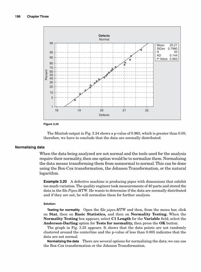
196 Chapter Three
Defects
Per
cent
2221201918
99
95
90
80706050403020
10
5
1
DefectsNormal
Mean 20.21StDev 0.7980N 20AD 0.144P-Value 0.963
Figure 3.24
The Minitab output in Fig. 3.24 shows a p-value of 0.963, which is greater than 0.05; therefore, we have to conclude that the data are normally distributed.
Normalizing data
When the data being analyzed are not normal and the tools used for the analysis require their normality, then one option would be to normalize them. Normalizing the data means transforming them from nonnormal to normal. This can be done using the Box-Cox transformation, the Johnson Transformation, or the natural logarithm.
Example 3.20 A defective machine is producing pipes with dimensions that exhibit too much variation. The quality engineer took measurements of 40 parts and stored the data in the fi le Pipes.MTW. He wants to determine if the data are normally distributed and if they are not, he will normalize them for further analysis.
Solution:
Testing for normality Open the fi le pipes.MTW and then, from the menu bar, click on Stat, then on Basic Statistics, and then on Normality Testing. When the Normality Testing box appears, select C1 Length for the Variable fi eld; select the Anderson-Darling option for Tests for normality, then press the OK button.
The graph in Fig. 3.25 appears. It shows that the data points are not randomly clustered around the centerline and the p-value of less than 0.005 indicates that the data are not normal.
Normalizing the data There are several options for normalizing the data; we can use the Box-Cox transformation or the Johnson Transformation.
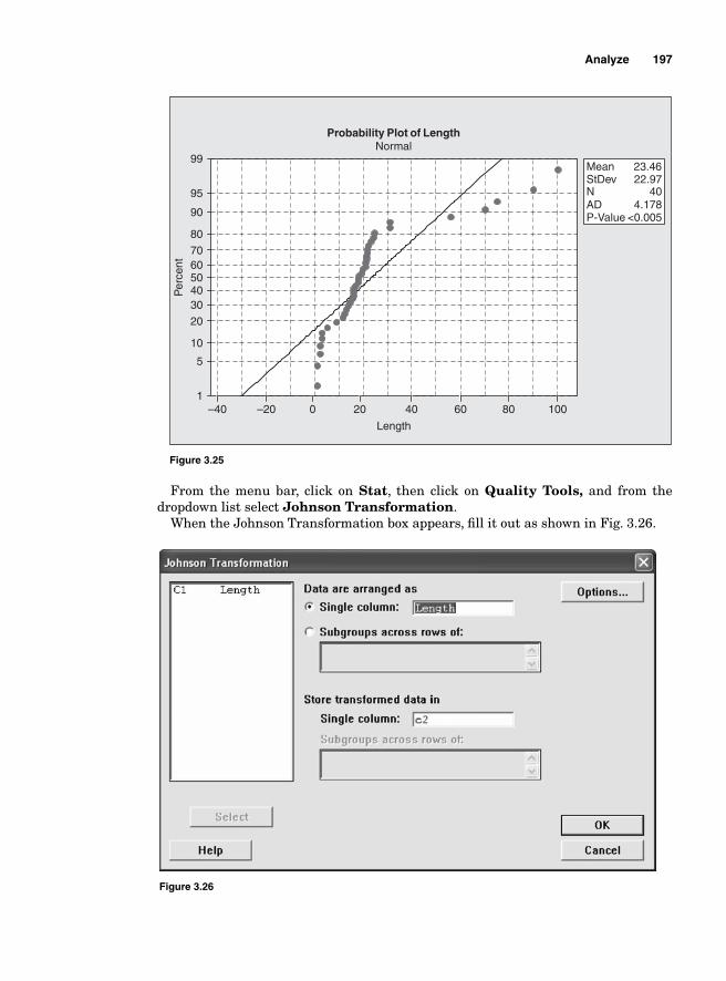
Analyze 197
From the menu bar, click on Stat, then click on Quality Tools, and from the dropdown list select Johnson Transformation.
When the Johnson Transformation box appears, fi ll it out as shown in Fig. 3.26.
Figure 3.26
Length
Per
cent
100806040200–20–40
99
95
90
80
7060504030
20
10
5
1
Probability Plot of LengthNormal
Mean 23.46StDev 22.97N 40AD 4.178P-Value <0.005
Figure 3.25
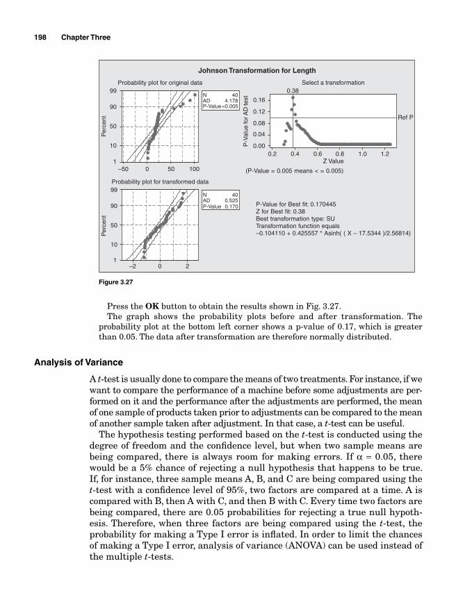
198 Chapter Three
Per
cent
Per
cent
100500–50
99
90
50
10
1
20–2
99
90
50
10
1
Z Value
P-V
alue
for A
D te
st
1.21.00.80.60.40.2
0.16
0.12
0.08
0.04
0.00
0.38
Ref P
P-Value for Best fit: 0.170445Z for Best fit: 0.38Best transformation type: SUTransformation function equals–0.104110 + 0.425557 * Asinh( ( X – 17.5344 )/2.56814)
Probability plot for original data
Probability plot for transformed data
Select a transformation
(P-Value = 0.005 means < = 0.005)
Johnson Transformation for Length
AD 4.178N 40
P-Value<0.005
AD 0.525N 40
P-Value 0.170
Figure 3.27
Press the OK button to obtain the results shown in Fig. 3.27. The graph shows the probability plots before and after transformation. The
probability plot at the bottom left corner shows a p-value of 0.17, which is greater than 0.05. The data after transformation are therefore normally distributed.
Analysis of Variance
A t-test is usually done to compare the means of two treatments. For instance, if we want to compare the performance of a machine before some adjustments are per-formed on it and the performance after the adjustments are performed, the mean of one sample of products taken prior to adjustments can be compared to the mean of another sample taken after adjustment. In that case, a t-test can be useful.
The hypothesis testing performed based on the t-test is conducted using the degree of freedom and the confi dence level, but when two sample means are being compared, there is always room for making errors. If α = 0.05, there would be a 5% chance of rejecting a null hypothesis that happens to be true. If, for instance, three sample means A, B, and C are being compared using the t-test with a confi dence level of 95%, two factors are compared at a time. A is compared with B, then A with C, and then B with C. Every time two factors are being compared, there are 0.05 probabilities for rejecting a true null hypoth-esis. Therefore, when three factors are being compared using the t-test, the probability for making a Type I error is infl ated. In order to limit the chances of making a Type I error, analysis of variance (ANOVA) can be used instead of the multiple t-tests.
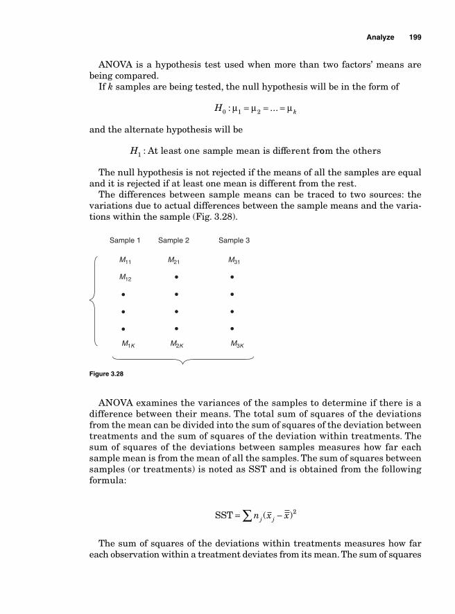
Analyze 199
ANOVA is a hypothesis test used when more than two factors’ means are being compared.
If k samples are being tested, the null hypothesis will be in the form of
H k0 1 2: ...μ μ μ= = =
and the alternate hypothesis will be
H1 : At least one sample mean is different froom the others
The null hypothesis is not rejected if the means of all the samples are equal and it is rejected if at least one mean is different from the rest.
The differences between sample means can be traced to two sources: the variations due to actual differences between the sample means and the varia-tions within the sample (Fig. 3.28).
M11
M12
M21 M31
Sample 1 Sample 2 Sample 3
M1K M2K M3K
Figure 3.28
ANOVA examines the variances of the samples to determine if there is a difference between their means. The total sum of squares of the deviations from the mean can be divided into the sum of squares of the deviation between treatments and the sum of squares of the deviation within treatments. The sum of squares of the deviations between samples measures how far each sample mean is from the mean of all the samples. The sum of squares between samples (or treatments) is noted as SST and is obtained from the following formula:
SST = −∑ n x xj j( )2
The sum of squares of the deviations within treatments measures how far each observation within a treatment deviates from its mean. The sum of squares
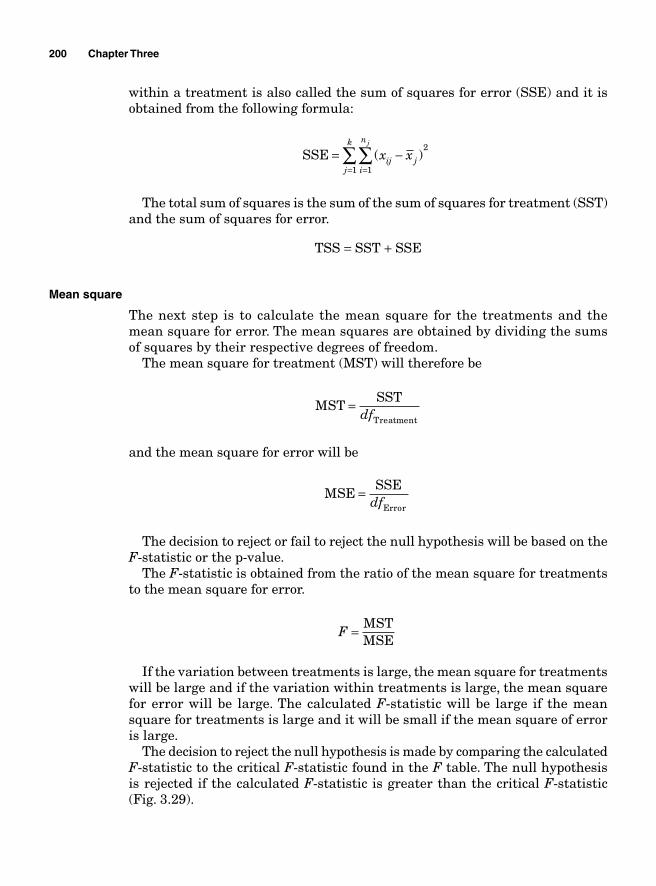
200 Chapter Three
within a treatment is also called the sum of squares for error (SSE) and it is obtained from the following formula:
SSE = −
==∑∑ ( )x xij ji
n
j
k j
11
2
The total sum of squares is the sum of the sum of squares for treatment (SST) and the sum of squares for error.
TSS = SST + SSE
Mean square
The next step is to calculate the mean square for the treatments and the mean square for error. The mean squares are obtained by dividing the sums of squares by their respective degrees of freedom.
The mean square for treatment (MST) will therefore be
MST
SST
Treatment=
df
and the mean square for error will be
MSE
SSE
Error=
df
The decision to reject or fail to reject the null hypothesis will be based on the F-statistic or the p-value.
The F-statistic is obtained from the ratio of the mean square for treatments to the mean square for error.
F = MST
MSE
If the variation between treatments is large, the mean square for treatments will be large and if the variation within treatments is large, the mean square for error will be large. The calculated F-statistic will be large if the mean square for treatments is large and it will be small if the mean square of error is large.
The decision to reject the null hypothesis is made by comparing the calculated F-statistic to the critical F-statistic found in the F table. The null hypothesis is rejected if the calculated F-statistic is greater than the critical F-statistic (Fig. 3.29).
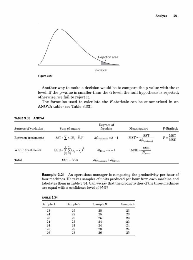
Analyze 201
Another way to make a decision would be to compare the p-value with the α level. If the p-value is smaller than the α level, the null hypothesis is rejected; otherwise, we fail to reject it.
The formulas used to calculate the F-statistic can be summarized in an ANOVA table (see Table 3.33).
TABLE 3.33 ANOVA
Degrees ofSources of variation Sum of square freedom Mean square F-Statistic
Between treatments SST = ∑ −nj jx x j( )2 dfTreatments = k – 1 MSTSST
Treatment
=df
F = MSTMSE
Within treatments SSE = −==∑∑ ( )x xij ji
n
j
k j
11
2
dfError = n – k MSESSE
Error
=df
Total SST + SSE dfTreatments + dfErrors
Example 3.21 An operations manager is comparing the productivity per hour of four machines. He takes samples of units produced per hour from each machine and tabulates them in Table 3.34. Can we say that the productivities of the three machines are equal with a confi dence level of 95%?
TABLE 3.34
Sample 1 Sample 2 Sample 3 Sample 4
23 25 25 23 24 22 25 23 25 22 25 23 24 23 24 23 24 24 24 24 25 22 23 24 26 23 26 25
Rejection area
F-critical
Figure 3.29
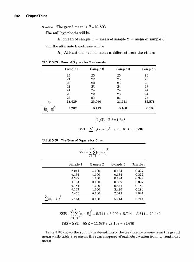
202 Chapter Three
Solution: The grand mean is x = 23 893.
The null hypothesis will be
H0 : mean of sample 1 mean of sample 2 me= = aan of sample 3
and the alternate hypothesis will be
H1 : At least one sample mean is different froom the others
TABLE 3.35 Sum of Square for Treatments
Sample 1 Sample 2 Sample 3 Sample 4
23 25 25 23 24 22 25 23 25 22 25 23 24 23 24 23 24 24 24 24 25 22 23 24 26 23 26 25 x–j 24.429 23.000 24.571 23.571
x xj −( )2 0.287 0.797 0.460 0.103
( ) .x xj − =∑ 2 1 648
SST = − = × =∑n x xj j( ) . .2 7 1 648 11 536
TABLE 3.36 The Sum of Square for Error
SSE = −( )==∑∑ x xij ji
n
j
k j
11
2
Sample 1 Sample 2 Sample 3 Sample 4
2.041 4.000 0.184 0.327 0.184 1.000 0.184 0.327 0.327 1.000 0.184 0.327 0.184 0.000 0.327 0.327 0.184 1.000 0.327 0.184 0.327 1.000 2.469 0.184 2.469 0.000 2.041 2.041
( )x xij ji
nj
−=∑
1
2 5.714 8.000 5.714 3.714
SSE = 5.714 + 8.000 + 5= −( )==∑∑ x xij ji
n
j
k j
11
2
..714 + 3.714 = 23.143
TSS = SST + SSE = 11.536 + 23.143 = 34.679
Table 3.35 shows the sum of the deviations of the treatments’ means from the grand mean while table 3.36 shows the sum of square of each observation from its treatment mean.
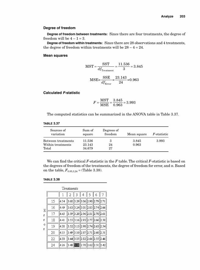
Analyze 203
Degree of freedom
Degree of freedom between treatments: Since there are four treatments, the degree of freedom will be 4 – 1 = 3.
Degree of freedom within treatments: Since there are 28 observations and 4 treatments, the degree of freedom within treatments will be 28 – 4 = 24.
Mean squares
MSTSST
Treatment
= = =df
11 5363
3 845.
.
MSE=SSE
=23.143
24=0.963
Errordf
Calculated F-statistic
F = = =MSTMSE
3 8450 963
3 993..
.
The computed statistics can be summarized in the ANOVA table in Table 3.37.
TABLE 3.37
Sources of Sum of Degrees of variation square freedom Mean square F-statistic
Between treatments 11.536 3 3.845 3.993Within treatments 23.143 24 0.963 Total 34.679 27
We can fi nd the critical F-statistic in the F table. The critical F-statistic is based on the degrees of freedom of the treatments, the degree of freedom for error, and α. Based on the table, F0.05,3,24 = (Table 3.38).
TABLE 3.38
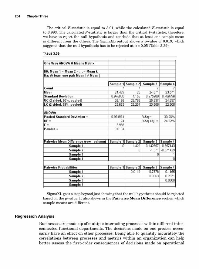
204 Chapter Three
The critical F-statistic is equal to 3.01, while the calculated F-statistic is equal to 3.993. The calculated F-statistic is larger than the critical F-statistic; therefore, we have to reject the null hypothesis and conclude that at least one sample mean is different from the others. The SigmaXL output shows a p-value of 0.019, which suggests that the null hypothesis has to be rejected at α = 0.05 (Table 3.39).
TABLE 3.39
SigmaXL goes a step beyond just showing that the null hypothesis should be rejected based on the p-value. It also shows in the Pairwise Mean Difference section which sample means are different.
Regression Analysis
Businesses are made up of multiple interacting processes within different inter-connected functional departments. The decisions made on one process neces-sarily have an effect on other processes. Being able to quantify accurately the correlations between processes and metrics within an organization can help better assess the fi rst-order consequences of decisions made on operational
Analyze 205
processes. Some of the questions that an organization must address before considering signifi cant process changes are
How will productivity react to an increase in wages?
How does a reduction in inventory affect time-to-deliver?
Does an increase in marketing expenses affect sales?
How do changes in the prices of a given input affect the cost of the output?
Can a process improvement offset recent increases in the cost of acquisition of supplies?
The regression analysis is the part of statistical analysis that analyzes the relationship between quantitative variables. It helps predict the reaction of a variable when the magnitude of a related variable changes. For instance, a human resources (HR) director can intuitively determine that there is a cor-relation between wages and employee attrition rate. That intuitive determina-tion does not necessarily provide actionable information that can help assess the optimal level of wages that lead to an acceptable attrition rate. Since the attrition rate depends on wages, the HR director will want to know what attri-tion rate to expect for each level of wages. Such information can provide better decision making.
The objective of regression analysis is to create a mathematical model under the form of a polynomial function that can help to determine how the predicted or dependent variable y (the variable to be estimated, the attrition rate in the case of the HR director) reacts to the variations in the predicator or independent variables x (wages in the case of the HR director).
The polynomial function is in the form of
Attrition rate = α wages + β
where α and β are constants whose values determine the strength of the rela-tionship between attrition rate and wages.
The fi rst step when conducting a regression analysis should be to determine whether there is any relationship between the independent and dependent variables, and if there is, how important it is. If there is a lack of correlation, there would be no need for creating a model because it would be useless. The covariance, the coeffi cient of correlation, and the coeffi cient of determination can determine the existence of that relationship and its level of signifi cance. However, these alone do not help make accurate predictions on how variations of the independent variables affect the dependent variables.
It is obvious that in most cases there is more than one independent variable that can cause the variations in a dependent variable. Our HR director knows that there might be other factors explaining the high attrition rate. Other fac-tors besides wages include the amount of overtime employees have to work, the point system, the number of terminations due to poor performance, the number of terminations due to failure to drug tests, etc.
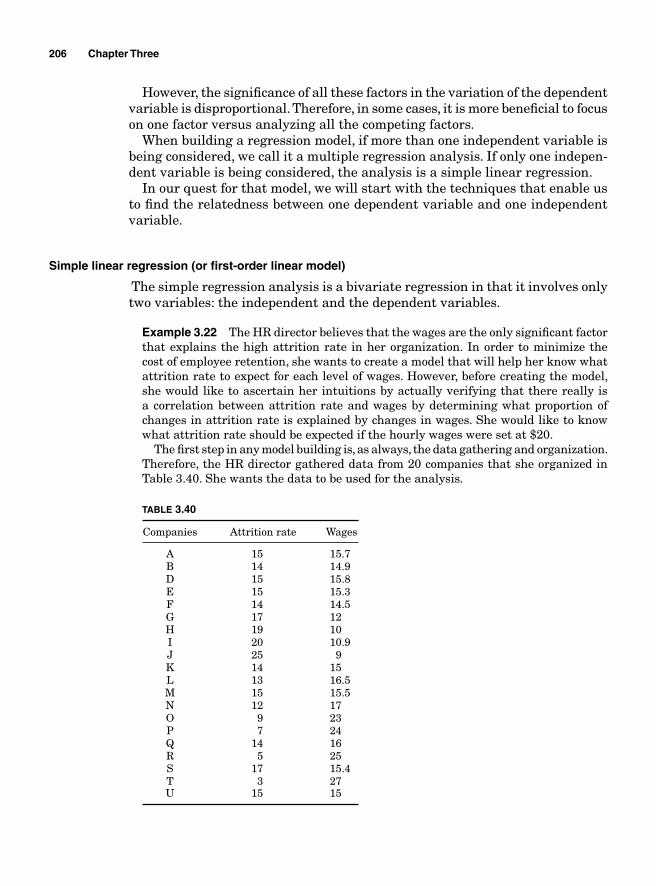
206 Chapter Three
However, the signifi cance of all these factors in the variation of the dependent variable is disproportional. Therefore, in some cases, it is more benefi cial to focus on one factor versus analyzing all the competing factors.
When building a regression model, if more than one independent variable is being considered, we call it a multiple regression analysis. If only one indepen-dent variable is being considered, the analysis is a simple linear regression.
In our quest for that model, we will start with the techniques that enable us to fi nd the relatedness between one dependent variable and one independent variable.
Simple linear regression (or fi rst-order linear model)
The simple regression analysis is a bivariate regression in that it involves only two variables: the independent and the dependent variables.
Example 3.22 The HR director believes that the wages are the only signifi cant factor that explains the high attrition rate in her organization. In order to minimize the cost of employee retention, she wants to create a model that will help her know what attrition rate to expect for each level of wages. However, before creating the model, she would like to ascertain her intuitions by actually verifying that there really is a correlation between attrition rate and wages by determining what proportion of changes in attrition rate is explained by changes in wages. She would like to know what attrition rate should be expected if the hourly wages were set at $20.
The fi rst step in any model building is, as always, the data gathering and organization. Therefore, the HR director gathered data from 20 companies that she organized in Table 3.40. She wants the data to be used for the analysis.
TABLE 3.40
Companies Attrition rate Wages
A 15 15.7 B 14 14.9 D 15 15.8 E 15 15.3 F 14 14.5 G 17 12 H 19 10 I 20 10.9 J 25 9 K 14 15 L 13 16.5 M 15 15.5 N 12 17 O 9 23 P 7 24 Q 14 16 R 5 25 S 17 15.4 T 3 27 U 15 15
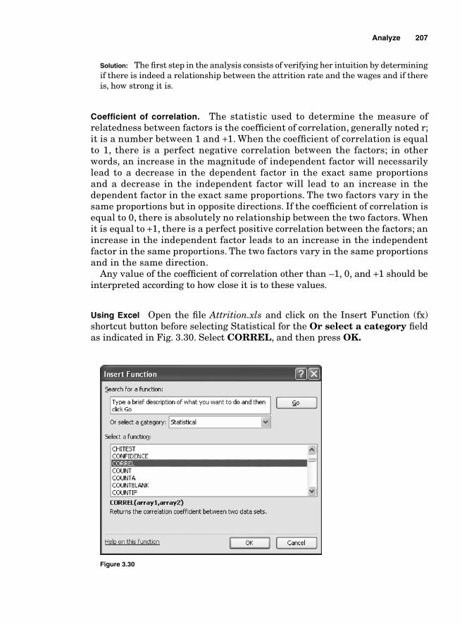
Analyze 207
Solution: The fi rst step in the analysis consists of verifying her intuition by determining if there is indeed a relationship between the attrition rate and the wages and if there is, how strong it is.
Coeffi cient of correlation. The statistic used to determine the measure of relatedness between factors is the coeffi cient of correlation, generally noted r; it is a number between 1 and +1. When the coeffi cient of correlation is equal to 1, there is a perfect negative correlation between the factors; in other words, an increase in the magnitude of independent factor will necessarily lead to a decrease in the dependent factor in the exact same proportions and a decrease in the independent factor will lead to an increase in the dependent factor in the exact same proportions. The two factors vary in the same proportions but in opposite directions. If the coeffi cient of correlation is equal to 0, there is absolutely no relationship between the two factors. When it is equal to +1, there is a perfect positive correlation between the factors; an increase in the independent factor leads to an increase in the independent factor in the same proportions. The two factors vary in the same proportions and in the same direction.
Any value of the coeffi cient of correlation other than –1, 0, and +1 should be interpreted according to how close it is to these values.
Using Excel Open the fi le Attrition.xls and click on the Insert Function (fx) shortcut button before selecting Statistical for the Or select a category fi eld as indicated in Fig. 3.30. Select CORREL, and then press OK.
Figure 3.30
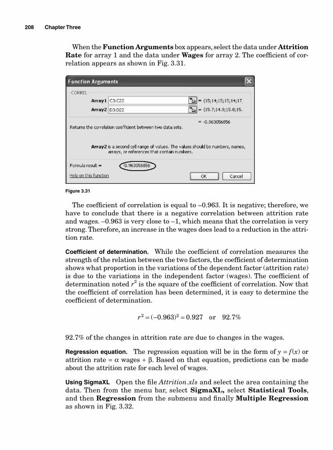
208 Chapter Three
When the Function Arguments box appears, select the data under Attrition Rate for array 1 and the data under Wages for array 2. The coeffi cient of cor-relation appears as shown in Fig. 3.31.
Figure 3.31
The coeffi cient of correlation is equal to –0.963. It is negative; therefore, we have to conclude that there is a negative correlation between attrition rate and wages. –0.963 is very close to –1, which means that the correlation is very strong. Therefore, an increase in the wages does lead to a reduction in the attri-tion rate.
Coeffi cient of determination. While the coeffi cient of correlation measures the strength of the relation between the two factors, the coeffi cient of determination shows what proportion in the variations of the dependent factor (attrition rate) is due to the variations in the independent factor (wages). The coeffi cient of determination noted r2 is the square of the coeffi cient of correlation. Now that the coeffi cient of correlation has been determined, it is easy to determine the coeffi cient of determination.
r2 20 963 0 927= − =( . ) . or 92.7%
92.7% of the changes in attrition rate are due to changes in the wages.
Regression equation. The regression equation will be in the form of y = f (x) or attrition rate = α wages + β. Based on that equation, predictions can be made about the attrition rate for each level of wages.
Using SigmaXL Open the fi le Attrition.xls and select the area containing the data. Then from the menu bar, select SigmaXL, select Statistical Tools, and then Regression from the submenu and fi nally Multiple Regression as shown in Fig. 3.32.
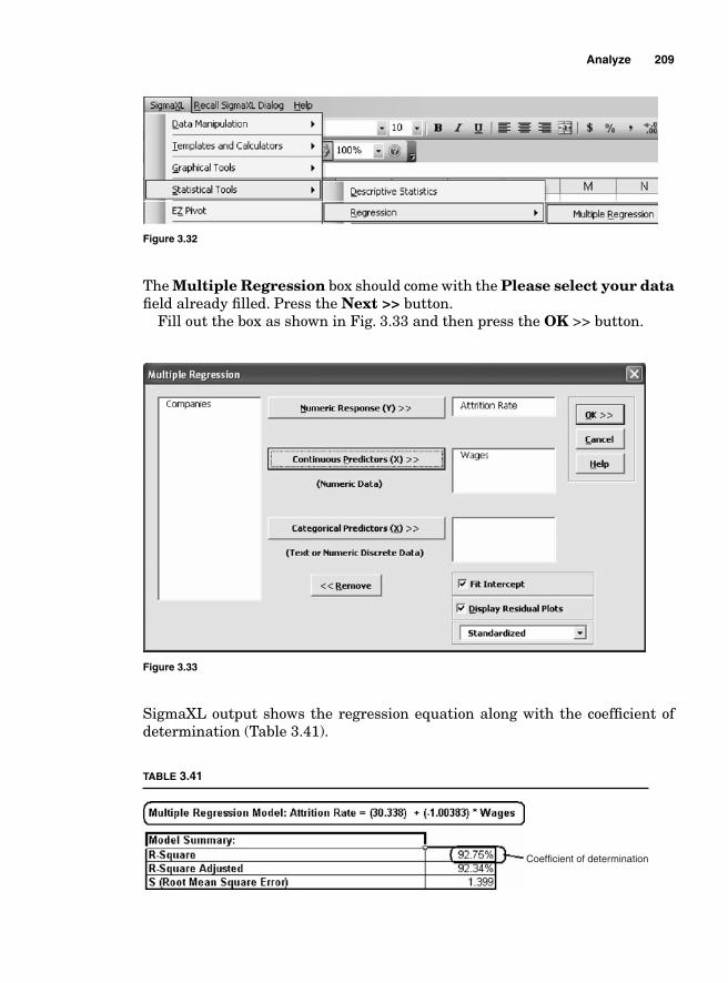
Analyze 209
Figure 3.32
The Multiple Regression box should come with the Please select your data fi eld already fi lled. Press the Next >> button.
Fill out the box as shown in Fig. 3.33 and then press the OK >> button.
Figure 3.33
SigmaXL output shows the regression equation along with the coeffi cient of determination (Table 3.41).
Coefficient of determination
TABLE 3.41
210 Chapter Three
If the wages were set at $20, the attrition rate would be 10.261.
Attrition rate = 30.338 – (1.0038 × 20) = 10.261
Multiple regression analysis
When more than one independent factor is used to explain the dependent factor, a multiple regression analysis is used. The principle followed when conducting a multiple regression analysis is the same as when conducting a simple regression with the difference that more input factors are used. Since multiple indepen-dent factors are used, some might be more signifi cant to the model than others might. Therefore, to make the model more fi t for use, it might be necessary to eliminate the nonsignifi cant factors.
Example 3.23 An operations manager has determined the following fi ve factors to be signifi cant in delivering customers’ orders on time: (1) inventory accuracy, (2) rate of rework, (3) employees’ productivity, (4) delay in the reception of customers’ orders, and (5) delays in loading shipments. He collects a sample of 25 days and tabulates the data as shown in Table 3.42. He wants to create a regression model that would help predict on-time delivery based on variations in the independent factors.
TABLE 3.42
On-time delivery Inventory Rework Productivity Order delay Loading
0.96 0.98 0.04 0.90 7.00 8.96 0.90 0.94 0.12 0.91 0.00 8.90 0.95 0.94 0.15 0.96 6.95 8.95 0.94 0.93 0.06 0.91 9.00 8.94 0.95 0.94 0.05 0.96 6.95 8.95 0.90 0.95 0.10 0.91 0.00 8.90 0.94 0.93 0.26 0.93 8.00 8.94 0.95 0.98 0.05 0.96 6.95 8.95 0.94 1.00 0.06 0.95 6.94 8.94 0.94 0.93 0.16 0.95 6.94 8.94 0.98 0.97 0.02 1.00 10.00 8.98 0.90 0.93 0.10 0.93 6.90 8.90 0.94 0.93 0.06 0.98 6.94 8.94 0.96 0.95 0.04 0.97 6.96 8.96 0.95 0.94 0.05 0.96 11.00 8.95 0.96 0.95 0.14 0.98 6.96 8.96 0.96 0.95 0.04 0.97 1.00 8.96 0.90 0.94 0.10 0.93 6.90 8.90 0.96 0.95 0.04 0.97 13.00 8.96 0.90 0.95 0.15 0.91 6.90 8.90 0.93 0.92 0.07 0.91 6.93 8.93 0.95 1.00 0.05 0.96 12.00 8.95 0.91 0.92 0.29 0.90 6.91 8.91 0.95 0.94 0.05 0.96 6.95 8.95 0.91 0.95 0.09 0.98 10.00 8.91
Solution: Using SigmaXL, open the fi le on time delivery.xls and repeat the steps used in the previous example to obtain the output shown in Tables 3.43 and 3.44.
Analyze 211
For an alpha level of 0.05, the p-values in the parameter estimates part of the output show that loading is the only signifi cant factor in the model because it is the only one that has a p-value less than 0.05. Loading is the only input factor that affects on-time delivery.
TABLE 3.43
TABLE 3.44

This page intentionally left blank
Chapter
4Improve
Design of Experiments
A design engineer has just fi nished designing a diesel engine used to run a plodder. After testing the engine, she realized that the level of carbon monoxide that it generates exceeds by far the allowed limits of 30 PPM over 8 h of work.
The engineer decided to determine what part in the engine is causing it to generate such a high level of carbon monoxide. She wants to isolate the factors causing the problem and take corrective actions. After screening all the parts, she decided that only fi ve of them could have contributed to the problem but she does not know with certitude which ones signifi cantly impact the carbon monoxide level. The factors that she isolated are
■ The thickness of the oil■ The type of air fi lter■ The type of fuel fi lter■ The type of catalytic converter ■ The type of oxygen sensors
Based on her analysis, these are the only factors in the engine that could affect the generation of carbon monoxide. However, the extent to which each factor in isolation or in interaction with the other factors contributes to the problem is unknown.
She wants to not only determine the signifi cant factors but also create a regression model that would enable her to predict the level of the carbon mon-oxide whenever she changes the levels of the factors. She also wants to know with confi dence by how much the changes in the level of carbon monoxide are affected by the model that she wants to create.
Since the resources available to run the tests are limited, she chooses to run a design of experiments (DOE) in order to isolate the contributing factors at the lowest possible cost.
213
The customer satisfaction index (CSI) is used to measure how pleased customers are about the services that they receive from Senegal Bank. The quality engineer at Senegal Bank wants to know what factors have been causing the index to decrease recently to an unprecedented level. He isolated four factors as being potentially signifi cant.
■ Customers being kept on hold over the phone for too long■ Long lines at the bank■ Too much paperwork to obtain loans ■ High interest rates on short-term loans
The quality engineer knows that some of these factors or their interactions have been detrimental to the CSI but he does not know which ones are. The experiment that can help him determine the signifi cant factors is expensive and time consuming because it involves changes in the interest rate offered by the bank, changes in the volume of paperwork, the opening of special fast lines at the cashiers, and the hiring of new customer service personnel to speed up calls.
To limit the cost involved in the experiment, the engineer chooses to use a DOE because at the end of his experiment he also wants to create a reliable regression model to gauge future fl uctuations in the CSI that would result from variations in the signifi cant factors.
The Cpk index measures how capable a process is at meeting or exceeding customers’ expectations. Lately, the computed Cpk has proved to be unacceptably low. The operations manager has isolated the four factors that could contribute to poor performance.
■ Raw material from different suppliers■ Machine operator■ Temperature in storage after processing■ Temperature in the trailers that transport the fi nished product to customers
He wants to test these factor to determine which one of them or what combination of factors is contributing to lowering of the Cpk. He wants to isolate the signifi cant factors to take corrective actions. He chooses to use a DOE to limit the cost involved in the testing.
Whether changes are being made to an existing process, product, or system, or a new process, system, or product is being designed, it is always desirable to know the effects of the factors used in the process and the effects of the interac-tions between those factors on the expected outcome. In other words, a process engineer can optimize his processes if he can quantify the impact of each factor involved in his processes and the effects of the interactions between the factors on the response factor.
The best way to measure the factors’ (or main) effects and the interactions’ effects of a process is the use of the DOE.
214 Chapter Four
Improve 215
DOEs consist of creating different scenarios of different combinations of (input) factors to test the effects of those combinations on the outcome (the response factor).
Factorial Experiments
Most experiments involve two or more factors. To test the effects of the factors and their interactions, the experimenter can use the same factors but combine them at different levels to see how each combination of factor levels affects the output factor (response variable).
If the experimenter wants to test effects of n factors on the dependent factor with levels a a an1 2, ,K the number of confi gurations he would have would be a1 × a2 × a3 × … an. Because of the large number of confi gurations and the large number of samples to take for observations, it is often preferable to consider only the factors at two levels, usually considered high and low or (+) and (–) (or in some cases –1 and +1) with the meaning of high [or (+)] and low [or (−)] depending on the experiment being conducted.
Let us consider the example of an experimenter who is trying to optimize the production of organic fruits. After screening to determine the factors that are signifi cant for his experiment, he narrows the main factors that affect the production of the fruits to “light” and “water.” He wants to optimize the time that it takes to produce the fruits. He defi nes optimum as the minimum time necessary to yield comestible fruits.
To conduct his experiment, he runs several tests combining the two factors (water and light) at different levels. To minimize the cost of the experiment, he decides to use only two levels of the factors: high and low.
In this case, he will have two factors and two levels; therefore, the number of runs will be 2 42 = .
After conducting observations, he obtains the results tabulated in Table 4.1.
TABLE 4.1
Lighthigh Lightlow
Waterhigh 10 20Waterlow 15 25
Table 4.1 can be rewritten as Table 4.2.
TABLE 4.2
Waterhigh Lighthigh 10Waterhigh Lightlow 20Waterlow Lighthigh 15Waterlow Lightlow 25
The coded form of Table 4.1 is shown in Table 4.3.
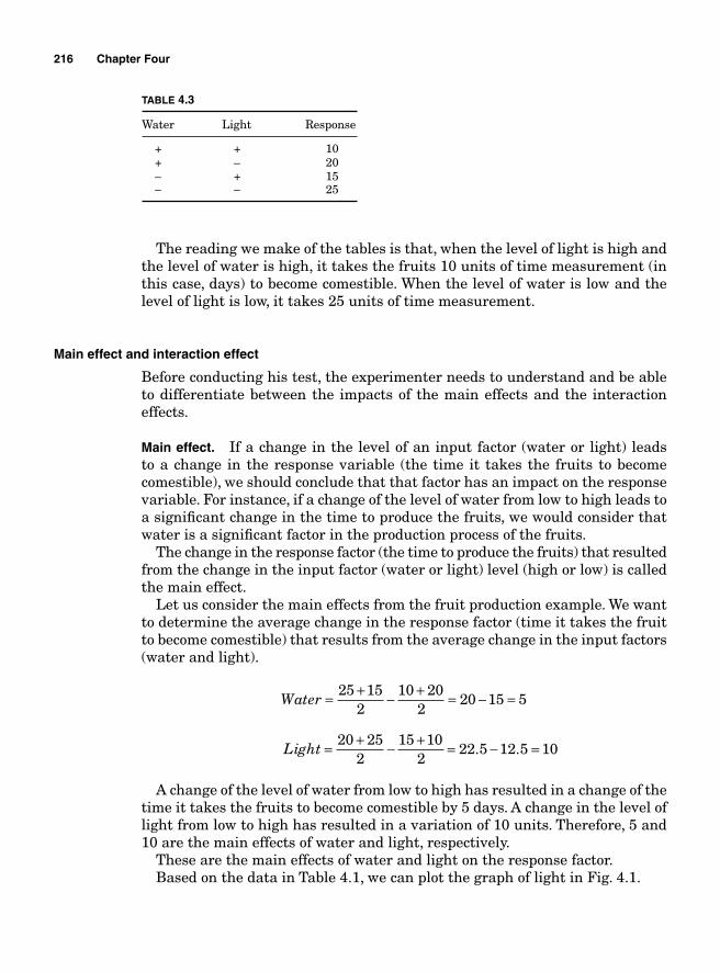
216 Chapter Four
The reading we make of the tables is that, when the level of light is high and the level of water is high, it takes the fruits 10 units of time measurement (in this case, days) to become comestible. When the level of water is low and the level of light is low, it takes 25 units of time measurement.
Main effect and interaction effect
Before conducting his test, the experimenter needs to understand and be able to differentiate between the impacts of the main effects and the interaction effects.
Main effect. If a change in the level of an input factor (water or light) leads to a change in the response variable (the time it takes the fruits to become comestible), we should conclude that that factor has an impact on the response variable. For instance, if a change of the level of water from low to high leads to a signifi cant change in the time to produce the fruits, we would consider that water is a signifi cant factor in the production process of the fruits.
The change in the response factor (the time to produce the fruits) that resulted from the change in the input factor (water or light) level (high or low) is called the main effect.
Let us consider the main effects from the fruit production example. We want to determine the average change in the response factor (time it takes the fruit to become comestible) that results from the average change in the input factors (water and light).
Water = + − + = − =25 15
210 20
220 15 5
Light = + − + = − =20 25
215 10
222 5 12 5 10. .
A change of the level of water from low to high has resulted in a change of the time it takes the fruits to become comestible by 5 days. A change in the level of light from low to high has resulted in a variation of 10 units. Therefore, 5 and 10 are the main effects of water and light, respectively.
These are the main effects of water and light on the response factor.Based on the data in Table 4.1, we can plot the graph of light in Fig. 4.1.
TABLE 4.3
Water Light Response
+ + 10 + – 20 – + 15 – – 25
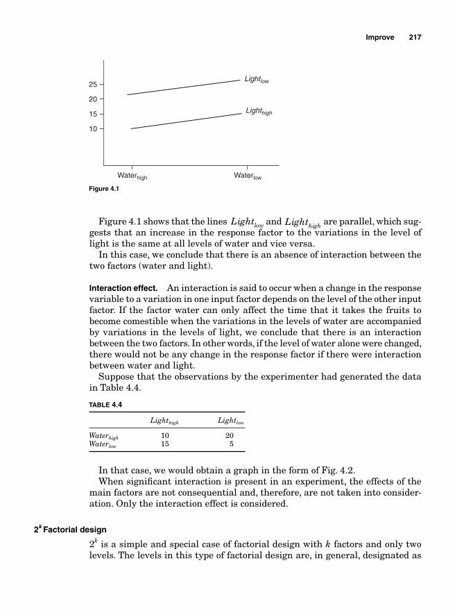
Improve 217
Figure 4.1 shows that the lines Lightlow and Lighthigh are parallel, which sug-gests that an increase in the response factor to the variations in the level of light is the same at all levels of water and vice versa.
In this case, we conclude that there is an absence of interaction between the two factors (water and light).
Interaction effect. An interaction is said to occur when a change in the response variable to a variation in one input factor depends on the level of the other input factor. If the factor water can only affect the time that it takes the fruits to become comestible when the variations in the levels of water are accompanied by variations in the levels of light, we conclude that there is an interaction between the two factors. In other words, if the level of water alone were changed, there would not be any change in the response factor if there were interaction between water and light.
Suppose that the observations by the experimenter had generated the data in Table 4.4.
Waterhigh Waterlow
Lighthigh
Lightlow
10
15
20
25
Figure 4.1
TABLE 4.4
Lighthigh Lightlow
Waterhigh 10 20Waterlow 15 5
In that case, we would obtain a graph in the form of Fig. 4.2.When signifi cant interaction is present in an experiment, the effects of the
main factors are not consequential and, therefore, are not taken into consider-ation. Only the interaction effect is considered.
2k Factorial design
2k is a simple and special case of factorial design with k factors and only two levels. The levels in this type of factorial design are, in general, designated as
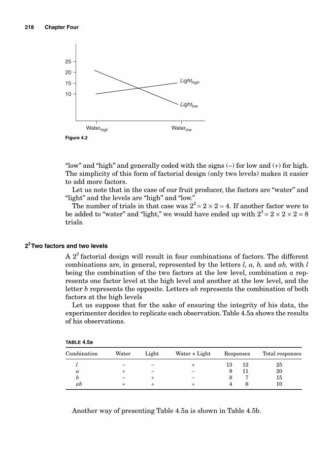
218 Chapter Four
“low” and “high” and generally coded with the signs (–) for low and (+) for high. The simplicity of this form of factorial design (only two levels) makes it easier to add more factors.
Let us note that in the case of our fruit producer, the factors are “water” and “light” and the levels are “high” and “low.”
The number of trials in that case was 22 = 2 × 2 = 4. If another factor were to be added to “water” and “light,” we would have ended up with 23 = 2 × 2 × 2 = 8 trials.
22 Two factors and two levels
A 22 factorial design will result in four combinations of factors. The different combinations are, in general, represented by the letters l, a, b, and ab, with l being the combination of the two factors at the low level, combination a rep-resents one factor level at the high level and another at the low level, and the letter b represents the opposite. Letters ab represents the combination of both factors at the high levels
Let us suppose that for the sake of ensuring the integrity of his data, the experimenter decides to replicate each observation. Table 4.5a shows the results of his observations.
Waterhigh Waterlow
Lighthigh
Lightlow
10
15
20
25
Figure 4.2
TABLE 4.5a
Combination Water Light Water × Light Responses Total responses
l − − + 13 12 25 a + − − 9 11 20 b − + − 8 7 15 ab + + + 4 6 10
Another way of presenting Table 4.5a is shown in Table 4.5b.
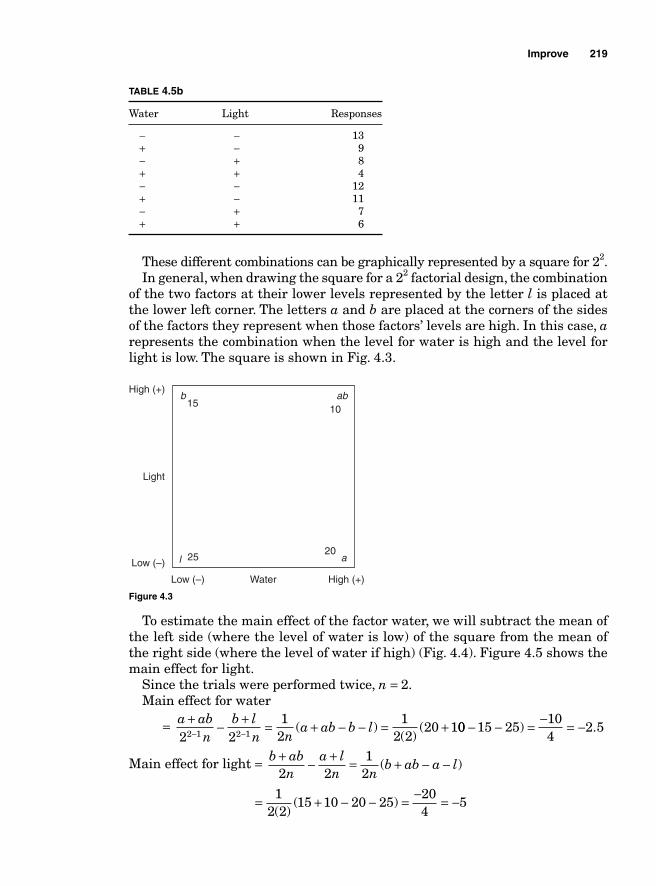
Improve 219
These different combinations can be graphically represented by a square for 22.In general, when drawing the square for a 22 factorial design, the combination
of the two factors at their lower levels represented by the letter l is placed at the lower left corner. The letters a and b are placed at the corners of the sides of the factors they represent when those factors’ levels are high. In this case, a represents the combination when the level for water is high and the level for light is low. The square is shown in Fig. 4.3.
TABLE 4.5b
Water Light Responses
− − 13 + − 9 − + 8 + + 4 − − 12 + − 11 − + 7 + + 6
b
al
ab15
10
2025
Water
Light
Low (–)
Low (–)
High (+)
High (+)
Figure 4.3
To estimate the main effect of the factor water, we will subtract the mean of the left side (where the level of water is low) of the square from the mean of the right side (where the level of water if high) (Fig. 4.4). Figure 4.5 shows the main effect for light.
Since the trials were performed twice, n = 2.Main effect for water
= a ab
nb l
n na ab b l
+ − + = + − − = +− −2 212
12 2
20 12 1 2 1 ( )( )
( 00 15 25104
2 5− − = − = −) .
Main effect for light = b abn
a ln n
b ab a l+ − + = + − −2 2
12
( )
= + − − = − = −12 2
15 10 20 25204
5( )
( )
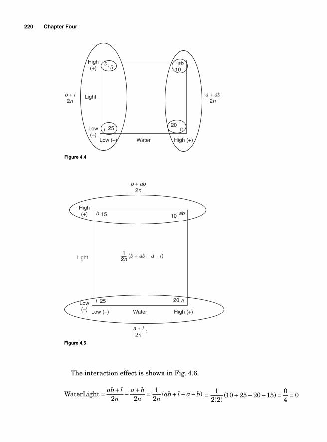
220 Chapter Four
The interaction effect is shown in Fig. 4.6.
WaterLight = ab ln
a bn n
ab l a b+ − + = + − −
2 212
( ) = + − − = =12 2
10 25 20 1504
0( )
( )
b
al
ab15 10
2025
Water
Lightb + l2n
Low (–)
Low (–)
High (+)
High(+)
a + ab2n
Figure 4.4
b
al
ab15 10
2025
Water
Light12n
Low (–)
Low (–) High (+)
High(+)
b + ab2n
a + l2n
:
(b + ab – a – l )
Figure 4.5
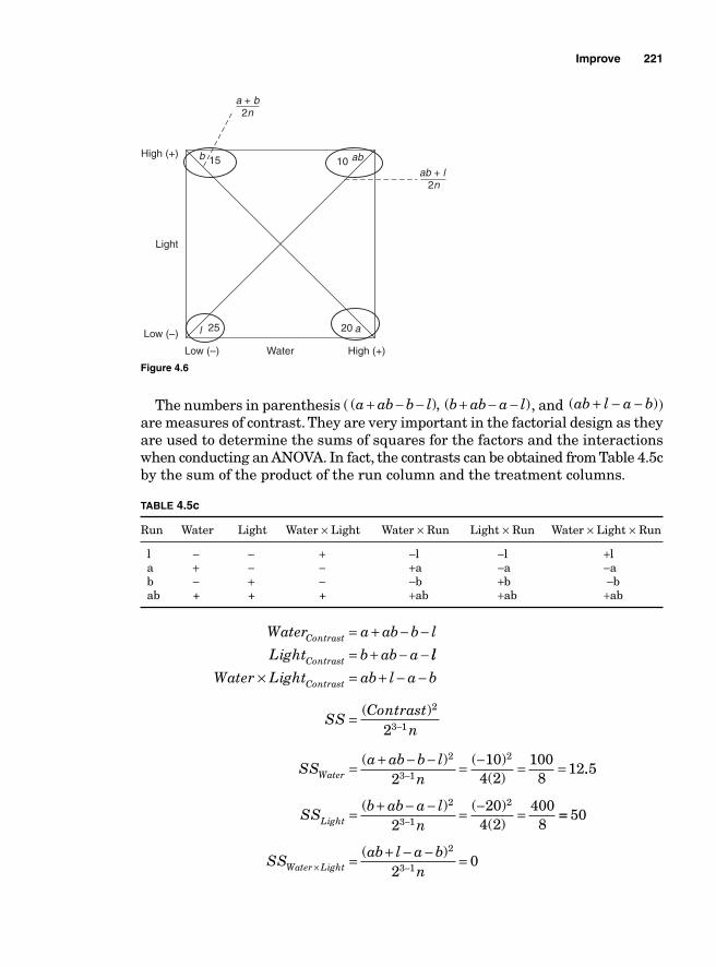
Improve 221
The numbers in parenthesis ( ( ), ( )a ab b l b ab a l+ − − + − − , and ( )ab l a b+ − − ) are measures of contrast. They are very important in the factorial design as they are used to determine the sums of squares for the factors and the interactions when conducting an ANOVA. In fact, the contrasts can be obtained from Table 4.5c by the sum of the product of the run column and the treatment columns.
TABLE 4.5c
Run Water Light Water × Light Water × Run Light × Run Water × Light × Run
l − − + −l −l +l a + − − +a −a −a b − + − −b +b −b ab + + + +ab +ab +ab
b
al
ab15 10
2025
Water
Light
Low (–)
Low (–)
High (+)
High (+)
ab + l2n
a + b2n
Figure 4.6
Water a ab b l
Light b ab aContrast
Contrast
= + − −= + − − ll
Water Light ab l a bContrast× = + − −
SS
Contrastn
= −( )2
3 12
SSa ab b l
nWater = + − − = − = =−( ) ( )
( )
2
3 1
2
210
4 2100
812..
( ) ( )( )
5
220
4 24008
2
3 1
2
SSb ab a l
nLight = + − − = − =− ==
= + − − =× −
50
20
2
3 1SSab l a b
nWater Light( )
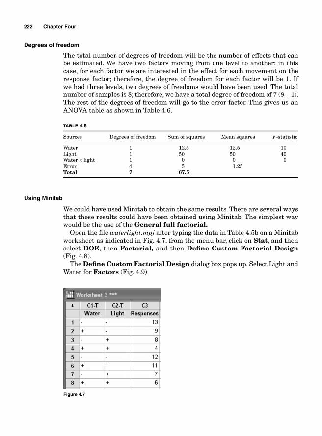
222 Chapter Four
Degrees of freedom
The total number of degrees of freedom will be the number of effects that can be estimated. We have two factors moving from one level to another; in this case, for each factor we are interested in the effect for each movement on the response factor; therefore, the degree of freedom for each factor will be 1. If we had three levels, two degrees of freedoms would have been used. The total number of samples is 8; therefore, we have a total degree of freedom of 7 (8 – 1). The rest of the degrees of freedom will go to the error factor. This gives us an ANOVA table as shown in Table 4.6.
TABLE 4.6
Sources Degrees of freedom Sum of squares Mean squares F-statistic
Water 1 12.5 12.5 10Light 1 50 50 40Water × light 1 0 0 0Error 4 5 1.25 Total 7 67.5
Using Minitab
We could have used Minitab to obtain the same results. There are several ways that these results could have been obtained using Minitab. The simplest way would be the use of the General full factorial.
Open the fi le waterlight.mpj after typing the data in Table 4.5b on a Minitab worksheet as indicated in Fig. 4.7, from the menu bar, click on Stat, and then select DOE, then Factorial, and then Defi ne Custom Factorial Design (Fig. 4.8).
The Defi ne Custom Factorial Design dialog box pops up. Select Light and Water for Factors (Fig. 4.9).
Figure 4.7
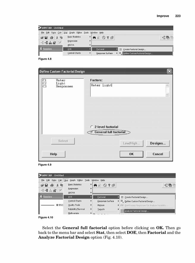
Improve 223
Figure 4.8
Figure 4.9
Figure 4.10
Select the General full factorial option before clicking on OK. Then go back to the menu bar and select Stat, then select DOE, then Factorial and the Analyze Factorial Design option (Fig. 4.10).
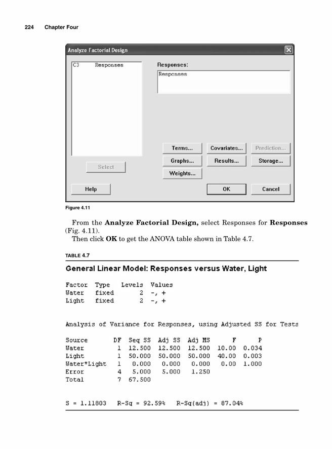
224 Chapter Four
From the Analyze Factorial Design, select Responses for Responses (Fig. 4.11).
Then click OK to get the ANOVA table shown in Table 4.7.
Figure 4.11
TABLE 4.7
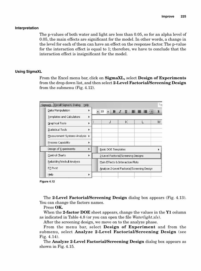
Improve 225
Interpretation
The p-values of both water and light are less than 0.05, so for an alpha level of 0.05, the main effects are signifi cant for the model. In other words, a change in the level for each of them can have an effect on the response factor. The p-value for the interaction effect is equal to 1; therefore, we have to conclude that the interaction effect is insignifi cant for the model.
Using SigmaXL
From the Excel menu bar, click on SigmaXL, select Design of Experiments from the drop down list, and then select 2-Level Factorial/Screening Design from the submenu (Fig. 4.12).
Figure 4.12
The 2-Level Factorial/Screening Design dialog box appears (Fig. 4.13). You can change the factors names.
Press OK.When the 2-factor DOE sheet appears, change the values in the Y1 column
as indicated in Table 4.8 (or you can open the fi le Waterlight.xls).After the screening design, we move on to the analyze phase.From the menu bar, select Design of Experiment and from the
submenu, select Analyze 2-Level Factorial/Screening Design (see Fig. 4.14).
The Analyze 2-Level Factorial/Screening Design dialog box appears as shown in Fig. 4.15.
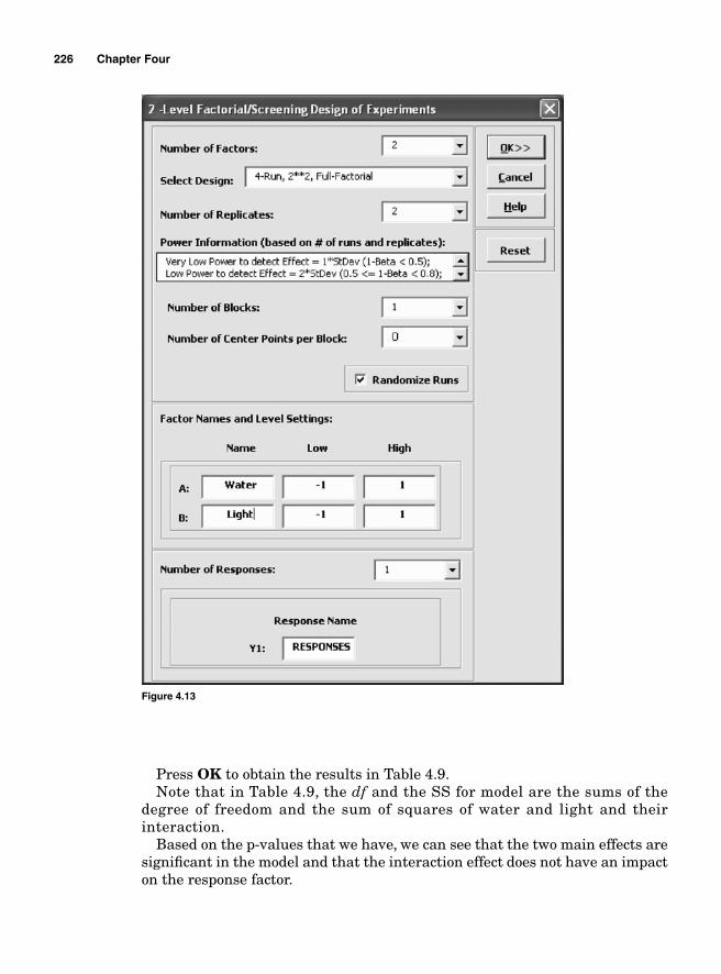
226 Chapter Four
Figure 4.13
Press OK to obtain the results in Table 4.9.Note that in Table 4.9, the df and the SS for model are the sums of the
degree of freedom and the sum of squares of water and light and their interaction.
Based on the p-values that we have, we can see that the two main effects are signifi cant in the model and that the interaction effect does not have an impact on the response factor.
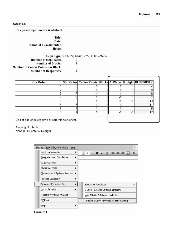
Improve 227
TABLE 4.8
Figure 4.14
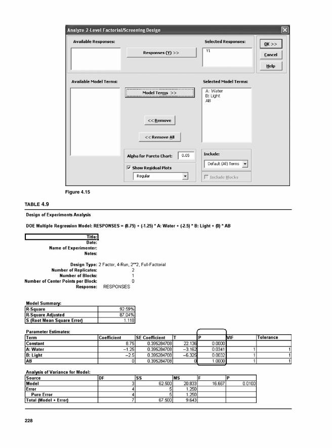
Figure 4.15
TABLE 4.9
228
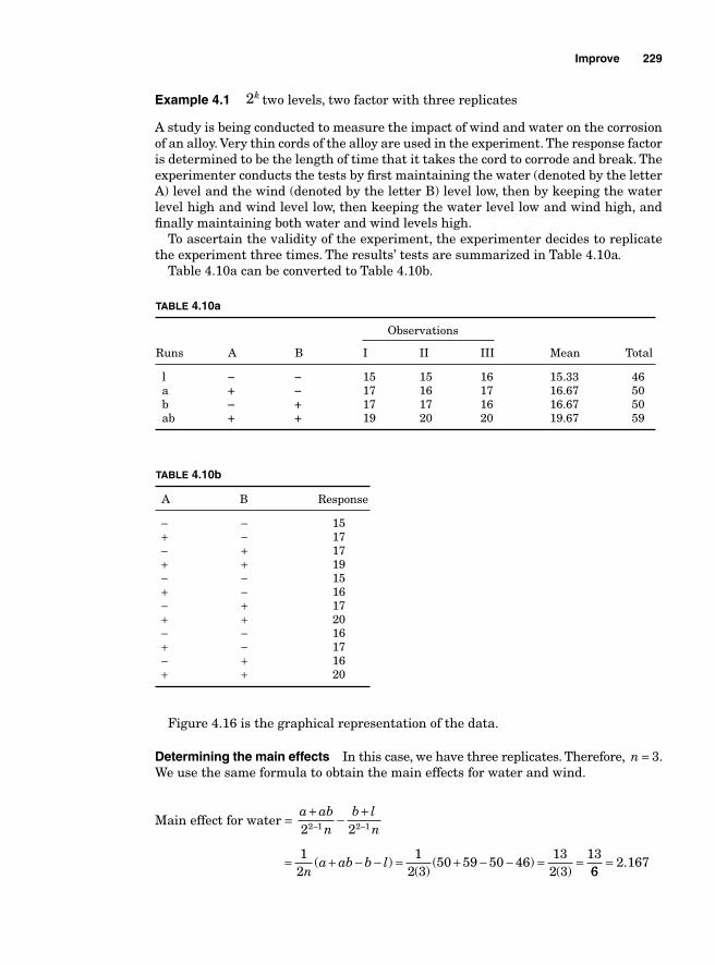
Improve 229
Example 4.1 2k two levels, two factor with three replicates
A study is being conducted to measure the impact of wind and water on the corrosion of an alloy. Very thin cords of the alloy are used in the experiment. The response factor is determined to be the length of time that it takes the cord to corrode and break. The experimenter conducts the tests by fi rst maintaining the water (denoted by the letter A) level and the wind (denoted by the letter B) level low, then by keeping the water level high and wind level low, then keeping the water level low and wind high, and fi nally maintaining both water and wind levels high.
To ascertain the validity of the experiment, the experimenter decides to replicate the experiment three times. The results’ tests are summarized in Table 4.10a.
Table 4.10a can be converted to Table 4.10b.
TABLE 4.10a
Observations
Runs A B I II III Mean Total
l - - 15 15 16 15.33 46 a + - 17 16 17 16.67 50 b - + 17 17 16 16.67 50 ab + + 19 20 20 19.67 59
TABLE 4.10b
A B Response
− − 15 + − 17 − + 17 + + 19 − − 15 + − 16 − + 17 + + 20 − − 16 + − 17 − + 16 + + 20
Figure 4.16 is the graphical representation of the data.
Determining the main effects In this case, we have three replicates. Therefore, n = 3. We use the same formula to obtain the main effects for water and wind.
Main effect for water = a ab
nb l
n+ − +− −2 22 1 2 1
= + − − = + − − = =1
21
2 350 59 50 46
132 3
13n
a ab b l( )( )
( )( ) 66
2 167= .
230 Chapter Four
Main effect for wind = b ab
na l
n+ − +2 2
= + − −12n
b ab a l( ) = + − − = = =12 3
50 59 50 46132 3
136
2 167( )
( )( )
.
Both main effects for water and wind are equal to 2.167. This means that a change in the level of water or wind from low to high will result in a change in the response factor by 2.167 units of time measurement.
Interaction effect
The interaction effect water × wind = ab ln
a bn n
ab l a b+ − + = + − −
2 212
( )
= + − − = =1
2 359 46 50 50
56
0 8333( )
( ) .
Sums of squares
SSContrast
n= −
( )2
3 12
SS
a ab b lnWater = + − − = = =−
( ) ( )( )
2
3 1
2
2134 3
16912
14..083
SSb ab a l
nWind = + − − = = =−( ) ( )
( ).
2
3 1
2
2134 3
16912
14 0083
2512
252
3 1
2
SSab l a b
nWater Wind× −= + − − = =( ) ( )112
2 083= .
46 Low Water 50 High
5950High
Wind
Low
Figure 4.16
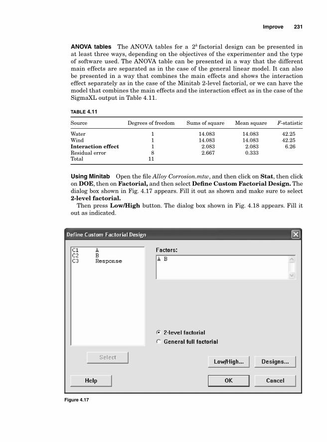
ANOVA tables The ANOVA tables for a 2k factorial design can be presented in at least three ways, depending on the objectives of the experimenter and the type of software used. The ANOVA table can be presented in a way that the different main effects are separated as in the case of the general linear model. It can also be presented in a way that combines the main effects and shows the interaction effect separately as in the case of the Minitab 2-level factorial, or we can have the model that combines the main effects and the interaction effect as in the case of the SigmaXL output in Table 4.11.
TABLE 4.11
Source Degrees of freedom Sums of square Mean square F-statistic
Water 1 14.083 14.083 42.25Wind 1 14.083 14.083 42.25Interaction effect 1 2.083 2.083 6.26Residual error 8 2.667 0.333 Total 11
Using Minitab Open the fi le Alloy Corrosion.mtw, and then click on Stat, then click on DOE, then on Factorial, and then select Defi ne Custom Factorial Design. The dialog box shown in Fig. 4.17 appears. Fill it out as shown and make sure to select 2-level factorial.
Then press Low/High button. The dialog box shown in Fig. 4.18 appears. Fill it out as indicated.
Figure 4.17
Improve 231
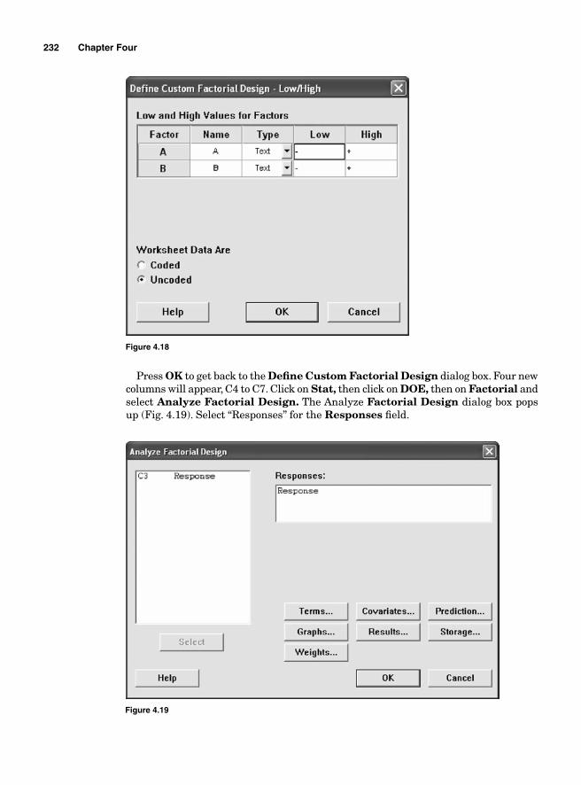
232 Chapter Four
Figure 4.19
Press OK to get back to the Defi ne Custom Factorial Design dialog box. Four new columns will appear, C4 to C7. Click on Stat, then click on DOE, then on Factorial and select Analyze Factorial Design. The Analyze Factorial Design dialog box pops up (Fig. 4.19). Select “Responses” for the Responses fi eld.
Figure 4.18
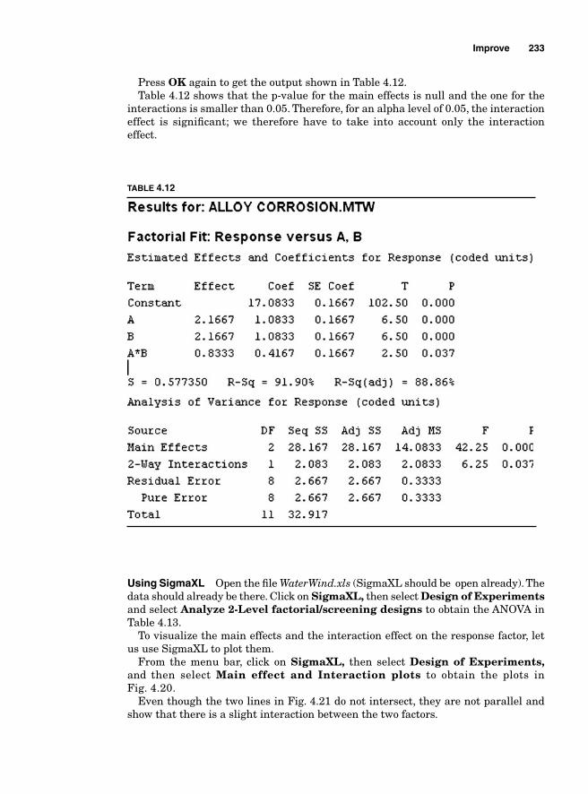
Improve 233
Press OK again to get the output shown in Table 4.12. Table 4.12 shows that the p-value for the main effects is null and the one for the
interactions is smaller than 0.05. Therefore, for an alpha level of 0.05, the interaction effect is signifi cant; we therefore have to take into account only the interaction effect.
Using SigmaXL Open the fi le WaterWind.xls (SigmaXL should be open already). The data should already be there. Click on SigmaXL, then select Design of Experiments and select Analyze 2-Level factorial/screening designs to obtain the ANOVA in Table 4.13.
To visualize the main effects and the interaction effect on the response factor, let us use SigmaXL to plot them.
From the menu bar, click on SigmaXL, then select Design of Experiments, and then select Main effect and Interaction plots to obtain the plots in Fig. 4.20.
Even though the two lines in Fig. 4.21 do not intersect, they are not parallel and show that there is a slight interaction between the two factors.
TABLE 4.12
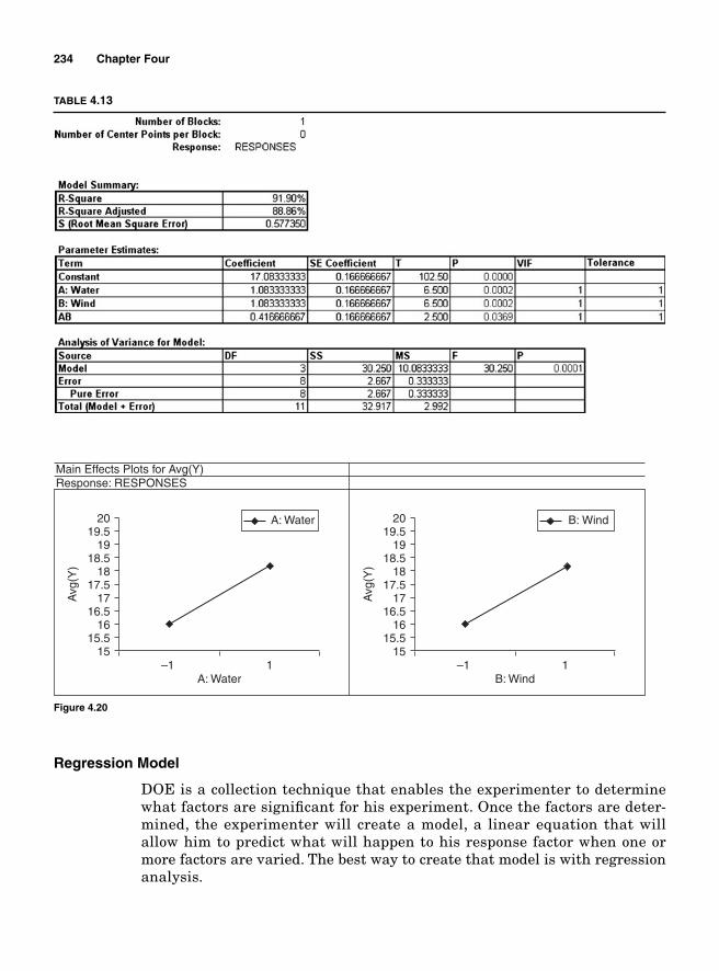
234 Chapter Four
Regression Model
DOE is a collection technique that enables the experimenter to determine what factors are signifi cant for his experiment. Once the factors are deter-mined, the experimenter will create a model, a linear equation that will allow him to predict what will happen to his response factor when one or more factors are varied. The best way to create that model is with regression analysis.
TABLE 4.13
15–1
A: Water
A: Water
Response: RESPONSESMain Effects Plots for Avg(Y)
Avg
(Y)
1
15.516
16.517
17.518
18.519
19.520
15–1
B: Wind
B: Wind
Avg
(Y)
1
15.516
16.517
17.518
18.519
19.520
Figure 4.20
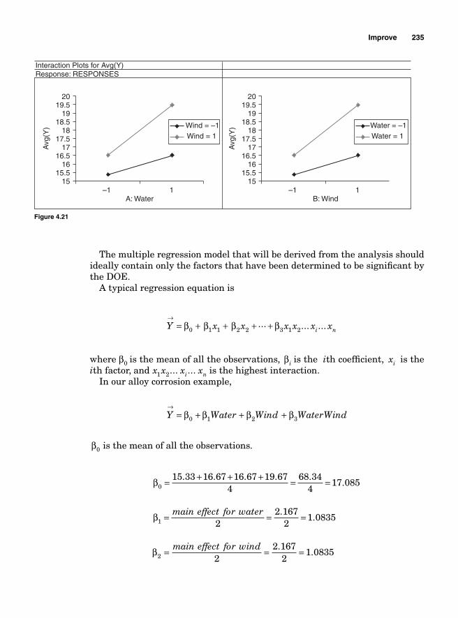
Improve 235
The multiple regression model that will be derived from the analysis should ideally contain only the factors that have been determined to be signifi cant by the DOE.
A typical regression equation is
Y x x x x x xi n
→= + + + +β β β β0 1 1 2 2 3 1 2
... ... ...
where β0 is the mean of all the observations, βi is the ith coeffi cient, xi is the ith factor, and x x x xi n1 2... ... is the highest interaction.
In our alloy corrosion example,
Y Water Wind WaterWind→
= + + +β β β β0 1 2 3
β0 is the mean of all the observations.
β0
68 344
17 085= + + + = =15.33 16.67 16.67 19.674
..
β1 2
2 1672
1 0835= = =main effect for water ..
β2 2
2 1672
1 0835= = =main effect for wind ..
15–1
A: Water
Wind = –1Wind = 1
Response: RESPONSESInteraction Plots for Avg(Y)
Avg
(Y)
1
15.516
16.517
17.518
18.519
19.520
15–1
B: Wind
Water = –1Water = 1
Avg
(Y)
1
15.516
16.517
17.518
18.519
19.520
Figure 4.21
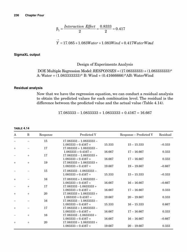
236 Chapter Four
β1 2
0 83332
0 417= = =Interaction Effect ..
Y Water Wind WaterWi→
= + + +17 085 1 083 1 083 0 417. . . . nnd
SigmaXL output
Design of Experiments Analysis
DOE Multiple Regression Model: RESPONSES = (17.08333333) + (1.083333333)* A: Water + (1.083333333)* B: Wind + (0.41666666)*AB: WaterWind
Residual analysis
Now that we have the regression equation, we can conduct a residual analysis to obtain the predicted values for each combination level. The residual is the difference between the predicted value and the actual value (Table 4.14).
17.083333 – 1.0833333 + 1.0833333 + 0.4167 = 16.667
TABLE 4.14
A B Response Predicted Y Response – Predicted Y Residual
− − 15 17.083333 − 1.0833333 – 1.083333 + 0.4167 = 15.333 15 – 15.333 –0.333+ − 17 17.083333 + 1.0833333 – 1.083333 + 0.4167 = 16.667 17 – 16.667 0.333− + 17 17.083333 − 1.0833333 + 1.083333 + 0.4167 = 16.667 17 – 16.667 0.333+ + 19 17.083333 + 1.0833333 + 1.083333 + 0.4167 = 19.667 19 – 19.667 –0.667
− − 15 17.083333 −1.0833333 – 1.083333 + 0.4167 = 15.333 15 – 15.333 –0.333
+ − 16 17.083333 + 1.0833333 – 1.083333 + 0.4167 = 16.667 16 – 16.667 –0.667− + 17 17.083333 −1.0833333 + 1.083333 + 0.4167 = 16.667 17 – 16.667 0.333+ + 20 17.083333 + 1.0833333 + 1.083333 + 0.4167 = 19.667 20 – 19.667 0.333− − 16 17.083333 − 1.0833333 – 1.083333 + 0.4167 = 15.333 16 – 15.333 0.667+ − 17 17.083333 + 1.0833333 – 1.083333 + 0.4167 = 16.667 17 – 16.667 0.333− + 16 17.083333 −1.0833333 + 1.083333 + 0.4167 = 16.667 16 – 16.667 –0.667+ + 20 17.083333 + 1.0833333 + 1.083333 + 0.4167 = 19.667 20 − 19.667 0.333
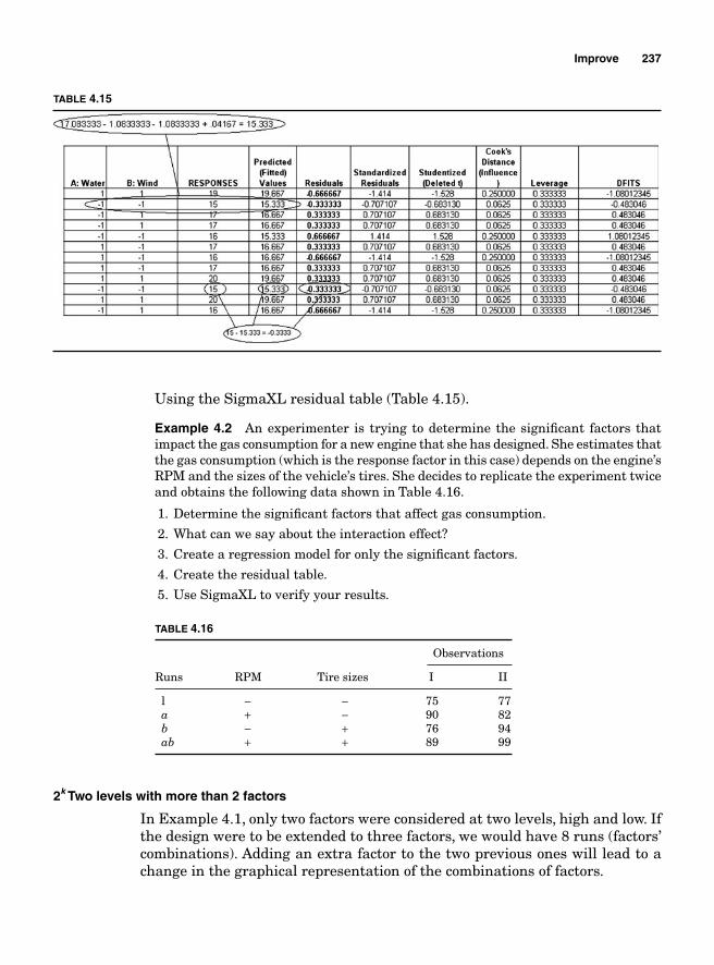
Improve 237
Using the SigmaXL residual table (Table 4.15).
Example 4.2 An experimenter is trying to determine the signifi cant factors that impact the gas consumption for a new engine that she has designed. She estimates that the gas consumption (which is the response factor in this case) depends on the engine’s RPM and the sizes of the vehicle’s tires. She decides to replicate the experiment twice and obtains the following data shown in Table 4.16.
1. Determine the signifi cant factors that affect gas consumption.
2. What can we say about the interaction effect?
3. Create a regression model for only the signifi cant factors.
4. Create the residual table.
5. Use SigmaXL to verify your results.
2k Two levels with more than 2 factors
In Example 4.1, only two factors were considered at two levels, high and low. If the design were to be extended to three factors, we would have 8 runs (factors’ combinations). Adding an extra factor to the two previous ones will lead to a change in the graphical representation of the combinations of factors.
TABLE 4.15
TABLE 4.16
Observations
Runs RPM Tire sizes I II
l − − 75 77 a + − 90 82 b − + 76 94 ab + + 89 99
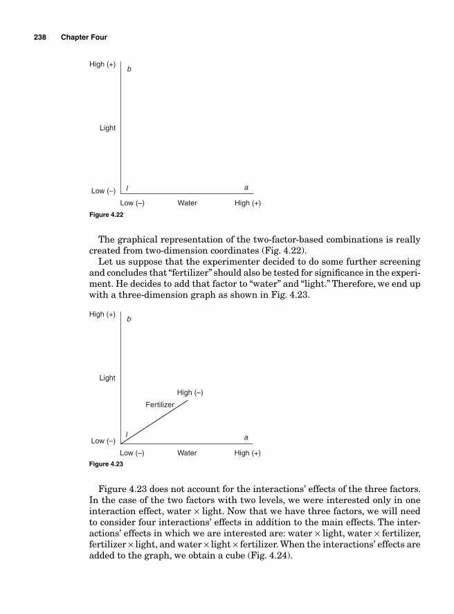
238 Chapter Four
The graphical representation of the two-factor-based combinations is really created from two-dimension coordinates (Fig. 4.22).
Let us suppose that the experimenter decided to do some further screening and concludes that “fertilizer” should also be tested for signifi cance in the experi-ment. He decides to add that factor to “water” and “light.” Therefore, we end up with a three-dimension graph as shown in Fig. 4.23.
b
al
Water
Light
Low (–)
Low (–)
High (+)
High (+)
Figure 4.22
b
al
Water
Fertilizer
Light
Low (–)
Low (–)
High (+)
High (–)
High (+)
Figure 4.23
Figure 4.23 does not account for the interactions’ effects of the three factors. In the case of the two factors with two levels, we were interested only in one interaction effect, water × light. Now that we have three factors, we will need to consider four interactions’ effects in addition to the main effects. The inter-actions’ effects in which we are interested are: water × light, water × fertilizer, fertilizer × light, and water × light × fertilizer. When the interactions’ effects are added to the graph, we obtain a cube (Fig. 4.24).
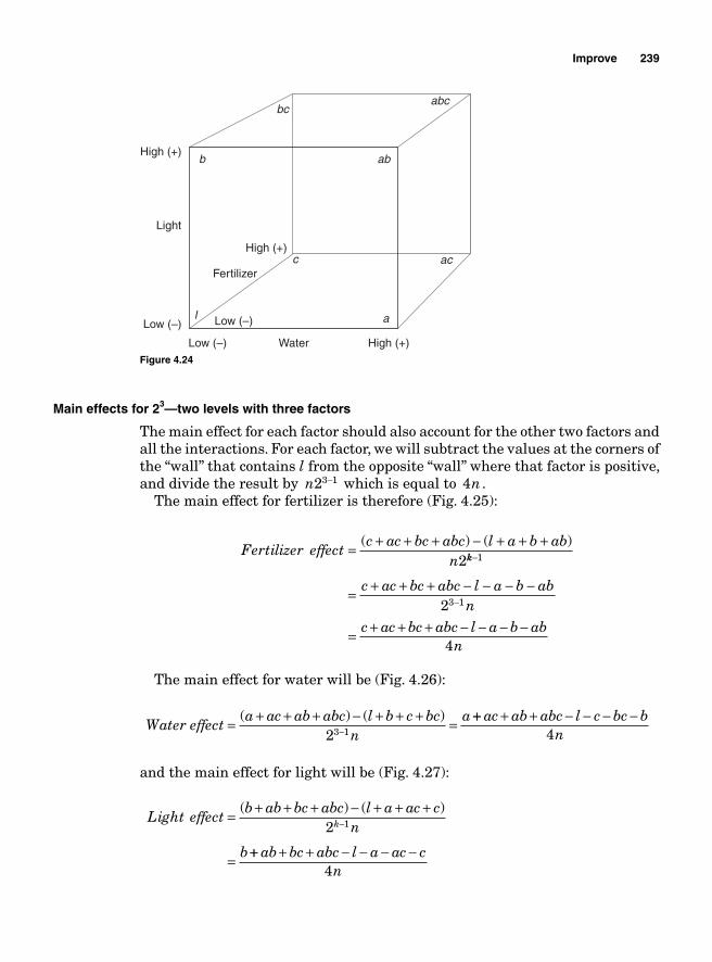
Improve 239
Main effects for 23—two levels with three factors
The main effect for each factor should also account for the other two factors and all the interactions. For each factor, we will subtract the values at the corners of the “wall” that contains l from the opposite “wall” where that factor is positive, and divide the result by n23 1− which is equal to 4n .
The main effect for fertilizer is therefore (Fig. 4.25):
Fertilizer effectc ac bc abc l a b ab
n= + + + − + + +( ) ( )
2kk
c ac bc abc l a b abn
−
−= + + + − − − −
1
3 12
= + + + − − − −c ac bc abc l a b ab
n4
The main effect for water will be (Fig. 4.26):
Water effect
a ac ab abc l b c bcn
a= + + + − + + + =−( ) ( )
23 1
++ + + − − − −ac ab abc l c bc bn4
and the main effect for light will be (Fig. 4.27):
Light effectb ab bc abc l a ac c
n
b
k= + + + − + + +
=
−( ) ( )
2 1
++ + + − − − −ab bc abc l a ac cn4
b
a
c ac
abc
l
ab
bc
Water
Light
Low (–)
Low (–)Low (–)
High (+)
High (+)
Fertilizer
High (+)
Figure 4.24
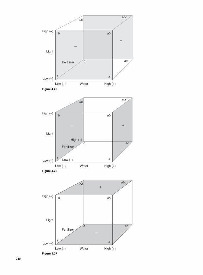
b
a
c ac
abc
l
ab
bc
Water
Light
Low (–)
Low (–)
High (+)
–
+
Fertilizer
High (+)
Figure 4.25
b
a
abc
l
ab
ac
bc
c
Water
Light
Low (–)
Low (–)Low (–)
High (+)
High (+)
– +
Fertilizer
High (+)
Figure 4.26
b
bc
c
a
ac
l
ab
abc
Water
Light
Low (–)
Low (–)
High (+)
–
+
Fertilizer
High (+)
Figure 4.27
240
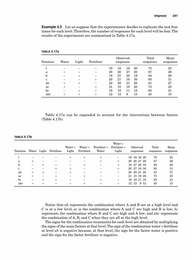
Improve 241
Example 4.3 Let us suppose that the experimenter decides to replicate the test four times for each level. Therefore, the number of responses for each level will be four. The results of the experiments are summarized in Table 4.17a.
TABLE 4.17a
Observed Total MeanNotation Water Light Fertilizer responses responses responses
l − − − 19 18 18 20 75 25 a + − − 20 20 27 20 87 29 b − + − 18 27 20 19 84 28 c − − + 20 27 16 30 93 31 ab + + − 20 20 21 20 81 27 ac + − + 21 15 19 20 75 25 bc − + + 16 18 11 18 63 21 abc + + + 12 12 8 13 45 15
Table 4.17a can be expanded to account for the interactions between factors(Table 4.17b).
TABLE 4.17b
Water × Water × Water × Fertilizer × Fertilizer × Observed Total MeanNotation Water Light Fertilizer Light Fertilizer Water Light responses responses responses
l − − − + + + − 19 18 18 20 75 25 a + − − − − + + 20 20 27 20 87 29 b − + − − + − + 18 27 20 19 84 28 c − − + + − − + 20 27 16 30 93 31 ab + + − + − − − 20 20 21 20 81 27 ac + − + − + − − 21 15 19 20 75 25 bc − + + − − + − 16 18 11 18 63 21 abc + + + + + + + 12 12 8 13 45 15
Notice that ab represents the combination where A and B are at a high level and C is at a low level; ac is the combination where A and C are high and B is low; bcrepresents the combination where B and C are high and A low; and abc represents the combination of A, B, and C when they are all at the high level.
The signs for the combination treatments for each level are obtained by multiplying the signs of the main factors at that level. The sign of the combination water × fertilizer at level ab is negative because, at that level, the sign for the factor water is positive and the sign for the factor fertilizer is negative.
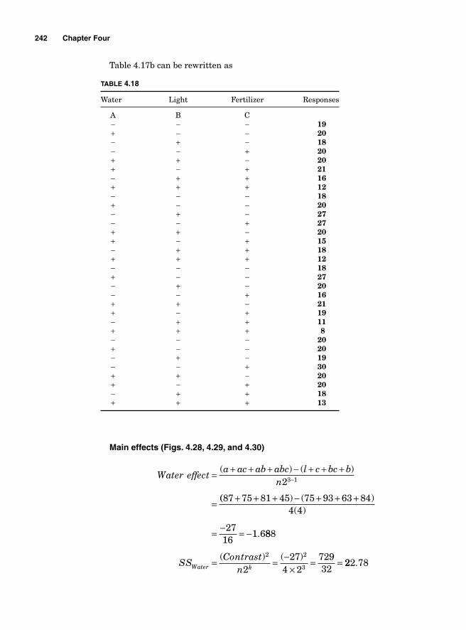
242 Chapter Four
Main effects (Figs. 4.28, 4.29, and 4.30)
Water effecta ac ab abc l c bc b
n( ) ( )= + + + − + + +
=
−23 1
(( ) ( )( )
.
87 75 81 45 75 93 63 844 4
2716
1 6
+ + + − + + +
= − = − 888
227
4 272932
2 2
3SSContrast
nWater k= = −×
= =( ) ( )222 78.
TABLE 4.18
Water Light Fertilizer Responses
A B C − − − 19 + − − 20 − + − 18 − − + 20 + + − 20 + − + 21 − + + 16 + + + 12 − − − 18 + − − 20 − + − 27 − − + 27 + + − 20 + − + 15 − + + 18 + + + 12 − − − 18 + − − 27 − + − 20 − − + 16 + + − 21 + − + 19 − + + 11 + + + 8 − − − 20 + − − 20 − + − 19 – − + 30 + + − 20 + − + 20 − + + 18
+ + + 13
Table 4.17b can be rewritten as
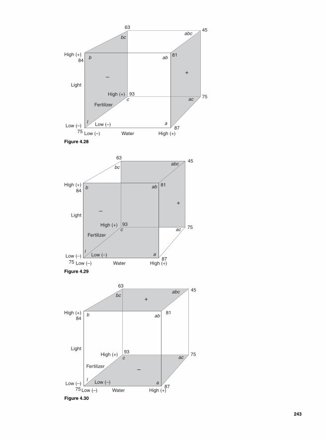
b
a
c ac
bcabc
l
ab
Water
Light
Low (–)
Low (–)Low (–)
High (+)
High (+)
–+
Fertilizer
High (+)84
63 45
75
87
93
75
81
Figure 4.28
b
a
c ac
l
ab
bcabc
Water
Light
Low (–)
Low (–)Low (–)
High (+)
High (+)
–+
Fertilizer
High (+)84
6345
75
87
93
75
81
Figure 4.29
b
a
c ac
l
ab
abcbc
Water
Light
Low (–)
Low (–)Low (–)High (+)
High (+)
–
+
Fertilizer
High (+)84
63
81
93
75
45
75
87
Figure 4.30
243
244 Chapter Four
Fertilizer effectc ac bc abc l a b ab= + + + − + + +( ) ( )
23−−
= + + + − − − −
= + + + −
1
4
93 75 63 45
n
c ac bc abc l a b abn
( ) (775 87 84 814 4
5116
3 188+ + +
×= − = −)
.
SS
ContrastnFertilizer k
= = −×
=( ) ( )2 2
3251
4 22601332
81 28= .
Light effectb ab bc abc l c a ac
n= + + + − + + +
=
−( ) ( )
(
23 1
884 81 45 63 75 87 75 934 4
5716
3 563+ + + − + + +
×= − = −) ( )
.
SSSContrast
nLight k= = −
×= =( ) ( )2 2
3257
4 23249
321001 53.
Interaction effects
Water-fertilizer effect Average effect of water at the high and low levels of fertilizer:Mean water effect at high fertilizer level
( ) ( )abc bc ac c
n− + −
2
Mean effect of water at the low level of fertilizer
( ) ( )ab b a ln
− + −2
The interaction effect will be the difference between the two effects divided by 2 (Fig. 4.31).
Water Fertilizer effectl ac abc b a ab b× = + + + − + +( ) ( cc c
n
abc bc ac c ab b a ln
k
+
= − + − − + − +
−
−
)2
2
1
3 1
= − + − − + − +
= − = −
−45 63 75 93 81 84 87 75
2 4
4516
2 81
3 1( )
.
SS
ContrastnWater Fertilizer k× = = −( ) ( )
(
2 2
245
4 233
202532
63 281)
.= =
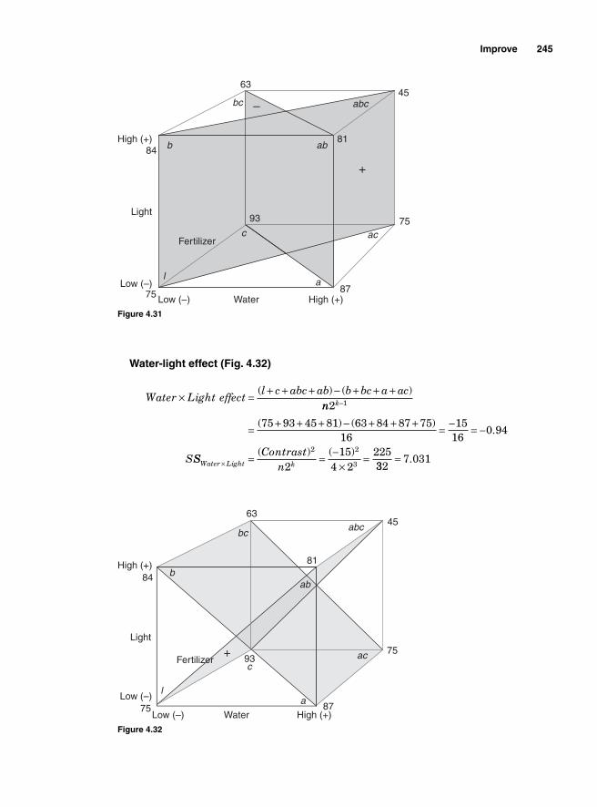
Improve 245
Water-light effect (Fig. 4.32)
Water Light effect
l c abc ab b bc a ac× = + + + − + + +( ) ( )nn k2 1−
= + + + − + + + = − = −( ) ( ).
75 93 45 81 63 84 87 7516
1516
0 94
SSSContrast
nWater Light k× = = −×
=( ) ( )2 2
3215
4 2225332
7 031= .
b
a
c ac
l
ab
abcbc
Water
Light
Low (–)
Low (–)
High (+)
–
+
Fertilizer
High (+)84
63
81
93
75
45
75
87
Figure 4.31
b
a
cac
abcbc
l
ab
Water
Light
Low (–)
Low (–)
High (+)
+Fertilizer
High (+)84
63
81
93
75
45
75
87
Figure 4.32
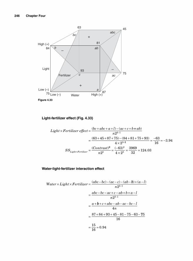
246 Chapter Four
Light-fertilizer effect (Fig. 4.33)
Light Fertilizer effectbc abc a l ac c b× = + + + − + +( ) ( ++
= + + + − + + +×
−
−
abn k
)
( ) ( )2
63 45 87 75 84 81 75 934 2
1
3 11
6316
3 94= − = −
=×
.
( )SS
ContrastLight Fertilizer
22 2
3263
4 23969
32124 03
n k = −×
= =( ).
Water-light-fertilizer interaction effect
Water Light Fertilizerabc bc ac c ab× × = − − − − −( ) ( ) ( bb a l
n
abc bc ac c ab b a ln
a
k
) ( )+ −
= − − + − + + −
= +
−
−
2
2
1
3 1
bb c abc ab ac bc ln
+ + − − − −
= + + + − − − −
4
87 84 93 45 81 75 63 77516
1516
0 94= = .
Low (–)
Low (–)
High (+)
High (+)
+
+
–
–
Water
Fertilizer
87
75
45
81
93
63
84
75
Light
b
bc
ac
a
c
abc
ab
Figure 4.33
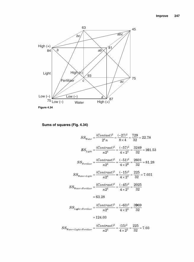
Improve 247
Sums of squares (Fig. 4.34)
SSContast
nWater k= = −×
= =( ) ( ).
2 2
227
8 472932
22 78
SSSContrast
nLight k= = −×
= =( ) ( )2 2
3257
4 23249
321001 53
251
4 2
2 2
.
( ) ( )SS
ContrastnFertilizer k= = −
× 33
2
260132
81 28
2
= =
=×
.
( )SS
ContrastnWater Light k == −
×= =
=×
( ).
154 2
22532
7 0312
3
SSWater Fertilizer(( ) ( )
.
Contrastn
SS
k
Li
2 2
3245
4 2202532
63 28
= −×
=
=
gght Fertilizer k
Contrastn× = = −
×=( ) ( )2 2
3263
4 239969
32
124 03=
=× ×
.
(SS
ContWater Light Fertilizer
rrastn k
) ( ).
2 2
3215
4 222532
7 03=×
= =
Low (–)
Low (–)Low (–)
High (+)
High (+)
High (+)
Water
Fertilizer
87
75
45
81
93
63
84
75
Light
b ab
bc
ac
a
c
abc
Figure 4.34
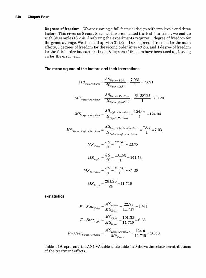
248 Chapter Four
Degrees of freedom We are running a full factorial design with two levels and three factors. This gives us 8 runs. Since we have replicated the test four times, we end up with 32 samples (8 × 4). Analyzing the experiments requires 1 degree of freedom for the grand average. We then end up with 31 (32 – 1); 3 degrees of freedom for the main effects, 3 degrees of freedom for the second order interaction, and 1 degree of freedom for the third order interaction. In all, 8 degrees of freedom have been used up, leaving 24 for the error term.
The mean square of the factors and their interactions
MSSS
dfWater LightWater Light
Water Light×
×
×= = 7.0031
17 031=
=××
.
MSSS
Water FertilizerWater Fertillizer
Water Fertilizer
L
df
MS
×= =63 28125
163 28
..
iight FertilizerLight Fertilizer
Light
SS
df××
×=
FFertilizer
Water Light FerMS
= =
× ×
124 031
124 03.
.
ttilizerWater Light Fertilizer
Water Li
SS
df= × ×
× gght Fertilizer×= =7 03
17 03
..
MSSSdf
MSSSdf
Water
Light
= = =
= =
22 781
22 78
101 5
..
. 331
101 53
81 281
81 28
=
= = =
.
..MS
SSdf
MS
Fertilizer
Errror = =281 2524
11 719.
.
F-statistics
F StatMSMSWater
Water
Error
− = = =22 7811 719
1 94.
.. 11
101 5311 719
8F StatMSMSLight
Light
Error
− = = =..
..66
F StatMS
Light FertilizerLight Fertiliz− =×
× eer
ErrorMS= =124 0
11 71910 58
..
.
Table 4.19 represents the ANOVA table while table 4.20 shows the relative contributions of the treatment effects.
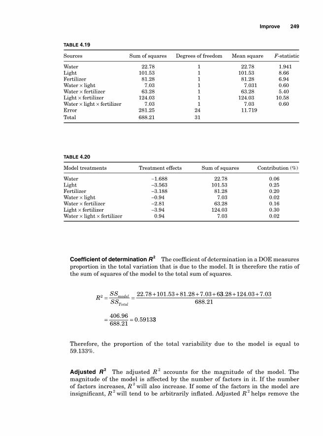
Improve 249
Coeffi cient of determination R 2 The coeffi cient of determination in a DOE measures proportion in the total variation that is due to the model. It is therefore the ratio of the sum of squares of the model to the total sum of squares.
RSSSS
model
Total
2 22 78 101 53 81 28 7 03 6= = + + + +. . . . 33 28 124 03 7 03688 21
406 96688 21
0 5913
. . ..
.
..
+ +
= = 33
Therefore, the proportion of the total variability due to the model is equal to 59.133%.
Adjusted R 2 The adjusted R 2 accounts for the magnitude of the model. The magnitude of the model is affected by the number of factors in it. If the number of factors increases, R 2 will also increase. If some of the factors in the model are insignifi cant, R 2 will tend to be arbitrarily infl ated. Adjusted R 2 helps remove the
TABLE 4.19
Sources Sum of squares Degrees of freedom Mean square F-statistic
Water 22.78 1 22.78 1.941Light 101.53 1 101.53 8.66Fertilizer 81.28 1 81.28 6.94Water × light 7.03 1 7.031 0.60Water × fertilizer 63.28 1 63.28 5.40Light × fertilizer 124.03 1 124.03 10.58Water × light × fertilizer 7.03 1 7.03 0.60Error 281.25 24 11.719Total 688.21 31
TABLE 4.20
Model treatments Treatment effects Sum of squares Contribution (%)
Water −1.688 22.78 0.06Light −3.563 101.53 0.25Fertilizer −3.188 81.28 0.20Water × light −0.94 7.03 0.02Water × fertilizer −2.81 63.28 0.16Light × fertilizer −3.94 124.03 0.30Water × light × fertilizer 0.94 7.03 0.02
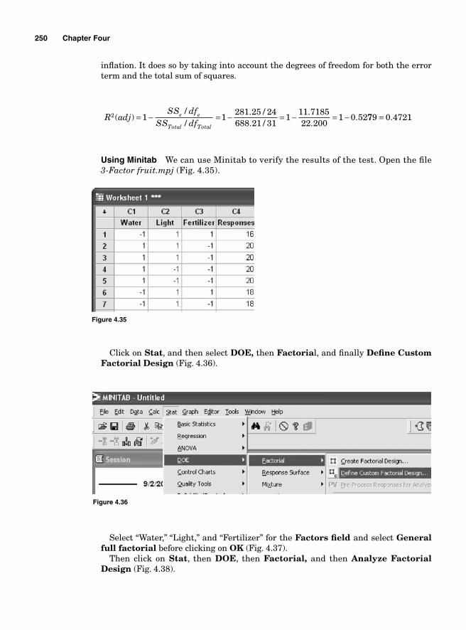
250 Chapter Four
infl ation. It does so by taking into account the degrees of freedom for both the error term and the total sum of squares.
R adjSS df
SS dfe e
Total Total
2 1( )//
= − =1281 25 24688 21 31
111 718522 200
1 0 52− = − = −. /. /
..
. 779 0 4721= .
Using Minitab We can use Minitab to verify the results of the test. Open the fi le 3-Factor fruit.mpj (Fig. 4.35).
Figure 4.35
Figure 4.36
Click on Stat, and then select DOE, then Factorial, and fi nally Defi ne Custom Factorial Design (Fig. 4.36).
Select “Water,” “Light,” and “Fertilizer” for the Factors fi eld and select Generalfull factorial before clicking on OK (Fig. 4.37).
Then click on Stat, then DOE, then Factorial, and then Analyze Factorial Design (Fig. 4.38).
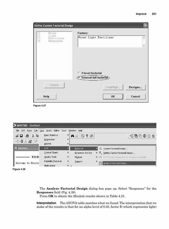
Improve 251
The Analyze Factorial Design dialog box pops up. Select “Responses” for the Responses fi eld (Fig. 4.39).
Press OK to obtain the Minitab results shown in Table 4.21.
Interpretation The ANOVA table matches what we found. The interpretation that we make of the results is that for an alpha level of 0.05, factor B (which represents light)
Figure 4.37
Figure 4.38
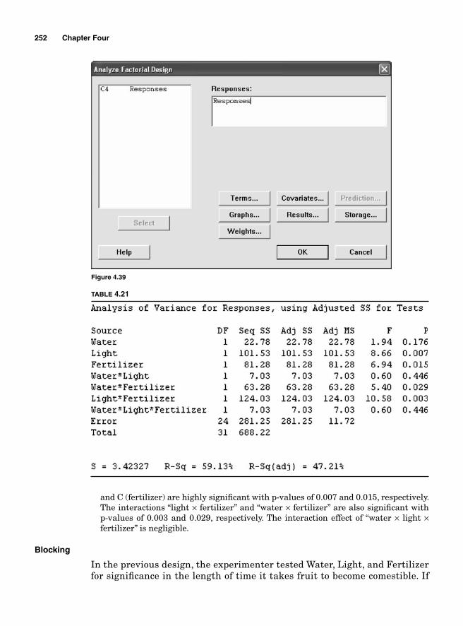
252 Chapter Four
TABLE 4.21
Figure 4.39
and C (fertilizer) are highly signifi cant with p-values of 0.007 and 0.015, respectively. The interactions “light × fertilizer” and “water × fertilizer” are also signifi cant with p-values of 0.003 and 0.029, respectively. The interaction effect of “water × light × fertilizer” is negligible.
Blocking
In the previous design, the experimenter tested Water, Light, and Fertilizer for signifi cance in the length of time it takes fruit to become comestible. If
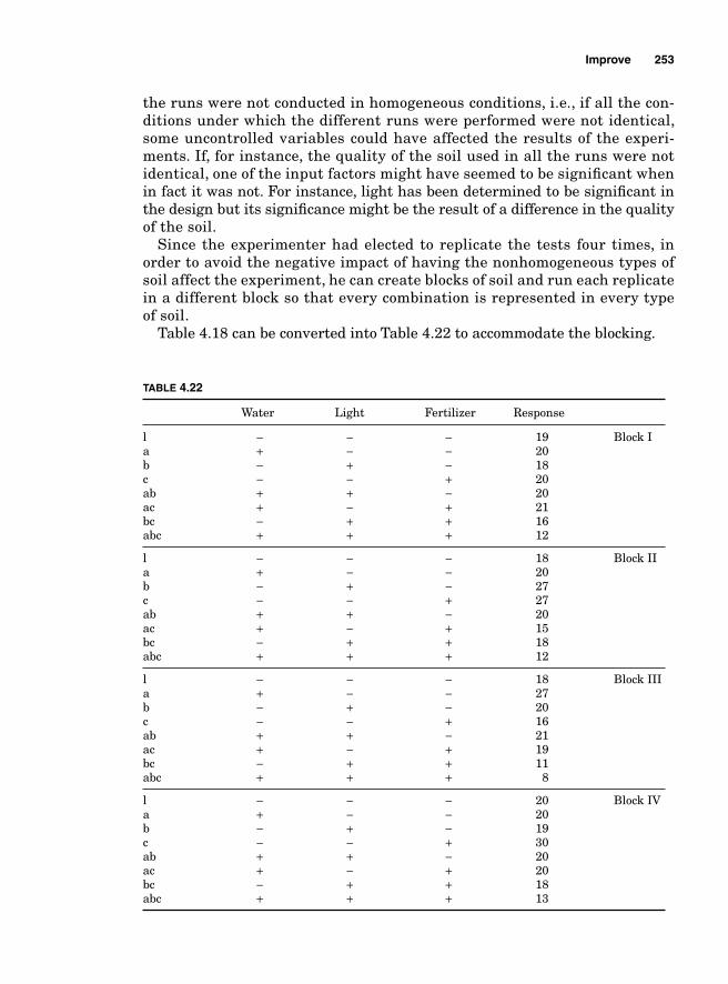
Improve 253
the runs were not conducted in homogeneous conditions, i.e., if all the con-ditions under which the different runs were performed were not identical, some uncontrolled variables could have affected the results of the experi-ments. If, for instance, the quality of the soil used in all the runs were not identical, one of the input factors might have seemed to be signifi cant when in fact it was not. For instance, light has been determined to be signifi cant in the design but its signifi cance might be the result of a difference in the quality of the soil.
Since the experimenter had elected to replicate the tests four times, in order to avoid the negative impact of having the nonhomogeneous types of soil affect the experiment, he can create blocks of soil and run each replicate in a different block so that every combination is represented in every type of soil.
Table 4.18 can be converted into Table 4.22 to accommodate the blocking.
TABLE 4.22
Water Light Fertilizer Response
l − − − 19 Block Ia + − − 20 b − + − 18 c − − + 20ab + + − 20ac + − + 21 bc − + + 16 abc + + + 12
l − − − 18 Block IIa + − − 20 b − + − 27 c − − + 27 ab + + − 20ac + − + 15 bc − + + 18 abc + + + 12
l − − − 18 Block IIIa + − − 27 b − + − 20 c − − + 16 ab + + − 21ac + − + 19 bc − + + 11 abc + + + 8
l − − − 20 Block IVa + − − 20 b − + − 19 c − − + 30 ab + + − 20ac + − + 20 bc − + + 18 abc + + + 13
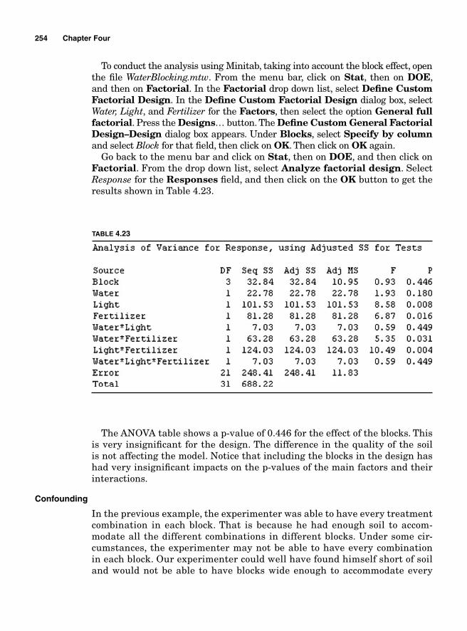
254 Chapter Four
To conduct the analysis using Minitab, taking into account the block effect, open the fi le WaterBlocking.mtw. From the menu bar, click on Stat, then on DOE, and then on Factorial. In the Factorial drop down list, select Defi ne Custom Factorial Design. In the Defi ne Custom Factorial Design dialog box, select Water, Light, and Fertilizer for the Factors, then select the option General full factorial. Press the Designs… button. The Defi ne Custom General Factorial Design–Design dialog box appears. Under Blocks, select Specify by column and select Block for that fi eld, then click on OK. Then click on OK again.
Go back to the menu bar and click on Stat, then on DOE, and then click on Factorial. From the drop down list, select Analyze factorial design. Select Response for the Responses fi eld, and then click on the OK button to get the results shown in Table 4.23.
The ANOVA table shows a p-value of 0.446 for the effect of the blocks. This is very insignifi cant for the design. The difference in the quality of the soil is not affecting the model. Notice that including the blocks in the design has had very insignifi cant impacts on the p-values of the main factors and their interactions.
Confounding
In the previous example, the experimenter was able to have every treatment combination in each block. That is because he had enough soil to accom-modate all the different combinations in different blocks. Under some cir-cumstances, the experimenter may not be able to have every combination in each block. Our experimenter could well have found himself short of soil and would not be able to have blocks wide enough to accommodate every
TABLE 4.23
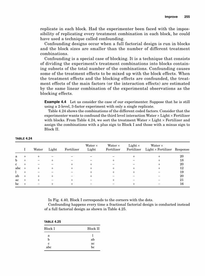
Improve 255
replicate in each block. Had the experimenter been faced with the impos-sibility of replicating every treatment combination in each block, he could have used a technique called confounding.
Confounding designs occur when a full factorial design is run in blocks and the block sizes are smaller than the number of different treatment combinations.
Confounding is a special case of blocking. It is a technique that consists of dividing the experiment’s treatment combinations into blocks contain-ing subsets of the total number of the combinations. Confounding causes some of the treatment effects to be mixed up with the block effects. When the treatment effects and the blocking effects are confounded, the treat-ment effects of the main factors (or the interaction effects) are estimated by the same linear combination of the experimental observations as the blocking effects.
Example 4.4 Let us consider the case of our experimenter. Suppose that he is still using a 2-level, 3-factor experiment with only a single replicate.
Table 4.24 shows the combinations of the different coded factors. Consider that the experimenter wants to confound the third level interaction Water × Light × Fertilizer with blocks. From Table 4.24, we sort the treatment Water × Light × Fertilizer and assign the combinations with a plus sign to Block I and those with a minus sign to Block II.
TABLE 4.24
Water × Water × Light × Water × I Water Light Fertilizer Light Fertilizer Fertilizer Light × Fertilizer Response
a + + − − − − + + 20b + − + − − + − + 18c + − − + + − − + 20abc + + + + + + + + 12l + − − − + + + − 19ab + + + − + − − − 20ac + + − + − + − − 21bc + − + + − − + − 16
TABLE 4.25
Block I Block II
a l b ab c ac abc bc
In Fig. 4.40, Block I corresponds to the corners with the dots. Confounding happens every time a fractional factorial design is conducted instead
of a full factorial design as shown in Table 4.25.
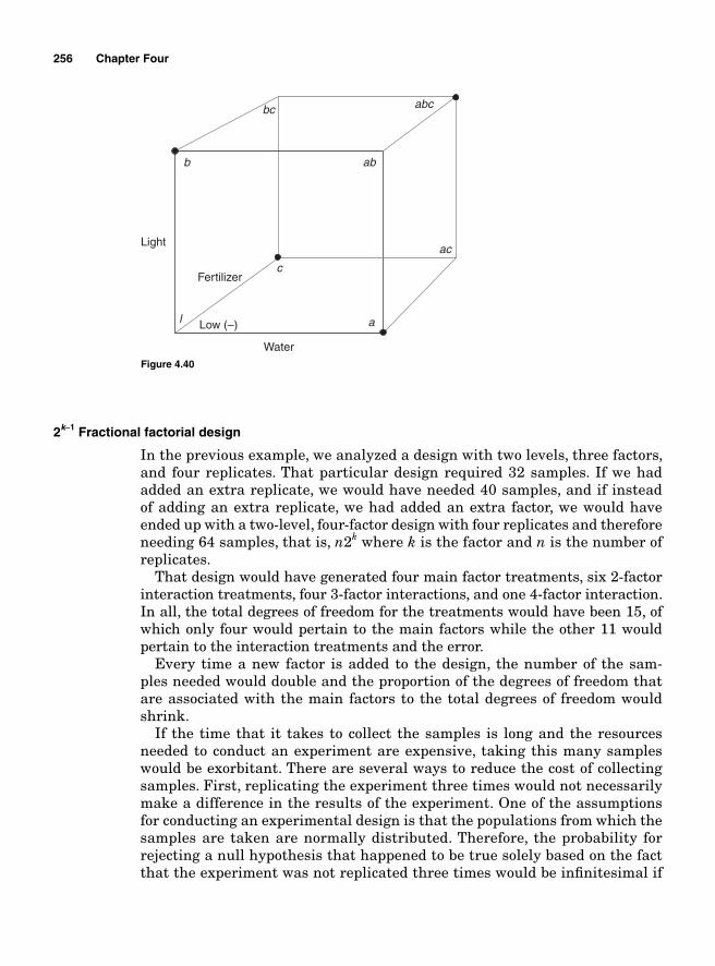
256 Chapter Four
2k-1 Fractional factorial design
In the previous example, we analyzed a design with two levels, three factors, and four replicates. That particular design required 32 samples. If we had added an extra replicate, we would have needed 40 samples, and if instead of adding an extra replicate, we had added an extra factor, we would have ended up with a two-level, four-factor design with four replicates and therefore needing 64 samples, that is, n2k where k is the factor and n is the number of replicates.
That design would have generated four main factor treatments, six 2-factor interaction treatments, four 3-factor interactions, and one 4-factor interaction. In all, the total degrees of freedom for the treatments would have been 15, of which only four would pertain to the main factors while the other 11 would pertain to the interaction treatments and the error.
Every time a new factor is added to the design, the number of the sam-ples needed would double and the proportion of the degrees of freedom that are associated with the main factors to the total degrees of freedom would shrink.
If the time that it takes to collect the samples is long and the resources needed to conduct an experiment are expensive, taking this many samples would be exorbitant. There are several ways to reduce the cost of collecting samples. First, replicating the experiment three times would not necessarily make a difference in the results of the experiment. One of the assumptions for conducting an experimental design is that the populations from which the samples are taken are normally distributed. Therefore, the probability for rejecting a null hypothesis that happened to be true solely based on the fact that the experiment was not replicated three times would be infi nitesimal if
Figure 4.40
b
a
c
l
ab
ac
abcbc
Water
Light
Low (–)
Fertilizer
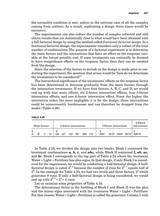
Improve 257
the normality condition is met, unless in the extreme case of all the samples coming from outliers. As a result, replicating a design three times would be excessive.
The experimenter can also reduce the number of samples collected and still obtain results that are statistically close to what would have been obtained with a full factorial design by using the method called fractional factorial design. In a fractional factorial design, the experimenter considers only a subset of the total number of combinations. The purpose of a factorial experiment is to determine the main factors and the interactions that have an effect on the response vari-able at the lowest possible cost. If some treatments can rationally be deemed to have insignifi cant effects on the response factor, then they can be omitted from the design.
Since the selection of the factors to include in the design is made prior to con-ducting the experiment, the question that arises would be “how do we determine the treatments to be considered?”
The hierarchical signifi cance of the treatments’ effects on the response factor has been determined to decrease gradually from the main factors through the interaction treatments. If we have four factors, A, B, C, and D, we would end up with four main effects, six 2-factor interaction effects, four 3-factor interaction effects, and one 4-factor interaction effect. Since the higher the interaction order, the more negligible it is for the design, those interactions could be unnecessarily burdensome and can therefore be dropped from the model (Table 4.26).
TABLE 4.26
4-Factor Main factors 2-Factor interactions 3-Factor interactions interactions
4 6 4 1A B C D AB AC AD BC BD CD ABC ACD ABD BCD ABCD
In Table 4.24, we divided the design into two blocks. Block I contained the treatment combinations a, b, c, and abc, while Block II contained l, ab, ac,and bc. Block I corresponds to the top part of Table 4.24 where the treatment Water × Light × Fertilizer has plus signs. In that design, if only Block I is consid-ered for the experiment, we would be conducting a half-factorial design. A half-factorial design is noted 2k-1 because the number of runs for 2k−1 equals half of 2k. In the example for Table 4.24, we had two levels and three factors, 23 which generates 8 runs. If only a half-factorial design is being considered, we would end up with 23−1 = 22 = 4 runs.
Let us examine some properties of Table 4.24.The determinant factor in the building of Block I and Block II was the plus
and the minus signs associated with the treatment Water × Light × Fertilizer. For that reason, Water × Light × Fertilizer is called the generator. Column I with
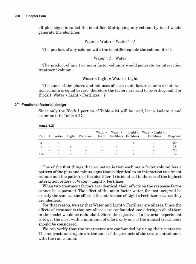
258 Chapter Four
all plus signs is called the identifi er. Multiplying any column by itself would generate the identifi er.
Water Water Water× = =2 I
The product of any column with the identifi er equals the column itself.
Water × I = Water
The product of any two main factor columns would generate an interaction treatment column.
Water × Light = Water × Light
The sums of the pluses and minuses of each main factor column or interac-tion column is equal to zero; therefore the factors are said to be orthogonal. For Block I, Water × Light × Fertilizer = I
23-1 Fractional factorial design
Since only the Block I portion of Table 4.24 will be used, let us isolate it and examine it in Table 4.27.
TABLE 4.27
Water × Water × Light × Water × Light × Run I Water Light Fertilizer Light Fertilizer Fertilizer Fertilizer Response
a + + − − − − + + 20 b + − + − − + − + 18 c + − − + + − − + 20 abc + + + + + + + + 12
One of the fi rst things that we notice is that each main factor column has a pattern of the plus and minus signs that is identical to an interaction treatment column and the pattern of the identifi er (I) is identical to the one of the highest interaction orders of Water × Light × Fertilizer.
When two treatment factors are identical, their effects on the response factor cannot be separated. The effect of the main factor water, for instance, will be exactly the same as the effect of the interaction of Light × Fertilizer because they are identical.
For that reason, we say that Water and Light × Fertilizer are aliases. Since the effects of treatments that are aliases are confounded, considering both of them in the model would be redundant. Since the objective of a factorial experiment is to get the most with a minimum of effort, only one of the aliased treatments should be considered.
We can verify that the treatments are confounded by using their contrasts. The contrasts once again are the sums of the products of the treatment columns with the run column.
Improve 259
Notice that each main factor is aliased with an interaction treatment that involves only the other two main factors.
Contrast a b c abc
Contrast
Water
Light Fertil
= − − +
× iizer
Light
a b c abc
Contrast a b c abc
Cont
= − − +
= − + − +
rrast a b c abc
Contrast
Water Fertilizer
Fer
× = − + − +
ttilizer
Water Light
a b c abc
Contrast a b
= − − + +
= − −× ++ +c abc
To determine what interaction treatment is aliased with a main factor, all we need to do is multiply that main factor with the generator treatment. To fi nd what interaction effect is aliased with water, for instance, we can multiply water with the generator Water × Light × Fertilizer.
Water Water Light Fertilizer Water Light F× × × = × ×2 eertilizer
I Light Fertilizer Light Fertili= × × = × zzer
When determining the effect of water on the response factor, both the effect of water and the effect of its alias Fertilizer × Light is what is actually being determined.
Water + Fertilizer × Light
Light + Water × Fertilizer
Fertilizer + Water × Light
Thus far, all the results that we obtained are based on the fact that we selected Block I for our design. What would have happened if we had chosen Block II, which corresponds to the combinations with minus signs at the generator column?
Block II is called the alternate or complementary half fraction as opposed to Block I, which is the principal fraction. We can see that the identifi er column is the opposite of the generator column.
I Water Light Fertilizer= − × ×
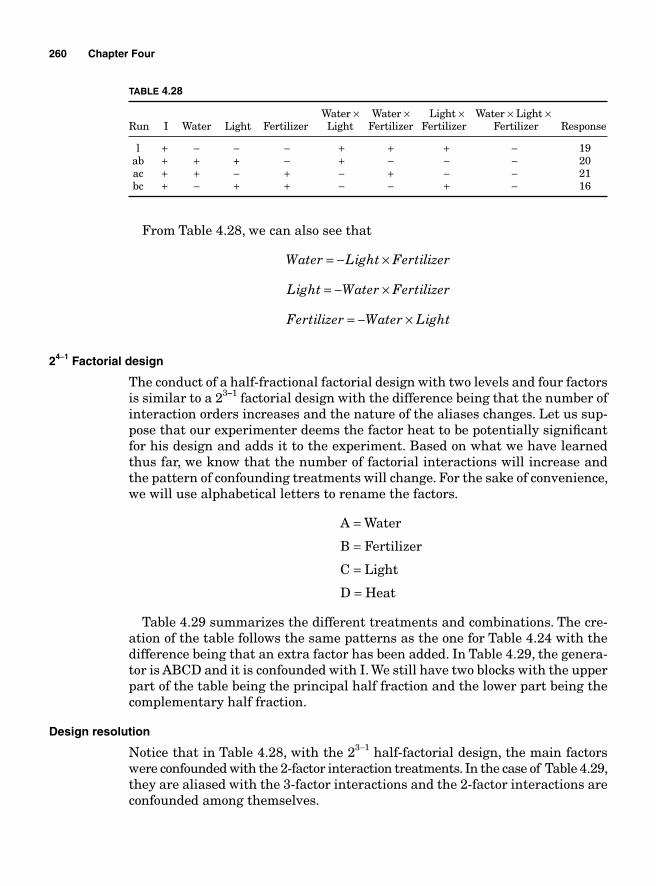
260 Chapter Four
From Table 4.28, we can also see that
Water Light Fertilizer= − ×
Light Water Fertilizer= − ×
Fertilizer Water Light= − ×
24-1 Factorial design
The conduct of a half-fractional factorial design with two levels and four factors is similar to a 23-1 factorial design with the difference being that the number of interaction orders increases and the nature of the aliases changes. Let us sup-pose that our experimenter deems the factor heat to be potentially signifi cant for his design and adds it to the experiment. Based on what we have learned thus far, we know that the number of factorial interactions will increase and the pattern of confounding treatments will change. For the sake of convenience, we will use alphabetical letters to rename the factors.
A = Water
B = Fertilizer
C = Light
D = Heat
Table 4.29 summarizes the different treatments and combinations. The cre-ation of the table follows the same patterns as the one for Table 4.24 with the difference being that an extra factor has been added. In Table 4.29, the genera-tor is ABCD and it is confounded with I. We still have two blocks with the upper part of the table being the principal half fraction and the lower part being the complementary half fraction.
Design resolution
Notice that in Table 4.28, with the 23−1 half-factorial design, the main factors were confounded with the 2-factor interaction treatments. In the case of Table 4.29, they are aliased with the 3-factor interactions and the 2-factor interactions are confounded among themselves.
TABLE 4.28
Water × Water × Light × Water × Light × Run I Water Light Fertilizer Light Fertilizer Fertilizer Fertilizer Response
l + − − − + + + − 19 ab + + + − + − − − 20 ac + + − + − + − − 21 bc + − + + − − + − 16
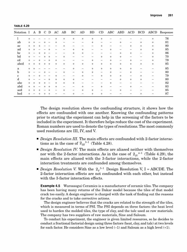
Improve 261
TABLE 4.29
Notation I A B C D AC AB BC AD BD CD ABC ABD ACD BCD ABCD Response
l + − − − − + + + + + + − − − − + 76 ab + + − + − + − − − + − − + − + + 81 ac + + + − − − + − − − + − − + + + 80 ad + + − − + − − + + − − + − − + + 85 bc + − + + − − − + + − − − + + − + 86 bd + − − + + − + − − − + + + − − + 70 cd + − + − + + − − − + − + − + − + 79 abcd + + + + + + + + + + + + + + + + 85
a + + − − − − − + − + + + + + − − 85 b + − − + − − + − + + − + − + − − 80 c + − + − − + − − + − + + + − + − 79 d + − − − + + + + − − − − + + + − 80 abc + + + + − + + + − − − + − − − − 82 abd + + – + + + − − + − + − − + − − 83 acd + + + − + − + − + + − − + − − − 85 bcd + − + + + − − + − + + − − − + − 87
The design resolution shows the confounding structure, it shows how the effects are confounded with one another. Knowing the confounding patterns prior to starting the experiment can help in the screening of the factors to be included in the experiment. It therefore helps reduce the cost of the experiment. Roman numbers are used to denote the types of resolutions. The most commonly used resolutions are III, IV, and V.
■ Design Resolution III. The main effects are confounded with 2-factor interac-tions as in the case of 2 3 1
III− (Table 4.28).
■ Design Resolution IV. The main effects are aliased neither with themselves nor with the 2-factor interactions. As in the case of 2 4 1
IV− (Table 4.29), the
main effects are aliased with the 3-factor interactions, while the 2-factor interaction treatments are confounded among themselves.
■ Design Resolution V. With the 2 5 1V
− Design Resolution V, I = ABCDE. The 2-factor interaction effects are not confounded with each other, but instead with the 3-factor interaction effects.
Example 4.5 Wurossogui Ceramics is a manufacturer of ceramic tiles. The company has been having many returns of the Dakar model because the tiles of that model crack too easily. A design engineer is charged with the task of fi nding out the reasons for the cracks and to take corrective actions.
The design engineer believes that the cracks are related to the strength of the tiles, which is measured in terms of PSI. The PSI depends on three factors: the heat level used to harden the molded tiles, the type of clay, and the talc used as raw materials. The company has two suppliers of raw materials, Sine and Saloum.
To conduct his experiment, the engineer is given limited resources, so he decides to conduct a fractional factorial design using three factors (heat, clay, and talc) at two levels for each factor. He considers Sine as a low level (–1) and Saloum as a high level (+1).
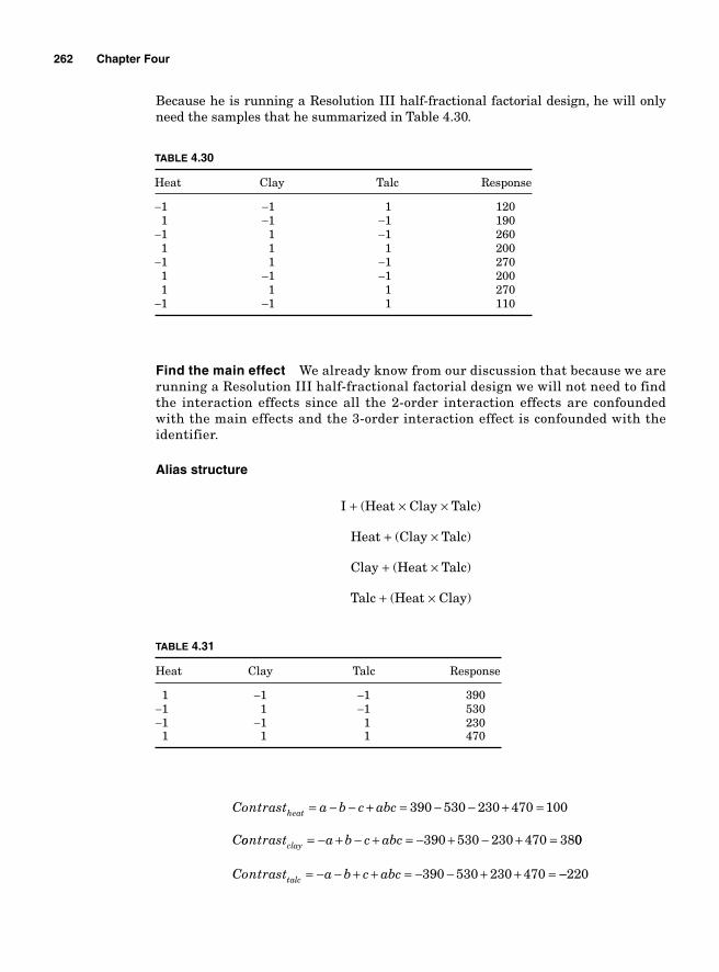
262 Chapter Four
Because he is running a Resolution III half-fractional factorial design, he will only need the samples that he summarized in Table 4.30.
TABLE 4.30
Heat Clay Talc Response
−1 −1 1 120 1 −1 −1 190−1 1 −1 260 1 1 1 200−1 1 −1 270 1 −1 −1 200 1 1 1 270−1 −1 1 110
TABLE 4.31
Heat Clay Talc Response
1 −1 −1 390−1 1 −1 530−1 −1 1 230 1 1 1 470
Find the main effect We already know from our discussion that because we are running a Resolution III half-fractional factorial design we will not need to find the interaction effects since all the 2-order interaction effects are confounded with the main effects and the 3-order interaction effect is confounded with the identifier.
Alias structure
I + (Heat × Clay × Talc)
Heat + (Clay × Talc)
Clay + (Heat × Talc)
Talc + (Heat × Clay)
Contrast a b c abc
C
heat = − − + = − − + =390 530 230 470 100
oontrast a b c abcclay = − + − + = − + − + =390 530 230 470 3800
390 530 230 470Contrast a b c abctalc = − − + + = − − + + = −−220
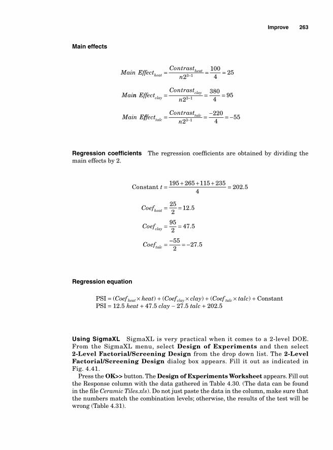
Improve 263
Main effects
Main EffectContrast
n
Mai
heatheat= = =−2
1004
253 1
nn EffectContrast
n
Main E
clayclay= = =−2
3804
953 1
fffectContrast
ntalctalc= = − = −−2
2204
553 1
Regression coeffi cients The regression coeffi cients are obtained by dividing the main effects by 2.
Constant t = + + + =195 265 115 2354
202 5.
Coef
Coef
Coef
heat
clay
talc
= =
= =
=
252
12 5
952
47 5
.
.
−− = −552
27 5.
Regression equation
PSI = (Coef heat × heat) + (Coef clay × clay) + (Coef talc × talc) + Constant PSI = 12.5 heat + 47.5 clay − 27.5 talc + 202.5
Using SigmaXL SigmaXL is very practical when it comes to a 2-level DOE. From the SigmaXL menu, select Design of Experiments and then select 2-Level Factorial/Screening Design from the drop down list. The 2-Level Factorial/Screening Design dialog box appears. Fill it out as indicated in Fig. 4.41.
Press the OK>> button. The Design of Experiments Worksheet appears. Fill out the Response column with the data gathered in Table 4.30. (The data can be found in the fi le Ceramic Tiles.xls). Do not just paste the data in the column, make sure that the numbers match the combination levels; otherwise, the results of the test will be wrong (Table 4.31).
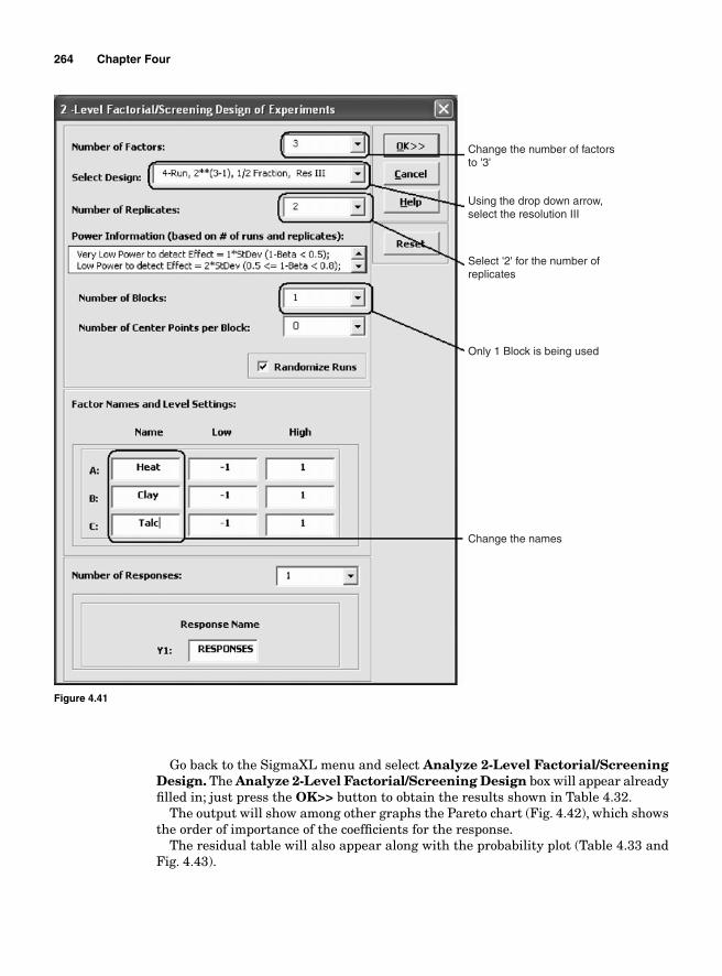
264 Chapter Four
Go back to the SigmaXL menu and select Analyze 2-Level Factorial/Screening Design. The Analyze 2-Level Factorial/Screening Design box will appear already fi lled in; just press the OK>> button to obtain the results shown in Table 4.32.
The output will show among other graphs the Pareto chart (Fig. 4.42), which shows the order of importance of the coeffi cients for the response.
The residual table will also appear along with the probability plot (Table 4.33 and Fig. 4.43).
Change the number of factorsto '3'
Using the drop down arrow, select the resolution III
Select '2' for the number of replicates
Only 1 Block is being used
Change the names
Figure 4.41
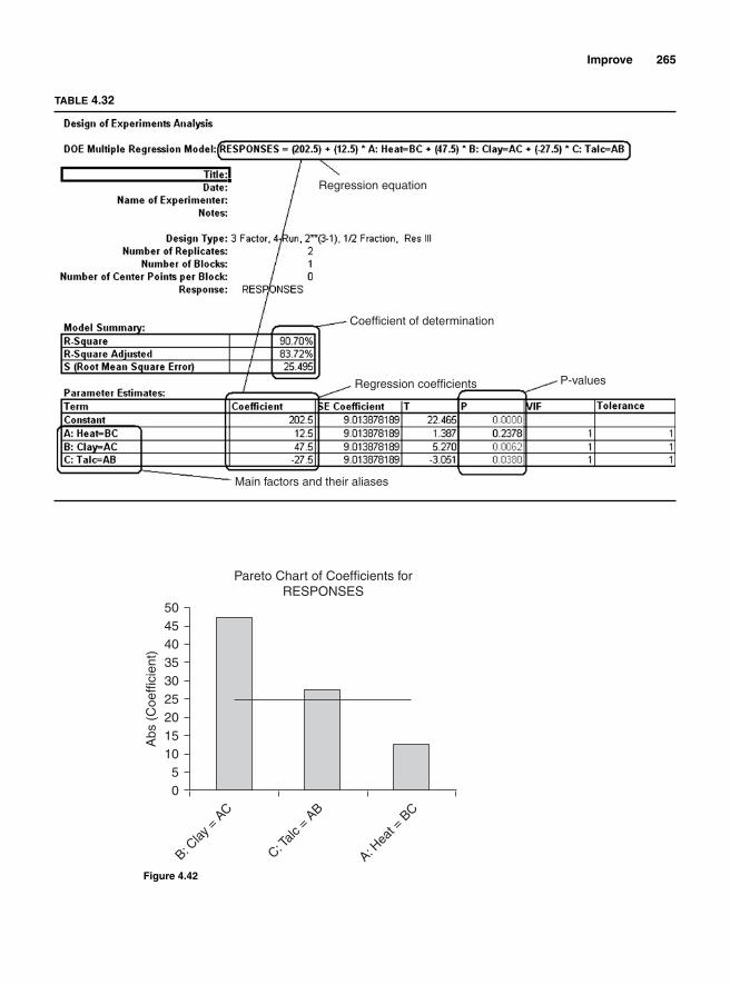
Improve 265
Regression equation
Coefficient of determination
Regression coefficients
Main factors and their aliases
P-values
TABLE 4.32
0
B: Clay
= A
C
C: Talc
= A
B
A: Hea
t = B
C
Abs
(C
oeffi
cien
t)
5101520253035404550
Pareto Chart of Coefficients forRESPONSES
Figure 4.42
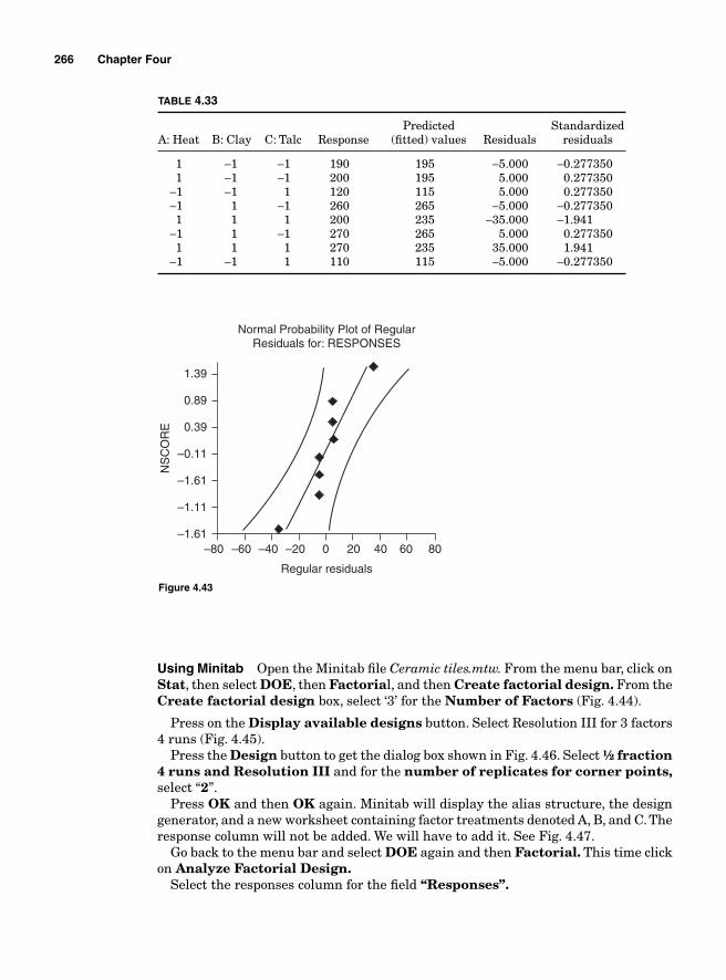
266 Chapter Four
–80 –60 –40 –20 0 20 40 60 80–1.61
–1.11
–1.61
Normal Probability Plot of RegularResiduals for: RESPONSES
Regular residuals
NS
CO
RE
–0.11
0.39
0.89
1.39
Figure 4.43
TABLE 4.33
Predicted StandardizedA: Heat B: Clay C: Talc Response (fi tted) values Residuals residuals
1 −1 −1 190 195 −5.000 −0.277350 1 −1 −1 200 195 5.000 0.277350 −1 −1 1 120 115 5.000 0.277350 −1 1 −1 260 265 −5.000 −0.277350 1 1 1 200 235 −35.000 −1.941 −1 1 −1 270 265 5.000 0.277350 1 1 1 270 235 35.000 1.941 −1 −1 1 110 115 −5.000 −0.277350
Using Minitab Open the Minitab fi le Ceramic tiles.mtw. From the menu bar, click on Stat, then select DOE, then Factorial, and then Create factorial design. From the Create factorial design box, select ‘3’ for the Number of Factors (Fig. 4.44).
Press on the Display available designs button. Select Resolution III for 3 factors 4 runs (Fig. 4.45).
Press the Design button to get the dialog box shown in Fig. 4.46. Select ½ fraction4 runs and Resolution III and for the number of replicates for corner points, select “2”.
Press OK and then OK again. Minitab will display the alias structure, the design generator, and a new worksheet containing factor treatments denoted A, B, and C. The response column will not be added. We will have to add it. See Fig. 4.47.
Go back to the menu bar and select DOE again and then Factorial. This time click on Analyze Factorial Design.
Select the responses column for the fi eld “Responses”.
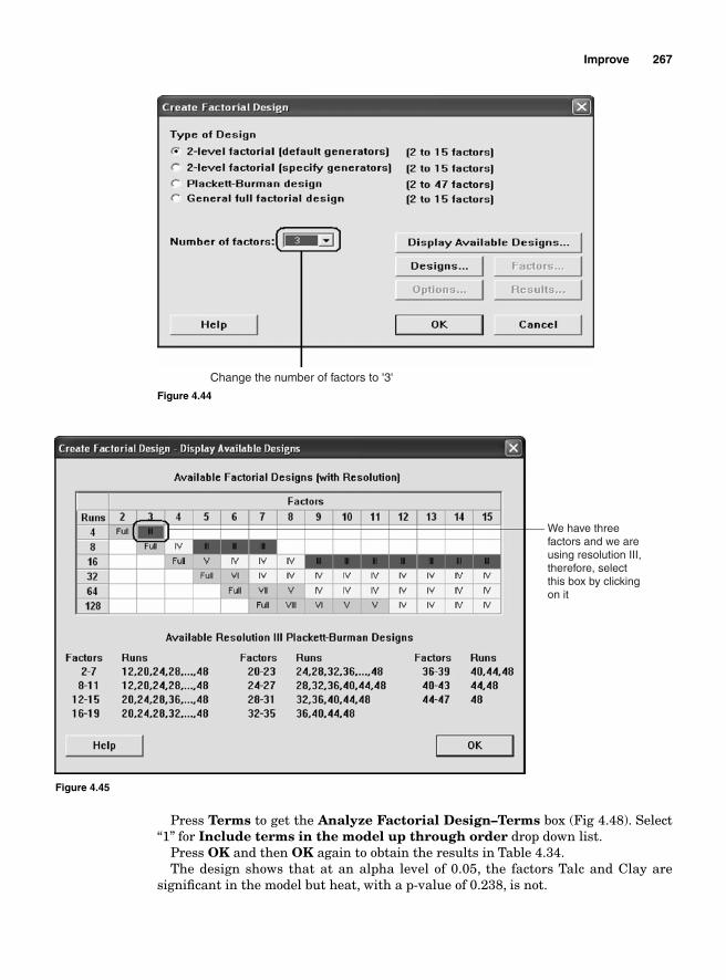
Improve 267
Change the number of factors to '3'
Figure 4.44
We have threefactors and we areusing resolution III, therefore, selectthis box by clicking on it
Figure 4.45
Press Terms to get the Analyze Factorial Design–Terms box (Fig 4.48). Select “1” for Include terms in the model up through order drop down list.
Press OK and then OK again to obtain the results in Table 4.34.The design shows that at an alpha level of 0.05, the factors Talc and Clay are
signifi cant in the model but heat, with a p-value of 0.238, is not.
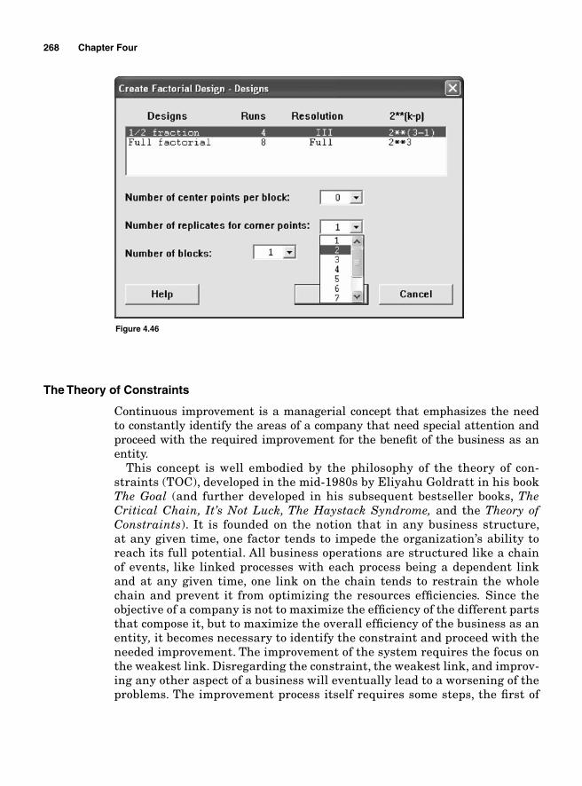
268 Chapter Four
The Theory of Constraints
Continuous improvement is a managerial concept that emphasizes the need to constantly identify the areas of a company that need special attention and proceed with the required improvement for the benefi t of the business as an entity.
This concept is well embodied by the philosophy of the theory of con-straints (TOC), developed in the mid-1980s by Eliyahu Goldratt in his book The Goal (and further developed in his subsequent bestseller books, The Critical Chain, It’s Not Luck, The Haystack Syndrome, and the Theory of Constraints). It is founded on the notion that in any business structure, at any given time, one factor tends to impede the organization’s ability to reach its full potential. All business operations are structured like a chain of events, like linked processes with each process being a dependent link and at any given time, one link on the chain tends to restrain the whole chain and prevent it from optimizing the resources effi ciencies. Since the objective of a company is not to maximize the effi ciency of the different parts that compose it, but to maximize the overall effi ciency of the business as anentity, it becomes necessary to identify the constraint and proceed with the needed improvement. The improvement of the system requires the focus on the weakest link. Disregarding the constraint, the weakest link, and improv-ing any other aspect of a business will eventually lead to a worsening of the problems. The improvement process itself requires some steps, the fi rst of
Figure 4.46
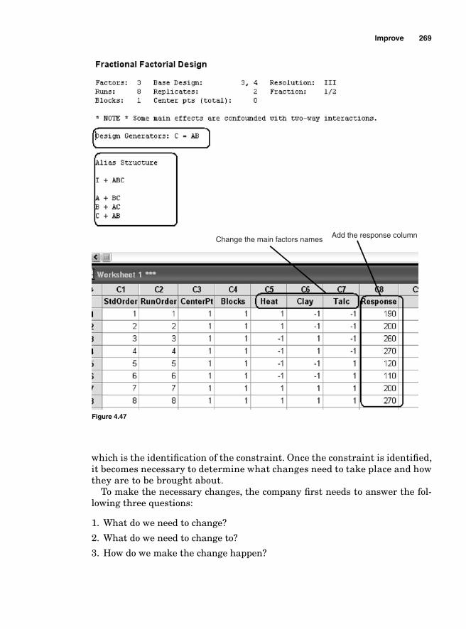
Improve 269
which is the identifi cation of the constraint. Once the constraint is identifi ed, it becomes necessary to determine what changes need to take place and how they are to be brought about.
To make the necessary changes, the company fi rst needs to answer the fol-lowing three questions:
1. What do we need to change?
2. What do we need to change to?
3. How do we make the change happen?
Change the main factors names Add the response column
Figure 4.47
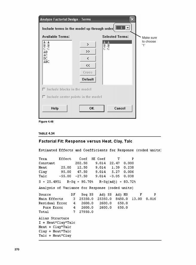
Make sureto choose'1'
Figure 4.48
TABLE 4.34
270
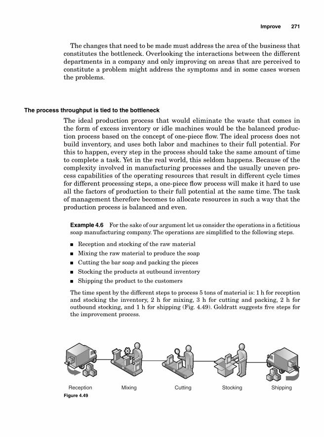
Improve 271
The changes that need to be made must address the area of the business that constitutes the bottleneck. Overlooking the interactions between the different departments in a company and only improving on areas that are perceived to constitute a problem might address the symptoms and in some cases worsen the problems.
The process throughput is tied to the bottleneck
The ideal production process that would eliminate the waste that comes in the form of excess inventory or idle machines would be the balanced produc-tion process based on the concept of one-piece fl ow. The ideal process does not build inventory, and uses both labor and machines to their full potential. For this to happen, every step in the process should take the same amount of time to complete a task. Yet in the real world, this seldom happens. Because of the complexity involved in manufacturing processes and the usually uneven pro-cess capabilities of the operating resources that result in different cycle times for different processing steps, a one-piece fl ow process will make it hard to use all the factors of production to their full potential at the same time. The task of management therefore becomes to allocate resources in such a way that the production process is balanced and even.
Example 4.6 For the sake of our argument let us consider the operations in a fi ctitious soap manufacturing company. The operations are simplifi ed to the following steps.
■ Reception and stocking of the raw material
■ Mixing the raw material to produce the soap
■ Cutting the bar soap and packing the pieces
■ Stocking the products at outbound inventory
■ Shipping the product to the customers
The time spent by the different steps to process 5 tons of material is: 1 h for reception and stocking the inventory, 2 h for mixing, 3 h for cutting and packing, 2 h for outbound stocking, and 1 h for shipping (Fig. 4.49). Goldratt suggests fi ve steps for the improvement process.
Reception Mixing Cutting Stocking Shipping
Figure 4.49
272 Chapter Four
1. Identify the constraint. This scenario clearly shows the “cutting and packing” step to be the critical constraint for the processing line as a whole because no matter how well all the other steps perform it will be impossible for the business to process 5 tons of soap in less than 3 hours. The bottleneck caused by the cutting and packing step translates into two forms of waste: overproduction generated by the upstream operations because the cutting and packing step cannot process all the output that comes from the mixing step (if it operates at its full potential) and underused resources downstream.
An improvement in any aspect of the processing line other than the cutting and packing step will lead to an increase in either excessive idle inventory after the mixing step or more idle machines and higher cycle time.
Once the constraint has been identifi ed, the next step is proceeding with the improvement.
2. Exploit the constraint. A constraint is not a step in the process that is unnecessary and needs to be eliminated. The bottleneck is defi ned as a resource whose capacity is equal to or is less than the demand placed on it. It is the slowest performing area in a process and it determines the level of output generated by that process. Analyze the constraint to ensure that it is only performing the tasks for which it was meant. Decide on what can be done to enhance its performance. Eliminate all the clutter and the non-value-adding activities that might be slowing the constraint. In our example, the exploitation of the constraint should include the inspection of the cutting machine to ensure that it is performing to expectation, an audit and time studies to determine if the employees working at the cutting station are following the process, and an analysis to determine if there is any quality problem that makes it necessary to perform rework or scrap part of the products.
3. Subordinate all activities to the needs of the constraint. In this step, the improvement team focuses all its effort on improving the performance of the constraint. If there is too much rework done at the constraint level, determine what needs to be done toeliminate it. If there is any adjustment that needs to be performed on the machines or too much motion that reduces the employees’ performance that needs to be addressed, the improvement team should fi nd a way to make the necessary improvement.
4. Elevate the constraint. If the process is fl exible to allow labor capacity to be moved from the other steps to the constraint, workers from stocking and shipping, for instance, could be allocated to the cutting step to alleviate it since stocking and shipping would remain idle most of the time.
Removing operational capacity from other processing steps and assigning it to the cutting step will increase the cutting throughput, and since the performance of the overall production process is tied to the constraint, the process yield will be increased.
5. Restart the process without letting inertia become the system’s constraint. Now that capacity has been added to the constraint and its performance increased, the improvement process must be restarted again from step 1 until the current constraint is no longer the constraint. The improvement process must be repeated without letting inertia set in. The way we can tell that the current constraint is no longer the constraint is when further changes are made on the current constraint and they do not positively impact the production process throughput. Therefore,
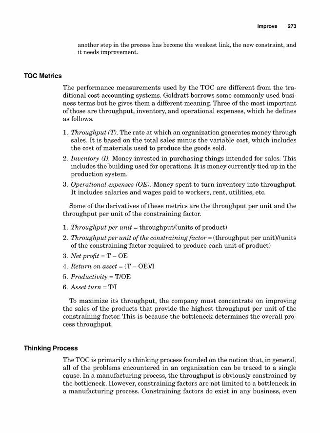
Improve 273
another step in the process has become the weakest link, the new constraint, and it needs improvement.
TOC Metrics
The performance measurements used by the TOC are different from the tra-ditional cost accounting systems. Goldratt borrows some commonly used busi-ness terms but he gives them a different meaning. Three of the most important of those are throughput, inventory, and operational expenses, which he defi nes as follows.
1. Throughput (T). The rate at which an organization generates money throughsales. It is based on the total sales minus the variable cost, which includes the cost of materials used to produce the goods sold.
2. Inventory (I). Money invested in purchasing things intended for sales. This includes the building used for operations. It is money currently tied up in the production system.
3. Operational expenses (OE). Money spent to turn inventory into throughput. It includes salaries and wages paid to workers, rent, utilities, etc.
Some of the derivatives of these metrics are the throughput per unit and the throughput per unit of the constraining factor.
1. Throughput per unit = throughput/(units of product)
2. Throughput per unit of the constraining factor = (throughput per unit)/(units of the constraining factor required to produce each unit of product)
3. Net profi t = T – OE
4. Return on asset = (T – OE)/I
5. Productivity = T/OE
6. Asset turn = T/I
To maximize its throughput, the company must concentrate on improving the sales of the products that provide the highest throughput per unit of the constraining factor. This is because the bottleneck determines the overall pro-cess throughput.
Thinking Process
The TOC is primarily a thinking process founded on the notion that, in general, all of the problems encountered in an organization can be traced to a single cause. In a manufacturing process, the throughput is obviously constrained by the bottleneck. However, constraining factors are not limited to a bottleneck in a manufacturing process. Constraining factors do exist in any business, even
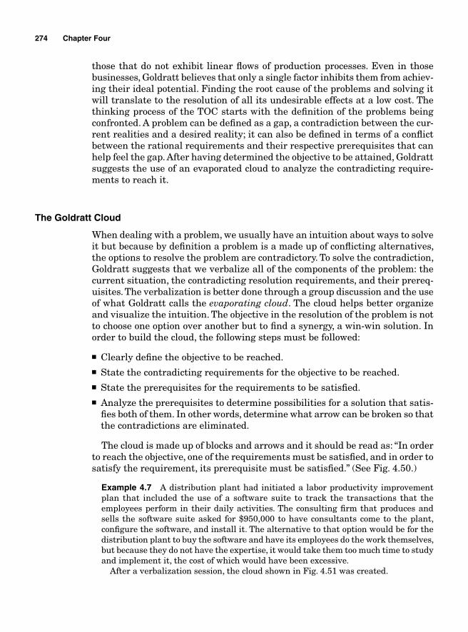
274 Chapter Four
those that do not exhibit linear fl ows of production processes. Even in those businesses, Goldratt believes that only a single factor inhibits them from achiev-ing their ideal potential. Finding the root cause of the problems and solving it will translate to the resolution of all its undesirable effects at a low cost. The thinking process of the TOC starts with the defi nition of the problems being confronted. A problem can be defi ned as a gap, a contradiction between the cur-rent realities and a desired reality; it can also be defi ned in terms of a confl ict between the rational requirements and their respective prerequisites that can help feel the gap. After having determined the objective to be attained, Goldratt suggests the use of an evaporated cloud to analyze the contradicting require-ments to reach it.
The Goldratt Cloud
When dealing with a problem, we usually have an intuition about ways to solve it but because by defi nition a problem is a made up of confl icting alternatives, the options to resolve the problem are contradictory. To solve the contradiction, Goldratt suggests that we verbalize all of the components of the problem: the current situation, the contradicting resolution requirements, and their prereq-uisites. The verbalization is better done through a group discussion and the use of what Goldratt calls the evaporating cloud. The cloud helps better organize and visualize the intuition. The objective in the resolution of the problem is not to choose one option over another but to fi nd a synergy, a win-win solution. In order to build the cloud, the following steps must be followed:
■ Clearly defi ne the objective to be reached.■ State the contradicting requirements for the objective to be reached.■ State the prerequisites for the requirements to be satisfi ed.■ Analyze the prerequisites to determine possibilities for a solution that satis-
fi es both of them. In other words, determine what arrow can be broken so that the contradictions are eliminated.
The cloud is made up of blocks and arrows and it should be read as: “In order to reach the objective, one of the requirements must be satisfi ed, and in order to satisfy the requirement, its prerequisite must be satisfi ed.” (See Fig. 4.50.)
Example 4.7 A distribution plant had initiated a labor productivity improvement plan that included the use of a software suite to track the transactions that the employees perform in their daily activities. The consulting fi rm that produces and sells the software suite asked for $950,000 to have consultants come to the plant, confi gure the software, and install it. The alternative to that option would be for the distribution plant to buy the software and have its employees do the work themselves, but because they do not have the expertise, it would take them too much time to study and implement it, the cost of which would have been excessive.
After a verbalization session, the cloud shown in Fig. 4.51 was created.
Improve 275
During the brainstorming session, it was determined that for the consulting fi rm to do all the implementation work, it would have to send two of its engineers to the plant and have them work full time on the project. The solution to the problem was found by having the consulting fi rm send an engineer to the plant 1 day a week for 3 months. The engineer would train the employees on how to implement the software, give them assignments, and verify the tasks accomplished each time he comes to the plant. The total implementation cost was brought down from $950,000 to $230,000 and the project was completed on time.
The Goldratt Reality Trees
The evaporating cloud is a systemic visualization of the alternative ways of solving a problem. But looking at the cloud alone would not solve the problem. Goldratt suggests that the cloud is analyzed through a verbalization of the problem. The verbalization enables us to understand the current realities and to determine the best ways to reach an ideal situation.
Requirement 1
Requirement 2 Prerequisite 2
Prerequisite 1
ConflictObjective
Figure 4.50
Install the software in thewarehouse
Consultants do allthe work
We do the work
Consultants have the expertiseand they are asking for
$950,000
We need the expertise toimplement the software but
do not have it and wecannot afford $950,000
Conflict
Figure 4.51
276 Chapter Four
Current reality tree
In his book, It’s Not Luck, Goldratt shows that in most cases, what we think to be problems in an organization are not really problems, they are nothing but the undesirable effects (UDEs) of one actual problem. If a manager is confronted with a multitude of poor performing areas in his operations that end up making his score-cards red, chances are that all the problems that he thinks he is facing are nothing but the UDEs of a single actual problem. Unless the actual problem is found and corrected, any attempt to solve the UDEs would only result in costly temporary fi xes that would never totally eliminate the problem and instead would put management in a constant fi re-fi ghting mode. Goldratt suggests that the actual problem can be found by building what he called a current reality tree (CRT).
The CRT is a relational diagram that uses a syllogistic reasoning to analyze all the existing problems in an organization and seeks to fi nd their root causes. The idea is to fi nd relatedness between UDEs by using syllogisms, major prem-ises, minor premises, injections, and conditional reasoning to come to a common cause of all the UDEs.
A CRT is built at a brainstorming session. It starts with the listing of all the UDEs before using a cause-and-effect reasoning to conduct the analysis.
Example 4.8 Ziguinchor Distribution Center is a forward logistics warehousing storage facility that specializes in receiving inventory from suppliers, storing the products, and shipping them to its customers when orders are received. The performance of the warehouse’s operations is tracked using scorecards and the metrics in the scorecards have not been meeting expectations. A brainstorming session was organized to fi nd the root cause of the situation. The members of the team involved with the session started by listing the poor performing areas. Their objective is to fi nd the root cause.
1. High employee turnover 2. Failure to deliver customers’ orders on time 3. Loss of inventory 4. Poor quality 5. Low inventory turnover 6. High lead time 7. Too many work-related accidents 8. Low productivity 9. High operational expenses10. Low morale11. Loss of customers12. Too many customer complaints13. Customer services too costly14. Employee absenteeism15. Ineffi cient production processes
After having inventoried all the UDEs, the team started by fi nding affi nities and causalities between them. Then it created the fi rst branches of the tree. The following branch should be read as: “If the company sends poor quality products and it fails to
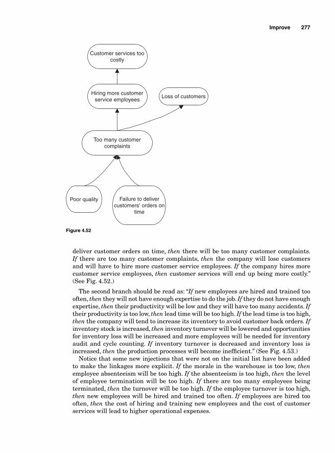
Improve 277
deliver customer orders on time, then there will be too many customer complaints. If there are too many customer complaints, then the company will lose customers and will have to hire more customer service employees. If the company hires more customer service employees, then customer services will end up being more costly.” (See Fig. 4.52.)
The second branch should be read as: “If new employees are hired and trained too often, then they will not have enough expertise to do the job. If they do not have enough expertise, then their productivity will be low and they will have too many accidents. If their productivity is too low, then lead time will be too high. If the lead time is too high, then the company will tend to increase its inventory to avoid customer back orders. If inventory stock is increased, then inventory turnover will be lowered and opportunities for inventory loss will be increased and more employees will be needed for inventory audit and cycle counting. If inventory turnover is decreased and inventory loss is increased, then the production processes will become ineffi cient.” (See Fig. 4.53.)
Notice that some new injections that were not on the initial list have been added to make the linkages more explicit. If the morale in the warehouse is too low, then employee absenteeism will be too high. If the absenteeism is too high, then the level of employee termination will be too high. If there are too many employees being terminated, then the turnover will be too high. If the employee turnover is too high, then new employees will be hired and trained too often. If employees are hired too often, then the cost of hiring and training new employees and the cost of customer services will lead to higher operational expenses.
Customer services toocostly
Hiring more customerservice employees
Too many customercomplaints
Poor quality Failure to delivercustomers’ orders on
time
Loss of customers
Figure 4.52
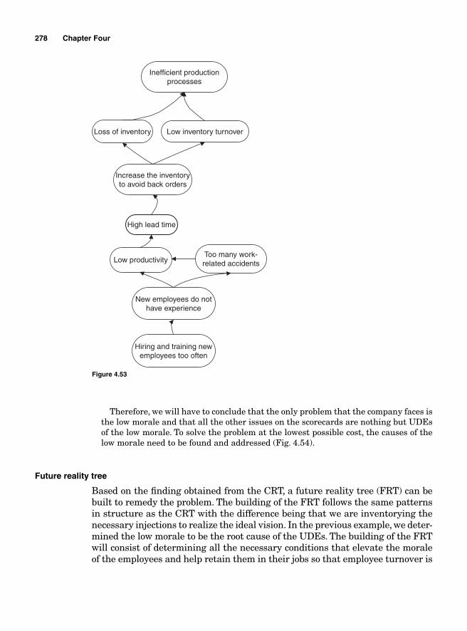
278 Chapter Four
Inefficient productionprocesses
Loss of inventory Low inventory turnover
Increase the inventoryto avoid back orders
High lead time
Low productivityToo many work-related accidents
New employees do nothave experience
Hiring and training newemployees too often
Figure 4.53
Therefore, we will have to conclude that the only problem that the company faces is the low morale and that all the other issues on the scorecards are nothing but UDEs of the low morale. To solve the problem at the lowest possible cost, the causes of the low morale need to be found and addressed (Fig. 4.54).
Future reality tree
Based on the fi nding obtained from the CRT, a future reality tree (FRT) can be built to remedy the problem. The building of the FRT follows the same patterns in structure as the CRT with the difference being that we are inventorying the necessary injections to realize the ideal vision. In the previous example, we deter-mined the low morale to be the root cause of the UDEs. The building of the FRT will consist of determining all the necessary conditions that elevate the morale of the employees and help retain them in their jobs so that employee turnover is
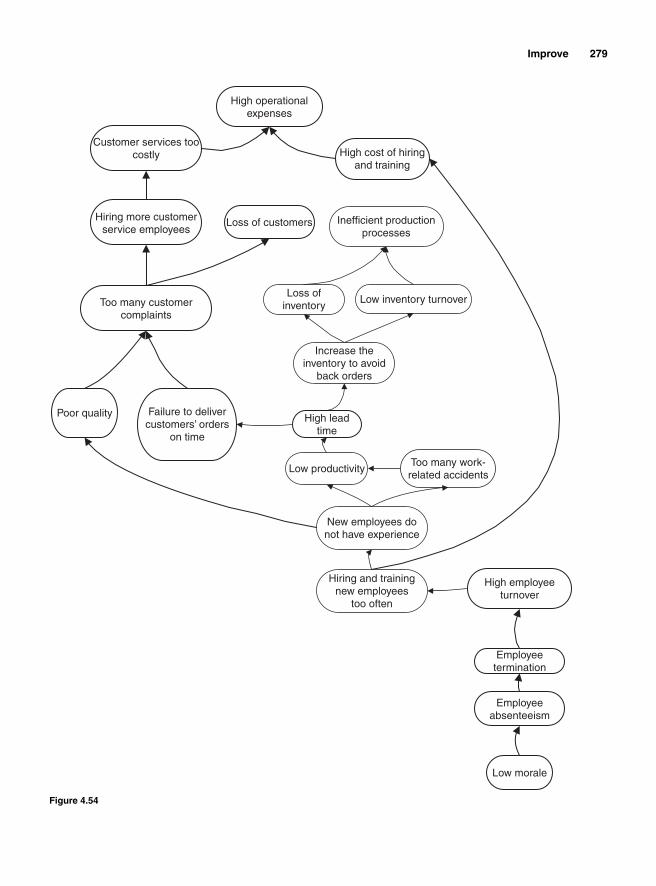
Improve 279
High operationalexpenses
High cost of hiringand training
Loss of customers Inefficient productionprocesses
Loss of inventory
Low inventory turnover
Increase the inventory to avoid
back orders
High leadtime
Low productivityToo many work-related accidents
New employees do not have experience
Hiring and trainingnew employees
too often
High employeeturnover
Employeetermination
Employeeabsenteeism
Low morale
Customer services toocostly
Hiring more customerservice employees
Too many customercomplaints
Poor quality Failure to delivercustomers’ orders
on time
Figure 4.54
280 Chapter Four
reversed and quality and productivity are improved. Of course, the causes of low morale will have to be determined before remedies are considered.
5S
5s is derived from fi ve Japanese words: seiri, seiton, seiso, seiketsu, and shit-suke. In English, these words closely mean, respectively, sort, set in order, shine, standardize, and sustain. 5s represents a fi ve-step process aimed at reducing waste, streamlining operations, and ultimately increase productivity. It is a process of organizing a workplace in order to optimize the effi ciency of the resources’ utilization by keeping it tidy. It is about having the right products and tools (and only the right products and the right tools) at the right places at the right time. It is a process that eliminates clutter, reduces workers’ motion, and increases fl oor capacity by reducing the size of the space needed for opera-tions. By assigning every tool or product a known and identifi ed location close to where it is normally used, confusion is reduced, the time spent looking for things is reduced and, consequently, productivity is improved. The execution of a 5s process is done by enforcing a discipline of cleanliness and orderliness that leads to an improvement in productivity and quality and a better control over inventory. But 5s is not just a form of housekeeping; it is a methodology of organizing and developing a productive work environment.
The benefi ts derived from the implementation of a 5s program can be very tangible. A company with which the author worked saved approximately $1.5 million in one fi scal year and drastically reduced customers’ complaints after implementing 5s. The company was suffering from a great deal of disorganiza-tion in its shipping docks, which resulted in very often systemically shipping customers’ orders but not physically loading the shipments in the trailers. As a result of that, customers’ packages would be found days or weeks later some-where in the warehouse after the customers repeatedly called to complain about not receiving their orders. The cost incurred to correct the mistakes was exorbi-tant because not only would the plant face more rework to fi ll the orders again but the shipping cost was also doubled even though the fi rst packages were not delivered. Implementing 5s helped a great deal to correct the problem by not only reducing customers’ complaints but also by eliminating orphan packages and therefore reducing inventory discrepancies. It also increased fl oor capacity and improved cycle time by improving productivity.
The fi ve steps of the 5s are as follows:
Step 1: Seiri or sorting. In this phase, the team implementing the 5s meth-odology inventories all the tools, material, and equipment that are currently in the plant. Then the team separates the tools and equipment that are presently needed for regular operations from those that are not needed. The products that are not needed are removed and taken away from the space used for daily operations to a temporary location where they will be recycled, reassigned, or disposed of. Sorting enables the operations to claim a great deal of space.
Improve 281
Step 2: Seiton or set in order. Arrange and label the needed tools in such a way that they are handy and easy to use. Every item needs to be at a specifi c place and only that item needs to be there. The workers should not have to travel far to search for the tools that they need to do their work. The storage locations should be clearly identifi ed and the workers should know exactly where to fi nd the tools that they need. This process helps improve effi ciency by reducing motion.
Step 3: Seiso or shine. Once the unneeded items have been removed, the clut-ter and the clog disposed of, and the needed tools and equipment reorganized, labeled, and stored at specifi ed locations, the next step is to steadily clean the workplace. A clean environment renders unexpected items visible. At the plant mentioned previously, customers’ packages were left at places where they were not supposed to be and as a result, they were not being loaded in the trailers. No one was alerting the supervisors because nothing indicated that the packages were not supposed to be where they were found. After the 5s process was implemented, the entire warehouse fl oor was painted and all the locations identifi ed using labels and placards. By keeping the plant clean and tidy, every time a package is left at a wrong location it is very quickly noticed and removed.
Step 4: Seiketsu or standardize. The standardization step consists of creating a sense of consistency in the ways that the tasks are performed. Standardization makes it easy to move workers around without losing out on productivity as well as making it easy to control tools, equipment, and material.
Step 5: Shitsuke or sustain. The last step consists of making the four previ-ous steps a habit for all the employees to follow the procedures. This is the most diffi cult step in a 5s process because if the four previous steps are not translated into a culture for the organization, it is easy to fall back to their old ways.

This page intentionally left blank
Chapter
5Control
Statistical Process Control (SPC)
Once the improvements have been made and the best practices defi ned, man-agement should take control measures to ensure that the production processes do not deviate from the defi ned standards.
In the past, the most widely used technique to ensure quality in products that were bought or sold by most businesses was acceptance sampling. Acceptance sampling is a technique that consists of randomly selecting samples from batches for testing to determine their conformance to predetermined standards. The samples are taken after production has been completed. Once the products have been manufactured, a quality controller inspects some samples to sift out the nonconforming products that would be either discarded or sent for rework. Quality was inspected in the products and the inspection only took place when the products were about to be delivered to customers. It was a quality manage-ment system that only enforced localized actions on the output instead of taking actions on the overall processes that generated the output.
That process was not only time consuming but also it was costly because it negatively affected productivity without necessarily leading to a defect-free pro-duction system. The purpose of improving the quality of the products delivered to customers is not just to satisfy customer; it is also to reduce cost by improving productivity. Improving the quality of the products shipped to the end users by solely relying on inspections at the end of production lines can be extremely exorbitant because it requires extra quality controllers, more equipment and space for the inspections. It would eventually decrease the overall productivity of the business. If special circumstances were to create alterations to the produc-tion process and result in the production of a considerable amount of defects, this would translate into waste and the output would have to be either discarded or reworked. The alternative to scrapping or reworking those defective products is enduring customer complaints and the cost attached to them.
283
Productivity is a business metric that measures the resources’ effi ciency. The productivity of a process is calculated as the ratio of the output to the amount of resources used to produce it, or as the number of items generated for each dollar invested. Expressed as a formula, where P = productivity, O = output, and C = the cost incurred to produce O, productivity would be
P = O/C
There is a positive correlation between productivity of a process and good quality. In a defect-free process, the cost of production is the cost of producing all the goods that are actually used by the customer. In a process that generates defects, the cost of production includes the cost of the defects (inspection costs, returns from customers, rework in the process fl ow, etc.).
One alternative to inspections at the end of production lines is the use of SPC. SPC is a preemptive quality control technique that does not aim at inspecting quality in the products themselves but rather at instilling quality in the process that leads to the production of those products by making sure that the production process is stable and in control. SPC is more about managing the quality of a pro-duction process than it is about sifting defective products from a process output.
The objective of SPC is to avoid waste in the form of scrap and rework by not producing defective products in the fi rst place. It is, therefore, a tool that improves both quality and productivity.
Control charts are the most widely used tools in SPC. They were invented by Dr. Walter Shewhart in the 1920s and later further developed by Dr. Edward Deming.
Some of the important benefi ts of using control charts are
■ To keep the production process in statistical control and stable■ To detect special causes of variations before it is too late■ To determine if there is a need for machine maintenance or operator retraining■ To improve productivity while improving quality■ To prevent defects
Variation Is the Root Cause of Defects
Customers are the ultimate judges of the quality of products and services; their judgments about the quality levels of their purchases depend on certain charac-teristics of the products that they buy. Every product or service exhibits certain characteristics, some of which are critical to its quality. The critical to quality (CTQ) characteristics are those whose absence or nonconformity to customers’ expectations result in the product being deemed of poor quality.
Before producing the goods and services intended for customers, the design engineers predetermine their CTQ characteristics and they include them in the designs of the products with the expectation that each item produced will meet the predetermined standards.
284 Chapter Five
Control 285
When the production process for the goods and services is in progress, the manufacturer tries to generate identical products that meet the engineered standards. But producing perfectly identical products is not possible because variations are an inherent part of every production process. Variations in pro-duction are defi ned as the difference in magnitude between the CTQ charac-teristics of the items produced.
When we buy a case of Pepsi, chances are that all the cans in the case were manufactured by the same machine and within a short time frame. The expec-tations are that the cans are identical. They might indeed seem identical but a closer observation is likely to reveal differences in the CTQs between them; no two cans are likely to be identical.
Some of the CTQs are explicitly written on the cans. For instance, the sugar content is 41 g, the total carbohydrates is 41 g, the total fat is 0, the total pro-tein is 0, the total amount of sodium is 30 mg, the caffeine content is 38 mg, the total calories is 150 g, and the volume of drink inside each can is set at 355 mL. These are very explicit and clearly written CTQs but they are not the only ones. Some CTQs such as taste are implicit and obviously expected to be present in each can. If any of these CTQs deviates too far from these preset targets, the customers would consider the products as being of poor quality. For instance, the customers expect the sugar level to be 41 g. If they buy a can and the sugar level happens to be 30 g or 50 g, they would consider this CTQ to be too far from target of 41 g and, consequently, the can of Pepsi would have failed to meet their expectations. However, if the sugar level was 40.8 g or 41.2 g, the difference from the target of 41 g would be so insignifi cant that it might go unnoticed by the customers. Therefore, the manufacturer can consider cans with sugar levels between 40.8 g and 41.2 g as being good enough to be shipped to customers, but cans with sugar levels of 43 g would be considered as nonconforming to standards and therefore defective.
In manufacturing, the variability can be the results of several factors includ-ing differences in raw materials, differences in operators’ skills, and poor adjust-ments of machines.
Variations can be short lived as in the case of piece-to-piece variations that result from a lack of attention to details on the part of an operator. But they can also be the long-term effect of an unattended machine that is gradually deteriorating over time.
The determination of the nature of the causes of variation depends on the extent of the variations.
Assignable (or special) causes of variation
When the causes of variation generate differences in the CTQs of the output that are signifi cantly important, they are called assignable causes (by Shewhart) or special causes (by Deming) and are considered sources of defects. When they occur, the production process is stopped and the causes of variations investigated. Those causes can range from a badly calibrated machine, to an operator’s lack
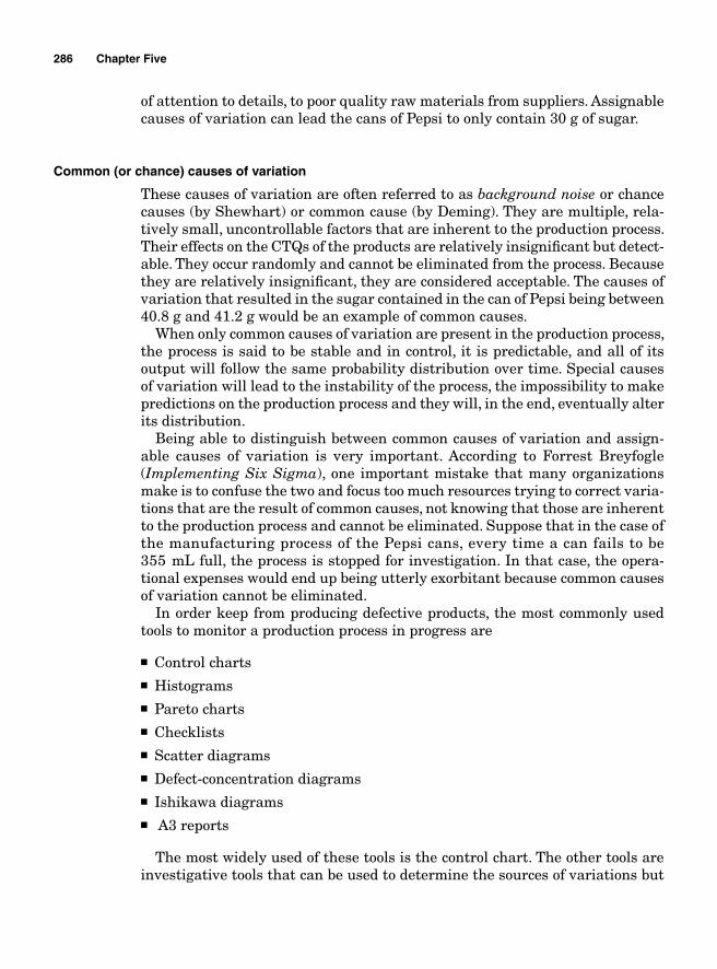
286 Chapter Five
of attention to details, to poor quality raw materials from suppliers. Assignable causes of variation can lead the cans of Pepsi to only contain 30 g of sugar.
Common (or chance) causes of variation
These causes of variation are often referred to as background noise or chance causes (by Shewhart) or common cause (by Deming). They are multiple, rela-tively small, uncontrollable factors that are inherent to the production process. Their effects on the CTQs of the products are relatively insignifi cant but detect-able. They occur randomly and cannot be eliminated from the process. Because they are relatively insignifi cant, they are considered acceptable. The causes of variation that resulted in the sugar contained in the can of Pepsi being between 40.8 g and 41.2 g would be an example of common causes.
When only common causes of variation are present in the production process, the process is said to be stable and in control, it is predictable, and all of its output will follow the same probability distribution over time. Special causes of variation will lead to the instability of the process, the impossibility to make predictions on the production process and they will, in the end, eventually alter its distribution.
Being able to distinguish between common causes of variation and assign-able causes of variation is very important. According to Forrest Breyfogle (Implementing Six Sigma), one important mistake that many organizations make is to confuse the two and focus too much resources trying to correct varia-tions that are the result of common causes, not knowing that those are inherent to the production process and cannot be eliminated. Suppose that in the case of the manufacturing process of the Pepsi cans, every time a can fails to be 355 mL full, the process is stopped for investigation. In that case, the opera-tional expenses would end up being utterly exorbitant because common causes of variation cannot be eliminated.
In order keep from producing defective products, the most commonly used tools to monitor a production process in progress are
■ Control charts■ Histograms■ Pareto charts■ Checklists■ Scatter diagrams■ Defect-concentration diagrams■ Ishikawa diagrams■ A3 reports
The most widely used of these tools is the control chart. The other tools are investigative tools that can be used to determine the sources of variations but
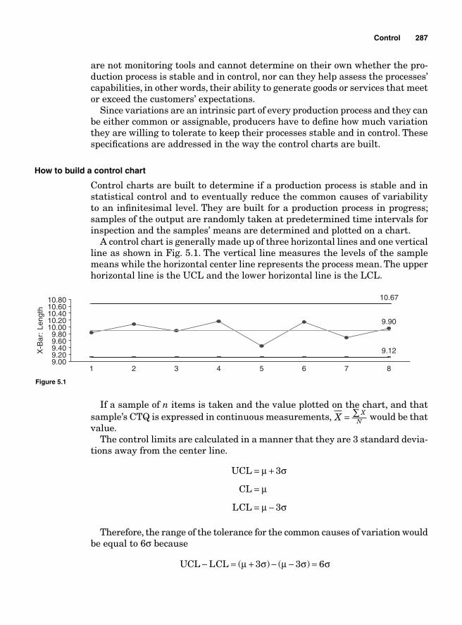
Control 287
are not monitoring tools and cannot determine on their own whether the pro-duction process is stable and in control, nor can they help assess the processes’ capabilities, in other words, their ability to generate goods or services that meet or exceed the customers’ expectations.
Since variations are an intrinsic part of every production process and they can be either common or assignable, producers have to defi ne how much variation they are willing to tolerate to keep their processes stable and in control. These specifi cations are addressed in the way the control charts are built.
How to build a control chart
Control charts are built to determine if a production process is stable and in statistical control and to eventually reduce the common causes of variability to an infi nitesimal level. They are built for a production process in progress; samples of the output are randomly taken at predetermined time intervals for inspection and the samples’ means are determined and plotted on a chart.
A control chart is generally made up of three horizontal lines and one vertical line as shown in Fig. 5.1. The vertical line measures the levels of the sample means while the horizontal center line represents the process mean. The upper horizontal line is the UCL and the lower horizontal line is the LCL.
9.90
9.12
10.67
9.009.209.409.609.80
10.0010.2010.4010.6010.80
1 2 3 4 5 6 7 8
X-B
ar:
Leng
th
Figure 5.1
If a sample of n items is taken and the value plotted on the chart, and that sample’s CTQ is expressed in continuous measurements, X X
N= ∑ would be that value.
The control limits are calculated in a manner that they are 3 standard devia-tions away from the center line.
UCL
CL
LCL
= +
=
= −
μ σ
μ
μ σ
3
3
Therefore, the range of the tolerance for the common causes of variation would be equal to 6σ because
UCL LCL− = + − − =( ) ( )μ σ μ σ σ3 3 6
288 Chapter Five
If all the plots of the sample means fall within the control limits and they follow a random pattern as in the case of Fig. 5.1, the production process is con-sidered as being in statistical control. If a sample is taken and its mean plots outside of the control limits, this would indicate that a special cause of variation has occurred and that the production process needs to be stopped so that the causes of the variation can be investigated.
Example 5.1 A production process is supposed to generate pistons that weigh 10 lb each. Samples of 5 pistons are taken at time intervals of 45 min for inspection and the mean weights of the samples are plotted on the control chart depicted in Fig. 5.2. Every sample mean has fallen within the control limits until sample 33 was plotted. The control chart has shown a stable and in control pattern until sample 33. Since the mean of the sample is way outside of the control limits, something special must have happened to cause that sample to be out of control. The production process needs to be stopped so that the special causes for that variation can be investigated and corrections made. The causes of that variation can be anything from a defective or unattended machine to an operator’s mistake. Once the corrections are made, the process should be back in control.
10.258.47
12.04
8.0010.0012.0014.0016.0018.00
1 2 3 4 5 6 7 8 9 10 11 12 13 14 15 16 17 18 19 20 21 22 23 24 25 26 27 28 29 30 31 32 33 34 35 36 37 38
X-B
ar: B
eer
Figure 5.2
Rational subgrouping
One of the main reasons for using control charts is to be able to detect the special causes of variation and to reduce gradually the common causes of variation to an infi nitesimal level. Since the purpose of the control charts is to detect the signal factors (the factors that signal to the production supervisor the presence of a special cause of variation), the control charts must be built in such a way that only the noise factors (common causes of variation) determine the levels of the control limits.
The building of control charts is based on samples taken from the processing lines. The sizes of the samples taken and the time intervals between samples can impact the confi gurations of the charts and thus their interpretation.
According to Dr. Walter Shewhart, samples should be taken based on rational subgroups. This means that samples should be taken in such a way that the variability within them would only refl ect the chance variability of the process at the exclusion of the assignable variability.
If the samples taken include both assignable and common causes’ observa-tions, the standard deviation used to calculate the control limits would not be the refl ection of only the chance variation. The range of the control limits would end up being too wide to detect signal factors.
When items in the same sample are taken within a short time frame, they are more likely to come from the same lot of chance causes. But if the time frame
Control 289
that it takes to complete a subgroup is too wide, the probability for observations refl ecting assignable causes of variation being included in the samples would be greater. If the time frame is short, the probability for including special causes of variation within samples will be minimized, while the ability to detect the variations between samples due to those causes will be maximized.
Probability for misinterpreting control charts
The concept of building a control chart is close to performing a hypothesis test-ing with the null hypothesis suggesting that the process is stable and in control; therefore, all the dots are within the control limits.
H ocess is in control
H ocess is out of contra
0 :
:
Pr
Pr ool
The null hypothesis is not rejected as long as all the plotted dots are between the upper and lower control limits. If a dot is outside the control limits, the null hypothesis is rejected and the process is considered out of control. As in the case of any hypothesis testing, opportunities for making errors are also present when interpreting control charts.
Type I error `
One of the purposes of control charts is to reduce the variations to an insig-nifi cant level; therefore, the control limits are set to levels where only common causes of variations are tolerated and at the same time the probability for com-mitting a Type I error is minimized.
Based on the rules of hypothesis testing, a Type I error α is founded on reject-ing the null hypothesis when in fact it is true, on concluding that the process is out of control when in fact it is in control. The Type I error α is therefore tied to the control limits and its probability can be estimated. The Shewhart control charts are the most commonly used. They are built by using the process mean as the center line and the upper and lower control limits are three standard deviations away from the center line.
If the actual process mean μ and standard deviation σ are known, based on the central limit theorem, the control limits and the center line would be
UCL
CL
LCL
= +
=
= −
μ σ
μ
μ σ
3
3
n
n
where n is the number of observations in a subgroup.
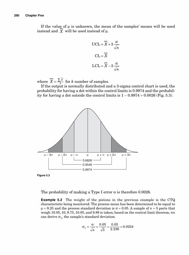
290 Chapter Five
If the value of μ is unknown, the mean of the samples’ means will be used instead and X will be used instead of μ.
UCL
CL
LCL
= +
=
= −
Xn
X
Xn
3
3
σ
σ
where X Xk= ∑ for k number of samples.
If the output is normally distributed and a 3-sigma control chart is used, the probability for having a dot within the control limits is 0.9974 and the probabil-ity for having a dot outside the control limits is 1 – 0.9974 = 0.0026 (Fig. 5.3).
μ – 3σ μ – 2σ μ + 2σ μ + 3σμ – σ μ + σμ
0.68260.9546
0.9974
Figure 5.3
The probability of making a Type I error α is therefore 0.0026.
Example 5.2 The weight of the pistons in the previous example is the CTQ characteristic being monitored. The process mean has been determined to be equal to μ = 9.25 and the process standard deviation is σ = 0.05. A sample of n = 5 parts that weigh 10.05, 10, 9.75, 10.05, and 9.89 is taken; based on the central limit theorem, we can derive σ x, the sample’s standard deviation.
σ σx n
= = = =0 05
5
0 052 236
0 0224. .
..
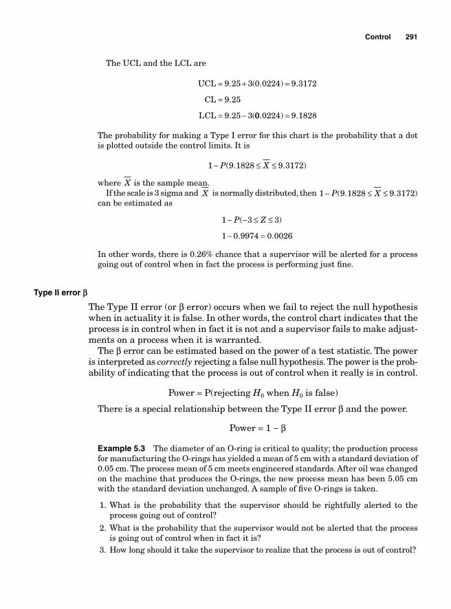
Control 291
The UCL and the LCL are
UCL
CL
LCL
= + =
=
= −
9 25 3 0 0224 9 3172
9 25
9 25 3
. ( . ) .
.
. (00 0224 9 1828. ) .=
The probability for making a Type I error for this chart is the probability that a dot is plotted outside the control limits. It is
1 9 1828 9 3172− ≤ ≤P X( . . )
where X is the sample mean.If the scale is 3 sigma and X is normally distributed, then 1 9 1828 9 3172− ≤ ≤P X( . . )
can be estimated as
1 3 3
1 0 9974 0 0026
− − ≤ ≤
− =
P Z( )
. .
In other words, there is 0.26% chance that a supervisor will be alerted for a process going out of control when in fact the process is performing just fi ne.
Type II error a
The Type II error (or β error) occurs when we fail to reject the null hypothesis when in actuality it is false. In other words, the control chart indicates that the process is in control when in fact it is not and a supervisor fails to make adjust-ments on a process when it is warranted.
The β error can be estimated based on the power of a test statistic. The power is interpreted as correctly rejecting a false null hypothesis. The power is the prob-ability of indicating that the process is out of control when it really is in control.
Power = P(rejecting H0 when H0 is false)
There is a special relationship between the Type II error β and the power.
Power = 1 − β
Example 5.3 The diameter of an O-ring is critical to quality; the production process for manufacturing the O-rings has yielded a mean of 5 cm with a standard deviation of 0.05 cm. The process mean of 5 cm meets engineered standards. After oil was changed on the machine that produces the O-rings, the new process mean has been 5.05 cm with the standard deviation unchanged. A sample of fi ve O-rings is taken.
1. What is the probability that the supervisor should be rightfully alerted to the process going out of control?
2. What is the probability that the supervisor would not be alerted that the process is going out of control when in fact it is?
3. How long should it take the supervisor to realize that the process is out of control?
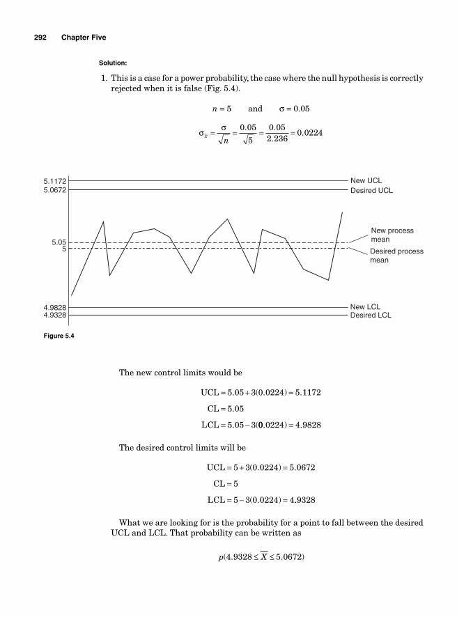
292 Chapter Five
Solution:
1. This is a case for a power probability, the case where the null hypothesis is correctly rejected when it is false (Fig. 5.4).
n = 5 and σ = 0.05
σ σx
n= = = =0 05
5
0 052 236
0 0224. .
..
4.93284.9828
55.05
5.06725.1172 New UCL
Desired UCL
New LCLDesired LCL
New processmean
Desired processmean
Figure 5.4
The new control limits would be
UCL
CL
LCL
= + =
=
= −
5 05 3 0 0224 5 1172
5 05
5 05 3
. ( . ) .
.
. (00 0224 4 9828. ) .=
The desired control limits will be
UCL
CL
LCL
= + =
=
= − =
5 3 0 0224 5 0672
5
5 3 0 0224 4
( . ) .
( . ) ..9328
What we are looking for is the probability for a point to fall between the desired UCL and LCL. That probability can be written as
p X( . . )4 9328 5 0672≤ ≤
Control 293
which translates into
pDesired LCL new
ZDesired UCL new
x x
−≤ ≤ −⎛
⎝⎜
⎞
⎠
μσ
μσ ⎟⎟
− ≤ ≤ −⎛⎝⎜
p Z4 9328 5 05
0 02245 0672 5 05
0 0224. .
.. .
.⎞⎞⎠⎟
Based on the normal distribution theory, this is equivalent to
p Z( . . ) ( . ) ( . ) .− ≤ ≤ = − − = −5 232 0 768 0 767 5 323 0 777Φ Φ 00 0 777= .
Φ( . ) .0 767 0 777=
and Φ( . )− =5 323 0 are found on the Z table.
The probability that a point would be plotted between the desired control limits is 0.777.
The probability that a point would be plotted outside the desired control limits is 1 0 777 0 223− =. . . So the power probability, the probability that the supervisor would be rightfully alerted that the process is going out of control, the probability that the null hypothesis is correctly rejected when it is actually true, is 0.223.
2. This is an example of a Type II error β. A false null hypothesis fails to be rejected, the process is believed to be in control when in fact it is not.
Based on the power probability 1 1 0 777 0 223− = − =β . . , it follows that the probability that the null hypothesis fails to be rejected when it is actually false, in other words, the probability that the supervisor would not be alerted that the process is going out of control when in fact it is β = 0 777. .
3. The time that it takes a control chart to run before an out of control process is detected can also be estimated. The average run length (ARL) measures the average number of samples taken to monitor a process until the process signals that it is operating at a different level from the one it started with. The ARL is based on the probability that a point would be plotted outside the control limits. The probability that the null hypothesis would be correctly rejected when it is actually false is the power probability and it is equal to 1 − β. ARL is the inverse of the power probability and it is, consequently,
ARL =−
= =11
10 223
4 484β .
.
It would take 4.484 time measurement units to realize that the process is out of control.
How to determine if the process is out of control—WECO rules
The assumptions thus far have been based on the fact that a process is in con-trol if all the dots are within the control limits and they are randomly spread. Under some circumstances, all the dots can be within the control limits and not be randomly spread. In that case, a close observation of the control chart can reveal that the process is following a pattern that shows that it is about to go out of control.
Figure 5.5 shows a chart with all the dots being within the control limits. However, the quality controller should be alarmed by the trend. If the chart
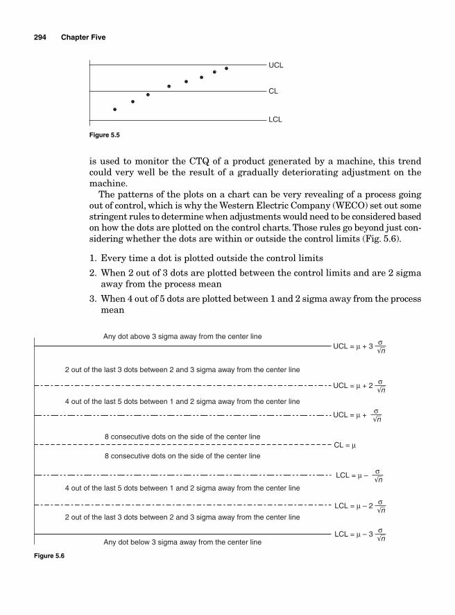
294 Chapter Five
UCL
CL
LCL
Figure 5.5
is used to monitor the CTQ of a product generated by a machine, this trend could very well be the result of a gradually deteriorating adjustment on the machine.
The patterns of the plots on a chart can be very revealing of a process going out of control, which is why the Western Electric Company (WECO) set out some stringent rules to determine when adjustments would need to be considered based on how the dots are plotted on the control charts. Those rules go beyond just con-sidering whether the dots are within or outside the control limits (Fig. 5.6).
1. Every time a dot is plotted outside the control limits
2. When 2 out of 3 dots are plotted between the control limits and are 2 sigma away from the process mean
3. When 4 out of 5 dots are plotted between 1 and 2 sigma away from the process mean
Any dot above 3 sigma away from the center line
Any dot below 3 sigma away from the center line
2 out of the last 3 dots between 2 and 3 sigma away from the center line
2 out of the last 3 dots between 2 and 3 sigma away from the center line
4 out of the last 5 dots between 1 and 2 sigma away from the center line
4 out of the last 5 dots between 1 and 2 sigma away from the center line
8 consecutive dots on the side of the center line
8 consecutive dots on the side of the center line
LCL = μ – 3 σn
LCL = μ – 2 σn
LCL = μ – σn
UCL = μ + 3 σn
UCL = μ + 2 σn
UCL = μ +
CL = μ
σn
Figure 5.6
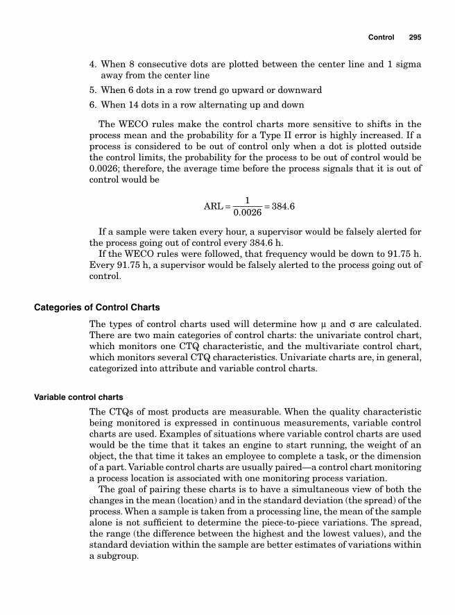
Control 295
4. When 8 consecutive dots are plotted between the center line and 1 sigma away from the center line
5. When 6 dots in a row trend go upward or downward
6. When 14 dots in a row alternating up and down
The WECO rules make the control charts more sensitive to shifts in the process mean and the probability for a Type II error is highly increased. If a process is considered to be out of control only when a dot is plotted outside the control limits, the probability for the process to be out of control would be 0.0026; therefore, the average time before the process signals that it is out of control would be
ARL = =1
0 0026384 6
..
If a sample were taken every hour, a supervisor would be falsely alerted for the process going out of control every 384.6 h.
If the WECO rules were followed, that frequency would be down to 91.75 h. Every 91.75 h, a supervisor would be falsely alerted to the process going out of control.
Categories of Control Charts
The types of control charts used will determine how μ and σ are calculated. There are two main categories of control charts: the univariate control chart, which monitors one CTQ characteristic, and the multivariate control chart, which monitors several CTQ characteristics. Univariate charts are, in general, categorized into attribute and variable control charts.
Variable control charts
The CTQs of most products are measurable. When the quality characteristic being monitored is expressed in continuous measurements, variable control charts are used. Examples of situations where variable control charts are used would be the time that it takes an engine to start running, the weight of an object, the that time it takes an employee to complete a task, or the dimension of a part. Variable control charts are usually paired—a control chart monitoring a process location is associated with one monitoring process variation.
The goal of pairing these charts is to have a simultaneous view of both the changes in the mean (location) and in the standard deviation (the spread) of the process. When a sample is taken from a processing line, the mean of the sample alone is not suffi cient to determine the piece-to-piece variations. The spread, the range (the difference between the highest and the lowest values), and the standard deviation within the sample are better estimates of variations within a subgroup.
296 Chapter Five
The most commonly associated control charts are the X and R charts and the X and s charts.
The mean and range charts— X and R charts
The X and R charts are paired charts created from CTQ measurements of a process yield to monitor the process central tendency and the process variability. To create X and R charts, small samples of the same sizes (usually between 2 and 5) of successive parts are taken at preset time intervals.
The samples are taken, and their mean and range are calculated and plotted on their respective charts. The key factors in creating X and R charts are the deter-mination of the sample sizes, the time to order, and the number of samples.
The sample sizes are determined based on rational subgrouping. The sam-ples are chosen in such a way that the probability for having special causes of variation within samples is minimized. In so doing, the range within samples is smaller and only refl ects common causes of variation. If only background noises are present within subgroups, then any signal factor that arises between samples would rightfully alert to changes in the process, and prompt for a production stoppage and an investigation for suitable actions. To reduce the opportunities of having mixed common and special causes of variations within the same sample, the pieces of the sample need to be taken at the same time or within a very short time frame. If, for instance, some pieces of a sample were taken at the end of a shift and some pieces at the beginning of the next shift or some before lunch and some after, opportunity for including special causes of variations would more likely be greater. A number of at least 25 samples should be taken initially to provide opportunities for main sources of variations to appear.
The time to order (the frequency of the sampling) should be determined in such a way that it effectively detects signal factors at a reasonable cost and soon enough so that appropriate actions can be taken to bring the process back in control. In the initial phases of the building of the control charts, samples should be taken at shorter time intervals to see how the process behaves. If the process is deemed stable and in control, the time to order (time between two samples) can be gradually increased until it becomes cost effective. Depending on the processes, the time to order can be anywhere between twice per shift to every 30 min.
Calculating the sample statistics to be plotted
The sample statistics plotted on the two charts are X and R, with X measuring the samples’ means (measure of location) and R measuring the samples’ ranges (measure of dispersion).
If X X Xn1 2, , ..., are the pieces contained in a sample being considered, then
X
X X Xn
n=+ + +1 2
...
Control 297
and
R X Xhighest lowest= −
where Xhighest and Xlowest are the highest and the lowest observations, respec-tively, in the sample.
Example 5.4 A sample of fi ve pieces that weigh 12, 12.03, 12.07, 11.09, and 12.01 are taken from a production line. What are X and R?
XX X X
nn=
+ + += + + + +1 2 12 12 03 12 07 11 09 12 01
5
... . . . . == =59 25
11 84.
.
R X Xhighest lowest= − = − =12 07 11 09 0 98. . .
Calculating the center line and control limits
To calculate the control limit and the center line, it is customary to start with the range chart fi rst and then the process average chart. If the R chart displays a process out of control due to high variability, there is no need to proceed with the X until corrective actions are taken.
Center lines. The center line for the R chart is the mean range and it is obtained by adding the values of the ranges of the samples and dividing them by the number of their scores. For k number of samples,
R
R R Rk
k=+ + +1 2
...
The center line for X chart is the mean of the sample means and it is obtained by adding the sample means and then dividing the obtained value by the number of scores.
X
X X Xk
k= + + +1 2 ...
Example 5.5 Based on the data in Table 5.1, fi nd the center lines for the X and the R charts.
TABLE 5.1
X 4.99 5.1 5 5 5.1 4.97 5.02 5.01 5.01 4.99 5.01 5.02 5.02 5.1 5.01R 0.3 0.3 0.3 0.3 0.3 0.29 0.3 0.3 0.3 0.32 0.3 0.3 0.3 0.3 0.3
X 4.96 5.02 5.03 5 5.03 4.99 4.96 5 5.02 5.02 5.02 5.01R 0.31 0.3 0.3 0.3 0.31 0.31 0.31 0.3 0.29 0.31 0.3 0.31
298 Chapter Five
Solution: The center line for the X chart is
XX X X
k= + + + = =1 2 27 135 41
275 02
... ..
The center line for the R chart is
RR R R
k=
+ + += =1 2 27 8 15
270 3
... ..
Control limits. Control limits are calculated in such a way that they will contain the process variations if only common causes are present. The upper and lower control limits are three standard deviations away from the center lines.
Control limits for X chart
The UCL and LCL for the X chart are
UCL
CL
LCL
= +
=
= −
X
X
X
X
X
3
3
σ
σ
The biggest unknown here is the σ X, the standard deviation of the samples. Its value can be determined in several ways. One way to do it would be through the use of the standard error estimate σ
n based on the central limit theorem and another one would be the use of the mean range.
There is a constant relationship between the mean range and the standard deviation for normally distributed data.
σsr
= Rd2
where the constant d2 is a function of n.
Standard-error-based X chart
The standard-error-based chart is straightforward. Based on the central limit theorem, the standard deviation used for the control limits is nothing but the standard deviation of the process divided by the square root of the sample size. Therefore, we obtain:
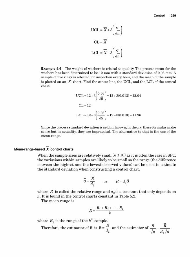
Control 299
UCL
CL
LCL
= +⎛⎝⎜
⎞⎠⎟
=
= −⎛⎝⎜
⎞⎠⎟
Xn
X
Xn
3
3
σ
σ
Example 5.6 The weight of washers is critical to quality. The process mean for the washers has been determined to be 12 mm with a standard deviation of 0.03 mm. A sample of fi ve rings is selected for inspection every hour, and the mean of the sample is plotted on an X chart. Find the center line, the UCL, and the LCL of the control chart.
UCL
CL
L
= +⎛⎝⎜
⎞⎠⎟
= + =
=
12 30 03
512 3 0 013 12 04
12
.( . ) .
CCL = −⎛⎝⎜
⎞⎠⎟
= − =12 30 03
512 3 0 013 11 96
.( . ) .
Since the process standard deviation is seldom known, in theory, these formulas make sense but in actuality, they are impractical. The alternative to that is the use of the mean range.
Mean-range-based X control charts
When the sample sizes are relatively small ( )n ≤ 10 as it is often the case in SPC, the variations within samples are likely to be small so the range (the difference between the highest and the lowest observed values) can be used to estimatethe standard deviation when constructing a control chart.
σsr
= Rd2
or R d= 2σsr
where R is called the relative range and d2 is a constant that only depends on n. It is found in the control charts constant in Table 5.2.
The mean range is
R
R R Rk
k=+ + +1 2
...
where Rk is the range of the kth sample.
Therefore, the estimator of σsr
is σsr = R
d2 and the estimator of σ
sr
n
R
d n=
2
.
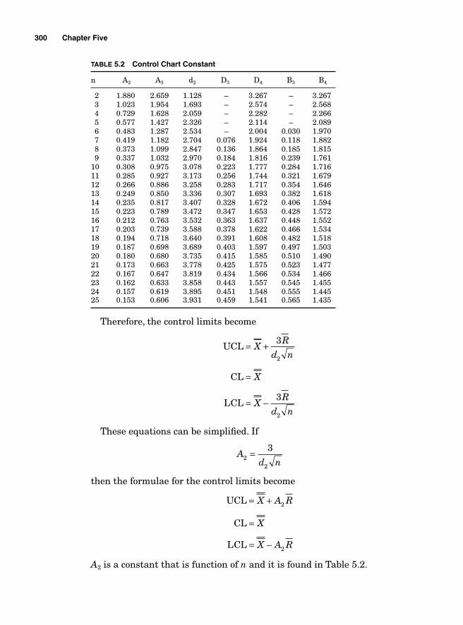
300 Chapter Five
TABLE 5.2 Control Chart Constant
n A2 A3 d2 D3 D4 B3 B4
2 1.880 2.659 1.128 – 3.267 – 3.267 3 1.023 1.954 1.693 – 2.574 – 2.568 4 0.729 1.628 2.059 – 2.282 – 2.266 5 0.577 1.427 2.326 – 2.114 – 2.089 6 0.483 1.287 2.534 – 2.004 0.030 1.970 7 0.419 1.182 2.704 0.076 1.924 0.118 1.882 8 0.373 1.099 2.847 0.136 1.864 0.185 1.815 9 0.337 1.032 2.970 0.184 1.816 0.239 1.76110 0.308 0.975 3.078 0.223 1.777 0.284 1.71611 0.285 0.927 3.173 0.256 1.744 0.321 1.67912 0.266 0.886 3.258 0.283 1.717 0.354 1.64613 0.249 0.850 3.336 0.307 1.693 0.382 1.61814 0.235 0.817 3.407 0.328 1.672 0.406 1.59415 0.223 0.789 3.472 0.347 1.653 0.428 1.57216 0.212 0.763 3.532 0.363 1.637 0.448 1.55217 0.203 0.739 3.588 0.378 1.622 0.466 1.53418 0.194 0.718 3.640 0.391 1.608 0.482 1.51819 0.187 0.698 3.689 0.403 1.597 0.497 1.50320 0.180 0.680 3.735 0.415 1.585 0.510 1.49021 0.173 0.663 3.778 0.425 1.575 0.523 1.47722 0.167 0.647 3.819 0.434 1.566 0.534 1.46623 0.162 0.633 3.858 0.443 1.557 0.545 1.45524 0.157 0.619 3.895 0.451 1.548 0.555 1.44525 0.153 0.606 3.931 0.459 1.541 0.565 1.435
Therefore, the control limits become
UCL
CL
LCL
= +
=
= −
XR
d n
X
XR
d n
3
3
2
2 These equations can be simplifi ed. If
A
d n22
3=
then the formulae for the control limits become
UCL
CL
LCL
= +
=
= −
X A R
X
X A R
2
2 A2 is a constant that is function of n and it is found in Table 5.2.
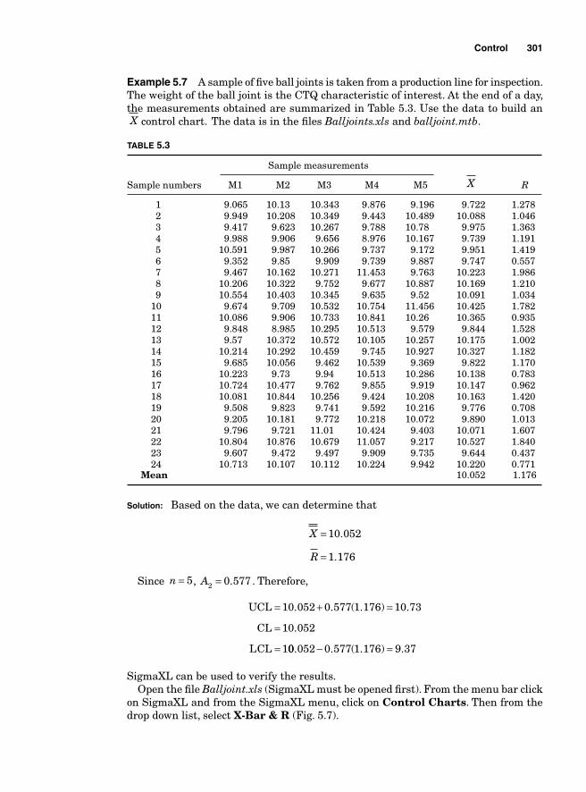
Control 301
Example 5.7 A sample of fi ve ball joints is taken from a production line for inspection. The weight of the ball joint is the CTQ characteristic of interest. At the end of a day, the measurements obtained are summarized in Table 5.3. Use the data to build an X control chart. The data is in the fi les Balljoints.xls and balljoint.mtb.
TABLE 5.3
Sample measurements
Sample numbers M1 M2 M3 M4 M5 X R
1 9.065 10.13 10.343 9.876 9.196 9.722 1.278 2 9.949 10.208 10.349 9.443 10.489 10.088 1.046 3 9.417 9.623 10.267 9.788 10.78 9.975 1.363 4 9.988 9.906 9.656 8.976 10.167 9.739 1.191 5 10.591 9.987 10.266 9.737 9.172 9.951 1.419 6 9.352 9.85 9.909 9.739 9.887 9.747 0.557 7 9.467 10.162 10.271 11.453 9.763 10.223 1.986 8 10.206 10.322 9.752 9.677 10.887 10.169 1.210 9 10.554 10.403 10.345 9.635 9.52 10.091 1.034 10 9.674 9.709 10.532 10.754 11.456 10.425 1.782 11 10.086 9.906 10.733 10.841 10.26 10.365 0.935 12 9.848 8.985 10.295 10.513 9.579 9.844 1.528 13 9.57 10.372 10.572 10.105 10.257 10.175 1.002 14 10.214 10.292 10.459 9.745 10.927 10.327 1.182 15 9.685 10.056 9.462 10.539 9.369 9.822 1.170 16 10.223 9.73 9.94 10.513 10.286 10.138 0.783 17 10.724 10.477 9.762 9.855 9.919 10.147 0.962 18 10.081 10.844 10.256 9.424 10.208 10.163 1.420 19 9.508 9.823 9.741 9.592 10.216 9.776 0.708 20 9.205 10.181 9.772 10.218 10.072 9.890 1.013 21 9.796 9.721 11.01 10.424 9.403 10.071 1.607 22 10.804 10.876 10.679 11.057 9.217 10.527 1.840 23 9.607 9.472 9.497 9.909 9.735 9.644 0.437 24 10.713 10.107 10.112 10.224 9.942 10.220 0.771 Mean 10.052 1.176
Solution: Based on the data, we can determine that
X
R
=
=
10 052
1 176
.
.
Since n = 5, A2 0 577= . . Therefore,
UCL
CL
LCL
= + =
=
=
10 052 0 577 1 176 10 73
10 052
1
. . ( . ) .
.
00 052 0 577 1 176 9 37. . ( . ) .− =
SigmaXL can be used to verify the results.Open the fi le Balljoint.xls (SigmaXL must be opened fi rst). From the menu bar click
on SigmaXL and from the SigmaXL menu, click on Control Charts. Then from the drop down list, select X-Bar & R (Fig. 5.7).
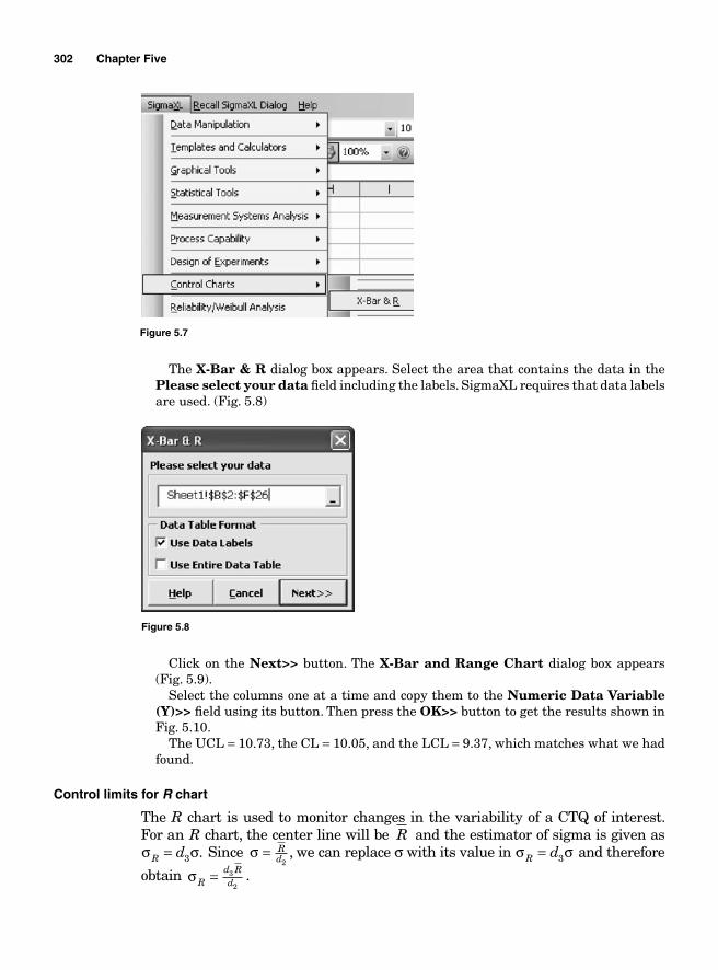
302 Chapter Five
Figure 5.7
The X-Bar & R dialog box appears. Select the area that contains the data in the Please select your data fi eld including the labels. SigmaXL requires that data labels are used. (Fig. 5.8)
Figure 5.8
Click on the Next>> button. The X-Bar and Range Chart dialog box appears (Fig. 5.9).
Select the columns one at a time and copy them to the Numeric Data Variable (Y)>> fi eld using its button. Then press the OK>> button to get the results shown in Fig. 5.10.
The UCL = 10.73, the CL = 10.05, and the LCL = 9.37, which matches what we had found.
Control limits for R chart
The R chart is used to monitor changes in the variability of a CTQ of interest. For an R chart, the center line will be R and the estimator of sigma is given as σ σR d= 3 . Since σ = R
d2, we can replace σ with its value in σ σR d= 3 and therefore
obtain σRd Rd= 3
2.
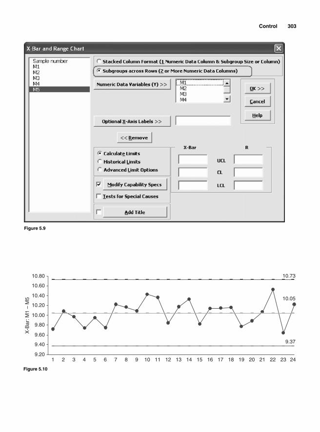
Control 303
Figure 5.9
9.201 2 3 4 5 6 7 8 9 10 11 12 13 14 15 16 17 18 19 20 21 22 23
9.37
10.05
10.73
24
9.40
9.60
9.80
10.00
10.20
10.40
10.60
10.80
X-B
ar: M
1 –
M5
Figure 5.10
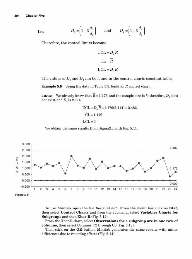
304 Chapter Five
Let Ddd3
3
2
1 3= −⎛⎝⎜
⎞⎠⎟ and D
dd4
3
2
1 3= +⎛⎝⎜
⎞⎠⎟
Therefore, the control limits become
UCL
CL
LCL
=
=
=
D R
R
D R
4
3
The values of D3 and D4 can be found in the control charts constant table.
Example 5.8 Using the data in Table 5.3, build an R control chart.
Solution: We already know that R = 1 176. and the sample size is 5; therefore, D3 does not exist and D4 is 2.114.
UCL
CL
LCL
= = =
=
=
D R4 1 176 2 114 2 486
1 176
0
. ( . ) .
.
We obtain the same results from SigmaXL with Fig. 5.11.
–0.500
0.000
0.500
1.000
1.500
2.000
2.500
3.000
1 2 3 4 5 6 7 8 9 10 11 12 13 14 15 16 17 18 19 20 21 22 23 24
0.000
1.176
2.487
R: M
1 –
M5
Figure 5.11
To use Minitab, open the fi le Balljoint.mtb. From the menu bar click on Stat, then select Control Charts and from the submenu, select Variables Charts for Subgroups and then Xbar-R (Fig. 5.12).
From the Xbar-R chart, select Observations for a subgroup are in one row of columns, then select Columns C2 through C6 (Fig. 5.13).
Then click on the OK button. Minitab generates the same results with minor differences due to rounding effects (Fig. 5.14).
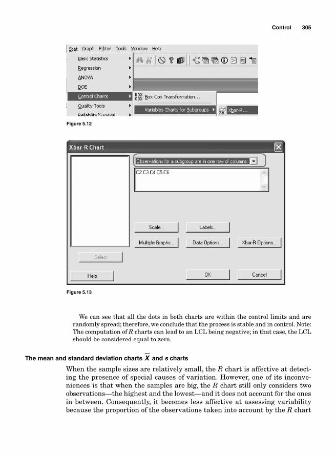
Control 305
We can see that all the dots in both charts are within the control limits and are randomly spread; therefore, we conclude that the process is stable and in control. Note: The computation of R charts can lead to an LCL being negative; in that case, the LCL should be considered equal to zero.
The mean and standard deviation charts X and s charts
When the sample sizes are relatively small, the R chart is affective at detect-ing the presence of special causes of variation. However, one of its inconve-niences is that when the samples are big, the R chart still only considers two observations—the highest and the lowest—and it does not account for the ones in between. Consequently, it becomes less affective at assessing variability because the proportion of the observations taken into account by the R chart
Figure 5.12
Figure 5.13
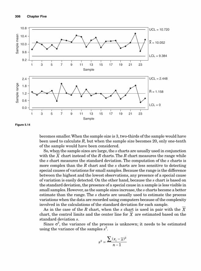
306 Chapter Five
9.2
1 3 5 7 9 11 13
Sample
LCL = 9.384
UCL = 10.720
X = 10.052
15 17 19 21 23
Sam
ple
mea
n
9.6
10.0
10.4
10.8
0.0
1 3 5 7 9 11 13
Sample
LCL = 0
UCL = 2.448
R = 1.158
15 17 19 21 23
Sam
ple
rang
e
0.6
1.2
1.8
2.4
Figure 5.14
becomes smaller. When the sample size is 3, two-thirds of the sample would have been used to calculate R, but when the sample size becomes 20, only one-tenth of the sample would have been considered.
So, when the sample sizes are large, the s charts are usually used in conjunction with the X chart instead of the R charts. The R chart measures the range while the s chart measures the standard deviation. The computation of the s charts is more complex than the R chart and the s charts are less sensitive to detecting special causes of variations for small samples. Because the range is the difference between the highest and the lowest observations, any presence of a special cause of variation is easily detected. On the other hand, because the s chart is based on the standard deviation, the presence of a special cause in a sample is less visible in small samples. However, as the sample sizes increase, the s charts become a better estimate than the range. The s charts are usually used to estimate the process variations when the data are recorded using computers because of the complexity involved in the calculations of the standard deviation for each sample.
As in the case of the R chart, when the s chart is used in pair with the Xchart, the control limits and the center line for X are estimated based on the standard deviation s.
Since σ2, the variance of the process is unknown; it needs to be estimated using the variance of the samples s2.
s
x xn
i22
1=
−−
∑ ( )
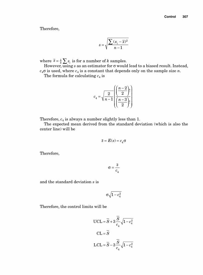
Control 307
Therefore,
s
x xn
i=−
−∑ ( )2
1
where s sk i= ∑1 is for a number of k samples. However, using s as an estimator for σ would lead to a biased result. Instead,
c4σ is used, where c4 is a constant that depends only on the sample size n. The formula for calculating c4 is
cn
n
n42
1
22
32
=−
−⎛⎝⎜
⎞⎠⎟
−⎛⎝⎜
⎞⎠⎟
⎛
⎝
⎜⎜⎜⎜
⎞
⎠
⎟⎟⎟⎟
!
!
Therefore, c4 is always a number slightly less than 1. The expected mean derived from the standard deviation (which is also the
center line) will be
s E s c= =( ) 4σ
Therefore,
σ = s
c4
and the standard deviation s is
σ 1 4
2− c
Therefore, the control limits will be
UCL
CL
LCL
= + −
=
= − −
SSc
c
S
SSc
c
3 1
3 1
442
442
308 Chapter Five
These equations can be simplifi ed by factoring s . We obtain
Bc
c
Bc
c
34
42
44
42
13
1
13
1
= − −
= + −
Therefore,
UCL
CL
LCL
=
=
=
B S
S
B S
4
3
The values of B3 and B4 are found in the control chart constant table in Table 5.2.
S can be used to calculate the control limits for the X chart paired with the s chart.
The center line will still be X and the control limits
UCL = +X sc n
34
and LCL = −Xs
c n3
4
These equalities can also be further simplifi ed. If
A
c n34
3=
then
UCL
CL
LCL
= +
=
= −
X SA
X
X SA
3
3
Example 5.9 The length of a gasket is critical to quality. Every hour, 10 gaskets inspected. The data in Table 5.4 summarize the observations obtained at the end of the fi rst shift; build an s chart and an X chart.
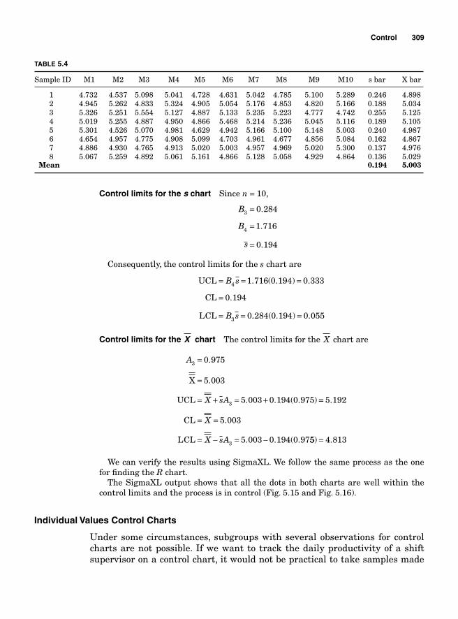
Control 309
Control limits for the s chart Since n = 10,
B
B
s
3
4
0 284
1 716
0 194
=
=
=
.
.
.
Consequently, the control limits for the s chart are
UCL
CL
LCL
= = =
=
= =
B s
B s
4
3
1 716 0 194 0 333
0 194
0
. ( . ) .
.
.. ( . ) .284 0 194 0 055=
Control limits for the X chart The control limits for the X chart are
A
X sA
3
3
5 003
5 003 0 194 0 975
=
=
= + = +
0.975
X
UCL
.
. . ( . ) ==
= =
= − = −
5 192
5 003
5 003 0 194 0 973
.
.
. . ( .
CL
LCL
X
X sA 55 4 813) .=
We can verify the results using SigmaXL. We follow the same process as the one for fi nding the R chart.
The SigmaXL output shows that all the dots in both charts are well within the control limits and the process is in control (Fig. 5.15 and Fig. 5.16).
Individual Values Control Charts
Under some circumstances, subgroups with several observations for control charts are not possible. If we want to track the daily productivity of a shift supervisor on a control chart, it would not be practical to take samples made
TABLE 5.4
Sample ID M1 M2 M3 M4 M5 M6 M7 M8 M9 M10 s bar X bar
1 4.732 4.537 5.098 5.041 4.728 4.631 5.042 4.785 5.100 5.289 0.246 4.898 2 4.945 5.262 4.833 5.324 4.905 5.054 5.176 4.853 4.820 5.166 0.188 5.034 3 5.326 5.251 5.554 5.127 4.887 5.133 5.235 5.223 4.777 4.742 0.255 5.125 4 5.019 5.255 4.887 4.950 4.866 5.468 5.214 5.236 5.045 5.116 0.189 5.105 5 5.301 4.526 5.070 4.981 4.629 4.942 5.166 5.100 5.148 5.003 0.240 4.987 6 4.654 4.957 4.775 4.908 5.099 4.703 4.961 4.677 4.856 5.084 0.162 4.867 7 4.886 4.930 4.765 4.913 5.020 5.003 4.957 4.969 5.020 5.300 0.137 4.976 8 5.067 5.259 4.892 5.061 5.161 4.866 5.128 5.058 4.929 4.864 0.136 5.029 Mean 0.194 5.003
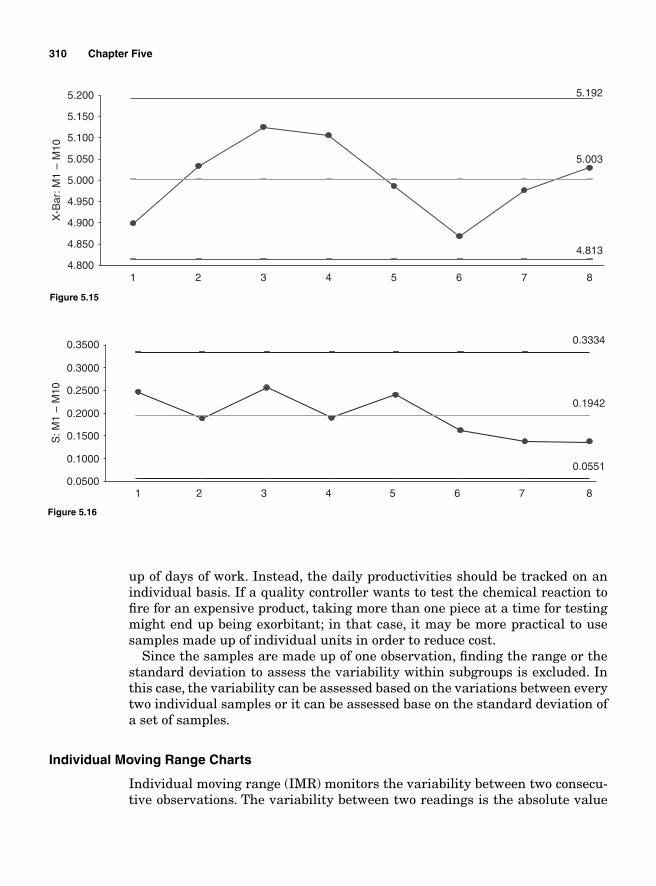
310 Chapter Five
5.003
4.813
5.192
4.800
4.850
4.900
4.950
5.000
5.050
5.100
5.150
5.200
1 2 3 4 5 6 7 8
X-B
ar: M
1 –
M10
Figure 5.15
0.1942
0.0551
0.3334
0.0500
0.1000
0.1500
0.2000
0.2500
0.3000
0.3500
1 2 3 4 5 6 7 8
S: M
1 –
M10
Figure 5.16
up of days of work. Instead, the daily productivities should be tracked on an individual basis. If a quality controller wants to test the chemical reaction to fi re for an expensive product, taking more than one piece at a time for testing might end up being exorbitant; in that case, it may be more practical to use samples made up of individual units in order to reduce cost.
Since the samples are made up of one observation, fi nding the range or the standard deviation to assess the variability within subgroups is excluded. In this case, the variability can be assessed based on the variations between every two individual samples or it can be assessed base on the standard deviation of a set of samples.
Individual Moving Range Charts
Individual moving range (IMR) monitors the variability between two consecu-tive observations. The variability between two readings is the absolute value
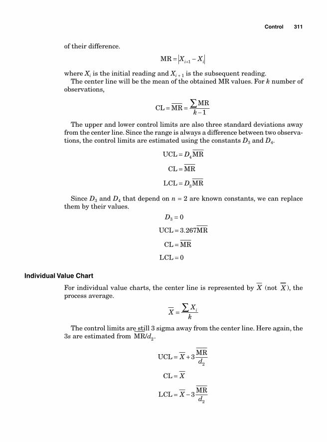
Control 311
of their difference.
MR = −+X Xi i1
where Xi is the initial reading and Xi + 1 is the subsequent reading. The center line will be the mean of the obtained MR values. For k number of
observations,
CL MR
MR= =
−∑k 1
The upper and lower control limits are also three standard deviations away from the center line. Since the range is always a difference between two observa-tions, the control limits are estimated using the constants D3 and D4.
UCL MR
CL MR
LCL MR
=
=
=
D
D
4
3
Since D3 and D4 that depend on n = 2 are known constants, we can replace them by their values.
D3 = 0
UCL MR
CL MR
LCL
=
=
=
3 267
0
.
Individual Value Chart
For individual value charts, the center line is represented by X (not X ), the process average.
X
Xk
i= ∑
The control limits are still 3 sigma away from the center line. Here again, the 3s are estimated from MR/d2.
UCLMR
CL
LCLMR
= +
=
= −
Xd
X
Xd
3
3
2
2
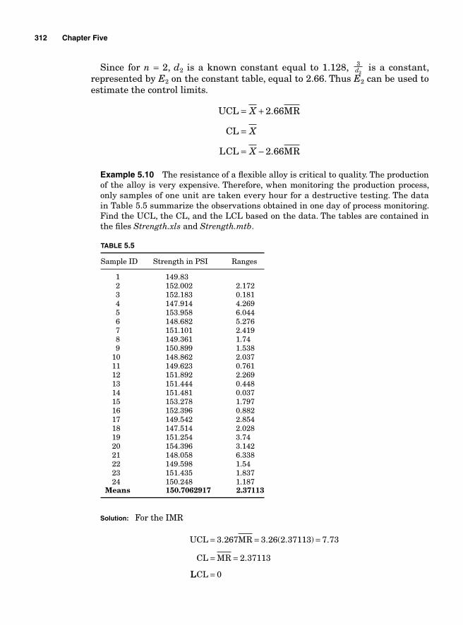
312 Chapter Five
Since for n = 2, d2 is a known constant equal to 1.128, 32d is a constant,
represented by E2 on the constant table, equal to 2.66. Thus E2 can be used to estimate the control limits.
UCL MR
CL
LCL MR
= +
=
= −
X
X
X
2 66
2 66
.
.
Example 5.10 The resistance of a fl exible alloy is critical to quality. The production of the alloy is very expensive. Therefore, when monitoring the production process, only samples of one unit are taken every hour for a destructive testing. The data in Table 5.5 summarize the observations obtained in one day of process monitoring. Find the UCL, the CL, and the LCL based on the data. The tables are contained in the fi les Strength.xls and Strength.mtb.
TABLE 5.5
Sample ID Strength in PSI Ranges
1 149.83 2 152.002 2.172 3 152.183 0.181 4 147.914 4.269 5 153.958 6.044 6 148.682 5.276 7 151.101 2.419 8 149.361 1.74 9 150.899 1.538 10 148.862 2.037 11 149.623 0.761 12 151.892 2.269 13 151.444 0.448 14 151.481 0.037 15 153.278 1.797 16 152.396 0.882 17 149.542 2.854 18 147.514 2.028 19 151.254 3.74
20 154.396 3.142 21 148.058 6.338 22 149.598 1.54 23 151.435 1.837 24 150.248 1.187 Means 150.7062917 2.37113
Solution: For the IMR
UCL MR
CL MR
= = =
= =
3 267 3 26 2 37113 7 73
2 37113
. . ( . ) .
.
LLCL = 0
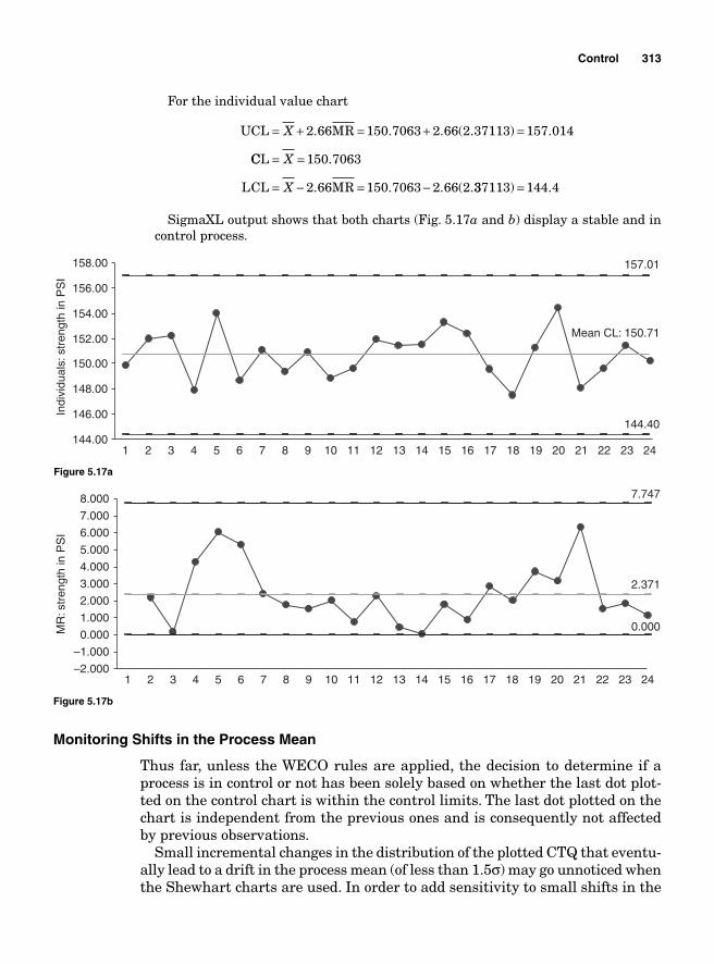
Control 313
For the individual value chart
UCL MR= + = + =X 2 66 150 7063 2 66 2 37113 157 014. . . ( . ) .
CCL
LCL MR
= =
= − = −
X
X
150 7063
2 66 150 7063 2 66 2
.
. . . ( .337113 144 4) .=
SigmaXL output shows that both charts (Fig. 5.17a and b) display a stable and in control process.
–2.000
–1.000
0.000
1.000
2.000
3.000
4.000
5.000
6.000
7.000
8.000
1 2 3 4 5 6 7 8 9 10 11 12 13 14 15 16 17 18 19 20 21 22 23 24
MR
: str
engt
h in
PS
I
0.000
2.371
7.747
Figure 5.17b
Monitoring Shifts in the Process Mean
Thus far, unless the WECO rules are applied, the decision to determine if a process is in control or not has been solely based on whether the last dot plot-ted on the control chart is within the control limits. The last dot plotted on the chart is independent from the previous ones and is consequently not affected by previous observations.
Small incremental changes in the distribution of the plotted CTQ that eventu-ally lead to a drift in the process mean (of less than 1.5σ) may go unnoticed when the Shewhart charts are used. In order to add sensitivity to small shifts in the
Mean CL: 150.71
144.40
157.01
144.00
146.00
148.00
150.00
152.00
154.00
156.00
158.00
1 2 3 4 5 6 7 8 9 10 11 12 13 14 15 16 17 18 19 20 21 22 23 24
Indi
vidu
als:
stre
ngth
in P
SI
Figure 5.17a
314 Chapter Five
process mean to the control charts, two types of charts are used: the cumulative sum (CUSUM) and the exponentially weighted moving average (EWMA). These two types of charts take into account the recent past data.
CUSUM
The CUSUM charts consider the samples mean deviations from the process target. It plots the cumulative sum of the deviations. Two approaches to CUSUM charts are generally considered: the graphical procedure (V-mask) and the com-putational procedure. The two are actually equivalent with the graphical ver-sion being a visual representation of the computational version.
The V-mask approach. Let us suppose that μ0 is the process target and X i is the ith sample mean.
s X
s X X X
s X
i
j i
1 1 0
2 0 1 0 2 0
= −
= − = − + −
= −
∑
μ
μ μ μ( ) ( ) ( )
(
M
μμ μ μ μ0 1 0 2 0 0) ( ) ( ) ... ( )∑ = − + − + + −X X X j
sj is the cumulative sum up to the jth sample and that is what is plotted on the CUSUM chart at time t. The cumulative sum sj includes not only the last sample’s deviation from the target but also the cumulative deviations of all the previous ones. For that reason, it is a better tool for estimating the overall deviation from the process target. If the process is in control, if it is not deviat-ing from its target, the cumulative sum should be close to zero ( )X i ≈ μ0 . The process is considered as going out of control if a drift in the cumulative sums drives to an upward or downward process shift.
Thus far, we have not mentioned any control limits; it is because the CUSUM chart does not have control limits. One way to determine if the process is in control or not is through the use of the V-mask. A V-mask is a transparent plastic overlay with a V shape drawn on it (Fig. 5.18).
Every time a new dot is plotted on the chart, the mask is laid on it with the point on the V-mask applied on top of the last plotted sj dot on the chart. The
Figure 5.18
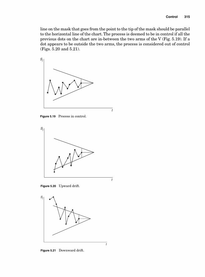
Control 315
line on the mask that goes from the point to the tip of the mask should be parallel to the horizontal line of the chart. The process is deemed to be in control if all the previous dots on the chart are in-between the two arms of the V (Fig. 5.19). If a dot appears to be outside the two arms, the process is considered out of control (Figs. 5.20 and 5.21).
t
Sj
Figure 5.19 Process in control.
t
Sj
Figure 5.20 Upward drift.
t
Sj
Figure 5.21 Downward drift.
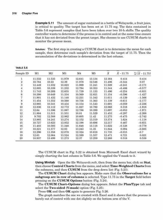
316 Chapter Five
Example 5.11 The amount of sugar contained in a bottle of Welayarde, a fruit juice, is critical to quality. The target has been set at 11.75 mg. The data contained in Table 5.6 represent samples that have been taken over two 10-h shifts. The quality controller wants to determine if the process is in control and at the same time ensure that it has not deviated from the preset target. She chooses to use CUSUM charts to monitor the process mean.
Solution: The fi rst step in creating a CUSUM chart is to determine the mean for each sample, then determine each sample’s deviation from the target of 11.75. Then the accumulation of the deviations is determined in the last column.
TABLE 5.6
Sample ID M1 M2 M3 M4 M5 X X − 11 75. ( ).X −∑ 11 75
1 11.532 11.535 11.979 12.641 13.134 12.164 0.414 0.414 2 10.784 10.23 12.39 11.078 12.546 11.406 –0.344 0.07 3 12.449 11.032 10.823 11.999 11.241 11.509 –0.241 –0.171 4 12.005 10.339 11.232 12.794 10.353 11.344 –0.406 –0.577 5 11.743 10.209 12.655 11.739 11.133 11.496 –0.254 –0.831 6 10.398 10.649 11.334 10.569 12.821 11.154 –0.596 –1.427 7 11.901 11.432 11.148 12.231 11.342 11.611 –0.139 –1.566 8 11.454 11.552 10.568 10.756 11.363 11.139 –0.611 –2.177 9 12.985 10.341 10.434 13.154 11.543 11.691 –0.059 –2.236 10 12.836 12.112 12.772 11.827 10.792 12.068 0.318 –1.918 11 12.64 11.596 11.067 12.786 10.399 11.697 –0.053 –1.971 12 11.864 11.511 11.551 10.81 11.529 11.453 –0.297 –2.268 13 9.702 12.588 12.062 10.605 11.42 11.275 –0.475 –2.742 14 13.885 14.241 13.274 12.152 13.319 13.374 1.624 –1.118 15 10.727 13.623 13.852 12.198 10.686 12.217 0.467 –0.651 16 11.403 10.593 11.348 11.648 13.118 11.622 –0.128 –0.779 17 10.221 11.577 12.83 13.243 11.35 11.844 0.094 –0.685 18 12.296 11.358 12.078 12.324 10.618 11.735 –0.015 –0.7 19 12.61 12.064 13.524 12.599 11.557 12.471 0.721 0.021 20 10.937 13.499 11.273 12.37 13.259 12.268 0.518 0.538
The CUSUM chart in Fig. 5.22 is obtained from Microsoft Excel chart wizard by simply charting the last column in Table 5.6. We applied the V-mask to it.
Using Minitab Open the fi le Welayarde.mtb, then from the menu bar, click on Stat, then choose Control Charts from the menu, and select Time-Weighted Charts from the submenu, and then CUSUM from the drop down list (Fig. 5.23).
The CUSUM Chart dialog box appears. Make sure that the Observations for a subgroup are in row of columns is selected. Type 11.75 in the Target fi eld before pressing on the CUSUM Options button (Fig. 5.24).
The CUSUM Chart–Options dialog box appears. Select the Plan/Type tab and select the Two-sided (V-mask) option (Fig. 5.25).
Press OK and then OK again to generate Fig. 5.26.The graph matches the one we created with Excel and it shows that the process is
barely out of control with one dot slightly on the bottom arm of the V.
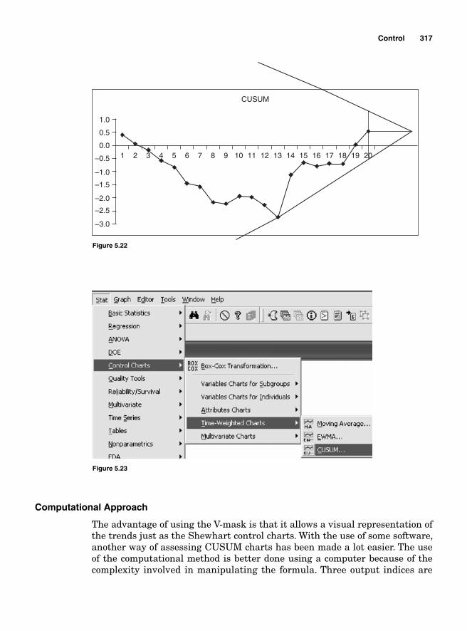
Control 317
Computational Approach
The advantage of using the V-mask is that it allows a visual representation of the trends just as the Shewhart control charts. With the use of some software, another way of assessing CUSUM charts has been made a lot easier. The use of the computational method is better done using a computer because of the complexity involved in manipulating the formula. Three output indices are
–3.0
–2.5
–2.0
–1.5
–1.0
–0.5 1 2 3 4 5 6 7 8 9 10 11
CUSUM
12 13 14 15 16 17 18 19 200.0
0.5
1.0
Figure 5.22
Figure 5.23
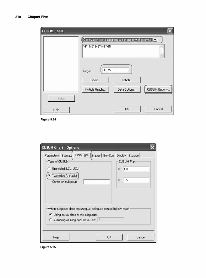
318 Chapter Five
Figure 5.24
Figure 5.25
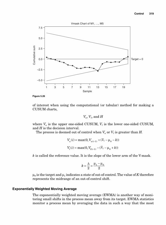
Control 319
of interest when using the computational (or tabular) method for making a CUSUM charts,
Vu, Vl, and H
where Vu is the upper one-sided CUSUM, Vl is the lower one-sided CUSUM, and H is the decision interval.
The process is deemed out of control when Vu or Vl is greater than H.
V i V x k
V i V
u u i i
l
( ) max( , ( ))
( ) max( ,
( )= + − −
=
−0
0
1 0μ
ll i ix k( ) ( ))− − − +1 0μ
k is called the reference value. It is the slope of the lower arm of the V-mask.
k = =
−Δ2 2
1 0μ μ
μ0 is the target and μ1 indicates a state of out-of-control. The value of K therefore represents the midrange of an out-of-control shift.
Exponentially Weighted Moving Average
The exponentially weighted moving average (EWMA) is another way of moni-toring small shifts in the process mean away from its target. EWMA statistics monitor a process mean by averaging the data in such a way that the most
1 3 5 7 9 11
Sample
Cum
ulat
ive
sum
–5.0
–2.5
0.0
Vmask Chart of M1, …, M5
Target = 0
2.5
5.0
7.5
13 15 17 19
Figure 5.26
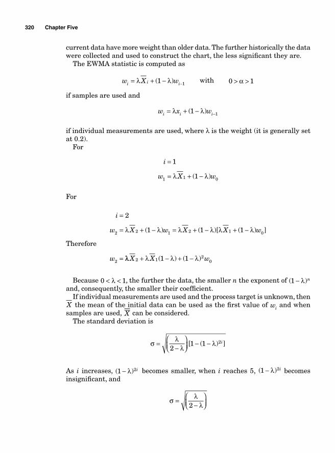
320 Chapter Five
current data have more weight than older data. The further historically the data were collected and used to construct the chart, the less signifi cant they are.
The EWMA statistic is computed as
w X wi i i= + − −λ λ( )1 1 with 0 1> >α
if samples are used and
w x wi i i= + − −λ λ( )1 1
if individual measurements are used, where λ is the weight (it is generally set at 0.2).
For
i
w X w
=
= + −
1
11 1 0λ λ( )
For
Therefore
i
w X w X X w
w
=
= + − = + − + −
=
2
1 1 12 2 1 2 1 0
2
λ λ λ λ λ λ( ) ( )[ ( ) ]
λλ λ λ λX X w2 12
01 1+ − + −( ) ( )
Because 0 1< <λ , the further the data, the smaller n the exponent of ( )1 − λ n and, consequently, the smaller their coeffi cient.
If individual measurements are used and the process target is unknown, then X the mean of the initial data can be used as the fi rst value of wi and when samples are used, X can be considered.
The standard deviation is
σ λ
λλ=
−⎛⎝⎜
⎞⎠⎟
− −2
1 1 2[ ( ) ]i
As i increases, ( )1 2− λ i becomes smaller, when i reaches 5, ( )1 2− λ i becomes insignifi cant, and
σ λ
λ=
−⎛⎝⎜
⎞⎠⎟2
Control 321
When i < 5, the upper and lower control limits are
UCL
LCL
= +−
⎛⎝⎜
⎞⎠⎟
− −
= −
Xs
c n
Xs
c n
i32
1 1
3
4
2
4
λλ
λ[ ( ) ]
λλλ
λ2
1 1 2
−⎛⎝⎜
⎞⎠⎟
− −[ ( ) ]i
When i > 5
UCL
LCL
= +−
⎛⎝⎜
⎞⎠⎟
= −−
⎛⎝⎜
⎞⎠⎟
X sc n
X sc n
32
32
4
4
λλ
λλ
Example 5.12 The amount of fat is critical to quality for each bar of soap produced at Sogui-Sabunde. The data contained in Table 5.7 were collected over two shifts of production. The data in the table can be found in the fi le Sogui sabunde.mtb.
1. Using EWMA, determine if the process is in control using the samples’ historic mean as a process target.
2. What would we say about the process if the process target were 50.5 g of fat per bar?
TABLE 5.7
Sample ID M1 M2 M3
1 49.08 51.4749 49.4695 2 50.871 50.5511 50.524 3 49.368 49.5386 50.694 4 48.882 50.5051 50.9733 5 50.112 50.0821 50.7661 6 48.921 49.7529 50.8386 7 50.862 48.8734 49.6406 8 50.324 49.5912 51.0464 9 48.566 49.6555 49.3142 10 49.505 50.5136 47.6921 11 49.363 51.0993 51.9579 12 49.447 47.848 48.9557 13 49.156 50.271 49.3338 14 50.062 50.0566 49.7153 15 51.044 51.5204 51.4028 16 50.5 48.2541 49.7105
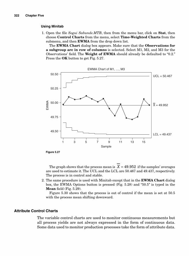
322 Chapter Five
Using Minitab
1. Open the fi le Sogui Sabunde.MTB, then from the menu bar, click on Stat, then choose Control Charts from the menu, select Time-Weighted Charts from the submenu, and then EWMA from the drop down list.
The EWMA Chart dialog box appears. Make sure that the Observations for a subgroup are in row of columns is selected. Select M1, M2, and M3 for the Observations’ fi eld. The Weight of EWMA should already be defaulted to “0.2.” Press the OK button to get Fig. 5.27.
1 3 5 7 9
Sample
LCL = 49.437
X = 49.952
UCL = 50.467
EW
MA
49.50
49.75
50.00
50.25
EWMA Chart of M1, …, M3
50.50
11 13 15
Figure 5.27
The graph shows that the process mean is X = 49 952. if the samples’ averages are used to estimate it. The UCL and the LCL are 50.467 and 49.437, respectively. The process is in control and stable.
2. The same procedure is used with Minitab except that in the EWMA Chart dialog box, the EWMA Options button is pressed (Fig. 5.28) and “50.5” is typed in the Mean fi eld (Fig. 5.29).
Figure 5.30 shows that the process is out of control if the mean is set at 50.5 with the process mean shifting downward.
Attribute Control Charts
The variable control charts are used to monitor continuous measurements but all process yields are not always expressed in the form of continuous data. Some data used to monitor production processes take the form of attribute data.
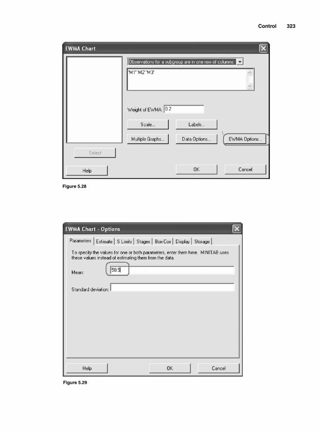
Control 323
Figure 5.28
Figure 5.29
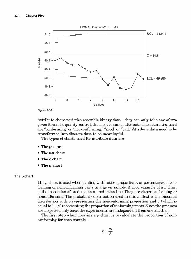
324 Chapter Five
1 3 5 7 9
Sample
LCL = 49.985
X = 50.5
UCL = 51.015
EW
MA
49.6
49.8
50.0
50.2
50.4
50.6
50.8
EWMA Chart of M1, …, M3
51.0
11 13 15
Figure 5.30
Attribute characteristics resemble binary data—they can only take one of two given forms. In quality control, the most common attribute characteristics used are “conforming” or “not conforming,” “good” or “bad.” Attribute data need to be transformed into discrete data to be meaningful.
The types of charts used for attribute data are
■ The p chart ■ The np chart ■ The c chart ■ The u chart
The p chart
The p chart is used when dealing with ratios, proportions, or percentages of con-forming or nonconforming parts in a given sample. A good example of a p chart is the inspection of products on a production line. They are either conforming or nonconforming. The probability distribution used in this context is the binomial distribution with p representing the nonconforming proportion and q (which is equal to 1 – p) representing the proportion of conforming items. Since the products are inspected only once, the experiments are independent from one another.
The fi rst step when creating a p chart is to calculate the proportion of non-conformity for each sample.
p
mb
=
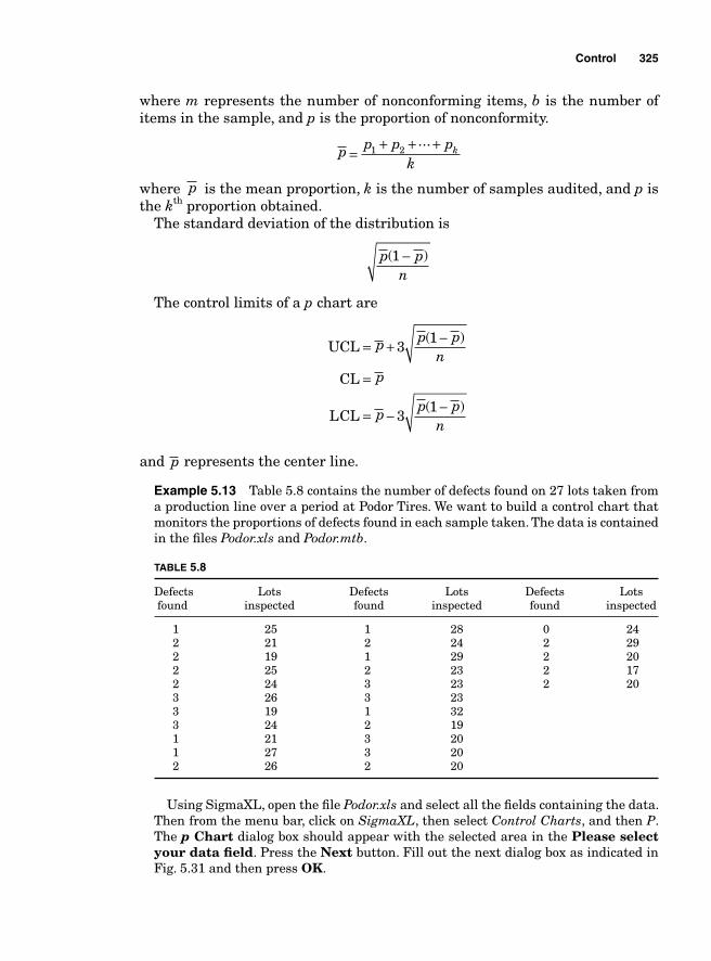
Control 325
where m represents the number of nonconforming items, b is the number of items in the sample, and p is the proportion of nonconformity.
p p p p
kk=
+ + +1 2...
where p is the mean proportion, k is the number of samples audited, and p is the kth proportion obtained.
The standard deviation of the distribution is
p pn
( )1 −
The control limits of a p chart are
UCL
CL
LCL
= + −
=
= − −
p p pn
p
p p pn
31
31
( )
( )
and p represents the center line.
Example 5.13 Table 5.8 contains the number of defects found on 27 lots taken from a production line over a period at Podor Tires. We want to build a control chart that monitors the proportions of defects found in each sample taken. The data is contained in the fi les Podor.xls and Podor.mtb.
TABLE 5.8
Defects Lots Defects Lots Defects Lots found inspected found inspected found inspected
1 25 1 28 0 24 2 21 2 24 2 29 2 19 1 29 2 20 2 25 2 23 2 17 2 24 3 23 2 20 3 26 3 23 3 19 1 32 3 24 2 19 1 21 3 20 1 27 3 20 2 26 2 20
Using SigmaXL, open the fi le Podor.xls and select all the fi elds containing the data. Then from the menu bar, click on SigmaXL, then select Control Charts, and then P. The p Chart dialog box should appear with the selected area in the Please select your data fi eld. Press the Next button. Fill out the next dialog box as indicated in Fig. 5.31 and then press OK.
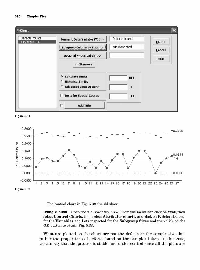
326 Chapter Five
Figure 5.31
–0.0500
0.0000
0.0500
0.1000
0.1500
0.2000
0.2500
0.3000
1 2 3 4 5 6 7 8 9 10 11 12 13 14 15 16 17 18 19 20 21 22 23 24 25 26 27
P -
Def
ects
fou
nd
0.0000
0.0844
0.2709
Figure 5.32
The control chart in Fig. 5.32 should show.
Using Minitab Open the fi le Podor tire.MPJ. From the menu bar, click on Stat, then select Control Charts, then select Attributes charts, and click on P. Select Defects for the Variables and Lots inspected for the Subgroup Sizes and then click on theOK button to obtain Fig. 5.33.
What are plotted on the chart are not the defects or the sample sizes but rather the proportions of defects found on the samples taken. In this case, we can say that the process is stable and under control since all the plots are
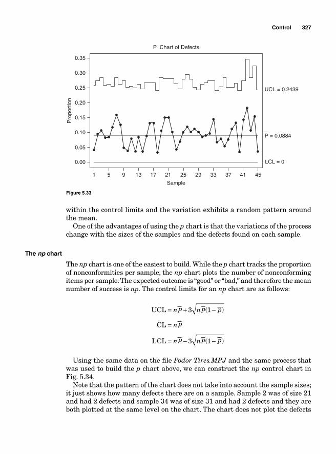
Control 327
within the control limits and the variation exhibits a random pattern around the mean.
One of the advantages of using the p chart is that the variations of the process change with the sizes of the samples and the defects found on each sample.
The np chart
The np chart is one of the easiest to build. While the p chart tracks the proportion of nonconformities per sample, the np chart plots the number of nonconforming items per sample. The expected outcome is “good” or “bad,” and therefore the mean number of success is np. The control limits for an np chart are as follows:
UCL
CL
LCL
= + −
=
= − −
np np p
np
np np p
3 1
3 1
( )
( )
Using the same data on the fi le Podor Tires.MPJ and the same process that was used to build the p chart above, we can construct the np control chart in Fig. 5.34.
Note that the pattern of the chart does not take into account the sample sizes; it just shows how many defects there are on a sample. Sample 2 was of size 21 and had 2 defects and sample 34 was of size 31 and had 2 defects and they are both plotted at the same level on the chart. The chart does not plot the defects
1
0.00
0.05
0.10
0.15
0.20
0.25
P Chart of Defects
0.30
0.35
5 9 13 17 21 25
Sample
LCL = 0
P = 0.0884
UCL = 0.2439
Pro
port
ion
29 33 37 41 45
Figure 5.33
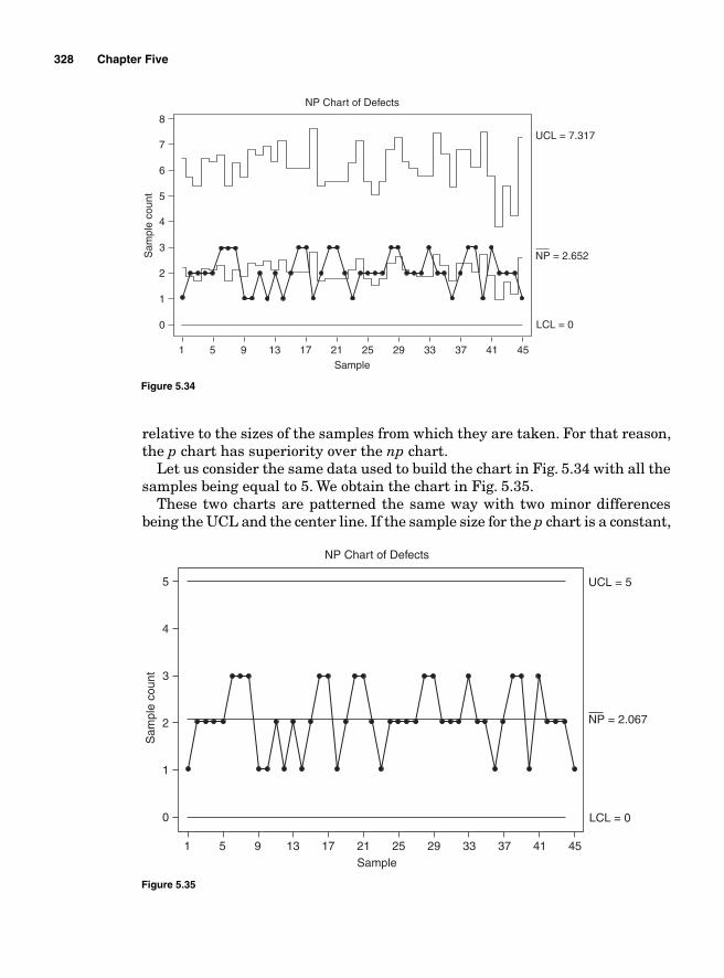
328 Chapter Five
1
0
1
3
2
4
5
6
NP Chart of Defects
7
8
5 9 13 17 21 25Sample
LCL = 0
NP = 2.652
UCL = 7.317S
ampl
e co
unt
29 33 37 41 45
Figure 5.34
relative to the sizes of the samples from which they are taken. For that reason, the p chart has superiority over the np chart.
Let us consider the same data used to build the chart in Fig. 5.34 with all the samples being equal to 5. We obtain the chart in Fig. 5.35.
These two charts are patterned the same way with two minor differences being the UCL and the center line. If the sample size for the p chart is a constant,
1
0
2
1
3
NP Chart of Defects
4
5
5 9 13 17 21 25Sample
LCL = 0
NP = 2.067
UCL = 5
Sam
ple
coun
t
29 33 37 41 45
Figure 5.35
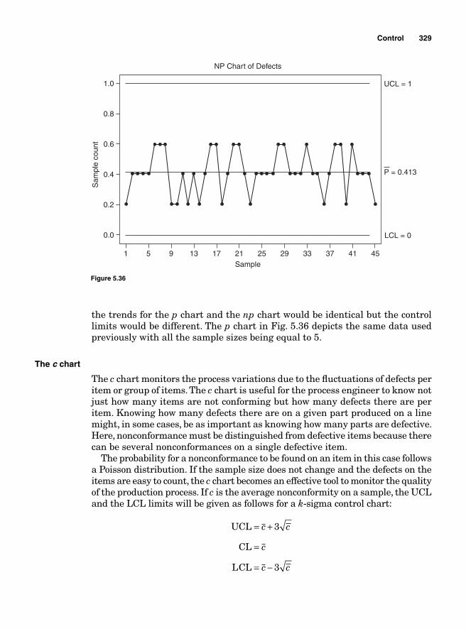
Control 329
1
0.0
0.4
0.2
0.6
NP Chart of Defects
0.8
1.0
5 9 13 17 21 25Sample
LCL = 0
P = 0.413
UCL = 1
Sam
ple
coun
t
29 33 37 41 45
Figure 5.36
the trends for the p chart and the np chart would be identical but the control limits would be different. The p chart in Fig. 5.36 depicts the same data used previously with all the sample sizes being equal to 5.
The c chart
The c chart monitors the process variations due to the fl uctuations of defects per item or group of items. The c chart is useful for the process engineer to know not just how many items are not conforming but how many defects there are per item. Knowing how many defects there are on a given part produced on a line might, in some cases, be as important as knowing how many parts are defective. Here, nonconformance must be distinguished from defective items because there can be several nonconformances on a single defective item.
The probability for a nonconformance to be found on an item in this case follows a Poisson distribution. If the sample size does not change and the defects on the items are easy to count, the c chart becomes an effective tool to monitor the quality of the production process. If c is the average nonconformity on a sample, the UCL and the LCL limits will be given as follows for a k-sigma control chart:
UCL
CL
LCL
= +
=
= −
c c
c
c c
3
3
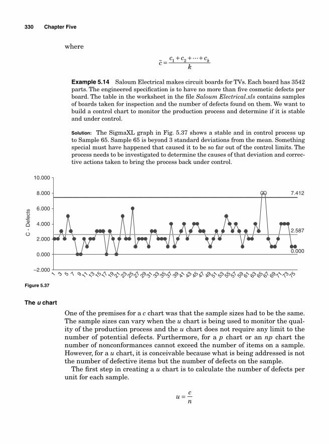
330 Chapter Five
where
c
c c ck
k=+ + +1 2
...
Example 5.14 Saloum Electrical makes circuit boards for TVs. Each board has 3542 parts. The engineered specifi cation is to have no more than fi ve cosmetic defects per board. The table in the worksheet in the fi le Saloum Electrical.xls contains samples of boards taken for inspection and the number of defects found on them. We want to build a control chart to monitor the production process and determine if it is stable and under control.
Solution: The SigmaXL graph in Fig. 5.37 shows a stable and in control process up to Sample 65. Sample 65 is beyond 3 standard deviations from the mean. Something special must have happened that caused it to be so far out of the control limits. The process needs to be investigated to determine the causes of that deviation and correc-tive actions taken to bring the process back under control.
–2.000
0.000
2.000
4.000
6.000
8.000
10.000
1 3 5 7 9 11 13 15 17 19 21 23 25 27 29 31 33 35 37 39 41 43 45 47 49 51 53 55 57 59 61 63 65 67 69 71 73 75
C -
Def
ects
7.412
2.587
0.000
Figure 5.37
The u chart
One of the premises for a c chart was that the sample sizes had to be the same. The sample sizes can vary when the u chart is being used to monitor the qual-ity of the production process and the u chart does not require any limit to the number of potential defects. Furthermore, for a p chart or an np chart the number of nonconformances cannot exceed the number of items on a sample. However, for a u chart, it is conceivable because what is being addressed is not the number of defective items but the number of defects on the sample.
The fi rst step in creating a u chart is to calculate the number of defects per unit for each sample.
u
cn
=
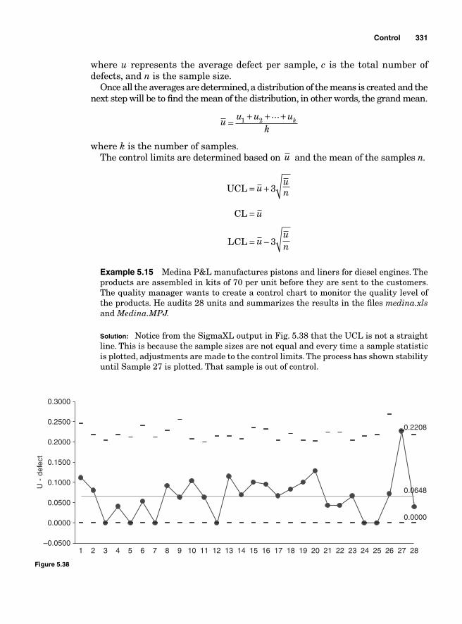
Control 331
where u represents the average defect per sample, c is the total number of defects, and n is the sample size.
Once all the averages are determined, a distribution of the means is created and the next step will be to fi nd the mean of the distribution, in other words, the grand mean.
u u u u
kk=
+ + +1 2...
where k is the number of samples. The control limits are determined based on u and the mean of the samples n.
UCL
CL
LCL
= +
=
= −
uun
u
uun
3
3
Example 5.15 Medina P&L manufactures pistons and liners for diesel engines. The products are assembled in kits of 70 per unit before they are sent to the customers. The quality manager wants to create a control chart to monitor the quality level of the products. He audits 28 units and summarizes the results in the fi les medina.xls and Medina.MPJ.
Solution: Notice from the SigmaXL output in Fig. 5.38 that the UCL is not a straight line. This is because the sample sizes are not equal and every time a sample statistic is plotted, adjustments are made to the control limits. The process has shown stability until Sample 27 is plotted. That sample is out of control.
–0.0500
0.0000
0.0500
0.1000
0.1500
0.2000
0.2500
0.3000
1 2 3 4 5 6 7 8 9 10 11 12 13 14 15 16 17 18 19 20 21 22 23 24 25 26 27 28
U -
def
ect
0.2208
0.0648
0.0000
Figure 5.38

This page intentionally left blank

Appendix
Tables
333
TABLE A.1 Binomial
p
n s 0.01 0.02 0.04 0.05 0.06 0.08 0.1 0.12 0.14 0.15 0.16 0.18 0.2 0.22 0.24 0.25 0.3 0.35 0.4 0.45 0.5
2 0 0.98 0.96 0.922 0.903 0.884 0.846 0.81 0.774 0.74 0.723 0.706 0.672 0.64 0.608 0.578 0.563 0.49 0.423 0.36 0.303 0.252 1 0.02 0.039 0.077 0.095 0.113 0.147 0.18 0.211 0.241 0.255 0.269 0.295 0.32 0.343 0.365 0.375 0.42 0.455 0.48 0.495 0.52 2 0.002 0.003 0.004 0.006 0.01 0.014 0.02 0.023 0.026 0.032 0.04 0.048 0.058 0.063 0.09 0.123 0.16 0.203 0.25
3 0 0.97 0.941 0.885 0.857 0.831 0.779 0.729 0.681 0.636 0.614 0.593 0.551 0.512 0.475 0.439 0.422 0.343 0.275 0.216 0.166 0.1253 1 0.029 0.058 0.111 0.135 0.159 0.203 0.243 0.279 0.311 0.325 0.339 0.363 0.384 0.402 0.416 0.422 0.441 0.444 0.432 0.408 0.3753 2 0.001 0.005 0.007 0.01 0.018 0.027 0.038 0.051 0.057 0.065 0.08 0.096 0.113 0.131 0.141 0.189 0.239 0.288 0.334 0.3753 3 0.001 0.001 0.002 0.003 0.003 0.004 0.006 0.008 0.011 0.014 0.016 0.027 0.043 0.064 0.091 0.125
4 0 0.961 0.922 0.849 0.815 0.781 0.716 0.656 0.6 0.547 0.522 0.498 0.452 0.41 0.37 0.334 0.316 0.24 0.179 0.13 0.092 0.0634 1 0.039 0.075 0.142 0.171 0.199 0.249 0.292 0.327 0.356 0.368 0.379 0.397 0.41 0.418 0.421 0.422 0.412 0.384 0.346 0.299 0.254 2 0.001 0.002 0.009 0.014 0.019 0.033 0.049 0.067 0.087 0.098 0.108 0.131 0.154 0.177 0.2 0.211 0.265 0.311 0.346 0.368 0.3754 3 0.001 0.002 0.004 0.006 0.009 0.011 0.014 0.019 0.026 0.033 0.042 0.047 0.076 0.111 0.154 0.2 0.254 4 0.001 0.001 0.001 0.002 0.002 0.003 0.004 0.008 0.015 0.026 0.041 0.063
5 0 0.951 0.904 0.815 0.774 0.734 0.659 0.59 0.528 0.47 0.444 0.418 0.371 0.328 0.289 0.254 0.237 0.168 0.116 0.078 0.05 0.0315 1 0.048 0.092 0.17 0.204 0.234 0.287 0.328 0.36 0.383 0.392 0.398 0.407 0.41 0.407 0.4 0.396 0.36 0.312 0.259 0.206 0.1565 2 0.001 0.004 0.014 0.021 0.03 0.05 0.073 0.098 0.125 0.138 0.152 0.179 0.205 0.23 0.253 0.264 0.309 0.336 0.346 0.337 0.3135 3 0.001 0.001 0.002 0.004 0.008 0.013 0.02 0.024 0.029 0.039 0.051 0.065 0.08 0.088 0.132 0.181 0.23 0.276 0.3135 4 0.001 0.002 0.002 0.003 0.004 0.006 0.009 0.013 0.015 0.028 0.049 0.077 0.113 0.1565 5 0.001 0.001 0.001 0.002 0.005 0.01 0.018 0.031
6 0 0.941 0.886 0.783 0.735 0.69 0.606 0.531 0.464 0.405 0.377 0.351 0.304 0.262 0.225 0.193 0.178 0.118 0.075 0.047 0.028 0.0166 1 0.057 0.108 0.196 0.232 0.264 0.316 0.354 0.38 0.395 0.399 0.401 0.4 0.393 0.381 0.365 0.356 0.303 0.244 0.187 0.136 0.0946 2 0.001 0.006 0.02 0.031 0.042 0.069 0.098 0.13 0.161 0.176 0.191 0.22 0.246 0.269 0.288 0.297 0.324 0.328 0.311 0.278 0.2346 3 0.001 0.002 0.004 0.008 0.015 0.024 0.035 0.041 0.049 0.064 0.082 0.101 0.121 0.132 0.185 0.235 0.276 0.303 0.3136 4 0.001 0.001 0.002 0.004 0.005 0.007 0.011 0.015 0.021 0.029 0.033 0.06 0.095 0.138 0.186 0.2346 5 0.001 0.001 0.002 0.002 0.004 0.004 0.01 0.02 0.037 0.061 0.0946 6 0.001 0.002 0.004 0.008 0.016
7 0 0.932 0.868 0.751 0.698 0.648 0.558 0.478 0.409 0.348 0.321 0.295 0.249 0.21 0.176 0.146 0.133 0.082 0.049 0.028 0.015 0.0087 1 0.066 0.124 0.219 0.257 0.29 0.34 0.372 0.39 0.396 0.396 0.393 0.383 0.367 0.347 0.324 0.311 0.247 0.185 0.131 0.087 0.0557 2 0.002 0.008 0.027 0.041 0.055 0.089 0.124 0.16 0.194 0.21 0.225 0.252 0.275 0.293 0.307 0.311 0.318 0.298 0.261 0.214 0.1647 3 0.002 0.004 0.006 0.013 0.023 0.036 0.053 0.062 0.071 0.092 0.115 0.138 0.161 0.173 0.227 0.268 0.29 0.292 0.2737 4 0.001 0.003 0.005 0.009 0.011 0.014 0.02 0.029 0.039 0.051 0.058 0.097 0.144 0.194 0.239 0.2737 5 0.001 0.001 0.002 0.003 0.004 0.007 0.01 0.012 0.025 0.047 0.077 0.117 0.1647 6 0.001 0.001 0.001 0.004 0.008 0.017 0.032 0.055
334
7 7 0.001 0.002 0.004 0.0088 0 0.923 0.851 0.721 0.663 0.61 0.513 0.43 0.36 0.299 0.272 0.248 0.204 0.168 0.137 0.111 0.1 0.058 0.032 0.017 0.008 0.0048 1 0.075 0.139 0.24 0.279 0.311 0.357 0.383 0.392 0.39 0.385 0.378 0.359 0.336 0.309 0.281 0.267 0.198 0.137 0.09 0.055 0.0318 2 0.003 0.01 0.035 0.051 0.07 0.109 0.149 0.187 0.222 0.238 0.252 0.276 0.294 0.305 0.311 0.311 0.296 0.259 0.209 0.157 0.1098 3 0.003 0.005 0.009 0.019 0.033 0.051 0.072 0.084 0.096 0.121 0.147 0.172 0.196 0.208 0.254 0.279 0.279 0.257 0.2198 4 0.001 0.002 0.005 0.009 0.015 0.018 0.023 0.033 0.046 0.061 0.077 0.087 0.136 0.188 0.232 0.263 0.2738 5 0.001 0.002 0.003 0.003 0.006 0.009 0.014 0.02 0.023 0.047 0.081 0.124 0.172 0.2198 6 0.001 0.001 0.002 0.003 0.004 0.01 0.022 0.041 0.07 0.1098 7 0.001 0.003 0.008 0.016 0.0318 8 0.001 0.002 0.004
9 0 0.914 0.834 0.693 0.63 0.573 0.472 0.387 0.316 0.257 0.232 0.208 0.168 0.134 0.107 0.085 0.075 0.04 0.021 0.01 0.005 0.0029 1 0.083 0.153 0.26 0.299 0.329 0.37 0.387 0.388 0.377 0.368 0.357 0.331 0.302 0.271 0.24 0.225 0.156 0.1 0.06 0.034 0.0189 2 0.003 0.013 0.043 0.063 0.084 0.129 0.172 0.212 0.245 0.26 0.272 0.291 0.302 0.306 0.304 0.3 0.267 0.216 0.161 0.111 0.079 3 0.001 0.004 0.008 0.013 0.026 0.045 0.067 0.093 0.107 0.121 0.149 0.176 0.201 0.224 0.234 0.267 0.272 0.251 0.212 0.1649 4 0.001 0.001 0.003 0.007 0.014 0.023 0.028 0.035 0.049 0.066 0.085 0.106 0.117 0.172 0.219 0.251 0.26 0.2469 5 0.001 0.002 0.004 0.005 0.007 0.011 0.017 0.024 0.033 0.039 0.074 0.118 0.167 0.213 0.2469 6 0.001 0.001 0.002 0.003 0.005 0.007 0.009 0.021 0.042 0.074 0.116 0.1649 7 0.001 0.001 0.001 0.004 0.01 0.021 0.041 0.079 8 0.001 0.004 0.008 0.0189 9 0.001 0.002
10 0 0.904 0.817 0.665 0.599 0.539 0.434 0.349 0.279 0.221 0.197 0.175 0.137 0.107 0.083 0.064 0.056 0.028 0.013 0.006 0.003 0.00110 1 0.091 0.167 0.277 0.315 0.344 0.378 0.387 0.38 0.36 0.347 0.333 0.302 0.268 0.235 0.203 0.188 0.121 0.072 0.04 0.021 0.0110 2 0.004 0.015 0.052 0.075 0.099 0.148 0.194 0.233 0.264 0.276 0.286 0.298 0.302 0.298 0.288 0.282 0.233 0.176 0.121 0.076 0.04410 3 0.001 0.006 0.01 0.017 0.034 0.057 0.085 0.115 0.13 0.145 0.174 0.201 0.224 0.243 0.25 0.267 0.252 0.215 0.166 0.11710 4 0.001 0.002 0.005 0.011 0.02 0.033 0.04 0.048 0.067 0.088 0.111 0.134 0.146 0.2 0.238 0.251 0.238 0.20510 5 0.001 0.001 0.003 0.006 0.008 0.011 0.018 0.026 0.037 0.051 0.058 0.103 0.154 0.201 0.234 0.24610 6 0.001 0.001 0.002 0.003 0.006 0.009 0.013 0.016 0.037 0.069 0.111 0.16 0.20510 7 0.001 0.001 0.002 0.003 0.009 0.021 0.042 0.075 0.11710 8 0.001 0.004 0.011 0.023 0.04410 9 0.001 0.002 0.004 0.0110 10 0.001
(Continued)
335
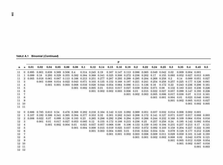
TABLE A.1 Binomial (Continued)
p
n s 0.01 0.02 0.04 0.05 0.06 0.08 0.1 0.12 0.14 0.15 0.16 0.18 0.2 0.22 0.24 0.25 0.3 0.35 0.4 0.45 0.5
11 0 0.895 0.801 0.638 0.569 0.506 0.4 0.314 0.245 0.19 0.167 0.147 0.113 0.086 0.065 0.049 0.042 0.02 0.009 0.004 0.00111 1 0.099 0.18 0.293 0.329 0.355 0.382 0.384 0.368 0.341 0.325 0.308 0.272 0.236 0.202 0.17 0.155 0.093 0.052 0.027 0.013 0.00511 2 0.005 0.018 0.061 0.087 0.113 0.166 0.213 0.251 0.277 0.287 0.293 0.299 0.295 0.284 0.268 0.258 0.2 0.14 0.089 0.051 0.02711 3 0.001 0.008 0.014 0.022 0.043 0.071 0.103 0.135 0.152 0.168 0.197 0.221 0.241 0.254 0.258 0.257 0.225 0.177 0.126 0.08111 4 0.001 0.001 0.003 0.008 0.016 0.028 0.044 0.054 0.064 0.086 0.111 0.136 0.16 0.172 0.22 0.243 0.236 0.206 0.16111 5 0.001 0.002 0.005 0.01 0.013 0.017 0.027 0.039 0.054 0.071 0.08 0.132 0.183 0.221 0.236 0.22611 6 0.001 0.002 0.002 0.003 0.006 0.01 0.015 0.022 0.027 0.057 0.099 0.147 0.193 0.22611 7 0.001 0.002 0.003 0.005 0.006 0.017 0.038 0.07 0.113 0.16111 8 0.001 0.001 0.004 0.01 0.023 0.046 0.08111 9 0.001 0.002 0.005 0.013 0.02711 10 0.001 0.002 0.00511 11
12 0 0.886 0.785 0.613 0.54 0.476 0.368 0.282 0.216 0.164 0.142 0.123 0.092 0.069 0.051 0.037 0.032 0.014 0.006 0.002 0.00112 1 0.107 0.192 0.306 0.341 0.365 0.384 0.377 0.353 0.32 0.301 0.282 0.243 0.206 0.172 0.141 0.127 0.071 0.037 0.017 0.008 0.00312 2 0.006 0.022 0.07 0.099 0.128 0.183 0.23 0.265 0.286 0.292 0.296 0.294 0.283 0.266 0.244 0.232 0.168 0.109 0.064 0.034 0.01612 3 0.001 0.01 0.017 0.027 0.053 0.085 0.12 0.155 0.172 0.188 0.215 0.236 0.25 0.257 0.258 0.24 0.195 0.142 0.092 0.05412 4 0.001 0.002 0.004 0.01 0.021 0.037 0.057 0.068 0.08 0.106 0.133 0.159 0.183 0.194 0.231 0.237 0.213 0.17 0.12112 5 0.001 0.004 0.008 0.015 0.019 0.025 0.037 0.053 0.072 0.092 0.103 0.158 0.204 0.227 0.222 0.19312 6 0.001 0.003 0.004 0.005 0.01 0.016 0.024 0.034 0.04 0.079 0.128 0.177 0.212 0.22612 7 0.001 0.001 0.002 0.003 0.006 0.009 0.011 0.029 0.059 0.101 0.149 0.19312 8 0.001 0.001 0.002 0.002 0.008 0.02 0.042 0.076 0.12112 9 0.001 0.005 0.012 0.028 0.05412 10 0.001 0.002 0.007 0.01612 11 0.001 0.00312 12
336
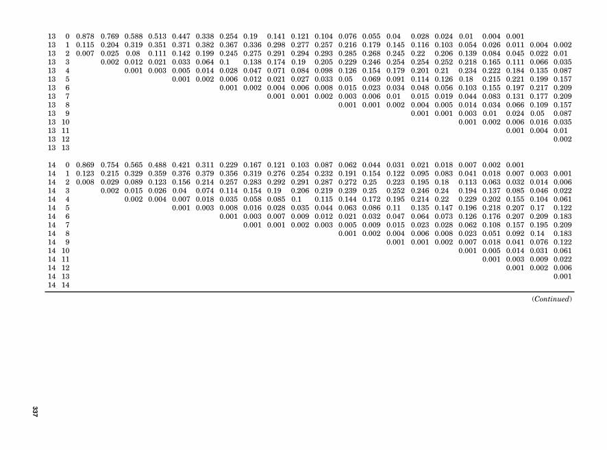
13 0 0.878 0.769 0.588 0.513 0.447 0.338 0.254 0.19 0.141 0.121 0.104 0.076 0.055 0.04 0.028 0.024 0.01 0.004 0.00113 1 0.115 0.204 0.319 0.351 0.371 0.382 0.367 0.336 0.298 0.277 0.257 0.216 0.179 0.145 0.116 0.103 0.054 0.026 0.011 0.004 0.00213 2 0.007 0.025 0.08 0.111 0.142 0.199 0.245 0.275 0.291 0.294 0.293 0.285 0.268 0.245 0.22 0.206 0.139 0.084 0.045 0.022 0.0113 3 0.002 0.012 0.021 0.033 0.064 0.1 0.138 0.174 0.19 0.205 0.229 0.246 0.254 0.254 0.252 0.218 0.165 0.111 0.066 0.03513 4 0.001 0.003 0.005 0.014 0.028 0.047 0.071 0.084 0.098 0.126 0.154 0.179 0.201 0.21 0.234 0.222 0.184 0.135 0.08713 5 0.001 0.002 0.006 0.012 0.021 0.027 0.033 0.05 0.069 0.091 0.114 0.126 0.18 0.215 0.221 0.199 0.15713 6 0.001 0.002 0.004 0.006 0.008 0.015 0.023 0.034 0.048 0.056 0.103 0.155 0.197 0.217 0.20913 7 0.001 0.001 0.002 0.003 0.006 0.01 0.015 0.019 0.044 0.083 0.131 0.177 0.20913 8 0.001 0.001 0.002 0.004 0.005 0.014 0.034 0.066 0.109 0.15713 9 0.001 0.001 0.003 0.01 0.024 0.05 0.08713 10 0.001 0.002 0.006 0.016 0.03513 11 0.001 0.004 0.0113 12 0.00213 13
14 0 0.869 0.754 0.565 0.488 0.421 0.311 0.229 0.167 0.121 0.103 0.087 0.062 0.044 0.031 0.021 0.018 0.007 0.002 0.00114 1 0.123 0.215 0.329 0.359 0.376 0.379 0.356 0.319 0.276 0.254 0.232 0.191 0.154 0.122 0.095 0.083 0.041 0.018 0.007 0.003 0.00114 2 0.008 0.029 0.089 0.123 0.156 0.214 0.257 0.283 0.292 0.291 0.287 0.272 0.25 0.223 0.195 0.18 0.113 0.063 0.032 0.014 0.00614 3 0.002 0.015 0.026 0.04 0.074 0.114 0.154 0.19 0.206 0.219 0.239 0.25 0.252 0.246 0.24 0.194 0.137 0.085 0.046 0.02214 4 0.002 0.004 0.007 0.018 0.035 0.058 0.085 0.1 0.115 0.144 0.172 0.195 0.214 0.22 0.229 0.202 0.155 0.104 0.06114 5 0.001 0.003 0.008 0.016 0.028 0.035 0.044 0.063 0.086 0.11 0.135 0.147 0.196 0.218 0.207 0.17 0.12214 6 0.001 0.003 0.007 0.009 0.012 0.021 0.032 0.047 0.064 0.073 0.126 0.176 0.207 0.209 0.18314 7 0.001 0.001 0.002 0.003 0.005 0.009 0.015 0.023 0.028 0.062 0.108 0.157 0.195 0.20914 8 0.001 0.002 0.004 0.006 0.008 0.023 0.051 0.092 0.14 0.18314 9 0.001 0.001 0.002 0.007 0.018 0.041 0.076 0.12214 10 0.001 0.005 0.014 0.031 0.06114 11 0.001 0.003 0.009 0.02214 12 0.001 0.002 0.00614 13 0.00114 14
(Continued)
337
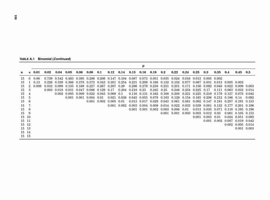
TABLE A.1 Binomial (Continued)
p
n s 0.01 0.02 0.04 0.05 0.06 0.08 0.1 0.12 0.14 0.15 0.16 0.18 0.2 0.22 0.24 0.25 0.3 0.35 0.4 0.45 0.5
15 0 0.86 0.739 0.542 0.463 0.395 0.286 0.206 0.147 0.104 0.087 0.073 0.051 0.035 0.024 0.016 0.013 0.005 0.00215 1 0.13 0.226 0.339 0.366 0.378 0.373 0.343 0.301 0.254 0.231 0.209 0.168 0.132 0.102 0.077 0.067 0.031 0.013 0.005 0.00215 2 0.009 0.032 0.099 0.135 0.169 0.227 0.267 0.287 0.29 0.286 0.279 0.258 0.231 0.201 0.171 0.156 0.092 0.048 0.022 0.009 0.00315 3 0.003 0.018 0.031 0.047 0.086 0.129 0.17 0.204 0.218 0.23 0.245 0.25 0.246 0.234 0.225 0.17 0.111 0.063 0.032 0.01415 4 0.002 0.005 0.009 0.022 0.043 0.069 0.1 0.116 0.131 0.162 0.188 0.208 0.221 0.225 0.219 0.179 0.127 0.078 0.04215 5 0.001 0.001 0.004 0.01 0.021 0.036 0.045 0.055 0.078 0.103 0.129 0.154 0.165 0.206 0.212 0.186 0.14 0.09215 6 0.001 0.002 0.005 0.01 0.013 0.017 0.029 0.043 0.061 0.081 0.092 0.147 0.191 0.207 0.191 0.15315 7 0.001 0.002 0.003 0.004 0.008 0.014 0.022 0.033 0.039 0.081 0.132 0.177 0.201 0.19615 8 0.001 0.001 0.002 0.003 0.006 0.01 0.013 0.035 0.071 0.118 0.165 0.19615 9 0.001 0.001 0.003 0.003 0.012 0.03 0.061 0.105 0.15315 10 0.001 0.003 0.01 0.024 0.051 0.09215 11 0.001 0.002 0.007 0.019 0.04215 12 0.002 0.005 0.01415 13 0.001 0.00315 1415 15
338
Tables 339
TABLE A.2 Poisson
Mean
Events 0.1 0.2 0.3 0.4 0.5 0.6 0.7 0.8 0.9 1
0 0.90484 0.81873 0.74082 0.67032 0.60653 0.54881 0.49659 0.44933 0.40657 0.367881 0.09048 0.16375 0.22225 0.26813 0.30327 0.32929 0.34761 0.35946 0.36591 0.367882 0.00452 0.01637 0.03334 0.05363 0.07582 0.09879 0.12166 0.14379 0.16466 0.183943 0.00015 0.00109 0.00333 0.00715 0.01264 0.01976 0.02839 0.03834 0.0494 0.061314 0 0.00005 0.00025 0.00072 0.00158 0.00296 0.00497 0.00767 0.01111 0.015335 0 0 0.00002 0.00006 0.00016 0.00036 0.0007 0.00123 0.002 0.00307
1.1 1.2 1.3 1.4 1.5 1.6 1.7 1.8 1.9 2
0 0.33287 0.30119 0.27253 0.2466 0.22313 0.2019 0.18268 0.1653 0.14957 0.135341 0.36616 0.36143 0.35429 0.34524 0.3347 0.32303 0.31056 0.29754 0.28418 0.270672 0.20139 0.21686 0.23029 0.24167 0.25102 0.25843 0.26398 0.26778 0.26997 0.270673 0.07384 0.08674 0.09979 0.11278 0.12551 0.13783 0.14959 0.16067 0.17098 0.180454 0.02031 0.02602 0.03243 0.03947 0.04707 0.05513 0.06357 0.0723 0.08122 0.090225 0.00447 0.00625 0.00843 0.01105 0.01412 0.01764 0.02162 0.02603 0.03086 0.036096 0.00082 0.00125 0.00183 0.00258 0.00353 0.0047 0.00612 0.00781 0.00977 0.012037 0.00013 0.00021 0.00034 0.00052 0.00076 0.00108 0.00149 0.00201 0.00265 0.003448 0.00002 0.00003 0.00006 0.00009 0.00014 0.00022 0.00032 0.00045 0.00063 0.000869 0 0 0.00001 0.00001 0.00002 0.00004 0.00006 0.00009 0.00013 0.00019
10 0 0 0 0 0 0.00001 0.00001 0.00002 0.00003 0.00004
2.1 2.2 2.3 2.4 2.5 2.6 2.7 2.8 2.9 3
0 0.12246 0.1108 0.10026 0.09072 0.08208 0.07427 0.06721 0.06081 0.05502 0.049791 0.25716 0.24377 0.2306 0.21772 0.20521 0.19311 0.18145 0.17027 0.15957 0.149362 0.27002 0.26814 0.26518 0.26127 0.25652 0.25104 0.24496 0.23838 0.23137 0.224043 0.18901 0.19664 0.20331 0.20901 0.21376 0.21757 0.22047 0.22248 0.22366 0.224044 0.09923 0.10815 0.1169 0.12541 0.1336 0.14142 0.14882 0.15574 0.16215 0.168035 0.04168 0.04759 0.05378 0.0602 0.0668 0.07354 0.08036 0.08721 0.09405 0.100826 0.01459 0.01745 0.02061 0.02408 0.02783 0.03187 0.03616 0.0407 0.04546 0.050417 0.00438 0.00548 0.00677 0.00826 0.00994 0.01184 0.01395 0.01628 0.01883 0.02168 0.00115 0.00151 0.00195 0.00248 0.00311 0.00385 0.00471 0.0057 0.00683 0.00819 0.00027 0.00037 0.0005 0.00066 0.00086 0.00111 0.00141 0.00177 0.0022 0.0027
10 0.00006 0.00008 0.00011 0.00016 0.00022 0.00029 0.00038 0.0005 0.00064 0.0008111 0.00001 0.00002 0.00002 0.00003 0.00005 0.00007 0.00009 0.00013 0.00017 0.0002212 0 0 0 0.00001 0.00001 0.00001 0.00002 0.00003 0.00004 0.0000613 0 0 0 0 0 0 0 0.00001 0.00001 0.0000114 0 0 0 0 0 0 0 0 0 015 0 0 0 0 0 0 0 0 0 0
3.1 3.2 3.3 3.4 3.5 3.6 3.7 3.8 3.9 4
0 0.04505 0.04076 0.03688 0.03337 0.0302 0.02732 0.02472 0.02237 0.02024 0.018321 0.13965 0.13044 0.12171 0.11347 0.10569 0.09837 0.09148 0.08501 0.07894 0.073262 0.21646 0.2087 0.20083 0.1929 0.18496 0.17706 0.16923 0.16152 0.15394 0.146533 0.22368 0.22262 0.22091 0.21862 0.21579 0.21247 0.20872 0.20459 0.20012 0.195374 0.17335 0.17809 0.18225 0.18582 0.18881 0.19122 0.19307 0.19436 0.19512 0.195375 0.10748 0.11398 0.12029 0.12636 0.13217 0.13768 0.14287 0.14771 0.15219 0.156296 0.05553 0.06079 0.06616 0.0716 0.0771 0.08261 0.0881 0.09355 0.09893 0.10427 0.02459 0.02779 0.03119 0.03478 0.03855 0.04248 0.04657 0.05079 0.05512 0.059548 0.00953 0.01112 0.01287 0.01478 0.01687 0.01912 0.02154 0.02412 0.02687 0.029779 0.00328 0.00395 0.00472 0.00558 0.00656 0.00765 0.00885 0.01019 0.01164 0.01323
10 0.00102 0.00126 0.00156 0.0019 0.0023 0.00275 0.00328 0.00387 0.00454 0.0052911 0.00029 0.00037 0.00047 0.00059 0.00073 0.0009 0.0011 0.00134 0.00161 0.0019212 0.00007 0.0001 0.00013 0.00017 0.00021 0.00027 0.00034 0.00042 0.00052 0.0006413 0.00002 0.00002 0.00003 0.00004 0.00006 0.00007 0.0001 0.00012 0.00016 0.000214 0 0.00001 0.00001 0.00001 0.00001 0.00002 0.00003 0.00003 0.00004 0.0000615 0 0 0 0 0 0 0.00001 0.00001 0.00001 0.00002
(Continued)
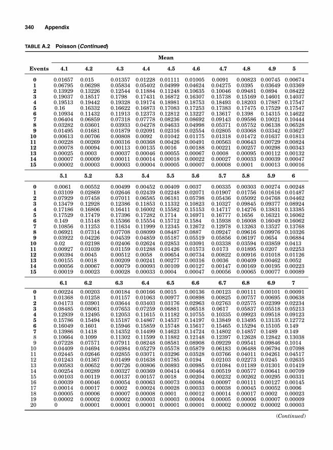
340 Appendix
TABLE A.2 Poisson (Continued)
Mean
Events 4.1 4.2 4.3 4.4 4.5 4.6 4.7 4.8 4.9 5
0 0.01657 0.015 0.01357 0.01228 0.01111 0.01005 0.0091 0.00823 0.00745 0.006741 0.06795 0.06298 0.05834 0.05402 0.04999 0.04624 0.04275 0.0395 0.03649 0.033692 0.13929 0.13226 0.12544 0.11884 0.11248 0.10635 0.10046 0.09481 0.0894 0.084223 0.19037 0.18517 0.1798 0.17431 0.16872 0.16307 0.15738 0.15169 0.14601 0.140374 0.19513 0.19442 0.19328 0.19174 0.18981 0.18753 0.18493 0.18203 0.17887 0.175475 0.16 0.16332 0.16622 0.16873 0.17083 0.17253 0.17383 0.17475 0.17529 0.175476 0.10934 0.11432 0.11913 0.12373 0.12812 0.13227 0.13617 0.1398 0.14315 0.146227 0.06404 0.06859 0.07318 0.07778 0.08236 0.08692 0.09143 0.09586 0.10021 0.104448 0.03282 0.03601 0.03933 0.04278 0.04633 0.04998 0.05371 0.05752 0.06138 0.065289 0.01495 0.01681 0.01879 0.02091 0.02316 0.02554 0.02805 0.03068 0.03342 0.03627
10 0.00613 0.00706 0.00808 0.0092 0.01042 0.01175 0.01318 0.01472 0.01637 0.0181311 0.00228 0.00269 0.00316 0.00368 0.00426 0.00491 0.00563 0.00643 0.00729 0.0082412 0.00078 0.00094 0.00113 0.00135 0.0016 0.00188 0.00221 0.00257 0.00298 0.0034313 0.00025 0.0003 0.00037 0.00046 0.00055 0.00067 0.0008 0.00095 0.00112 0.0013214 0.00007 0.00009 0.00011 0.00014 0.00018 0.00022 0.00027 0.00033 0.00039 0.0004715 0.00002 0.00003 0.00003 0.00004 0.00005 0.00007 0.00008 0.0001 0.00013 0.00016
5.1 5.2 5.3 5.4 5.5 5.6 5.7 5.8 5.9 6
0 0.0061 0.00552 0.00499 0.00452 0.00409 0.0037 0.00335 0.00303 0.00274 0.002481 0.03109 0.02869 0.02646 0.02439 0.02248 0.02071 0.01907 0.01756 0.01616 0.014872 0.07929 0.07458 0.07011 0.06585 0.06181 0.05798 0.05436 0.05092 0.04768 0.044623 0.13479 0.12928 0.12386 0.11853 0.11332 0.10823 0.10327 0.09845 0.09377 0.089244 0.17186 0.16806 0.16411 0.16002 0.15582 0.15153 0.14717 0.14276 0.13831 0.133855 0.17529 0.17479 0.17396 0.17282 0.1714 0.16971 0.16777 0.1656 0.16321 0.160626 0.149 0.15148 0.15366 0.15554 0.15712 0.1584 0.15938 0.16008 0.16049 0.160627 0.10856 0.11253 0.11634 0.11999 0.12345 0.12672 0.12978 0.13263 0.13527 0.137688 0.06921 0.07314 0.07708 0.08099 0.08487 0.0887 0.09247 0.09616 0.09976 0.103269 0.03922 0.04226 0.04539 0.04859 0.05187 0.05519 0.05856 0.06197 0.0654 0.06884
10 0.02 0.02198 0.02406 0.02624 0.02853 0.03091 0.03338 0.03594 0.03859 0.041311 0.00927 0.01039 0.01159 0.01288 0.01426 0.01573 0.0173 0.01895 0.0207 0.0225312 0.00394 0.0045 0.00512 0.0058 0.00654 0.00734 0.00822 0.00916 0.01018 0.0112613 0.00155 0.0018 0.00209 0.00241 0.00277 0.00316 0.0036 0.00409 0.00462 0.005214 0.00056 0.00067 0.00079 0.00093 0.00109 0.00127 0.00147 0.00169 0.00195 0.0022315 0.00019 0.00023 0.00028 0.00033 0.0004 0.00047 0.00056 0.00065 0.00077 0.00089
6.1 6.2 6.3 6.4 6.5 6.6 6.7 6.8 6.9 7
0 0.00224 0.00203 0.00184 0.00166 0.0015 0.00136 0.00123 0.00111 0.00101 0.000911 0.01368 0.01258 0.01157 0.01063 0.00977 0.00898 0.00825 0.00757 0.00695 0.006382 0.04173 0.03901 0.03644 0.03403 0.03176 0.02963 0.02763 0.02575 0.02399 0.022343 0.08485 0.08061 0.07653 0.07259 0.06881 0.06518 0.0617 0.05837 0.05518 0.052134 0.12939 0.12495 0.12053 0.11615 0.11182 0.10755 0.10335 0.09923 0.09518 0.091235 0.15786 0.15494 0.15187 0.14867 0.14537 0.14197 0.13849 0.13495 0.13135 0.127726 0.16049 0.1601 0.15946 0.15859 0.15748 0.15617 0.15465 0.15294 0.15105 0.1497 0.13986 0.1418 0.14352 0.14499 0.14623 0.14724 0.14802 0.14857 0.1489 0.1498 0.10664 0.1099 0.11302 0.11599 0.11882 0.12148 0.12397 0.12628 0.12842 0.130389 0.07228 0.07571 0.07911 0.08248 0.08581 0.08908 0.09229 0.09541 0.09846 0.1014
10 0.04409 0.04694 0.04984 0.05279 0.05578 0.05879 0.06183 0.06488 0.06794 0.0709811 0.02445 0.02646 0.02855 0.03071 0.03296 0.03528 0.03766 0.04011 0.04261 0.0451712 0.01243 0.01367 0.01499 0.01638 0.01785 0.0194 0.02103 0.02273 0.0245 0.0263513 0.00583 0.00652 0.00726 0.00806 0.00893 0.00985 0.01084 0.01189 0.01301 0.0141914 0.00254 0.00289 0.00327 0.00369 0.00414 0.00464 0.00519 0.00577 0.00641 0.0070915 0.00103 0.00119 0.00137 0.00157 0.0018 0.00204 0.00232 0.00262 0.00295 0.0033116 0.00039 0.00046 0.00054 0.00063 0.00073 0.00084 0.00097 0.00111 0.00127 0.0014517 0.00014 0.00017 0.0002 0.00024 0.00028 0.00033 0.00038 0.00045 0.00052 0.000618 0.00005 0.00006 0.00007 0.00008 0.0001 0.00012 0.00014 0.00017 0.0002 0.0002319 0.00002 0.00002 0.00002 0.00003 0.00003 0.00004 0.00005 0.00006 0.00007 0.0000920 0 0.00001 0.00001 0.00001 0.00001 0.00001 0.00002 0.00002 0.00002 0.00003
(Continued)
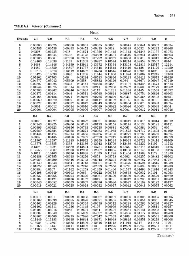
Tables 341
TABLE A.2 Poisson (Continued)
Mean
Events 7.1 7.2 7.3 7.4 7.5 7.6 7.7 7.8 7.9 8
0 0.00083 0.00075 0.00068 0.00061 0.00055 0.0005 0.00045 0.00041 0.00037 0.000341 0.00586 0.00538 0.00493 0.00452 0.00415 0.0038 0.00349 0.0032 0.00293 0.002682 0.0208 0.01935 0.018 0.01674 0.01556 0.01445 0.01342 0.01246 0.01157 0.010733 0.04922 0.04644 0.0438 0.04128 0.03889 0.03661 0.03446 0.03241 0.03047 0.028634 0.08736 0.0836 0.07993 0.07637 0.07292 0.06957 0.06633 0.06319 0.06017 0.057255 0.12406 0.12038 0.1167 0.11303 0.10937 0.10574 0.10214 0.09858 0.09507 0.09166 0.1468 0.14446 0.14199 0.13941 0.13672 0.13394 0.13108 0.12816 0.12517 0.122147 0.1489 0.14859 0.14807 0.14737 0.14648 0.14542 0.14419 0.1428 0.14126 0.139598 0.13215 0.13373 0.13512 0.13632 0.13733 0.13815 0.13878 0.13923 0.1395 0.139599 0.10425 0.10698 0.1096 0.11208 0.11444 0.11666 0.11874 0.12067 0.12245 0.12408
10 0.07402 0.07703 0.08 0.08294 0.08583 0.08866 0.09143 0.09412 0.09673 0.0992611 0.04777 0.05042 0.05309 0.0558 0.05852 0.06126 0.064 0.06674 0.06947 0.0721912 0.02827 0.03025 0.0323 0.03441 0.03658 0.0388 0.04107 0.04338 0.04574 0.0481313 0.01544 0.01675 0.01814 0.01959 0.0211 0.02268 0.02432 0.02603 0.02779 0.0296214 0.00783 0.00862 0.00946 0.01035 0.0113 0.01231 0.01338 0.0145 0.01568 0.0169215 0.00371 0.00414 0.0046 0.00511 0.00565 0.00624 0.00687 0.00754 0.00826 0.0090316 0.00164 0.00186 0.0021 0.00236 0.00265 0.00296 0.0033 0.00368 0.00408 0.0045117 0.00069 0.00079 0.0009 0.00103 0.00117 0.00132 0.0015 0.00169 0.0019 0.0021218 0.00027 0.00032 0.00037 0.00042 0.00049 0.00056 0.00064 0.00073 0.00083 0.0009419 0.0001 0.00012 0.00014 0.00016 0.00019 0.00022 0.00026 0.0003 0.00035 0.000420 0.00004 0.00004 0.00005 0.00006 0.00007 0.00009 0.0001 0.00012 0.00014 0.00016
8.1 8.2 8.3 8.4 8.5 8.6 8.7 8.8 8.9 9
0 0.0003 0.00027 0.00025 0.00022 0.0002 0.00018 0.00017 0.00015 0.00014 0.000121 0.00246 0.00225 0.00206 0.00189 0.00173 0.00158 0.00145 0.00133 0.00121 0.001112 0.00996 0.00923 0.00856 0.00793 0.00735 0.00681 0.0063 0.00584 0.0054 0.0053 0.02689 0.02524 0.02368 0.02221 0.02083 0.01952 0.01828 0.01712 0.01602 0.014994 0.05444 0.05174 0.04914 0.04665 0.04425 0.04196 0.03977 0.03766 0.03566 0.033745 0.0882 0.08485 0.08158 0.07837 0.07523 0.07217 0.06919 0.06629 0.06347 0.060736 0.11907 0.11597 0.11285 0.10972 0.10658 0.10345 0.10033 0.09722 0.09414 0.091097 0.13778 0.13585 0.1338 0.13166 0.12942 0.12709 0.12469 0.12222 0.1197 0.117128 0.1395 0.13924 0.13882 0.13824 0.13751 0.13663 0.1356 0.13445 0.13316 0.131769 0.12555 0.12687 0.12803 0.12903 0.12987 0.13055 0.13108 0.13146 0.13168 0.13176
10 0.1017 0.10403 0.10626 0.10838 0.11039 0.11228 0.11404 0.11568 0.1172 0.1185811 0.07488 0.07755 0.08018 0.08276 0.0853 0.08778 0.0902 0.09255 0.09482 0.0970212 0.05055 0.05299 0.05546 0.05793 0.06042 0.06291 0.06539 0.06787 0.07033 0.0727713 0.03149 0.03343 0.03541 0.03743 0.03951 0.04162 0.04376 0.04594 0.04815 0.0503814 0.01822 0.01958 0.02099 0.02246 0.02399 0.02556 0.0272 0.02888 0.03061 0.0323815 0.00984 0.0107 0.01162 0.01258 0.01359 0.01466 0.01577 0.01694 0.01816 0.0194316 0.00498 0.00549 0.00603 0.0066 0.00722 0.00788 0.00858 0.00932 0.0101 0.0109317 0.00237 0.00265 0.00294 0.00326 0.00361 0.00399 0.00439 0.00482 0.00529 0.0057918 0.00107 0.00121 0.00136 0.00152 0.0017 0.0019 0.00212 0.00236 0.00261 0.0028919 0.00046 0.00052 0.00059 0.00067 0.00076 0.00086 0.00097 0.00109 0.00122 0.0013720 0.00018 0.00021 0.00025 0.00028 0.00032 0.00037 0.00042 0.00048 0.00055 0.00062
9.1 9.2 9.3 9.4 9.5 9.6 9.7 9.8 9.9 10
0 0.00011 0.0001 0.00009 0.00008 0.00007 0.00007 0.00006 0.00006 0.00005 0.000051 0.00102 0.00093 0.00085 0.00078 0.00071 0.00065 0.00059 0.00054 0.0005 0.000452 0.00462 0.00428 0.00395 0.00365 0.00338 0.00312 0.00288 0.00266 0.00246 0.002273 0.01402 0.01311 0.01226 0.01145 0.0107 0.00999 0.00932 0.0087 0.00811 0.007574 0.03191 0.03016 0.0285 0.02691 0.0254 0.02397 0.02261 0.02131 0.02008 0.018925 0.05807 0.05549 0.053 0.05059 0.04827 0.04602 0.04386 0.04177 0.03976 0.037836 0.08807 0.08509 0.08215 0.07926 0.07642 0.07363 0.0709 0.06822 0.06561 0.063067 0.11449 0.11183 0.10915 0.10644 0.10371 0.10098 0.09825 0.09551 0.09279 0.090088 0.13024 0.12861 0.12688 0.12506 0.12316 0.12118 0.11912 0.117 0.11483 0.11269 0.13168 0.13147 0.13111 0.13062 0.13 0.12926 0.12839 0.1274 0.12631 0.12511
10 0.11983 0.12095 0.12193 0.12279 0.1235 0.12409 0.12454 0.12486 0.12505 0.12511
(Continued)
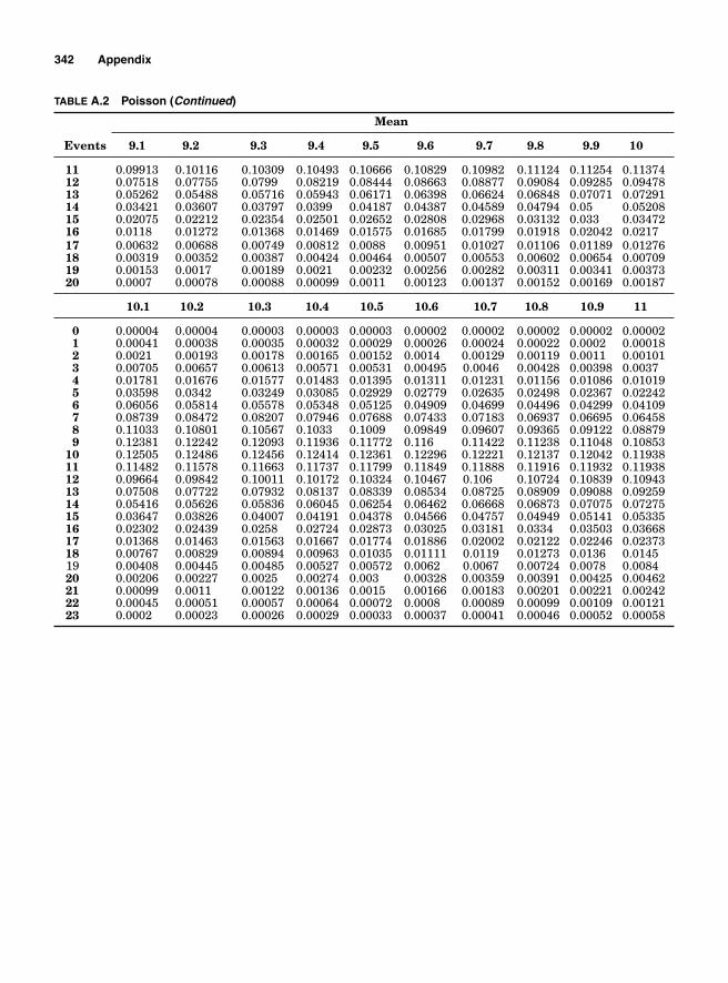
342 Appendix
TABLE A.2 Poisson (Continued)
Mean
Events 9.1 9.2 9.3 9.4 9.5 9.6 9.7 9.8 9.9 10
11 0.09913 0.10116 0.10309 0.10493 0.10666 0.10829 0.10982 0.11124 0.11254 0.1137412 0.07518 0.07755 0.0799 0.08219 0.08444 0.08663 0.08877 0.09084 0.09285 0.0947813 0.05262 0.05488 0.05716 0.05943 0.06171 0.06398 0.06624 0.06848 0.07071 0.0729114 0.03421 0.03607 0.03797 0.0399 0.04187 0.04387 0.04589 0.04794 0.05 0.0520815 0.02075 0.02212 0.02354 0.02501 0.02652 0.02808 0.02968 0.03132 0.033 0.0347216 0.0118 0.01272 0.01368 0.01469 0.01575 0.01685 0.01799 0.01918 0.02042 0.021717 0.00632 0.00688 0.00749 0.00812 0.0088 0.00951 0.01027 0.01106 0.01189 0.0127618 0.00319 0.00352 0.00387 0.00424 0.00464 0.00507 0.00553 0.00602 0.00654 0.0070919 0.00153 0.0017 0.00189 0.0021 0.00232 0.00256 0.00282 0.00311 0.00341 0.0037320 0.0007 0.00078 0.00088 0.00099 0.0011 0.00123 0.00137 0.00152 0.00169 0.00187
10.1 10.2 10.3 10.4 10.5 10.6 10.7 10.8 10.9 11
0 0.00004 0.00004 0.00003 0.00003 0.00003 0.00002 0.00002 0.00002 0.00002 0.000021 0.00041 0.00038 0.00035 0.00032 0.00029 0.00026 0.00024 0.00022 0.0002 0.000182 0.0021 0.00193 0.00178 0.00165 0.00152 0.0014 0.00129 0.00119 0.0011 0.001013 0.00705 0.00657 0.00613 0.00571 0.00531 0.00495 0.0046 0.00428 0.00398 0.00374 0.01781 0.01676 0.01577 0.01483 0.01395 0.01311 0.01231 0.01156 0.01086 0.010195 0.03598 0.0342 0.03249 0.03085 0.02929 0.02779 0.02635 0.02498 0.02367 0.022426 0.06056 0.05814 0.05578 0.05348 0.05125 0.04909 0.04699 0.04496 0.04299 0.041097 0.08739 0.08472 0.08207 0.07946 0.07688 0.07433 0.07183 0.06937 0.06695 0.064588 0.11033 0.10801 0.10567 0.1033 0.1009 0.09849 0.09607 0.09365 0.09122 0.088799 0.12381 0.12242 0.12093 0.11936 0.11772 0.116 0.11422 0.11238 0.11048 0.10853
10 0.12505 0.12486 0.12456 0.12414 0.12361 0.12296 0.12221 0.12137 0.12042 0.1193811 0.11482 0.11578 0.11663 0.11737 0.11799 0.11849 0.11888 0.11916 0.11932 0.1193812 0.09664 0.09842 0.10011 0.10172 0.10324 0.10467 0.106 0.10724 0.10839 0.1094313 0.07508 0.07722 0.07932 0.08137 0.08339 0.08534 0.08725 0.08909 0.09088 0.0925914 0.05416 0.05626 0.05836 0.06045 0.06254 0.06462 0.06668 0.06873 0.07075 0.0727515 0.03647 0.03826 0.04007 0.04191 0.04378 0.04566 0.04757 0.04949 0.05141 0.0533516 0.02302 0.02439 0.0258 0.02724 0.02873 0.03025 0.03181 0.0334 0.03503 0.0366817 0.01368 0.01463 0.01563 0.01667 0.01774 0.01886 0.02002 0.02122 0.02246 0.0237318 0.00767 0.00829 0.00894 0.00963 0.01035 0.01111 0.0119 0.01273 0.0136 0.014519 0.00408 0.00445 0.00485 0.00527 0.00572 0.0062 0.0067 0.00724 0.0078 0.008420 0.00206 0.00227 0.0025 0.00274 0.003 0.00328 0.00359 0.00391 0.00425 0.0046221 0.00099 0.0011 0.00122 0.00136 0.0015 0.00166 0.00183 0.00201 0.00221 0.0024222 0.00045 0.00051 0.00057 0.00064 0.00072 0.0008 0.00089 0.00099 0.00109 0.0012123 0.0002 0.00023 0.00026 0.00029 0.00033 0.00037 0.00041 0.00046 0.00052 0.00058
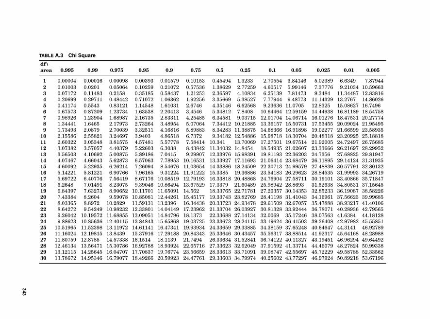
TABLE A.3 Chi Square
df\area 0.995 0.99 0.975 0.95 0.9 0.75 0.5 0.25 0.1 0.05 0.025 0.01 0.005
1 0.00004 0.00016 0.00098 0.00393 0.01579 0.10153 0.45494 1.3233 2.70554 3.84146 5.02389 6.6349 7.879442 0.01003 0.0201 0.05064 0.10259 0.21072 0.57536 1.38629 2.77259 4.60517 5.99146 7.37776 9.21034 10.596633 0.07172 0.11483 0.2158 0.35185 0.58437 1.21253 2.36597 4.10834 6.25139 7.81473 9.3484 11.34487 12.838164 0.20699 0.29711 0.48442 0.71072 1.06362 1.92256 3.35669 5.38527 7.77944 9.48773 11.14329 13.2767 14.860265 0.41174 0.5543 0.83121 1.14548 1.61031 2.6746 4.35146 6.62568 9.23636 11.0705 12.8325 15.08627 16.74966 0.67573 0.87209 1.23734 1.63538 2.20413 3.4546 5.34812 7.8408 10.64464 12.59159 14.44938 16.81189 18.547587 0.98926 1.23904 1.68987 2.16735 2.83311 4.25485 6.34581 9.03715 12.01704 14.06714 16.01276 18.47531 20.277748 1.34441 1.6465 2.17973 2.73264 3.48954 5.07064 7.34412 10.21885 13.36157 15.50731 17.53455 20.09024 21.954959 1.73493 2.0879 2.70039 3.32511 4.16816 5.89883 8.34283 11.38875 14.68366 16.91898 19.02277 21.66599 23.58935
10 2.15586 2.55821 3.24697 3.9403 4.86518 6.7372 9.34182 12.54886 15.98718 18.30704 20.48318 23.20925 25.1881811 2.60322 3.05348 3.81575 4.57481 5.57778 7.58414 10.341 13.70069 17.27501 19.67514 21.92005 24.72497 26.7568512 3.07382 3.57057 4.40379 5.22603 6.3038 8.43842 11.34032 14.8454 18.54935 21.02607 23.33666 26.21697 28.2995213 3.56503 4.10692 5.00875 5.89186 7.0415 9.29907 12.33976 15.98391 19.81193 22.36203 24.7356 27.68825 29.8194714 4.07467 4.66043 5.62873 6.57063 7.78953 10.16531 13.33927 17.11693 21.06414 23.68479 26.11895 29.14124 31.3193515 4.60092 5.22935 6.26214 7.26094 8.54676 11.03654 14.33886 18.24509 22.30713 24.99579 27.48839 30.57791 32.8013216 5.14221 5.81221 6.90766 7.96165 9.31224 11.91222 15.3385 19.36886 23.54183 26.29623 28.84535 31.99993 34.2671917 5.69722 6.40776 7.56419 8.67176 10.08519 12.79193 16.33818 20.48868 24.76904 27.58711 30.19101 33.40866 35.7184718 6.2648 7.01491 8.23075 9.39046 10.86494 13.67529 17.3379 21.60489 25.98942 28.8693 31.52638 34.80531 37.1564519 6.84397 7.63273 8.90652 10.11701 11.65091 14.562 18.33765 22.71781 27.20357 30.14353 32.85233 36.19087 38.5822620 7.43384 8.2604 9.59078 10.85081 12.44261 15.45177 19.33743 23.82769 28.41198 31.41043 34.16961 37.56623 39.9968521 8.03365 8.8972 10.2829 11.59131 13.2396 16.34438 20.33723 24.93478 29.61509 32.67057 35.47888 38.93217 41.4010622 8.64272 9.54249 10.98232 12.33801 14.04149 17.23962 21.33704 26.03927 30.81328 33.92444 36.78071 40.28936 42.7956523 9.26042 10.19572 11.68855 13.09051 14.84796 18.1373 22.33688 27.14134 32.0069 35.17246 38.07563 41.6384 44.1812824 9.88623 10.85636 12.40115 13.84843 15.65868 19.03725 23.33673 28.24115 33.19624 36.41503 39.36408 42.97982 45.5585125 10.51965 11.52398 13.11972 14.61141 16.47341 19.93934 24.33659 29.33885 34.38159 37.65248 40.64647 44.3141 46.9278926 11.16024 12.19815 13.8439 15.37916 17.29188 20.84343 25.33646 30.43457 35.56317 38.88514 41.92317 45.64168 48.2898827 11.80759 12.8785 14.57338 16.1514 18.1139 21.7494 26.33634 31.52841 36.74122 40.11327 43.19451 46.96294 49.6449228 12.46134 13.56471 15.30786 16.92788 18.93924 22.65716 27.33623 32.62049 37.91592 41.33714 44.46079 48.27824 50.9933829 13.12115 14.25645 16.04707 17.70837 19.76774 23.56659 28.33613 33.71091 39.08747 42.55697 45.72229 49.58788 52.3356230 13.78672 14.95346 16.79077 18.49266 20.59923 24.47761 29.33603 34.79974 40.25602 43.77297 46.97924 50.89218 53.67196
343
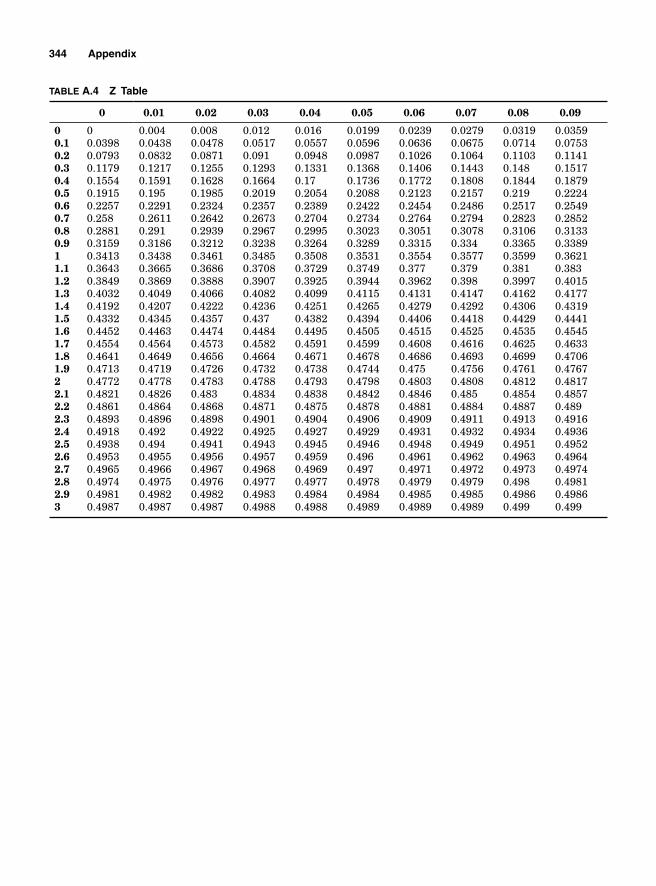
344 Appendix
TABLE A.4 Z Table
0 0.01 0.02 0.03 0.04 0.05 0.06 0.07 0.08 0.09
0 0 0.004 0.008 0.012 0.016 0.0199 0.0239 0.0279 0.0319 0.03590.1 0.0398 0.0438 0.0478 0.0517 0.0557 0.0596 0.0636 0.0675 0.0714 0.07530.2 0.0793 0.0832 0.0871 0.091 0.0948 0.0987 0.1026 0.1064 0.1103 0.11410.3 0.1179 0.1217 0.1255 0.1293 0.1331 0.1368 0.1406 0.1443 0.148 0.15170.4 0.1554 0.1591 0.1628 0.1664 0.17 0.1736 0.1772 0.1808 0.1844 0.18790.5 0.1915 0.195 0.1985 0.2019 0.2054 0.2088 0.2123 0.2157 0.219 0.22240.6 0.2257 0.2291 0.2324 0.2357 0.2389 0.2422 0.2454 0.2486 0.2517 0.25490.7 0.258 0.2611 0.2642 0.2673 0.2704 0.2734 0.2764 0.2794 0.2823 0.28520.8 0.2881 0.291 0.2939 0.2967 0.2995 0.3023 0.3051 0.3078 0.3106 0.31330.9 0.3159 0.3186 0.3212 0.3238 0.3264 0.3289 0.3315 0.334 0.3365 0.33891 0.3413 0.3438 0.3461 0.3485 0.3508 0.3531 0.3554 0.3577 0.3599 0.36211.1 0.3643 0.3665 0.3686 0.3708 0.3729 0.3749 0.377 0.379 0.381 0.3831.2 0.3849 0.3869 0.3888 0.3907 0.3925 0.3944 0.3962 0.398 0.3997 0.40151.3 0.4032 0.4049 0.4066 0.4082 0.4099 0.4115 0.4131 0.4147 0.4162 0.41771.4 0.4192 0.4207 0.4222 0.4236 0.4251 0.4265 0.4279 0.4292 0.4306 0.43191.5 0.4332 0.4345 0.4357 0.437 0.4382 0.4394 0.4406 0.4418 0.4429 0.44411.6 0.4452 0.4463 0.4474 0.4484 0.4495 0.4505 0.4515 0.4525 0.4535 0.45451.7 0.4554 0.4564 0.4573 0.4582 0.4591 0.4599 0.4608 0.4616 0.4625 0.46331.8 0.4641 0.4649 0.4656 0.4664 0.4671 0.4678 0.4686 0.4693 0.4699 0.47061.9 0.4713 0.4719 0.4726 0.4732 0.4738 0.4744 0.475 0.4756 0.4761 0.47672 0.4772 0.4778 0.4783 0.4788 0.4793 0.4798 0.4803 0.4808 0.4812 0.48172.1 0.4821 0.4826 0.483 0.4834 0.4838 0.4842 0.4846 0.485 0.4854 0.48572.2 0.4861 0.4864 0.4868 0.4871 0.4875 0.4878 0.4881 0.4884 0.4887 0.4892.3 0.4893 0.4896 0.4898 0.4901 0.4904 0.4906 0.4909 0.4911 0.4913 0.49162.4 0.4918 0.492 0.4922 0.4925 0.4927 0.4929 0.4931 0.4932 0.4934 0.49362.5 0.4938 0.494 0.4941 0.4943 0.4945 0.4946 0.4948 0.4949 0.4951 0.49522.6 0.4953 0.4955 0.4956 0.4957 0.4959 0.496 0.4961 0.4962 0.4963 0.49642.7 0.4965 0.4966 0.4967 0.4968 0.4969 0.497 0.4971 0.4972 0.4973 0.49742.8 0.4974 0.4975 0.4976 0.4977 0.4977 0.4978 0.4979 0.4979 0.498 0.49812.9 0.4981 0.4982 0.4982 0.4983 0.4984 0.4984 0.4985 0.4985 0.4986 0.49863 0.4987 0.4987 0.4987 0.4988 0.4988 0.4989 0.4989 0.4989 0.499 0.499
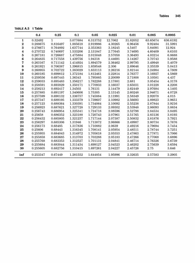
Tables 345
TABLE A.5 t Table
0.4 0.25 0.1 0.05 0.025 0.01 0.005 0.0005
1 0.32492 1 3.077684 6.313752 12.7062 31.82052 63.65674 636.61922 0.288675 0.816497 1.885618 2.919986 4.30265 6.96456 9.92484 31.59913 0.276671 0.764892 1.637744 2.353363 3.18245 4.5407 5.84091 12.9244 0.270722 0.740697 1.533206 2.131847 2.77645 3.74695 4.60409 8.61035 0.267181 0.726687 1.475884 2.015048 2.57058 3.36493 4.03214 6.86886 0.264835 0.717558 1.439756 1.94318 2.44691 3.14267 3.70743 5.95887 0.263167 0.711142 1.414924 1.894579 2.36462 2.99795 3.49948 5.40798 0.261921 0.706387 1.396815 1.859548 2.306 2.89646 3.35539 5.04139 0.260955 0.702722 1.383029 1.833113 2.26216 2.82144 3.24984 4.7809
10 0.260185 0.699812 1.372184 1.812461 2.22814 2.76377 3.16927 4.586911 0.259556 0.697445 1.36343 1.795885 2.20099 2.71808 3.10581 4.43712 0.259033 0.695483 1.356217 1.782288 2.17881 2.681 3.05454 4.317813 0.258591 0.693829 1.350171 1.770933 2.16037 2.65031 3.01228 4.220814 0.258213 0.692417 1.34503 1.76131 2.14479 2.62449 2.97684 4.140515 0.257885 0.691197 1.340606 1.75305 2.13145 2.60248 2.94671 4.072816 0.257599 0.690132 1.336757 1.745884 2.11991 2.58349 2.92078 4.01517 0.257347 0.689195 1.333379 1.739607 2.10982 2.56693 2.89823 3.965118 0.257123 0.688364 1.330391 1.734064 2.10092 2.55238 2.87844 3.921619 0.256923 0.687621 1.327728 1.729133 2.09302 2.53948 2.86093 3.883420 0.256743 0.686954 1.325341 1.724718 2.08596 2.52798 2.84534 3.849521 0.25658 0.686352 1.323188 1.720743 2.07961 2.51765 2.83136 3.819322 0.256432 0.685805 1.321237 1.717144 2.07387 2.50832 2.81876 3.792123 0.256297 0.685306 1.31946 1.713872 2.06866 2.49987 2.80734 3.767624 0.256173 0.68485 1.317836 1.710882 2.0639 2.49216 2.79694 3.745425 0.25606 0.68443 1.316345 1.708141 2.05954 2.48511 2.78744 3.725126 0.255955 0.684043 1.314972 1.705618 2.05553 2.47863 2.77871 3.706627 0.255858 0.683685 1.313703 1.703288 2.05183 2.47266 2.77068 3.689628 0.255768 0.683353 1.312527 1.701131 2.04841 2.46714 2.76326 3.673929 0.255684 0.683044 1.311434 1.699127 2.04523 2.46202 2.75639 3.659430 0.255605 0.682756 1.310415 1.697261 2.04227 2.45726 2.75 3.646
inf 0.253347 0.67449 1.281552 1.644854 1.95996 2.32635 2.57583 3.2905
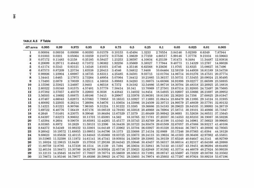
TABLE A.6 F Table
df\area 0.995 0.99 0.975 0.95 0.9 0.75 0.5 0.25 0.1 0.05 0.025 0.01 0.005
1 0.00004 0.00016 0.00098 0.00393 0.01579 0.10153 0.45494 1.3233 2.70554 3.84146 5.02389 6.6349 7.879442 0.01003 0.0201 0.05064 0.10259 0.21072 0.57536 1.38629 2.77259 4.60517 5.99146 7.37776 9.21034 10.596633 0.07172 0.11483 0.2158 0.35185 0.58437 1.21253 2.36597 4.10834 6.25139 7.81473 9.3484 11.34487 12.838164 0.20699 0.29711 0.48442 0.71072 1.06362 1.92256 3.35669 5.38527 7.77944 9.48773 11.14329 13.2767 14.860265 0.41174 0.5543 0.83121 1.14548 1.61031 2.6746 4.35146 6.62568 9.23636 11.0705 12.8325 15.08627 16.74966 0.67573 0.87209 1.23734 1.63538 2.20413 3.4546 5.34812 7.8408 10.64464 12.59159 14.44938 16.81189 18.547587 0.98926 1.23904 1.68987 2.16735 2.83311 4.25485 6.34581 9.03715 12.01704 14.06714 16.01276 18.47531 20.277748 1.34441 1.6465 2.17973 2.73264 3.48954 5.07064 7.34412 10.21885 13.36157 15.50731 17.53455 20.09024 21.954959 1.73493 2.0879 2.70039 3.32511 4.16816 5.89883 8.34283 11.38875 14.68366 16.91898 19.02277 21.66599 23.58935
10 2.15586 2.55821 3.24697 3.9403 4.86518 6.7372 9.34182 12.54886 15.98718 18.30704 20.48318 23.20925 25.1881811 2.60322 3.05348 3.81575 4.57481 5.57778 7.58414 10.341 13.70069 17.27501 19.67514 21.92005 24.72497 26.7568512 3.07382 3.57057 4.40379 5.22603 6.3038 8.43842 11.34032 14.8454 18.54935 21.02607 23.33666 26.21697 28.2995213 3.56503 4.10692 5.00875 5.89186 7.0415 9.29907 12.33976 15.98391 19.81193 22.36203 24.7356 27.68825 29.8194714 4.07467 4.66043 5.62873 6.57063 7.78953 10.16531 13.33927 17.11693 21.06414 23.68479 26.11895 29.14124 31.3193515 4.60092 5.22935 6.26214 7.26094 8.54676 11.03654 14.33886 18.24509 22.30713 24.99579 27.48839 30.57791 32.8013216 5.14221 5.81221 6.90766 7.96165 9.31224 11.91222 15.3385 19.36886 23.54183 26.29623 28.84535 31.99993 34.2671917 5.69722 6.40776 7.56419 8.67176 10.08519 12.79193 16.33818 20.48868 24.76904 27.58711 30.19101 33.40866 35.7184718 6.2648 7.01491 8.23075 9.39046 10.86494 13.67529 17.3379 21.60489 25.98942 28.8693 31.52638 34.80531 37.1564519 6.84397 7.63273 8.90652 10.11701 11.65091 14.562 18.33765 22.71781 27.20357 30.14353 32.85233 36.19087 38.5822620 7.43384 8.2604 9.59078 10.85081 12.44261 15.45177 19.33743 23.82769 28.41198 31.41043 34.16961 37.56623 39.9968521 8.03365 8.8972 10.2829 11.59131 13.2396 16.34438 20.33723 24.93478 29.61509 32.67057 35.47888 38.93217 41.4010622 8.64272 9.54249 10.98232 12.33801 14.04149 17.23962 21.33704 26.03927 30.81328 33.92444 36.78071 40.28936 42.7956523 9.26042 10.19572 11.68855 13.09051 14.84796 18.1373 22.33688 27.14134 32.0069 35.17246 38.07563 41.6384 44.1812824 9.88623 10.85636 12.40115 13.84843 15.65868 19.03725 23.33673 28.24115 33.19624 36.41503 39.36408 42.97982 45.5585125 10.51965 11.52398 13.11972 14.61141 16.47341 19.93934 24.33659 29.33885 34.38159 37.65248 40.64647 44.3141 46.9278926 11.16024 12.19815 13.8439 15.37916 17.29188 20.84343 25.33646 30.43457 35.56317 38.88514 41.92317 45.64168 48.2898827 11.80759 12.8785 14.57338 16.1514 18.1139 21.7494 26.33634 31.52841 36.74122 40.11327 43.19451 46.96294 49.6449228 12.46134 13.56471 15.30786 16.92788 18.93924 22.65716 27.33623 32.62049 37.91592 41.33714 44.46079 48.27824 50.9933829 13.12115 14.25645 16.04707 17.70837 19.76774 23.56659 28.33613 33.71091 39.08747 42.55697 45.72229 49.58788 52.3356230 13.78672 14.95346 16.79077 18.49266 20.59923 24.47761 29.33603 34.79974 40.25602 43.77297 46.97924 50.89218 53.67196
346

Index

This page intentionally left blank

1 sample t-test dialog box, SigmaXL, 178–179
2 Sample Mann-Whitney dialog box, SigmaXL, 190, 192f
22 factorial design, 218–22123–1 fractional factorial design, 258–26024–1 factorial design, 2602-factor DOE sheet, 225, 227f2k factorial design, 217–218, 237–2392k–1 fractional factorial design, 256–2582-Level Factorial/Screening Design dialog box,
SigmaXL, 2253-sigma control charts, 2905s process, 280–281
α (alpha) confi dence level, 175, 177–178α (Type I) errors
hypothesis testing, 175variations in production, 289–291
acceptance sampling, 283accuracy
gauge bias, 94–96gauge linearity, 96–100measurement errors due to, 86–93overview, 86variations due to, 93
action plans, FMEA, 170–172actual capabilities, 106, 109–111actual customers, 19adjusted coeffi cient of determination,
249–250affi nity diagrams, 144–146aliases, 258–259, 262alpha (α) confi dence level, 175,
177–178alternate hypotheses
ANOVA, 199Chi-square test, 183contingency analysis, 186hypothesis testing, 174Mann-Whitney U test, 189, 193
alternative plans, project charter, 17
analysis of variance. See ANOVAAnalyze 2-Level Factorial/Screening Design
dialog box, SigmaXL, 225, 226f, 228fAnalyze Factorial Design option, Minitab,
223–224Analyze phase, 143–211
affi nity diagram, 144–146ANOVA
calculated F-statistic, 203–204mean square, 200–203overview, 198–200
brainstorming, 143cause-and-effect analysis, 146–148cycle time reduction
batch versus one-piece fl ow, 164–165overview, 161–162takt time, 162–164
data gathering and process improvementoverview, 165–166value stream mapping, 166–168
failure mode and effect analysisaction plan, 171–172example of, 172–173failure mode assessment, 170–171hypothesis testing, 174–177overview, 168–170p-value method, 177–181
fault tree analysis, 152–154nominal group process, 143–144nonparametric hypothesis testing
Chi-square test, 182–185contingency analysis, 185–187Mann-Whitney U test, 187–195normality testing, 195–196normalizing data, 196–198overview, 182
Pareto analysis, 149–152regression analysis
coeffi cient of correlation, 207coeffi cient of determination, 208overview, 204–206regression equation, 208
Note: Page numbers referencing fi gures are italicized and followed by an “f ”.
349
350 Index
Analyze phase, regression analysis (Cont.):simple linear regression, 206–207using Excel, 207–208using SigmaXL, 208–211
wasteinappropriate processing, 159Lean approach to reduction of, 159–161motion, 158overproduction, 156–157overview, 154–156product defects, 159unnecessary inventory, 158unnecessary transportation, 158–159wait, 157–158
Anderson-Darling test, 195–196ANOVA (analysis of variance)
calculated F-statistic, 203–204defi ned, 84factorial experiments, 231mean square, 200–203overview, 198–200
appraisal cost, 31approximating binomial problems by Poisson
distribution, 56as is process mapping, 22asset turn, 273assignable causes of variations in production,
285–286attribute control charts
c chart, 329–330np chart, 327–329overview, 322–324p chart, 324–327u chart, 330–331
attribute data, 44, 324attribute gauge studies, 100–102Automatically load SigmaXL option, Help
submenu, SigmaXL menu, 3availability, equipment, 137–138available time, 168average completion rate, 140–141
β (Type II) errorshypothesis testing, 175variations in production, 291–293
background noise, 286background statements, 16balanced production processes, 271basic features, 24–25batch-and-queue process
cycle time reduction, 164–165overproduction, 156–157
bias, gauge, 93–96binomial distribution, 47–48
Binomial Distribution box, Minitab, 49binomial problems, approximating by Poisson
distribution, 56blocking, regression model, 252–254bottlenecks, 156–157, 167, 271–273Box-Cox transformation, 122–128, 196–198brainstorming. See also specifi c brainstorming
techniques by namefault tree analysis, 153–154overview, 143–146
breaking points, Pareto analysis, 152, 153fBreyfogle, Forrest, 30, 286
C&E (cause-and-effect) analysis, 146–148, 168c 2 distribution, central limit theorem, 77–80c 2 statistic
Chisquare test, 183–185contingency analysis, 186–187
calculated F-statistic, ANOVA, 203–204capability indices. See potential capabilities;
process capability analysiscapacity calculations
daily, 136–137facility, 137resources, 135worker, 135
capital, working, 161capturing voice of customer
critical-to-quality tree, 22–23customers of project, 21external customer, 19–21internal customer, 21Kano analysis, 23–25next step in process, 21–22overview, 17–19
categorical data. See nonparametric hypothesis testing
cause-and-effect (C&E) analysis, 146–148, 168c charts, 329–330center lines, mean and range charts, 297–298central limit theoremc 2 distribution, 77–80estimating population mean
with large sample sizes, 71–74with small sample sizes and σ unknown
t-distribution, 74–77estimating sample sizes, 80–81overview, 69–70sample size when estimating mean, 81–82sampling distribution of mean, 70–71
champions, project, 16chance causes of variations in production,
286–287charters, project, 15–17

Index 351
charts. See also control chartsfl ow, 22, 170Gantt, 10–13standard deviation, 305–309
Chi-square testgoodness-of-fi t, 182–185of independence, 185–187
clouds, evaporating, 274–275cluster sampling, 68coeffi cient of correlation, 207–208coeffi cient of determination
adjusted, 249–250overview, 249regression analysis, 208
common causes of variations in production, 286–287
completion dates, FMEA projected, 172completion rate, average, 140–141computational approach to monitoring shifts
in process mean, 317–319confi dence intervals
estimating population mean, 72–73hypothesis testing, 177p-value method, 181
confi dence levelshypothesis testing, 175p-value method, 177–178
conformance, cost of, 30, 34–36confounding, regression model, 254–256contingency analysis, 185–187continuous distributions
versus discrete distributions, 44–45overview, 56–58
continuous improvement, 268continuous variables, 45, 56contrasts, 221, 258–259control charts, 283–331
attributec chart, 329–330np chart, 327–329overview, 322–324p chart, 324–327u chart, 330–331
defi ned, 84process capability analysis, 104statistical process control, 283–284variable
calculating sample statistics to be plotted, 296–297
center lines, 297–298control limits, 298, 302–305individual moving range charts, 310–311individual values control charts, 309–313mean and range charts, 296
mean and standard deviation charts, 305–309
mean-range-based X control charts, 299–302
monitoring shifts in process mean, 313–322overview, 295–296standard-error-based X chart, 298–299
variations in productionassignable causes of, 285–286building control chart, 287–288common causes of, 286–287overview, 284–285probability for misinterpreting control
charts, 289rational subgrouping, 288–289Type I error α, 289–291Type II error β, 291–293WECO rules, 293–295
control limitsc charts, 329EWMA, 321IMR charts, 311individual value charts, 311–312mean and range charts, 298mean-range-based X control charts, 300np charts, 327overview, 287p charts, 325process capability analysis, 104for s charts, 309standard-error-based X chart, 299Type I error α, 289–290u charts, 331WECO rules, 293–294X and s paired charts, 307–308
for X charts, 298, 309Control phase. See control chartsconvenience sampling, 68correlation, coeffi cient of, 207–208cost. See wastecost of collection of samples, 256–257cost of conformance, 30, 34–36cost of nonconformance, 31, 34–36cost of production, 21, 283–284cost of quality
according to Taguchi, 36–38appraisal cost, 31assessing, 29–30cost of conformance, 30cost of nonconformance, 31external failure, 31–34internal failure, 31optimal, 34–36preventive cost, 30–31
352 Index
Cp short-term potential capability index, 107–109
CPA (critical path analysis), 11–13CPM capability index, 116–121Cr short-term potential capability index,
107–109creation of value, 1critical F-statistic, ANOVA, 203–204critical path analysis (CPA), 11–13critical-to-quality tree. See CTQ treeCRT (current reality tree), 276–278CSR (customer service) data collection, 21CTQ (critical-to-quality) tree. See also
attribute control charts; variable control charts
capturing voice of customer, 22–23defects per unit, 132variation, 284–285
cubes, 23 factorial design, 238–239, 240fcumulative frequencies, Pareto analysis,
149–150cumulative sum (CUSUM) charts,
314–317current controls, FMEA, 171current reality tree (CRT), 276–278customer service (CSR) data collection, 21customers
allowing to pull value, 161capturing voice of
critical-to-quality tree, 22–23customers of project, 21external customer, 19–21internal customer, 21Kano analysis, 23–25next step in process, 21–22overview, 17–19
expectations of, 19, 136, 285requirements of, 22–23SIPOC diagram, 26takt time, 162–164value of products to, 160value stream mapping, 166–168
CUSUM (cumulative sum) charts, 314–317cycle time
defi ned, 135–136reduction of
batch versus one-piece fl ow, 164–165overview, 161–162takt time, 162–164
throughput rate, 141value stream mapping, 167
daily capacities, worker, 136–137daily productivities, 309–310
data analysis, Mann-Whitney U test, 189, 193
data gatheringoverview, 43and process improvement, 165–168
data manipulation menu, SigmaXL, 4–5data types, 43–44decision rule, hypothesis testing, 175defects, 131, 159, 283–284. See also variations
in productiondefects per million opportunities (DPMO), 133defects per opportunity (DPO), 132defects per unit (DPU), 132defi ne, measure, analyze, improve, and control
(DMAIC) pattern, 2–4. See also specifi c phases by name
Defi ne Custom Factorial Design dialog box, Minitab, 222–223, 254
Defi ne Custom General Factorial Design–Design dialog box, Minitab, 254
Defi ne phase, 9–41capturing voice of customer
critical-to-quality tree, 22–23customers of project, 21external customer, 19–21internal customer, 21Kano analysis, 23–25next step in process, 21–22overview, 17–19
cost of qualityaccording to Taguchi, 36–38appraisal cost, 31assessing, 29–30cost of conformance, 30cost of nonconformance, 31external failure, 31–34internal failure, 31optimal, 34–36preventive cost, 30–31
project charter, 15–17project planning
Gantt charts, 10–13overview, 9–10PERT, 13–15
SIPOC, 26–28stakeholder analysis, 38–41
defi nitionof problems, 274project, 16, 21
degrees of freedomANOVA, 203factorial experiments, 222interaction effects, 248

Index 353
delighter features, 25delivery time, 162–164Dell
customer-pulled value, 161customer-specifi ed value, 160unnecessary inventory, 158
density function, Poisson distribution, 54dependent variables, 205–206, 210descriptions, project, 17Descriptive Statistics box, SigmaXL, 6–7design of experiments (DOE), 213–215design reliability analysis. See FMEAdesign resolution
alias structure, 262main effects, 262–263overview, 260–262regression coeffi cients, 263regression equations, 263regression model, 260–268using Minitab, 266–268using SigmaXL, 263–266
Design Resolution III, 261Design Resolution IV, 261Design Resolution V, 261detection in FMEA, 171–172determination, coeffi cient of. See coeffi cient of
determinationdeviations
cumulative sum of, 314from quality target, 36–37
discrete probability distributionsbinomial, 47–48versus continuous, 44–45hyper-geometric, 51–53Poisson, 54–56using Excel, 48–49using Minitab, 49–51
discrete random variables, 45distribution, nonnormal, 128–130distributions, probability. See probabilityDMAIC (defi ne, measure, analyze, improve,
and control) pattern, 2–4. See also specifi c phases by name
DOE (design of experiments), 213–215downtime, 138DPMO (defects per million opportunities),
133DPO (defects per opportunity), 132DPU (defects per unit), 132
effi ciency, equipment, 138–140elimination of waste, 134–135employee capacity, 135employee feedback, 22
equipmentavailability, 137–138overall effi ciency, 139–140performance effi ciency, 138, 140utilization, 137–138
errorshypothesis testing, 175measurement, due to accuracy, 86–93nonsampling, 68sampling, 68–69
estimatingpopulation mean
with large sample sizes, 71–74with small sample sizes and σ unknown
t-distribution, 74–77sample sizes, 80–81sigma, 106–107
evaporating cloud, 274–275events, 44EWMA (exponentially weighted moving
average), 319–322Excel
coeffi cient of correlation, 207–208overview, 2probability distributions using, 48–49
expectations, customer, 19, 136, 285expected frequencies
Chi-square test, 183–184contingency analysis, 186–187
expected value, 45–46experiments, 44, 213–215. See also factorial
experimentsexponential distribution, Z transformation,
62–64exponentially weighted moving average
(EWMA), 319–322external customers, 19–21external failure, cost of, 31–34
facilitators, nominal group process, 144facility capacity calculation, 137factorial experiments
22 factorial design, 218–2212k factorial design, 217–218degrees of freedom, 222interaction effect, 217interpretation, 225main effect, 216–217overview, 215–216using Minitab, 222–224using SigmaXL
ANOVA tables, 231determining main effects, 229–230interaction effect, 230

354 Index
factorial experiments, using SigmaXL (Cont.):overview, 225–229sums of squares, 230using Minitab, 231–233
failure, cost of, 31–34failure mode and effect analysis. See FMEAfault tree analysis (FTA), 152–154, 155f, 168features, product, 24–25feedback
employee, 22quality assurance, 22
FFA (Force Field Analysis), 39–41fi rst time yield (FTY), 133–134fi rst-order linear model, 206–207fi shbone, 146–148, 1685s process, 280–281fl exible work force, 136–137fl ow, production, 160–161fl ow charts, 22, 170fl ow processes, one-piece, 271fl ow time, 141FMEA (failure mode and effect analysis)
action plan, 171–172example of, 172–173failure mode assessment, 170–171hypothesis testing, 174–177overview, 168–170p-value method, 177–181
focus groups, 21Force Field Analysis (FFA), 39–41fractional factorial design, 257frequencies
cumulative, 149–150expected, 183–184, 186–187observed, 183–184, 186–187relative, 150
FRT (future reality tree), 278–281F-statistics
ANOVA, 200–201, 203–204regression model, 248–252
FTA (fault tree analysis), 152–154, 155f, 168FTY (fi rst time yield), 133–134Function Arguments dialog box, Excel, 48f,
50f, 208future reality tree (FRT), 278–281
Gantt charts, 10–13gauges
bias, 94–96linearity, 96–100performance of, 83precision and accuracy, 86
Goldratt, Eliyahu, 268, 273–281graphical procedure, CUSUM charts, 314
half-factorial designs, 257, 260hyper-geometric distribution, 51–53hypotheses, alternate. See alternate
hypotheseshypothesis testing, 94, 174–177, 195–196,
289. See also ANOVA; nonparametric hypothesis testing
identifi ers, 258Improve phase, 213–281
design of experiments, 213–215factorial experiments
22 factorial design, 218–2212k factorial design, 217–218degrees of freedom, 222interaction effect, 217interpretation, 225main effect, 216–217overview, 215–216using Minitab, 222–224using SigmaXL, 225–234
regression model23−1 fractional factorial design, 258–26024−1 factorial design, 2602k two levels with more than 2 factors,
237–2392k−1 fractional factorial design, 256–258blocking, 252–254confounding, 254–256design resolution, 260–268F-statistics, 248–252interaction effects, 244–248main effects for 23, 239–244mean square of factors and interactions, 248overview, 234–236residual analysis, 236–237SigmaXL output, 236
theory of constraintsevaporating cloud, 274–275metrics, 273overview, 268–271process throughput and bottlenecks, 271–273reality trees, 275–281thinking process, 273–274
improvement, continuous, 161IMR (individual moving range) charts,
310–311inappropriate processing, 159independent variables, 205–206, 210individual moving range (IMR) charts, 310–311individual values control charts, 309–313innovation, 10inputs, SIPOC diagram, 26Insert Function dialog box, Excel, 48, 207
Index 355
interaction effects22 factorial design, 220–221factorial experiments, 217, 230regression model, 244–248
interest, stakeholder, 39, 40finternal customers, 18–19, 21internal failure, cost of, 31inventory
overproduction of outbound, 156–157in theory of constraints, 273unnecessary, 158WIP, 141
Ishikawa diagrams, 146–148, 168
Johnson Transformation, 196–198judgment sampling, 68Juran, Joseph, Dr., 29, 149
Kaizen events. See also cycle timedata gathering and process improvement,
165–168defi ned, 161
Kano analysis, 23–25key process input variables (KPIV), 147KJ method, 144–146Kolmogorov-Smirnov test, 195KPIV (key process input variables), 147
LCDs (liquid crystal displays), 34Lean metrics
cycle time, 135–136equipment availability, 138equipment performance effi ciency, 138, 140equipment utilization, 137–138facility capacity calculation, 137net operating rate, 139operating speed rate, 138–139overall equipment effi ciency, 139–140overview, 134–135quality rate of products, 139resources capacity calculations, 135throughput rate, 140–141workers capacity calculation, 135workers’ daily capacity, 136–137
Lean Six Sigma, 1–2Lean waste reduction approach, 159–161level of risk, hypothesis testing, 174–175Liker, Jeffrey, 1Likert scale, 20linear regression, 206–207linearity, gauge, 93, 96–100liquid crystal displays (LCDs), 34Little’s law, 141locational data, 44
lognormal distribution, 128long-term potential performance, 109long-term sigma, 107loss function equation, 37lower specifi ed limit (LSL), 104, 106
main effectsfor 23, 239–244design resolution, 262–263factorial experiments, 216–217, 229–230
Mann-Whitney U testanalyzing data, 189defi ning null hypothesis, 189determining values of U statistic, 189–190overview, 187–189using SigmaXL, 190–195
mappingas is process, 22process, 22value stream, 166–168, 169f
mean. See also monitoring shifts in process mean
estimatingwith large sample sizes, 71–74sample size when, 81–82with small sample sizes and σ unknown
t-distribution, 74–77exponential distribution, 63Poisson distribution, 54probability, 45–46
mean and range chartscalculating sample statistics to be plotted,
296–297center lines, 297–298control limits, 298, 302–305mean-range-based X control charts, 299–302overview, 296standard-error-based X chart, 298–299
mean and standard deviation charts, 305–309mean square
ANOVA, 200–203of regression model factors and interactions,
248mean-range-based X control charts, 299–302Measure phase, 43–141. See also metrics
attribute gauge studies, 100–102basic probability
binomial distribution, 47–48continuous distribution, 56–58discrete probability distributions, 47–55discrete versus continuous distributions,
44–45Excel, distributions using, 48–49expected value or mean, 45–46

356 Index
Measure phase, basic probability (Cont.):hyper-geometric distribution, 51–53Minitab, distributions using, 49–51overview, 44Poisson distribution, 54–56variance and standard deviation, 46Z transformation, 58–66
central limit theoremc 2 distribution, 77–80estimating population mean, 71–77estimating sample sizes, 80–81overview, 69–70sample size when estimating mean, 81–82sampling distribution of mean X, 70–71
data gathering, 43data types, 43–44estimating sigma, 106–107measurement systems analysis, 82–86potential capabilities
actual capabilities, 109–111long-term, 109Minitab output, 115–116overview, 107parts per million, 111short-term, 107–109Taguchi’s capability indices, 116–121Z transformation, 111–115
precision and accuracygauge bias, 94–96gauge linearity, 96–100measurement errors due to, 86–93overview, 86variations due to, 93
process capability analysiswith nonnormal data, 121–122normality assumption and Box-Cox
transformation, 122–123overview, 103–106using Box-Cox transformation, 123–128using nonnormal distribution, 128–130
samplingerrors, 68–69nonrandom, 68nonsampling errors, 68planning for, 66–67random, 67–68
work in progress, 141measurement systems analysis, 82–86menu bar, SigmaXL, 3–5metrics
fi rst time yield, 133–134Lean
cycle time, 135–136equipment availability, 138equipment performance effi ciency, 138, 140
metrics, Lean (Cont.):equipment utilization, 137–138facility capacity calculation, 137net operating rate, 139operating speed rate, 138–139overall equipment effi ciency, 139–140overview, 134–135quality rate of products, 139resources capacity calculations, 135throughput rate, 140–141workers capacity calculation, 135workers’ daily capacity, 136–137
overview, 130scorecard, 28Six Sigma, 131–133TOC, 273
Microsoft Excelcoeffi cient of correlation, 207–208overview, 2probability distributions using, 48–49
MinitabCUSUM charts, 316–317design resolution, 266–268exponentially weighted moving average,
322factorial experiments, 222–224, 231–232F-statistics, 250–251normality testing, 195–196overview, 2Pareto analysis, 152p chart, 326–327potential capabilities, 115–116probability distributions using, 49–51Z transformation, 64–66
misinterpretation, control chart, 289monitoring, project, 17monitoring shifts in process mean
computational approach, 317–319CUSUM charts, 314–317exponentially weighted moving average,
319–322overview, 313–314
motion, 158multiple regression analysis, 210–211Multiple Regression dialog box, Excel,
208–209multivariate control charts, 295
needs, customer, 22–23negative working capital, 161net operating rate, 139net profi t, 273next step in process, capturing voice of, 21–22nominal data. See nonparametric hypothesis
testing

Index 357
nominal group process, 143–144nonconformance, cost of, 30, 31, 34–36nonnormal data, process capability analysis
with, 121–122nonnormal distribution, process capability
analysis using, 128–130nonparametric hypothesis testing
Chi-square test, 182–185contingency analysis, 185–187Mann-Whitney U test, 187–195normality testing, 195–196normalizing data, 196–198overview, 182
nonrandom sampling, 68nonsampling errors, 68normal data, process capabilities with, 106normal distribution, 56–58Normal Random Number Generator box,
SigmaXL, 6normality assumption and Box-Cox
transformation, 122–123normality testing, 195–196, 197fnormalizing data, 196–198np charts, 327–329null hypotheses
ANOVA, 199Chi-square test, 183contingency analysis, 186hypothesis testing, 174–177Mann-Whitney U test, 189, 193p-value method, 177–181
numbers, project, 16Numeric Data Variables (Y)>> button,
Descriptive Statistics box, SigmaXL, 6–7
observed frequenciesChi-square test, 183–184contingency analysis, 186–187
occurrence in FMEA, 171–172OEE (overall equipment effi ciency),
139–1401 sample t-test dialog box, SigmaXL,
178–179one-piece fl ow, 161, 164–165, 271operating speed rate, 138–139operational expenses, 273optimal cost of quality, 34–36ordinal data. See nonparametric hypothesis
testingorganization, workplace, 280orthogonal factors, 258outbound inventory, 156–157outputs, SIPOC diagram, 26overall equipment effi ciency (OEE), 139–140overproduction, 156–157
parametric datahypothesis testing, 174–177p-value method, 177–181
parentheses in factorial designs, 221Pareto analysis, 147, 149–152, 153fparts per million (PPM), 111–112PCE (process cycle effi ciency), 141p charts, 324–327perfection, 161performance effi ciency, equipment,
138, 140performance features, 25PERT (program evaluation and review
technique), 13–15planned downtime, 138planning
projectGantt charts, 10–13overview, 9–10PERT, 13–15
for sampling, 66–67Poisson distributions, 54–56, 133polynomial functions, 205population mean, estimating
with large sample sizes, 71–74with small sample sizes and σ unknown
t-distribution, 74–77potential capabilities
actual capabilities, 109–111long-term, 109Minitab output, 115–116overview, 106–107parts per million, 111short-term, 107–109Taguchi’s capability indices,
116–121Z transformation, 111–115
potential causes of failure, FMEA, 170–171
potential customers, 19potential effect of failure, FMEA, 170potential failure mode, FMEA, 170power of stakeholders, 39, 40fpower of test statistics, 291PPM (parts per million), 111–112PPM capability index, 116–121precision
gauge bias, 94–96gauge linearity, 96–100measurement errors due to, 86–93overview, 86variations due to accuracy, 93
preemptive techniques. See FMEApreventive actions, FMEA, 171–172preventive cost, 30–31

358 Index
probabilitycontinuous distribution, 56–58discrete distributions
binomial, 47–48versus continuous, 44–45hyper-geometric, 51–53Poisson, 54–56using Excel, 48–49using Minitab, 49–51
expected value or mean, 45–46for misinterpreting control charts, 289overview, 44variance and standard deviation, 46Z transformation, 58–66
problemsdefi nition of, 274verbalization of, 274–275
process capability analysis. See also potential capabilities
with nonnormal data, 121–122normality assumption and Box-Cox
transformation, 122–123overview, 103–106using Box-Cox transformation, 123–128using nonnormal distribution, 128–130
process cycle effi ciency (PCE), 141process mapping, 22process step, FMEA, 170processes. See also FMEA; monitoring shifts in
process mean; regression analysiscapturing voice of next step in, 21–22data gathering and improvement of
overview, 165–166value stream mapping, 166–168
SIPOC diagram, 26throughput and bottlenecks, 271–273
processinginappropriate, 159overproduction, 156–157takt time, 164
product function, FMEA, 170production. See also cycle time; variations in
productionbalanced processes, 271cost of, 283–284fl ow, 160–161
productive resources, 135productivity
5s, 280inappropriate processing, 159Lean waste reduction, 159–161motion, 158overproduction, 156–157
productivity (Cont.):overview, 154, 156product defects, 159reducing cycle time
batch versus one-piece fl ow, 164–165overview, 161–162takt time, 162–164
relationship with quality, 29–30statistical process control, 283–284in theory of constraints, 273unnecessary inventory, 158unnecessary transportation, 158–159wait, 157–158
products. See also FMEAallowing customer to pull, 161defects in as waste, 159defi ning value of, 160features, 24–25overproduction, 156–157quality rate of, 139value streams, 160
profi t loss, 30program evaluation and review technique
(PERT), 13–15project champions, 16project charters, 15–17, 18fproject customers, 21project defi nition, 16, 21project description, 17project management, 9–10project monitoring, 17project numbers, 16project planning
Gantt charts, 10–13overview, 9–10PERT, 13–15
projected completion dates, FMEA, 172pull techniques, 161, 167p-value
ANOVA, 201FMEA, 177–181Mann-Whitney U test, 190, 191f
quality, 22, 29–30, 283–284. See also cost of quality; CTQ tree
quality assurance (QA) feedback, 22quality rate of products, 139quality testing, 66
R chartscalculating sample statistics to be plotted,
296–297center lines, 297–298

Index 359
R charts (Cont.):control limits, 298, 302–305versus other charts, 305–306overview, 296
random sampling, 67–68random variables, 45range charts. See mean and range chartsrational subgrouping, 288–289, 296reality trees
current, 276–278future, 278–281overview, 275
recommended preventive actions, FMEA, 171–172
referendums, 66regression analysis. See also regression model
causes and effects, 147coeffi cient of correlation, 207coeffi cient of determination, 208overview, 204–206regression equation, 208simple linear regression, 206–207testing gauge linearity, 96–97using Excel, 207–208using SigmaXL, 208–211
regression coeffi cients, 207–208, 263regression equations, 208, 263regression model
23−1 fractional factorial design, 258–26024−1 factorial design, 2602k factorial design, 237–2392k−1 fractional factorial design, 256–258blocking, 252–254confounding, 254–256design resolution, 260–268F-statistics, 248–252interaction effects, 244–248main effects for 23, 239–244mean square of factors and interactions,
248overview, 234–236residual analysis, 236–237SigmaXL output, 236
relative frequencies, Pareto analysis, 150repeatability, 85–86replication of designs, 256–257reproducibility, 85–86requirements, customer, 22–23residual analysis, 236–237resolution, design. See design resolutionresources, capability of, 29resources capacity calculations, 135return on assets, 273
risk analysis, project charter, 17risk level, hypothesis testing, 174–175risk priority numbers (RPNs), 171–172rolled throughput yield (RTY), 134Ryan-Joyner test, 195
s charts, 305–309sample collection, 256–257sample size
estimating, 80–81mean and range charts, 296when estimating mean, 81–82when estimating population mean, 71–77
samplingacceptance, 283distribution of mean, 70–71errors, 68–69nonrandom, 68nonsampling errors, 68planning for, 66–67random, 67–68
scheduling, 9–10, 17seiketsu phase, 281seiri phase, 280seiso phase, 281seiton phase, 281set in order phase, 281Set menu, SigmaXL, 4set up time, 168severity in FMEA, 171–172Shewhart, Walter, Dr., 288Shewhart control charts, 289, 313shifts in process mean. See monitoring shifts
in process meanshine phase, 281shitsuke phase, 281Shojinka, 136–137short-term potential capabilities, 107–109short-term sigma, 106–107sigma, estimating, 106–107SigmaXL
central limit theorem, 76–77, 81–82contingency analysis, 187design resolution, 263–266factorial experiments
ANOVA tables, 231determining main effects, 229–230interaction effect, 230overview, 225–229sums of squares, 230using Minitab, 231–233
Mann-Whitney U test, 190–195measurement errors due to precision, 89–93

360 Index
SigmaXL (Cont.):overview, 3–7p-value method, 178–181regression analysis, 208–211regression model output, 236
simple linear regression, 206–207SIPOC (Suppliers-Input-Process-Output-
Customers), 26–28Six Sigma, 1–2, 131–133SOP (standard operating procedures), 22sorting phase, 280SPC (statistical process control), 103, 283–284.
See also control chartsspecial causes of variations in production,
285–286specifi ed limits, 104square, 22 factorial design, 219SSE (sum of squares for error), 199–202SST (sum of squares for treatments), 199,
201–202Stack Column dialog box, SigmaXL, 190, 191fstakeholder analysis, 38–41stakeholders, project charter, 15–17standard deviation
of discrete distribution, 46EWMA, 320exponential distribution, 63p charts, 325relationship to mean range, 298
standard deviation charts, 305–309standard operating procedures (SOP), 22standard-error-based X charts, 298–299standardize phase, 281statistical process control (SPC), 103, 283–284.
See also control chartsstatistics
Chi-square test, 183Mann-Whitney U test, 189–190
strategy, project, 9stratifi ed sampling, 67structured brainstorming sessions, 143subgrouping, rational, 288–289, 296sum of squares for error (SSE), 199–202sum of squares for treatments (SST), 199, 201–202sums of squares
factorial experiments, 230interaction effects, 247
suppliers, SIPOC diagram, 26Suppliers-Input-Process-Output-Customers
(SIPOC), 26–28surveys, 19–20, 25, 66sustain phase, 281systematic sampling, 68
Taguchi, Genichi, Dr.capability indices, 116–121cost of quality, 36–38defi nition of quality, 29
takt time, 135, 162–164task owners, FMEA, 172TCE (total containment effectiveness),
131–132TDPU (total defect per unit), 134templates, SigmaXL, 5–6, 81–82testing. See also ANOVA; nonparametric
hypothesis testinghypothesis, 94, 174–177, 195–196, 289normality, 195–196, 197fquality, 66
theory of constraints. See TOCthinking process, TOC, 273–2743-sigma control charts, 290threshold features, 24–25throughput, 157, 271–273throughput per unit, 273throughput per unit of constraining factor, 273throughput rate, 140–141time measurement, 141time to order, 296timeframes, 288–289TOC (theory of constraints)
evaporating cloud, 274–275metrics, 273overview, 268–271process throughput and bottlenecks,
271–273reality trees, 275–281thinking process, 273–274
tolerance, 103–104, 116total containment effectiveness (TCE), 131–132total defect per unit (TDPU), 134total opportunities, 132total sum of squares (TSS), 201–202Toyota Production System, 1tracking methods, defect, 131transportation, unnecessary, 158–159TSS (total sum of squares), 201–202t-tests, 174–177, 1982 Sample Mann-Whitney dialog box, SigmaXL,
190, 192f22 factorial design, 218–22123–1 fractional factorial design, 258–26024–1 factorial design, 2602-factor DOE sheet, 225, 227f2k factorial design, 217–218, 237–2392k–1 fractional factorial design, 256–258

Index 361
2-Level Factorial/Screening Design dialog box, SigmaXL, 225
Type I errors (α)hypothesis testing, 175variations in production, 289–291
Type II errors (β)hypothesis testing, 175variations in production, 291–293
U statistic, Mann-Whitney U test, 189–190u charts, 330–331undesirable effects (UDEs), 276univariate control charts, 295unnecessary inventory, 158unnecessary transportation, 158–159upper specifi ed limit (USL), 104, 106utilization, equipment, 137–138
valueallowing customer to pull, 161creation of, 1defi ning, 160
value added work, 165value statements, project charter, 17value streams
identifying, 160mapping, 166–168, 169f
variability, 131, 310–311variable control charts
calculating sample statistics to be plotted, 296–297
center lines, 297–298control limits, 298, 302–305individual moving range, 310–311individual values, 309–313mean and range charts, 296mean and standard deviation, 305–309mean-range-based X chart, 299–302monitoring shifts in process mean, 313–322overview, 295–296standard-error-based X chart, 298–299
variable data, 44variables, random, 45variance. See also ANOVA
of critical paths, 14Poisson distribution, 54and standard deviation, 46
variations due to accuracy, 93variations in measurements, 83–84variations in production
assignable causes of, 285–286building control chart, 287–288common causes of, 286–287
variations in production (Cont.):overview, 284–285probability for misinterpreting control
charts, 289rational subgrouping, 288–289Type I errors, 289–291Type II errors, 291–293WECO rules, 293–295
verbalization of problems, 274–275V-mask, 314–316voice of customer, capturing
critical-to-quality tree, 22–23customers of project, 21external customer, 19–21internal customer, 21Kano analysis, 23–25next step in process, 21–22overview, 17–19
wait, 157–158waste
cycle time reductionbatch versus one-piece fl ow, 164–165overview, 161–162takt time, 162–164
elimination of, 134–135inappropriate processing, 159Lean approach to reduction of, 159–161motion, 158overproduction, 156–157overview, 154–156product defects, 159unnecessary inventory, 158unnecessary transportation, 158–159wait, 157–158
WBS (Work Breakdown Structure), 10WECO (Western Electric Company) rules,
293–295Weibull distribution, 128WIP (work in progress), 141Work Breakdown Structure (WBS), 10work instructions, 22worker capacity calculations, 135worker daily capacities, 136–137working capital, 161
X chartscontrol limits for, 298, 309mean and range charts
calculating sample statistics to be plotted, 296–297
center lines, 297–298control limits, 298

362 Index
X charts, mean and range charts (Cont.):mean-range-based X control charts,
299–302overview, 296standard-error-based X chart, 298–299
mean and standard deviation charts, 305–309
Z transformationexponential distribution,
62–64hypothesis testing, 174overview, 58–62process capability, 111–115using Minitab, 64–66


