Embed Size (px)
Citation preview
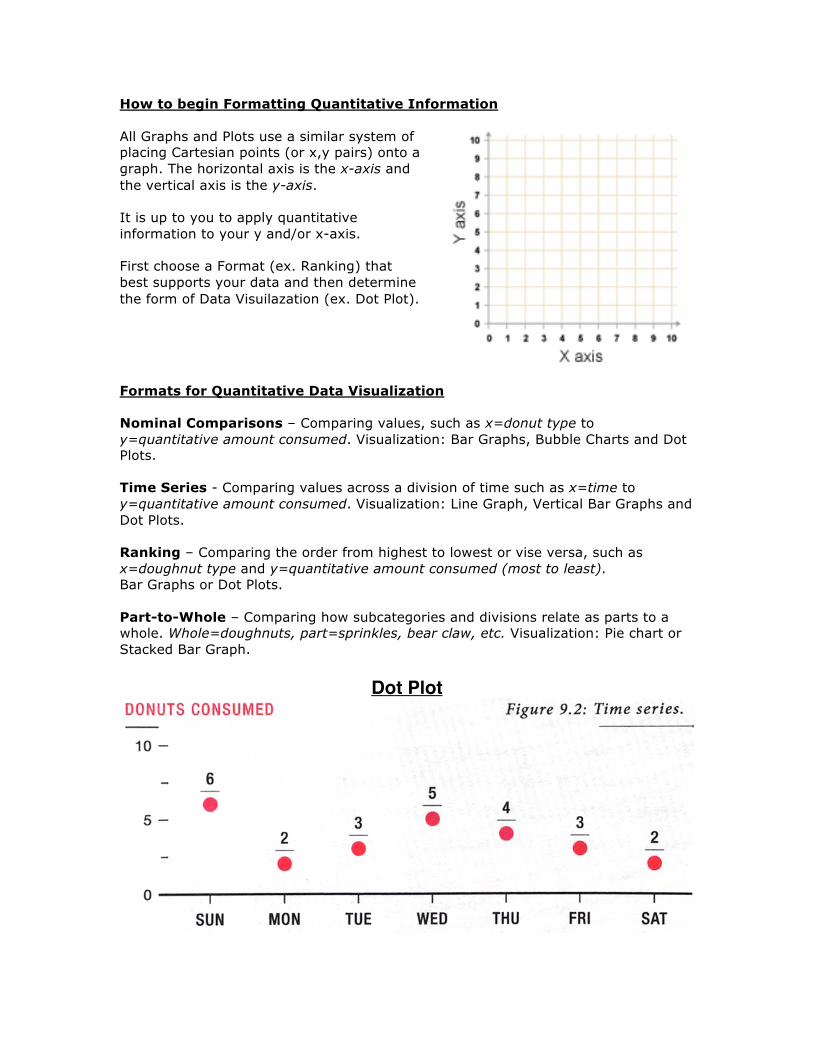
How to begin Formatting Quantitative Information All Graphs and Plots use a similar system of placing Cartesian points (or x,y pairs) onto a graph. The horizontal axis is the x-axis and the vertical axis is the y-axis. It is up to you to apply quantitative information to your y and/or x-axis. First choose a Format (ex. Ranking) that best supports your data and then determine the form of Data Visuilazation (ex. Dot Plot).
Formats for Quantitative Data Visualization Nominal Comparisons – Comparing values, such as x=donut type to y=quantitative amount consumed. Visualization: Bar Graphs, Bubble Charts and Dot Plots. Time Series - Comparing values across a division of time such as x=time to y=quantitative amount consumed. Visualization: Line Graph, Vertical Bar Graphs and Dot Plots. Ranking – Comparing the order from highest to lowest or vise versa, such as x=doughnut type and y=quantitative amount consumed (most to least). Bar Graphs or Dot Plots. Part-to-Whole – Comparing how subcategories and divisions relate as parts to a whole. Whole=doughnuts, part=sprinkles, bear claw, etc. Visualization: Pie chart or Stacked Bar Graph.
Dot Plot
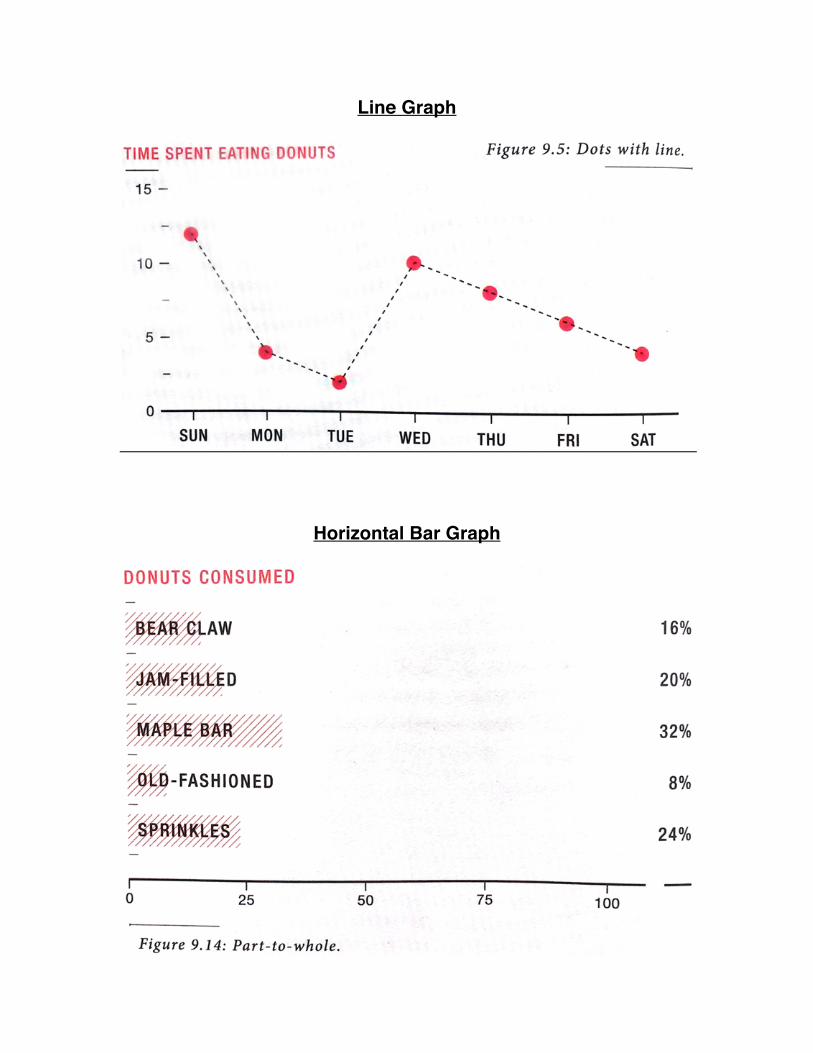
Line Graph
Horizontal Bar Graph
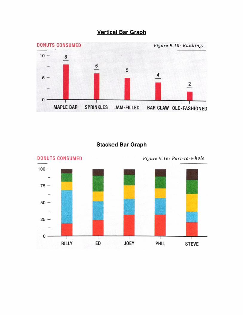
Vertical Bar Graph
Stacked Bar Graph
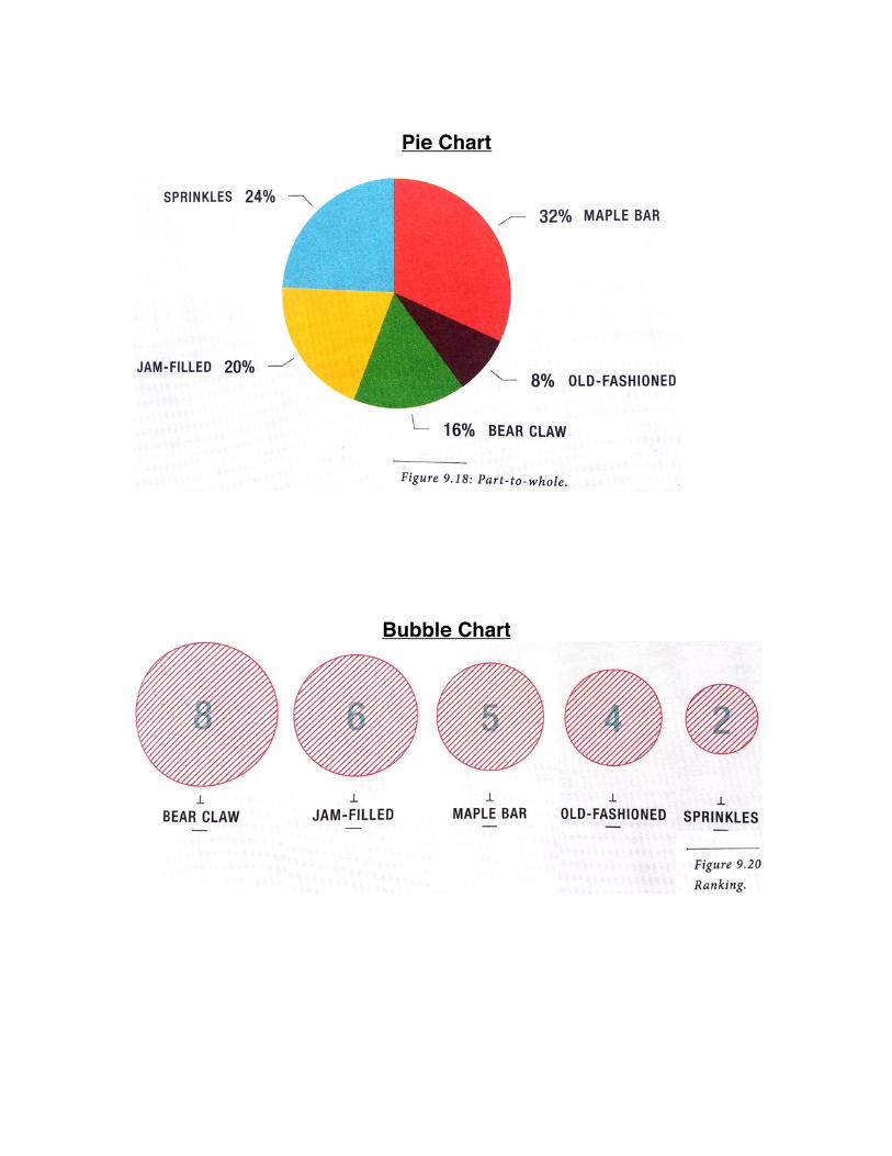
Pie Chart
Bubble Chart
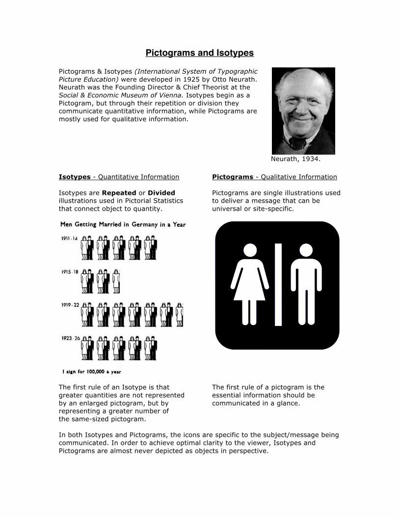
Pictograms and Isotypes Pictograms & Isotypes (International System of Typographic Picture Education) were developed in 1925 by Otto Neurath. Neurath was the Founding Director & Chief Theorist at the Social & Economic Museum of Vienna. Isotypes begin as a Pictogram, but through their repetition or division they communicate quantitative information, while Pictograms are mostly used for qualitative information.
Neurath, 1934. Isotypes - Quantitative Information Isotypes are Repeated or Divided illustrations used in Pictorial Statistics that connect object to quantity.
Pictograms - Qualitative Information Pictograms are single illustrations used to deliver a message that can be universal or site-specific.
The first rule of an Isotype is that greater quantities are not represented by an enlarged pictogram, but by representing a greater number of the same-sized pictogram.
The first rule of a pictogram is the essential information should be communicated in a glance.
In both Isotypes and Pictograms, the icons are specific to the subject/message being communicated. In order to achieve optimal clarity to the viewer, Isotypes and Pictograms are almost never depicted as objects in perspective.
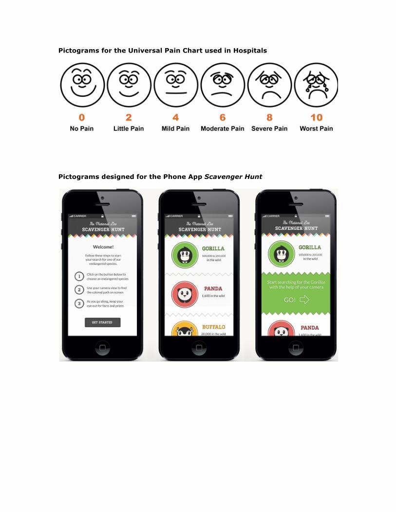
Pictograms for the Universal Pain Chart used in Hospitals
Pictograms designed for the Phone App Scavenger Hunt
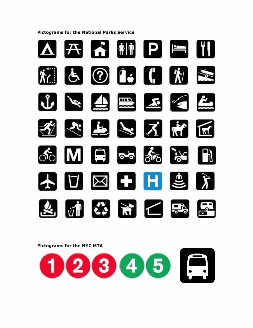
Pictograms for the National Parks Service
Pictograms for the NYC MTA
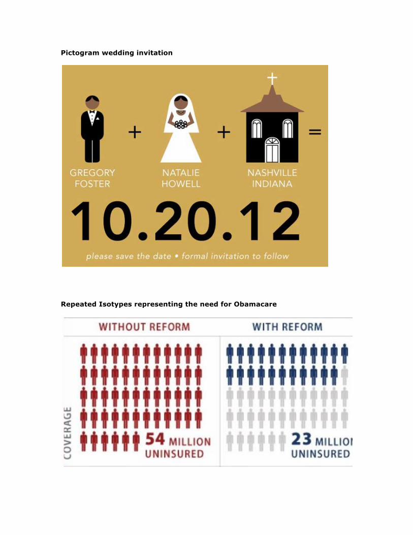
Pictogram wedding invitation
Repeated Isotypes representing the need for Obamacare
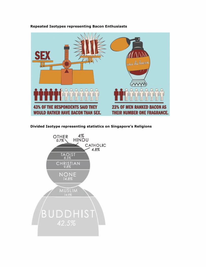
Repeated Isotypes representing Bacon Enthusiasts
Divided Isotype representing statistics on Singapore’s Religions
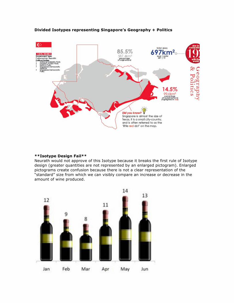
Divided Isotypes representing Singapore’s Geography + Politics
**Isotype Design Fail** Neurath would not approve of this Isotype because it breaks the first rule of Isotype design (greater quantities are not represented by an enlarged pictogram). Enlarged pictograms create confusion because there is not a clear representation of the “standard” size from which we can visibly compare an increase or decrease in the amount of wine produced.
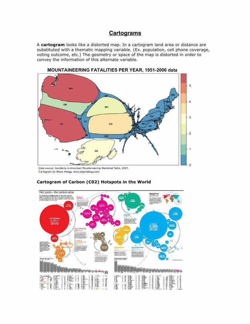
Cartograms A cartogram looks like a distorted map. In a cartogram land area or distance are substituted with a thematic mapping variable. (Ex. population, cell phone coverage, voting outcome, etc.) The geometry or space of the map is distorted in order to convey the information of this alternate variable.
Cartogram of Carbon (C02) Hotspots in the World
Formats for Qualitative Data Visualization
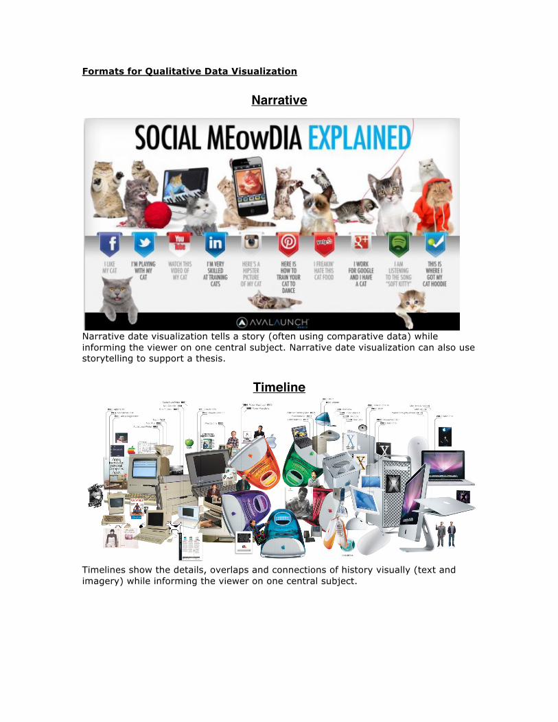
Narrative
Narrative date visualization tells a story (often using comparative data) while informing the viewer on one central subject. Narrative date visualization can also use storytelling to support a thesis.
Timeline
Timelines show the details, overlaps and connections of history visually (text and imagery) while informing the viewer on one central subject.
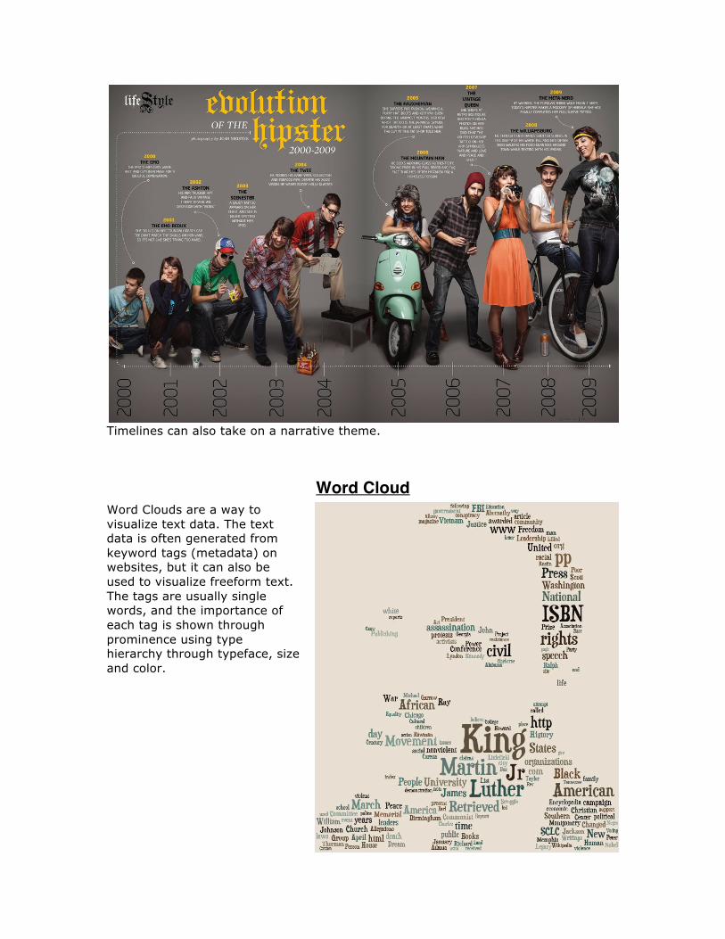
Timelines can also take on a narrative theme.
Word Cloud Word Clouds are a way to visualize text data. The text data is often generated from keyword tags (metadata) on websites, but it can also be used to visualize freeform text. The tags are usually single words, and the importance of each tag is shown through prominence using type hierarchy through typeface, size and color.
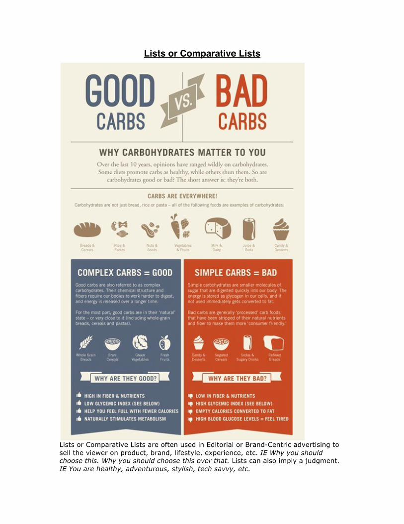
Lists or Comparative Lists
Lists or Comparative Lists are often used in Editorial or Brand-Centric advertising to sell the viewer on product, brand, lifestyle, experience, etc. IE Why you should choose this. Why you should choose this over that. Lists can also imply a judgment. IE You are healthy, adventurous, stylish, tech savvy, etc.
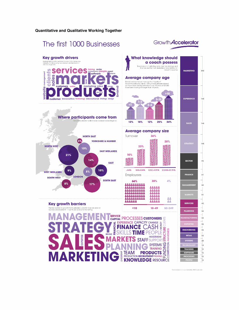
Quantitative and Qualitative Working Together


![Foster 2008 Legume Sm Plot[1]](https://img.dokumen.tips/doc/110x75/6321245b80403fa2920c9a0b/foster-2008-legume-sm-plot1.jpg)


