Embed Size (px)
Citation preview

123Designing documents for train operatorsInformation Design Journal + Document Design 11(2 /3), 123–137
© 2002/2003 John Benjamins Publishing Company
Silvia Torsi, Antonio Rizzo, Simone Pozzi and Luca Save
Designing documents for train operators
A contribution to graphic design from cultural psychology
Keywords: user-centered design, cultural-historical
psychology, document design heuristics
This paper addresses the issue of redesigning a train list.
The train list is a paper document of few pages that
provides train operators of the Italian railway company
with basic information about the features of the railway
line they are moving along, the means of traction and
engine characteristics.
Methodologies borrowed from the ªelds of document
design and human–computer interaction were applied to
the analysis, redesign, and evaluation of a new train list
following a ªrst prototype developed by the railway
company.
In all phases (analysis, redesign, evaluation) the study
was guided by the theoretical framework of cultural-
historical psychology, according to which artifacts histori-
cally shaped by human practice always mediate human
cognition. The results of the evaluation provide empirical
evidence to support the added value of combining docu-
ment design techniques with the heuristic role of the
historical analysis of an artifact, especially in a safety-
critical context, so as to properly improve tools and
instruments used in human activity and thus reduce the
risk of breakdowns.
Introduction
The train list is a paper document of few pages that provides
the train operators of the Italian railway company with
basic information about the features of the railway line that
they are moving along, the means of traction and engine
characteristics. Using the train list, the train operator can
plan and carry out driving activities while considering the
physical characteristics of the train, safety-related inform-
ation, the kind of signaling that will be encountered along
the line and a detailed timetable containing the arrival time
at each station. The train list is often used under adverse
legibility conditions due to time/space constraints, and
therefore easy access and high levels of comprehensibility
of information are crucially important.
The analysis and evaluation of the train list was begun
by applying the principles and heuristics of document
design (Schriver, 1997; Tufte, 1997) to the prototype of a
new version of the train list proposed by the railway com-
pany. Subsequently, the actual use of the current train list
was investigated by two focus groups consisting of ªnal
users. A scenario-based approach was adopted to explore
diŸerent modalities of the use of the train list and its
contextual strengths and weaknesses (Carroll, 1995;
Bannon and Bødker, 1991). Then during focus group
sessions, users were asked to suggest possible improve-
ments to the train list. The analysis of the use of the train
list provided signiªcant data for the subsequent phase,

124 Silvia Torsi, Antonio Rizzo, Simone Pozzi and Luca Save
redesigning the train list. It is important to state that while
the users proposed a number of contentive modiªcations,
our assignment from the railway company was only to
improve the graphic aspects of the new prototype, which
already contained more information than the existing
train list. Our contribution was therefore restricted to the
organization of the information contained in the train list.
The data collected during the ªrst two phases were
used to produce a number of redesign options. As the
ªnal stage in the process, the prototypes were tested by 47
users who were asked to select them iteratively using a
‘tournament’ system (see the section on Testing ).
All phases of this study combined document design
with a user-centered design methodology. Moreover, a
cognitive science perspective based on cultural-historical
psychology provided us with the theoretical framework
that guided the planning of the research and the interpre-
tation of the results.
In what follows, we ªrst sketch the theoretical cul-
tural-historical framework, after which we present: 1. the
train list prototype proposed by the railway company, 2.
the analysis of the train list conducted according to
Schriver’s heuristics of document design, 3. the results of
the focus group meetings with the train operators, and 4.
the design of the new prototypes and their testing. In our
conclusion we discuss the potential implications of this
study for the ªeld of document design.
Theoretical framework
Recent developments within Cognitive Science (Hutchins,
1995; Zhang and Norman, 1994; Norman, 1993) have
provided empirical support to the long-standing thesis
that human cognition is mediated by artifacts (rules, tools,
models, representations) both internal and external to the
mind (Cole, 1996). The concept of the mediating role of
artifacts was originally put forward in the cultural-histori-
cal approach developed by Vygotsky at the beginning of the
last century (Vygotsky, 1978). One of the central tenets of
Vygotsky’s approach, named the law of cultural develop-
ment, is that higher mental processes can be understood
only if we understand the tools that mediate them. On the
one hand, artifacts mediate the modiªcation of higher
psychological processes: ontogenetic psychological devel-
opment is not only due to biological maturation and
interaction with the ‘natural’ world, but also occurs
through interaction with external informational structures
embodied in the material tools and symbolic systems
developed within a given culture (e.g., language, math,
mental schemata). On the other hand, the production,
modiªcation, and evolution of tools and symbolic struc-
tures are continuous processes that shape the environment
where ontogenetic psychological development occurs.
An important class of tools, named secondary artifacts
by Wartofsky (1973), are representations. Wartofsky
proposed a distinction between primary and secondary
artifacts ‘(...) what constitutes a distinctively human form
of action is the creation and use of artifacts, as tools, in the
production of the means of existence and in the reproduc-
tion of the species. Primary artifacts are those directly used
in this production; secondary artifacts are those used in the
preservation and transmission of the acquired skills or
modes of action or praxis by which this production is
carried out. Secondary artifacts are therefore representa-
tions of such modes of action, and in this sense are mi-
metic, not simply of the objects of an environment which
are of interest or use in this production, but of these objects
as they are acted upon, or of the mode of operation or
action involving such objects.’ (Wartofsky, 1979, p. 202.)
Unlike primary artifacts, secondary artifacts do not
mediate the interaction between humans and the physi-
cal world. Instead, they mediate the interaction of
humans with primary artifacts. Secondary artifacts
(notational systems, algorithms, rules, norms, proce-
dures) are representations of modes of interaction with
primary artifacts. A procedure, such as a checklist or a
recipe, is a representation of a sequence of actions one
should apply to reach a particular goal using a set of
primary artifacts. An important aspect of the relationship

125Designing documents for train operators
between primary and secondary artifacts is that the more a
representation evolves historically the more it becomes
mimetic to the privileged modality of use of the secondary
artifact and less to the use of primary artifacts, let alone the
objects we want to modify (consider, for example, writing
systems or numbers). Once embodied in external repre-
sentations secondary artifacts become objects in them-
selves, which populate the world where we live and
produce. Thus, an artifact does not characterize itself as a
primary or secondary artifact in absolute terms but accord-
ing to the activity carried out by the user (Rizzo, 2000).
In activity of driving a train, the train list is a second-
ary artifact in that it mediates the interaction with pri-
mary artifacts (the driving system, the whole train, the
security devices in the train and on the line , the signaling
system, etc.), and with the external world (the line, the
railway stations), allowing the acquisition of crucial
knowledge for an orderly and safe trip.
Presentation of the artifact
Figures 1 and 2 summarize the train list prototype pro-
posed by the railway company. It consists of a heading,
which contains general information related to the train
(Figure 1), and the columns, containing diŸerent types of
Figure 1. The original heading.
Figure 2. The original columns.
126 Silvia Torsi, Antonio Rizzo, Simone Pozzi and Luca Save
information (e.g., speed, time) that are mapped on to the
stations that the train operator will encounter along the
way (Figure 2).
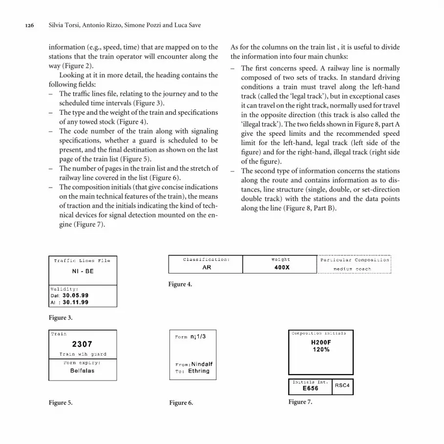
Looking at it in more detail, the heading contains the
following ªelds:
– The tra¹c lines ªle, relating to the journey and to the
scheduled time intervals (Figure 3).
– The type and the weight of the train and speciªcations
of any towed stock (Figure 4).
– The code number of the train along with signaling
speciªcations, whether a guard is scheduled to be
present, and the ªnal destination as shown on the last
page of the train list (Figure 5).
– The number of pages in the train list and the stretch of
railway line covered in the list (Figure 6).
– The composition initials (that give concise indications
on the main technical features of the train), the means
of traction and the initials indicating the kind of tech-
nical devices for signal detection mounted on the en-
gine (Figure 7).
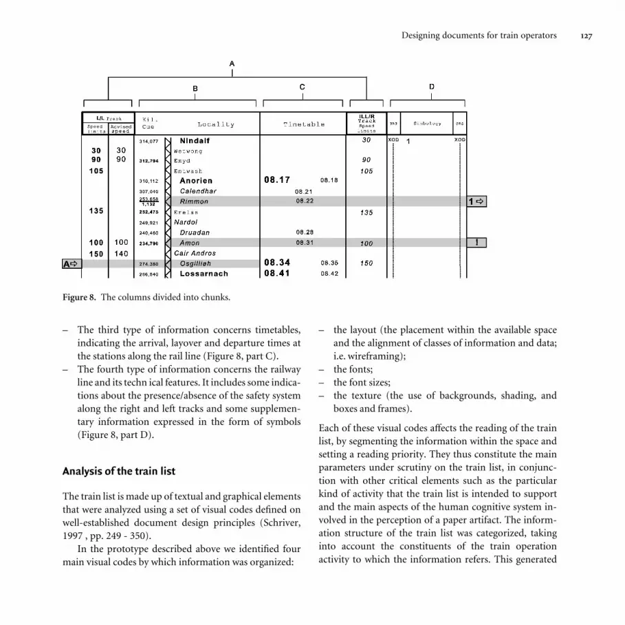
As for the columns on the train list , it is useful to divide
the information into four main chunks:
– The ªrst concerns speed. A railway line is normally
composed of two sets of tracks. In standard driving
conditions a train must travel along the left-hand
track (called the ‘legal track’), but in exceptional cases
it can travel on the right track, normally used for travel
in the opposite direction (this track is also called the
‘illegal track’). The two ªelds shown in Figure 8, part A
give the speed limits and the recommended speed
limit for the left-hand, legal track (left side of the
ªgure) and for the right-hand, illegal track (right side
of the ªgure).
– The second type of information concerns the stations
along the route and contains information as to dis-
tances, line structure (single, double, or set-direction
double track) with the stations and the data points
along the line (Figure 8, Part B).
Figure 4.
Figure 3.
Figure 5. Figure 6. Figure 7.
127Designing documents for train operators
– The third type of information concerns timetables,
indicating the arrival, layover and departure times at
the stations along the rail line (Figure 8, part C).
– The fourth type of information concerns the railway
line and its techn ical features. It includes some indica-
tions about the presence/absence of the safety system
along the right and left tracks and some supplemen-
tary information expressed in the form of symbols
(Figure 8, part D).
Analysis of the train list
The train list is made up of textual and graphical elements
that were analyzed using a set of visual codes deªned on
well-established document design principles (Schriver,
1997 , pp. 249 - 350).
In the prototype described above we identiªed four
main visual codes by which information was organized:
– the layout (the placement within the available space
and the alignment of classes of information and data;
i.e. wireframing);
– the fonts;
– the font sizes;
– the texture (the use of backgrounds, shading, and
boxes and frames).
Each of these visual codes aŸects the reading of the train
list, by segmenting the information within the space and
setting a reading priority. They thus constitute the main
parameters under scrutiny on the train list, in conjunc-
tion with other critical elements such as the particular
kind of activity that the train list is intended to support
and the main aspects of the human cognitive system in-
volved in the perception of a paper artifact. The inform-
ation structure of the train list was categorized, taking
into account the constituents of the train operation
activity to which the information refers. This generated
Figure 8. The columns divided into chunks.

128 Silvia Torsi, Antonio Rizzo, Simone Pozzi and Luca Save
four clusters of information. The ªrst cluster refers to
the train (e.g., the weight of the train), and the second
one refers to the train list itself (e.g., the number of
sheets in the document). Both clusters are arranged in
the heading. The third cluster has to do with the railway
line (e.g., the kind of track) and the fourth cluster has to
do with the interaction between the train and the line
(e.g., the speed). These last two clusters of information
are contained in the columns.
It was our intention to use these clusters as anchoring
points for the redesign. The general idea was to manipu-
late the graphical aspects of the information, clustering
the diŸerent types of information physically in one place
in order to keep the graphical representation of each type
of information constant.
Evaluation of the train list
The Document Design Guidelines related to the four
codes mentioned above were applied to evaluate the origi-
nal prototype of the train list. The following is a list of the
main violations of some of the most best-established prin-
ciples of document design (Schriver, 1997, pp. 506–517).
– Font: The use of 5 -point fonts. Using fonts of less than
6 points is severely discouraged for the production of
any document, regardless of the modalities of use.
This is even more so when users might need reading
glasses or when they must operate in scarce lighting
conditions.
– Font: The use of the same font type and size for the
title of a ªeld and the data (see Figure 4, particular
composition). It was decided to modify these param-
eters to better distinguish the content from the title of
the ªelds.
– Font: We found other inconsistencies in font use; for
example, in the columns the maximum speeds were
shown in capital letters for the left track, and in italics
for the right track.
– Texture: The evaluation of the texture showed an
excessive use of borders and frames for segmenting
the diŸerent classes of information in the heading
(Figures 3, 4, 5, and 7). The heuristics of document
design suggest avoiding borders as long as it is possible
to segment the visual space by means of alignment and
spacing of the diŸerent clusters of elements.
– Layout: We observed some inconsistencies in the clus-
tering of the information; for example, the informa-
tion related to the train list is merged into the same
boxes as the information related to the train.
The results of this evaluation were used together with the
results of the train operator focus groups to guide the
redesign of the prototype.
Focus groups
After the heuristic analysis and evaluation of the original
prototype, two focus group sessions were conducted, each
with 10 train operators. The aim of each focus group was
to gather information on the needs of the train operator in
well-deªned contexts of use. The focus group sessions
were segmented into a general introduction and three
operational phases.
The ªrst operational phase explored the relationship
between the train list and the train operator’s activities, by
collecting individual stories summarized on a whiteboard
and shared and discussed among all participants. The
modalities of use of the current train list were investigated
by eliciting scenarios of use in both routine and critical
circumstances.
In the second phase the participants were asked to
indicate what in their perception was the order of impor-
tance of the contents of the train list relative to the two
phases of the activity: before departure and while operat-
ing the train. The priority list was established using
colored Post-It stickers containing both the class of data
and the data (e.g.: Weight: 400X; Timetable arrival:

129Designing documents for train operators
08:17), by positioning the items on an ordinal scale. The
ªnal list was created by computing the Mode for each
position on the scale.
In the third phase, the train operators were asked to
cluster the content according to their preferred modality of
use and to comment on the coding used for representing
the information. The clustering was carried out by having
each participant create an individual layout using Post-It
stickers and then negotiating a convergence of proposals.
Focus group results
The distinction between the Heading and the Columns
turned out to be sensible and well grounded in practice
since the Heading is normally read before departure
while the train is stationary, while, during travel, they
glance at the Columns when needed (reading in mo-
tion). Another major ªnding was that the train operators
perceive and use the information in the train list consist-
ently with the content categories identiªed in the analy-
sis of the train list (see above). This result prompted us
to use the information clusters (train list info and Train
info for the heading, Line info and Train/Line inter-
action info for the columns) as guidelines in the subse-
quent redesign phase. We also asked train operators to
identify the most relevant information based on their
operational experience. For instance, the most relevant
information item for the train list info cluster turned out
to be the Validity of the train list, while Locality was
named as most important in the Line info cluster.
During the discussion, we also realized that these in-
formation items worked as anchoring points to guide the
search for and use of other data.
There were no well-deªned or consistent comments
on the coding, apart from a criticism on the use of the 5-
point font size.
Finally, in the second phase of the focus group ses-
sions the train operators pointed out the need to have
further information on the train and on the train-line
interaction. As mentioned above, we recorded this need
but did not use it in the redesign of the prototype since it
was not consistent with the premises of the study and with
our original research objectives.
The redesign phase
The redesign phase incorporated the results obtained in
the two preceding phases. It consisted of the application
of the four visual codes previously deªned. For the sake of
simplicity, in what follows we consider the type and size of
the font as a single category, since this was also the way in
which the data were treated in the statistical analysis. We
started by modifying the Layout, then we applied changes
to the Font and ªnally to the Texture. In this way we
obtained a number of Header and Column prototypes
having a diŸerent representation of the information, but
as we mentioned above, we stuck with the same kind of
data as contained in the Original prototype.
As far as layout is concerned, we decided to design
three variants for the Header and two for the Columns.
The basic principles used for organizing the Header were
alignment and contiguity of the content in the two clus-
ters of information (train list Info and Train Info). Thus,
we cadme up with three diŸerent settings: one maintain-
ing, with some diŸerences, the existing organization of
information (these prototypes had an ‘original heading
macrostructure’, Figure 1); a second one that placed the
information on the Train list at the top and information
on the train at the bottom (these prototypes had a ‘hori-
zontal heading macrostructure’, Figure 9); and a third one
that placed the information on the train list on the left and
information on the train on the right (‘vertical heading
macrostructure’, Figure10).
Progressive modiªcations were made to the layout
heading prototypes by modifying the shape and size of the
fonts (Figure 11) and by adding diŸerent types of back-
grounds to the texture (Figure 12).

130 Silvia Torsi, Antonio Rizzo, Simone Pozzi and Luca Save
Figure 9. Horizontal macrostructure modiªed in the layout.
Figure 10. Vertical macrostructure in the layout.
Figure 11. Vertical macrostructure modiªed in the layout and in the fonts.
131Designing documents for train operators
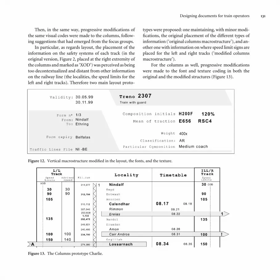
Then, in the same way, progressive modiªcations of
the same visual codes were made to the columns, follow-
ing suggestions that had emerged from the focus groups.
In particular, as regards layout, the placement of the
information on the safety systems of each track (in the
original version, Figure 2, placed at the right extremity of
the columns and marked as ‘XOD’) was perceived as being
too decontextualized and distant from other information
on the railway line (the localities, the speed limits for the
left and right tracks). Therefore two main layout proto-
types were proposed: one maintaining, with minor modi-
ªcations, the original placement of the diŸerent types of
information (‘original columns macrostructure’), and an-
other one with information on where speed limit signs are
placed for the left and right tracks (‘modiªed columns
macrostructure’).
For the columns as well, progressive modiªcations
were made to the font and texture coding in both the
original and the modiªed structures (Figure 13).
Figure 12. Vertical macrostructure modiªed in the layout, the fonts, and the texture.
Figure 13. The Columns prototype Charlie.
132 Silvia Torsi, Antonio Rizzo, Simone Pozzi and Luca Save
Out of this matrix emerged 30 prototypes for the
headings and 6 for the columns of the train list. Each one
of them was named using letters from the phonetic alpha-
bet in use in the aviation community. ‘Alpha’, ‘Bravo’,
‘Charlie’, etc., except for the original prototype, which we
named ‘Original’ both for the header and for the columns.
Testing
After the redesign phase, the prototypes were tested with
47 train operators. The train operators were selected in
order to establish two further independent variables: train
operator certiªcation and experience with the train list.
These two further independent variables were introduced
in order to select a sample that covered potential sources
of variation within the train operator population (i.e.,
selection of a representative sample).
The train operator variable had three levels: (1) re-
gional line train operators (regional, N = 12), (2) freight
train operators (freight, N = 20), and (3) long-distance
passenger train operators (long-distance, N = 15). This
variable was introduced because it had emerged in the
focus groups that the needs of the three categories of
operators were somewhat diŸerent. For example, the in-
formation on the recommended speed is very important
for the ‘long-distance’ and the ‘regional’ train operators
(because they have to strictly follow the timetable) and
during the focus group sessions several users from these
two categories denounced the bad design of this section
of the train list. On the other hand the ‘freight’ operators
don’t consider these data to be crucially relevant to
their activity, since they don’t have to hold to a precise
timetable.
The train list experience variable had two levels: (1)
extensive experience with the train list ( more then 10
months of use of the prototype, N = 28), (2) no experience
with the train list (e.g., service on lines where the train list
was not in use, N = 19). This independent variable was
introduced in order to control the potential eŸect of habit
on the preference for a train list format. Within each level
the train operators were distributed among the three
diŸerent types of train service (Regional, Freight, Long-
Distance).
The testing phase of the new prototypes was carried
out in two stages: in the ªrst session, 30 Heading and 6
Column prototypes were presented to the group while in
the second session the 18 most favored headings were
presented (six for each macrostructure), along with all 6
column prototypes (three for each macrostructure).
In both stages the train operators were asked to choose
two prototypes for each kind of Heading macrostructure
(original, horizontal, vertical), and then to rank the se-
lected prototypes from best to worst. This gave a classiª-
cation of the 6 chosen headings for each user. All 6
column prototypes were also ranked from best to worst.
During the data analysis, 10 points were assigned to
the best prototype for each user, 6 to the second, 4 to the
third, 3 to the fourth, 2 to the ªfth and 1 to the sixth. All
the other prototypes (12 for the Header, none for the
Columns) received a score of zero.
The data coming from the ªrst session were used only
to select the most favored prototypes and to eliminate the
prototypes having only minimal diŸerences in the visual
coding. The data of second stage were analyzed with a
four mixed-factor ANOVA, two within-subjects factors:
– Macrostructure (3 levels for the Header: Original,
Horizontal, Vertical; 2 Levels for the Columns: Origi-
nal, Modiªed);
– Level of Modiªcation (3 levels: Layout only, Layout+
Font, Layout+Font+Texture);
and two between-subjects factors:
– Type of service (3 levels: Freight, Regional, Long-Dis-
tance);
– Experience (2 levels: Experience, No-Experience).
We made the following hypothesis for Main eŸects:

133Designing documents for train operators
Header
– Macrostructure: A preference for the horizontal or the
vertical macrostructures. Rationale: a sharp distinc-
tion among clusters;
– Level of Modiªcation: A preference for the header
prototypes that received modiªcations in layout, font
and texture. Rationale: text alignment, correction of
font code violations, no use of borders around the
data elements, use of texture for segmenting and
building continuity among related items;
– Experience: A preference of the experienced train
operators for the Original Header Macrostructure.
Rationale: Extensive familiarity with a well-estab-
lished clustering of data (structure);
– Type of service: No diŸerence between the three serv-
ices. Rationale: Service characteristics do not aŸect the
use of information contained in the header. This factor
is to be considered more a control variable to be used to
explore potential diŸerences in the population.
Column
– Macrostructure: A preference for Modiªed Columns.
Rationale: A better clustering of data;
– Level of Modiªcation: A preference for the prototypes
that received modiªcations in layout, font and texture.
Rationale: text alignment, correction of font code
violations; correct use of texture for segmenting and
building continuity among linked contents in space;
– Experience: A preference by the experienced train
operators for the Original Column Macrostructure.
Rationale: Extensive familiarity with a well-established
layout;
– Type of service: A possible diŸerence between Freight
and the other two services. Rationale: Less concern for
maintaining the recommended speed. Again, this vari-
able is to be considered more a control variable to be
used to explore potential diŸerences in the population.
Table 2. The nine best headers with the corresponding
Macrostructure, Level of Modiªcation and Score.
Macrostructure Level of Header Score
Modiªcation prototype
Original Layout-Font-Texture Hotel 6.7
Layout-Font-Texture India 6.1
Layout-Font Juliet 1.7
Horizontal Layout-Font-Texture Victor 2.3
Layout-Font-Texture Uniform 1.5
Layout-Font Siera 1.1
Vertical Layout-Font-Texture Perugia 1.4
Layout-Font-Texture Lazio 1.3
Layout-Font Roma 1.3
Results
In the following, the results are presented separately, ªrst
for the Header and then for the Columns.
Header
The Macrostructure eŸect turned out to be signiªcant
(F (2,558)=26.2, p<.001) due to a higher score for the
Original Macrostructure compared to the other two.
Table 1 reports the means for the three macrostructures
and the related post-hoc level of signiªcance (Fisher’s
PLSD 5% test).
A further post-hoc analysis carried out between the
three best Headers prototypes for each Macrostructure
(see Table 2) showed that the signiªcant diŸerence was
mainly due to two speciªc headers both belonging to the
Table 1. The average score of the three Header Macrostructures.
Average score Post-Hoc
(Fisher’s PLSD)
Original2.8
vs. Horizontal <0.001
vs. Vertical <0.001
Horizontal 1.1
Vertical 0.9
134 Silvia Torsi, Antonio Rizzo, Simone Pozzi and Luca Save
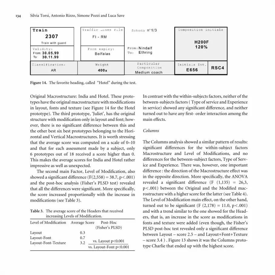
Original Macrostructure: India and Hotel. These proto-
types have the original macrostructure with modiªcations
in layout, fonts and texture (see Figure 14 for the Hotel
prototype). The third prototype, ‘Juliet’, has the original
structure with modiªcation only in layout and font; how-
ever, there is no signiªcant diŸerence between this and
the other best six best prototypes belonging to the Hori-
zontal and Vertical Macrostructures. It is worth stressing
that the average score was computed on a scale of 0–10
and that for each assessment made by a subject, only
6 prototypes out of 18 received a score higher than 0.
This makes the average scores for India and Hotel rather
impressive as well as unexpected.
The second main Factor, Level of Modiªcation, also
showed a signiªcant diŸerence (F(2,558) = 38.7, p<.001)
and the post-hoc analysis (Fisher’s PLSD test) revealed
that all the diŸerences were signiªcant. More speciªcally,
the score increased proportionally with the increase in
modiªcations (see Table 3).
Table 3. The average score of the Headers that received
increasing Levels of Modiªcation.
Level of Modiªcation Average Score Post-Hoc
(Fisher’s PLSD)
Layout 0.3
Layout-Font 0.7
Layout-Font-Texture 3.2 vs. Layout p<0.001
vs. Layout-Font p<0.001
In contrast with the within-subjects factors, neither of the
between-subjects factors ( Type of service and Experience
in service) showed any signiªcant diŸerence, and neither
turned out to have any ªrst- order interaction among the
main eŸects.
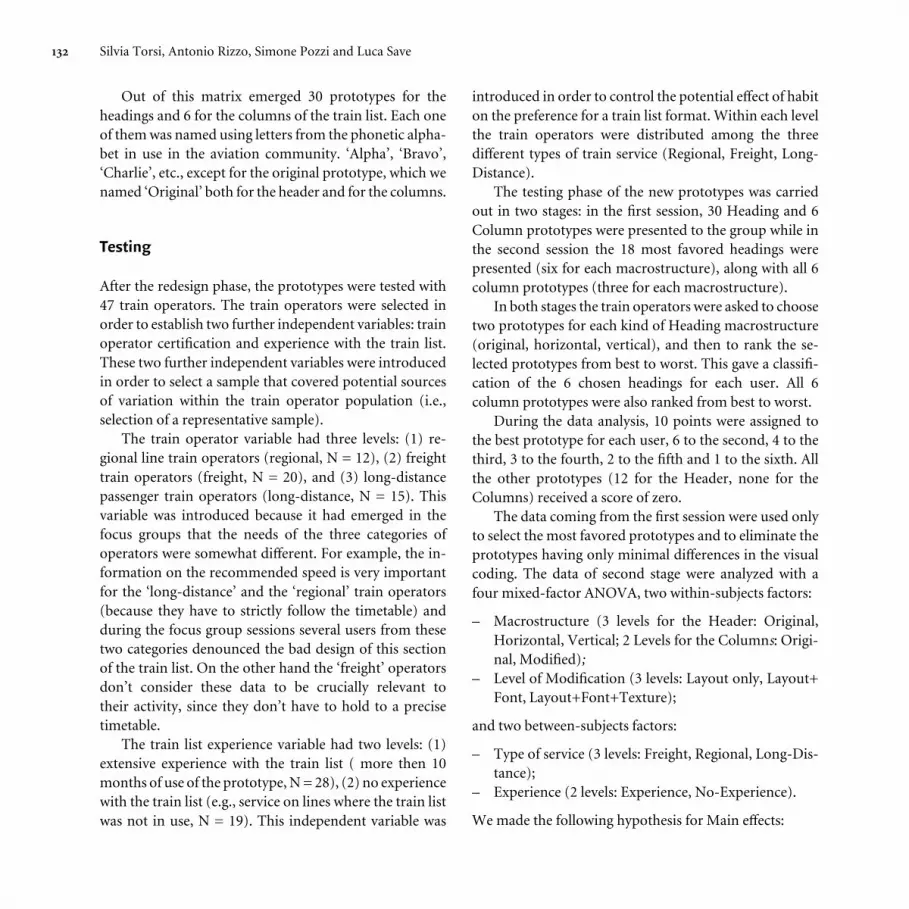
Columns
The Columns analysis showed a similar pattern of results:
signiªcant diŸerences for the within-subject factors
Macrostructure and Level of Modiªcations, and no
diŸerences for the between-subject factors, Type of Serv-
ice and Experience. There was, however, one important
diŸerence : the direction of the Macrostructure eŸect was
in the opposite direction. More speciªcally, the ANOVA
revealed a signiªcant diŸerence (F (1,135) = 26,3,
p<.001) between the Original and the Modiªed mac-
rostructure with a higher score for the latter (see Table 4).
The Level of Modiªcation main eŸect, on the other hand,
turned out to be signiªcant (F (2,178) = 11.0, p<.001)
and with a trend similar to the one showed for the Head-
ers, that is, an increase in the score as modiªcations in
fonts and texture were added (even though, the Fisher’s
PLSD post-hoc test revealed only a signiªcant diŸerence
between Layout – score 2.5 – and Layout+Font+Texture
– score 3.4 ) . Figure 13 shows it was the Columns proto-
type Charlie that ended up with the highest score.
Figure 14. The favorite heading, called “Hotel” during the test.

135Designing documents for train operators
Table 4. The 6 Column prototypes with their corresponding
Macrostructure, Level of modiªcation, and Score.
Macrostructure Level of Columns Score
Modiªcation prototype
Original Layout-Font-Texture Bravo 3.8
Layout-Font Alfa 3.1
Layout Original 2.8
Modiªed Layout-Font-Texture Charlie 7.2
Layout-Font Delta 4.8
Layout Echo 4.2
Discussion
Considering the overall pattern of results we could state
that, independently from the experience of the Train
Operators with the train list and from their type of Train
service, the Macrostructure and the Level of Modiªcation
turned out to be important factors to establish the pre-
ferred visual display of the train list data. However consid-
ering the direction of the eŸects there is an important
diŸerence between the two sets of data in the train list, the
Headers and the Columns. For the Columns the direction
of the eŸects was as expected, that is, with a higher score
for the Modiªed Macrostructure, and with an increasing
score as modiªcations were added to the layout, font, and
texture; whereas for the Headers the direction of the
eŸects were partially in the opposite direction (better
results with the addition of modiªcations in layout, font,
and texture, but a higher score for the Original
Macrostructure). We expected that an organization of
the Header with a clear distinction between the two main
clusters of information would help the accessibility and
use of the content. But the average score of the 6 proto-
types with the original Macrostructure turned out to be
higher than the average scores of the other two sets of
prototypes, Horizontal and Vertical. However, looking at
this result in detail we can observe (see Table 2) that the
Headers that received by far the best score were Hotel and
India, while Juliet, which is characterized by the same
layout and font as Hotel but without the modiªcations in
texture, did not score better than any of the best three of
the Vertical or Horizontal Macrostructure.
These data suggest that the coding for clustering is
critically important because when texture is used to help
this coding the Original Macrostructure is far and away
the winner. It seems that the Original Macrostructure,
even if not the best at clustering data, has some advan-
tages. These advantages are counterbalanced by a better
display of data in the Vertical or Horizontal Macrostruc-
ture, but texture improvements more clearly delineate the
clustering in the Original Macrostructure. But why
should the Original macrostructure have an advantage for
the Header and not for the Columns?
These results could be interpreted as showing that the
improvements in the Columns were judged by the train
operators to be clear and substantial compared to the
original train list, while those to the Header were consid-
ered less clear and less important. Thus the role of habit
and the comparison with the original version were deter-
minative in the operators’ judgment. But this is not con-
sistent with the lack of diŸerence between the train
operators with experience and the ones without experi-
ence using the train list. So we went back to the train
operators to look for a potential reason for this preference
for the Original Macrostructure. We brie¶y presented the
analytical results to them and asked for their thoughts and
comments. Through these qualitative interviews we dis-
covered that all train operators were used to ªnding the
same kind of information as in the train list in another
publication, called the Train Booklet, with a layout very
similar to the format of the Original prototype. In fact, we
discovered that this publication had inspired the design of
the original train list. Hence the habit linked to the Train
Booklet was common to all train operators, regardless of
the experience with the train list. As a consequence, all
operators were used to a particular reading order, and
that was no longer present in our alternative design pro-
posals (i.e., the ones with modiªcations in the Horizontal
136 Silvia Torsi, Antonio Rizzo, Simone Pozzi and Luca Save
and Vertical Macrostructure), whereas the reading order
was preserved in the Original Macrostructure. Further-
more, if we look at the Original Header prototype and to
the Hotel prototype (Figure 14), it is easy to see how the
modiªcations in font and texture help the clustering and
segmentation of the content and better supports reading
for information.
Conclusions
The integration of document design principles with the
experimental methods of the interaction design approach
seems to produce sound and interesting results that rest
both on theoretical and empirical grounds. The contri-
bution of the document design heuristics was evident
and important and led to sound results that allowed us to
enhance the train list prototype, and even to manage the
level of improvement. But in this e¹cient collaboration
an intriguing heuristic role was also played by the
cultural-historical approach to human cognition, which
prompted us to consider the context of use and the his-
tory of the artifact involved in the design process. This
was of special help in the organization of the testing and
in the interpretation of the results. It is our opinion that,
particularly in safety-critical domains where breakdowns
in the interactions due to the introduction of new
technology is a well documented hazard, the cultural-
historical approach could help in designing tools that are
within the zone of proximal development, that is, tools
which are not too advanced for the learning capabilities
of the intended users, while still augmenting the capabili-
ties of man–artifact systems.
Acknowledgment
This research was carried out with the ªnancial support of the
Italian Railways and we would like to thank all the FS personnel
for their support and their passion for their work. We would also
like to thank two anonymous reviewers for their apposite and
stimulating comments, suggestions, and critiques.
References
Bannon, L. J., & Bødker S. (1991). Beyond the interface:
Encountering artifacts in use. In J.M. Carroll (Ed.),
Designing interaction: Psychology at the human-computer
interface (pp. 227–253). Cambridge: Cambridge University
Press.
Carroll, J.M. (1995). Scenario-Based Design, Envisioning Work
and Technology in System Development. New York: Wiley.
Cole, M. (1996). Cultural Psychology : A once and future
discipline. Cambridge, MA: Harvard University Press.
Hutchins, E. (1995). Cognition in the wild. Cambridge, MA:
MIT Press.
Norman, D. A. (1993). Things that make us smart: Defending
human attributes in the age of the machine. Reading, MA:
Addison-Wesley.
Rizzo, A. (2000). La natura degli artefatti e la loro
progettazione [The ontology and design of artefacts].
Sistemi Intelligenti, 12, 437–452.
Schriver, K.A. (1997). Dynamics in document design: Creating
text for readers. New York: Wiley.
Tufte, E.R. (1997). Visual explanations: Images and quantities,
evidence and narrative. Cheshire, CT: Graphics Press.
Vygotsky, L. S. (1978). Mind in society: The development of
higher psychological processes (J. Cole, V. John-Steiner,
S. Scribner, & E. Souberman, Trans.). Cambridge, MA:
Harvard University Press.
Wartofsky, M. (1973). Models: Representation and the scientiªc
understanding. Dordrecht: Reidel.
Zhang, J., & Norman, D. A. (1994). Representations in
distributed cognitive tasks. Cognitive Science, 18, 87–122.

137Designing documents for train operators
about the authors
Silvia Torsi is a PhD candidate in the Department of Commu-
nication Science at the University of Siena. Her chief area of
theoretical interest, Cognitive Ergonomics, is the main
landmark for her Interaction Design and Information Design
research activities. She is also interested in the Psychology of
Perception and Visual Design.
Antonio Rizzo is a full Professor in Psychology and leads the
Interaction Design Unit at the Department of Communication
Science at the University of Siena. He has extensive experience
managing projects concerning both human factors and
interaction design issues. He is currently lecturing on Multi-
media Design and is particularly interested in the application
of new learning methods, related to the use of new digital
technologies.
Contact: [email protected]
Simone Pozzi is a PhD candidate in the Department of
Communication Science at the University of Siena. He is
currently involved in research projects in the Air Tra¹c
Control domain where he works in the areas of validation,
safety, and risk assessment. He has a full University degree
in Human-Computer Interaction.
Luca Save is a PhD candidate in the Department of Communi-
cation Science at the University of Siena. He has three years’
experience lecturing on Human-Machine Interaction and he
has been involved in several research projects concerning the
evaluation and redesign of safety-critical systems. His main
interests are in Cognitive Ergonomics, Human Computer
Interaction and Interaction Design techniques.


