Embed Size (px)
Citation preview
Color Design & Technology
A Multidisciplinary Approach to Colour
PART 2
Editors Alice Plutino Gabriele Simone Alessandro Rizzi
Research Culture And Science Books series - Vol. 002
RESEARCH CULTURE AND SCIENCE BOOKS (RCASB) series Vol. 002
ISSN: 2785-115X www.rcasb.eu
Licensing terms: books published on the RCASB series are open access books, distributed
under the terms and conditions of the Creative Commons Attribution License (CC BY). You
are free to share (copy and redistribute the material in any medium or format) and adapt (re-
mix, transform, and build upon the material for any purpose, even commercially, under the
following terms: you must give appropriate credit to authors, provide a link to the license, and
indicate if changes were made. You may do so in any reasonable manner, but not in any way
that suggests the licensor endorses you or your use; you may not apply legal terms or techno-
logical measures that legally restrict others from doing anything the license permits. The au-
thors keep the rights to further publish their contents where they want and can archive pre-print
and post-print or the publisher's version of the PDF of their books with no embargo period.
Peer review process: all books submitted to the Research Culture And Science Book series are
peer-reviewed according to the following procedure:
First review level: the series Editors evaluate the book to determine if the topic and content are
of interest to the RCASB series. Once the book has passed this preliminary review, the series
Editors select several reviewers from the Editorial Board based on their expertise in a particular
subject area or topic.
Second review level: each book is reviewed by two or three reviewers with a blind peer-review
process where the reviewers are kept anonymous. Reviewers are asked to evaluate the book
proposal based on the following criteria:
Originality
Relevance to RCASB series multidisciplinary approach
Technical/Cultural merit and/or validity
Soundness of methodology
Completeness of the reported work
Conclusions supported by the data
Correct acknowledgment of the work of others through references
Effectiveness of the manuscript (organization and writing)
Clarity of tables, graphs, and illustrations
Importance to multidisciplinary researchers
Relevance to multidisciplinary practices
If the book is accepted with revisions by the reviewers, the author(s) are asked to improve the
book according to the suggestions provided. The revised book proposal will then be submitted
for further review. After collecting the reviewers' reports, the series Editors decide on the
book's acceptability for publication.
Book Title: Color Design & Technology - A Multidisciplinary Approach to Colour – Part 2
Edited by: Alice Plutino, Gabriele Simone and Alessandro Rizzi
DOI: 10.23738/RCASB.002
ISBN: 978-88-99513-14-6
© Copyright 2021 by Gruppo del Colore – Associazione Italiana Colore
Piazza C. Caneva, 4
20154 Milano
C.F. 97619430156
P.IVA: 09003610962
www.gruppodelcolore.it
e-mail: [email protected]
Translation rights, electronic storage, reproduction and total or partial adaptation with any
means reserved for all countries.
Published by Gruppo del Colore – Associazione Italiana Colore: 19 September 2021
Color Design & Technology
A Multidisciplinary Approach to Colour
Part 2
Editors
Alice Plutino
Gabriele Simone
Alessandro Rizzi
Research Culture And Science Books series - Vol. 002

Color Design & Technology - A Multidisciplinary Approach to Colour – Part 2
3
Index
Preface 11
Chapter 1 Light and Color for the Show 13
Abstract 13
1. Introduction 14
2. Live stage 15
2.1 The variables 16
2.2 Possible choices 18
2.3 Technology 19
3. TV and Cinema 21
3.1 Color temperature and white balance 22
3.2 KELVIN or MIRED units 25
3.3 Δuv or Green/Magenta axis 25
3.4 New technologies, new problems 26
3.5 CRI and “classic” color rendering indexes 27
3.6 TLCI-2012, TLFM-2013, and SSI indexes 28
4. Conclusions 30
5. Conflict of interest declaration 30
6. Funding source declaration 31
7. Acknowledgment 31
8. Short biography of the author 31
References 31
Chapter 2 Real material texture color management in CAD systems for
Spatial Design 35
Abstract 35
1. Introduction 36
2. The color issue 37
3. Transformations between digital color spaces 38
Color Design & Technology - A Multidisciplinary Approach to Colour – Part 2
4
4. Acquisition of texture colors 41
5. Conclusions 46
6. Conflict of interest declaration 46
7. Funding source declaration 46
8. Acknowledgment 46
9. Short biography of the author 47
References 47
Chapter 3 Colour in Spaces: A Spatial Design Approach 49
Abstract 49
1. Spatial design 50
2. Elements and principles in spatial design 52
3. Colour in spaces and places 53
3.1 Spaces and places 53
3.2 Common colour terms is spatial design 57
4. Conclusions 59
5. Copyrighted works 59
6. Conflict of interest declaration 59
7. Funding source declaration 59
8. Short biographies 59
Bibliography 60
Chapter 4 Word to color! Tells, persuades, evokes 61
Abstract 61
1. Introduction 62
2. Project 1 color concept/guideline color 63
3. Project 2 color design for the communication of a commercial food 67
4. Project 3 color design for a new series of books: mistery 70
5. Project 4 the colors of one's own personal brand 74
6. Conflict of interest declaration 76
Color Design & Technology - A Multidisciplinary Approach to Colour – Part 2
5
7. Funding source declaration 76
8. Short biography of the author 76
Chapter 5 Color and Culture 77
Abstract 77
1. Meaning Of Colours 78
1.1 White 78
1.2 Black 78
1.3 Red 78
1.4 Orange 79
1.5 Yellow 79
1.6 Green 79
1.7 Blue 80
1.8 Purple 80
2. What is CMF design? 81
3. Who is the cmf designer? 81
4. CMF/different levels 81
4.1 C/Colours 81
4.2 M/Materials 81
4.3 F/Finish 81
5. CMF design steps 82
5.1 Brief 82
5.2 Company analysis 82
5.3 Competitors analysis 82
5.4 Target analysis 82
5.5 Trend analysis 82
5.6 Moodboard 83
5.7 Definition of the message 84
5.8 Cmf palettes 84
Color Design & Technology - A Multidisciplinary Approach to Colour – Part 2
6
5.9 Color scheme 84
5.10 Application and color variants 84
6. Examples of CMF design projects 85
7. Conflict of interest declaration 86
8. Funding source declaration 86
Chapter 6 Color in Fashion - a brief historical excursus 87
Abstract 87
1. Introduction 88
2. The eternal combination of black and white 89
2.1 Black and white 89
3. Total black 91
3.1. Black 91
4. Total White 96
4.1. White 96
5. Total Red (i.e. Colour) 97
5.1. Red 98
6. Brand Identity 99
6.1. Brown - Beige - Louis Vitton 99
6.2. Orange - Hermès 101
6.3. Tiffany blue - TIFFANY & CO 102
6.4. Red and green - Gucci 103
6.5. Trafalgar Red - Christian Dior 103
6.6. Red Valentino - Valentino 104
6.7. Red - Christian Louboutin 104
6.8. Green - Carven 105
6.9. Shocking Pink - Elsa Schiaparelli 106
6.10. Lavin Blue - Jeanne Lavin 107
6.11. Blue Crossbow - Renato Balestra 108
Color Design & Technology - A Multidisciplinary Approach to Colour – Part 2
7
6.12. Blue - Giorgio Armani 108
6.13. Neutral colors - Greige - Giorgio Armani 108
6.14. Yellow - Fendi 109
6.15. Yellow - Versace 110
6.16. Multicolor - Emilio Pucci 111
6.17. Multicolor - Missoni 112
7. Manufacturing quality and originality of creation 113
7.1. Creativity 113
7.2. The Italian Manner 114
7.3. The revisitation of textiles in schools of design 118
7.4. Industrial creativity upstream from the planned diversification
of decoration 118
7.5. Innovation 119
7.6. Technology 120
7.7. Research and development 120
8. Conflict of interest declaration 120
9. Funding source declaration 120
10. Bibliographic citations and notes 120
Short biography of the author(s) 121
Notes 122
Chapter 7 Color in the persuasive strategy 125
Abstract 125
1. Introduction 126
2. From the visual medium to the linguistic one 126
3. From the linguistic medium to the visual 127
4. Color idea first drafts: development phases of a brand 128
5. Color in motion: the animatic 130
6. Conflict of interest declaration 131
Color Design & Technology - A Multidisciplinary Approach to Colour – Part 2
8
7. Funding source declaration 131
8. References 131
Author Biography 132
Notes 132
Chapter 8 Colour not by chance. Culture of Vision for a conscious
chromatic project 133
Abstract 133
1. Introduction 134
2. An infinite journey with the “Ray of Iris”. History and theories in
Chromatic Culture 134
2.1 The “chromatic way of thinking” in history, culture, theories 134
2.2 Interdiscipline, multidiscipline, transdiscipline of colour 139
2.2.1 Art and architecture between social commitment and
experimentation 140
2.2.2 Material and immaterial: light and illusory “chromatic pixels” 143
2.2.3 Ethics and sustainability in the chromatic project 145
3. Colour at the roots of visual language, from tradition to contemporary
147
3.1 The communication process and its rules. Color as a sign 148
3.2 Colour in the classification of the sign 151
4. The future from history: comparative and applied chromatic theories,
from analysis to design 163
4.1 A “comparative mosaic” from ‘Policroma’. Protagonists and roles
of colour theories: scientific-disciplinary, symbolic-artistic, technical-
applicative and other purposes and aspects. Goethe, Runge, Itten, and
more... 163
4.2 Phenomenology of the image and Gestalt 221
4.3 The role and the “optical weight” of colour in the Gestalt
configuration of the form and in the hierarchies of the visual field:
from Kandinsky, Itten, Klee, Albers, up to contemporaneity (Zeky,
Maffei, Marcolli) 222
Color Design & Technology - A Multidisciplinary Approach to Colour – Part 2
9
4.4 From theories to practice: Shiro Kuramata’s cultured and conscious
example in design 230
4.5 From theory to design works: six examples of application 237
5. Colour as language, sign and symbol: significant semiotic and signify
semiotic 248
5.1 An effective link in the art of persuasion: rhetoric and “chromatic
image” in the Semiotics of Vision 249
6. From theories to practice: a possible procedure for chromatic analysis
and project 266
6.1 Methods, criteria, parameters for analysis and project. A “model”
for the applications 267
Notes 271
7. References 272

Color Design & Technology - A Multidisciplinary Approach to Colour – Part 2
10
Color Design & Technology - A Multidisciplinary Approach to Colour – Part 2
11
Preface
Color is a fascinating theme that involves many disciplines like physics,
chemistry, optics, psychology, anthropology and sociology, together with
colorimetry, computer science, design and many others. Color is related
with the visual sensation and perception and has an impact on the cognitive
and emotional nature of every human being. We are surrounded by colors,
at home, in the cities, at the supermarkets. Despite this, the education of
professionals in this field, remains very complex but necessary task.
Since 2014, Associazione Italiana Colore - Gruppo del Colore, the Italian
Color Association with Poli.DESIGN (Politecnico di Milano) and
Università degli Studi di Milano, have cooperated to held (in English) the
initial four editions of the Master in Color Design and Technology.
As far as we know, nowadays, this Master is the only international,
multidisciplinary, theoretical and practical course aiming at training color
specialists and technicians, providing them skills for acquisition,
measurement, and management of color in many application areas. Main
strength of the Master is its strong correlation between theoretical lectures
and practical lessons, which allow a rapid learning and the development of
professional skills.
So far, the Master has been attended by many students from all over the
world like e.g., Australia, Austria, Brazil, Colombia, Finland, India, Italy,
Japan, Lebanon, Spain, Portugal, Russia and many others. The multicultural
environment in which the students are involved enriches them and allowed
the development of a positive discussion about color culture, naming and
uses across different nations.
The main purpose of this book is to present the major part of teachers and
subjects of the Master, as well as to foster the discussion about the many
different possible ways of teaching and educating on the complex topic of
color.
This book is divided in three Volumes, each one of them focused on
specific issues about color theories, management, applications and design.
In this book, as in the Master, color will not be described as simple attribute
of an object, but as technical means of expression, at the base of perception
and interaction with reality.
Alice Plutino, Gabriele Simone and Alessandro Rizzi, Editors
Color Design & Technology - A Multidisciplinary Approach to Colour – Part 2
12
Chapter 1 Light and Color for the Show
13
Chapter 1 Light and Color for the Show Andrea Siniscalco, Department of Design, Politecnico di Milano
Abstract The design of light and color to improve the performance of a singer or
actor or any artist is of absolute importance. As part of a show, be it a live
performance, a movie, or a television program, the designer’s choices can
make any event unforgettable or sink its quality, invalidating the efforts of
all other figures involved in production.
The decisions of the lighting designer (or director of photography) are those
that give direction to the production. According to the presented content,
these choices provide the aesthetic sense and the narrative path, mediated by
experience. Few months may be enough to grasp the theoretical rudiments
of the profession. Still, their successful implementation requires a
sensitivity and a technical maturity that must be built over the years.
This chapter will focus on specific entertainment sectors, namely the live
stage and lighting for television and cinema, the variables and technologies
involved, and some elements that differ from the much more well-known
architectural lighting field.
The aim is to provide an overview of at least part of what is sometimes
defined as a niche sector. In reality, it represents a significant branch of
color and lighting design, with varied and fascinating contents that must be
known and valorized.
Keywords: Lighting design, Color design, Entertainment, Live stage, TV lighting,
Cinema lighting
DOI 10.23738/RCASB.00201
This chapter is part of the book: Color Design & Technology - A Multidisciplinary Approach
to Colour – Part 2, edited by Alice Plutino, Gabriele Simone and Alessandro Rizzi
ISBN 978-88-99513-15-3
Research Culture and Science Book Series Vol 2
ISSN 2785-115X www.rcasb.eu
Color Design & Technology - A Multidisciplinary Approach to Colour – Part 2
14
1. Introduction Perception of color is closely linked with the phenomenon of light, to the
point that one could say that the first does not exist without the second.
Also, concerning lighting, technology is now at a level, which allows us to
use color without any limits or sacrifices.
However, the color concerning architectural lighting still encounters some
resistance, from the simplest ones to understand, such as the tendency to
avoid cold and not very organic colors for illuminating food, up to a very
personal acceptance or rejection of color related to culture and perception of
the space innate to each individual. If it is true that light can transform
space, reshaping the way it is perceived, the same can be said of colored
light.
Different shades of white light (or even colored) have been often used in
various lighting contexts in recent years. In the architectural field,
luminaires capable of emitting colored light have existed for more than
thirty years (an example could be the Metamorfosi line by Artemide in the
‘90s). Today, modern control technologies allow one to effortlessly manage
the light intensity at home in terms of tones of white and color (the Philips
Hue system, for example).
The domestic environment, however, is not covered by restrictive standards.
Talking about the workplaces, in recent years, the use of different color
temperatures (white light) is at the base of the techniques called human-
centric lighting. This particular approach consists of regulating the circadian
rhythm with specific light cycles, helping individuals improve their
performance in both day and night shifts.
In interiors, the use of color is mostly accepted. It can be for human-centric
lighting purposes or communicative-aesthetic use, enriching the spaces with
hints of color to make them more attractive.
In the field of exteriors, however, the matter is more complicated.
Concerning architectural spaces, colored lighting is often used to give a new
look to buildings (which may not be particularly interesting during the day);
it is also true that this tendency generally works well for the most
contemporary architecture.
If we talk about historical facades, it is widespread to face a certain
resistance to the use of colored light. The interpretation of architecture
(which should be one of the primary objectives when lighting historical
buildings) can be easily distorted using colors with nothing to do with the
historical context.
There are numerous lighting cases of historical buildings that have received
such harsh criticism from experts and the people that they have been
Chapter 1 Light and Color for the Show
15
removed to be replaced by more “sober” and respectful lighting. The
situation gets more acceptable if colored lighting is only temporary and has
a specific purpose (for example, pink lighting of monuments for the fight
against breast cancer day). Another field in which color is welcome is that
of temporary art installations, for which there are many festivals around the
world. Summing up, it is easy to draw a parallel between colored light and
the spectacularization of spaces.
For this reason, of the various lighting areas, the more oriented on the use of
color are those related to the entertainment. To present an example, in this
chapter, we will discuss lighting features for live stage, television, and
cinema.
2. Live stage The incredible influence of lighting when an event is staged has been
known since the days of classical theater. Still, the advent of electricity
made it possible to bring the impact of light to levels never reached before.
A striking example of the use of electric light in a scenic context of
propaganda was the well-known “Cathedral of light.” In 1934, at the
Zeppelintribune in Nuremberg on the occasion of the Reichsparteitag (the
annual meeting of the Nazi party), Albert Speer, Hitler’s trusted architect,
used 152 searchlights with a diameter of 150 cm, loaned by the Luftwaffe to
outline the frame of the immense stadium capable of host over 340.000
people. The effect obtained left the ambassadors of other states astonished
(Speer et al., 1997), and the joint use of Richard Wagner’s music (Die
Meistersinger von Nürnberg) was what consecrated the power expressed in
that event (Moller, 1980). More than the political content of the parade, it
was the synaesthesia between light and sound that forged the message of
hegemonic power that would soon become sadly known to the whole world.
Later, the introduction of color in lighting in entertainment events is already
documented in the postwar period in British theaters (Applebee, 1950). It
even hypothesizes using these experiences to evaluate the quantity and
chromaticity of light for the commoners (Strange and Hewitt, 1956).
The study of the relationship between illumination and stage in show events
intensifies until it is finally formalized in 1970 (Reid, 1970).
Time passed, and technology evolved, and in 1980 the moving lights were
introduced to the market by Vari-Lite (Vari-Lite, 2021). The use of color
becomes more and more important in live performances, until, in 1988, the
concerts of The Wall by Pink Floyd, designed by Mark Brickman, traced a
milestone for the lighting of shows (Williams, 1988).
Color Design & Technology - A Multidisciplinary Approach to Colour – Part 2
16
Since then, technology has made great strides in live performance, and
manufacturers have incredibly evolved the luminaires from those that were
once used in the ’80s in discos. However, numerous issues must be taken
into consideration.
2.1 The variables Lighting design for the live stage is not a simple task. Thinking of it as a
series of operations that lead to a result, it could be possible to compare it to
an artistic or architectural activity. Despite the freedom granted to the
designer, numerous factors make the lights’ preparation for a live show an
actual race against time; there are many steps and checks to do in a short
amount of time.
First, the show venues are usually available only a few days before the show
itself, so it is impossible to plan ahead. This situation is also due to the high
rental costs of these structures. The production operations concentrate on
the dates near the show, and lighting is only a part of things to be done.
Designers are faced with the need to prepare and test everything in few days
(a little more if the show production is of considerable size). Working
experience is essential in these cases; beyond the ability to find optimal
solutions to possible unforeseen events, knowing the various venues where
the shows are held (pros and cons) is a big help for the lighting designer.
Software tools such as Wysiwyg (CAST, 2021), Deepence2 (Syncronorm,
2021), L8-Software (L8 Ltd., 2021), and Spotlight (Vectorworks, 2021) can
somehow help to simulate the lighting installation. Still, as regards their use,
there are different opinions on the part of professionals. Some avoid these
systems entirely; others use them in the early phase, while others use them
more widely. These are mainly software packages that allow the
professional to virtually rebuild the stage (possibly starting from the CAD
drawings of the set designers) and virtually install existing light projectors,
simulating the control consoles. It is also possible to export files that allow a
certain level of automation during the actual show. However, the algorithms
used by these digital tools are not always very refined. Sometimes, the
simulated show does not have enough correspondence with the result, to the
point that some designers prefer to avoid the digital simulation and rely only
on experience.
Everything is decided in the last few days. The lighting designer’s artistic
sensibility remains the essential tool; knowing how to read the show’s
various nuisances and visually transpose them, improving their emotional
charge.
Chapter 1 Light and Color for the Show
17
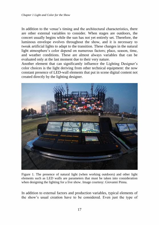
In addition to the venue’s timing and the architectural characteristics, there
are other external variables to consider. When stages are outdoors, the
concert usually begins while the sun has not yet entirely set. Therefore, the
luminous envelope evolves throughout the show, and it is necessary to
tweak artificial lights to adapt to the transition. These changes in the natural
light atmosphere’s color depend on numerous factors; place, season, time,
and weather conditions. These are almost always variables that can be
evaluated only at the last moment due to their very nature.
Another element that can significantly influence the Lighting Designer’s
color choices is the light deriving from other technical equipment: the now
constant presence of LED-wall elements that put in scene digital content not
created directly by the lighting designer.
Figure 1. The presence of natural light (when working outdoors) and other light
elements such as LED walls are parameters that must be taken into consideration
when designing the lighting for a live show. Image courtesy: Giovanni Pinna.
In addition to external factors and production variables, typical elements of
the show’s usual creation have to be considered. Even just the type of
Color Design & Technology - A Multidisciplinary Approach to Colour – Part 2
18
engagement of the lighting designer (a contract with the production or
directly with the artist) can affect the professional’s freedom of choice.
Then there are the other figures in the show; the most important is
undoubtedly the artist himself, who can have a personal vision of the
show’s color that ultimately can affect the designer’s decisions.
These requests may not be persistent, but they can happen; in this case, the
designer must mediate them with his vision of the show.
Another critical factor is the Set Designer. The physical construction of
space (geometries, materials, choice of colors) is crucial for lighting
choices, and the maximum synergy between the two teams is more than
desirable.
2.2 Possible choices A common approach is that the project starts to form in the designer’s mind
early, a “painting without colors” that gives more importance to the scene’s
compartments, the spotlights’ orientation, and the fillings done with wash-
type lights and so on. In this phase, the use of color is only a draft; it is
possible to get an idea of what colors could be used, but the information
available is still not enough, and by going more in-depth, the risk is to waste
your work. When everything goes into production, at the time of staging, it
is possible to really give color to the event; work upwards, and observe the
“substance.” It might also happen that the initial ideas might be rejected
during the programming phase because they do not fit the rest of the scenic
machine (which perhaps remains unknown until just before the show).
The choice of colors is almost always the result of a personal interpretation.
Beyond the sporadic requests that might happen, it is the designer who
chooses, through his musicality. The lighting designer can almost be
considered an added musician who participates using time, measurements,
and lyrical writing on every track on cue. It is essential to know the
programmed repertoire entirely to build its chromaticity, passing from
framework to framework. The freedom to do all this then depends on the
factors seen before and on the luminaires available and the designer’s
competence to use them (acquired only through experience).
Entering into the heart of the choice of colors, the approaches that can be
adopted are practically infinite and mostly depend on the lighting designer’s
sensibility. One can play on warm tones on warm, cold on cold,
complementary colors, and in contrast, what is essential is that these choices
accompany the concert narrative.
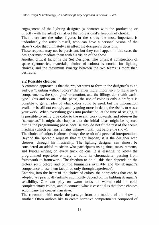
The chromatic shift marks the passage from one module of the show to
another. Often authors like to create narrative compartments composed of
Chapter 1 Light and Color for the Show
19
multiple songs. A good choice is to keep the same colors within these
segments, introducing different colors to move to the next compartment.
Figure 2. Color is often used to characterize specific narrative arcs in shows. Image
courtesy: Claypaky. Photo Credit: Ralph Larmann.
The presence of natural light in the concert’s initial moments can be an
issue, partly because of its intensity and partly because of the variability of
its appearance. A possible approach to this problematic condition can be
neutral white light, assisted by the correct quantity of artificial smoke,
which gives an impression of diffuse glow, “naturally” luminous.
Achromatic light can be used while waiting for the sun to set completely
and then introduce the first color. However, it should be emphasized that the
transition from achromatic to colored light creates a notable detachment,
which should be reflected in the show’s narrative. It implies a change of
state even in the spectators, who find themselves more immersed in it.
2.3 Technology In addition to natural light, variability comes from digital contents that are
usually presented through LED walls or projections, as already mentioned.
Nowadays, the amount of light emitted by these devices is by no means
Color Design & Technology - A Multidisciplinary Approach to Colour – Part 2
20
negligible, and their presence is now a must in the productions of a certain
level.
Spanning from simple vertical elements that can change the perception of
depth on the set to actual modules scattered all over the stage, their amount
of light and coloring must be considered when placing the other luminaires.
It’s always a good thing when the lighting designer coordinates his work
with the digital content creator to create synergy and manageable choices.
This interaction can be significantly improved using a technology called
“media server,” which allows the integration of video content in the control
consoles operated by the lighting staff, ensuring a good mixing level.
Usually, however, the lighting designer (when he cannot make suggestions
about the colors of the videos) must adapt to digital content to make
harmonious light choices.
Technology continues to improve in years, providing more possibilities
every day: higher powers, more control, and bright “full” colors. However,
the flip side of the coin is that as the possibilities increase, so does the
complexity.
If we think of the shows of just some years ago, everything was about using
fixed beacons and colored gel filters; flexibility was less, but the preparation
time was lower.
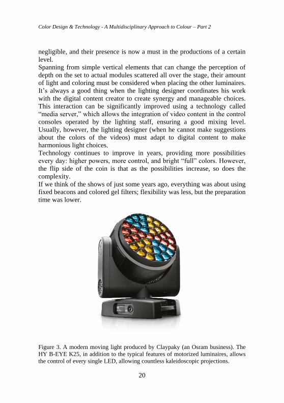
Figure 3. A modern moving light produced by Claypaky (an Osram business). The
HY B-EYE K25, in addition to the typical features of motorized luminaires, allows
the control of every single LED, allowing countless kaleidoscopic projections.
Chapter 1 Light and Color for the Show
21
Moving lights allow an extensive range of colors to be obtained, gobos to be
implemented, light to be profiled (to remote control them), and multiplied
with prisms, as each luminaire is potentially able to carry out the work of
many. Then there are video projections, sets in transparency, special
materials, platforms, etc. Technology increased flexibility to a level that that
was unthinkable until not long ago, but such improvements can be
overwhelming for the designer. The possibility of obtaining unlimited
colors does not necessarily mean that this should be done. At times, using a
fixed spotlight with a colored gel filter is still the most effective and
economical choice, even if less blatant.
This consideration does not mean that technology should be avoided. On the
contrary, today, more than ever, it is essential that professionals are
prepared for the possibilities that products and systems have to offer, always
keeping up to date to evaluate the best choices.
Concerning advanced light sources, in the entertainment field, solid-state
lighting has conquered its position. Although their dominance is not as
established as in the architectural lighting field, the possibility to contain the
power implied has LED manufacturers develop many devices that mount
this type of lamp.
However, from a chromatic point of view, the LED still encounters
resistances; some purists of gas discharge light sources prefer to avoid
LEDs, opting for classic lamps, assisted by dichroic or even gel filters.
Regarding hues, LED light sources can produce more saturated colors, not
in terms of the color rendition of illuminated materials, but the light beam’s
appearance, when projected into the environment where artificial smoke is
dispersed. In terms of entertainment, the color white remains a weak point
of LEDs, making it less brilliant than the one created with metal halide
lamps. Some LED sources are offered in RGBW format (Red, Green, Blue,
and White) to give greater chromatic flexibility, but the result is still not
comparable with discharge lamps from a white point of view. The same is
true for sources that must provide a portion of UV for fluorescence, such as
Congo-blue, for which traditional lamps are still more appropriate.
The digital light sources are more flexible from a control point of view, but
as mentioned above, too much flexibility can extend the show’s preparation
time.
3. TV and Cinema Lighting for television and cinema has a very ancient history. The use of
artificial light in indoor studios instead of outdoor theaters (around the ‘20s)
led to a revolution of light in scenography, giving the great masters of
Color Design & Technology - A Multidisciplinary Approach to Colour – Part 2
22
photography a whole new ground in which to experiment. One of the most
notable masterpieces that made this experiment the key to his success was
Fritz Lang’s Metropolis. In this movie, light assumes a semiotic value, in
the management of light and shadow, in the dynamic projections, using
electric discharges and luminous objects as scenographic communication
tools to amplify the scenes’ affect human emotions (Roth, 1978). Lang drew
his inspirations from Art Deco, Bauhaus, and Futurism (Rutsky, 1993;
Wolfe, 2020), applying them to light.
On that occasion, the design of light went from a scientific and
technological subject to a communicative, scenographic expression (Pooky,
2016).
The first and foremost difference between TV and cinema lighting is that
the illumination must meet the requirements for the cameras and not for the
human observer (Box, 2020). Even if sophisticated, these devices do not
have the typical processes of the visual system (such as the color constancy
or the lateral inhibition of the retina, to name just a couple). Some
technologies may attempt to copy some visual system features; however,
the complexity of human perception cannot be easily replicated, and some
corrections are necessary.
Concerning color, the immediate attention that the lighting group (usually
composed of the director of photography and the gaffer) must have is to
apply all the necessary technical procedures to balance the color
temperature of all the sources on stage. It is fundamental to carry these
procedures following the white balance for digital cameras or stock of film
chosen.
A second fundamental task consists of introducing colored light for
aesthetic reasons or simulating specific light sources in the scene to support
the program’s narrative.
3.1 Color temperature and white balance I do not intend to dwell on the basic concepts of color science, as it is not
the purpose of this chapter. Still, speaking of the world of cinema and
television lighting, we can report that some importance is given to the CIE
chromaticity diagram of 1931 (Smith and Guild, 1931). This diagram
represents the gamut of human visual perception. The colors all appear in
their most saturated version on the outside of the horseshoe. Of these colors,
the most peculiar ones lie on the line of the purples, which represents colors
that are obtainable only through the mixing of the others (the extremes of
the visible spectrum in particular). The most interesting component,
however, is the one given by the central space of the diagram. That is where
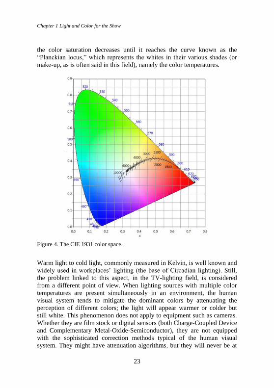
Chapter 1 Light and Color for the Show
23
the color saturation decreases until it reaches the curve known as the
“Planckian locus,” which represents the whites in their various shades (or
make-up, as is often said in this field), namely the color temperatures.
Figure 4. The CIE 1931 color space.
Warm light to cold light, commonly measured in Kelvin, is well known and
widely used in workplaces’ lighting (the base of Circadian lighting). Still,
the problem linked to this aspect, in the TV-lighting field, is considered
from a different point of view. When lighting sources with multiple color
temperatures are present simultaneously in an environment, the human
visual system tends to mitigate the dominant colors by attenuating the
perception of different colors; the light will appear warmer or colder but
still white. This phenomenon does not apply to equipment such as cameras.
Whether they are film stock or digital sensors (both Charge-Coupled Device
and Complementary Metal-Oxide-Semiconductor), they are not equipped
with the sophisticated correction methods typical of the human visual
system. They might have attenuation algorithms, but they will never be at
Color Design & Technology - A Multidisciplinary Approach to Colour – Part 2
24
the level of our visual perception. Stock films, for example, are balanced at
3200 K (Tungsten light) or 5600 K (Daylight); digital cameras, on the other
hand, can be set to a value of your choice between 3200 K and 5600 K, but
always and in any case only one color temperature at the time. This means
that when there are whites with different color temperatures simultaneously
in a scene, the camera can only have a single white point as a reference; the
others whites will all appear more or less yellowish or bluish.
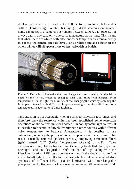
Figure 5. Example of luminaire that can change the tone of white. On the left, a
detail of the Reflex, which is equipped with LED chips with different color
temperatures. On the right, the Maverick allows changing the white by switching the
front panel treated with different phosphors coating to achieve different color
temperatures. Image courtesy: Cineo Lighting.
This situation is not acceptable when it comes to television recordings, and
therefore, once the reference white has been established, some correction
operations on the sources must be adopted. On non-dynamic light sources, it
is possible to operate additively by summing other sources with different
color temperatures to balance. Alternatively, it is possible to use
subtraction, reducing the power of some components of the spectrum. This
result is usually obtained (at least partially) employing correction filters
(gels) named CTO (Color Temperature Orange) or CTB (Color
Temperature Blue). Filters have different intensity levels (full, half, quarter,
one-eight) and are designed to shift the hue of light along with the
Planckian location. LED light sources can modify the shade of white (but
also colored) light with multi-chip sources (which would enable an additive
synthesis of different LED dies) or luminaires with interchangeable
phosphor panels. However, it is not uncommon to use filters even on solid-
Chapter 1 Light and Color for the Show
25
state sources; “traditional” lighting designers sometimes use this technique
in specific fields such as the exhibition area (Murano, 2017).
3.2 KELVIN or MIRED units When correcting the whites with gel filters, the result is not linear. Suppose
one uses a 1/8 CTO filter on a cold source. In that case, it can get a color
temperature shift of about 200 K. If it applies the same filter on a warmer
light source, the shift can even reach 600 K. The amount of radiation that is
filtered is also very different. The color temperature corrections applied via
hardware on LED lighting fixtures follow what was set by the operator.
However, a consolidated methodology deriving from gel filters has resulted
in a particular approach to color temperature corrections.
To not be constrained by the lack of linearity described above, filter
manufacturers consider units called MIREDs (Micro REciprocal Degree)
instead of using the simple Kelvin scale (Priest, 1933). The MIREDs then
also entered the interfaces of the control systems of LED luminaires;
although not strictly necessary, they provide a more comprehensive
selection range that considers the technician’s preferences. The MIREDs are
calculated by dividing 1 million by the color temperature to be converted;
therefore, a MIRED shift is obtained by subtracting the starting value from
the target one. For example, a daylight type source (6500K) is equal to
about 154 MIRED. In order to convert it to an incandescent type warm light
source (3200K / about 312 MIRED), a shift of 158 MIRED is required
(obtainable with a full CTO gel). On the other side, the quantity of radiation
lost in the process (this obviously does not apply to LED) is not considered
here.
3.3 Δuv or Green/Magenta axis The Planckian locus is the curve describing the different color temperatures
in a chromaticity diagram. However, the correlated color temperature data
alone (Davis, 1931) is not sufficient to explain the chromatic make-up of
lighting sources, especially when it comes to the rendering of a scene
through a camera. The isotherm lines that transversely intercept the
Planckian locus curve represent the chromatic variability that sources with
the same color temperature can have. Numerically, their value is commonly
described by the parameter Δuv (MacAdam, 1937) that quantifies the
distance of a point on the isotherm from the Planckian locus (which ideally
represents a “pure” white). If the value is positive (above the curve), white
will be tinged with green/yellow; if the value is negative (under the curve),
white will be tinged with magenta/pink. Therefore, it is possible to have
Color Design & Technology - A Multidisciplinary Approach to Colour – Part 2
26
whites with the same color temperature (expressed in K) and still have
different colors.
Instead of the Δuv, in TV Lighting, the green-magenta axis describes these
displacements above or below the Planckian locus. Also, in this case,
chromatic correction filters are available to tweak the chromaticity of the
light. These filters act on what is known as the CC scale (Color
Compensation Scale) and can range from Full minus green (magenta filter,
30M) to Full plus green (green filter, 30 G). As seen for the MIRED, this
terminology (the magenta-green axis) has also been adopted in the most
recent luminaires, whose LED chips are equipped with green and magenta
dies to correct the chromaticity of whites according to the CC scale and
implemented in the product interface.
The correction given by the green and magenta LEDs is particularly crucial
in luminaires that have two or more chips inside them that produce different
white lights through conversion with phosphors. This type of LED has dies
that emit blue light through a layer of phosphors, which reconvert the
colored light into white light, whose characteristics vary according to the
composition of the phosphor layer. Thanks to this technology, it is possible
to have lighting fixtures that implement colored light (Red, Green, and
Blue) and white light with two different color temperatures; for example,
cold (daylight at 6500 K) and warm (tungsten at 3200 K). However, when
these latter two sources are used to obtain intermediate color temperatures,
it is possible to run into some problems. The transition from cold light to
warm light can be done by mixing the two and corresponds to a linear shift
on the chromaticity diagram. The Planckian locus, however, is not a line but
a curve. The intermediate shades of light between hot and cold fall under
the Planckian curve, thus tending towards magenta. In modern LED lighting
fixtures, however, thanks to green and magenta LED chips installed in the
products, it is possible to compensate for this issue with control systems by
adjusting the position of the light on the green/magenta axis.
3.4 New technologies, new problems Solid-state light sources have now also taken root in the entertainment
lighting sector. The efficiency of these sources is undoubtedly a plus for
anyone; however, one of the main reasons why LED technology is
particularly desirable (now that the emitted fluxes have become more than
reliable) is the possibility of controlling numerous parameters of every
single luminaire remotely. Indeed, some aspects will take some time to be
accepted, such as comparing LED with high-power HMI sources; the latter
are more available and less expensive for the same luminous flux. Still
Chapter 1 Light and Color for the Show
27
talking about economic aspects, the productions are often reluctant to invest
in something that provides (in the end) the same visual achievement that
was obtained with “classic” sources, looking only at the final result and not
at man/hours and better management control processes. Finally, the
irruption of electronics in a field historically dominated by electrical
engineering leads to the need for staff improvement, introducing skills that
were not widespread before; this requires a lengthy training process that
often slows down production in a sector where timing is essential. In
addition to the difficulties described above, there are other aspects to take
into consideration. The advent of LEDs has enriched the color palettes of
directors of photography. Numerous ways of standardizing color
coordinates have been studied to have a common vocabulary. However, this
made it even more evident that different cameras capture color in a slightly
different way from each other. In addition to this, the reproduction of
captured colors is done on devices (the user TV screens) that often have
inadequate gamuts. The light color can be created by adding different types
of LEDs or by conversion using phosphors. In order to complicate things,
these two approaches can include several methodologies and other
elements. In the various steps necessary for video reproduction, metameric
matches can frequently happen that, with the “classic” sources were less
common. In some aspects of the production, a high color rendering is
desirable: make-up, wardrobe, brand identity, commercial products, logos.
Their reproduction must not be distorted by light sources that are inadequate
from a spectral point of view. Numerous efforts have been made to find a
way to describe the ability of a light source to render color; the color
rendering indexes have existed for several years. However, they present
some fundamental problems that make them unsuitable for the television
and cinema lighting sector.
3.5 CRI and “classic” color rendering indexes The most common method of determining the color rendering of a light
source is to use it on specific sample colors and evaluate how much it
differs in rendering these samples compared to a reference source.
Comparison is the method underlying the CRI (Color Rendering Index)
proposed by the CIE. Around the mid-1900s, the advent of fluorescent
sources and their early way of rendering colors raised the need to invent a
method for determining the chromatic quality of sources. The CIE proposed
a test sample method of color rendering evaluation. Today, the CRI is still
in force, in its updated and extended version, but it presents numerous
issues that cause continuous criticism and requests for revision (Davis and
Color Design & Technology - A Multidisciplinary Approach to Colour – Part 2
28
Ohno, 2009). First of all, the system is based on 14 color samples taken
from the Munsell color system (Munsell, 1905). The first choice of these
samples (eight) was made up of low saturated colors and only in a second
version were those with higher saturation added. However, the choice of
colors does not adapt to discontinuous spectrum light sources (like metal
halides or LEDs) and can give very low render values even for very
performing sources. In addition to this, there are various inconsistencies,
like the choice of color space used to calculate the chromatic distance
between the points (CIEUVW), the use of the Von Kries transform for color
adaptation (defined as inadequate), the lack of continuity at color
temperatures above 5000K for which one passes from the Planckian locus
to the CIE Daylight locus (CIE, 1999), and many other criticisms.
These issues have led some researchers at the National Institute of
Standards and Technology (NIST) to develop an alternative system known
as Color Quality Scale (Davis and Ohno, 2010). The CQS is based on the
evaluation of Munsell color samples (like for the CRI) that are much more
saturated. Moreover, the color space used is CIELAB (more uniform than
CIEUVW). In this way, the sources are not penalized (nor rewarded) if they
increase the chroma (a factor considered positive for contrast perception
(Hashimoto and Nayatani, 1994)) compared to the reference, but only if
they reduce it and if they cause changes in hue or reduction of lightness. A
further and more recent color rendering index is ANSI/IES TM-30-20
(IESNA, 2020), which uses an objective statistical method to evaluate the
differences between the test source and the reference source set of 99
samples. The color space used is CIECAM02 (CIE, 2004). The evaluation
of fidelity is not only taken into consideration, but the standard also
implements a graph that shows a comparison between the two gamuts (test
and reference), which give a straightforward and quick reading of the results
obtained. Without debating on which index is the most appropriate, there is
one thing in common: all these indexes have been designed for the
evaluation of color rendering by the human visual system. However, in the
television and cinema lighting sector, the final observer is the camera and
not the human being. This crucial difference makes all classic color
rendering indexes inadequate for television and cinema purposes. It was,
therefore, necessary to study specific indexes for this sector.
3.6 TLCI-2012, TLFM-2013, and SSI indexes In an attempt to remove the well-known problems of the CRI, the
researchers of the European Broadcasting Union (EBU), based on some
preliminary studies (Sproson and Taylor, 1971), developed two indexes for
Chapter 1 Light and Color for the Show
29
the television sector, the Television Lighting Consistency Index in 2012 and
the Television Luminaire Matching Factor in 2013 (European Broadcasting
Union, 2017).
TLCI-2012 removes the human observer regarding color discrimination,
entrusting the evaluation to a spectroradiometric measurement of a sample
(the first 18 patches of the Macbeth ColorChecker, excluded the greyscale)
compared with a reference sample. The chromaticity of the reference used
can be on the Planckian locus (if the test source is below 3400 K), on the
Daylight locus (if above 5000 K), or a linear interpolation between the two
(if the test is between 3400 and 5000 K). The measured values are then
processed by a specific software that simulates the typical characteristics of
the cameras and displays where the image will be played. For cameras, the
considered parameters are responsivity curves, linear matrix, and
optoelectronic transfer function or gamma-correction. As for the displays,
instead, the parameters are the non-linearity or electro-optical transfer
function, the chromaticities of the set of primaries, and the white balance
point. Once the calculations have been performed, the software returns a
unique value (Qa) from 0 to 100, which indicates how feasible it is to
attempt a chromatic correction on the source. The results must be
interpreted according to the type of production; for example, film-type shots
have a much more restrictive reading than live shots with different cameras.
The TLMF-2013 is very similar to the previous one. The main difference is
that instead of an ideal reference source, a real one is used, which can be
chosen according to the type of test source and specified in the results. The
aim is to be more direct than TLCI in the evaluation of the mix between
different sources. While TLCI is helpful for equipment manufacturers,
TLFM is aimed at practitioners to predict a combination of sources before
arriving in the studio, where it is usually too late to intervene (Wood, 2013).
A further index is the Spectral Similarity Index (SSI), developed in 2016 by
experts from the Academy of Motion Picture Arts and Sciences (Academy
of Motion Picture Arts and Sciences, 2020). In the SSI, to avoid the excess
of variability given by the human evaluation or numerous and different
cameras (which may have spectral sensitivities that reach out of the visible
spectrum), the variance of the test source related to the reference source is
taken into account. Therefore, the spectral sensitivities of the various
devices are not considered, but instead, how much (in certain regions of the
spectrum) the test source spectrum differs from that of the reference source
(Tungsten or Daylight). The purpose was to create a so-called “confidence
factor.” The result is an index (0 to 100) on the probabilities of the test
source to render the colors in the same way as the reference.
Color Design & Technology - A Multidisciplinary Approach to Colour – Part 2
30
4. Conclusions In this chapter, some lighting sectors in which color plays a fundamental
role were presented. Typical problems and some possible solutions were
also presented. In these fields, solutions usually do not derive from
scientific practice but rather from the experience of the professionals
involved. At present, it is not yet conceivable that automatic processes can
replace the specialized figures of technicians in this sector, even if some
studies in this direction are already underway (Hsiao, Chen and Lee, 2017).
The artistic nuances of the entertainment world (which also include
theatrical lighting, musicals, and fashion shows) are so varied that even
those who have an adequate skill set (for example, architectural lighting
designers) may not be able to deal with show projects on a professional
level, without first having accumulated sufficient experience. The subject
matter is the same, from a physical point of view (and within certain limits
also technological). Still (as described in the chapter), the approach is
significantly different, as are the terminologies and tools.
This does not mean that there is a discriminating factor to boast the title of
lighting designer (freely used both in the entertainment world and in the
world of "traditional" lighting). Still, due attention must be paid to the
differences that characterize the various sectors, approaching novelty with
an open mind to better understand various professional sectors. Overlaps,
technologies involved, tools used, final goals to be pursued, and the means
to achieve them. Being able to understand the design approaches of the
various professional fields could allow tackling every project (the lighting
of buildings, shows, installations but also retail, workplaces, etc.) drawing
inspiration from multiple sectors, to obtain a final result which technically
adequate, but also able to inspire those who experience it.
5. Conflict of interest declaration The author declares that nothing has affected his objectivity or
independence in the production of this work. Neither the author nor his
immediate family member has any financial interest in the people, topics, or
companies involved in this article. Neither the author nor his immediate
family member had a professional relationship with the people and
companies cited in this article. The author also declares that no conflict of
interest, including financial, personal, or other relationship with other
people and organization within three years of beginning the submitted work
that could inappropriately influence, or be perceived to influence, this work.
Chapter 1 Light and Color for the Show
31
6. Funding source declaration This study did not receive any specific grant from funding agencies in the
public, commercial, or not-for-profit sectors.
7. Acknowledgment There are many people with whom I have had interesting insights on these
topics over the years. The first thanks go to Giovanni Pinna. I would also
like to thank Salvatore Mancinelli and Raffaele Perin. Finally, the Claypaky
and Spotlight companies.
8. Short biography of the author Andrea Siniscalco. MSc in Design in 2002 and Ph.D. in 2007 in the field
of lighting fixture design. Since 2003, he has been collaborating with the
Lab Luce - Dip. Design - Politecnico di Milano. Since 2008, he has been
teaching lighting (design theory and CAD methods) as an adjunct professor
at the School of Design - Politecnico di Milano. Deputy Director of the
Masters in Lighting Design & Technology. Vice President of the GdC-
Associazione Italiana Colore.
References Academy of Motion Picture Arts and Sciences (2020) ‘Academy Spectral Similarity Index
(SSI): Overview’. Academy of Motion Picture Arts and Sciences. Available at:
https://www.oscars.org/sites/oscars/files/ssi_overview_2020-03-13.pdf (Accessed: 4 May
2021).
Applebee, L. G. (1950) ‘Stage Lighting in the Post-War Theatre in Great Britain’, Lighting
Research and Technology, 15(8 IEStrans), pp. 265–284. doi:
10.1177/147715355001500801.
Box, H. C. (2020) Set lighting technician’s handbook: film lighting equipment, practice, and
electrical distribution. Fifth edition. London ; New York: Routledge/Taylor & Francis
Group.
CAST (2021) wysiwyg Lighting Design - CAST Group of Companies Inc., CAST Software.
Available at: https://cast-soft.com/wysiwyg-lighting-design/ (Accessed: 4 May 2021).
CIE (1999) A method for assessing the quality of daylight simulators for colorimetry. Paris:
Bureau central de la CIE.
CIE (ed.) (2004) A colour appearance model for colour management systems: CIEAMO2.
Vienna, Austria: CIE Central Bureau (Technical report, CIE 159:2004).
Davis, R. (1931) ‘A correlated color temperature for illuminants’, Bureau of Standards Journal
of Research, 7(4), p. 659. doi: 10.6028/jres.007.039.
Color Design & Technology - A Multidisciplinary Approach to Colour – Part 2
32
Davis, W. and Ohno, Y. (2009) ‘Approaches to color rendering measurement’, Journal of
Modern Optics, 56(13), pp. 1412–1419. doi: 10.1080/09500340903023733.
Davis, W. and Ohno, Y. (2010) ‘Color quality scale’, Optical Engineering, 49(3), p. 033602.
doi: 10.1117/1.3360335.
European Broadcasting Union (2017) EBU TECH 3355 - Method for the Assessment of the
colorimetric properties of Luminaires. Available at:
https://tech.ebu.ch/publications/tech3355 (Accessed: 4 May 2021).
Hashimoto, K. and Nayatani, Y. (1994) ‘Visual clarity and feeling of contrast’, Color Research
& Application, 19(3), pp. 171–185. doi: 10.1002/col.5080190305.
Hsiao, S.-W., Chen, S.-K. and Lee, C.-H. (2017) ‘Methodology for stage lighting control based
on music emotions’, Information Sciences, 412–413, pp. 14–35. doi:
10.1016/j.ins.2017.05.026.
IESNA (2020) ‘IES Method for Evaluating Light Source Color Rendition – ANSI/IES TM-30-
20’. Available at: https://store.ies.org/product/tm-30-20-ies-method-for-evaluating-light-
source-color-rendition/ (Accessed: 4 May 2021).
L8 Ltd. (2021) L8 software, L8 LLC. Available at: https://l8.ltd/m/ (Accessed: 4 May 2021).
MacAdam, D. L. (1937) ‘Projective Transformations of I. C. I. Color Specifications’, JOSA,
27(8), pp. 294–299. doi: 10.1364/JOSA.27.000294.
Moller, L. E. (1980) ‘Music in Germany During the Third Reich: The Use of Music for
Propaganda’, Music Educators Journal, 67(3), pp. 40–44. doi: 10.2307/3400616.
Munsell, A. H. (1905) A Color Notation. G. H. Ellis Co. Available at:
http://archive.org/details/acolornotation00munsgoog (Accessed: 24 September 2020).
Murano, F. (2017) L’illuminazione delle opere nelle mostre d’arte. Maggioli Editore.
Available at: https://books.google.it/books?id=CpmhswEACAAJ.
Pooky (2016) ‘Industrial meets art deco – How Metropolis helped design the future’, Light and
shade, 3 April. Available at: https://www.pooky.com/2016/03/03/industrial-meets-art-
deco-how-metropolis-helped-design-the-future (Accessed: 4 May 2021).
Priest, I. G. (1933) ‘A Proposed Scale for Use in Specifying the Chromaticity of Incandescent
Illuminants and Various Phases of Daylight*’, JOSA, 23(2), pp. 41–45. doi:
10.1364/JOSA.23.000041.
Reid, F. (1970) ‘Techniques of stage lighting’, Lighting Research & Technology, 2(3), pp.
125–134. doi: 10.1177/14771535700020030701.
Roth, L. (1978) ‘“Metropolis”, The Lights Fantastic: Semiotic Analysis of Lighting Codes in
Relation to Character and Theme’, Literature/Film Quarterly, 6(4), pp. 342–346.
Rutsky, R. L. (1993) ‘The Mediation of Technology and Gender: Metropolis, Nazism,
Modernism’, New German Critique, (60), p. 3. doi: 10.2307/488664.
Smith, T. and Guild, J. (1931) ‘The C.I.E. colorimetric standards and their use’, Transactions
of the Optical Society, 33(3), pp. 73–134. doi: 10.1088/1475-4878/33/3/301.
Chapter 1 Light and Color for the Show
33
Speer, A. et al. (1997) Inside the Third Reich: memoirs. New York: Touchstone.
Sproson, W. N. and Taylor, E. W. (1971) ‘A color television illuminant consistency index,
BBC research department report 1971-45’. BBC. Available at:
http://downloads.bbc.co.uk/rd/pubs/reports/1971-45.pdf (Accessed: 4 May 2021).
Strange, J. W. and Hewitt, H. (1956) ‘Light and Colour in Daily Life’, Lighting Research and
Technology, 21(10 IEStrans), pp. 255–276. doi: 10.1177/147715355602101001.
Syncronorm (2021) DEPENCE2. Syncronorm GmbH. Available at:
https://www.syncronorm.com/products/depence2/overview/ (Accessed: 4 May 2021).
Vari-Lite (2021) Vari-Lite, Vari-Lite. Available at: https://www.vari-lite.com/global
(Accessed: 4 May 2021).
Vectorworks (2021) Entertainment & Lighting - Design Software | Vectorworks Spotlight.
Available at: https://www.vectorworks.net/en-GB/spotlight (Accessed: 4 May 2021).
Williams, M. (1988) Pink Floyd and Company - Interview to Marc Brickman, Pink Floyd and
Company. Available at:
https://pfco.neptunepinkfloyd.co.uk/band/interviews/other/other_frame.html (Accessed: 4
May 2021).
Wolfe, S. (2020) ‘Fritz Lang’s Metropolis. How the Iconic Silent Film Took Inspiration from
Art Movements’, Artland Magazine, 11 December. Available at:
https://magazine.artland.com/fritz-langs-metropolis-how-the-iconic-silent-film-took-
inspiration-from-art-movements/ (Accessed: 4 May 2021).
Wood, M. (2013) ‘Television Lighting Consistency Index – TLCI’. Mike Wood - Contact
Information. Available at:
https://www.mikewoodconsulting.com/articles/Protocol%20Fall%202013%20-%20TLCI.pdf
(Accessed: 4 May 2021).

Color Design & Technology - A Multidisciplinary Approach to Colour – Part 2
34
Chapter 2 Real material texture color management in CAD systems for Spatial Design
35
Chapter 2 Real material texture color
management in CAD systems for Spatial
Design Maurizio Rossi, Politecnico di Milano
Abstract Over the past 20 years, the methodology of the spatial designer's work has
radically changed. This type of design used to be based primarily on
experiential aspects and was drafted exclusively through 2D drawing
techniques. The design of geometries, the choice of materials and
luminaires, were mainly based on the drafting of drawings, reports and
descriptive specifications. The use of CAD systems, first born in the
engineering sector, has now spread to interior design too. In today’s design
process the use of CAD has become fundamental, for the quantitative and
qualitative evaluation of the project and up to its final presentation. The new
Lighting CAD systems pay special attention to the physical correctness of
the light-matter interaction calculation. While luminaire manufacturers have
been making standardized photometric data available in online catalogs for
a few years now, color information related to interior design materials,
coatings and paints, does not follow any standard and uses very different
color samples. This chapter does not present a basic theoretical solution to
this problem, but proposes an applied design method for managing the
colors of real materials, including textured materials, in Lighting CAD.
Keywords: Lighting, color, CAD, textures, material, spatial design
DOI 10.23738/RCASB.00202
This chapter is part of the book: Color Design & Technology - A Multidisciplinary Approach
to Colour – Part 2, edited by Alice Plutino, Gabriele Simone and Alessandro Rizzi
ISBN 978-88-99513-15-3
Research Culture and Science Book Series Vol 2
ISSN 2785-115X www.rcasb.eu
Color Design & Technology - A Multidisciplinary Approach to Colour – Part 2
36
1. Introduction A Lighting CAD provides design verification tools at the design stage.
These make it possible, as a first function, to obtain quantitative information
on design parameters such as illuminance, on object surfaces, luminance,
from predetermined observer positions, the uniformity index U0 (CEN,
2011), the glare index UGR (CIE, 2010) and other design parameters
provided by the standards for interiors. The method of calculating these
parameters is often codified by the standards by means of photometric
quantities that do not contain information of a spectral and/or chromatic
nature.
In recent years, in addition to quantitative verification, Lighting CADs have
also offered qualitative evaluation capabilities that allow us to create photo-
realistic renderings to try to assess the appearance of the spatial design
before production. The computational methods required to obtain this type
of image are much more complex than those provided by the standards,
because they should try to simulate the interaction between light and matter
described by the equations of the electromagnetic field (Maxwell, 1865). In
particular, rendering has become a qualitative assessment tool in the design
process, often overrated and, indeed, sometimes misleading. Indeed,
commercial CAD systems almost always use calculation engines for a
rendering of the biased type, which are not based on physically correct
calculations of the light-matter interaction. This produces very beautiful
renderings, typical of 3D cinema animations, but with little connection with
the reality of the project and this can cause misunderstandings with the
client when shifting to the implementation phase of the project.
In commercial Lighting CAD systems, Lightscape and other software
(Khodulev and Kopylov, 1996) have begun to use unbiased rendering (Arvo
et al., 2001). For luminaires, designers access photometric data, in standard
formats, available from online catalogs published by manufacturers. While
for materials, Lighting CADs simplify the management of input data, which
are not defined through radiometric bidirectional reflectance distribution
function (BRDF), impossible to obtain for designers, but with colorimetric
data. For homogeneous materials, color charts are available that refer to
commercial color atlases from which colorimetric data can often be
deduced. For textured materials, widely used in interior design, no
colorimetric information is ever available, but only images, often
downloaded from the Internet, whose acquisition process is unknown and
whose colors have little relation with real materials. The designer always
selects textured materials such as woods, stones, tiles and laminates based
Chapter 2 Real material texture color management in CAD systems for Spatial Design
37
on direct observation of actual samples available from suppliers and not
based on photographs downloaded from the Internet.
2. The color issue Historically, color has been defined by the three parameters hue, saturation
and lightness. Hue and saturation are the two chromatic attributes of color.
We can therefore consider color as a composition of three attributes: two
chromatic and one related to lightness (Hunter and Harold, 1987). Starting
from the tristimulus theory (Helmholtz, 1867) and from experiments
conducted on human subjects (Wright, 1929; Guild, 1931), in 1931 the
International Commission on Illumination (CIE) defined the characteristics
of the average human chromatic observer (CIE, 2018). With this definition
we obtain a non-biunivocal relationship between light radiations and the
tristimulus values XYZ, which are the basis of colorimetry and define an
absolute color space. From the tristimulus values we obtain the chromaticity
coordinates xy that define, in the chromaticity diagram, the hue and
saturation variations visible to the human eye. Unfortunately, this diagram
is not good for a perceptual evaluation of the differences between colors.
That is, equal distances in the diagram do not correspond to equal
perceivable color differences (MacAdam, 1942). To try to overcome this
problem the CIE has proposed other color spaces, among them the L*a*b*
has been widely used in many application areas, because it is based on the
principle of opposite colors (Hering, 1964).
In the context of using a Lighting CAD for spatial design, the topic of color
management of light and materials, which are the subject of the project, is
still largely ignored by software manufacturers. Digital color reproduction
on displays was born based on relative RGB color spaces that depend on the
color characteristics of the reproduction device and do not guarantee a
correct representation of color information on different devices. There are
also other digital relative color spaces that are based on the three
fundamental dimensions of color, such as HSL, HSV, HSI, and HSB, which
are used in some software to make the definition of a color more intuitive,
but these are only a transformation of the relative RGB color space (Hughes
et al., 2013). In everyday design practice, digital color is almost always
defined and reproduced in terms of RGB triplets, regardless of the displays
and input devices used, with the result that correct color reproduction
cannot be guaranteed on different display devices.
However, the problem is even more complex because the correct digital
reproduction of real colors is a field of research still open worldwide, to
which the international standards, based on colorimetry, although modified
Color Design & Technology - A Multidisciplinary Approach to Colour – Part 2
38
over the years (CIE, 2018), are not able to fully respond (Rizzi, 2021). This
problem also depends on the fact that color is the psychological-perceptual
result of the response of the human visual system to external stimuli, the
electromagnetic radiation between 380-780nm, but also to the observation
of color in the context of other colors, the history of what has been observed
and the development/cultural context of people. In this sense, color is not an
objective physical quantity but a subjective qualitative aspect of human
visual perception. This definition contrasts with the need to be able to
measure, quantify and digitally reproduce color (Land, 1977).
3. Transformations between digital color spaces Using a Lighting CAD involves managing color information in different
relative color spaces. One possible answer to this problem is to use the ICC
color profiles of the devices concerned (ICC, 2020). Using this standard, the
color information of digital images is managed in a reference format called
PCS, instead of the relative RGB color spaces. This mean that the color
information contained in the images is managed in an absolute color space,
the PCS, which is independent of input/output devices. Two possible PCSs
can be used in the ICCv4 standard: the absolute color spaces XYZ, or
L*a*b* (ISO, 2010).
Through the ICC profile of an input/output device, the software can
transform the color from the absolute PCS color space to the relative color
space of the device and/or vice versa. Although it has many limitations, this
method makes it possible to maintain color information between devices
that have different relative color spaces. The ICC color profile can be
created via a calibration procedure for output devices, such as displays and
printers, as well as for input devices, such as cameras and scanners. Some
manufacturers provide, along with the installation drivers of the device, ICC
profiles for their products; these are files with the extension .icc or .icm.
However, with the normal aging of the hardware, these profiles quickly lose
their validity and must be recreated through a device calibration procedure
that can be performed with special measuring instruments.
The XYZ and L*a*b* absolute color spaces attempt to describe the colors
that can be perceived by the human visual system and therefore contain a
very wide range of colors, which is beyond the color acquisition and
reproduction capabilities of commercially available devices. With the
advent of the Internet and color monitors, an absolute digital color space,
sRGB (IEC, 1999), has been proposed, which display manufacturers should
strive to adopt. This color space defines:
Chapter 2 Real material texture color management in CAD systems for Spatial Design
39
A. The chromaticity coordinates of the three RGB primary colors that
compliant displays must have.
B. The mathematical transformation of colors between the XYZ and the
sRGB color spaces.
C. The reference white, defined by the illuminant D65 standard.
D. The gamma correction ≈ 2.2.
E. The conditions for viewing images on the display. These have 4
requirements:
1. the average luminance of the display should be ≈ 80cd/m2;
2. the average reflectance of surfaces adjacent to the monitor should
be ≈ 0.2 (preferably gray);
3. the display should be anti-reflective and have black screens that
mask direct light from above and from the sides;
4. the ambient light where the display is located should have a color
temperature of ≈ 5000K.
Fig 1 An sRGB monitor set up at a workstation.
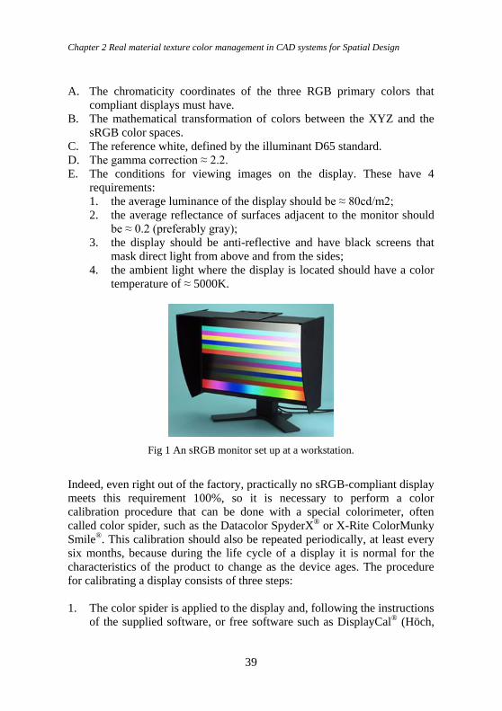
Indeed, even right out of the factory, practically no sRGB-compliant display
meets this requirement 100%, so it is necessary to perform a color
calibration procedure that can be done with a special colorimeter, often
called color spider, such as the Datacolor SpyderX® or X-Rite ColorMunky
Smile®. This calibration should also be repeated periodically, at least every
six months, because during the life cycle of a display it is normal for the
characteristics of the product to change as the device ages. The procedure
for calibrating a display consists of three steps:
1. The color spider is applied to the display and, following the instructions
of the supplied software, or free software such as DisplayCal® (Höch,
Color Design & Technology - A Multidisciplinary Approach to Colour – Part 2
40
2017), the user must adjust the display to conform as closely as
possible to the sRGB color space.
2. At the end of the previous step, the software supplied with the color
spider provides information on the percentage of compliance with the
sRGB standard of the display. It also creates a color profile (.icm or .icc
file) of the display, which also depends on the characteristics of the PC
graphics card.
3. The color profile that was created in the previous step must be entered
in the operating system settings. This will ensure that the application
software, equipped with a color management module (CMM), can be
informed about the color characteristics of the display.
Fig 2 Result of the sRGB calibration process of a display viewed in DisplayCal®.
The dashed triangle is the sRGB color space. The display has a good quality, as it is
99% compliant with the sRGB color space. Indeed, although the triangle of the
display color space is wider than the sRGB one, it does not cover it completely in
the red area.
Making the display compliant with the sRGB standard is the first step in
ensuring that digital color reproduction is the same on different devices.
However, two critical elements remain.
The first is that a slight adjustment of the display brightness, or just the
automatic intervention that modern PCs carry out, to change the
chromaticity of the display after sunset, so as not to disrupt the human
circadian system (Cajochen et al., 2011), is enough to frustrate the sRGB
Chapter 2 Real material texture color management in CAD systems for Spatial Design
41
calibration process. The second critical element is that ensuring the color
fidelity of digital images between different displays is only the last part of
the process, which is not sufficient to ensure that the image on the display is
a chromatically reliable representation of reality. The latter part also
depends on how the color data is imported from physical to virtual reality
and on the calculation model, of the interaction between light and matter,
implemented by the CAD software. For example, Autodesk states that some
of its software is sRGB-compliant for importing textures and producing
renderings.
For homogeneous materials a possible solution is to convert the colors of
materials measured in the real world from the XYZ color space to the sRGB
color space. This type of conversion can be done with matrix calculations
that are beyond the scope of this work. For this purpose there are many free
software programs (IRO Gr. Ltd., 2020). This approach can be applied only
to materials that have a homogeneous color surface; in the case of textured
materials a different method is needed.
4. Acquisition of texture colors In order to incorporate textured materials, such as wood and stone, into
Lighting CAD software, images of these materials must be captured with
input devices, such as a scanner or camera, which can be calibrated.
Downloading images of materials from the Internet or photographing them
without an input device calibration process is not sufficient, because we have
no guarantee of the color space in which the RGB values contained in the
image file, which typically might be in .tif, .jpg or .png format, are defined.
The photography-based method might seem like the easiest method, but it is
not (Guarini and Rossi, 2021). Because even if you have a professional
camera, a darkroom and lighting systems on a photo set, it is very difficult to
ensure uniform illumination on the surface of the material. The most reliable
method is based on the use of a scanner, in which the lighting conditions are
always carefully controlled.
It is advisable to have an A3 sized scanner to be able to use a larger sample
size of material, but an A4 can also be used for this purpose. The scanning
software supplied with the scanner should make it possible to calibrate the
scanner to produce an .icc color profile of the input device. If not, you can use
a third-party software such as, for example, VueScanPro® (Hamrick, 2020).
Finally, it is necessary to have a calibration table such as the one defined by
the IT8.7/2 standard (ANSI, 2008), which comes with a CD containing the
color data from the table. This is printed on special photographic paper that
guarantees color reliability for 2 years after its purchase.
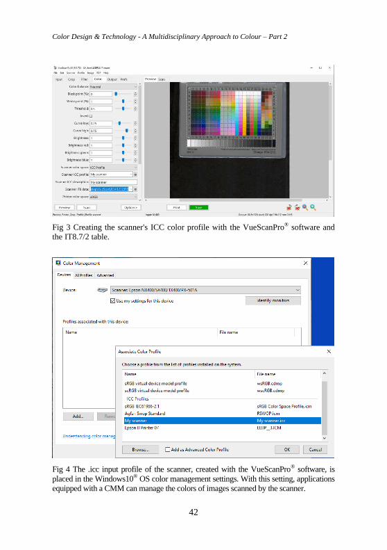
Color Design & Technology - A Multidisciplinary Approach to Colour – Part 2
42
Fig 3 Creating the scanner's ICC color profile with the VueScanPro® software and
the IT8.7/2 table.
Fig 4 The .icc input profile of the scanner, created with the VueScanPro® software, is
placed in the Windows10® OS color management settings. With this setting, applications
equipped with a CMM can manage the colors of images scanned by the scanner.
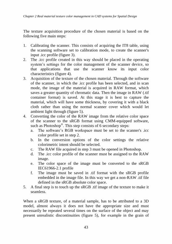
Chapter 2 Real material texture color management in CAD systems for Spatial Design
43
The texture acquisition procedure of the chosen material is based on the
following five main steps:
1. Calibrating the scanner. This consists of acquiring the IT8 table, using
the scanning software set to calibration mode, to create the scanner's
input .icc profile (figure 3).
2. The .icc profile created in this way should be placed in the operating
system’s settings for the color management of the scanner device, so
that applications that use the scanner know its input color
characteristics (figure 4).
3. Acquisition of the texture of the chosen material. Through the software
of the scanner, in which the .icc profile has been selected, and in scan
mode, the image of the material is acquired in RAW format, which
saves a greater quantity of chromatic data. Then the image in RAW (.tif
container format) is saved. At this stage it is best to capture the
material, which will have some thickness, by covering it with a black
cloth rather than using the normal scanner cover which would let
ambient light through (figure 5).
4. Converting the color of the RAW image from the relative color space
of the scanner to the sRGB format using CMM-equipped software,
such as Photoshop®. This step consists of 6 secondary steps:
a. The software’s RGB workspace must be set to the scanner's .icc
color profile set in step 2.
b. In the conversion options of the color settings the relative
colorimetric intent should be selected.
c. The RAW file acquired in step 3 must be opened in Photoshop.
d. The .icc color profile of the scanner must be assigned to the RAW
image.
e. The color space of the image must be converted to the sRGB
IEC61966-2.1 profile
f. The image must be saved in .tif format with the sRGB profile
embedded in the image file. In this way we get a non-RAW .tif file
defined in the sRGB absolute color space.
5. A final step is to touch up the sRGB .tif image of the texture to make it
seamless.
When a sRGB texture, of a material sample, has to be attributed to a 3D
model, almost always it does not have the appropriate size and must
necessarily be repeated several times on the surface of the object and may
present unrealistic discontinuities (figure 5), for example in the grain of
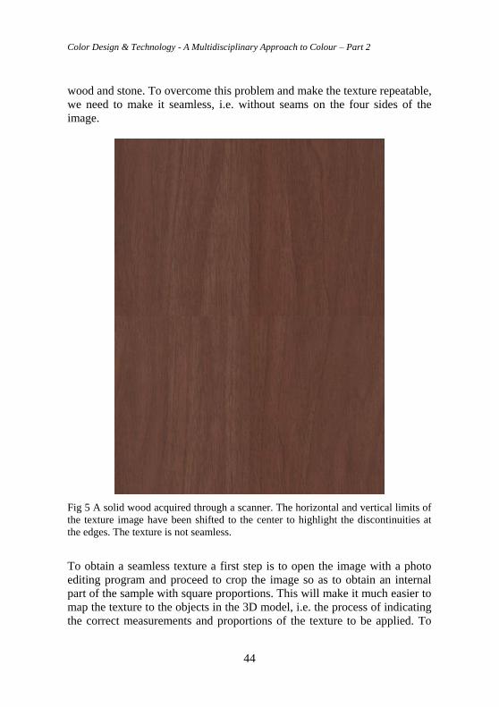
Color Design & Technology - A Multidisciplinary Approach to Colour – Part 2
44
wood and stone. To overcome this problem and make the texture repeatable,
we need to make it seamless, i.e. without seams on the four sides of the
image.
Fig 5 A solid wood acquired through a scanner. The horizontal and vertical limits of
the texture image have been shifted to the center to highlight the discontinuities at
the edges. The texture is not seamless.
To obtain a seamless texture a first step is to open the image with a photo
editing program and proceed to crop the image so as to obtain an internal
part of the sample with square proportions. This will make it much easier to
map the texture to the objects in the 3D model, i.e. the process of indicating
the correct measurements and proportions of the texture to be applied. To
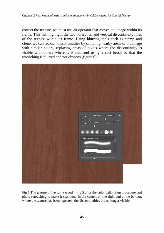
Chapter 2 Real material texture color management in CAD systems for Spatial Design
45
correct the texture, we must use an operator that moves the image within its
frame. This will highlight the two horizontal and vertical discontinuity lines
of the texture within its frame. Using blurring tools such as stamp and
clone, we can retouch discontinuities by sampling nearby areas of the image
with similar colors, replacing areas of pixels where the discontinuity is
visible with others where it is not, and using a soft brush so that the
retouching is blurred and not obvious (figure 6).
Fig 5 The texture of the same wood in fig 5 after the color calibration procedure and
photo retouching to make it seamless. In the center, on the right and at the bottom,
where the texture has been repeated, the discontinuities are no longer visible.
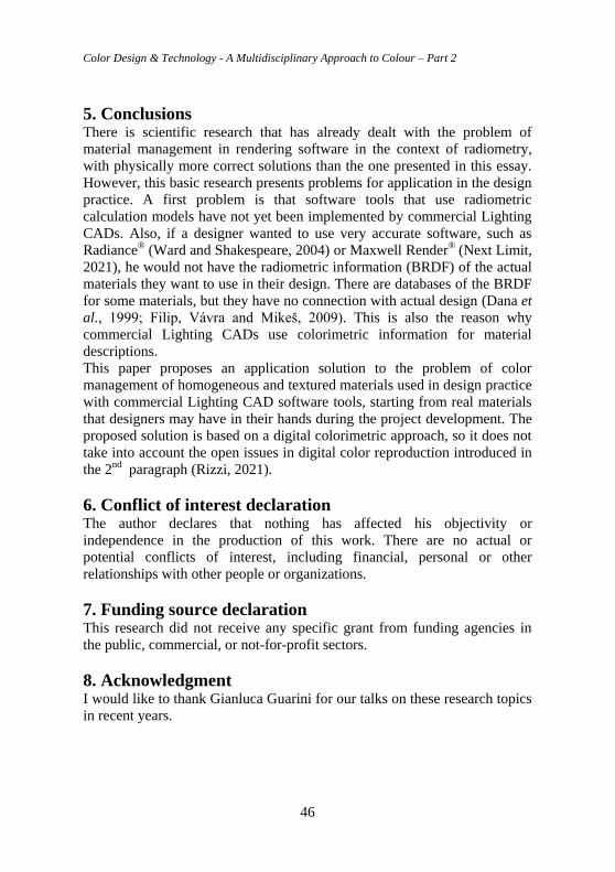
Color Design & Technology - A Multidisciplinary Approach to Colour – Part 2
46
5. Conclusions There is scientific research that has already dealt with the problem of
material management in rendering software in the context of radiometry,
with physically more correct solutions than the one presented in this essay.
However, this basic research presents problems for application in the design
practice. A first problem is that software tools that use radiometric
calculation models have not yet been implemented by commercial Lighting
CADs. Also, if a designer wanted to use very accurate software, such as
Radiance® (Ward and Shakespeare, 2004) or Maxwell Render® (Next Limit,
2021), he would not have the radiometric information (BRDF) of the actual
materials they want to use in their design. There are databases of the BRDF
for some materials, but they have no connection with actual design (Dana et
al., 1999; Filip, Vávra and Mikeš, 2009). This is also the reason why
commercial Lighting CADs use colorimetric information for material
descriptions.
This paper proposes an application solution to the problem of color
management of homogeneous and textured materials used in design practice
with commercial Lighting CAD software tools, starting from real materials
that designers may have in their hands during the project development. The
proposed solution is based on a digital colorimetric approach, so it does not
take into account the open issues in digital color reproduction introduced in
the 2nd paragraph (Rizzi, 2021).
6. Conflict of interest declaration The author declares that nothing has affected his objectivity or
independence in the production of this work. There are no actual or
potential conflicts of interest, including financial, personal or other
relationships with other people or organizations.
7. Funding source declaration This research did not receive any specific grant from funding agencies in
the public, commercial, or not-for-profit sectors.
8. Acknowledgment I would like to thank Gianluca Guarini for our talks on these research topics
in recent years.
Chapter 2 Real material texture color management in CAD systems for Spatial Design
47
9. Short biography of the author Maurizio Rossi. MSc, PhD. Full professor of Design at Politecnico di
Milano where he is the scientific manager of the Lab. Luce, the director of
the Master program in Color Design & Technology and the Master program
in Lighting Design & Technology. He is the editor-in-chief of the Color
Culture and Science Journal. From 2012 to 2018 he was the President of the
Associazione Italiana Colore. Since 2018 he is member of the Executive
Committee of AIC (International Color Association)
References ANSI (2008) ANSI IT8.7/2-1993(R2008) - Graphic Technology - Color Reflection Target for
Input Scanner Calibration. ANSI.
Arvo, J. et al. (2001) ‘State of the Art in Monte Carlo Ray Tracing for Realistic Image
Synthesis’, in. Siggraph 2001 Course 29, Los Angeles, CA, pp. 1–192.
Cajochen, C. et al. (2011) ‘Evening exposure to a light-emitting diodes (LED)-backlit
computer screen affects circadian physiology and cognitive performance’, Journal of
Applied Physiology (Bethesda, Md.: 1985), 110(5), pp. 1432–1438. doi:
10.1152/japplphysiol.00165.2011.
CEN (2011) EN 12464-1:2011 Light and lighting - Lighting of work places - Part 1: Indoor
work places.
CIE (2010) CIE 190:2010 Calculation and Presentation of United Glare Rating Tables for
Indoor Lighting Luminaires.
CIE (2018) CIE 015:2018 Colorimetry, 4th edition.
Dana, K. J. et al. (1999) ‘Reflectance and texture of real-world surfaces’, ACM Transactions
on Graphics, 18(1), pp. 1–34. doi: 10.1145/300776.300778.
Filip, J., Vávra, R. and Mikeš, S. (2009) UTIA BTF Database - Database. Available at:
http://btf.utia.cas.cz/?brdf_dat_dwn (Accessed: 11 April 2021).
Guarini, G. and Rossi, M. (2021) ‘A practical procedure for obtaining calibrated material
colors for CAD Systems’, in. Rucolor202. The International Scientific Conference of the
Color Society of Russia, Smolensk, RU: Smolensk State University Press, pp. 196–201.
Guild, J. (1931) ‘The colorimetric properties of the spectrum’, Philosophical Transactions of
the Royal Society of London. Series A, 230A(681–693), pp. 149–187. doi:
10.1098/rsta.1932.0005.
Hamrick (2020) VueScanPro. Available at: https://www.hamrick.com/ (Accessed: 30 October
2020).
Helmholtz, H. von (1867) Handbuch der physiologischen Optik,. Leipzig: Voss.
Hering, E. (1964) Outlines of a Theory of the Light Sense. 1St Edition edition. Translated by
L. M. Hurvich and D. Jameson. Harvard University Press.
Höch, F. (2017) DisplayCAL - Display Calibration and Characterization powered by
ArgyllCMS. ArgyllCMS. Available at: http://displaycal.net/ (Accessed: 13 April 2021).
Hughes, J. et al. (2013) Computer Graphics: Principles and Practice. 3rd edition. Upper Saddle
River, New Jersey: Addison-Wesley Professional.
Color Design & Technology - A Multidisciplinary Approach to Colour – Part 2
48
Hunter, R. S. and Harold, R. W. (1987) The Measurement of Appearance, 2nd Edition. 2nd
Edition. New York: Wiley-Interscience.
ICC (2020) International Color Consortium.
IEC (1999) IEC 61966-2-1:1999 Multimedia systems and equipment - Colour measurement
and management - Part 2-1: Colour management - Default RGB colour space - sRGB.
IRO Gr. Ltd. (2020) EasyRGB - Convert color data into different standards and color spaces.
Available at: https://www.easyrgb.com/en/convert.php (Accessed: 30 October 2020).
ISO (2010) ISO 15076-1:2010 Image technology colour management — Architecture, profile
format and data structure — Part 1: Based on ICC.1:2010.
Khodulev, A. and Kopylov, E. (1996) ‘Physically Accurate Lighting Simulation’, in.
GraphiCon’96, 6th Int. Conf. on Computer Graphics and Visualization, GraphiCon
Scientific Society, RU, pp. 111–119.
Land, B. (1977) ‘The Retinex Theory of Color Vision’, Scientific American, (12). doi:
10.1038/scientificamerican1277-108.
MacAdam, D. L. (1942) ‘Visual Sensitivities to Color Differences in Daylight*’, JOSA, 32(5),
pp. 247–274. doi: 10.1364/JOSA.32.000247.
Maxwell, J. C. (1865) ‘VIII. A dynamical theory of the electromagnetic field’, Philosophical
Transactions of the Royal Society of London, 155, pp. 459–512. doi:
10.1098/rstl.1865.0008.
Next Limit (2021) Maxwell Render | CPU, GPU & Cloud photorealistic render engine.
Available at: https://maxwellrender.com/ (Accessed: 17 April 2021).
Rizzi, A. (2021) ‘Colour after colorimetry’, Coloration Technology, 137(1), pp. 22–28. doi:
https://doi.org/10.1111/cote.12496.
Ward, G. and Shakespeare, R. (2004) Rendering With Radiance: The Art And Science Of
Lighting Visualization. Revised edition. Davis, Calif.: Booksurge Llc.
Wright, W. D. (1929) ‘A re-determination of the trichromatic coefficients of the spectral
colours’, Transactions of the Optical Society, 30(4), pp. 141–164. doi: 10.1088/1475-
4878/30/4/301.
Chapter 3 Colour in Spaces: A Spatial Design Approach
49
Chapter 3 Colour in Spaces: A Spatial
Design Approach Douha Youssef Attiah, King Abdulaziz University, Saudi Arabia
Vien Cheung, University of Leeds, UK
Abstract Spaces are often built under specific structures and are composed by
different materials. The final appearance of a space is dictated by utilisation
of all the individual elements, such as colour, texture, gloss, shape, that the
materials carry. Additionally, ambience and mood of the spaces are usually
impacted directly by light and the surroundings. This chapter provides an
overview on design elements and principles in spatial design, followed by
discussions in the area of colour interaction for the one element and the
whole context.
Keywords: Colour, spaces, places, spatial design, design elements, design principles,
colour interaction
DOI 10.23738/RCASB.00203
This chapter is part of the book: Color Design & Technology - A Multidisciplinary Approach
to Colour – Part 2, edited by Alice Plutino, Gabriele Simone and Alessandro Rizzi
ISBN 978-88-99513-15-3
Research Culture and Science Book Series Vol 2
ISSN 2785-115X www.rcasb.eu
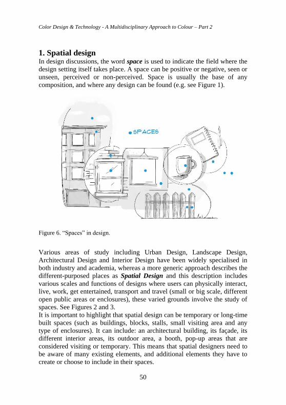
Color Design & Technology - A Multidisciplinary Approach to Colour – Part 2
50
1. Spatial design In design discussions, the word space is used to indicate the field where the
design setting itself takes place. A space can be positive or negative, seen or
unseen, perceived or non-perceived. Space is usually the base of any
composition, and where any design can be found (e.g. see Figure 1).
Figure 6. “Spaces” in design.
Various areas of study including Urban Design, Landscape Design,
Architectural Design and Interior Design have been widely specialised in
both industry and academia, whereas a more generic approach describes the
different-purposed places as Spatial Design and this description includes
various scales and functions of designs where users can physically interact,
live, work, get entertained, transport and travel (small or big scale, different
open public areas or enclosures), these varied grounds involve the study of
spaces. See Figures 2 and 3.
It is important to highlight that spatial design can be temporary or long-time
built spaces (such as buildings, blocks, stalls, small visiting area and any
type of enclosures). It can include: an architectural building, its façade, its
different interior areas, its outdoor area, a booth, pop-up areas that are
considered visiting or temporary. This means that spatial designers need to
be aware of many existing elements, and additional elements they have to
create or choose to include in their spaces.
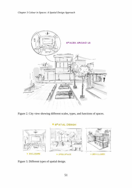
Chapter 3 Colour in Spaces: A Spatial Design Approach
51
Figure 2. City view showing different scales, types, and functions of spaces.
Figure 3. Different types of spatial design.
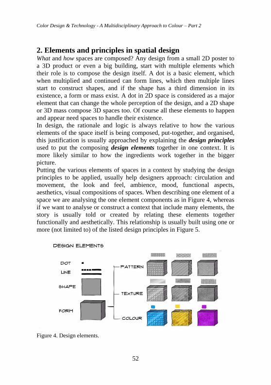
Color Design & Technology - A Multidisciplinary Approach to Colour – Part 2
52
2. Elements and principles in spatial design What and how spaces are composed? Any design from a small 2D poster to
a 3D product or even a big building, start with multiple elements which
their role is to compose the design itself. A dot is a basic element, which
when multiplied and continued can form lines, which then multiple lines
start to construct shapes, and if the shape has a third dimension in its
existence, a form or mass exist. A dot in 2D space is considered as a major
element that can change the whole perception of the design, and a 2D shape
or 3D mass compose 3D spaces too. Of course all these elements to happen
and appear need spaces to handle their existence.
In design, the rationale and logic is always relative to how the various
elements of the space itself is being composed, put-together, and organised,
this justification is usually approached by explaining the design principles
used to put the composing design elements together in one context. It is
more likely similar to how the ingredients work together in the bigger
picture.
Putting the various elements of spaces in a context by studying the design
principles to be applied, usually help designers approach: circulation and
movement, the look and feel, ambience, mood, functional aspects,
aesthetics, visual compositions of spaces. When describing one element of a
space we are analysing the one element components as in Figure 4, whereas
if we want to analyse or construct a context that include many elements, the
story is usually told or created by relating these elements together
functionally and aesthetically. This relationship is usually built using one or
more (not limited to) of the listed design principles in Figure 5.
Figure 4. Design elements.
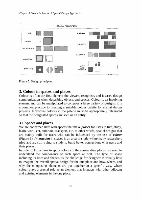
Chapter 3 Colour in Spaces: A Spatial Design Approach
53
Figure 5. Design principles.
3. Colour in spaces and places Colour is often the first element the viewers recognise, and it eases design
communication when describing objects and spaces. Colour is an involving
element and can be manipulated to compose a large variety of designs. It is
a common practice to creating a suitable colour palette for spatial design
projects. Individual colours in the palette must be appropriately integrated
so that the designated spaces are seen as an entity.
3.1 Spaces and places We are concerned here with spaces that make places for users to live, study,
learn, work, eat, entertain, transport, etc. In other words, spatial designs that
are mainly built for users who can be influenced by the use of colour
(Figure 6). Interaction in spaces is an area of study where many researchers
tried and are still trying to study to build better connections with users and
their places.
In order to know how to apply colours to the surrounding places, we need to
understand the components of each space at first. The type of space
including its lines and shapes, as the challenge for designers is usually how
to imagine the overall spatial design for the one place and how, where, and
why the composing elements are put together in a specific way, where
colour plays a crucial role as an element that interacts with other adjacent
and existing elements in the one place.
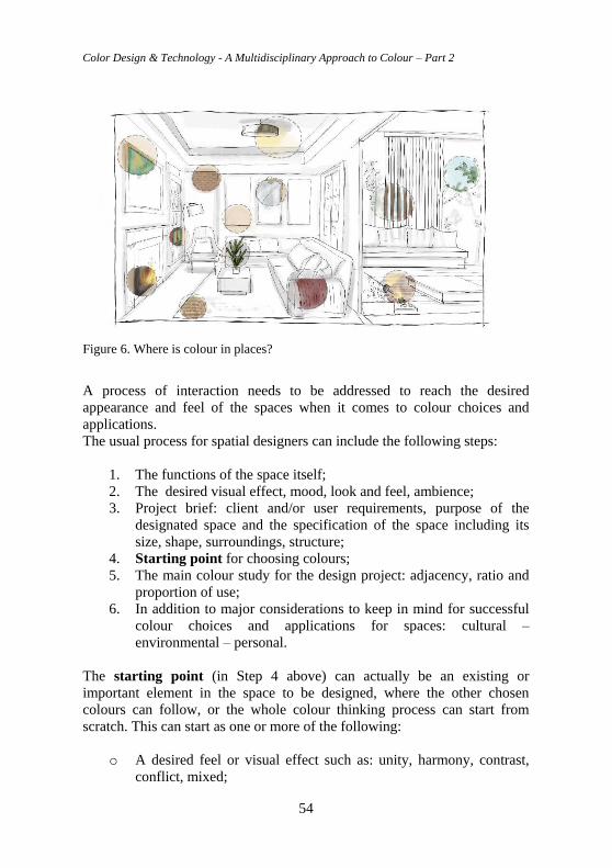
Color Design & Technology - A Multidisciplinary Approach to Colour – Part 2
54
Figure 6. Where is colour in places?
A process of interaction needs to be addressed to reach the desired
appearance and feel of the spaces when it comes to colour choices and
applications.
The usual process for spatial designers can include the following steps:
1. The functions of the space itself;
2. The desired visual effect, mood, look and feel, ambience;
3. Project brief: client and/or user requirements, purpose of the
designated space and the specification of the space including its
size, shape, surroundings, structure;
4. Starting point for choosing colours;
5. The main colour study for the design project: adjacency, ratio and
proportion of use;
6. In addition to major considerations to keep in mind for successful
colour choices and applications for spaces: cultural –
environmental – personal.
The starting point (in Step 4 above) can actually be an existing or
important element in the space to be designed, where the other chosen
colours can follow, or the whole colour thinking process can start from
scratch. This can start as one or more of the following:
o A desired feel or visual effect such as: unity, harmony, contrast,
conflict, mixed;
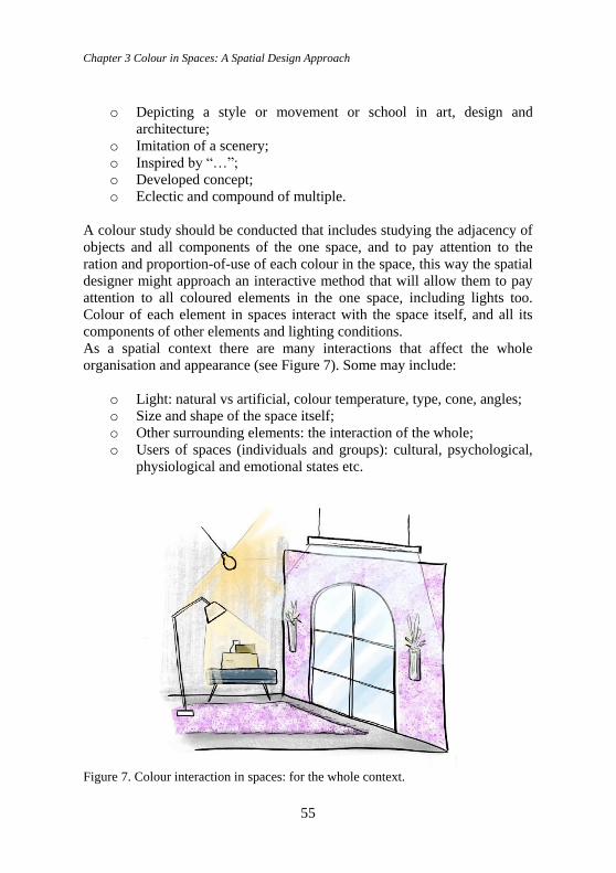
Chapter 3 Colour in Spaces: A Spatial Design Approach
55
o Depicting a style or movement or school in art, design and
architecture;
o Imitation of a scenery;
o Inspired by “…”;
o Developed concept;
o Eclectic and compound of multiple.
A colour study should be conducted that includes studying the adjacency of
objects and all components of the one space, and to pay attention to the
ration and proportion-of-use of each colour in the space, this way the spatial
designer might approach an interactive method that will allow them to pay
attention to all coloured elements in the one space, including lights too.
Colour of each element in spaces interact with the space itself, and all its
components of other elements and lighting conditions.
As a spatial context there are many interactions that affect the whole
organisation and appearance (see Figure 7). Some may include:
o Light: natural vs artificial, colour temperature, type, cone, angles;
o Size and shape of the space itself;
o Other surrounding elements: the interaction of the whole;
o Users of spaces (individuals and groups): cultural, psychological,
physiological and emotional states etc.
Figure 7. Colour interaction in spaces: for the whole context.
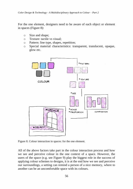
Color Design & Technology - A Multidisciplinary Approach to Colour – Part 2
56
For the one element, designers need to be aware of each object or element
in spaces (Figure 8):
o Size and shape;
o Texture: tactile vs visual;
o Pattern: line type, shapes, repetition;
o Special material characteristics: transparent, translucent, opaque,
glow etc.
Figure 8. Colour interaction in spaces: for the one element.
All of the above factors take part in the colour interaction process and how
we see and perceive colour in the one context of a space. However, the
users of the space (e.g. see Figure 9) play the biggest role in the success of
applying colour schemes to designs, it is at the end how we see and perceive
our surroundings, a setting can remind a person of a nice memory, where to
another can be an uncomfortable space with its colours.
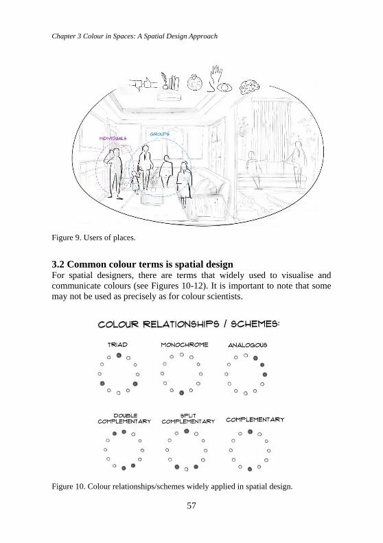
Chapter 3 Colour in Spaces: A Spatial Design Approach
57
Figure 9. Users of places.
3.2 Common colour terms is spatial design For spatial designers, there are terms that widely used to visualise and
communicate colours (see Figures 10-12). It is important to note that some
may not be used as precisely as for colour scientists.
Figure 10. Colour relationships/schemes widely applied in spatial design.
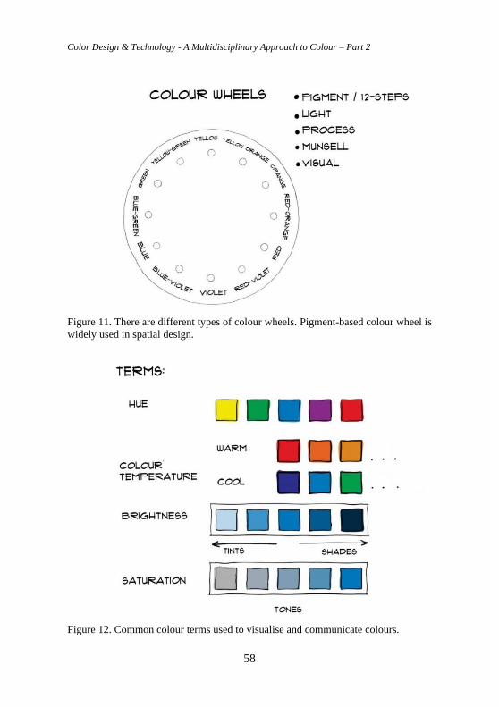
Color Design & Technology - A Multidisciplinary Approach to Colour – Part 2
58
Figure 11. There are different types of colour wheels. Pigment-based colour wheel is
widely used in spatial design.
Figure 12. Common colour terms used to visualise and communicate colours.
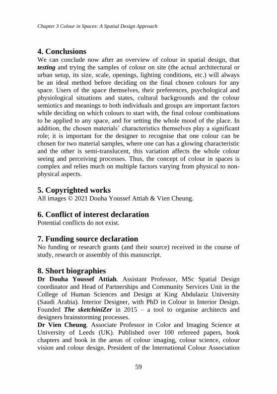
Chapter 3 Colour in Spaces: A Spatial Design Approach
59
4. Conclusions We can conclude now after an overview of colour in spatial design, that
testing and trying the samples of colour on site (the actual architectural or
urban setup, its size, scale, openings, lighting conditions, etc.) will always
be an ideal method before deciding on the final chosen colours for any
space. Users of the space themselves, their preferences, psychological and
physiological situations and states, cultural backgrounds and the colour
semiotics and meanings to both individuals and groups are important factors
while deciding on which colours to start with, the final colour combinations
to be applied to any space, and for setting the whole mood of the place. In
addition, the chosen materials’ characteristics themselves play a significant
role; it is important for the designer to recognise that one colour can be
chosen for two material samples, where one can has a glowing characteristic
and the other is semi-translucent, this variation affects the whole colour
seeing and perceiving processes. Thus, the concept of colour in spaces is
complex and relies much on multiple factors varying from physical to non-
physical aspects.
5. Copyrighted works All images © 2021 Douha Youssef Attiah & Vien Cheung.
6. Conflict of interest declaration Potential conflicts do not exist.
7. Funding source declaration No funding or research grants (and their source) received in the course of
study, research or assembly of this manuscript.
8. Short biographies Dr Douha Youssef Attiah. Assistant Professor, MSc Spatial Design
coordinator and Head of Partnerships and Community Services Unit in the
College of Human Sciences and Design at King Abdulaziz University
(Saudi Arabia). Interior Designer, with PhD in Colour in Interior Design.
Founded The sketchiniZer in 2015 – a tool to organise architects and
designers brainstorming processes.
Dr Vien Cheung. Associate Professor in Color and Imaging Science at
University of Leeds (UK). Published over 100 refereed papers, book
chapters and book in the areas of colour imaging, colour science, colour
vision and colour design. President of the International Colour Association
Color Design & Technology - A Multidisciplinary Approach to Colour – Part 2
60
(AIC) which has a global membership of 30 colour societies over five
continents.
Bibliography Attiah, D. Y. (2016) ‘A constant-theoretical sampling and comparison approach to optimise
colour thinking in the interior-design process’, PhD Thesis. University of Leeds. Available
at: http://etheses.whiterose.ac.uk/13834 (Accessed: 12 April 2021).
Berns, R. S. (2019) Billmeyer and Saltzman's Principles of Color Technology. 4th edn.
Hoboken, US: Wiley.
Brooker, G. and Stone, S. (2010) What is Interior Design? (Essential Design Handbooks). 4th
edn. Brighton, UK: Rotovision.
Caan, S. (2011) Rethinking Design and Interiors: Human Beings in the Built Environment.
London, UK: Laurence King Publishing.
Ching, F. D. K. (2015) Architecture: Form, Space, & Order. 4th edn. Hoboken, US: Wiley.
Lawson, B. (2005) How Designers Think: The Design Process Demystified. 4th edn.
Abingdon, UK: Routledge.
Westland, S., Laycock, K., Cheung, V., Henry, P. and Mahyar, F. (2007) ‘Colour harmony’,
Colour: Design & Creativity, 1(1), 1, pp. 1-15. Available at: https://aic-
color.org/resources/Documents/jaic_v1_review.pdf (Accessed: 12 April 2021).
Chapter 4 Word to color! Tells, persuades, evokes
61
Chapter 4 Word to color! Tells, persuades,
evokes Elisabetta Del Zoppo
Abstract For the teaching module "Project work the Color in the Communication"
within the Master in Color Design and Technology promoted by the
Politecnico di Milano in collaboration with the Italian Color Association, I
decided to involve students with different projects, designed to embrace
different creative and methodological approaches precisely to face the
multiple areas of the visual communication. Each project aims to train
creativity, experiment with color in the choice and application, use the
different techniques for the selection and construction of a color code. The
goal is to provide students with the useful tools to acquire familiarity,
technique and awareness, facing the processing steps of a color project
articulated in all its communicative and aesthetic extension, through the
conception, development of its parts and the final presentation. A careful
look at the visual graphic culture foresees associations and connections of
different nature; interdisciplinary and intercultural, contemporary and
historical considerations where color is a fundamental and complex element
that must be carefully investigated to discover its innumerable nuances and
different communicative values. Only when you deal with the color design
you can completely understand its strength and complexity. The ability to
choose and to combine color in the right quantities for an effective
communication is the result of a lot of training, specialized skills, technique,
method, sensitivity, intuition, creativity and knowledge. Elements that will
be investigated and highlighted during the project work.
Keywords: Training, technique, sensitivity, knowledge
DOI 10.23738/RCASB.00204
This chapter is part of the book: Color Design & Technology - A Multidisciplinary Approach
to Colour – Part 2, edited by Alice Plutino, Gabriele Simone and Alessandro Rizzi
ISBN 978-88-99513-15-3
Research Culture and Science Book Series Vol 2
ISSN 2785-115X www.rcasb.eu
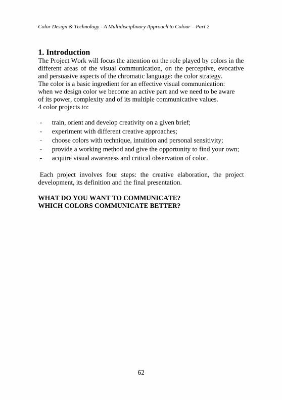
Color Design & Technology - A Multidisciplinary Approach to Colour – Part 2
62
1. Introduction The Project Work will focus the attention on the role played by colors in the
different areas of the visual communication, on the perceptive, evocative
and persuasive aspects of the chromatic language: the color strategy.
The color is a basic ingredient for an effective visual communication:
when we design color we become an active part and we need to be aware
of its power, complexity and of its multiple communicative values.
4 color projects to:
- train, orient and develop creativity on a given brief;
- experiment with different creative approaches;
- choose colors with technique, intuition and personal sensitivity;
- provide a working method and give the opportunity to find your own;
- acquire visual awareness and critical observation of color.
Each project involves four steps: the creative elaboration, the project
development, its definition and the final presentation.
WHAT DO YOU WANT TO COMMUNICATE?
WHICH COLORS COMMUNICATE BETTER?
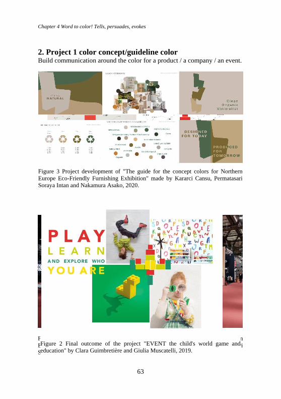
Chapter 4 Word to color! Tells, persuades, evokes
63
2. Project 1 color concept/guideline color Build communication around the color for a product / a company / an event.
Figure 4 Final outcome of the project "The guide for the concept colors for Northern
Europe Eco-Friendly Furnishing Exhibition" made by Kararci Cansu, Permatasari
Soraya Intan and Nakamura Asako, 2020.
Figure 1 Project development of "EVENT the child's world game and education" by
Clara Guimbretière and Giulia Muscatelli, 2019.
Figure 2 Final outcome of the project "EVENT the child's world game and
education" by Clara Guimbretière and Giulia Muscatelli, 2019.
Figure 3 Project development of "The guide for the concept colors for Northern
Europe Eco-Friendly Furnishing Exhibition" made by Kararci Cansu, Permatasari
Soraya Intan and Nakamura Asako, 2020.
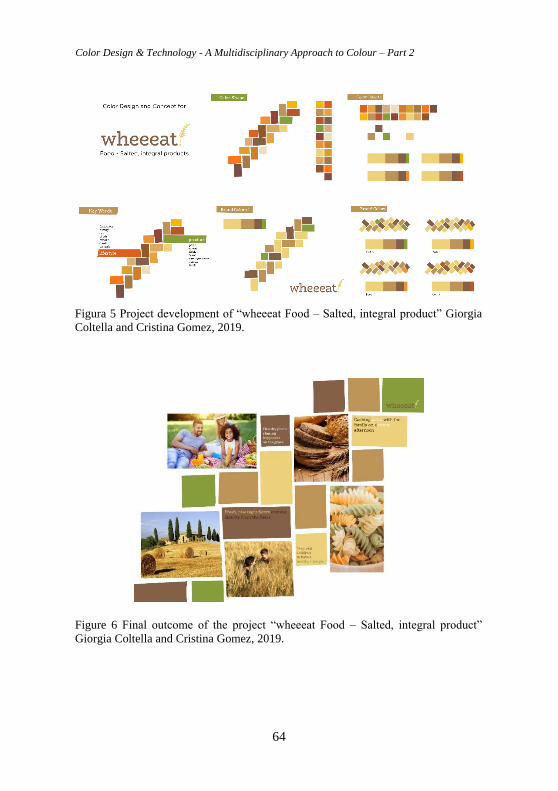
Color Design & Technology - A Multidisciplinary Approach to Colour – Part 2
64
Figure 6 Final outcome of the project “wheeeat Food – Salted, integral product”
Giorgia Coltella and Cristina Gomez, 2019.
Figura 5 Project development of “wheeeat Food – Salted, integral product” Giorgia
Coltella and Cristina Gomez, 2019.
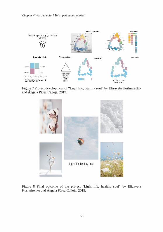
Chapter 4 Word to color! Tells, persuades, evokes
65
Figure 7 Project development of “Light life, healthy soul” by Elizaveta Kushnirenko
and Ángela Pérez Calleja, 2019.
Figure 8 Final outcome of the project "Light life, healthy soul" by Elizaveta
Kushnirenko and Ángela Pérez Calleja, 2019.
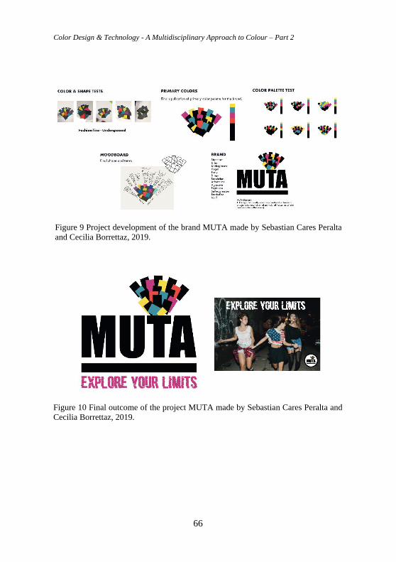
Color Design & Technology - A Multidisciplinary Approach to Colour – Part 2
66
Figure 9 Project development of the brand MUTA made by Sebastian Cares Peralta
and Cecilia Borrettaz, 2019.
Figure 10 Final outcome of the project MUTA made by Sebastian Cares Peralta and
Cecilia Borrettaz, 2019.
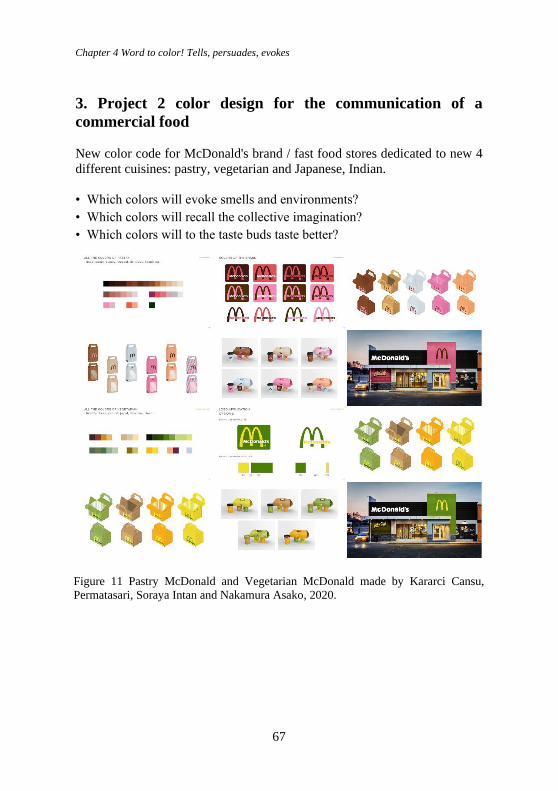
Chapter 4 Word to color! Tells, persuades, evokes
67
3. Project 2 color design for the communication of a
commercial food
New color code for McDonald's brand / fast food stores dedicated to new 4
different cuisines: pastry, vegetarian and Japanese, Indian.
• Which colors will evoke smells and environments?
• Which colors will recall the collective imagination?
• Which colors will to the taste buds taste better?
Figure 11 Pastry McDonald and Vegetarian McDonald made by Kararci Cansu,
Permatasari, Soraya Intan and Nakamura Asako, 2020.
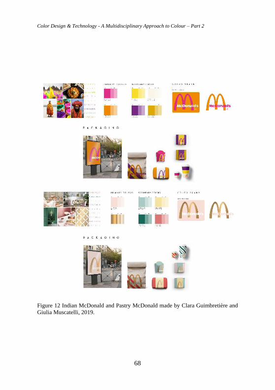
Color Design & Technology - A Multidisciplinary Approach to Colour – Part 2
68
Figure 12 Indian McDonald and Pastry McDonald made by Clara Guimbretière and
Giulia Muscatelli, 2019.
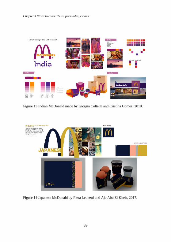
Chapter 4 Word to color! Tells, persuades, evokes
69
Figure 13 Indian McDonald made by Giorgia Coltella and Cristina Gomez, 2019.
Figure 14 Japanese McDonald by Piera Leonetti and Aja Abu El Kheir, 2017.
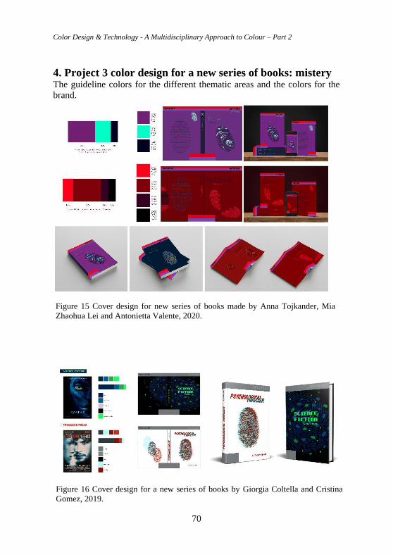
Color Design & Technology - A Multidisciplinary Approach to Colour – Part 2
70
4. Project 3 color design for a new series of books: mistery The guideline colors for the different thematic areas and the colors for the
brand.
Figure 15 Cover design for new series of books made by Anna Tojkander, Mia
Zhaohua Lei and Antonietta Valente, 2020.
Figure 16 Cover design for a new series of books by Giorgia Coltella and Cristina
Gomez, 2019.
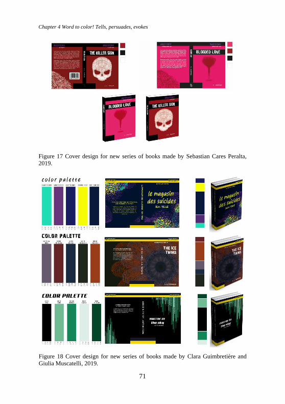
Chapter 4 Word to color! Tells, persuades, evokes
71
Figure 18 Cover design for new series of books made by Clara Guimbretière and
Giulia Muscatelli, 2019.
Figure 17 Cover design for new series of books made by Sebastian Cares Peralta,
2019.
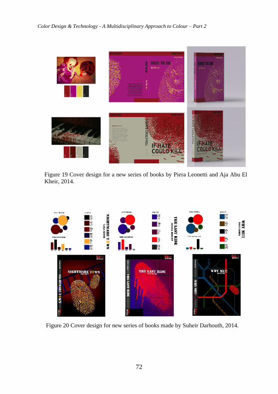
Color Design & Technology - A Multidisciplinary Approach to Colour – Part 2
72
Figure 19 Cover design for a new series of books by Piera Leonetti and Aja Abu El
Kheir, 2014.
Figure 20 Cover design for new series of books made by Suheir Darhouth, 2014.
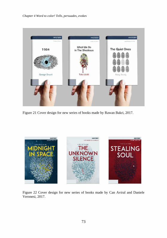
Chapter 4 Word to color! Tells, persuades, evokes
73
Figure 21 Cover design for new series of books made by Rawan Bakri, 2017.
Figure 22 Cover design for new series of books made by Can Aviral and Daniele
Veronesi, 2017.
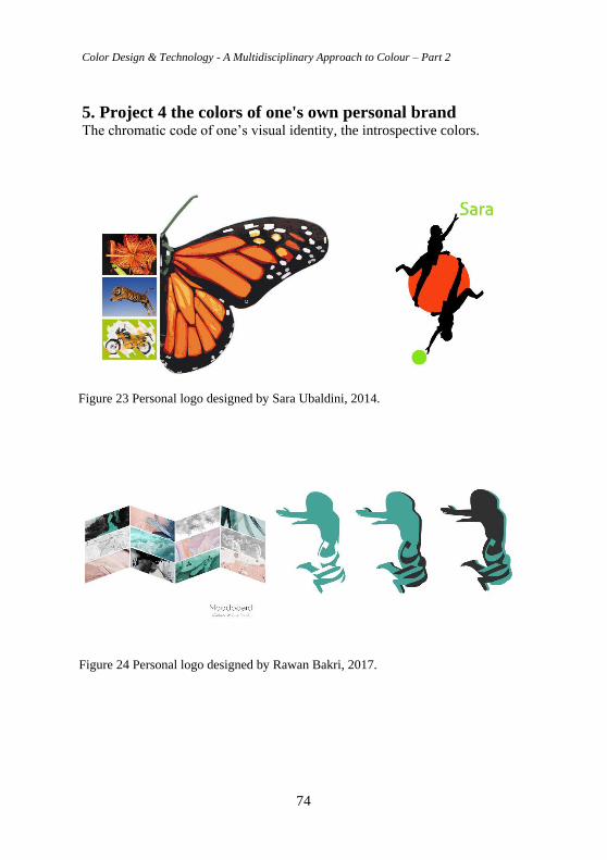
Color Design & Technology - A Multidisciplinary Approach to Colour – Part 2
74
5. Project 4 the colors of one's own personal brand The chromatic code of one’s visual identity, the introspective colors.
Figure 23 Personal logo designed by Sara Ubaldini, 2014.
Figure 24 Personal logo designed by Rawan Bakri, 2017.

Chapter 4 Word to color! Tells, persuades, evokes
75
Figure 25 Personal logo designed by Susie Xie, 2017.
Figure 26 Personal logo designed by Can Aviral, 2017.
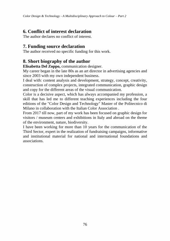
Color Design & Technology - A Multidisciplinary Approach to Colour – Part 2
76
6. Conflict of interest declaration The author declares no conflict of interest.
7. Funding source declaration The author received no specific funding for this work.
8. Short biography of the author Elisabetta Del Zoppo, communication designer.
My career began in the late 80s as an art director in advertising agencies and
since 2003 with my own independent business.
I deal with: content analysis and development, strategy, concept, creativity,
construction of complex projects, integrated communication, graphic design
and copy for the different areas of the visual communication.
Color is a decisive aspect, which has always accompanied my profession, a
skill that has led me to different teaching experiences including the four
editions of the "Color Design and Technology" Master of the Politecnico di
Milano in collaboration with the Italian Color Association .
From 2017 till now, part of my work has been focused on graphic design for
visitors / museum centers and exhibitions in Italy and abroad on the theme
of the environment, nature, biodiversity.
I have been working for more than 10 years for the communication of the
Third Sector, expert in the realization of fundraising campaigns, informative
and institutional material for national and international foundations and
associations.
Chapter 5 Color and Culture
77
Chapter 5 Color and Culture Olga Salvoni
Abstract Colour is a very complex element, it produces different effects depending
on each society. Colours have a relationship with events and experiences
that form the collective memory of world. Aesthetic perceptions change
based on cultural backgrounds.
Products need to support different aesthetic values and aspirations
according to different influences or trends, which can be local, global or a
fusion of both. Since aesthetic preferences are directly linked to different
CMF elements, the same colour, material or finish can be perceived
differently depending on culture.
DOI 10.23738/RCASB.00205
This chapter is part of the book: Color Design & Technology - A Multidisciplinary Approach
to Colour – Part 2, edited by Alice Plutino, Gabriele Simone and Alessandro Rizzi
ISBN 978-88-99513-15-3
Research Culture and Science Book Series Vol 2
ISSN 2785-115X www.rcasb.eu
Color Design & Technology - A Multidisciplinary Approach to Colour – Part 2
78
1. Meaning Of Colours It’s important to know the true meaning of colours to communicate the right
message.
In a CMF Design project, in addition to defining the correct chromatic
combination it’s important to know the meaning of each hue. Also, the color
is connected with the context, this is a key player in the color choice. Color
psychology studies how different colors determine human behavior.
1.1 White White is a neutral color, the archetype of light. In some parts of the world,
white has the opposite meaning.
The meaning of white is completely opposed to that of black color. This
symbolizes the principle of the vital phase. In general, white expresses hope
for the future. It is the symbol of purity, noble feelings, desire for change,
virginity, spirituality, technology and glamour.
CLEANING - PURIFICATION - ELEGANCE - EXCLUSIVITY -
PURITY - LIGHTNESS - NEUTRALITY - MEDITATION -
ABSENCE
1.2 Black Black is the absence of light, it evokes both, positive and negative emotions.
The first association black has is with mystery, the unknown and the hidden.
Black is also associated with style and is a popular color in retail. Black
suits are often worn by business men and women, a black suit implies
seriousness and professionalism.
POWER - SOPHISTICATION - CHAOS - DARKNESS - DEATH -
AUTHORITY - MISTERY - PRIVATION - REBELLION
1.3 Red Red is a stimulating, fascinating, competitive color. It represents
excitement, vital energy, domination and desire. In color psychology, red is
the most intense color. And thus, can provoke the strongest emotions.
In some ways, red is the opposite of blue. Red speeds up our heart rate,
blood flow, and body temperature. This color stimulates our senses of smell
and taste, making us more sensitive to our environments.
Chapter 5 Color and Culture
79
EXCITEMEN - PASSION - DANGER - FERTILITY - SEDUCTION -
SEXUALITY - AGGRESSION PASSION - LOVE - COURAGE -
HATE
1.4 Orange Orange is warm color, it combines the phisical energy of red with the bright
happiness of yellow. Since ancient times-long before it was called orange.
This color has had a strong impact. Today, orange continues to elicit strong
reactions. Orange is also known to be a color of motivation, lends a positive
attitude, and general enthusiasm for life. Overall, orange is great for
bringing comfort in tough times, and creating a sense of fun or freedom in
your visuals.
FUN - WARMTH - CREATIVITY - ENCOURAGEMENT - HEALTH
- STIMULATION - HAPPINESS BALANCE - ENERGY -
CONFIDENCE
1.5 Yellow Yellow Is the colour of the day and the light. This colour stimulates the
mind and it is good for communication. Studies show that the meaning of
the color yellow can be warmth, cheerfulness, increased mental activity,
increased muscle energy. Softer yellows are commonly used as a gender-
neutral color for babies and young children. Light yellows also give a more
calm feeling of happiness than bright yellows.
Dark yellows and gold-hued yellows look antique and be used in designs
where a sense of classic is desired. Bright yellow is an attention-getter, and
its contrast with black is the most visible color combination. This
combination can be used to communicate a warning sign.
HAPPINESS - SUNSHINE - MIND-STIMULATION - HOPE -
ENERGY - VITALITY - FRIENDSHIP COWARDICE - SICKNESS
1.6 Green Green is the colour of vitality, it is linked to nature. This colour provides
emotional and mental balance. It’s a combination of yellow and blue. We
use green in design for spaces intended to promote creativity and
productivity. Green is a color that helps alleviate anxiety, depression, and
nervousness.
Different shades of green have different meanings, for example while
yellow-green stands for sickness, jealousy, and cowardice, dark green
Color Design & Technology - A Multidisciplinary Approach to Colour – Part 2
80
represents greed, ambition, and wealth, and olive green represents the
traditional color of peace.
Green is often used for the packaging of natural health products, it also
implies safety.
GROWTH - HARMONY - FRESHNESS - SAFETY - FERTILITY -
LUCK - WEALTH - HOPE PROSPERITY - NATURE
1.7 Blue The archetype of blue is water, the sea, but also the sky. It represents
calmness, tranquility, tolerance, meditation. Like many colors, our response
to the color blue is complex and sometimes even contradictory.
Blue represents introspective journeys and symbolizes wisdom and depth of
understanding. But blue is also a symbol of depression and the depths of the
human psyche. This color typically evoke emotions of professionalism,
authority, and trust, it can be considered as neutral and timeless. The color
blue is highly associated with responsibility and is therefore regarded as
representing reliability. For good reason, the insurance industry has widely
embraced this color to represent their brand.
STABILITY - PEACE - CALM - RELAXING - MEDITATIVE -
AUTHORITY - WATER - TRANQUILITY -SECURITY
1.8 Purple Purple is the colour of ambivalence and suggestion, it can calm the mind
and the nerves, as well as encourage creativity. As a combination of red and
blue, it carries stimulation of red and the calmness and integrity of blue.
This color has long been associated with wealth and royalty, as purple dye
was precious and expensive. Purple used professionally can feel a bit
unsettled and therefore uncomfortable. In the world of advertising and
fashion, the color purple is seen as a soothing and vibrant color and usually
symbolizes luxury as well as the expression of femininity in women. For its
smoothing properties it is often used in beauty and anti-aging products.
LUXURY - ROYALITY - ROMANCE - SPIRITUALITY - MISTERY
- SUGGESTION - MAGIC CREATIVITY - FEMININITY
Chapter 5 Color and Culture
81
2. What is CMF design? CMF design is a new professional discipline which focuses on designing
and specifying colours, materials and finishes to enhance the attributes of
products.
The CMF designer is the person who is specialized in CMF design, he or
she is also called colour designer, his mission is:
- to increase product performance, aesthetic appeal, and functionality.
- to reach new consumers and new markets.
There are different approaches to the practice of CMF design according to
geographical location, type of industry, level of experience and cultural
background; but some fundamental definitions are in common.
3. Who is the cmf designer? The CMF designer create a strong emotional connection with the consumer.
1 He increases the product’s performance, aesthetic appeal, and
functionality.
2 He helps a product to stand out from its competition.
3 He raises the perceived value of the product.
4 He reaches a new consumer, market or geography.
5 He provides a compelling sensory experience.
6 He creates a system of tiered product positioning.
7 He refreshes or reposition your current product without changing
manufacturing processes.
4. CMF/different levels 4.1 C/Colours The cmf designer knows colours from his consideration of hue, value and
saturation to the psychological effects on the target market. He can design
the perfect colour and the perfect combination of more colours.
4.2 M/Materials CMF designer also has a great passion for material design, he is specialized
in developing materials to solve problems. He works with his team of
experts in several fields: textile, leather, plastic, wood, composites and
metals.
4.3 F/Finish The CMF designer is obsessed over details on a product, from the gloss
level, to the texture and finish.
Color Design & Technology - A Multidisciplinary Approach to Colour – Part 2
82
He ensures that the final result will not only make a strong impact, but it
will be functionally and lasting too.
5. CMF design steps 5.1 Brief This is a short summary document outlining the goal of the project, the
specific task at hand, the budget and the expected timeline
5.2 Company analysis
The company has to be analysed to understand the characteristics, the
values and elds in which it operates. The products taken into consideration
will have one or more board showing all their functional
and chromatic properties.
5.3 Competitors analysis It’s important to research competitors interesting and competitive products
to get information on cost, usage, colors and materials. The products taken
into consideration will have a board that shows all its functional and
chromatic properties.
5.4 Target analysis Large and small companies classify people into groups according to a set of
similar characteristics and consumption behaviours.
The target takes into account: age, gender, taste, job, level of education, etc.
5.5 Trend analysis The trend tracking process is based on constant observation, documentation
and analysis of different contexts. The color landscape is in constant
evolution. Therefore, the identification of current and emerging trends is
fundamental. Products which have an interesting formal, chromatic and
material language are able to provide the client with different design ideas.
Trends are not static but fast moving, always changing. Trends help to
anticipate possible future scenarios, as well as new consumers’ needs,
desires and aspirations.
The CMF designer deliver comprehensive brie ngs in forms of visuals,
moodboards, lifestyle trends and inspirations, everything tailored for the
brand and products.
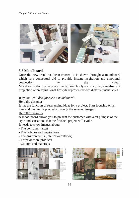
Chapter 5 Color and Culture
83
5.6 Moodboard Once the new trend has been chosen, it is shown throught a moodboard
which is a conceptual aid to provide instant inspiration and emotional
connection to the client.
Moodboards don’t always need to be completely realistic, they can also be a
projection or an aspirational lifestyle represented with different visual cues.
Why the CMF designer use a moodboard?
Help the designer
It has the function of rearranging ideas for a project. Start focusing on an
idea and then tell it precisely through the selected images.
Help the customer
A mood board allows you to present the customer with a rst glimpse of the
style and sensations that the finished project will evoke
It needs to show images about:
- The consumer target
- The hobbies and inspirations
- The environments (interior or exterior)
- Three or more products
- Colours and materials
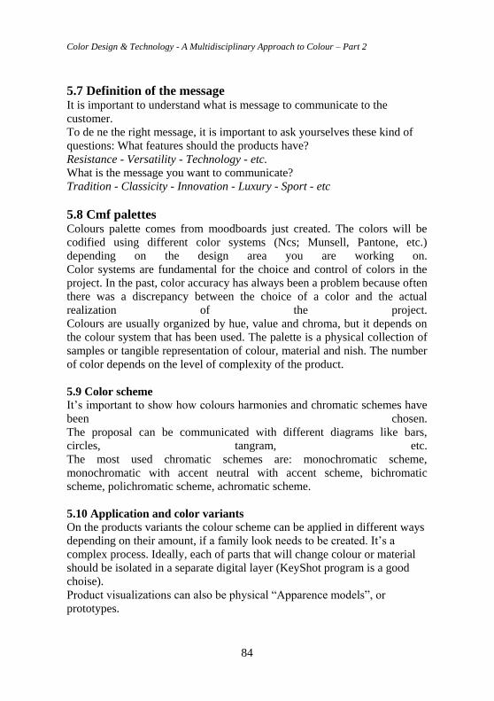
Color Design & Technology - A Multidisciplinary Approach to Colour – Part 2
84
5.7 Definition of the message It is important to understand what is message to communicate to the
customer.
To de ne the right message, it is important to ask yourselves these kind of
questions: What features should the products have?
Resistance - Versatility - Technology - etc.
What is the message you want to communicate?
Tradition - Classicity - Innovation - Luxury - Sport - etc
5.8 Cmf palettes Colours palette comes from moodboards just created. The colors will be
codified using different color systems (Ncs; Munsell, Pantone, etc.)
depending on the design area you are working on.
Color systems are fundamental for the choice and control of colors in the
project. In the past, color accuracy has always been a problem because often
there was a discrepancy between the choice of a color and the actual
realization of the project.
Colours are usually organized by hue, value and chroma, but it depends on
the colour system that has been used. The palette is a physical collection of
samples or tangible representation of colour, material and nish. The number
of color depends on the level of complexity of the product.
5.9 Color scheme It’s important to show how colours harmonies and chromatic schemes have
been chosen.
The proposal can be communicated with different diagrams like bars,
circles, tangram, etc.
The most used chromatic schemes are: monochromatic scheme,
monochromatic with accent neutral with accent scheme, bichromatic
scheme, polichromatic scheme, achromatic scheme.
5.10 Application and color variants
On the products variants the colour scheme can be applied in different ways
depending on their amount, if a family look needs to be created. It’s a
complex process. Ideally, each of parts that will change colour or material
should be isolated in a separate digital layer (KeyShot program is a good
choise).
Product visualizations can also be physical “Apparence models”, or
prototypes.
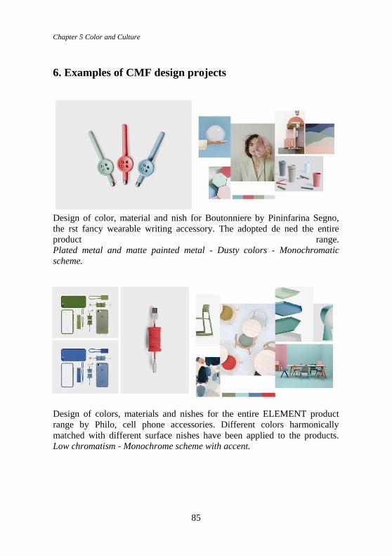
Chapter 5 Color and Culture
85
6. Examples of CMF design projects
Design of color, material and nish for Boutonniere by Pininfarina Segno,
the rst fancy wearable writing accessory. The adopted de ned the entire
product range.
Plated metal and matte painted metal - Dusty colors - Monochromatic
scheme.
Design of colors, materials and nishes for the entire ELEMENT product
range by Philo, cell phone accessories. Different colors harmonically
matched with different surface nishes have been applied to the products.
Low chromatism - Monochrome scheme with accent.
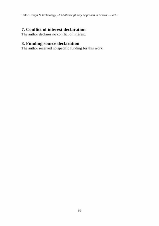
Color Design & Technology - A Multidisciplinary Approach to Colour – Part 2
86
7. Conflict of interest declaration The author declares no conflict of interest.
8. Funding source declaration The author received no specific funding for this work.
Chapter 6 Color in Fashion - a brief historical excursus
87
Chapter 6 Color in Fashion - a brief
historical excursus Arturo Dell'Acqua Bellavitis, Professor Emeritus, School of Design,
Politecnico di Milano
Angelo Sabbioni Architect and designer. Professor of Fashion Design at
Politecnico di Milano.
Abstract Colors are the main characters of the history of fashion. Designers and
fashion houses; over time, have built their own color palettes so as to make
them real chromatic icons. Color is in fact both the result of our perception
of light and an effective and direct means of communication. And it is
precisely the latter that shall be analysed in the following text in order to
trace a brief excursus to testify how strongly color is linked to the world of
fashion.
Keywords: Color, Fashion, Communication, History
DOI 10.23738/RCASB.00206
This chapter is part of the book: Color Design & Technology - A Multidisciplinary Approach
to Colour – Part 2, edited by Alice Plutino, Gabriele Simone and Alessandro Rizzi
ISBN 978-88-99513-15-3
Research Culture and Science Book Series Vol 2
ISSN 2785-115X www.rcasb.eu
Color Design & Technology - A Multidisciplinary Approach to Colour – Part 2
88
1. Introduction “Color directly influences the soul. Color is the keyboard, the eyes are the
hammers, the soul is the piano with many strings. The artist is the hand that
plays, touching one key or another purposively, to cause vibrations in the
soul.”
W. Kandinsky, Sguardi sul passato, Se, Milano 2017 (2006-1999-1962)
"Colors, like features, follow the changes of the emotions"
M.Tosi, Pablo Picasso: I Grandi dell'Arte, GoodMood, Milano 2017
In the fascinating and wonderful history of fashion, colors have always been
among the undisputed protagonists of creations and proposals specially
studied by designers and/or by and for specific fashion houses; which, over
time, have built their own color palettes so as to make them real chromatic
icons. However, giving a scientific definition of what color is, becomes
rather complex since, to be able to do so, it would be necessary to involve
different disciplines such as physics, chemistry and last but not least
psychology. But if we want to summarize its definition more immediately
we can simply say that the color is:
our eyes' perception of light
an effective and direct means of communication able to "express", convey
feelings, emotions, even discordant with each other, because they are linked
to its variations in tone, to its nuances, more or less bright, more or less
intense, more or less faded.
And it is precisely on this second important aspect, communication, that I
want to pause, in order to trace a brief excursus to testify how strongly color
is linked to the world of fashion. The value of communication, which takes
place through the use of a specific color, in the fashion system, is so strong
that it is inextricably linked, like the brand, to the maison itself if not
directly to the stylist, fashion creator, designer, who used it, or strongly
desired if not "created" it.
Color therefore becomes an important fil rouge through which it is possible
to retrace the career of famous international creatives; because, in turn, it
takes on the role of: companion, architect of successes, symbol of
revolutions, means of communication, but, above all, it becomes an
identification tool of which, to name a few, are an example the Blue Lanvin,
the Blue Tiffany, Hermes' Orange, Dior red, Valentino red and Armani
greige.
Having made these premises, let's go further, by way of example, into the
importance of color in the Fashion System.
Chapter 6 Color in Fashion - a brief historical excursus
89
The Introduction section should include the background and aims of the
chapter in a comprehensive manner.
Once you have focused on the specific topic of your study, you should
investigate the latest and most relevant literature related to your study. Your
literature review should be complete, but not overly long.
2. The eternal combination of black and white “With black and white you can get to the essentials. It allows for greater
clarity; it has the ability to capture the character of a person on his marked
face, to express the essence of a place through the play of lights in a
landscape, or to stop a moment out of time against the background of an
action. Black and white helps to extract the message; it helps to see beyond
the blanket of color the essence of a thing, person, or place. It is out of
time.”
Richard Olsenius, National Geographic Photography Field Guide: Digital
Black & White
2.1 Black and white In symbology, black and white are both assigned to the range of non-colors
or achromatic values. They represent the opposite of each other, the alpha
and omega of the chromatic scale and as such they "attract" each other
because symbolically they are "complementary" to each other.
Among the various protagonists of fashion linked to this chromatic
combination, one cannot fail to mention the brilliant designer Coco Chanel
(1883-1971) and her style that revolutionized the concept of femininity in
the twentieth century and with which she helped free women from the
constricting clothing typical of the Belle Époque. Thanks to her simplicity
becomes chic, refined to be put at the service of a modern, dynamic, hard-
working woman who needs comfortable, practical clothing. The designer
was able to transform the rigor, spent during her childhood at the orphanage
of the Congregation of the Sacred Heart, into the cornerstone that represents
her idea of elegance, where the monastic style was borrowed above all in
the chromatic choices. This dichotomy between black and white is clearly
evident not only in her collections but also in her accessories which in this
way are loaded with a strong symbolic value, or rather an idea of authority.
Black and white, according to the couturier, were undisputed colors of
extreme refinement, elegance and, consequently, all other colors were
placed in the background. Certainly the essence of the diarchy between the
two colors was fully revealed by Coco Chanel in 1919, when she created
Chanel n. 5. The packaging, a simple, transparent pharmacy bottle, was not
Color Design & Technology - A Multidisciplinary Approach to Colour – Part 2
90
the only peculiarity introduced by the French couturier. Certainly the
container was clearly different from the very elaborate ones of the time, but
the real novelty was contained in the label: minimal, with a white
background and black lettering. The two iconic "Cs", silhouetted on white
or black backgrounds, re-proposed and re-propose today as yesterday this
continuous game of decisive, clear and essential contrasts, and they do so in
such a strong and innovative way that they become and then remain the
official logo of the House of Chanel.
Since its origins, the history of costume and fashion, however, shows these
two non-colors, white and black, as authoritarian, elegant, formal tones, at
least until the 1950s, after which this value is however scratched, thanks
Optical Art [1] that, through its optical illusions, brings to the stage a visual
deception made of graphics and textures. Subsequently, in a very short time,
the style of Optical art contaminates the world of fashion. From that
moment on, the "optical illusions" were also adopted by the great designers
of the time [2], thanks to which creations that are still current will come to
life. From that moment on, nothing will be the same, the juxtaposition of the
two non-colors will escape the rigid formality to fully experience the daring
time of the sixties and seventies. To fully understand this transformation
one might look at the historical images of 1960's fashion, starting from
Mary Quant (born 1934) up to the Space Age collection (1964) created by
André Courrèges (1923-2016). As one can easily see with Courrèges,
however, the two colors are never used in a balanced, homogeneous way,
giving each the same weight as the other, the same value. In fact, in his
creations it will always be white to prevail over black, which instead will be
limited to defining lines and graphics which are the result of a rigorous,
orthogonal geometry. Optical fashion and its declinations, as parts of a
recurring fashion, however, will not end in the Sixties or Seventies but will
return to relive other lives parading once more on the catwalks. At the
beginning of the nineties, for example, Jean Paul Gaultier, inspired by the
traditional haute couture of the Orthodox Jews, would propose a winter
collection characterized by: long coats, haute couture shirts, huge fur
circular hats or ushanka hats, in some cases with models parading with
shaved heads, wearing the typical Jewish headdress, while moving in a
range of colors in which black predominates together with white. But black
and white would be proposed again in the autumn-winter 2013-2014
collections and beyond. For this collection, for example, Ann
Demeulemeester re-elaborated the combination of these two non-colors,
restoring the image of a more contemporary clothing. Alberta Ferretti and
Valentino instead opted for these colors in order to create bon ton dresses;
Chapter 6 Color in Fashion - a brief historical excursus
91
Byblos proposed a baroque texture on a white knitted dress; Burberry used a
combination of the two to create an animalier pattern; while Tom Ford
relied on elegant tribal motifs; Fendi, on the other hand, made white and
black prevail one at a time; and a black backdrop was chosen by Marni to
design white graphics upon; finally Viktor & Rolf that also set up their
collection starting from the historical diarchy of the two non-colors.
But there is of course no end to the possible combinations of black and
white and this contrast will make people talk again, because, as we know,
fashion is cyclical, so, sooner or later, it will reappear on the market. The
return will certainly be revitalized and adapted according to the latest trends
and this will also be possible thanks to the use of new technologies and/or
new materials. For this reason, few years after autumn/winter 2015-16
collections, the combination of the two colors is proposed again, with
stripes, checkers and triangles, all mixed in the two-tone Valentino dress; in
the abstract graphic lines that characterize the mini dresses and trench coats
by Carolina Herrera and in the animalier inspiration, in the optical version
by Céline which characterizes the coats.
3. Total black "Women think of all colors except the absence of color. I have said that
black has it all. White too. Their beauty is absolute. It is the perfect
harmony."
Coco Chanel
M.Tosi, Pablo Picasso: I Grandi dell'Arte, GoodMood, Milano 2017
3.1. Black Different symbolic meanings, positive and/or negative, closely connected to
each other, are attributed to the black color. It is undoubtedly a hue strongly
linked to the past and tradition, which are recognized with meanings of
majesty, authority and power. But this same color can also embody both
sides of the same coin at the same time, which on the one hand contains
positive values as it "guides" every ethical and moral conduct in an
irreproachable way, and on the other it can be charged instead with negative
values such as destruction, the fear of the unknown, disintegration to the
point of penetrating into the world of the occult. In several ancient
languages this ambivalence is also strengthened, on a lexical level, by
attributing a negative value to the opaque black color, and a positive one to
the bright black color. Or again, black as an abstraction, as a spiritual,
ascetic expression, as sacrifice, mortification but also, continuing the game
of duality, awareness of the space it occupies and/or an instrument of
Color Design & Technology - A Multidisciplinary Approach to Colour – Part 2
92
seduction. This color tells us of a belonging that can be real or presumed but
still made accessible to everyone thanks to fashion, which allows you to
shift between many possible identities. Especially in womenswear, more
than in menswear, fashion with its looks, at times eccentric, at times
controversial, has made it possible to diminsh the rigour of black, through
multiple tailoring creations. Whether simple or with lace, minimalist or
baroque, black is a sign of awareness and sums up the extremes of the
dichotomy in which fashion has always struggled: exclusivity and diffusion.
However, one thing is certain, everyone is fascinated by it, because
whatever its value is, it has the ability to adapt to the most different styles so
as to make it, today as yesterday, the main charachter, a symbol of elegance
and purity. Even if the attraction towards this non-color sometimes seems to
disappear, overwhelmed by the momentary precepts of fashion, inevitably,
after a few seasons, it will return forcefully to the forefront, overshadowing
the rest of the colors, from reds to pinks, from yellows to greens up to the
range of browns. And here the black color returns once again to impose
itself with decision, leaving a single glimmer of visibility to those hues that
counterbalance it, blues and neutral tones. The importance and the value of
black, as a sign and as an expression of a visual thought, has been evident
since its first fifteenth-century manifestations. Although its maximum
diffusion occurs between the second half of the sixteenth century. and the
first half of the following century, both in the Catholic and in the Reformed
world. And in this case also, in order to analyze the use of this color in the
fashion panorama (in the most modern sense of the term) we have to start
from the figure of Coco Chanel, because it is with her legendary little black
dress, combined with flowing and considerable pearl necklaces, that Chanel
characterises the first postwar period. As already mentioned, this fashion
pillar, in addition to introducing an idea of simplification in dressing (not an
obvious step at that time), also helped the "black color" catching on not only
for evening dresses, but also for day dresses [3], therefore making it suitable
for any occasion because of its elegance and sensuality. Another important
milestone for the black color was reached in the twentieth century due to the
existentialists [4], who adopted this hue so as to make it the main color of
their clothing. A clothing made up of cigarette trousers, sweaters with a
very high collar, austere and extremely buttoned shirts where the chromatic
dictatorship of black dominates, interrupted only at times by the use of
candid blouses and Breton sweaters, in a marine style, with blue stripes on a
white background. Since 1950 on the French scene appeared the blouson
noir, a group of young hooligans, analogous to the English teddy boys,
whose name allusively refers to their way of dressing strictly black leather
Chapter 6 Color in Fashion - a brief historical excursus
93
jackets. While a couple of decades later, the Punk movement [5] was born
in the mid-1970s, followed by the slogan "no future". The movement starts
from rock music (Patti Smith, Sex Pistols, Dead Boys) but progressively
invests all the arts: from literature, to fashion up to visual arts. At the base
of this sub-culture there is undoubtedly a nihilistic aesthetic, which in the
fashion scene sees Vivienne Westwood [6] as an undisputed icon. She
deserves the merit of having been able to visually interpret the discomfort of
those young people, through the black color, the safety pins, the studs, the
shiny skin of the tight trousers and the ripped tights. In the seventies,
therefore, Vivienne Westwood helped to create the punk style, through
extravagant and provocative creations. But it is since March 1981, with the
Pirate collection show held in London, that we fully learnt how her models
no longer drew inspiration only from street fashion and/or the youth world:
they were not simply eccentric, but also had a foundation strongly rooted in
history, tradition and in the tailoring technique. The continuous search for
her, borrows from the past continuous references, exploring all the eras,
drawing from them the style, be they costumes of the seventeenth or
eighteenth century. In fact, her inspiration seems to regenerate itself by
drawing lifeblood from the love she has towards history, painting and her
social and political commitment. It is no coincidence that Vivienne
Westwood was the first contemporary designer to reintroduce the corset
with extreme conviction, a complex element of haute couture now buried in
the distant past, updating it both in terms of manufacturing and image.
Perceived as a fashion by now, the punk style still remains a moderate
expression, compared to that developed in the eighties through the so-called
gothic fashion, in Italy known as dark fashion. Those belonging to the dark
style rejected any mediation or irony: if the former contrasted their black
clothing with improbable gaudy colored hair, thus managing to mitigate the
severity of total black, with the arrival of the darks instead, the register
changes because what they show is all their extremism by choosing only the
non-color black as a means by which to express themselves.
This continuous game of opposites goes on in the eighties, when the black
hue, sober and refined, contrasts with color, connoting itself as a distinctive
element of luxury and elegance. In fact, it was in these years that the Dolce
& Gabbana brand made itself known on the international scene, through a
look inspired by the Sicilian woman. Starting from the model of a woman
strictly dressed in black clothes and surrounded by men of honor, a
stereotype well represented in the film "The girl with the gun" [7] the
stylists, Domenico Dolce and Stefano Gabbana, set up their advertising
campaign drawing inspiration from the Italian Neorealism [8], focusing
Color Design & Technology - A Multidisciplinary Approach to Colour – Part 2
94
strictly on a black and white photograph. The two stylists thus lay the
foundations of their following imagery, made of laces, rosaries and
madonnas all rigorously orchestrated and wrapped in a wise and mysterious
black color.
Moreover, with the arrival in Paris of the Japanese designers, Yamamoto,
Miyake and the Japanese fashion house Comme des Garçons, in the eighties
the language of fashion undergoes a substantial transformation, since the
concepts of elegance and beauty are overturned and redefined by lowering
the tones. In a moment the sparkling colors of the Eighties ranging from
bottle green to fuchsia up to electric blues are completely obscured by
entirely black collections like the one that Rei Kawakubo [9] proposes in
her first fashion show. Monochrome collections that could be monotonous,
flat, two-dimensional, repetitive but which are instead made non-trivial by
the skilful combination of different fabrics. The same happens for Yohji
Yamamoto [10] who in 1981 proposes a collection dominated by black as a
characterizing element, borrowing it from the ninja culture of the samurai
who adopted it as a "weapon" of defense, to better blend in. The garments
are enriched by subtraction, the concept of less is more, which is also dear
to Coco Chanel, becomes the “fil rouge” that unites different designers. The
black color, then relegated to sporadic occasions, mourning and/or
important evenings, takes on a new meaning and returns as a symbol of
elegance and purity. Up to the point of representing a watershed between a
cultured and refined aesthetic, which makes its use of black, and a simpler
and more modest one, which instead puts color at the center of one's style.
Some social categories will therefore begin to tame the chromatic
exuberance, progressively transforming their wardrobe, becoming, in spite
of themselves, fashion victims. No doubt total black is the real passe-
partout of every season, elegant, sober, seductive, chaste, the ally of our
physical form: it streamlines it, makes us confident, user-friendly, does not
require long (wasted) time in combinations (especially when you have to
pack your bags).
If you check the sales of many fashion houses, regardless of the season,
black, of any garment, size, or material, will be the best-selling color. In
short, total black can sometimes become boring but it is definitely effective.
However, in order not to make it boring and trivial, it is important to take
care of the details, such as the cut of the dress itself, the type of fabric or the
right accessory, shoe, bag, hat and/or jewel to be combined in a strategic
way. In addition, there are garments that were born to be exclusively black,
such as tight leather trousers, or the typical short leather jacket popular in
Chapter 6 Color in Fashion - a brief historical excursus
95
the eighties, or a certain type of centaur boots, characterized by buckles and
sturdy soles.
And this is how black, in western culture known as the color of death, then
relaunched by the anti-bourgeois movement par excellence, punk in the
early 80s, today becomes a symbol of different types of women, sometimes
diverging from each other. That is the sexy woman, the fashionable one, the
modest one, the overweight one and the undecided one who, not knowing
what to choose, feels reassured when wearing a color that she knows will
not cause any discussions. It must be admitted: a black dress solves many
situations because it is able to completely change the look through a simple
change of accessories, whether they are sneakers, elegant or casual shoes, or
important, minimal, eccentric jewels or even more demanding bags, jackets
or outerwear.
In short, with a little creativity and a bit of good taste, a simple black dress
multiplies our possible outfits, for different occasions of use. Black can
become extremely sexy when, for example, combined with a lace dress, a
silk slip or a guêpière. But it can also be extremely aggressive, provocative,
when combined with leather dresses, zips and studs. Finally, it can also
become very elegant, when you think of tailored day suits or evening
dresses among which we cannot fail to mention the strictly black tuxedos by
Yves Saint Laurent the symbol of a radical change in womanswear.
Getting closer and closer to the present day we arrive at the Twisted Fantasy
collection where the designer, Alexander McQueen (1969-2010,) for
autumn 2009 in a provocative way shows us a collective hallucination
where the protagonists constantly move, in the balance between a refined
style and the monstrous being almost to reveal the fleeting border. Very
pale faces contrasted with red or black lips, accentuated by a make-up with
smudged contours that overflows as if to make them caricatures of
themselves. Faces framed by improbable hats, cages, cans, plastic bags
expertly revisited and ennobled not in substance but in style. A style
capable of restoring a haughty image and redefining a new concept of
beauty at times terrible, well embodied by the Black Duck Feather dress.
This frightening creature of the night, perhaps a bearer of misfortunes, of
bad omens, advances decisively on the catwalk, towering on her very high
busts and her proud gaze creating around her an aura of mystery, mixed
with terror as in the most frightful nightmares. This is a tailoring virtuosity,
made of volumes and plumage, which gives rise to a spectacular dress that
is strongly suggestive, so that it deserves to be exhibited at the Metropolitan
Museum of Art in New York.
Color Design & Technology - A Multidisciplinary Approach to Colour – Part 2
96
Obviously the use of this color is not limited to just the stylists mentioned,
whether they are from the present or from the past, but the dissertation
could continue indefinitely therefore we limit ourselves to mentioning just a
few: Ann Demeulemeester (1959), Gareth Pugh (1981) , Rick Owens
(1962) and the London label Kokon To Zai (1996).
4. Total White "White is a world so high compared to us that we hardly hear its sound, it is
nothing before its origin."
Vassili Kandinsky
C.Vanoni, A piedi nudi nell'arte. Una passeggiata alla scoperta dei
capolavori antichi e moderni, Solferino, Milano 2019
4.1. White White is simplistically considered an emblem of light, the color of divinity
and intended as a generating principle, an archetype of resurrection and
eternal rebirth. It is the color of purity and for this reason it is traditionally
chosen and worn in religious ceremonies. It offers a sense of peace and
tranquility, comfort and hope, it helps relieving emotional disturbances,
stimulates openness, growth and creativity. But like any color, it also
contains some negative elements. An excess of white in environments can
make them appear cold, isolated, sterile, voids, uninteresting, and for this
reason they can be fully experienced only by those who have a strong
mental stability and a strong charisma, in short, by those who are not scared
of a white sheet of paper, but rather find in it the generative strength of a
new creativity. This is what white represents for the Belgian designer
Martin Margiela (1957). In fact, in the aesthetics of the Maison Margiela
white arises conceptually in the making, it provides the true freedom of
expression in the name of which it is worth removing, from the label of the
garment, the name of the Brand to give the floor to the main characters of
this process: his creations. The designer's unconventional and provocative
concepts combined with a scrupulous creative design process and tailoring
mastery make it difficult for the press to classify him. His avant-garde
research becomes a work of art, a democratic fashion that shuns luxury and
ostentation as it favours the use of recycled materials and clothes that he
deconstructs by cutting and reassembling them, showing what it was usually
hidden. Linings, padding, reinforcements, first unstitched and then
reassembled, give life to a new style and to new creative expressions.
The white hue can also be connected to the stylist Laura Biagiotti. In 1972,
the lady of cashmere showed a collection of a few very versatile white
Chapter 6 Color in Fashion - a brief historical excursus
97
garments at Palazzo Pitti, demonstrating that white, despite being a simple
color, can be truly chic and refined, so that it can be worn at any time of day
or night. Candid, with more or less cold, ethereal tones, this color represents
to her a means through which she can emphasize femininity and elegance,
also accentuated through soft lines and almost impalpable shapes that
delicately embrace the silhouette.
White has also fostered the design creativity of another main actor of
international fashion, Gianfranco Ferré in as much as for him it becomes a
whole with his iconic garment, the strictly white shirt. A style icon that in
2015 relives in the exhibition [11] dedicated to it: "The white shirt in my
opinion". A real tribute to the sartorial poetics and creative genius of the
"designer and architect" who defines this garment "a sign of my style",
"contemporary lexicon of elegance". "For me fashion is poetry, intuition,
fantasy, but it is also a method and design attitude that is based on the
conception of the dress as the result of a planned intervention ...." I would
say that a large part of my creative process is explained in the light of my
background and my training as an architect ". And it is precisely this
continuous dialogue between architecture and fashion that gives life,
through research, to the creation of a new way of conceiving clothing, a
new innovative way of designing it. The candid white shirts enhanced by
skilful plays of light and shadow come to life in this exhibition that through
photographic images, conceived as if they were x-rays of the dress, reveal
the secrets of its design to those who have the technical know-how.
After talking about two non-colors, white and black, let's now proceed with
our analysis by addressing the color par excellence, namely red.
5. Total Red (i.e. Colour) "Red, as we imagine it, like a typically warm color, without limits, acts
internally as a very lively, bright, restless color, which, however, does not
possess the character of prodigality of yellow, which is consumed by
spreading on all sides , but rather generates, despite all its energy and
intensity, a strong note of immense energy, almost aware of its purpose. In
this agitation and ardor, turned mainly towards oneself and a little towards
the outside, a so to speak virile maturity is expressed ”.
Wassily Kandinsky
W. Kandinsky, Tutti gli scritti – volume II- dello spirituale nell’arte- Scritti
critici e autobiografici – Teatro -Poesie, Feltrinelli, Milano 1974 e 1989
Color Design & Technology - A Multidisciplinary Approach to Colour – Part 2
98
5.1. Red Red is the color par excellence because it communicates and signals
something special: it is extraordinarily attractive, extravagant, provocative
and corresponds to energy in all its forms. In the Book of Genesis, for
example, the color red is given a very important symbolic value, in fact it
represents the generating principle of life. It is therefore no coincidence that
the name Adam in Hebrew is linked to a double meaning, red and living,
and that it is he who was created by shaping red clay.
Present in almost all archaic languages, the term red is often used as a
synonym for color: in Latin, for example, the adjective rubeus (red) also
means colored, while in the Spanish language the word colorado can also
mean red. In other languages, such as in Russian, this double meaning
resides in the root of the adjective red, krasni, which is the same as the
adjective beautiful, krassivi.
Its extraordinary nuances, from the most subtle to the darkest, are loaded
with multiple meanings, sometimes ambivalent, which find in the creativity
of the designers a fertile territory that soon pours onto the catwalks. The
collections light up with scarlet, Venetian, cardinal, amaranth, burgundy,
cherry, coral, crimson, magenta, ruby red, which, in the darker shades of
garnet, claret, burgundy, carmine, is charged with a noir halo, which has the
aim to seduce and stun the senses. Among the major promoters of this
shade, the stylists Christian Dior and Valentino certainly occupy a first-rate
place, of which we will discuss more detail later on, analyzing their brand
identity. This common thread that links this vivid color to fashion continues
on the catwalks in every season. For F/W 2012-13, for example, stylists
seem to affirm that red, in all its shades, is the color of the year. Alexander
Wang moves towards a very dark red which, thanks to the sheen of the
fabrics used, gives life to different nuances. Similarly, Acne prefers shiny
fabrics dyed an ox blood red for this season; the carmine red instead
distinguishes the Blugirl coat while at the same time the hibiscus red defines
the Cacharel look. Comme des Garçons is also attracted by this hue to the
point of inserting it into the three-dimensional coat in carmine red. Then,
also for this season, the flaming red of Christian Dior is inevitable, followed
by Christopher Kane who chooses to contrast two shades of red, blood red
and ruby red. But the S/S 2013 collection by Alexander McQueen is also
tinged with flaming red with the corolla dress, the blood red suit and fuchsia
lapels by Costume National, the long dress by Valentino (this time with a
noir kind of red), a cherry red and a blood red for Miu Miu. The red look of
Micheal Kors is glamorous and sporty at the same time, while Moschino
uses it as a background tone on which white profiles stand out. The
Chapter 6 Color in Fashion - a brief historical excursus
99
presence of this color, in its different nuances, also continues with the S/S
2014 by Fendi, Burberry Prorsum, Miu Miu, Dolce & Gabbana, Jean Paul
Gaultier, Alexander McQueen, Etro, Trussardi, Prada, Valentino, Marc
Jacobs , Dior, Saint Laurent, Stella McCartney up to touch its darker
variations for the maison Martin Margela and Tod's. The love for this color
is also renewed in the following A/W 2014/15/16/17/18 with Louis Vitton,
Valentino, Vivienne Westwood and Christopher Kane, Acne Studios, in the
Max Mara and Fendi, Prada, Gucci fashion shows, Les Copains and
Emporio Armani. Up to A/W 2020/21 where again an intense, brilliant red
pervades the catwalks of great designers. Alexander McQueen, for example,
uses it to characterize his suits consisting of jacket and trousers. Saint
Laurent for latex dresses, Givenchy for longuette and long shrugs,
Valentino for covering tight-fitting sheath dresses with sequins and Miu
Miu for her long coats. As it is easy to guess, this analysis could continue
indefinitely, managing to find, for each season, for any year, its right shade
of red, confirming once again that red is the color par excellence.
6. Brand Identity As mentioned at the beginning of this dissertation, there are specific colors
that more than others contain in themselves, in their tone, in their nuances,
stories inextricably linked to the designer and/or the brand that used them.
Guardians of a glorious past, strong in the present and, above all, hopeful of
an ever-changing future, these shades have gradually proved to be the real
keystone of successes and aesthetic revolutions. Able to "transform" and
reconfirm itself every time, becoming the real winning element that, linked
to a marketing operation, has been able to establish itself on the market at
times even in a more effective and recognizable way than the very brand or
becoming a brand itself . Color, in that specific shade, thus becomes the true
janitor of a potential that allows companies to create their own brand
identity. An example of this is the orange color that identifies the Hermès
packaging, the Tiffany blue, the Lanvin blue, the Greige Armani and the
Valentino red that we will now go into in more detail.
6.1. Brown - Beige - Louis Vitton The products made by the French maison Louis Vuitton are undoubtedly
identifiable in the leather color and its nuances, ranging from darker shades
of browns to lighter beige ones. Dark brown, a shade linked to the nuances
of earth and nature, is in fact the background color on which the beige
initials, LV, stand out, making up one of the best known and most imitated
monograms in the world.
Color Design & Technology - A Multidisciplinary Approach to Colour – Part 2
100
The history of the brand begins in 1845 in Paris in Rue Neuve des
Capucines at number 4 when its founder, Louis Vuitton, after a period of
profitable apprenticeship, carried out with a trunk manufacturer, decides to
channel his innate craftsmanship skills into a business of his own. In
addition to the undoubted aesthetic aspect, initially the first trunks created
by Louis Vuitton also stand out from all the others for a series of
innovations such as the use of a gray cotton oilcloth, the "Gray Trianon",
which covers them making them so waterproof. The added value,
introduced with the application of this simple intuition, makes the object,
conceived by Loius Vitton, functional, practical and, above all, successful,
therefore soon copied so much that, in 1872, to defend itself from imitators,
he decides to stand out again by introducing in their trunks a red and beige
striped pattern. In 1886, animated by continuous research, he transferred
further value to his suitcases by revolutionizing the closures, thus making
his trunks even more airtight. In 1888, however, the novelties began to be
introduced by the founder's son, Georges Vuitton, with the creation of the
iconic brown and beige checkered canvas [12], "sealed" by the writing,
"Marque L. Vuitton déposée", suitably positioned with the purpose of
protecting the logo from further imitations; and it is again he, Georges, who
continues his father's business after his death [13], and creates the LV
monogram in his honor in 1896, thus making the memory of his father
"immortal". To complete the work, Georges also creates a contrasting beige
texture [14] on a brown canvas, which shows all-over the interlaced LV
monogram [15], his father's initials, surrounded by stylized designs of
flowers and diamonds. This canvas will then be registered as a trademark in
1905 and today it is the hallmark of the brand. Soon the high quality and
innovations introduced in its travel items, (initially trunks, then mainly
bags), elevated these products to fundamental style icons. Thus in 1913 the
historic boutique was inaugurated on the Avenue des Champs-Élysées in
Paris and, on the threshold of the outbreak of the First World War, the Louis
Vuitton stores were already present in various cities around the world: New
York, Washington, London, Bombay, Alexandria (Egypt) and Buenos
Aires. The designer Paul Poiret, the photographer Dora Maar and the
painter Francis Picabia, were among the first to appreciate the value of the
LV-logged artifacts; but later, between the fifties and sixties, the fame of the
brand also reached the glossy world of the printed media by appearing in
the travel columns of Vouge, to then move on to the world of the jet set
with, one above all, the actress Anna Magnani which will then be followed,
in more recent times, by many other illustrious characters such as Madonna,
Angelina Jolie, David Bowie, Uma Thurman, ...
Chapter 6 Color in Fashion - a brief historical excursus
101
Another fundamental date for the longevity of the brand is 1997, the date on
which Marc Jacobs was appointed creative director of the Louis Vuitton
maison. Thanks to the intuition of the emerging designer, focused on the
modernization of the monogram, the company experiences a second youth.
The operation is carried out by initially involving the artist/stylist Stephen
Sprouse, who creates a graffiti version of the monogram canvas and,
subsequently, in 2003/2005, involving the Japanese artist Takashi
Murakami. The latter will give life to different reinterpretations of the
canvas. Among the most famous: the version with a white background and
multicolored logos and characters;, the one with cherry blossoms and finally
the one with cherries. Taking up the diktat to dare, the designer, even in the
following years spent at the maison, continues to rework and modernize the
monogram bags. Needless to say, the bags quickly turned into real cultural
phenomena. Jacobs' profitable experience in the Vuitton maison then
concludes with the spring summer 2014 collection, in which he proposes the
graphics of Stephen Sprouse, but this time transferring them directly to the
statuesque body of the model Edie Campbell, thus charging them with a
strong symbolic value and a new communicative power. In November 2014,
the maison then releases to the market the limited edition Celebrating
Monogram [16]. A line created with a dual purpose: to celebrate 160 years
of their history and at the same time to give modernity to the brand.
The secret of this perpetual success probably lies primarily in the genius of
its founder and in the generations that have succeeded him; as it certainly
also resides in having managed to create real evergreens, of which the
Speedy bag and the Lockit bag are an example. The company, riding the
wave of success, was then able to evolve by extending its production also to
the field of clothing, footwear, accessories, goldsmithing and watchmaking,
becoming a multinational of luxury goods, proving once again to always
stay in step with the times.
6.2. Orange - Hermès The bright, citrusy orange of Hermès packaging, the iconic color of the
French brand, was born in 1945 thanks to an entrepreneurial choice made
by Émile-Maurice Hermès, grandson of the founder of the homonymous
Maison. Thanks to the difficulty of finding the traditional cream-colored
boxes, until then used to package their products, the grandson was forced to
fall back on packaging of another color. And this is how in a short time this
bright orange managed to make the brand recognizable all over the world,
so much so that it became its true symbol. Even today, when thinking of
Hermès, we automatically think of this orange color that, since 1949, has
Color Design & Technology - A Multidisciplinary Approach to Colour – Part 2
102
been made even more refined by the presence of the now classic brown
ribbon, characterized along the edges by a contrasting stitching that since
then closes the Hermès packages. In 1994, the Hermès Maison received the
Packaging Oscar for its folding boxes, now countless in type and size (more
than 700 types). As further evidence of how important this orange shade has
become over time since 1996, the same color is extended to all Hermès
packaging. Consequently, even the boxes for bijoux and Art de la Table
items hitherto characterized by the first gray color, and the second by the
green color make this shade their own.
In March 2020 Hermès launches the first lipstick collection, Rouge Hermès,
and it is no coincidence that one of the colors of the collection is “Orange
Boite”. But the French maison Hermès, in addition to the color linked to its
packaging, is also represented by other colors that characterize its products
of excellence such as the timeless bags Kelly and Birkin, known all over the
world, as the symbol of Hèrmes par excellence. in orange, burgundy, green
and leather.
6.3. Tiffany blue - TIFFANY & CO In 1837, far from the European aesthetic (still linked to a sumptuous
Victorian style) at 259 Broadway in Manhattan, in the city of New York,
the new Tiffany & Co. store was inaugurated. Initially specializing in the
sale of stationery and small precious objects. the shop responded perfectly
to the new "American style" centered on the harmony and simplicity of
those years. Following the same entrepreneurial path in 1845, with the
publication of the Blue Book, the first mail order catalog in the United
States, Tiffany sought a widespread diffusion of its refined and high quality
jewels. Subsequently, in 1848, the brand decided to devote itself solely to
the jewelry trade by introducing the use of precious stones. Thus was born
the historic US company Tiffany & Co, founded by Charles Lewis Tiffany
and his partner/friend John B. Young who with their jewels "set" in small
and captivating packaging have always embodied, in the female universe,
the archetype of the object of desires. As it is easy to understand in this
case, however, its brand identity is not linked to the color of a dress but like
the Hermès brand it is linked to the color of the packaging, a chromatic
shade of blue that oscillates between the aquamarine green hue and the
peacock blue or Pantone No. 1837 [17], also called robin's egg blue [18],
better known as Tiffany blue.
In 1886, the success of the Tiffany & Co company became unstoppable
thanks to the introduction of the diamond engagement ring. From that
moment onward, having a Tiffany blue box becomes the fulfillment of a
Chapter 6 Color in Fashion - a brief historical excursus
103
dream for everyone regardless of the beauty and/or preciousness of the
object it contains; this is testified by the newspapers that begin to attribute
to the now famous “boxes” an inestimable value equal to that of Tiffany
jewels themselves. In 1961, the release of the film "Breakfast at Tiffany's"
based on the novel by Truman Capote and starring a young Audrey
Hepburn, an undisputed icon of elegance and style, contributed to act as an
additional sounding board. During the filming, which took place partly
inside the renowned store, unfortunately the company forebad the
appearance of the now famous blue packaging which, starting from 1998,
together with the tiffany blue hue, the white satin bow that wraps it and the
same term "Tiffany Blue Box", is further "protected", by a patent duly
registered as a trademark and consequently no longer reproducible by other
companies.
6.4. Red and green - Gucci The history of the Gucci brand, strongly linked to tradition and innovation,
is clearly identified in two omnipresent colors, red and green. It all began in
1921 thanks to Guccio Gucci, who, returning to Florence, after a period
spent between London and Paris [19], decided to open shops in his
hometown dedicated to the production of leather goods and travel items that
have their leitmotiv in the world of horse riding. To this brand, the primary
color red [20], often related to the feelings of love and passion, finds its
complementary [21] in its secondary color, green [22], to which it is
constantly combined. And on this combination, which best expresses the
communicative power of the two colors, Gucci creates its own trademark.
And this is how the colors of the saddle girth, bits, stirrups, which belong to
the aristocratic world of riding, lose their function in an instant to acquire a
new one. They become textures, graphic and decorative elements, details
that distinguish both the accessories and the clothes of the brand and that
have undisputed style icons such as Audrey Hepburn, Jackie Kennedy,
Grace Kelly, Maria Callas as best “testimonials”.
6.5. Trafalgar Red - Christian Dior The attraction and love of the French designer Christian Dior towards this
color was immediately evident from his first collections. Unmistakable in
its bright and refined shades, the red color was initially used by Dior, with
the aim of reviving the souls of the society, which had just emerged from
the war, and of those who today we would call its followers. Thus the idea
of the red "Trafalgar" was born. In the little dictionary of fashion, published
in 1954 by Cassell, Christian Dior, about the color red said: “Very
Color Design & Technology - A Multidisciplinary Approach to Colour – Part 2
104
stimulating and attractive, it is the color of life. I love red, and in my
opinion, it works with any skin tone. Scarlet red, shiny red, English red,
crimson or cherry, there is one for everyone and if you don't want a red
dress you can use a red hat that, in combination, provides a great effect
[...]". The following year , 1955, Dior's lipstick was born because of the
love for this shade. Today Dior red continues to be present in the Haute
Couture collection created by Raf Simons, former art director of the
Maison, and to identify the Dior-Trafalgar make-up.
6.6. Red Valentino - Valentino In the Italian panorama, on the other hand, this color is inextricably linked
to the designer Valentino Garavani, who distinguished himself for his
recognizable style and for having created a particular shade of red, called
Rosso Valentino. A particular, very bright, gradation, between carmine,
purple and cadmium red, created specifically by the designer to connote
only some of his collection clothes. Tradition has it that Valentino's
predilection for this color began to manifest from an early age, in his aunt's
trimmings shop, where he spent entire afternoons, and was then
strengthened, following his stay in Paris, during an apprenticeship with Jean
Dessès. But the real awareness of this color occured only when he, still a
student, went to the representation of Bizet's Carmen at the Barcelona
Opera. Valentino was so fascinated, enraptured, by this shade that
characterized the costumes that in that precise moment he understood that
after the inevitable black and white, there couldn't be a more beautiful and
stimulating color than red. Since then, the color red occupied a special place
in its collections, so much so that from 1968 until 2005, he never failed to
complete the show, both for prêt-à-porter and haute couture, with one or
more items of that hue. Further evidence of this perennial love for red are:
the retrospective organized in Rome in 2007, "45 years of Style", the
autumn/winter 2008-09 collection (the designer's latest) and the Shanghai
fashion show-event, organized in autumn 2013.
Valentino red is undoubtedly a sensual nuance perfectly attributable to its
creator, so much so that it can also be used as the name of the brand,
REDValentino, to identify the second line of the Maison dedicated to a
younger audience.
6.7. Red - Christian Louboutin In the fashion field, the red color is also associated with the shoes of the
French designer Christian Louboutin, made immediately recognizable by
the characteristic red sole. The idea, simple but brilliant at the same time,
Chapter 6 Color in Fashion - a brief historical excursus
105
seems to be born in Milan, in 1992, during the refinement of the Pensée
model. The designer, not entirely satisfied with the prototype, decided in an
instant to dye the sole of the shoe with the red nail polish with which, at that
precise moment, his assistant was coloring her nails. Thus a myth was born
and, although copied over time, it remains the progenitor of many who have
then imitated it.
6.8. Green - Carven The French couturière Marie-Louise Carven, aka Carmen de Tommaso
better known as Madame Carven, the "lady of the green color", founder of
the fashion house of the same name, owes her success to a complex linked
to her stature. She has always been passionate about tailoring, she entered
this world as a perfect self-taught person to create perfect clothes on herself
and in proportion to her stature. In 1945, at the age of 34, Carven opened his
fashion house on the Champs-Élysées; her talent began to be recognized
and appreciated so much that it conquered the celebrities of the time, young
French actresses, such as Martine Carol, Leslie Caron, Brigitte Fossey, the
dancer actress Zizi Jeanmaire and the singer-songwriter Édith Piaf. All
women united by a single characteristic, height, an obsession of the
couturière but at the same time the driving force behind her success that led
her in 1951 to focus her line precisely on this type of user. Her women,
thanks to skilful sartorial games of pleats that highlight the shapes, are able
to be sensual without resorting to artificial padding. Her clothes are
fashionable, refined, at the same time handy, youthful and fresh. Among all
of hers, in her first collection (1945), one stands out: the summer dress Ma
griffe, a cotton dress with vertical white and green stripes, with a long and
wide skirt and a generous neckline. It seems that the fabric used to make the
dress was found by chance in the attic of an old castle, probably purchased
shortly before the outbreak of the First World War to make maids' uniforms.
At the time no one would have thought that that bright green would have
made the fortune of the newborn brand that from that moment on became
the emblem, the distinctive signature of the Carven house, so much so that it
was used not only in clothing, but also as a means of communication. and
brand identification, in packaging, perfumes and obviously in fabrics. With
this color still present on the catwalks today, we want to pay homage to a
great woman, Madame Carven, who was able to masterfully combine her
technical, tailoring, stylistic skills with communicative and managerial
skills. In 1946, for example, with the aim of advertising her first fragrance,
she "rained" on Paris, hundreds of perfume samples, "parachuted" over the
city. Then in the fifties, in conjunction with the release in France of the film
Color Design & Technology - A Multidisciplinary Approach to Colour – Part 2
106
Gone with the Wind, she created a collection inspired by it. In the same year
she is also among the first to: develop prêt-à-porter and show her collections
abroad, influencing high fashion with the use of African fabrics, madras,
batik, raffia, wefts exotic and ethnic motifs. But perhaps her greatest
teaching is contained in her willpower, in her ability to be able to transform
her "weak point", her stature, into her strong point that generates collections
and styles that have conquered the world.
6.9. Shocking Pink - Elsa Schiaparelli Elsa Schiapparelli is certainly the archetype of the talented woman, with
brilliant inventions and intuitions. She comes from an aristocratic, cultured
family, a lover of literature, of art, she comes into contact with some of the
greatest exponents of Dadaism such as Marcel Duchamps and Man Ray for
whom she also poses as a model. In the thirties she collaborated with
various surrealist artists such as: Elsa Triolet, Alberto Giacometti, Salvador
Dalí, with whom she created, in 1937 the Aragosta dress and the shoe hat
and a few years later, for the Circus-1938 collection, the Lacrime dresses
and Skeleton. With Pablo Picasso, on the other hand, she creates the gloves
painted on the fathers hands of the subsequent black gloves with red python
nails.
Elsa Schiapparelli approaches the world of fashion during the years in New
York, but it is in Paris that she begins to devote herself full time to this
activity, first becoming a pupil of the designer Paul Poiret, for whom she
creates her first models, then starting a business of her own. In fact, in 1927,
with the help of an Armenian refugee, the designer began making black
pullovers decorated with white designs, arousing the interest of US
department stores. The shapeless sweater, which until then was relegated to
rural use, underwent a qualitative leap with her, finally conquering a shape
of its own. In the field of knitwear her most memorable outcomes are: her
sweaters characterized by large trompe-l'oeil [23] bows in a black and white
optical style then further declined in the creation of tattoo-sweaters, with
pierced hearts, up to "X-ray" pullovers, on which the structure of the human
skeleton [24] was reproduced as in an X-ray. In those years her provocative
creations were in contrast to those of another very famous designer of the
time, Coco Chanel. Both protagonists and antagonists of the twentieth
century, they gave life to a "rivalry" carried on with collections
characterized by dream dresses, which undoubtedly left an indelible mark
on the fashion universe. Coco Chanel is responsible for bringing simplicity
and naturalness to the fashion system, while Elsa Schiaparelli is credited
with having fueled the creative flair by offering clothes and special
Chapter 6 Color in Fashion - a brief historical excursus
107
accessories that are never banal. Although different, they both have several
points in common, such as: the need to abandon the conventions and
constraints in women's clothing of the time; approaching the prêt-à-porter
dress, produced following standard measurements and through mass
production; designing not only clothes but also accessories and new
fragrances, for example. But, always remaining faithful to her own style,
linear, almost austere, for Coco Chanel and creative, research for Elsa
Schiaparelli who proposes a bold woman, able to be ahead of the times, the
first for example to use visible zippers on dresses. A woman who, in the
Paris of the thirties, with her surreal and provocative creations manages to
upset and at the same time thrill the souls of the bourgeoisie. Finally, the
perfume bottle is very famous, inspired by the curves of the American
actress Mae West and modeled for her by Léonor Fini. The designer's
favorite nuance is derived from this fragrance, contained in a bright-colored
box, a vivid fuchsia, which she renamed Shocking pink, a very intense
shade of magenta so as to be impertinent, a pure concentrate of energy and
exoticism that in a moment seduces the world of fashion by crowding the
catwalks.
"The color appeared before my eyes: bright, impossible, bold, pleasant, full
of energy like light, all the birds and fish in the world; a color from China
and Peru, not Western; a "shocking" color, pure and undiluted ... " [25]
6.10. Lavin Blue - Jeanne Lavin Among the most important designers of the 1920s and 1930s, Jeanne
Lanvin [26] is undoubtedly remembered for her extraordinary sartorial
skills and for having created the shade that takes her name from her, Lavin
blue. A very precise nuance that can be described as a soft cobalt, a celestial
blue with touches of mauve, specially created in the 1920s following a trip
to Italy, perhaps inspired by a fresco by Fra Angelico, by the blue of his
skies. Blue has always represented, together with burgundy, the color of
elegance, in many ways very similar to black, because it is suitable for any
time of day or evening.
From 1923 onwards, with the purchase of a dyehouse located outside Paris,
in Nanterre, her natural inclination and attention to color found the right
dimension, thus enriching her creations with always refined and inimitable
palettes. For example, the satin dress that Anna Eleonor Roosevelt wore in
1932 following the election of her husband, Franklin Roosevelt, was a
Lavin blue.
Color Design & Technology - A Multidisciplinary Approach to Colour – Part 2
108
Among the most well-known colors, besides Lanvin Blue, we remember
Polignac Pink [27] and Velasquez Green, another testimony of her
boundless love for art.
6.11. Blue Crossbow - Renato Balestra The transport and passion for the color blue is for Renato Balestra an innate
attraction that has always lived with him, it is a natural, almost unconscious
choice that is difficult to explain otherwise: "...they tell me that if I had to
choose an object, a dress, I always chose the blue one by instinct ”. The
Balestra Blue treads the catwalks for the first time in 1958, enjoying
immediate success that leads it, from that moment on, to become the most
recurring color proposed by the designer, a color that will often characterize
his collections enough to lead the press , eager to give everyone and
everything a “label”, to call it blue Balestra.
6.12. Blue - Giorgio Armani According to several interviews, it emerges that blue has always been the
color that the designer personally prefers. In it, and in its shades, he sees an
alternative elegance to black materialize: calm, less austere but equally
strong, profound, able to confer equal dignity to the wearer. Some memories
of the designer are also linked to this nuance, such as the dress worn for
confirmation and the uniform worn during the military period, as well as
some fundamental stages of his career; the color blue appears in fact in the
palette of the first women's collection (spring / summer 1976), and in the
following years it continues alternatively to be proposed to once again
become a true protagonist, in more recent times, with the A/W 2019/2020
fashion show, staged in the rooms of the Armani Silos, an exhibition space
that contains the history and aesthetics of the designer. On this occasion
Armani brings to the catwalk for the first time the union of the two
collections, feminine and masculine, in a yarn that plays on the continuous
alternation between day and night declining in different shades of blue that
gradually fade into black both in women's and men's outfits.
6.13. Neutral colors - Greige - Giorgio Armani However, the distinctive trait of the dresses created by Giorgio Armani is
certainly attributable to soft lines, defined and characterized by neutral
colors. With the term, neutral color, we mainly tend to identify three colors:
white, black, gray but at the same time also all those various shades that
tend to them [28]. In the field of fashion, they also come to include browns
starting with lighter shades such as camel [29], and then gradually reaching
Chapter 6 Color in Fashion - a brief historical excursus
109
darker shades such as khaki, taupe, or very dark shades such as Van Dyck
Dark Brown. The variations of these neutral colors, be they warm or cold,
are well embodied in the gray color, which, in its changes of tone, flows on
one side, in the warmer version tending to brown, in the shades of dove gray
and on the other side, in the version colder tending towards shades of blue,
in nuances of payne gray, cadet gray, baby blue gray, avio gray, etc... all
shades united by a common denominator: the ease of being able to combine
them with other tones. However, it was only at the end of the seventies,
with the Giorgio Armani's pret-à-porter design [30], that tone moderation
was achieved through the use of these neutral, indefinite, versatile colors. In
fact, the designer is responsible for the "creation" of various shades of gray,
more or less cold, more or less warm, among which the greige undoubtedly
stands out, a neutral, borderline nuance, in perfect balance between warm
and cold tones.
“I was looking for a shade that was warm but at the same time
metropolitan, sober but not obvious. And greige is all this to me: discreet,
sophisticated and natural. I love natural colors, they give a deep sense of
tranquility and serenity, and they are a base on which anything can be
built". "They allow you to connect other colors together, they make a link
between distant shades possible. Greige is like a background color.
Something that remains, above which you can imagine different
combinations from time to time. " [31]
As you can easily guess etymologically the term greige, comes from the
fusion of two words/colors, gray and beige, to define a shade that embodies
the evocative summa of both tones and that, thanks to the King Midas of
fashion, Giorgio Armani, it becomes an integral part of its men's and
women's collections, so much so that it was identified in the eighties with
the nickname of “King of Greige”. The greige color [32] soon became a
philosophy of life, a distinctive trait, synonymous with elegance, testimonial
of a whispered luxury, and therefore frequently used by designers and
interior architects.
6.14. Yellow - Fendi The color yellow, especially for the shyest people, can at a first glance
appear as an unusual color, difficult to wear, yet this hue has many
precedents in the fashion system. After 1920, thanks to Coco Chanel,
yellow becomes an innovative must-have color that on the Italian scene
finds its home in the Fendi maison, which elects it as its official color.
Yellow has always embodied sunshine, as it expresses the joy of living. It is
a color that cannot be forgotten which is suitable for the complexion of
Color Design & Technology - A Multidisciplinary Approach to Colour – Part 2
110
many women, whether they are brunettes, blondes, reds, Caucasians or
olive-colored, just knowing how to choose the right nuances for each type
of woman. It is suitable for summer, but also for colder seasons when taken
in its darker shades, such as ocher, mustard or gold. In its browner shades,
for example, it is a particularly accessible color for a wide range of
complexions that can be enhanced further when combined with colors
highlighting brown nuances through accessories or jewelry in gold, brass or
copper. For those who have a less exuberant personality and do not always
want to be the center of attention, the approach to this color can take place
gradually through the use of accessories. Foulards, hats, sunglasses, shoes
and bags can thus help to liven up a classic basic outfit by giving brightness
to the wearer. Yellow is also often used in combination with purple (its
complement), magenta and orange, especially in its mustard shades. When
experimenting these shades, however, and in order to avoid appearing dull,
it is advisable to combine a mustard yellow or a bright yellow with a daring
make-up that highlights eyes and lips through bold colors. In short, wearing
this color with mastery and ease it is difficult not to get noticed because,
according to the nuances used it can certainly be of great impact or refined
beauty.
6.15. Yellow - Versace At the end of the seventies it was the turn of the emerging Versace brand to
forcefully bring the yellow color back on the scenes, this time in its gold
version.
Gianni Versace left Reggio Calabria in 1972 when he moved to Milan to
pursue his dream that began to materialize only a few years later, in 1978,
with the foundation of the homonymous company Versace then led, after
his untimely death, by his brother Santo and his sister Donatella.
A great lover of art and classicism, a passion that he pours into collecting,
magnetically attracted to the theater, for which he will create various stage
costumes, Gianni Versace brings to Milan his boundless love for Magna
Graecia, and inevitably pours it into the his style as its main feature. The
figurative elements, borrowed from Hellenic vase painting, the geometric or
floral meanders, and the acanthus leaves are now colored in gold and
become, together patterns and shapes that embellish his creations together
with Baroque decorations revisited in an eccentric, pop rock version. The
continuous references to classicism thus lead him to coin, in 1993, the
iconic medusa head since then perpetually present in the collections in
various forms: as a brand, as a texture on fabrics, or as a detail of an
accessory that embellishes, as if it were a rigorously gold-colored jewelery,
Chapter 6 Color in Fashion - a brief historical excursus
111
dresses, shoes, bags, belts, glasses, brooches and perfumes. The choice of
the gorgon, a mythological figure capable of petrifying anyone who looked
directly into her eyes, obviously gives rise to different interpretations. Using
it, the designer almost seem to transfer the power of the magnetic gaze of
medusa to his creations in order to leave anyone who is in front of it
speechless, “petrified”. Therefore a symbol of good luck but also a
seductive figure in which vanity and lust coexist, in short, vices that are
well suited to represent the dissolute and intriguing world of fashion.
Research and the desire to explore new solutions lead him to experiment
with new fabrics; 1982, is the year in which the designer, draping the
Oroton [33], a technological metal mesh fabric, brings "gold" dresses to the
catwalk, then it is the turn of the "Africa" fabric through which delicate
transparencies come to life thanks to the combination of viscose and nylon
threads, then, in 1993, a smash hit: the sexy and glamorous “bondage” style
and, in 1994, the “Safety pin dress” worn on the red carpet by Elizabeth
Hurley. The long black dress, characterized by a generous slit, a deep
décolleté and strategic cuts held together by maxi golden safety pins, in a
jewel version with the effigy of the medusa, the following day occupies the
pages of all the magazines, thus becoming one of the most iconic dresses in
the history of fashion.
Even after the painful changes that have marked the history of this maison,
the color yellow still remains the color that best represents it, both in clothes
and as an expression of creativity. In 2015 Donatella Versace pays homage
to her brother through the line of accessories inspired by the classic way of
Magna Graecia, and then seals this memory in 2017 with the S/S 2018
collection dedicated to the timeless classics of Gianni Versace. For the
occasion, the most famous top models who wore his clothes, Naomi
Campbell, Cindy Crawford, Claudia Schiffer, Carla Bruni and Helena
Christensen, all rigorously dressed in Oroton sweaters, do not fail to pay
homage to him.
6.16. Multicolor - Emilio Pucci Emilio Pucci is the Italian designer who has made color his distinctive
feature through which he has been able to introduce light-heartedness and
joie de vivre into fashion. Sportsman, adventure lover, honored with medals
[34], stylist, politician, heir to one of the most important families in
Florence, he approaches the world of fashion almost by chance thanks to a
fortuitous coincidence. In fact, in 1947, on the Swiss snows of Zermatt, the
well-known photographer Toni Frissel immortalised the unaware designer
together with a friend for whom he had specially designed a ski suit. The
Color Design & Technology - A Multidisciplinary Approach to Colour – Part 2
112
success was such and immediate that the following year, in Harper's Bazaar
magazine, his first collection appeared.
His creations, essential in lines, elegant in the designs of polychromatic
fabrics, sometimes optical [35], but always characterized by fine fabrics,
earned him the nickname "The Prince of Prints" [36]. While the world of
Haute Couture looks to Christian Dior's New Look, to the elegance of his
structured, corolla dresses, squeezed at the waist, Emilio Pucci prefers to
move towards a comfortable style of clothing, with soft lines and bright
colors, thus anticipating sportswear fashion. The collaboration with the
textile industries is also significant and profitable, allowing him to be the
first to experience the potential of stretch fabrics, which well embody his
idea of beauty generated by freedom of movement and lightness. His
chromatic vein will then seal his success. Energetic, reinforced by a skilful
and sophisticated taste for using color, it undoubtedly draws inspiration
from the vivid colors of the Mediterranean and exotic landscapes. His skill
and sensitivity allow him to combine and harmonize different shades,
passing from more or less bright greens to aquamarine blues, to then get to
the gradations of yellows, pinks and lavender shades declined in cobalt blue
and at times invigorated by black and/or white strokes. After a few years, in
1954, in America, the official consecration arrives with the assignment of
the "Neiman-Marcus Award" and puccimania spreads everywhere, it
inevitably arrives among the famous personalities of the jet set with
actresses such as Marilyn Monroe, Sophia Loren and Gina Lollobrigida but
does not spare even the first lady Jackie Kennedy.
6.17. Multicolor - Missoni The homonymous brand was born in 1953 from the artistic and non-artistic
partnership of Ottavio Missoni and Rosita Jelmini. With them knitwear,
previously innovated and brought closer to fashion thanks to illustrious
precedents such as Luisa Spagnoli [37] and Elsa Schiapparelli, enters fully
into fashion, confirming the Missoni brand as a leader in the luxury
knitwear sector. The brand is immediately recognizable thanks to the
kaleidoscopic use of color, a use that has its deepest roots in the artistic
avant-gardes that characterised the early twentieth century. The artistic
references range from the abstract art of Kandinsky, Klee to the geometric
one, made of pure colors, by Sonia Delaunay to continue with the futurist
movement of Giacomo Balla and Gino Severini. It is by operating in this
context that the Missonis mature their distinctive mark based on the use of
multicolor geometric combinations. Zigzag motifs, waves, twists,
patchwork, made of pure colors, wisely mixed, and of continuous research
Chapter 6 Color in Fashion - a brief historical excursus
113
and experimentation that has been able to interpret the world of knitwear in
an ever new and innovative way over the years. Wearing a Missoni
designed dress is therefore equivalent to wearing a color that's become
material that takes its shape almost as if it were molded directly onto the
body, continuously weaving these aesthetic references borrowed from art
that becomes with them true art applied to the fashion system.
7. Manufacturing quality and originality of creation
7.1. Creativity Creativity, according to the rules conforming with the etymological
interpretation of the term itself, tends to express the capacity of reason and
imagination to work together in design projects.
According to J.P. Guilford, the founder of studies on creative intelligence
(in studies which suggest the need to develop diagnostic tools capable of
individuating, in particular during youth, the dynamic and expressive aptitudes
which are omitted in the intellectual process as it is evaluated by the tests
normally used), creativity is characterized by nine principal factors:
a particular sensibility to problems
a capacity to produce ideas
flexibility of principles
originality in forming ideas
a capacity for synthesis
a capacity to define and structure one's ideas in new ways
experience and knowledge
a capacity for evaluating.
Among the most important traits of creativity for educational purposes, and, as
a consequence, for social ends, are curiosity or the disposition to wonder,
inventiveness, the capacity to personalize one's experiences, to reconfigure the
knowledge one has acquired.
It is generally believed that the capacities normally listed under the concept of
creativity are not traits held exclusively by geniuses or by talented people, but,
rather, that each person, to a different degree, possesses them potentially.
Schumpeter, the great Austrian sociologist- economist, affirmed that
the true entrepreneurial function lay in innovation and creativity, not in the
possession of capital; he therefore predicted that at the origin of competition
one would find creativity and competitiveness, not a price war; today these
views are found to correspond increasingly to reality.
Surely, without some originality in the initial ideas, new products would be
nothing more than corrected revisiting of existing products. But "creativity
Color Design & Technology - A Multidisciplinary Approach to Colour – Part 2
114
must be thought of not just as a source, but in a broader fashion, as a fertile
ground on which a process occurs which leads to innovation." It is
indispensable, not only for stylists, designers, and art directors, but for anyone
working in a factory or company. A few decades ago, the traditional company
system featured a relative stability in terms of its markets, technology, and
competition: the objective was to maintain this routine. Today, creativity is
needed in order to develop new products and processes, to conceive
effective marketing strategies, to launch new, winning sales campaigns, to
find new solutions to ever more complex and rapidly evolving external
challenges.
Placing creativity at the service of research and technological innovation can
represent a valid and indispensable strategic factor for success in the textile
sector and for fashion in particular. One can verify that the creative and
innovative aspects in the textile sector, through the conception of new products,
is acquiring a decidedly strategic role for companies. It is to the planning
activities of designers that companies are entrusting in greater measure the
spread and development of innovation in all strategic forms, both in those
planned and in those unforeseen by marketers. By giving them
shape,planning designers render concrete some possibility for transferring an
innovation into a usable resource, and they are capable of bringing together
aesthetics, technology, and marketing, and of coordinating the various
company charges toward a common objective.
7.2. The Italian Manner In matters of design and related activities, Italy is a world center of
innovation, a particular node of the global network of relations from which,
for some reason, the new is generated. On the other hand, we may observe that
the creation of the new always results from a complex, in many ways
unrepeatable alchemy. It is always the fruit of a particular context which came to
be over time as the stratification of an unpredictable plurality of events. It is
the product of a set of interactions which have given rise to a particular
system.
Within this general setting, the system's specific and individuating aspects
may be traced back to an original intertwining of diverse polarities. A
dynamic equilibrium — conflict-riddled but rather productive —
between business and culture, between the individuals and community,
and between local and global.
To speak of textile design in Italy means making reference to a particular mix of
people, institutions, and places, all interacting: a varied assemblage of
professionals, but with its theorists, artists, and communicators; of
Chapter 6 Color in Fashion - a brief historical excursus
115
manufacturing companies, publishing ventures and craftsmanship, of centers
of cultural promotion and centers of technological innovation (such as
universities).
This is precisely the essence of this varied network of interactions which
generates a context suited to making Italy, in particular, a unique center of
innovation.
Indeed, it is just because doing design has been an activity so constantly
exposed to multiple stimulations that a city such as Milan has revealed itself
to be such an extraordinary laboratory of ideas.
The intertwining of business and culture, of higher technology and widespread
craftsmanship, between individual entrepreneurship and team work are
typically Italian facts: "Italian character" is not merely a geographic label, it
is rather the expression of a complex historical narrative (local and unre-
peatable) from which emerges the uniqueness (and so the originality) of its
creations.
Italian design, as we have mentioned, is an open system (today it includes
international professionals and companies), crossed by the most
heterogeneous flows of information (as part of economic and cultural
globalization), stimulated by all of the great dynamic factors (demographic,
technological, economic, cultural) which distinguish contemporary societies.
Indeed, as we have already observed, for a series of fortuitous events, it offers a
mode of existence which prefigures the operative and cultural models, at the
same time local and global, which are currently being spoken of as the most
original expression of the contemporary world. It would seem contradictory
to speak of material innovation for companies in textiles for interior decoration
and, in particular, for fashion.
The Italian manner of innovating is founded above all on research and
on creativity and it has developed a cultural technique which is much
closer to the logic of a craftsman's workshop than to those of great
industry, even though behind the majority of the products of this sector
there lies extensive research into technology and materials, which is of some
relevance in explaining the success this industry has enjoyed in international
markets.
This innovation is not ostentatious, however, being composed of many small
inventions introduced "from product to product" and not of "once-off"
innovations, as happens in big industry.
This way of creating innovation, based on a territorially widespread
technical potential which is hardly ever the exclusive possession of a single
company, has grown and developed thanks to a network of small and
medium-sized companies, working in specialized areas and often organized in
Color Design & Technology - A Multidisciplinary Approach to Colour – Part 2
116
integrated districts. They are microsegments of a vaster production, halfway
between an artisan's shop and a factory, capable of constantly bringing forth
innovations thanks to the fact that they have small, flexible plants.
The overall system which is its outgrowth is capable of switching between
industrial modes of production and artisanal ones so that it can produce large
numbers of "hand-made" products so as to endow, on the one hand, an
industrial product made in large numbers with the quality of high-level
craftmanship, and on the other hand to offer industrial prices even for limited
series pieces.
This wholly Italian manner of introducing innovation chooses, both by
necessity and by choice, to invent on its own the technical solutions it requires
in order to adapt new technologies to its aesthetics and practices, and not the way
round.
Never does one find the complete acceptance of what technology offers,
rather, we find an intuitive capacity to seize its innovative potential so as to
reinterpret it according to the material innovation of the Italian interior
decoration industry.
Materials, technology, and manufacturing processes, taken together, constitute
the essential contribution which manufacturing companies make to the
complex and fascinating, wholly Italian itinerary which, from a designer's
innovative idea, leads to a finished product, that is to say, their contribution to
textile design.
In reality, this propensity for innovation is the peculiar characteristic of our
small and medium-sized companies. It is due to the happy coexistence of
various factors: a traditional competitiveness, the immersion in a society and
an environment made to respond to ever more stringent quality
requirements, to the fact that each company works as part of an integrated
production cycle, with ties both upstream and downstream, and laterally,
and with a higher degree of specialization.
Now just as one cannot speak of an Italian style in decoration or in fashion we
cannot speak of an Italian style of innovation, but simply of a common logic
for the greater part of these firms: constant research. Italian textile firms in
fashion design are used to shouldering the burden of research. They know
that to get from the birth of an idea to its translation into a high-quality
industrial product requires enormous investments and an indispensable
propensity to experimentation, that curiosity, a capacity to adapt to changes, and
industrial inventiveness are all needed.
A high aesthetic level remains an element which cannot be forgone in luxury
goods, but what marks the difference is the capacity to express one's
personality in two elements: narrative and comfort.
Chapter 6 Color in Fashion - a brief historical excursus
117
Luxury is increasingly acquiring the features of luxury cocooning.
Thus it is clear why the world of fashion design is rediscovering with renewed
interest these textile components which it had for too long forgotten in a
superficial leveling rejection of decoration in general and, more often,
because of a lack of acquaintance by designers with textile materials.
The pervasive rapport with the technical-informational element, cold and
detached, is being counterbalanced by an increased pleasure in and desire for
the past, for traditional things, fibers and traditional materials, fabric which
rediscover decorative elements from history and local culture. These values
assume a greater relevance in every aspect of daily life as one's garnment
becomes ever more the area for warm interaction between technology and
tradition. In this context, the Italian manner of innovating appears entirely
strategically appropriate.
Innovation represents the conclusive, fundamental phase of a process of
economic and technological growth of a firm initiated by an invention and later
defined thanks to its development. The modalities with which innovation
emerges vary: a new product, a new productive process, new forms of
industrial and financial organization, new outlet markets, new raw materials
and semi-finished products.
As an external variable, innovation is not subordinated to economic trends.
It follows, instead, its own development; it often becomes a propulsive
factor which guarantees additional profit to the entrepreneur-innovator,
although as the innovation is imitated by other economic players, the
additional profit margin will be eroded in the medium-long term.
The legislative framework prefigured for Italy in the last two years as regards
the "protection of design", subsequent to the coming into force of law #95 of
2001, has changed considerably with respect to the past. The new law
establishes a carefully updated juridical arrangement concerning new market
dynamics, the production and diffusion of design products, including textiles. In
addition, differently from the past, the legislation addresses industrial design
specifically, thereby greatly reducing interpretive ambiguities which arose in the past
because of having to generalize over different contexts in applying the law.
Meanwhile, innovation is becoming the keystone of industrial competition.
In this sense, design should be considered a powerful stimulus factor for
the development of innovation in companies. We have observed how
design research represents a characteristic and systemic element which is
widespread throughout the firms, their activities, their actions, and the
products of the system of Italian fashion industry.
The key words of this concept are natural ease, technology, luxury: a natural ease
exalted in technology and sublimated in luxury. True luxury involves transmitting
Color Design & Technology - A Multidisciplinary Approach to Colour – Part 2
118
by means of a precious object a sensation of genuine well-being and of closing in
on one's own most intimate desires: the relation with the object aims at
ensuring an improvement of the quality of one's life in perceptive and
introspective terms.
The traditional technologies properly of the fashion sector are witnessing
today new hybrids which associate indistinctly natural and artificial fabrics,
with high-performance high-tech fabrics including bistretch fabrics,
polyamidic fibres of great physical quality, with exceptional wearing
properties and new expressive values. New finishes, beyond the classic
coating, offer mixes with metal threads, pairings with translucid materials so
as to obtain products with wonderful structural bearing and lighting
possibilities.
7.3. The revisitation of textiles in schools of design In its traditional definition, textile design ties curtains to decorative
patterns which industry renews through styling. Modern textile design,
instead, is born from the efforts to find new materials which speak to the
very nature of their components. These studies are directed at designing
advanced textile products, including new materials, starting from new
technologies and exploiting the intrinsic properties of these fibers.
Modern textile design was born in the Bauhaus where, for the first time,
attempts are made to mix within woven yarns materials with different
expressive capacities (paper and cellophane, rayon and cotton, etc.) to try to
create a material shock so that this new material would convey tension
internally and not from the external addition of signs and decorations. It
is through these experiments in textile "alchemy" that a glimpse is caught,
for the first time, of the possibility of obtaining new, artificial materials
whose technical aspects and expressive force may be controlled.
7.4. Industrial creativity upstream from the planned
diversification of decoration Today a new relationship between industry and designers, more precisely
between large industrial firms of raw materials and designers, is coming to
light. The production of raw materials no longer coincides with the
straightforward supply of raw material to transformation industry. Rather, it
is evolving toward the concept of an "industry of services," in other words,
toward a policy which tends to identify the great producers of raw materials
with a center linking companies and providing them with information, a new
service policy providing added value which serves as a guide through all the
stages of the industrial market. Design is included among these services,
Chapter 6 Color in Fashion - a brief historical excursus
119
particularly as an activity of coordination and a provider of selected
information for professional concerning transformation.
In this new kind of relationship, design, which had traditionally been tied to
consumer goods, finds new avenues opening before it. This coordination work
is no longer addressed to a single industry through direct designing projects, it
is addressed to the whole transformation industry, by means of instruments or
tools of coordination and work. For instance, in the textile market this type of
activity involves planning information about colors, about new applications for
textiles, and new quality levels reached in traditional products. The very
organization of the world of textile industry makes it difficult to undertake
research for new applications. This difficulty is increased by the ever present
possibility of renewal based on a simple seasonal change of colors and
decors. The textile industry has developed an agile mode of production, but
one too often based on traditional business relationships. The presence of new
materials opens new possibilities for production and new areas of study for
designers.
7.5. Innovation Every innovation sinks roots into a past formed by research, studies, and
experimentation.
"The soundest managers have discovered the importance of innovation to
reaching success: estimates indicate that about 90% of the volume of sales
in successful companies is formed by products which only ten years ago were
unknown to the market. Even more impressive is the fact that in
industrialized countries 45% of domestic product derives from creative
research."
The requests for innovation which today's consumers make to firms is
different from that of the past: what is new is considered more for its greater
satisfaction of needs and for its problem-solving, rather than as a variation on
a theme; the fashion manufacturers' answer has concentrated on employing
newer and newer raw materials, enhanced by innovative finishes. We are in a
period in which technical textile for fashion is clearly on the rise, and we are
launched in the discovery of new products and markets, and this influences
development and innovation in the field of textiles for fashion . Innovation
is not based only on technology: although this last may play a very
important role in the creation of added value for the client, not only as
regards the product, but also for the organization which revolves around it.
Color Design & Technology - A Multidisciplinary Approach to Colour – Part 2
120
7.6. Technology One of the most important characteristics of the system of textile firms for
fashion to have emerged in the last few years is technological progress
which has always influenced the greatest part of industrial sectors, leading to
a genuine explosion of new products. Research in technology plays today
an entirely different role from the one it had thirty years ago: product and
process innovation continuously stimulate change, as well as being
stimulated by them, in turn.
There is great sensitivity for all that the textile sector expresses of the
contemporary world of which technology is surely one of the fundamental
aspects: that notwithstanding, technology continues to be overlooked.
7.7. Research and development The effectiveness of a firm's innovation depends on the integration of its
research and development with its marketing. Traditionally, the principal
aims of R&D were to increase sales volume and, especially, to increase
profits: today, these have been joined by the aim of meeting the demands of
consumers. At the same time, the uniqueness of single products must be
stressed since only brands and goods with a well-defined personality, with an
image which is clearly distinct from its market alternatives, and with
features that are difficult to reproduce are holding their own before the
challenges of the present and the future: this is why firms often avail
themselves of patents to protect their rights
8. Conflict of interest declaration The author declares no conflict of interest.
9. Funding source declaration The author received no specific funding for this work.
10. Bibliographic citations and notes A. Donanno, Modabolario - parole e immagini della moda, Ikon editrice
srl, Milano 2011
C. Sinclair, Vogue. Christian Dior, Atlante, Valsamoggia 2014
E. Moroni, Storia della moda – XVIII-XX secolo, Skira, Milano 2000
G.M. Conti, Design & Moda – progetti corpi simboli , Giunti, Firenze 2014
P.G. Pasols, Louis Vuitton- The birth of modern luxury, Abrams, New York
2005
Chapter 6 Color in Fashion - a brief historical excursus
121
R. Airaghi, La camicia bianca secondo me – Gianfranco Ferré, Skira,
Milano 2014
A. Fukai, Fashion History - from the 18th to the 20th century, Taschen,
Koln 2002
M. Charo, Colore e Moda, Logos, Modena 2008
E. Morini, Storia della moda: XVIII-XXI secolo, Skira, Milano 2010
K. Hennessy, Fashion -The Ultimate Book of Costume and Style, Dorling
Kindersley, London 2012
Schiaparelli, E. (2016) 'Shocking Life. Autobiografia', Donzelli Editore,
Roma, 2016
Oliva, S. (2020) 'Greige di Giorgio Armani, il colore elegante e
intramontabile', 8 October 2020 available at
https://www.vogue.it/moda/gallery/giorgio-armani-greige -color-fashion-
elegant-timeless-look-photo (Accessed 03 March 2021)
J.P. Guilford, The Nature of Human Intelligence, R- Sternberg ed. New
Haven USA 2003
AA.VV. Models of Intelligence, R.J. Sternberg, Jacques Lautry, Todd I
Lubart editors New Haven Ct USA 2003
J Schumpeter, Business Cycles A Theoreteical , Historical and Statistical
Analysis of The Capitalistic Process, Martino Fine Books, Easford. CT
USA 20’17
J Schumpeter, The Theory of Economic Development, Economics Third
World Studies , Library of Congress, Washington, Usa 2018
W. Kandinsky, Sguardi sul passato, Se, Milano 2017 (2006-1999-1962)
M.Tosi, Pablo Picasso: I Grandi dell'Arte, GoodMood, Milano 2017
Richard Olsenius, National Geographic Photography Field Guide: Digital
Black & White
M.Tosi, Pablo Picasso: I Grandi dell'Arte, GoodMood, Milano 2017
C.Vanoni, A piedi nudi nell'arte. Una passeggiata alla scoperta dei
capolavori antichi e moderni, Solferino, Milano 2019
W. Kandinsky, Tutti gli scritti – volume II- dello spirituale nell’arte- Scritti
critici e autobiografici – Teatro -Poesie, Feltrinelli, Milano 1974 e 1989
Short biography of the author(s) Arturo Dell'Acqua Bellavitis. Industrial Design honorary professor of the
Politecnico di Milano, where he was Dean of the School of Design and
Head of the Design Department. Chief and Senior Professor of Textile
Design degree course and Manager of Fashion Design degree courses. He is
one of the founders of the College of Design of the Politecnico and of the
Interior Design PhD course. He lectured in many international universities.
Color Design & Technology - A Multidisciplinary Approach to Colour – Part 2
122
Angelo Sabbioni: Architect and designer. After a period of work in
architecture and design, he had worked (2001-2006) as fashion designer for
primary word brands.
In 2005 he started teaching Textile and Fashion design at Politecnico di
Milano. Since 2011 he has been the chief of the Fashion laboratory in
Polimi and since the academic year 2006/2007 he is professor of Fashion
Design at Politecnico di Milano.
Notes [1] Optical Art, also known as Op Art, is an abstract art movement, linked to kinetic art
movements. Born in the late fifties in Europe and the United States. Consecrated in 1965
with The Responsive Eyes exhibition held at the Museum of Modern Art in New York, it
will then develop in the seventies of the twentieth century.
[2] 1960
[3] We recall that at the time, black dresses, especially for women, were worn during periods
of mourning.
[4] Philosophical current born between the 18th and 19th centuries, then spread widely in the
20th century, which attributes a specific value to the individual. This current of
philosophical thought has embraced various human cultural and social spheres, from
literature to the arts, to costume, affirming the freedom of choice and the authenticity of
existence.
[5] Term coined to identify a youth subculture that flourished in the mid-1970s in the United
States and the United Kingdom.
[6] With the beginning of the relationship with Malcolm McLaren, destined to become the
manager of the Sex Pistols, Vivienne Westwood starts to create the punk style in the
seventies.
[7] Film by director Mario Monicelli released in 1968 which sees Monica Vitti as the leading
actress.
[8] Developed in Italy during the World War II and in the immediate post-war period,
neorealism was a cultural movement that had very relevant repercussions on contemporary
cinema and sees among its major exponents Roberto Rossellini, Luchino Visconti, Vittorio
De Sica, Alberto Lattuada.
[09] Famous Japanese designer, founder of the Comme des Garçons brand.
[10] Defined as the poet of black
[11] The exhibition "The white shirt according to me" was organized at the Palazzo Reale in
Milan.
[12] Damier canvas
[13] Louis Vuitton died in Asnières-sur-Seine on 02/27/1892.
[14] For the creation of this canvas it seems that Georges Vuitton was inspired, for the four-
petaled flowers, by the famous majolica tiles of his family kitchen (made in the city of
Gien).
[15] The LV logo can be present in black and white colors or in their monochrome versions,
but depending on the context, it can be supplied in other colors: brown and orange
Chapter 6 Color in Fashion - a brief historical excursus
123
[16] Six different artists are involved in the design of this line: Karl Lagerfeld, Frank Gehry,
Cindy Sherman, Marc Newson, Christian Louboutin and Rei Kawakubo.
[17] 1837is the year in which the first jewelry shop was inaugurated.
[18] This is a shade of blue whose name derives directly from the color of the American robin's
eggs.
[19] Probably in those years he has the opportunity to see the growing success of Louis Vuitton
products
[20] The primary color is that color that cannot be reproduced by combining other shades with
each other.
[21] Complementary colors are pairs of colors that are diametrically opposed to each other in
the color circle, such as blue and orange, yellow and purple, red and green. Each of these
pairs of colors contains within itself the complete triad of primary colors and they are often
used next to each other, because from this combination they enhance each other, reaching
the maximum of their communicative strength. For this reason they are often used in
design, product graphics and marketing campaigns
[22] Green is a secondary color that is obtained by mixing in equal parts two primary colors,
blue and yellow
[23] Vogue called the trompe l'oeil sweaters an "absolute masterpiece" and they soon became
the brand's best sellers.
[24] It is with the skeleton dress, created in 1938, that the Americans remember and still call
Elsa Schiaparelli "Skeleton Dress" today.
[25] In her autobiography (Shocking Life, 1954 - Author: Schiaparelli Elsa Donzelli), Elsa
Schiaparelli defined her beloved Shocking pink in this way.
[26] Madam Lanvin was the first to have a color with her own name.
[27] Soft tonality dedicated to her daughter Marie-Blanche de Polignac
[28] Other neutral colors are for example milky white and ivory.
[29] Other variations of neutrals tending to light brown are beige and ecru.
[30] Giorgio Armani S.p.A. is an Italian company founded in 1975 by Giorgio Armani and his
partner Sergio Galeotti.
[31] Giorgio Armani quote from the Vogue article, 8 October 2020, written by Selene Oliva
Greige of Giorgio Armani, the elegant and timeless color - Vogue
https://www.vogue.it/moda/gallery/giorgio-armani-greige -color-fashion-elegant-timeless-
look-photo
[32] Maison Chanel in 2010 chose this shade too: greige, as the ideal color of its Particuliere
enamel
[33] As a lover of metal mesh in collaboration with a German craftsman, he creates the Oroton,
a metal mesh able to follow the features of the body, giving it the feeling of being
immersed in gold.
[34] After the Second World War he was awarded the War Cross for military valor and three
Silver Medals for military valor.
[35] In the 1950s, inspired by Optical Art, he created the first summer collection in black and
white and again in those years he began to develop his prints signed with his own name
"Emilio".
[36] The title: "prince of prints" was coined by the British press
Color Design & Technology - A Multidisciplinary Approach to Colour – Part 2
124
[37] In 1928 Luisa Spagnoli founded the Angora Spagnoli company, experimenting with an
innovative system for processing angora wool.
Chapter 7 Color in the persuasive strategy
125
Chapter 7 Color in the persuasive strategy Lia Luzzatto, www.lialuzzatto.it
Abstract As both a scholar and a teacher, I have often wondered which was the best
way to bring students to 'color', this mysterious object that poses countless
questions whose answers are often not unique. And how the acquired
knowledge could be applied in communication with a particular reference to
advertising in which color becomes the subject and object of persuasion. In
marketing, as in advertising, color frequently plays a leading role, its power
of suggestion is based on a sensorial complex that requires the
implementation of cognitive, psychological and perceptive knowledge; so in
the Project Work of the Color Design & Tehcnology master, which
provided for a practical application of the theoretical part previously carried
out, I turned to students with a path suitable for stimulating their creativity
seen as a dynamic process capable of producing innovative and valuable
ideas and inventions, and giving voice to emotions, two necessary factors
for any communication project. In addition to the visual part, I insisted on
the importance of translating chromatic emotions into words and then also
apply the reverse path. In communication and especially in advertising, in
fact, the visual part is usually accompanied by the verbal one and it is in this
perceptive-emotional whole that the message is realized. We also know that
vision imposes itself as a strong cognitive metaphor to confront with mental
and semiotic procedures.
Keywords: Communication, creativity, project
DOI 10.23738/RCASB.00207
This chapter is part of the book: Color Design & Technology - A Multidisciplinary Approach
to Colour – Part 2, edited by Alice Plutino, Gabriele Simone and Alessandro Rizzi
ISBN 978-88-99513-15-3
Research Culture and Science Book Series Vol 2
ISSN 2785-115X www.rcasb.eu
Color Design & Technology - A Multidisciplinary Approach to Colour – Part 2
126
1. Introduction How persuasive is color and how much? To answer this question, it is
appropriate to give a look at that part of communication theory called
'pragmatics' that deals with the effects on behavior and indicates three
variables of equal importance in the formulation of the message: syntax,
semantics and, of course, pragmatics.
Both the numerical (verbal) and the analogical (non-verbal) language are
articulated according to more or less complex syntax and a more or less rich
semantic charge of relationship. Thus while the verbal language regarding
even a complex syntax is usually scarce in the semantic field of relation, the
analogue one can behave in the opposite way: rich in semantics and poor in
syntax.
Syntax concerns the structuring of the message, semantics the meanings
also transmitted by the message, pragmatics concerns the influence that the
message as a whole has on behavior; it is the pragmatics that can ultimately
be considered the purpose for which one communicates and that, in
persuasive communication, looks at the final result, i.e. whether the
message has managed to induce the persuaded to voluntarily do what the
persuader wants and pays particular attention to the formulation of the
message both at a syntactic and content level.
Color fits into this complexity in a transversal way; we know that it can
respect perceptive rules and a compositional syntax, but we also know that
it can subvert them to surprise and amaze, and that it is important to know
and use its sensitive, allegorical, symbolic and emotional charge, that is
semantics.
Keeping these premises in mind, I carried out my lessons by reminding that
the use of color in persuasive communication manages to integrate the
aesthetic content with the unconscious, emotional, meaning-bearing one, as
it refers to something else than itself: as a sign in a conventional way, as
symbol and emotion in an evocative way capable of producing suggestions
and synaesthesia slipping into other perceptive spaces.
2. From the visual medium to the linguistic one Each episode of communication activates a participation of the senses.
Color, like all visual communication, does not escape this definition and
offers itself to perception as a sensorial complexity that includes the
emotional and cognitive field: factors which must not be ignored in its
design.
Keeping in mind this belief of mine, to stimulate individual and collective
creative abilities, to bring conscious and unconscious mental resources to
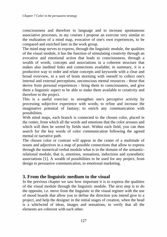
Chapter 7 Color in the persuasive strategy
127
consciousness and therefore to language and to increase spontaneous
associative processes, in my courses I propose an exercise very similar to
the realization of a mind map, evocative of one's own experiences, to be
compared and enriched later in the work group.
The mind map serves to express, through the linguistic module, the qualities
of the visual module, it has the function of stimulating creativity through an
evocative and emotional action that leads to consciousness, through a
wealth of words, concepts and associations in a coherent structure that
makes also inedited links and connections available; in summary, it is a
productive way to order and relate concepts and keywords with a clear and
broad overview, in a sort of brain storming with oneself to collect one's
internal and external perceptions, unconscious mental resources - those that
derive from personal experiences - bring them to consciousness, and give
them a linguistic aspect to be able to make them available to creativity and
therefore to the project.
This is a useful exercise: to strengthen one's perceptive activity by
processing subjective experience with words; to refine and increase the
imaginative potential of fantasy; to enrich any communication with
possibilities.
With mind maps, each branch is connected to the chosen color, placed in
the center, from which all the words and emotions that the color arouses and
which will then be sorted by fields start. Within each field, you can then
search for the key words of color communication following the agreed
mental or narrative path.
The chosen color or contrast will appear in the center of a multitude of
nouns and adjectives in a map of possible connections that allow to express
through the numerical-verbal module what is in the domain of the semantic-
relational module, that is, emotions, sensations, inductions and synesthetic
associations [1]. A wealth of possibilities to be used for any project, from
design to persuasive communication, to emotional marketing.
3. From the linguistic medium to the visual In the previous chapter we saw how important it is to express the qualities
of the visual module through the linguistic module. The next step is to do
the opposite, i.e. move from the linguistic to the visual register with the use
of mood boards that allow you to define the direction you intend give to a
project, and help the designer in the initial stages of creation, when the head
is a whirlwind of ideas, images and sensations, to verify that all the
elements are coherent with each other.
Color Design & Technology - A Multidisciplinary Approach to Colour – Part 2
128
Mood boards, as we know, are used in various fields: in interior design to
show what kind of ambience the new furniture will create; in fashion to
provide an idea of the sensations that the product will evoke and show what
it is inspired by., in web design to define the ambience of the site; in
advertising to highlight the emotions you want to arouse and in color to
communicate the feeling, the concept, the mood that the chosen color
evokes.
In our project, the mind map and mood boards are closely linked. Course
participants are invited to choose from the mind map some coordinated
keywords to represent a concept, an ambience or a situation to be realized in
the mood, so as to give voice to a first vision of what the brand or product,
which focus on a certain color, want to communicate. In this phase we fully
enter into the semantics of color as Claudio Widmann points out when he
writes: "it is certainly confirmed thata semantic area exists, in which colors
take on meanings that go far beyond their physical appearance and that
there is a solid relationship between the meanings attributed to colors and
the social context within these meanings mature” [2].
4. Color idea first drafts: development phases of a brand Both the mind map and the mood board are an aspect of the initial phases to
creatively and consonant design an 'icon' color for a brand which wants to
enter the market or simply change its appearance or for a new product that
wants to stand out in a salient way in the competition.
We know that while the brand must convey values such as: trust, respect for
the environment, honesty, seriousness, joy, youth, etc.; The product, which
instead belongs to the category of economic goods, must have objective
characteristics, but also not objective and emotional ones, capable of
satisfying a consumer's need and interpreting a dream.
In both cases the color, relying on its semantic and perceptive charge, can
be a determining element and in some cases it can interpret both the brand
and the product. During the course I proposed a working method, able to
satisfy this hypothesis, which involves a series of steps, starting with the
mind map which facilitates the generation of ideas and even unusual links;
continuing with the selection of the concepts to be expressed.
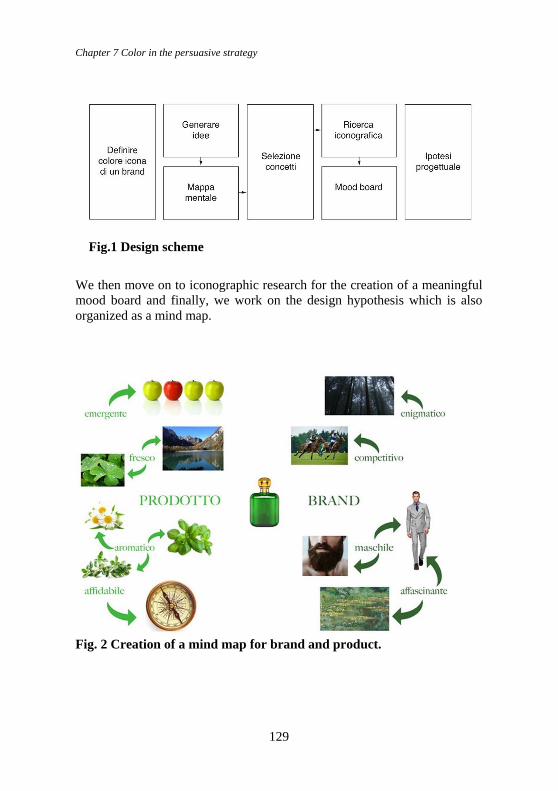
Chapter 7 Color in the persuasive strategy
129
Fig.1 Design scheme
We then move on to iconographic research for the creation of a meaningful
mood board and finally, we work on the design hypothesis which is also
organized as a mind map.
Fig. 2 Creation of a mind map for brand and product.
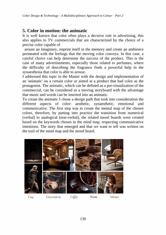
Color Design & Technology - A Multidisciplinary Approach to Colour – Part 2
130
5. Color in motion: the animatic It is well known that color often plays a decisive role in advertising, this
also applies to TV commercials that are characterized by the choice of a
precise color capable of
arouse an imaginary, imprint itself in the memory and create an ambience
permeated with the feelings that the moving color conveys. In this case, a
careful choice can help determine the success of the product. This is the
case of many advertisements, especially those related to perfumes, where
the difficulty of describing the fragrance finds a powerful help in the
synaesthesia that color is able to arouse.
I addressed this topic in the Master with the design and implementation of
an 'animatic' on a certain color or aimed at a product that had color as the
protagonist. The animatic, which can be defined as a pre-visualization of the
commercial, can be considered as a moving storyboard with the advantage
that music and words can be inserted into an animatic.
To create the animatic I chose a design path that took into consideration the
different aspects of color: aesthetic, synaesthetic, emotional and
communicative. The first step was to create the mental map of the chosen
colors, therefore, by putting into practice the transition from numerical
(verbal) to analogical (non-verbal), the related mood boards were created
based on the keywords chosen in the mind map, respecting communicative
intentions. The story that emerged and that we want to tell was written on
the trail of the mind map and the mood board.
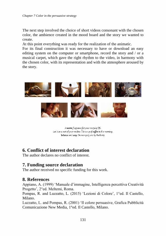
Chapter 7 Color in the persuasive strategy
131
The next step involved the choice of short videos consonant with the chosen
color, the ambience created in the mood board and the story we wanted to
create.
At this point everything was ready for the realization of the animatic.
For its final construction it was necessary to have or download an easy
editing system on the computer or smartphone, record the story and / or a
musical carpet, which gave the right rhythm to the video, in harmony with
the chosen color, with its representation and with the atmosphere aroused by
the story.
6. Conflict of interest declaration The author declares no conflict of interest.
7. Funding source declaration The author received no specific funding for this work.
8. References Appiano, A. (1999) ‘Manuale d’immagine, Intelligenza percettiva Creatività
Progetto’, 2°ed. Meltemi, Roma.
Pompas, R. and Luzzatto, L. (2015) ‘Lezioni di Colore’, 1°ed. Il Castello,
Milano.
Luzzatto, L. and Pompas, R. (2001) ‘Il colore persuasive, Grafica Pubblicità
Comunicazione New Media, 1°ed. Il Castello, Milano.
Color Design & Technology - A Multidisciplinary Approach to Colour – Part 2
132
Luzzatto, L. and Pompas, R. (2017) Il Significato dei Colori, 1°
ed.Bompiani, Milano.
Luzzatto, L. and Pompas, R. (2015) ‘Lezioni di Colore’, 1°ed. Il Castello,
Milano.
Lüscher, M. (1976) ‘Il Test dei Colori’, 1°ed. Astrolabio, Ubaldini editore,
Roma.
Sources of illustrations
Fig. 2 project carried out by the students of my Theory of Color course, at
the Fondazione Accademia di Comunicazione in Milan.
Fig. 3 and 4 project by Sandhiya Jayaprakash Brindha, Eugenia Matilde
Marchetti, master Color design & technology, Milan 2020
Author Biography. Lia Luzzatto Essayist, publicist and chromatic consultant. Professor of Color Theory in
university faculties, she participates and organizes seminars and courses in
Italy and abroad. She is a speaker at national and international conferences
and conventions on color issues in fashion and communication.
She is the author of the book China: Chronicle of the Five Colors published
by Franco Angeli and co-author of the volumes: Colori e Moda (Giunti
Bompiani, Milan), Lezioni di Colore (published by Il Castello, Milan),
Colore & Colori (published by Il Castello, Milan), The persuasive color (ed.
Il Castello, Milan), The colors of dressing (ed.Hoepli, Milan), The meaning
of colors in ancient civilizations (ed. Bompiani, Milan), Knowing and
understanding color (ed. Il Castello, Milan), The Language of Color (ed. Il
Castello, Milan), Read Your Personality (ed. Il Castello, Milan). He has also
participated in numerous collective books.
Former member of CISST (Italian Association for the History of Textiles)
and member of ADI (Association for Industrial Design), she is member of
ECD (Environmental Color Design) Buenos Aires, Argentina and Color
Study Group, Stockholm, Sweden. She is a founding member of the Gruppo
del Colore, the Italian Color Association, of which she was a member of the
Presidential Council and the Scientific Committee for three terms.
Notes [1] Ave Appiano, Manuale di immagine, Pag. 30, Ed. Meltemi, Roma 1999
[2] Claudio Widmann, Il simbolismo dei colori, cap.I, Piovan Editore, Abano Terme 1988.
Chapter 8 Colour not by chance. Culture of Vision for a conscious chromatic project
133
Chapter 8 Colour not by chance. Culture of
Vision for a conscious chromatic project Anna Marotta, Politecnico di Torino
Abstract In the current civilization of the image, the chromatic component constitutes an indispensable and winning language (to be addressed systematically) in any type of performance and/or communication: an aspect that is often not addressed suffi-ciently in the basic training of many professions. How much then does the visual aspect (even chromatic) count in the success and work of an architect or a de-signer or a designer in general, in any field? Awareness of vision and perception are a precious component to improve performances, and multicultural exchanges. Chromatic Culture can be confirmed as an authentic project dimension in the analysis and intervention on architecture and city, territory and landscape, as well as in the definition, conservation and enhancement of Cultural Heritage, without forgetting the design product, graphics, digital, cinema and more. Therefore, we will provide a specific overview on the Culture of Vision (in particular chromatic) between specific theories and practices (from Goethe onwards), tradition and in-novation, with thematic examples, to better understand (but also to apply and ver-ify, in the analysis and in the project) the founding role of cultural matrices with findings in Divisionism and in the Bauhaus, up to now). Among the most im-portant objectives, the control of communication and of the “chromatic image”, in all the aforementioned areas, should be emphasized, without forgetting the struc-tures and processes of formal languages and visual characters, with relative meanings. The challenge is then to demonstrate (paraphrasing Arnheim) that “chromatic thinking”, based on the Culture of Vision and on Comparative Color Theories, is confirmed as a fundamental methodological approach, in analysis and design. From theories to praxis, therefore, to “draw color” in a cultured and con-scious way, and to educate oneself to it without interruption, in the time of history and in the space of cultural territories.
Keywords: History, Colour theories and models, Art, Architecture, Design, Communication, Semiotics of vision, Colour as a sign.
DOI 10.23738/RCASB.00206
This chapter is part of the book: Color Design & Technology - A Multidisciplinary Approach
to Colour – Part 2, edited by Alice Plutino, Gabriele Simone and Alessandro Rizzi
ISBN 978-88-99513-15-3
Research Culture and Science Book Series Vol 2
ISSN 2785-115X www.rcasb.eu
Color Design & Technology - A Multidisciplinary Approach to Colour – Part 2
134
1. Introduction The course is configured as a great “challenge”: that of demonstrating (also
in the application parts) how the chromatic culture (and the thought related
to it) are fundamental for any type of action, in the field of color analysis
and design. So even the most applicative experiences cannot be separated
from this method approach: the same technical physics or all the palettes
(that we apply to create products in any type of project) are born from a
millennia-long experience.
In the first module the approach to comparative chromatic theories will be
exemplified and facilitated by the illustration of Itten’s theory, with the
example of its chromatic model, with the parameters that generate it and the
consequent color contrasts, to be applied in the analysis and in the project.
A brief comparative description of some models selected to demonstrate the
complexity of color theories in history and chromatic culture will follow.
This first part will be accompanied and verified through particularly
significant application examples: from art (including street art) to
architecture, design and so on, trying to propose a critical selection that fits
the needs and curricula of the students of the course.
2. An infinite journey with the “Ray of Iris”. History and
theories in Chromatic Culture Tracing “the ray of Iris”, that is the coloured thread reconnecting the path of
knowledge and “chromatic way of thinking” in history and in the cultural
territories, is never easy: for a series of reasons and situations such as
vastness, depth and articulation of the phenomena in which (with various
titles) it is involved, as the main subject, or as an instrumental element. And
the procedure appears even more complex if rules and principles have to be
derived from such knowledges for the analysis and the chromatic project.
2.1 The “chromatic way of thinking” in history, culture, theories The beginning of this narration can therefore only be entrusted to the
wonderful images that Owen Jones, Philipp Hackert, Jacobs Hittorff have
handed down to us from history. Owen Jones (London, February 15th, 1809
- London, April 19th, 1874) was an English architect, draftsman and writer;
he decided to move to Europe in 1832 (France, Italy, Greece, Spain), Egypt
and the Middle East. In Greece, Jones met the German architect Gottfried
Semper, known for his studies about the polychromy of ancient Greek
architecture. Jones stood out with his works in Paris at the Sèvres Museum
and in Egypt (Cairo). In his book Grammar of Ornament (1856) he
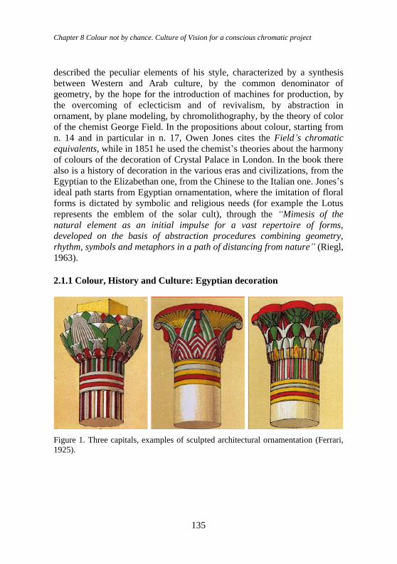
Chapter 8 Colour not by chance. Culture of Vision for a conscious chromatic project
135
described the peculiar elements of his style, characterized by a synthesis
between Western and Arab culture, by the common denominator of
geometry, by the hope for the introduction of machines for production, by
the overcoming of eclecticism and of revivalism, by abstraction in
ornament, by plane modeling, by chromolithography, by the theory of color
of the chemist George Field. In the propositions about colour, starting from
n. 14 and in particular in n. 17, Owen Jones cites the Field’s chromatic
equivalents, while in 1851 he used the chemist’s theories about the harmony
of colours of the decoration of Crystal Palace in London. In the book there
also is a history of decoration in the various eras and civilizations, from the
Egyptian to the Elizabethan one, from the Chinese to the Italian one. Jones’s
ideal path starts from Egyptian ornamentation, where the imitation of floral
forms is dictated by symbolic and religious needs (for example the Lotus
represents the emblem of the solar cult), through the “Mimesis of the
natural element as an initial impulse for a vast repertoire of forms,
developed on the basis of abstraction procedures combining geometry,
rhythm, symbols and metaphors in a path of distancing from nature” (Riegl,
1963).
2.1.1 Colour, History and Culture: Egyptian decoration
Figure 1. Three capitals, examples of sculpted architectural ornamentation (Ferrari,
1925).
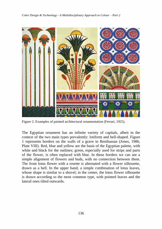
Color Design & Technology - A Multidisciplinary Approach to Colour – Part 2
136
Figure 2. Examples of painted architectural ornamentation (Ferrari, 1925).
The Egyptian ornament has an infinite variety of capitals, albeit in the
context of the two main types prevalently: lotiform and bell-shaped. Figure
1 represents borders on the walls of a grave in Benihassan (Jones, 1986,
Plate VIII). Red, blue and yellow are the basis of the Egyptian palette, with
white and black for the outlines; green, especially used for strips and parts
of the flower, is often replaced with blue. In these borders we can see a
simple alignment of flowers and buds, with no connection between them.
The front lotus flower with a rosette is alternated with a flower silhouette,
drawn as a bell. In the upper band, a simple combination of lotus leaves,
whose shape is similar to a shovel; in the center, the lotus flower silhouette
is drawn according to the most common type, with pointed leaves and the
lateral ones tilted outwards.
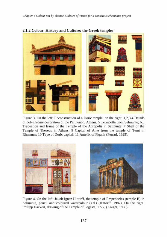
Chapter 8 Colour not by chance. Culture of Vision for a conscious chromatic project
137
2.1.2 Colour, History and Culture: the Greek temples
Figure 3. On the left: Reconstruction of a Doric temple; on the right: 1,2,3,4 Details
of polychrome decoration of the Parthenon, Athens; 5 Terracotta from Selinunte; 6,8
Trabeation and frame of the Temple of the Acropolis in Selinunte; 7 Shell of the
Temple of Theseus in Athens; 9 Capital of Ante from the temple of Temi in
Rhamnus; 10 Type of Doric capital; 11 Antefix of Figalia (Ferrari, 1925).
Figure 4. On the left: Jakob Ignaz Hittorff, the temple of Empedocles (temple B) in
Selinunte, pencil and coloured watercolour (s.d.) (Hittorff, 1987). On the right:
Philipp Hackert, drawing of the Temple of Segesta, 1777, (Knight, 1986).
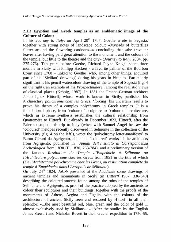
Color Design & Technology - A Multidisciplinary Approach to Colour – Part 2
138
2.1.3 Egyptian and Greek temples as an emblematic image of the
Culture of Colour
In his Journey to Italy, on April 20th 1787, Goethe wrote in Segesta,
together with strong notes of landscape colour: «Myriads of butterflies
flutter around the flowering cardoons...» concluding that «the traveller
leaves after having paid great attention to the monument and the colours of
the temple, but little to the theatre and the city» (Journey to Italy, 2004, pp.
275-276). Ten years before Goethe, Richard Payne Knight spent three
months in Sicily with Philipp Hackert - a favorite painter of the Bourbon
Court since 1768 – linked to Goethe (who, among other things, acquired
part of his ‘Sicilian’ drawings) during his years in Neaples. Particularly
significant is his pencil watercolour drawing of the temple of Segesta (fig. 4
on the right), an example of his Prospectmalerei, among the realistic views
of classical places (Krönig, 1987). In 1851 the Franco-German architect
Jakob Ignaz Hittorff, whose work is known in Sicily, published his
Architecture polichrôme chez les Grecs, ‘forcing’ his uncertain results to
prove his theory of a complex polychromy in Greek temples. It is a
foundational phase, from ‘coloured’ sculpture to ‘coloured’ architecture,
which in extreme synthesis establishes the cultural relationship from
Quatremère to Hittorff. But already in December 1823, Hittorff, after the
Palermo stop of his trip to Italy (when with Samuel Angel he saw the
‘coloured’ metopes recently discovered in Selinunte in the collection of the
University (fig. 4 on the left)), wrote the ‘polychromy letter-manifesto’ to
Baron Gérard da Agrigento, about the ‘coloured’ works of the architects
from Agrigento, published in Annali dell’Instituto di Corrispondenza
Archeologica from 1830 (II, 1830, 263-284), and a preliminary version of
the famous Restitution du Temple d’Empedocle à Sélinonte ou
l’Architecture polychrome chez les Grecs from 1851 in the title of which
(De l’Architecture polychromme chez les Grecs, ou restitutition complète du
temple d’Empédocles dans l’Acropolis de Sélinunte).
On July 24th 1824, Jakob presented at the Académie some drawings of
ancient temples and monuments in Sicily (in Hittorff 1987, 336-340)
describing the coloured stuccos found among the ruins of the temples of
Selinunte and Agrigento, as proof of the practice adopted by the ancients to
colour their sculptures and their buildings, together with the proofs of the
monuments of Athens, Aegina and Figalia, with the colours of the
architecture of ancient Sicily seen and restored by Hittorff in all their
splendor: «...the most beautiful red, blue, green and the color of gold ...
almost exclusively used by Sicilians…». After the studies by the English
James Stewart and Nicholas Revett in their crucial expedition in 1750-55,
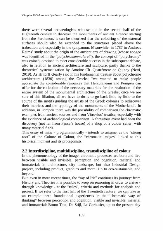
Chapter 8 Colour not by chance. Culture of Vision for a conscious chromatic project
139
there were several archaeologists who set out in the second half of the
Eighteenth century to discover the monuments of ancient Greece: starting
from the Parthenon, it can be theorized that the colouring of the external
surfaces should also be extended to the structures placed above the
trabeation and especially in the tympanum. Meanwhile, in 1787 in Andreas
Reims’ study about the origin of the ancient arts of drawing (whose apogee
was identified in the “polychromenmalerei”), the concept of “polychromy”
was coined, destined to meet considerable success in the subsequent debate,
also in relation to ancient architecture and sculpture, partly thanks to the
theoretical systematization by Antoine Ch. Quatrèmere de Quincy (Netti,
2019). As Hittorff clearly said in his fundamental treatise about polychrome
architecture (1830) among the Greeks: “we wanted to make people
appreciate the considerable resources that Herculaneum and Pompeii can
offer for the collection of the necessary materials for the restitution of the
entire system of the monumental architecture of the Greeks; once we are
sure of this filiation, all we have to do is to go back little by little to the
source of the motifs guiding the artists of the Greek colonies to rediscover
their matrices and the typology of the monuments of the Motherland”. In
addition, in Pompeii there was the possibility of comparison the chromatic
examples from ancient sources and from Vitruvius’ treatise, especially with
the evidence of archaeological comparison. A fortuitous event had been the
discovery (not far from Pansa’s house) of a shop of a colour seller, with
many material finds.
This essay of mine - programmatically - intends to assume, as the “strong
root” of the Culture of Colour, the “chromatic images” linked to this
historical moment and its protagonists.
2.2 Interdiscipline, multidiscipline, transdiscipline of colour In the phenomenology of the image, chromatic processes are born and live
between visible and invisible, perception and cognition, material and
immaterial: in architecture, city landscape, but also Industrial Design
project, including product, graphics and more. Up to eco-sustainable, and
beyond.
But, even in more recent times, the “ray of Iris” continues its journey: from
History and Theories it is possible to keep on reasoning in order to arrive -
through knowledge - at the “rules”, criteria and methods for analysis and
project. If we refer to the first half of the Twentieth century, we can take as
an example three foundational experiences in the “chromatic way of
thinking” between perception and cognition, visible and invisible, material
and immaterial: Bruno Taut, De Stijl, Le Corbusier, up to the present day
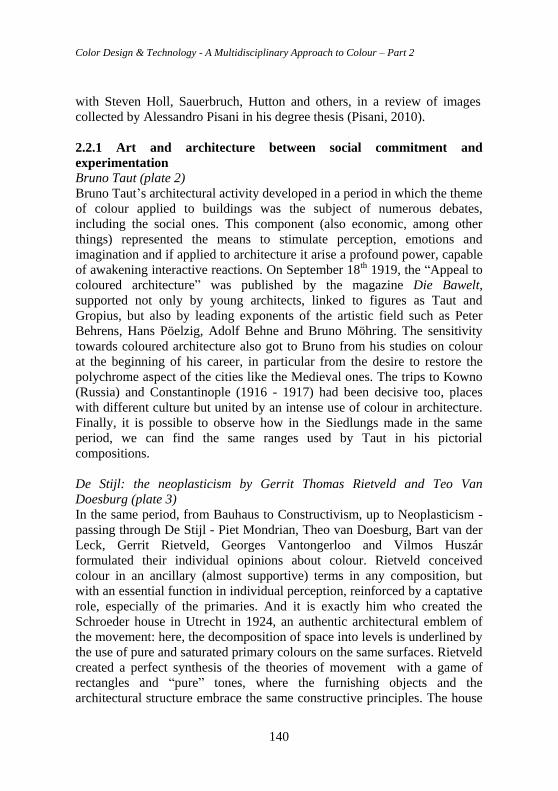
Color Design & Technology - A Multidisciplinary Approach to Colour – Part 2
140
with Steven Holl, Sauerbruch, Hutton and others, in a review of images
collected by Alessandro Pisani in his degree thesis (Pisani, 2010).
2.2.1 Art and architecture between social commitment and
experimentation
Bruno Taut (plate 2)
Bruno Taut’s architectural activity developed in a period in which the theme
of colour applied to buildings was the subject of numerous debates,
including the social ones. This component (also economic, among other
things) represented the means to stimulate perception, emotions and
imagination and if applied to architecture it arise a profound power, capable
of awakening interactive reactions. On September 18th 1919, the “Appeal to
coloured architecture” was published by the magazine Die Bawelt,
supported not only by young architects, linked to figures as Taut and
Gropius, but also by leading exponents of the artistic field such as Peter
Behrens, Hans Pöelzig, Adolf Behne and Bruno Möhring. The sensitivity
towards coloured architecture also got to Bruno from his studies on colour
at the beginning of his career, in particular from the desire to restore the
polychrome aspect of the cities like the Medieval ones. The trips to Kowno
(Russia) and Constantinople (1916 - 1917) had been decisive too, places
with different culture but united by an intense use of colour in architecture.
Finally, it is possible to observe how in the Siedlungs made in the same
period, we can find the same ranges used by Taut in his pictorial
compositions.
De Stijl: the neoplasticism by Gerrit Thomas Rietveld and Teo Van
Doesburg (plate 3)
In the same period, from Bauhaus to Constructivism, up to Neoplasticism -
passing through De Stijl - Piet Mondrian, Theo van Doesburg, Bart van der
Leck, Gerrit Rietveld, Georges Vantongerloo and Vilmos Huszár
formulated their individual opinions about colour. Rietveld conceived
colour in an ancillary (almost supportive) terms in any composition, but
with an essential function in individual perception, reinforced by a captative
role, especially of the primaries. And it is exactly him who created the
Schroeder house in Utrecht in 1924, an authentic architectural emblem of
the movement: here, the decomposition of space into levels is underlined by
the use of pure and saturated primary colours on the same surfaces. Rietveld
created a perfect synthesis of the theories of movement with a game of
rectangles and “pure” tones, where the furnishing objects and the
architectural structure embrace the same constructive principles. The house
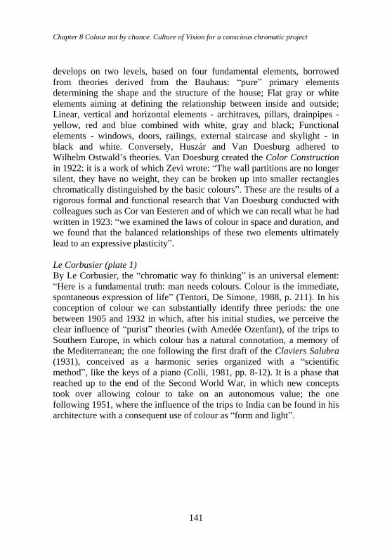
Chapter 8 Colour not by chance. Culture of Vision for a conscious chromatic project
141
develops on two levels, based on four fundamental elements, borrowed
from theories derived from the Bauhaus: “pure” primary elements
determining the shape and the structure of the house; Flat gray or white
elements aiming at defining the relationship between inside and outside;
Linear, vertical and horizontal elements - architraves, pillars, drainpipes -
yellow, red and blue combined with white, gray and black; Functional
elements - windows, doors, railings, external staircase and skylight - in
black and white. Conversely, Huszár and Van Doesburg adhered to
Wilhelm Ostwald’s theories. Van Doesburg created the Color Construction
in 1922: it is a work of which Zevi wrote: “The wall partitions are no longer
silent, they have no weight, they can be broken up into smaller rectangles
chromatically distinguished by the basic colours”. These are the results of a
rigorous formal and functional research that Van Doesburg conducted with
colleagues such as Cor van Eesteren and of which we can recall what he had
written in 1923: “we examined the laws of colour in space and duration, and
we found that the balanced relationships of these two elements ultimately
lead to an expressive plasticity”.
Le Corbusier (plate 1)
By Le Corbusier, the “chromatic way fo thinking” is an universal element:
“Here is a fundamental truth: man needs colours. Colour is the immediate,
spontaneous expression of life” (Tentori, De Simone, 1988, p. 211). In his
conception of colour we can substantially identify three periods: the one
between 1905 and 1932 in which, after his initial studies, we perceive the
clear influence of “purist” theories (with Amedée Ozenfant), of the trips to
Southern Europe, in which colour has a natural connotation, a memory of
the Mediterranean; the one following the first draft of the Claviers Salubra
(1931), conceived as a harmonic series organized with a “scientific
method”, like the keys of a piano (Colli, 1981, pp. 8-12). It is a phase that
reached up to the end of the Second World War, in which new concepts
took over allowing colour to take on an autonomous value; the one
following 1951, where the influence of the trips to India can be found in his
architecture with a consequent use of colour as “form and light”.
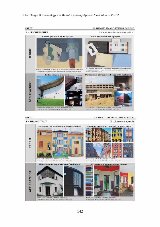
Color Design & Technology - A Multidisciplinary Approach to Colour – Part 2
142
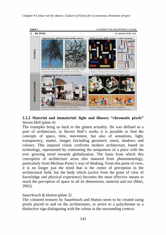
Chapter 8 Colour not by chance. Culture of Vision for a conscious chromatic project
143
2.2.2 Material and immaterial: light and illusory “chromatic pixels”
Steven Holl (plate 4)
The examples bring us back to the gistest actuality. He was defined as a
poet of architecture, in Steven Hall’s works it is possible to find the
concepts of space, time, movement, but also of sensations, light,
transparency, matter, images (including geometric ones), shadows and
colours. This inspired vision confronts modern architecture, based on
technology, represented by contrasting the uniqueness of a place with the
ever growing trend towards globalization. The basis from which this
conception of architecture arose also matured from phenomenology,
particularly from Merleau-Ponty’s way of thinking. From this point of view,
it is no longer just the mind that is the centre of perception in the
architectural field, but the body which (active from the point of view of
knowledge and physical experience) becomes the most effective means to
reach the perception of space in all its dimensions, material and not (Mari,
2002).
Sauerbruch & Hutton (plate 5)
The coloured textures by Sauerbruch and Hutton seem to be created using
pixels placed in and on the architectures, to arrive to a polychrome as a
distinctive sign dialogueing with the colour in the surrounding context.
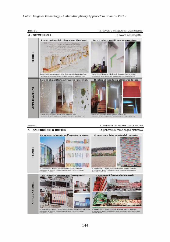
Color Design & Technology - A Multidisciplinary Approach to Colour – Part 2
144
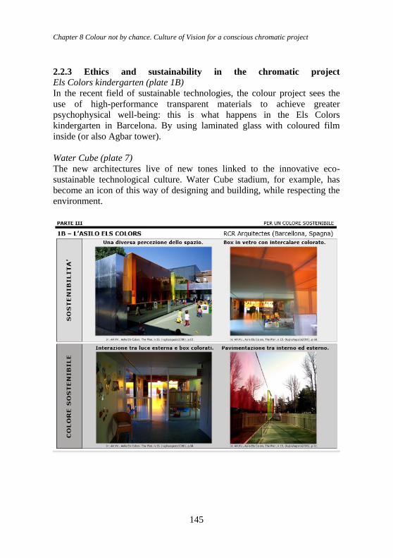
Chapter 8 Colour not by chance. Culture of Vision for a conscious chromatic project
145
2.2.3 Ethics and sustainability in the chromatic project Els Colors kindergarten (plate 1B)
In the recent field of sustainable technologies, the colour project sees the
use of high-performance transparent materials to achieve greater
psychophysical well-being: this is what happens in the Els Colors
kindergarten in Barcelona. By using laminated glass with coloured film
inside (or also Agbar tower).
Water Cube (plate 7)
The new architectures live of new tones linked to the innovative eco-
sustainable technological culture. Water Cube stadium, for example, has
become an icon of this way of designing and building, while respecting the
environment.
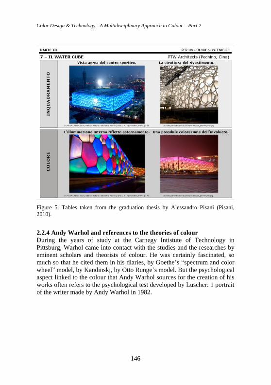
Color Design & Technology - A Multidisciplinary Approach to Colour – Part 2
146
Figure 5. Tables taken from the graduation thesis by Alessandro Pisani (Pisani,
2010).
2.2.4 Andy Warhol and references to the theories of colour
During the years of study at the Carnegy Intistute of Technology in
Pittsburg, Warhol came into contact with the studies and the researches by
eminent scholars and theorists of colour. He was certainly fascinated, so
much so that he cited them in his diaries, by Goethe’s “spectrum and color
wheel” model, by Kandinskj, by Otto Runge’s model. But the psychological
aspect linked to the colour that Andy Warhol sources for the creation of his
works often refers to the psychological test developed by Luscher: 1 portrait
of the writer made by Andy Warhol in 1982.
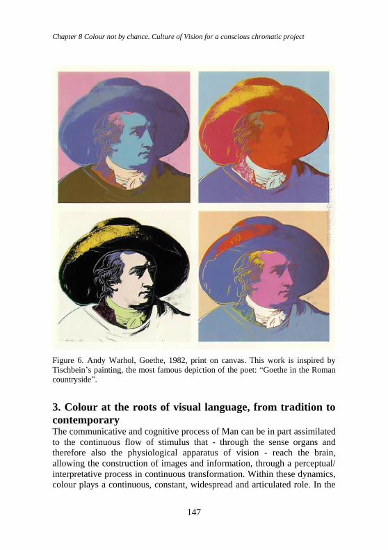
Chapter 8 Colour not by chance. Culture of Vision for a conscious chromatic project
147
Figure 6. Andy Warhol, Goethe, 1982, print on canvas. This work is inspired by
Tischbein’s painting, the most famous depiction of the poet: “Goethe in the Roman
countryside”.
3. Colour at the roots of visual language, from tradition to
contemporary The communicative and cognitive process of Man can be in part assimilated
to the continuous flow of stimulus that - through the sense organs and
therefore also the physiological apparatus of vision - reach the brain,
allowing the construction of images and information, through a perceptual/
interpretative process in continuous transformation. Within these dynamics,
colour plays a continuous, constant, widespread and articulated role. In the
Color Design & Technology - A Multidisciplinary Approach to Colour – Part 2
148
infinite ways in which it is declined in our life, we can recall a couple of
cases: nature and religion.
In the succession of the seasons, for example, nature speaks about its
mutations through colour, just as the patternings of animals declare their
type of life: exhibition and appeal, defense and aggression, mimicry and
survival.
On the other hand, in the field of faith, each religion thrives on its own
codifications and symbolisms, to spread, share and confirm its own creed.
The universe collecting and uniting all the aspects we have mentioned is
communication: and in each of them, colour lives and plays its role as a
sign, symbol, complex and complete language.
The main methods of the education to the vision mentioned in this essay
include the research experiences by Wassily Kandinsky, Johannes Itten,
László Moholy-Nagy and Paul Klee at the Bauhaus in Weimar; by György
Kepes at the New Bauhaus in Chicago; by Josef Albers at Yale University
School of Design; by Max Bill at the Hochschule für Gestaltung in Ulm; by
Bruno Munari at the Carpenter Centre in Cambridge; by Lois Swirnoff at
the Department of Art, Design and History in Los Angeles.
3.1 The communication process and its rules. Color as a sign Since it is necessary, here, to adopt a great simplification, we can affirm that
the great tendency is to divide the modes of communication into three large
groups: verbal, paraverbal and non-verbal. In the verbal, the logical and
analogical content prevails, in which the content is important, the type of
language adopted and the strengths chosen in the speech. In the second type,
the mode of transmission of the message prevails: that is, of the content:
therefore the mode and the “register”, the level of communication, including
the tone of the voice and pauses, or other elements of completion, is
important. Finally, in the third case, body language, facial expression,
postures and gestures, clothing are used. Mimicry, body movements,
physical relationship with the interlocutor or audience are used. In reality,
there are infinite ways of communicating: even silence is a form of
communication. In particular, in this case, we will privilege all the visual
modes in the Culture of Vision, the domain of choice for the birth and
origin of color, its uses, its relationship with communication. But the
fundamental aspect (together with all the technical-scientific and
psychological aspects, of which color is an active subject and a passive
object) is what we can define “Chromatic Culture”, including the particular
phenomena of Semiotics of vision and the related rhetoric of vision.
Systems, modes, elements and relationships, inherent to these latter
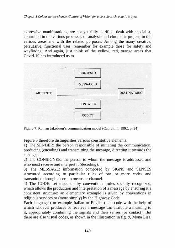
Chapter 8 Colour not by chance. Culture of Vision for a conscious chromatic project
149
expressive manifestations, are not yet fully clarified, dealt with specialist,
controlled in the various processes of analysis and chromatic project, in the
various areas and with the related purposes. Among the many creative,
persuasive, functional uses, remember for example those for safety and
wayfindng. And again, just think of the yellow, red, orange areas that
Covid-19 has introduced us to.
Figure 7. Roman Jakobson’s communication model (Caprettini, 1992, p. 24).
Figure 5 therefore distinguishes various constitutive elements:
1) The SENDER: the person responsible of initiating the communication,
producing (encoding) and transmitting the message, directing it towards the
consignee.
2) The CONSIGNEE: the person to whom the message is addressed and
who must receive and interpret it (decoding).
3) The MESSAGE: information composed by SIGNS and SENSES
structured according to particular rules of one or more codes and
transmitted through a certain means or channel.
4) The CODE: set made up by conventional rules socially recognized,
which allows the production and interpretation of a message by ensuring it a
consistent structure: an elementary example is given by conventions in
religious services or (more simply) by the Highway Code.
Each language (for example Italian or English) is a code with the help of
which whoever produces or receives a message can attribute a meaning to
it, appropriately combining the signals and their senses (or contact). But
there are also visual codes, as shown in the illustration in fig. 9, Mona Lisa,
Color Design & Technology - A Multidisciplinary Approach to Colour – Part 2
150
with the various transformations of meaning, induced by the different
formal languages, in different representative styles.
5) The CHANNEL: means, instrument, physical apparatus used to activate
and maintain communication, to transmit and receive the message;
6) The CONTEXT: the complexity of the conditions in which the
communication takes place, and more precisely the situation, known or
assumed, which unites sender and consignee even partially. It includes the
“objects” to which the message refers and attributes a meaning, that is to
say its referents.
To each of these constitutive factors, which still remain interdependent from
each other, corresponds one of the following 4 functions:
1) Emotional: the importance assumed by the sender in the message and by
the attitude of the subject towards what it is being expressed (such as
“emoticons” in SMS).
2) Conative, or “force function”: it occurs when there is the sender’s
intention to change or to directly involve the consegnee’s behavior,
stimulating the response. It is therefore the fundamental function.
3) Poetics (stylistic), it could precisely be referred to as self-reflective: with
it we intend to strengthen the expressiveness of the message which first
presents itself and its internal configuration, focusing on factors of
coherence. It is the main of the poetic, and more generally rhetorical,
message.
4) Metalinguistics: it takes place when the message talks about itself, in
particular when it describes or specifies the code involved in the
communication; or when it indicates, by its own means, how it works.
A possible definition of communication could be the following one: the set
of “signs” that are exchanged between two people to:
Inform - be informed.
Influence the interlocutor’s attitudes and decision-making orientations
and vice versa: therefore persuade.
Process or develop the analysis of a situation in logical terms.
Explain, define, modify the quality of the relationship with others, to
also promote greater participation.
Involve/interact.
Entertain, interest, educate.
Communication must be: Quick, Direct, Effective. This also applies to
Visual Communication, even when it uses colour, which indeed helps in all
these functions. In the field of sales, this is summarized with the “example
of the 5S: “ Stop, Show, Seduce, Satisfy, Sell”.
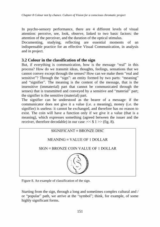
Chapter 8 Colour not by chance. Culture of Vision for a conscious chromatic project
151
In psycho-sensory performance, there are 4 different levels of visual
attention: perceive, see, look, observe, linked to two basic factors: the
attention of the perceiver, and the duration of the optical stimulus.
Documenting, studying, reflecting are essential moments of an
indispensable practice for an effective Visual Communication, in analysis
and in project.
3.2 Colour in the classification of the sign But, if everything is communication, how is the message “real” in this
process? How do we transmit ideas, thoughts, feelings, sensations that we
cannot convey except through the senses? How can we make them “real and
sensitive”? Through the “sign”: an entity formed by two parts: “meaning”
and “signifier”. The meaning is the content of the message, that is the
insensitive (immaterial) part that cannot be communicated through the
senses) that is transmitted and conveyed by a sensitive and “material” part;
the signifier is the sensitive (material) part.
The signifier can be understood as the bearer of a message: if the
communicator does not give it a value (i.e. a meaning), money (i.e. the
signifier) is useless: it cannot be exchanged, and therefore has no reason to
exist. The coin will have a function only if we give it a value (that is a
meaning), which expresses something (agreed between the issuer and the
receiver, therefore decodable) in our case :<< $ 1 >> (fig. 8).
SIGNIFICANT ≡ BRONZE DISC
MEANING ≡ VALUE OF 1 DOLLAR
SIGN ≡ BRONZE COIN VALUE OF 1 DOLLAR
Figure 8. An example of classification of the sign.
Starting from the sign, through a long and sometimes complex cultural and /
or “popular” path, we arrive at the “symbol”; think, for example, of some
highly significant forms.
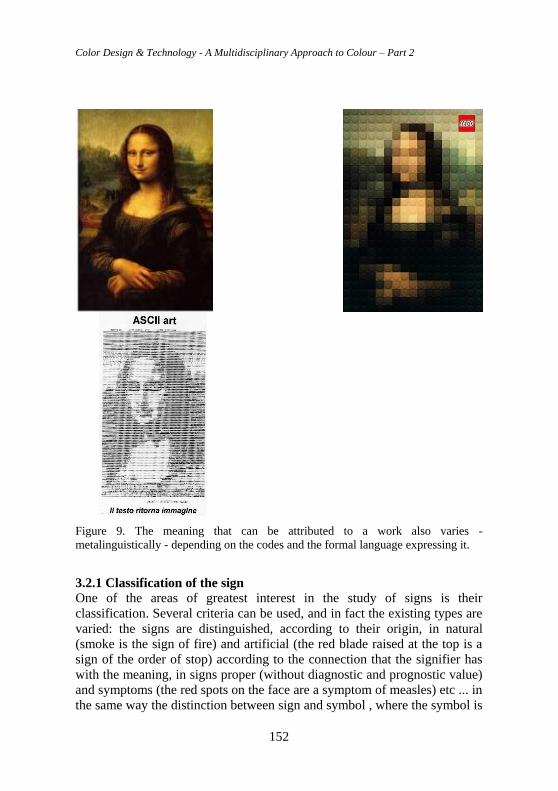
Color Design & Technology - A Multidisciplinary Approach to Colour – Part 2
152
Figure 9. The meaning that can be attributed to a work also varies -
metalinguistically - depending on the codes and the formal language expressing it.
3.2.1 Classification of the sign
One of the areas of greatest interest in the study of signs is their
classification. Several criteria can be used, and in fact the existing types are
varied: the signs are distinguished, according to their origin, in natural
(smoke is the sign of fire) and artificial (the red blade raised at the top is a
sign of the order of stop) according to the connection that the signifier has
with the meaning, in signs proper (without diagnostic and prognostic value)
and symptoms (the red spots on the face are a symptom of measles) etc ... in
the same way the distinction between sign and symbol , where the symbol is
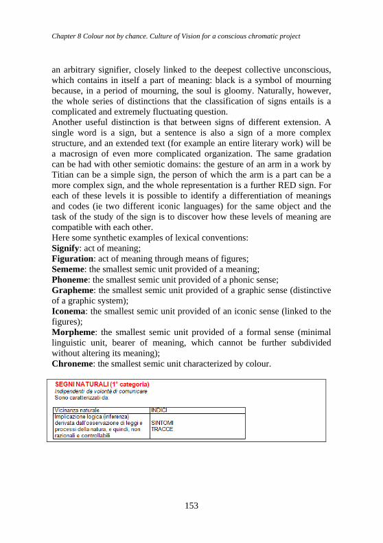
Chapter 8 Colour not by chance. Culture of Vision for a conscious chromatic project
153
an arbitrary signifier, closely linked to the deepest collective unconscious,
which contains in itself a part of meaning: black is a symbol of mourning
because, in a period of mourning, the soul is gloomy. Naturally, however,
the whole series of distinctions that the classification of signs entails is a
complicated and extremely fluctuating question.
Another useful distinction is that between signs of different extension. A
single word is a sign, but a sentence is also a sign of a more complex
structure, and an extended text (for example an entire literary work) will be
a macrosign of even more complicated organization. The same gradation
can be had with other semiotic domains: the gesture of an arm in a work by
Titian can be a simple sign, the person of which the arm is a part can be a
more complex sign, and the whole representation is a further RED sign. For
each of these levels it is possible to identify a differentiation of meanings
and codes (ie two different iconic languages) for the same object and the
task of the study of the sign is to discover how these levels of meaning are
compatible with each other.
Here some synthetic examples of lexical conventions:
Signify: act of meaning;
Figuration: act of meaning through means of figures;
Sememe: the smallest semic unit provided of a meaning;
Phoneme: the smallest semic unit provided of a phonic sense;
Grapheme: the smallest semic unit provided of a graphic sense (distinctive
of a graphic system);
Iconema: the smallest semic unit provided of an iconic sense (linked to the
figures);
Morpheme: the smallest semic unit provided of a formal sense (minimal
linguistic unit, bearer of meaning, which cannot be further subdivided
without altering its meaning);
Chroneme: the smallest semic unit characterized by colour.
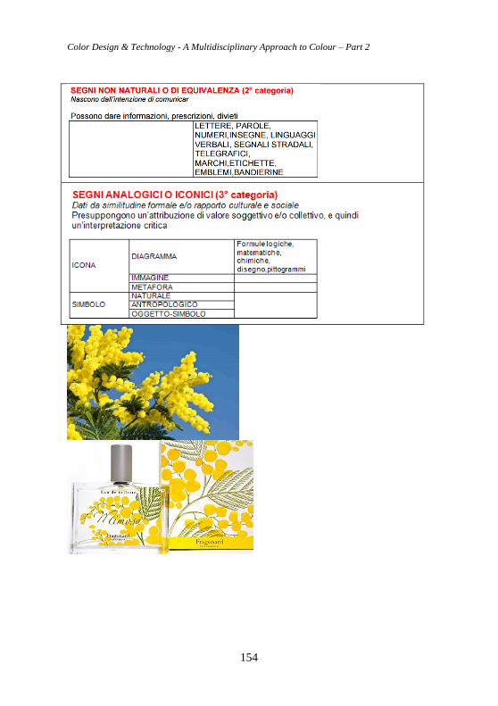
Color Design & Technology - A Multidisciplinary Approach to Colour – Part 2
154
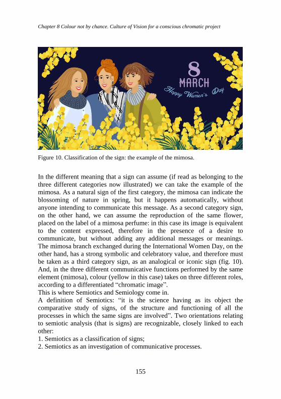
Chapter 8 Colour not by chance. Culture of Vision for a conscious chromatic project
155
Figure 10. Classification of the sign: the example of the mimosa.
In the different meaning that a sign can assume (if read as belonging to the
three different categories now illustrated) we can take the example of the
mimosa. As a natural sign of the first category, the mimosa can indicate the
blossoming of nature in spring, but it happens automatically, without
anyone intending to communicate this message. As a second category sign,
on the other hand, we can assume the reproduction of the same flower,
placed on the label of a mimosa perfume: in this case its image is equivalent
to the content expressed, therefore in the presence of a desire to
communicate, but without adding any additional messages or meanings.
The mimosa branch exchanged during the International Women Day, on the
other hand, has a strong symbolic and celebratory value, and therefore must
be taken as a third category sign, as an analogical or iconic sign (fig. 10).
And, in the three different communicative functions performed by the same
element (mimosa), colour (yellow in this case) takes on three different roles,
according to a differentiated “chromatic image”.
This is where Semiotics and Semiology come in.
A definition of Semiotics: “it is the science having as its object the
comparative study of signs, of the structure and functioning of all the
processes in which the same signs are involved”. Two orientations relating
to semiotic analysis (that is signs) are recognizable, closely linked to each
other:
1. Semiotics as a classification of signs;
2. Semiotics as an investigation of communicative processes.
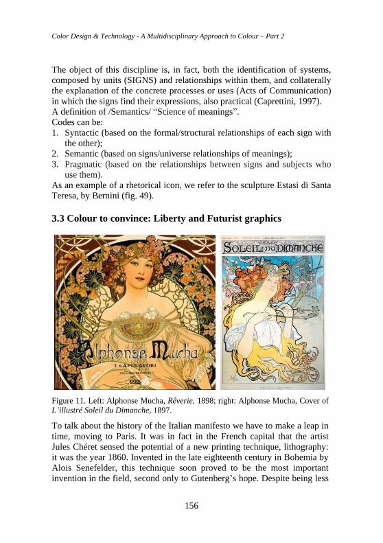
Color Design & Technology - A Multidisciplinary Approach to Colour – Part 2
156
The object of this discipline is, in fact, both the identification of systems,
composed by units (SIGNS) and relationships within them, and collaterally
the explanation of the concrete processes or uses (Acts of Communication)
in which the signs find their expressions, also practical (Caprettini, 1997).
A definition of /Semantics/ “Science of meanings”.
Codes can be:
1. Syntactic (based on the formal/structural relationships of each sign with
the other);
2. Semantic (based on signs/universe relationships of meanings);
3. Pragmatic (based on the relationships between signs and subjects who
use them). As an example of a rhetorical icon, we refer to the sculpture Estasi di Santa
Teresa, by Bernini (fig. 49).
3.3 Colour to convince: Liberty and Futurist graphics
Figure 11. Left: Alphonse Mucha, Rêverie, 1898; right: Alphonse Mucha, Cover of
L’illustré Soleil du Dimanche, 1897.
To talk about the history of the Italian manifesto we have to make a leap in
time, moving to Paris. It was in fact in the French capital that the artist
Jules Chéret sensed the potential of a new printing technique, lithography:
it was the year 1860. Invented in the late eighteenth century in Bohemia by
Alois Senefelder, this technique soon proved to be the most important
invention in the field, second only to Gutenberg’s hope. Despite being less
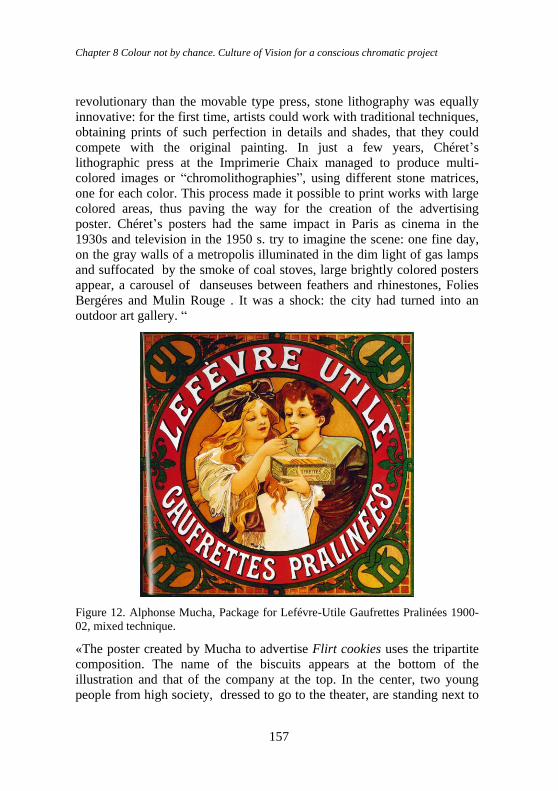
Chapter 8 Colour not by chance. Culture of Vision for a conscious chromatic project
157
revolutionary than the movable type press, stone lithography was equally
innovative: for the first time, artists could work with traditional techniques,
obtaining prints of such perfection in details and shades, that they could
compete with the original painting. In just a few years, Chéret’s
lithographic press at the Imprimerie Chaix managed to produce multi-
colored images or “chromolithographies”, using different stone matrices,
one for each color. This process made it possible to print works with large
colored areas, thus paving the way for the creation of the advertising
poster. Chéret’s posters had the same impact in Paris as cinema in the
1930s and television in the 1950 s. try to imagine the scene: one fine day,
on the gray walls of a metropolis illuminated in the dim light of gas lamps
and suffocated by the smoke of coal stoves, large brightly colored posters
appear, a carousel of danseuses between feathers and rhinestones, Folies
Bergéres and Mulin Rouge . It was a shock: the city had turned into an
outdoor art gallery. “
Figure 12. Alphonse Mucha, Package for Lefévre-Utile Gaufrettes Pralinées 1900-
02, mixed technique.
«The poster created by Mucha to advertise Flirt cookies uses the tripartite
composition. The name of the biscuits appears at the bottom of the
illustration and that of the company at the top. In the center, two young
people from high society, dressed to go to the theater, are standing next to
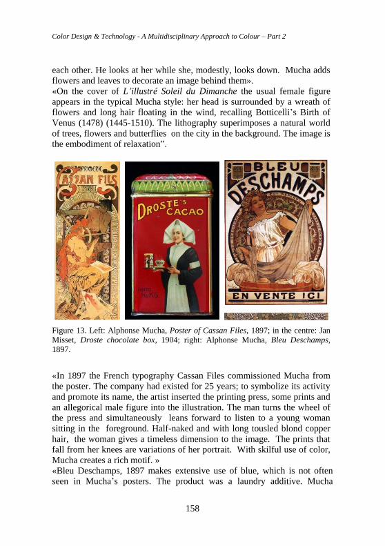
Color Design & Technology - A Multidisciplinary Approach to Colour – Part 2
158
each other. He looks at her while she, modestly, looks down. Mucha adds
flowers and leaves to decorate an image behind them».
«On the cover of L’illustré Soleil du Dimanche the usual female figure
appears in the typical Mucha style: her head is surrounded by a wreath of
flowers and long hair floating in the wind, recalling Botticelli’s Birth of
Venus (1478) (1445-1510). The lithography superimposes a natural world
of trees, flowers and butterflies on the city in the background. The image is
the embodiment of relaxation”.
Figure 13. Left: Alphonse Mucha, Poster of Cassan Files, 1897; in the centre: Jan
Misset, Droste chocolate box, 1904; right: Alphonse Mucha, Bleu Deschamps,
1897.
«In 1897 the French typography Cassan Files commissioned Mucha from
the poster. The company had existed for 25 years; to symbolize its activity
and promote its name, the artist inserted the printing press, some prints and
an allegorical male figure into the illustration. The man turns the wheel of
the press and simultaneously leans forward to listen to a young woman
sitting in the foreground. Half-naked and with long tousled blond copper
hair, the woman gives a timeless dimension to the image. The prints that
fall from her knees are variations of her portrait. With skilful use of color,
Mucha creates a rich motif. »
«Bleu Deschamps, 1897 makes extensive use of blue, which is not often
seen in Mucha’s posters. The product was a laundry additive. Mucha
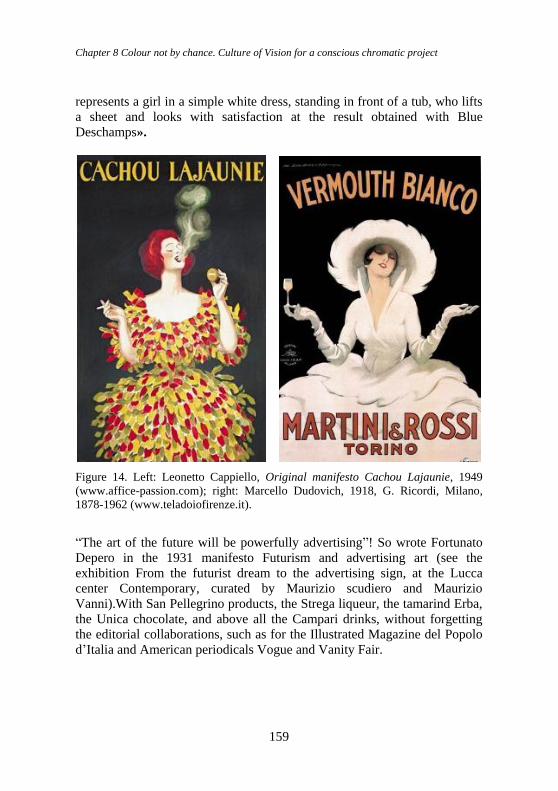
Chapter 8 Colour not by chance. Culture of Vision for a conscious chromatic project
159
represents a girl in a simple white dress, standing in front of a tub, who lifts
a sheet and looks with satisfaction at the result obtained with Blue
Deschamps».
Figure 14. Left: Leonetto Cappiello, Original manifesto Cachou Lajaunie, 1949
(www.affice-passion.com); right: Marcello Dudovich, 1918, G. Ricordi, Milano,
1878-1962 (www.teladoiofirenze.it).
“The art of the future will be powerfully advertising”! So wrote Fortunato
Depero in the 1931 manifesto Futurism and advertising art (see the
exhibition From the futurist dream to the advertising sign, at the Lucca
center Contemporary, curated by Maurizio scudiero and Maurizio
Vanni).With San Pellegrino products, the Strega liqueur, the tamarind Erba,
the Unica chocolate, and above all the Campari drinks, without forgetting
the editorial collaborations, such as for the Illustrated Magazine del Popolo
d’Italia and American periodicals Vogue and Vanity Fair.
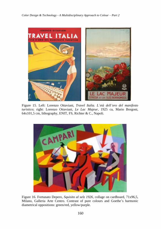
Color Design & Technology - A Multidisciplinary Approach to Colour – Part 2
160
Figure 15. Left: Lorenzo Ottaviani, Travel Italia. L’età dell’oro del manifesto
turistico; right: Lorenzo Ottaviani, Le Lac Majeur, 1925 ca, Mario Borgoni,
64x101,5 cm, lithography, ENIT, FS, Richter & C., Napoli.
Figure 16. Fortunato Depero, Squisito al selz 1926, collage on cardboard, 71x96,5,
Milano, Galleria Arte Centro. Contrast of pure colours and Goethe’s harmonic
diametrical oppositions: green/red, yellow/purple.
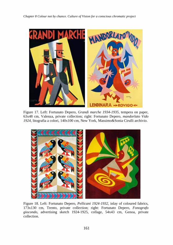
Chapter 8 Colour not by chance. Culture of Vision for a conscious chromatic project
161
Figure 17. Left: Fortunato Depero, Grandi marche 1934-1935, tempera on paper,
63x48 cm, Valenza, private collection; right: Fortunato Depero, mandorlato Vido
1924, litografia a colori, 140x100 cm, New York, Massimo&Sonia Cirulli archivio.
Figure 18. Left: Fortunato Depero, Pellicani 1924-1932, inlay of coloured fabrics,
173x130 cm, Trento, private collection; right: Fortunato Depero, Fonografo
giocondo, advertising sketch 1924-1925, collage, 54x43 cm, Genoa, private
collection.
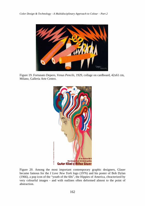
Color Design & Technology - A Multidisciplinary Approach to Colour – Part 2
162
Figure 19. Fortunato Depero, Venus Pencils, 1929, collage on cardboard, 42x61 cm,
Milano, Galleria Arte Centro.
Figure 20. Among the most important contemporary graphic designers, Glaser
became famous for the I Love New York logo (1976) and his poster of Bob Dylan
(1966), a pop icon of the “youth of the 60s”, the Hippies of America, chracterized by
very colourful images - and with outlines often deformed almost to the point of
abstraction.
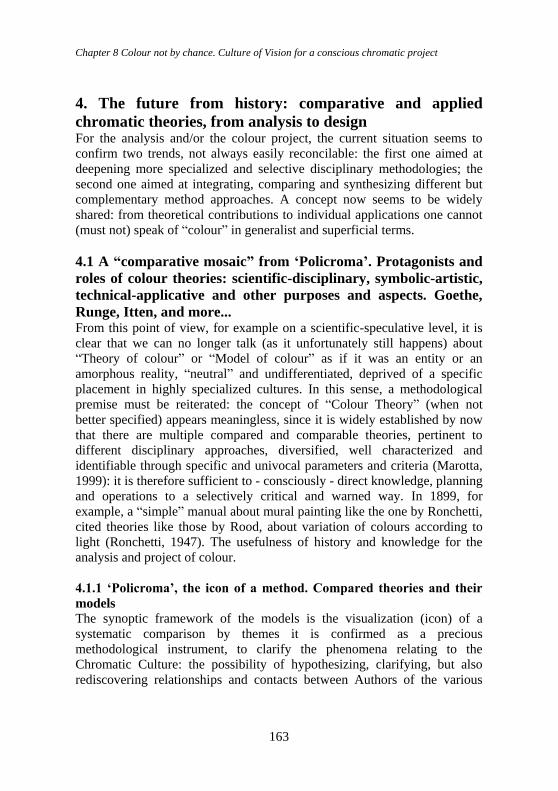
Chapter 8 Colour not by chance. Culture of Vision for a conscious chromatic project
163
4. The future from history: comparative and applied
chromatic theories, from analysis to design For the analysis and/or the colour project, the current situation seems to
confirm two trends, not always easily reconcilable: the first one aimed at
deepening more specialized and selective disciplinary methodologies; the
second one aimed at integrating, comparing and synthesizing different but
complementary method approaches. A concept now seems to be widely
shared: from theoretical contributions to individual applications one cannot
(must not) speak of “colour” in generalist and superficial terms.
4.1 A “comparative mosaic” from ‘Policroma’. Protagonists and
roles of colour theories: scientific-disciplinary, symbolic-artistic,
technical-applicative and other purposes and aspects. Goethe,
Runge, Itten, and more... From this point of view, for example on a scientific-speculative level, it is
clear that we can no longer talk (as it unfortunately still happens) about
“Theory of colour” or “Model of colour” as if it was an entity or an
amorphous reality, “neutral” and undifferentiated, deprived of a specific
placement in highly specialized cultures. In this sense, a methodological
premise must be reiterated: the concept of “Colour Theory” (when not
better specified) appears meaningless, since it is widely established by now
that there are multiple compared and comparable theories, pertinent to
different disciplinary approaches, diversified, well characterized and
identifiable through specific and univocal parameters and criteria (Marotta,
1999): it is therefore sufficient to - consciously - direct knowledge, planning
and operations to a selectively critical and warned way. In 1899, for
example, a “simple” manual about mural painting like the one by Ronchetti,
cited theories like those by Rood, about variation of colours according to
light (Ronchetti, 1947). The usefulness of history and knowledge for the
analysis and project of colour.
4.1.1 ‘Policroma’, the icon of a method. Compared theories and their
models
The synoptic framework of the models is the visualization (icon) of a
systematic comparison by themes it is confirmed as a precious
methodological instrument, to clarify the phenomena relating to the
Chromatic Culture: the possibility of hypothesizing, clarifying, but also
rediscovering relationships and contacts between Authors of the various
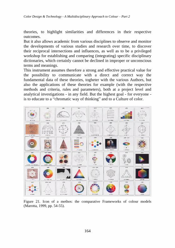
Color Design & Technology - A Multidisciplinary Approach to Colour – Part 2
164
theories, to highlight similarities and differences in their respective
outcomes.
But it also allows academic from various disciplines to observe and monitor
the developments of various studies and research over time, to discover
their reciprocal intersections and influences, as well as to be a privileged
workshop for establishing and comparing (integrating) specific disciplinary
dictionaries, which certainly cannot be declined in improper or unconscious
terms and meanings.
This instrument assumes therefore a strong and effective practical value for
the possibility to communicate with a direct and correct way the
fundamental data of these theories, togheter with the various Authors, but
also the applications of these theories for example (with the respective
methods and criteria, rules and parameters), both at a project level and
analytical investigations - in any field. But the highest goal - for everyone -
is to educate to a “chromatic way of thinking” and to a Culture of color.
Figure 21. Icon of a methos: the comparative Frameworks of colour models
(Marotta, 1999, pp. 54-55).
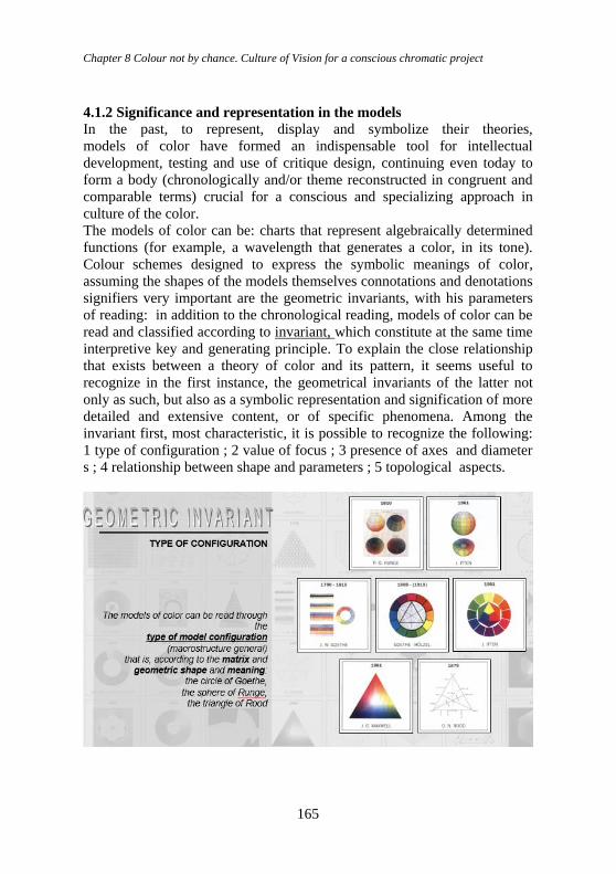
Chapter 8 Colour not by chance. Culture of Vision for a conscious chromatic project
165
4.1.2 Significance and representation in the models
In the past, to represent, display and symbolize their theories,
models of color have formed an indispensable tool for intellectual
development, testing and use of critique design, continuing even today to
form a body (chronologically and/or theme reconstructed in congruent and
comparable terms) crucial for a conscious and specializing approach in
culture of the color.
The models of color can be: charts that represent algebraically determined
functions (for example, a wavelength that generates a color, in its tone).
Colour schemes designed to express the symbolic meanings of color,
assuming the shapes of the models themselves connotations and denotations
signifiers very important are the geometric invariants, with his parameters
of reading: in addition to the chronological reading, models of color can be
read and classified according to invariant, which constitute at the same time
interpretive key and generating principle. To explain the close relationship
that exists between a theory of color and its pattern, it seems useful to
recognize in the first instance, the geometrical invariants of the latter not
only as such, but also as a symbolic representation and signification of more
detailed and extensive content, or of specific phenomena. Among the
invariant first, most characteristic, it is possible to recognize the following:
1 type of configuration ; 2 value of focus ; 3 presence of axes and diameter
s ; 4 relationship between shape and parameters ; 5 topological aspects.
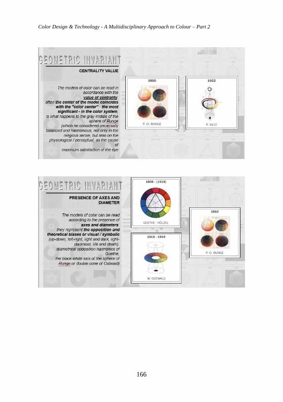
Color Design & Technology - A Multidisciplinary Approach to Colour – Part 2
166
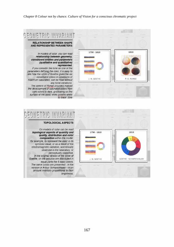
Chapter 8 Colour not by chance. Culture of Vision for a conscious chromatic project
167
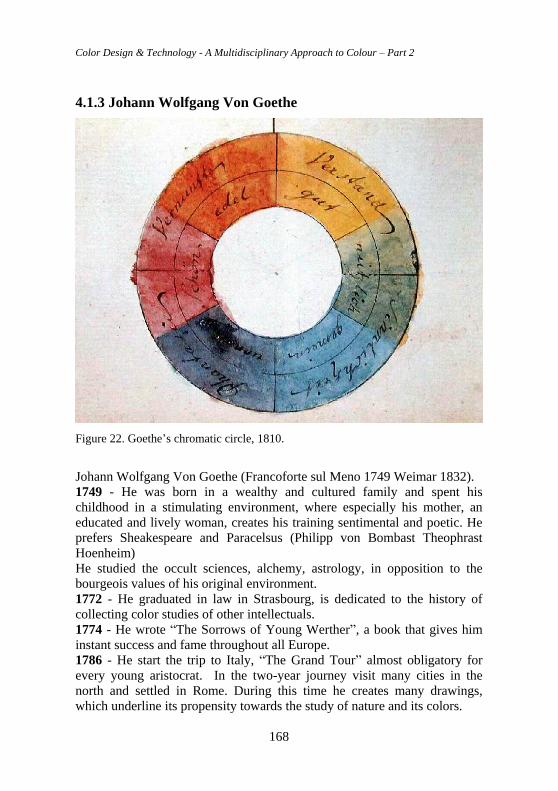
Color Design & Technology - A Multidisciplinary Approach to Colour – Part 2
168
4.1.3 Johann Wolfgang Von Goethe
Figure 22. Goethe’s chromatic circle, 1810.
Johann Wolfgang Von Goethe (Francoforte sul Meno 1749 Weimar 1832).
1749 - He was born in a wealthy and cultured family and spent his
childhood in a stimulating environment, where especially his mother, an
educated and lively woman, creates his training sentimental and poetic. He
prefers Sheakespeare and Paracelsus (Philipp von Bombast Theophrast
Hoenheim)
He studied the occult sciences, alchemy, astrology, in opposition to the
bourgeois values of his original environment.
1772 - He graduated in law in Strasbourg, is dedicated to the history of
collecting color studies of other intellectuals.
1774 - He wrote “The Sorrows of Young Werther”, a book that gives him
instant success and fame throughout all Europe.
1786 - He start the trip to Italy, “The Grand Tour” almost obligatory for
every young aristocrat. In the two-year journey visit many cities in the
north and settled in Rome. During this time he creates many drawings,
which underline its propensity towards the study of nature and its colors.
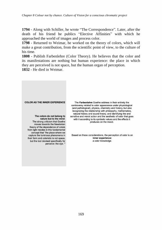
Chapter 8 Colour not by chance. Culture of Vision for a conscious chromatic project
169
1794 - Along with Schiller, he wrote “The Correspondence”. Later, after the
death of his friend he publics “Elective Affinities” with which he
approached the world of images and process color.
1798 - Returned to Weimar, he worked on the theory of colors, which will
make a great contribution, from the scientific point of view, to the culture of
his time.
1808 - Publish Farbenlehre (Color Theory). He believes that the color and
its manifestations are nothing but human experience: the place in which
they are perceived is not space, but the human organ of perception.
1832 - He died in Weimar.
Color Design & Technology - A Multidisciplinary Approach to Colour – Part 2
170
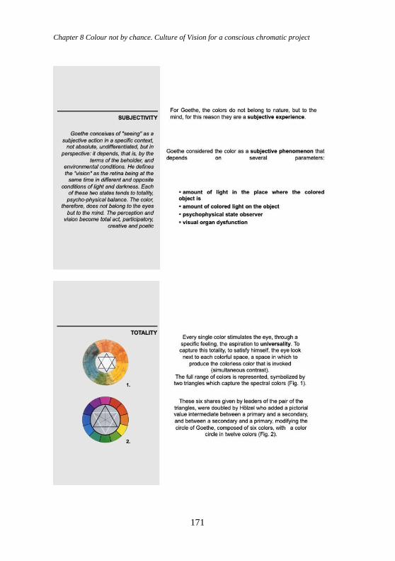
Chapter 8 Colour not by chance. Culture of Vision for a conscious chromatic project
171
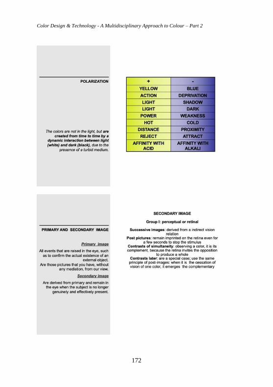
Color Design & Technology - A Multidisciplinary Approach to Colour – Part 2
172
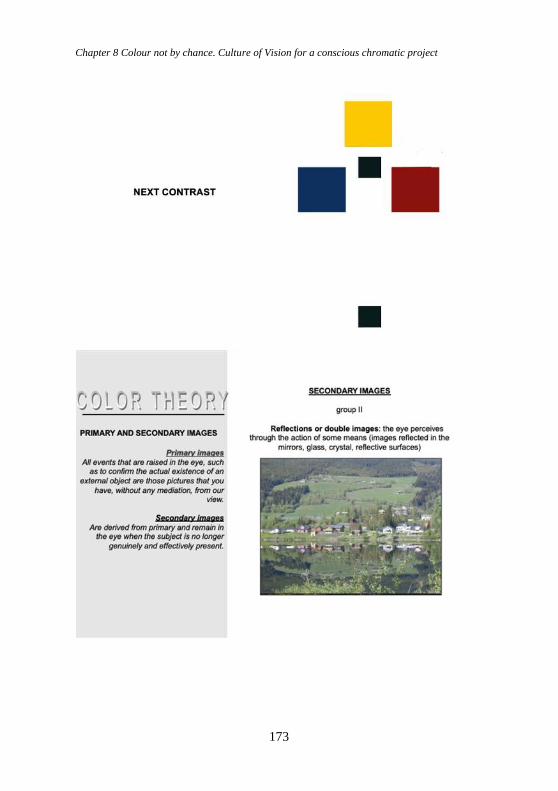
Chapter 8 Colour not by chance. Culture of Vision for a conscious chromatic project
173
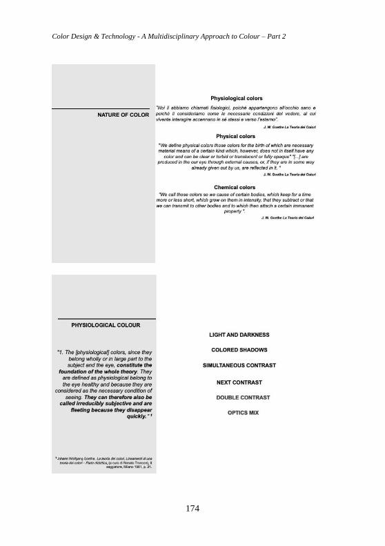
Color Design & Technology - A Multidisciplinary Approach to Colour – Part 2
174
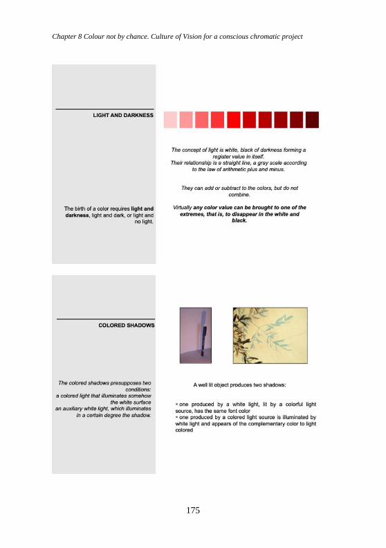
Chapter 8 Colour not by chance. Culture of Vision for a conscious chromatic project
175
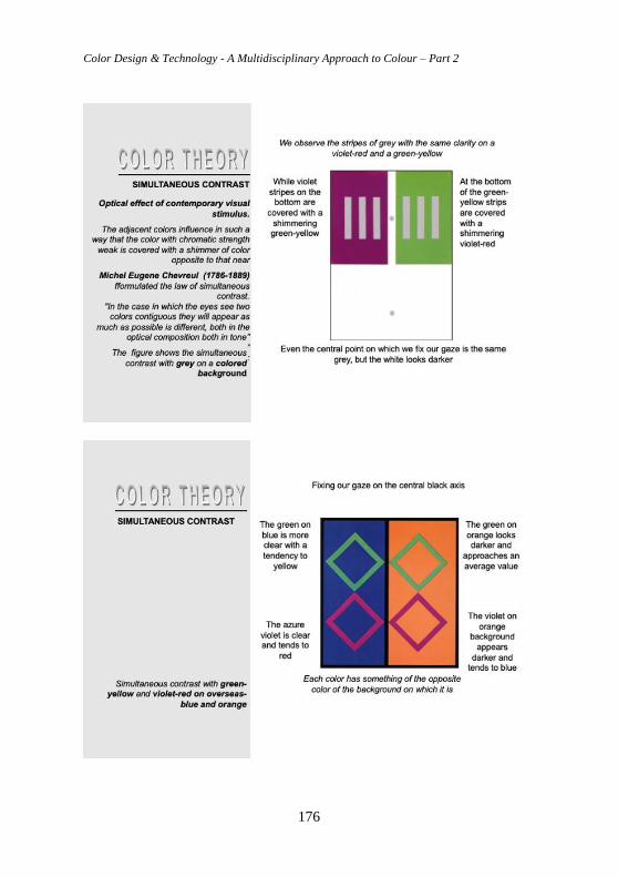
Color Design & Technology - A Multidisciplinary Approach to Colour – Part 2
176
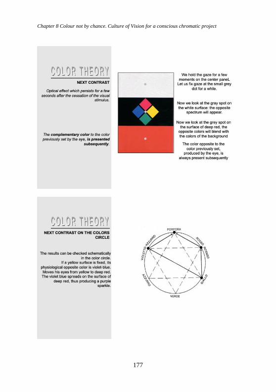
Chapter 8 Colour not by chance. Culture of Vision for a conscious chromatic project
177
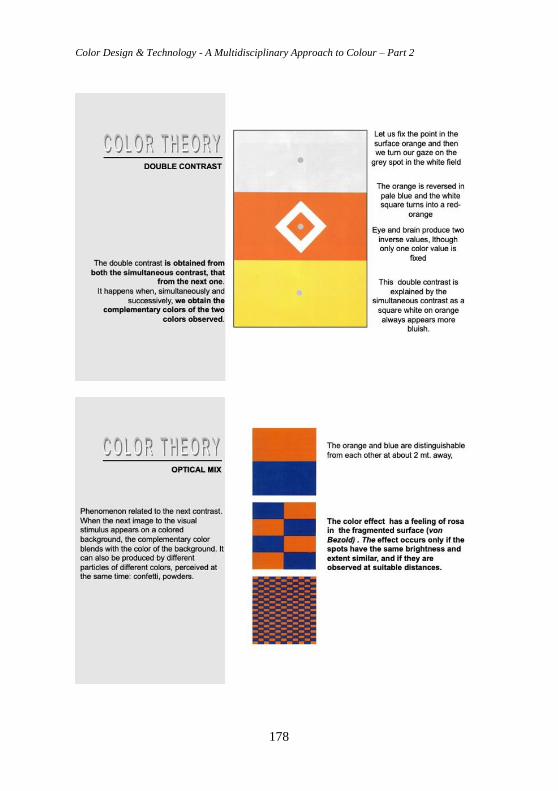
Color Design & Technology - A Multidisciplinary Approach to Colour – Part 2
178
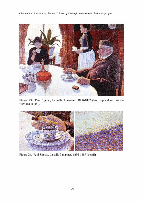
Chapter 8 Colour not by chance. Culture of Vision for a conscious chromatic project
179
Figure 23. Paul Signac, La salle à manger, 1886-1887 (from optical mix to the
“divided color”).
Figure 24. Paul Signac, La salle à manger, 1886-1887 (detail).
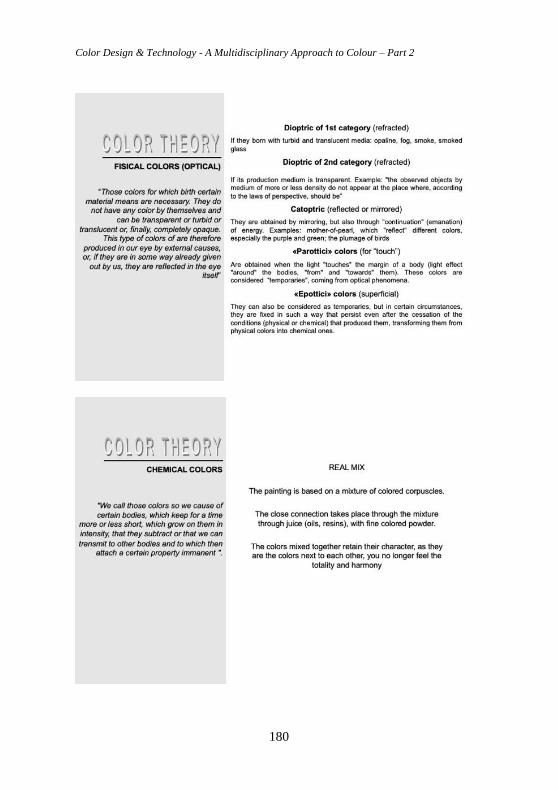
Color Design & Technology - A Multidisciplinary Approach to Colour – Part 2
180
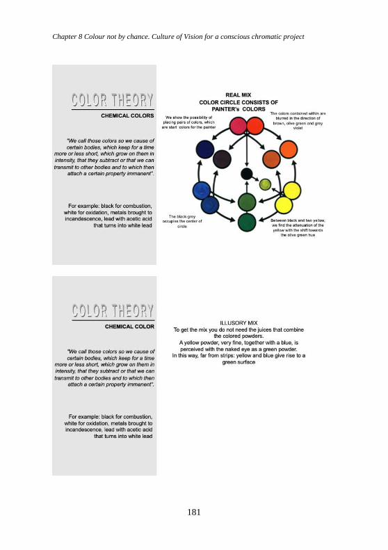
Chapter 8 Colour not by chance. Culture of Vision for a conscious chromatic project
181
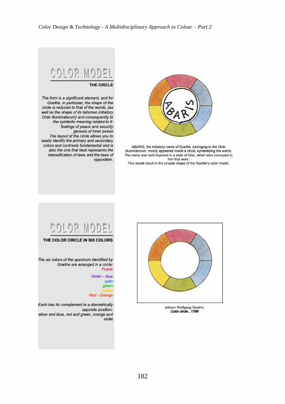
Color Design & Technology - A Multidisciplinary Approach to Colour – Part 2
182
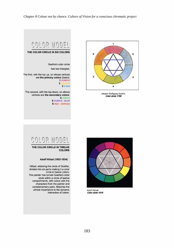
Chapter 8 Colour not by chance. Culture of Vision for a conscious chromatic project
183
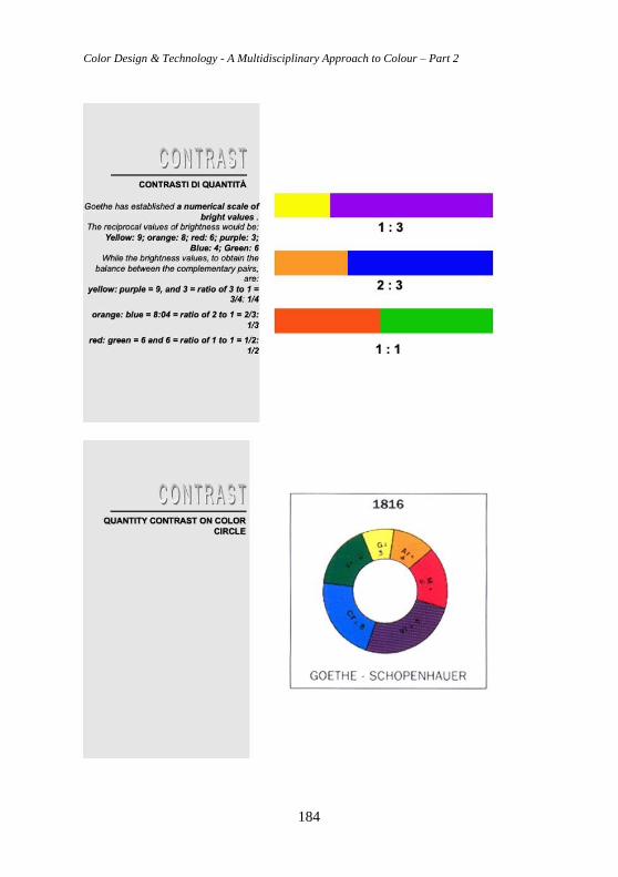
Color Design & Technology - A Multidisciplinary Approach to Colour – Part 2
184
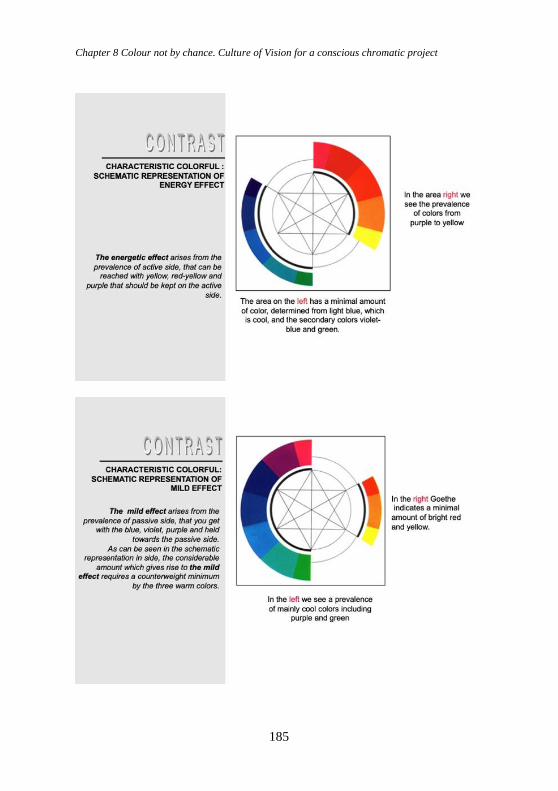
Chapter 8 Colour not by chance. Culture of Vision for a conscious chromatic project
185
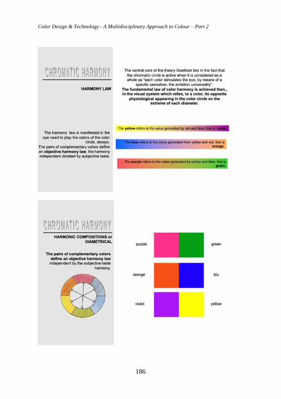
Color Design & Technology - A Multidisciplinary Approach to Colour – Part 2
186
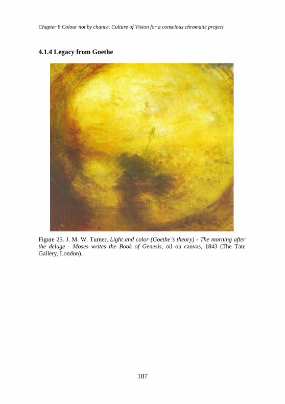
Chapter 8 Colour not by chance. Culture of Vision for a conscious chromatic project
187
4.1.4 Legacy from Goethe
Figure 25. J. M. W. Turner, Light and color (Goethe’s theory) - The morning after
the deluge - Moses writes the Book of Genesis, oil on canvas, 1843 (The Tate
Gallery, London).
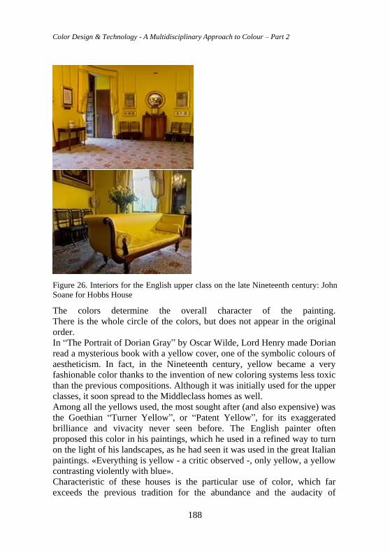
Color Design & Technology - A Multidisciplinary Approach to Colour – Part 2
188
Figure 26. Interiors for the English upper class on the late Nineteenth century: John
Soane for Hobbs House
The colors determine the overall character of the painting.
There is the whole circle of the colors, but does not appear in the original
order.
In “The Portrait of Dorian Gray” by Oscar Wilde, Lord Henry made Dorian
read a mysterious book with a yellow cover, one of the symbolic colours of
aestheticism. In fact, in the Nineteenth century, yellow became a very
fashionable color thanks to the invention of new coloring systems less toxic
than the previous compositions. Although it was initially used for the upper
classes, it soon spread to the Middleclass homes as well.
Among all the yellows used, the most sought after (and also expensive) was
the Goethian “Turner Yellow”, or “Patent Yellow”, for its exaggerated
brilliance and vivacity never seen before. The English painter often
proposed this color in his paintings, which he used in a refined way to turn
on the light of his landscapes, as he had seen it was used in the great Italian
paintings. «Everything is yellow - a critic observed -, only yellow, a yellow
contrasting violently with blue».
Characteristic of these houses is the particular use of color, which far
exceeds the previous tradition for the abundance and the audacity of
Chapter 8 Colour not by chance. Culture of Vision for a conscious chromatic project
189
combinations: much of the richness of these effects was obtained with
wallpapers and fabrics, thanks to the use of elaborated coloured prints and
extraordinary weaving techniques.
The liveliness and freshness of the colours applied during the late
Nineteenth century was partly due to the invention of aniline, a new
colouring. The aesthetic consequence of this technological advance was the
creation of some very bright yellows, vivid blues and acid greens of such
chemical intensity never seen before. Earthy reds or very dark browns were
also used, but they were enlightened with gold or very bright yellows. First
of all they were used in fabrics and wallpapers, but the new colours could
also be incorporated into varnishes.
The architects of the Aesthetic movement had a certain predilection for the
use the “Greeneryallery”, a slightly modified olive green with shades of
yellow, for the wooden panels, and an antique pink or hyacinth for the
walls, even if they preferred brighter and lighter colours for the rooms used
during the day.
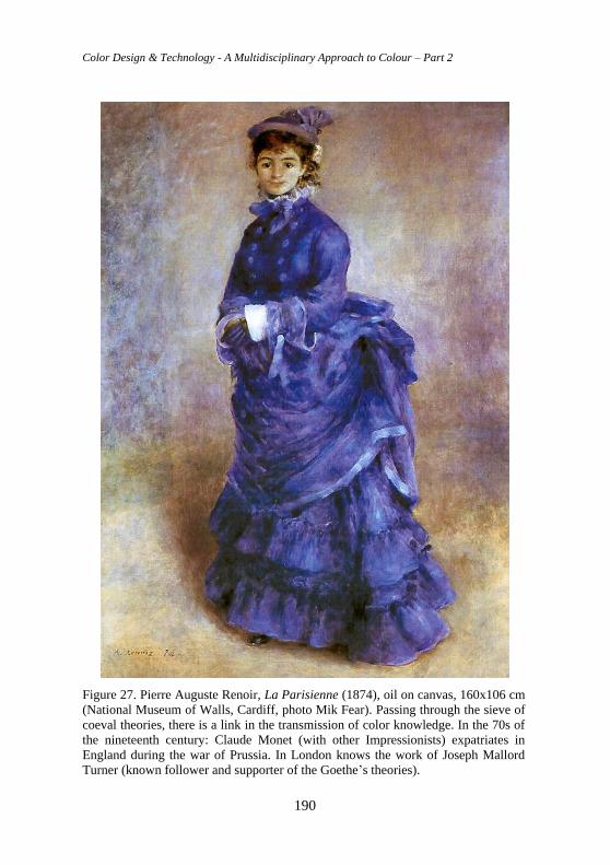
Color Design & Technology - A Multidisciplinary Approach to Colour – Part 2
190
Figure 27. Pierre Auguste Renoir, La Parisienne (1874), oil on canvas, 160x106 cm
(National Museum of Walls, Cardiff, photo Mik Fear). Passing through the sieve of
coeval theories, there is a link in the transmission of color knowledge. In the 70s of
the nineteenth century: Claude Monet (with other Impressionists) expatriates in
England during the war of Prussia. In London knows the work of Joseph Mallord
Turner (known follower and supporter of the Goethe’s theories).
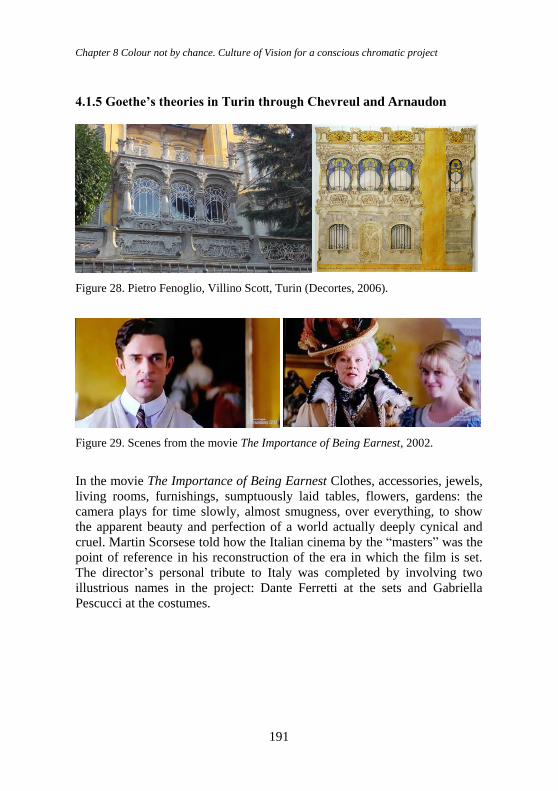
Chapter 8 Colour not by chance. Culture of Vision for a conscious chromatic project
191
4.1.5 Goethe’s theories in Turin through Chevreul and Arnaudon
Figure 28. Pietro Fenoglio, Villino Scott, Turin (Decortes, 2006).
Figure 29. Scenes from the movie The Importance of Being Earnest, 2002.
In the movie The Importance of Being Earnest Clothes, accessories, jewels,
living rooms, furnishings, sumptuously laid tables, flowers, gardens: the
camera plays for time slowly, almost smugness, over everything, to show
the apparent beauty and perfection of a world actually deeply cynical and
cruel. Martin Scorsese told how the Italian cinema by the “masters” was the
point of reference in his reconstruction of the era in which the film is set.
The director’s personal tribute to Italy was completed by involving two
illustrious names in the project: Dante Ferretti at the sets and Gabriella
Pescucci at the costumes.
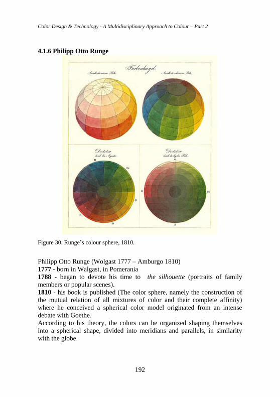
Color Design & Technology - A Multidisciplinary Approach to Colour – Part 2
192
4.1.6 Philipp Otto Runge
Figure 30. Runge’s colour sphere, 1810.
Philipp Otto Runge (Wolgast 1777 – Amburgo 1810)
1777 - born in Walgast, in Pomerania
1788 - began to devote his time to the silhouette (portraits of family
members or popular scenes).
1810 - his book is published (The color sphere, namely the construction of
the mutual relation of all mixtures of color and their complete affinity)
where he conceived a spherical color model originated from an intense
debate with Goethe.
According to his theory, the colors can be organized shaping themselves
into a spherical shape, divided into meridians and parallels, in similarity
with the globe.
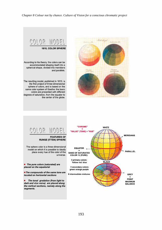
Chapter 8 Colour not by chance. Culture of Vision for a conscious chromatic project
193
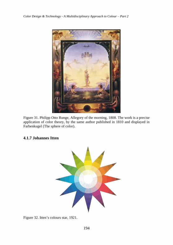
Color Design & Technology - A Multidisciplinary Approach to Colour – Part 2
194
Figure 31. Philipp Otto Runge, Allegory of the morning, 1808. The work is a precise
application of color theory, by the same author published in 1810 and displayed in
Farbenkugel (The sphere of color).
4.1.7 Johannes Itten
Figure 32. Itten’s colours star, 1921.
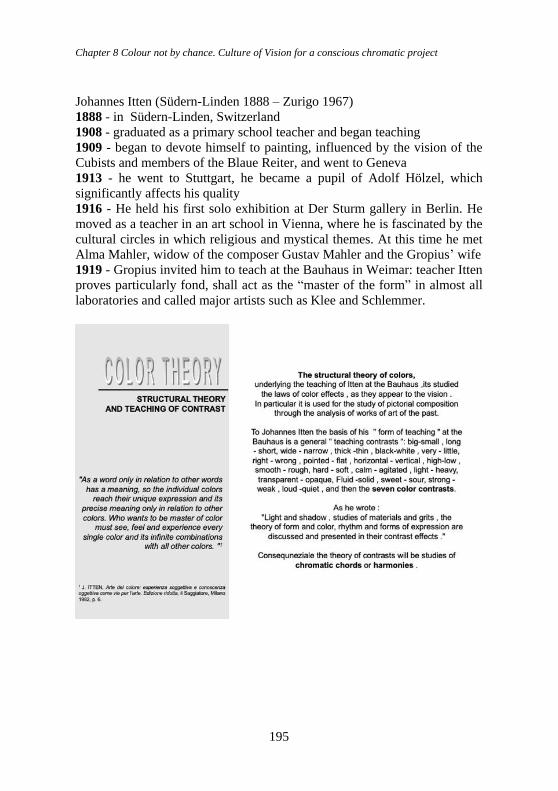
Chapter 8 Colour not by chance. Culture of Vision for a conscious chromatic project
195
Johannes Itten (Südern-Linden 1888 – Zurigo 1967)
1888 - in Südern-Linden, Switzerland
1908 - graduated as a primary school teacher and began teaching
1909 - began to devote himself to painting, influenced by the vision of the
Cubists and members of the Blaue Reiter, and went to Geneva
1913 - he went to Stuttgart, he became a pupil of Adolf Hölzel, which
significantly affects his quality
1916 - He held his first solo exhibition at Der Sturm gallery in Berlin. He
moved as a teacher in an art school in Vienna, where he is fascinated by the
cultural circles in which religious and mystical themes. At this time he met
Alma Mahler, widow of the composer Gustav Mahler and the Gropius’ wife
1919 - Gropius invited him to teach at the Bauhaus in Weimar: teacher Itten
proves particularly fond, shall act as the “master of the form” in almost all
laboratories and called major artists such as Klee and Schlemmer.
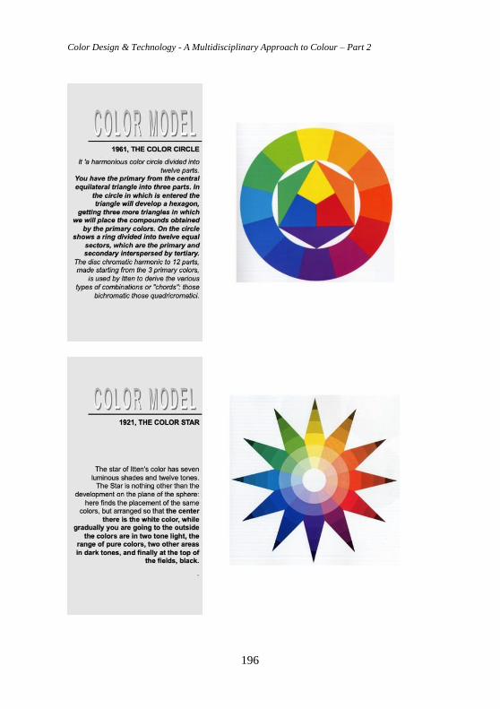
Color Design & Technology - A Multidisciplinary Approach to Colour – Part 2
196
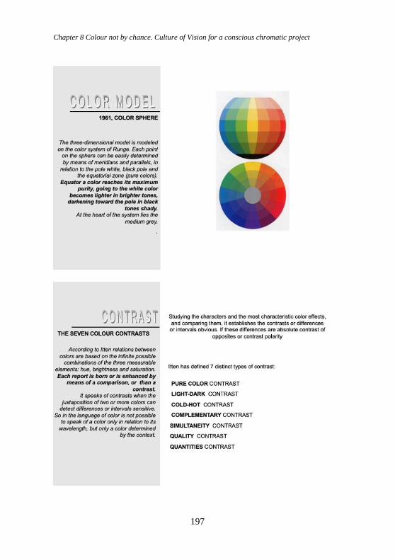
Chapter 8 Colour not by chance. Culture of Vision for a conscious chromatic project
197
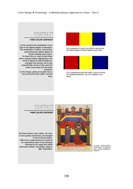
Color Design & Technology - A Multidisciplinary Approach to Colour – Part 2
198
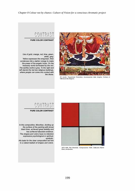
Chapter 8 Colour not by chance. Culture of Vision for a conscious chromatic project
199
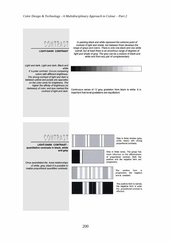
Color Design & Technology - A Multidisciplinary Approach to Colour – Part 2
200
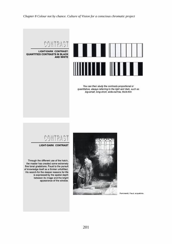
Chapter 8 Colour not by chance. Culture of Vision for a conscious chromatic project
201
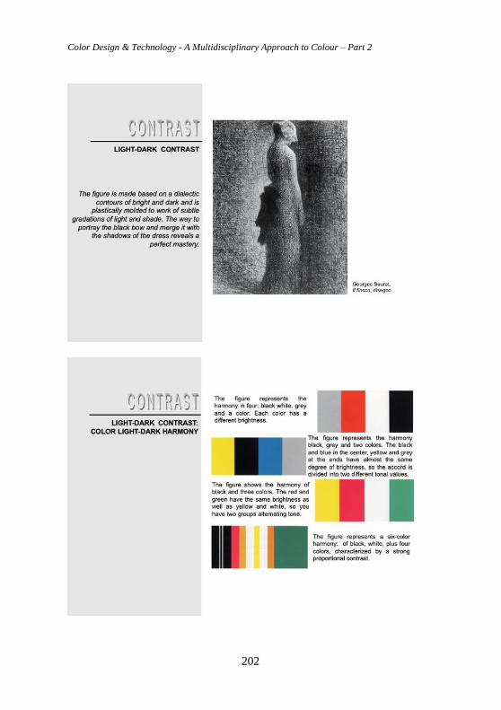
Color Design & Technology - A Multidisciplinary Approach to Colour – Part 2
202
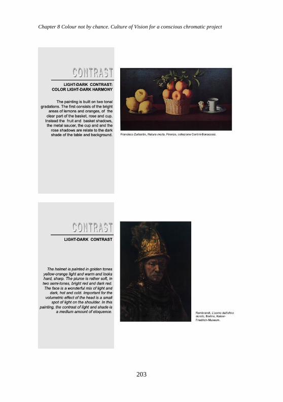
Chapter 8 Colour not by chance. Culture of Vision for a conscious chromatic project
203
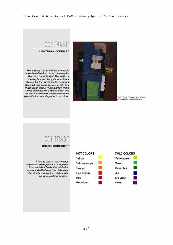
Color Design & Technology - A Multidisciplinary Approach to Colour – Part 2
204
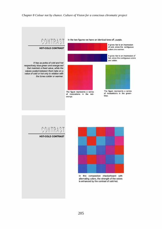
Chapter 8 Colour not by chance. Culture of Vision for a conscious chromatic project
205
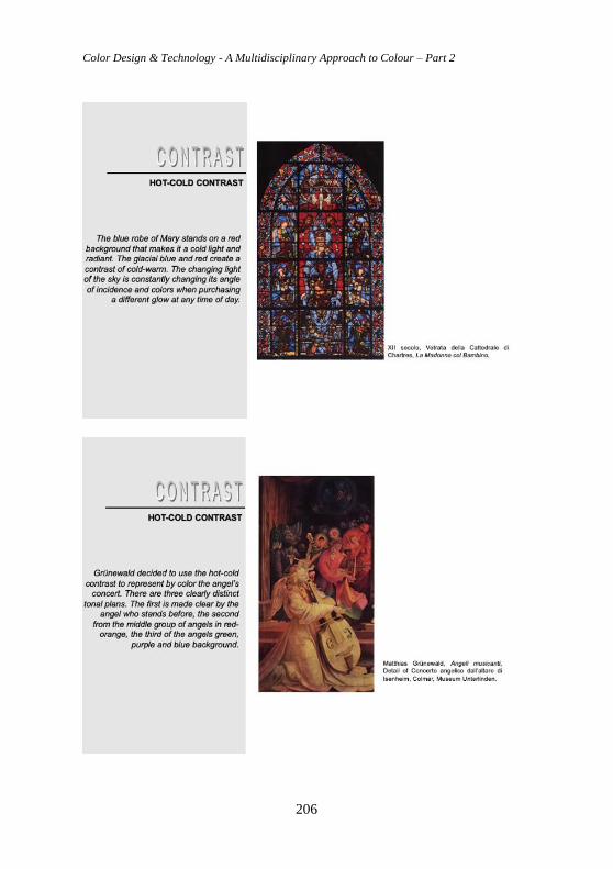
Color Design & Technology - A Multidisciplinary Approach to Colour – Part 2
206
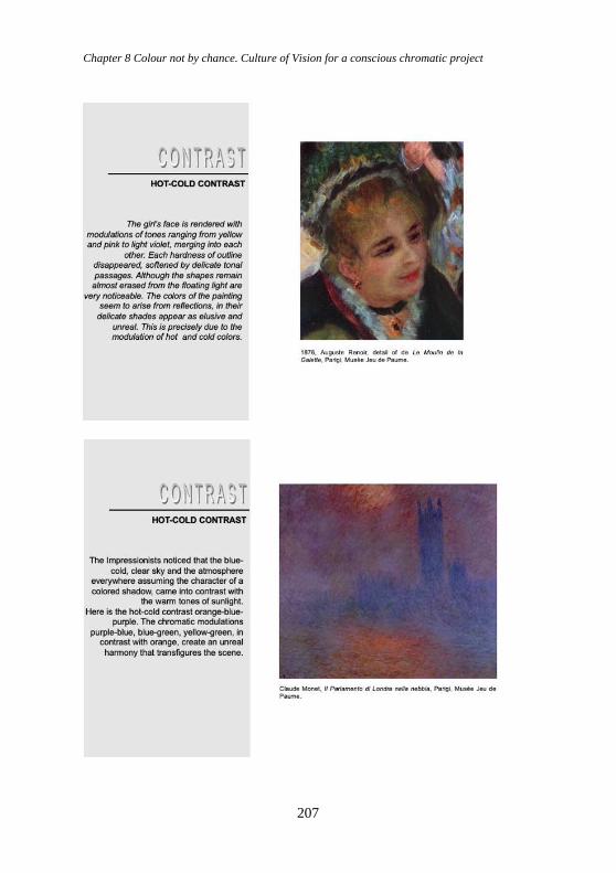
Chapter 8 Colour not by chance. Culture of Vision for a conscious chromatic project
207
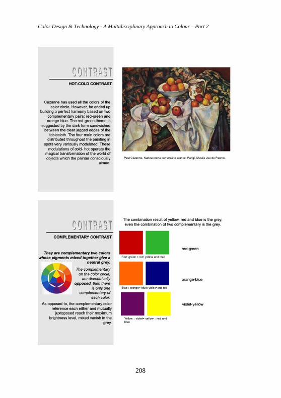
Color Design & Technology - A Multidisciplinary Approach to Colour – Part 2
208
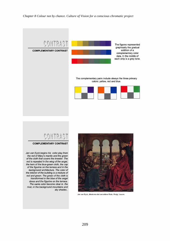
Chapter 8 Colour not by chance. Culture of Vision for a conscious chromatic project
209
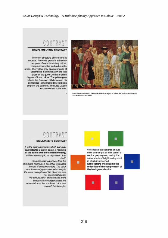
Color Design & Technology - A Multidisciplinary Approach to Colour – Part 2
210
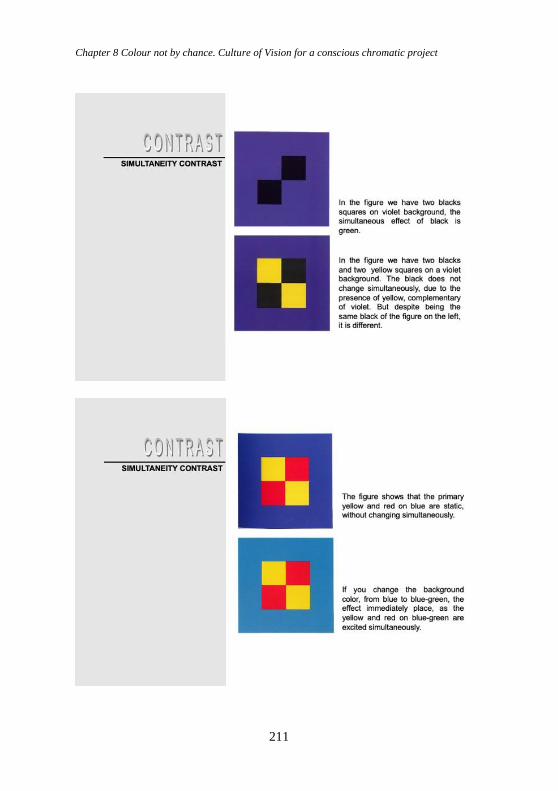
Chapter 8 Colour not by chance. Culture of Vision for a conscious chromatic project
211
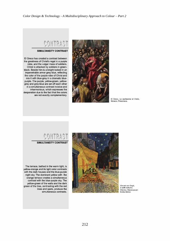
Color Design & Technology - A Multidisciplinary Approach to Colour – Part 2
212
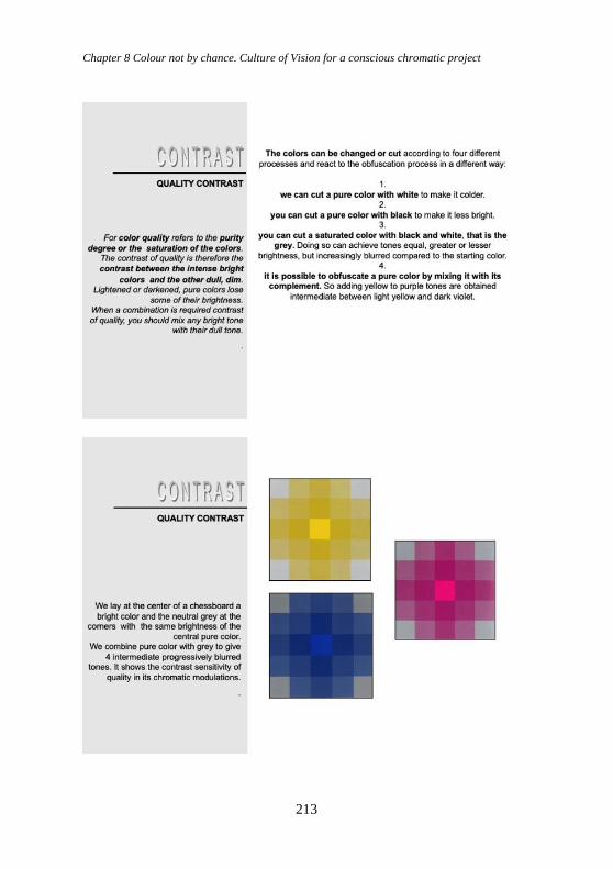
Chapter 8 Colour not by chance. Culture of Vision for a conscious chromatic project
213
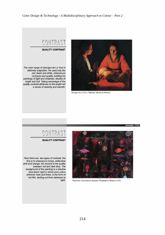
Color Design & Technology - A Multidisciplinary Approach to Colour – Part 2
214
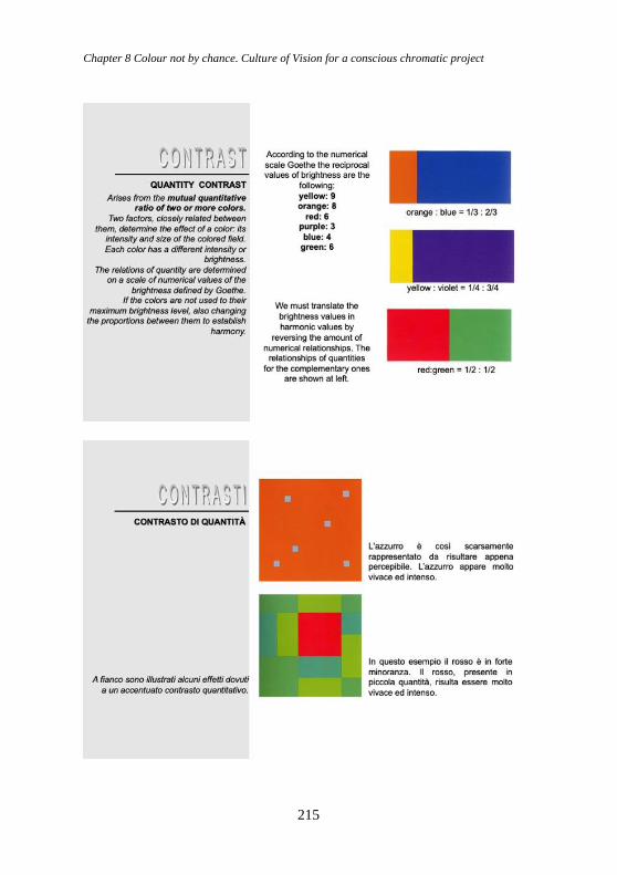
Chapter 8 Colour not by chance. Culture of Vision for a conscious chromatic project
215
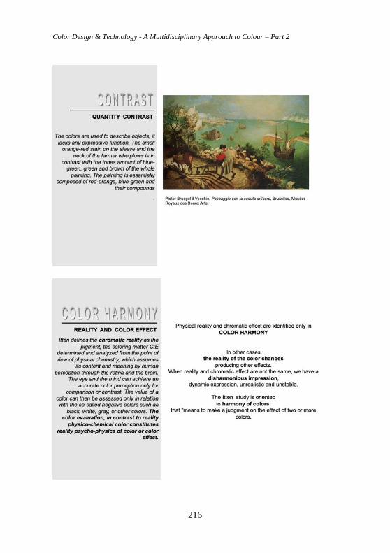
Color Design & Technology - A Multidisciplinary Approach to Colour – Part 2
216
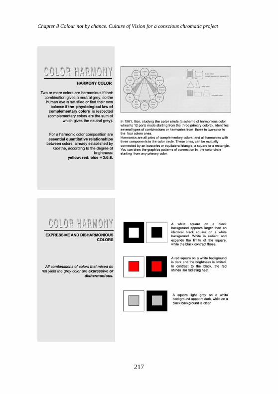
Chapter 8 Colour not by chance. Culture of Vision for a conscious chromatic project
217
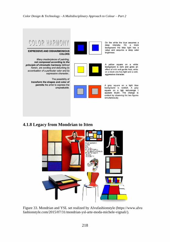
Color Design & Technology - A Multidisciplinary Approach to Colour – Part 2
218
4.1.8 Legacy from Mondrian to Itten
Figure 33. Mondrian and YSL set realized by Alvufashionstyle (https://www.alvu
fashionstyle.com/2015/07/31/mondrian-ysl-arte-moda-michele-vignali/).
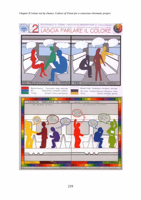
Chapter 8 Colour not by chance. Culture of Vision for a conscious chromatic project
219
Color Design & Technology - A Multidisciplinary Approach to Colour – Part 2
220
Figure 34. Itten’s theories applied by selecting opposite colour triplets on his colour
disc. The two colour triads were selected by applying an isosceles triangle (see p.
83)
4.1.9 Josef Albers Josef Albers (Bottrop 1888 - New Haven 1976), one of the first students of
the Bauhaus who was awarded with the title of Meister, that is master, for
presenting his theory based on his experiments in which he favors the use of
paper materials (from coloured ones to newspaper clippings) with the aim
of applying formal changes that may affect the behavior of the material.
Within his poetics on colour, the phenomena related to optical illusions and
the interaction of colour are highlighted. Among the numerous theoretical-
scientific laws there is the one by Weber-Fechner, related to the differential
thresholds, according to which during a sensorial perceptive experience
(and therefore also visual) it is possible to verify - also quantitatively - the
relationship between the real intensity of a physical stimulus and the
subjective sensation induced by it.
Albers compares the behavior of colour to the one of the musical notes. The
word synaesthesia, one of the rhetorical figures of the literature, can be
interpreted in the field of the study of colour and related phenomena as a
“consent” (or simultaneous perception of two different perceptual
expressions), resulting from the stimulation of a single sensory organ. The
phenomenon can involve all the five senses at the same time or only part of
them. The “audition colorée” is particularly common, with which stimulus
are simultaneously perceived with the form of images and visual structures.
Albers’ theory proposes the perception of colour by the human eye with a
location “above or below” another, resulting in a different “illusion of
space” which confirms the sensation of progress towards the observer or of
retreat from it. Furthermore, the theorist also expresses an apparent
“volumetry in two dimensions”, measuring with extreme precision the
distances and the visual relationships between flat areas of tonal colors. The
relationship between the chromatic ranges within the constant pattern of the
square that he identifies, with different entities of extension, density,
absorption and radiance. There is an interaction of the colours in the squares
that are balanced or combined two by two, to support or contrast all the
remaining ones: the same colour, placed on different backgrounds or
adjoinings, can appear different, while in the same way - with the same
artifice - different colours can seem absolutely identical (Marotta, 2010).
Chapter 8 Colour not by chance. Culture of Vision for a conscious chromatic project
221
4.2 Phenomenology of the image and Gestalt The phenomenology of the image contributes to the knowledge of the
fundamental issues relating to the nature of images, within today’s visual
culture based on the pre-eminence of the image over the word and on the
perceptive and aesthetic value of images, also and not only dependent on
language, for the construction of knowledge, in order to integrate teaching
knowledge, theoretical skills and practical procedures useful to the students
for their procedures.
Contextually to the linguistic and philosophical definition of the terms
phenomenon and phenomenology, it would be essential to frame the nature
and the reality of images by addressing the study that emerged in the
contemporary debate to offer an essential overview of the main descriptions
and conceptions of the image developed by the Western way of thinking.
From the distinction between artistic value and historical-cultural relevance
on one hand and autonomy of the image on the other hand.
If the complexity of a visual perception (especially chromatic) is not easily
describable and even less catalogable, we can here identify, in short but
exhaustive terms, at least three ways in “perceptual colour”:
1. Phenomenological: colour “as it appears” and as it is perceptually
perceived.
2. Neurophysiological: through the knowledge of the vision receptor
apparatus and its functioning.
3. Psychophysical: the production of neuronal stimulus by means and
instruments and their measurement are correlated to a physiological
reaction. Through the physical measurement of the emitted and
perceived radiations (also in combination) which are connected to the
psychological response, we arrive at the “advanced psychophysics”. In
these advanced colorimetric approaches, the “physical” measures are
crossed and screened in a “transdisciplinary” way with psychological
outcomes and aspects, towards more complex considerations.
Regarding the visual perception, according to various “schools of way of
thinking” we can briefly summarize three of the main theories here:
a. Constructivist or empiricist theory (Helmholtz, Gregory): the visual
perception as a construction of the image takes place from time to time
by dynamic comparison between the sensory information provided by
the eye and the images previously perceived in the past and stored in
memory.
b. Ecological theory (Gibson): the perception of objects cannot be
considered separately from the underlying structure on which they are
inserted or projected.
Color Design & Technology - A Multidisciplinary Approach to Colour – Part 2
222
c. Gestalt or configured form theory (Koffka, Wertheimer, Kohler,
Arnheim, Musatti, Marcolli and others): the mind projects outward,
through the senses, innate forms and categories adapted to the
surrounding world. In the latter case, perception derives from the
organization of sensations, rather than from their association by
summation: the whole is not a simple sum of the parts.
The relationship between figure and background plays an important role in
the development of perceptual phenomena. In this conception, memory and
experience play a fundamental role. In the final perceptual outcome, there is
often an interrelation between the laws of the Gestalt, rather than the
prevalence of just one of them.
4.3 The role and the “optical weight” of colour in the Gestalt
configuration of the form and in the hierarchies of the visual
field: from Kandinsky, Itten, Klee, Albers, up to
contemporaneity (Zeky, Maffei, Marcolli) Gestalt psychology (Gestalt means form, scheme, representation), also
called Psychology of form, is a psychological current concerning perception
and experience that was born and developed at the beginning of the
Twentieth century in Germany (between the 1910s and the 1930s), to then
continue its course in the USA, where its main exponents had moved during
the period of Nazi persecutions.
One of the essential postulates of the Gestalt is that according to which each
area of the visual field is not perceived in isolation but in relation to other
parts, so as to constitute units of greater perceptual importance, according to
particular conditions of stimulation: it follows that everything is something
more then the sum of the parts. Furthermore, the field can be segmented
into areas that take on the role of figures, with an object nature, and into
areas that take on a background role, of a less concrete or evident character.
Regarding the modalities of these relations, it is necessary to refer to the
studies conducted in this regard by Gestalt psychologists and in particular to
the studies by M. Wertheimer, K. Koffka and W. Kohler. Wertheimer has
identified a series of rules or laws about how to group the elements of the
field into larger structures, that is into configurations. Thought and
perception always concern organized wholes. The conditions by which the
elements of the field unify and organize into perceptual units are determined
by their relationship with the context, whose role is decisive in the
recognition of figures and in the attribution of meaning. The visual field is
assimilated - in analogy with what happens in physical science, and
particularly in dynamics - to a field of forces. Six different laws of form or
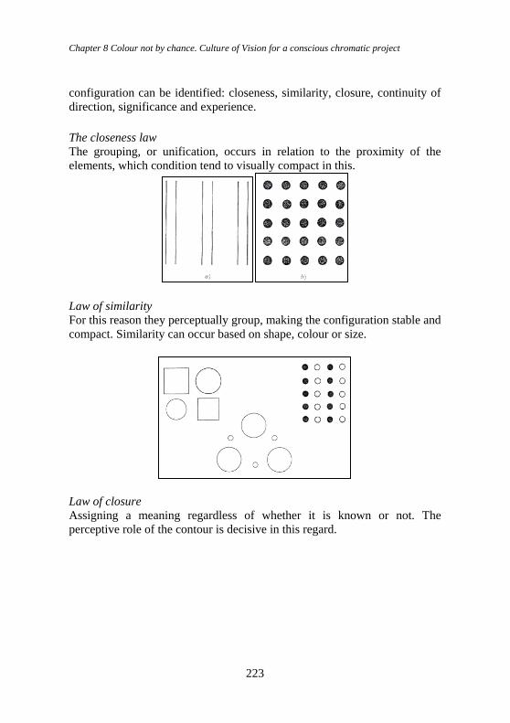
Chapter 8 Colour not by chance. Culture of Vision for a conscious chromatic project
223
configuration can be identified: closeness, similarity, closure, continuity of
direction, significance and experience.
The closeness law
The grouping, or unification, occurs in relation to the proximity of the
elements, which condition tend to visually compact in this.
Law of similarity
For this reason they perceptually group, making the configuration stable and
compact. Similarity can occur based on shape, colour or size.
Law of closure
Assigning a meaning regardless of whether it is known or not. The
perceptive role of the contour is decisive in this regard.
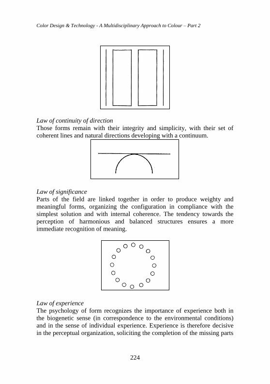
Color Design & Technology - A Multidisciplinary Approach to Colour – Part 2
224
Law of continuity of direction
Those forms remain with their integrity and simplicity, with their set of
coherent lines and natural directions developing with a continuum.
Law of significance
Parts of the field are linked together in order to produce weighty and
meaningful forms, organizing the configuration in compliance with the
simplest solution and with internal coherence. The tendency towards the
perception of harmonious and balanced structures ensures a more
immediate recognition of meaning.
Law of experience
The psychology of form recognizes the importance of experience both in
the biogenetic sense (in correspondence to the environmental conditions)
and in the sense of individual experience. Experience is therefore decisive
in the perceptual organization, soliciting the completion of the missing parts
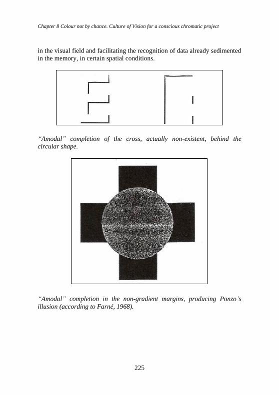
Chapter 8 Colour not by chance. Culture of Vision for a conscious chromatic project
225
in the visual field and facilitating the recognition of data already sedimented
in the memory, in certain spatial conditions.
“Amodal” completion of the cross, actually non-existent, behind the
circular shape.
“Amodal” completion in the non-gradient margins, producing Ponzo’s
illusion (according to Farné, 1968).
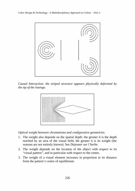
Color Design & Technology - A Multidisciplinary Approach to Colour – Part 2
226
Causal Interaction: the striped structure appears physically deformed by
the tip of the lozenge.
Optical weight between chromatisms and configurative geometries.
1. The weight also depends on the spatial depth: the greater it is the depth
reached by an area of the visual field, the greater it is its weight (the
reasons are not entirely known). See Dejeuner sur l’herbe.
2. The weigth depends on the location of the object with respect to its
“visual pattern”, and in particular with respect to the centre.
3. The weight of a visual element increases in proportion to its distance
from the pattern’s centre of equilibrium.
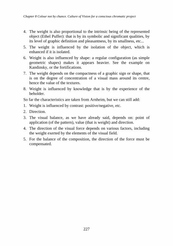
Chapter 8 Colour not by chance. Culture of Vision for a conscious chromatic project
227
4. The weight is also proportional to the intrinsic being of the represented
object (Ethel Puffer): that is by its symbolic and significant qualities, by
its level of graphic definition and pleasantness, by its smallness, etc...
5. The weight is influenced by the isolation of the object, which is
enhanced if it is isolated.
6. Weight is also influenced by shape: a regular configuration (as simple
geometric shapes) makes it appears heavier. See the example on
Kandinsky, or the fortifications.
7. The weight depends on the compactness of a graphic sign or shape, that
is on the degree of concentration of a visual mass around its centre,
hence the value of the textures.
8. Weight is influenced by knowledge that is by the experience of the
beholder.
So far the characteristics are taken from Arnheim, but we can still add:
1. Weight is influenced by contrast: positive/negative, etc.
2. Direction.
3. The visual balance, as we have already said, depends on: point of
application (of the pattern), value (that is weight) and direction.
4. The direction of the visual force depends on various factors, including
the weight exerted by the elements of the visual field.
5. For the balance of the composition, the direction of the force must be
compensated.
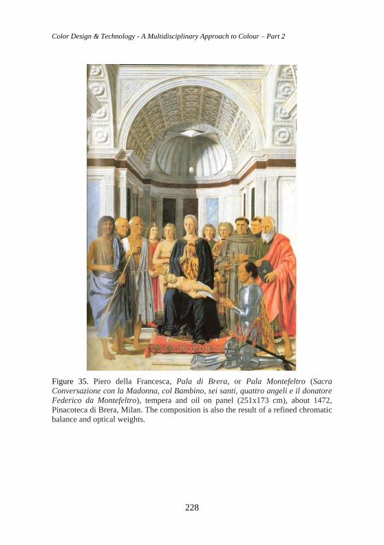
Color Design & Technology - A Multidisciplinary Approach to Colour – Part 2
228
Figure 35. Piero della Francesca, Pala di Brera, or Pala Montefeltro (Sacra
Conversazione con la Madonna, col Bambino, sei santi, quattro angeli e il donatore
Federico da Montefeltro), tempera and oil on panel (251x173 cm), about 1472,
Pinacoteca di Brera, Milan. The composition is also the result of a refined chromatic
balance and optical weights.
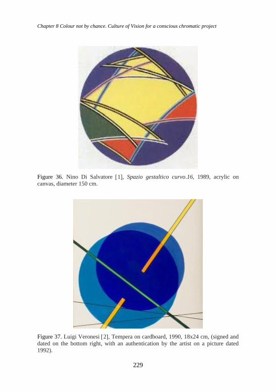
Chapter 8 Colour not by chance. Culture of Vision for a conscious chromatic project
229
Figure 36. Nino Di Salvatore 1, Spazio gestaltico curvo.16, 1989, acrylic on
canvas, diameter 150 cm.
Figure 37. Luigi Veronesi 2, Tempera on cardboard, 1990, 18x24 cm, (signed and
dated on the bottom right, with an authentication by the artist on a picture dated
1992).
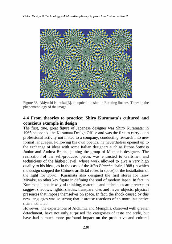
Color Design & Technology - A Multidisciplinary Approach to Colour – Part 2
230
Figure 38. Akiyoshi Kitaoka 3, an optical illusion in Rotating Snakes. Tones in the
phenomenology of the image.
4.4 From theories to practice: Shiro Kuramata’s cultured and
conscious example in design The first, true, great figure of Japanese designer was Shiro Kuramata: in
1965 he opened the Kuramata Design Office and was the first to carry out a
professional activity not linked to a company, conducting research into new
formal languages. Following his own poetics, he nevertheless opened up to
the exchange of ideas with some Italian designers such as Ettore Sottsass
Junior and Andrea Branzi, joining the group of Memphis designers. The
realization of the self-produced pieces was entrusted to craftsmen and
technicians of the highest level, whose work allowed to give a very high
quality to his ideas, as in the case of the Miss Blanche chair, 1988 (in which
the design stopped the Chinese artificial roses in space) or the installation of
the light for Spiral. Kuramata also designed the first stores for Issey
Miyake, an other key figure in defining the soul of modern Japan. In fact, in
Kuramata’s poetic way of thinking, materials and techniques are pretexts to
suggest shadows, lights, shades, transparencies and never objects, physical
presences that impose themselves on space. In fact, the shock caused by this
new languages was so strong that it arouse reactions often more instinctive
than meditated.
However, the experiences of Alchimia and Memphis, observed with greater
detachment, have not only surprised the categories of taste and style, but
have had a much more profound impact on the productive and cultural
Chapter 8 Colour not by chance. Culture of Vision for a conscious chromatic project
231
structure of the project. Researches that appeared frivolous and limited to
chromatic or decorative aspects have instead concretely modified entire
industrial sectors, supporting innovation, both technical and formal, in the
field of coloured laminates, recomposed woods, glass and lighting. The
apparent disharmony of forms, on the contrary, concealed an intimate
adhesion to an unstable present and places Italian reflection at the centre of
the culture of design. If the academy was unable to keep up, to update, the
pages of prestigious magazines and new schools elaborated proposals and
reflections.
A constellation of young foreigners, above all, found their centre of gravity
in the ateliers in Milan: for the first time since the end of the Second World
War, Italy discovered itself international, able to attract talents and export
ideas. Shiro Kuramata was certainly not the first, and will not be the last, of
the young foreign designers fascinated by the new season of the Italian
design. Kuramata was perhaps the best example of a new cultural condition;
he is Japanese, but “not at all Zen”. Close to the Memphis group, Kuramata
elaborated a poetic and swirling language, light and hard, transparent and
solid, neutral and coloured. Kuramata worked with materials of his
contemporary and moved in spaces without place, to extract unstable,
precarious, temporary balances. His objects were ambiguous and elusive,
yet they fixed with pinpoint precision the sense of a contemporary that just
needed to be recognized: “the biggest problem is gravity, we have to try to
think about how to remove it. My strongest desire is to feel free from
gravity, free from all bonds. I want to float”.
4.4.1 General review of theories and criteria “For a designer, a good project is a generous and pertinent response to all
the possibilities offered to him, and the quality of the result lies in the close
and authentic correspondence between form and meaning”.
The contrast between pure colours detected by Itten is evident in this piece
of furniture designed by Shiro Kuramata.
Kuramata’s objects have been designed to amaze, to give sensations by
going beyond the systematic search for function. In all this, there is a study
for precise details reflecting the minuteness of the daily life of the Japanese
world, of a culture rooted in time that places its origins in the social
phenomenon of the Sixteenth century, when the bourgeoisie rebelled against
the imposing Samurai caste, the period of the beginning of a new culture
made up by small but significant details. The quality of this designer’s
designs is found in the chosen shapes and colours, thanks to which they
become the protagonists of the scene, enhancing full and empty spaces,
Color Design & Technology - A Multidisciplinary Approach to Colour – Part 2
232
colours and transparencies that arise sensations to the touch and sight in the
subjects. In the Japanese culture there is a singular relationship between the
senses unknown to the Western one, particularly relating to the relationship
between sound-colour and colour-sound, according to which when you look
at a colour you can hear a sound, and this is the philosophy put into light by
Kuramata. In fact, “the designer’s work can be described as the use of the
resources of a particular language made understandable through the non-
verbal equivalents of intention, style, sense and structure, but there also are
other levels of experience more related to the function that must be received
immediately.
“A truly brilliant work is deeply rooted in its time, it includes awareness,
dreams and aspirations, as well as specific resources and technologies: work
of this kind respects the past and concretely creates the future” (Potter, p.
35). Kuramata’s work and poetics can be observed through different points
of view, such as colour, form-matter, transparency-gravity and light.
4.4.2 Colour The use of colour is one of the main means through which a designer
expresses himself. Shiro Kuramata made a particular use of colour in his
creations, playing with it according to the different circumstances, starting
from the use of a primary colour up to its complete “dematerialization”,
thus making possible to create different shades and multiple reflections. The
most used colours are black, white and red-orange, probably chosen by the
designer with the aim of creating possible strong contrasts thanks to the
combination of them, especially in the mixture of transparent methacrylate
and steel elements.
In Kuramata’s designs and realizations it is possible to highlight a
relationship with Itten’s way of thinking regarding the choice of shapes and
colours present in his theory. In fact, he developed a theory about colour,
taking up Goëthe’s and Runge’s way of thinking, within which he identified
seven contrasts of colour: pure colours contrast, chiaroscuro contrast, cold-
warm contrast, complementary colours contrast, simultaneity contrast,
quality contrast and quantity contrast.
The first contrast, relating to the use of pure colours at the highest level of
saturation, combined with each other, can be particularly observe in
Homage to Mondrian (fig. 42), a dresser with different red, blue and yellow
geometric elements. The second contrast, chiaroscuro, is present in many of
his creations, bringing the contrast to a maximum exasperation through the
use of full and dark colours combined with transparent and light elements.
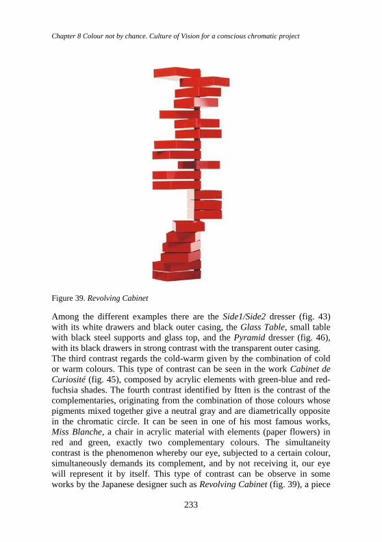
Chapter 8 Colour not by chance. Culture of Vision for a conscious chromatic project
233
Figure 39. Revolving Cabinet
Among the different examples there are the Side1/Side2 dresser (fig. 43)
with its white drawers and black outer casing, the Glass Table, small table
with black steel supports and glass top, and the Pyramid dresser (fig. 46),
with its black drawers in strong contrast with the transparent outer casing.
The third contrast regards the cold-warm given by the combination of cold
or warm colours. This type of contrast can be seen in the work Cabinet de
Curiosité (fig. 45), composed by acrylic elements with green-blue and red-
fuchsia shades. The fourth contrast identified by Itten is the contrast of the
complementaries, originating from the combination of those colours whose
pigments mixed together give a neutral gray and are diametrically opposite
in the chromatic circle. It can be seen in one of his most famous works,
Miss Blanche, a chair in acrylic material with elements (paper flowers) in
red and green, exactly two complementary colours. The simultaneity
contrast is the phenomenon whereby our eye, subjected to a certain colour,
simultaneously demands its complement, and by not receiving it, our eye
will represent it by itself. This type of contrast can be observe in some
works by the Japanese designer such as Revolving Cabinet (fig. 39), a piece
Color Design & Technology - A Multidisciplinary Approach to Colour – Part 2
234
of furniture made up of drawers in glossy red methacrylate, and Sedia
Seduta (fig. 44), a chair made up by two elements rispectively yellow and
black.
By quality contrast we mean the one between intense, bright colours, and
other pale and dim colours and can be observe in some objects by Kuramata
such as the Sofa with Arms, between the shine of the steel and the opacity of
the leather or fabric seat. The seventh contrast identified by Itten is the
quantity contrast, which arises from the reciprocal quantitative relationship
of two or more colours. The effect of a colour is determined by two factors,
its intensity and the size of the coloured field; each colour has different
intensity or brightness. Goethe established a numerical scale based on the
reciprocal brightness values. It is necessary to translate the brightness
values into harmonic values of quantity, by inverting the numerical ratios.
The contrast is based on the combination of high brightness colours with a
low quantity value, and low brightness colours with high quantity values.
Among the works by the Japanese designer, those in which it is most
evident are Homage to Joseph Hoffman, Volume 2 and Sedia Seduta. In the
first work it can be observe how the surface occupied by the dark colour of
the fabric is considerably higher than the one of the bright light of the bulbs.
In the second, the yellow seatback and seat are in smaller quantities than the
rest of the black armchair.
4.4.3 Form and matter The game of reflections and shades of Kuramata’s objects are forged by a
wise choice of shapes and materials. In the wide range of creations the use
of acrylic materials is predominant, the result of experimentations with this
extremely innovative material for the time. Methacrylate is used by
experimenting with it in solid, liquid and gaseous state. Thanks to the
research and the combination of this material it has been possible to create
objects composed by different coloured layers giving rise to multiple
internal reflections, as in Vaso monofiore. In addition to acrylic, glass was
also often used, an ancient material but re-proposed in a modern key thanks
to the use of new techniques for assembling the elements (such as
photosensitive glue) that made it possible and created particular pieces of
furniture that had never been made before. Among these there is the Glass
product line, in which we can find various seats, tables, small tables and
shelves. The experimentation of these new techniques and new materials led
to the production of singular objects characterized by pure and geometric
shapes contrasted with rounded shapes, sturdy and solid elements contrasted
with perforated elements, such as the Sing Sing Sing chair and the How
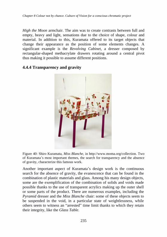
Chapter 8 Colour not by chance. Culture of Vision for a conscious chromatic project
235
High the Moon armchair. The aim was to create contrasts between full and
empty, heavy and light, sensations due to the choice of shape, colour and
material. In addition to this, Kuramata offered to its target objects that
change their appearance as the position of some elements changes. A
significant example is the Revolving Cabinet, a dresser composed by
rectangular-shaped methacrylate drawers rotating around a central pivot
thus making it possible to assume different positions.
4.4.4 Transparency and gravity
Figure 40: Shiro Kuramata, Miss Blanche, in http://www.moma.org/collection. Two
of Kuramata’s most important themes, the search for transparency and the absence
of gravity, characterize this famous work.
Another important aspect of Kuramata’s design work is the continuous
search for the absence of gravity, the evanescence that can be found in the
combination of plastic materials and glass. Among his many design objects,
some are the exemplification of the combination of solids and voids made
possible thanks to the use of transparent acrylics making up the outer shell
or some parts of the product. There are numerous examples, including the
Pyramid dresser and the Miss Blanche chair: some of these objects seem to
be suspended in the void, in a particular state of weightlessness, while
others seem to witness an “arrested” time limit thanks to which they retain
their integrity, like the Glass Table.
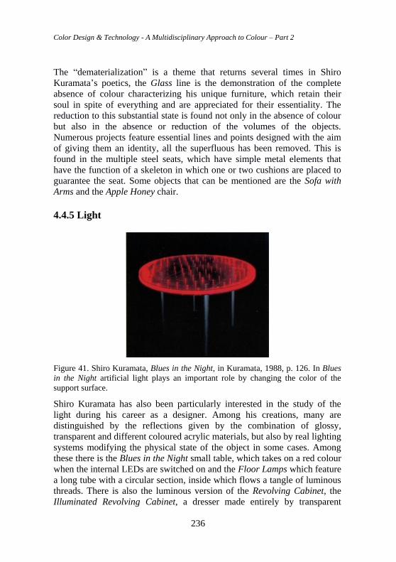
Color Design & Technology - A Multidisciplinary Approach to Colour – Part 2
236
The “dematerialization” is a theme that returns several times in Shiro
Kuramata’s poetics, the Glass line is the demonstration of the complete
absence of colour characterizing his unique furniture, which retain their
soul in spite of everything and are appreciated for their essentiality. The
reduction to this substantial state is found not only in the absence of colour
but also in the absence or reduction of the volumes of the objects.
Numerous projects feature essential lines and points designed with the aim
of giving them an identity, all the superfluous has been removed. This is
found in the multiple steel seats, which have simple metal elements that
have the function of a skeleton in which one or two cushions are placed to
guarantee the seat. Some objects that can be mentioned are the Sofa with
Arms and the Apple Honey chair.
4.4.5 Light
Figure 41. Shiro Kuramata, Blues in the Night, in Kuramata, 1988, p. 126. In Blues
in the Night artificial light plays an important role by changing the color of the
support surface.
Shiro Kuramata has also been particularly interested in the study of the
light during his career as a designer. Among his creations, many are
distinguished by the reflections given by the combination of glossy,
transparent and different coloured acrylic materials, but also by real lighting
systems modifying the physical state of the object in some cases. Among
these there is the Blues in the Night small table, which takes on a red colour
when the internal LEDs are switched on and the Floor Lamps which feature
a long tube with a circular section, inside which flows a tangle of luminous
threads. There is also the luminous version of the Revolving Cabinet, the
Illuminated Revolving Cabinet, a dresser made entirely by transparent
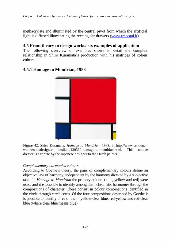
Chapter 8 Colour not by chance. Culture of Vision for a conscious chromatic project
237
methacrylate and illuminated by the central pivot from which the artificial
light is diffused illuminating the rectangular drawers (www.treccani.it)
4.5 From theory to design works: six examples of application The following overview of examples shows in detail the complex
relationship in Shiro Kuramata’s production with his matrices of colour
culture.
4.5.1 Homage to Mondrian, 1983
Figure 42. Shiro Kuramata, Homage to Mondrian, 1983, in http://www.schoener-
wohnen.de/designer- lexikon/130330-homage-to-mondrian.html. This unique
dresser is a tribute by the Japanese designer to the Dutch painter.
Complementary-harmonies colours
According to Goethe’s theory, the pairs of complementary colours define an
objective law of harmony, independent by the harmony dictated by a subjective
taste. In Homage to Mondrian the primary colours (blue, yellow and red) were
used, and it is possible to identify among them chromatic harmonies through the
compositions of character. These consist in colour combinations identified in
the circle through circle cords. Of the four compositions described by Goethe it
is possible to identify three of them: yellow-clear blue, red-yellow and red-clear
blue (where clear blue means blue).
Color Design & Technology - A Multidisciplinary Approach to Colour – Part 2
238
Pure colours
The contrast of pure colours consists in the combination of any colour at the
highest saturation point, it is the simplest to achieve. At least three distinct
colours are required to create this type of contrast. The juxtaposition of yellow,
red and blue represents the greatest degree of tension between pure colours. If
we separate the colours with white or black lines, they acquire a greater
prominence: thus, each colour acquires a concrete value. In Kuramata’s work
analyzed here, there is precisely the juxtaposition of yellow, red and blue,
separated by black lines and white squares, and they take on a greater contrast.
In Mondrian’s composition a great stability is achieved by dividing the pictorial
surface with large black lines. Shapes and colours have no expressive
psychological or spiritual-symbolic intent. His taste for clear composition led
him to a realism of shapes and colours.
Warm and cold colours
Colours take on a cold and warm value only in relation to warmer or colder
tones. The Impressionists realized that the transparent cold clear blue of the sky
and the atmosphere contrasted with the warm shades of the sunlight, taking on a
character of a coloured shadow everywhere. In the work in question, there is a
contrast between a cold colour (blue) and two warm ones (yellow and red).
Spatiality of colours
Colours, and even shapes, have expressive values with a sensitive and
conceptual nature. The association of colours and shapes means that there is a
parallelism between them. The square, for example, is a symbol of materiality,
heaviness and closure. Each shape made up of a clear pattern of horizontals and
verticals falls within the expressive sphere of the square. In this regard, these
elements can be found in Kuramata’s work due to the presence of horizontal
and vertical elements.
The square corresponds to red, the symbolic color of matter; the strength and
opacity of the red participate in the stillness and heaviness of the square.
Furthermore, it is possible to say that the squares present in the work, especially
the red one, contribute to produce the effect of the two-dimensionality of the
object, to the point of making it seems devoid of depth. The spatial effect of a
colour depends on several factors; in a colour there are forces producing effects
of depth, and they show in form of chiaroscuro, warm-cold, quality or quantity
contrasts. Diagonals and intersections can furthermore create the spatial effect.
In Mondrian’s painting that Kuramata took up to pay homage to the Dutch
painter, there are a not intersected blue and a yellow shapes on a white
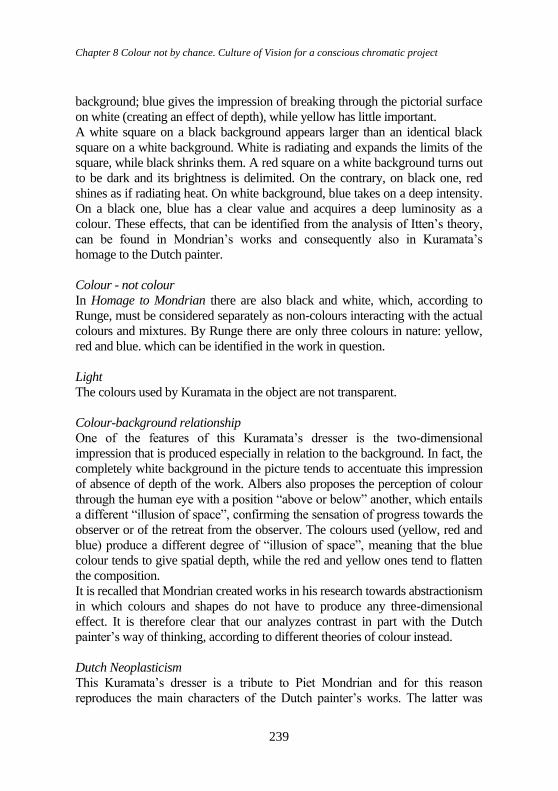
Chapter 8 Colour not by chance. Culture of Vision for a conscious chromatic project
239
background; blue gives the impression of breaking through the pictorial surface
on white (creating an effect of depth), while yellow has little important.
A white square on a black background appears larger than an identical black
square on a white background. White is radiating and expands the limits of the
square, while black shrinks them. A red square on a white background turns out
to be dark and its brightness is delimited. On the contrary, on black one, red
shines as if radiating heat. On white background, blue takes on a deep intensity.
On a black one, blue has a clear value and acquires a deep luminosity as a
colour. These effects, that can be identified from the analysis of Itten’s theory,
can be found in Mondrian’s works and consequently also in Kuramata’s
homage to the Dutch painter.
Colour - not colour
In Homage to Mondrian there are also black and white, which, according to
Runge, must be considered separately as non-colours interacting with the actual
colours and mixtures. By Runge there are only three colours in nature: yellow,
red and blue. which can be identified in the work in question.
Light
The colours used by Kuramata in the object are not transparent.
Colour-background relationship
One of the features of this Kuramata’s dresser is the two-dimensional
impression that is produced especially in relation to the background. In fact, the
completely white background in the picture tends to accentuate this impression
of absence of depth of the work. Albers also proposes the perception of colour
through the human eye with a position “above or below” another, which entails
a different “illusion of space”, confirming the sensation of progress towards the
observer or of the retreat from the observer. The colours used (yellow, red and
blue) produce a different degree of “illusion of space”, meaning that the blue
colour tends to give spatial depth, while the red and yellow ones tend to flatten
the composition.
It is recalled that Mondrian created works in his research towards abstractionism
in which colours and shapes do not have to produce any three-dimensional
effect. It is therefore clear that our analyzes contrast in part with the Dutch
painter’s way of thinking, according to different theories of colour instead.
Dutch Neoplasticism
This Kuramata’s dresser is a tribute to Piet Mondrian and for this reason
reproduces the main characters of the Dutch painter’s works. The latter was
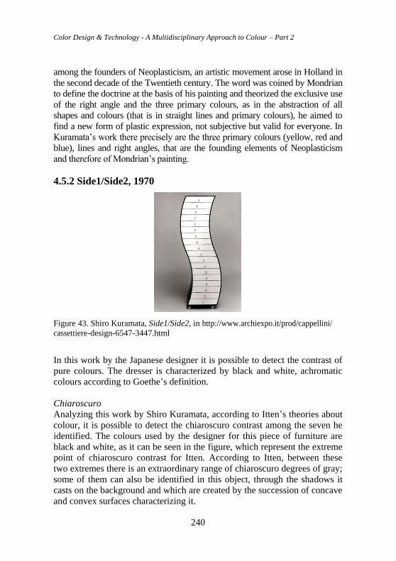
Color Design & Technology - A Multidisciplinary Approach to Colour – Part 2
240
among the founders of Neoplasticism, an artistic movement arose in Holland in
the second decade of the Twentieth century. The word was coined by Mondrian
to define the doctrine at the basis of his painting and theorized the exclusive use
of the right angle and the three primary colours, as in the abstraction of all
shapes and colours (that is in straight lines and primary colours), he aimed to
find a new form of plastic expression, not subjective but valid for everyone. In
Kuramata’s work there precisely are the three primary colours (yellow, red and
blue), lines and right angles, that are the founding elements of Neoplasticism
and therefore of Mondrian’s painting.
4.5.2 Side1/Side2, 1970
Figure 43. Shiro Kuramata, Side1/Side2, in http://www.archiexpo.it/prod/cappellini/
cassettiere-design-6547-3447.html
In this work by the Japanese designer it is possible to detect the contrast of
pure colours. The dresser is characterized by black and white, achromatic
colours according to Goethe’s definition.
Chiaroscuro
Analyzing this work by Shiro Kuramata, according to Itten’s theories about
colour, it is possible to detect the chiaroscuro contrast among the seven he
identified. The colours used by the designer for this piece of furniture are
black and white, as it can be seen in the figure, which represent the extreme
point of chiaroscuro contrast for Itten. According to Itten, between these
two extremes there is an extraordinary range of chiaroscuro degrees of gray;
some of them can also be identified in this object, through the shadows it
casts on the background and which are created by the succession of concave
and convex surfaces characterizing it.
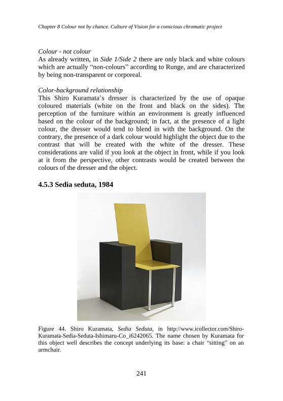
Chapter 8 Colour not by chance. Culture of Vision for a conscious chromatic project
241
Colour - not colour
As already written, in Side 1/Side 2 there are only black and white colours
which are actually “non-colours” according to Runge, and are characterized
by being non-transparent or corporeal.
Color-background relationship
This Shiro Kuramata’s dresser is characterized by the use of opaque
coloured materials (white on the front and black on the sides). The
perception of the furniture within an environment is greatly influenced
based on the colour of the background; in fact, at the presence of a light
colour, the dresser would tend to blend in with the background. On the
contrary, the presence of a dark colour would highlight the object due to the
contrast that will be created with the white of the dresser. These
considerations are valid if you look at the object in front, while if you look
at it from the perspective, other contrasts would be created between the
colours of the dresser and the object.
4.5.3 Sedia seduta, 1984
Figure 44. Shiro Kuramata, Sedia Seduta, in http://www.icollector.com/Shiro-
Kuramata-Sedia-Seduta-Ishimaru-Co_i6242065. The name chosen by Kuramata for
this object well describes the concept underlying its base: a chair “sitting” on an
armchair.
Color Design & Technology - A Multidisciplinary Approach to Colour – Part 2
242
In this chair by Shiro Kuramata yellow and black were used. The first one is
part of the six colours of the spectrum identified by Goethe and is one of the
three primary (fundamental) colours together with cyan and magenta (a
variety of purple).
Chiaroscuro
As in Side 1/Side 2, in Sedia Seduta it is possible to identify first of all the
chiaroscuro contrast again. The two colours used, yellow and black, have
different degrees of brightness: in fact, yellow has a high degree of
brightness, while black has the lowest brightness value: the combination of
colours with different degrees of brightness generates the chiaroscuro
contrast.
Quality contrast
Another one of Itten’s contrasts that can be observed in this work by
Kuramata is the quality contrast. Chromatic quality is the degree of purity
of colours, where purity means their degree of saturation. Quality contrast is
the contrast between intense, bright colours and other pale, dim ones. In
Sedia Seduta the contrast originates between yellow (bright and intense
colour) and black (dim colour).
Spatiality of colours
The object in question is characterized, as already written, by a two-toned
also characterizing it from the point of view of its shape and its solidity. The
(bright) yellow colour has been used by Kuramata in the backseat and in the
seat, which consist of a thin layer of material. The brightness of the colour
helps to accentuate the sense of lightness of this element. The two parts just
mentioned (yellow back and seat) are installed in a black parallelepiped.
The use of this colour (pale and dim) accentuates the heaviness and solidity
of the base part of Sedia Seduta.
Color - not color/light
In addition to yellow, black was used in the work in question, which is
considered a non-color by the German theorist. In this case, yellow is not
transparent as well as black, which Runge considered a corporeal colour,
that is devoid of transparency. In Sedia Seduta Kuramata used yellow,
which for Runge is one of the three existing colours together with red and
clear blue.
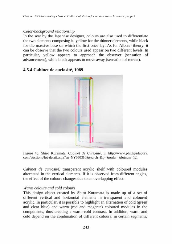
Chapter 8 Colour not by chance. Culture of Vision for a conscious chromatic project
243
Color-background relationship
In the seat by the Japanese designer, colours are also used to differentiate
the two elements composing it: yellow for the thinner elements, while black
for the massive base on which the first ones lay. As for Albers’ theory, it
can be observe that the two colours used appear on two different levels. In
particular, yellow appears to approach the observer (sensation of
advancement), while black appears to move away (sensation of retreat).
4.5.4 Cabinet de curiosité, 1989
Figure 45. Shiro Kuramata, Cabinet de Curiosité, in http://www.phillipsdepury.
com/auctions/lot-detail.aspx?sn=NY050310&search=&p=&order=&lotnum=12.
Cabinet de curiosité, transparent acrylic shelf with coloured modules
alternated in the vertical elements. If it is observed from different angles,
the effect of the colours changes due to an overlapping effect.
Warm colours and cold colours
This design object created by Shiro Kuramata is made up of a set of
different vertical and horizontal elements in transparent and coloured
acrylic. In particular, it is possible to highlight an alternation of cold (green
and clear blue) and warm (red and magenta) coloured modules in the
components, thus creating a warm-cold contrast. In addition, warm and
cold depend on the combination of different colours: in certain segments,
Color Design & Technology - A Multidisciplinary Approach to Colour – Part 2
244
magenta may arise an impression of cold if the adjacent colours are warm,
otherwise warm if the neighboring colours are cold.
Pure colours
By observing the shelf it is possible to identify a contrast of pure colours,
as the coloured acrylic elements with a greater degree of saturation are
combined in certain points. In fact, there are two types of combinations:
red with green and magenta with blue.
Degree of colour saturation
The alternating warm and cold colours in modules of different sizes can
cause different sensations based on the clarity of each single element: the
parts with a higher saturation level give an idea of a certain solidity, unlike
those with a lower level which almost seem to be crossed inside by a
liquid. Thanks to these characteristics, the shelf can exemplify two of the
seven contrasts by Goethe’s theory of colour: the contrast of quality and
quantity. In this case, the design object does not have its own well-defined
totality and integrity, it can appear as a dematerialized geometric shape to
an individual’s sight. Harmony can be created by the balanced ensemble of
the different alternating elements in different colours.
Complementary colours and harmonies
The shelf is characterized by the set of Goethe’s main “expressions” such
as yellow, blue, red and green, a term by which he defined colours. The
first three in particular are the three pure colours placed at the vertexes of
Goethe’s chromatic circle, while the green turns out to be a real mixing
colour between yellow and blue. This last colour creates a harmonic, that is
a diametrical composition when it is combined with magenta.
Light
The shelf features the only three existing colours according to Runge,
namely yellow, red and clear blue, interspersed with other defined mixing
colours, such as green and magenta, created by the transition from one pure
colour to another. These are in particular transparent colours, which,
according to Runge’s way of thinking, are most affected by the effect of
light that creates greater energy on them and from which it is reflected in a
more relevant way. In addition, the light (both natural and artificial)
involves the creation of different coloured shadows in the surrounding
environment, giving origin to a special effect makimg the design object
even more unique.
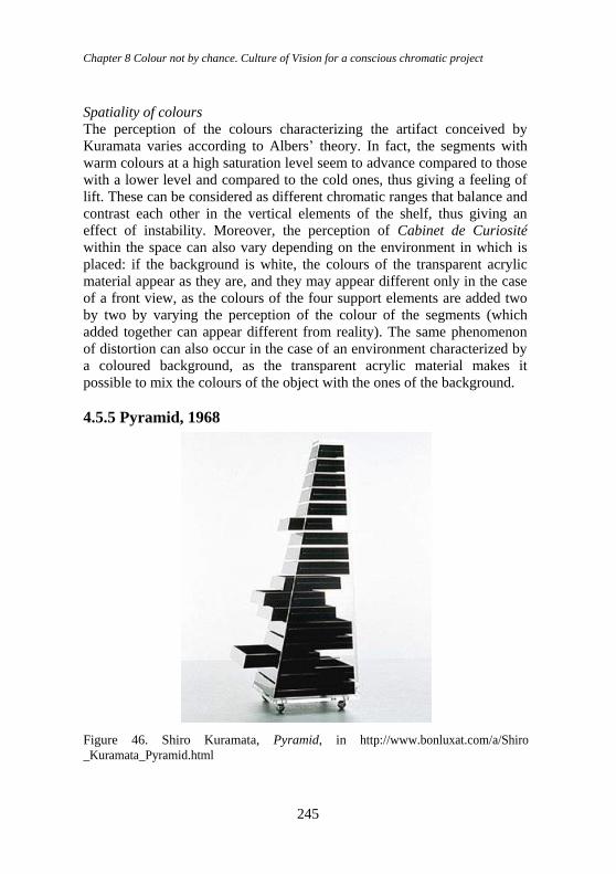
Chapter 8 Colour not by chance. Culture of Vision for a conscious chromatic project
245
Spatiality of colours
The perception of the colours characterizing the artifact conceived by
Kuramata varies according to Albers’ theory. In fact, the segments with
warm colours at a high saturation level seem to advance compared to those
with a lower level and compared to the cold ones, thus giving a feeling of
lift. These can be considered as different chromatic ranges that balance and
contrast each other in the vertical elements of the shelf, thus giving an
effect of instability. Moreover, the perception of Cabinet de Curiosité
within the space can also vary depending on the environment in which is
placed: if the background is white, the colours of the transparent acrylic
material appear as they are, and they may appear different only in the case
of a front view, as the colours of the four support elements are added two
by two by varying the perception of the colour of the segments (which
added together can appear different from reality). The same phenomenon
of distortion can also occur in the case of an environment characterized by
a coloured background, as the transparent acrylic material makes it
possible to mix the colours of the object with the ones of the background.
4.5.5 Pyramid, 1968
Figure 46. Shiro Kuramata, Pyramid, in http://www.bonluxat.com/a/Shiro
_Kuramata_Pyramid.html
Color Design & Technology - A Multidisciplinary Approach to Colour – Part 2
246
Pyramid. Dresser in transparent and black acrylic with a particular
pyramidal shape, defined by the shape of the individual drawers composing
it, placed in ascendancy.
Pure colour
The black colour represents the extreme chiaroscuro point of the vertex of
Itten’s chromatic star model. A phenomenon of proportional contrast may
occur in the event in which the black drawers are left open in a disorderly
manner, giving an effect of imbalance to the viewer who will be able to
distinguish the pyramid shape to a lesser extent.
Colour and non-colour
The Pyramid dresser is characterized by the black colour of the drawers
enclosed in a transparent casing. According to Runge’s theory, black is one
of those colours to be considered separately as “non-color”, like white, in
this case brought to the minimum level of saturation. In fact, the total
transparency represents the total dematerialization of the external cladding.
Gestalt laws
The design object arises a never unitary perception of form at the sight of
the observer. In fact, Pyramid is characterized by a unique structure in
transparent acrylic, in which the black drawers of decreasing shape are
placed from top to bottom, spaced from each other by a few cm. The
singular pyramidal shape can be perceived when there is the “total” closure
of the individual elements defining its shape, thanks to the Gestalt law of
closure, according to which the visual system associates the character of
objectivity with the closed form, assigning it meaning independently of
whether it is known or not. The recognition of the geometric shape can also
take place thanks to the experience law, according to which experience is
decisive in the perceptual organization under certain spatial conditions, as
completions the missing parts are solicited in the visual field and the
recognition of data already settled in memory is facilitated.
Degree of colour saturation
Pyramid is a dresser characterized by the presence of two non-colours:
black and white. The first is at the maximum level of saturation, it
constitutes the central body of the transparent casing that emerges in a
particular way, which can be considered as white in the state of minimum
saturation.
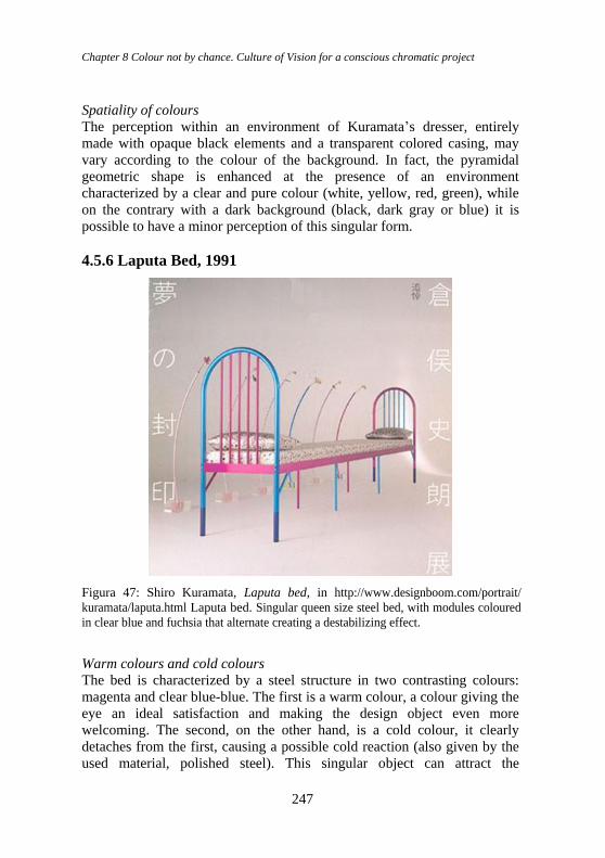
Chapter 8 Colour not by chance. Culture of Vision for a conscious chromatic project
247
Spatiality of colours
The perception within an environment of Kuramata’s dresser, entirely
made with opaque black elements and a transparent colored casing, may
vary according to the colour of the background. In fact, the pyramidal
geometric shape is enhanced at the presence of an environment
characterized by a clear and pure colour (white, yellow, red, green), while
on the contrary with a dark background (black, dark gray or blue) it is
possible to have a minor perception of this singular form.
4.5.6 Laputa Bed, 1991
Figura 47: Shiro Kuramata, Laputa bed, in http://www.designboom.com/portrait/
kuramata/laputa.html Laputa bed. Singular queen size steel bed, with modules coloured
in clear blue and fuchsia that alternate creating a destabilizing effect.
Warm colours and cold colours
The bed is characterized by a steel structure in two contrasting colours:
magenta and clear blue-blue. The first is a warm colour, a colour giving the
eye an ideal satisfaction and making the design object even more
welcoming. The second, on the other hand, is a cold colour, it clearly
detaches from the first, causing a possible cold reaction (also given by the
used material, polished steel). This singular object can attract the
Color Design & Technology - A Multidisciplinary Approach to Colour – Part 2
248
observer’s attention at the sight thanks to the alternation of the two colours
characterizing the structure of this piece of furniture, which creates an
effect of disorder involving and destabilized perception by the subject who
is observing it, due to the continuous alternation of clear blue and magenta
between the two headboards and the bed supports.
Complementary colours and harmonies
Laputa Bed is characterized by two colours among the main ones identified
by Goethe, magenta and blue, which constitute two of the vertexes of the
triangle of primary colours inscribed in the chromatic circle. In particular, a
chromatic intensification effect can be created, as the clear blue intensifies
into the magenta if the turbidity is attenuated.
Spatiality of colours
The colour of the space in which the bed designed by Kuramata is placed
can influence the perception by the observer. In fact, if the background is a
warm colour such as red-orange and magentas, the parts of the steel
structure of the bed that can emerge in a particular way are those in blue;
vice versa, if the background is characterized by cold colours, the opposite
phenomenon can occur. If, on the other hand, the background is white then
the two previously mentioned colours are in balance and at the same time
in clear contrast. In the latter case, it is the silk textile complement that can
be “uniformed” and it can emerge in a small way from the background,
thanks to the white colour with a texture reminiscent of the star piece
terrace created by the designer.
5. Colour as language, sign and symbol: significant semiotic
and signify semiotic The partial conclusions we have reached in the previous chapters direct us
to some considerations, if not confirmations. In the case of Kuramata, for
example, we have had precise results with respect to the laws, criteria and
parameters derived from the theories he privileged, freely applied,
therefore within the absence of uncritical automatisms. On the contrary, we
have observed how the applications of these laws from the emerged
theories, have been enriched by crossing with other aspects.
The same can be said above all for some themes in the field of Liberty and
Futurist graphics that we have proposed: in this case too, we have been able
to find correspondences, without rigid and sterile automatisms: therefore,
chromatic theories can be considered (if we do not want to strictly apply all
their decrees) as a direction and orientation, both in the application for
Chapter 8 Colour not by chance. Culture of Vision for a conscious chromatic project
249
analysis and design, as well as to broaden, deepen and articulate our
knowledge (our reflections) on chromatic culture.
Now, considering the breadth and numerousness of the comparative
theories in the synoptic table of figure 20, we can ask other questions, such
as: “is it possible for theories to find proofs of the way of thinking and the
visual mode that can be derived from the theories of colour, even in other
historical periods than those we have examined so far?”. The answer is
positive, if we cross (for example) the “chromatic way of thinking” (and
the related practice) to the artistic theories in Italy, from Renaissance to
Mannerism.
But to those questions, we can add an even more complex one: “it is
possible to use colour within Significant and/or Signified Semiotics (as we
have indicated in the Classification of the Sign, on p. 21) precisely to
confirm its symbolic and significant function?
5.1 An effective link in the art of persuasion: rhetoric and
“chromatic image” in the Semiotics of Vision To confirm this, in the Sixteenth century for example, the Counter-
Reformation set the goal - in the Jesuit “rhetorical way” - of also visually
regulating art and architecture, according to strategies planned and inspired
by figures such as Ignazio di Loyola (with the Jesuit Society), to oppose the
French Reform. The precise attention paid by religious institutions to
architecture and art was complemented by a similar attention paid - by
contemporary leading figures - to colour and its theories: among many,
Jesuit theorists of colour emerged, such as Athanasius Kircher and François
d’Aguilon. Among the protagonists of the Council of Trent (and therefore
later), the Culture of Vision - in the treatises following the Council of Trent
- confirmed the importance of colours. In his treatise Gabriele Paleotti
(1522-1597) (Paleotti, 1582) defined painting, “as a popular book, capable
of any material, be it sky or earth, animals or plants, or human actions of
whatever kind, which requires that the painter […], at least mediocre or not
lack of competence at all”. While chap. XII prescribed to avoid “profane
images [...] with large masses of gold [...]” while “natural, figured and
vividly coloured things [...] give us the true news (scientific, NDR) without
which we are in difficulties and darkness of various things”. While in the
De pictura sacra (1624) Federico Borromeo (1564-1631), Carlo’s cousin,
theologian and very young cardinal, prominent figure, lover of science,
admirer of Galileo, spoke explicitly about colour in chap. XI: “The painter
needs piety above all: “Colours are almost words that, perceived with the
eyes, penetrate the soul no less than the voices perceived by the ears [...], so
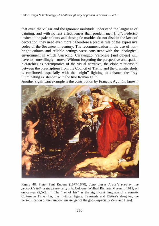
Color Design & Technology - A Multidisciplinary Approach to Colour – Part 2
250
that even the vulgar and the ignorant multitude understand the language of
painting, and with no less effectiveness than prudent men […]”. Federico
insited: “the pale colours and these pale marbles do not disdain the laws of
decoration, they need even more”: therefore a precise rule of the expressive
codes of the Seventeenth century. The recommendation in the use of non-
bright colours and reliable settings were consistent with the ideological
environment in which Carraccio, Caravaggio, Veronese (and others) will
have to - unwillingly - move. Without forgetting the perspective and spatial
hierarchies as peremptories of the visual narrative, the close relationship
between the prescriptions from the Council of Trento and the dramatic shots
is confirmed, especially with the “night” lighting to enhance the “ray
illuminating existence” with the true Roman Faith.
Another significant example is the contribution by François Aguilón, known
Figure 48. Pieter Paul Rubens (1577-1640), Juno places Argus’s eyes on the
peacock’s tail, at the presence of Iris. Cologne, Wallraf Richartz Museum, 1611, oil
on canvas (2,5x3 m). The “ray of Iris” as the significant language of chromatic
Culture in Time (Iris, the mythical figure, Taumante and Elettra’s daughter, the
personification of the rainbow, messenger of the gods, especially Zeus and Hera).
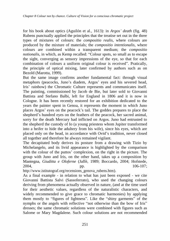
Chapter 8 Colour not by chance. Culture of Vision for a conscious chromatic project
251
for his book about optics (Aguilón et al., 1613): in Argos’ death (fig. 48)
Rubens punctually applied the principles that the treatise set out in the three
types of mixtures of colours: the compositio realis, where colours are
produced by the mixture of materials; the compositio intentionalis, where
colours are combined within a transparent medium; the compositio
notionalis, in which, as Kemp recalled: “Colour spots, so small as to escape
the sight, converging as sensory impressions of the eye, so that for each
combination of colours a uniform original colour is received”. Pratically,
the principle of optical mixing, later confirmed by authors such as on
Bezold (Marotta, 1999).
But the same image confirms another fundamental fact: through visual
metaphors (peacocks, Juno’s diadem, Argos’ eyes and his severed head,
Iris’ rainbow) the Chromatic Culture represents and communicates itself.
The painting, commissioned by Jacob de Bie, but later sold to Giovanni
Battista and Stefano Balbi, left for England in 1806 and it is now in
Cologne. It has been recently restored for an exhibition dedicated to the
years the painter spent in Genoa, it represents the moment in which Juno
places Argos’ eyes on the peacock’s tail. The goddes prepares to place the
shepherd’s hundred eyes on the feathers of the peacock, her sacred animal,
sorry for the death Mercury had inflicted on Argos. Juno had entrusted to
the shepherd the custody of Io (a young priestess whom Jupiter transformed
into a heifer to hide the adultery from his wife), since his eyes, which are
placed only on the head, in accordance with Ovid’s tradition, never closed
all together and therefore he always remained vigilant.
The decapitated body derives its posture from a drawing with Tizio by
Michelangelo, and its livid appearance is highlighted by the comparison
with the colour of the puttos’ complexion, on the right in the picture. The
group with Juno and Iris, on the other hand, takes up a composition by
Mantegna, Giuditta e Oloferne (Jaffè, 1989; Boccardo, 2004; Hofstede,
2004, pp. 106-107;
http://www.istitutograf.org/recensions_genova_rubens.htm).
As a final example - in relation to what has just been exposed - we cite
Giovanni Battista Salvi (Sassoferrato), who used the changing colours
deriving from phenomena actually observed in nature, (and at the time used
for their aesthetic values, regardless of the naturalistic characters, and
widely recommended to give grace to chromatic harmonies) by applying
them mostly to “figures of lightness”. Like the “shiny garments” of the
nymphs or the angels with reflective “not otherwise than the bow of Iris”
dresses; the same chromatic solutions were combined with figures such as
Salome or Mary Magdalene. Such colour solutions are not recommended
Color Design & Technology - A Multidisciplinary Approach to Colour – Part 2
252
for the Virgin or for other highly respected figures according to him,
confirming an ancient rule in use: in analogy with symbolic purposes, less
so with the science of nature. Between the Sixteenth and the Seventeenth
century, therefore, it is confirmed how history and theory of colour
contributed to build the one of cultural way of thinking.
5.1.1 The Culture of Vision in the theology of the Jesuit Society.
Communication and persuasion of the theories by Sant’Ignazio di
Loyola. The Jesuit “theatre”
The composition should be read as the focal point of a complex whole,
made up of the entire space of the chapel, where the baroque genius makes
manifest the concept of the “beautiful assembled”, that is the thematic and
visual unity between architecture, sculpture, painting and decoration.
Bernini took up the theological meaning due to the suggestions of the
Venetian nobleman: the dedication to the reformer saint of the Carmelite
Order is associated with the celebration of the Corner family with the seven
cardinals (including Federico and Doge Giovanni who are buried there, the
latters long dead). They are depicted here as living, in conversation with
each other and facing from choirs and boxes, beyond which it is possible to
see majestic architectures in an illusory perspective, converging towards the
altar of the chapel. The illusionistic game between real and unreal involves
all categories: place, space, human time and divine time.
While recalling Bernini’s consummate experience as a set designer and
author of theatrical machines, it is good to underline that the spectacular
nature of Bernini’s highly cultivated art is not a mere “artifice”, adapting
perfectly to the religious content in that need for persuasion - conformed to
the meaning - that the theatre of the Jesuits expressed by a linguistic system
that indiscriminately blends all artistic techniques in an integral and total
vision of art. In this work from his maturity, Gian Lorenzo Bernini managed
to effectively achieve one of the basic objectives of his research: to
implement, through the integration of the arts, a new lyrical synthesis
between vision and emotions. Man overcomes his human limitations, only
by voluntarily opening to God.
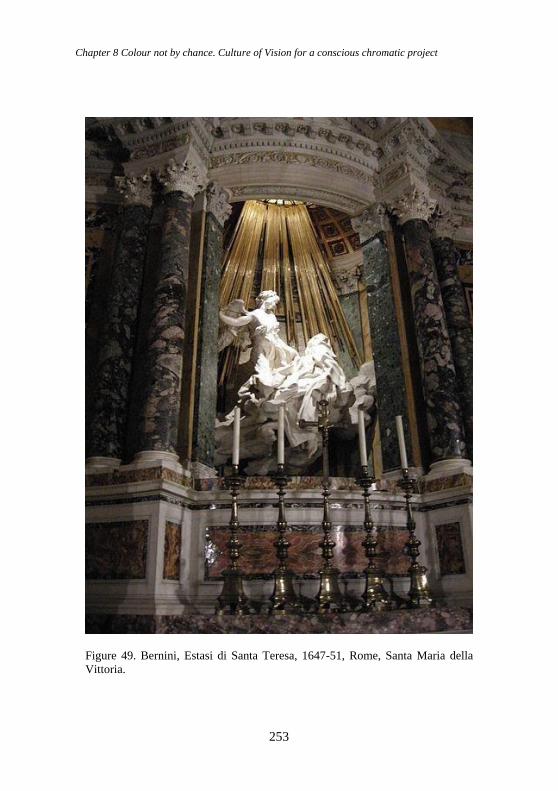
Chapter 8 Colour not by chance. Culture of Vision for a conscious chromatic project
253
Figure 49. Bernini, Estasi di Santa Teresa, 1647-51, Rome, Santa Maria della
Vittoria.
Color Design & Technology - A Multidisciplinary Approach to Colour – Part 2
254
5.2 From the Counter-Reformation to the Nouvelle Rhétorique:
from the relationship between signifier and signified, to the
relationship between expression level and content level In the relationship between the signified and the signifier, what can the role
of colour as language and “chromatic image” be? To move towards a
semiotic translation of the role of colour as a “chromatic image”, some
preliminary concepts are indispensable.
We have observed how (paragraphs 3.2 and 3.2.1) the image (including
colour) is included by many Authors in the third category in the
classification of the sign: the one of analogical or iconic signs: therefore,
among the most complex, versatile and full of meanings. In reality, with
regard to visual (and chromatic) communication, it is hardly necessary to
reiterate how what appears to be a mere “natural” perception, derived from
immediate reactions of our sensory apparatus, is actually “the most
theoretical of the senses” (Napolitano Valditara, 1994) to be considered, if
not precisely as an “exact science”, certainly through “logical” and clear
disciplinary rules.
But, as in all types of communication, an indispensable aspect is constituted
by signification: therefore, together with the control of scientific and
technical approaches, also the one of the means of expression or content
(cultural, artistic, emotional), appears fundamental, linear with what is
proposed (for example) by figures such as Algirdas Julien Greimas, by the
Groupe μ from Liège and by the school of the Nouvelle Rhétorique, or by
Hjelmslev and Perelman (Greimas, 2002; Hjelmslev, 1999; Perelman,
Olbrechts-Tyteca, 1958). By Louis Hjelmslev in fact, the distinction
between signified and signifier is broadened and articulated: the signified
(insensitive) becomes the “content level”, while the signifier (sensitive and
therefore communicable) becomes the “expression level”. Both “levels” are
structured and organized no longer through “simple” sign units, but through
whole semiotics (we assume here the term “semiotics” with the meaning by
De Saussure, as a “science of signs”, which tends to an overall and general
analysis of the mechanisms underlying knowledge, communication,
languages and all human activities understood as languages. Examples of
semiotics: mythology, flowers, others.
Hjelmslev again called “connotative semiotics” those whose expression
level is a semiotic, and instead called “metasemiotics” those in which the
content level is a semiotic, in analogy - it seems - with the term
“metalanguage”, when it contains in itself a part of the message content. But
how is a transfer of this (even rhetorical) approach possible into the
language of vision? The Trattato del segno visivo (Migliore, 2007) laid the
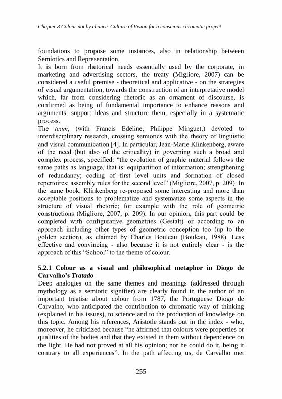
Chapter 8 Colour not by chance. Culture of Vision for a conscious chromatic project
255
foundations to propose some instances, also in relationship between
Semiotics and Representation.
It is born from rhetorical needs essentially used by the corporate, in
marketing and advertising sectors, the treaty (Migliore, 2007) can be
considered a useful premise - theoretical and applicative - on the strategies
of visual argumentation, towards the construction of an interpretative model
which, far from considering rhetoric as an ornament of discourse, is
confirmed as being of fundamental importance to enhance reasons and
arguments, support ideas and structure them, especially in a systematic
process.
The team, (with Francis Edeline, Philippe Minguet,) devoted to
interdisciplinary research, crossing semiotics with the theory of linguistic
and visual communication 4. In particular, Jean-Marie Klinkenberg, aware
of the need (but also of the criticality) in governing such a broad and
complex process, specified: “the evolution of graphic material follows the
same paths as language, that is: equipartition of information; strengthening
of redundancy; coding of first level units and formation of closed
repertoires; assembly rules for the second level” (Migliore, 2007, p. 209). In
the same book, Klinkenberg re-proposed some interesting and more than
acceptable positions to problematize and systematize some aspects in the
structure of visual rhetoric; for example with the role of geometric
constructions (Migliore, 2007, p. 209). In our opinion, this part could be
completed with configurative geometries (Gestalt) or according to an
approach including other types of geometric conception too (up to the
golden section), as claimed by Charles Bouleau (Bouleau, 1988). Less
effective and convincing - also because it is not entirely clear - is the
approach of this “School” to the theme of colour.
5.2.1 Colour as a visual and philosophical metaphor in Diogo de
Carvalho’s Tratado
Deep analogies on the same themes and meanings (addressed through
mythology as a semiotic signifier) are clearly found in the author of an
important treatise about colour from 1787, the Portuguese Diogo de
Carvalho, who anticipated the contribution to chromatic way of thinking
(explained in his issues), to science and to the production of knowledge on
this topic. Among his references, Aristotle stands out in the index - who,
moreover, he criticized because “he affirmed that colours were properties or
qualities of the bodies and that they existed in them without dependence on
the light. He had not proved at all his opinion; nor he could do it, being it
contrary to all experiences”. In the path affecting us, de Carvalho met
Color Design & Technology - A Multidisciplinary Approach to Colour – Part 2
256
Humboldt, already Friedrich von Schiller’s friend, but above all Goethe, a
key figure in Diogo’s experience towards the Culture of Colour, which he
faced and lived at 360 degrees (Marotta, 2020 ). Certainly, one can agree on
the “romantic” character of their - shared - approachs to life and to the
knowledge of time. Diogo programmatically linked the literary sphere to the
chromatic culture, also expressed through strongly and programmatically
chromatic visual metaphors. This is what happened when he convicingly
stated: “The most famous poets will all fall, in the admirable and beautiful
phenomenon of the celestial arc, in their metric compositions”. Omero
attributed to it the colour of gold: [p. 148] Ιριν δ᾽οτρυνε χρυσοπτερον
αγγελεουσαν “, (Iliad, lib. XI, 185). Probably, also for their characteristics
of iridescent polychromy, Diogo maintained that “The neck of the dove and
the tail of the peacock are beautiful objects, which must be sung even by the
best poets”. Lucretius depicted them as follows: “Pluma Columbarum quo
pacto in Sole videtur: Quae sita cervices circum, collum que coronat (Lib.
II. De Rer. Nat) [p. 149] (XXII. §. 49)”. Keeping on, Diogo recalled other
chromatic examples, between Vision and Literature: “Tasso, perhaps
imitating this beautiful original (by Lucretius NdA), depicted the same
phenomena of colours, in the feathers of the dove and the peacock
(Gerusalemme Liberata, Cant. XV .5. [p. 149])”. And Virgilio mentioned
the peacock in his Metamorfosi too, according to De Carvalho: “offers you
a thousand colours in his verses of the Aeneid”, as a metaphor for vision.
Let’s not forget that, on the same theme, Pieter Paul Rubens realized one of
the most important and significant paintings from Virgil’s Metamorfosi,
representing the peacock with its tail as a metaphor for vision, specifically
the chromatic one; not surprisingly, the painter had already collaborated for
a long time with François d’Aguilòn for the illustrations of Opticorum libri
sex. Again regarding the observation about colour in nature - between
science, art and poetry - Diogo also referred to Milton (Book VII, Lost
Paradise), who exalted all the plants which (leaving the hand of the
Creator) decorate the Earth (naked before the Creation) in the prevailing
and pleasant Colour of Green.
5.2.2 Colour in Significant Semiotics (ALPHA Group) Actualizing the discourse anticipated by De Carvalho and other treatise
writers, it may be legitimate to ask a question here: “how can colour be
significant through the concept of chromatic image?”. But what definition
of image can we assume for our communication purposes? According to
many scholars (Floch, Groupe μ, Arnheim, Damish), it can be understood as
a complex of significant elements, that is as a text. It can express complex
Chapter 8 Colour not by chance. Culture of Vision for a conscious chromatic project
257
conceptual models, even in purely visual terms. Therefore, if we come back
- albeit in non-rigorous terms - to the classification of the sign in the
Semiotic of Vision, within this we can resume the category of analogical or
iconic signs (that is those given by formal similarity and/or cultural and
social relationship), also deep in the visual, perceptive, chromatic ways.
Definition of image and classification of sign:
CONTENT LEVEL AND EXPRESSION LEVEL
sign as to the sign as SIGNIFIER + SIGNIFICANCE EXPRESSION LEVEL + CONTENT
LEVEL (with ‘dedicated’ semiotics)
By Groupe μ and Louis Hjelmslev,
the distinction is:
Content level Expression level
= significance =
Ideas awakend by a sign
= signifier =
Material manifestatione of a sign
They presuppose the
attribution of a
subjective and/or
collective value and
therefore a critical
interpretation
ICON
IMAGE
DIAGRAM
Logical,
mathematical,
chemical formulas,
drawing
METAPHOR
SYMBOL
NATURAL
ANTHROPOLOGICAL
OBJECT-SYMBOL
Color Design & Technology - A Multidisciplinary Approach to Colour – Part 2
258
We can therefore define:
connotative semiotics those whose expression level is a semiotic
metasemiotics those in which the content level is a semiotic
Assuming the Mythology as semiotic signifier then, an answer to the
question posed previously can be expressed through the image of
Botticelli’s Venus: since she hides her sexuality with her long hair, alluded
(through a rhetorical preterition) by the shape of the hair itself, in a way that
seems ambiguous.
Everything leads back to the principle that the nakedness of Venus is not
only an exaltation of classical beauty, but also an affirmation of pure
beauty, of the simplicity of soul. Among the hidden meanings of Venus
there is also the correspondence between the pagan myth of the birth of the
water goddess and the baptism. The life given by the Zephyrs and the
clothing offered by Ora are nothing but personifications of the principles of
physicality and spirituality, poles at the centre of which Venus stands as a
symbol of balance. In the union of opposites represented by the Goddess,
we recall the essential principle of complementarity, in life and in love, of
physical experience and spiritual ascent, here identifiable with the elevation
of the intellect to the knowledge of the true, of the good, of the just. Venus
is placed at the centre of the scene, and represents the sacred and human
principle of divine and earthly love, of the purity of the soul, of rebirth.
To her right the group formed by Zephyr and Clori. Zephyr is the image of
the fecundating wind “bearer of life”, from which life originates; Clori
represents the physicality of the loving act.
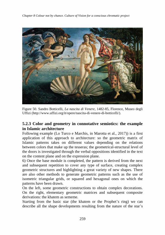
Chapter 8 Colour not by chance. Culture of Vision for a conscious chromatic project
259
Figure 50. Sandro Botticelli, La nascita di Venere, 1482-85, Florence, Museo degli
Uffizi (http://www.uffizi.org/it/opere/nascita-di-venere-di-botticelli/).
5.2.3 Color and geometry in connotative semiotics: the example
in Islamic architecture Following example (Lo Turco e Marchis, in Marotta et al., 2017)) is a first
application of this approach to architecture: so the geometric matrix of
Islamic patterns takes on different values depending on the relations
between colors that make up the tesseras; the geometrical-structural level of
the doors is investigated through the verbal oppositions identified in the text
on the content plane and on the expression plane.
6) Once the base module is completed, the pattern is derived from the next
and subsequent repetition to cover any type of surface, creating complex
geometric structures and highlighting a great variety of new shapes. There
are also other methods to generate geometric patterns such as the use of
isometric triangular grids, or squared and hexagonal ones on which the
patterns have been drawn.
On the left, some geometric constructions to obtain complex decorations.
On the right, elementary geometric matrices and subsequent composite
derivations: the khatem as sememe.
Starting from the basic star (the khatem or the Prophet’s ring) we can
describe all the shape developments resulting from the nature of the star’s
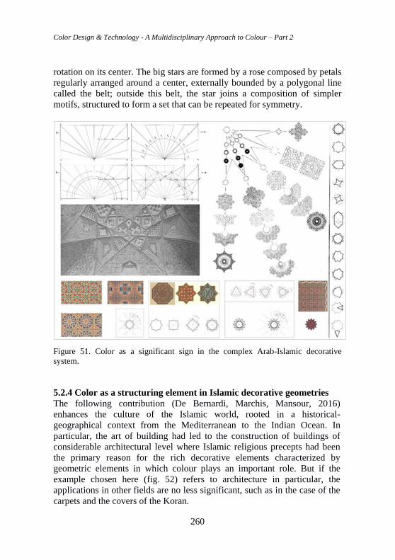
Color Design & Technology - A Multidisciplinary Approach to Colour – Part 2
260
rotation on its center. The big stars are formed by a rose composed by petals
regularly arranged around a center, externally bounded by a polygonal line
called the belt; outside this belt, the star joins a composition of simpler
motifs, structured to form a set that can be repeated for symmetry.
Figure 51. Color as a significant sign in the complex Arab-Islamic decorative
system.
5.2.4 Color as a structuring element in Islamic decorative geometries
The following contribution (De Bernardi, Marchis, Mansour, 2016)
enhances the culture of the Islamic world, rooted in a historical-
geographical context from the Mediterranean to the Indian Ocean. In
particular, the art of building had led to the construction of buildings of
considerable architectural level where Islamic religious precepts had been
the primary reason for the rich decorative elements characterized by
geometric elements in which colour plays an important role. But if the
example chosen here (fig. 52) refers to architecture in particular, the
applications in other fields are no less significant, such as in the case of the
carpets and the covers of the Koran.
Chapter 8 Colour not by chance. Culture of Vision for a conscious chromatic project
261
As Elena Marchis notes, “Nor should it be forgotten that, if on one hand the
Muslim religion has banned the portray of human figures in order not to
give space to idolatry, on the other hand the chemistry of materials and in
particular the techniques of fusion of glassy materials and firing ceramic
materials, offered to the Islamic architects unknown potential in both Greek
and Roman world. But the Islamic world is and remains a polychrome
world because Allah “created all things on Earth for you with different
colours. In truth, there is a sign in it for people who remember.” (Koran,
Sura 16, 13)”.
Speaking about decorative patterns, colour and geometry, De Bernardi
argued, in particular, that it is difficult to talk about Islamic decoration
without considering the theme of “Symmetry” and “Colour”, as well as the
effect that colour has in underlining or in inhibit the perception of
symmetries in decorations in general, especially for floor and wall
decorations. Exactly symmetry - a geometric condition (particularly
fascinating and solidly innate in the human being) - is enhanced by
immersing in the colour (De Bernardi, Marchis, Mansour, 2016).
At this point it is also necessary to introduce the symmetry of translation,
that is the overlap of the figures with their simple translation. Ultimately,
by highlighting the axes with red and blue, we are faced with 6+6 reflection
symmetries, 4+4 rotation symmetries and 4 translation symmetries
(horizontal, vertical, left diagonal and right diagonal). Others can even be
discovered (4 glissosymmetries), as we will see later.
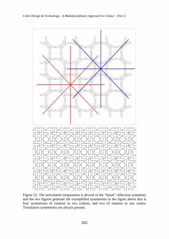
Color Design & Technology - A Multidisciplinary Approach to Colour – Part 2
262
Figure 52. The articulated composition is devoid of the “banal” reflection symmetry
and the two figures generate the exemplified symmetries in the figure above that is
four symmetries of rotation in two centres, and two of rotation in one centre.
Translation symmetries are always present.
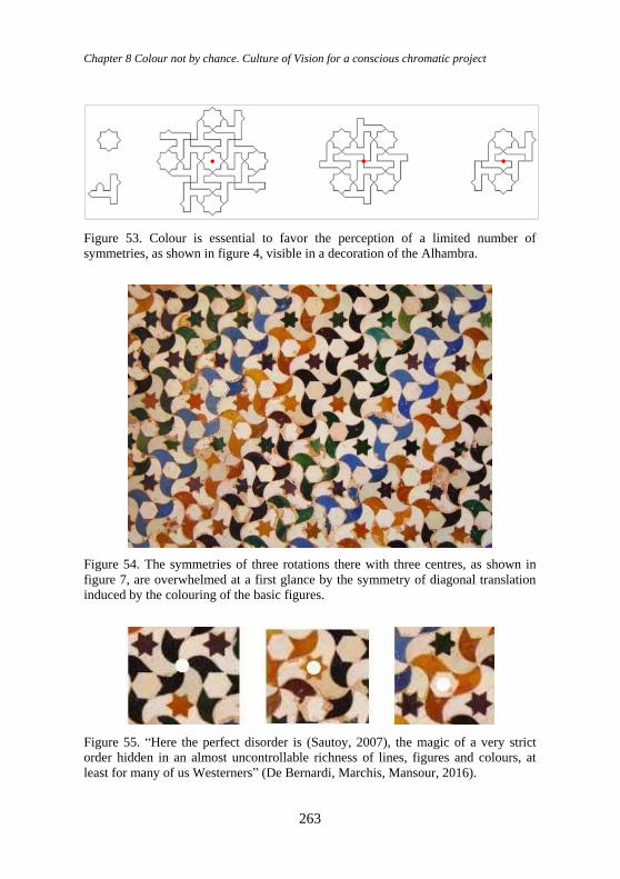
Chapter 8 Colour not by chance. Culture of Vision for a conscious chromatic project
263
Figure 53. Colour is essential to favor the perception of a limited number of
symmetries, as shown in figure 4, visible in a decoration of the Alhambra.
Figure 54. The symmetries of three rotations there with three centres, as shown in
figure 7, are overwhelmed at a first glance by the symmetry of diagonal translation
induced by the colouring of the basic figures.
Figure 55. “Here the perfect disorder is (Sautoy, 2007), the magic of a very strict
order hidden in an almost uncontrollable richness of lines, figures and colours, at
least for many of us Westerners” (De Bernardi, Marchis, Mansour, 2016).
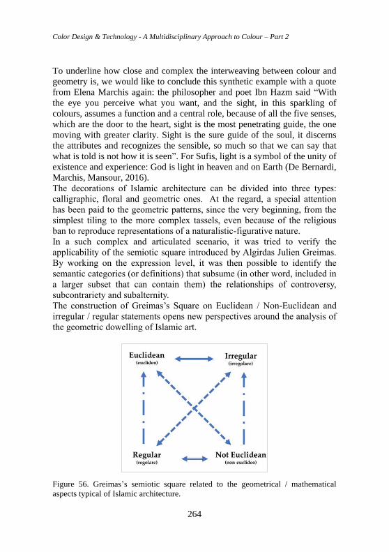
Color Design & Technology - A Multidisciplinary Approach to Colour – Part 2
264
To underline how close and complex the interweaving between colour and
geometry is, we would like to conclude this synthetic example with a quote
from Elena Marchis again: the philosopher and poet Ibn Hazm said “With
the eye you perceive what you want, and the sight, in this sparkling of
colours, assumes a function and a central role, because of all the five senses,
which are the door to the heart, sight is the most penetrating guide, the one
moving with greater clarity. Sight is the sure guide of the soul, it discerns
the attributes and recognizes the sensible, so much so that we can say that
what is told is not how it is seen”. For Sufis, light is a symbol of the unity of
existence and experience: God is light in heaven and on Earth (De Bernardi,
Marchis, Mansour, 2016).
The decorations of Islamic architecture can be divided into three types:
calligraphic, floral and geometric ones. At the regard, a special attention
has been paid to the geometric patterns, since the very beginning, from the
simplest tiling to the more complex tassels, even because of the religious
ban to reproduce representations of a naturalistic-figurative nature.
In a such complex and articulated scenario, it was tried to verify the
applicability of the semiotic square introduced by Algirdas Julien Greimas.
By working on the expression level, it was then possible to identify the
semantic categories (or definitions) that subsume (in other word, included in
a larger subset that can contain them) the relationships of controversy,
subcontrariety and subalternity.
The construction of Greimas’s Square on Euclidean / Non-Euclidean and
irregular / regular statements opens new perspectives around the analysis of
the geometric dowelling of Islamic art.
Figure 56. Greimas’s semiotic square related to the geometrical / mathematical
aspects typical of Islamic architecture.
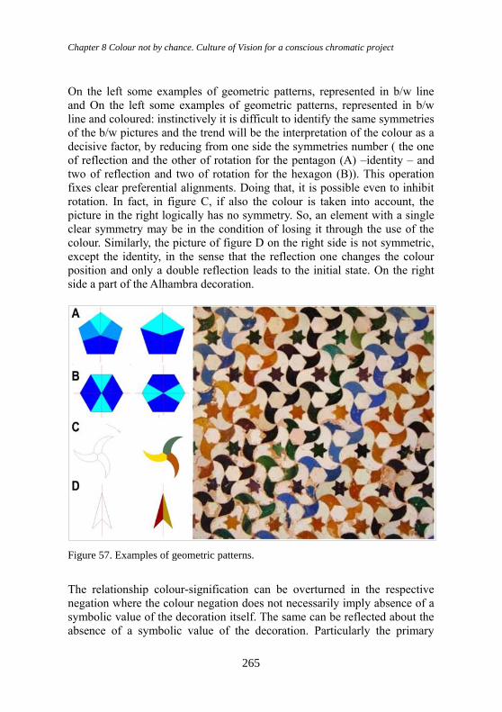
Chapter 8 Colour not by chance. Culture of Vision for a conscious chromatic project
265
On the left some examples of geometric patterns, represented in b/w line
and On the left some examples of geometric patterns, represented in b/w
line and coloured: instinctively it is difficult to identify the same symmetries
of the b/w pictures and the trend will be the interpretation of the colour as a
decisive factor, by reducing from one side the symmetries number ( the one
of reflection and the other of rotation for the pentagon (A) –identity – and
two of reflection and two of rotation for the hexagon (B)). This operation
fixes clear preferential alignments. Doing that, it is possible even to inhibit
rotation. In fact, in figure C, if also the colour is taken into account, the
picture in the right logically has no symmetry. So, an element with a single
clear symmetry may be in the condition of losing it through the use of the
colour. Similarly, the picture of figure D on the right side is not symmetric,
except the identity, in the sense that the reflection one changes the colour
position and only a double reflection leads to the initial state. On the right
side a part of the Alhambra decoration.
Figure 57. Examples of geometric patterns.
The relationship colour-signification can be overturned in the respective
negation where the colour negation does not necessarily imply absence of a
symbolic value of the decoration itself. The same can be reflected about the
absence of a symbolic value of the decoration. Particularly the primary
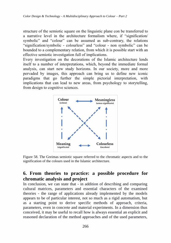
Color Design & Technology - A Multidisciplinary Approach to Colour – Part 2
266
structure of the semiotic square on the linguistic plane con be transferred to
a narrative level in the architecture formalism where, if “signification/
symbolic” and “colour” can be assumed as sub-contrary, the relations
“signification/symbolic - colourless” and “colour - non symbolic” can be
bounded to a complementary relation, from which it is possible start with an
effective semiotic investigation full of implications.
Every investigation on the decorations of the Islamic architecture lends
itself to a number of interpretations, which, beyond the immediate formal
analysis, can start new study horizons. In our society, more and more
pervaded by images, this approach can bring us to define new iconic
paradigms that go further the simple pictorial interpretation, with
implications that can lead to new areas, from psychology to storytelling,
from design to cognitive sciences.
Figure 58. The Greimas semiotic square referred to the chromatic aspects and to the
signification of the colours used in the Islamic architecture.
6. From theories to practice: a possible procedure for
chromatic analysis and project In conclusion, we can state that - in addition of describing and comparing
cultural matrices, parameters and essential characters of the examined
theories - the range of applications already implemented by the models
appears to be of particular interest, not so much as a rigid automatism, but
as a starting point to derive specific methods of approach, criteria,
parameters, even in concrete and material experiments. In a dimension thus
conceived, it may be useful to recall how is always essential an explicit and
reasoned declaration of the method approaches and of the used parameters,
Chapter 8 Colour not by chance. Culture of Vision for a conscious chromatic project
267
considered the most appropriate for the purposes of scientific
investigations. Just as it can be a tool to settle the choices in the analysis
and in the interrogation of sources. In the essential phases, basic criteria and
parameters must be established on the basis of the project objectives and
the required frameworks, keeping in mind the relationship between “text
and context”.
6.1 Methods, criteria, parameters for analysis and project. A
“model” for the applications In this sense, a hypothesis already launched, presented on the occasion of
the preliminary woorkshop at the Colour Conference in Geona in 2014
(Marotta, 2014) focused the attention - more than on technical parameters -
on elements and factors, including the psychological ones, historical or
more generally cultural, which come into play. Among these parameters,
two classes have been identified, which can be placed in a reciprocal
relationship, according to specific needs: the first includes those most
closely related to the example subject of analysis and/or intervention,
precisely understood (Application example, sampling; Analysis and/or
project objectives; Conventions chosen; Dictionary; Significant parameters;
Comparable examples; Biographies/ sources). The second class of
parameters collects aspects of a more general nature (Historical,
geographical and cultural context; Contents and symbolic values; Physio-
psychological phenomena, controllable or applicable; Recognisable or
applicable materials and technologies; Colour as light; Colour as pigment;
Movements, theories, cultural and artistic protagonists of specific reference:
matrices).
It is obvious that the path and the intertwining of the proposed “items”
should not be strictly addressed in all its parts: it is possible to select only a
few, in order to deduce further ideas towards new orientations and
completions, for analysis and project.
It will be interesting to verify if by following this path over time and
experience, we will be able to obtain useful and clear answers (also
representative and significant, depending on the various parameters
selected) which may be different, depending on the different chosen and
consulted sources, just as it will be possible to evaluate the effectiveness of
these criteria, also in connection with existing theories and models,
confirmed as a moment of deep knowledge. Knowledge as a true and
indispensable parameter of a conscious project.
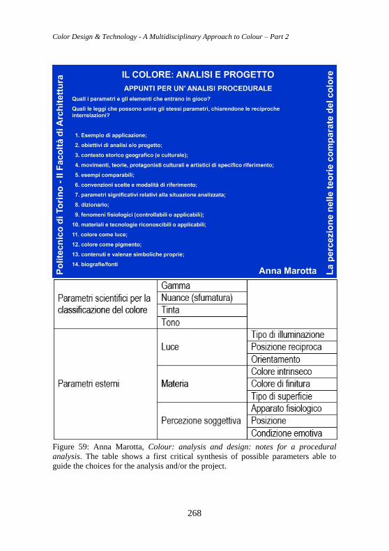
Color Design & Technology - A Multidisciplinary Approach to Colour – Part 2
268
Figure 59: Anna Marotta, Colour: analysis and design: notes for a procedural
analysis. The table shows a first critical synthesis of possible parameters able to
guide the choices for the analysis and/or the project.
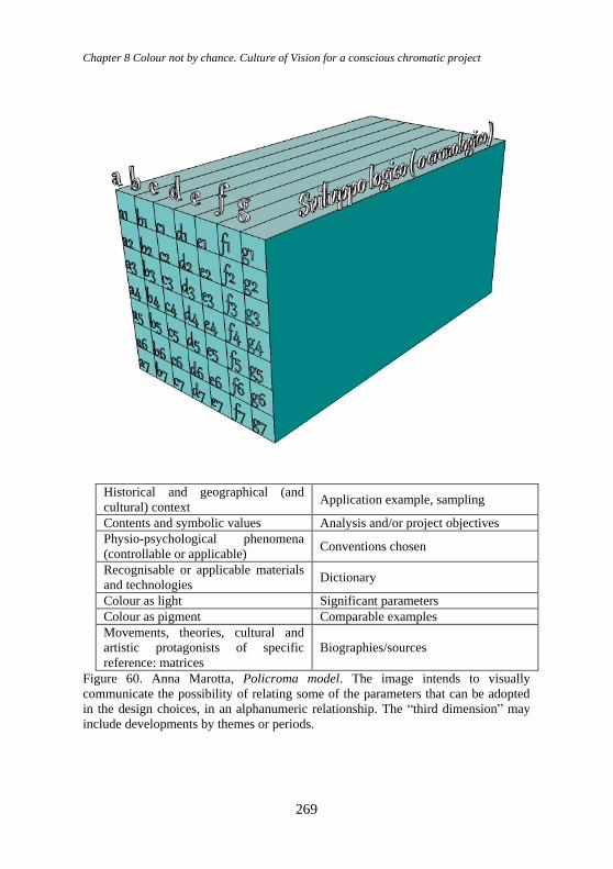
Chapter 8 Colour not by chance. Culture of Vision for a conscious chromatic project
269
Historical and geographical (and
cultural) context Application example, sampling
Contents and symbolic values Analysis and/or project objectives
Physio-psychological phenomena
(controllable or applicable) Conventions chosen
Recognisable or applicable materials
and technologies Dictionary
Colour as light Significant parameters
Colour as pigment Comparable examples
Movements, theories, cultural and
artistic protagonists of specific
reference: matrices
Biographies/sources
Figure 60. Anna Marotta, Policroma model. The image intends to visually
communicate the possibility of relating some of the parameters that can be adopted
in the design choices, in an alphanumeric relationship. The “third dimension” may
include developments by themes or periods.
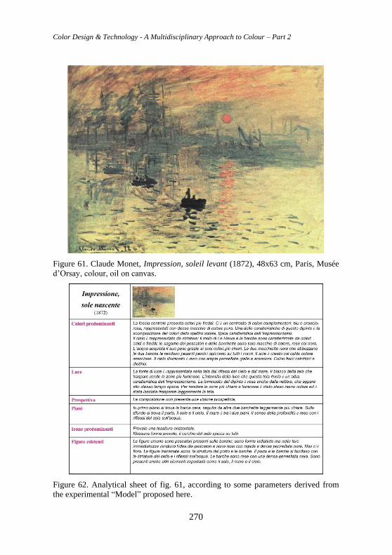
Color Design & Technology - A Multidisciplinary Approach to Colour – Part 2
270
Figure 61. Claude Monet, Impression, soleil levant (1872), 48x63 cm, Paris, Musée
d’Orsay, colour, oil on canvas.
Figure 62. Analytical sheet of fig. 61, according to some parameters derived from
the experimental “Model” proposed here.
Chapter 8 Colour not by chance. Culture of Vision for a conscious chromatic project
271
“… and nearby, rambling and clustering along low walls, purple flowers
and red. And since there was always lurking in my mind the dream of a
woman who would enrich me with her love, that dream in those two
summers used to be quickened with the freshness and coolness of running
water; and whoever she might be, the woman whose image I called to mind,
purple flowers and red would at once spring up on either side of her like
complementary colours.”
Marcel Proust, Swann’s way, 1913
Notes [1] Nino Di Salvatore (1924 - 2001), after the artistic high school continued his researches
about geometry, shape and colour, which lead him to perform the first “non-objective”
works. In 1948 he joined the Movimento Arte Concreta starting the study of Gestalt
Psychology, in which he identified his source of artistic inspiration, a theory that will also
be the starting point of his intense didactic activity. In 1950 he wrote and published Il
problema spazio in which Gestalt is proposed as a psycho-perceptive structure of the arts
(the idea of a concrete beauty) for the first time in Italy. He had been presented in
countless exhibitions and events all over the world (some of his drawings for fabrics are
now at Moma in New York). He is also involved in cinematography, realizing “Commento
a punto, linea e superficie di Kandinsky”. Sensitive to training, he founded in Novara
(1954) the Centro Studi Arte-Industria, a school for designers, the first institute in Italy
that adopted a design methodology based on the principles of Gestalt. In 1970 he moved
his school to Milan, where it became the Scuola Politecnica di Design, a para-university
institute, to which teachers such as Bruno Munari, Max Huber, Pino Tovaglia, Attilio
Marcolli, Alberto Rosselli will volunteer their contribution. He even taught a subject
created by him: Science of Vision, a course that creatively taught visual perception.
Parallel to the more planning and basic design subjects, Di Salvatore supported Antonio
Grieco’s Ergonomics course, Physiology, Neurophysiology, Gaetano Kanizsa’s
Psychology of Perception course and Guido Petter’s Psychology of Communication
course. In 1995 the ADI awarded the Compasso d’Oro for the career to the Scuola
Politecnica di Design (Caramel, 1987; Lambertini, 1992).
[2] Luigi Veronesi, (1908-1998), leading artist of abstract research in Italy between the two
Wars; his production is characterized by rigorous, kaleidoscopic geometric configurations.
His interest in investigating the relationships between sounds and colours through the
visual transposition of musical frequencies also built his work as a set designer. Léger’s
friend, he was particularly interested in the Russian and Dutch constructivists, dedicating
to the search for an abstract language with a strong geometric tendency; in 1934 he joined
the Abstraction-Création group. In relationship with Pagano and Persico, he collaborated
with photomontages in Casabella. In 1939 he published 14 variazioni di un tema pittorico,
with the musical commentary by Malipiero, starting a series of researches about the
relationships between musical scales and chromatic scales that will characterize much of
his work. In 1949 he joined the MAC by participating from this moment on in the
exhibitions of the movement. Veronesi never neglected the linear layouts and the rigorous
geometric configurations of his debut (Composizione 08, 1964, Turin, Galleria d’Arte
Moderna). From 1973 to 1977 he taught Composition and Chromatology at the Academy
Color Design & Technology - A Multidisciplinary Approach to Colour – Part 2
272
in Brera (Veronesi, 1997). The three primary colours and their complementaries are
associated with everyday objects in the first part of the volume, while the second part,
more congenial to the “lyrical rationalism” of the Milanese artist, is dedicated to their
overlap, giving rise to real “pieces” of abstract painting. In 1983 he was awarded the
Feltrinelli dell’Accademia dei Lincei prize for painting.
3 Akiyoshi Kitaoka: after his 1991 PhD from the Institute of Psychology, University of
Tsukuba, he specialized in visual perception and visual illusions of geometrical shape,
brightness, color, in motion illusions and other visual phenomena like Gestalt completion
and Perceptual transparency, based on a modern conception of Gestalt Psychology.
Noguchi, K., Kitaoka, A., and Takashima, M. (2008) Gestalt-oriented perceptual research
in Japan: Past and present. Gestalt Theory, 30, 11-28; Kitaoka, A. (2008) Cognitive
psychology of visual illusion. Japanese Journal of Cognitive Psychology, 5, 177-185.
[4] Among their publications we recall: Gruppo μ, 1980. Retorica generale: le figure della
comunicazione, Milan: Bompiani, 1980. Gruppo μ, 1985. Retorica della poesia, Milan:
Mursia 1985 and Klinkemberg Jean Marie, 1996. Précis de sémiotique general, Paris.
7. References Aguilón, F. Rubens, P.P., Galle, T. (1613) ‘Francisci Aguilonii e Societate lesu
Opticorum libri sex Philosophis iuxta ac Mathematicis utiles’, Ex Officina
Plantiniana, Apud Viduam et Filios Io. Moreti, Antwerp.
Anolli, L., Cigoli, V. (1978) ‘Lo sviluppo della percezione visiva’, Giunti OS-
Organizzazioni Speciali, Firenze.
Arnheim, R. (2002) ‘Arte e percezione visiva. Nuova versione’, Feltrinelli, Milano.
Barbero, W. et al. (1996) ‘L’Enciclopedia dell’Architettura Garzanti’, Garzanti,
Milano, p. 813.
Benjamin, W. (2000) ’L’opera d’arte nell’epoca della sua riproducibilità tecnica.
Arte e società di massa’ (trad.it. di Enrico Filippini), Einaudi, Torino, pp. 19-56.
Bernhard, E., Bürdek (1992) ‘Design: storia, teoria e prassi del disegno industriale’,
Mondadori, Milano.
Boccardo, P. (2004) ‘L’età di Rubens. Dimore, committenti e collezionisti
genovesi’, Skira, Genova.
Bouleau, C. (1988) ‘La geometria segreta dei pittori’, Electa.
Branzaglia, C. (2003) ‘Comunicare con le immagini’, Mondadori, Milano.
Branzi, A. (a cura di) (2007) ‘Capire il design’, Giunti, Firenze-Milano.
Bressan, P. (1992) ‘La percezione visiva’, CLEUP, Padova.
Calabrese, O. (1977) ‘Le arti figurative e il linguaggio’, Guaraldi, Firenze.
Caprettini, G. P. (1992) ‘Comunicazione e scienza dei segni’, Torino, CUSL Pier
Giorgio Frassati.
Caramel, L. (1987) ‘Movimento Arte Concreta 1948-1958’, Galleria Fonte
D’Abisso Edizioni, Modena.
Caramelli, N., Kanizsa, G. (1988) ‘L’eredità della psicologia della Gestalt’, Mulino,
Bologna.
Castelnovi, P. (1980) ‘La città: istruzioni per l’uso. Semiotica della comunicazione
nel progetto e nello spazio urbano’, Einaudi, Torino.
Colli, L. M. (1981) ‘Storia dell’arte’, n. 43, La Nuova Italia, Firenze.
Chapter 8 Colour not by chance. Culture of Vision for a conscious chromatic project
273
Corno, D. (1978) ‘Le strutture e lo spazio. Notazioni di semiotica dei linguaggi
spaziali’, Giappichelli, Torino.
D’Amato, G. (2005) ‘Storia del design’, Mondadori, Milano, pp. 178-191.
De Bernardi, M.L., Marchis, E. M. C., Mansour, O. (2016) ‘Il colore come elemento
delle geometrie decorative islamiche’. In: XII Conferenza del Colore, Torino, pp.
413-424.
De Carvalho e Sampayo, D. (1787) ‘Tratado das Cores. Que consta de tres partes:
analythica, synthetica, hermeneutica’, Malta, Officina Typographica de S. A. E.
Impressor Fr. Joaõ Mallìa, Com licença dos Superiores.
Di Fiore, E., Cardaci, M. (1981) ‘La percezione visiva nel neonato’, Palumbo,
Firenze.
Du Sautoy, M. (2007) ‘Il disordine perfetto’, BUR.
Ferrari, G. (1925) ‘Gli stili nella forma e nel colore. Rassegna dell’arte antica e
moderna’, Edizioni Crudo & C., Torino.
Gibson, J. J. (1999) ‘Un approccio ecologico alla percezione visiva’, Il Mulino,
Bologna.
Gombrich, E. H. (1984) ‘Il senso dell’ordine. Studio sulla psicologia dell’arte
decorativa’, Einaudi, Torino.
Hachen, M. (2007) ‘Scienza della visione: spazio e Gestalt, design e
comunicazione’, Apogeo, Milano.
Hofstede, M.H. (2004) ‘Rubens’, Rizzoli/Skira, Milano.
Jaffè, M. (1989) ‘Rubens’, Rizzoli, Milano.
Jones, O. (1986) ‘The Grammar of Ornament’, New York, Portland House (first
published in England 1856).
Kanizsa, G. (1980) ‘La grammatica del vedere’, Il Mulino, Bologna.
Koenig, G. K. (1974) ‘Architettura e comunicazione’, Libreria Editrice Fiorentina,
Firenze.
Kohler, W. (1961) ‘La psicologia della Gestalt’, Feltrinelli, Milano.
Kuramata, S. (1988) ‘Shiro Kuramata: 1967 – 1987’, Parco, Tokyo.
Lambertini, L. (1992) ’Di Salvatore’, Electa, Milano.
Mari, A. (2002) ‘Steven Holl’, Edilstampa, Roma.
Marotta, A. (1999) ‘Policroma. Dalle teorie comparate al progetto del colore’, Celid,
Torino 1999.
Marotta, A. (2010) ‘La teoria del colore di Philipp Otto Runge’, Dispense del corso
di Percezione e Comunicazione Visiva, Politecnico di Torino.
Marotta, A. (2010) ‘Kunst der Farbe ovvero l’arte del colore di Johannes Itten’,
Dispense del corso di Percezione e Comunicazione Visiva, Politecnico di Torino.
Marotta, A. (2010) ‘Eredità Goethiane Un segmento del raggio di Iride da Goethe al
Bauhaus’, Dispense del corso di Percezione e Comunicazione Visiva, Politecnico di
Torino.
Marotta, A. (2014) ‘Arte e Colore nella riqualificazione della città e del paesaggio’,
in: Conferenza del Colore GdC - Associazione Italiana Colore. Dipartimento di
Scienze per l’Architettura - Scuola Politecnica - Università degli Studi di Genova,
11-12 settembre 2014.
Color Design & Technology - A Multidisciplinary Approach to Colour – Part 2
274
Marotta, A.; Spallone, R.; Lo Turco, M.; Zich, U.; Vitali, M.; Marchis, E.;
Pavignano, M. (2017) ‘Visual Images and Language in Architecture: Signifier
Semiotics and Meaning Semiotics’, in: Proceedings - ISSN 2504-3900 - pp. 1-17.
Marotta, A. (2020) ‘Diogo de Carvalho e Sampayo: un Tratado da riscoprire’, in:
Colore e Colorimetria. Contributi Multidisciplinari. Vol. XVI A, pp. 376-382,
Milano: Gruppo del Colore - Associazione Italiana Colore.
Migliore. T. (2007) ‘Trattato del segno visivo. Per una retorica dell’immagine’,
Mondadori, Milano.
Morteo, E. (2008) ‘Grande Atlante del Desing dal 1850 a oggi’, Mondadori Electa,
Milano, pp. 346-347.
Napolitano Valditara, L. M. (1994) ‘Lo sguardo nel buio. Metafore visive e forme
grecoantiche della razionalità’, Laterza, Bari.
Netti, R. (2019) ‘The colours of the ancient Greek architecture’, in Cultura e Scienze
del Colore/Color Culture and Science, ISSN 2384-9568 - Elettronico - Vol. 11, 02,
pp. 14-24.
Paleotti, G. (1582) ’Discorso intorno alle imagini sacre et profane diuiso in cinque
libri’, Bologna.
Parini, P. (2012) ’I percorsi dello sguardo’, Ed. Artemisia, pp. 17 -73; 187 -205.
Pinotti, A., Somaini A. (2014) ‘Teorie dell’immagine. Il dibattito contemporaneo’,
Ed. Raffaello Cortina, Milano, pp. 9-29.
Pisani, A. (2010) ‘Il colore come parametro di progetto nell’architettura sostenibile’,
Tesi di laurea magistrale, Politecnico di Torino, a.a. 2010/2011, relatore Anna
Marotta.
Potter, N. (2010) ‘Cos’è un designer’, Codice, Torino.
Riegl, A. (1963) ‘Problemi di stile – fondamenti di una storia dell’arte ornamentale’.
Feltrinelli, Milano.
Ronchetti, G. (1947) ‘Pittura murale. Fresco, tempera, stereocromia, pittura ad olio,
encausto, quinta edizione, Hoepli, Milano.
Sambursky, S. et al. (1990) ‘Il sentimento del colore. L’esperienza cromatica come
simbolo, cultura e scienza, Studio Redazionale, Firenze.
Scalvini, M. L. (1975) ‘L’architettura come semiotica connotativa’, Bompiani,
Milano.
Sciolla, G. C. (1988) ‘Insegnare l’arte’, La nuova Italia, Firenze, pp. 3-80.
Tentori, F., De Simone, R. (1988) ’Le Corbusier. Guida all’architettura moderna’,
Laterza, Roma-Bari.
Vercelloni, M., Bianchi, R. (2004) ‘Design’, Mondadori Electa, Milano, pp. 146-
150.
Veronesi, L. (1997) ‘I colori’, Corraini, Milano.
Williams, R. (1994) ‘The Non-Designer Design Book’, Peachpit Press, Berkely.
Zanuttini, L. (2001) ‘Dalla luce all’immagine. Introduzione alla percezione visiva’,
Forum Editrice, Udine.
http://www.istitutograf.org/recensioni_genova_rubens.htm
http://www.sakuramatsuriantiquariato.com/schede.php
Chapter 8 Colour not by chance. Culture of Vision for a conscious chromatic project
275
http://www.casazen.com/giappone_tradizionale/shoji.htm
http://www.casazen.com/arredo/arredo_fusuma.htm
http://www.toshiyukikita.com/english/works/03.html
http://www.art-directory.info/design/masanori-umeda-1941/
http://www.vitra.com/en-un/home/designers/sori-yanagi/
http://www.architetturaedesign.it/index.php/2008/05/22/makio-hasuike-design-
materiali.htm http://www.elettronicaflash.it
http://en.wikipedia.org/wiki/File:Katsura_Imperial_Villa.jpg
http://en.wikipedia.org/wiki/File:Shokin-tei.jpg
http://www.schoener-wohnen.de/designer-lexikon/130330-homage-to-
mondrian.html http://www.archiexpo.it/prod/cappellini/cassettiere-design-6547-
3447.html http://www.moma.org/collection
http://www.casazen.com/giappone_tradizionale/estetica.htm
http://www.vitra.com/en-un/home/designers/sori-yanagi/
http://www.vitra.com/en-un/home/designers/isamu-noguchi/products/
http://it.wikipedia.org/wiki/Isao_Hosoe
http://www.architetturaedesign.it/index.php/2008/05/22/makio-hasuike-design-
materiali.htm
http://www.makiohasuike.com/
http://www.art-directory.info/design/masanori-umeda-1941/
http://www.tobiamorra.com/