Embed Size (px)
Citation preview

D E S I G NP O R T F O L I O
CHRISTOPHER DAVIDA

C O N T A C TCHRISTOPHER DAVID
101 W. 1290 S.Logan, UT 84321
C O N T E N T S4
6
8
10
12
14
16
18
20
22
MONTAGE
WEB PAGE MOCKUP
INFOGRAPHIC
BUSINESS CARDS
BUSINESS LETTERHEAD
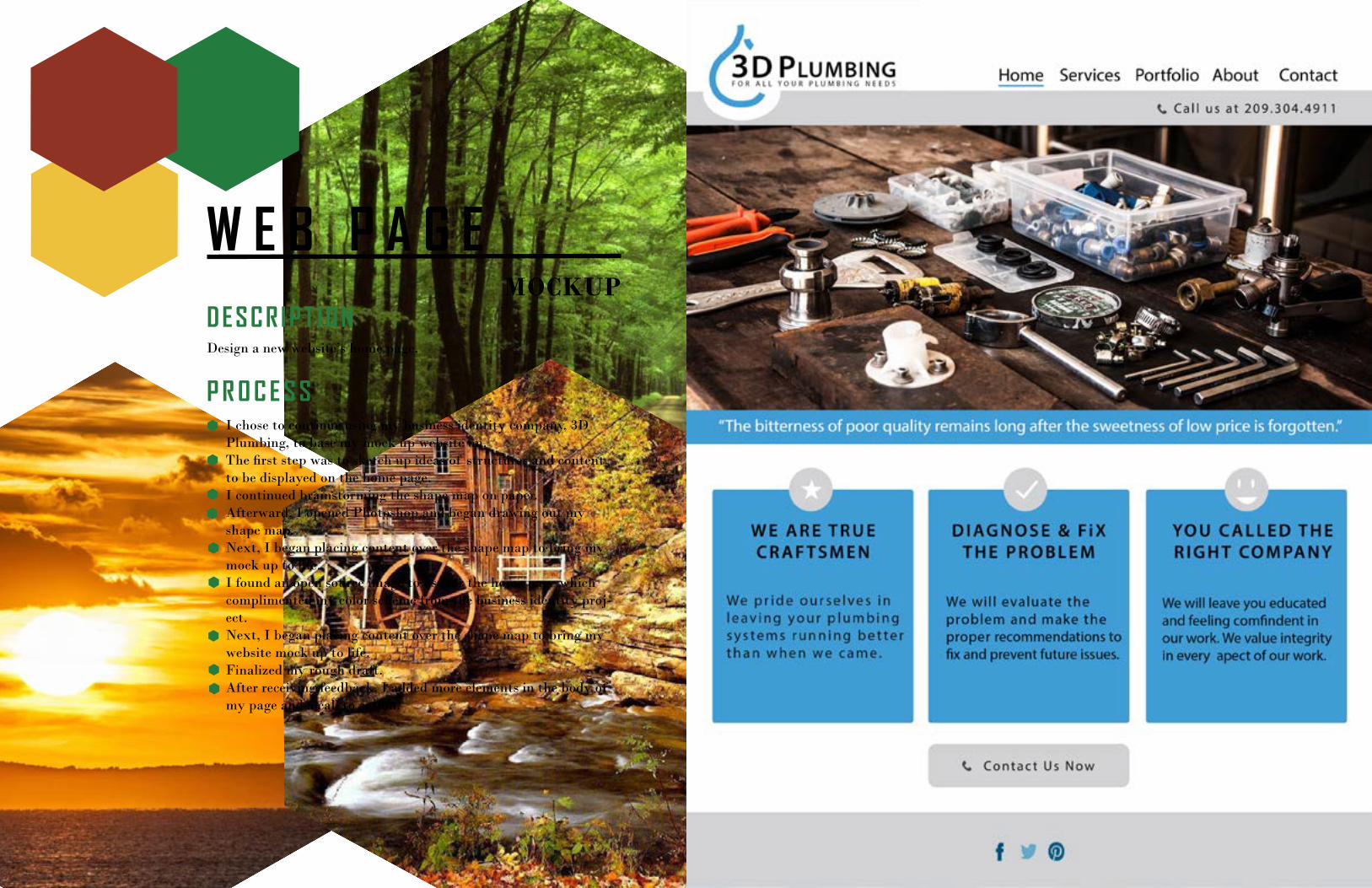
CODING PROJECT
BROCHURE
PHOTODESIGN
PREZI DESIGN
MAGAZINE COVER

M O N T A G EDESCRIPT IONDesign a spiritual poster montage using the blend of images and type.
P R O C E S SI had an idea of incorporating the stars with God’s creations. To get started I needed two pictures which encompassed my criteria. In Photoshop I combined the two pictures. I used a variety of layer masks and the brush tool to create the gradual blended effect.I then made up a quote connecting the images to the viewer and added the text on the image. I chose two font-faces that complimented each other emphasizing His hands and how he made us.In this design, I incorperated these design principles: proximity, alignment, and flow.
W E B P A G EMOCKUP
DESCRIPT IONDesign a new website’s home page.
P R O C E S SI chose to continue using my business identity company, 3D Plumbing, to base my mock up website on.The first step was to sketch up ideas of structures and content to be displayed on the home page.I continued brainstorming the shape map on paper.Afterward, I opened Photoshop and began drawing out my shape map.Next, I began placing content over the shape map to bring my mock up to life.I found an open source image to use for the home page which complimented my color scheme from the business identity proj-ect.Next, I began placing content over the shape map to bring my website mock up to life.Finalized my rough draft.After receiving feedback, I added more elements in the body of my page and a call to action.

I N F O G R A P H I CDESCRIPT IONCreate an infographic that organizes data in a visually pleasing way.
P R O C E S S While brainstorming, I sketched out some ideas of roller coasters and theme parks.I did research of other infographics to refine the information needing to be displayed about roller coasters.After I got a better idea of what I needed to do for my infographic, I sketched out my first draft.I then sketched out some graphics that I knew I wanted to include in the infographic with my researched layouts and added creativity.Next I opened up Illustrator and started on my Infographic.I created all of the illustrations, logo, and graph. Also added texture to top and bottom sections.

B U S I N E S SCARDS
DESCRIPT IONCreate a logo for a company/service/organization and establish a vi-sual identity across documents.
P R O C E S SI first brainstormed of several different logo ideas. This company doesn’t currently have a logo. Their branding has not yet been set in stone.After sketching, I used Illustrator to bring some of them to life. After playing with color schemes and typography, I chose three of my favorites.I wanted to focus the logo around the company name since that is their current branding and reputation. Illustrations were secondary to the company name.I got votes from various people on which was their favorite. It helped me to narrow it down to the one I would use in my final project.I fine tuned my illustration and logo then placing it on my business card and stationary.6. I made sure to unify my design by repetition in the color scheme, typography, and logo. My alignment was a large fac-tor in making the design flow and take advantage of the white space.

B U S I N E S SLETTERHEAD
DESCRIPT IONCreate a logo for a company/service/organization and establish a vi-sual identity across documents.
P R O C E S SI first brainstormed of several different logo ideas. This company doesn’t currently have a logo. Their branding has not yet been set in stone.After sketching, I used Illustrator to bring some of them to life. After playing with color schemes and typography, I chose three of my favorites.I wanted to focus the logo around the company name since that is their current branding and reputation. Illustrations were secondary to the company name.I got votes from various people on which was their favorite. It helped me to narrow it down to the one I would use in my final project.I fine tuned my illustration and logo then placing it on my business card and stationary.6. I made sure to unify my design by repetition in the color scheme, typography, and logo. My alignment was a large fac-tor in making the design flow and take advantage of the white space.
C O D I N GPROJECT
DESCRIPT IONCode a custom webpage with HTML and CSS.
P R O C E S STo begin, I was able to adjust my business identity log for the purpose of being displayed on my webpage. In Illustrator I was able to Adjust sizing and add a subtle curve to the corners.Then, I created an HTML and CSS page. Starting with the HTML, I created my basic tabs and added tags to improve the structure of my page.In the CSS, I customized my size for the logo to 472px width and centered it on the page.The CSS also provides the different colors for the color scheme. The design displays a blue banner along with a sub-banner.I created the background using a repeated image using Illustrator and applying the repeat in the CSS page.Finally, I validated my code using HTML and CSS validators.

B R O C H U R EDESCRIPT IONDesign a brochure with logo, theme, and content for a company.
P R O C E S STo start the project, I drew out sketchs of several designs.After finding a tri-fold design that I liked, I opened up InDesign and began laying out my guideline/rulers and created my layout.The photos used were photoshoped to enhance the colors. These photos quality and resolution was reduced for the appropriate sizes needed in the brochure.Through InDesign I was able to create the structure/layout, clippy masks for the photos used, custom logo, custom waves, and custom social media icons.I saved the design as a PNG and printed the brochure on 18 x 12 inch glossy card-stock.

P H O T O D E S I G NDESCRIPT IONBy using photography and design skills, create a project that encompasses a consistent color scheme from the image.
P R O C E S SI took advantage of Photoshop and InDesign software to create this photodesign. First decision was what color scheme to go with. My favorite places is Lake Tahoe. There are so many colors especially during the Fall. There are many colors at sunrise and sunset as well. Although there were variety of colors, I decided to go with Monochromatic Blue due to depth of blues available in the water and sky. After taking the photo, it was much dark-er than desired.I created a new 8.5 x 11 inch document in Photoshop. Next, the desired colors for my color scheme needed to be enhanced. I opened the image up in Photoshop and enhanced my blues and purples. The darker colors I made more vibrant to make the picture seem full of energy and pleasant.After enhancing the image, the distractions in the photo needed to be removed. Within Photoshop, I used the laso tool to select the boats, buoys, and other distractions and deleted them. The photo surface needed to be smoothed out and edited to make it appear there was not anything removed.Second I opened the enhanced image in InDesign. This is where I added the Monochromatic Blue logo at the bottom right and added a enlarged mirroring of the logo a the top left. The mir-rored objects had a higher opacity so it did not distract and flowed with my design.
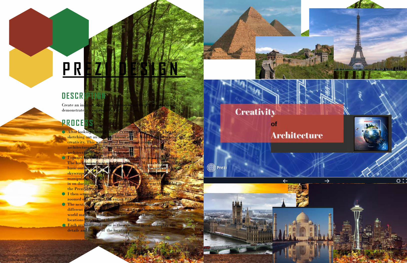
P R E Z I D E S I G NDESCRIPT IONCreate an instructional presentation using the Prezi software to demonstrate it’s capabilities and potential.
P R O C E S SAfter looking through many example presentations, I began sketching out an idea and layout of the World’s architectural creativity. This was inspired by my background in architecture and my desire to show others how creative architecture is throughout the world.I opened up GIMP and Photoshop to create my header image. The background was used from Pintrest. My sketch provided a basic outline and flow of the presentation. The small earth with skyscrapers, in head banner, was an image that was manipulated in GIMP to add the desired affect when zoomed in on during the Prezi presentation. The text was then added in the Prezi software.I then setup slides to zoom into the small world and then zoomed out to reveal the entire HD global display.The next slide was a canvas in which to demonstrate the different designs of architecture. The canvas was an antiqued world map with little framed architectural scenes of several locations throughout the world.Each architectural scene is then zoomed in on to display the details and header of the location name.

M A G A Z I N ECOVER
DESCRIPT IONDesign a magazine cover that displays a self-portrait and illustrates something about myself. Article titles about myself are also included.
P R O C E S SThere were several magazines that were perfect to display me. I chose the Western Horseman as a starting place which is a western magazine that focuses on outdoors, horses, cowboy lifestyles, and flashbacks to the “Wild West”.For my project, I chose to focus the article titles on facts of what makes up a cowboy and myself, my favorite music, inspi-rations and topics that keep me pressing forward through life, and tips that I have discovered that can assist with success. These are a few things that chose to focus on to draw people to reading the magazine about me.First I sketched out on paper a possible layout of the magazine cover.Next I created a shape map on paper of one of my sketches. I then searched out a photo that I wanted to use of me as a model. I opened this image in Photoshop to make small adjustments of lighting and cleaned up the photo.Next I opened up InDesign and created a new 8.5 x 11 inch page.Then I copied my Photoshop Image of myself.My first draft consisted of spanning the photo across the entire cover and overlaying the text over the picture. I soon changed this by taking a section of my picture that displays the beige wall and stretching it to go beneath the header.Afterward, I created text boxes to span the right side of my cover. Each text box also had a silhouette box to create contrast from the image acting as a splash of color.Once I was finished, I saved the InDesign file and then exported a PNG.