Embed Size (px)
Citation preview
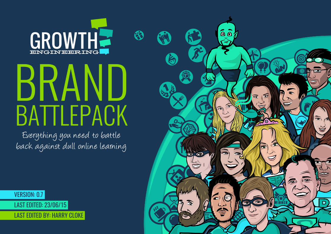
BRANDBATTLEPACK
Everything you need to battleback against dull online learning
LAST EDITED: 23/06/15LAST EDITED BY: HARRY CLOKE
VERSION: 0.7
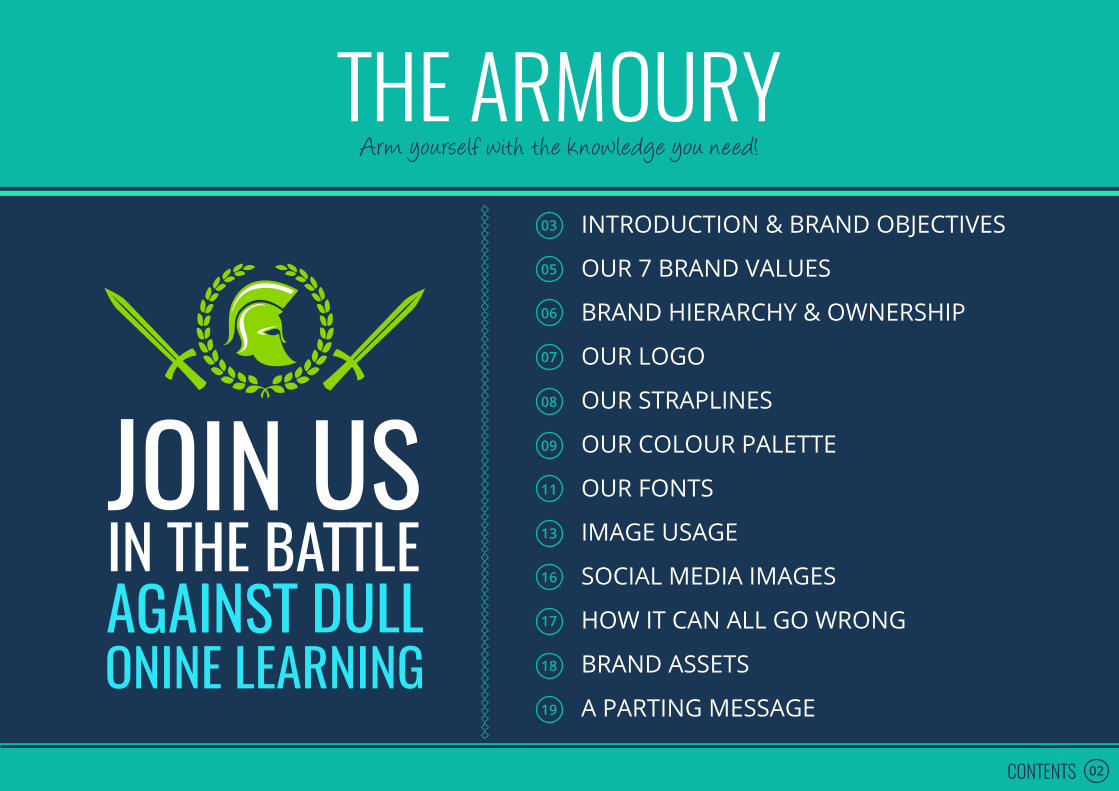
THE ARMOURY03
05
06
07
08
09
11
13
16
17
18
19
INTRODUCTION & BRAND OBJECTIVES
OUR 7 BRAND VALUES
BRAND HIERARCHY & OWNERSHIP
OUR LOGO
OUR STRAPLINES
OUR COLOUR PALETTE
OUR FONTS
IMAGE USAGE
SOCIAL MEDIA IMAGES
HOW IT CAN ALL GO WRONG
BRAND ASSETS
A PARTING MESSAGE
02CONTENTS
Arm yourself with the knowledge you need!

THE BATTLEPLAN
03INTRODUCTION & BRAND OBJECTIVES
Here’s what you need to know before we get started…
When you’re in a battle against an almighty enemy (the seemingly endless supply of dull online learning that gets cranked out throughout our industry), it pays to know yourself and to know where your strengths lie. From then on in, it’s all about consistency
and sticking to your game plan. If you falter in your resolution – even for just a second – you risk everything. No pressure.
That’s why this document is important!
Our ‘Brand Battlepack’ highlights all the written, visual and graphic elements that encompass our brand. These guidelines enable us to maintain a consistent voice for our audience – one that will help capture their imagination, spur them into action, drive growth (ours and theirs) and energise the industry. Please refer to The Battlepack when developing any internal or external communications.
If you have any questions, require any further clarification or need to check your communications are falling within the brand remit, please perform the Growth Engineering secret hand signal and say the phrase ‘War starts at midnight’ three times. Or just email marketing@
growthengineering.co.uk.
GOOD LUCK AND HAVE FUN WITH IT!
Task 1Task 2Task 3
04INTRODUCTION & BRAND OBJECTIVES
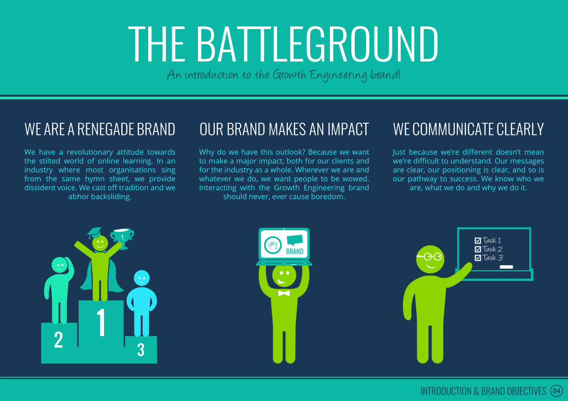
THE BATTLEGROUNDAn introduction to the Growth Engineering brand!
WE ARE A RENEGADE BRANDWe have a revolutionary attitude towards the stilted world of online learning. In an industry where most organisations sing from the same hymn sheet, we provide dissident voice. We cast off tradition and we
abhor backsliding.
WE COMMUNICATE CLEARLYJust because we’re different doesn’t mean we’re difficult to understand. Our messages are clear, our positioning is clear, and so is our pathway to success. We know who we
are, what we do and why we do it.
OUR BRAND MAKES AN IMPACTWhy do we have this outlook? Because we want to make a major impact, both for our clients and for the industry as a whole. Wherever we are and whatever we do, we want people to be wowed. Interacting with the Growth Engineering brand
should never, ever cause boredom.

05OUR 7 BRAND VALUES
We’ve drawn up the following list of values to help determine how we wage our war on dull online learning. While our values are supremely important to us, you shouldn’t think of them as an albatross around your neck. They’re primarily a cultural tool, there to help make working for Growth Engineering a fun experience. Think
of the following as the ‘Growth Engineering Playbook’:
1. WE CREATE TECHNOLOGY THAT INSPIRES LEARNING
We are committed to helping learners to unlock their full potential.
2. THE WORD ‘BORING’ ISN’T IN OUR VOCABULARY
When it comes to dull online learning, we take no prisoners. We want to deliver fun learning
experiences that make learners smile.
3. WE DO THINGS WITH PASSION OR WE DON’T DO THEM AT ALL
We don’t believe in half measures. We are clear about the problems we solve and we’re
passionate about what we do.
6. WE ARE HONEST AND OPEN, NO MATTER THE CIRCUMSTANCES
We take responsibility for our actions. We don’t hide and we always push ourselves to do better.
5. WE HELP EACH OTHERTO FLOURISH
We are a team and we support one another in reaching our potential. We stand together and
we fall together.
4. WE WILL ALWAYS REMAIN CURIOUS AND WE NEVER WANT TO STOP LEARNING
We have an insatiable appetite for improvement. We push boundaries and we’re not afraid to
make mistakes along the way.
7. WE SHARE THE LOVE WHEREVER POSSIBLE
We focus on the positives, celebrate our successes and quickly banish all negativity.
THE PLAYBOOKThe Growth Engineering Code of Ethics

IMGHERE
06BRAND HIERARCHY & OWNERSHIP
Brand Captain #1: Juliette Denny([email protected])
Brand Captain #2: Harry Cloke([email protected])
Brand Captain #2: xxxxx([email protected])
Brand Captain #3: Anthony Organ([email protected])
Brand Captain #1: Paul Kerins([email protected])
THE BRAND HIERARCHYIntroducing the entire Growth Engineering brand family!
The Brand Battlechief
THE BRAND BARON THE BRAND BOFFIN THE BRAND BANDIT

GROWTHENGINEERING
x
x x x x x x
07OUR LOGO
OUR LOGOGrowth Engineering’s Coat of Arms
Growth Engineering Approved Logos
Avoid the Brand Police. Don’t do any of the following:UNAUTHORIZED LOGO USAGE
#1: Main Navy Over White #2: Inverse White Over Navy #3: All White Over Navy
Don’t stretch it out horizontally or vertically. Our logo isn’t a toy!
Don’t rotate our logo. It makes us feel dizzy and it can cause extreme disorientation.
Don’t change the colours of the text or the speech bubbles, or the font for that matter.
Don’t use the logo on anything other than a white or navy blue background.
Don’t drop the speech bubbles. They are part of who we are!
Don’t use a drop shadow behind the logo, it already stands out more than you can imagine.
*Please note: high quality versions of all approved logos are available on the Growth Engineering Drive.

08OUR STRAPLINES
OUR BATTLECRYGrowth Engineering’s approved straplines: say them loud and proud!
#1 We wage war on dull online learning!When to use me: Whenever possible. Whenever you are talking about Growth Engineering in a general sense.
#3 Shaking up the learning landscape!When to use me: Sparingly – please use straplines #1 and #2 wherever possible. Please use this strapline when it is inappropriate to talk about war or zombies. Please use when selling into a super-corporate environment.
#2 Turn your zombie learners into learning legends!When to use me: Whenever the focus is on learner engagement.
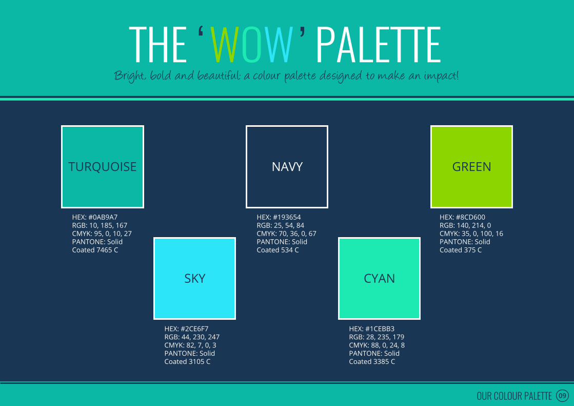
09OUR COLOUR PALETTE
WOWBright, bold and beautifu l: a colour palette designed to make an impact!
NAVYTURQUOISE GREEN
SKY CYAN
THE ‘ ’ PALETTE
HEX: #0AB9A7RGB: 10, 185, 167CMYK: 95, 0, 10, 27PANTONE: Solid Coated 7465 C
HEX: #193654RGB: 25, 54, 84CMYK: 70, 36, 0, 67PANTONE: Solid Coated 534 C
HEX: #8CD600RGB: 140, 214, 0CMYK: 35, 0, 100, 16PANTONE: Solid Coated 375 C
HEX: #2CE6F7RGB: 44, 230, 247CMYK: 82, 7, 0, 3PANTONE: Solid Coated 3105 C
HEX: #1CEBB3RGB: 28, 235, 179CMYK: 88, 0, 24, 8PANTONE: Solid Coated 3385 C

GGGG
GGG
GG
GG
GGG
G
GGGG
G1A
2
3
4
5
B C D E
10OUR COLOUR PALETTE
COLOUR COMBOSCombining colours and creating harmony!
◊ While we have five different colours in our palette, the colour combinations are limited.
◊ When combining colours, ‘Navy’ must always be used as the ‘base’ or ‘accent’ colour.
◊ In other words the following colour combinations are acceptable: (A2 to A5 and 1B to 1E).
◊ All other colour combinations should be avoided. However a select few other combinations can still work in some cases such as B3, C2, C4, C5, D3 and E3.
◊ When applying our colours to a white background, please take great care when using ‘Sky’, ‘Cyan’ or ‘Green’ – in most cases these colours will not look impactful on the page.
◊ All boxes with a red border demonstrate an unacceptable combination of our colours.

11OUR FONTS
OUR FONTSA Comic Sans / Times New Roman free zone!
THIS IS ANEXAMPLE DOCUMENT
Fonts get smaller as we move down the page.
WHEN OSWALD IS RE-USED IT SHOULD BE SMALLERThe majority of text should be justified with the last line aligned left. Exceptions to this rule include cases where the amount of text on a line causes words to be three spaces apart.
The majority of text should be justified with the last line aligned left. Exceptions to this rule include cases where the amount of text on a line causes words to be three spaces apart.
*Please ensure that the auto-hyphenation is turned off. This will prevent words from being split in two.
FONT SET 1: For use in non-editable documents(PDFs, Videos, Our Website, Printed Graphics, etc.)
OSWALD LIGHT IS OUR HEADER FONTAngelina is our subtitle / highlight font (size may vary)
Open sans is our main body font. Open sans is our main body font. Open sans is our main body font. Open sans is our main body font. Open sans is our main body font. Open sans is our main body font.
ALL CAPS BOLD GEORGIA IS OUR HEADER FONTGeorgia Italic is our subtitle / highlight fontGeorgia is our main body font. Georgia is our main body font. Georgia is our main body font. Georgia is our main body font. Georgia is our main body font. Georgia is our main body font.
FONT SET 2: For use in editable documents (Word Documents, PowerPoints, etc.)Georgia is a common font and will work across all computers.
*Please ensure that the auto-hyphenation is turned off. This will prevent words from being split in two.
12OUR FONTS
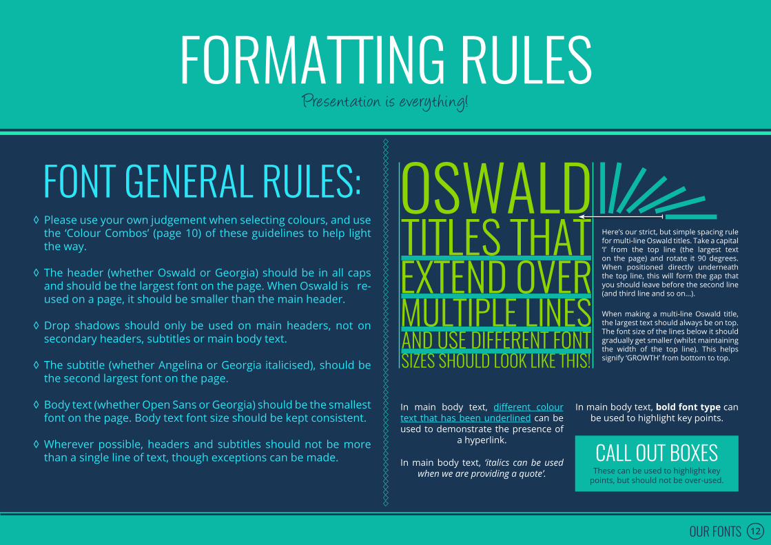
FORMATTING RULESPresentation is everything!
FONT GENERAL RULES: ◊ Please use your own judgement when selecting colours, and use the ‘Colour Combos’ (page 10) of these guidelines to help light the way.
◊ The header (whether Oswald or Georgia) should be in all caps and should be the largest font on the page. When Oswald is re-used on a page, it should be smaller than the main header.
◊ Drop shadows should only be used on main headers, not on secondary headers, subtitles or main body text.
◊ The subtitle (whether Angelina or Georgia italicised), should be the second largest font on the page.
◊ Body text (whether Open Sans or Georgia) should be the smallest font on the page. Body text font size should be kept consistent.
◊ Wherever possible, headers and subtitles should not be more than a single line of text, though exceptions can be made.
In main body text, bold font type can be used to highlight key points.
In main body text, ‘italics can be used when we are providing a quote’.
In main body text, different colour text that has been underlined can be used to demonstrate the presence of
a hyperlink.
CALL OUT BOXESThese can be used to highlight key
points, but should not be over-used.
When making a multi-line Oswald title, the largest text should always be on top. The font size of the lines below it should gradually get smaller (whilst maintaining the width of the top line). This helps signify ‘GROWTH’ from bottom to top.
Here’s our strict, but simple spacing rule for multi-line Oswald titles. Take a capital ‘I’ from the top line (the largest text on the page) and rotate it 90 degrees. When positioned directly underneath the top line, this will form the gap that you should leave before the second line (and third line and so on…).

13PRIMARY IMAGES
PRIMARY IMAGESGrowth Engineering Images fall into three categories:
As the arch-enemies of dull online learning, we need something tangible to battle against – a flesh and blood representation of what we’re trying to stop.
Zombie learners are the terrifying by-product of a dull online learning experience. They’ve been bitten by the boring bug, the light has drained from their eyes and they’ve become a barely-functioning, slobbering mess. Worse still, they’re completely uninterested in their professional development. The horror…!
It’s our mission to stop the spread of zombie learners throughout the globe. We’re like Brad Pitt in World War Z, except we’re not phoning this performance in.
How do we stop it? At the source. We don’t kill zombie learners (they were people once, after all), we stop the spread of dull online learning by creating engaging and exciting learning experiences. A truly noble cause, I’m sure you’ll agree.
Everyone secretly wants to slide into a spandex costume, wear their pants on the outside of their clothes and strap a cape to their back. We all want to be a superhero. Who wouldn’t want to be some combination of James Bond, Wonder Woman and Albert Einstein?
They are the best we imagine we could be. They battle against impossible odds and somehow always come out on top. They are examples of potential, fully unlocked.
More importantly, their moral compass points true north. They help people, whenever they can. And that’s what we’re all about. Here at Growth Engineering, we create learner-focused solutions that unlock people’s full potential. We create learning superheroes.
The battle against dull online learning won’t be won overnight, so we need as much help as we can get. That’s why we’re creating an army of learning superheroes, ready to lead the charge and change the world!
Growth Engineering is home to a group of incredibly talented people who work together to achieve the same extraordinary goal: to improve the training and development experience for hundreds of thousands of dedicated learners.
Each and every team member is a superhero in their own right and we recognise this fact.
When we use images of team members throughout Marketing collateral, we do not show them in their everyday human guise. We only ever show their heroic alter egos. This is our way of telling the world that we’ve got a team that’s ready to shake up the eLearning landscape.
Think about it. Would you rather interact with Bob, the Customer Service Expert, or Super Bob, the Customer Crusader? Now imagine having an entire team of superheroes at your beck and call. What can’t we achieve together?
ZOMBIES TEAM MEMBERS SUPERHEROES

14IMAGE USAGE
PRIMARY IMAGE RULESPrimary Images should be exciting and fun, while representing the Growth Engineering brand
Colour #1
Colour #2 ◊ You may use colours
from outside the Growth Engineering ‘Wow Palette’.
◊ Primary Images must always be based on a Growth Engineering Team Member, Customer or a figure of prominence within the online learning community.
◊ You must use a minimum of two colours from within the Growth Engineering ‘Wow Palette’.
◊ Wherever possible a Primary Image should reflect the job role or position of the person on which it is based. For instance, a ‘Word Warrior’ should brandish a pen as a weapon and ‘Captain Camera’ should have a camera.
◊ Superheroes only. Normal looking folk will be shown the door.

15IMAGE USAGE
SECONDARY IMAGESGrowth Engineering’s build an image tool!
[ACCESSORIES]
[FIGURES]
[EXTRAS]
‘BUILD AN IMAGE’ RULESThis isn’t ‘Nam. There are rules:
◊ Secondary images must be sourced from the ‘Figures’, ‘Accessories’, and ‘Extra’ master-sheets.
◊ These images can be moved around, rotated and re-coloured, but should not be stretched or actively re-designed. Please do not apply drop-shadows to these images.
◊ You can use individual images from each sheet, or combine them as you wish – just don’t let things get too chaotic.
◊ Each individual element (i.e. each ‘Figure’, or ‘Accessory’ or ‘Extra’), should be a single colour, but you may have multiple elements with different colours within a single image (see the examples to the side).
◊ Please ensure that everything is neatly aligned and positioned – if you’re uncertain then run it past a Growth Engineering designer.
◊ Additional details within individual elements (such as facial expressions, or constituent parts such as windows or lines) should be highlighted in white.

16SOCIAL MEDIA IMAGES
SOCIAL MEDIA IMAGESSharing is caring!
PLEASE FOLLOW THESE STANDARDS WHEN POSTING IMAGES TO SOCIAL MEDIA OUTLETS:
Twitter cover image: 1500 x 500 pixels
Facebook cover image: 851 x 315 pixels
Twitter post image: 1024 x 512 pixels Pinterest image: 735 x 1102 pixels
Facebook link sharing image: 1200 x 637 pixels
17HOW IT CAN ALL GO WRONG
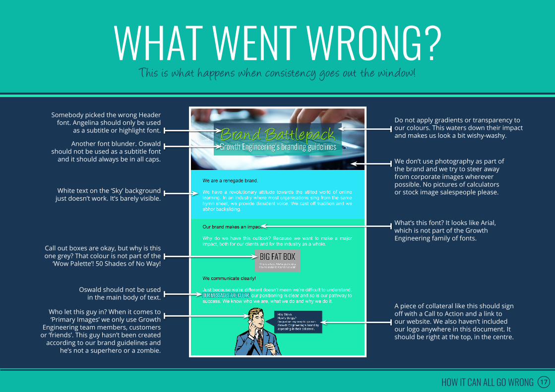
WHAT WENT WRONG?This is what happens when consistency goes out the window!
Somebody picked the wrong Header font. Angelina should only be used
as a subtitle or highlight font.
Another font blunder. Oswald should not be used as a subtitle font
and it should always be in all caps.
Do not apply gradients or transparency to our colours. This waters down their impact and makes us look a bit wishy-washy.
We don’t use photography as part of the brand and we try to steer away from corporate images wherever possible. No pictures of calculators or stock image salespeople please.
What’s this font? It looks like Arial, which is not part of the Growth Engineering family of fonts.
Oswald should not be used in the main body of text.
A piece of collateral like this should sign off with a Call to Action and a link to our website. We also haven’t included our logo anywhere in this document. It should be right at the top, in the centre.
White text on the ‘Sky’ background just doesn’t work. It’s barely visible.
Call out boxes are okay, but why is this one grey? That colour is not part of the
‘Wow Palette’! 50 Shades of No Way!
Who let this guy in? When it comes to ‘Primary Images’ we only use Growth
Engineering team members, customers or ‘friends’. This guy hasn’t been created
according to our brand guidelines and he’s not a superhero or a zombie.
18BRAND ASSETS
ASSETSLinks coming soon
GROWTH ENGINEERING PRIMARY IMAGE LIBRARY
GROWTH ENGINEERING SECONDARY IMAGE LIBRARY
GROWTH ENGINEERING SCREENSHOT LIBRARY
EDITABLE EMAIL SIGNATURE FILE
POWERPOINT TEMPLATE
GROWTH ENGINEERING LETTERHEAD
EDITABLE BUSINESS CARD FILE

1
2
3
19A PARTING MESSAGE
THE KEY TAKEAWAYSThings to remember!
Stay consistently consistent. Never waver.
If you’re ever uncertain, refer to the Brand Battlepack. If that doesn’t resolve the issue – don’t panic. Get in touch with one of Growth Engineering’s highly trained brand mechanics and we’ll get you up and running in no time.
Have fun while using the Growth Engineering brand. Remember to create things that make people smile!