Embed Size (px)
Citation preview

Idea Generation
This was a mind map to get all of our ideas down on paper, it highlights what we feel are the most important things about ICE that we can express with the design of the handbook and suggests a few different visual ideas along with some format ideas.We like the idea of using a paper crafted appearance to create to set it apart from other standard more corporate style handbooks.
These are initial ideas of how we want the front page to look and the different ways we can make it work. We are trying to experiment with the visual appeal of the handbook to try and trigger interest from the first glance, so we felt it was important to have a cover that stood out as bold and interesting, much like the ethos of ICE.
We want to keep the general style and branding for ICE, as we think that it is important to have consistency within the brand. The cover we feel should be the navy blue that is the sameon the leaflet. After the cover we can experiment more by playing around with the colours and shape in the ICE logo.

Front Page Ideas
2.
1. 3.
4.
1.Pros: -Interesting two tone visual appearance-Gives you an instant idea of what the inside will look like without having to open it.
Cons:-blue section could be flimsy-blue section could be flimsy-Not a lot of roomfor content on blue page
2. Pros:-Similar visual appearance to idea one but with a more sturdy design.
Cons:-Could become dog eared and untidy easily-Could become dog eared and untidy easily-Still not alot of content space.
3. Pros:-Lots of content space-Sturdy design-Interesting abnormal appeal
Cons:Cons:-Could become dog eared (not as easily)-Logo size may need to be changed
4. Pros:-Second page has a whole blank page for introduction
Cons:Cons:-Leaves a big blue ‘blob’ on one page-Logo cut out could be damaged meaning weak branding.
General notes:- Logo sizes are open to change.- These Ideas are based around a laser cut/paper crafted front page.
Our Choice:- Option 3 is our favourite as it incorporates the - Option 3 is our favourite as it incorporates the laser cut front page but still leaves a sturdy and useful space to put content on meaning it is not wasted. We chose a laser cut design to differentiate the handbook from a company with a more formal approach.

Content Format Ideas
Idea generation for how the content can be displayed within the handbook. This idea is based around the use of slits to hold external sheets or inserts of information about different sections within ICE. We’d like to experiment further with the use of different slits and different possible or useful formats for the inserts.
Other methods of displaying the caontent and different ways of folding the handbook, such as underfolded pockets/pouches, a concertina fold and a standard book layout. We feel that the most suited format is using slits because its relativley easy to produce and is presentable as a unique layout method.
Ideas on where we can take the content further such as a page for business cards to sit in, an events calendar and an interchangeable contact form. There is also experimentation on how we can take the idea forward including different formats for the inserts, for example an A6 card or an A4 poster fold.

Content Ideas
Further development for the slit/insert idea. The consetina fold is similar to that of the ICE leaflet so it also fits with the branding. If this was an option the inserts would have to be folded so that they wouldn’t fall out. We would like to explore different ways of holding inserts to develop the idea further. The insert idea is so that information can be changed therefore the handbook wouldn’t become changed therefore the handbook wouldn’t become outdated easily. The inserts would be based on several templates that can be easily edited and inserted before each induction at the beginning of the month. They also allow quick and easy access to relevenat information without having to flick through pages and pages of information.

Physical Mock Up Ideas
This image gives a slightly clearer representation of the front page with the cut out section. Through this cut out you would be able to see the logo and the words ‘Handbook’ would also be on the front navy blue page just underneath the cut out piece.
This is the next available double page after the introduction illustrative page and the friends of ICE page. As the left page wouldn’t be able to have a slit in it because it is the first of the concertina folds and due to there being content on the other side we suggest having this as the contents, making it user friendly and quick to find what you need.
The next page is the idea we have explored digitally The next page is the idea we have explored digitally with the folded insert in a simple straight across slit. After seeing it physically made we have decided to discard this idea as the fold would have to be very precise in order for it to not stick out of the bottom of the publication. It would also leave a lot of negative space on the page.
This is the first double page that would be available to have two inserts. The first page is a diagonal slit that holds the insert in by the corner. This looks nice visually but when its comes to holding inserts it could be a little flimsy and the content could be easily lost. (ideally the inserts would be printed on card to give them a more professional appearance.) WWe prefer the page with two diagonal slits as this makes the insert stable, looks nice and also there isn’t too much overhand on the back of the page.
This is an idea we had where we took parts of the logo and used those as the insert holders, we thought this would look really nice but when we made it the shapes weren’t recognisable as the shapes from the logo which made it quite irrelevant. It also wasn’t as stable compared to the diagonal slits.
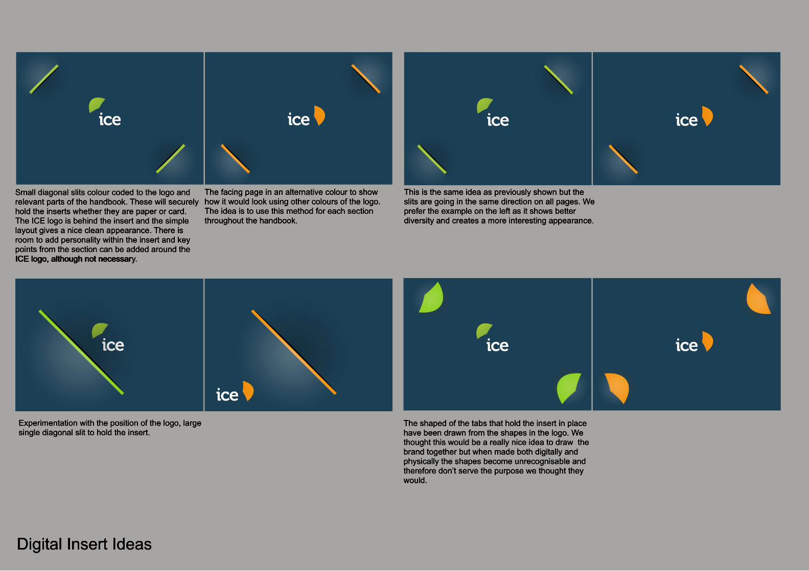
Digital Insert Ideas
Experimentation with the position of the logo, large single diagonal slit to hold the insert.
The shaped of the tabs that hold the insert in place have been drawn from the shapes in the logo. We thought this would be a really nice idea to draw the brand together but when made both digitally and physically the shapes become unrecognisable and therefore don’t serve the purpose we thought they would.
Small diagonal slits colour coded to the logo and relevant parts of the handbook. These will securely hold the inserts whether they are paper or card. The ICE logo is behind the insert and the simple layout gives a nice clean appearance. There is room to add personality within the insert and key points from the section can be added around the ICE logo, although not necessarICE logo, although not necessary.
The facing page in an alternative colour to show how it would look using other colours of the logo. The idea is to use this method for each section throughout the handbook.
This is the same idea as previously shown but the slits are going in the same direction on all pages. We prefer the example on the left as it shows better diversity and creates a more interesting appearance.

Content, Front Page
Further development ofideas for the frontcover. Rather than leaving the area blank, we thought it might me nice to fit in illustrations based on what happens around ICE. We think this gives a more friendly, less formal idea about ICE right from the beginning of the handbook.
What we really like about this idea is that the What we really like about this idea is that the handbook looks really clean cut, and organised on the outside, but when opened you get the feeling of warm friendly environment.
TTo carry on the friendly appearance, we thought would use up space that would otherwise be wasted to hold a list of friends of ICE. Alternatively important information such as affiliates or contact details of people from ICE. We thought it would keep the friendly style if the logos such as HSBC were drawn out in the sketchy style similar to the illustrations on the facing page.illustrations on the facing page.
Lorem ipsum dolor sit amet, consectetuer adipiscing elit, sed diam nonummy nibh euismod tincidunt ut laoreet dolore magna aliquam erat volutpat. Ut wisi enim ad minim veniam, quis nostrud exerci tation ullamcorper suscipit lobortis nisl ut aliquip ex ea commodo consequat. Duis autem vel eum iriure dolor in hendrerit in vulputate velit esse molestie consequat, vel illum dolore eu feugiat nulla facilisis at vero eros et
Friends of Welsh Ice

Front Page Ideas
Here is a digital representation of inserts within the booklet. The example inserts are A6 in size within an A5 booklet. The top example shows the folded up version of the insert which folds out to A4 shown below the first example. The fold out can contain any information or illustration and has the potential to be double sided. The middle of the fold out is the sub title for the The middle of the fold out is the sub title for the section so it allows the user to see where they are in the handbook.
The bottom version is an example of diThe bottom version is an example of different formats that can be placed inside the handbook, for example a single A6 card with an events calendar on it, so that new people can see what’s going on and get involved. Another thought that we want to explore is the possibility of adding multiple slits for business cards from companies within ICE, these are then in easy reach if a new within ICE, these are then in easy reach if a new company needs for example a design agency, and the information is interchangeable should new people join.

Final Diagram of Ideas
An exploded diagram of how the final handbook can be put together. This illustrates the different types of inserts, and a few of the concepts we have explored. Such as a business card pocket that could hold companies at ICE that would be helpful to a startup business. It shows how the book will be bound and how it will function.