Embed Size (px)
Citation preview

(BIG) DATA IN MAPS

Hello!I am Szymon PifczykI am a mapmaker, I dry imaginary towns and I became a journalist by a total coincidence
You can contact me at:[email protected]

WHAT DO I DO?
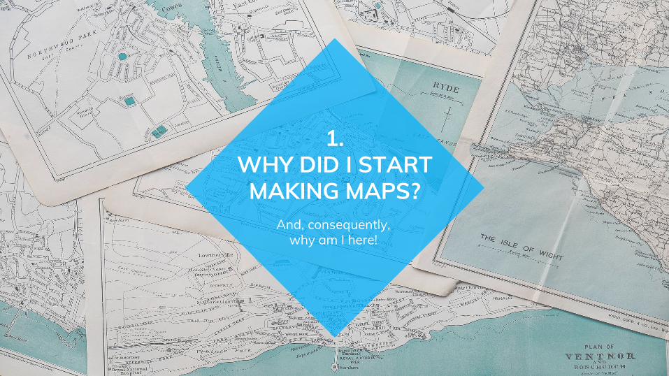
And, consequently, why am I here!
1.WHY DID I START MAKING MAPS?

“All the good things, they come from America”
- a man with a truly tremendous haircut (he most likely said it)

INCOME DONUTS

DETROIT RACE MAP
© Eric Fischer

POLISH ELECTIONS
© Eric Fischer
NOT ALL THE GOOD
THINGS COME FROM AMERICA!
- the world

After all, charts work just as well,
don’t they?
2.WHY ARE
MAPS GREAT?

Maps show what spreadsheets and
charts hide

Making them is usually free and sometimes other firms will pay you
to do so

Some data just has to be presented on
maps

You can produce your own data
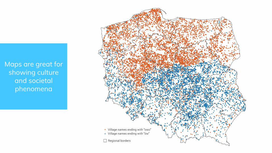
Maps are great for showing culture
and societal phenomena
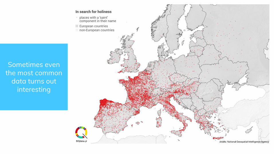
Sometimes even the most common
data turns out interesting

Maps are great for displaying large
datasets

And sometimes they just look
beautiful

Okay, maps are awesome but so what?
3.WHAT’S IN IT FOR
MY BUSINESS?
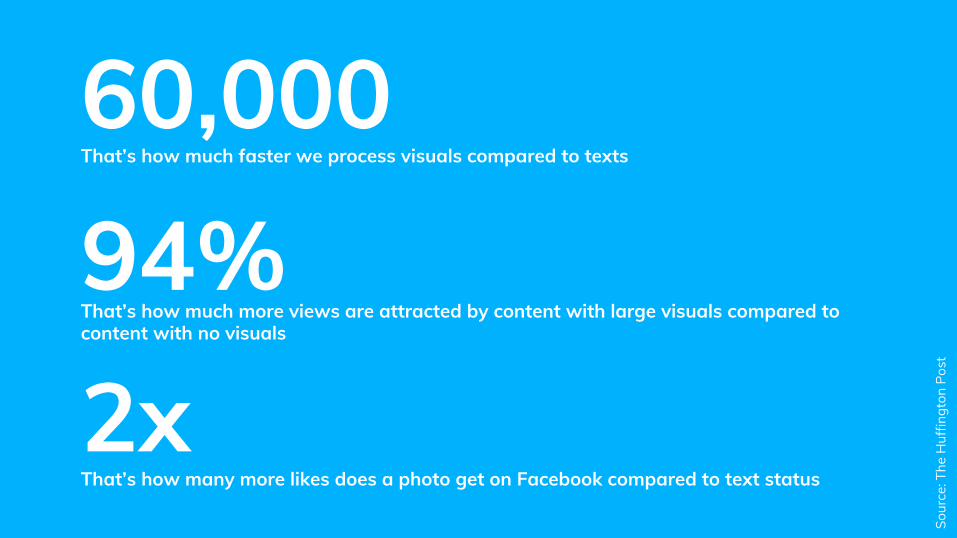
60,000 That’s how much faster we process visuals compared to texts
2xThat’s how many more likes does a photo get on Facebook compared to text status
94%That’s how much more views are attracted by content with large visuals compared to content with no visuals
Sour
ce: T
he H
uffin
gton
Pos
t

MAPS ARE BIG AND COLORFUL
VISUALSand people - particularly people
on the Internet - are attracted to color

EVERYONE’S DOING IT
The New York Times’ Upshot has set a high standard for visualizing data on maps and other news outlets such as The Washington Post, Guardian, Die Zeit and others follow the lead.
© The N
ew York Tim
es

But how do I start?
4.OKAY, YOU’VE
CONVINCED ME

WHAT DO YOU NEED?
GIS software
Geographical data
Statistical data

MOST-COMMON GIS SOFTWARE
ArcGISThe behemoth created and developed by Californian firm ESRI. Commercial, costs a lot of $$$. Impressive capabilities.
QGISAn open-source alternative to ArcGIS. Free, a little less capable but completely enough for most non-professional users.
RStatistical package R offers some GIS components and can create amazing maps but imho the required coding effort is too heavy compared to the outcome in most cases.
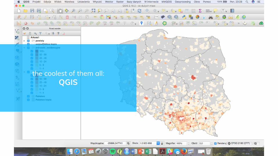
the coolest of them all:QGIS

➜ Lack of data - in particular geographic data (shapefiles and similar)
➜ Low granularity of data➜ Beginner’s mistakes
ANYTHING OBSTACLES?

Place your screeshot here
Place your screenshot here

Thanks!Any questions?You can find me at:@szpifczyk (twitter) facebook.com/[email protected]
CREDITS
Special thanks to the awesome people who created this presentation template and who uploaded some of the photos used here
➜ Presentation template by SlidesCarnival➜ Photographs by Pixabay