Embed Size (px)
Citation preview
Draft Pages What Needs to be
improved
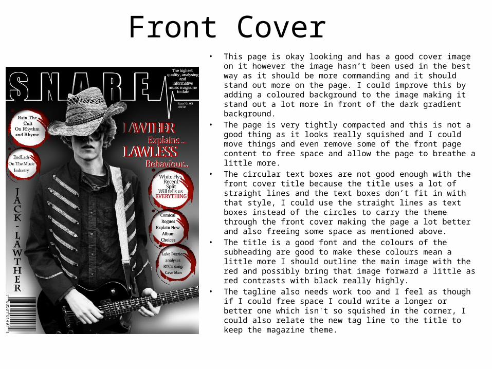
Front Cover • This page is okay looking and has a good cover image on it
however the image hasn’t been used in the best way as it should be more commanding and it should stand out more on the page. I could improve this by adding a coloured background to the image making it stand out a lot more in front of the dark gradient background.
• The page is very tightly compacted and this is not a good thing as it looks really squished and I could move things and even remove some of the front page content to free space and allow the page to breathe a little more.
• The circular text boxes are not good enough with the front cover title because the title uses a lot of straight lines and the text boxes don’t fit in with that style, I could use the straight lines as text boxes instead of the circles to carry the theme through the front cover making the page a lot better and also freeing some space as mentioned above.
• The title is a good font and the colours of the subheading are good to make these colours mean a little more I should outline the main image with the red and possibly bring that image forward a little as red contrasts with black really highly.
• The tagline also needs work too and I feel as though if I could free space I could write a longer or better one which isn't so squished in the corner, I could also relate the new tag line to the title to keep the magazine theme.
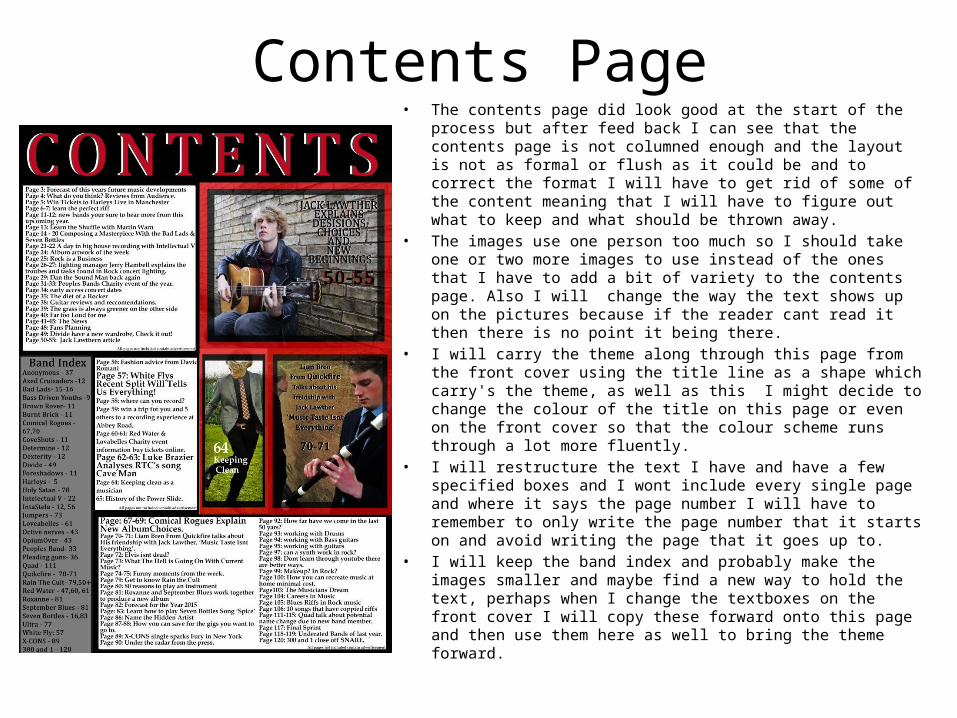
Contents Page• The contents page did look good at the start of the process but
after feed back I can see that the contents page is not columned enough and the layout is not as formal or flush as it could be and to correct the format I will have to get rid of some of the content meaning that I will have to figure out what to keep and what should be thrown away.
• The images use one person too much so I should take one or two more images to use instead of the ones that I have to add a bit of variety to the contents page. Also I will change the way the text shows up on the pictures because if the reader cant read it then there is no point it being there.
• I will carry the theme along through this page from the front cover using the title line as a shape which carry's the theme, as well as this I might decide to change the colour of the title on this page or even on the front cover so that the colour scheme runs through a lot more fluently.
• I will restructure the text I have and have a few specified boxes and I wont include every single page and where it says the page number I will have to remember to only write the page number that it starts on and avoid writing the page that it goes up to.
• I will keep the band index and probably make the images smaller and maybe find a new way to hold the text, perhaps when I change the textboxes on the front cover I will copy these forward onto this page and then use them here as well to bring the theme forward.
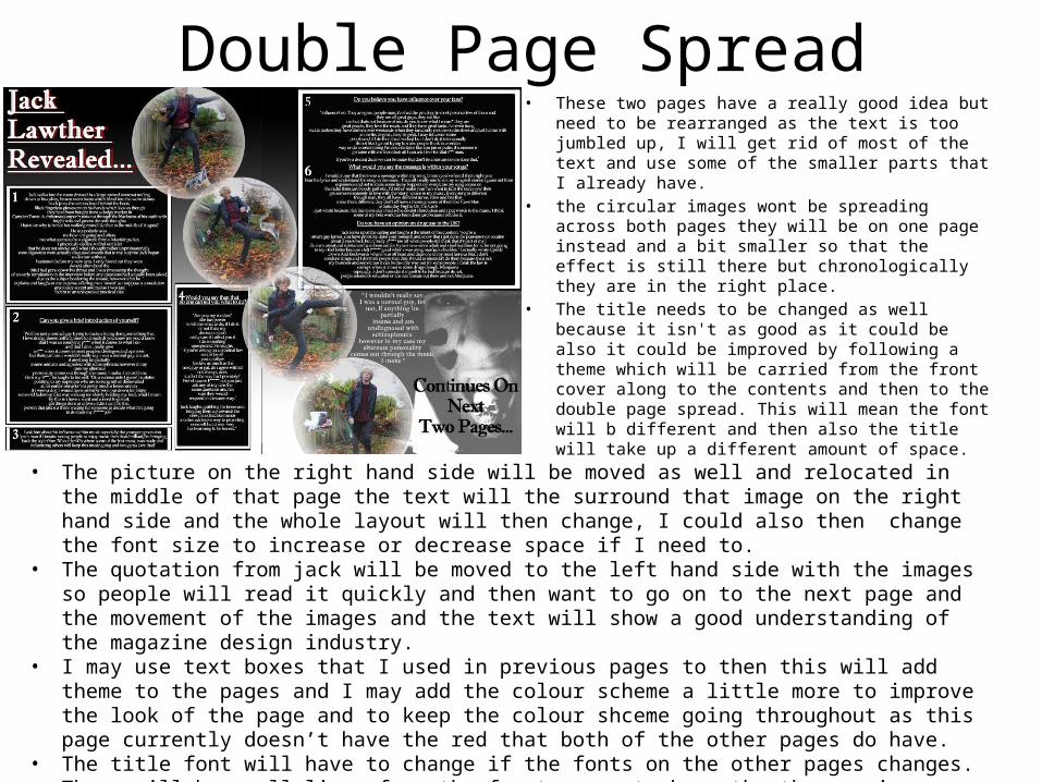
Double Page Spread• These two pages have a really good idea but need to
be rearranged as the text is too jumbled up, I will get rid of most of the text and use some of the smaller parts that I already have.
• the circular images wont be spreading across both pages they will be on one page instead and a bit smaller so that the effect is still there but chronologically they are in the right place.
• The title needs to be changed as well because it isn't as good as it could be also it could be improved by following a theme which will be carried from the front cover along to the contents and then to the double page spread. This will mean the font will b different and then also the title will take up a different amount of space.
• The picture on the right hand side will be moved as well and relocated in the middle of that page the text will the surround that image on the right hand side and the whole layout will then change, I could also then change the font size to increase or decrease space if I need to.
• The quotation from jack will be moved to the left hand side with the images so people will read it quickly and then want to go on to the next page and the movement of the images and the text will show a good understanding of the magazine design industry.
• I may use text boxes that I used in previous pages to then this will add theme to the pages and I may add the colour scheme a little more to improve the look of the page and to keep the colour shceme going throughout as this page currently doesn’t have the red that both of the other pages do have.
• The title font will have to change if the fonts on the other pages changes.• There will be small lines from the front cover to keep the theme going throughout and this will make the
magazine s theme shine through and they will serve as good graphics for my magazine.