Embed Size (px)
Citation preview

6. What have you learnt about technologies from the process of constructing this product?
to transfer a photo from a file to photoshop you simply click on the photo and drag it
across to the grey background of photoshop & drop. You then drag it across to the window
you wish to use it on, and there you go.
To make the text or shape stand out, simply open the ‘layer style’ window, and click on the small white boxes to the left, on for
example, ‘drop shadow’, to create the main objects stand out
I used adobe photoshop to create my front page

6. What have you learnt about technologies from the process of constructing this product?
I used adobe photoshop to create my contents page
TO MAKE YOUR PAGE LOOK A BIT LESS BORING, SIMPLY CLICK A F EW CM AWAY FROM A PHOTO YOU WISH TO ROTATE
AND A SMALL ARROW GOING ROUND IN A CIRCLE WILL APPEAR. SIMPLY DRAG IT IN THE DIRECTION YOU WISH TO ROTATE THE OBJECT. This adds a younger less-
sophisticated edge to your page, to show it’s aimed at a younger audience.
TO CHANGE THE COLOUR OF AN OBJECT, SIMPLY CLICK ON THE ITEM ON THE RIGHT HAND SIDE
PANEL, AND CHOOSE THE ‘COLOUR BOX’ AND THE TOP, THIS BOX WILL THEN APPEAR – MOVE THE
CURSOR AROUND TO CHANGE THE DARKNESS AND SHADING. This enables you to get the exact effect
you want.

6. What have you learnt about technologies from the process of constructing this product?
I used indesign to create my double page spread
Using the indesign
programme,If you have too many words forThe word box, simply click on
the Small ‘+’ shown and then click
onThe text box you wish to
expand Your text into
Select the ‘color’ option on the right
hand side panel, you can alter the shade
of your selected color.
Click on the ‘swatch’ option to choose your initial color.
Then click on the ‘color’ option to
change the shade of your chosen color.

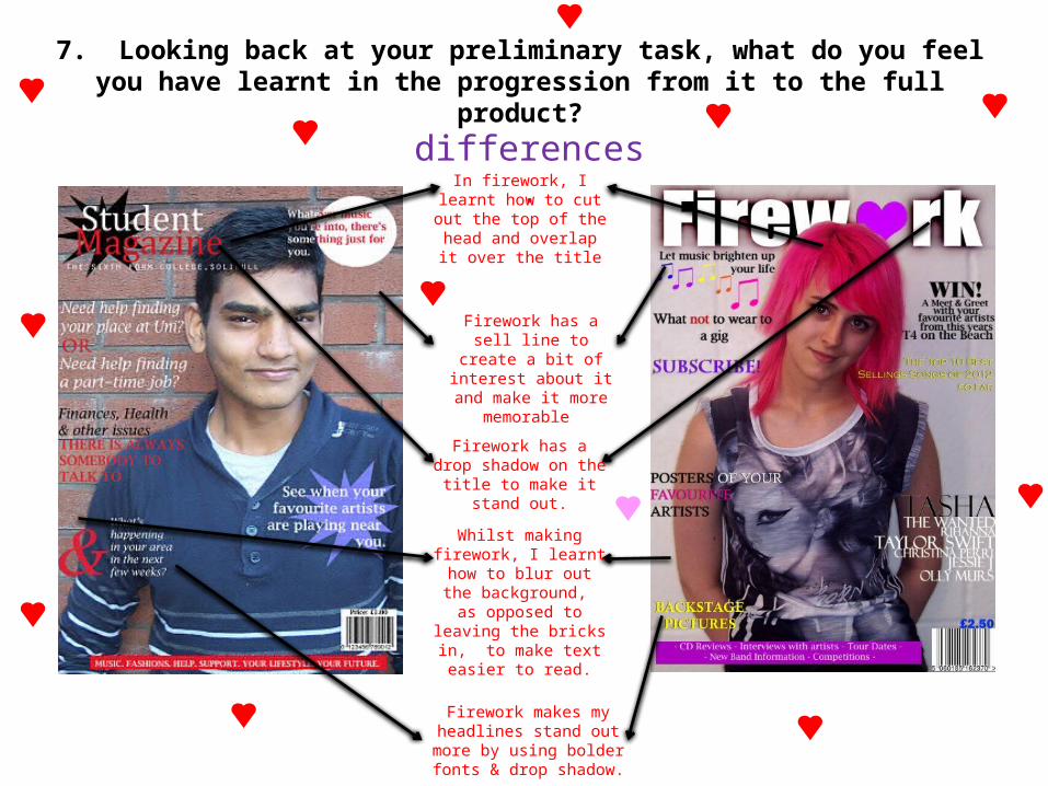
7. Looking back at your preliminary task, what do you feel you have learnt in the progression from it to the full product?
Since my preliminary task, I feel I have came on a lot in terms of making my magazine look more professional and realistic, and learnt how to do a lot more with the technology.
Since my preliminary task, I have learnt how to choose appropriate colours for the subjects, and highlight the main points in the articles, and taking photos to suit the
general overall theme. I also followed the conventions of other pop magazines to make mine look realistic.

7. Looking back at your preliminary task, what do you feel you have learnt in the progression from it to the full product?
Both have text overlapping the main
image – more magazine-like and less sophisticated.
similarities.
Both have a medium close up as their
main image on the front cover – a
convention often used in magazines
Both have the barcode in the
bottom right hand corner – another convention often
found in magazines
Both have a footer at the bottom –
something I knew how to do back then
too
7. Looking back at your preliminary task, what do you feel you have learnt in the progression from it to the full product?
differences.In firework, I learnt how to cut out the
top of the head and overlap it over the
title
Firework has a sell line to create a bit of interest about it and
make it more memorable
Firework has a drop shadow on the title
to make it stand out.
Whilst making firework, I learnt how
to blur out the background, as
opposed to leaving the bricks in, to
make text easier to read.
Firework makes my headlines stand out more by using bolder fonts &
drop shadow.

7. Looking back at your preliminary task, what do you feel you have learnt in the progression from it to the full product?
similarities.States the issue
number – to show it’s an established
magazine with more than one issue
Highlights the main page numbers – to highlight the main
points and add a bit of interest to the design
of the page
Coloured shapes in the background, to add colour and enhance
text
The background is plain on both of my pieces – this makes sure there
isn’t too much going on

7. Looking back at your preliminary task, what do you feel you have learnt in the progression from it to the full product?
differences.Firework uses a
quote to entice the reader into wanting to know more about the inside articles,
probably more appropriate in a
music magazine than a college one
Firework uses more appropriate photos in
my opinion, as opposed to the
slightly random ones my college
magazines has
Since creating my college magazine, I learnt how to rotate photos, to add a bit
of a younger edge to my magazine, and I used this feature on
firework