Embed Size (px)
Citation preview

Ancillary work: Making the outside cover for my
digipak
Step 1: The backgroundFor the first step of creating the outside cover of my digipak I had to think of a background that I would use throughout all of the artwork. I chose to use a dark blue gradient as it look a lot smoother than just one plain colour and it links to the colours we want to use to help create visual synergy between everything.

Step 2: The tracklist I decided that the first piece of text I would add would be the tracklist as it gives guidelines for everything else on the back cover. Its in Bebas Kai font as it is a clear font that is very easy to read even from a difference. From my research I know that a lot of digipaks within this genre like to use clear fonts as stylish fonts just seem hard to read and unsuitable. It is in white font as it didn’t look as good with black font on this background colour.

Step 3: Adding the album title
After the tracklist I added the album title, this was mainly because it is custom made and so took longer than just typing. It is at the bottom right of the front cover as thats what I noticed a lot when comparing to other digipaks. The album title will remain like this when adding it on other artworks to help create our visual synergy.
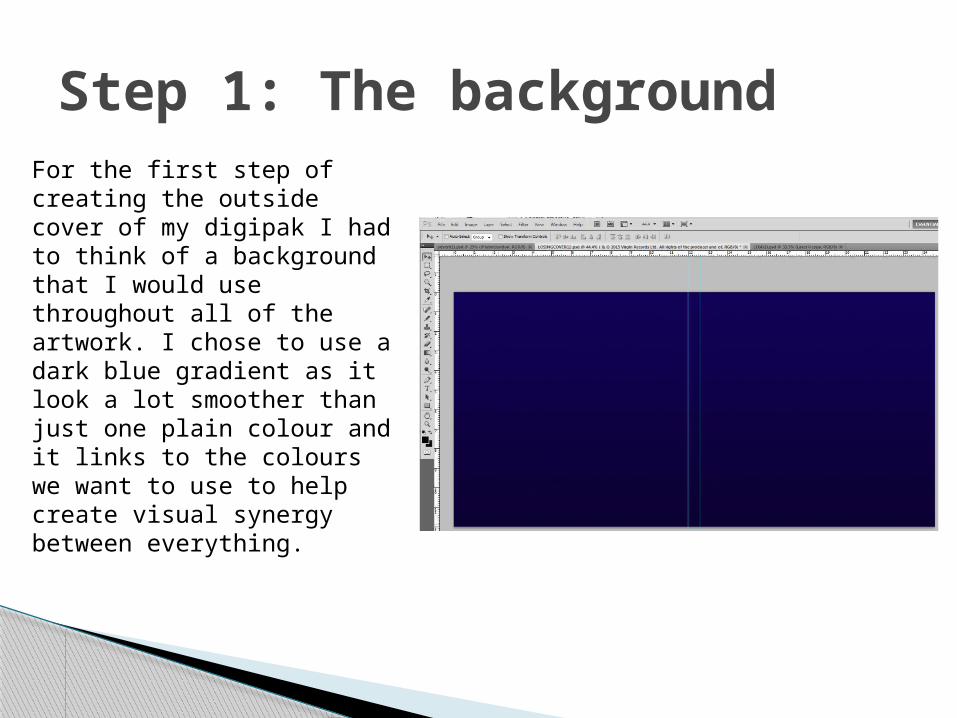
Step 4: Artist nameJust like with the album title this text of the artist’s name will remain the same throughout other pieces of work. It is also the same font as the tracklist as it is clear and helps the audience identify and separate the album title and artist’s name.

Step 5: A sticker This isn’t compulsory to have but nowadays you almost see a sticker on every album cover mentioning the best songs on the album, normally also the most successful. The font on the sticker is also Bebas Kai to help with synergy and as said before that it stands out so well. The sticker is completely opposite to the album title and artist name as it gives more space in the middle for the artist’s picture.
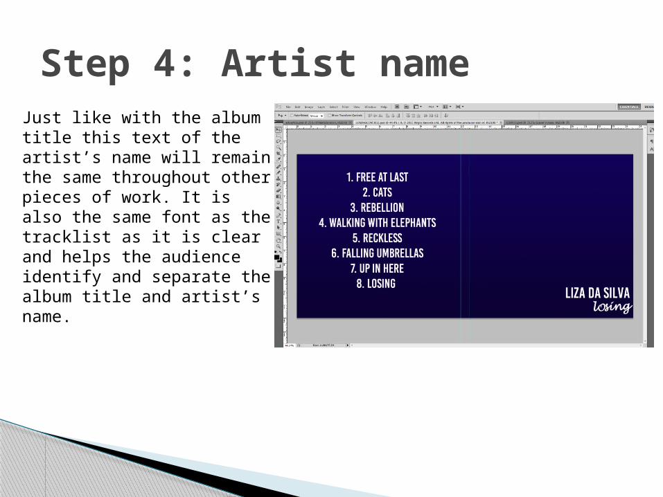
Step 6: Finishing the backAfter finishing the front (besides including a picture of the artist), I then finished the back, adding in the record label, copyright and ownership information and the barcode. The record label I went for is Virgin as they’re very popular now and pretty known for sign up and coming artists. All the writing is in white as it matches the colour of other text on the digipak. This is mainly because black would not be clear to see on the dark blue background.

Step 7: The spineAfter finishing the back and front cover I then proceeded to start and finish the spine. This included the record label logo, artists name and album title used in the same font and colour as before to help match the visual synergy. All I need to do now is put in an image of the artist but we’ve had a problem getting the image and are not sure if we would have to include something else on the front instead, hopefully we can get the images needed a proceed to finish the outside of the digipak.