Embed Size (px)
Citation preview

1
© Happiest Minds Technologies Pvt. Ltd. All Rights Reserved
January, 2014
Data Visualization & Reporting for Case Management By Shantanu Paknikar Happiest Minds, IT Services Group
Ankit Arya Gautam Karni Suresh Kumar Varun Mehta IIM Rohtak, PGPM – 2014
2
© Happiest Minds Technologies Pvt. Ltd. All Rights Reserved
Table of Contents 1. Introduction ................................................................................................................... 3
2. Case Management ......................................................................................................... 5
3. Key Performance Indicators ........................................................................................... 6
4. Visualization Types......................................................................................................... 6
5. Visualization Examples ................................................................................................... 9
KPI # 1: Request Withdrawal Rate ................................................................................. 9
KPI # 2: Number of customers on-boarded ................................................................. 10
KPI # 3: Process cycle time ........................................................................................... 11
KPI # 4: Volume Forecast ............................................................................................. 12
Correlation between KPIs ............................................................................................ 13
6. Conclusion .................................................................................................................... 14
7. References ................................................................................................................... 15
3
© Happiest Minds Technologies Pvt. Ltd. All Rights Reserved
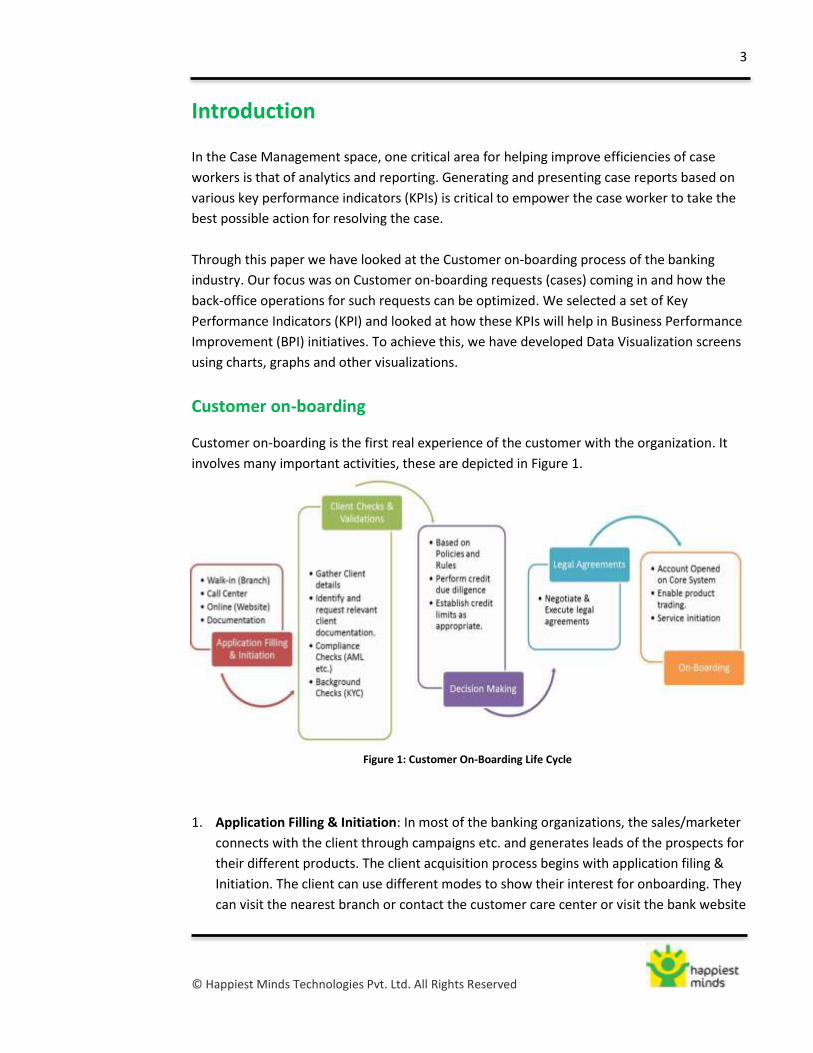
Figure 1: Customer On-Boarding Life Cycle
Introduction
In the Case Management space, one critical area for helping improve efficiencies of case
workers is that of analytics and reporting. Generating and presenting case reports based on
various key performance indicators (KPIs) is critical to empower the case worker to take the
best possible action for resolving the case.
Through this paper we have looked at the Customer on-boarding process of the banking
industry. Our focus was on Customer on-boarding requests (cases) coming in and how the
back-office operations for such requests can be optimized. We selected a set of Key
Performance Indicators (KPI) and looked at how these KPIs will help in Business Performance
Improvement (BPI) initiatives. To achieve this, we have developed Data Visualization screens
using charts, graphs and other visualizations.
Customer on-boarding
Customer on-boarding is the first real experience of the customer with the organization. It
involves many important activities, these are depicted in Figure 1.
1. Application Filling & Initiation: In most of the banking organizations, the sales/marketer
connects with the client through campaigns etc. and generates leads of the prospects for
their different products. The client acquisition process begins with application filing &
Initiation. The client can use different modes to show their interest for onboarding. They
can visit the nearest branch or contact the customer care center or visit the bank website

4
© Happiest Minds Technologies Pvt. Ltd. All Rights Reserved
for online application filing. The bank documents the application for the type of product
they are intended for.
2. Client checks & validation: Next the dedicated on-boarding team (back office) takes
ownership of the onboarding request and connects with other departments to process
the request. They do the client checks and verification by gathering client details through
various ways. These can include requesting documents for identification such as driving
license, passport and checking their validation. Apart from these different compliance
checks are performed depending upon the law of the land.
One of these compliance checks could be Anti Money Laundering (AML). They are set of
laws or regulations designed to cease the practice of generating income through illegal
ways. In most cases money launderers conceal their actions through a series of steps that
make it look like money coming from illegal or unethical sources was earned legally. In
India, for instance, AML comes under Prevention of Money Laundering Act, 2002. The
main purpose of this act is to prevent money-laundering as well as to provide for
confiscation of property involved in money-laundering.
Background checks are done through KYC (Know your Customer), which is a term used
for the customer identification process. It involves making adequate efforts to determine
true identity and beneficial ownership of accounts, the nature of customer’s business,
fairness of operations in the account in relation to the customer’s business, source of
funds, which in turn helps the banks to manage their risks effectively. The main objective
of the KYC guidelines is to prevent criminal elements using banks, intentionally or
unintentionally for money laundering. KYC basically has two components - Identity and
Address. While the identity remains the same, there may be change in address so the
banks are required to periodically update their records.
3. Decision Making: The decision to purchase / clear a financial product is usually driven by
many factors. However, in difficult economic times, it’s important to understand the risks
involved in the commercial product portfolio. After the authenticity of the customer has
been established, decision is taken based on the bank’s policies, rules and regulations
regarding its different products. The decision may include establishing credit limit for the
customer after performing credit due diligence
4. Legal Agreements: Once the decision is made to sell/ offer the product to the client, all
the legal formalities should be completed. These include negotiating legal term,
executing legal agreements and completing legal due diligence. These agreements vary
as per the requirement of legal system of the country.
5. On-boarding: Thereafter, the account is opened in the bank’s core system with the
intimation to the customer through welcome pack or calls. The customer can start
utilizing the service and begin the product trading.

5
© Happiest Minds Technologies Pvt. Ltd. All Rights Reserved
Case Management
Case Management is the handling of unstructured ad-hoc and unpredictable processes. It
involves human participants and relies on user decisions, actions, events, and policies. Case
Management can be used to model and address any back-office operations scenario. For this
paper, we have considered a customer on-boarding request as a case that needs to be
handled. An on-boarding request is typically for a particular product; request types can
therefore be modeled as per product types.
The customer On-boarding process involves different interdependent processes, with unique
aspects for each request (product) type. Case Management allows better coordination of on-
boarding activities involving human intervention, resulting in improved efficiencies. Case
Data Visualization and Reporting is critical to assist decision making for case workers during
the on-boarding operations activities.
Case Type Identification
The major product types in a bank include accounts, cards and loan. With each product type
there can be multiple products, for example, product type card can include products such as
credit card, debit card, travel card etc. In case management, we will have a different case
type for the on-boarding process for each product as depicted in the Figure 2 below.
Figure 2: Case Types
6
© Happiest Minds Technologies Pvt. Ltd. All Rights Reserved
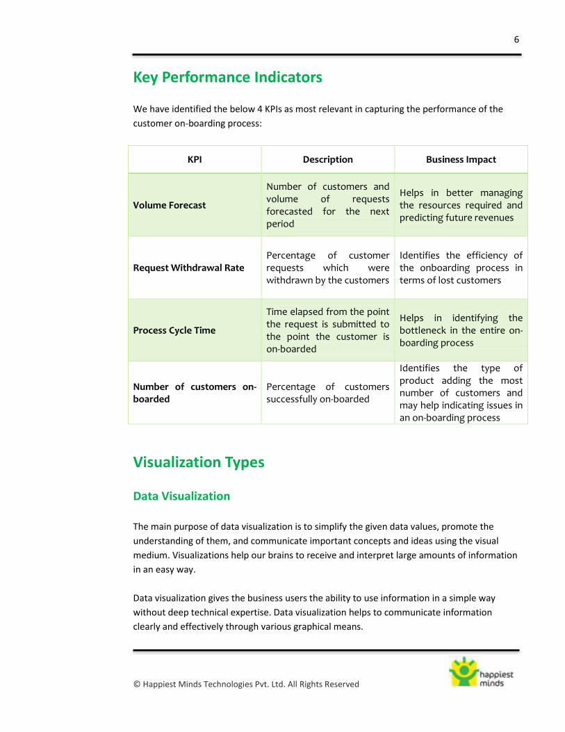
Key Performance Indicators
We have identified the below 4 KPIs as most relevant in capturing the performance of the
customer on-boarding process:
KPI Description Business Impact
Volume Forecast
Number of customers and volume of requests forecasted for the next period
Helps in better managing the resources required and predicting future revenues
Request Withdrawal Rate Percentage of customer requests which were withdrawn by the customers
Identifies the efficiency of the onboarding process in terms of lost customers
Process Cycle Time
Time elapsed from the point the request is submitted to the point the customer is on-boarded
Helps in identifying the bottleneck in the entire on-boarding process
Number of customers on-boarded
Percentage of customers successfully on-boarded
Identifies the type of product adding the most number of customers and may help indicating issues in an on-boarding process
Visualization Types
Data Visualization
The main purpose of data visualization is to simplify the given data values, promote the
understanding of them, and communicate important concepts and ideas using the visual
medium. Visualizations help our brains to receive and interpret large amounts of information
in an easy way.
Data visualization gives the business users the ability to use information in a simple way
without deep technical expertise. Data visualization helps to communicate information
clearly and effectively through various graphical means.

7
© Happiest Minds Technologies Pvt. Ltd. All Rights Reserved
Types of Visualizations
One important aspect in the visualizations is to identify the right type of visualization, which
in turn shall help in interpreting the data in an easy way. The various type of visualizations
followed in the report are as follows:
1. Pie chart
A pie chart is also known as a circle graph. This is divided into sectors, illustrating
numerical proportion. In a pie chart, the arc length of each sector is proportional to the
quantity it represents.
One disadvantage of pie charts is that it is difficult to compare different sections of a
given pie chart, or to compare data across different pie charts. Pie charts may sometime
be replaced by other plots, for example, Bar Chart.
2. Column chart or Bar chart
A column chart, also known as a bar chart, is usually represented with rectangular bars of
lengths usually proportional to the magnitudes or frequencies of what they represent.
The bars can be either horizontally or vertically oriented.
The column chart can be further represented in single or multi series with respect to the
data model and the visualization purpose.
3. Line chart
A chart which displays information as a series of data points which is usually connected
by straight line segments to form a line chart or a line graph. It is a basic type
of chart common in many fields.
A line chart is often used to visualize a trend in data over intervals of time, known as
a time series. Thus, line charts are often drawn chronologically.
4. Tree map
Tree mapping is a method for displaying hierarchical data by using nested rectangles.
Each branch of the tree is given a rectangle, which is then tiled with smaller rectangles
representing sub-branches. A leaf node's rectangle has an area proportional to a
specified dimension on the data. Often the leaf nodes are colored to show a
separate dimension of the data.

8
© Happiest Minds Technologies Pvt. Ltd. All Rights Reserved
When the color and size dimensions are correlated in some way with the tree structure,
one can often easily see patterns that would be difficult to spot in other ways, such as if
a certain color is particularly relevant. A second advantage of tree maps is that, by
construction, they make efficient use of space. As a result, they can legibly display
thousands of items on the screen simultaneously.
5. Scatter chart
In a Scatter chart the data is predominantly displayed as a collection of points. Each point
may indicate the value of one variable. This variable may in turn determine the position
on the vertical or horizontal axis.
From a Scatter chart, correlations between variables can be inferred. A famous example
would the height and weight plotted on x and y axis respectively.
Usually, any Correlation may be positive, negative, or null. In a positive correlation, the
pattern of dots is plotted from lower left to upper right. And in a negative correlation it is
the reverse order.
6. Network Graph
Network graph visualization is generally used to plot the directed and the undirected
graph structures. The graph allows networks to be compared. Also the relationship
between entities can be captured in network graph.
9
© Happiest Minds Technologies Pvt. Ltd. All Rights Reserved
Visualization Examples
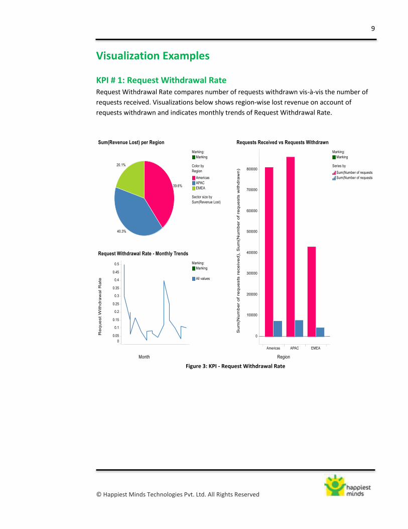
KPI # 1: Request Withdrawal Rate Request Withdrawal Rate compares number of requests withdrawn vis-à-vis the number of
requests received. Visualizations below shows region-wise lost revenue on account of
requests withdrawn and indicates monthly trends of Request Withdrawal Rate.
Figure 3: KPI - Request Withdrawal Rate
10
© Happiest Minds Technologies Pvt. Ltd. All Rights Reserved
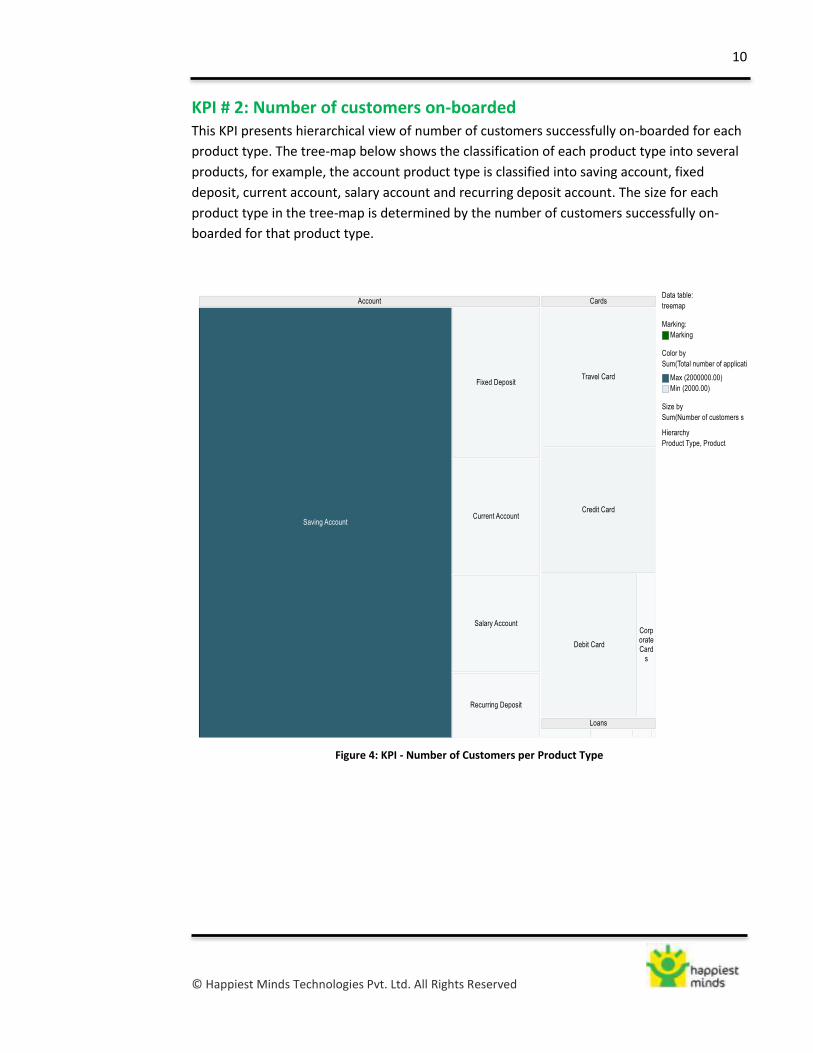
KPI # 2: Number of customers on-boarded This KPI presents hierarchical view of number of customers successfully on-boarded for each
product type. The tree-map below shows the classification of each product type into several
products, for example, the account product type is classified into saving account, fixed
deposit, current account, salary account and recurring deposit account. The size for each
product type in the tree-map is determined by the number of customers successfully on-
boarded for that product type.
Figure 4: KPI - Number of Customers per Product Type

11
© Happiest Minds Technologies Pvt. Ltd. All Rights Reserved
KPI # 3: Process cycle time This KPI measures the total time taken for the entire customer on-boarding process. To
depict process cycle time for each product we have used stacked graph showing time taken
for each sub part of the on-boarding process. Also, to compare bank’s process cycle time
with the industry’s we have used side-by-side bar graph for different products offered by the
bank.
Figure 5: KPI - On-Boarding Process Cycle Time
12
© Happiest Minds Technologies Pvt. Ltd. All Rights Reserved
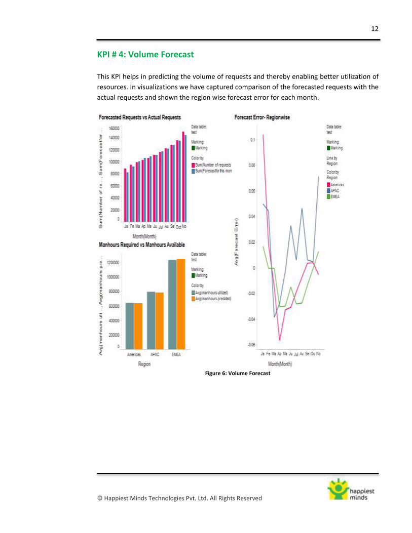
KPI # 4: Volume Forecast
This KPI helps in predicting the volume of requests and thereby enabling better utilization of
resources. In visualizations we have captured comparison of the forecasted requests with the
actual requests and shown the region wise forecast error for each month.
Figure 6: Volume Forecast

13
© Happiest Minds Technologies Pvt. Ltd. All Rights Reserved
Correlation between KPIs Using the scatter plot we were able to find positive correlation between the time taken for
on-boarding and request withdrawal rate. This means that if a product had a higher process
cycle time, the request withdrawal rate would have been higher. This implies that the
number of requests withdrawn without being fulfilled by a bank is proportional to the time
taken by it to process the requests. Hence, if a bank is able to reduce the process cycle time,
it will able to retain more customers.
Figure 7: Negative impact (higher withdrawals) of longer on-boarding

14
© Happiest Minds Technologies Pvt. Ltd. All Rights Reserved
Conclusion
A picture is worth a thousand words. Similarly, the value in data can truly be unlocked when
it can be visualized well.
In summary, case visualization can result in the following benefits:
1. Visualizations enable comparison between variables over time, we could see
variances between forecasted and actual requests using a side by side bar chart.
2. Visualizations help in viewing changing trends, for instance depicting request
withdrawal rate on a line chart over a time period gives an idea of how it has
changed.
3. Vast quantities of data can be looked more quickly as it is more representative than
data tables, for example using a tree map we could depict the most popular products
i.e. resulting in the most on-boarding requests.
4. Visualizations help achieve more insight into the nature of a problem, we had
represented time consumed by different parts of on-boarding process using a
stacked bar chart and were able to see which process took most time.
5. Visualizations help in discovering correlation between variables by using
visualizations such as Scatter Plot which showed how request withdrawal rate
increases for products with higher process cycle time

15
© Happiest Minds Technologies Pvt. Ltd. All Rights Reserved
References
1. Tibco Spotfire Application Data Services
2. http://www.sas.com/knowledge-exchange/business-analytics/innovation/why-your-
brain-needs-data-visualization/index.html
3. http://en.wikipedia.org/wiki/Data_visualization : This website gives an overview of data
visualization and different approaches on the scope of data visualization. One common
focus is on information presentation, such as Friedman (2008) presented it. In this line
the "Data Visualization: Modern Approaches" (2007) article gives an overview of
different subjects of data visualization.
4. ‘Magic Quadrant for Business Intelligence and Analytics Platforms’, www.gartner.com:
This document plots different vendors of BI tools on a graph with completion of vision on
x-axis and ability to execute on y-axis. It further categorizes the vendors into leaders,
challengers, niche player and visionaries based on their positions on the graph. This
article is very useful in comparing different vendors based on their strengths & cautions.
5. http://www.tableausoftware.com/ : This website is useful to understand the different
type of visualizations which are most commonly used in different industries. The white
papers gives a deeper insight to different types of data visualizations.
6. http://stn.spotfire.com/spotfire_client_help/whnjs.htm: we have used TIBCO Spotfire for
data visualization in this project. The help website and software feature gives detailed
information of the usage of the software, its different features and using them.
7. ‘Client Onboarding: Solving the Challenges, Maximizing the Opportunities’, Fenergo
white paper: This white paper describes what is client on-boarding and measuring client
on boarding. It helped in defining the KPI needed for data visualization.
8. ‘Knowledgent Insights’, http://www.knowledgent.com: Knowledgent is a purpose-built
Industry Information Consultancy that provides advanced Information Management and
Analytical (IM&A) solutions with industry-specific specialization in Financial Services, Life
Sciences, Healthcare and Commercial markets. Their white paper ‘Client Onboarding
Process Reengineering: Performance Management of Client Onboarding Programs’ is
useful to get more insights on customer on-boarding
9. ‘Client On-boarding and Customer Experience’, http://venkysundaram.wordpress.com :
this blog discussions reasons for poor on-boarding experience by the customers which
can be considered while streamlining the customer on-boarding process.
10. http://www.banktech.com/: this website is useful to understand different banking terms
and concepts
11. http://www.ibm.com
12. http://www.investopedia.com/
16
© Happiest Minds Technologies Pvt. Ltd. All Rights Reserved
About Happiest Minds
Happiest Minds is a next-generation IT services company helping clients differentiate and win with a
unique blend of innovative solutions and services based on the core technology pillars of cloud
computing, social computing, mobility and analytics. We combine an unparalleled experience,
comprehensive capabilities in the following industries: Retail, Media, CPG, Manufacturing, Banking
and Financial services, Travel and Hospitality and Hi-Tech with pragmatic, forward-thinking advisory
capabilities for the world’s top businesses, governments and organizations. Founded in 2011, Happiest
Minds is privately held with headquarters in Bangalore, India and offices in the USA and UK.
For further information, please contact [email protected]
Corporate Office
Happiest Minds Technologies Pvt. Ltd.
Block II, Velankani Tech Park
43 Electronics City
Hosur Road, Bangalore 560100, INDIA
Phone: +91 80 332 03333
Fax: +91 80 332 03000
United States
116 Village Boulevard, Suite 200
Princeton, New Jersey, 08540
Phone:+1 609 951 2296
2018 156th Avenue NE #224
Bellevue, WA 98007
United Kingdom
200 Brook Drive, Green Park, Reading
Berkshire, RG2 6UB
Phone: +44 11892 56072
Fax: + 44 11892 56073
About the authors
Shantanu Paknikar ([email protected]) is General Manager, Innovative Business Solutions
in the IT Services division of Happiest Minds. His expertise areas include middleware systems, SOA, BPM,
enterprise integration, cloud computing, social media, mobility, analytics, multimedia, and distributed
computing systems. He is passionate about innovation, research, and learning.
Ankit Arya ([email protected]), Gautam Karni ([email protected]), Suresh Kumar
([email protected]) and Varun Mehta ([email protected])are students of IIM Rohtak,
PGPM – 2014.The work on this paper was done during Business Analytics course at IIM Rohtak in collaboration
with Happiest Minds.
DISCLAIMER: It may be noted that the authors take full responsibility for the content. IIM Rohtak does not
necessarily subscribe to the views expressed in this paper, which are those of the authors.