Embed Size (px)
Citation preview

Page 1 | Infographics | April 2012
Infographics a short history

Page 2 | Infographics | April 2012
Definition
Infographics = information graphics
“graphic visual representations of information, data* or knowledge. These graphics present complex information quickly and clearly”- Wikipedia
*aka data visualisation
Bar charts and maps, line graphs, pie charts, system diagrams, tables…

Page 3 | Infographics | April 2012
Purpose
Shifts the balance between perception and cognition to take fuller advantage of the brain's abilities

Page 4 | Infographics | April 2012
Principles
Proximity Objects that are close together are perceived as a group
Similarity Objects that share similarattributes (e.g. color or shape)are perceived as a group
Connection Objects that are connected(e.g. by a line) are perceived as a group
Page 5 | Infographics | April 2012
PrinciplesEnclosure Objects that appear to have a
boundary around them (e.g. formed by a line or area of common colour) are perceived as a group
Closure Open structures are perceived as closed, complete, and regular whenever there is a way that they can reasonably be interpreted as such
Continuity Objects that are aligned together or appear to be a continuation of one another are perceived as a group
Connection Objects that are connected (e.g. by a line) are perceived as a group

Page 6 | Infographics | April 2012

Page 7 | Infographics | April 2012
Origins
Cave paintings!
Maps pre-date writing by several millennia
An early infographic that made a difference…
In 1857, English nurse Florence Nightingale used information graphics persuading Queen Victoria to improve conditions in military hospitals, principally the Coxcomb chart, a combination of stacked bar and pie charts, depicting the number and causes of deaths during each month of the Crimean War.

Page 8 | Infographics | April 2012
Origins

Page 9 | Infographics | April 2012
Modern infographics

Page 10 | Infographics | April 2012
Research centricLauren Manning, a New York based designer, explores various methods to visualise one single data set for her thesis. Food Consumed:
“It’s like comparing apples to oranges.” This phrase is the best way to describe the current state of data visualizations. …Instead of seeing many excellent visualizations of all different data sets, what if you could see tons of visualizations of the same data set? What new comparisons, knowledge and structure might be developed from this?

Page 11 | Infographics | April 2012
Research centricLauren Manning, a New York based designer, explores various methods to visualise one single data set for her thesis. Food Consumed:
“It’s like comparing apples to oranges.” This phrase is the best way to describe the current state of data visualizations. …Instead of seeing many excellent visualizations of all different data sets, what if you could see tons of visualizations of the same data set? What new comparisons, knowledge and structure might be developed from this?

Page 12 | Infographics | April 2012
Research centric

Page 13 | Infographics | April 2012
Customisable

Page 14 | Infographics | April 2012
Public data
research centric and attributed to multiple sources

Page 15 | Infographics | April 2012
Attributed to multiple sources
Blog data comes from a variety of online sources, including LiveJournal, MSN Spaces, MySpace, Blogger, Flickr, Technorati, Feedster, Ice Rocket, and Google.

Page 16 | Infographics | April 2012
RSPCA Freedom Food sales data visualisation
We produced assets to reach out to bloggers and online influencers, providing visuals to support a statistics based PR story.
Very successful campaign results for RSPCA.
Page 17 | Infographics | April 2012
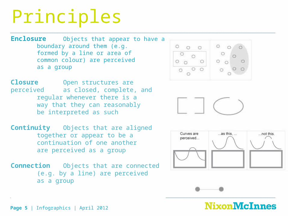
Channel 4 ‘Ask the Chancellors’ debate

Page 18 | Infographics | April 2012
Datacopter Twitter visualisation app for Channel 4
Page 19 | Infographics | April 2012
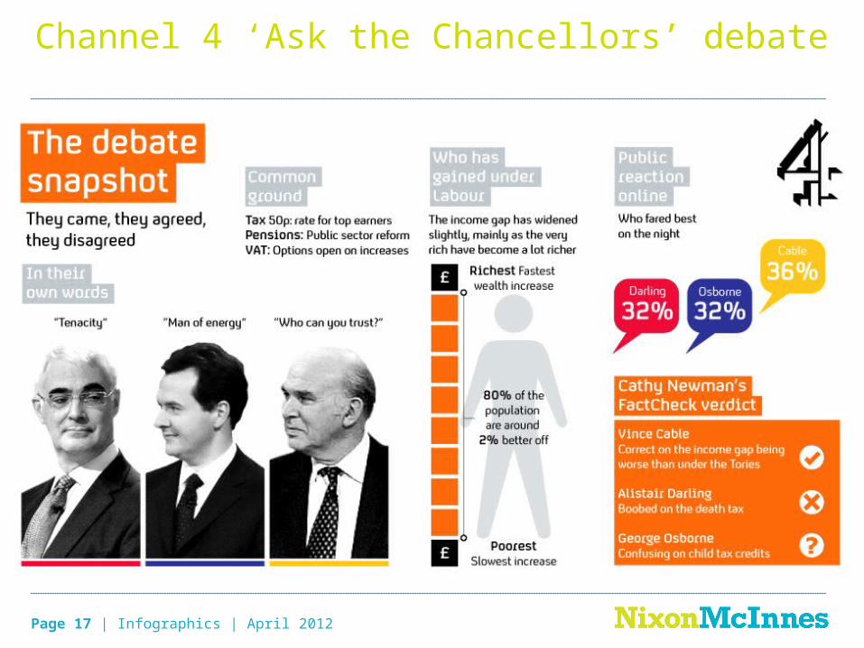
Datacopter Twitter visualisation app V2.0
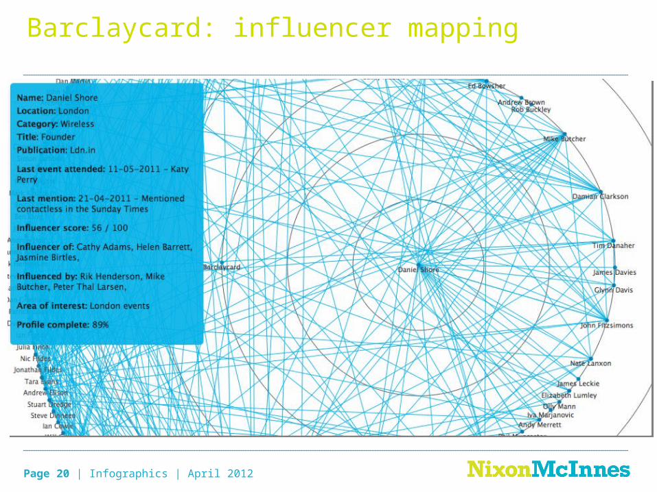
Page 20 | Infographics | April 2012
Barclaycard: influencer mapping
Page 21 | Infographics | April 2012
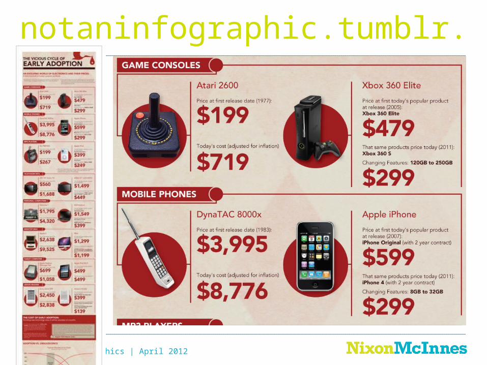
notaninfographic.tumblr.com

Page 22 | Infographics | April 2012
Thank you!@bethgranterhttp://delicious.com/bethgranter/infographics