Embed Size (px)
Citation preview

Teams, styles and scalable applications
vittorio vittori @vttrx vitto #css #team #style-guide

I started to love modular design thanks to…

…my beloved LEGO!
it was love for modular design and engineering

I dreamed to became an artist

and one day I met internet

so, full of dreams and ideals, I became…

a Macromedia Flash developer
for 6 years

but this wasn’t the end I switched to HTML, CSS and JS

and I saw my LEGO again
.class{ background-color: green; } . { border-top: 1px solid blue; }

with infinite possibilities
<div class=“ ”> Heilo world! </div>
so, I decided
to move on and…

write beautiful CSS
#home.new table div tr {…}
/* buy bread @ SUPERMAKET */ .Pag .red_area#ORO HR {…}
/* not working */ /* MUST BE A CSS BUG */ .str.CIAO..new > * > div {…}

ok, I know I’m missing somethingCSS

This is when I realized I needed to using tools to ease my life

Using a framework helps you gain time on reusable stuff like grids & widgets you need for your scaling application
Using an approach gives you the opportunity to grow your code between scaling application that changes during development
Now let’s talk about approaches not frameworks

APPROACH AUTHOR
SMACSSsmacss.com
Jonathan Snooksnook.ca
OOCSS github.com/stubbornella/oocss/wiki
Nicole Sullivanstubbornella.org
Expressive CSSjohnpolacek.github.io/expressive-css
John Polacekjohnpolacek.com
BEM bem.info
Vitaly Harisov vitaly.harisov.name
what’s around

SMACSS Scalable and Modular Architecture for CSS

v
SMACSS BASE
for common element selectors
body, form { margin: 0; padding: 0; }
a { color: #039; }
a:hover { color: #03F; }

v
SMACSS BASE
not nice for element ’s attribute selectors
input[type=“text”] { color: #039; }
.alt-input { color: red; }
.i-said-alt-input { …: #03F!important; }
v
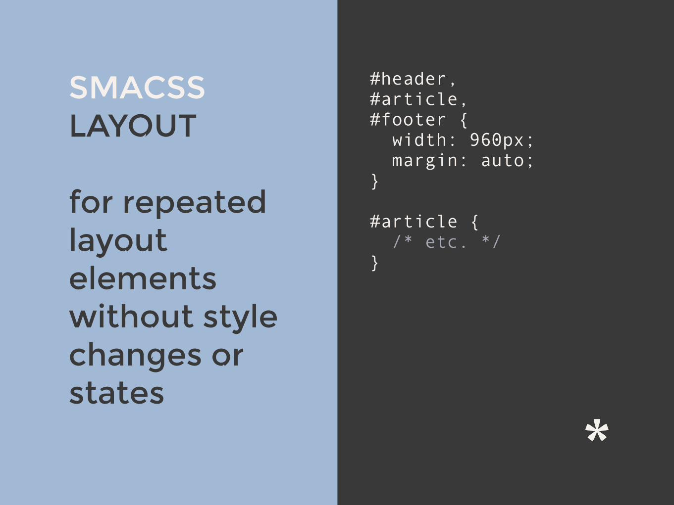
SMACSS LAYOUT
for repeated layout elements without style changes or states
#header, #article, #footer { width: 960px; margin: auto; }
#article { /* etc. */ }

v
SMACSS LAYOUT
not nice they may need to be changed in the future
#article { /* bg yellow */ }
.bg-blue { /* bg blue */ }
#article.bg-blue { /* bg blue */ }

SMACSS MODULE
designed to exist as a standalone component
.module > h2 { padding: 5px; }
.module span { padding: 5px; }

v
span { /* BASE styles */ border: 2px solid; border-color: red; }
.module > h2 { padding: 5px; }
.module span { padding: 5px; /* unwanted inherited propos */ border: 2px solid; border-color: red; }
SMACSS MODULE
resets needed because of BASE in some cases

SMACSS STATE
something that augments and overrides all other styles
.tab { color: white; }
.is-tab-active { color: black; border: 1px … #000; }
.is-active { color: black; }

v
SMACSS STATE
not nice for potential states duplication
.tab { color: white; }
.is-tab-active { color: black; border: 1px … #000; }
.is-active { color: black; }
.is-button-active { color: black; }

SMACSSScalable and Modular Architecture for CSS
CONS xYou have to be careful on
widget children selectors strength
xMany design levels, layout, base, widgets, etc. that can lead to conflicts if you work on a team
xWidget’s element selectors are not a best practice
PROS ✓Organizing files by
widgets it’s nice for avoiding conflicts
✓Very fast on building codebase with state selectors

OOCSS Object Oriented CSS
v
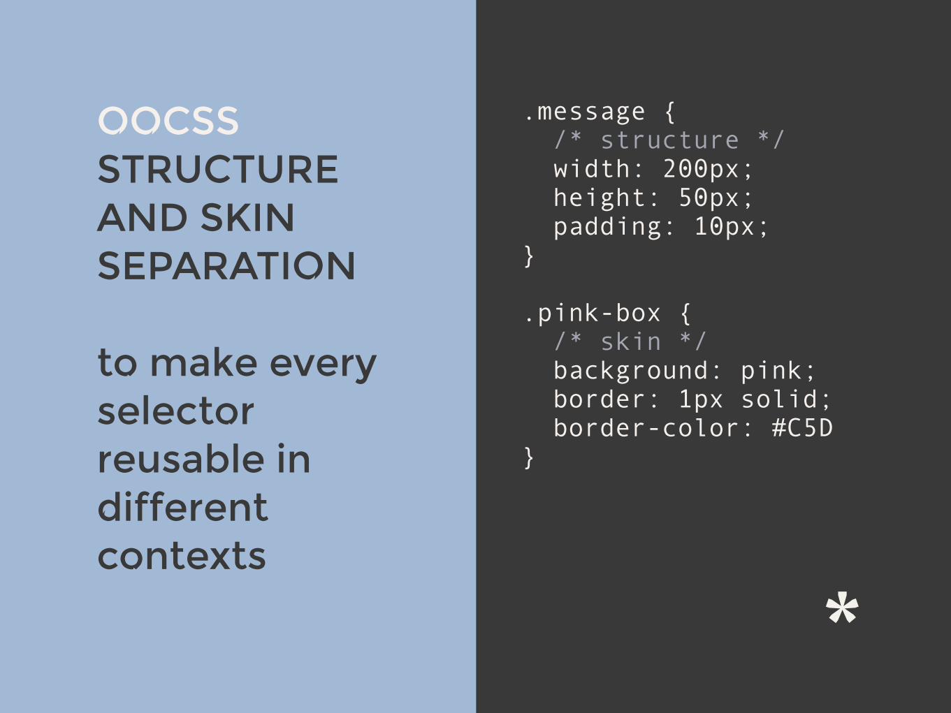
OOCSS STRUCTURE AND SKIN SEPARATION
to make every selector reusable in different contexts
.message { /* structure */ width: 200px; height: 50px; padding: 10px; }
.pink-box { /* skin */ background: pink; border: 1px solid; border-color: #C5D }

v
OOCSS STRUCTURE AND SKIN SEPARATION
<div class=“message pink-box blue-box”> … </div>
not nice if you want to avoid changes in HTML template for some client changes
v
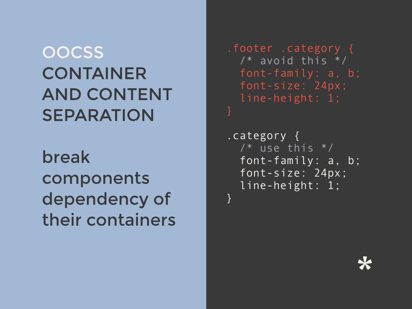
OOCSS CONTAINER AND CONTENT SEPARATION
break components dependency of their containers
.footer .category { /* avoid this */ font-family: a, b; font-size: 24px; line-height: 1; }
.category { /* use this */ font-family: a, b; font-size: 24px; line-height: 1; }

v
OOCSS CONTAINER AND CONTENT SEPARATION
not nice cause you may be forced to reset some props
.category { font-family: a, b; font-size: 24px; line-height: 1; }
/* SMACSS states */ .small-font { font-size: 12px; }

OOCSSObject Oriented CSS
CONS xYou will write verbose
HTML
xVisual changes are made mainly in the HTML templates
PROS ✓Smaller CSS files size with
reusable selectors
✓Nice for prototyping
✓Easy to write
✓Can be combined with other approaches

OOCSS by Nicole Sullivan
github.com/stubbornella/oocss/wiki

EXPRESSIVE CSS Scalable CSS using utility classes

v
EXPRESSIVE CSS UTILITY/HELPER CLASSES
a list of ready to be used styles
/* Bootstrap like */ .center-block { display: block; margin-left: auto; margin-right: auto; }
/* HTML5 boilerplate like */ .hidden { display: none !im…; visibility: hidden; }

not nice if you don’t want verbose, heavy HTML
v
EXPRESSIVE CSS UTILITY/HELPER CLASSES
<div class=“message move-left margin-top more-padding no-padding-left just-a-few-border-left no-border—top”> … </div>

EXPRESSIVE CSSScalable CSS using utility classes
CONS xNeeds documentation to
share infos to the team on the stuff you write
xIf you use Foundation, Bootstrap or other you can get some conflict selector
PROS ✓Approach very similar to
frameworks like Bootstrap, so it’s easy to learn for people already using them
✓Easy to read if the team has the docs
✓Very, very, very fast writing
EXPRESSIVE CSS by John Polacek
johnpolacek.github.io/expressive-css

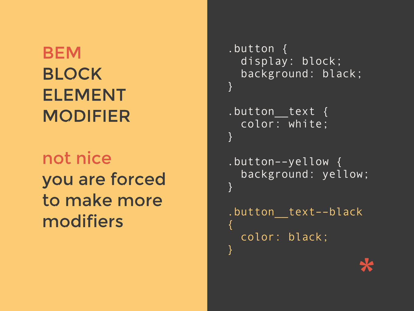
BEM Block Element Modifier

v
BEM BLOCK ELEMENT MODIFIER
self container modules without deep selector levels
/* block */ .button { display: block; background: black; }
/* element (a block child) */ .button__text { color: white; }
/* modifier */ .button––yellow { background: yellow; }
v
BEM BLOCK ELEMENT MODIFIER
not nice you are forced to make more modifiers
.button { display: block; background: black; }
.button__text { color: white; }
.button––yellow { background: yellow; }
.button__text––black { color: black; }

BEMBlock Element Modifier
CONS x It’s time consuming
x Hard to naming things and keep it consistent
x Verbose selectors naming
x Bigger CSS file size
x Suggested to be used with CSS critical path
PROS ✓Nice scalable solution
✓Just 1 level class selectors
✓Conflict proof selectors
✓Ultra flexible and reusable widgets
✓Nice for teams when they know how it works

Why all these approaches listed?
Because the more approaches you learn
the more solutions you have the more viewpoints you see the more problems you consider

What is the future?

Maybe mixing parts of these approaches together to do itin your way
SMACSS
OOCSS
Expressive CSS
BEM
Your way to do it

now, what about CSS & TEAMS ?

Front-end developer
Builds the templates from the designs to make them responsive or other
Iterates the staging pages the back-end dev made to give feedback
Client iteration
How we are used to do develop
Back-end developer
Takes the HTML static templates from the fdev and make them dynamic

Client feedback iterations
Back-end developer
Staging app / pages
back-end tests
Production app
The fdev prepares the templates
Front-end developer
HTML static
templates
front-end tests

Back-end developer
Staging app / pages
back-end tests
Production app
Client feedback iterations
Front-end developer
HTML static
templates
front-end tests
The client gives iteration feedback

Production app
Back-end developer
Staging app / pages
back-end tests
Client feedback iterations
Front-end developer
HTML static
templates
front-end tests
The bdev bakes the app

Production app
Back-end developer
Staging app / pages
back-end tests
Client feedback iterations
Front-end developer
HTML static
templates
front-end tests
The client gives iteration feedback

Production app
Back-end developer
Staging app / pages
back-end tests
Client feedback iterations
Front-end developer
HTML static
templates
front-end tests
We are is ready to go in production

What about the velocity of this process?
Is everything going always slightly fast?

Front-end developer
static page +
widgets
static page +
widgets
static page +
widgets
static page +
widgets
static page +
widgets
I just need a purple button, but
where is it?
static page +
widgets
static page +
widgets
static page +
widgets
static page +
widgets
static page +
widgets
static page +
widgets
static page +
widgets
static page +
widgets
Back-end developer
??
?
Now we have 70 static views let’s play to hide and seek.
+ 53
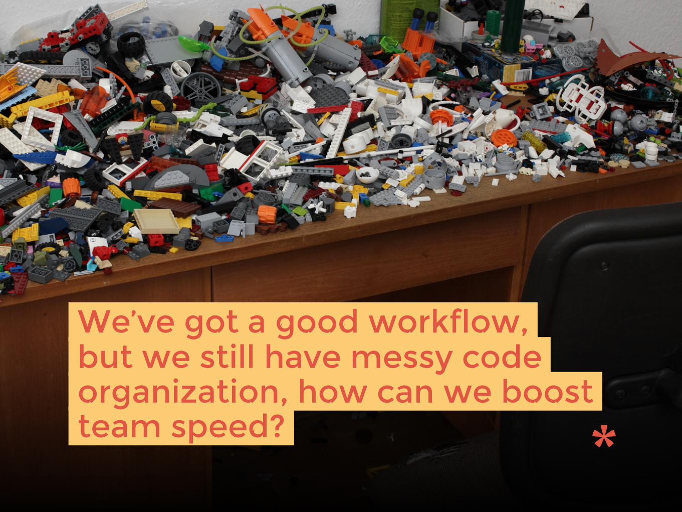
We’ve got a good workflow, but we still have messy code organization, how can we boost team speed?
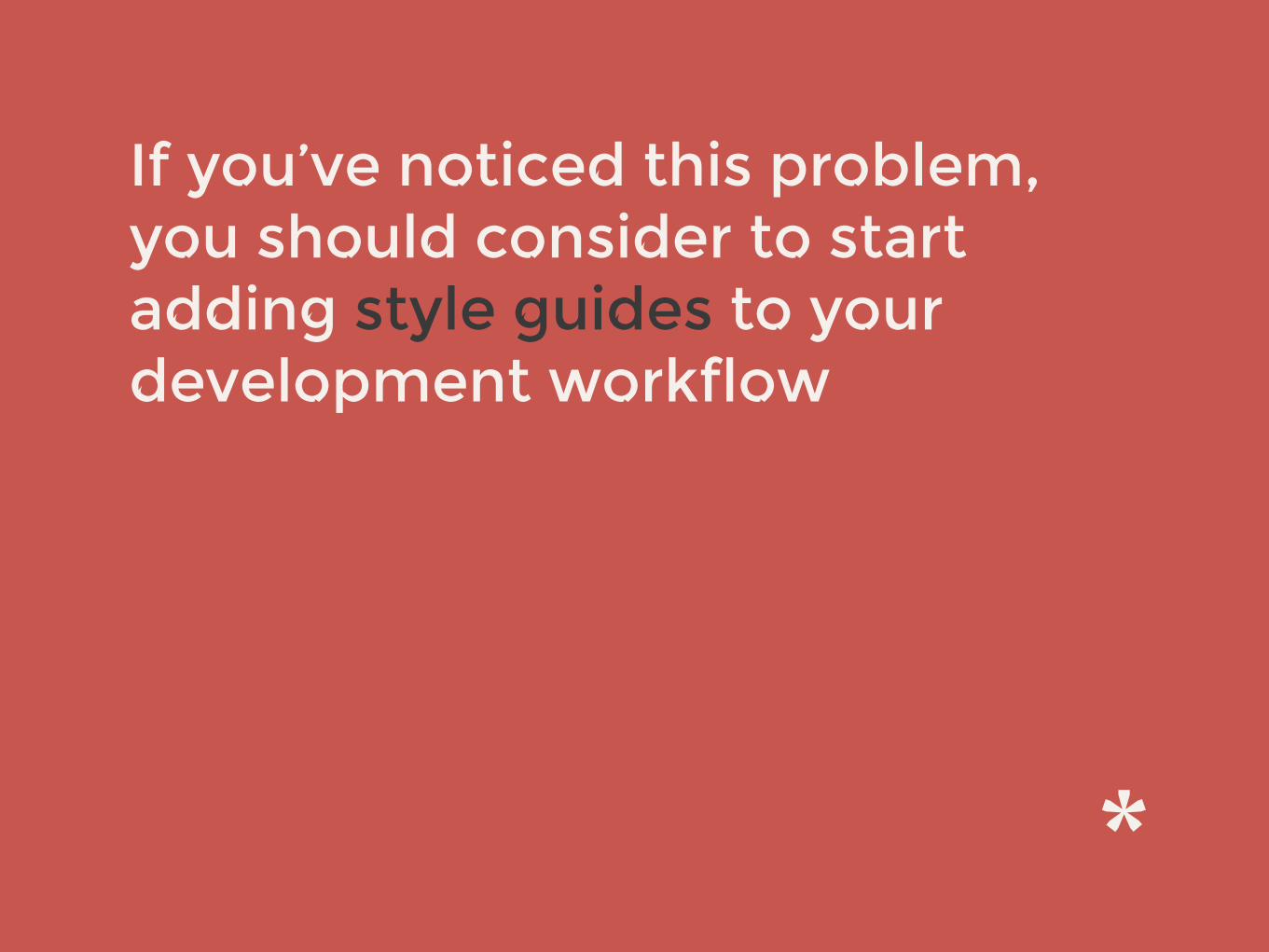
If you’ve noticed this problem, you should consider to start adding style guides to your development workflow

There’s a tons of style guide generators around github.com/davidhund/styleguide-generatorsstyleguides.io
• Hologram • StyleDocco • Huge styleguide. • Styledown • stylifyme
• mdcss • Kalei • kss • tapestry • etc.
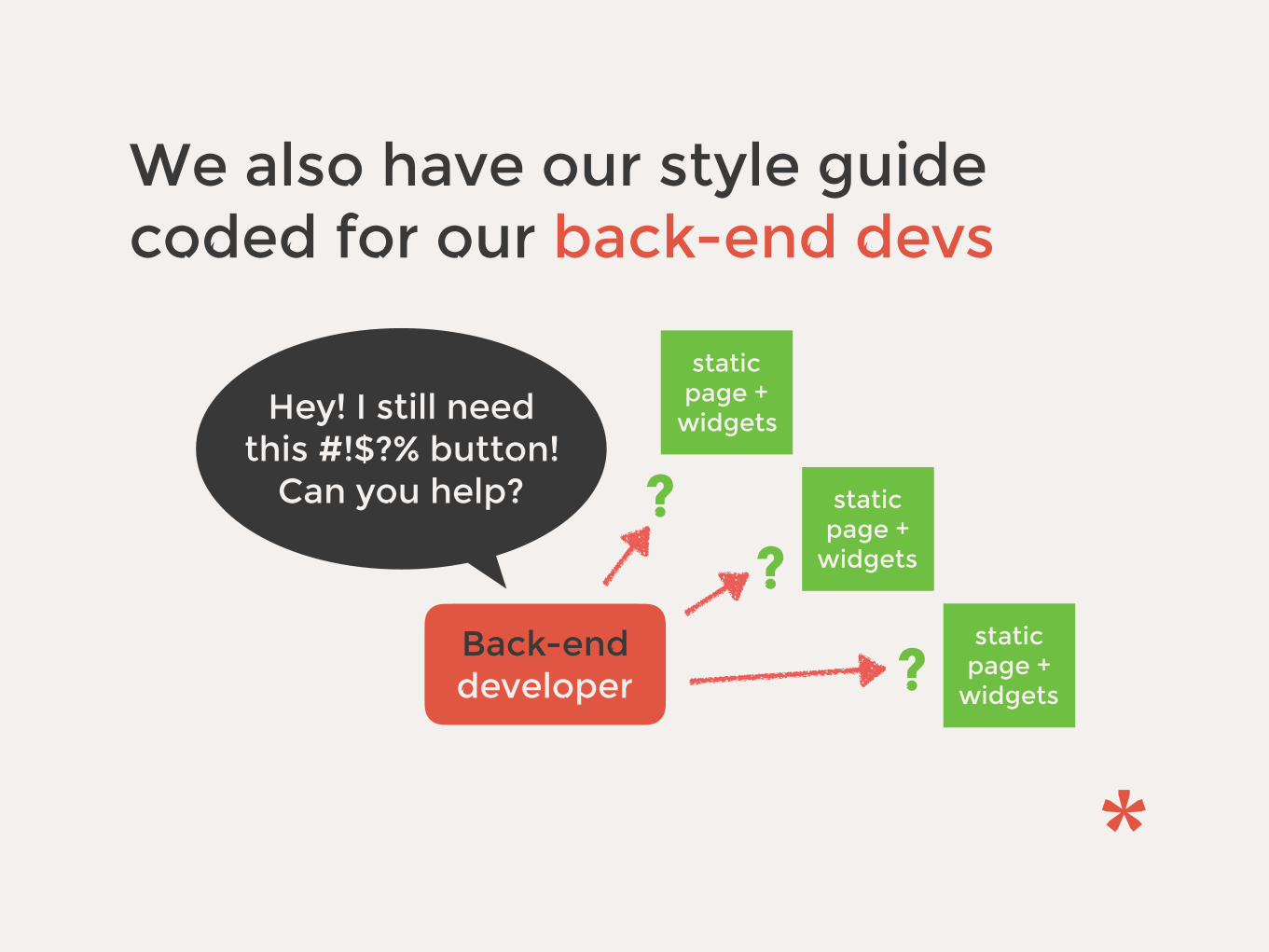
We also have our style guide coded for our back-end devs
Hey! I still need this #!$?% button!
Can you help?
static page +
widgets
static page +
widgets
static page +
widgets
Back-end developer
??
?

a-pollo

a tool to pass front-end code to back-end developers
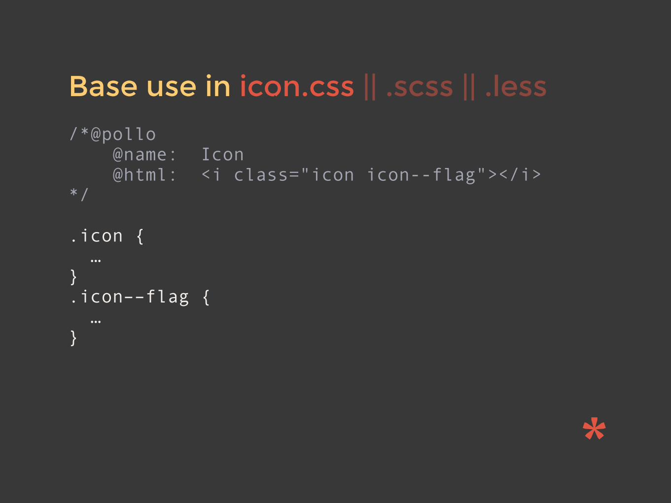
Base use in icon.css || .scss || .less
/*@pollo @name: Icon @html: <i class="icon icon--flag"></i> */
.icon { … } .icon––flag { … }
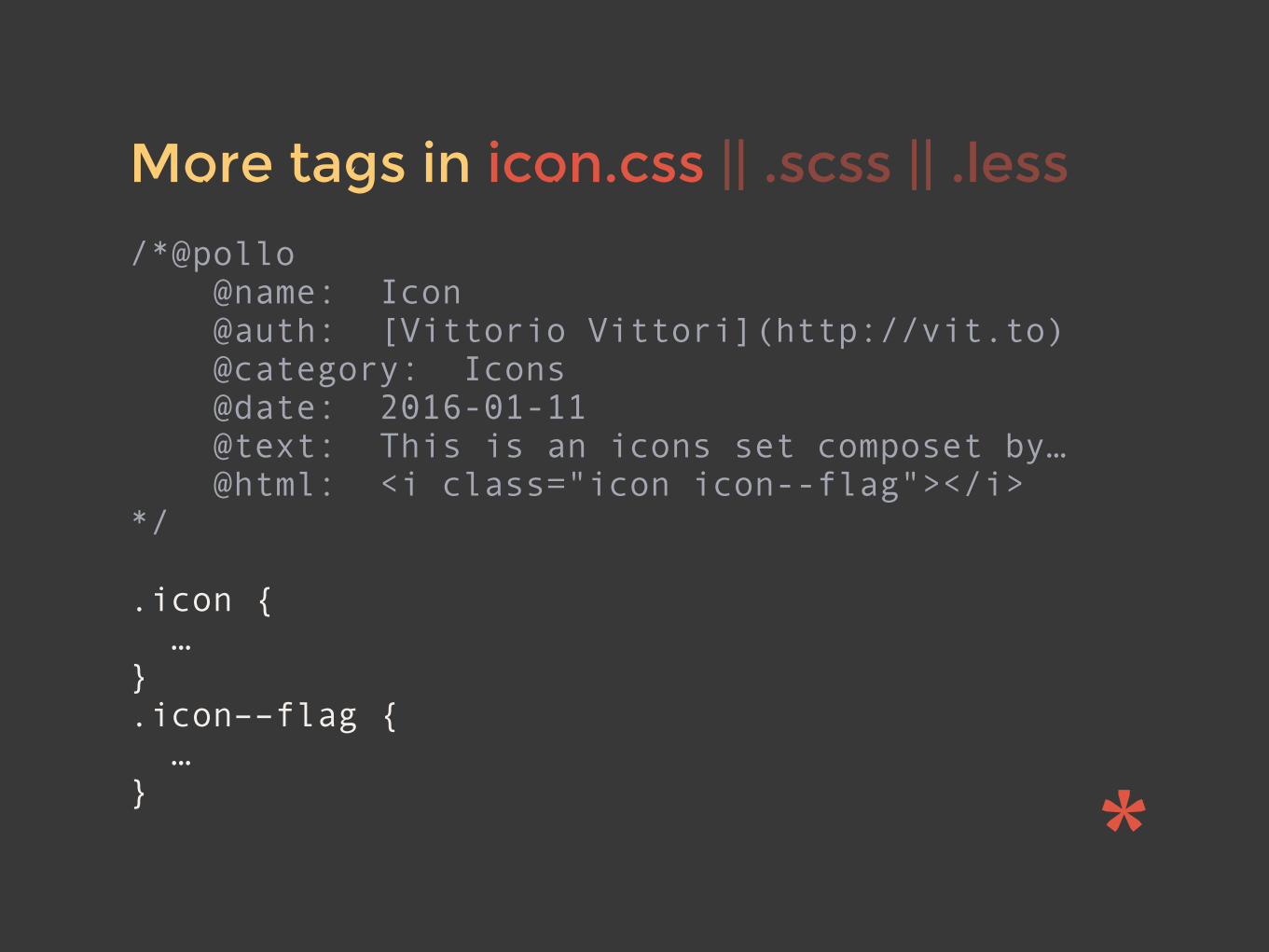
More tags in icon.css || .scss || .less
/*@pollo @name: Icon @auth: [Vittorio Vittori](http://vit.to) @category: Icons @date: 2016-01-11 @text: This is an icons set composet by… @html: <i class="icon icon--flag"></i> */
.icon { … } .icon––flag { … }

Multiple examples in icon.css
/*@pollo … */ /*@pollo … */ /*@pollo … */ /*@pollo … */ /*@pollo … */
.icon { … } .icon––flag { … }

Hexo is used by a-pollo
hexo.io/docs/themes.html

a-pollo repo @ github.com/vitto/a-pollo website @ vitto.github.io/a-pollo
✓ Widget files doc/s ✓ Project stats ✓ Based on hexojs to
easily custom style guide theme
? CSS stats ? SASS doc ? LESS doc ? Default markdown
style guide articles
Features Roadmap

Global usage
# Global installation $ npm install -g a-pollo
# Config file a-pollo.yml creation $ a-pollo init
# Default command to generate style guide $ a-pollo
# Choose a different config file $ a-pollo config=file.yml
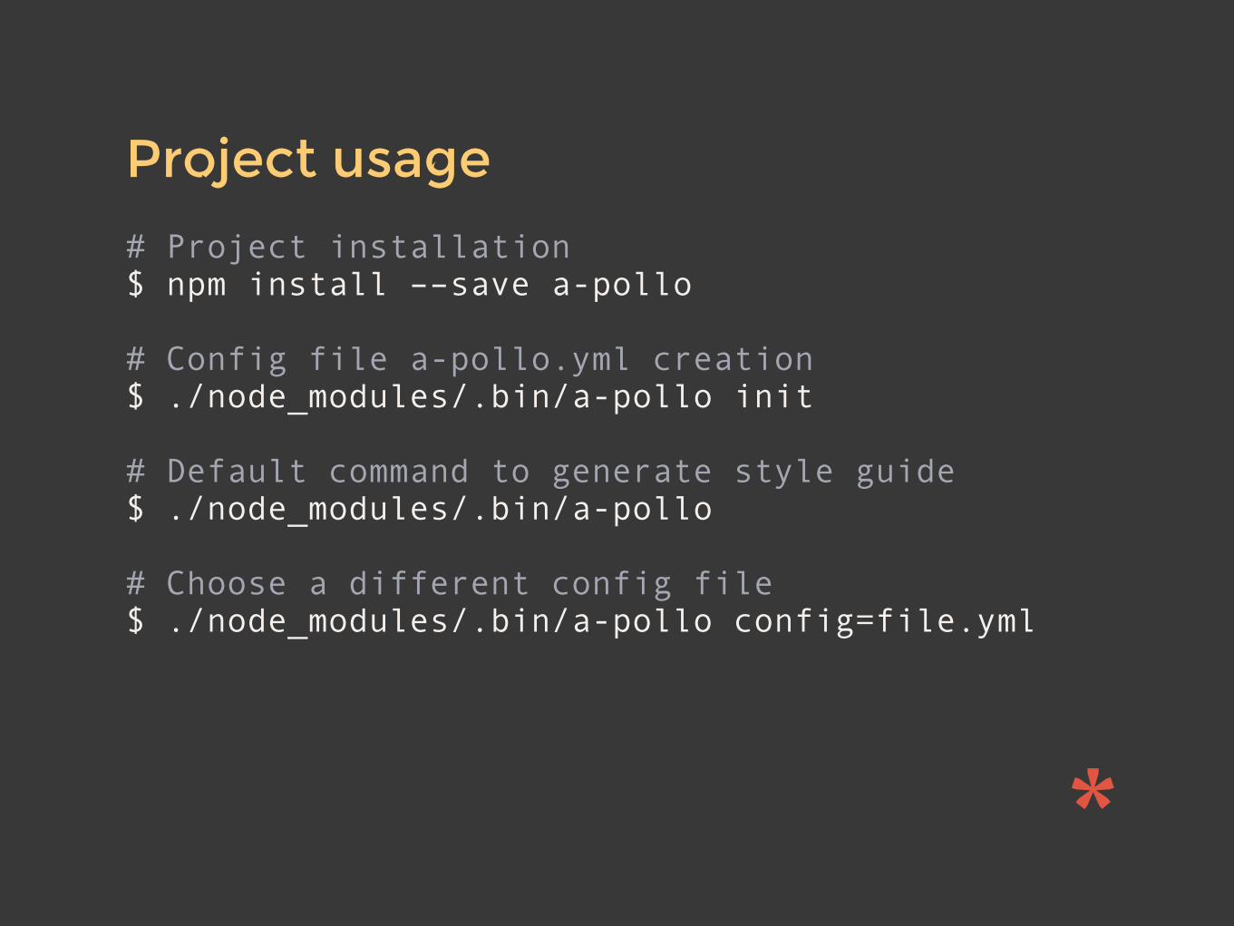
Project usage
# Project installation $ npm install ––save a-pollo
# Config file a-pollo.yml creation $ ./node_modules/.bin/a-pollo init
# Default command to generate style guide $ ./node_modules/.bin/a-pollo
# Choose a different config file $ ./node_modules/.bin/a-pollo config=file.yml
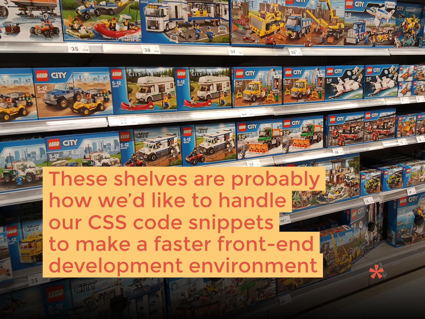
These shelves are probably how we’d like to handle our CSS code snippets to make a faster front-end development environment

</> with || die();

QUESTIONS?
vittorio vittori @vttrx vitto vit.to


![Assisting with Scalable Scalable Vector Graphics and ... · SVG Scalable Vector Graphics [6] SSVG Scalable Scalable Vector Graphics [10] LWA Live Website Annotate [See Section 4]](https://img.dokumen.tips/doc/110x75/5fdccc690a10ab2c1e74ae97/assisting-with-scalable-scalable-vector-graphics-and-svg-scalable-vector-graphics.jpg)