Embed Size (px)
Citation preview
Taking Legacy Projects Responsive:
Design Issues
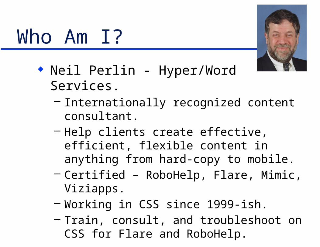
Who Am I?
Neil Perlin - Hyper/Word Services.– Internationally recognized content consultant.– Help clients create effective, efficient, flexible
content in anything from hard-copy to mobile.– Certified – RoboHelp, Flare, Mimic, Viziapps.– Working in CSS since 1999-ish.– Train, consult, and troubleshoot on CSS for Flare
and RoboHelp.
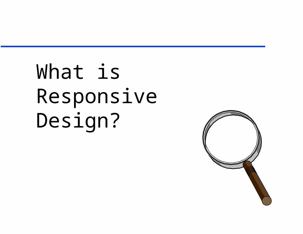
What is Responsive Design?

What Is Responsive Design? Creating one web site/help output that can detect
a display device’s properties and automatically reformat itself accordingly.– Vs creating one site/output for each device.
Developed by Ethan Marcotte in 2010.– See http://alistapart.com/article/responsive-
web-design/ For example, online help with…

Flare…
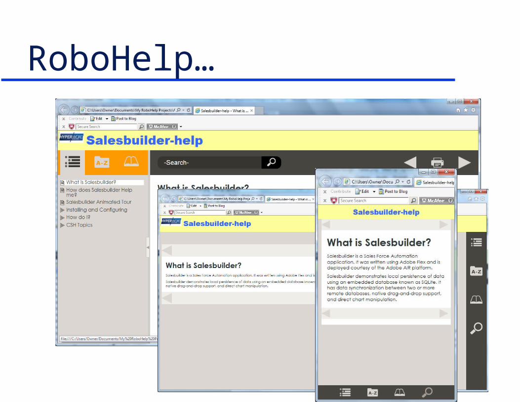
RoboHelp…

Why It’s Important Lets us create content to run on any device
(within reason) readers may have.– IMO, the biggest change in tech comm since
HTML. But:
– Redesigning and rewriting legacy projects can be messy.
– Adds new design and wording issues.

What’s Under the Hood?
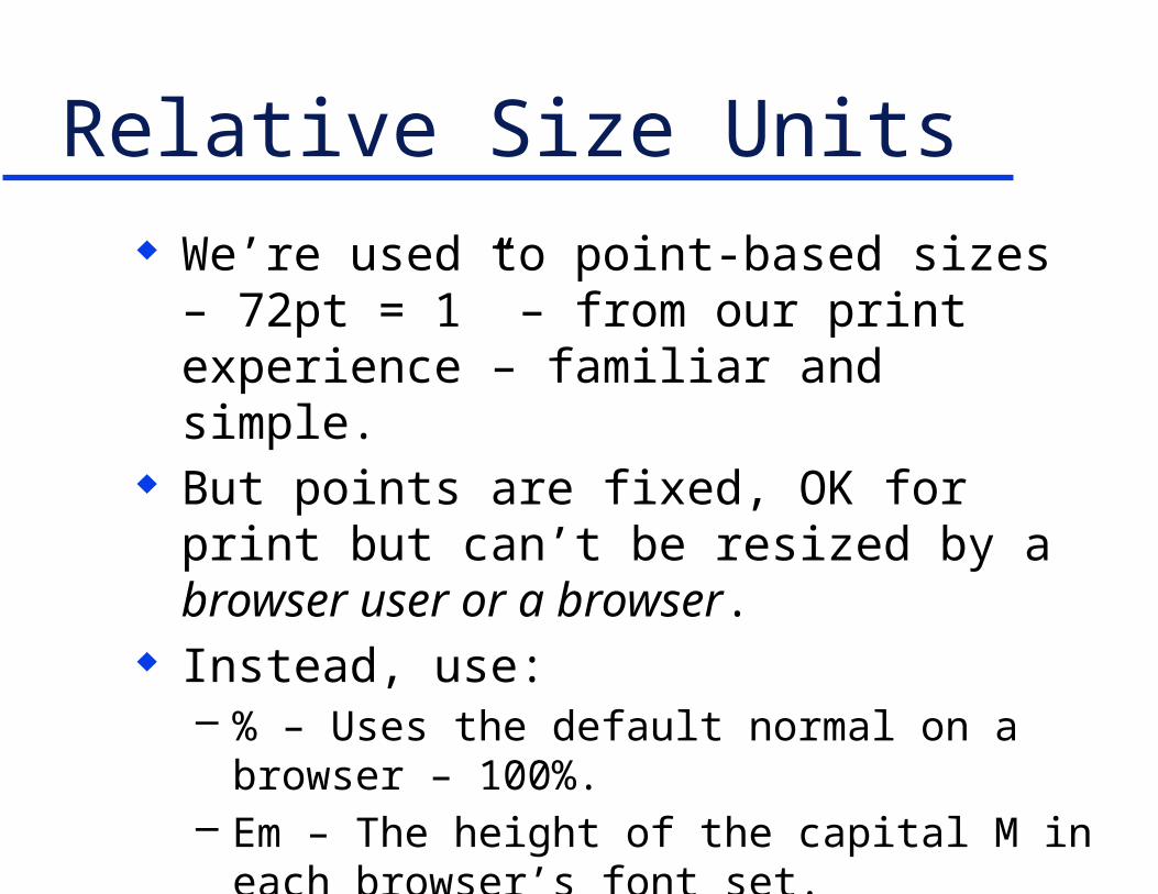
Relative Size Units We’re used to point-based sizes – 72pt = 1” –
from our print experience – familiar and simple. But points are fixed, OK for print but can’t be
resized by a browser user or a browser. Instead, use:
– % – Uses the default normal on a browser – 100%.– Em – The height of the capital M in each browser’s
font set.– Rem – See
http://snook.ca/archives/html_and_css/font-size-with-rem
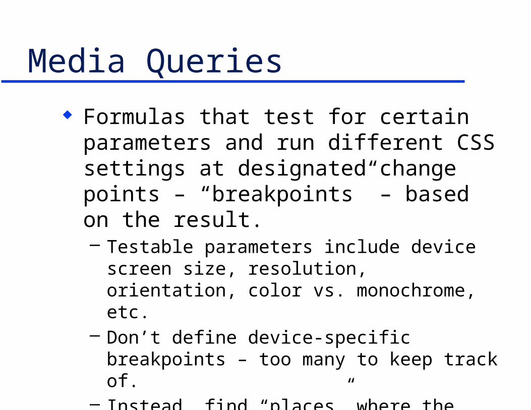
Media Queries
Formulas that test for certain parameters and run different CSS settings at designated change points – “breakpoints” – based on the result.– Testable parameters include device screen size,
resolution, orientation, color vs. monochrome, etc.– Don’t define device-specific breakpoints – too many
to keep track of.– Instead, find “places” where the design suddenly
doesn’t work and use those place as breakpoints.
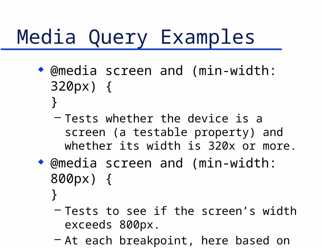
Media Query Examples
@media screen and (min-width: 320px) {}– Tests whether the device is a screen (a testable
property) and whether its width is 320x or more. @media screen and (min-width: 800px) {
}– Tests to see if the screen’s width exceeds 800px. – At each breakpoint, here based on width, different
CSS settings take effect that reformat the screen or show or hide different elements.

Fluid Grids
Basically involves creating layouts that can go from this to this
Based on the CSS “float” property rather than hidden tables.
Good intro at: http://www.1stwebdesigner.com/tutorials/fluid-grids-in-responsive-design/

General Design and Writing Issues

Too Much Content We create lots of content because we always
have. And we’ve always had large screens to show it. We can write separate content for each device. But that undercuts the rationales for single
sourcing and responsive design. What do we do when one set of content has to
work on devices with different screen sizes?
Edit Like Crazy? Yes, but it’s hard to cut existing content beyond
a certain mental point. May be easier to throw out the existing content
and redo it from scratch from a new perspective. For example…

How much can you cut this text in 2 minutes?
“One if by land and two if by sea,”
“And I on the opposite shore will be.”
“Ready to ride and spread the alarm”
“Through every Middlesex village and farm.”– “Midnight Ride of Paul Revere”, Henry Wadsworth Longfellow
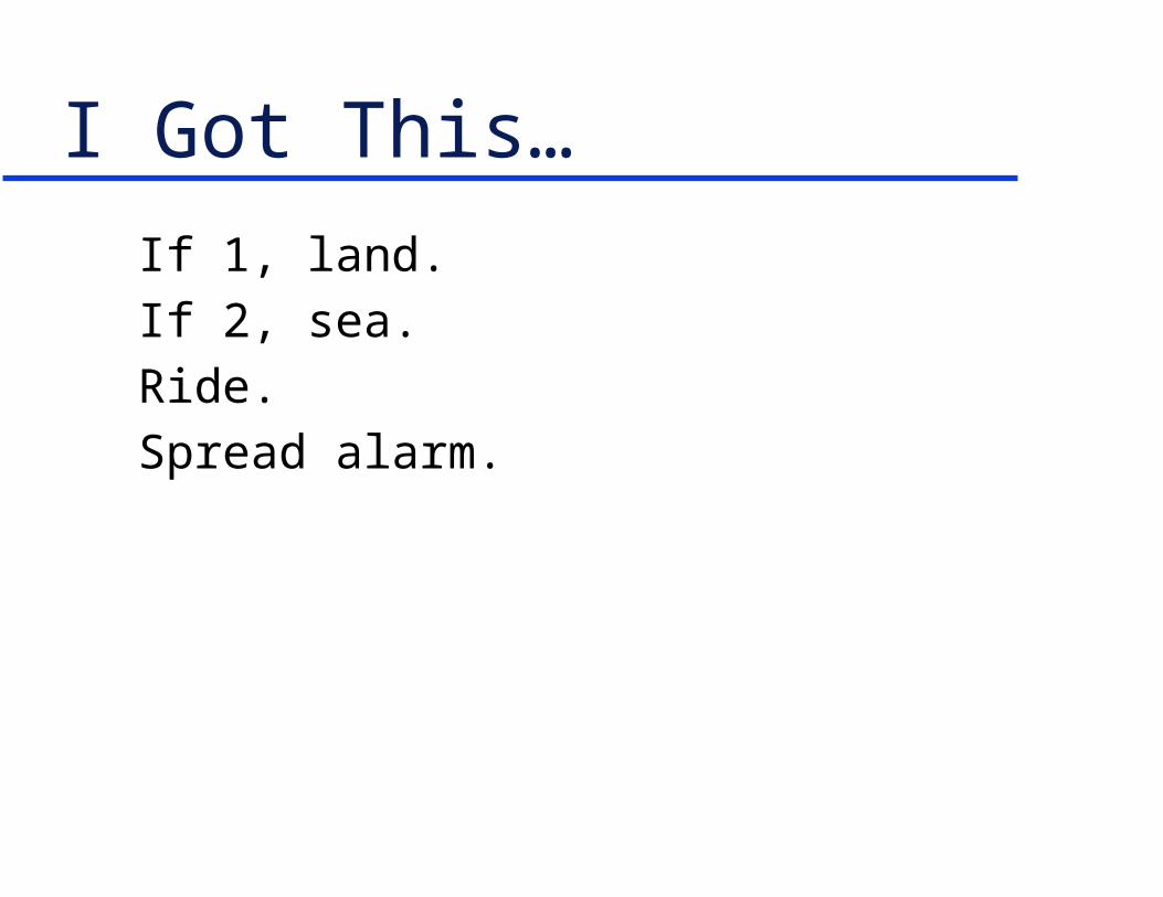
I Got This…
If 1, land.
If 2, sea.
Ride.
Spread alarm.

Now Try This… Cut this site down to tablet size, then phone size.

Gatwick Got This… For the tablet.
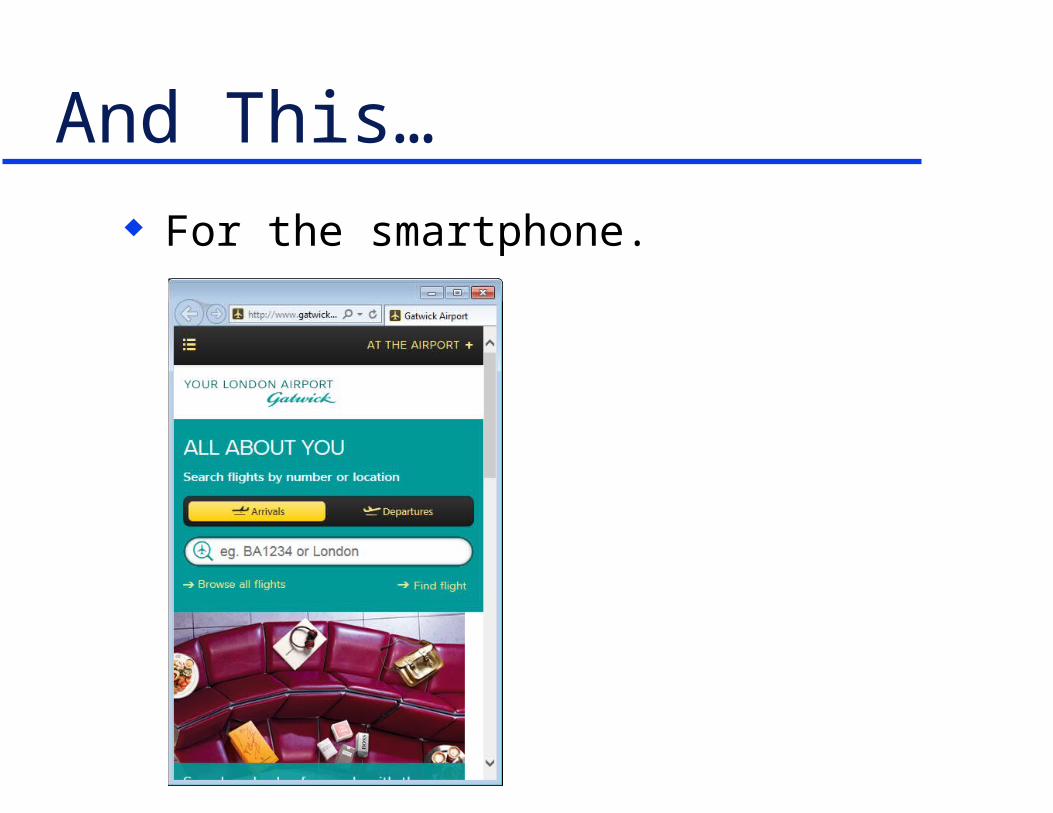
And This… For the smartphone.
Consider “Mobile First” “More often than not, the mobile experience for
a Web application or site is designed and built after the PC version is complete. Here's three reasons why Web applications should be designed for mobile first instead.”– 1. Mobile is exploding– 2. Mobile forces you to focus– 3. Mobile extends your capabilities
» Mobile First, Luke Wroblewski» http://www.lukew.com/ff/entry.asp?933
Thoughts on “Mobile First” …exploding – Is your company going mobile?
– Do you want to risk being left behind? …focus – Limited screen space makes us define
what’s really important. – Less important material can be displayed as the screen
expands, or left out entirely, shortening all the doc. …capabilities – We can build device location or
orientation-based content, with built-in camera, RSS feeds, transaction processing, and more.

Information Presentation Information now presented in static tables may
have to be re-thought and presented via search.
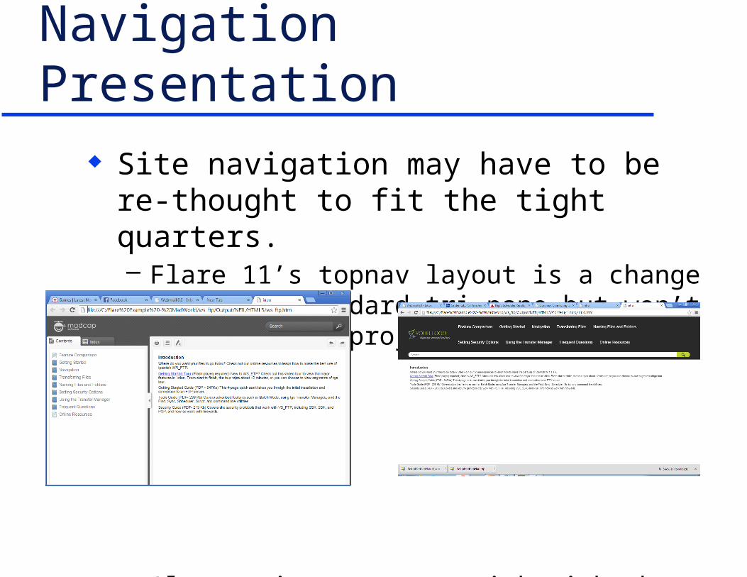
Navigation Presentation Site navigation may have to be re-thought to fit
the tight quarters.– Flare 11’s topnav layout is a change from the standard
tri-pane but won’t work for all projects.
Alternatives are to stick with the tri-pane or revise the project to fit topnav.
Specific Design and Writing Issues
Writing Keep it short and to the point; this time fer sure.
– Not new but vital if users may see the same content in different sized “viewports” on different occasions.
– Write tight(ly).– Minimize words.– Use short words – “buy” rather than “purchase”.– Use short phrases – ‘“buy”, not “purchase”’.– Action text only, no concepts – depending on the case.– If the output may be rotatable, check the effect on
your design.
Image Issues Images can resize but may become unreadable.
– Can set img’s display to none at a breakpoint in order to hide the image, but:» Setting img display to none hides all the images.» To hide selected images, create a sub-class of img and apply
it to those images.» May have to work in unfamiliar areas of the CSS.
– But hiding an image affects text that refers to it – e.g. “…as shown in the image below” no longer works.
– Or consider cropping images, like the Gatwick site.
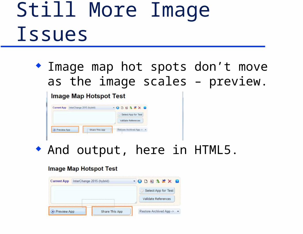
Still More Image Issues Image map hot spots don’t move as the image
scales – preview.
And output, here in HTML5.
“Movie” Issues Movies created in Captivate, Camtasia, etc.
– If your movies scale and contain text caption boxes, make sure the caption boxes scale.
– If the caption boxes scale, does the text become too small to read?
– If so, do you have to replace the text captions with voice-over narration?
– And control what type gets used – text or voice-over?– Also increases the movie creation workload since you
have to create two versions of each movie – voice-over and text captions.
Wording Customization Issues Wording can vary by output format – “click” for
desktop vs. “tap” for mobile. How to deal with this in responsive design? Use an intermediate word like “select” but that’s
often unsatisfactory. Or automate the customization between formats. Which I’m pleased to say is now possible. Demo…
Summary Lots of new design, writing, and technical
challenges. It sounds daunting, but so did the move by tech
comm to online help and the web in the ‘90s. We met those challenges – time to do so again.

Hyper/Word Services Offers…
Training • Consulting • DevelopmentFlare • Flare CSS • Flare Single SourcingRoboHelp • RoboHelp CSS • RoboHelp
HTML5ViziAppsSingle sourcing • Structured authoring
Thank you... Questions?
www.hyperword.comTwitter: NeilEric


![Responsive Design Fundamentals [Read-Only] - … Design Fundame… · Responsive Design Fundamentals Carolyn Yon, PMI-ACP Development Manager ... Responsive Design • web design](https://img.dokumen.tips/doc/110x75/5b7c060b7f8b9adb4c8df8c4/responsive-design-fundamentals-read-only-design-fundame-responsive-design.jpg)