Embed Size (px)
Citation preview

Style Sheet

MastheadThe colour scheme of the masthead on the front cover is red as it is a strong and confident colour. A bright red is used for signalling and catch attention. Symbolising strength and certainty the style of the masthead supports the image of LIVE! and gives the magazine a vivid and confident appearance.
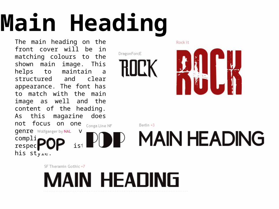
Main HeadingThe main heading on the front cover will be in matching colours to the shown main image. This helps to maintain a structured and clear appearance. The font has to match with the main image as well and the content of the heading. As this magazine does not focus on one music genre the fonts vary to compliment the respective artist and his style.

Cover Lines
EXTRA SPECIALCOVER
LINESThe font of the cover lines will vary depending on the main image and main heading so that it matches with the rest of the front cover. As the cover lines are there to point out additional content to the main article they are underlined and in a bold but sans serif font. The information below the main cover lines is written in Times New Roman to separate it from the headlines.
Additional Information
Also the colours have to fit in with the colour scheme of the rest of the page. Important is to use bold colours (like black, white or red) so that they stand out from the background and are not overlooked. A special announcement might be highlighted in a different colour so that the reader is attracted by it and satisfied as this magazine offers something extra and individual.


