Embed Size (px)
Citation preview
Before: After:
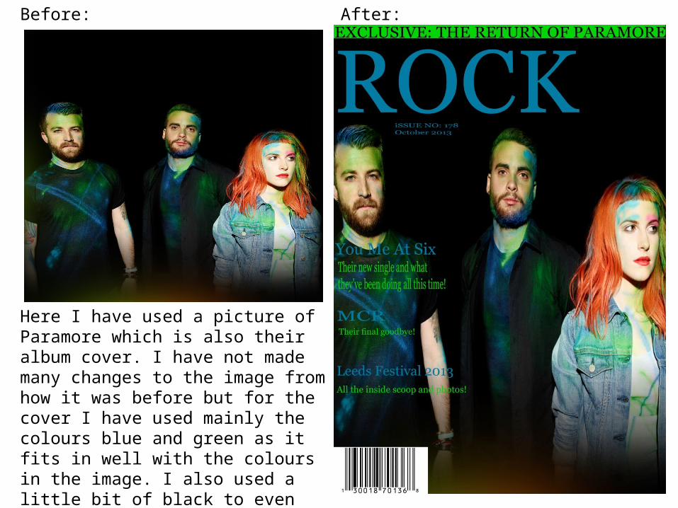
Here I have used a picture of Paramore which is also their album cover. I have not made many changes to the image from how it was before but for the cover I have used mainly the colours blue and green as it fits in well with the colours in the image. I also used a little bit of black to even out the blue and green. Also, a barcode has been used as it is a main feature on a magazine.
Before: After:
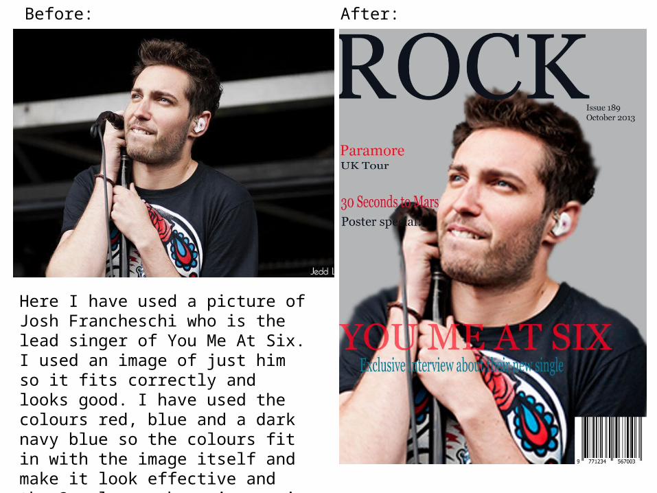
Here I have used a picture of Josh Francheschi who is the lead singer of You Me At Six. I used an image of just him so it fits correctly and looks good. I have used the colours red, blue and a dark navy blue so the colours fit in with the image itself and make it look effective and the 3 colour scheme is a main convention. Also, I have used a barcode as it is a main feature on a magazine.
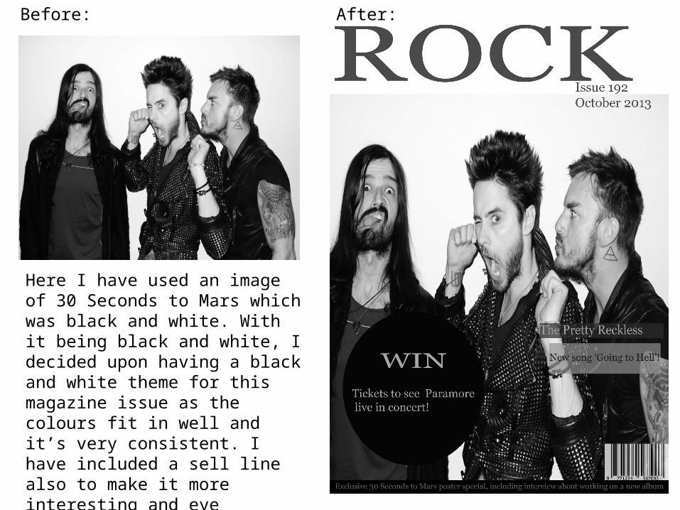
Here I have used an image of 30 Seconds to Mars which was black and white. With it being black and white, I decided upon having a black and white theme for this magazine issue as the colours fit in well and it’s very consistent. I have included a sell line also to make it more interesting and eye catching to the audience. Also, a barcode has been used as it is a main feature on a magazine.
Before: After:
Before: After:
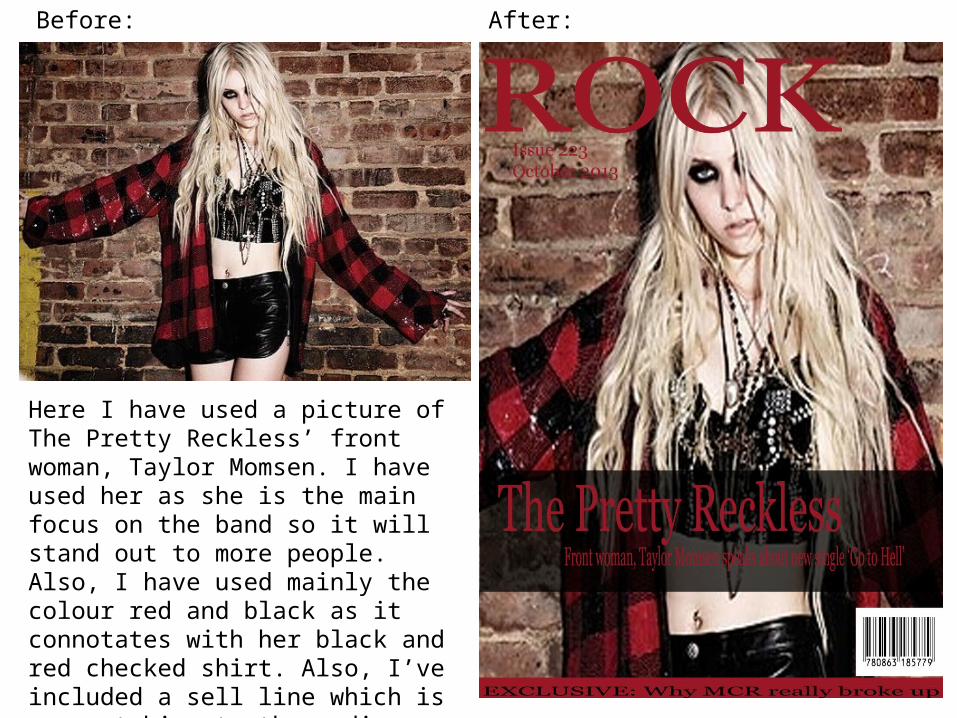
Here I have used a picture of The Pretty Reckless’ front woman, Taylor Momsen. I have used her as she is the main focus on the band so it will stand out to more people. Also, I have used mainly the colour red and black as it connotates with her black and red checked shirt. Also, I’ve included a sell line which is eye catching to the audience. Also, a barcode has been included as it is a main feature on a magazine.


