Embed Size (px)
Citation preview

The Masthead
Puff
Main image shot
Image
The main cover line
Strap Line
Tag lines
Tag lines
Bar code
House style: Grey, White, Red, Brown
Front Cover
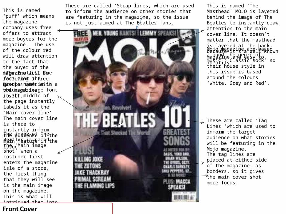
This is named ‘The Masthead’ MOJO is layered behind the image of The Beatles to instantly draw attention to the main cover line. It doesn’t matter that the masthead is layered at the back, because it’s a well known magazine and easy to identify.
These are called ‘Tag Lines 'which are used to inform the target audience on what stories will be featuring in the Mojo magazine.
This is named ‘puff’ which means the magazine company uses free offers to attract more buyers for the magazine. The use of the colour red will draw attention to the fact that the buyer of the magazine will be receiving a free Beatles gift with the magazine itself.
Mojo magazine are based around the genre of music ‘ Classic Rock’ so their house style in this issue is based around the colours ‘White, Grey and Red’. ‘The Beatles’ The fact that
the groups name is in a bold and large font in the middle of the page instantly labels it as the ‘Main cover line’ The main cover line is there to instantly inform the audience on the main feature in the issue.
The image of The Beatles is named the ‘Main image shot’ When a costumer first enters the magazine isle of a store, the first thing that they will see is the main image on the magazine. This is what will intrigued them into picking up the magazine and finding out what sort of story lines feature in the issue.
These are called ‘Strap lines, which are used to inform the audience on other stories that are featuring in the magazine, so the issue is not just aimed at The Beatles fans.
The tag lines are placed at either side of the magazine, as borders, so it gives the main cover shot more focus.

Double Page Spread ( Identify)
Placement of image
The masthead
Column
Placement of images
Placement of image
Main cover image
Columns
HeadingUse of Red
Use of white
Use of Black

The use of five images is there so the reader doesn’t have to just read the text in the columns above. The target audience for this magazine would be teenagers and its commonly said that teenagers are not attracted to pages with masses of text on it. So the images are there as a distraction.
The main image is of the lead singer of My Chemical Romance, this is used on the left hand side to immediately draw attention for when the reader opens up the first page.
Double Page Spread ( describe)
The house style of this contents page is the colours Red, white and black. The genre of music ‘Alternative Rock’ often uses dark colours in either costumes, posters and magazines. Rock bands often use dark colours to make them look fierce, dark and mysterious. Its effective as it makes the audience curious to what this band is all about, which results in them reading articles about them and giving their music a listen.
The use of very little text in the columns will attract more attention to the reader as teenagers often look at images more than the text itself. The use of columns divide up the text so its not just one huge paragraph down one side of the page. The columns are reduced in size to put more focus on the images.
Most rock magazines like to use the colour red against dark colours as it symbolises things such as danger and darkness, which attracts their target audience.
The mast head is spread out between the double pages to attract attention to the contents and what the main feature in the magazine is.
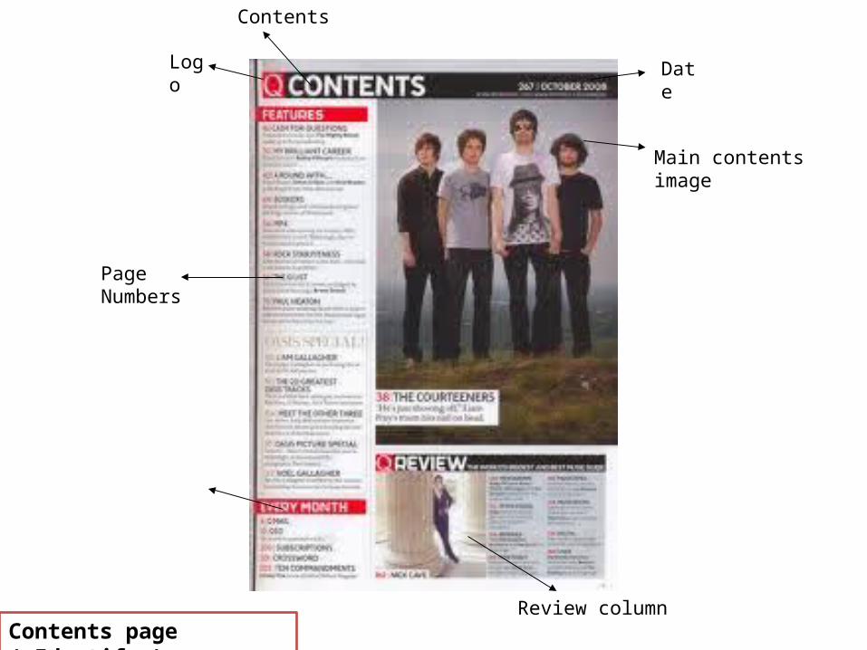
Contents page ( Identify )
Main contents image
Logo
Contents
Page Numbers
Review column
Date

Contents page ( describe )
The main contents image is used on the right hand side of the page to immediately attract the audience and to inform them on what the main feature in the magazine is. It also placed there to even out the amount of text on the page, because if there is too much text, the reader wont even look twice.
Page numbers are used on a contents page so that the reader can identify what topics are featured in the magazine. They are also there to separate the text so it doesn’t look like one huge paragraph describing what’s in the magazine.
The repetitive use of the colour red reflects the house style of the magazine and it is also used to divide the text and to make the contents page look more appealing to the audience.
The use of the smaller image at the bottom of the contents page draws very little attention as its placed below the main image which would attract far more attention due to its difference in size.
The date is placed on the contents page so as soon as the reader opens up the magazine, they will instantly be informed on what issue the magazine is and how long it will be until the next issue.