Embed Size (px)
Citation preview

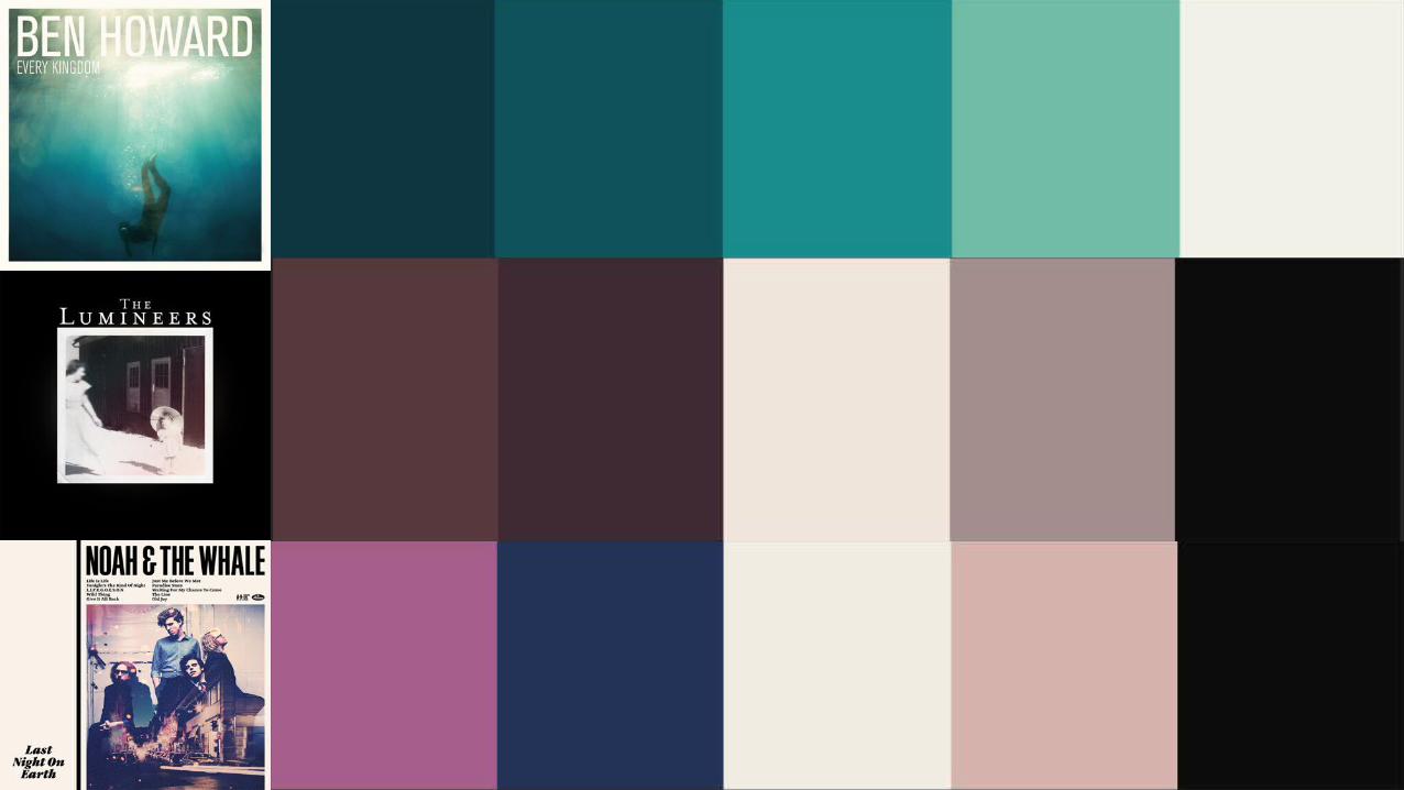
Similar genre digipaks


How has this helped my research?• Looking at digipaks belonging to artists of a similar genre to Samuel Ford has allowed me to think deeper about my
choice of design. A common theme throughout the artwork is a vintage, faded look which makes the albums look much older than they actually are. This appeals to the target audience because they are often looking for more obscure, less mainstream music which this old-fashioned style reflects.
• Through using a colour scheme generating application, I could effectively analyse the different colours used in the album artwork and pick out common elements. I found that throughout the artwork, natural and earthy colours are common – there are lots of browns, greens and reds. Nature is a convention of the genre, as folk music has its roots in musicians singing whilst working outdoors to motivate workers and ease boredom.
• Another notable similarity between all of these album covers is that the artwork is not hand drawn, but rather a photograph of a single image. This is perhaps done to maintain a nostalgic look – the Beirut and Mumford and Sons album covers especially look like they could have been taken with a polaroid, and The Lumineers’ photograph looks even older, perhaps late 1800s to early 1900s.
• The CDs for most of the digipaks look very stripped-down, using just one colour and the name of the band/album. Ben Howard and Beirut in particular are very minimalist, using just black and yellow colours (respectively) for the discs and the names typed on.
• The back cover of the digipaks tend to feature the names of the songs listed in the centre of the design, with plain or simplistic artwork. With the exception of Beirut, none of the covers have people on them unlike the front covers which highlights the stripped down, minimalist style of folk music. The lack of elaborate background art also helps to focus on the track listing.