Embed Size (px)
Citation preview

Understanding Responsive Web Design

What is responsive design?
Responsive web design (RWD) is an approach to web design with a strong emphasis on image viewing experience to make reading easier and minimize:
Resizing , panning, and scrolling for “simpler” navigation.
This common set of best user experience practices can be applied to a wide range of devices, including mobile phones and desktop computers

Why responsive design?
Next Year Phones and Tablets will overtake Desktop Computer as the primary way people get Online

Fonts
Ems Percentages Rems
The best way to implement a responsive font size is to use:
Is relative to parent's font size, eg. 2em = 28px if parent element's font-size is 14px.
percentages are resizeable units for font size, and their CSS declarations can be inherited
is relative to the html element's font-size.
Typography is one of the most important aspects of responsive web design

img { max-width: 100%; height: auto; }
Fluid Images One way around this is to size images in relative units, rather than absolute pixel dimensions.
The most common relative solution is to set the max-width at the image at 100%and the data-fullsrc attribute

Fluid Grids “A fluid is a substance that continually deforms (flows) under an applied shear stress” – Wikipedia
Regardless of what the device or screen size is, components in fluid designs are going to flow and adapt to the user environment.

Media Queries
<link rel="stylesheet" media="screen and (max-width: 640px)" href="smallscreen.css" type="text/css" />
Target specific screen sizes with Different styles
You can change styles depending on :
Height and width of the browser
Screen resolution
Orientation of the device

In a fluid website layout, also referred to as a liquid layout, the majority of the components inside have percentage widths, and thus adjust to the user’s screen resolution
Fixed-width layouts
Liquid layouts
A fixed website layout has a wrapper that is a fixed width, and the components inside it have either percentage widths or fixed widths.
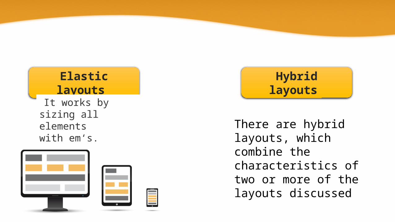
Elastic layouts Hybrid layouts
There are hybrid layouts, which combine the characteristics of two or more of the layouts discussed
It works by sizing all elements with em‘s.
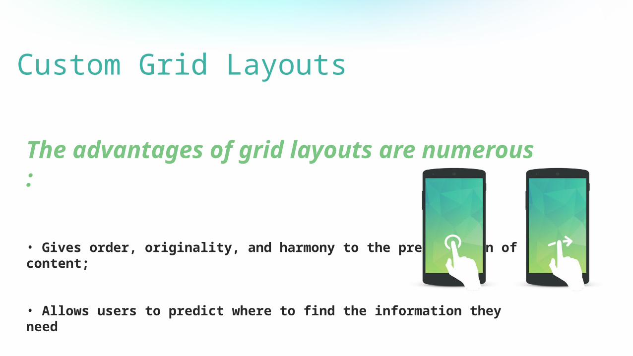
The advantages of grid layouts are numerous :
• Gives order, originality, and harmony to the presentation of content;
• Allows users to predict where to find the information they need
• Makes it easier to add new content without having it looking disjointed or marginalized.
Custom Grid Layouts

<div id="wrapper"> <div id="header">Header</div> <div id="content">Content</div> <div id="sidebar">Sidebar</div> <div id="footer">Footer</div></div>
Code Example:
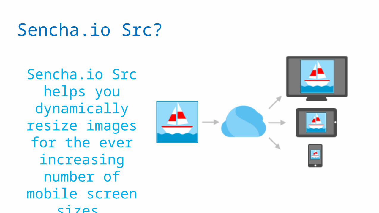
Sencha.io Src?
Sencha.io Src helps you
dynamically resize images for
the ever increasing number of
mobile screen sizes.

Here are three JavaScript solutions that can help us serve responsive websites to older browsers lacking CSS3 support:
JavaScript Solutions
Respond.js Modernizr Adaptive.960.js

Thank you