Embed Size (px)
Citation preview

MAGAZINE ANALYSIS

Site and soundSight and sound is a magazine which focuses on the actual content rather than attractiveness for its viewers.
The target audience would be a much more distinguished older cliental which loves for films would require significantly more attention to detail, hence why thy do not focus too much on the aesthetics.
You can see that the masthead is one that conforms to the conventions of a magazine.
Simple colour scheme blue and white, since blue is regarded as a masculine which is also noted to be a colour of wisdom and power which could ultimately relate to the character on the front cover.
The model on the front cover is a high profile celebrity who is also the star of the film, which is why they opted to put him on the front cover.
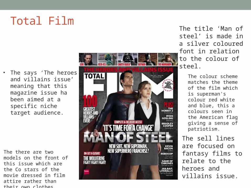
Total Film
• The says ‘The heroes and villains issue’ meaning that this magazine issue ha been aimed at a specific niche target audience.
The there are two models on the front of this issue which are the Co stars of the movie dressed in film attire rather than their own clothes
The colour scheme matches the theme of the film which is superman's colour red white and blue, this a colours seen in the American flag giving a sense of patriotism.
The title ‘Man of steel’ is made in a silver coloured font in relation to the colour of steel.
The sell lines are focused on fantasy films to relate to the heroes and villains issue.
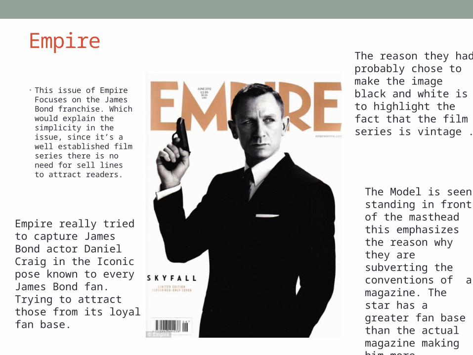
Empire
• This issue of Empire Focuses on the James Bond franchise. Which would explain the simplicity in the issue, since it’s a well established film series there is no need for sell lines to attract readers.
Empire really tried to capture James Bond actor Daniel Craig in the Iconic pose known to every James Bond fan. Trying to attract those from its loyal fan base.
The Model is seen standing in front of the masthead this emphasizes the reason why they are subverting the conventions of a magazine. The star has a greater fan base than the actual magazine making him more important.
The reason they had probably chose to make the image black and white is to highlight the fact that the film series is vintage .
Reflection • From these magazine covers I can deduce that the main focus
should be the image, whether or not its going to be the character or the star gracing the cover. If it’s the character I will have to make sure the correct effects, mise en scene and colour scheme is incorporated so that the targeted audience can be able to recognise the genre I am trying to portray.
• Another thing to think about is the depth I go into with the sell lines the magazines I looked at had a variety although I personally believe that sight & sound had the right amount it didn’t distract you from the main image and wasn’t seen as cluttered.
• Lastly I have to think about the overall layout of the magazine is majorly important by looking at these three examples they each prioritised one aspect/ convention of the magazine and I think I need to take into great consideration which one I will for my magazine front cover.