Embed Size (px)
Citation preview

Drupal 8 Themes with
SASS and SMACSS
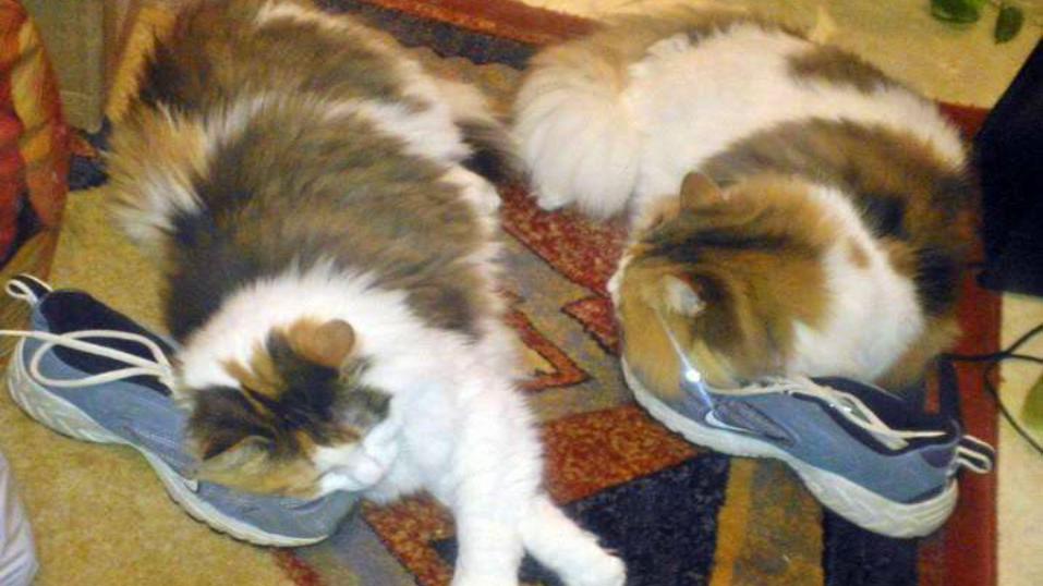
(and kittens)


Who am I?


Liisa, The CSS Nazi
Senior Software Developer, Super-
hyper Drupal Girl @Tieto
d.org: lduerig
Twitter: @LisKit7

About Tieto
Tieto is the largest Nordic IT services provider, offering full
life-cycle services, mainly focusing in:
● Financial services
● Manufacturing, Retail and Logistics
● Public, Healthcare and Welfare
● Telecom, Media and Energy

Not part of the scope of this presentation, but
ask if you want to know more. May be good for
a later presentation.
=

Old school.
● media queries /
breakpoints
● sprites
● fixed gutter width
● fixed sprite width
Unmaintainable, manual
labour and prone to
inconsistencies.

SASS - CSS with Superpowers
$variable + @mixin + @extend ==
less copy/paste ==
consistant ==
AWESOME!
(Be careful with @extends.
And nesting fever. (Later))

What about Drupal?
● Can’t modules handle this?o Yes, but if you know enough code to be writing
SCSS, you probably shouldn’t need a module for it.
● How does this work with Drupal dev?o Perfectly. Separately.

Setup
● Ruby
● Sass
● Compass
● Breakpoint
● Bundler, for version management

Ruby
config.rb
● Environment (minification)
● Firesass
● Resources
● Compass plugins
● Import external stuff
● SASS options

Bundler Gemfile
Useful if you are working on a pre-existing
setup, and need specific versions of things.

Variables? Awesome!
Use for:
● breakpoints
● measurements
● font-sizes
● font-families
● … anything that you use often or should have a default.
Benefits:
● Consistent CSS.
● Easy to make site-wide changes.
● No need to sift through code if a breakpoint or font-size
should be changed.
● No need to remember what these default values are.

Best practices
● Keep most site-wide variables in a partial _variables.scss, within your
SMACSS “base” directory.
● Use these variables in other partials, don’t mix up static styles with
variables!
o Every time I find font-size: 10px an SCSS partial, God kills a kitten and
I have nightmares.
● Vertical measurement variables and font-sizes should be ems and
calculated with Compass vertical-rhythm library.
● Horizontal measurement variables can be set however you want, perhaps
using multiples of a $base-unit-pixels. Be consistent.
$ compass watch….

SASS @mixins
Use mixins for bits of code
that you use frequently in
your SCSS.
This little mixin makes it very
easy to whip up media
queries on-the-fly.

And then the mixin grew up and realized life
wasn’t
so
simple.

Don’t re-invent the wheel.
SASS libraries have a lot of awesome functions
and mixins to do this stuff for you.

Breakpoint
http://breakpoint-sass.com
Really Simple, Organized,
Media Queries with Sass

How about that obnoxious
sprite?
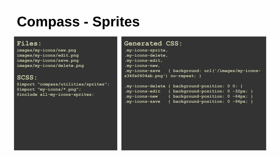
Compass - Sprites
Files:images/my-icons/new.png
images/my-icons/edit.png
images/my-icons/save.png
images/my-icons/delete.png
SCSS:@import "compass/utilities/sprites";
@import "my-icons/*.png";
@include all-my-icons-sprites;
Generated CSS:.my-icons-sprite,
.my-icons-delete,
.my-icons-edit,
.my-icons-new,
.my-icons-save { background: url('/images/my-icons-
s34fe0604ab.png') no-repeat; }
.my-icons-delete { background-position: 0 0; }
.my-icons-edit { background-position: 0 -32px; }
.my-icons-new { background-position: 0 -64px; }
.my-icons-save { background-position: 0 -96px; }

Compass - Sprites
● Configuration options per sprite or sprite-map
● Magic selectors
● Magic imports
● Sprite layouts
● Sass functions
tutorial: http://compass-style.org/help/tutorials/spriting/

Compass - SpritesWe need:
● toggle menu icon for mobile
● fixed width and height
● list-items in the menu should
be of equal height
● More control, no extra classes
SCSS Generated CSS

Compass - Sprites
That’s extra lines of code, what’s the point?● I am not wasting my time fiddling around with a sprite.
● I don’t care how many pixels a particular image is offset
in the sprite.
● I don’t care what size the image is.
● My designers don’t have to care about creating sprites
or listen to me whine, either.

What else can we do with
Compass?

Compass - CSS3
Which of these would you rather write?
HINT!

Compass - Links
● Hover Link – Underline a link when you hover over it.
● Link Colors – Easy assignment of colors to link states.
● Unstyled Link – Make a link appear like regular text.

Compass - Lists
● Bullets – Mixins for managing list bullets.
● Horizontal List – Float a list so it appears horizontally.
● Inline-Block List – set list-elements to inline-block so they appear
horizontally while retaining their structure.
● Inline List – Style a list as inline text.

Compass - Text
● Ellipsis – Text truncation with ellipsis.
● Force Wrap – Wrap URLs and long lines of text.
● No Wrap – Remembering whether or not there's a hyphen in white-
space is too hard.
● Text Replacement – Replace text with images.
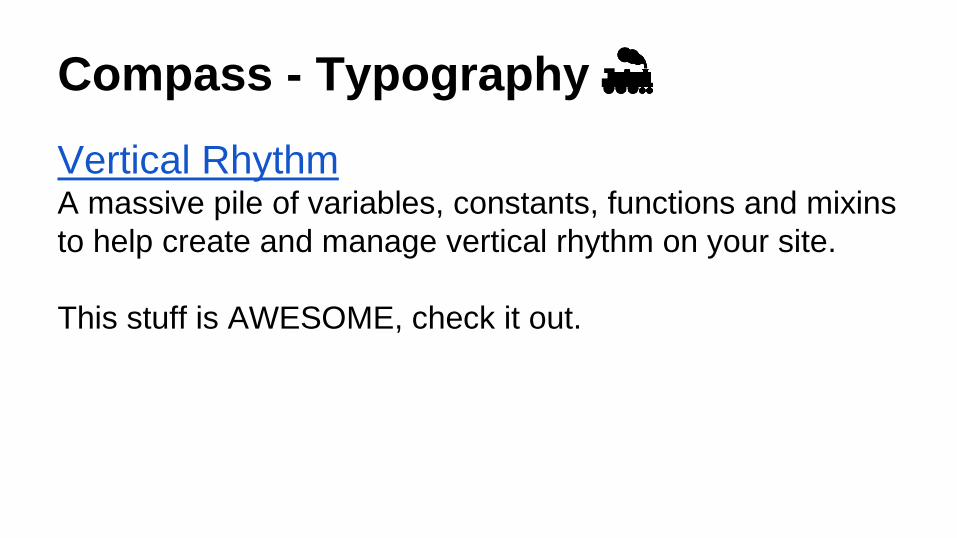
Compass - Typography
Vertical RhythmA massive pile of variables, constants, functions and mixins
to help create and manage vertical rhythm on your site.
This stuff is AWESOME, check it out.

Compass also has it’s own
layout import, and there are
many other Sass layout
libraries out there, Susy,
Bootstrap, Zen grids...
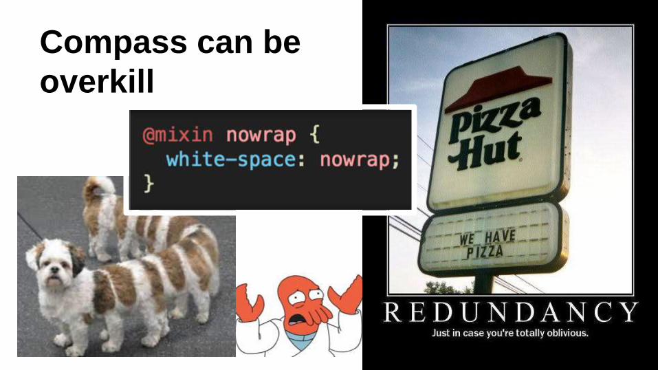
Compass can be
overkill

But usually is a timesaver.
● Calculates ems for you with Vertical Rhythm.
● Generates sprites and all kinds of sprite-related
goodies.
● Allows you to do all kinds of things that would normally
require many lines of CSS to be cross-browser
compatible.
● All kinds of fun stuff that is tedious to do by hand.

Nesting
is the best thing
ever, right?
.block {h2.title {color: MediumSeaGreen;
}}
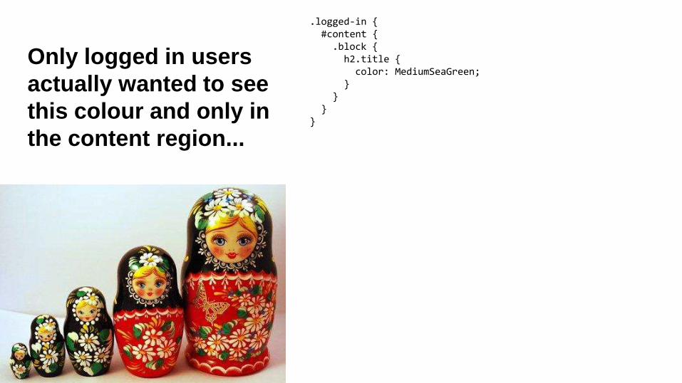
Only logged in users
actually wanted to see
this colour and only in
the content region...
.logged-in {#content {.block {h2.title {color: MediumSeaGreen;
}}
}}

Wait, the
sidebar should
be different!
.logged-in {#content {.block {h2.title {color: MediumSeaGreen;
}}.sidebar-second {.block {h2.title {color: LightGoldenRodYellow;
}}
}}
}
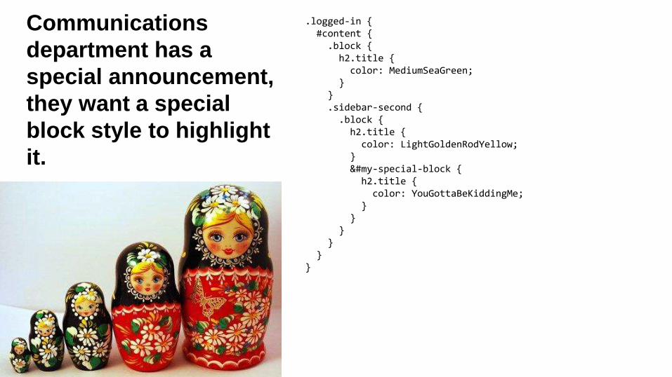
Communications
department has a
special announcement,
they want a special
block style to highlight
it.
.logged-in {#content {.block {h2.title {color: MediumSeaGreen;
}}.sidebar-second {.block {h2.title {color: LightGoldenRodYellow;
}&#my-special-block {h2.title {color: YouGottaBeKiddingMe;
}}
}}
}}

Poor kitty. :’(.logged-in {#content {.block h2.title {color: MediumSeaGreen;
}.sidebar-second {.block {h2.title {color: LightGoldenRodYellow;
}&#my-special-block {h2.title {color: YouGottaBeKiddingMe;
}}}}}} /* This is called saving space */
.logged-in #content .block h2.title { color: MediumSeaGreen; }
.logged-in #content .sidebar-second .block h2.title { color: LightGoldenRodYellow; }
.logged-in #content .sidebar-second .block#my-special-block h2.title { color: YouGottaBeKiddingMe; }

Override this, I dare you.
.node-type-key-topics #main #content .panel-pane.pane-key-topics-portfolio-panel-pane-2 .view-key-topics-portfolio > .view-content li.views-row > div {
}
Real life example. Love the ability to nest selectors in SASS/LESS, but remember that nesting isn’t
always necessary. If you don’t need to nest to achieve a certain level of specificity, don’t do it.
Rule of thumb: Nest no more than 3-4 levels deep!
http://www.creativebloq.com/css3/avoid-css-mistakes-10135080 - For all the insights on everything
everyone is doing wrong.
padding: 0;padding: 0 $base_unit !important;
There, I did it. Neener, neener.
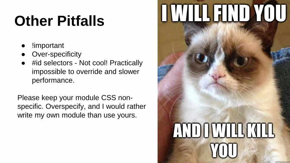
Other Pitfalls
● !important
● Over-specificity
● #id selectors - Not cool! Practically
impossible to override and slower
performance.
Please keep your module CSS non-
specific. Overspecify, and I would rather
write my own module than use yours.

SMACSS
● Scalable and
● Modular
● Architecture for
● Cascading
● Style
● Sheets
https://smacss.com/

Why?
● Organization
● Working with individual, repeatable
components, rather than whole-page
mentality
● Less nesting
● Fewer unnecessary overrides
● BEM - Easier to tell what a component is doing from
name alone
● Styleguide-driven development

Sass structure
● Base - Resets, defaults, variables, mixins, no classes or ids!
● Layout - Set it and forget it. No styles!
● Module (Component) - Individual and repeatable separate pieces of your
site (e.g. .button)
o Block
o Element
o Modifier
● State - hover and other contextual issues
● Theme (Skin) - Things specific to your theme, independant of
components, etc.

BEM Naming
Conventions
.cat { // Block: A cat. }
.cat__fur { // Element: Fur is an element “in” the cat. }
.cat__box { // Element: Box is a wrapper around the cat. }
.cat--fetish { // Modifier: Fetish is a specific cat. }
.cat--fetish.is-purring { // State: Fetish the cat is purring. }
.living-room .cat { // Theme: A cat in the living room. }

Styleguide driven development
New to front-end development?
“Here’s a secret: No one
else really knows what
they’re doing either.”
Nicholas Gallagher, 2013
(stolen from John Albin)

Further reading/watching/tools
● http://styleguides.io/
● Styleguide driven
development -
https://www.youtube.com/wat
ch?v=0ulC_UiObS0
● http://bourbon.io