Embed Size (px)
Citation preview

Contents Page – Codes and Conventions


Target Audience
Using people on the contents page also creates a direct mode of address by having one of the models staring straight into the camera, drawing the attention of the audience and helping to form a relationship with them and draw their attention to the article it links to.
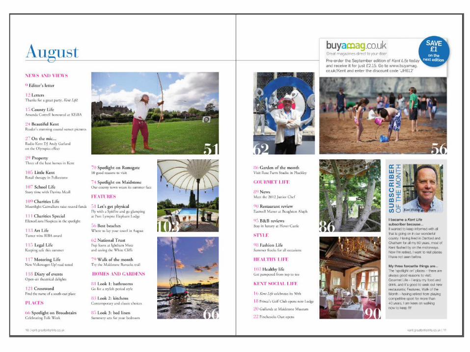
The contents page is also filled with people from different age groups, be it children at a beach, a middle ages man doing archery or an elderly man staring into the camera. The majority of the people are, however, men, are all white, and are all dressed in ways or participating in activities that give the impression that they’re middle classed. The subscriber of the month is also a white male, making the magazine’s audience clear.
The clothing worn in the pictures, with the exception of the children on a beach who are dressed for that setting, seems to be smart and formal, giving an impression of wealth. The subscriber of the month has a collared shirt suggesting formal clothing, the archer is dressed in an archery outfit, which, although not formal, still gives the impression of a middle or higher class. The man in the suit jacket and hat also looks to be well off, and from a similar class.
This sends the message that the audience reading are also middle/upper class, as they’d read articles that relate to them, and in turn the magazine is also for a white, male, mostly middle aged to elderly audience.

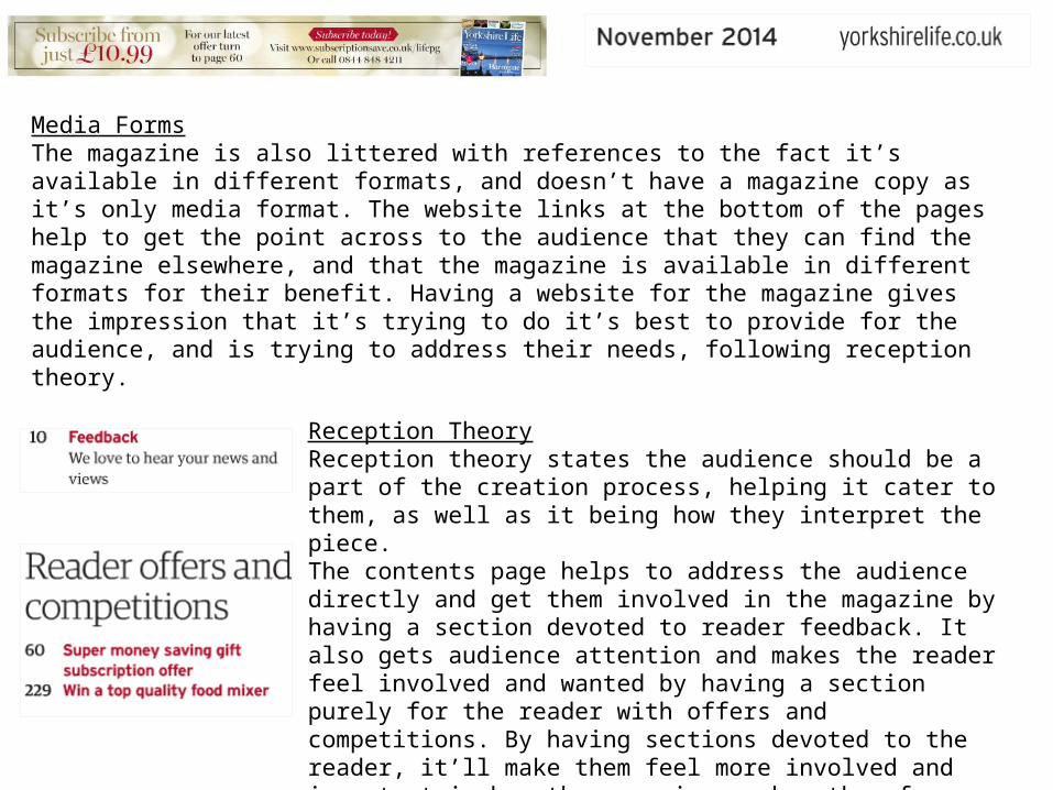
Media FormsThe magazine is also littered with references to the fact it’s available in different formats, and doesn’t have a magazine copy as it’s only media format. The website links at the bottom of the pages help to get the point across to the audience that they can find the magazine elsewhere, and that the magazine is available in different formats for their benefit. Having a website for the magazine gives the impression that it’s trying to do it’s best to provide for the audience, and is trying to address their needs, following reception theory.
Reception TheoryReception theory states the audience should be a part of the creation process, helping it cater to them, as well as it being how they interpret the piece. Having a section on the contents page with a ‘Subscriber Of The Month’ is a direct way to involve the audience in the magazine, making them feel important and involved, therefore more likely to purchase the magazine as it addresses it’s audience and listens to them.The subscriber is also a white, middle aged man, and you can see the edges of his collared shirt, giving the impression he’s dressed in smart clothing. This gives out the idea that he’s probably a wealthy man to be dressed like this, and is from a middle or upper class lifestyle. This therefore gives the impression that the target audience of the magazine is from the same background.

The pictures used in the magazine of places all depict bright, beautiful images to try to entice the audience, as well as sell the region as a whole as it’s a regional magazine. The pictures of umbrella’s by the pool and a room with fancy chandeliers and tables throughout give an idea of class, something running through the contents page, suggesting a middle class audience. The colours in the pictures and text also help the audience receive an idea of the magazine being bright and happy, correlating with the fact it’s an August edition, being the height of summer. The colours in the text are mainly pinks and blues, colours familiar with a summer scene, a sunset for example, and this is continued through the pictures by the pinks and reds in the dining room picture, the blue of the sky in the boat picture, and the blues and greens in the pool scene. These all help to convey to the audience an idea of the magazine being happy and summer filled, helping to sell it to them, as well as continuing the middle classed themes.

The style and layout of the contents page is very structured and easy for the reader to follow. Different sections are clearly marked, making it easy to understand and find what you’re looking for. The coloured titles helps catch the audience’s eye, and draws the attention of the reader.The simple serif fonts helps the contents page as it doesn’t have too much going on, and is therefore easy to follow. Having everything to the left side also helps to make the contents look more professional and sophisticated, appealing to the middle class audience who’d want a sophisticated look.

Target Audience
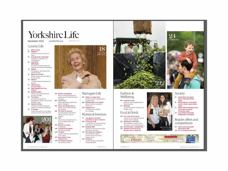
Using people on the contents page also creates a direct mode of address by having two of the female models staring straight into the camera, drawing the attention of the audience and helping to form a relationship with them and draw their attention to the article it links to.
The contents page has a mixture of ages and genders, however they all appear to be white and middle class. You get the idea of their class due to their clothing, all appearing to be very formal, the only exception being the adult male and child, presumably father and son. Even though those two are dressed in more casual clothing, the idea of a perfect family being represented still echoes a middle class, well off, stereotypical, perfect family.
The use of mostly women gives the impression that the magazine is more for woman, however the fact there is an adult male on there suggests it could go to any gender, the main audience stereotype being that they’re white, middle class, and in general middle aged to elderly.
Media FormsThe magazine is also littered with references to the fact it’s available in different formats, and doesn’t have a magazine copy as it’s only media format. The website links at the bottom of the pages help to get the point across to the audience that they can find the magazine elsewhere, and that the magazine is available in different formats for their benefit. Having a website for the magazine gives the impression that it’s trying to do it’s best to provide for the audience, and is trying to address their needs, following reception theory.
Reception TheoryReception theory states the audience should be a part of the creation process, helping it cater to them, as well as it being how they interpret the piece. The contents page helps to address the audience directly and get them involved in the magazine by having a section devoted to reader feedback. It also gets audience attention and makes the reader feel involved and wanted by having a section purely for the reader with offers and competitions. By having sections devoted to the reader, it’ll make them feel more involved and important in how the magazine works, therefore more likely to buy the magazine as it listens to and appeals to them.
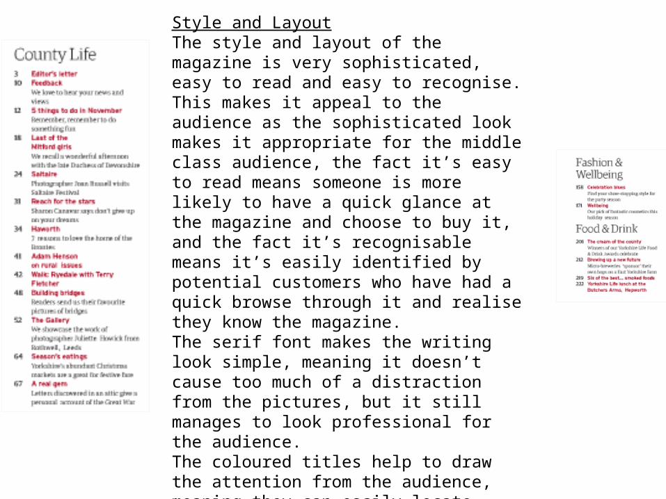
Style and LayoutThe style and layout of the magazine is very sophisticated, easy to read and easy to recognise. This makes it appeal to the audience as the sophisticated look makes it appropriate for the middle class audience, the fact it’s easy to read means someone is more likely to have a quick glance at the magazine and choose to buy it, and the fact it’s recognisable means it’s easily identified by potential customers who have had a quick browse through it and realise they know the magazine. The serif font makes the writing look simple, meaning it doesn’t cause too much of a distraction from the pictures, but it still manages to look professional for the audience.The coloured titles help to draw the attention from the audience, meaning they can easily locate articles that appeal to them rather than wasting their time trying to find things, meaning they have a more positive view towards the magazine in general. The use of columns for the text also helps make the magazine look more professional, making it more appealing for an audience.


Target Audience
Using people on the contents page also creates a direct mode of address by having models staring straight into the camera, drawing the attention of the audience and helping to form a relationship with them and draw their attention to the article it links to. The contents page doesn’t have many people on it, however it has a countertype of using only women in it. Usually if a magazine had women, they’d be sexualised and there as objects according to Mulvey’s male gaze theory, however in this contents page the women are all powerful and there in their own right, to tell their stories.
Looking at the clothing each of the women in the contents are wearing, it’s clear they all give an impression to the reader of being somewhat wealthy, most likely therefore, middle class or upwards.
The downside to the females in the contents is the fact they all follow the stereotype of being middle aged, middle class, and white, meaning although it does appeal females as a whole, it steal limits it’s apparent target audience to middle aged, middle class, white females.

Media FormsThe magazine is also littered with references to the fact it’s available in different formats, and doesn’t have a magazine copy as it’s only media format. The website links at the bottom of the pages help to get the point across to the audience that they can find the magazine elsewhere, and that the magazine is available in different formats for their benefit. Having a website for the magazine gives the impression that it’s trying to do it’s best to provide for the audience, and is trying to address their needs, following reception theory.
Reception TheoryReception theory states the audience should be a part of the creation process, helping it cater to them, as well as it being how they interpret the piece. Having a section on the contents page with a ‘Subscriber Of The Month’ is a direct way to involve the audience in the magazine, making them feel important and involved, therefore more likely to purchase the magazine as it addresses it’s audience and listens to them. It also gives the audience an incentive to be a part of the magazine, to keep buying it and to give feedback because by being featured in the contents page it acts as a reward to the readers, giving them their own recognition and their chance to be a real part of the real magazine.

The pictures used in the contents page are all depicting winter scenes whilst still enticing the audience with beautiful images and selling the region as a whole. The picture of the church shows a bright blue sky with white snow, a pretty scene to capture the audience attention, whilst the building is a solid white colour with a pinky blue background. The colours reflect a winter time, as it’s the January edition of the magazine, keeping a winter theme. The blues are also used in the titling in the contents, as well as the advertisement for the magazine website. This helps to both draw the attention of the reader to those areas, as well as keep a colour theme to make the contents page look sophisticated and professional.Having a church and a gallery also gives the idea it’s a middle class magazine as those are places typically imagined as pretty that do attract the middle class. This follows the idea the audience of the magazine is middle class, keeping them intrigued with what there is to read in the magazine.

Style and LayoutThe style and layout of the magazine is very sophisticated, easy to read and easy to recognise. This makes it appeal to the audience as the sophisticated look makes it appropriate for the middle class audience, the fact it’s easy to read means someone is more likely to have a quick glance at the magazine and choose to buy it, and the fact it’s recognisable means it’s easily identified by potential customers who have had a quick browse through it and realise they know the magazine. The serif font makes the writing look simple, meaning it doesn’t cause too much of a distraction from the pictures, but it still manages to look professional for the audience.The coloured underlines help to draw the attention from the audience, meaning they can easily locate articles that appeal to them rather than wasting their time trying to find things, meaning they have a more positive view towards the magazine in general. The colour is also a blue, used throughout the contents page in pictures and titles, meaning it follows the colour scheme well.The use of columns for the text also helps make the magazine look more professional, making it more appealing for an audience.


Target Audience
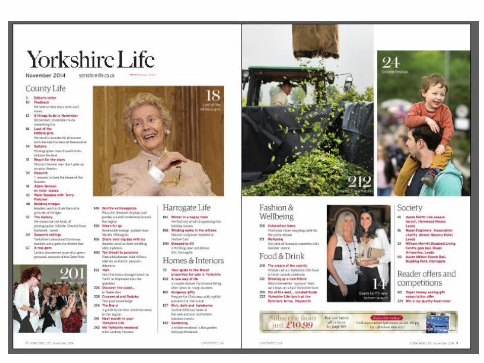
This magazine contents page seems to go against the conventions of others as it only has one person on it, and even then it’s simply the back of a woman’s head and arms. This goes against the usual conventions of having white, middle aged, middle class people in the pictures, even though you can see this woman is white.
The use of pictures of gives an impression the magazine is aimed at a middle class audience, as it depicts scenic views, country kitchens, art, and well made food, all giving a depiction of a middle class lifestyle. The art and food are typically associated with an intelligent middle class, hence having them on the contents suggests the magazine is aimed at such an audience. Having these also suggests an older audience, most likely middle aged as these aren’t activities or things young adults or the elderly would be imagined to take part in as often. The advertisement in the contents page of a company for financial aid also suggest an elder audience, particularly as it mentions savings and pensions, hence a middle class or elderly audience.Due to the stereotypes of other regional magazines, it is most likely this magazine is still aimed at a white audience, and the evidence suggests they’re still middle aged and middle class.

Media FormsThe magazine is also littered with references to the fact it’s available in different formats, and doesn’t have a magazine copy as it’s only media format. The website links at the bottom of the pages help to get the point across to the audience that they can find the magazine elsewhere, and that the magazine is available in different formats for their benefit. Having a website for the magazine gives the impression that it’s trying to do it’s best to provide for the audience, and is trying to address their needs, following reception theory.
Reception TheoryReception theory states the audience should be a part of the creation process, helping it cater to them, as well as it being how they interpret the piece. The contents page helps to address the audience directly and get them involved in the by having a section purely for the reader with offers and competitions. By having sections devoted to the reader, it’ll make them feel more involved and important in how the magazine works, therefore more likely to buy the magazine as it listens to and appeals to them.
Images
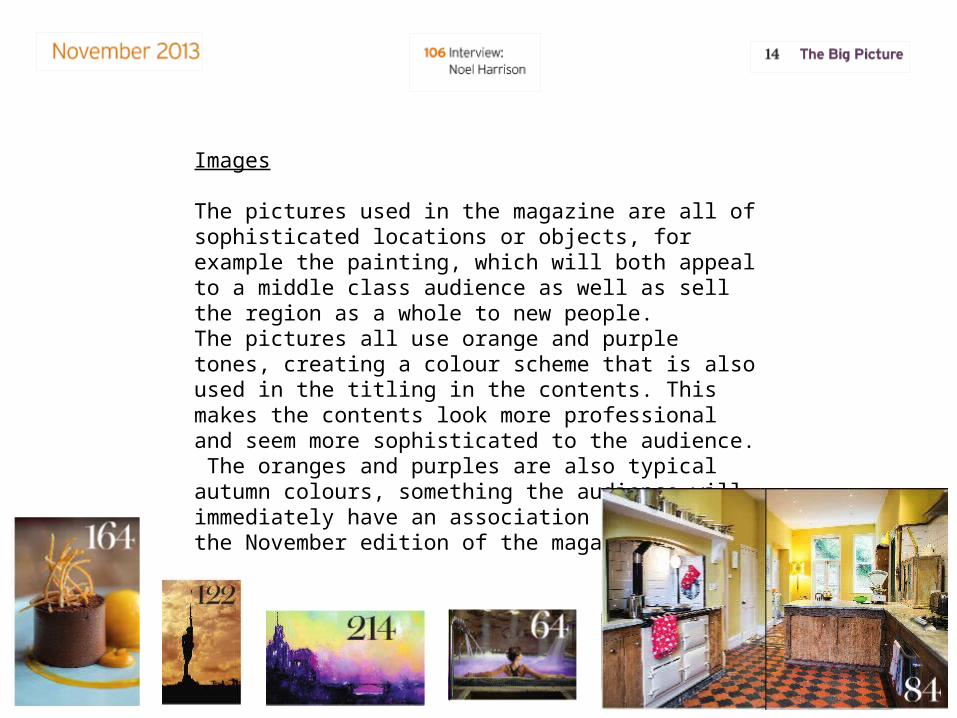
The pictures used in the magazine are all of sophisticated locations or objects, for example the painting, which will both appeal to a middle class audience as well as sell the region as a whole to new people.The pictures all use orange and purple tones, creating a colour scheme that is also used in the titling in the contents. This makes the contents look more professional and seem more sophisticated to the audience. The oranges and purples are also typical autumn colours, something the audience will immediately have an association with as it’s the November edition of the magazine.

Style and LayoutThe style and layout of the magazine is very sophisticated, easy to read and easy to recognise. This makes it appeal to the audience as the sophisticated look makes it appropriate for the middle class audience, the fact it’s easy to read means someone is more likely to have a quick glance at the magazine and choose to buy it, and the fact it’s recognisable means it’s easily identified by potential customers who have had a quick browse through it and realise they know the magazine. The serif font makes the writing look simple, meaning it doesn’t cause too much of a distraction from the pictures, but it still manages to look professional for the audience.The coloured numbers help to draw the attention from the audience, meaning they can easily locate articles that appeal to them rather than wasting their time trying to find things, meaning they have a more positive view towards the magazine in general. The colours are also purple and oranged, used throughout the contents page in pictures and titles, meaning it follows the colour scheme well.The use of columns for the text also helps make the magazine look more professional, making it more appealing for an audience.


