Embed Size (px)
Citation preview
Analysis of Lana Del Rey promotional poster
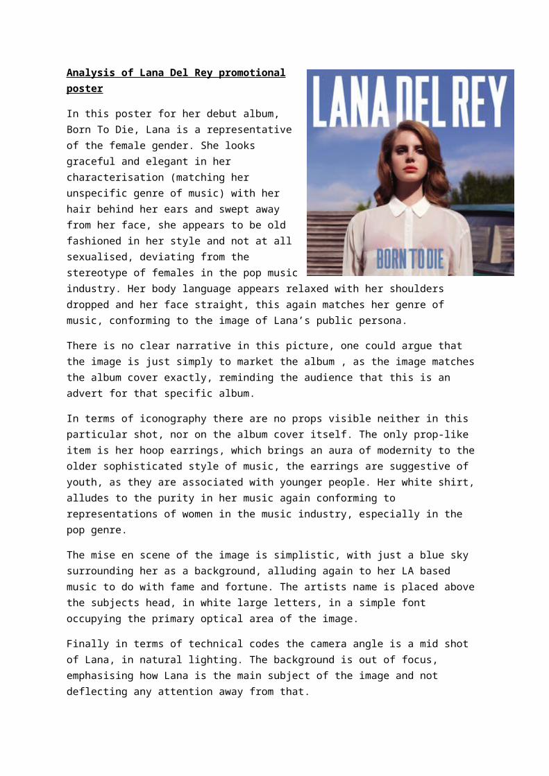
In this poster for her debut album, Born To Die, Lana is a representative of the female gender. She looks graceful and elegant in her characterisation (matching her unspecific genre of music) with her hair behind her ears and swept away from her face, she appears to be old fashioned in her style and not at all sexualised, deviating from the stereotype of females in the pop music industry. Her body language appears relaxed with her shoulders dropped and her face straight, this again matches her genre of music, conforming to the image of Lana’s public persona.
There is no clear narrative in this picture, one could argue that the image is just simply to market the album , as the image matches the album cover exactly, reminding the audience that this is an advert for that specific album.
In terms of iconography there are no props visible neither in this particular shot, nor on the album cover itself. The only prop-like item is her hoop earrings, which brings an aura of modernity to the older sophisticated style of music, the earrings are suggestive of youth, as they are associated with younger people. Her white shirt, alludes to the purity in her music again conforming to representations of women in the music industry, especially in the pop genre.
The mise en scene of the image is simplistic, with just a blue sky surrounding her as a background, alluding again to her LA based music to do with fame and fortune. The artists name is placed above the subjects head, in white large letters, in a simple font occupying the primary optical area of the image.
Finally in terms of technical codes the camera angle is a mid shot of Lana, in natural lighting. The background is out of focus, emphasising how Lana is the main subject of the image and not deflecting any attention away from that.