Embed Size (px)
Citation preview

By Sujata Gurung
WHAT DO HORROR FILM TITLES LOOK
LIKE?

What do horror film titles look like
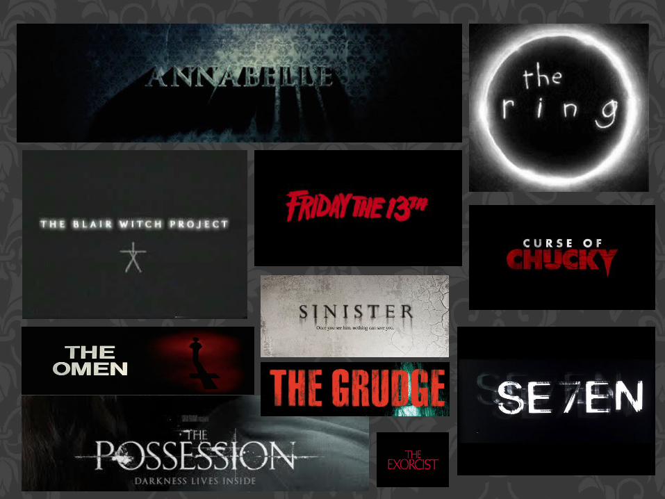
The common colours used in horror film titles are black, white, red or sometimes green.
In my view point I think black connotes mystery, suspense, whilst white is a colour used to symbolise purity or innocence, vulnerability, just like the victims in most horror films. Red is connotes blood, death, danger etc. All these connotations are linked to horror film, and because of these conventions of colours we associate the title with horror genre. Some font styles are similar for example the ‘Blair witch project’ and sinister however ‘The Ring’ font style is a bit peculiar and also the circle around the title puts emphasis on the title ‘The Ring’