Embed Size (px)
Citation preview

LOOKING BACK AT YOUR PRELIMINARY TASK, WHAT DO YOU FEEL YOU HAVE
LEARNT IN THE PROGRESSION FROM IT TO THE FULL PRODUCT?
SCHOOL MAGAZINE
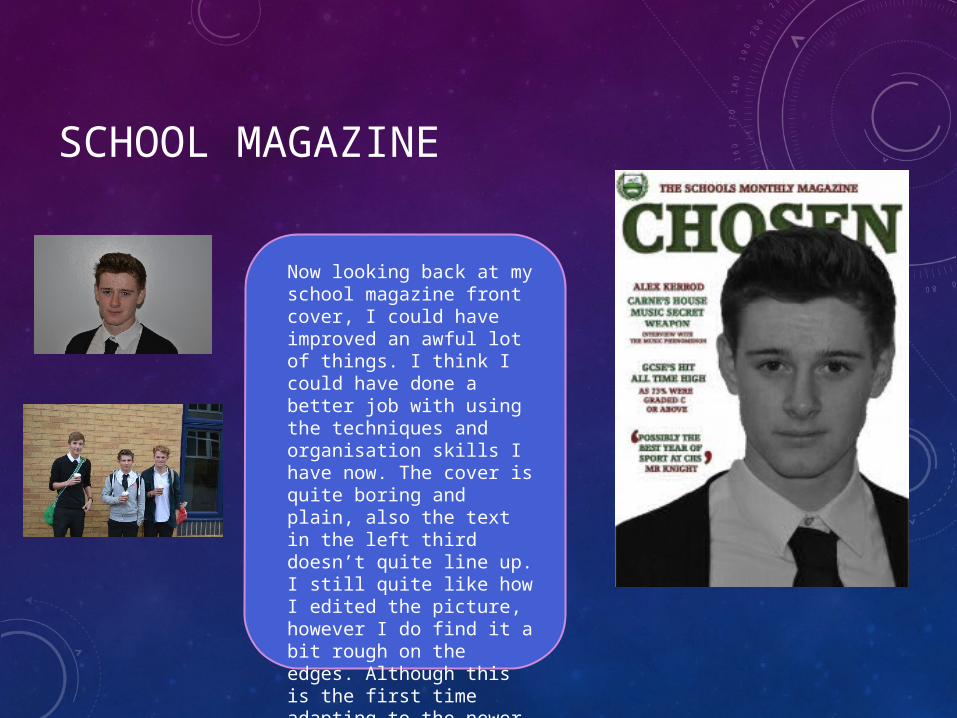
Now looking back at my school magazine front cover, I could have improved an awful lot of things. I think I could have done a better job with using the techniques and organisation skills I have now. The cover is quite boring and plain, also the text in the left third doesn’t quite line up. I still quite like how I edited the picture, however I do find it a bit rough on the edges. Although this is the first time adapting to the newer version of Photoshop Cs6 I think I did a decent first attempt of a magazine cover.

SCHOOL MAGAZINE
I personally think my contents page is okay. The layout looks good in my opinion and there is a lot going on, there are a decent number of pictures and a fair amount of text to go with it. I do think the title of the page should be bigger looking at it now. I have improved throughout the progression of my magazines. I prefer my music magazine contents page as I feel the pictures are a lot better especially the main image.
FRONT COVERS:
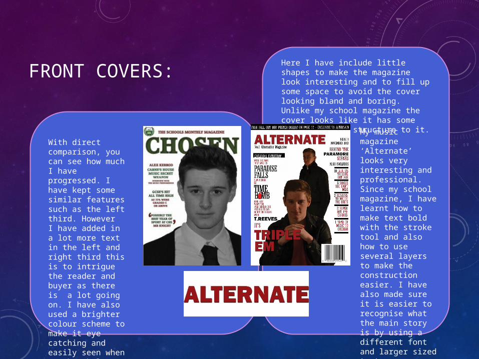
With direct comparison, you can see how much I have progressed. I have kept some similar features such as the left third. However I have added in a lot more text in the left and right third this is to intrigue the reader and buyer as there is a lot going on. I have also used a brighter colour scheme to make it eye catching and easily seen when on the shelves so it stands out from other magazines.
Here I have include little shapes to make the magazine look interesting and to fill up some space to avoid the cover looking bland and boring. Unlike my school magazine the cover looks like it has some uniformity and structure to it.
My music magazine ‘Alternate’ looks very interesting and professional. Since my school magazine, I have learnt how to make text bold with the stroke tool and also how to use several layers to make the construction easier. I have also made sure it is easier to recognise what the main story is by using a different font and larger sized text.
CONTENTS PAGE:
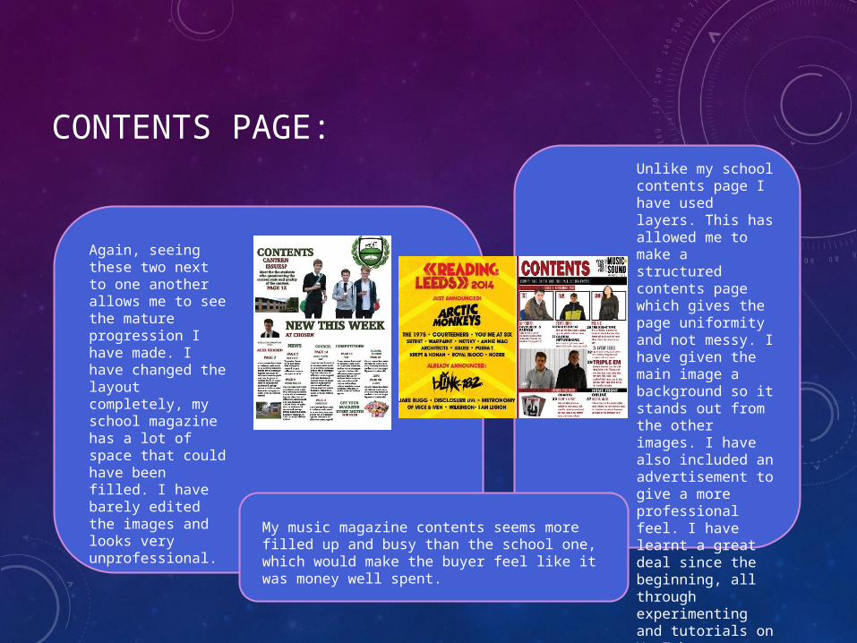
Again, seeing these two next to one another allows me to see the mature progression I have made. I have changed the layout completely, my school magazine has a lot of space that could have been filled. I have barely edited the images and looks very unprofessional.
Unlike my school contents page I have used layers. This has allowed me to make a structured contents page which gives the page uniformity and not messy. I have given the main image a background so it stands out from the other images. I have also included an advertisement to give a more professional feel. I have learnt a great deal since the beginning, all through experimenting and tutorials on YouTube.
My music magazine contents seems more filled up and busy than the school one, which would make the buyer feel like it was money well spent.
HOW THESE IMPROVEMENTS HAVE AFFECTED THE OUTCOME OF MY DOUBLE PAGE SPREAD
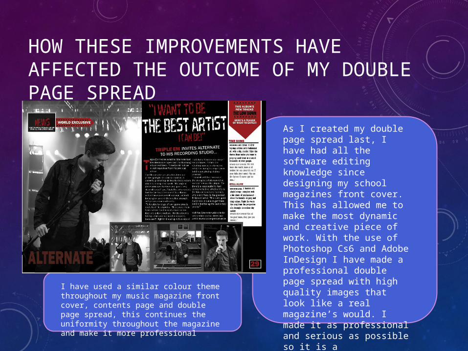
As I created my double page spread last, I have had all the software editing knowledge since designing my school magazines front cover. This has allowed me to make the most dynamic and creative piece of work. With the use of Photoshop Cs6 and Adobe InDesign I have made a professional double page spread with high quality images that look like a real magazine’s would. I made it as professional and serious as possible so it is a sophisticated looking page like a real magazine which would do this.
I have used a similar colour theme throughout my music magazine front cover, contents page and double page spread, this continues the uniformity throughout the magazine and make it more professional
TO CONCLUDE
On the whole I have learnt how to properly use software such as Photoshop and InDesign. And I have progressed in the way I use the effects to convey my work. I personally think that my designs have matured and become more structured like the generic music magazine. In addition I have used many other technologies (which I had never used before) to present my evaluation questions.