Embed Size (px)
Citation preview

MY MAGAZINE POWER POINT INTRODUCTIONBy Amna Afzal

LOGO• The colour scheme i had chosen for my logo was red and white, this is because it looks urban and are two unique colours, also the font i had chosen looks like a type of graffiti which is what we usually see on the streets and in music magazines and also music videos.• Originally the colour scheme i had chosen for my logo was black
and yellow, but i felt that the colours didn't match as well to my standards and didn't look urban enough to me or the type of colours we would use or see in a music video or magazine.
i chose to put my logo on a black background as it makes the colours stand out and show more.
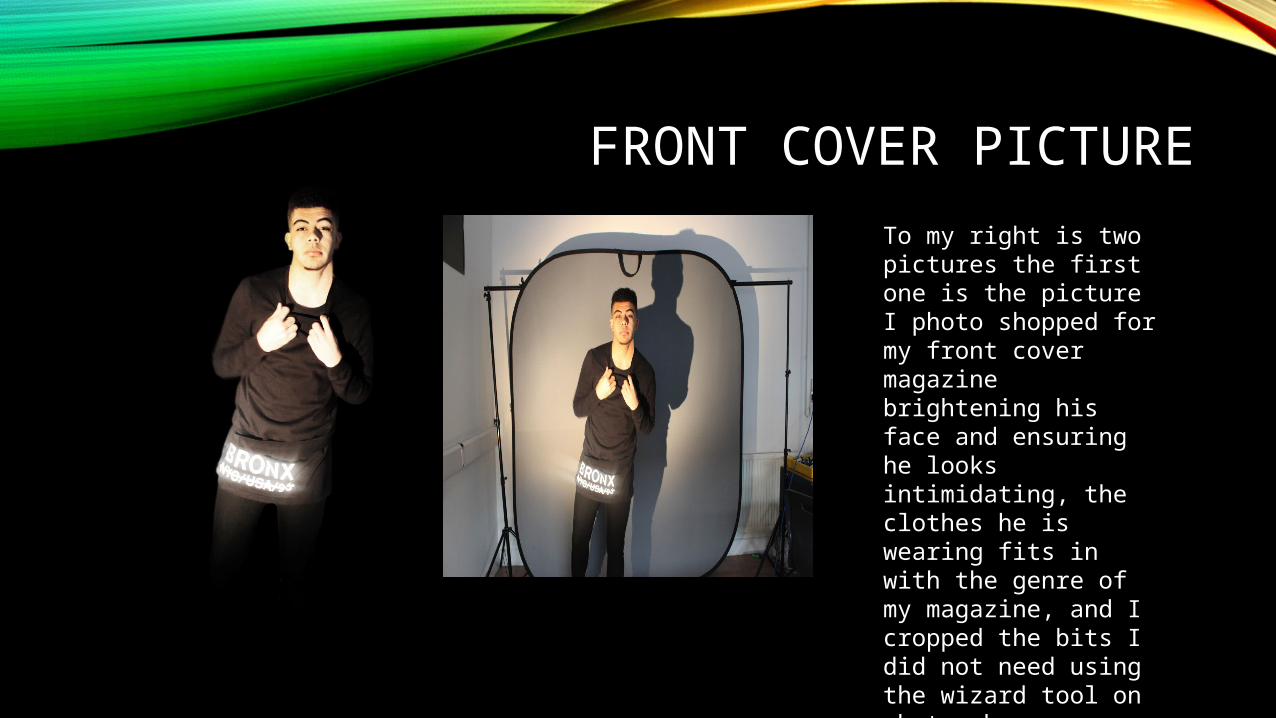
FRONT COVER PICTURETo my right is two pictures the first one is the picture I photo shopped for my front cover magazine brightening his face and ensuring he looks intimidating, the clothes he is wearing fits in with the genre of my magazine, and I cropped the bits I did not need using the wizard tool on photo shop.

CONTENTS PAGE PICTUREThis is the contents page picture the first one is the original photo and the second one is the photoshopped photo, I used the burn tool to burn some bits I wanted to stand out and I cropped out the background and unnecessary bits that were not needed I chose this one over my last years one as I believe it looks more masculine and intimidating as that’s what I was intending on doing.

DOUBLE PAGE SPREAD PHOTOThese are the two pictures one of which I photo shopped and the original photos as we can see I had to do a lot of editing by cropping and sorting out lighting and taking off any unwanted things I did not need. It was hard to crop my third person so I cropped everything and done his edits separately
It was intended for the males to have a shadow on their face or a dark area to make them look powerful and intimidating which is how they are usually seen in the context of the genre I have chosen so I intended to do them following my genre.
Tools: brightening, contrast, burn tool for vibrancy and enhancement wizard and rubber tool for background

PHOTO OPTIONS (JUST A LITTLE SELECTION I HAD TO CHOOSE FROM)
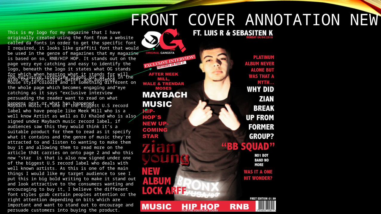
FRONT COVER ANNOTATION NEWThis is my logo for my magazine that I have originally
created using the font from a website called da fonts in order to get the specific font I required, it looks like graffiti font that would be used in the genre of magazines that my magazine is based on so, RNB/HIP HOP. It stands out on the page very eye catching and easy to identify the logo, beneath the logo it states what OG stands for which when hearing what it stands for will grab the right target market and audience.The exclusive interview stands out as its in the house style colours and is something different on the whole page which becomes engaging and eye catching as it says “exclusive interview” persuading the reader want to read on what happens next or what has happened.Maybach music is one of the biggest U.S record label who have people like Meek Mill who is a well know Artist as well as DJ Khaled who is also signed under Maybach music record label, if audiences saw this they would think it’s a suitable product for them to read as it specify what it contains and the genre of music they're attracted to and listen to wanting to make them buy it and allowing them to read more on the article that carries on onto page 2 and who this new “star” is that is also now signed under one of the biggest U.S record label who deals with well known artists. As this is one of the main things I would like my target audience to see I put this in big bold writing to make it stand out and look attractive to the consumers wanting and encouraging to buy it, I believe the different font styles grab certain peoples attention or the right attention depending on bits which are important and want to stand out to encourage and persuade customers into buying the product.

CONTENTS PAGE NEW

DOUBLE PAGE SPREAD NEW

CONCLUSION
![M:\My Documents\Media Studies\Mr Lau\Music Magazine\Microsoft Power Point Dps Analysis [Compatibility Mode]](https://img.dokumen.tips/doc/110x75/5556ad42d8b42a3f7e8b4fd7/mmy-documentsmedia-studiesmr-laumusic-magazinemicrosoft-power-point-dps-analysis-compatibility-mode-55849fc3cd853.jpg)