Embed Size (px)
Citation preview

the making of....
ALL PRINT PRODUCTIONS

the making of....
1. FRONT PANEL

Firstly, I took the low-angle image of the tower block as I wanted this to be the iconic image in relation to the promotion of the artist. I had to enlarge the image slightly using the transformation tool to fit the frame and then I changed the colour of the image using Image > Adjustments > Black and White to the black and white
theme I decided upon after watching the film Control.

Secondly, I added the titles Vanilla and For What It’s Worth in the bottom right-hand corner using the text tool and then changed the colour of the text to bright pink. I continued using the same font, Bebas Neue, that I had used for the titles in my music video and conformed further to the style of Control’ by making the titles pink. I didn’t want a background for my titles as I wanted to be able to see the building in the background,
which is also why I aligned my text to the right rather than centring it as I wanted the building to be the main focus.
the making of....
2. MIDDLE 3 PANELS

For my middle 3 panels, I took a panoramic image of a wall of graffiti so that it would span across my 3 panels. I had to alter the size slightly with the transformation tool but the main issue that I wanted to address was the colour of the image. I muted the colours by Image > Adjustments > Hue and Saturation and I reduced
the saturation and brightness of the image to increase the ‘greyness of the image’.

To conform to the conventions of a CD case, I decided to include a disk tray imprinted on my design in the middle panel. To achieve this, I found an image of a disk tray on Google and copied and pasted it into
Photoshop. I then removed the white background using the magic wand tool to select it and delete it and I then centred the image on my middle 3 panels.

the making of....
3. FOLD-OUT PANEL

For my fold-out panel, I took two pictures – one of a pavement and one of a small section of white-washed brick wall to form the background of my design. I cropped the images to just the section that I wanted using the rectangular marquee tool and deleting the parts I didn’t want. With the white wall, the image that I was able to take was too small and I didn’t want to distort the bricks by enlarging the image. Because of this, I
selected the image using the rectangular marquee tool again and copied and pasted the image multiple times to make it the size of the panel.

As my performer was no longer available for a photoshoot, I had to take a print screen of him from my music video to use for my print productions. As the background of this image was not a single block image, I
couldn’t use the magic wand tool to select it all and delete it. Instead, I had to use the eraser tool to remove the entire background. Also, the bent leg in the left-hand picture was changed by me erasing the right leg in the image and copying the left leg and pasting it in place so that he looked like he was standing rather than
walking. I had to use the eye dropper tool to select the colour of his trousers and then use the paintbrush toolto fill in the slight gap where the ‘new leg’ joined.

The main part of this design was the repetition of a graffiti tag across the white-washed wall. I took an image of a graffiti tag on a wall and decided on the part of the tag that I wanted to choose. Luckily, much of the tag was surrounded by a yellow outline so was largely contained in itself. I used the eraser tool to isolate the part of the tag that I wanted to use and then used the eye dropper tool to select the yellow of the outline. I then
used the paintbrush tool to complete the outline around the tag so that it looked like a complete tag. I picked this tag also because the pink fitted with my black/white/pink colour theme.

Finally, I pieced all the layers together of the pavement, the wall and Toby to create the basis of the image. I then had to copy and paste the tag multiple times over the wall to create the Warhol effect that I was aiming for. I decided not to cover the wall entirely as I didn’t want it to be an overwhelming motif. I altered the sizes
of the tag with the transformation tool and reduced the opacity of some of the tags to make them appear slightly faded, and as if they were actually painted on the wall.

the making of....
4. BACK PANEL

For my back panel, I decided to use an image of a skateboard to include this element of my music video into my print productions. I took a picture of a skateboard propped against a red brick wall quite close up. I then duplicated this image and made the image behind in black and white, as can be seen on the left, with Image
> Adjustments > Black and White.

With the front duplicate image, I removed the brick wall background with the eraser tool so that the grey wall could be seen through to continue the grey colour scheme across all of my panels. I decided I wanted to alter the red of the skateboard to the same pink as the titles on my CD case and so used the eye dropped
tool to select this colour and then drew a square in this colour using the rectangular shape tool. I wanted this colouring to look realistic so I reduced the opacity of this block shape so that the writing on the skateboard
underneath came through and it looked like the actual colour of the skateboard.

I then wrote the track listings, using the text tool, in the same font as the rest of my productions, onto the design. However, because I had used pink as the colour for the skateboard, I chose white titles to create a
contrast between the two. I aligned the text to the left, as I have on my A4 poster, and also so that the tracks were set upon the skateboard. I lined the top track with the fork of the skateboard, and because of this, there
wasn’t enough space for all 20 tracks on my back panel. Consequently, I removed the last three tracks to keep my design looking this way.

To continue the motif of the graffiti tag that I had established with my fold-out panel, I decided to include this tag as a sticker on the bottom of my skateboard. I found an image of a clip-art style white peeling sticker
and pasted it onto my design. I removed the white background using the magic wand tool to select it and then deleting it and then I pasted the tag onto the sticker. I reduced the size and rotated it using the
transformation tool to make it fit into the sticker and then reduced the opacity of both the sticker and the tag to make them look slightly faded, like a real sticker.

Finally, to make my back panel that of a conventional CD case, I included both a barcode and the name of the record company to cement the authenticity of my design. I found an image of a barcode on Google and
pasted this onto my design, placing it in the bottom right-hand corner and relatively small, so as not to obstruct my design. Underneath this, to keep the panel uncluttered, I used the text tool to type COPYRIGHT
OF MALHOTRA RECORDS in the same font, and in white lettering so as to match the track listings.

the making of....
5. A4 POSTER

Firstly, I took the low-angle image of the tower block as I wanted this to be the iconic image in relation to the promotion of the artist. I had to enlarge the image slightly using the transformation tool to fit the frame and then I changed the colour of the image using Image > Adjustments > Black and White to the black and white
theme I decided upon after watching the film Control.

Secondly, I added the titles Vanilla and For What It’s Worth in the top left-hand corner using the text tool and then changed the colour of the text to bright pink. I continued using the same font, Bebas Neue, that I had
used for the titles in my music video and conformed further to the style of Control’ by making the titles pink. I didn’t want a background for my titles as I wanted to be able to see the building in the background, which is
also why I aligned my text to the left rather than centring it as I wanted the building to be the main focus.

To conform to the conventions of an album promotion advertisement, I decided to include reviews of the album from critics. I wrote three quotes from NME, The Guardian and Clash of the album to include on the
poster, alongside ratings stars. I created these using the text tool, in the same font and colour as my titles. I wanted to somehow include these in the image of the tower block and so I rotated the three text boxes
slightly, using the transformation tool, so that they appeared to be printed on the wall of the tower and slightly reduced the opacity of the text in the layers box so that they embodied the texture of the wall.
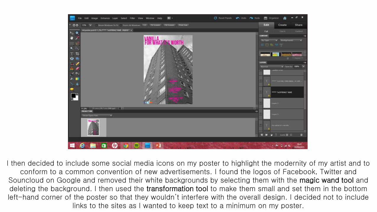
I then decided to include some social media icons on my poster to highlight the modernity of my artist and to conform to a common convention of new advertisements. I found the logos of Facebook, Twitter and
Souncloud on Google and removed their white backgrounds by selecting them with the magic wand tool and deleting the background. I then used the transformation tool to make them small and set them in the bottom left-hand corner of the poster so that they wouldn’t interfere with the overall design. I decided not to include
links to the sites as I wanted to keep text to a minimum on my poster.

Finally, I decided to add a release date for my album on the poster. Again, I wrote the text in the same font and colour as the other text on the poster with the text tool. However, I then added a white shape behind the text using the rectangle tool to make this stand out and also perhaps look like the sold-out signs that artists
place on their tour dates. I centred this in the poster as the most important piece of information on the poster as the eye is drawn to this. This is the finished product.