Embed Size (px)
Citation preview

Logo – Step By Step
Step 1: First I got an image from Google images of an abstract blood background. I chose this image because it looks good and very much matches the horror genre conventions. The image will became the inside of the text and therefore it needs to be some sort of red, as from my research I found that most horror movies titles use red writing on a background, to make it stand out but to also link to blood, death and horror.
Step 2: Then, I went on to http://www.dafont.com and download four horror themed fonts, ‘true lies’, ‘why so serious’, ‘scream again’ and ‘scary Halloween’. I then typed in the name of our production company ‘Pennywise Productions’, which is named after the popular movie character from ‘It’ Pennywise the clown. I didn’t place the ‘I’ in productions as it is going to be replaced by an image of a knife. I then
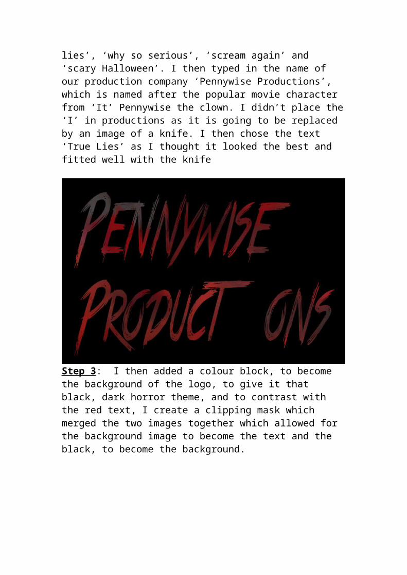
chose the text ‘True Lies’ as I thought it looked the best and fitted well with the knife
Step 3: I then added a colour block, to become the background of the logo, to give it that black, dark horror theme, and to contrast with the red text, I create a clipping mask which merged the two images together which allowed for the background image to become the text and the black, to become the background.
Step 4: After some searching on Google for an image of a knife there wasn’t a suitable image for my logo, so I drew one myself, using the pencil tool on Photoshop. I think knife looks okay, as I am new to
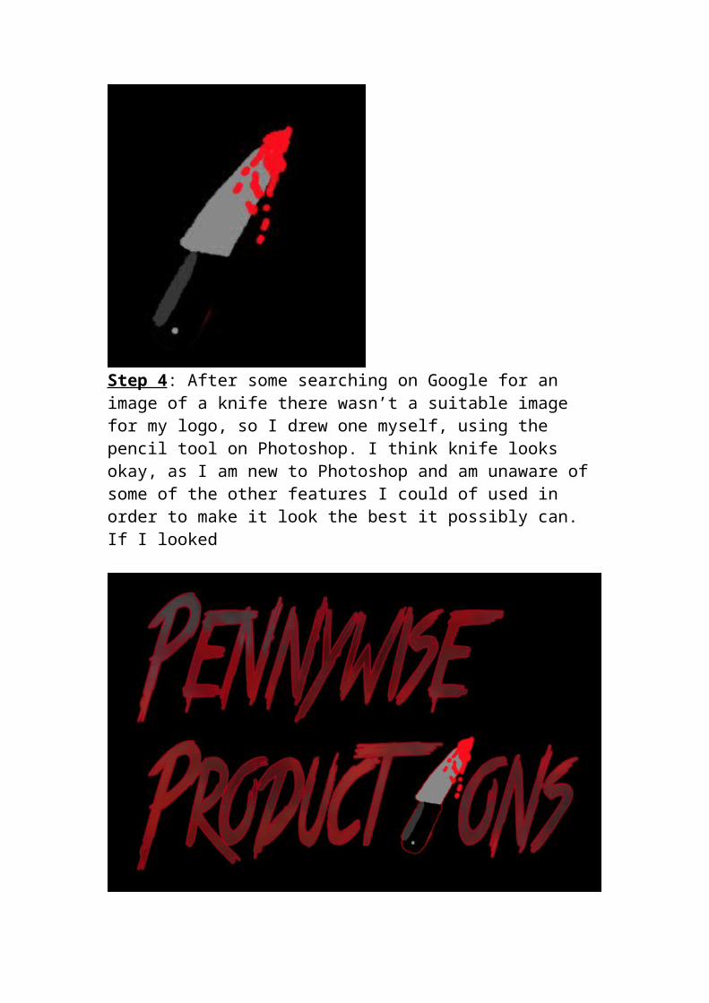
Photoshop and am unaware of some of the other features I could of used in order to make it look the best it possibly can. If I looked
Step 5: After I positioned the knife with the text, I added a red glow to make the text and images stand out more and again link to the idea of blood and death. I think this looks good and effective, and fits with the horror theme and will add an element of horror to my production.