Embed Size (px)
Citation preview

Responsiv webbdesignGenom media queries

Tillbaka till HTML/CSSEfter vår lilla utflykt med JavaScript

Dagens föreläsning
• Vad innebär responsiv webbdesign?• Media queries?• Att designa för olika enheter

https://goo.gl/J8ouB6
• Bra?• Dåligt?• Förbättringar?
https://goo.gl/ZMmg9w
• Bra?• Dåligt?• Förbättringar?

http://www.activatedesign.co.nz/blog/wp-content/uploads/2014/04/responsive-web-design.jpg


ia.webbintro.se

http://mediaqueri.es/
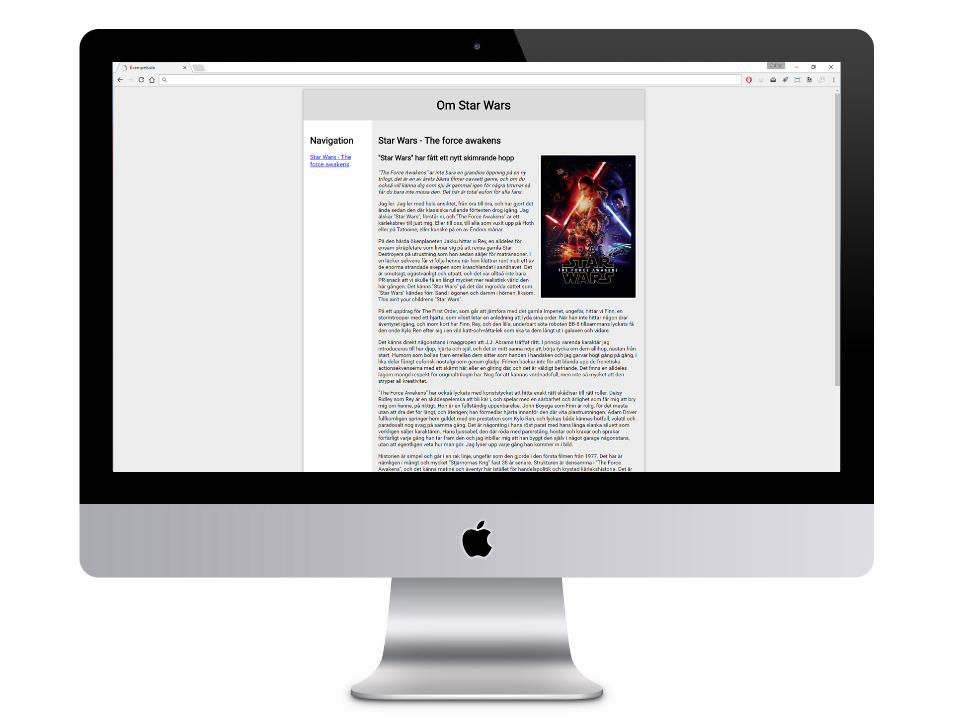
• Exempel på hur olika webbplatser använder sig utav responsiv design för att anpassa sig efter olika förutsättningar

http://alistapart.com/article/responsive-web-design

http://www.abookapart.com/products/responsive-web-design

Varför responsiv webbdesign?

1. Allt fler surfar med mobiler/surfplattor

2. Ger oss möjlighet anpassa innehållet efter det medium som användaren användare

3. Många webbsidor hittas genom social media, vilket används mest på mobiler

4. Responsiva webbplatser prioriteras av Google vid sökningar

5. Snabbar upp webbsidorna

6. Vi använder mer och mer olika enheter, för att utföra, eller fortsätta utföra en uppgift

Med andra ord – tänk responsivt!

http://alistapart.com/article/dao
The web’s greatest strength, I believe, is often seen as a limitation, as a defect. It is the
nature of the web to be flexible, and it should be our role as designers and developers to embrace this flexibility, and produce pages
which, by being flexible, are accessible to all.
—John Allsopp, 2000

Nyckelord för responsiv webbdesign
• CSS 3 Media Queries• Flexible layout• Flexible media• Breakpoints• Mobile viewport sizes• Compatibility

http://www.w3.org/TR/css3-mediaqueries/

Olika typer av stilmallar
<link rel="stylesheet" type="text/css” media="screen" href=”style.css">
<link rel="stylesheet" type="text/css” media="print" href=”print.css">

Att styla för olika mål

Att styla för olika upplösningar

Att jobba med media queriesmedia print & media screen

Flexibel layout & media


Att jobba med dynamisk bredd% istället för pixlar
Auto

Brytpunkter? Hur var när?

Exempel på brytpunkterhttp://lawrencestewart.ca/popular-media-queries-for-responsive-web-design/


"Start with the small screen first, then expand until it looks like *crap*. Time to insert a breakpoint!“
http://www.peachpit.com/articles/article.aspx?p=1945831


Att jobba med brytpunkterVilka enheter ska vi anpassa oss till?
Tankeverkstad!

Mobile Viewport Sizes
Är en pixel alltid en pixel?https://developer.mozilla.org/en-US/docs/Mozilla/Mobile/Viewport_meta_tag


alert(document.documentElement.clientWidth);

Anpassa storlek efter skärmstorlekHmm, det blev ju ganska litet… hur löser vi detta?

Olika viewports
<meta name="viewport" content="initial-scale=1.0, width=device-width">
initial-scale=1maximum-scale=1minimum-scale=1width=500user-scalable=no
http://dev.w3.org/csswg/css-device-adapt/

Gör vår webbsida responsiv! =)

“that’s what responsive web design is: a possible solution, a way to more fully design for the web’s inherent flexibility”