Embed Size (px)
Citation preview

AS MEDIA EVALUATIONMegan Healy

Question 1• In what way does your media product use, develop or challenge forms and conventions of real media products?
Question 1• Throughout my magazine, on the front
page, contents page and double page spread I have continuously tried to use the generic conventions found on other music magazines.
• I analysed an issue of "Blender" magazine's front page to work out what the typical conventions are: http://meganhealymedia.blogspot.co.uk/2014/09/analysis-of-three-music-magazines_23.html
• I learnt about mastheads, cover lines, anchorage text and selling lines, etc. I created my own copy of NME: http://meganhealymedia.blogspot.co.uk/2014/09/creative-nme-task.html
• I could apply generic conventions to my own music magazine.

Question 1Using the conventions on my front page:• I followed the left third rule and positioned my
masthead in the top left hand corner – I had influence to do this from DJ magazine.
• I ensured the main cover line stood out from all other cover lines by making it colourful and contrasting.
• I merged the URL into the masthead just like DJ magazine does, this shows that I benefited from research.
• I used a bar code and date line to ensure that my magazine looks realistic and professional.
• The numerous cover lines show that my magazine is jam packed.
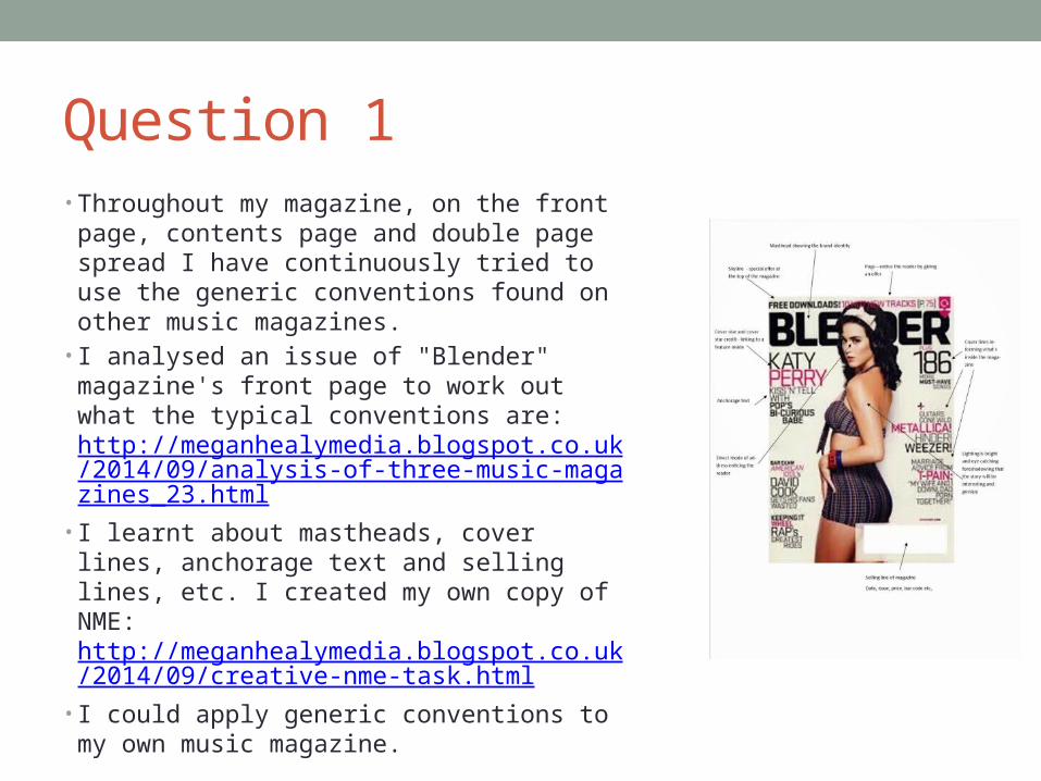
Question 1Developing and challenging conventions –
Front page:• I added my own twist to my front page; magazines
such as DJ magazine or Mixmag use very busy backgrounds – I chose a plain, lime green background.
• Mixmag features more than one image on the front page, I however, have kept my front page to the point and used one image – this makes my artist seem dominant.
• This is another example of mixmag magazine's conventions being different to the featured conventions in my magazine: http://meganhealymedia.blogspot.co.uk/2014/09/research-into-similar-products-other.html
• I displayed my anchorage text in a bold and italic way – NME and Q do this, but my magazine is a different genre, therefore it’s a challenge to conventions because Mixmag and DJ magazine do not: http://meganhealymedia.blogspot.co.uk/2014/10/similar-products.html
The differences:
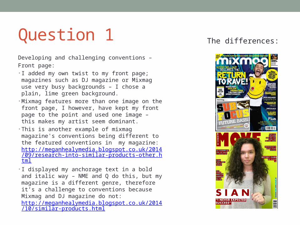
Question 1Influences for my front page:• Mixmag DJ elektro
VIBE• DJ magazine helped me create my
masthead – I also used a round, bold font “Amity Jack”. I also made the font burgundy – this screams for attention.
• The names of Mixmag and DJ are so simple, this inspired me to call my magazine MOVE – an alternative reason for MOVE being my choice is because when you listen to dance music it simply makes you want to move.
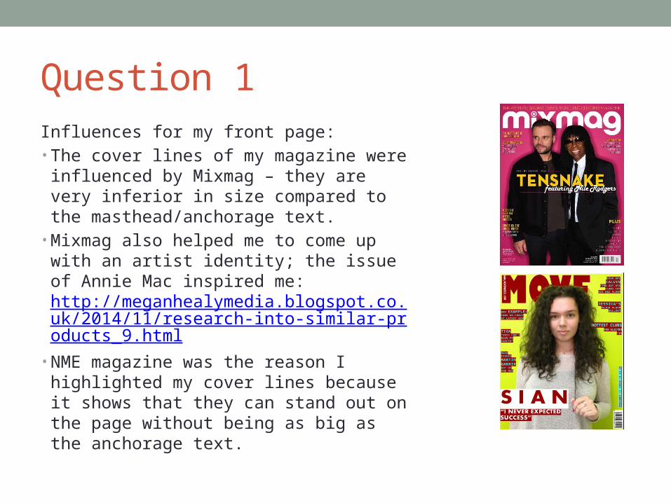
Question 1Influences for my front page:• The cover lines of my magazine were
influenced by Mixmag – they are very inferior in size compared to the masthead/anchorage text.
• Mixmag also helped me to come up with an artist identity; the issue of Annie Mac inspired me: http://meganhealymedia.blogspot.co.uk/2014/11/research-into-similar-products_9.html
• NME magazine was the reason I highlighted my cover lines because it shows that they can stand out on the page without being as big as the anchorage text.
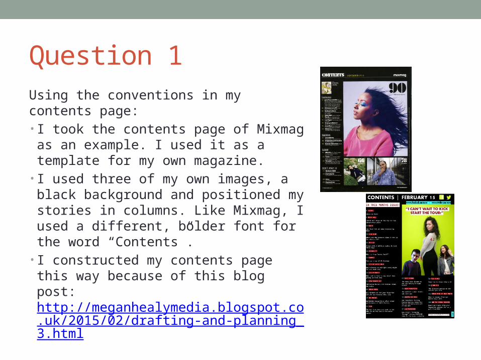
Question 1Using the conventions in my contents page:• I took the contents page of Mixmag as an
example. I used it as a template for my own magazine.
• I used three of my own images, a black background and positioned my stories in columns. Like Mixmag, I used a different, bolder font for the word “Contents”.
• I constructed my contents page this way because of this blog post: http://meganhealymedia.blogspot.co.uk/2015/02/drafting-and-planning_3.html
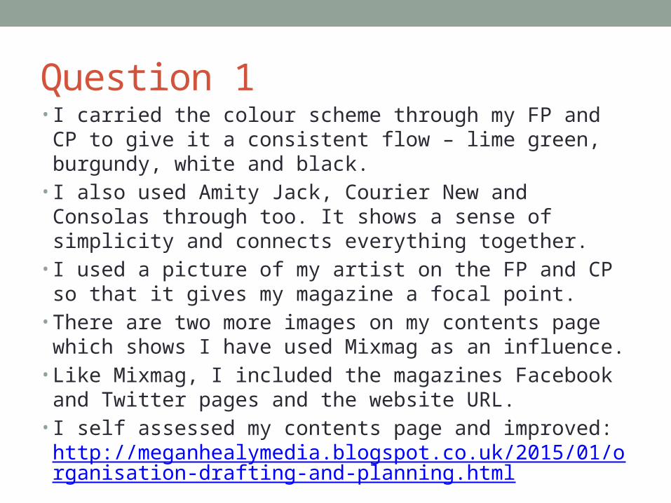
Question 1• I carried the colour scheme through my FP and CP to give
it a consistent flow – lime green, burgundy, white and black.
• I also used Amity Jack, Courier New and Consolas through too. It shows a sense of simplicity and connects everything together.
• I used a picture of my artist on the FP and CP so that it gives my magazine a focal point.
• There are two more images on my contents page which shows I have used Mixmag as an influence.
• Like Mixmag, I included the magazines Facebook and Twitter pages and the website URL.
• I self assessed my contents page and improved: http://meganhealymedia.blogspot.co.uk/2015/01/organisation-drafting-and-planning.html
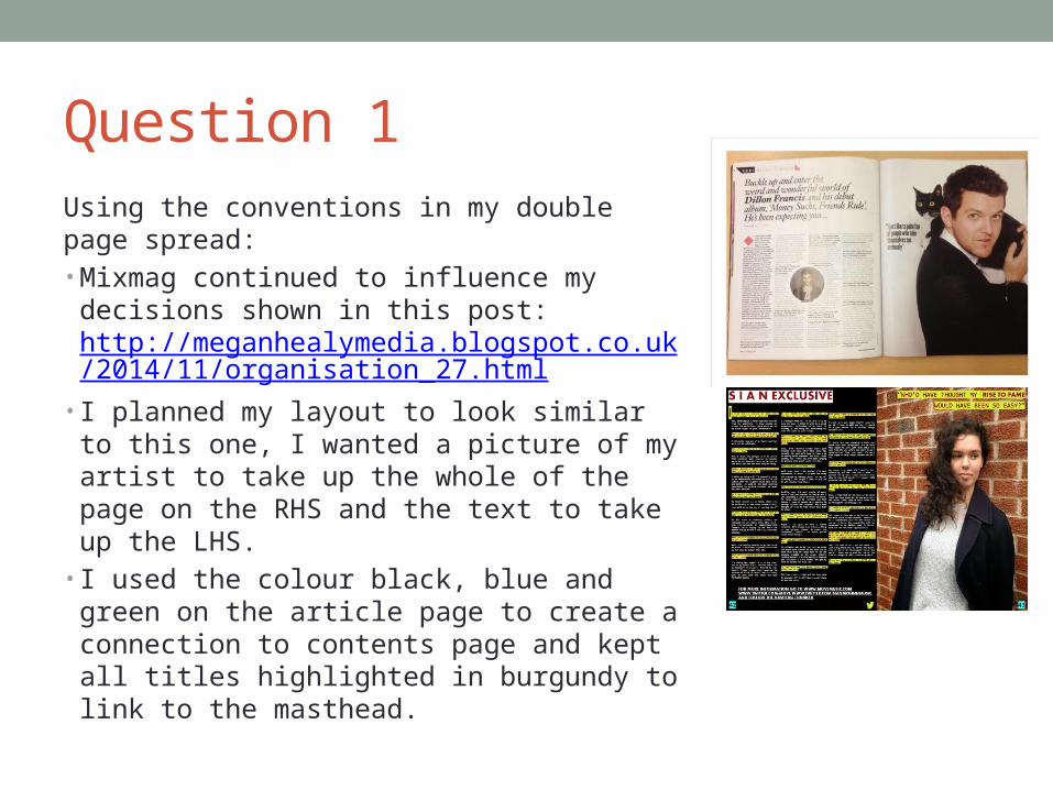
Question 1Using the conventions in my double page spread:• Mixmag continued to influence my
decisions shown in this post: http://meganhealymedia.blogspot.co.uk/2014/11/organisation_27.html
• I planned my layout to look similar to this one, I wanted a picture of my artist to take up the whole of the page on the RHS and the text to take up the LHS.
• I used the colour black, blue and green on the article page to create a connection to contents page and kept all titles highlighted in burgundy to link to the masthead.

Question 1
Developing and challenging the conventions in my double page spread:• I looked at magazines like NME
and VIBE to strengthen my research: I found that articles took up two pages – I challenged this as I have an enticing interview on one page.
• I used VIBE magazine as inspiration - http://meganhealymedia.blogspot.co.uk/2014/10/drafting-and-planning_22.html
Question 2• How does your media product represent particular social
groups?
Question 2
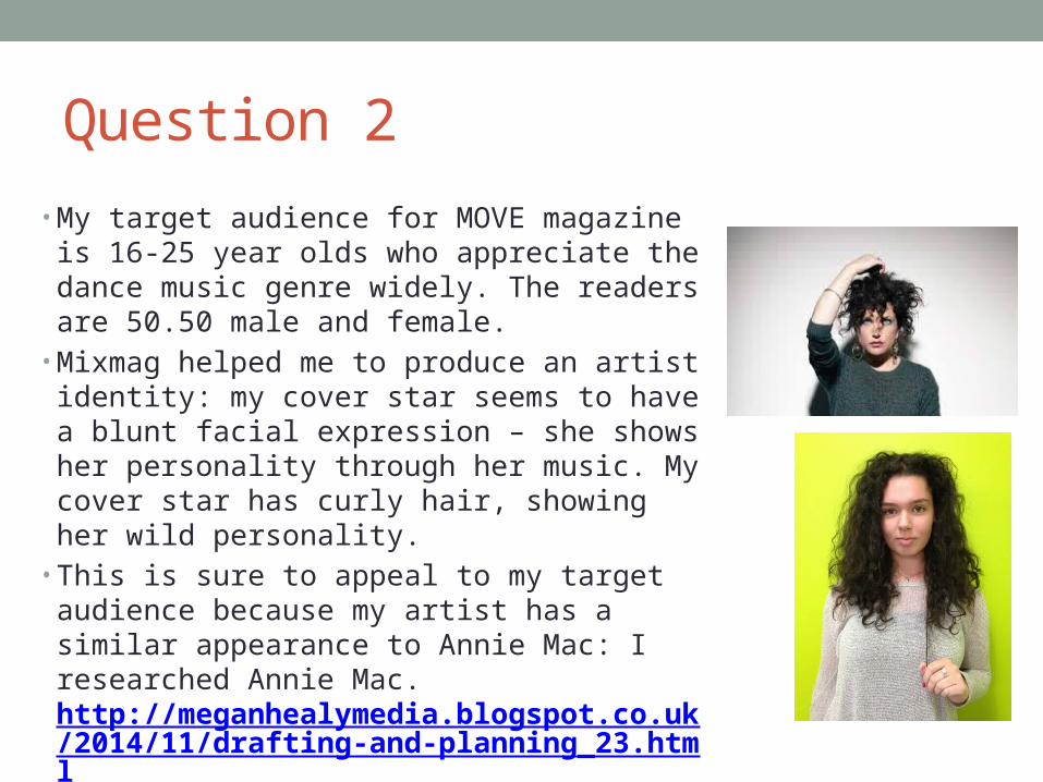
• My target audience for MOVE magazine is 16-25 year olds who appreciate the dance music genre widely. The readers are 50.50 male and female.
• Mixmag helped me to produce an artist identity: my cover star seems to have a blunt facial expression – she shows her personality through her music. My cover star has curly hair, showing her wild personality.
• This is sure to appeal to my target audience because my artist has a similar appearance to Annie Mac: I researched Annie Mac. http://meganhealymedia.blogspot.co.uk/2014/11/drafting-and-planning_23.html
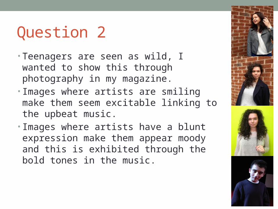
Question 2• Teenagers are seen as wild, I wanted to show
this through photography in my magazine.• Images where artists are smiling make them
seem excitable linking to the upbeat music.• Images where artists have a blunt expression
make them appear moody and this is exhibited through the bold tones in the music.

Question 3• What kind of media institution might distribute your media
product and why?
Question 3• Bauer Media Group distributes music magazines, so I
researched into it. http://meganhealymedia.blogspot.co.uk/2014/11/drafting-and-planning.html
• It distributes Q and Kerrang. So I didn’t think Bauer Media Group was right for my magazine, therefore I went on to look at companies that distribute magazine's such as Mixmag.
• Thrust Publishing who distributes DJ magazine could be right for my magazine:
• It has experience with a magazine of the same genre and it's a British company like my magazine is a British magazine.
Question 3• 1) I have chosen Thrust Publishing as my
magazine's distributor because my magazine was highly influenced by DJ magazine.
• http://meganhealymedia.blogspot.co.uk/2014/10/research-into-similar-products.html
• http://meganhealymedia.blogspot.co.uk/2015/02/drafting-and-planning_5.html
• 2) MOVE magazine has a website, Twitter page and Facebook page like DJ magazine. Having Thrust Publishing distribute my magazine, it will give MOVE the same sort of identity and popularity.
• 3) MOVE magazine will be able to merge well with Thrust Publishing as a new magazine for lovers of dance music.
Question 4• Who would be the audience for your media product?
Question 4
• My magazine is aimed at male and females 16-25 years old.
• I used Survey Monkey to know how to appeal to them: http://meganhealymedia.blogspot.co.uk/2014/10/targeting-audience.html
• I reduced the results into a chart: http://meganhealymedia.blogspot.co.uk/2014/11/target-audience.html
• I could then successfully target my audience.
Question 5• How did you attract/address your audience?
Question 5
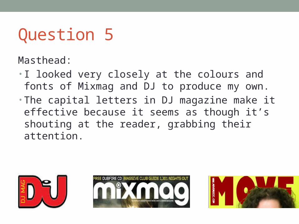
Masthead:• I looked very closely at the colours and fonts of Mixmag
and DJ to produce my own.• The capital letters in DJ magazine make it effective
because it seems as though it’s shouting at the reader, grabbing their attention.
Question 5
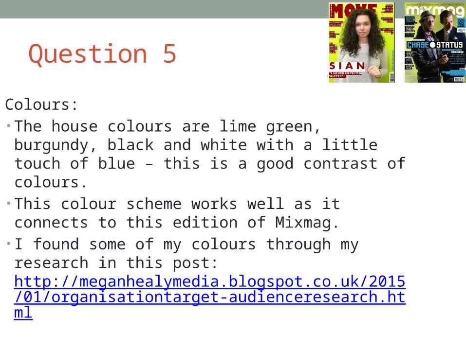
Colours:• The house colours are lime green, burgundy, black and
white with a little touch of blue – this is a good contrast of colours.
• This colour scheme works well as it connects to this edition of Mixmag.
• I found some of my colours through my research in this post: http://meganhealymedia.blogspot.co.uk/2015/01/organisationtarget-audienceresearch.html
Question 5
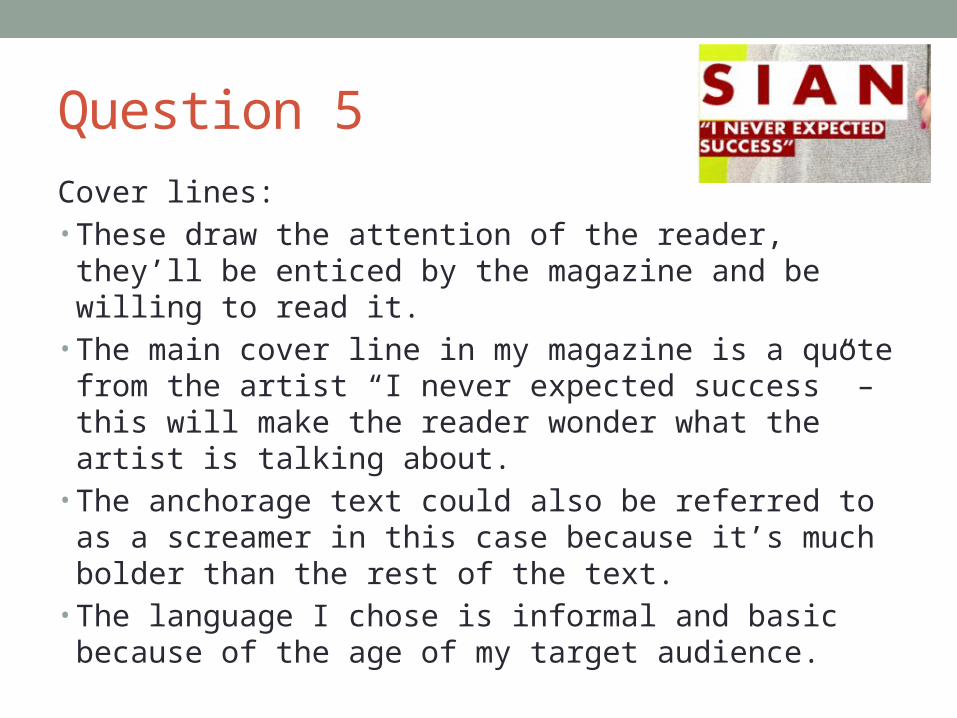
Cover lines:• These draw the attention of the reader, they’ll be enticed
by the magazine and be willing to read it.• The main cover line in my magazine is a quote from the
artist “I never expected success” – this will make the reader wonder what the artist is talking about.
• The anchorage text could also be referred to as a screamer in this case because it’s much bolder than the rest of the text.
• The language I chose is informal and basic because of the age of my target audience.
Question 5
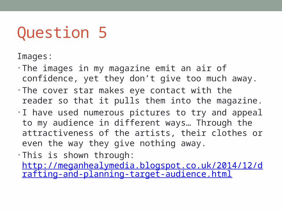
Images:• The images in my magazine emit an air of confidence, yet
they don’t give too much away.• The cover star makes eye contact with the reader so that
it pulls them into the magazine. • I have used numerous pictures to try and appeal to my
audience in different ways… Through the attractiveness of the artists, their clothes or even the way they give nothing away.
• This is shown through: http://meganhealymedia.blogspot.co.uk/2014/12/drafting-and-planning-target-audience.html
Question 6
• What have you learnt about technologies from the process of constructing the product?
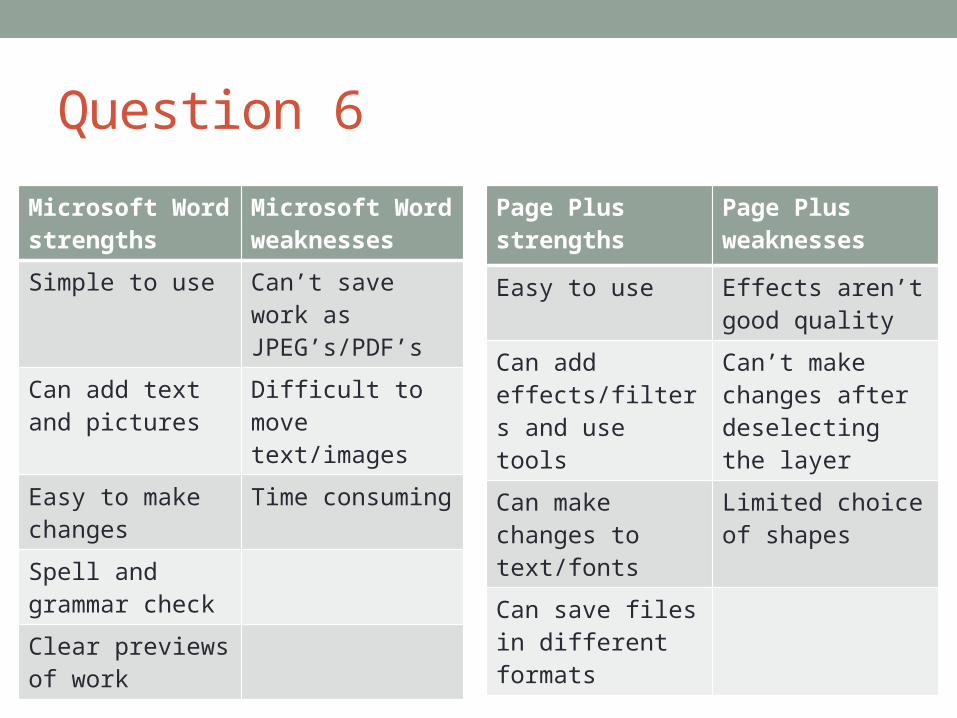
Question 6
Microsoft Word strengths
Microsoft Word weaknesses
Simple to use Can’t save work as JPEG’s/PDF’s
Can add text and pictures
Difficult to move text/images
Easy to make changes
Time consuming
Spell and grammar check
Clear previews of work
Page Plus strengths
Page Plus weaknesses
Easy to use Effects aren’t good quality
Can add effects/filters and use tools
Can’t make changes after deselecting the layer
Can make changes to text/fonts
Limited choice of shapes
Can save files in different formats
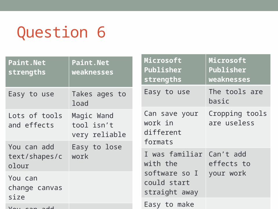
Question 6
Paint.Net strengths
Paint.Net weaknesses
Easy to use Takes ages to load
Lots of tools and effects
Magic Wand tool isn’t very reliable
You can add text/shapes/colour
Easy to lose work
You can change canvas size
You can add and remove layers
Microsoft Publisher strengths
Microsoft Publisher weaknesses
Easy to use The tools are basic
Can save your work in different formats
Cropping tools are useless
I was familiar with the software so I could start straight away
Can’t add effects to your work
Easy to make changes to
Question 6
Blogger:• Helped me to display progress of research into similar
products, drafting and planning, organisation and target audience.
• Helped me to access my coursework without saving it into files and losing it.
• Provides freedom: ability, to save, delete and edit your work.
• It’s been enjoyable to use as it’s another method of displaying my work.
Question 7• Looking back at your preliminary task, what do you feel
you have learnt in the progression from that to the full product?
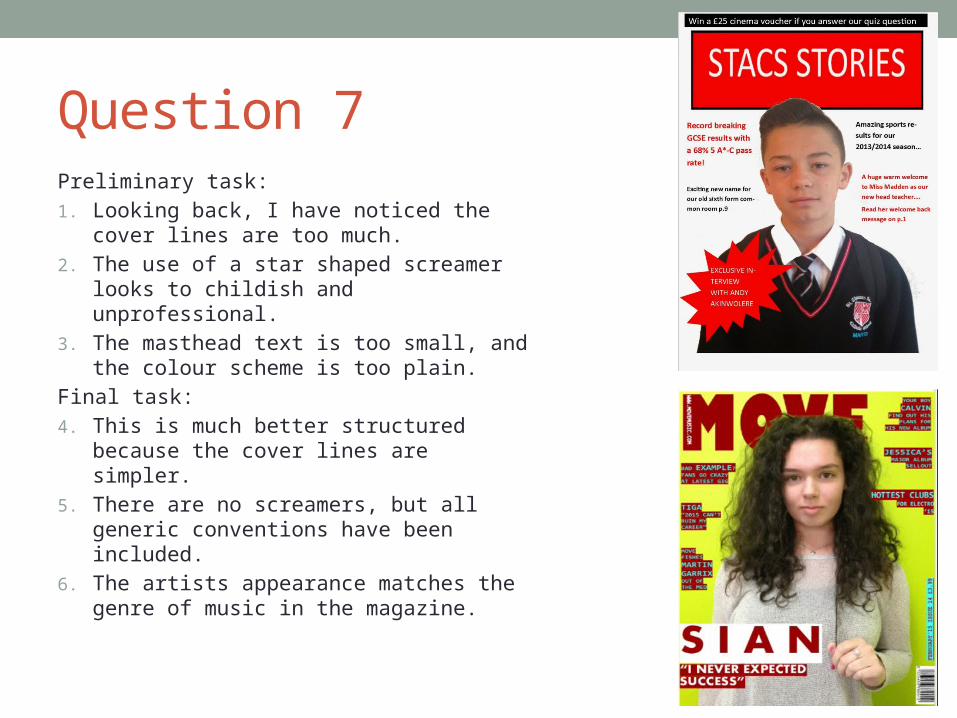
Question 7Preliminary task:1. Looking back, I have noticed the cover
lines are too much. 2. The use of a star shaped screamer
looks to childish and unprofessional. 3. The masthead text is too small, and
the colour scheme is too plain.Final task:4. This is much better structured because
the cover lines are simpler.5. There are no screamers, but all
generic conventions have been included.
6. The artists appearance matches the genre of music in the magazine.

Question 7Preliminary task:
1. There aren’t enough stories and it’s very plain.
2. The model is not making direct mode of address.
3. The text covers the model and makes him seem less relevant.
Final task:
4. I have included all of the generic conventions.
5. There are numerous images.
6. I have used a complimentary colour scheme.
Question 8• How successful do you feel your end product is in fulfilling
the task? How well does it fit the brief?
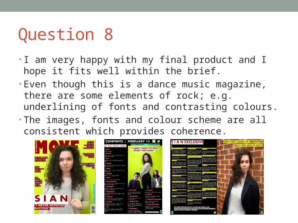
Question 8 • I am very happy with my final product and I hope it fits
well within the brief. • Even though this is a dance music magazine, there are
some elements of rock; e.g. underlining of fonts and contrasting colours.
• The images, fonts and colour scheme are all consistent which provides coherence.