Embed Size (px)
Citation preview

EVALUATION QUESTION 1
To create my magazine cover, I found a cover similar to my own
genre and that used a main photo similar to what I wanted and based mine around that. The cover below
is the cover I used as a model.
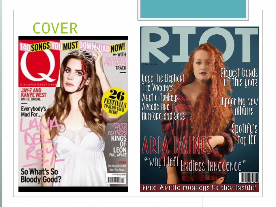
COVER
The model cover I used had a mid shot as the main photograph . My plan was to use a mid shotof my model too. I originally took the photos as mid shots, but also took close ups and long shots to have a variety to choose from.
The model cover I used had a mid shot as the main photograph . My plan was to use a mid shotof my model too. I originally took the photos as mid shots, but also took close ups and long shots to have a variety to choose from. I thought a poster of this band would be a good reason for someone to buy my magazine. Like my style model, I decided to place a large cover line in the bottom left hand corner with the name of the artist and the story that would be inside. In theory, this artist would be well known and therefore, this story would draw the readers attention and make them want to buy the magazine to get the exclusive. I found a font that I thought went well with my genre of Indie/Alternative and chose a colour. At first I wanted my main colours to be red but as the model was wearing red I changed the colour scheme to blues. I then decided that all blue was too bland and thought a pop of red would work well so had this cover story as red to make it stand out against the rest of the magazine. Like most popular music magazines, I had the main image slightly overlapping the masthead and the target audience already know the name of the magazine, therefore partially blocking the masthead does not matter.

I decided I did not want to include a puff as my style model did not use this on the cover. The majority of music magazines have the puff of a competition in a circle/bubble type shape, like the style model’s "26 festivals to blow your minds", and therefore I toyed around with bubbles and circles in my work but I felt like it did not fit with the style model of my magazine and therefore went without one. I also followed my model cover slightly when placing my storylines on to the cover, promoting the stories from the inside of the issue. These storylines help to encourage the target audience to purchase the issue as a storyline may interest them. I justified them down the left margin like on my model cover and altered the colours so like onthe model cover, each one stood out against the background but did not stand out too much as I wanted to go for a minimal look. I think that this helps the magazine cover look more realistic as all covers include these.
Also, like my model and every other music magazine, I included a barcode, issue date and price. This is a usual convention of a magazine cover as they are essential pieces of information for when the audience want to purchase the issue.
I feel as though my house style, fonts and colour scheme show connotations of an indie/alternative type theme. I feel as though the blues and reds show the music in the magazine is darker, less pop related and more edgy but not as dark as rock.
Overall, I feel as though my magazine cover follows the majority of music magazine conventions and looks like a realistic product that would be sold in shops.

CONTENTS
In order to create my own music magazine contents page, I used a variety
of different contents pages to help me create a realistic looking final product. I
used one more specifically though, to get the look I wanted the most, and used
others to help with other ideas. Below is my main style model.
I included a masthead that was the same font as the one from my front cover, so that there was recurring theme that linked to my cover, creating a house style. I also included a band index down the right hand side of my page. I did this as, although my main style model does not incorporate this, many others that I have researched have done this. It is to ensure that the readers can easily navigate their way through the magazine, finding the artists from the issue that they would like to read about due to the page numbers next to each artist.
I originally planned to have the main story as a bigger image, similar to my style model but then decided not everything would be evenly spread and it did not look the way I wanted it to look therefore I made it the same size as every other main story.
My contents page has various photographs linking to the main stories in the issue and include a page number and a quick summary of the story to help the readers find their way in the magazine. The font colours I have chosen are the same colours I have used in my cover, to carry on the house style.
The bottom of my contents page has a film reel of photographs I have taken in the past at concerts I have attended. The ones I have chosen also link to the colours I have used in my cover and throughout the magazine.
I have included a box of other stories which I could not possibly fit into photographs on the one page. I also used the font colours the same as the main story fonts and the colours on my cover.
My style model did not include the Facebook, Twitter or Instagram on the contents and therefore I did not include it in mine either.
Overall, I feel as though my contents page follows many conventions of a real magazine, and I have used a range of photographs on it. I feel like a couple more images could have made it stand out better or if I made the main image bigger but I did not think it worked and therefore, I liked it the way it was.

To create my double page spread, I followed usual conventions of a music magazine double page spread.
For the title of my double page spread article, I stuck with something simple that briefly explained it- "Aria Daines". I stayed with the same font that I used on the cover as it keeps my house style, matches the genre and looks effective. However, instead of blue, I used red as my background is white and I also wanted less blue on this one and decided Red was also running through the theme of my magazine and it also matched the tone of the clothing and hair of my model slightly.
A common convention of a music magazine is the use of columns for the article. I used five columns for my article and placed them on both pages of my double page spread. Also, for my article, I stuck to my house style with the fonts and the colour scheme. I made the Q&A questions stand out by making them red and using a different to my whole magazine, breaking the house style slightly. I put the answers to the questions in black, yet with a different font for the same reason. This means the audience can easily differentiate between the question and answer whilst reading it.
Also, another common convention of a double page spread is highlighting important points of an article or interview, I included one important quote. I made it stand out by adding a red block shape, breaking the house style once again, and I used white text for the actual quotes. I feel as though this was quite effective as it is the same colour as the background and looks like it may have been engraved out of the shape somehow.
Many music magazines use various images throughout the article, therefore I also did this. I used one photo on each page, so they are not too close together. I feel like the photographs make a border type look as it goes around three edges of the pages. This makes the overall appearance of the double page spread better as the text does not just seem plain on the page and is instead, bordering the photographs.
I also included page number in black to make it stand out on the white background so that that it was visible and made it easy for the audience to navigate through the magazine.
I feel like my article does not follow conventions of music magazines too obviously and therefore stands out a lot. It was my intention to not use a style model and create something that I liked the idea of in my mind and that did not follow the house style of my cover and contents, as it is an indie/alternative magazine and therefore I did want it to be alternative to other music magazines.


