Embed Size (px)
Citation preview

Double page Spread Research

Q Magazine
• The image on the front page clearly links with ones used on the second double page spread as the use of shadows and close-up shots is retained as a theme. The composition of the front page image also links with the double page spread as they are positioned as a group of four. This is a trait that is also continued in the first dps image which stretches across both pages as all members of the band are shown in the image. The gestures in the images also relate as the direction of gaze and clothing in the images is the same; this creates a fluid house style.
• A key design feature on this double page spread is the red smokey effect behind the title of the article ‘Fire and Ice’, the drops caps, and the corner of the page. This makes the layout more interesting and links to the smoke used in the first dps image. This colour is used throughout the article and also links to the logo of Q having a red background.
• There is a pull quote of the second dps in the centre of the image, this draws focus to the quote as it stands out among the group of pictures. I think having this on the second dps is more appropriate as the first is very simple and covers both pages with one image, therefore having a pull quote as well would over crowd the page and leave the second dps looking more empty.
• Page numbers and the website of the magazine are located at the bottom of the second dps page and help with navigation around the magazine; this is a feature which I believe is crucial to a magazines success as it relates to the contents page and gives the magazine a professional aesthetic.
• The magazine logo is located on the top left hand corner of the pages and makes sure every page is in keeping with the house style and is an obvious part of the magazine.
• There are two short introductory paragraphs before the main body of text to add background to the article, and persuade readers to continue onto the main piece of writing.
• The white writing for the title of the article and drops cap is white, which links to the front page as ‘Arctic Monkeys’ is also in white and capital letters.
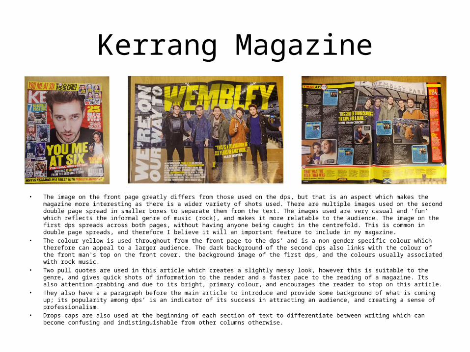
Kerrang Magazine
• The image on the front page greatly differs from those used on the dps, but that is an aspect which makes the magazine more interesting as there is a wider variety of shots used. There are multiple images used on the second double page spread in smaller boxes to separate them from the text. The images used are very casual and ‘fun’ which reflects the informal genre of music (rock), and makes it more relatable to the audience. The image on the first dps spreads across both pages, without having anyone being caught in the centrefold. This is common in double page spreads, and therefore I believe it will an important feature to include in my magazine.
• The colour yellow is used throughout from the front page to the dps’ and is a non gender specific colour which therefore can appeal to a larger audience. The dark background of the second dps also links with the colour of the front man's top on the front cover, the background image of the first dps, and the colours usually associated with rock music.
• Two pull quotes are used in this article which creates a slightly messy look, however this is suitable to the genre, and gives quick shots of information to the reader and a faster pace to the reading of a magazine. Its also attention grabbing and due to its bright, primary colour, and encourages the reader to stop on this article.
• They also have a a paragraph before the main article to introduce and provide some background of what is coming up; its popularity among dps’ is an indicator of its success in attracting an audience, and creating a sense of professionalism.
• Drops caps are also used at the beginning of each section of text to differentiate between writing which can become confusing and indistinguishable from other columns otherwise.
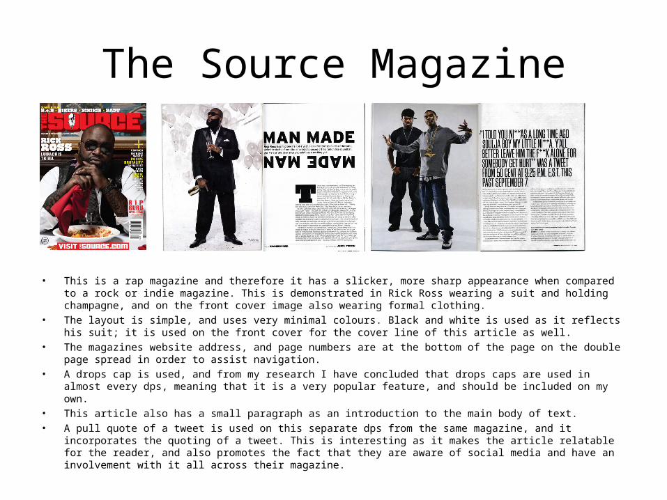
The Source Magazine
• This is a rap magazine and therefore it has a slicker, more sharp appearance when compared to a rock or indie magazine. This is demonstrated in Rick Ross wearing a suit and holding champagne, and on the front cover image also wearing formal clothing.
• The layout is simple, and uses very minimal colours. Black and white is used as it reflects his suit; it is used on the front cover for the cover line of this article as well.
• The magazines website address, and page numbers are at the bottom of the page on the double page spread in order to assist navigation.
• A drops cap is used, and from my research I have concluded that drops caps are used in almost every dps, meaning that it is a very popular feature, and should be included on my own.
• This article also has a small paragraph as an introduction to the main body of text. • A pull quote of a tweet is used on this separate dps from the same magazine, and it incorporates the quoting of a
tweet. This is interesting as it makes the article relatable for the reader, and also promotes the fact that they are aware of social media and have an involvement with it all across their magazine.