Embed Size (px)
Citation preview

Digital Graphic Narrative
Development
Ruby Hooper
Development Pro Forma
ByRuby Hooper

Shape Task

Evaluation
What did you like about your image?
The main thing I like about my image is the texture I added, the texture gives the illusion that my sugar glider has fur, I also like the colours because they are very similar to my animal of choice.
What would you improve if you did it again?
I would improve the detail if I created this particular image again because the image lacks depth. The image created has a very rough outline so if I was to do this again, the image would have a detailed outline and the colours wouldn’t be as blocky as they are in this piece. I would also use less texture as there is too much on this piece and they are rough.
Shape Task

Evaluation
What did you like about your image?What I like about this image I have created is that all the shapes that create the puffin are accurate which makes the image clear up close and from a distance that it is a puffin. I also like the subtle detail, like the texture for its feathers and fur, it gives the animal a little bit more depth. I also like the colours used as some are subtle while others are bold which gives a sense of where the light is. It is a minor improvement from my first shape task.
What would you improve if you did it again?If I were to create this image in particular again I would spend more time on it to get more detail in. This would make the animal look more realistic and would also improve the quality of the piece.
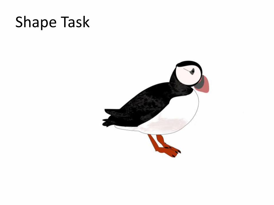
Rotoscope

Evaluation
What did you like about your image?
I like how the image I have created has a similar symmetry I also like the detail and care that is visible. I also like the repetition of basic colours because it is simple yet effective, the use of colour is also not overwhelming but is athletically pleasing because of the limited range of colour.
What would you improve if you did it again?
If I were to do this again I would work faster but keep the same amount of care and detail, I would also choose a simpler animal to rotoscope. The image I created took a long time so if I were to rotoscope again the choice of creation would be simpler.
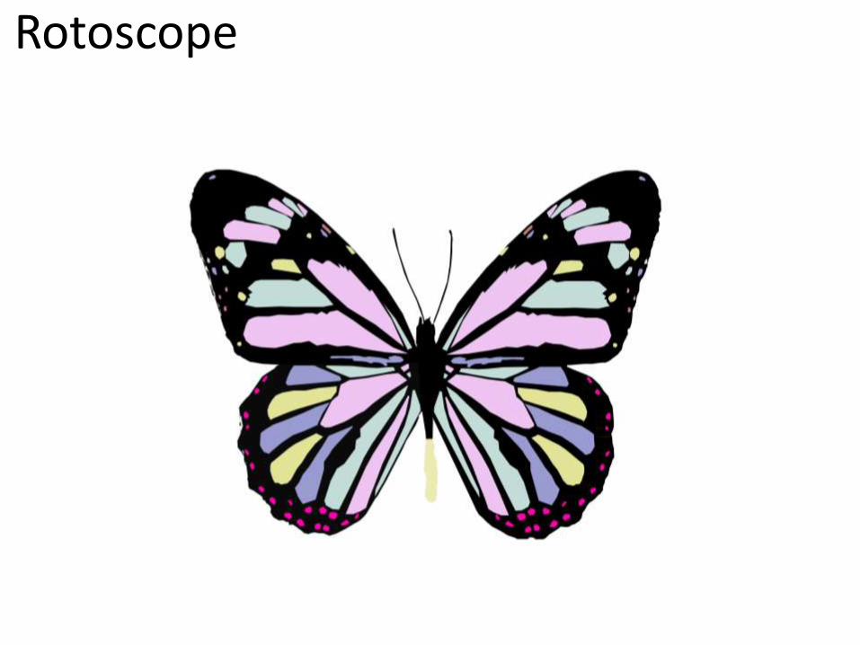
Rotoscope
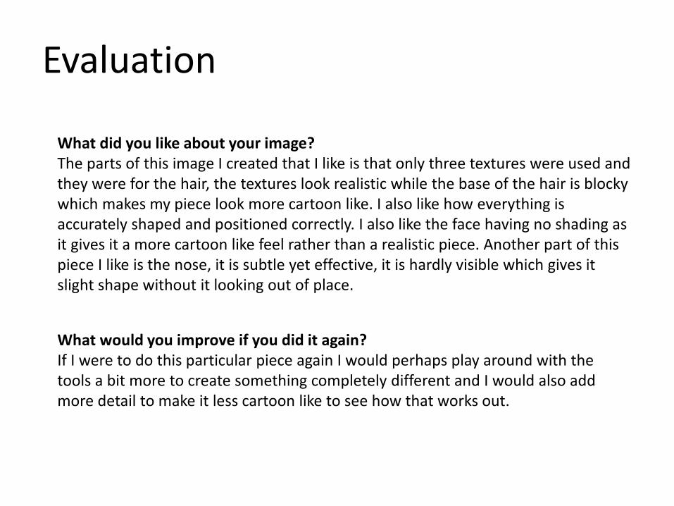
Evaluation
What did you like about your image?The parts of this image I created that I like is that only three textures were used and they were for the hair, the textures look realistic while the base of the hair is blocky which makes my piece look more cartoon like. I also like how everything is accurately shaped and positioned correctly. I also like the face having no shading as it gives it a more cartoon like feel rather than a realistic piece. Another part of this piece I like is the nose, it is subtle yet effective, it is hardly visible which gives it slight shape without it looking out of place.
What would you improve if you did it again?If I were to do this particular piece again I would perhaps play around with the tools a bit more to create something completely different and I would also add more detail to make it less cartoon like to see how that works out.
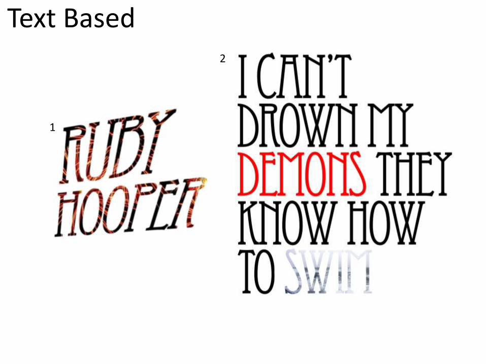
Text Based
1
2

EvaluationWhat did you like about your image?
The things I like about my image is how professional both images look, I also like how simple yet effective the image within the text is in image one, I think the image was selected well as it isn't too bold but it gives the text more meaning and character. The things I like about example two is how my image captures the song lyric in a simple way, each letter is close to the other to show how intense the lyric is.
What would you improve if you did it again?
If I was to do it again I would dim the colours so the image isn’t as intense on the audience, I would also create a shadow to give the text depth. If I were to capture an image in the text I would also pick bolder, thicker text to ensure the image is clearer to the audience.
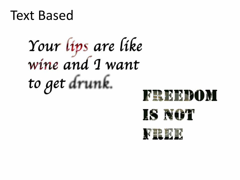
Text Based
Evaluation
What did you like about your image?The two text based images I have created, I believe are interesting for the audience. I like the tools I used as I am comfortable with them yet they are effective. I also like the styles used as they are very different from each other and also how the meanings are not as strong as each other. I also like how the font used is relevant to the subject, the first piece is a Shakespeare quote and the second is to do with the military so the font used is a bit of a hint.
What would you improve if you did it again?If I were to create these two again I would find a stronger background image for the second piece and I would also use bolder fonts for the first image as the lips and wine images within are unclear.

Comic Book 1
2

EvaluationWhat did you like about your image?
The things I like about image one is that the background is unknown to the audience allowing their imagination to decide what it is, I also like that the background is blocky while the foreground has kept the detail similar to the original image. The things I like about image two is how the audience attention is attracted to the foreground because the background isn’t as detailed.
What would you improve if you did it again?
if I did it again I would try and make the background detailed while the foreground was basic, I would also attempt to make colours bolder or fainter.
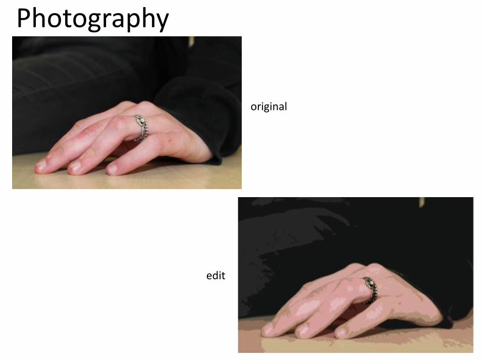
Photography
original
edit

EvaluationWhat do you like about your image?Original - The image is intended to represent excitement, I like this image because I believe it fits the brief of excitement as it shows an engagement ring. The image is clean and fresh with no distracting background so all of the audiences focus is on the foreground.Edit – I prefer the edited image as the audiences attention is brought directly to the ring so the theme of excitement is shown in a better way.
What would you improve if you did it again?Original - if I were to take this shot again I would position my hand and fingers differently to ensure my thumb is visible. I would also use a model with better looking hands than my own.Edit – if I were to edit this image again I would lighten the shade of the ring so it stood out even more.

original edit
Evaluation
What did you like about your image?The things I like about this image is that is represents loneliness in a subtle way, I also like how the image was captured low to the floor as it gives the illusion the camera is further away from the person than it was, which shows distance from the person making them lonely, I also like how small the person appears to look in this image because loneliness causes a person to feel belittled.
What would you improve if you did it again?If I were to capture this image again I would get closer to the person on the bench because then the audience are more aware of where their focus should be and I would also have the character looking down with his hands together to put emphasis on the theme of loneliness.


Evaluation
What did you like about your image?I love how happy the character in the image is because it shows clearly that the theme is happiness, I also think that the picture on the computer screen makes the image happier, which again represents the theme of happiness.
What would you improve if you did it again?If I were to take this picture again I would attempt to make it clearer that the character is happy because the pug on the screen is. I would also move the hair away from the characters face or use a person with shorter hair because the hair causes the image to look somewhat creepy when the entire image should scream ‘happiness’ at the audience.
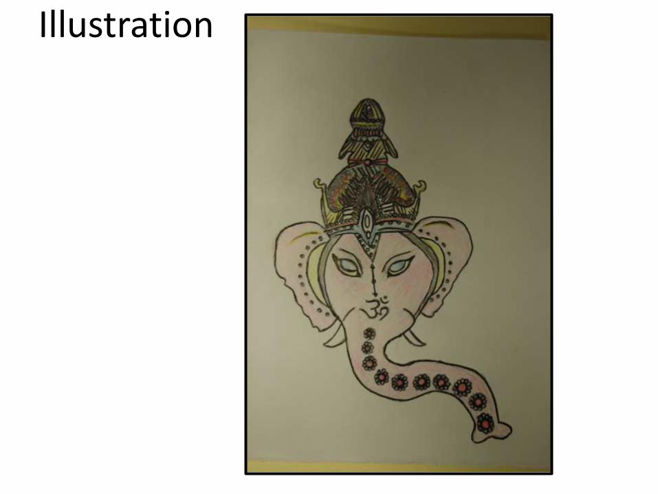
Illustration

Evaluation
What did you like about your image?
The things I like about my image are that it is very similar to the original but I have changed parts of it, I have added more detail in places it was relevant while taking away some detail because it was too much, I also like how my creation as it is recognisable. Another thing I like about my image is that the detail gives the image character and gives the audience a lot to look at.
What would you improve if you did it again?
if I was to create another illustration I would make the image less detailed so it is easily repeated and I would use tracing paper if necessary to create symmetry in my image. I would also use a wider range of colours and shades to make my illustration realistic.
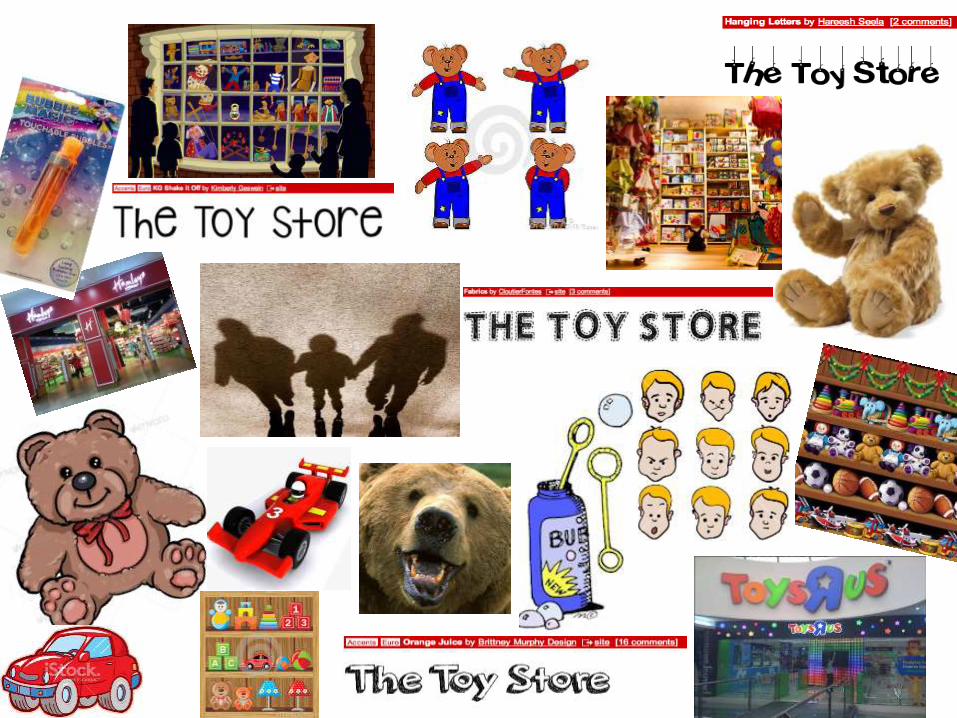
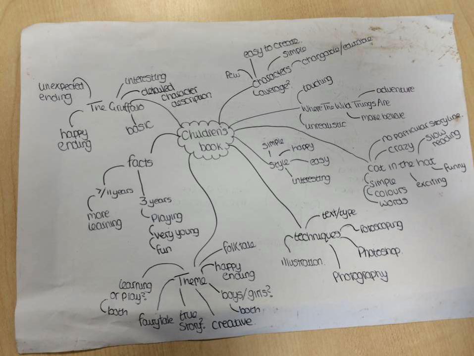
Initial Ideas

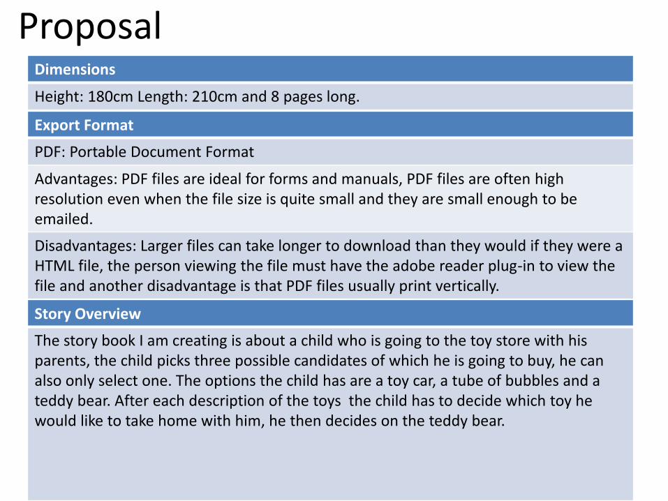
ProposalDimensions
Height: 180cm Length: 210cm and 8 pages long.
Story Overview
The story book I am creating is about a child who is going to the toy store with his parents, the child picks three possible candidates of which he is going to buy, he can also only select one. The options the child has are a toy car, a tube of bubbles and a teddy bear. After each description of the toys the child has to decide which toy he would like to take home with him, he then decides on the teddy bear.
Export Format
PDF: Portable Document Format
Advantages: PDF files are ideal for forms and manuals, PDF files are often high resolution even when the file size is quite small and they are small enough to be emailed.
Disadvantages: Larger files can take longer to download than they would if they were a HTML file, the person viewing the file must have the adobe reader plug-in to view the file and another disadvantage is that PDF files usually print vertically.

Deadline
16/10/14
Audience
My aim for this book is to make the book appear appealing to both adults and children, the book is going to be appealing to both females and males aged three and above but a child of three is having their parents pick them books and read it to them so it has to look childish and fun but show that the contents is also educational to the child. The book is suited to all classes as it would be relatively cheap to create
Production Methods
The methods I intend on using for my piece is rotoscoping on most pages as I believe this will be the most effective way to create the toys, I can then also create a better image because I have details to compare to and I also can create my own image of each toy. I am also going to be using photography to capture the child as this will look effective along side rotoscoping.
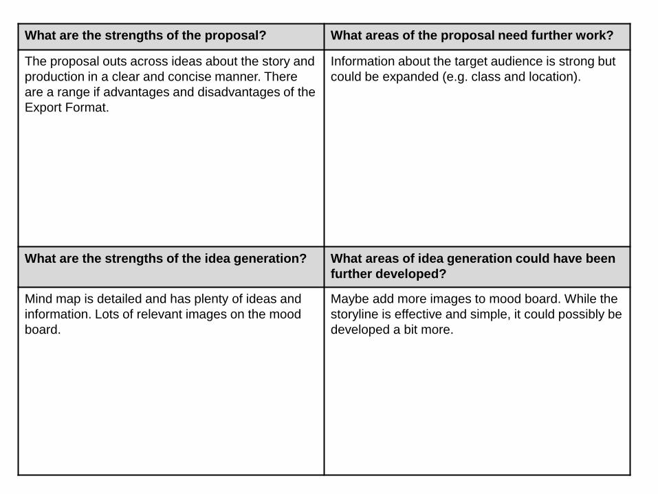
What are the strengths of the proposal? What areas of the proposal need further work?
The proposal outs across ideas about the story and
production in a clear and concise manner. There
are a range if advantages and disadvantages of the
Export Format.
Information about the target audience is strong but
could be expanded (e.g. class and location).
What are the strengths of the idea generation? What areas of idea generation could have been
further developed?
Mind map is detailed and has plenty of ideas and
information. Lots of relevant images on the mood
board.
Maybe add more images to mood board. While the
storyline is effective and simple, it could possibly be
developed a bit more.

What are the strengths of the proposal? What areas of the proposal need further work?
The proposal for the story idea is very well written
and detailed, with very clear descriptions. The
overview for the story idea is presented is also
presented in a clear an concise way which is good
as it is an original story idea and therefore needs to
be explained properly in the proposal.
The proposal is very well laid out, the only criticism
I can think of is that you could go into some more
depth in the audience section about what styles
and techniques you will use to make the book
appear both fun and childish as well as educational,
such as what colours will be used.
What are the strengths of the idea generation? What areas of idea generation could have been
further developed?
The idea generation mood board has effectively
captured almost all of the elements and things
involved in the plot in a range of photographic
forms, as well as cartoon illustrations, alongside a
wide array of very appropriate and fitting fonts. It
has even been arranged and laid out in an
interesting and visually appealing way.
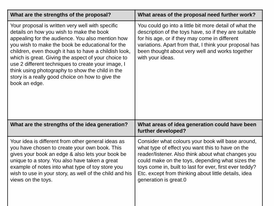
What are the strengths of the proposal? What areas of the proposal need further work?
Your proposal is written very well with specific
details on how you wish to make the book
appealing for the audience. You also mention how
you wish to make the book be educational for the
children, even though it has to have a childish look,
which is great. Giving the aspect of your choice to
use 2 different techniques to create your image, I
think using photography to show the child in the
story is a really good choice on how to give the
book an edge.
You could go into a little bit more detail of what the
description of the toys have, so if they are suitable
for his age, or if they may come in different
variations. Apart from that, I think your proposal has
been thought about very well and works together
with your ideas.
What are the strengths of the idea generation? What areas of idea generation could have been
further developed?
Your idea is different from other general ideas as
you have chosen to create your own book. This
gives your book an edge & also lets your book be
unique to a story. You also have taken a great
example of notes into what type of toy store you
wish to use in your story, as well of the child and his
views on the toys.
Consider what colours your book will base around,
what type of effect you want this to have on the
reader/listener. Also think about what changes you
could make on the toys, depending what sizes the
toys come in, built to last for ever, first ever teddy?
Etc. except from thinking about little details, idea
generation is great.0
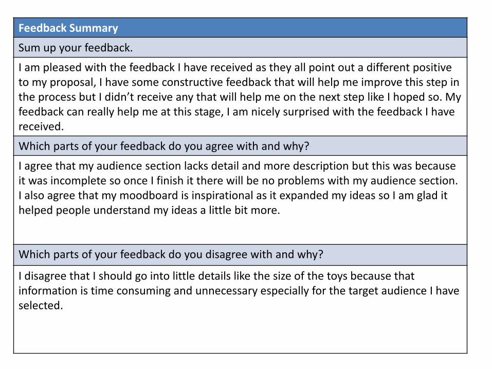
Feedback Summary
Sum up your feedback.
I am pleased with the feedback I have received as they all point out a different positive to my proposal, I have some constructive feedback that will help me improve this step in the process but I didn’t receive any that will help me on the next step like I hoped so. My feedback can really help me at this stage, I am nicely surprised with the feedback I have received.
Which parts of your feedback do you agree with and why?
I agree that my audience section lacks detail and more description but this was because it was incomplete so once I finish it there will be no problems with my audience section. I also agree that my moodboard is inspirational as it expanded my ideas so I am glad it helped people understand my ideas a little bit more.
Which parts of your feedback do you disagree with and why?
I disagree that I should go into little details like the size of the toys because that information is time consuming and unnecessary especially for the target audience I have selected.

Storyboards

Storyboards

Storyboards
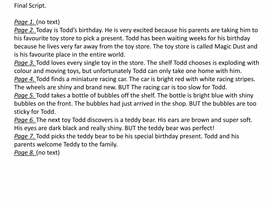
Final Script.
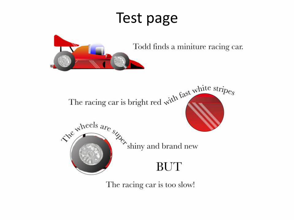
Page 1. (no text)Page 2. Today is Todd’s birthday. He is very excited because his parents are taking him to his favourite toy store to pick a present. Todd has been waiting weeks for his birthday because he lives very far away from the toy store. The toy store is called Magic Dust and is his favourite place in the entire world.Page 3. Todd loves every single toy in the store. The shelf Todd chooses is exploding with colour and moving toys, but unfortunately Todd can only take one home with him.Page 4. Todd finds a miniature racing car. The car is bright red with white racing stripes. The wheels are shiny and brand new. BUT The racing car is too slow for Todd.Page 5. Todd takes a bottle of bubbles off the shelf. The bottle is bright blue with shiny bubbles on the front. The bubbles had just arrived in the shop. BUT the bubbles are too sticky for Todd.Page 6. The next toy Todd discovers is a teddy bear. His ears are brown and super soft. His eyes are dark black and really shiny. BUT the teddy bear was perfect!Page 7. Todd picks the teddy bear to be his special birthday present. Todd and his parents welcome Teddy to the family. Page 8. (no text)

Digital Flat Plans
Text here
Text here
Text here
Text here
Text here
Text here
Text here Text here
Test page