Embed Size (px)
Citation preview

Unit 12: Final Personation & Course Reflection
By Rico Mendez
Unit 1:Introduction to Design
• From this Van Gough panting I can see a variety of different things.
• The first thing I noticed was the faint, but big lettering. That said " AllPotens" twice. Once on the bottom of the painting. An another on the middle of the panting.
• But other than that. From an artist point of view. I also noticed the depth perception. How there is a lot of people attracted to the light. In the painting and visually. I think it grabs your attention by the variety of different colors. The light is a warm color. While the colors around it are cool colors.

Unit 1:Introduction to Design
This is the Van Gogh Painting discus from above.

Unit 1:Introduction to Design Part. 2
• Discussion Forum W1: History Research
• Choose a topic from the list below and research it on the Internet
• Type a minimum of 200 words on your chosen subject. Include images and/or links to images related you the subject you have chosen.
• Click on the link “Discussion Forum Wk1” and type your work there.
• * Reply to 3 other student's reports. Comment on what you learned from their report. Write a minimum of 6 sentences.
Topics
• Paper, Minimalism, Johann Gutenberg, Typography, Art Nouveau, The Poster, Photography, Impressionism, Lithography, Paul Rand, Linotype Machine, Surrealism, Frank Lloyd Wright, Expressionism, Illuminated Manuscripts, Expressionism, The Bauhaus, Jan Tschichold, The Computer, Art Deco, The Pencil

Unit 2: Design Process
• Pg.8 #1: My backpack is one of my favorite possessions. It is a semicircle, like a turtle shape almost. The color of the backpack is purple, it has purple spikes and 3 pockets with zippers. As I did my best to draw a sketch of my bag. Image 1.
• This bags purpose was made to hold school materials or other objects that had to be carried around. Its form attracts attention to the carrier. It mostly cant hold objects heavier then 100 pounds. But its form doesn't assist its function at all.
• #2:
An object that I found that has gone outta style are parachute pants. Parachute pants have gone out of style. I know its out of style because no one wears them anymore. Its made out of windbreaker material and its date is in the 80s - 90s. it was cool then because it use to be super cool. But its become dated because it was a trend.
• Pg.20 #3:
Image 2 hold all the information that you asked for in its drawn out website.
• #8:
• Image 3 is the hand out drawings of my 10 business cards.

Unit 2: Design Process
Images that go along with the unit 2 above.
#1
#3
#2

Unit 3: Design Elements & Principles : Research instructions.• 1. Define the following elements of design: Space, Shape/Form,
Size/Scale, Color, Line, Value, and Texture.
• 2. Define the following principles of design: Format, Balance, Repetition & Rhythm/Pattern, Proximity/Unity, Alignment, Emphasis/Focal Point, Contrast and White Space ( also might be called Positive and Negative space).
• 3. Define the four laws of Gestalt theory.
• 4. Define the following: Rule of Thirds, Symmetrical, Asymmetrical, Golden Ratio

Unit 3: Design Elements & Principles : Research Results.• #1) Elements of Design:
• Space – the area deep within the moment of design, will take place on.
• Shape/form – the 3 basic types of shapes are geometric, natural, and abstract.
• Size/Scale – can function, attract or it can be organized.
• Color – there are 3 parts to color, Chroma – name we give the color, intensity –strength of the color, 3rd is the value – lightness or darkness of a color.
• Line - lines are one of the basic elements of design.
• Value – the use of lightness and darkness in a piece of art work.
• Texture – always a part of our design whether intentional or not.

Unit 3: Design Elements & Principles : Research Results.• #2) Principle of Design:
• Format – attract attention in a competition.
• Balance – visual equality in shape, form, value etc. Balance can be either symmetrical, evenly balanced, or asymmetrical, unevenly balanced.
• Repetition and Rhythm/Pattern – Keeping design in center format.
• Proximity/Unity – Keep your design in a type of harmony, made to feel complete.
• Alignment – How elements on the page are lined up with each other.
• Emphasis/Focal Point – Given to an area within the design, because that are is meant to be seen or marked as important.
• White Space/Negative Space – The use of emptiness to give a layout breathing out.

Unit 3: Design Elements & Principles : Research Results.• #3) Define the 4 Laws Of Gestalt Theory:
• Proximity – when you see objects grouped together
• Similarly – Comparing if there are alike things in the painting.
• Closure – see parts of something your mind puts together things that look alike and guess what it is.
• Simplicity – the absence of luxury.

Unit 3: Design Elements & Principles : Research Results.
• #4) Define.
• Rule of 3rds – Photos are divided into 3rd with two imaginary lines. A pair going Vertical and another going Horizontal. Forming nine sections on the picture. Use this to improve pictures.
• Symmetrical – When one side balances the other or mirrors it.
• Asymmetrical – is the Absence of, or violation, of symmetry.
• Golden Ratio – Only tool for comparison, describes aesthetically pleasing proportional within a piece of art/design.

Unit 3: Design Elements & Principles : Research Instructions Part 2.• 1. Go to page 62 in your text book and complete the following
exercises unit "Try This", #2, #3, #4.

Unit 3: Design Elements & Principles : Research Results Part 2.• Pg.62
#2) I really like "Arcady" by George Owen Kapp House Sycarnore Canyon Road Cali. What I really like about this photograph is the proximity in it. The alignment and how it is layed out really leaves me in awe. It gives me that peaceful feeling. The mountains to me feel like they are the focus point of this photo. An the scale of the building gives you that close up feeling. So it makes that full view of the mountains all that more of the focus point.
"Jones Woods" town house, Est. 65th and 66th street between Lexington and 3rd Avn., N.Y,N.Y.
This caught my attention by the way the trees are grouped together and how the warm colors in the photo. The similarity in the trees make them all look alike. The focus point of this photo is the little boy reaching into this water fountain. The value of the light and shade of colors really do give it a peaceful day setting. For a photo take in the city that never sleeps. It really captures thepeacefulness of the city.
• #3) Gameinformer issue 258: The Horror
In Pg.10-11, It grabs your attention by focusing on this giant creature. In the middle of the room, in a crowd of people. The Elements, principals, of theories of design that are in here are: focus point, proximity, size, value, and format. I Believe these elements, principals and theories of design help this layout.
The advertisement in the same issue would be, for Hyrule Warriors, It has one huge focus point, and that is on link and his friends. I believe the layout works because of the following elements, principals and theories: Value, balance, Asymmetrical, colors, scale and alignment in this advertisement.

Unit 3: Design Elements & Principles : Research Results Part 2.• #4 Abilene Reporters-news Thursday Sept.25, 2014
• "Writers leave Abilene kids with things to ponder"- by Timothy Chipp
• These designer used the rule of 3rd to crop and center this little girl as the focus point in this photo. but it does not use the Golden rule
• Advertisement, Am donuts in the same issue above. does not use the rule of 3rd. but it does look like it uses the Golden Rule. Makes everything proportion to size.
• Website, www.msn.com "Loin statue appears to be hiding time capsule'
• The picture used in this website does use the rule of 3rd, but does not use the golden rule.

Unit 4: Composition and Layout Research Instructions• 1. What is a grid and what is the purpose of a grid?
• 2. What do layouts begin with?
• 3. Explain why creating a focal point is important. What are some of the elements and principles that you can apply to create a focal point.
• 4. What is "Greek Text" and what is it used for?
• 5. What does negative space or white space do for a design?
• 6. What is trapped space? List the rules for using your negative space.
• 7. Explain the reason(s) for creating visual hierarchy.

Unit 4: Composition and Layout Research Results• Grid
-In graphic design and word processing applications, a grid is a series of vertical and horizontal lines that are used to subdivide a page vertically and horizontally into margins, columns, inter-column spaces, lines of type and spaces between blocks of type and images. These subdivisions form the basis of a modular and systematic approach to the layout, particularly for multipage documents.
- Purpose :) making the design process quicker, and ensuring visual consistency between related pages
http://www.webopedia.com/TERM/G/grid.html
• Layout
- Begins with negative space.
• Focal point
- A focal point is a prominent section on a web page that we want to guide the user’s attention to. The focal point is the eye-catching centerpiece of the page; it stands out and is distinct than other components.
http://sixrevisions.com/web_design/creating-focal-points/
- Some elements and principles of design I can use to make a focal point are : Color, contrast, and structure.
Unit 4: Composition and Layout Research Results• Greek text
• -A Style of displaying or rendering text or symbols
• - Used to desirer the King James Bible.
• What does neg. space do for a design?
• - Gives better structure and layouts.
• What is Trapped spaced, list of rules of using your neg. space.
• - Trapped spaced occurs when white space on a page is seeming “trapped” between elements (such as text or photos) with no space through which to flow.
• - Rules: There is no proper percentage of using white space. If it looks or feels crowded. Then it probably needs more white space.
• - More white space lends an upscale feel to a piece
• - More utilitarian document use less white space.
• Explain the reason for creating visual hierarchy?
-Visual hierarchy refers to the arrangement or presentation of elements in a way that implies importance. In other words, visualhierarchy influences the order in which the human eye perceives what it sees. This order is created by the visual contrast between forms in a field of perception. Objects with highest contrast to their surroundings are recognized first by the human mind. The term visual hierarchy is used most frequently in the discourse of the visual arts fields, notably so within the field of graphic design.

Unit 4: Composition and Layout Research Instructions Part 2.
•Look through both Magazine galleries.
•Choose 3 of the magazine ads to critique.
•Identify which ads you are critiquing. Then, list the elements and principles of design that were used to create each of the designs.
•Do you think the elements and principles were used effectively to convey the message
•What would you change if you were to redesign the ad, or would you change anything?
Unit 4: Composition and Layout Research Results Part 2.• PD_0017.jpg
• elements and principles- space, color, contrast, focal point.
• I do believe that these elements and principles used in this ad. where using the effectiveness of these elements and principles.
• I wouldn't change anything with this ad.
• image 1.jpg
• elements and principles- space, scale, color, texture, format, focal point.
• I do believe that these elements and principles used in this ad. where using the effectiveness of these elements and principles.
• I would have put a picture of the different Club House products in the left hand corner of the ad.
• image 2.jpg
• elements and principles- space, scale, color, value, contrast, focal point.
• I do believe that these elements and principles used in this ad. where using the effectiveness of these elements and principles.
• I would have put a period after "BEST" and "DESISION" to make it pop. An actually seem like it was the best decision ever.

Unit 4: Composition and Layout Research Results Part 2. images
PD_0017.jpg image 1.jpg image 2.jpg

Unit 4: Composition and Layout Research Instructions Part 3.• 1.Letterhead—8.5” x 11” sheet of paper o
• 2.Magazine ad--8.5” x 11” sheet of paper
• 3.Envelope and business card (outlines on one of the sheets you downloaded)
• 4.Use the envelope outline to design a billboard
• 5.Bi-fold Brochure(front and back)--8.5” x 11” sheet of paper folded one time.
• 6.Homepage for a website on an 8.5" x 11" page, turned horizontal (landscape)
• •Glue the images, text and colors on the second page of each format.
• •Once you have completed all of the formats, scan them into your computer or take a picture of each piece; label each piece so I know which layout it represents. Then, place all of the images in a zip folder. Name the zip folder as follows: lastnamefirstinitial_u4p3.

Unit 4: Composition and Layout Research Results Part 3. images
Business Card Envelope Letterhead

Unit 4: Composition and Layout Research Results Part 3. Images
Web designMagazine Ad

Unit 5: Typography Instruction
• Define the following: font, typeface, font family, glyph.
• 2. What determines a font category?
• 3. What is the #1 consideration in choosing a body font for print or screen?
• 4. Which fonts are best for print? For web?
• 5. If you choose an old style font for body copy, what would use for a headline?
• 6. All 10 point fonts are the same size. True or False
• 7. List the six font categories listed in the book.
• 8. List 6 font styles
• 9. Why is using all CAPS not a good idea?
• 10. Define: Leading, Kerning, and Tracking
• 11. Justification refers to what?
• 12. What is an Initial or Drop cap?

Unit 5 Part 1: Research
1). Define: Font, typeface, font family, and glyph.
Font: A complete set of characters in a particular size and style type.
Typeface: Contains a series of fonts.
Font family: Contains a series of fonts
Glyph: An individual character of a font , are not limited to upper or lower case lettering.
2). What determines a Font Category is: The shape of a fonts glyph, determines its category.
3). The number 1 consideration is its readability
4). regular for print, and for web its Arial or Helvetica.
5). The same typeface.
6). false
Unit 5 Part 1: Research
• 7). Bold and Italic type, All Caps, Spacing, Tabs and tab/dot leader.
• 8). Prosciutto and Melon, Bruschetta, Pasta E Fagioli, Classic Caesar, Costata Di Vitello, Fettuce Alfredo.
• 9). It cuts down readability, It makes it harder to understand and its considered shouting.
• 10). Define: Leading, Kerning, Tracking
• Leading: Space Between lines.
• Kerning: Refers to adjusting the space between individual glyphs.
• Tracking: Refers to adjusting the space between characters across a string of characters.
• 11). Justification refers to: all forms of copy alignment, including left justified, right justified, centered, or fully justified.
• 12). Drop Caps are: The really big letters at the beginning of the paragraph.

Unit 5 Part 2: Typography TimeLine Instruction
1. History of typography—Find the history of the following typefaces. Garamond, Caslon, Baskerville, Bodoni, Didot, Bookman, Century, Futura, Gill Sans, Times New Roman, Rockwell, Palatino, Optima, courier, Helvetica, and Verdana. 2. Create a timeline using the name of the font, year it was designed, and the name of the designer. Include a little background information as to why it was created. You do not have to type an essay for each typeface. Just a few sentences about each one. 3. Be creative with your timeline. Include images. 4. You can create the timeline in any software you are comfortable working in. 5. Name your file lastnamefirstinitial_u5p2
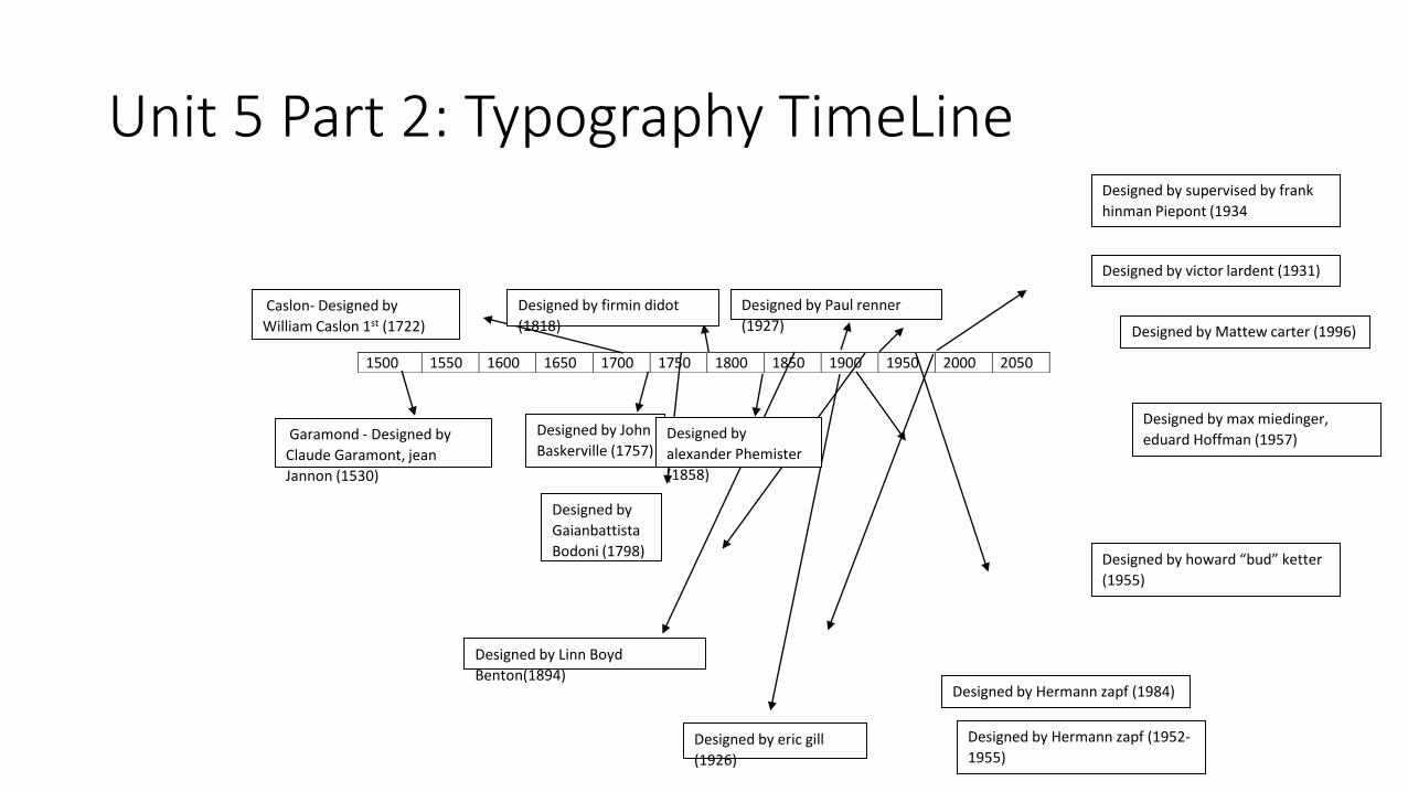
Unit 5 Part 2: Typography TimeLine
1500 1550 1600 1650 1700 1750 1800 1850 1900 1950 2000 2050
Garamond - Designed by
Claude Garamont, jean
Jannon (1530)
Designed by
Gaianbattista
Bodoni (1798)
Caslon- Designed by
William Caslon 1st (1722)
Designed by John
Baskerville (1757)
Designed by victor lardent (1931)
Designed by eric gill
(1926)
Designed by Paul renner
(1927)
Designed by Linn Boyd
Benton(1894)
Designed by
alexander Phemister
(1858)
Designed by firmin didot
(1818)
Designed by Hermann zapf (1984)
Designed by Hermann zapf (1952-
1955)
Designed by howard “bud” ketter
(1955)
Designed by max miedinger,
eduard Hoffman (1957)
Designed by supervised by frank
hinman Piepont (1934
Designed by Mattew carter (1996)

Unit 6: Color Basics Part 1: Research
• What are the 3 things that show the power of color? • * When color is light, what is white? What is black? • * Define the following: Primary colors, Secondary & Complementary
Colors, Tertiary colors, Triad, Analogous color. * List warm colors and cool colors
• * List at least 3 colors that have different cultural meanings. • * What does RGB and CMYK stand for? • * Which one is used for print and which one is used for screens? • * What is the Hexadecimal Code? • * What color system is used when specifying a spot color? • * What pairs of color would you use to create contrast?

Unit 6: Color Basics Part 1: Research Results
• What are 3 things that show the power of color are: Impact, Organization, And Emotion.
• What is white? White is all the color of the spectrum .
• What is black? Black is none of the colors on the spectrum.
• Define the following-
• - Primary colors-yellow, blue, red
• -Secondary colors- when 2 primary colors ,next to each other, on the color wheel cross.
• -Complementary colors- opposite colors on the color wheel.
• -Tertiary colors- miss of primary color with the closes secondary color on the color wheel.

Unit 6: Color Basics Part 1: Research Results
• -Triads- a group or set of three connected people or things.
• -Analogous color- appear nest to each other on the color wheel.
• (. warm colors: Yellow , Orange, Red,.) (. cool colors: blue , purple, green,.)
• 3 colors that have a different cultural meaning: White, Red, black.
• what does RGB and CMYK mean? RGB means red, blue, green. and CMYK means cyan, magenta, yellow, key.
• RGB is for computer screen. an CMYK is for printing in color.
• Hexadecimal code- 9 numbers for any and ever color.
• USF
• completrymenty colors.

Unit 6 Part 2: Project Instruction
• Using colors, shapes, lines, and textures create One (1) abstract design.
• * Within that One (1) design, create a visual hierarchy, a focal point and a balanced design.
• * For the colors, you will use the 3 color palettes: primary, secondary, and tertiary.
• * You can use Microsoft Word, Photoshop, create it by hand or any other software you are comfortable using.
• * If there are any exercises you need to do by hand, just either scan them into the computer or take a picture of your work with your camera and then upload those images.
• * Place the design on a white background and then place the design a black background for each color palette. This means you will have two(2) images for each color palette to submit, 6 images total to submit.
• * Create your design on an 8.5” x11” page.
• * Place all of the images in a zip folder. Name the folder as follows: lastnamefirstinitial_u6p2

Unit 6 Part 2: Project

Unit 7: Logo Design Instructions
• What is Branding? (http://marketing.about.com/cs/brandmktg/a/whatisbranding.htm)
• 2. What design pieces can be included in an Identity package? (http://justcreative.com/2010/04/06/branding-identity-logo-design-explained/)
• 3.What is a logo? What is its purpose? What makes a good logo? (http://www.sitepoint.com/logo-design-101-what-is-a-logo/) (http://www.logobee.com/feature3.htm)
• 4. Name 4 different styles of logo design. (http://breezycreativedesign.com/2010/01/21/5-different-types-of-logos/)

Unit 7: Logo Design Research Results
• What is branding? -name, term, sign, symbol or design, or a combination of them intended to identify the goods.
• What design pieces can be included in an Identity package? -The visual aspects that form part of the overall brand.
• What is a logo? What is its purpose? What makes a good logo? -A logo is a symbol, name or trademark of a company. Logos are used by companies because they represent a concise image of the company. A good logo is distinctive, appropriate, practical, graphic, simple in form and conveys an intended message.
• Name 4 different styles of logo design? -Brand mark Symbol, Word mark, Letter mark, Combination Mark

Unit 7: Part 2 Logo Design Project

Unit 8: Brochure Design Instructions
• You will design a brochure for a Farmers Market. Download the logo image to use on the brochure.
• 2. You may use images from the Internet, but make sure the resolution is high enough for print. If you have a question about an image, let me know.
• 3. The brochure will be a bi-fold. This means you will take an 8.5" x 11" page and fold it in half. You will have information on the front and back and on the inside.
• 4. Remember the front goes on the right side not the left. If you place the front on the left side, the fold will be on the wrong side. Please see the example below.
• 5. Once you have completed both sides of your brochure, save as a PDF.• 6. Name your work as follows: lastnamefirstinitial_u8.

Unit 8: Brochure Design
Abilene Farmers Market

Unit 9: Magazine Ad Instructions
• You will design a magazine ad for a fireworks company.
• 2. The ad will be for celebrating the 4th of July.
• 3. I have included a gallery of magazine ad examples for inspiration.
• 4. Make sure all images used for the ad are at a high enough resolution they can be used for print.
• 5. Once completed, save your image as a jpg or a PDF.
• 6. Name your file lastnamefirstinitial_u9
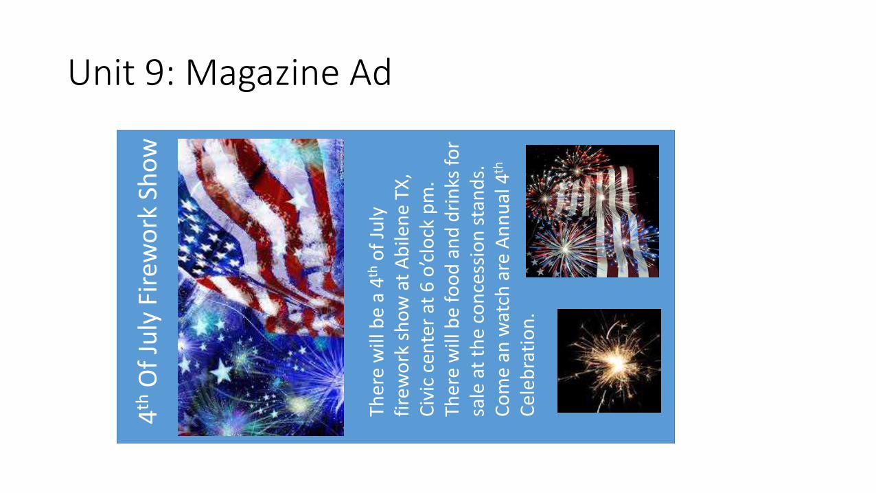
Unit 9: Magazine Ad
4th
Of
July
Fir
ewo
rk S
ho
w
Ther
e w
ill b
e a
4tho
f Ju
ly
fire
wo
rk s
ho
w a
t A
bile
ne
TX,
Civ
ic c
ente
r at
6 o
’clo
ck p
m.
Ther
e w
ill b
e fo
od
an
d d
rin
ks f
or
sale
at
the
co
nce
ssio
n s
tan
ds.
C
om
e an
wat
ch a
re A
nn
ual
4th
Ce
leb
rati
on
.

Unit 10: Billboard instructions
• You will create a billboard ad for the West Texas Fair and Rodeo.
• * Go to this web address for information on the fair for 2014. http://www.taylorcountyexpocenter.com/
• You will use the image of the billboard provided and create your billboard to fit.
• Download the logo file and include the logo on the billboard.
• Make sure all of the pieces are created at 300ppi. If your images are pixelated, points will be deducted.
• Save as a jpg or as a PDF.
• Name as follows: lastnamefirstinitial_u10

Unit 10: Billboard

Unit 11: Web Page Design Instructions
• For this project you will layout a homepage for a photography studio.
• You choose the name and create a logo for the studio. You can use your name and logo you created in a previous assignment or come up with another name and logo.
• You will include at least 3 images, text, a header and footer, and the navigation. Click on the link "Homepage Gallery". You do not have to recreate that design although you can. That is your choice. DoNot put the words Header, Logo, Footer, etc. on your design. Put the actual images, navigation, and other information on the page.
• Once completed, save as a jpg or a PDF.
• Name your file lastnamefirstinitial_u11

Unit 11: Web Page Design Fine Art