Embed Size (px)
Citation preview

Atlanta Regional Commission
For more information, contact:
The Economy on Election Eve:Swimming with an Undertow

The Highlights
• Nationally, recovery with expansion continues
– Gross Domestic Product (GDP) is recovering since the recessionary trough, and employment has as well, but progress has been slow
– Productivity and wage trends (negative, generally) have held growth back
• Locally, overall recovery in jobs and the unemployment rate overall mirror that seen in the nation—with some local areas lagging
• Locally and nationally, significant issues remain
– Higher unemployment rates for minorities and less-educated populations
– Concentration of job growth in lower-income sectors, which pay lower wages
• Leading indicators (e.g. job postings, patents, and forecasts) demonstrate potential for growth in higher-wage sectors

GDP Trends-National
Gross Domestic Product (GDP) is the most-watched macroeconomic indicator. Recovery has been fairly steady, overall, since the bottom of the recession in late 2008, but many quarters have been sluggish and a few even have strayed into negative territory. Since early 2014, however, there have been no negative quarters for GDP.
Source: Wall Street Journal; Bureau of Economic Analysis (BEA)

GDP Trends-Metro
GDP, Millions of chained (2009) dollars, 2014
137,181 to 1,423,173
69,940 to < 137,181
41, 130 to < 69,940
27, 556 to < 41, 130
13,366 to < 27,556
Atlanta is a leading Southeastern metro in terms of GDP, one of the few regional competitors for larger metros elsewhere.
Source: Bureau of Economic Analysis (BEA), via Neighborhood Nexus

Percent Change in GDP for Metros: 2013-14
% Annual Change GDP, chained (2009) Dollars:
3.1 to 8.5
2.4 to < 3.1
1.6 to < 2.4
0.7 to < 1.6
-1 to < 0.7
GDP growth for the most recent period has been strong in Atlanta, but does trail—on a percentage basis—many smaller metros in the Southeast, as well as quite a few metros in the West.
Source: Bureau of Economic Analysis (BEA), via Neighborhood Nexus

Productivity Trends counterproductive
Productivity soared during the 1990s, surged during the recession with fewer workers doing less, but has slipped during the recovery. Lagging productivity has held down GDP increases, and (as we will see later) restrained wage growth.
Source: Macrotrends, Inc.

YOY Job Change: Atlanta and the Nation
-8
-6
-4
-2
0
2
4
6
Jan
-00
Jul-
00
Jan
-01
Jul-
01
Jan
-02
Jul-
02
Jan
-03
Jul-
03
Jan
-04
Jul-
04
Jan
-05
Jul-
05
Jan
-06
Jul-
06
Jan
-07
Jul-
07
Jan
-08
Jul-
08
Jan
-09
Jul-
09
Jan
-10
Jul-
10
Jan
-11
Jul-
11
Jan
-12
Jul-
12
Jan
-13
Jul-
13
Jan
-14
Jul-
14
Jan
-15
Jul-
15
Jan
-16
Jul-
16
Year-over-Year Percent Change in Employment
ATL US
This graph shows the year-over-year percent change in employment for metro Atlanta (blue) and the US as a whole (green). What we see is during the recession, employment change was much lower in metro Atlanta, but as of 2012, it has surpassed the United States. The gap has narrowed in recent quarters.
Source: Bureau of Labor Statistics

Atlanta Pre-Recession Peak
-15.0%
-10.0%
-5.0%
0.0%
5.0%
10.0%
De
c-0
7
Mar
-08
Jun
-08
Sep
-08
De
c-0
8
Mar
-09
Jun
-09
Sep
-09
De
c-0
9
Mar
-10
Jun
-10
Sep
-10
De
c-1
0
Mar
-11
Jun
-11
Sep
-11
De
c-1
1
Mar
-12
Jun
-12
Sep
-12
De
c-1
2
Mar
-13
Jun
-13
Sep
-13
De
c-1
3
Mar
-14
Jun
-14
Sep
-14
De
c-1
4
Mar
-15
Jun
-15
Sep
-15
De
c-1
5
Mar
-16
Jun
-16
Change in employment from pre-recession peak
This graph shows the percent change in employment from the pre-recession peak. You can see starting in 2008 there were far fewer jobs than right before the recession. Around March 2014, the economy started picking back up. In December 2015, we had the highest increase in jobs since before the recession—and the most recent months show increases at close to the same rate as last December.
Source: Bureau of Labor Statistics

Unemployment Rate Trends
Between the end of 2007 and mid-2009, the national unemployment rate soared from 5% to 9.5% (almost doubling). As of mid-2016, the rate was nearing pre-recession “lows” even as underemployment persists.
Source: BLS- LAUS
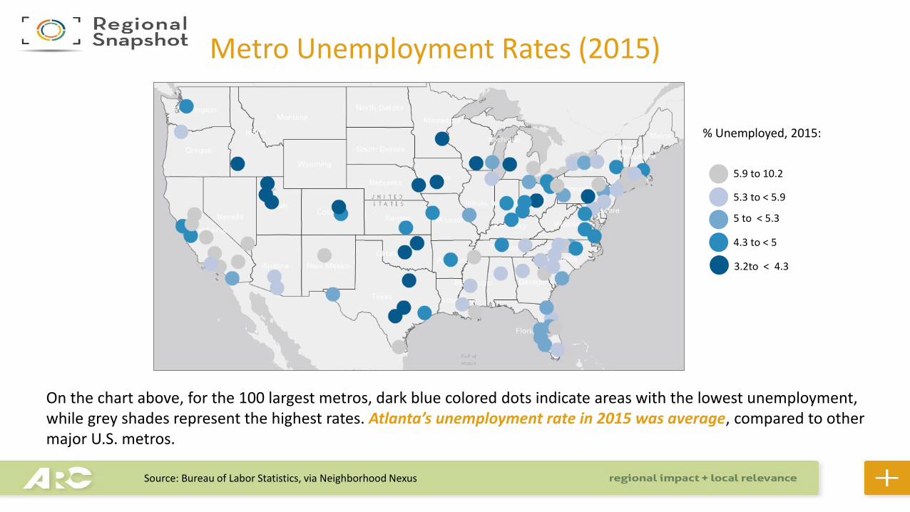
Metro Unemployment Rates (2015)
% Unemployed, 2015:
5.9 to 10.2
5.3 to < 5.9
5 to < 5.3
4.3 to < 5
3.2to < 4.3
On the chart above, for the 100 largest metros, dark blue colored dots indicate areas with the lowest unemployment, while grey shades represent the highest rates. Atlanta’s unemployment rate in 2015 was average, compared to other major U.S. metros.
Source: Bureau of Labor Statistics, via Neighborhood Nexus

Unemployment Rates: Atlanta in Context
4.6
10.3
10.810.6
9.3
8.2
7.6
5.9
5.2
4.6
10.4 10.510.3
8.9
7.8
7.2
5.6
5.0
0.0
2.0
4.0
6.0
8.0
10.0
12.0
2007 2008 2009 2010 2011 2012 2013 2014 2015 2016
GA
ATL MSA
USA
Source: BLS LAUS Data; August data, yearly
The unemployment rate for the Atlanta MSA is lower than that of Georgia, at every point since the onset and the ending/ recovery from the Great Recession. While the Atlanta rate is higher than that of the nation , the MSA has improved more quickly 2014-2016.

Unemployment Rates: Counties in Context
Source: BLS LAUS Data; August data, yearly
0.0
2.0
4.0
6.0
8.0
10.0
12.0
14.0
16.0
2007 2008 2009 2010 2011 2012 2013 2014 2015 2016
ClaytonRockdaleHenryDouglasDeKalbFultonGAATL MSAUSAFayetteGwinnettCobb
The unemployment rates in a majority of ARC counties, while improving with the national and state pattern, still lag (as of August 2016) the Metro Atlanta average in 6 of 10 cases.

Unemployment Rates by Race/Ethnicity
Unemployment rates for minorities, always relatively higher than others’ rates, have improved at a slower rate coming out of the Great Recession.
Source: BLS- LAUS

Unemployment Rate by Education Level
The unemployment rates in a majority of ARC counties, while improving with the national and state pattern, still lag (as of August 2016) the Metro Atlanta average in 6 of 10 cases.
Source: BLS- LAUS

National Wage Trends: 2002-Present
Wage growth has failed to “turn around” since the Great Recession and is far below the 1983-2015 average as shown, even with a ticking up 2012-2016. Wage growth lags—significantly –even the slow recoveries in jobs and unemployment rates.
2016
Source: BLS QCEW 1Q

Percent Change Average Hourly Earnings of All Employees in 2012-2016:
0.7 to 4.2
-1.5 to < 0.7
-3.1 to < -1.5
-5.5 to < -3.1
-11.9 to < -5.5
Metro Atlanta doesn’t have the highest average hourly earnings among the largest metros, but it does have one of the highest changes in earnings (of the metros) from 2012 to 2016.
Average Hourly Earnings, 2012-16
Source: Bureau of Labor Statistics, via Neighborhood Nexus

Job Trends (% Change) by Period--
-0.6%
-1.1% -1.1% -1.1% -1.2%
-0.5%
-1.0%-1.3%
-1.7%
-1.3%-1.1% -1.0%
0.2%
-1.8%
2.0%
3.0%
3.4% 3.5%
6.7%
3.7%
4.1%
1.4%
4.0%
4.7%
3.9%
3.1%
5.6%
1.2%
-3.0%
-2.0%
-1.0%
0.0%
1.0%
2.0%
3.0%
4.0%
5.0%
6.0%
7.0%
8.0%
USA State MSA 10co Cherokee Clayton Cobb DeKalb Douglas Fayette Fulton Gwinnett Henry Rockdale
2007-2012 2012-2016 2015-2016
This chart shows that, during the Great Recession and its aftermath (2007-2012), jobs declined in all areas shown, except Henry where they held. During the recovery of 2012-2016, the number of jobs increased in all counties and comparison areas. This increase is most dramatic in the 2015-2016 period.
Source: BLS QCEW 1Q Data for each year: Processing and Analysis by ARC Research & Analytics

YOY by Lower-Wage Sector
-30
-25
-20
-15
-10
-5
0
5
10
15
Jan
-07
Mar
-07
May
-07
Jul-
07
Sep
-07
No
v-0
7
Jan
-08
Mar
-08
May
-08
Jul-
08
Sep
-08
No
v-0
8
Jan
-09
Mar
-09
May
-09
Jul-
09
Sep
-09
No
v-0
9
Jan
-10
Mar
-10
May
-10
Jul-
10
Sep
-10
No
v-1
0
Jan
-11
Mar
-11
May
-11
Jul-
11
Sep
-11
No
v-1
1
Jan
-12
Mar
-12
May
-12
Jul-
12
Sep
-12
No
v-1
2
Jan
-13
Mar
-13
May
-13
Jul-
13
Sep
-13
No
v-1
3
Jan
-14
Mar
-14
May
-14
Jul-
14
Sep
-14
No
v-1
4
Jan
-15
Mar
-15
May
-15
Jul-
15
Sep
-15
No
v-1
5
Jan
-16
Mar
-16
May
-16
Jul-
16
Year-over-year percent change by sector (metro Atlanta)
Construction Retail Leisure
It’s important to look at this job growth by sector, as therein lies the rub for the economy. During the recession, lower-wage sectors such as Construction, Leisure, and Retail took a severe hit. But lately, Construction, Leisure, and Retail are performing very well.
Source: BLS

YOY Job Change: Higher-Wage Sector
-12
-10
-8
-6
-4
-2
0
2
4
6
8
10
Year-over-year percent change by sector (metro Atlanta)
Information Finance Professional/Business
Conversely, higher-wage sectors have lagged, after run-ups from late 2009 to early 2011. From 2013 to present, the sectors of Information, Finance, and Professional Business and Technical Services have shown declining employment.
Source: BLS

Average Weekly Wage Trends (% Change) by Period--
1.3%
0.4%0.6%
0.0%
2.0%
-1.7%
-0.1%
0.3%
2.1%
3.6%
-0.2%-0.6%
6.0%
1.9%
-2.4%
-1.0%-0.5%
-1.2%
-5.6%
6.3%
-3.7%
0.4%
-6.0%-5.4%
0.4%
-5.5%
-3.5%
-4.8%
-8.0%
-6.0%
-4.0%
-2.0%
0.0%
2.0%
4.0%
6.0%
8.0%
USA State MSA 10co Cherokee Clayton Cobb DeKalb Douglas Fayette Fulton Gwinnett Henry Rockdale
2007-2012 2012-2016 2015-2016
This chart shows that, during the Great Recession and its aftermath, wages actually showed very slight increases in most areas—perhaps due to part-time and lower-wage workers being laid off. During the recovery of 2012-2016, however, the low-wage-driven job recovery has led to a drop in average weekly wages—in most areas. This decline is, notably, more dramatic in the 2015-2016 period.
Source: BLS QCEW 1Q Data for each year, adjusted for inflation

Software Developers Job Postings
Source: Burning Glass, accessed October 2016
There has, then, been weakness in the growth of occupied jobs in higher-wage sectors in our local (and national recovery). There has NOT, however, been low demand for skills in those sectors. For instance, the demand for software developers in our metro has been very high over the last few years—as well as that for other high-tech sectors like digital media. If this demand can be better met (better retention, training, and recruitment would be tools to do so)—wages could start to rise.

Patents filed per 100,000 population, 2015:
67.1 to 739.5
38 to < 67.1
22.4 to < 38
12 to < 22.4
1.7 to < 12
Trends in patents are also encouraging, as leading indicator for higher-wage job growth. When there are high amounts of patents filed, it suggests that people are innovating, creating, and starting businesses. This map shows the number of patents filed per 100,000 people in 2015. Dark blue represents the highest rates and light blue/ grey represent the lowest. Atlanta is a leader in the Southeast, while in the middle of the pack nationally, per the rate(s) of patents filed,
Patents- Metro Level
Source: United States Patent and Trademark Office

Employment Forecast
23
Total Private Sector Employment (in Thousands) by Industry
-100 0 100 200 300 400 500 600
Forestry & Fishing
Mining
Utilities
Mgmt of Cos
Information
Arts, Ent & Rec
Educ Svcs
Transp & Warehouse
Manufacturing
Wholesale Trade
Other Svcs
Finance and Insurance
Real Estate
Accom & Food Svcs
Construction
Admin & Waste Mgmt Svcs
Prof, Sci & Tech Svcs
Retail Trade
Health Care
Emp in 1990 Change 1990-2015 Change 2015-2040
Source: ARC The Region’s Plan Forecast (2015) Series
…And finally, ARC’s recent Series 15 forecasts predict strong growth in both Professional Scientific and Technical Services and Finance.

Summing Up
• Things are looking up– GDP growth with Atlanta a leader
– Recovered from the Recession• Unemployment Rate
• Job Numbers
• Challenges remain‒ Job growth concentrated lower-sectors
‒ Lagging wages
‒ “Unequal” unemployment
‒ Future trends encouraging‒ High-tech, high-wage sector postings
‒ Patents
‒ Forecasts


