Embed Size (px)
Citation preview

Page | 3
Team Members: Submitted to:
Shivangi- 13dm175 Dr. Meena Bhatia
Tushar Mittal- 13dm205
Vaibhav Rusia- 13dm210
Shilpi upadhyay- 13dm174
Siddhant Sharma- 13dm182
Udit jain- 13dm206
Siddharth raghuvanshi- 13dm183

Page | 4
List of Companies:
1. Bharti Airtel Ltd.
2. Idea Cellular Ltd.
3. Reliance Communications Ltd.
4. Adani Enterprises Ltd.
5. Container corporation of India ltd
6. Adani Ports and Special Economic Zone Ltd.

Page | 5
S.NO. PARTICULARS PAGE
NO.
1
What purpose does annual report serve? 6
2
Why companies are disclosing certain information voluntary?
7
3
Why do companies use graph in annual report? 8
4
Analysis of the data as collected in the Excel sheet
9-12
5
Distortions & deficiencies in graphs. 13-16
6
Findings of your research and any suggestions to SEBI
17
7
Annexure 1 - Graphs 18-25
8
Annexure 2 – Financial statements 16-43
9 Referencing 44
Page | 6
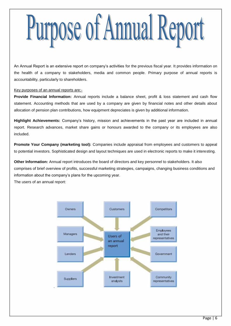
An Annual Report is an extensive report on company’s activities for the previous fiscal year. It provides information on
the health of a company to stakeholders, media and common people. Primary purpose of annual reports is
accountability, particularly to shareholders.
Key purposes of an annual reports are:-
Provide Financial Information: Annual reports include a balance sheet, profit & loss statement and cash flow
statement. Accounting methods that are used by a company are given by financial notes and other details about
allocation of pension plan contributions, how equipment depreciates is given by additional information.
Highlight Achievements: Company’s history, mission and achievements in the past year are included in annual
report. Research advances, market share gains or honours awarded to the company or its employees are also
included.
Promote Your Company (marketing tool): Companies include appraisal from employees and customers to appeal
to potential investors. Sophisticated design and layout techniques are used in electronic reports to make it interesting.
Other Information: Annual report introduces the board of directors and key personnel to stakeholders. It also
comprises of brief overview of profits, successful marketing strategies, campaigns, changing business conditions and
information about the company’s plans for the upcoming year.
The users of an annual report:
.

Page | 7
To find out why companies disclose certain information voluntarily we have done an interview with a person who has
over 6 years experience in the accounting industry and have tried to get the answer for the same.
Words Of Wisdom:
ASHISH CHHABRA
[Co-Partner in “N kumar chhabra n company”
Over 6 years of experience as a CA in the industry.]
Sir, WHY do companies disclose certain information voluntarily in their annual reports??
“Voluntary itself means it’s not compulsory. Talking the ‘WHY’ question I would say that there are many things which
the management considers before giving certain information in the annual report. Firstly, it looks at the industry trends
for eg: if I am in a sector where all my competitors are showing a set of information voluntarily say: a set of graphs,
then I also need to show the information. Not that it is compulsory but I don’t want to go against the industry trends
and convey a bad image of my company to my stakeholders. Secondly, it totally depends on the company’s policies
and what the management decides. If I value my stakeholders and if I want them to know what actually is going on in
the company I will definitely show and display more than what is compulsory. Moreover, voluntary disclosure helps the
company to build a good reputation and a trust among the shareholders. ”
Sir, can a company manipulate voluntary information to present a better picture and fool the
stakeholders?
“Yes, they surely can. Why would I show the information which conveys a bad picture of my company? I would say it’s
not manipulation it’s just being smart enough to show what is good in your company and ignoring the figures which
depict a bad image to the stakeholders.”
Sir, would you consider this an ethical practice?
“Anything that shows a better position of the company than the actual position is considered unethical. But it is totally
up to the management what to voluntarily disclosure and what not to.”

Page | 8
Graphs speak a universal visual language. Information is depicted by use of column graphs, line graphs and pie
charts. Graphs are more user friendly as compared to traditional format of presenting the financial information by
means of tables. Financial graphs enhance understandability of financial data for users without accounting
background. Graphs aid in presenting summary information, breakdown the language barrier, facilitate comparisons,
emphasize on relationships between various variables having financial or non-financial origin, save time in analyzing
data and trends. Graphs are used as a marketing tool in order to make the annual report look appealing to the users.
They attract reader’s attention with their colored components and are used to project a good image of the company in
the eyes of investors and other stakeholders.
The pictorial presentation of information is most widely used as a part of director’s report, financial summary and the
highlight section.
Managements use graph to manipulate the financial information and distort the message to be conveyed, for example
exaggerating an upward trend or understating a downward trend by starting the vertical axis at a number higher than
zero, inadequately titled and labelled graphs, obtrusive backgrounds, failing to show vertical axes to mislead potential
investors.
Graphically presentation helps the company’s stakeholders to understand the working of the company in a better way.

Page | 9
HORIZONTAL COMPARISON:
Airtel: Talking about performance of the company we analyzed that the company’s performance do affect the
graphical disclosure of a company through financial graphs:
In the case of Bharti Airtel pvt limited, we analyzed the net profit of the company over a period from 2008-09 to
2012-13. The company had a trend of disclosing “profit and profit margin” and “EPS” graph till 2009-2010 as the
companies’ net profit and EPS were on a constant rise but after 2010, the company has not shown the graph for
“profit and profit margin” and “EPS”, reason being the net profit of the company is on a constant decline from 2010
onwards. Therefore, the management does not want to depict the bad shape of the company through the “profit
and profit margin” graph.
The table attached gives the reason for the above conclusion:
RELIANCE COMMUNICATION :
While examining the annual reports of reliance communications for three years (2009-2010, 2010-2011, 2011-2012),
we came across certain discrepancies which were perhaps an attempt to mislead the potential investors. In the year
2009-2010, firm had shown their earnings graphically as ‘net profit’ which was 46550 million whereas in the
subsequent year there was a net loss of 757 crores and instead of that, EBITDA (earnings before interest, tax,
depreciation and amortisation) were depicted graphically which invariably is much higher and increasing
subsequently. Same practice was followed in the year 2011- 2012 where there was a low net profit of 150 crores.
While EBITDA has been on rise, the return on equity for the year ending 2012 was a low 2.5 percent. Most
importantly there has no depiction of EPS and DPS graphically which is of great interest to the
shareholders for interpreting the company’s performance.
ADANI ENTERPRISE

Page | 10
The company has showed the compared net worth graph during the fiscal year 2010 and 2011 when the performance comparing to the previous years was very good. But in fiscal year 2012 and 2013 when the percentage change is almost negligible, it didn’t show the net worth graph. This shows that the company is focussed on showing only positive aspects through graphs in its annual reports.
Adani enterprise is the largest producer of thermal coal in India. During the fiscal year 2012 and 2013, the production of Adani enterprise increased as compared to the previous years. Therefore, it showed graphs of coal trading in both the years.
The company showed EPS graph during the year 2009 and 2010 .But as it is decreasing they didn’t show the same in the subsequent years.
Company showed the revenue graph during fiscal year 2010 but it declined tremendously. So, it is not shown in the subsequent years.
ADANI PORTS AND SPECIAL ECONOMIC ZONE:
We analyzed the annual reports of Adani Ports and Special Economic Zone Limited for year 2010 to 2013. The major
transition was seen from 2010-11 to 2011-12, when company changed its name from ‘Mundra Port and Special
Economic Zone Limited’ to ‘Adani Port and Special Economic Zone Limited’ on January 6th 2012.
In the above transition, company improved its position in terms of Net Profit, Turnover but share price in NSE and
BSE took a fall. Moreover, the number of graphical disclosures by company was increased from year 2010-11 to
2011-12 from 6 to 9.
The particular graphs of container growth, cargo handled, EBITDA and categories of shareholders were added in year
2011-12 annual report.
Therefore, from above analysis, we conclude for particularly this sector, as company improves number of graphical
disclosures are increased by it.

Page | 11
Idea:
Through the analysis of Idea cellular, it is found that the graphical disclosure remained the same for all the years. The
market share of the company has been on rise and so are the revenues. The net profit, ROA, ROE and EPS are
continuously declining. The company’s payout ratio is zero. Thus, the company discloses only those aspects by way
of graphs which reflect a positive picture of the company. Ex: growth in cash profits, revenue, comparison of BSE and
NSE with the company’s share prices to show the upward trend.
VERTICAL COMPARISON:
Telecommunication sector:
Market cap reflects the equity value of the company. The size of the company is judged on the basis of its market cap.
Among the major players in the telecommunication sector, Airtel has the highest market cap of ₹ 1,16,404.29 crores
followed by Idea and RCom.
ROA tells an investor how much profit a company generated for each ₹1 in assets. It is a way gauge the asset
intensity of a business. Companies in the telecommunication sector are very asset-intensive since they require big,
expensive machinery or equipment to generate a profit.
( http://beginnersinvest.about.com/od/incomestatementanalysis/a/return-on-assets-roa-income-statement.htm). ROA
is highest for Idea followed by Airtel and Reliance.
The return on equity ratio (ROE) measures how much the shareholders earned for their investment in the company.
The higher the ratio, the more efficient management is in utilizing its equity base and the better return is to investors.
(http://www.investopedia.com/university/ratios/profitability-indicator/ratio4.asp). Bharti Airtel has the highest ROE
followed by Idea and Reliance.
Through the intercompany comparison in telecommunication sector, following observations have been made:
Few graphs are disclosed by all these companies that include sales revenue and Earnings since these
variables were on continuous rise over the years.
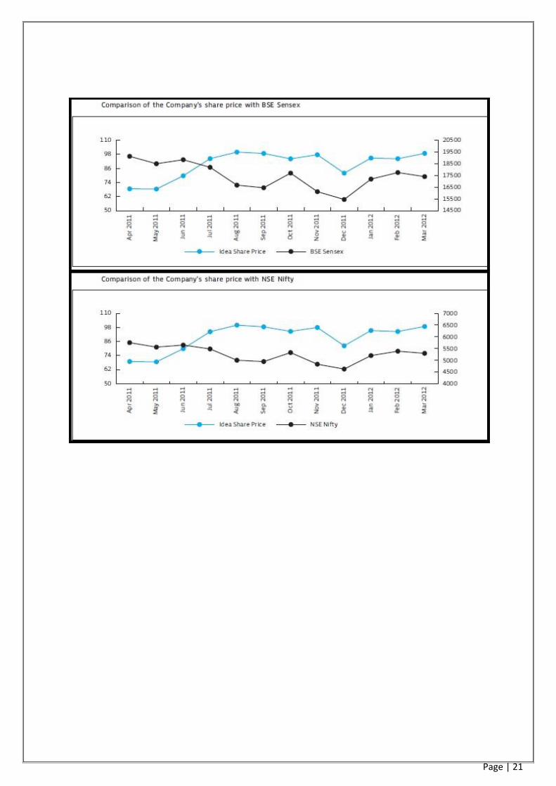
Airtel and Idea followed the practice of graphical disclosure of Comparison of the company’s share prices with
BSE Sensex and NSE Nifty to give a clear picture of the company’s performance. It acts as a marketing tool
towards the potential investors.
Airtel’s EPS is on constant decline so the company chose to disclose through graphs the Book value of the
shares which is increasing and not the EPS.
Mar '13 Mar '12 Mar '11 Mar '10 Mar '09
Earnings Per Share 13.42 15.09 20.32 24.82 40.79
Book Value 142.58 130.16 115.42 96.24 145.01
(Source: moneycontrol.com)

Page | 12
Reliance chose not to show either of the two through graphs as both are on continuous decline. EPS was even
negative for 2010-11.
Mar '12 Mar '11 Mar '10 Mar '09 Mar '08
Earnings Per Share 0.76 -3.67 2.32 23.27 12.53
Book Value 218.97 233.26 244.66 250.43 120.35
(Source: moneycontrol.com)
Same was the case with Idea too as shown below:
Mar '12 Mar '11 Mar '10 Mar '09 Mar '08
Earnings Per Share 1.74 2.56 3.19 3.23 3.96
Book Value 38.99 37.18 34.59 36.37 13.44
(Source: moneycontrol.com)
Idea has disclosed the net profit graph despite the fact that it has been decreasing while other companies
did not.
Net Profit/(Loss) For the Period
Mar '12 Mar '11 Mar '10 Mar '09
AIRTEL 5,730.00 7,716.90 9,426.16 7,743.84
IDEA 576.54 844.6 1,053.66 1,008.21
RCOM 156 -757.99 478.93 2,352.93
(Source: moneycontrol.com)
Few graphs providing non-financial information have also been disclosed like subscriber base. No. of
subscribers of all the three companies are increasing but Idea did not disclose the same through graph.
It can be said that decision to disclose the information of financial or non-financial importance through graphs is totally
at the discretion of the management. The management emphasises on the disclosing the positive performance of the
companies perhaps to mislead the stakeholders or just to enhance transparency and understandibility through the
annual reports. Big companies and companies with better performance (Airtel in the above case) have more positive
variables to be graphed to give a better picture. Thus, they disclose more via graphs. For instance, Reliance with low
market cap and low performance used only four graphs as compared to its competitors( Airtel and Idea) which used
six graphs.
Page | 13
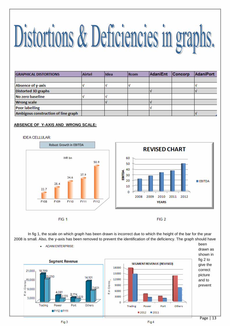
ABSENCE OF Y-AXIS AND WRONG SCALE:
In fig 1, the scale on which graph has been drawn is incorrect due to which the height of the bar for the year
2008 is small. Also, the y-axis has been removed to prevent the identification of the deficiency. The graph should have
been
drawn as
shown in
fig 2 to
give the
correct
picture
and to
prevent

Page | 14
0
20
40
60
80
100
120
0
5000
10000
15000
20000
25000 ID
EA S
HA
RE
PR
ICE
BSE
SEN
SEX
MONTH
Comparision of the Idea share prices with BSE Sensex (Revised)
BSE
idea
exaggeration.
In fig 3, the scale starts from 3000 and the difference is 6000 subsequently. Also, there is absence of tick labels on the
y-axis and grid lines to locate the exact values from the chart. The graph looks ambiguous. Example: the revenue from
power in 2011 which is Rs 2137cr appears at the level of Rs 3000cr.
NO ZERO BASELINE: Not including zero in the baseline is one way to exaggerate a trend for those who don’t read
labels carefully. For educated audiences who can be expected to read tick labels, zero is not needed.

Page | 15
POOR LABELLING : Not including tick labels in the graph makes the reading of graphs difficult.
LINE GRAPH LIMITATION : A graph in the annual report of Adani ports uses a high width line graph due to which
it becomes difficult to read the actual values from the graph.

Page | 16
INAPPROPRIATE 3D GRAPHS: The 3D graphs formed without grid lines makes the graph look inappropriate if
the bars are seen in reference to tick labels on Y-axis and have the tendency to mislead the users in the absence
of labels showing the exact value represented by each bar.

Page | 17
Major findings:
The major finding of our research is depicted as follows:
The annual report is not only a rule which the companies have to follow but also a marketing tool and
a tool to build a brand image in the market.
Companies at times voluntarily disclose certain information that depicts a better picture of the
company.
Graphical representation is at times used as a trick to fool the stakeholders.
Suggestions to SEBI:
Financial report users easily get mislead due to the presence of distorted graphs in the financial
report. To check this practice. Though graphs are disclosed voluntarily by the companies , to check
the practice of submitting distorted graphs, SEBI should impose certain strict rules for graph
disclosures:
Assigning a specific scale for graphs.
Graphs having only one axis cannot be included.
Value representations instead of points should be avoided.
Multiple scaling graphs depicting more than one variable with different scales should not be used.
All variables should lie on same grid.
Interval ratios should remain constant either it be a histogram, bar graph or column graph.
Proper label lings should be present.
Scaling units must be defined.
Intervals should not be broken at any point.
Zero should remain the origin of graph.
Lines on graph should be clear. (no doubling allowed)
Companies disclosing graphs in distorted patterns should be punished with penalties.
Distortion identifying committee should be formed by SEBI to have a check on this practice.
Companies showing distorted graphs continuously in their reports should be declared by SEBI as
untrustworthy.

Page | 18
Annexure 1
BHARTI AIRTEL: The followin six graphs are used by the company in their annual report 2011-2012

Page | 19

Page | 20
IDEA CELLULAR : The followin six graphs are used by the company in their annual report 2011-2012
Page | 21

Page | 22
RELIANCE COMMUNICATION : The followin four graphs are used by the company in their annual report 2011-2012

Page | 23
ADANI ENTERPRISES : The following six graphs are used by the company in their annual report 2012-2013
CONTAINER CORPORATION OF INDIA : They do not have any graphical disclosure

Page | 24
ADANI PORTS : The following nine graphs are used by the company in their annual report 2012-2013.

Page | 25
Page | 26
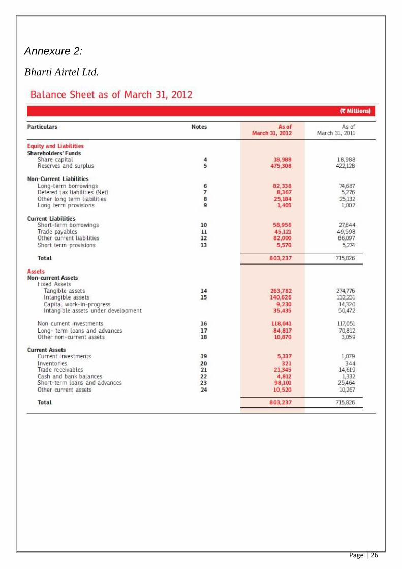
Annexure 2:
Bharti Airtel Ltd.

Page | 27

Page | 28

Page | 29
2. Idea Cellular Ltd.

Page | 30

Page | 31

Page | 32
3. Reliance Communications Ltd.

Page | 33

Page | 34

Page | 35
4. Adani Enterprises Ltd.
Page | 36

Page | 37

Page | 38
5. Container corporation of India ltd

Page | 39

Page | 40

Page | 41
6. Adani Ports and Special Economic Zone Ltd.

Page | 42

Page | 43

Page | 44
Reporting to shareholders, a good practice guide , 2008 by Ernst & Young
^ Dictionary of Finance and Investment Terms by John Downes and Jordon Elliot Goodman Barron 1995
Research report : Pretty pictures, damned lies, and graphs in reports
Wilson, Kelly; Stanton, Patricia . Australian Accountant 66.5 (Jun 1996)
The use and abuse of graphs in annual reports: theoretical framework and empirical, beattie, vivien:jones,
Michael john, accounting and business research; autumn 1992;22;88 ABI/INFORM complete pg291
Pictures that lie: The abuse of Graph in annual reports: are major.. Johnson, Johnny R; rice, Robert
R;Roemmch, roger A, Management Accounting(pre-1986); 62,4 ABI/INFORM complete pg.50
^ http://www.accountingtools.com/definition-wrap-report (accessed 14 august 2013).
http://www.moneycontrol.com (accessed 14 august 2013).
http:www.equitymaster.com (accessed 13 august 2013).
Bharti_Airtel (2012),Annual Report ,bharti airtel ltd ,India
Idea cellular (2012),Annual Report ,idea cellular ltd, India
Reliance communication ltd(2012),Annual Report ltd ,reliance communication ,India
Adani enterprises (2012),Annual Report , Adani enterprises ltd, India
Container corporation of india ltd(2012),Annual Report , Container corporation of india ltd,India
Adaini ports and special economic zone(2012),Annual Report , Adaini ports and special economic zone
ltd,India