About Me – Sam Partland
• 10 years digital marketing experience
• Lead generation & affiliate marketing for various
niches
• Covered all aspects of digital marketing for small
businesses through my own business
• Have worked agency side and currently in-house at
REA Group as a Digital Search Manager (SEO)

The Presentation
• Preparing your Data
• Categorisation & Classification
• Pivot Tables
• Slicing & Filtering data
• Making Everything Pretty
• Estimating Traffic
• Search Market Overview
• Competitive Landscape
• Ranking Snapshot
• Opportunity Analysis
• Keyword Dashboard
• Weighted Rankings
• Google Analytics
Setup Presentation

Before We Begin… Sorry Mac Users!
Due to technical limitations on Excel for
Mac, you will be severely limited in how
you can present data.
You can still do most of it… it’s just
takes more effort.

Preparing Your Data
• Single RAW table with all data you will compare on a separate
sheet from any dashboard and report• ie, don’t have a separate table for each month or metric, use a combined table
• One month / keyword per row in most cases
• New column for anything you want to filter the data by
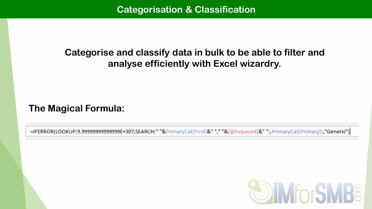
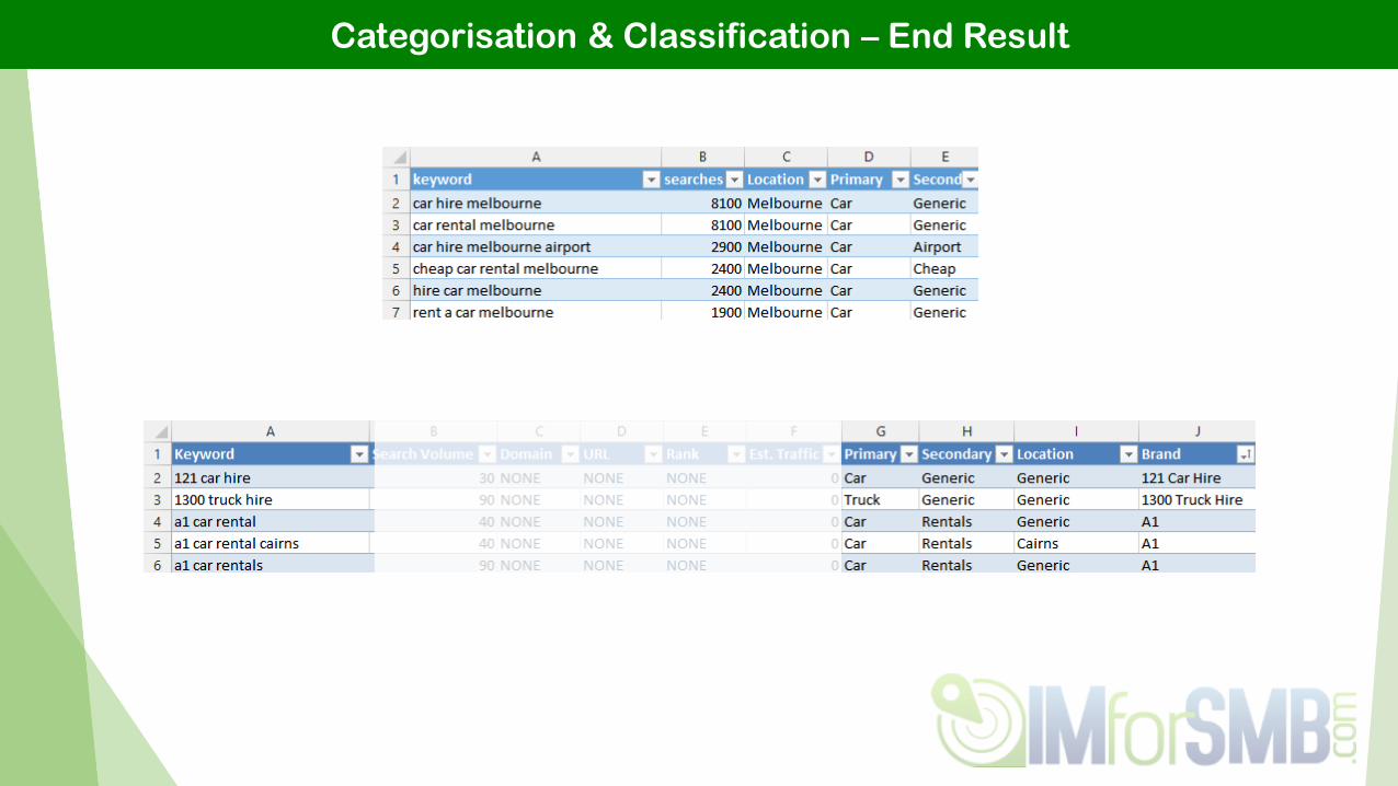
Categorisation & Classification
Categorise and classify data in bulk to be able to filter and
analyse efficiently with Excel wizardry.
The Magical Formula:

Categorisation & Classification – The Magic
1. Find One
of These
2. In Here
3. Then Put
Matching
Category
4. In Here
Important Note: Formula looks at the ‘Find’ column
from bottom up. Don’t ask why, it’s just magic.

Pivot Tables
A pivot table primarily allows you to present your data in a
digestible manner. When you update the RAW, you can
‘refresh’ your pivot table. Design once & refresh.
• Easily filter
• Apply styling / formats
• Run formulas
• Generate graphs
• Much more!...
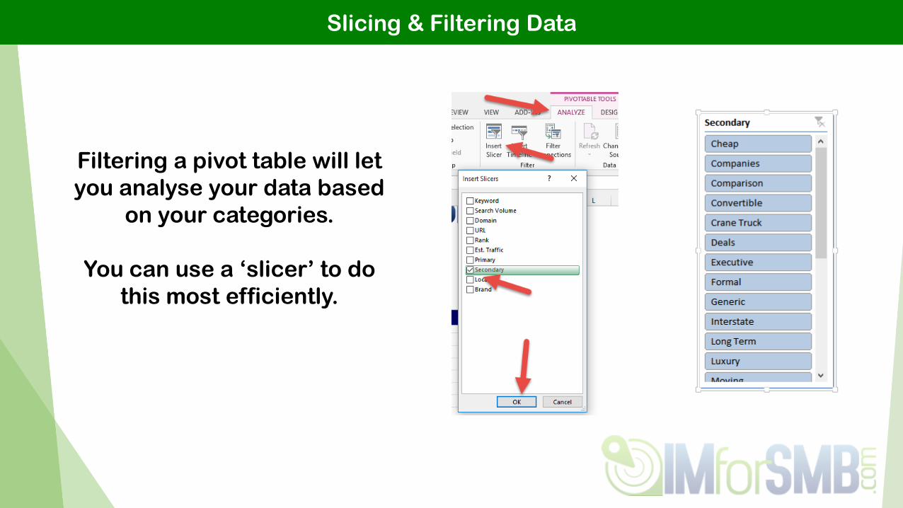
Slicing & Filtering Data
Filtering a pivot table will let
you analyse your data based
on your categories.
You can use a ‘slicer’ to do
this most efficiently.
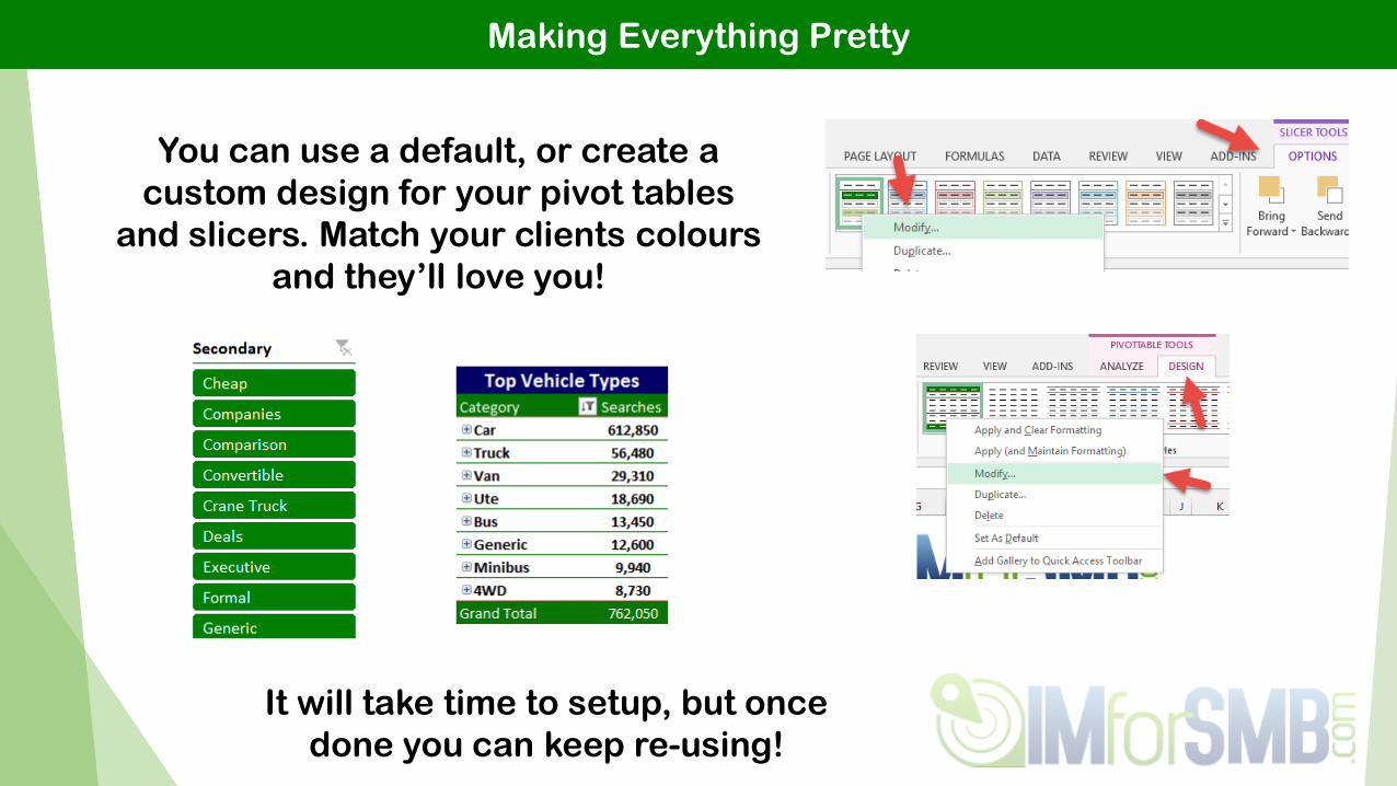
Making Everything Pretty
You can use a default, or create a
custom design for your pivot tables
and slicers. Match your clients colours
and they’ll love you!
It will take time to setup, but once
done you can keep re-using!
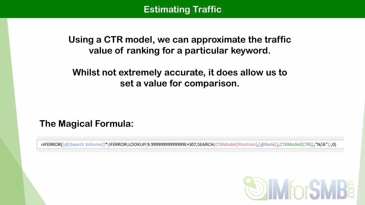
Estimating Traffic
Using a CTR model, we can approximate the traffic
value of ranking for a particular keyword.
Whilst not extremely accurate, it does allow us to
set a value for comparison.
The Magical Formula:

Estimating Traffic - How
1. Find The
Rank
2. In Here
3. Then Multiply
Search Volume
4. By The
Matching
Approx. CTR

Search Market Overview
Using categorised keyword research & search volume
data, we can present a top-level market overview.
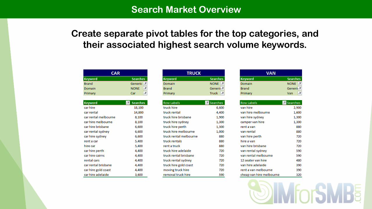
Search Market Overview
Create separate pivot tables for the top categories, and
their associated highest search volume keywords.
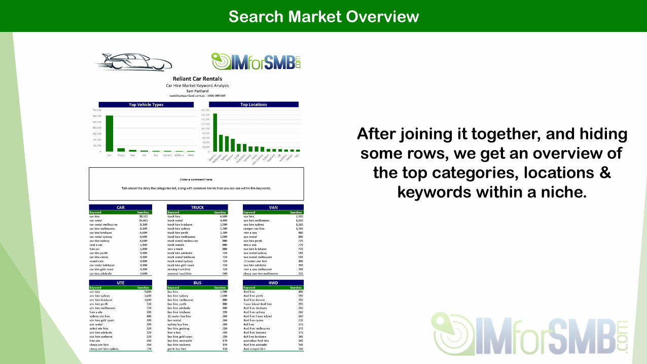
Search Market Overview
After joining it together, and hiding
some rows, we get an overview of
the top categories, locations &
keywords within a niche.
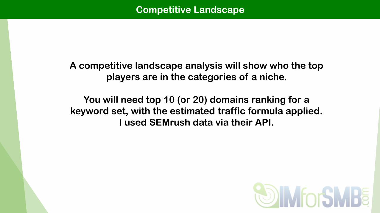
Competitive Landscape
A competitive landscape analysis will show who the top
players are in the categories of a niche.
You will need top 10 (or 20) domains ranking for a
keyword set, with the estimated traffic formula applied.
I used SEMrush data via their API.

Competitive Landscape
Putting it all together we get an
overview of the top players within a
niche.
This will really assist in setting your
performance goals, as you know
who ranks where.
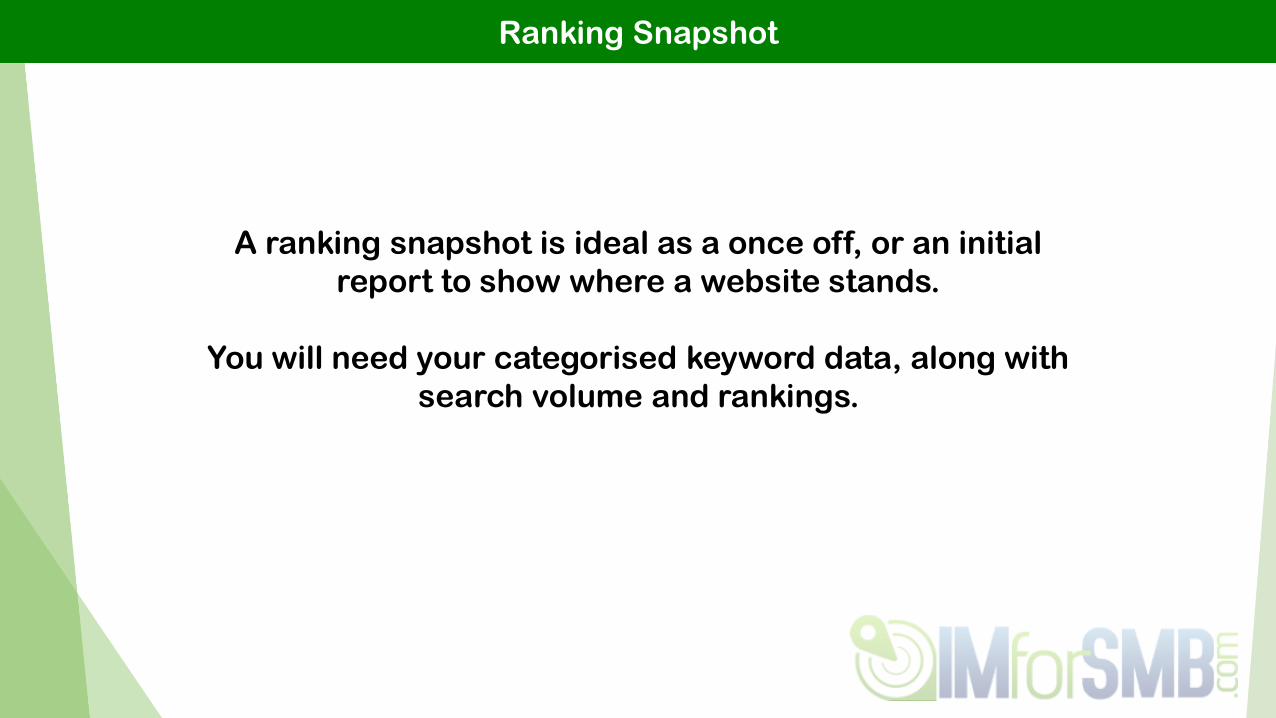
Ranking Snapshot
A ranking snapshot is ideal as a once off, or an initial
report to show where a website stands.
You will need your categorised keyword data, along with
search volume and rankings.

Ranking Snapshot
Using estimated traffic, we can show approx. strength,
along with the % share of what #1 would get.
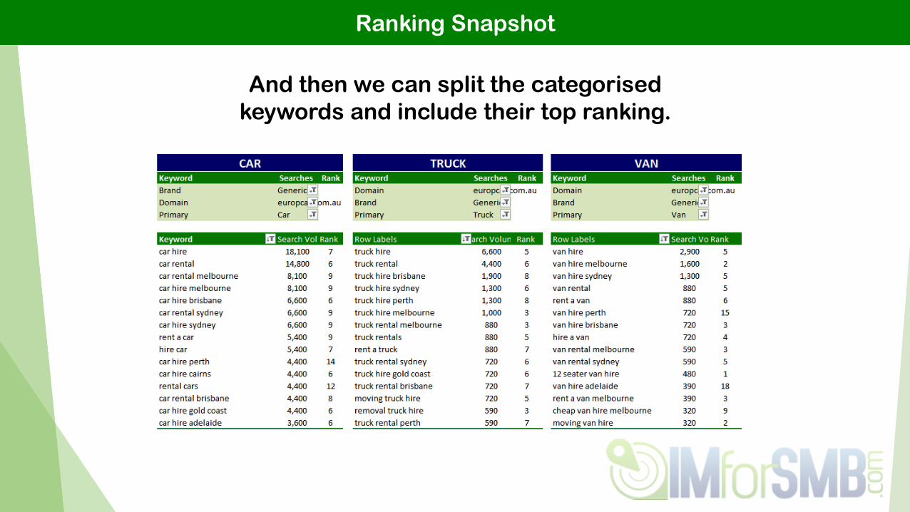
Ranking Snapshot
And then we can split the categorised
keywords and include their top ranking.

Ranking Snapshot
This will give a performance
overview, and roughly touch on
how they are performing
compared to how #1 would be
performing.

Opportunity Analysis
An opportunity analysis will allow you to identify key
areas of interest for your client. Not within individual
keywords, but overall categories.
You will need your categorised keyword data, along with
search volume and rankings.

Opportunity Analysis
Split your data into graphs of the categories you want to
analyse. For this, I will run with Primary, Secondary, and
Location.

Opportunity Analysis
Surely your client will throw
money at you once they realise
the opportunity available!
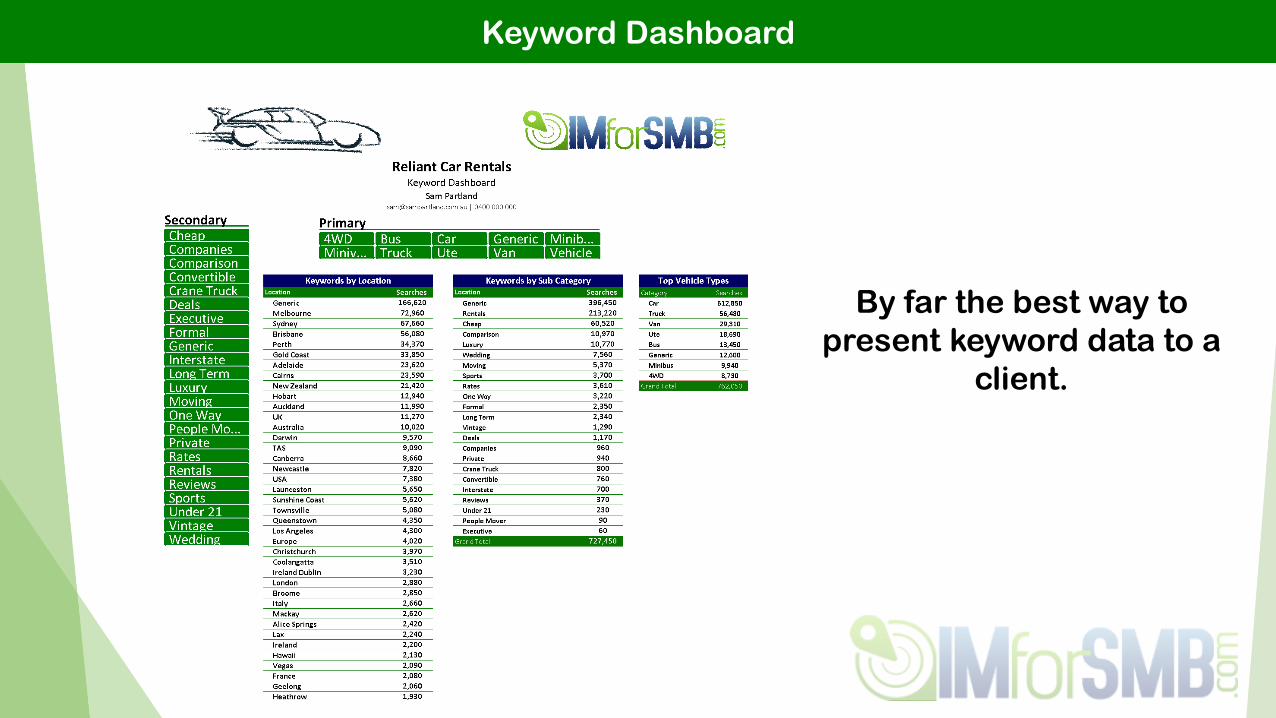
Keyword Dashboard
Reports aren’t always the best way to present data though,
and are best avoided where possible!
You should be using dashboards.
Keyword Dashboard
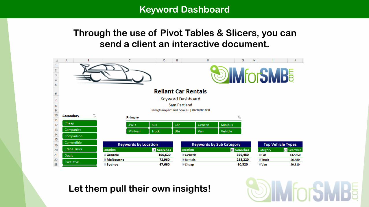
Through the use of Pivot Tables & Slicers, you can
send a client an interactive document.
Let them pull their own insights!
Keyword Dashboard
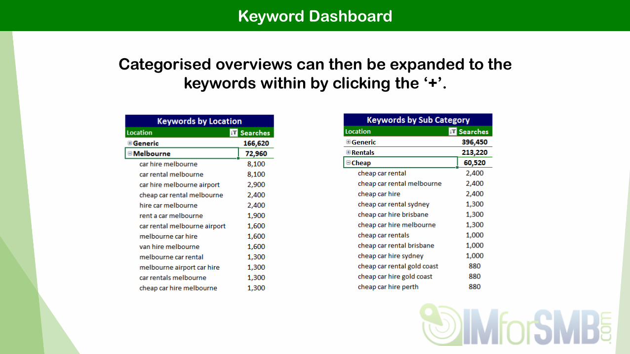
Categorised overviews can then be expanded to the
keywords within by clicking the ‘+’.
Keyword Dashboard
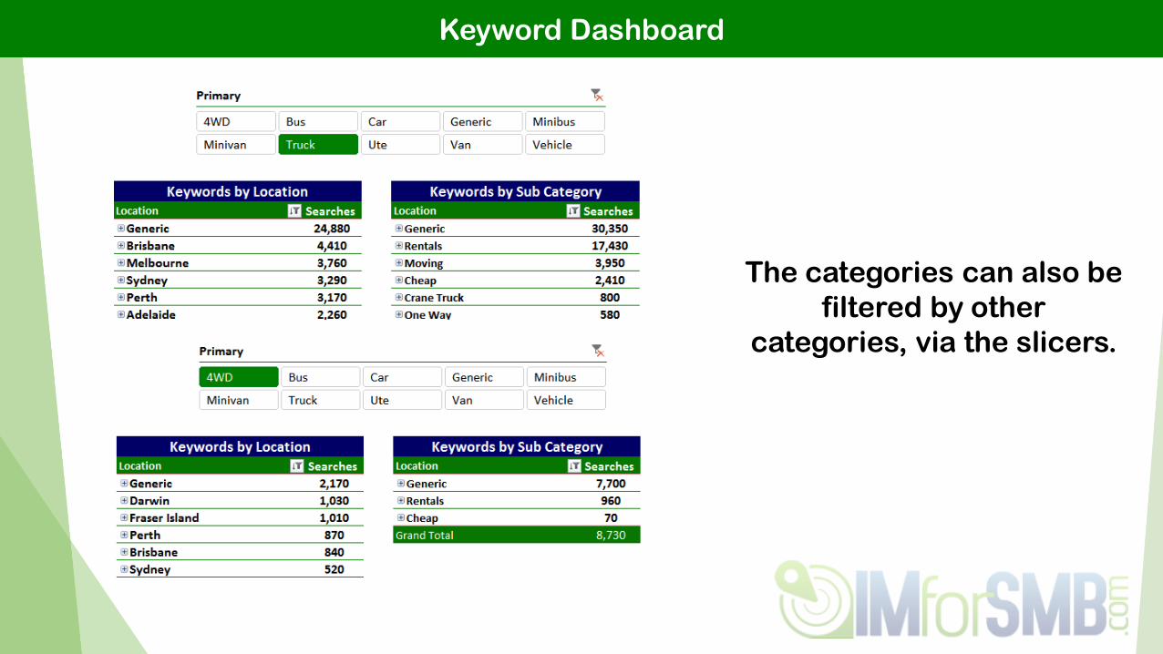
The categories can also be
filtered by other
categories, via the slicers.

Weighted Rankings
Not all keywords are equal.
An ‘average rank’ treats them like they are.

Weighted Rankings
At a quick glance, this report is not showing anything positive.
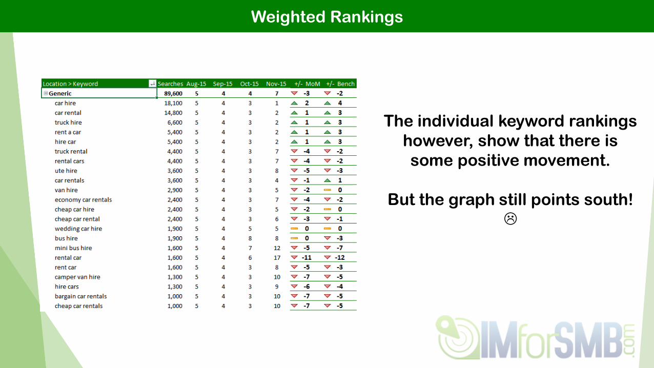
Weighted Rankings
The individual keyword rankings
however, show that there is
some positive movement.
But the graph still points south!

Weighted Rankings
By dividing estimated traffic by search volume, we can
assign a weighted market share.
Since the highest volume terms still increased in rank, the overall
market share movement was actually positive.

Weighted Rankings
A great way to avoid any
negative feedback / questions
from a client, and have
something clear & positive
you can highlight.

Google Analytics
Exporting your Google Analytics data allows you to
expand upon it, analyse it, and present it how you
would like to.
You also don’t need to train a client on how to use GA
for them to see their performance.
Google Analytics
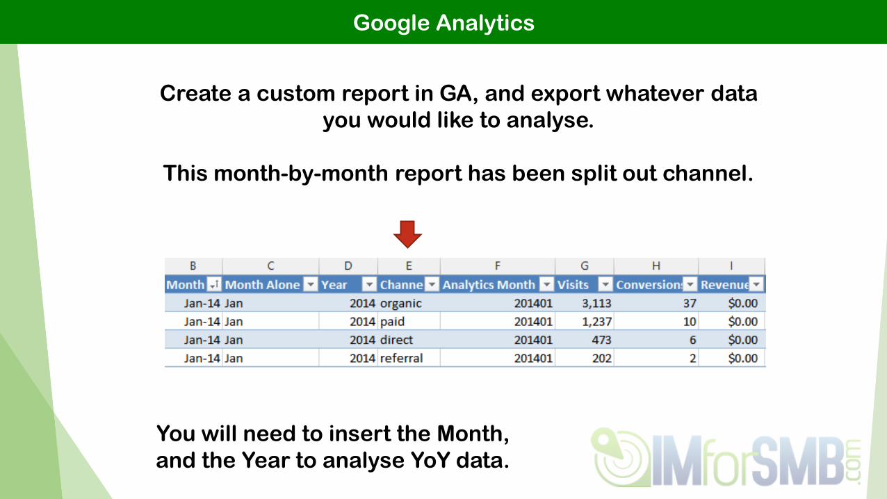
Create a custom report in GA, and export whatever data
you would like to analyse.
This month-by-month report has been split out channel.
You will need to insert the Month,
and the Year to analyse YoY data.

Google Analytics
Pivot tables are inserted so that we can
control the performance graphs.

Google Analytics
Two slicers are setup to select a month (or period) for the
report, and a comparison month (or period).
These control pivot tables with the
associated metrics.

Google Analytics
The backend pivot tables then let us
generate a simple report using the
GA data.
Using a slicer, you can generate
channel specific reports, and
create a small set of easily-updated
pages for the report.

Google Analytics
The comments are even being auto-magically generated
based on whether a metric has increased or decreased.
Add a personal touch to the comment, and you’ve saved
yourself a bit of time each month.

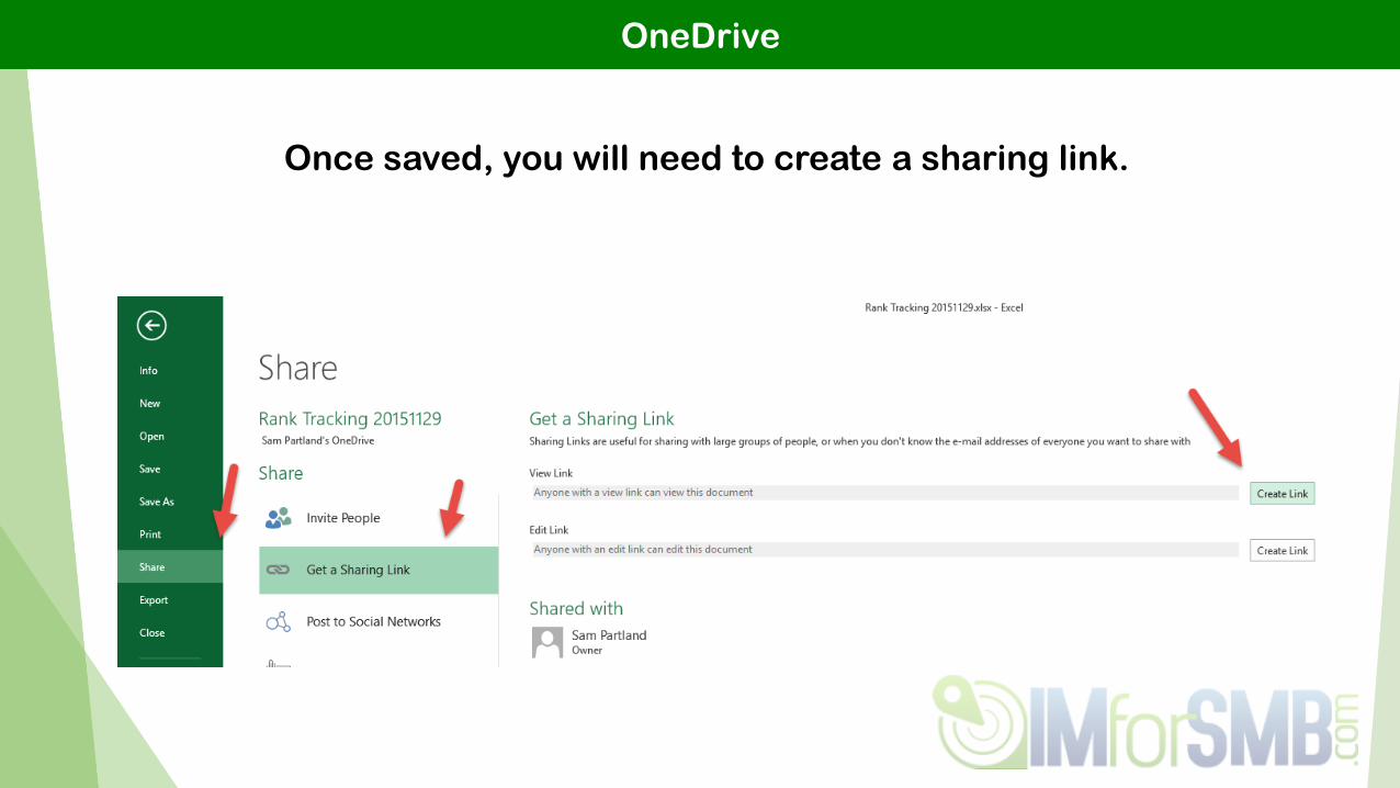
OneDrive
OneDrive allows you to present your data in an online
dashboard.
Don’t send your client a file, send them a link!
…. Essentially small-scale Tableau on a budget.
OneDrive
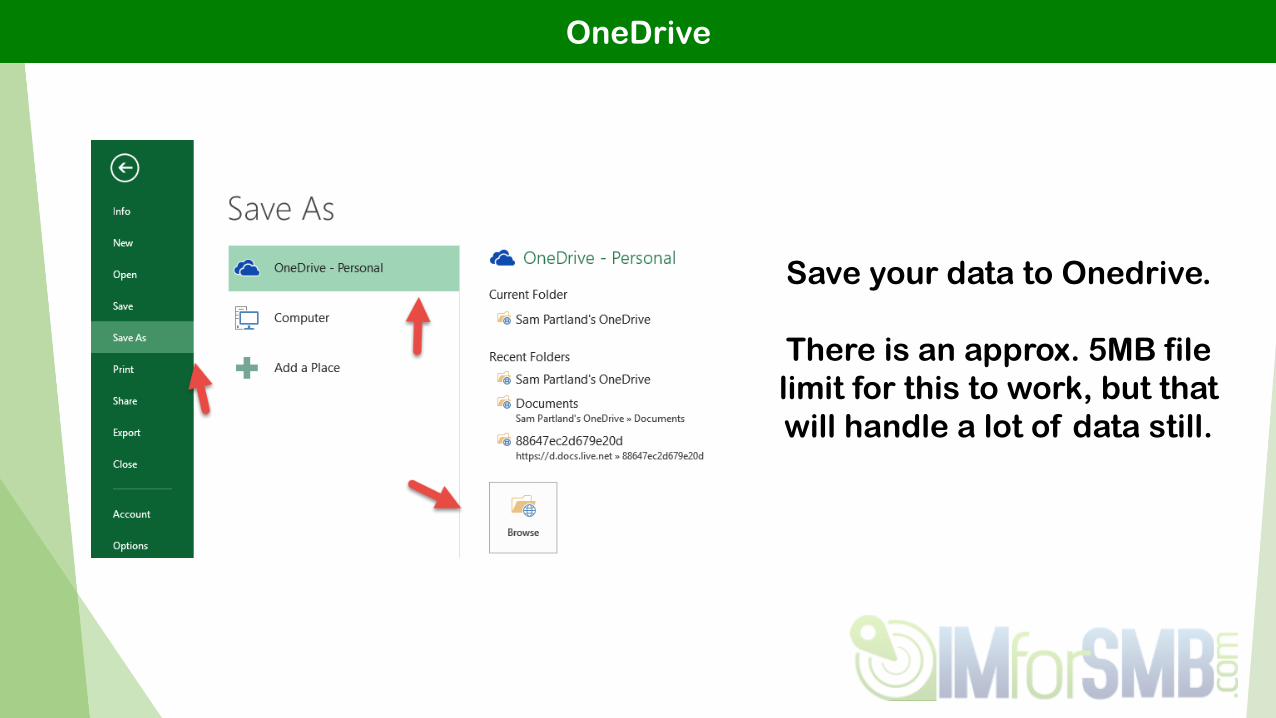
Save your data to Onedrive.
There is an approx. 5MB file
limit for this to work, but that
will handle a lot of data still.
OneDrive
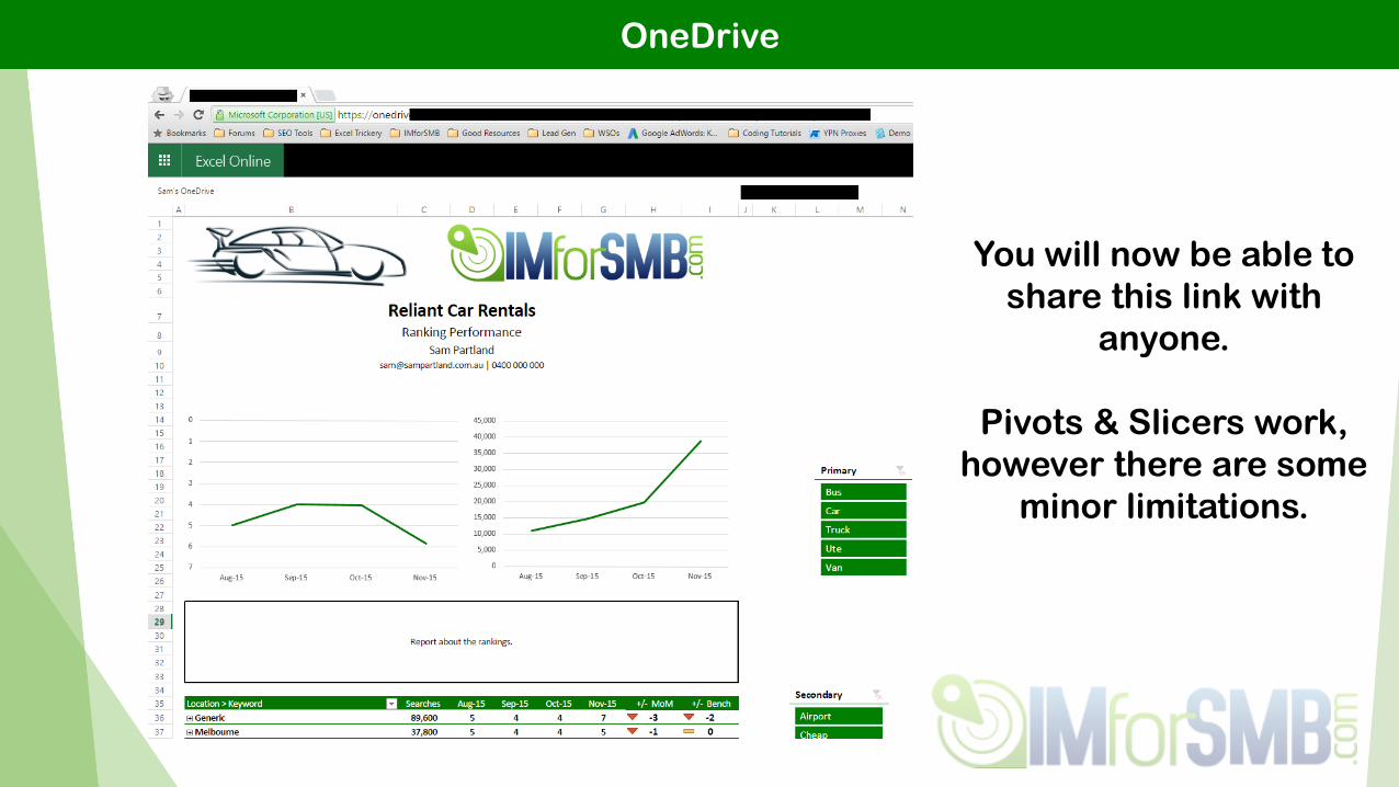
You will now be able to
share this link with
anyone.
Pivots & Slicers work,
however there are some
minor limitations.

Another Example – Brand vs Generic Builder
Using GWT keyword data, you can categorise
keywords as brand / generic and then view
this split by month.

Keep Updated At:
http://www.imforsmb.com
https://twitter.com/imforsmb
https://www.facebook.com/IMforSMB/
Add me on LinkedIn:https://www.linkedin.com/in/sampartland
Recommended